Hands on a keyboard

How the 9 Best Association Websites Drive Engagement in 2026

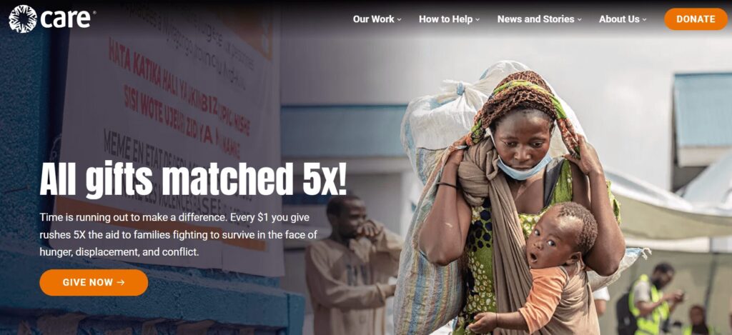
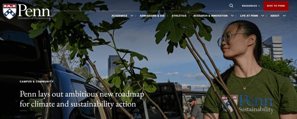
Having a streamlined, user-friendly association website is a non-negotiable in 2026. A Clutch survey of 500 internet users found that half believe a company’s website design is important to their overall brand, and 31% think an engaging user experience is a top priority for website design. A professional, clean, modern digital presence establishes the immediate credibility necessary for long-term audience engagement.

But association website design is about more than aesthetics—high-quality, engaging design can also directly impact your revenue. The 2025 Association Member Experience Report from Higher Logic found a five-year renewal rate of 93% among members who describe their digital involvement as “very easy,” while those who struggled with online navigation or portals reported lower engagement. 

With that in mind, we created this comprehensive guide to website design for associations, focusing on these key topics: 

What makes for an engaging association website design in 2026?

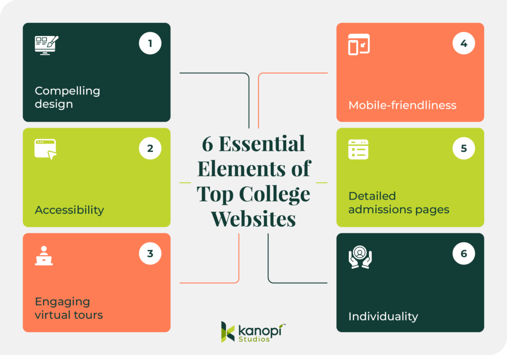
Engaging association websites prioritize streamlined functionality, with biometric authentication capabilities, WCAG 2.1 AA accessibility compliance, and AI-driven content personalization. High-performing sites function as member retention engines, reducing administrative friction and delivering immediate value through self-service portals and intuitive, mobile-first navigation.

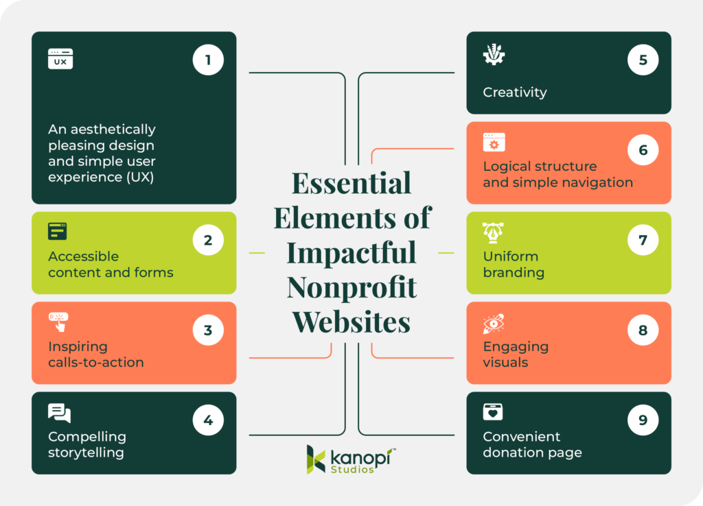
Essential elements of a high-performing association site

Associations can transition from “information overload” to “engagement-first” design by focusing on these essential elements:

  • Streamlined, member-first navigation: Effective navigation includes clear, action-oriented labels for menu items that prioritize the top 5–7 areas members actually visit. By reducing the number of top-level menu items and utilizing mega-menus for deeper discovery, you can help members find what they’re looking for in seconds, not minutes. 
  • Comprehensive member portals: Your membership portal is the online home of your member experience. High-performing portals include self-service tools for everything from tracking certification credits to managing group memberships or medical expenses. Additionally, centralized membership dashboards with reminders, upcoming events, and resources reduce your staff’s administrative burden while empowering your members.
  • Mobile-friendly design: With more than 60% of web traffic coming from mobile devices as of Q1 2025, mobile-friendliness is crucial. This means thumb-friendly navigational elements, such as properly-spaced buttons and hamburger-style menus. Additionally, prioritize rapid load times (targeting under 2 seconds) and simplified mobile forms. If a member can’t register for your annual conference while standing in line for coffee, your design is a barrier to your revenue.
  • Accessibility as a default: Accessibility is a requirement for equitable membership. This means building to WCAG 2.1 AA standards from day one. Proper color contrast, screen-reader compatibility, and keyboard navigation ensure that your association’s mission is available to everyone, regardless of ability or device.
  • AI-driven personalization: Personalized web experiences can increase new-member sign-up conversion rates by up to 202%. AI tools are the gateway to developing tailored member experiences that suit each individual’s needs. By analyzing past behavior, like webinar attendance or white paper downloads, your website can dynamically surface the most relevant resources for each individual, ensuring they see exactly what they need without having to dig through your archives.
  • Bento grid layouts: Inspired by the organized compartments of a Japanese bento box, this layout style uses modular, rectangular tiles to display diverse types of content simultaneously without feeling cluttered. It’s the perfect solution for associations that need to highlight multiple resources, such as news, upcoming events, and a Join CTA,  on a single screen. Take a look at an example of what this layout style looks like:
Membership

Join Our Community

Elevate your craft with exclusive resources and a global network of peers.

Become a Member
Upcoming
MARCH 15, 2026

Annual Summit 2026

Workshops and visionary keynotes from industry titans.

2,500+
Active Members

Latest Updates

2H AGO
Q3 Expansion Strategy
YESTERDAY
New Mentor Applications
Newsletter
Weekly insights.
  • Clear member benefits: Engaging membership sites feature a dedicated, high-visibility page or section that clearly outlines the value proposition of each membership tier. Use concise language, an ROI calculator, and social proof (such as member testimonials) to highlight the benefits of joining your membership program. Your website should also make it easy for existing members to access benefits online, such as event registrations, courses, and job boards.  

Research from Association Adviser’s 2025 Association Benchmarking Report determined that even though associations increased member touchpoints to an average of 30.4 times per month last year, many are running into the challenge of “information overload,” where more content is actually leading to less engagement. 

As a result, your website communications goal isn’t to increase the number of touchpoints, but to increase their relevance. By focusing on these essentials, you ensure that every digital interaction reinforces your association’s value rather than contributing to the clutter.

Best association website design examples

The best way to gather ideas for optimizing your association’s website is to review examples of successful sites and note how they effectively incorporate key features and functionality that support the member experience. Here are nine top association websites and the key features and functionality that enable them to engage prospective and existing members: 
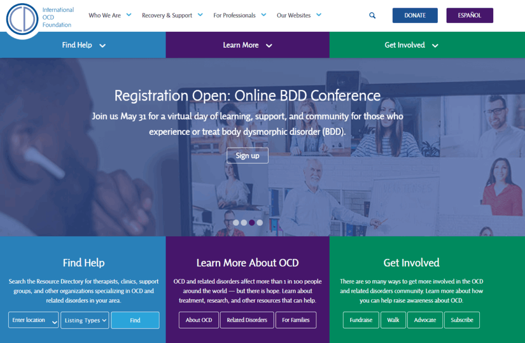
1. Eye Recommend

The Eye Recommend website homepage

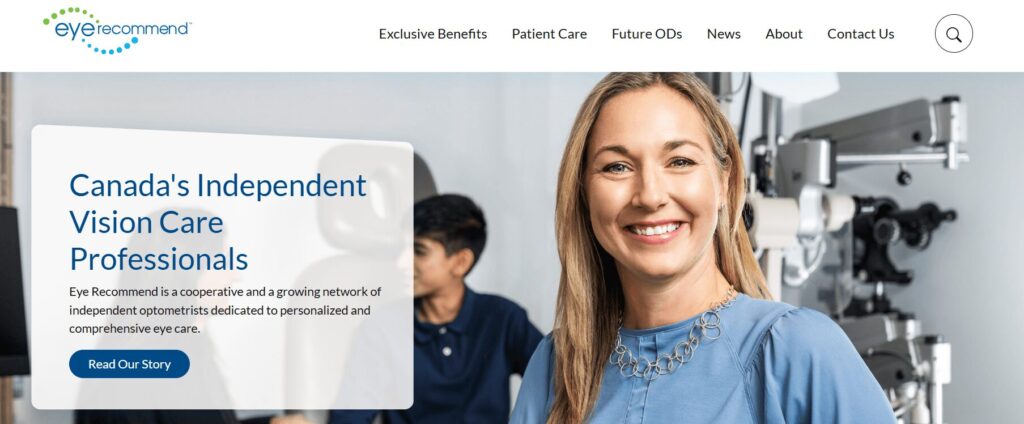
Eye Recommend’s website is both a powerful recruitment tool for their optometric cooperative and a functional search engine for patients.

Three stand-out features of the Eye Recommend website:

  • Consolidated benchmarking single sign-on (SSO): Kanopi simplified the user experience for the Eye Recommend website by building a single sign-on solution. Members can now access critical Clinic Benchmarking data, including gross profits and patient metrics, with a single set of credentials, which eliminated the need to juggle multiple logins across different domains.
  • Localized marketplace with Solr Search: To help independent clinics scale, Kanopi implemented a powerful Solr Search and an expanded Marketplace. Members can filter listings by location to find equipment, inventory, and practices for sale that are specifically relevant to their region, reducing search friction.
  • Visual consistency and accessibility-first design: Recognizing that a vision care organization must lead by example, Kanopi overhauled the site’s typography and color contrast. The result was a design refresh that provided a welcoming brand presentation while ensuring the site met high accessibility standards for all users.

Learn more about how Kanopi improved page load times and mobile usage for Eye Recommend

2. International Association of Business Communicators (IABC)

The IABC website homepage

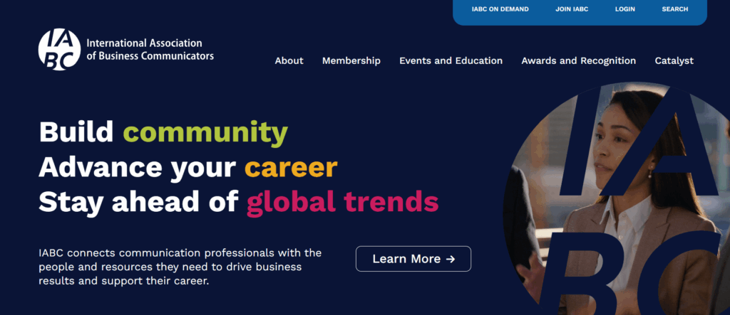
The IABC website leverages clear brand storytelling and a high-performance search function that makes decades of communication archives accessible.

Three stand-out features of the IABC website:

  • Unified domain architecture: IABC worked with Kanopi Studios to merge three disparate sites into one cohesive WordPress home, reducing maintenance while strengthening brand authority.
  • High-performance archive search: A robust filtering system allows members to instantly surface decades of communication research and case studies.
  • Dynamic component-based layouts: Flexible design blocks empower the IABC team to create consistent, professional pages without needing a developer.

Read more about how Kanopi successfully merged three sites to tell IABC’s compelling story

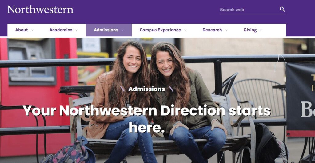
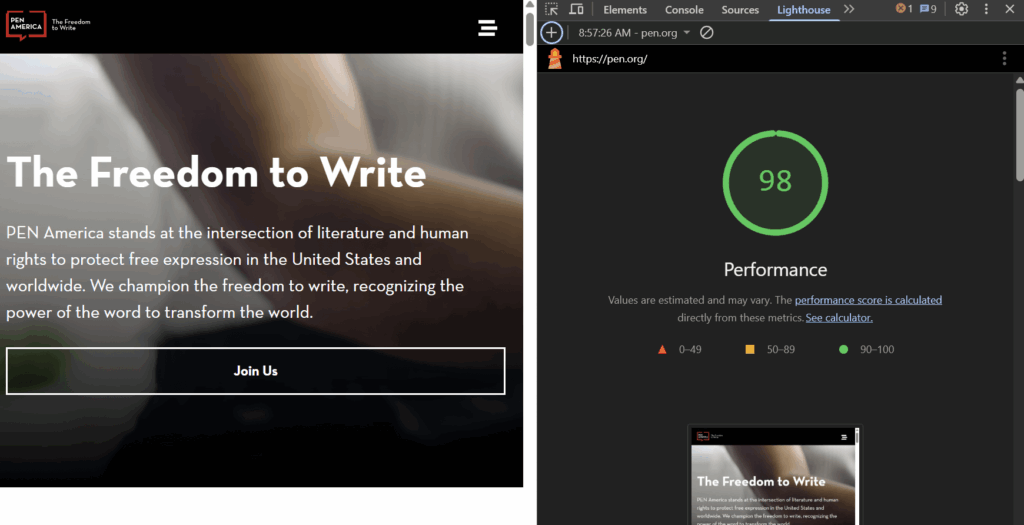
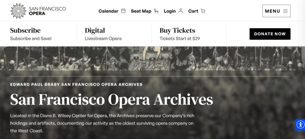
3. American Association of Retired Persons (AARP)

The AARP website homepage

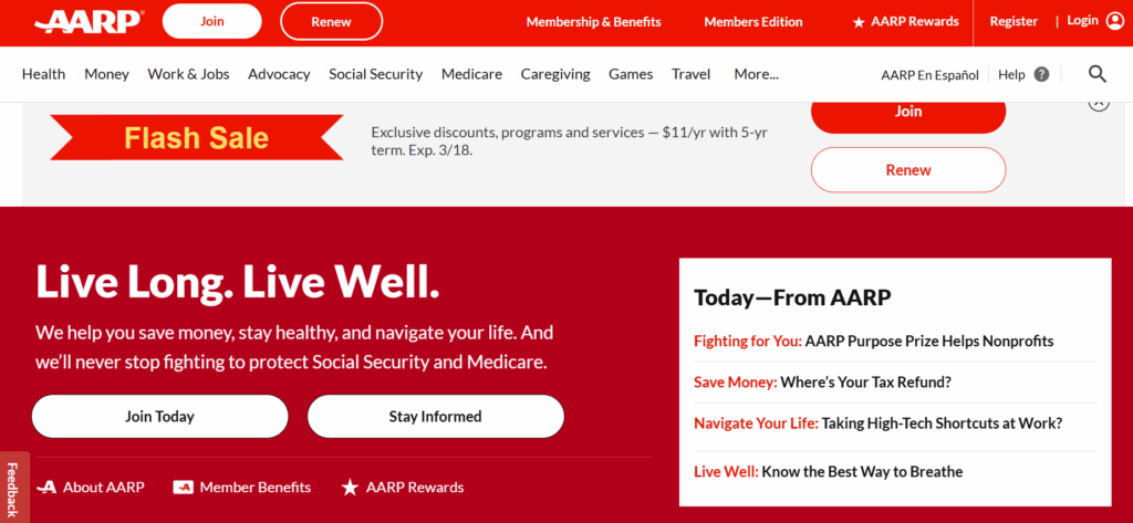
The AARP website provides a masterclass in accessible design. The site boasts a 99/100 accessibility score on Lighthouse, an automated website auditing tool, demonstrating a high level of commitment to design legibility and inclusivity. 

Three stand-out features of the AARP website:

  • Inclusive typography and high color contrast: The high-legibility design features larger touch targets and high color contrast ratios tailored for older demographics.
  • Cognitive load management: The clean, distraction-free layout uses clear iconography and simple language to prevent information overload.
  • Voice search optimization: Advanced SEO and technical architecture make the site easily navigable via voice-assistive technologies.

4. National Association of Realtors (NAR) 

The NAR website homepage

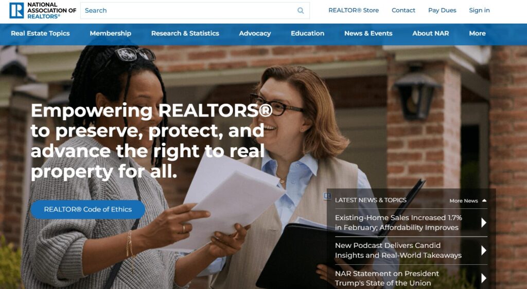
As one of the largest professional associations in the world, the NAR website is a benchmark for managing massive volumes of data while providing a personalized experience for over 1.5 million members. Their site excels at translating complex legislative and market data into actionable insights.

Three stand-out features of the NAR website:

  • Dynamic member center with SSO integration: This setup enables real-time access to education credits, membership status, and personalized benefits tailored to the user’s specific real estate board.
  • Robust research and statistics hub: The site features interactive data visualizations and proprietary market reports, positioning the NAR as the definitive authority on housing data.
  • A geographically targeted advocacy platform: Members can connect with local and national legislative alerts, making it simple for realtors to engage in “call to action” campaigns that impact their specific markets.

5. Project Management Institute (PMI)

The PMI website homepage

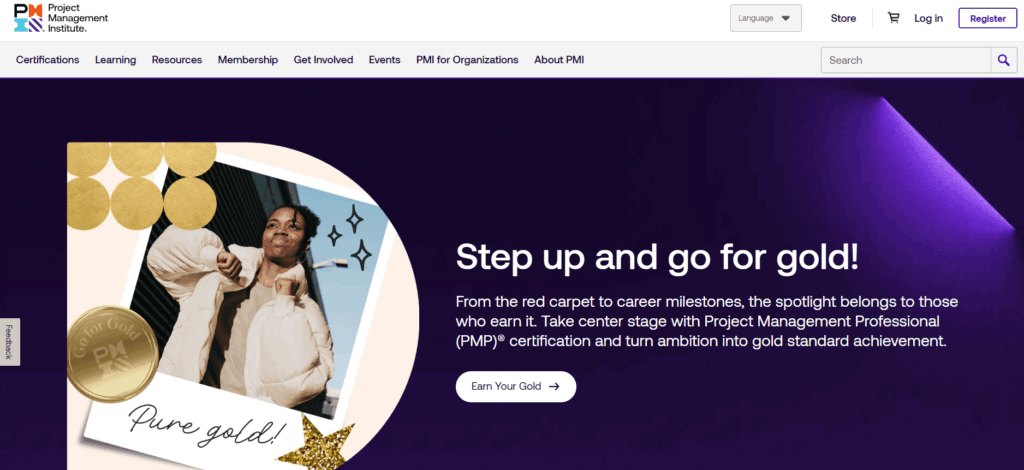
PMI manages a massive global audience with highly technical needs. Their site handles a diverse array of certifications (PMP, CAPM, etc.) within a unified ecosystem.

Three stand-out features of the PMI website:

  • Global chapter geo-locator: An interactive map tool uses browser geolocation to instantly connect members with their local chapter and upcoming regional networking events.
  • Gamified certification progress: A visual “Roadmap to Certification” uses progress bars and milestones to help members navigate the complex requirements of professional credentialing.
  • Standards+™ digital resource library: A searchable, high-speed digital platform provides “just-in-time” access to the PMBOK® Guide and other technical standards via mobile-optimized snippets rather than long PDFs.

6. Alberta Teachers Association

The ATA website homepage

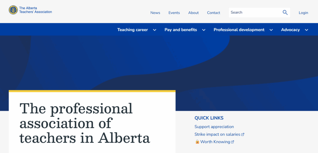
The ATA offers a great example of an association using web design to reduce administrative costs while improving member convenience. The organization moved from mailing physical plastic cards to a self-serve digital card service and embraced several additional modern web design features to improve the user experience.

Three stand-out features of the ATA website:

  • Complex permissions logic: A robust backend handles varied access levels for over 40,000 members, ensuring the right resources reach the right teachers.
  • Simplified dues management: Integrated payment systems make it easy for members to manage their professional standing and renewals online.
  • Member-centric news feed: A customized content engine surfaces local chapter news alongside province-wide educational updates.

7. IEEE Communications Society

The IEEE ComSoc website homepage

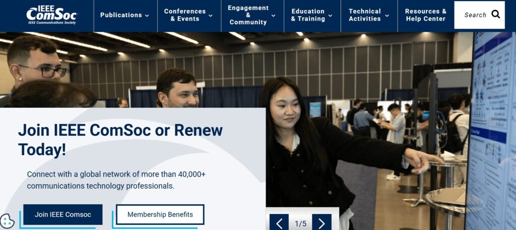
IEEE ComSoc is a global network of over 40,000 communications technology professionals. The website provides a streamlined user experience, highlighting resources such as publications, events, community engagement opportunities, and skill development training. 

Three stand-out features of the IEEE ComSoc website:

  • Technical publication integration: Direct API connections to IEEE Xplore allow members to access high-level technical papers without leaving the ComSoc site.
  • Global event calendars: A centralized, timezone-aware calendar features dozens of international conferences and local chapter meetups.
  • Expert directories: A searchable “Find an Expert” database facilitates global networking among telecommunications professionals.

8. American Nurses Association (ANA)

The ANA website homepage

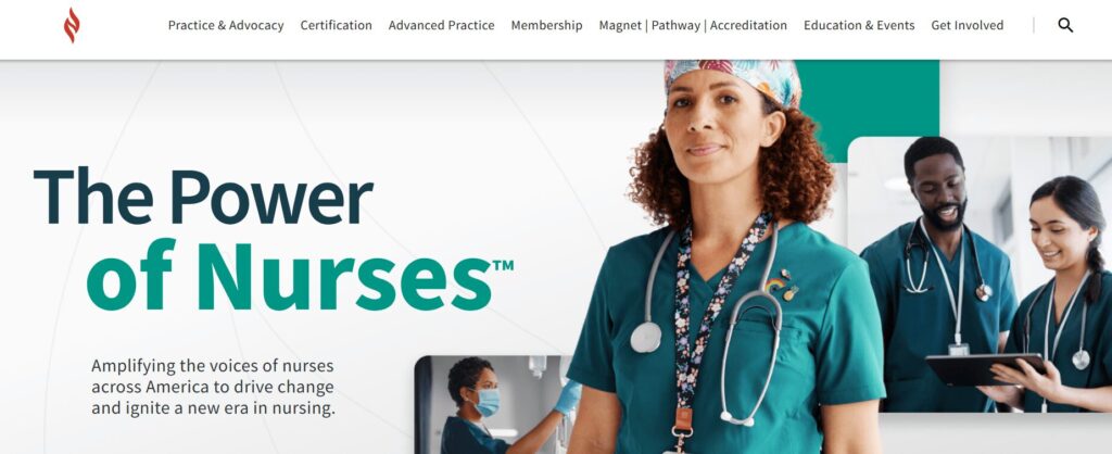
As the online hub for the premier professional association for RNs, the ANA website goes above and beyond in facilitating the member journey. It successfully balances advocacy and professional development with a highly personal feel.

Three stand-out features of the ANA website:

  • Integrated certification tracker: A seamless connection to the ANCC (American Nurses Credentialing Center) allows nurses to track continuing education credits and certification status directly through their profile.
  • Action-oriented advocacy center: This tool reduces the friction of political engagement by enabling members to contact their representatives with pre-filled templates based on their zip code.
  • Custom job alerts: Members can set alerts that notify them only of roles matching their specific nursing sector and geographic preferences, effectively filtering out irrelevant postings.

9. New England Association of Schools & Colleges (NEASC)

The NEASC website homepage

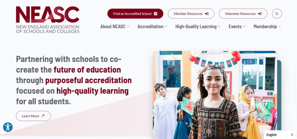
The NEASC website is a top-tier example of how an accrediting body can use digital tools to manage complex professional workflows. The site serves as a vital bridge between educational institutions and rigorous accreditation standards.

Three stand-out features of the NEASC website:

  • Searchable institution directory with advanced filtering: The public and educational professionals can verify the accreditation status of thousands of schools across multiple membership cycles and regions.
  • Resource-heavy accreditation toolkits: Designed with a clear content hierarchy, these kits enable school administrators to easily navigate the extensive documentation and self-reflection forms required for accreditation.
  • Streamlined event and workshop registration system: This tool handles high-volume sign-ups for professional development sessions, specifically tailored to different educational sectors from early childhood through higher education.

Expert website design tips for associations

1. Design for frictionless renewals.

Renewals provide your association with reliable recurring revenue, but a poorly designed website can become a barrier to member retention. A Higher Logic report found that almost half of associations report first-year renewal rates below 60%, often due to “unclear onboarding” on their websites.

Action steps to take today: 

  • Implement biometric login options (FaceID/TouchID) for member portals, making it easier for members to access their membership status information on supported devices. 
  • Provide an auto-renewal opt-in checkbox at the point of initial sign-up or renewal that allows members to keep a payment method on file for automatic annual billing.
  • Offer secure tokenization through gateways like Stripe or Authorize.net so members can pay with “the card on file” in a single click.

2. Optimize for answer engine visibility. 

While you may be familiar with search engine optimization (SEO), your site must also be optimized for generative or answer engines like ChatGPT and Gemini to succeed in today’s online landscape. People interact with generative search engines much less formally than traditional search platforms, asking questions in a conversational style and expecting immediate, personalized responses. 

Action steps to take today: 

  • Structure your content with clear H2 and H3 headings so AI engines can easily pull your information into their summaries.
  • Implement structured data, otherwise known as schema, to help engines understand the context of each page on your site. This could include Person, Organization, FAQ, BlogPosting, and Product schema. 
  • Identify and resolve technical issues that can affect traditional and AI search results, such as broken links or slow page load times. 

3. Use dynamic social proof.

Members want to see authentic, real-time validation from their peers. Dynamic social proof transforms your website from a one-way sales pitch into a living community, leveraging FOMO (the fear of missing out) and transparency to demonstrate your association’s value.

Action steps to take today: 

  • Record member video stories to share in recruitment emails and blog posts. 
  • Display real-time counters (e.g., “452 members are attending our next webinar”) to encourage engagement and build community.
  • Incorporate a live social media feed displaying posts from both your organization’s page and member posts that tag your organization or use one of your hashtags. 

4. Maintain brand consistency. 

If a member clicks from your main homepage to a legacy “Resources” subdomain or a third-party “Career Center” and the design suddenly changes, it erodes trust and creates friction in the user experience. Maintaining a unified visual and tonal language across all platforms ensures your association comes across as professional, reliable, and secure.

Action steps to take today: 

  • Create a digital style guide for your staff to use when making any website updates or changes. Include logo usage instructions, typography, hex codes, standardized writing conventions, and other visual and tonal guidelines. 
  • Audit your third-party integrations (like your AMS portal or job board) to ensure they use “header/footer” wrapping that matches your primary site’s navigation.
  • Standardize your component library so that every button, form, and “Call to Action” looks and behaves the same way, regardless of which page the member is visiting.

Curious whether your association’s website is currently hitting the mark when it comes to implementing best practices? Complete our free UX assessment scorecard to help evaluate your current performance and identify areas for improvement:

UX Scorecard

Rate your website to uncover member experience opportunities.

Association website design: FAQs

How often should our association redesign its website?

Associations should conduct recurring UX audits every six months. During this process, you should make small adjustments and improvements to your site based on metrics like time on page and conversion rates. This continuous improvement process ensures that your site won’t become outdated too quickly and that you can easily respond to fluctuations in your engagement metrics.

How do we integrate our AMS (Association Management System) without slowing down the site?

Adopt headless CMS architectures or prioritize API-first integrations to maintain peak front-end performance. A “headless” approach enables developers to deliver content via APIs seamlessly across any platform by decoupling the backend (i.e., your content management system, such as WordPress or Drupal) from the user interface. With a headless website architecture, you can create content once and seamlessly distribute it across both your website and your AMS.

What is the average cost of a custom association website in 2026? 

The cost of a custom association website depends heavily on the complexity of features such as member portal integrations. For mid-to-large associations, the investment covers deep AMS synchronization, custom single-sign-on (SSO) configurations, and rigorous accessibility auditing to meet inclusive design standards.

How can AI improve our member experience? 

AI tools can enhance members’ experiences through personalized content recommendations and support. Generative AI can now provide “predictive search,” which anticipates a member’s needs based on their career stage or past renewal behavior. Plus, 24/7 AI-driven member support chats help streamline the member experience by delivering immediate answers to common questions.

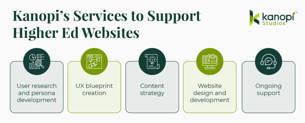
How Kanopi can help you create a member-centric website

The Kanopi team is well-versed in crafting member retention engines out of legacy association websites. We’ve helped dozens of associations transform their fragmented digital footprints into unified, high-performance platforms. Our website design services for associations include: 

  • Strategic discovery: Our team conducts comprehensive audience research to understand your current presence and develop a strategy tailored to your community.
  • AMS & SSO integration: We specialize in connecting complex back-end systems (iMIS, Fonteva, NetForum, etc.) to websites and implementing straightforward SSO for member-only portals.
  • Unified digital ecosystems: We consolidate fragmented domains and multi-site architectures into one high-performance, easy-to-manage platform.
  • High-performance dashboards: We build enhanced member areas featuring responsive, fully customizable charts and personalized resource libraries.
  • Inclusive design focus: We ensure your site meets all of the highest AA/AAA accessibility standards, providing equitable access for your entire global audience.
  • Continuous improvement: Through dedicated web support, we partner with you long-term to keep your site healthy and responsive to new trends.

From streamlining complex workflows to creating modern, accessible designs, see how we’ve helped organizations like yours thrive.

Wrapping Up

By prioritizing intuitive navigation, AI-driven personalization, and mobile-first accessibility, you can move beyond 'information overload' and start delivering true value via your association website design. Whether you’re looking for a full redesign or a targeted UX audit, the goal remains the same: making your members' digital involvement seamless. 

Kanopi Team

9 Best Healthcare Web Design Companies to Work With in 2026

Your healthcare or hospital website is the vital link connecting community members with the essential medical services they need to lead healthy lives. Your website is a critical launch point in the patient journey—studies show that over 60% of consumers use the web to choose a new healthcare provider or search for a service or care option, such as urgent care or imaging services.

Take a look at this example patient journey illustrating the key role healthcare websites play in transforming website visitors into patients:

Patient Journey

Step 1 of 4

Google

Search results for “best dermatologist…”

Ad • www.skindoc.com

Premium Skin Care Clinic

Board-certified experts. Book now.

TOP RATED

ClearSkin Dermatology

Rated #1 for patient satisfaction. Same-day appointments.

★★★★★ (2,847 reviews)
ClearSkin
ServicesAbout

Your Skin Deserves Expert Care

We combine medical excellence with a luxury patient experience.

📅 Schedule Consultation

Complete Your Booking

Selected Service:
General Dermatology Consultation
Time:
Tuesday, Oct 14 at 10:30 AM

However, your organization might not have the capacity or expertise to turn your digital home into a comprehensive resource that effectively serves your community. Working with a healthcare web design company can provide the support you need to continue delivering high-quality online experiences to your audience. 

This guide compares the top healthcare web design agencies to help your healthcare organization find the right fit for your digital needs, covering:

9 Best Healthcare Website Agencies to Partner With

CompanyBest ForTarget Audience
Kanopi StudiosHigh-touch, mission-driven partnershipUniversity medical departments, health foundations, and specialized health networks
Design de PlumeInclusivity-powered designHospitals and health centers seeking inclusive, community-driven communication
ModeaDigital “front door” engineeringLarge-scale hospitals, healthcare systems, and payors
Hedy & HoppPrivacy-first marketingMulti-location providers, health plans, and hospitals needing proven ROI
Intrepy MarketingPrivate practices and surgical centersSpecialty medical practices (Orthopedics, Med Spas, etc.) and solo providers
Windmill StrategyMedical device and life science companiesB2B MedTech and life science manufacturers
Practice BuildersData-driven practice growthPrivate clinics, urgent care centers, and dental/specialty providers
Supreme OptimizationTechnical life sciences and biotechScience-heavy companies in life sciences, pharma, and health tech ecosystems
RainCastleBiotech branding and investor designBiotech startups and established life science brands

1. Kanopi Studios

Kanopi Studios' website homepage

Location: Kanopi operates remotely, with a team spread across North America. 

Best For: A high-touch, mission-driven partnership

Target Audience: University medical departments, health foundations, hospitals, and specialized health networks

Services Overview: Kanopi’s healthcare web design services are built on a philosophy that medical websites should be easy for everyone to use, from patients to content editors to healthcare providers. The Kanopi team prioritizes intuitive user interfaces, accessible functionality and content, and mobile-friendliness. Additionally, every healthcare website Kanopi builds is fully HIPAA- and at least WCAG 2.1 AA-compliant

Key healthcare web design services include: 

  • Research and strategy: Every web project starts with discovery and research for a deep understanding of your target audience. This ensures that your website speaks to your users’ needs, no matter who they are. 
  • Design, user experience, and content: Kanopi creates engaging, accessible, and user-friendly healthcare content that simplifies the visitor experience and deepens audience relationships. 
  • Web development: Kanopi’s engineers bring your website to life with essential features and functionality, from online patient portals to location maps.
  • Web support: The Kanopi team partners with you to drive long-term success, continually enhancing your website with security updates, feature upgrades, and revitalized navigation.

Here’s a snapshot of how Kanopi approaches patient-first design for healthcare clients. We turn messy user interfaces into clean, engaging, patient-first digital experiences. 

Before & After UX Slider

The Power of Patient-First Design

✚ CareFirst
Services • Doctors • Portal • Contact

Your Health Journey,
Simplified

Access records, book doctors, and manage care from any device.

Book Appointment →
👨‍⚕️
Modern UX
🏥 GENERAL MEDICAL GROUP INC. Login | Register | Search
⚡ FLASH SALE: 20% OFF WELLNESS CHECKS – CALL NOW! ⚡
Quick Links

• Bill Pay
• Locations
• Careers
• Staff Info
• PDF Forms
Welcome to our Portal
Please call our office to request a PIN.
Support
Live Chat Offline.
Legacy UI

← Drag the slider to compare layouts →

Plus, 97% of Kanopi’s clients return year over year, demonstrating the team’s lasting commitment to digital healthcare success. 

2. Design de Plume 

Design de Plume's website homepage

Location: Canada and the U.S.

Best For: Inclusivity-powered design

Target Audience: Hospitals, health centers, and public sector organizations that serve diverse or vulnerable communities.

Services Overview: Design de Plume’s services are fueled by a commitment to inclusivity and honoring indigenous traditions. Their services include strategy, branding, website design, and campaigns. Some of their healthcare clients include the Johns Hopkins Center for Indigenous Health and the Maamwesying Ontario Health Team (MOHT).

3. Modea 

Modea's website homepage

Location: Headquarters in Blacksburg, VA

Best For: High-end digital “front door” product engineering

Target Audience: Large health systems and payors seeking sophisticated digital consumer experiences.

Services Overview: Modea partners with healthcare organizations to build and optimize their online resources. Their services include digital strategy, UX design, web development, electronic health record (EHR) integration, and HIPAA compliance. Their work has helped clients increase website conversions, site speed, and digital revenue.

4. Hedy & Hopp

The Hedy & Hopp website homepage

Location: Remote operations

Best For: Privacy-first marketing and HIPAA-compliant attribution

Target Audience: Large health systems, payors, and multi-location providers who need to prove marketing ROI.

Services Overview: Hedy & Hopp is a full-service digital marketing agency for healthcare organizations. They can step in at any point to support healthcare websites, whether they need a full rebuild or optimization. They can also build a robust marketing strategy that sets up your healthcare organization for long-term growth. 

5. Intrepy Healthcare Marketing

The Intrepy website homepage

Location: Based in Orlando, FL.

Best For: Private practices and surgical centers

Target Audience: Medical practices and solo providers

Services Overview: Intrepy takes a data-driven approach to healthcare marketing, leveraging real-world experience to provide tailored services that healthcare organizations need. Their services include medical SEO, web design, video production, paid advertising, and more. Clients have seen increases in organic website traffic and appointment booking after working with Intrepy. 

6. Windmill Strategy

The Windmill Strategy website homepage

Location: Based in Minneapolis, MN, with clients across the U.S. 

Best For: Medical device and life science companies

Target Audience: B2B MedTech

Services Overview: Windmill Strategy provides digital marketing services to B2B marketers with complex offerings. They help medical businesses establish leadership in their sector, showcase their offerings more effectively, and generate leads. They also build websites for life sciences organizations that speak to many audiences, from healthcare professionals and scientists to patients. 

7. Practice Builders

The Practice Builders' website homepage

Location: Headquarters in Durham, NC

Best For: Data-driven practice growth 

Target Audience: Small-to-medium size clinics

Services Overview: Practice Builders has been in the healthcare digital marketing space for over 45 years. They help practices grow through web design, reputation management, SEO, and social media marketing. Their clients range from medical offices to dental practices and other specialties. 

8. Supreme Optimization

The Supreme Optimization website homepage

Location: Remote/global capabilities

Best For: Technical life sciences and biotech

Target Audience: Scientific organizations needing Ph.D.-level strategists to communicate complex healthcare or life science products.

Services Overview: Supreme Optimization is a full-service marketing agency for life science organizations. Their global team includes 70+ Ph.D. scientist-marketers, ensuring they have deep knowledge of life science topics. Their team helps orgs maximize their ROI through smart UX and data-driven intelligence. 

9. RainCastle Communications

The RainCastle Communications website homepage

Location: Headquarters in Needham, MA

Best For: Biotech branding and investor-focused design

Target Audience: Biotechnology

Services Overview: RainCastle Communications builds B2B websites for life sciences, healthcare technology, and professional services. They take a strategic approach to web optimization, from thoughtful discovery and design to ongoing optimization. Their industry expertise allows them to achieve strong results while reducing risks. 

Top Healthcare Web Design Companies: FAQs

How does healthcare web design differ from standard web design?

Healthcare sites face significantly higher stakes than other sectors; they must balance complex regulatory compliance (HIPAA, ADA) with a patient-first UX that reduces anxiety and is easy to use for web visitors who are often stressed or in a hurry.

Why is industry-specific experience so important?

Experienced agencies already understand clinical workflows, medical SEO, and the specific trust signals needed to convert a visitor into a patient, so they don’t need to be brought up to speed on the ins and outs of your industry.

What is the average timeline for a healthcare website build?

Timelines depend on scope, but they generally range from a few months to significantly longer for enterprise-level organizations with complex integrations, such as EHRs and patient portals.

What are the non-negotiable compliance standards?

Any reputable agency must guarantee HIPAA compliance for data privacy and Web Content Accessibility Guidelines (WCAG) 2.1 Level AA accessibility standards.

How do agencies protect sensitive patient information (PHI)?

Top firms implement SSL encryption, secure data storage, and encrypted form submissions to ensure that any data transmitted, from appointment requests to bill pay, is protected from breaches.

What features do patients value most on a healthcare site?

Data shows that 94% of consumers prioritize easy navigation on the websites they use. Other essential healthcare site features include intuitive search, mobile-friendly appointment scheduling, provider directories, and secure patient portals.

Why is mobile-first design critical in healthcare?

With over 64% of web traffic originating from mobile phones, patients need to be able to find directions or book care while on the go, often while juggling other stressful tasks like childcare and jobs. That means a mobile-friendly interface is critical to help them complete essential tasks.

How is accessibility handled for diverse patient needs?

Agencies should follow WCAG guidelines by creating designs that facilitate keyboard navigation, provide high color contrast for the visually impaired, are screen reader compatible, and offer clear, jargon-free content.

How much does a professional healthcare website cost?

Pricing varies widely based on the number of pages, custom features (such as telehealth integrations), and the level of ongoing support required.

How can we measure the ROI of a new website?

A top-quality agency will track specific metrics such as increases in new patient inquiries, online appointment bookings, and improved search engine rankings for key medical terms. You can use this data to evaluate whether your site is serving your goals or whether you need to adjust your strategy to improve outcomes.

How to Choose the Right Service Provider for Your Needs

  1. Ensure specialty alignment. If your healthcare organization requires specialized functionality, ensure the web design provider you work with can accommodate your needs. For example, a pediatric care clinic needs a balance of professional trust for parents and a friendly, approachable aesthetic. This often requires multilingual content options and quick links for vaccine schedules or dosage charts.

💡 Pro Tip: Ask for a “Design Persona” review. A provider should be able to explain how their design choices specifically appeal to both the logical needs of a parent/patient and the emotional comfort of the user.

  1. View portfolios. Explore case studies and client stories from potential providers to see whether their services and deliverables align with your requirements. Verify that their past work includes high-quality medical imagery and engaging video storytelling. Also, browse their past projects on a mobile device to ensure complete mobile compatibility. 

💡 Pro Tip: Don’t just look at the homepages. Navigate to a deep resource page on your phone (e.g., a dosage chart or provider directory). If you have to pinch and zoom to read it, they aren’t truly mobile-optimized.

  1. Ask for references. Don’t just take their word for it—ask potential agencies for references from past clients so you fully understand their approach with healthcare providers. For instance, you may ask a reference, “How did the agency handle situations where a timeline needed to be extended due to a new compliance requirement?”

💡 Pro Tip: Ask this exact question: “Can you describe a time this agency caught a compliance or security risk before you did?” This reveals whether they are proactive partners or just order-takers.

  1. Verify HIPAA compliance and security standards. Ensure the provider you choose complies with digital HIPAA guidelines and offers top-level security standards. Confirm they implement multi-factor authentication (MFA) for all logins, SSL encryption for every form, and secure off-site backups.

💡 Pro Tip: If a provider says, “Our hosting is HIPAA-compliant, so your site is too,” keep looking. HIPAA compliance requires specific encryption at the application level (how the forms handle data), not just where the files are stored.

  1. Ensure custom accessibility. Ensure custom accessibility. Your web design partner should be able to tailor your site’s accessibility to your unique audience. For example, if your organization serves populations with low vision and blindness, your web provider should be able to build your website to accommodate these needs, including high color contrast, audio descriptions, and other essentials. 

💡 Pro Tip: Ask for an accessibility audit report from a previous project. If they can’t produce one, they likely aren’t testing for screen readers or low-vision users.

  1. Ask about EHR integration. Ask specifically if they have integrated with your exact EHR system, such as Epic, Oracle Health, PracticeSuite, or athenaOne, as the technical lift varies significantly between platforms. Ensure they can seamlessly link to or embed patient portals so users can access test results and medical history without a confusing login experience.

💡 Pro Tip: Integration isn’t “one size fits all.” Ask: “Do you use a native API integration for [Epic/Oracle], or are you just skinning an external login page?” The latter often leads to a disjointed user experience.

  1. Explore support options. Determine the level of ongoing support your provider will offer your organization to ensure continued success. Ask about their guaranteed response time for critical security patches versus general content updates.

💡 Pro Tip: Distinguish between “Response Time” (we saw your email) and “Resolution Time” (the bug is fixed). Ensure your service-level agreement (SLA) defines both for critical security patches.

  1. Inquire about results tracking. Evaluate how providers measure website performance and report back to clients. Beyond traffic, they should track online appointment booking rates, newsletter sign-ups, and the “Success Rate” of your internal search bar.

💡 Pro Tip: Ask them to set up “Conversion Funnels” that track how many visitors to a service page actually complete an “Appointment Request” form.

Wrapping Up

Finding the right web design provider for your healthcare organization is as much about relationship building as it is about wireframes and branding strategies. When you can find an agency that truly cares about your organization, deeply understands its needs, and is devoted to its success, you can build an online presence that furthers your healthcare mission. 

For more information, check out these additional healthcare web design resources:

The interior of a modern art museum

Web Design for Arts and Culture Organizations: 2026 Guide

After years of navigating uncertainty, the arts and culture sector is finally seeing a definitive resurgence as museum visitation has officially bounced back to pre-pandemic levels. 

However, this return to physical spaces hasn’t signaled a decrease in digital demand. In fact, there has been a 29% year-over-year increase in website sessions, proving that audiences are now more digitally engaged with arts organizations than ever before. For institutions to thrive in this new landscape, their web design must become a high-performing, connective bridge between the virtual world and the gallery floor.

In this guide, we’ll explore tips and best practices for designing your website to drive greater mission engagement and conversions. We’ll cover: 

The importance of engaging arts and culture web design

The value of your arts and culture organization is self-explanatory. You provide an incredible resource to your community through the artwork, music, or performances you offer, educating and inspiring the public. An engaging and thoughtful web design translates that value to your online community, transforming casual users into lifelong members of your cultural community.

With a well-structured web design strategy, you can: 

  • Balance stunning and immersive design with essential information like hours, pricing, and location. 
  • Increase conversion rates by nudging visitors toward financial support without feeling overly promotional.
  • Make massive, metadata-heavy digital collections searchable and engaging for the general public.
  • Create an accessible and positive experience for users with disabilities. 

The key components of effective web design for arts and culture organizations

The essential features of arts and culture websites, listed below

Every well-designed arts and culture website shares a few key qualities. To effectively promote your mission and connect community members to your cultural services, your website should have: 

  • User-friendly navigation: A clear menu structure and internal search functionality are crucial in helping users find the information, digital resources, or forms they need. 
  • Event calendars and landing pages: In 2024, there was a significant increase in users (32% overall) landing directly on event pages. These pages must be informative, with clear event details that include the date, time, and location.
  • Online ticketing: 76% of museum professionals say that online ticket sales are a core revenue channel. Your online ticketing process should be easy to use, regardless of what device type visitors are using. It should deliver tickets to users immediately, allowing them to download them on their phones or print them. 
  • Responsive design: Mobile use accounts for 70% of all website sessions and generates 53% of revenue for cultural organizations. Your website should automatically adapt to mobile screens, with larger fonts and buttons optimized for mobile formatting. 
  • Clear and uniform branding: Cohesive colors, fonts, messaging, and imagery are key to creating a unified brand identity for your cultural organization. 
  • Relevant calls to action (CTAs): CTAs are buttons or links that help users navigate to different parts of your website. Your site CTAs should appeal directly to your target audience’s needs. For example, your homepage should have buttons that direct users to your online ticketing page, event calendar, and donation page. 
  • Convenient and streamlined forms: Forms such as your donation page, membership signup, and online volunteer registration allow your organization to gather information about visitors and build deeper relationships with them. Forms should be simple and mobile-optimized to guarantee a streamlined user experience. 
  • Digital educational resources: If your cultural organization has a strong educational focus, courses, videos, quizzes, and interactive learning widgets will bring your information to life for learners.
  • High-quality videos and photos: Studies have shown that content with images receives 94% more views than content without. Include high-quality original photography and videos on your website to give visitors a glimpse into your exhibits. Your visual art is your best asset, so show it off!
  • Immersive digital experiences (interactive maps, online behind-the-scenes tours, etc.): Many cultural organizations, like the Exploratorium, offer just as much educational value on their websites as they do in their physical locations. Interactive content allows online users to have an equally valuable experience as in-person visitors. 
  • Donation page: The vast majority of cultural organizations in the U.S. are nonprofits that rely on charitable donations to survive and thrive. Your online donation page should include a compelling reason to donate, impact information about what gifts help you achieve, and details about various giving options, including cash, donor-advised funds, and gifts of stock.

4 examples of effective web design for arts and culture

Reviewing examples of real cultural websites that exhibit design best practices can help inspire you when refreshing your own website’s design. Explore these four sites, all created, redesigned, or supported by Kanopi Studios, to understand what makes them so successful. 

Accessibility & Scalability: The Frick Collection

The Frick Collection website homepage

The Frick Collection is an art museum and research center located in New York City. This institution worked with the Kanopi design team to modernize its digital presence, simplify landing pages, and streamline the user experience. 

What Works Well On this Website

  • Streamlined mobile-first design: Mobile-first design means that this website was built with mobile-friendliness in mind from the outset, not as an afterthought. Mobile-friendly elements of this site include an expandable hamburger menu and adaptable forms. 
  • Advanced search tool: The Kanopi team built a robust, searchable collections catalog for the Frick Collection website. The tool seamlessly integrates with the museum’s existing collections management system. 
  • Accessibility: This website has a 100/100 Lighthouse accessibility score. Lighthouse is a tool that evaluates accessibility based on several factors, including verifying that images have alternative text and that form elements have clear associated labels. 

Usability & Strategic Messaging: Sunnylands

The Sunnylands website homepage

Sunnylands is a historic estate in Rancho Mirage, California, renowned for its rich history, art, and architecture. Sunnylands collaborated with Kanopi to refresh its website, refine its messaging, and create a streamlined user experience. 

What Works Well On this Website

  • Audited and streamlined content: We created dynamic content types for the Sunnylands website, such as “Convenings” and “Events,” to facilitate richer and more engaging storytelling. 
  • Improved accessibility and aesthetics: Through collaboration with the Sunnylands creative team, we updated the website’s visuals (including a new pink accent color), aligned the website with brand standards, and improved the Lighthouse accessibility score to 100/100. 
  • Updated strategic messaging: Sunnylands is more than just a historic building; it’s also a destination for leaders in government, science, academia, the nonprofit sector, and the private sector to meet and conduct high-level convenings and international diplomacy. Through updated language, the website now clearly outlines all of the center’s offerings. 

Creativity & Navigability: San Francisco Conservatory of Music

The homepage of the SFCM website

The San Francisco Conservatory of Music provides a comprehensive educational experience for students seeking to advance their artistic and intellectual aspirations. The organization’s collaboration with the Kanopi team led to a 24% increase in scroll depth and an 88% increase in “how to apply” page views. 

What Works Well On this Website

  • Enhanced performance calendar: We built the website’s online calendar with robust tagging, filtering, and organization, as well as live streaming capabilities.
  • Clear messaging: The top-level main menu offers clear directives for users with active verbs, such as “Study,” “Discover,” and “Experience.” 
  • Flexible layouts: The Kanopi team incorporated new, flexible components into the website’s layout for more dynamic and engaging content.

Modernity & User-Friendliness: Hamilton Education Program

The Hamilton Education Program website homepage

The Hamilton Education Program is a partnership between the Gilder Lehrman Institute of American History, Hamilton, and the Rockefeller Foundation. The program combines theatrical experiences with historical education to help students in grades 6-12 learn more about the events depicted in the musical Hamilton

The program worked with Kanopi to reimagine their website into a high-performing resource and eliminate barriers to the user experience.  

What Works Well On this Website

  • Intuitive resource library: Users can easily find information by filtering by person, event, document, and theme. After clicking on a resource, visitors can delve deeper into its history and explore related resources, expanding their knowledge through a user-friendly interface. 
  • Curated content: The website presents a personalized user interface tailored to the user’s role, whether they are a parent, student, or teacher. They can view content customized to their interests and needs. 
  • Streamlined UX for teachers: The Kanopi team streamlined the user experience for teachers by ensuring that they only have to sign on once to create their account across both the Gilder Lehrman and Hamilton sites.

Best practices for designing your arts and culture website

To elevate your arts and culture website beyond the basics, consider the following best practices. 

1. Go beyond accessibility basics. 

Most organizations view “accessibility” as a legal checklist item. While it’s essential to comply with WCAG 2.1 standards, it’s best practice to go beyond these basic requirements to create a holistic and accessible experience for all online visitors. True leaders in the arts space are now designing for cognitive and sensory diversity in addition to physical disabilities.

The Problem: Typical “flashy” arts sites with auto-play videos and parallax scrolling can be overwhelming or exclusionary for neurodivergent visitors.

The Solution:

  • Offer a “Quiet Mode” toggle that reduces motion and simplifies layouts.
  • Use plain-language summaries for complex exhibition descriptions to improve engagement for users and ADHD or dyslexia. These summaries should be concise and free of jargon. 
  • Design simplified user journeys to help reduce anxiety for first-time visitors. 

2. Maintain an ethical approach to AI and cultural rights. 

72% of museums are already testing or adopting AI. With AI becoming a core part of web design, arts organizations face a unique philosophical crisis: how to use AI without exploiting the artists they represent.

The Problem: Standard AI search or chatbots might “hallucinate” facts about artifacts or use community-owned heritage without consent. 

The Solution:

  • Ensure community consent when digitizing and training AI on Indigenous or sensitive cultural heritage by connecting with the impacted communities and offering them opportunities to opt into or out of this type of data usage. 
  • Instead of letting a chatbot “guess” based on its general training, use retrieval-augmented generation (RAG). This forces the AI to only answer questions using the organization’s own verified database of records. If the answer isn’t in your vetted archives, the AI says “I don’t know” rather than making up an answer.
  • Protect artists’ intellectual property. Artists are increasingly concerned about their style being mimicked by AI. Use AI models that are explicitly instructed to only discuss the art, not generate new images in the style of that artist. Ensure your web design team includes robots.txt instructions that prevent external AI crawlers from scraping high-resolution images of copyrighted works in your digital galleries.

3. Combine the digital and physical experience.

Most web design tips for arts and culture organizations treat the website and the physical space as two separate entities. In 2026, the website is the visitor’s primary tool during the actual visit.

The Problem: QR codes often lead to a dead-end experience. Your website should act as a holistic indoor navigator and haptic guide.

The Solution:

  • Use hardware-free indoor navigation directly within the mobile browser, powered by technology providers like Mapsted or Pointr
  • Leverage haptic feedback (vibrations) on your website or mobile app to help visually impaired visitors “feel” the layout of a gallery.
  • Design a post-visit digital experience that turns a one-time ticket buyer into a lifelong community member. For example, generate a museum visit recap information page for each visitor or send follow-up information and details about the specific exhibits they engaged with. 

4. Measure impact holistically. 

Standard SEO typically just focuses on “conversions” (AKA ticket sales). But cultural organizations often prioritize their social impact alongside their fundraising capabilities. 

The Problem: Success for a museum isn’t just about ticket sales; it’s about igniting an educational spark and fostering a community connection.

The Solution: 

  • Measure digital dwell time as a proxy for educational value.
  • Track metrics that indicate a visitor’s readiness to return, such as adding future events to their calendar or downloading digital resources. 
  • Use qualitative survey data in conjunction with quantitative data to report community resonance scores to board members and donors. 

Leverage our free impact calculator here to define the educational impact of your website and determine the best next steps to take to improve impact. 

Beyond the Box Office: Measure Your Social Impact

Calculate your museum’s educational resonance

10,000
5.0 min
5,000
Educational Resonance Score
0
out of 10,000
Get Expert Guidance from Kanopi Studios

How Kanopi can help build a stunning arts and culture website

Kanopi Studios has been a trusted web design partner for cultural websites for over a decade. We take a holistic approach to web design, meeting you where you are to support your website at every stage of the development cycle. Our web design services for arts and culture organizations include: 

  • Research and strategy: We thoroughly research your audience to understand the digital context and needs of your cultural organization. We leverage tangible metrics to inform our website design approach, building on what works best.  
  • Web development: Our expert development team, comprising over 30 experienced professionals, leverages their knowledge of WordPress and Drupal to build a site customized to your specific requirements. Every site we build is at least WCAG AA compliant to ensure accessibility. 
  • Design, user experience, and content: We bring your website to life with intuitive user journeys to guide visitors through your content and connect them to your services and resources. All of our designs are mobile-responsive by default, ensuring a seamless user experience regardless of the device visitors use.
  • Web support: We provide cultural websites with the ongoing maintenance and iteration they need to thrive well into the future. We conduct bug fixes, update modules and plugins, and manage conversion optimizations to keep your website healthy and up-to-date. 

Wrapping up

To truly excel, websites for arts and culture organizations must be designed with a user-centric approach at every stage. Your institution’s digital presence is where community members connect with your mission, whether they’re looking for easy online ticketing or accessible educational materials. By following the advice in this guide, you can ensure visitors find everything they need and have their expectations met when they arrive at your website.

Looking for more web design tips and best practices? Check out these free additional resources: 

Kanopi's Jen Hill, Tim Tufts, and Joe Tuen giving high fives and thumbs up.

12 Website Design & Development Trends for 2026

Key Takeaways

  • Agentic Journeys: AI agents (like Gemini and GPT) are now bypassing traditional website funnels to complete transactions directly.
  • Semantic HTML as “SEO 2.0”: Clean, machine-readable code is no longer optional; it’s how AI discovers and recommends your site.
  • Calmer UX: Design is shifting toward minimalist, “distraction-free” interfaces that prioritize speed and accessibility.
  • Trust UX: Privacy and consent are now core architectural requirements, not just legal checkboxes.
  • Component-Driven Development: Using unified design systems to scale content rapidly without technical debt.

It’s that time of year again when we look ahead to what’s coming. We admittedly don’t love the word “trends” because it implies something fleeting, while our entire philosophy here at Kanopi is about building sustainably and intelligently, so websites will last. The word “trends” works great for a short headline, but this article is more about outlining what we see coming in all aspects of website design and development, so you can be prepared to decide what could work for your business. 

We’ll warn you: artificial intelligence is covered a lot in this article. Love it or hate it, it’s here. While we are all learning to find ways to allow AI into our workflows in order to create efficiencies, it’s critical to use it in a way that keeps humanity strong! (If you’re curious, here’s how Kanopi uses AI for clients).

1. Let the bots organize large datasets

One thing that AI is very skilled with is helping aggregate large, disparate datasets. Think competitor research, user behavior data, or analytics reports.

Our content and UX strategy teams use a combination of ChatGPT and Claude to analyze large datasets, identify patterns, and turn complex information into clear, human-readable insights. AI can be used here to reduce the manual lift required for time-intensive activities; work that once took weeks can now be completed in just a few days, freeing our strategists to focus on the high-impact thinking that drives meaningful results for our clients. 

As always, human guidance is key. A human needs to review the outputs as they come. It helps maintain accuracy, minimize bias, and ensure that AI outputs stay closely aligned with the project’s goals and broader strategic direction. 

2. Agentic journeys & funnel flattening

AI agents (ChatGPT, Gemini, custom enterprise agents, etc.) will increasingly handle research, booking, donations, and transactions end-to-end, collapsing multi-step funnels into single-intent, conversational flows. Early adoption in 2026 will raise new questions about attribution, fraud, consent, and regulation. 

What about website design, UX and content?

3. Make your content speak AI

AI isn’t just reading your content anymore. It’s deciding whether to recommend you at all. If your site isn’t structured in a way that ChatGPT, Gemini, and other AI agents can understand, you’re basically invisible to a growing chunk of how people discover things online. We’re talking semantic HTML, well-structured and agent-friendly APIs, stable URLs, and clean information hierarchies, and structured data … all the stuff that makes your content machine-readable. This is no longer optional. Think of it as SEO 2.0, except now you’re optimizing for robots that are way smarter than the old-school web crawlers. Otherwise, expect degraded representation in AI-driven search and assistants.

What Kanopi is doing: We start with AI-led content audits that reveal exactly where your content stands. What’s discoverable, what’s buried, what’s redundant, and what’s completely invisible to AI systems. These audits don’t just identify problems, they inform strategy, helping you prioritize what to fix first based on actual impact.

4. Scale your content without sacrificing your voice

One of the biggest challenges teams face is keeping content fresh and consistent across dozens (or hundreds) of pages. You’ve got style guides gathering dust, content editors struggling to match tone, and updates that take forever because every piece needs multiple rounds of review. AI changes that equation completely. But only if it’s trained on your voice, not generic internet speak.

What Kanopi is doing: We’re building custom AI workflows that learn your brand’s style guide, tone, and content patterns, then generate copy variations that actually sound like you. But we’re not just handing you a robot and wishing you luck. We’re creating prompt libraries and content templates tailored to your team’s specific needs. Need 10 variations of a CTA? Done. Want to update product descriptions across your catalog while maintaining consistency? Easy. We’re giving your content editors AI tools that work with them, not against them, so they can keep sites current without burning out. It’s like having a writing assistant who’s read every piece of content you’ve ever published and knows exactly how you like things done.

5. Design for speed and intuition

Nobody wants to click through five pages to do something an AI can handle in one conversation. We’re witnessing a significant shift toward interfaces that anticipate users’ needs and deliver them faster. Think calmer designs, less clutter, smarter personalization that doesn’t feel intrusive. Multi-step funnels are collapsing into simple, conversational flows because that’s what AI agents are built for and what users now expect. The best interfaces in 2026 will feel less like navigating a website and more like having a helpful assistant who intuitively understands your needs.

What Kanopi is doing: We’re using AI-powered tools to streamline our design workflows that create meaningful efficiencies for our downstream development teams. Our Figma to Claude process enables rapid component prototyping. This means we can create more, iterate faster and refine work, without putting timelines or budgets at risk. 

6. Unifying theme and atomic/component-driven design

A major trend shaping 2026 web design is the continued move toward unified, component-based systems. Instead of designing every page from scratch, we create a consistent library of reusable interface elements, buttons, cards, forms, navigation patterns, that work together seamlessly across your entire site. This ensures visual cohesion, faster development, and a smoother user experience.

What Kanopi is doing: We take this further by pairing modern design tools with cutting-edge AI development workflows. Using Figma’s Model Context Protocol (MCP), our design files connect directly to advanced AI coding tools like OpenAI Codex and Anthropic’s Claude. This means our designs are translated into high-quality, production-ready code with exceptional accuracy.

Once components are built, we use Google Chrome DevTools MCP to let AI validate how each piece actually renders in a real browser, catching visual issues early and ensuring the final experience matches the design vision.

From there, our developers ensure each component can be easily managed in your CMS. Finally, we build end-to-end functional tests that automatically watch for regressions, ensuring that as your site evolves, nothing breaks along the way.

The result is a unified design system powered by intelligent workflows that keeps your site visually consistent, easy to maintain, and ready to scale.

Other things we see coming

  • AI can serve as a valuable design research partner, helping designers quickly surface trends, industry-specific design patterns and assessing the accessibility of design components as they are being designed. 
  • Aesthetically speaking, we’re noticing a shift to calmer user experiences; minimalist interfaces, fewer distractions, more clarity, and clearer information hierarchies. 
  • Lastly, compliance for WCAG and “Consent UX” or “Trust UX” — the design of user interfaces and flows that ethically obtain user permission for data collection and use — is becoming mandatory. See the “Trust, Privacy, Consent & compliance in the next section for more information on this.  

There’s even more happening in website development (whether it’s Drupal, WordPress, or custom code)

Just like in strategy, content, and design, development is also undergoing a meaningful shift. These aren’t fads. They’re structural changes in how teams build, maintain, and future-proof websites. Here’s what we see shaping 2026:

7. Server-side rendering & resilient delivery

We’re watching teams swing back toward server-side rendering (SSR), static site generation (SSG), and progressive enhancement. This isn’t nostalgia, instead it’s a response to what users (and AI systems) now expect: fast initial loads, predictability, resilience, and content that’s easily discoverable by both humans and machines.

Modern frameworks absolutely still have a place, especially when rich interactivity is required, but we’re seeing a clearer separation between where complexity adds value and where it gets in the way.

8. Rethinking architecture: agents vs. complex frontends

As AI agents begin handling more of the “consumption layer” — surfacing answers, facilitating transactions, navigating information — the value of extremely complex, client-heavy architectures is being reconsidered.

 For informational sites and straightforward user journeys, well-structured, semantic content often wins over front-end flexibility. Complex frontends will continue to power robust applications, but many marketing and discovery-focused sites are trending back toward hybrid or server-first models.

Agents are already consuming AI-friendly APIs, and with evolving authentication, they’ll get even better at interpreting content over time. With the current pace of innovation, we predict this will be a delicate dance throughout 2026.

9. AI-accelerated technical debt

AI coding tools are incredible accelerators, but they’re accelerators in both directions. Yes, they speed up delivery. They also multiply code volume, inconsistency, and architectural drift if teams don’t stay vigilant.

This is where strong standards, clean patterns, and senior oversight matter more than ever. Without them, organizations end up with AI-generated technical debt and fragmented prompt/model sprawl — problems that cost significantly more to untangle later. Kanopi builds governance into our workflows so speed never comes at the expense of long-term stability.

As AI becomes embedded in websites and applications, the way we communicate trust changes too. Users need clarity around how their data is used, how permissions work, and what AI agents are doing on their behalf.

“Trust UX” is becoming its own discipline. Transparent consent flows, auditable agent actions, and understandable data policies are now core engineering requirements, not afterthoughts. And with legal scrutiny around consent management on the rise, we expect this to intensify in the coming year.

11. Predictive personalization & AI-driven adaptation

Users increasingly expect experiences that adapt to them, including personalized recommendations, context-aware content, and layouts that respond to user intent. Achieving this requires real AI infrastructure: data pipelines, model governance, and ethical frameworks.

Basic rules-based personalization won’t cut it anymore. Organizations that want to deliver anticipatory digital experiences will need to invest in more holistic, AI-driven systems.

12. Accessibility & inclusion as architectural foundations

Accessibility is no longer something you “add on” during QA. It’s becoming a structural requirement. Semantic HTML, non-JavaScript critical paths, and robust WCAG compliance are essential for AI discoverability and multimodal search (and are just good practice regardless).

As agents rely more on clean, machine-readable content, inaccessible markup and JS-gated experiences will carry increasing penalties. Building inclusively from the start is now both an ethical responsibility and a competitive advantage.

Curious about what Kanopi’s doing specifically? Here are a few exciting projects keeping us engaged:

Drupal CMS, Drupal Canvas, and Site Templates!

We’re hard at work in the Drupal community, helping Drupal CMS development continue. Drupal CMS 2.0 was released in January 2026, complete with a working Site template example building on top of Drupal Canvas, the new editor coming to Drupal.

There are AI integrations, theming in the browser, and instant component creation. This all will minimize development cycles and empower content creators to prototype and publish as they see fit.

We will be working to release a Site Template in the initial launch of the Drupal.org marketplace, so check back with us in the spring at DrupalCon Chicago.

AI Tooling to increase content editor and developer efficiency

We’re working to build AI workflows and tools into our tech stack and into Drupal and WordPress sites to help all of us be more productive in our day to day tasks. We’re connecting Figma to coding agents, as well as connecting automated audits to ticketing systems, content, image, and audio generation in content management systems. Basically, we are working in a way that we can do more with less.

Things are moving quickly, but the basics are still critical.

It’s a lot to absorb when technology moves ever faster, but it’s important to remember that the basics still hold true: your website needs to work for the humans that use it. Your visitors need the information they came looking for, and your editors on the back end need to be able to make updates that keep the website performant, accessible, and fresh. 

There’s always going to be more we can do to make websites better, so it’s easy to get overwhelmed with everything that’s coming. But remember this: you don’t need to know everything, you only need to know the things that will make your website meet the goals you’ve defined for it. 

We hope this post helps inspires you with ideas on how to make your website stronger in 2026!

35+ Best Nonprofit Websites for 2026 (& Optimization Tips!)

If you want to refresh your nonprofit or non-governmental organization (NGO) website, you’re in good company. According to the Nonprofit Tech for Good report, 68% of nonprofits have redesigned their websites in the past three years.

But without an in-house web designer or developer, it can be tough to know where to start. Because nonprofit websites tend to see high bounce rates of about 60%, compared to around 40% for websites in general, the stakes are high.

If your nonprofit wants to beat those odds, we’re here to help. Our expert web designers and developers at Kanopi Studios have worked with dozens of leading nonprofits worldwide to build secure, mobile-first websites that engage supporters and strengthen communities. 97% of our customers return year after year because they know we understand their audiences on a deeper level and they trust us to keep their sites healthy over the long term. 

When it comes to nonprofit web design, we know what works and what doesn’t. We’ve helped nonprofit clients increase page views per session by 37%, increase their accessibility scores, and unify their brands across dozens of member sites.

Based on this extensive experience, we’ve pulled together a complete guide to key elements and examples of an impactful nonprofit online presence

As you explore, note the strategies and design elements that resonate most. The best ideas often come from observing what’s already working and making it your own.

9 key features of an impactful nonprofit website

Before diving into our list of top examples, let’s explore a few essential elements that every engaging, impactful nonprofit website offers.

The nine essential elements of impactful nonprofit websites (all are listed below)

1. An aesthetically pleasing design and simple user experience (UX)

The best nonprofit websites offer seamless UX and a stylish, professional, uniform design. Top sites have a content strategy that meets their users’ needs and uses a variety of content types, from written text to photos and videos, to convey the mission. These sites understand their users’ generational differences and provide a tailored UX that reflects this, with flexible giving options and coordinated online and print experiences.

2. Accessible content and forms

Accessibility isn’t just a nice feature for nonprofit websites. In many cases, legal regulations like the Americans with Disabilities Act (ADA) require websites to be accessible to all visitors.

So, what are a few quick ways to improve your website’s accessibility? When using multimedia like video and images, include alternative text for visitors using screen-readers. Also, all of your content should be clear and easy to read by following color contrast standards. Your forms should be fully accessible as well, with descriptive form labels and high-contrast colors.

Use Kanopi’s recommended accessibility tools to help test your site’s accessibility, and remember to conduct plenty of manual testing to ensure compliance. 

3. Inspiring calls-to-action (CTAs)

The best nonprofit websites know who their users are and what motivates them to take action. Successful nonprofit marketing teams ask questions and research how their donors, constituents, and volunteers behave to identify changing trends. Then, they use CTAs and other simple navigation elements that make it easier for visitors to browse and find what they’re looking for.

4. Compelling storytelling

Supporters want to be part of a winning team. Focusing on successes allows users to envision how their time and donations will make a difference. Stories of building others up resonate and empower donors to join your nonprofit’s ongoing journey.

5. Creativity

Top nonprofit websites balance creativity with a simple user experience and consistent branding. Creativity doesn’t just have to mean creative design—it can encompass creative donation opportunities, online experiences, and other elements that show visitors something unexpected. For example, you could create an interactive map showcasing your mission’s reach in the community, or a variety of quizzes for users to test their knowledge of your mission. 

6. Logical structure and simple navigation

When visitors arrive on your nonprofit’s website, they should immediately be able to easily navigate to the information, landing page, form, or asset they’re looking for. Use a uniform page structure throughout your site and organize your pages with a simple top-level menu. Make sure vital pages like your online donation form are displayed prominently in your website’s menu and header. 

7. Uniform branding

Your nonprofit’s branding tells the world who you are and what you stand for. Your logo, colors, typography, visual style, and tone are key elements that help convey your mission and message. Your website should reflect your brand throughout so that it’s instantly recognizable to your supporters. 

8. Engaging visuals

Your website should incorporate authentic images showing real community members, volunteers, donors, and other stakeholders involved in your mission. 

Build a photo bank by taking professional photos at your organization’s events and volunteer opportunities, ensuring you have permission to use the photos from the subjects. Upload the visuals to your website’s content management system (CMS) to populate your site with inspiring, engaging photos that draw your audience in. 

9. Convenient donation page

A convenient, inspirational donation page is the centerpiece of your nonprofit’s website. Compelling donation pages feature a powerful call-to-action telling supporters why they should become donors, a simple form with just a few steps, and options to turn one-time gifts into recurring donations. The best nonprofit donation pages help turn casual visitors into dedicated supporters. 

Best nonprofit website examples

We’ve updated our list of best nonprofit websites for 2026. These sites expertly embody all of the features and best practices discussed above. We’ve grouped them into five categories based on what they do best:

Best nonprofit website designs

Girls Who Code 

A screenshot of the Girls Who Code homepage

Girls Who Code seeks to close the gender gap in the technology industry by engaging and training girls in computer science and coding skills. They’ve served 450,000 girls through their variety of summer camps, clubs, and college prep programs. 

What we like about Girls Who Code’s website design: 

  • Girls Who Code’s inspiring mission statement takes center stage on their homepage hero, supported with imagery of the girls they represent.
  • Their site includes vibrant and bold colors that offer a strong color contrast.
  • Their dedicated donation page provides a simple FAQ explaining how donations are spent and how to sponsor Girls Who Code if you’re a company.
  • Their donation form also includes suggested donation amounts that are directly tied to impact. For example, it mentions that $50 funds a girl’s coding education for a year. This specificity helps donors envision the real impact of their contributions.

Equal Opportunity Community Initiative 

This is a screenshot of Equal Opportunity Community Initiative's nonprofit website.

Based in Toronto, the Equal Opportunity Community Initiative (EOCI) is committed to improving the lives of vulnerable children, providing them an equal opportunity to reach their full potential. They prioritize five pillars to reach these goals: education, training, community, social mobility, and essential life needs. 

Why Equal Opportunity Community Initiative’s web design stands out:

  • The EOCI’s branded online donation page provides a seamless giving experience.
  • They have quick links to essential resources, providing different users with a clear starting point as they begin their journey through the site.
  • Engaging photos of the organization in action on the homepage helps visually tell the success story of the EOCI.

The California Wellness Foundation

The Cal Wellness website homepage

The California Wellness Foundation (Cal Wellness) is a community foundation dedicated to promoting good health and wellness for all Californians. This website presents its offerings to the community using powerful branding and a clear mission statement.

What we love about the Cal Wellness website:

  • The website’s design is highly accessible, conforming to the Level AA standards of the Web Content Accessibility Guidelines (WCAG). Accessible features include alternative text for images, sufficient color contrast between the foreground and background, and logical headings.
  • The site’s main menu is streamlined and easy to understand, using clear labels such as “Mission,” “Community,” and “Take Action.” 
  • Engaging, people-first visuals build emotional connection throughout the site. 

David Suzuki Foundation

This is a screenshot of the David Suzuki website, one of the best nonprofit websites.

The David Suzuki Foundation is dedicated to fighting climate change, restoring nature, and creating more sustainable communities. The foundation’s initiatives range from protecting caribou habitats in Ontario to supporting youth-led climate-related lawsuits. 

What we like about the David Suzuki Foundation’s web design

  • The DSF website is genuinely accessible, with concise and accurate alternative text for images on every page of their site.
  • Their straightforward user journeys for visitors who want to take action from the homepage, whether they wish to act online, locally, or in their own backyard.
  • The David Suzuki Foundation provides several flexible and innovative ways to give, including monthly and one-time donations, donating stocks, or virtual gifts.

Golden Gate National Parks Conservancy

Golden Gate Parks Conservancy website is one of our best nonprofit websites.

The Golden Gate National Parks Conservancy is dedicated to preserving the Golden Gate National Parks to be enjoyed by current and future generations. To accomplish this aim, the Conservancy focuses on four main areas: trail and park improvements, education and youth programs, ecosystem and wildlife conservation, and community programs and social impact. 

What’s great about the Golden Gate National Parks Conservancy’s web design

  • As part of Kanopi’s continuous website improvement program, ongoing improvements have resulted in a 31% decrease in bounce rate
  • Their embedded searchable directory within the homepage makes it easy for users to look up the park they’re interested in quickly.
  • They have clear user pathways for park visitors, volunteers, and donors from the homepage.

CARE

A screenshot of the CARE homepage

CARE’s mission is to end poverty and achieve social justice. Their work extends to many areas, including fighting hunger and malnutrition, strengthening resilience in the face of climate change, and reducing the educational and economic gap to help women succeed. 

What’s great about CARE’s web design:

  • The homepage CTA immediately draws visitors into CARE’s mission, demonstrating an urgent fundraising need and a convenient way to show support.
  • From letter-writing and advocacy to donating and volunteering, CARE provides flexible and creative ways to support their cause online.
  • An eye-catching responsive infographic tells site visitors how much of their expenses go to program services in their static footer. 
  • CARE’s up-to-date news and stories section keeps supporters informed and engaged.

Children’s Organ Transplant Association (COTA)

Screenshots showing the COTA website’s mobile and desktop views

The Children’s Organ Transplant Association (COTA) helps reduce financial burdens for families with children who require organ transplants. This healthcare nonprofit equips volunteers and families with the resources and tools they need to fundraise on their own. The organization has supported thousands of patients and helped raise over $160 million since 1986. 

What we love about COTA’s nonprofit web design:

  • COTA turned to Kanopi for support in updating its website to transform it into a mobile-friendly, accessible, high-performance resource. The site’s flexible structure, bold branding, and readable content make it easy for anyone to navigate and engage with the site. 
  • With the help of Kanopi’s expert guidance, families can now access a secure, user-friendly online portal to review expenses and access fundraising how-to guides and tutorials. 
  • The site also has a strong storytelling component, with compelling video testimonials, blog posts, and direct quotes from those who have been supported by the organization.

Freedom Service Dogs of America

Freedom Service Dogs is another top nonprofit website.

Freedom Service Dogs partners veterans as well as children and adults with disabilities with trained assistance dogs. The dogs are completely free of charge for each individual. 

Here’s why Freedom Service Dogs is one of the best nonprofit websites: 

  • The monthly giving program is prominently displayed on the homepage, helping supporters easily become recurring donors. 
  • The site has straightforward “about us” and impact information, reassuring donors and other stakeholders that their support will be used wisely. 
  • The bold, eye-catching design captivates visitors with a red, white, and blue theme.

Best NGO websites for accessibility

Boys & Girls Clubs of America

The homepage for the Boys & Girls Clubs of America website

The Boys & Girls Clubs of America provide after-school and mentorship programs for kids. Clubs can be found in all 50 states, helping young people prepare for their futures, break the cycle of inequity, and improve their overall stability and well-being. 

What’s excellent about the Boys & Girls Clubs of America web design:

  • The Boys & Girls Clubs of America provides a clear user journey starting point right from their homepage hero, with a drop-down menu for parents, teens, supporters, and educators.
  • This nonprofit website features an accessibility menu that allows users to adjust the contrast, highlight links, increase text spacing, increase font size, and more.
  • The site offers a built-in screen reader, which reads text aloud from the website. This enhances the browsing experience without people needing to rely on external software.
  • Additionally, bold, eye-catching homepage statistics immediately demonstrate the necessity of this organization’s work and the effectiveness of its program, demonstrating impact to prospective donors.

Sunnylands

Sunnylands is a historic estate located in Rancho Mirage, California, that serves as a venue for high-level convenings and international diplomacy. The estate is open to the public, and visitors can take tours to learn about the estate’s art, architecture, and rich history.

What we like about the Sunnylands website:

  • With help from Kanopi, Sunnylands scores a perfect 100 on the Lighthouse accessibility test, meaning it’s incredibly inclusive for visitors with visual and hearing impairments and other permanent or temporary disabilities.
  • The main menu is clear and understandable, demonstrating to visitors that this arts and culture organization continues to serve as a meeting place for high-level convenings.
  • The site’s design and color palette are bright and inviting, representing the estate’s commitment to community engagement and harmony with nature.

Feeding America

A screenshot of the Feeding America website homepage

Feeding America is a hunger-relief organization dedicated to providing greater food security across the U.S. Their programs include mobile pantries, disaster food assistance, SNAP application assistance, and more. 

Why Feeding America’s accessible web design stands out:   

  • Feeding America’s website offers straightforward user journeys for donors, volunteers, and advocates. For instance, when you click “Take Action” in the menu, there are separate options to volunteer, donate meals, and host a food drive.
  • Large font sizes and high contrast increase the site’s readability while drawing attention to the most important content.
  • The navigation bar offers a clear and intuitive layout, making it easier for users with cognitive or motor impairments to find relevant information. The minimalistic design reduces cognitive load, while large, labeled buttons provide clear paths for actions.

The Humane League

The Humane League is a great example of a top nonprofit website.

The Humane League seeks to end the abuse of animals raised for food production. The organization runs advocacy campaigns to encourage the world’s largest food companies to adopt more humane animal welfare policies.  

What’s excellent about The Humane League’s accessible web design: 

  • The website is accessible across different devices, improving usability for all users regardless of their screen size.
  • The Humane League offers one-off and monthly donations directly from their homepage hero through a CTA that weaves potential donors into their success story.
  • The website’s navigation menu is consolidated into categories to avoid visually or mentally overstimulating users.

American Heart Association

The American Heart Association website homepage

The American Heart Association (AHA) prioritizes fighting heart disease and stroke through research and public education. The AHA website serves as an online donation hub as well as a valuable educational resource for learning more about various health topics. 

What’s great about the American Heart Association’s accessible web design: 

  • The AHA uses distinct colors that meet contrast standards, making the content on their site accessible to everyone.
  • Their powerful CTA ‘Help Stop the Silent Killer’ firmly plants prospective donors into the story they tell.
  • They provide flexible ways to donate, including information on their donation page about how the AHA uses donors’ money to address COVID-19.

The National Council for the Blind in Ireland 

This is a screenshot of the National Council for the Blind in Ireland's homepage and is an example of a best nonprofit website.

The National Council for the Blind in Ireland (NCBI) provides support and services to the vision-impaired. Their Bookshare website offers the largest accessible digital library in Ireland. 

Why The National Council for the Blind in Ireland’s accessible web design makes an impact: 

  • Kanopi is proud to partner with NCBI, creating an accessible site that’s AAA compliant with high contrast, large text, and font zoom.
  • Fun graphics, bright colors, and relatable student pictures keep visitors engaged.
  • There are straightforward user journeys for students, leisure readers, and educators that begin from the homepage.

Best nonprofit websites for calls to action

International OCD Foundation

The IOCDF website homepage

The International OCD Foundation (IOCDF) is an organization devoted to helping people with OCD and their loved ones access the information, resources, and support they need to thrive. Their website’s CTAs emphasize three primary actions: finding help, learning more about OCD, and getting involved in the community. 

Here’s what’s effective about the IOCDF website:

  • The homepage effectively uses three different colors to highlight the CTAs for each primary user action.
  • Working with Kanopi’s expert web developers, the organization created a dynamic, scalable directory that helps people in need connect more easily with healthcare providers.
  • The website also offers an interactive map to improve the user experience by making it easier to identify nearby providers. 

Mercy Corps

A screenshot of Mercy Corps’ homepage that features a heart-wrenching photo of destroyed buildings and strong calls-to-action to donate

Mercy Corps is a global humanitarian organization that works to alleviate suffering, poverty, and oppression in some of the world’s most vulnerable communities. They provide emergency relief in the wake of disaster, manage the effects of climate change and conflict, and create sustainable solutions in more than 40 countries.

Why Mercy Corps’ website design stands out:

  • The website features strategically placed donation buttons, often highlighted in a contrasting color to make them stand out. A “Donate Now” button is always visible in the navigation menu, enabling visitors to take action at any point in their browsing experience.
  • The site uses emotional imagery, videos, and personal stories from people impacted by Mercy Corps’ work. These stories create a deep emotional connection with visitors, motivating them to act, whether by donating, volunteering, or spreading awareness.
  • The site features compelling landing pages, like a matching gift page encouraging visitors to double their impact through a simple process. It provides a convenient search tool for donors to check if their company participates, motivating them to take immediate action through workplace giving.

Inspired by these designs? Our team can build a modern, accessible website for your mission.

Habitat for Humanity

The Habitat for Humanity website is one of the best nonprofit websites to look to for inspiration.

Founded in 1976 in Americus, Georgia, Habitat for Humanity is a nationwide nonprofit that helps individuals build, refurbish, or preserve homes. New homeowners contribute a certain amount of “sweat equity” to help build their new house in exchange for an affordable mortgage.

Why Habitat for Humanity‘s CTAs stands out:

  • Habitat for Humanity engages site visitors with an uplifting story of building strength, stability, and self-reliance through shelter.
  • Multiple “Donate Now” CTAs encourage donors to act right off the homepage. 
  • A static menu with quick links to their Facebook, Twitter, YouTube, Pinterest, and Instagram accounts alongside descriptive search functionality and a prominent donate button make it easy to connect with them.

St. Jude Children’s Research Hospital 

The homepage of the St. Jude website

St. Jude Children’s Research Hospital seeks to research, treat, and ultimately defeat childhood cancer and other life-threatening pediatric diseases. They cover the costs of treatment, travel, housing, and food for families with children facing childhood cancer. 

Why St. Jude Children’s Research Hospital’s CTAs make an impact: 

  • Users can translate St. Jude Children’s Research Hospital’s website into Spanish, making their site accessible to more people with just one click.
  • Their drop-down search menu, listed by the diseases they treat, is built with their users in mind and helps site visitors get the information they need quickly.
  • They weave donors into their success stories and explain the impact of giving simply and concisely.

The Michael J. Fox Foundation

The Michael J. Fox Foundation ranks among the top nonprofit websites.

The Michael J. Fox Foundation is dedicated to finding a cure for Parkinson’s disease using research and the development of advanced therapies. They operate without an endowment and seek to act as quickly as possible to direct funding toward vital research and projects. 

What we like about The Michael J. Fox Foundation for Parkinson’s Research’s web design: 

  • The Michael J. Fox Foundation tells a hopeful story, inviting users to ‘Celebrate Science’ from their homepage hero CTA.  
  • Their content focuses on their donors and the difference they make through their support throughout their whole site.
  • Moving and empowering quotes from people with Parkinson’s explain the importance of research and how each person’s action affects millions of people.

Leukemia & Lymphoma Society

A screenshot of LLS’s homepage that features red CTA buttons for donating and learning more about the organization’s work

The Leukemia & Lymphoma Society (LLS) seeks to eliminate blood cancers through pioneering research, education, and advocacy. They work toward this mission by offering support for patients, caregivers, researchers, and healthcare professionals. 

Here’s what caught our eye on the LLS website: 

  • The LLS homepage provides helpful resources for patients and caregivers, contributing to a stress-free browsing environment. 
  • There are multiple ways to stay in touch via social media and email, allowing supporters to connect via their preferred platform.
  • The homepage highlights prominent news articles and other updates to help keep visitors informed. 

Glacier National Park Conservancy

The homepage for the Glacier National Park Conservancy

The Glacier National Park Conservancy is the official fundraising partner of Glacier National Park in Montana. It supports the park’s preservation, education, and research efforts through donations, grants, special projects, programs, and volunteer involvement. The Conservancy works to ensure that Glacier National Park remains a protected, vibrant natural resource for future generations.

What we love about Glacier Conservancy’s website design:

  • Glacier Conservancy’s website features a variety of ways to give, calling on supporters to donate, purchase items in an online store, submit matching gift requests, buy a special license plate from the DMV, and take other actions.
  • The organization uses Google Ads, making it incredibly easy to find the site. Through the Google Ad Grant program, they run ads that drive purchases from their online store, targeting keywords like “Glacier National Park Campgrounds” and “Glacier National Park Tours” to funnel visitors toward taking action. For reference, Getting Attention has an example of one of their ads, including performance results.
  • The site’s branding represents Glacier National Park well, with images that showcase the park’s scenery and animals. It also uses colors associated with the outdoors, including glacier blue, grassy green, and sunset burnt orange.

The Climate Reality Project

Homepage of the Climate Reality Project website

Founded by former U.S. Vice President Al Gore, the Climate Reality Project is another education and advocacy organization working to mitigate climate change. The organization’s signature program is a leadership training corps that equips leaders fighting for climate change solutions with greater resources and knowledge.  

Here’s why The Climate Reality Project is one of the best nonprofit websites:

  • Bold calls to action on the homepage inspire visitors to get involved in fighting climate change, encouraging users to sign up for the organization’s email newsletter. 
  • User-friendly, concise educational resources help communicate climate change issues in an easily digestible way.
  • A streamlined online donation page that allows donors to show their support in just a few clicks. 

Girl Scouts

The homepage of the Girl Scouts website

Girl Scouts invites girls across America to participate in building life skills such as leadership, entrepreneurship, and active citizenship. Typical Girl Scouts activities include camping, volunteering, earning badges, and, of course, selling cookies.

What stands out about the Girl Scouts’ web design:  

  • Engaging, informative images show girls participating in rewarding activities, bringing the Girl Scouts’ mission to life. 
  • The full site is available in Spanish, increasing accessibility. 
  • Clear user pathways provide resources for all involved, including the Girl Scouts themselves, volunteers, and parents and families.

The ASPCA

The ASPCA is one of the best nonprofit websites because of its obvious donation opportunities and descriptive fundraising page.

The American Society for the Prevention of Cruelty to Animals (ASPCA) is a well-known animal welfare organization founded to be a voice for vulnerable animals. The organization’s main activities include helping reduce overwhelming shelter intake rates, relocating animals to safe homes, and providing spay/neuter services. 

Here’s what caught our attention on the ASPCA website: 

  • The organization is known for its heart-tugging commercials, and its website is no different. Compelling photos of animals in need engage visitors right when they land on the homepage. 
  • The large DONATE button in the top right corner catches potential donors’ attention and stays visible no matter where you navigate to on the site. 
  • The “Team ASPCA” fundraising page provides detailed descriptions for different fundraising opportunities that supporters can participate in, from birthday campaigns to hosting a fundraising event. 

Best NGO websites for storytelling

Doctors Without Borders

The homepage of the Doctors Without Borders website

Doctors Without Borders is an international non-governmental organization dedicated to delivering medical aid where it’s most needed, typically in war zones or countries impacted by disease. The organization’s commitment to independence and impartiality allows its volunteers to take action in instances where politics or bureaucracy might slow other humanitarian response efforts. 

What’s excellent about the Doctors Without Borders web storytelling: 

  • Doctors Without Borders keeps visitors informed with up-to-date news and events, including a link to a live online discussion about mental health from their homepage hero.
  • An engaging static infographic on where donor money goes appears in the footer on every page of their site.
  • Donor-centric language puts supporters at the heart of the mission. One example is, “Your gift helps us provide medical humanitarian aid for hundreds of thousands of people each year.”

The Ronald McDonald House

The homepage of the Ronald McDonald House website

Ronald McDonald House Charities accommodate families with children undergoing medical procedures or treatments, allowing them to stay in RMHC lodgings for free. This helps save families money by letting them avoid hotel costs, while also providing a little peace of mind while their children are undergoing treatment. 

Why the Ronald McDonald House digital storytelling makes an impact:

  • RMHC’s powerful hero image invites donors into the world of someone directly impacted by donor support, with a compelling CTA to read their story. 
  • Their red donate button with a heart icon catches the attention of site visitors.
  • The RMHC shares an engaging video filled with real families on their “Get Involved” page to empower volunteers.

Make-A-Wish Foundation

Make-A-Wish website homepage

The Make-A-Wish Foundation serves children with critical illnesses to make their “wishes” come true, whether they dream of meeting a celebrity, attending an iconic event, etc. The kid-friendly website leverages bright primary colors and powerful statistics to highlight the organization’s success.

Here’s what stands out on the Make-A-Wish website:

  • The homepage features a compelling testimonial quote from a child positively impacted by the organization’s mission.
  • The homepage is straightforward, focusing on donation opportunities and impact statistics.
  • The “Impact of a Wish” information page uses engaging scrollytelling to create an interactive narrative. 

The Salvation Army USA

The Salvation Army website homepage

The Salvation Army is a Christian organization with a mission to combat homelessness and poverty and contribute to disaster relief. Supporters can help out by donating money or goods, hosting a fundraiser, or volunteering. 

How the Salvation Army USA online stories makes an impact: 

  • Their homepage hero with a compelling CTA makes it clear why people should act now and how.
  • Their site includes powerful films, making it possible for site visitors to hear directly from people whose lives are changed for the better through the Salvation Army.
  • The main services are broken down clearly on the homepage as well as a straightforward explanation of how the Salvation Army works to meet local needs.

The Conservation Fund 

This is a screenshot of the Conservation Fund's homepage and an example of a great nonprofit website.

The Conservation Fund seeks to protect America’s critical land and water through conservation and mitigation solutions. The organization is backed by a strong network of regional experts working to implement community-level change. 

What we like about The Conservation Fund’s web stories: 

  • The Conservation Fund puts its partners and supporters at the heart of their impact story.
  • They use engaging video stories to help users visualize what their donations go toward.
  • An interactive map shows the locations across all 50 states where the Conservation Fund has launched effective projects. 

The Nature Conservancy

The Nature Conservancy’s web design  is a great example of a best nonprofit website.

The Nature Conservancy seeks to tackle climate change, protect water and land resources, and build healthier communities to protect the global environment. They have lofty goals to achieve by 2030, including reducing CO2 emissions, helping 100 million people who are at risk of being impacted by severe climate change, and conserving 10 billion acres of ocean.  

Why The Nature Conservancy’s digital storytelling stands out: 

  • The Nature Conservancy uses inspiring imagery of animals and beautiful landscapes to emotionally connect users with nature and wildlife.
  • Using geolocation, the site recognizes where a user currently is and presents specific projects they’ve completed in that person’s state.
  • The Nature Conservancy features individual narratives about how conservation efforts have improved communities and ecosystems.

Alex’s Lemonade Stand Foundation for Childhood Cancer

Alex's Lemonade Stand is another one of our favorite nonprofit websites.

Alex’s Lemonade Stand helps fund research, spread awareness, and support families with the goal of curing childhood cancer. Since 2005, the organization has funded over 1,000 grants at 150 institutions. Alex’s Lemonade Stand also empowers kids to host their own lemonade stand fundraisers within their communities. Kids can host their own lemonade stand in their community, with the proceeds going to research projects and family support. 

These features make the Alex’s Lemonade Stand web design stand out: 

  • Their homepage includes a “Featured Hero” which highlights a beneficiary, includes a welcoming photo, and links to their unique story. When someone clicks through to the full story, the landing page also includes links to other beneficiaries’ stories, so readers can keep exploring.
  • The bold, playful colors and branding catch the eye while also appealing to the organization’s kid-friendly mission.
  • Alex’s Lemonade Stand regularly updates its site and blog with heartfelt stories, offering a behind-the-scenes look at its impact on childhood cancer. Each post highlights the personal journeys of children and families, the organization’s fundraising efforts, and the research advancements it funds.

Most creative nonprofit websites

World Wildlife Fund

The WWF homepage

The World Wildlife Fund (WWF) is an international conservation organization dedicated to reducing the negative impact of human activities on the environment. The WWF is the world’s largest wildlife and conservation organization, working in over 100 countries. 

What we like about the World Wildlife Fund’s web design: 

  • WWF offers a variety of resources for teachers to use in their classrooms to teach students about different animals and how to respect the environment. You can even sign up for a newsletter to receive regular resources.
  • This nonprofit website features interactive eCards that supporters can send to their friends and family to show they care about wildlife and the Earth.
  • The site includes interactive maps, quizzes, and free wildlife wallpapers to engage visitors.

Wounded Warriors Family Support

A screenshot of Wounded Warriors Family Support’s homepage that features an eye-catching American flag banner image

Wounded Warriors Family Support (WWFS) is a veteran-run charity that provides support to the families of wounded, injured, or fallen members of the U.S. military. For two decades, their mission has been to enhance the quality of life for military families by offering assistance and resources to help them cope with the emotional, physical, and financial challenges they face.

Why WWFS’ web design is unique and engaging:

  • This nonprofit website features unique donor engagement opportunities to boost retention, like hosting a race or golf event. Through an external platform, they also created eCards that people could send to a veteran, scholarship recipient, or friends to show support. You can explore WWFS’ eCard collection here.
  • The site prominently features awards, recognitions, and partnerships, showcasing the organization’s credibility and collaborations with other nonprofits and veteran groups.
  • WWFS offers a range of resources, such as information on respite care, family retreats, and mobility assistance programs. The website provides all the necessary details for families in need, including eligibility criteria, application processes, and timelines.

Covenant House

The Covenant House website made our list of the best nonprofit websites.

Covenant House provides support and housing for youths experiencing homelessness or trafficking. The organization offers a “continuum of care,” from street and van outreach to crisis care and long-term support. 

Why the Covenant House website is so inspiring:

  • Kanopi won two awards for our work on the Covenant website, helping this digital hub shine with updated integrations and donation processes, as well as an improved storytelling approach. 
  • The homepage offers multiple opportunities to get involved, from donating to participating in a Sleep Out event
  • Their “Meet Our Kids” page allows children impacted by homelessness to share their own stories. 

Memphis Zoo

The Memphis Zoo (pictured here in a screenshot) is another website that made our top nonprofit websites list.

Located in Memphis, Tennessee, the Memphis Zoo is home to over 3,500 animals, 500 species, and 19 exhibits. The zoo is supported by ticket sales, a membership program, direct donations, and corporate sponsorships. 

Our favorite elements of the Memphis Zoo website include:

  • Live animal cams turn the website into an engaging, interactive digital hub, rather than a static online experience. 
  • A detailed donation page offers donors greater flexibility with descriptions of different types of giving supporters can participate in.
  • High-quality images of animals and zoo visitors provide a professional, immersive browsing experience. 

The Malala Fund

The Malala Fund is one of the best nonprofit websites because of its sleek look and compelling content.

The Malala Fund helps girls pursue secondary education worldwide. The organization supports education advocates and activists, bolstering their work and connecting them to a global network that can provide support and professional development. 

Here’s why the Malala Fund made our best nonprofit websites list: 

  • The engaging, eye-catching homepage video brings the organization’s mission to life by showing the people it works with (which would be even better if the video were more accessible, with a pause or hide functionality). 
  • Compelling statistics showcase the extent of education and gender inequality in each country the Malala Fund operates. 
  • The website achieves a sleek look by making use of a mix of white space and pops of bright color. 

RAICES

The RAICES homepage

The Refugee and Immigrant Center for Education and Legal Services (RAICES) works to support immigrants and refugees by providing free and low-cost legal services to families and children in detention. The organization also offers social services such as resettlement assistance, transit support, and more. 

What we like about the RAICES website: 

  • The striking branding incorporates visually-appealing colors and font choices. 
  • There are many easily-accessible resources for refugees and immigrants, from removal defense services to DACA renewals. 
  • A self-service portal allows donors to take control of their engagement by updating their personal information and contributions whenever they want. 

The END Fund

The END Fund website homepage

The END Fund is a nonprofit devoted to mobilizing resources to address neglected tropic diseases. The organization uses donations to fund much-needed treatments. Their website places a major focus on their impact, with plenty of statistics related to their cause and programs. 

Unique features of the END Fund website include:

  • The site places an impressive focus on transparency and accountability, with a large and prominent annual report CTA on the homepage. 
  • The homepage clearly lays out the issue the organization addresses, giving visitors a solid understanding of the problem before diving into ways to help.
  • The website highlights three funds for supporters to donate to, providing more flexibility in allowing donors to choose campaigns that speak to their passions.

Sign up for our newsletter to get more web design best practices right in your inbox!

7 steps to jumpstart your nonprofit web design strategy

Feeling inspired and ready to jump into planning or optimizing your nonprofit’s website design approach? Follow these steps to get up and running: 

  1. Establish your goals. Does your site need a full rebuild or a low-scope refresh? Evaluate its age, whether it aligns with your current branding, and its speed and performance. Older, outdated, slow websites may require a wider-ranging update than new, updated, fast ones. 
  2. Research your audience and develop personas. Use website analytics such as bounce rate, time on page, and donation conversions to understand your audience’s user behaviors and preferences. Send surveys or plan small focus groups to ask deeper questions about your site’s usability and effectiveness. 
  3. Create a website wireframe and moodboard. Both of these elements help you create a positive and holistic user experience for visitors. A website wireframe is the bare-bones outline of your site’s navigation and structure. A moodboard is a collection of visual elements (such as pictures, colors, and typography) that help you get a better idea of your website’s style and feel. 
  4. Plan your content strategy. Your content includes both written and visual media that you incorporate into your site. Plan out a consistent schedule for publishing new blog posts, uploading video content, and refreshing old content to drive higher traffic and engagement. 
  5. Develop custom functionality. Work with a website developer to ensure your site has the custom features it needs to effectively serve your audience. These features could include a glossary, a robust internal search function, quizzes or polls, maps, and other interactive and engaging functionality. 
  6. Track data and analytics. Set up tools to monitor your website’s performance, such as Google Analytics. Track key metrics such as conversions and performance tracking to evaluate your site’s effectiveness after implementing changes. 
  7. Conduct regular website maintenance. By auditing and maintaining your website regularly, you can give it the support it needs to be a flexible, scalable, and sustainable resource. Implement security patches, upgrade modules and plugins, and optimize your visuals and code for a streamlined website experience. 

If this sounds overwhelming, Kanopi Studios has you covered. Read on to discover how we partner with nonprofit organizations to deliver high-quality, long-lasting websites that reach fundraising and donor engagement goals.

Work with Kanopi to create an optimized nonprofit website

As a nonprofit marketing professional, you might have plenty of creative and innovative web design ideas buzzing around in your head, but no clear picture of how to implement those ideas. That’s why working with a web design and development agency is often the best way for nonprofits to fully optimize their websites. 

Web design agencies like Kanopi Studios can help manage your website redesign process, using their years of experience, best practices, and visitor research to guide the way. Kanopi will support your nonprofit website development and design from start to finish, offering services such as:

Plus, working with Kanopi allows you to adopt a continuous improvement approach for your website, keeping it updated and effective as best practices evolve. We’ll ensure your website is positioned for long-term growth and designed to help achieve your goals, whether that’s growing your advocacy efforts or increasing your online donor audience. 

Looking for a few additional resources to help strategize your web design approach?

Check out these guides and resources:

An administrative building at a college

25+ of the Best College Websites & Why They Stand Out

University websites are more engaging, user-friendly, and innovative than ever before — and it isn’t going unnoticed.

According to the most recent E-Expectations Trends Report, college and university websites are the resource current high school students turn to most often for information about an institution. That means your college website matters — a lot.

If you’re considering rebuilding or redesigning your college website, you’ve come to the right place! The expert web designers and developers at Kanopi Studios have extensive experience with optimizing higher education websites to drive traffic and engagement. 

We’ve helped higher education clients increase user engagement by 71%, exceed user experience and accessibility standards, and break the mold with vibrant design. 97% of our clients return year after year, demonstrating our commitment to long-term website success. 

Leaning on our experience, we’ve compiled top college website examples and tips to improve your university’s online presence. We’ll cover:

First, let’s clarify why having a well-designed college website is so important. 

Why is high-quality college website design essential?

A college website needs to meet the needs of many different users. It must provide vital information to current students, staff, parents, and alumni. At the same time, it must empower new students and donors and help recruit staff.

A high-quality, user-friendly website design is key to helping you meet the needs of your diverse audience and communicate your core message. 

Also, your university’s website is often the only informative resource used by “stealth applicants,” or students who apply without first inquiring or connecting with your marketing team. That means your website carries a lot of weight in these prospective students’ decision-making process. 

6 Effective Features of Higher Ed Websites

These elements in particular help capture your audience’s attention and deliver need-to-know details:

The six essential elements of top college websites (listed below)

1. Compelling design

A well-designed website not only attracts potential students but can also provide a positive user experience that encourages prospects to explore the rest of the site and engage with more content.

When designing your own website, remember that less is more. Instead of cluttering the website with information, focus on clean, organized pages that are easy to navigate. Leave ample white space around important elements like calls to action (CTAs) to make them stand out. Doing so will help potential students find the information they need quickly and easily.

2. Accessibility

Under Section 504 and Title II, educational institutions must provide all individuals, including those with disabilities, equal access to important information and opportunities online. By making your website accessible, you avoid legal issues and demonstrate a commitment to promoting diversity, equity, and inclusion.

Check if your site adheres to accessibility and compliance laws, such as the Web Content Accessibility Guidelines. If it doesn’t, use Kanopi’s favorite tools and tech to meet these standards.

3. Engaging virtual tours

Virtual tours provide an immersive experience that can include panoramic photos, videos, and student-led tours that help prospective students better understand the campus. This insight is particularly important for students who cannot visit in person due to distance or other limitations.

Several of the following universities partner with YouVisit to add virtual tours to their websites. Consider whether working with an external partner is the best option for creating your own.

4. Mobile-friendliness

Members of Gen Z spend an average of over six hours on their phones daily, and you must meet these current and potential students where they are. Mobile optimization ensures your website is accessible on mobile devices and provides a positive user experience for all visitors.

To make your website mobile-friendly, adjust the layout and content to fit the screen size and resolution of the device on which it is being viewed. This can include reordering content, resizing images and videos, and adjusting font sizes. Other strategies for mobile optimization include simplifying the navigation menu, reducing page load times, and optimizing images and videos for mobile devices.

5. Detailed admissions pages

A comprehensive admissions page is a critical tool in a college’s recruitment strategy. It provides a clear path for potential students to navigate and ultimately submit their applications.

When crafting your admissions page, include information on how to apply, application requirements, deadlines, and important dates. It should also provide details on tuition and fees, scholarships, and other financial aid opportunities.

6. Individuality

A unique website helps distinguish your college or university from the competition. It can also leave a lasting impression on potential students, making it easier for them to understand your mission and values.

As you build your website, think about what makes your institution special. To differentiate yourself from other institutions, showcase your college’s unique and compelling aspects, such as programs, student life, or notable alumni.

Best College Websites: Our Top Picks

We’ve compiled our picks for the best college websites to explain what they are doing right and how you can replicate those best practices in your own website strategy. We’ve grouped each website based on the strategies they execute particularly well, including:

Best College Website Designs

McGill University

Embracing minimalist design

The McGill University website homepage

McGill University is a public research university located in Montreal, Canada. It is one of Canada’s top universities and is known for its prestigious academic programs and research. The McGill website provides a wealth of information about the university, including its history, faculty, student life, and research initiatives.

What’s excellent about McGill University’s web design:

  • Minimalist look: McGill’s homepage is clean and minimalist while still providing essential content to its users.
  • Inclusive language: The homepage call to action (CTA) uses second-person, inclusive language to help prospective students visualize their place on campus. 
  • Simple but engaging typography: The McGill website maintains simplicity throughout its typography, but did you notice the switch between serif and sans serif fonts? This creative choice offers more visual intrigue without being distracting. 

Loyola University Maryland

Dynamic visuals

Loyola University Maryland homepage

Based in Baltimore, Loyola University Maryland is one of the oldest Jesuit institutions in the United States. The Loyola Maryland website promotes the school’s Catholic values while providing plenty of information and opportunities for prospective students, donors, and faculty alike.

Standout features of Loyola University Maryland’s web design:

  • Straightforward navigation: The main navigation menu is streamlined with three CTA buttons — “Visit,” “Apply,” and “Give” — that link to high-demand pages.
  • Helpful white space: White space is used effectively to improve readability, enhance visual clarity, and draw attention to important information.
  • Dynamic homepage video: A professional, compelling video at the top of the homepage makes the website more dynamic and memorable.

Flagler College

Bold branding and engaging scrolling

Screenshot of the Flagler College homepage, showcasing why it's one of the best college websites

Flagler College is a small private institution located in St. Augustine, Florida. The university’s website promotes its historic roots while providing easily accessible resources for students, faculty, and other stakeholders.

Why Flagler’s web design exceeds expectations:

  • Homepage video: The homepage features an engaging video showcasing the campus, complete with a pause button to improve accessibility.
  • Bold colors: Flagler’s bold and eye-catching branding is on full display with colors that shift as you scroll down. 
  • Streamlined user pathways: Flagler worked with Kanopi’s web designers to simplify user pathways, helping visitors find what they need quickly. For example, the First Year Applicants page includes all the steps interested students need to follow to apply to the college in an easy-to-understand list. 
  • Simple navigation: The homepage also includes a convenient menu, allowing users to jump to different sections on the page. As a result of the structure and navigation updates supported by the Kanopi team, the Flagler site won two w3 Awards last year.

Roosevelt University

Interactive user interface

Homepage and mobile view of the Roosevelt University website

Roosevelt University is a private institution with campuses in Chicago and Schaumburg, Illinois. Roosevelt’s website prioritizes a highly engaging, interactive experience that makes it easier for current and prospective students, alumni, and other university community members to find opportunities that align with their interests.

What makes Roosevelt one of the best college websites:

  • User-friendly sign-on: With the help of Kanopi’s development experts, Roosevelt migrated its website to a more user-friendly Drupal instance that offers a convenient single sign-on for all user accounts.
  • Welcoming homepage: Roosevelt’s inviting homepage CTAs offer simple pathways for common user intentions, such as requesting more information, scheduling a visit, or completing a virtual tour. 
  • Inclusive pricing structure: Roosevelt emphasizes its relatively cheaper price tag when compared to other private universities, as well as its financial aid opportunities. This makes the website more inclusive for prospective students from all financial backgrounds.

University of Pennsylvania

Timely, relevant content and unified branding

University of Pennsylvania website homepage

Founded by Benjamin Franklin, the University of Pennsylvania (UPenn) is one of the nine colonial colleges established before the signing of the Declaration of Independence. The UPenn website offers a straightforward, clear view of the school’s priorities, including sustainability, diversity, and inclusion commitments.

What we like about the University of Pennsylvania’s web design:

  • Bold hero image: As soon as users arrive on UPenn’s homepage, they are greeted with an engaging hero image related to current events at the school. 
  • Consistent design: Each page maintains a consistent visual style, color scheme, and typography to create a unified and professional appearance.
  • Dynamic content: The homepage is frequently updated with the latest news, events, and ways to keep in touch with the university on social media. This lends a dynamic, active feel to the university’s web presence, letting visitors know this college is serious about informing its audience about the latest happenings. 

San Francisco Conservatory of Music

Clear calls to action and convenient digital calendar

The SFCM website homepage

The San Francisco Conservatory of Music (SFCM) offers a world-class education for musicians, helping students prepare for long-lasting careers in the music industry. The website for this arts and culture institution spotlights information for prospective students and those looking to attend upcoming performances.

What stands out on the SFCM website:

  • Performance calendar: SFCM worked with the Kanopi team to enhance their online performance calendar, allowing users to filter by department, event category, month, and year.
  • Straightforward CTAs: The top-level menu offers simple and clear CTAs, including “Study,” “Discover,” and “Experience,” helping visitors navigate with ease to achieve their goals.
  • Robust giving options: Donors have a wide array of giving types to choose from to show their support, including monthly giving, legacy donations, corporate gifts, and more.

Oberlin College and Conservatory

Site-wide visually engaging content

Oberlin College and Conservatory is one of the best college websites for design, as revealed in this homepage screenshot.

Oberlin College, located in Oberlin, Ohio, has a rich history of progressivism and student activism. The university’s website features diverse academic offerings, from a music conservatory to a strong liberal arts focus.

What we love about the Oberlin website:

  • Informational homepage video: The homepage automatically plays a reel highlighting the college’s campus, facilities, and student life.
  • Engaging visuals: The site uses high-quality images to give users a glimpse of what the college offers.
  • Hierarchical page structure: Content is arranged with visual hierarchy in mind, guiding the user’s eye to the most important elements on the page first.

The University of Texas at Austin

Robust navigation

A screenshot of the UT Austin homepage.

The University of Texas (UT) at Austin is a public research university in Austin, Texas, with over 51,000 students enrolled. The university’s branding and visual identity are evident throughout the website.

Here are the most effective elements of the UT Austin website design:

  • Detailed navigation: A comprehensive drop-down navigation bar helps visitors find exactly what they’re looking for.
  • Engaging imagery: High-resolution images and engaging graphics enhance the overall look and feel of the website.
  • Aesthetically pleasing use of color: UT Austin’s burnt orange brand color contrasts stylishly with the effective use of white space and bold text.

Best College Websites for Accessibility

Cornell University

Compliant and welcoming website

Homepage for Cornell University, one of the best college websites for accessibility

Based in Ithaca, New York, Cornell is a private Ivy League university offering seven undergraduate and seven graduate divisions. As a land-grant university, Cornell’s website keeps its research focus front and center while offering vital admissions and other academic information for current and prospective students.

What we like about Cornell’s accessible website design:

  • Strong color contrast: Vibrant, bold colors pass accessibility contrast requirements.
  • Useful alternative text: Images include concise and accurate alternative text for visually-impaired users.
  • Welcoming language: The content features first-person language, such as “we are a diverse community of scholars,” to promote inclusion.

Adelphi University

Adept at accepting accessibility feedback

A screenshot of the Adelphi homepage.

Adelphi University is a private institution located in Garden City, New York. According to its website, the university offers undergraduate and graduate programs in various academic disciplines, including social work, nursing, education, business, psychology, and more.

What makes the accessibility approach excellent:

  • Captioning: Transcripts and closed captions are available for audiovisual content, enabling individuals with hearing impairments to access the information.
  • Descriptive alt text: Images are backed by descriptive alternative text, making the site accessible to people using screen readers.
  • Accessibility feedback: The site includes an accessibility form, where users can report questions or concerns related to individuals with disabilities and their experience accessing content. The responses help the university stay accountable and further improve its accessibility standards.

University of Notre Dame

Simple, logical, accessible design

Homepage for the University of Notre Dame, one of the best college websites

Powered by a Catholic mission, the University of Notre Dame is located in South Bend, Indiana. It serves 8,000 undergraduate students and is noted for its football team as much as its prestigious academics, with both elements reflected on its robust website.

Why the University of Notre Dame’s accessible web design impressed us:

  • User-friendly navigation: A clear and consistent navigation system makes it easy for all users to find and access various website sections.
  • Keyboard-navigation-friendly: All interactive elements, such as buttons and forms, can be accessed and activated using only the keyboard, which is vital for individuals who cannot use a mouse.
  • Logical page structures: Headers are organized logically and hierarchically, helping screen readers navigate the content easily and improving overall readability.

University of Iowa

Engaging, accessible user experience

A screenshot of the Iowa homepage, one of the best college websites.

The University of Iowa (UI) is a public research university in Iowa City, Iowa. Its website boasts renowned academic programs, including those in medicine, engineering, business, and the arts.

How the University of Iowa’s accessibility commitment makes an impact:

  • Simple keyboard navigation: Although the website lacks an accessible name on the search button and has a miss-coded background video, its functionalities can be operated using a keyboard alone, without requiring a mouse. This is a crucial aspect of website accessibility.
  • Adjustable fonts: Users with low vision can adjust font size according to their needs without breaking the website’s layout.
  • High contrast: Sufficient color contrast between text and background enhances readability for people with visual impairments or color blindness.

Award-Winning College Websites

Some college websites are so effective, engaging, and visually appealing that they’re recognized on a larger stage. One such form of recognition is the Webby Awards, an annual award ceremony recognizing the top websites of the year. 

In the list below, we’ve compiled a few top examples of higher education websites honored with Webby Awards or nominations in recent years. These websites use exemplary audience engagement and visual design strategies, so note which elements you could borrow to improve your university’s website. 

Moore College of Art & Design Digital Viewbook

Distinctive and creative visual look

Homepage for the Moore College of Art & Design Viewbook

The Moore College of Art & Design is a private Philadelphia art school for women, nonbinary, and gender-nonconforming students. The college’s online promotional viewbook provides a unique and visually engaging resource for prospective students to envision their place at the school. We can honestly say we don’t see many college websites as unique and colorful as this one. 

Here’s what caught our attention in the Moore College Viewbook:

  • Unique comic-book-style design: The viewbook offers an engaging user experience reminiscent of reading a comic book. Bold colors, flashing elements, and unique microinteractions feel like walking through an animated world. 
  • Helpful user pathways: Visitors can select their own pathways using CTAs designed to provide tailored information for each educational path.
  • Heavy visual emphasis: A variety of photos from different events and programs give prospective students a realistic look at what life in the program is like. 

School of the Art Institute of Chicago

Unique microinteractions and branding

SAIC homepage

The School of the Art Institute of Chicago (SAIC) is a private art school considered one of the top art schools in the United States. The school’s website offers a veritable visual feast, with dynamic content and bold branding. 

Standout features of this website include:

  • User-focused navigation: The “Resources for” menu item speaks directly to the needs of different user groups, with convenient links to relevant informational pages. 
  • Microinteractions: The “Why SAIC?” section on the homepage features creative microinteractions — when users hover over each photo, they turn into dynamic videos that bring the content to life. 
  • Captivating colors: The site uses bold, eye-catching colors to create a more playful experience. 

University of San Francisco

Showcasing value to prospective students

Homepage for the University of San Francisco, one of the best college websites

The University of San Francisco (USF) is a private Jesuit university in San Francisco, California. The USF website highlights the university’s diverse student body, quality of education, and value. Prospective students can easily access information on every program available, from undergraduate and graduate degrees to research programs. 

Why we like this higher ed website:

  • Compelling hero image: The primary image on the homepage is a striking solo shot of a student with a university building in the background. The photo is simple yet effective, allowing prospective students to envision themselves on campus. 
  • Effective use of statistics: The homepage spotlights key statistics related to the university’s success, including information about campus diversity, social mobility, and lifetime earnings. These statistics are presented clearly so prospective students can easily understand how the university will support them.
  • Pop-out menu: The website uses a pop-out hamburger menu that keeps the header uncluttered. 

Best Virtual College Tours

Rice University

Unique illustrations

Screenshot of Rice University’s virtual tour.

Rice University is a private research university located in Houston, Texas. It is noted for its high level of research and strong academic reputation, with a 6:1 student-to-faculty ratio. The Rice website highlights upcoming events alongside statistics about the university’s rankings and student population.

Here are the standout features of the Rice virtual tour:

  • Engaging visuals: The site offers a fun twist on the typical virtual tour with an unexpected graphic layout that is still intuitive to use.
  • Interactivity: An interactive map allows users to explore different areas of the campus, including academic buildings, residence halls, sports facilities, and more.
  • User-friendly search functionality: A search bar encourages users to quickly look up landmarks and destinations, perfect for new and prospective students finding their way around campus.

University of Pittsburgh at Bradford

Accessible use of virtual reality

Screenshot of the Pitt Bradford virtual tour.

The University of Pittsburgh at Bradford is a regional campus of the University of Pittsburgh. Nestled among the Allegheny mountains, this school offers 115 academic programs to its 1,500 students. Its website showcases the variety of outdoor activities available while giving prospective students a glimpse into what life at the university is like with a carousel of homepage images.

Why the University of Pittsburgh at Bradford’s virtual tour caught our eye:

  • Effective VR use: The website features a virtual campus tour that uses virtual reality (VR) to provide users with a 360-degree immersive experience.
  • Student insights: The tour features video testimonials from current students, providing insights into their experiences, campus life, and extracurricular activities.
  • Accessibility: The virtual tour is accessible to users with disabilities, providing keyboard navigation options, captions for videos, and alt text for images.

Morehouse College

Screenshot of Morehouse College’s virtual tour

Morehouse College is a private, historically Black men’s college located in Atlanta, Georgia. The school is noted for playing an important role in the civil rights movement in the United States and for its robust alumni network, known as “Morehouse Men.”

Why the Morehouse College virtual tour stands out:

  • Interactive elements: The virtual tour for Morehouse College includes interactive elements that users can click on to read more about notable landmarks, alumni, and programs.
  • Immersion: 360-degree photos and videos provide an immersive view of key campus locations, giving prospective students a sense of being physically present.
  • Opportunities to connect: The tour includes links to the college’s social media accounts, allowing prospective students to explore campus life further and stay updated on current events.

Best Mobile College Websites

Members of Gen Z spend an average of over six hours on their phones daily, and you must meet these current and potential students where they are. Mobile optimization ensures your website is accessible on mobile devices and provides a positive user experience for all visitors.

To make your website mobile-friendly, adjust the layout and content to fit the screen size and resolution of the device on which it is being viewed. This can include reordering content, resizing images and videos, and adjusting font sizes. Other strategies for mobile optimization include simplifying the navigation menu, reducing page load times, and optimizing images and videos for mobile devices.

Stanford University

Responsive, convenient mobile experience

Screenshot of Stanford's mobile-optimized website

Another prestigious American university, Stanford enrolls over 17,000 students. Its campus, located in Stanford, California, occupies 8,180 acres, making it one of the largest university campuses in the country. The Stanford website covers multiple aspects of the school’s mission, including events, academics, research, healthcare, campus life, and admissions, with different headers throughout the homepage.

What we like about Stanford University’s mobile design:

  • Responsive layout: The website layout automatically adjusts to fit various screen sizes and resolutions, ensuring the content is easily viewable and accessible on mobile devices.
  • Convenient forms: Forms are simplified for mobile use, with responsive input fields and easy-to-select options to enhance user engagement.
  • Appropriate tap-target layout: Buttons and interactive elements are designed with sufficient spacing to accommodate tapping with the thumb.

University of British Columbia

Optimal mobile performance and load speeds

Screenshot of UBC's homepage, showing why it's one of the top college websites for mobile-friendliness.

The University of British Columbia (UBC) is a top Canadian university located in Vancouver. Its website is simple and clean, spotlighting campus news alongside a strong research focus.

What makes UBC’s mobile design great:

  • Performance optimization: Images and videos are compressed for faster loading times on mobile devices.
  • Readability: Text is legible on smaller screens without users needing to zoom in.
  • Lack of pop-ups: Pop-ups are limited to avoid disrupting the mobile browsing experience, as they can be challenging to close on smaller screens and lead to user frustration.

Brown University

Facilitating mobile connections

Screenshot of the mobile version of Brown's website.

Brown University is a private Ivy League research university located in Providence, Rhode Island. It was founded in 1764 and is one of the oldest and most prestigious universities in the United States.

Why Brown University’s mobile approach stands out:

  • Mobile-optimized video: The video on the homepage automatically adjusts to a static image in the mobile version, which is much easier to view.
  • Simple contact options: Click-to-call options are prevalent throughout the site, allowing users to contact the college directly from their mobile devices.
  • Streamlined content: Content is easy to read on smaller screens, with concise paragraphs and legible font sizes.

Best College Website Admissions Pages

University of Arizona

Convenient information for a wide range of user groups

Screenshot of UA's admissions page.

The University of Arizona is a large public land-grant university located in sunny Tucson, Arizona. Its website covers all the academic information that prospective students are curious about and provides a thorough overview of the culture and experience of living in Tucson.

Why the University of Arizona’s admissions page is effective:

  • Tailored content for different user groups: The admissions overview page for the University of Arizona has dedicated sections for each type of applicant, including prospective first-year, graduate, international, transfer, and online students.
  • Convenient contact information: The page highlights clear contact details for the admissions office, allowing visitors to reach out for inquiries.
  • FAQs: There are also answers to frequently asked questions about the admissions process and college life.

Northwestern University

Helpful prospective student information

The admissions page for Northwestern University, one of the top college websites

Renowned for its journalism, management, and music schools, Northwestern University stands apart as one of the most prestigious schools in the United States and the world. The school’s website highlights its prominent research focus and its commitment to fostering a diverse, inclusive, global community.

Why Northwestern’s admissions page made our list:

  • Welcoming tone: The website features a warm and inviting admissions page that welcomes prospective applicants with second-person, inclusive language, saying, “Your Northwestern Direction starts here.”
  • Helpful information: The page provides a concise overview of the college, highlighting its mission, values, and unique selling points. It also provides clear and detailed information about the admissions process, including application deadlines, requirements, and steps.
  • Convenient touring options: The website offers multiple ways to explore the campus, including in-person tours and virtual info sessions. 

Georgetown University

Inclusive and informative content

Screenshot of the Georgetown admissions page.

Georgetown University is a private research university in Washington, D.C. This highly selective school is also the oldest Catholic university in the United States. The Georgetown website offers information for its broad audience, including students and parents, alumni, faculty, and staff.

Here’s what’s exciting about the Georgetown admissions page:

  • Diversity commitment: Georgetown’s admissions page features a diversity and inclusion statement, ensuring prospective applicants that this is a welcoming environment for all.
  • Testimonials: The page includes a personal testimonial from a current student to showcase the university’s impact.
  • Touring options: The page also links to the tour page, where users can either schedule an in-person visit or view the campus using virtual tour technology.

Washington State University

Focus on financial accessibility 

Screenshot of WSU's admissions page.

Washington State University (WSU), located in Pullman, Washington, is a renowned public research institution with a rich history spanning over a century. Its easy-to-use navigation guides visitors through academic programs, campus life, and research initiatives.

Why Washington State University’s admissions page stands out:

  • Financial accessibility: The WSU admissions page features two calculators that prospective students can use to estimate their total cost of attendance and need for financial aid.
  • Engaging video: A visually pleasing video walks students and their families through the process of paying for college and applying for scholarships.

Region-specific information: A clear section explains how to apply to each regional campus.

Most Unique College Websites

Western Washington University Department of Design

Uniquely engaging interactivity

This is a screenshot of University of Western Washington's Department of Design website.

Western Washington University (WWU) is the northernmost university in the contiguous United States and is frequently ranked as one of the best public universities in the West. The university’s Department of Design offers graduate students the opportunity to expand their skills holistically. Its website takes an interactive approach that helps inform and engage visitors.

What we like about Western Washington University Department of Design’s website:

  • Unique interaction opportunities: This school’s imaginative homepage hero allows users to move and position design imagery around the page with their mouse, perfectly reflecting their values and mission and engaging prospective students.
  • Specific CTAs: They bring the impact of donations to life by including images and details of what users’ money goes towards under their “Give” CTA, from a new Riso printer for their production lab to scholarships and field trips.
  • Casual vibe: The conversational and friendly tone of voice hooks users in and makes them want to read every last word of their content.

Kenyon College

Idiosyncratic homepage image structure

Kenyon College website homepage

Kenyon is a small private liberal arts college based in Gambier, Ohio. Although Kenyon’s student population is a mere 1,660, its website’s unique and streamlined design puts it head and shoulders above many larger schools’ sites. 

Why the Kenyon College website made the list:

  • Eye-catching hero image: The homepage takes a bold, minimalist approach, with a standout quote and a unique, compelling image of everyday campus life.
  • Dynamic event calendar: The site features an engaging and up-to-date event calendar showcasing campus initiatives, lectures, and other activities.
  • Student success: The rest of the site highlights current student and alumni accomplishments and stories, showcasing their successes and experiences at the college.

Rhode Island School of Design – Alumni

Simple but effective design

Screenshot of the RISD alumni page.

The Rhode Island School of Design (RISD) is one of the most prestigious fine arts schools in the United States. The school’s alumni website reflects its design-driven mission, showcasing unique and interactive elements that offer visual intrigue and engage visitors.

Here’s what’s exciting about the RISD Alumni website:

  • Animated microinteractions: The clever use of animation, including the news and events scroll in the middle of the page and the hashtag scroll at the bottom, adds interest and serves a clear and useful purpose.
  • Success stories: The website highlights alumni stories, showcasing their successes and experiences at the college.
  • Simple but effective branding: The stark black-and-white design maintains a streamlined look without feeling boring.

How to Build the Best College Website with Agency Help

Website design agencies like Kanopi can help you optimize your college website by organizing content in an intuitive and visually pleasing way. Our team of specialists also offers a website growth plan once your website launches to help you stay on track toward your goals.

We offer a robust catalog of services to help support university websites at any stage of their development, including:

List of Kanopi’s services that support higher ed websites (explained below)
  • User research and persona development: We study your audience to understand their needs, preferences, and interests. Services include stakeholder workshops, competitor analysis, content and user experience audits, and technical planning. 
  • UX blueprint creation: Using personas, we map out your website’s content to help your users navigate your site more efficiently and achieve their goals. 
  • Content strategy: Effectively telling your university’s story is key to driving audience engagement. We help refine your unique voice and style to captivate your audience with a compelling, unified message. 
  • Website design and development: Our design and development services are focused on ensuring your website’s front-end look and back-end structure are optimized to support your goals. Our services are built to boost conversions through accessible, interactive design and high performance. 
  • Ongoing support: We provide ongoing assistance to adapt your site to shifting audience needs and maintain security and high performance over time. 

Working with Kanopi could give your university website redesign project the structure and expertise needed to be successful. Contact us if you want to take a continuous improvement approach to your college or university website.

Additional Resources

For more information on how to create the best college website, check out these additional resources:

Kanopi Team

Nonprofit Website Design: 11 Expert Tips to Drive Engagement

For nonprofits, having a strong online presence is more important than ever. Many people will meet your organization for the first time online, and online revenue is on the rise—it increased by 2% in 2024. Plus, 31% of online revenue took the form of monthly giving, demonstrating a potential for creating long-term relationships with online donors.

Whether you’re creating an entire new website for your nonprofit from scratch or refreshing an existing web page, it helps to see how fellow nonprofits’ websites use web design best practices to improve user experiences and advance their own credibility.

This guide will guide you through the basics of nonprofit web design, share real examples of excellent design, and help you align your website with your digital strategy. We’ll explore:

Nonprofit Website Design: FAQs

What are the benefits of strong nonprofit website design?

Your nonprofit’s web design is more than just another formality—it’s an important investment in your organization’s relationship with its supporters and its future success.

First, an easily navigable and aesthetically pleasing site gives your organization an air of legitimacy. A well-designed, thoughtfully-constructed site can boost users’ confidence and secure their decision to support your cause.

Credibility is important to individual supporters and institutional funders alike. For individual users, a top-quality site builds their trust in your organization and makes new supporters more likely to engage with your message—either by making a donation or by simply remembering your site the next time they’re looking to support a good cause.

Corporate sponsors, grantmakers, and foundation donors are also more likely to consider your organization a worthy candidate for funding if you have a professional-looking website. Your web design can communicate to funders that your nonprofit is well-organized and make it easier for them to access important information about your organization.

Web design is also helpful because it improves user experience (UX), which is important not only for showing supporters that you’re willing to put in the time and effort to improve their giving experience, but also for attaining higher retention and engagement rates. Your website gives supporters an easy way to get involved, whether that’s through donating online, finding and signing up for volunteer opportunities, or getting involved with fundraising.

What key information should every nonprofit website have?

Any user who comes across your website should be able to easily find basic information about your organization’s operations. These key details reassure users of your organization’s honesty and can inspire or reinforce a decision to contribute to your cause. Here are the resources every nonprofit should offer:

  • Resources for services and programs. Many nonprofit organizations have offerings available to all community members. If this is the case for your organization, you should have information about your services and programs clearly listed on your site so that potential beneficiaries can access them.
  • Fundraising information. Giving basic information on your current funding needs and disclosures regarding how your organization uses donations gives online donors the confidence to follow through with their gift.
  • Proof of impact. Users want to see just how much of a difference your organization makes. Demonstrate your impact by including testimonials, case studies, and statistics that reflect your organization’s greatest successes. Having real-life examples helps users connect with your mission and see the critical need for your nonprofit in your community.
  • Accreditations. Assure users of your credibility by sharing any relevant certifications your organization has earned. These might include a high Charity Navigator rating or a Candid Seal of Transparency.
  • Annual reports and other key data. These reports reinforce your organization’s impact, demonstrate financial transparency, and celebrate your supporters for their generosity.
  • Contact information. You may leave connections and donations on the table if users cannot easily get in touch with someone from your organization. Even if you think you have all the necessary information available on your site, users may have more questions, and it’s important to be there to address them.

How much does nonprofit web design cost?

In short, the cost depends on a lot of factors. Different nonprofits have different site needs and require varying levels of design support. Some organizations with the skill and bandwidth may be able to create inexpensive DIY websites, but most will need to invest in more professional website development. Some key considerations for cost include:

  • Refresh vs. full build: Are you building a website from scratch, or just looking to give your old one a makeover? Creating a totally new site will require more time and money, while refreshing an old one may be relatively more straightforward.
  • The level of customization your site requires: Larger nonprofits with diverse target audiences they need to impress will likely need a more distinctive branded website with robust custom functionality. Customization costs more than using basic templates, but for certain organizations, this cost is well worth it.
  • Ongoing support and maintenance costs: Your organization should budget for certain recurring costs associated with having a website. These include rights to your domain name, hosting fees, a secure sockets layer (SSL) certificate, and ongoing maintenance costs for updates, security, and troubleshooting. These costs, too, can vary, depending on factors like your hosting provider or site size.

Typically, it’s worth it for nonprofits to invest in a web design partner. Expert designers can give your site the strong foundation it needs to reach a wider audience and share your compelling mission with the world. Working with a designer can also increase your return on investment (ROI) as a better website advances your organization’s authority and inspires more donations.

12 Nonprofit Web Design Best Practices in Action

1. Simple Online Donation Process

Why it matters

Did you know the average donation page conversion rate is just 19%? The fact is, many donors will consider giving to your cause and then change their mind. This can happen for any number of reasons, some of which are not within your control. However, one major reason donors may turn away from your organization is a complicated giving process.

Hard-to-find pages, convoluted donation steps, or excessive form fields are frustrating and complicated, resulting in donor drop-off. A streamlined process, on the other hand, encourages more donations and inspires generosity.

Who’s doing this well?

charity:water’s site has a clear and simple donation process. Their homepage immediately prompts visitors to make a donation with minimal steps to complete the process; donors only need to provide their name, email, payment information, and donation amount.

They also offer suggested donation amounts, with options for both recurring and one-time donations clearly accessible. Take note of the number of payment options available; charity:water accepts card payments along with PayPal, stock, and even cryptocurrency. Their assurance that each donation is secure also lets donors know their site is legitimate and their gift protected.

Screenshot of the charity:water donation form

2. Clear Calls to Action

Why it matters

Your nonprofit’s website should do more than educate users on your mission and activities—it should invite and inspire each visitor to become more involved in your cause. Whether that’s by donating, volunteering, or subscribing to your newsletter, users need guidance on how to take the next steps in their involvement with your organization.

Good CTAs clearly explain to enthusiastic supporters how they can help promote your cause, increase your conversion rate, and encourage engagement across the board.

Who’s doing this well?

Feeding America’s site invites users to engage in a wide variety of ways. The homepage asks visitors to give before they even have to scroll, and the navigation bar on the top menu offers the opportunity to “Take Action.”

The “Take Action” page first impresses upon the reader a sense of urgency, sharing Feeding America’s mission and its progress towards its goal of ending hunger in the United States. Scroll a little further, and you’ll find these CTAs. These messages are concise, visually appealing, and action-oriented.

Screenshot of the Feeding America Take Action page

3. Consistent, Aesthetically Pleasing Visual Branding

Why it matters

Like it or not, your branding is a significant part of what users will remember from their interactions with your site, so make it count. Cohesive branding communicates your organization’s professionalism and builds trust with users, which is especially important for mission-driven organizations.

If your branding is clear enough, users are more likely to remember your organization and return to it later, even if they only interact with your site briefly. This recognition can boost donor retention and loyalty by helping supporters understand what makes your organization unique.

These benefits ultimately result in increased engagement with your organization and growing revenue.

Who’s doing this well?

The Malala Fund exemplifies branding that is both aesthetically appealing and cohesive across the site. Certain colors, shapes, and fonts repeat across the site, which provides a consistent experience for a user navigating through different pages. There are also graphic elements throughout, including pictures and videos. However, the page doesn’t look overcrowded, and the branding isn’t distracting. The overall look is distinctive, and doesn’t appear to have come from a template or to emulate any other organization.

Screenshot of the Malala Fund homepage

Even when presenting statistics, the graphics follow the same color scheme. This consistency keeps the content aesthetically pleasing and allows the reader to focus on the information.

Screenshot of a bar chart on the Malala Fund Why Girls Education Page.

4. Compelling Storytelling

Why it matters

You likely already know the value of stories when communicating with supporters—stories humanize your impact and emotionally engage your audience, increasing the likelihood that they’ll choose to give. When you can’t directly communicate with a potential supporter or funder, your stories speak for you, showing users why your cause matters and how your organization makes a difference.

Who’s doing this well?

To Write Love on Her Arms makes storytelling a core part of its site. Using multiple media types, including writing, videos, and podcasts, it tells stories of hope. While most of its stories do not directly discuss TWLOHA’s services, it speaksfor itself by telling individual stories that demonstrate the importance of seeking help for mental health.

Screenshot of the To Write Love on Her Arms Blog.

5. Streamlined Navigation

Why it matters

Forcing users to traverse the entirety of your website just to find the one piece of information they need will create frustration and cause drop-off. Ideally, visitors should be able to find what they are looking for in just one or two clicks.

Creating a website with intuitive navigation encourages users to engage more deeply with your site, guiding them along a path to your desired outcome. A strategically organized website also improves your search engine optimization (SEO), allowing both users and search engines to browse your site more efficiently and access key information about your mission.

Who’s doing this well?

Doctors Without Borders streamlines its navigation by limiting the number of headers and consolidating them in a single collapsible menu bar. It prioritizes key pages and groups similar pages so that users can quickly find basic information.

Once you navigate to a new page, the site offers breadcrumbs—visual aids at the top of the page that show a user’s journey through the site—that help users retrace their steps. The site also provides a search bar, which enables users to find more specific information.

Screenshot of the Doctors Without Borders menu bar.

6. Mobile-Friendliness

Why it matters

These days, most people will be viewing your website from their phone or tablet. If your site is slow, difficult to navigate, or unattractive on mobile devices, they’re unlikely to stick around or switch to a different device. Plus, a sizable number of donations come in through mobile devices, meaning performance is key. 

Improve your user experience—and your SEO—by creating a site optimized for mobile use. The more concise your mobile forms are, the better.

Who’s doing this well?

The Children’s Organ Transplant Association (COTA) has a site ideally designed for mobile devices, but that wasn’t always the case. COTA used to have an inaccessible site with slow loading times until they chose to work with Kanopi Studios to rebuild it.

Today, COTA’s site has all of the features of a great mobile site. The written content and photos easily adapt to different screen sizes, the pages load quickly, and the navigation buttons are large enough for touchscreen users. It also has a collapsible menu and short paragraphs, which both prevent cluttered screens.

Screenshot from a mobile device of the Children’s Organ Transplant Association homepage.

7. Accessibility

Why it matters

Over 25% of Americans live with disabilities. Creating an accessible site demonstrates that you care about your supporters, builds trust with all users, and ensures that anyone can engage with your mission. While building your site, ask yourself how each aspect would help or hinder a user living with disabilities.

Who’s doing this well?

Humane World for Animals, a nonprofit focused on animal protection, used Kanopi’s services to create a highly accessible website for all users. The result is a user-friendly online resource that offers high color contrast between foreground and background colors, optimizing the site’s legibility, particularly for users with dyslexia and/or visual impairments. Images on the site also include alternative text, which allows users with screen readers to understand exactly what each graphic element includes.

The project won a Web Excellence Award for Accessibility.

Screenshot of the Human World for Animals website homepage

8. Trust Signals

Why it matters

Your organization can give users confidence to invest in it by demonstrating transparency and providing proof of its legitimacy. Logos from your partners, security badges, financials, and testimonials can all build your credibility with new visitors and reinforce established supporters’ decision to remain involved in your organization.

Building trust with users can have a big impact on your organization’s funding potential. 59% of donors consider trust to be the most important factor in their decision to give to a nonprofit. If you invest in earning their confidence, they’ll invest in you.

Who’s doing this well?

The American Society for the Prevention of Cruelty to Animals (ASPCA) has trust signals in the site’s footer, where they’re clearly visible but not distracting.

The site provides links to its four-star rating from Charity Navigator and the Silver Transparency seal from Candid to prove that it earned these accreditations. The Silver Transparency link offers access to financial information, such as the organization’s revenue and expenses over the past year.

Additionally, listing the brand partnerships, especially with a reputable company like Subaru, signals to users that ASPCA has been well-vetted.

Screenshot of the footer of the American Society for the Prevention of Cruelty to Animals site.

9. High Performance

Why it matters

No one wants to deal with a site that never seems to load. Page speed tries users’ patience, resulting in a higher bounce rate and damaged conversion rate. Small delays can have big impacts; the bounce rate can almost double if users have to wait three seconds rather than two for a page to load.

Furthermore, a slow site will negatively impact your SEO ranking, making it harder for users to find your site.

Who’s doing this well?

Kanopi’s work with PEN America boosted their performance rating to a whopping 98. This indicates that their speed has increased through image optimization, browser caching, and enabling compression.

Screenshot of the PEN America homepage alongside a Lighthouse performance testing score of 98.

10. Strong Visual Imagery

Why it matters

Images are a surefire way to grab users’ attention. However, not all images are equally effective. Original, emotionally resonant photos enhance credibility and visual engagement far more than stock photos.

Who’s doing this well?

Girls Who Code has a wide variety of relevant images on their site. Pictures of volunteers and beneficiaries adorn their site and humanize their mission. Even their blog’s feature images are unique because they feature recurring colors and shapes as visual motifs.

Screenshot of the Girls Who Code homepage.

11. Clear Value for the Community

Why it matters

Demonstrating the value that your organization brings to its community is crucial for recruiting long-term support. When visitors see that they can solve a problem or access a vital resource directly on your site, they’ll start to view your nonprofit as much more than just a fundraising organization. They’ll see you as a credible digital location for information that improves their lives.

Who’s doing this well?

The San Francisco Opera website is a great example of a site that serves both as a digital tool for collecting donations and as an educational resource to help people find reliable information about “the oldest surviving opera company on the West Coast.” Specifically, the organization’s online archives are a user-friendly resource that helps visitors find information about past performances and notable people.

This arts and culture organization worked with Kanopi to ensure the archives are also secure and less prone to outages, providing an enhanced user experience and greater site protection.

The San Francisco Opera archives web page

12. Ongoing Maintenance and Performance Enhancement

Why it matters

Creating a website isn’t a set-it-and-forget-it venture. Nonprofit websites need regular updates, testing, and refinement—especially during campaign seasons or platform updates. Practicing good site maintenance is vital to your website’s continued success.

Who’s doing this well?

Since Kanopi helped build their site, First Tee has maintained its content and sleek look, as demonstrated by its consistent content updates and strong performance score. Remember to continually update your security, back up site data, and ensure all links are functioning properly.

Screenshot of the First Tee homepage.

Additional Nonprofit Website Design Considerations

A graphic of a woman sitting at a computer with thought bubbles asking questions, listed in text below

Before you start building or redesigning your site, ask yourself these questions:

  • Which CMS platform will you use? Popular platforms include WordPress and Drupal. Both platforms have their benefits; while WordPress offers ease and flexibility, Drupal offers more customization options and security measures for larger nonprofits.
  • How will you integrate your website into the rest of your digital marketing efforts? Using digital marketing tactics like email and social media to direct users to your website is a great way to drive engagement and increase donations. In addition, improving your SEO will bring more viewers to your site.
  • How will you incorporate AI and personalization into your website? Viewers love to feel like your website speaks directly to their wants and needs. AI can help make this a reality with technologies like chatbots that answer users’ questions or personalized call-to-action buttons based on users’ browsing habits.
  • How will you continually test your website to identify issues and opportunities? Using a variety of testing methods—including performance checks, manual and automated accessibility tests, user heat maps, and A/B testing—will help you stay on top of your game and address any issues that should arise.
  • What security measures will you take to keep your website (and visitors’ data) safe? For example, tools like Drupal can keep your site safe by enabling two-factor authentication, setting a password policy, and encrypting sensitive information.

What Kanopi Brings to Web Design for Nonprofits

Our website designers and developers have extensive experience working with nonprofits like yours. When you use Kanopi, you gain access to offerings like:

  • Deep audience research and persona development
  • Drupal and WordPress expertise
  • Baked-in accessibility
  • Interactive design
  • Mobile-first approach
  • User and content testing

Our services can help your organization create a brand new website, or we can work with your existing code to refresh or rebuild an old site. Even if your site has custom or complex code, we’ve got your back.

Final thoughts

Your nonprofit’s website is one of the most important points of contact between you and your supporters. It tells the story of your organization, demonstrates the importance of your work, and invites users to become a part of your story. Making your site as user-friendly and professional as it can be is a step towards your organization’s future, so take advantage of this chance to expand your reach and build your impact.

Want to learn more about creating a successful site for your nonprofit? Check out these additional examples:

Illustration of a woman standing in the middle of a field of tall grass with blue skies and clouds around her as icons of different navigation options float above her head to help her decide where to go.

Website Navigation Patterns (and the Future of Navigation with AI Search)

If you manage a website for a nonprofit, university, or healthcare organization, chances are your audience isn’t just browsing for pleasure. They’re looking for something important: how to donate, how to register for classes, or how to schedule care for themselves or a loved one.

That’s why navigation is so critical. It’s not just about design, it’s about helping people find what they need quickly, clearly, and confidently.

In this post we’ll break down the most common website navigation patterns, along with a look at how AI-powered search is changing and how website owners and editors should think about navigation.

1. Top Navigation Bar

The navigation bar for San Francisco Conservatory of Music

Source: sfcm.edu/ 

What it is:

A horizontal menu across the top of the page, often with your logo on the left and links like “About,” “Programs,” or “Donate” on the right.

Why it works:

  • It’s familiar and expected
  • Keeps the most important pages of your website experience front and center
  • Easy to use on desktops, tablets and larger mobile devices (depending on the number of options)

Things to watch:

  • Too many items can clutter the user interface (UI)
  • Not suitable for websites with dense or complex information architecture

Where it fits:

Perfect for mission-driven websites with clear, high-level goals, which use a simple, action-oriented top menu like: Donate, Get Involved, Refer a Patient.

2. Sidebar Navigation

An example of navigation from the UCSF Department of Surgery, where the navigation menu is a vertical list on the left.

Source: surgeryeducation.ucsf.edu/people 

What it is:

A vertical menu, often used on the left side of the screen.

Why it works:

  • Ideal for content-heavy sections, like articles or staff directories
  • Lets users see where they are in a hierarchy (e.g., Admissions → Graduate Programs → Apply)

Things to watch:

  • Can eat up valuable screen space on desktop
  • Doesn’t always translate well to mobile unless adapted
  • Better for secondary navigation, not primary navigation

Where it fits:

Great for internal portals, academic department pages, or patient resources where structure matters.

3. Dropdown & Mega Menus

The mega menu navigation from Humane World for Animals

Source: www.humaneworld.org/en 

What they are:

Hovering over a main menu reveals sub-pages. Mega menus take it further, organizing many links into columns, often with headings.

Why they work:

  • Help users browse complex topics (like academic programs or service offerings) without getting lost
  • Group related items for easy scanning
  • Opportunities to include richer content

Things to watch:

  • Need careful organization to avoid overwhelm
  • Don’t rely on hover alone, make sure they work well on tap interfaces too

Where they fit:

Larger institutions, like universities or hospital systems, that have complex information architecture or diverse audience groups.

4. Hamburger Menus

A navigation bar with a "hamburger" menu on the far right, which is indicated by an icon of three short lines stacked on top of each other

What it is:

The 3-line icon that hides and reveals the primary navigation, common on mobile devices.

Why it works:

  • Keeps mobile screens clean
  • Makes room for other important content like content call to action (CTAs)

Things to watch:

  • Some users don’t recognize or notice it
  • Always test it for clarity and make sure key pages are still discoverable
  • Ensure it works on tap and click
  • Should not be used on desktop or larger devices

Where it fits:

Every site should have a mobile-friendly version — hamburger menus are a reliable standard, but don’t hide everything if it’s critical.

The footer navigation for Flagler College

Source: www.flagler.edu/ 

What it is:

Links placed at the bottom of every page.

Why it works:

  • Offers a second chance to guide visitors
  • Good place for contact info, careers, privacy policy, and internal links

Things to watch:

  • Avoid cramming it with too many items
  • Keep it visually simple and organized
  • Consider including key items from your main navigation to create a secondary point for users to traverse your site

Where it fits:

All websites benefit from a helpful footer,  it’s the safety net for people who scroll all the way down looking for answers.

The Next Shift: AI-Powered Navigation

Now for what’s coming next, and is already starting to show up on forward-looking websites … instead of clicking through layers of navigation, more and more visitors want to just ask a question:

“How do I apply for tuition assistance?”

“I need directions to the clinic.”

“How can I get involved beyond just donating?”

AI-powered search tools,  including chat-style interfaces and natural language search are making this possible. It’s like giving your site a smart assistant that understands questions and points people to the right answer instantly.

Why it matters for your mission:

  • Saves time for visitors (and staff)
  • Reduces friction points, especially during stressful moments (like seeking care or emergency help)
  • Helps users find specific, deep content without navigating complex menus

AI tools can supplement your menus, not replace them. For example, a donor might browse your navigation, but a returning volunteer could just ask the chatbot “Where’s the login page for last year’s volunteers?”

As more people expect intuitive experiences everywhere, organizations that invest in smart search tools,  especially on high-traffic or information-dense sites, will have an opportunity to  stand out.

Choose the right navigation pattern for your needs.

Good navigation helps people find what they need with the least amount of friction. Whether someone wants to make a donation or explore academic programs, choosing the right navigation pattern is critical for making it easier for users to connect with the content that matters most. It’s all about removing friction and guiding people in the right direction.

Collage of older people using smartphones and laptops

Designing for Healthy Aging: Crafting Inclusive Digital Experiences for Seniors

When designing for healthy aging, it’s important to look beyond just the visual experience. We need to consider how content, user experience, and functionality come together to shape the digital experiences of seniors navigating the web. 

One of the biggest shifts is generational: Gen X is now entering its senior years. These individuals are in their late 40s, 50s, and early 60s. (Sorry if it shocks you to see this in black & white, fellow Gen Xers, but there it is… we just report the facts.) As this shift occurs, website owners and content creators need to adjust how they present information online.

To understand this change, let’s look at how Gen X compares to previous generations. Seniors are typically seen as the least tech-savvy of all demographics. But over the last decade, as web technologies have matured and prioritized user experience over visuals, we’ve seen that seniors are adapting.

After all, Gen X has grown up with technology. They’ve evolved alongside it. They are more technologically sophisticated than Boomers. They already use the web in powerful and meaningful ways and expect a dynamic and evolving experience, not a static one. In other words: they’re ready to engage with changing digital landscapes.

Now let’s compare Gen X with Millennials (Gen Y). Both generations want ownership over their digital experiences, but how they define that ownership is different. Millennials want to personalize their experience. They want control over the interface to change colors, reorder layouts and adjust settings.

Gen X, on the other hand, seeks mastery. They’re more willing to take the time to learn how an interface works, even if it’s not perfectly optimized for them at first. They understand that websites evolve and are ready to adapt.

As Gen X and Y are entering their senior years and make up 46% of the US population, they will soon be the largest segment of supporters for most non-profit and educational organizations. Traditionally seniors donate more consistently, contribute higher dollar amounts, and often share causes with friends and family. Crafting intuitive and inclusive experiences for this newly senior demographic is a strategic opportunity to build lasting relationships and boost the impact of your mission over the next decade.

A chart showing how seniors 65+ are the largest donors for charitable organizations over any other younger age group, with an average of $1567 per 65+ donor.

This leads into how we can design effective websites for seniors so they can get the information they need, and you can get the conversions you want. At Kanopi, when we talk about design, we mean more than just visuals. We take a holistic approach, incorporating content, user experience, and functionality.

First, let’s talk about content.

Tell your story. Emotional storytelling is a powerful way to engage older audiences. As people age, they become more receptive to emotional connections. Use testimonials, reviews, and user-generated content. This helps build a connection between the user and your organization and can turn users into advocates.

Next, focus on messaging and clarity. 

Gen X and Boomers have been marketed to their entire lives. They know a sales pitch when they see one. They value authenticity and are skeptical of hyperbole. When we work with clients, we recommend acknowledging user struggles, empathizing with their experiences, and offering specific content solutions. Most importantly, guide them to what they need rather than simply telling them what to do.

Keep things simple. Stick to one idea per content block. Don’t overload the user with too much at once. Instead, craft a journey. Let users absorb information in small, manageable chunks. This makes your content easier to navigate and understand. It also helps users reach their goals, which improves conversions and ROI.

Refine the user experience, starting with mobile.

About one-third of Boomers don’t use cell phones and prefer desktop. But over 90% of Gen Xers own smartphones and use them for everything from casual browsing to task-focused activities. This means your mobile experience can’t be an afterthought. It has to be fully optimized and offer the same functionality as your desktop site.

A chart demonstrating smartphone ownership by generation, with Millennials in the lead with 98%, followed by GenX with 90% and Boomers at only 33%.

Shorten the user journey.

Evaluate your information architecture. Reduce the number of steps required to complete a task. Give users clear feedback on their progress during multi-step processes, like booking or checkout. If an error occurs, explain it in plain language and show users how to fix it. Empower them to learn and troubleshoot on their own.

Managing complexity is key. As the web grows more complex, seniors will need simplified pathways. Break large tasks into smaller steps using multi-stage forms. Let users save their progress and return later. This flexibility supports a better experience.

Train your users.

Gen X is willing to learn, so help them. Offer training videos, FAQs, how-tos, tooltips, and contextual help menus. Even chatbots can guide them through interfaces. Embed learning into their journey so they can grow more confident over time.

Color combinations matter.

Color is the first thing users experience. As people age, vision shifts. Blue cells in the eye fade, making it harder to see blue. If your brand uses blue for important UI elements, support it with sizing, shapes, or iconography. Avoid using blue and yellow together — or red and green. These combinations can be hard to distinguish.

Use a contrast checker.

According to the National Library of Medicine, contrast sensitivity starts declining after age 40 and may be reduced by up to 83% by age 80. A 4.5:1 ratio is considered accessible, but 7:1 is ideal. Proper contrast helps users distinguish navigation, CTAs, and form inputs. WebAIM is a good contrast checker.

NO ALL CAPS (or rather, no all caps).

ALL CAPS reduces readability and disrupts the ability to quickly scan content, especially on mobile. Increase font size and use legible typefaces instead.

Put the ‘fun’ in functionality.

Personalized support helps users feel seen. Chatbots and virtual assistants offer real-time help. Provide access to help resources, contact options, and support channels. Boomers may prefer phone calls, while Gen X leans toward email or chat. Give users multiple ways to get assistance.

Support assistive technologies.

As Gen X ages, they’ll experience many of the same mobility and vision challenges as older Boomers. Make sure your site works with screen readers and voice recognition tools. This not only increases usability but also makes your users feel heard and supported.

Everyone benefits (including site owners)

So what are the benefits of doing all this?

  1. You reduce stigma. A well-designed site helps seniors feel welcome and avoids making them feel like outsiders who have to jump through hoops.
  2. You improve accessibility and usability. And with that comes an SEO bonus: accessible sites rank better.
  3. You boost engagement. Seniors trust and rely heavily on word-of-mouth  (especially Boomers). A positive experience encourages them to share it with friends and family, expanding your reach.
  4. Ultimately, good design improves lives. It’s what happens when people can easily find the information, services or solutions they need.

Keep measuring, keep improving.

It’s a question we often hear our clients ask: 

“How do you measure the success of implementing these practices?”

At Kanopi, we’re big believers in what comes next. We don’t consider a website “done” when it launches. Instead, we support it over time through regular checks, testing and user feedback, and continue to refine the experience to meet evolving goals. We use both qualitative and quantitative methods to track success, using both data and direct insights from users.

If something isn’t working like it should, we make changes. Ongoing improvement helps each site stay effective and relevant.

Want more? We held a webinar about this.

Interface of ON24's webinar platform with Cliff Persaud giving a webinar on best practices on building a website for an aging population.

Cliff Persaud is our wise yet not-quite-senior-aged Creative & Strategy Director here at Kanopi. If you’re interested in delving into more of his cranial treasures, check out his other blog posts below. Even better, set aside 30 minutes to watch his webinar on website best practices for aging populations.