

Imagine you’re just outside of a coffee shop. You can smell the warm smells of coffee and teas, and freshly baked cookies. The air outside is brisk and the promise of tasty warmth is too much to resist so you go to enter the store and…
- someone is standing in front of the door saying “you don’t belong here”.
- you are allowed in, able to order and pay but you have to let them call you “Lamp”
- you are allowed in, able to order and pay but only if you order in gibberish — and you must take whatever they think you ordered.
- you enter the shop but are not told how much the coffee will cost and you’re not allowed to pay for it anyway.
Seems like a pretty awful experience, right? When we reach out to our website users to ask them to engage with us it’s like saying they should come in and buy a cup of coffee. And when the experience is not inclusive… well, I think you get the idea.
Your website is the doorway to your organization. From higher education, to non-profit, to commercial establishments, you don’t want to turn people away because a form isn’t inclusive.
What does it mean to be inclusive?
One of the key challenges is the intimidation surrounding the term “inclusive.” Some leaders simply don’t know where to start, and may be tempted to do nothing rather than risk taking a misstep. In reality, this approach is like the coffee shop owner continuing to call someone the wrong name because they are afraid to ask that person what their name is. Instead, it’s a better approach to admit you may not get it perfect the first time, but that you are open to learning.
While it might seem vast and impossible to account for all the variables, and there’s a risk of not doing it correctly the first time, doing nothing is not an option. We live in an increasingly diverse world, with people coming from different cultures with different naming conventions and needs, and we have to accommodate different standards to include as many people as possible. You are responsible for how you present your information. That means that the answer is to find a way to make this easier to adopt into your organizational culture.
In this article we’re going to break down inclusivity into three easy to manage concepts:
- Identity
- Accessibility
- Usability
From here, we’ll discuss how to apply this to your website’s forms. Improve your website and your culture with greater understanding and empathy by knowing how to better respect your users so we can all enjoy a great cuppa and a cookie.
Identity
I take my coffee seriously and no one can tell me how to take it. I don’t take it the same way as I did at 14 (yes, I regularly drank it back then) as I do now. And that’s just coffee. How can we impose, even ‘harmless’ limitations, on the important aspects of someone’s identity if we wouldn’t want our coffee order defined for us?
Every website visitor looks at your site through the lens of their identity and the experiences that have helped shape their perception of that identity. But how can we break that down? We cannot but we can focus on key areas that make it easier to be more inclusive to all.
- Gender
- Cultural
- Ability
But what do those terms mean?
Gender identity is the understanding that the societal imposition of binary gender assignments, or specific roles/limitations associated with an assignment are exclusive and unjust. The acceptance of the idea that gender is binary is that it’s “just how it has always been,” but studies of ancient histories show that to be false. It is just how it has never been.
Cultural identity shapes who we are in relation to where we come from. Though racial background is an aspect of this, this also includes focuses such as language, religion beliefs and other aspects by which one defines their personal history.
Ableism assumes a person’s abilities: physical, mental, environmental or otherwise. Going back to our coffee shop: it would be like the stairs to the doorway that assumes all those who want to purchase coffee and a cookie have the ability to ascend those steps. Ableism is often hidden in the most innocent language. The way in which we navigate the world around us, online or off, impacts how we interpret content.
This leads us to our second point: accessibility
Accessibility
Accessibility has gotten a lot more press over the past few years, and though most of the press has been on the legal side, it has a greater impact than that. It can be very much like being told to buy something without being told the cost or having the ability to pay. Like the whole of inclusivity, this can feel like a lot but really, it’s based upon one principal, POUR:
- Perceivable
- Operatiable
- Understandable
- Robust
It basically means that users, regardless of ability, need access to an equal online experience. Here are some examples of challenges that may impact the usability of your site:
- Cognitive: ADD, ADHD, ASD, Alzheimer’s etc.
- Mobility: Parkinsons, ALS, Muscular Dystrophy
- Visual: partial or complete blindness, color blindness, vertigo
- Audio: partial hearing loss, deafness
Let’s talk about that coffee shop more — moving onto cookies (because who doesn’t love the occasional cookie?). Each of these challenges, alone or in combination, can impact the overall usability of a website. Website content that is unable to be navigated with assistive technologies (such as those that do not use a mouse) is as exclusive as a person standing at the doorway to your favorite store saying “you, you cannot go in there. You don’t belong. We don’t think it’s important for you to come buy a cookie.” We wouldn’t do that in real life, we cannot do this online.
Usability
User experience has been a focus for years and it goes beyond accessibility to overall usability. Some additional ways usability can be impacted include:
- Low bandwidth
- Browser level blockers or plugins
- Other environmental factors from lighting, noise, and those that may distract the mind or limit mobility.
An overall inclusive form takes these considerations into account as well, acting like the awning over the shop’s door.
How to make inclusive forms
In our coffee shop example, to know if the shop was inclusive we’d look at the doorways, signs and images, we’d see if there was room for us to wait in line and to pick up their drinks. We’d move through a space to make sure the shop itself was set up for us to go in and buy that cup of coffee and a cookie. We’d know, walking through there, what we are doing and why.
This is not so different online. The first step to making your forms inclusive is to really think about why you are collecting information.
- What is the strategically chosen goal or KPI I am focused on when I am asking these questions?
- How will the information I am collecting help me reach that goal or KPI?
- Am I asking questions I don’t really need the answer to?
In many cases we find ourselves wanting to collect information on a form to help us get to know our users better, to build better personas and the like. We don’t have the small talk about the day as the coffee is poured to learn about our customers, so, online we try to get more info at each touchpoint. We recognize that information can be valuable when it comes to learning about your customers. The idea is that digital connections and trust have to come in another form. As an industry we’re coming to this with greater respect for the end user’s right not to share or be forced to check boxes that do not align with their identity.
Here are some common form fields to think about when considering your approach:
- Honorifics: often the first field on a form, it can set the stage for the rest of the experience. Expand your options to include non-binary as well as professionally respectful selections such as Dr., Mx., Rev.
- Names: how we call ourselves matter. Overall name fields need to lose many of the restrictions we place on them. That means no minimum (so that individuals with last names such as Yu are validated) or a maximum (Balasubramanian and other longer names have no reason to be abbreviated) character limit can be imposed. Some names are hyphenated or have apostrophes which can be flags as having special characters.
Additionally, be mindful when using validation as history is full of people with names, such as Crazy Horse and Black Hawk that can teach us not to make assumptions. The easiest way to accomplish this is to allow for a single name field without character limits and minimal, if any, validation requirements. - Pronouns: there are more than binary genders and some individuals may have more than a single set of pronouns. Start by adding them/them to the selections and allow for these options to be presented as checkboxes to allow for individualized experiences. Be mindful of how these fields are asked for as well; they are not “chosen” pronouns, they are simply a person’s pronouns.
- Gender: do you need this information? If you are not an organization that requires a gender to perform its duties, consider adding “I’d prefer not to say” and making this an optional field. If you’re a medical institution, perhaps biological sex is a necessary field and gender may play into how a medical situation is discussed (ie: a transgendered man becomes pregnant). If you do need this information, be mindful and respectful in the words chosen and what those words mean to the end user.
- Race: many histories tell the story of newcomers imposing racial identities on peoples without respect to how they identify themselves. This still echoes in many forms as they collect this data. To break away from those impositions, allow for a wide variety of options, acknowledging differences between similar sounding options: for example “Black” may not be the same as “African American” and “Hispanic” may not be the same as “Hispanic” or “Latin(a/o), & Latinx”. And always present this information with the ability to select multiple options.
- Relationships: ensure that when asking for an individual’s relationship to another we continue this practice of respect: use “spouse” over “husband/wife”, use “parent/guardian” over “mother/father”, “child” over “son/daughter” and “sibling” over “brother/sister”. This sends an immediate message to the user that you respect those in their lives.
- Contact Information: if collecting email addresses or phone numbers, do not limit character counts as this may discourage those with longer names and/or phone numbers originating from a country different than yours. If you intend to call someone, please ask for timezone information.
In real life most of us are nimble and practice so many of these methods: you’d be a great coffee shop owner and we’d all love buying coffee from you. Really, this comes down to doing more online of what we do when we are face to face.
And this isn’t theoretical. Here’s an example:
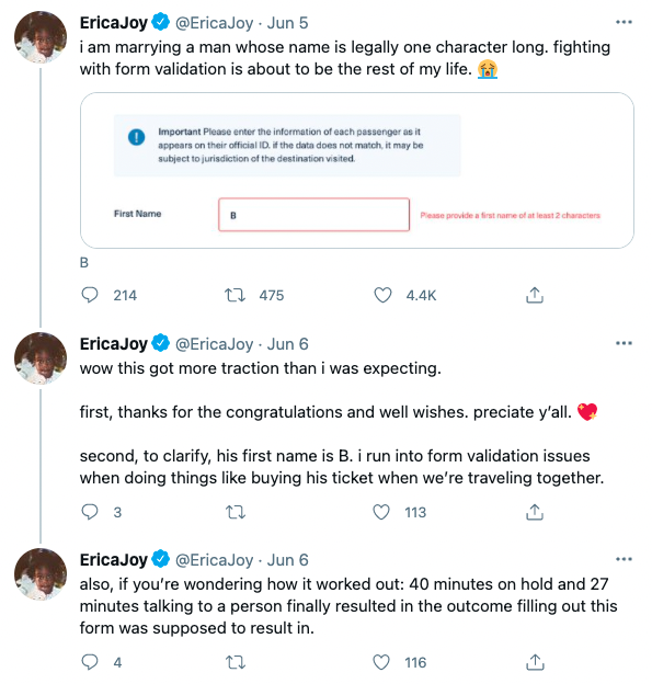
And here is a recent example where someone with a last name of only two letters can’t fill out a form:
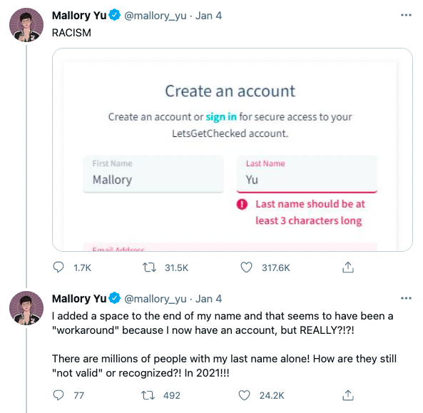
This is no different than someone standing in front of the coffee shop denying you entrance. If you expect your users to provide you information you need to ensure barriers to entry have been removed.
How to make accessible forms
On the weekends I love really dark roasted coffee with (preferably raw, local) honey in it. The bitter sweet warmth fills my soul and fuels my morning. But imagine you’re behind me in that shop. I’m at the station off to the side where we’re adding in sweeteners and getting napkins and what not. You see that the honey jar is on a shelf just out of my reach. I cannot get it. Would you, presumably being taller than I, help me? Again, in real life you’re wonderful and you’re all about accessibility; it’s just bringing these practices into our digital lives. And it’s important; more than 20% of adults in the US and Canada self-identify as disabled, and worldwide that percentage is nearly the same.
And consider this: all users are differently abled from time to time due to temporary or environmentally controlled factors, like a broken wrist, or being on a noisy train.
Here are a few things to look out for to ensure your forms are inclusive to all users, regardless of abilities.
- Keyboard Navigation: ensure all form fields are able to be navigated to (and away from) only using a keyboard. From assistive technologies to broken track pads — this is a must do. We go more in-depth about making forms friendly for screen readers here.
- Form Labels: include descriptive and meaningful form labels to alert all users as to what is expected of them.
- Instructions: create clear and concise indications as to what you’re hoping to accomplish, how the data will be used, and what you are hoping the user to share.
- Example: Asking for a number.
- Please indicate what kind of number you’re asking for: phone, zip code etc.
- Example: Asking for a number.
Though progress bars can be nice, they are not required. It’s more about making the expectation as to what information is needed from the end user in each step clear.
- Error Messages: non-visual users won’t perceive the visual error message. Make sure that it’s location makes sense in their journey without having to backtrack and search for why something isn’t working.
- Time Limits: time limits can create a barrier for some users. Determine if this is even necessary, and if so, look for ways to break the form into smaller, saveable pieces to allow users as much time as they need to complete the journey.
- Contrast: many forms try to use stylish, grayed out text. A grayed out button or text is acceptable if it’s an inactive element that is not usable but if a user is to derive information about the form or interact with a field, proper color contrast is required.
Human-Centric Respect
Meeting our needs is the most human of qualities. It doesn’t matter if it’s succumbing to the desire for a cup of joe and a treat or accomplishing a task online; if we need to complete a task we must feel welcome and able to do so. Overall it’s important to keep the forms, and all aspects of your user journey, human focused. Mindful choices that show humility on the part of your organization indicate that your users are of value to you — not only you to them. We need to start with our language, user phrases of “people of” and “people who” — acknowledging that the individuals and not an imposed demographic label is what is important to you.
Forms are asking your users to provide their personal data as they engage with your site. An inclusive approach breaks down barriers and builds trust. It’s a big world and we’re excited to make connecting with all those humans in it a little easier. Reach out if you need help with inclusive forms or overall inclusive content strategy.
Want more related information? We’re big on inclusion and accessibility here at Kanopi. Here are a few related articles: