

Let’s dive into the quirky world of web accessibility, where mistakes are as common as cat videos on the internet. Trust me, these blunders are not just face-palm moments but also huge learning curves. So, buckle up for a rollercoaster ride through the most common accessibility missteps!
1. Overlays: A Digital Band-Aid
Let’s start with overlays. Ah, overlays, the digital equivalent of slapping a Band-Aid on a broken arm. They promise a quick fix to accessibility, but in reality, they’re about as effective as a chocolate teapot. Overlays often fail to address the underlying issues, leaving users with disabilities in a virtual lurch, and possibly in legal jeopardy. Instead, follow the best practice approach referred to as “native Accessibility” which means building accessibility into the design and code from the onset.
2. Testing Tools: Don’t Put All Your Eggs in One Basket
Next up, testing tools. Relying on a single tool for accessibility testing is like painting a house with a toothbrush. Sure, you might make some progress, but you’re missing out on the heavy machinery! Diverse tools uncover different issues, so mix them up. Use automated tools, manual testing, and – the secret sauce – real user feedback when possible.
3. Contrast Catastrophes: More Than Just a Fashion Statement
Now, let’s talk contrast. Poor contrast on websites isn’t just a design faux pas; it’s an accessibility nightmare. It’s like trying to read a book in a dimly lit room while wearing sunglasses. Not fun. And it’s so easy to check! Ensure your text stands out against its background like a zebra in a field of horses. Your users’ eyes will thank you.
4. Keyboard Navigation: Don’t Leave Anyone Stranded
Imagine navigating a website with just your keyboard and getting stuck on a digital island with no way out. Welcome to the world of poor keyboard navigation. It’s essential for motor-disabled users but often forgotten like last year’s New Year’s resolutions. Make every interactive element reachable via keyboard. Your users shouldn’t need a map and compass to navigate your site.
5. Alt Text: A Picture is Worth a Thousand Words, But Only If You Describe It
Images on your site are invisible to screen readers unless they have alt text. Skipping alt text is like showing a movie with no sound and no subtitles. Describe those images! It’s not just a courtesy; it’s a gateway to a richer experience for users who rely on screen readers.
6. Forms: The Bermuda Triangle of Accessibility
Ever filled out a form online and felt like you entered the Bermuda Triangle? That’s what it’s like when forms aren’t accessible. Labels disappearing, confusing instructions, and error messages as clear as mud. Make your forms as straightforward as a LEGO instruction manual — easy to follow and frustration-free. The more inclusive and accessible, the better.
7. Multimedia Mayhem: Don’t Just Play it, Say it!
Multimedia content without captions and transcripts is like a joke without a punchline. It just doesn’t work. Captions aren’t just for those with hearing impairments; they’re a boon during noisy commutes or when your headphones decide to play hide and seek. Transcripts? They’re the MVP for users who prefer reading over watching.
Wrapping Up: The Path to Inclusive Web Wonderland
So there you have it, folks: a whirlwind tour through the wild world of common web accessibility mistakes. Remember, creating an accessible website opens doors; it’s not about being perfect, it’s about being better. Let’s make the web a wonderland for everyone, one accessibility fix at a time!
If you need help with the accessibility of your website, contact us.
Want more accessibility info via a webinar?
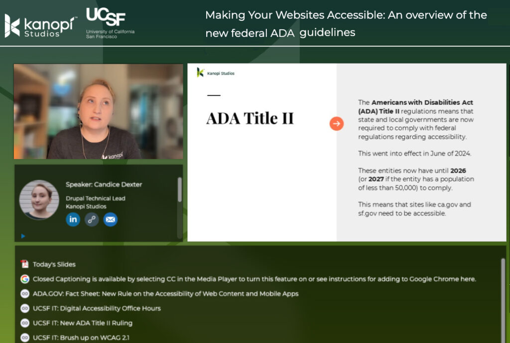
Kanopi’s Candice Dexter gave a webinar for our client the University of California San Francisco called “Making Your Websites Accessible: An Overview of the New Federal ADA Guidelines.” (30 minutes)