





Kanopi Team

Nonprofit Website Design: 11 Expert Tips to Drive Engagement

For nonprofits, having a strong online presence is more important than ever. Many people will meet your organization for the first time online, and online revenue is on the rise—it increased by 2% in 2024. Plus, 31% of online revenue took the form of monthly giving, demonstrating a potential for creating long-term relationships with online donors.

Whether you’re creating an entire new website for your nonprofit from scratch or refreshing an existing web page, it helps to see how fellow nonprofits’ websites use web design best practices to improve user experiences and advance their own credibility.

This guide will guide you through the basics of nonprofit web design, share real examples of excellent design, and help you align your website with your digital strategy. We’ll explore:

Nonprofit Website Design: FAQs

What are the benefits of strong nonprofit website design?

Your nonprofit’s web design is more than just another formality—it’s an important investment in your organization’s relationship with its supporters and its future success.

First, an easily navigable and aesthetically pleasing site gives your organization an air of legitimacy. A well-designed, thoughtfully-constructed site can boost users’ confidence and secure their decision to support your cause.

Credibility is important to individual supporters and institutional funders alike. For individual users, a top-quality site builds their trust in your organization and makes new supporters more likely to engage with your message—either by making a donation or by simply remembering your site the next time they’re looking to support a good cause.

Corporate sponsors, grantmakers, and foundation donors are also more likely to consider your organization a worthy candidate for funding if you have a professional-looking website. Your web design can communicate to funders that your nonprofit is well-organized and make it easier for them to access important information about your organization.

Web design is also helpful because it improves user experience (UX), which is important not only for showing supporters that you’re willing to put in the time and effort to improve their giving experience, but also for attaining higher retention and engagement rates. Your website gives supporters an easy way to get involved, whether that’s through donating online, finding and signing up for volunteer opportunities, or getting involved with fundraising.

What key information should every nonprofit website have?

Any user who comes across your website should be able to easily find basic information about your organization’s operations. These key details reassure users of your organization’s honesty and can inspire or reinforce a decision to contribute to your cause. Here are the resources every nonprofit should offer:

  • Resources for services and programs. Many nonprofit organizations have offerings available to all community members. If this is the case for your organization, you should have information about your services and programs clearly listed on your site so that potential beneficiaries can access them.
  • Fundraising information. Giving basic information on your current funding needs and disclosures regarding how your organization uses donations gives online donors the confidence to follow through with their gift.
  • Proof of impact. Users want to see just how much of a difference your organization makes. Demonstrate your impact by including testimonials, case studies, and statistics that reflect your organization’s greatest successes. Having real-life examples helps users connect with your mission and see the critical need for your nonprofit in your community.
  • Accreditations. Assure users of your credibility by sharing any relevant certifications your organization has earned. These might include a high Charity Navigator rating or a Candid Seal of Transparency.
  • Annual reports and other key data. These reports reinforce your organization’s impact, demonstrate financial transparency, and celebrate your supporters for their generosity.
  • Contact information. You may leave connections and donations on the table if users cannot easily get in touch with someone from your organization. Even if you think you have all the necessary information available on your site, users may have more questions, and it’s important to be there to address them.

How much does nonprofit web design cost?

In short, the cost depends on a lot of factors. Different nonprofits have different site needs and require varying levels of design support. Some organizations with the skill and bandwidth may be able to create inexpensive DIY websites, but most will need to invest in more professional website development. Some key considerations for cost include:

  • Refresh vs. full build: Are you building a website from scratch, or just looking to give your old one a makeover? Creating a totally new site will require more time and money, while refreshing an old one may be relatively more straightforward.
  • The level of customization your site requires: Larger nonprofits with diverse target audiences they need to impress will likely need a more distinctive branded website with robust custom functionality. Customization costs more than using basic templates, but for certain organizations, this cost is well worth it.
  • Ongoing support and maintenance costs: Your organization should budget for certain recurring costs associated with having a website. These include rights to your domain name, hosting fees, a secure sockets layer (SSL) certificate, and ongoing maintenance costs for updates, security, and troubleshooting. These costs, too, can vary, depending on factors like your hosting provider or site size.

Typically, it’s worth it for nonprofits to invest in a web design partner. Expert designers can give your site the strong foundation it needs to reach a wider audience and share your compelling mission with the world. Working with a designer can also increase your return on investment (ROI) as a better website advances your organization’s authority and inspires more donations.

12 Nonprofit Web Design Best Practices in Action

1. Simple Online Donation Process

Why it matters

Did you know the average donation page conversion rate is just 19%? The fact is, many donors will consider giving to your cause and then change their mind. This can happen for any number of reasons, some of which are not within your control. However, one major reason donors may turn away from your organization is a complicated giving process.

Hard-to-find pages, convoluted donation steps, or excessive form fields are frustrating and complicated, resulting in donor drop-off. A streamlined process, on the other hand, encourages more donations and inspires generosity.

Who’s doing this well?

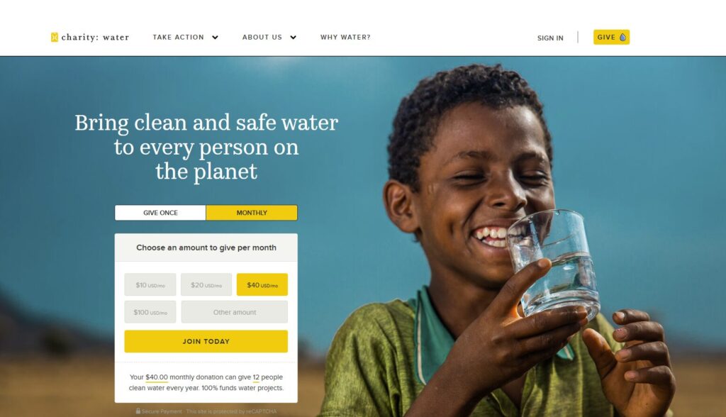
charity:water’s site has a clear and simple donation process. Their homepage immediately prompts visitors to make a donation with minimal steps to complete the process; donors only need to provide their name, email, payment information, and donation amount.

They also offer suggested donation amounts, with options for both recurring and one-time donations clearly accessible. Take note of the number of payment options available; charity:water accepts card payments along with PayPal, stock, and even cryptocurrency. Their assurance that each donation is secure also lets donors know their site is legitimate and their gift protected.

Screenshot of the charity:water donation form

2. Clear Calls to Action

Why it matters

Your nonprofit’s website should do more than educate users on your mission and activities—it should invite and inspire each visitor to become more involved in your cause. Whether that’s by donating, volunteering, or subscribing to your newsletter, users need guidance on how to take the next steps in their involvement with your organization.

Good CTAs clearly explain to enthusiastic supporters how they can help promote your cause, increase your conversion rate, and encourage engagement across the board.

Who’s doing this well?

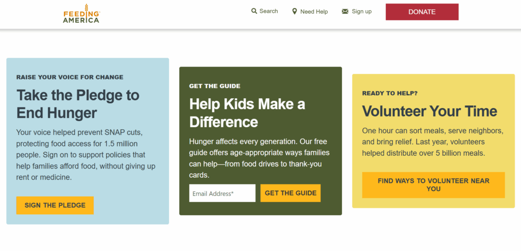
Feeding America’s site invites users to engage in a wide variety of ways. The homepage asks visitors to give before they even have to scroll, and the navigation bar on the top menu offers the opportunity to “Take Action.”

The “Take Action” page first impresses upon the reader a sense of urgency, sharing Feeding America’s mission and its progress towards its goal of ending hunger in the United States. Scroll a little further, and you’ll find these CTAs. These messages are concise, visually appealing, and action-oriented.

Screenshot of the Feeding America Take Action page

3. Consistent, Aesthetically Pleasing Visual Branding

Why it matters

Like it or not, your branding is a significant part of what users will remember from their interactions with your site, so make it count. Cohesive branding communicates your organization’s professionalism and builds trust with users, which is especially important for mission-driven organizations.

If your branding is clear enough, users are more likely to remember your organization and return to it later, even if they only interact with your site briefly. This recognition can boost donor retention and loyalty by helping supporters understand what makes your organization unique.

These benefits ultimately result in increased engagement with your organization and growing revenue.

Who’s doing this well?

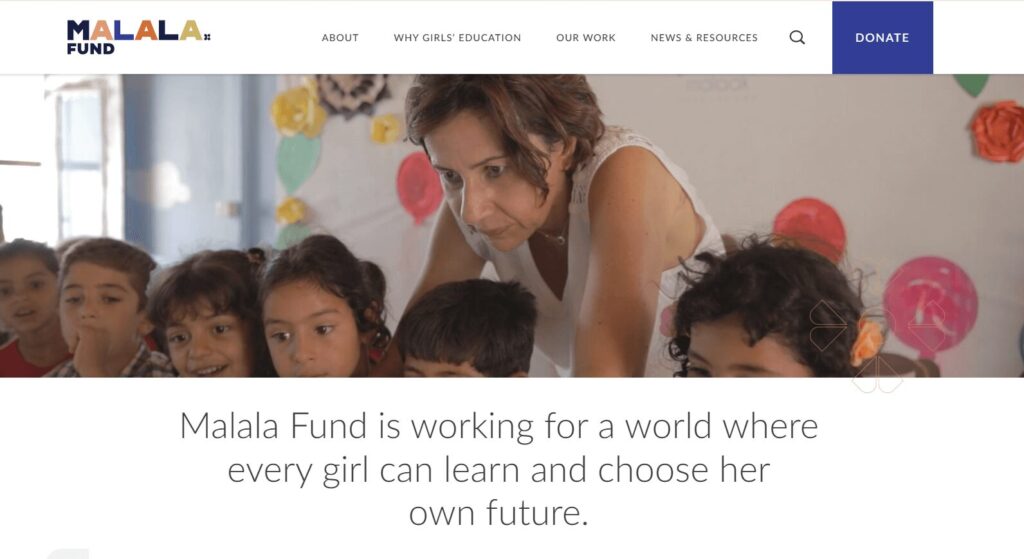
The Malala Fund exemplifies branding that is both aesthetically appealing and cohesive across the site. Certain colors, shapes, and fonts repeat across the site, which provides a consistent experience for a user navigating through different pages. There are also graphic elements throughout, including pictures and videos. However, the page doesn’t look overcrowded, and the branding isn’t distracting. The overall look is distinctive, and doesn’t appear to have come from a template or to emulate any other organization.

Screenshot of the Malala Fund homepage

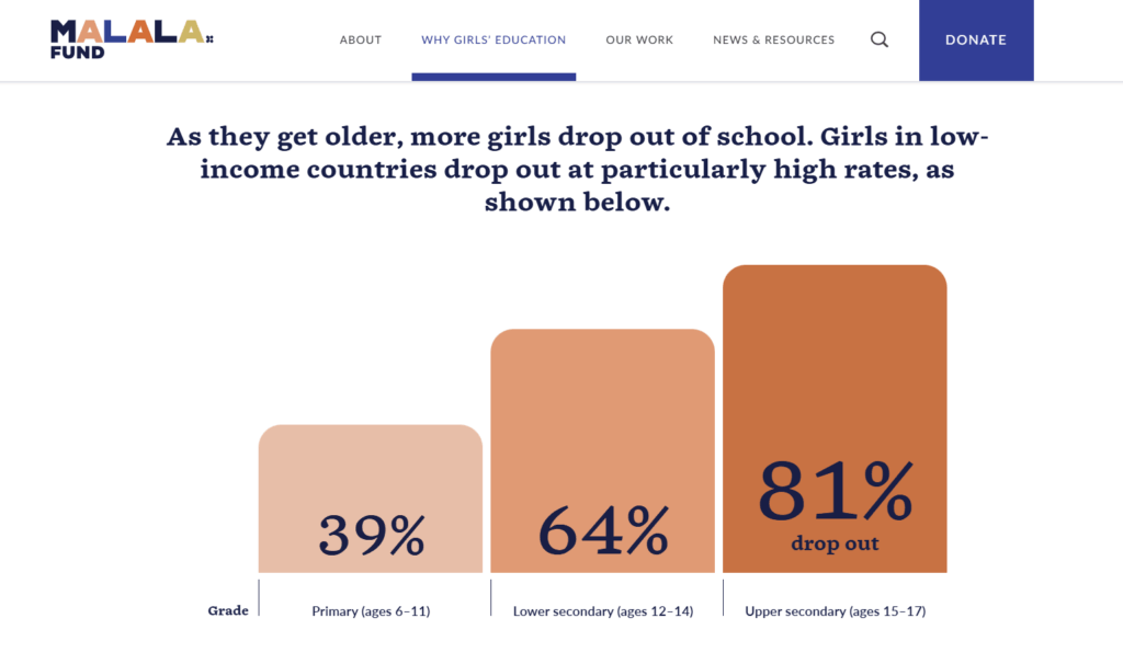
Even when presenting statistics, the graphics follow the same color scheme. This consistency keeps the content aesthetically pleasing and allows the reader to focus on the information.

Screenshot of a bar chart on the Malala Fund Why Girls Education Page.

4. Compelling Storytelling

Why it matters

You likely already know the value of stories when communicating with supporters—stories humanize your impact and emotionally engage your audience, increasing the likelihood that they’ll choose to give. When you can’t directly communicate with a potential supporter or funder, your stories speak for you, showing users why your cause matters and how your organization makes a difference.

Who’s doing this well?

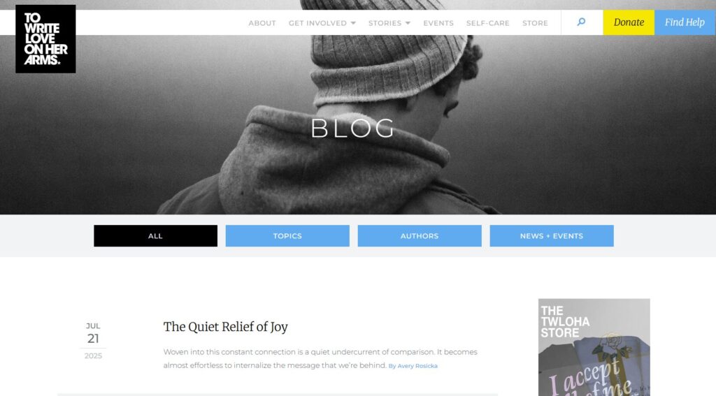
To Write Love on Her Arms makes storytelling a core part of its site. Using multiple media types, including writing, videos, and podcasts, it tells stories of hope. While most of its stories do not directly discuss TWLOHA’s services, it speaksfor itself by telling individual stories that demonstrate the importance of seeking help for mental health.

Screenshot of the To Write Love on Her Arms Blog.

5. Streamlined Navigation

Why it matters

Forcing users to traverse the entirety of your website just to find the one piece of information they need will create frustration and cause drop-off. Ideally, visitors should be able to find what they are looking for in just one or two clicks.

Creating a website with intuitive navigation encourages users to engage more deeply with your site, guiding them along a path to your desired outcome. A strategically organized website also improves your search engine optimization (SEO), allowing both users and search engines to browse your site more efficiently and access key information about your mission.

Who’s doing this well?

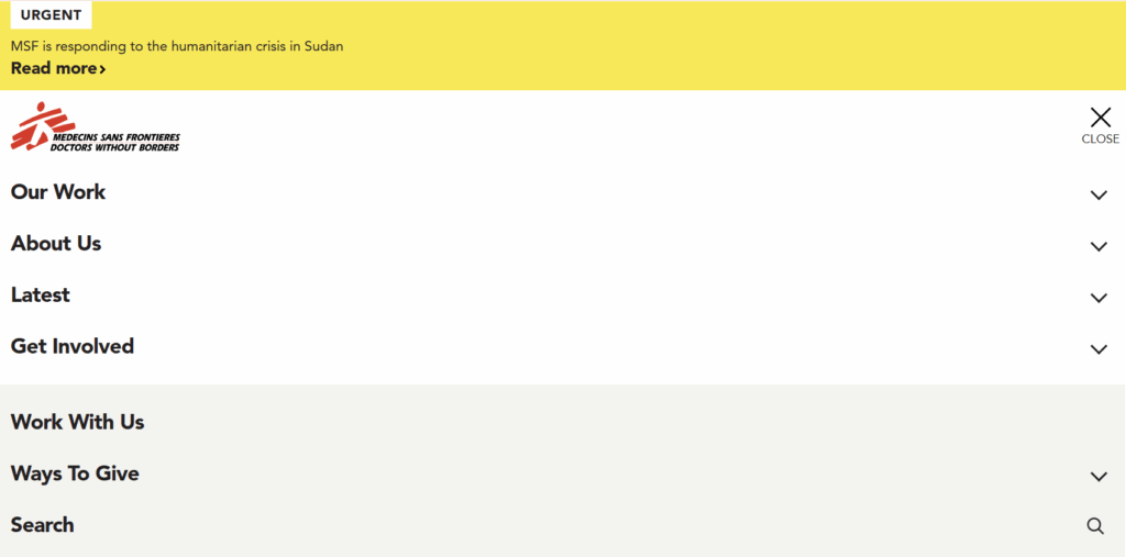
Doctors Without Borders streamlines its navigation by limiting the number of headers and consolidating them in a single collapsible menu bar. It prioritizes key pages and groups similar pages so that users can quickly find basic information.

Once you navigate to a new page, the site offers breadcrumbs—visual aids at the top of the page that show a user’s journey through the site—that help users retrace their steps. The site also provides a search bar, which enables users to find more specific information.

Screenshot of the Doctors Without Borders menu bar.

6. Mobile-Friendliness

Why it matters

These days, most people will be viewing your website from their phone or tablet. If your site is slow, difficult to navigate, or unattractive on mobile devices, they’re unlikely to stick around or switch to a different device. Plus, a sizable number of donations come in through mobile devices, meaning performance is key. 

Improve your user experience—and your SEO—by creating a site optimized for mobile use. The more concise your mobile forms are, the better.

Who’s doing this well?

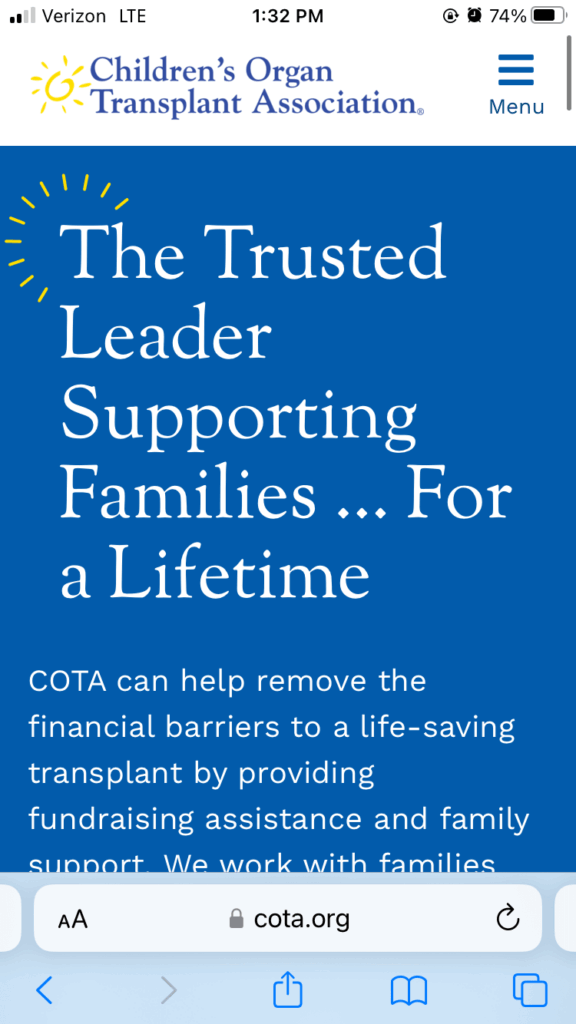
The Children’s Organ Transplant Association (COTA) has a site ideally designed for mobile devices, but that wasn’t always the case. COTA used to have an inaccessible site with slow loading times until they chose to work with Kanopi Studios to rebuild it.

Today, COTA’s site has all of the features of a great mobile site. The written content and photos easily adapt to different screen sizes, the pages load quickly, and the navigation buttons are large enough for touchscreen users. It also has a collapsible menu and short paragraphs, which both prevent cluttered screens.

Screenshot from a mobile device of the Children’s Organ Transplant Association homepage.

7. Accessibility

Why it matters

Over 25% of Americans live with disabilities. Creating an accessible site demonstrates that you care about your supporters, builds trust with all users, and ensures that anyone can engage with your mission. While building your site, ask yourself how each aspect would help or hinder a user living with disabilities.

Who’s doing this well?

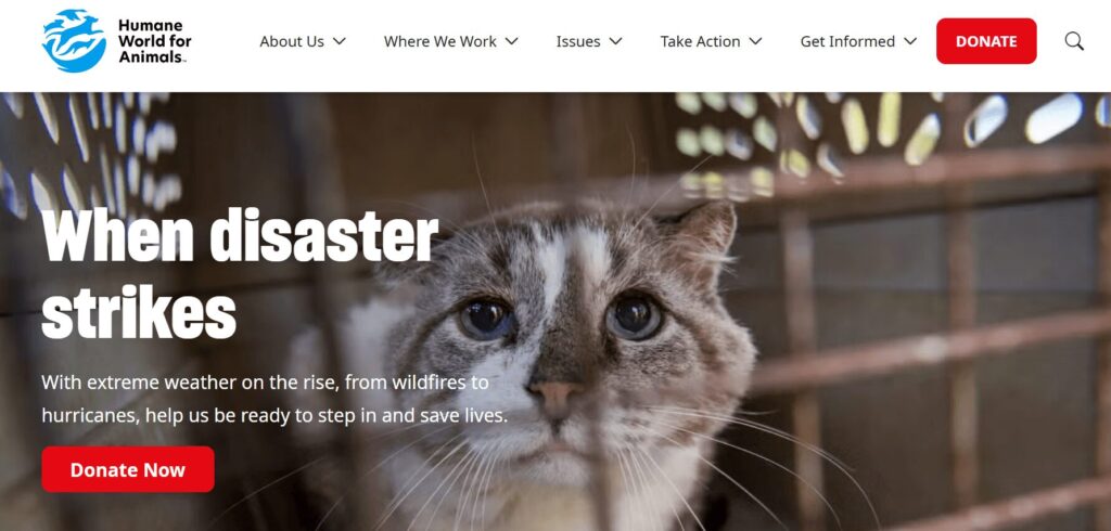
Humane World for Animals, a nonprofit focused on animal protection, used Kanopi’s services to create a highly accessible website for all users. The result is a user-friendly online resource that offers high color contrast between foreground and background colors, optimizing the site’s legibility, particularly for users with dyslexia and/or visual impairments. Images on the site also include alternative text, which allows users with screen readers to understand exactly what each graphic element includes.

The project won a Web Excellence Award for Accessibility.

Screenshot of the Human World for Animals website homepage

8. Trust Signals

Why it matters

Your organization can give users confidence to invest in it by demonstrating transparency and providing proof of its legitimacy. Logos from your partners, security badges, financials, and testimonials can all build your credibility with new visitors and reinforce established supporters’ decision to remain involved in your organization.

Building trust with users can have a big impact on your organization’s funding potential. 59% of donors consider trust to be the most important factor in their decision to give to a nonprofit. If you invest in earning their confidence, they’ll invest in you.

Who’s doing this well?

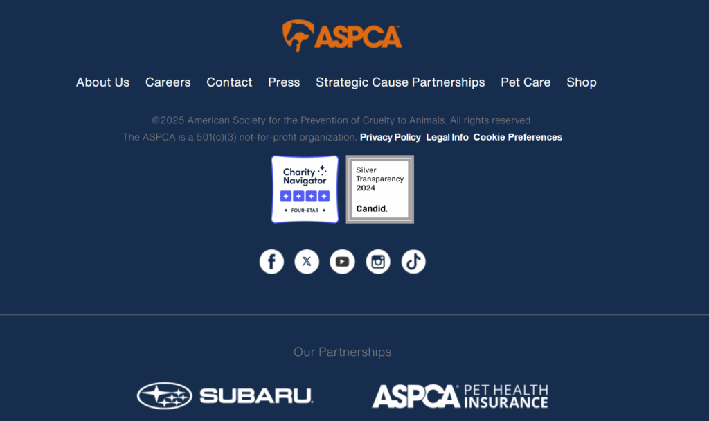
The American Society for the Prevention of Cruelty to Animals (ASPCA) has trust signals in the site’s footer, where they’re clearly visible but not distracting.

The site provides links to its four-star rating from Charity Navigator and the Silver Transparency seal from Candid to prove that it earned these accreditations. The Silver Transparency link offers access to financial information, such as the organization’s revenue and expenses over the past year.

Additionally, listing the brand partnerships, especially with a reputable company like Subaru, signals to users that ASPCA has been well-vetted.

Screenshot of the footer of the American Society for the Prevention of Cruelty to Animals site.

9. High Performance

Why it matters

No one wants to deal with a site that never seems to load. Page speed tries users’ patience, resulting in a higher bounce rate and damaged conversion rate. Small delays can have big impacts; the bounce rate can almost double if users have to wait three seconds rather than two for a page to load.

Furthermore, a slow site will negatively impact your SEO ranking, making it harder for users to find your site.

Who’s doing this well?

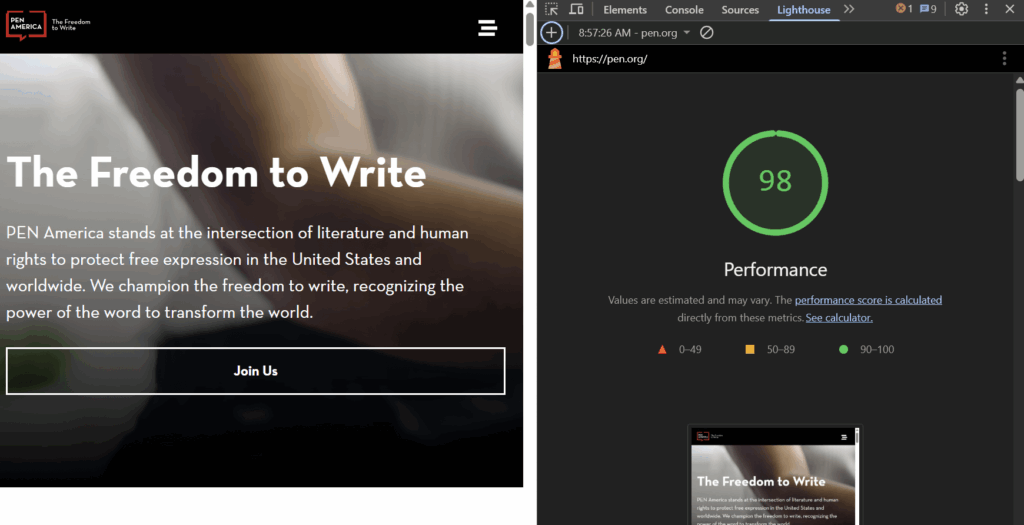
Kanopi’s work with PEN America boosted their performance rating to a whopping 98. This indicates that their speed has increased through image optimization, browser caching, and enabling compression.

Screenshot of the PEN America homepage alongside a Lighthouse performance testing score of 98.

10. Strong Visual Imagery

Why it matters

Images are a surefire way to grab users’ attention. However, not all images are equally effective. Original, emotionally resonant photos enhance credibility and visual engagement far more than stock photos.

Who’s doing this well?

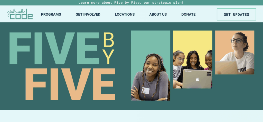
Girls Who Code has a wide variety of relevant images on their site. Pictures of volunteers and beneficiaries adorn their site and humanize their mission. Even their blog’s feature images are unique because they feature recurring colors and shapes as visual motifs.

Screenshot of the Girls Who Code homepage.

11. Clear Value for the Community

Why it matters

Demonstrating the value that your organization brings to its community is crucial for recruiting long-term support. When visitors see that they can solve a problem or access a vital resource directly on your site, they’ll start to view your nonprofit as much more than just a fundraising organization. They’ll see you as a credible digital location for information that improves their lives.

Who’s doing this well?

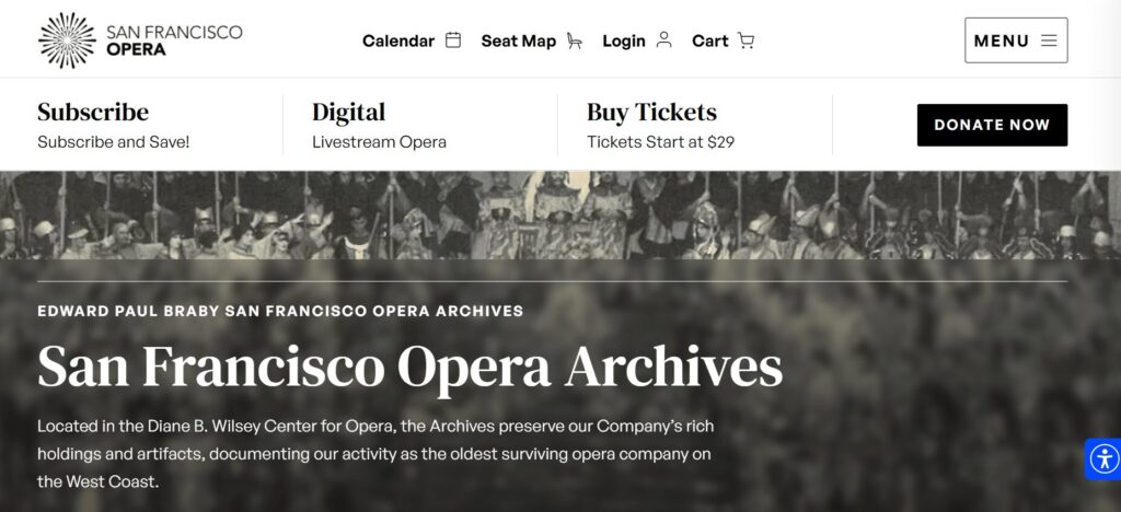
The San Francisco Opera website is a great example of a site that serves both as a digital tool for collecting donations and as an educational resource to help people find reliable information about “the oldest surviving opera company on the West Coast.” Specifically, the organization’s online archives are a user-friendly resource that helps visitors find information about past performances and notable people.

This arts and culture organization worked with Kanopi to ensure the archives are also secure and less prone to outages, providing an enhanced user experience and greater site protection.

The San Francisco Opera archives web page

12. Ongoing Maintenance and Performance Enhancement

Why it matters

Creating a website isn’t a set-it-and-forget-it venture. Nonprofit websites need regular updates, testing, and refinement—especially during campaign seasons or platform updates. Practicing good site maintenance is vital to your website’s continued success.

Who’s doing this well?

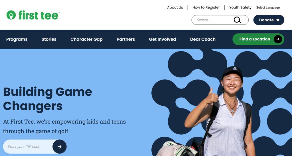
Since Kanopi helped build their site, First Tee has maintained its content and sleek look, as demonstrated by its consistent content updates and strong performance score. Remember to continually update your security, back up site data, and ensure all links are functioning properly.

Screenshot of the First Tee homepage.

Additional Nonprofit Website Design Considerations

A graphic of a woman sitting at a computer with thought bubbles asking questions, listed in text below

Before you start building or redesigning your site, ask yourself these questions:

  • Which CMS platform will you use? Popular platforms include WordPress and Drupal. Both platforms have their benefits; while WordPress offers ease and flexibility, Drupal offers more customization options and security measures for larger nonprofits.
  • How will you integrate your website into the rest of your digital marketing efforts? Using digital marketing tactics like email and social media to direct users to your website is a great way to drive engagement and increase donations. In addition, improving your SEO will bring more viewers to your site.
  • How will you incorporate AI and personalization into your website? Viewers love to feel like your website speaks directly to their wants and needs. AI can help make this a reality with technologies like chatbots that answer users’ questions or personalized call-to-action buttons based on users’ browsing habits.
  • How will you continually test your website to identify issues and opportunities? Using a variety of testing methods—including performance checks, manual and automated accessibility tests, user heat maps, and A/B testing—will help you stay on top of your game and address any issues that should arise.
  • What security measures will you take to keep your website (and visitors’ data) safe? For example, tools like Drupal can keep your site safe by enabling two-factor authentication, setting a password policy, and encrypting sensitive information.

What Kanopi Brings to Web Design for Nonprofits

Our website designers and developers have extensive experience working with nonprofits like yours. When you use Kanopi, you gain access to offerings like:

  • Deep audience research and persona development
  • Drupal and WordPress expertise
  • Baked-in accessibility
  • Interactive design
  • Mobile-first approach
  • User and content testing

Our services can help your organization create a brand new website, or we can work with your existing code to refresh or rebuild an old site. Even if your site has custom or complex code, we’ve got your back.

Final thoughts

Your nonprofit’s website is one of the most important points of contact between you and your supporters. It tells the story of your organization, demonstrates the importance of your work, and invites users to become a part of your story. Making your site as user-friendly and professional as it can be is a step towards your organization’s future, so take advantage of this chance to expand your reach and build your impact.

Want to learn more about creating a successful site for your nonprofit? Check out these additional examples:

Illustration of a woman standing in the middle of a field of tall grass with blue skies and clouds around her as icons of different navigation options float above her head to help her decide where to go.

Website Navigation Patterns (and the Future of Navigation with AI Search)

If you manage a website for a nonprofit, university, or healthcare organization, chances are your audience isn’t just browsing for pleasure. They’re looking for something important: how to donate, how to register for classes, or how to schedule care for themselves or a loved one.

That’s why navigation is so critical. It’s not just about design, it’s about helping people find what they need quickly, clearly, and confidently.

In this post we’ll break down the most common website navigation patterns, along with a look at how AI-powered search is changing and how website owners and editors should think about navigation.

1. Top Navigation Bar

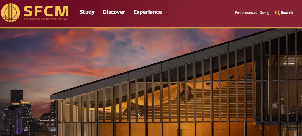
The navigation bar for San Francisco Conservatory of Music

Source: sfcm.edu/ 

What it is:

A horizontal menu across the top of the page, often with your logo on the left and links like “About,” “Programs,” or “Donate” on the right.

Why it works:

  • It’s familiar and expected
  • Keeps the most important pages of your website experience front and center
  • Easy to use on desktops, tablets and larger mobile devices (depending on the number of options)

Things to watch:

  • Too many items can clutter the user interface (UI)
  • Not suitable for websites with dense or complex information architecture

Where it fits:

Perfect for mission-driven websites with clear, high-level goals, which use a simple, action-oriented top menu like: Donate, Get Involved, Refer a Patient.

2. Sidebar Navigation

An example of navigation from the UCSF Department of Surgery, where the navigation menu is a vertical list on the left.

Source: surgeryeducation.ucsf.edu/people 

What it is:

A vertical menu, often used on the left side of the screen.

Why it works:

  • Ideal for content-heavy sections, like articles or staff directories
  • Lets users see where they are in a hierarchy (e.g., Admissions → Graduate Programs → Apply)

Things to watch:

  • Can eat up valuable screen space on desktop
  • Doesn’t always translate well to mobile unless adapted
  • Better for secondary navigation, not primary navigation

Where it fits:

Great for internal portals, academic department pages, or patient resources where structure matters.

3. Dropdown & Mega Menus

The mega menu navigation from Humane World for Animals

Source: www.humaneworld.org/en 

What they are:

Hovering over a main menu reveals sub-pages. Mega menus take it further, organizing many links into columns, often with headings.

Why they work:

  • Help users browse complex topics (like academic programs or service offerings) without getting lost
  • Group related items for easy scanning
  • Opportunities to include richer content

Things to watch:

  • Need careful organization to avoid overwhelm
  • Don’t rely on hover alone, make sure they work well on tap interfaces too

Where they fit:

Larger institutions, like universities or hospital systems, that have complex information architecture or diverse audience groups.

4. Hamburger Menus

A navigation bar with a "hamburger" menu on the far right, which is indicated by an icon of three short lines stacked on top of each other

What it is:

The 3-line icon that hides and reveals the primary navigation, common on mobile devices.

Why it works:

  • Keeps mobile screens clean
  • Makes room for other important content like content call to action (CTAs)

Things to watch:

  • Some users don’t recognize or notice it
  • Always test it for clarity and make sure key pages are still discoverable
  • Ensure it works on tap and click
  • Should not be used on desktop or larger devices

Where it fits:

Every site should have a mobile-friendly version — hamburger menus are a reliable standard, but don’t hide everything if it’s critical.

The footer navigation for Flagler College

Source: www.flagler.edu/ 

What it is:

Links placed at the bottom of every page.

Why it works:

  • Offers a second chance to guide visitors
  • Good place for contact info, careers, privacy policy, and internal links

Things to watch:

  • Avoid cramming it with too many items
  • Keep it visually simple and organized
  • Consider including key items from your main navigation to create a secondary point for users to traverse your site

Where it fits:

All websites benefit from a helpful footer,  it’s the safety net for people who scroll all the way down looking for answers.

The Next Shift: AI-Powered Navigation

Now for what’s coming next, and is already starting to show up on forward-looking websites … instead of clicking through layers of navigation, more and more visitors want to just ask a question:

“How do I apply for tuition assistance?”

“I need directions to the clinic.”

“How can I get involved beyond just donating?”

AI-powered search tools,  including chat-style interfaces and natural language search are making this possible. It’s like giving your site a smart assistant that understands questions and points people to the right answer instantly.

Why it matters for your mission:

  • Saves time for visitors (and staff)
  • Reduces friction points, especially during stressful moments (like seeking care or emergency help)
  • Helps users find specific, deep content without navigating complex menus

AI tools can supplement your menus, not replace them. For example, a donor might browse your navigation, but a returning volunteer could just ask the chatbot “Where’s the login page for last year’s volunteers?”

As more people expect intuitive experiences everywhere, organizations that invest in smart search tools,  especially on high-traffic or information-dense sites, will have an opportunity to  stand out.

Choose the right navigation pattern for your needs.

Good navigation helps people find what they need with the least amount of friction. Whether someone wants to make a donation or explore academic programs, choosing the right navigation pattern is critical for making it easier for users to connect with the content that matters most. It’s all about removing friction and guiding people in the right direction.

Collage of older people using smartphones and laptops

Designing for Healthy Aging: Crafting Inclusive Digital Experiences for Seniors

When designing for healthy aging, it’s important to look beyond just the visual experience. We need to consider how content, user experience, and functionality come together to shape the digital experiences of seniors navigating the web. 

One of the biggest shifts is generational: Gen X is now entering its senior years. These individuals are in their late 40s, 50s, and early 60s. (Sorry if it shocks you to see this in black & white, fellow Gen Xers, but there it is… we just report the facts.) As this shift occurs, website owners and content creators need to adjust how they present information online.

To understand this change, let’s look at how Gen X compares to previous generations. Seniors are typically seen as the least tech-savvy of all demographics. But over the last decade, as web technologies have matured and prioritized user experience over visuals, we’ve seen that seniors are adapting.

After all, Gen X has grown up with technology. They’ve evolved alongside it. They are more technologically sophisticated than Boomers. They already use the web in powerful and meaningful ways and expect a dynamic and evolving experience, not a static one. In other words: they’re ready to engage with changing digital landscapes.

Now let’s compare Gen X with Millennials (Gen Y). Both generations want ownership over their digital experiences, but how they define that ownership is different. Millennials want to personalize their experience. They want control over the interface to change colors, reorder layouts and adjust settings.

Gen X, on the other hand, seeks mastery. They’re more willing to take the time to learn how an interface works, even if it’s not perfectly optimized for them at first. They understand that websites evolve and are ready to adapt.

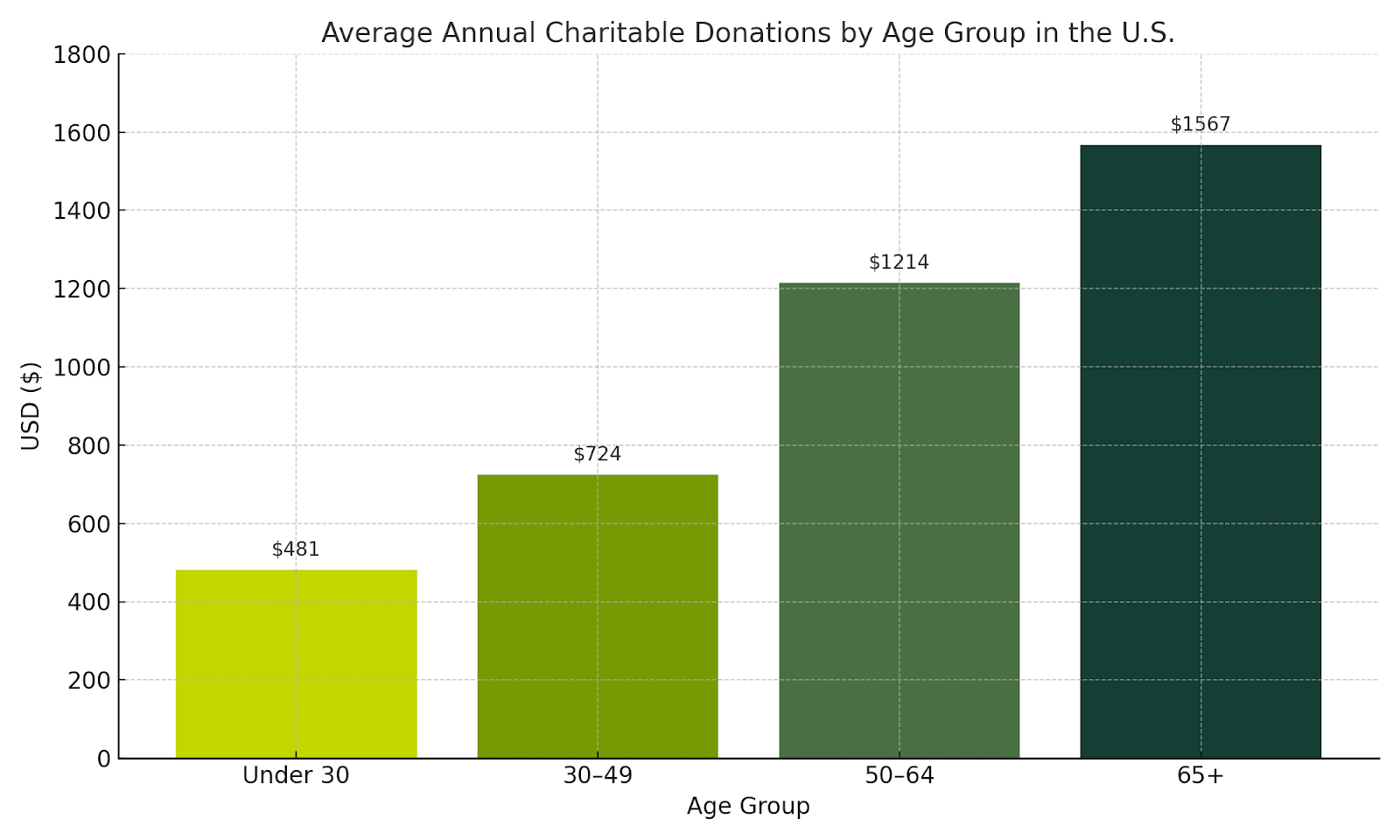
As Gen X and Y are entering their senior years and make up 46% of the US population, they will soon be the largest segment of supporters for most non-profit and educational organizations. Traditionally seniors donate more consistently, contribute higher dollar amounts, and often share causes with friends and family. Crafting intuitive and inclusive experiences for this newly senior demographic is a strategic opportunity to build lasting relationships and boost the impact of your mission over the next decade.

A chart showing how seniors 65+ are the largest donors for charitable organizations over any other younger age group, with an average of $1567 per 65+ donor.

This leads into how we can design effective websites for seniors so they can get the information they need, and you can get the conversions you want. At Kanopi, when we talk about design, we mean more than just visuals. We take a holistic approach, incorporating content, user experience, and functionality.

First, let’s talk about content.

Tell your story. Emotional storytelling is a powerful way to engage older audiences. As people age, they become more receptive to emotional connections. Use testimonials, reviews, and user-generated content. This helps build a connection between the user and your organization and can turn users into advocates.

Next, focus on messaging and clarity. 

Gen X and Boomers have been marketed to their entire lives. They know a sales pitch when they see one. They value authenticity and are skeptical of hyperbole. When we work with clients, we recommend acknowledging user struggles, empathizing with their experiences, and offering specific content solutions. Most importantly, guide them to what they need rather than simply telling them what to do.

Keep things simple. Stick to one idea per content block. Don’t overload the user with too much at once. Instead, craft a journey. Let users absorb information in small, manageable chunks. This makes your content easier to navigate and understand. It also helps users reach their goals, which improves conversions and ROI.

Refine the user experience, starting with mobile.

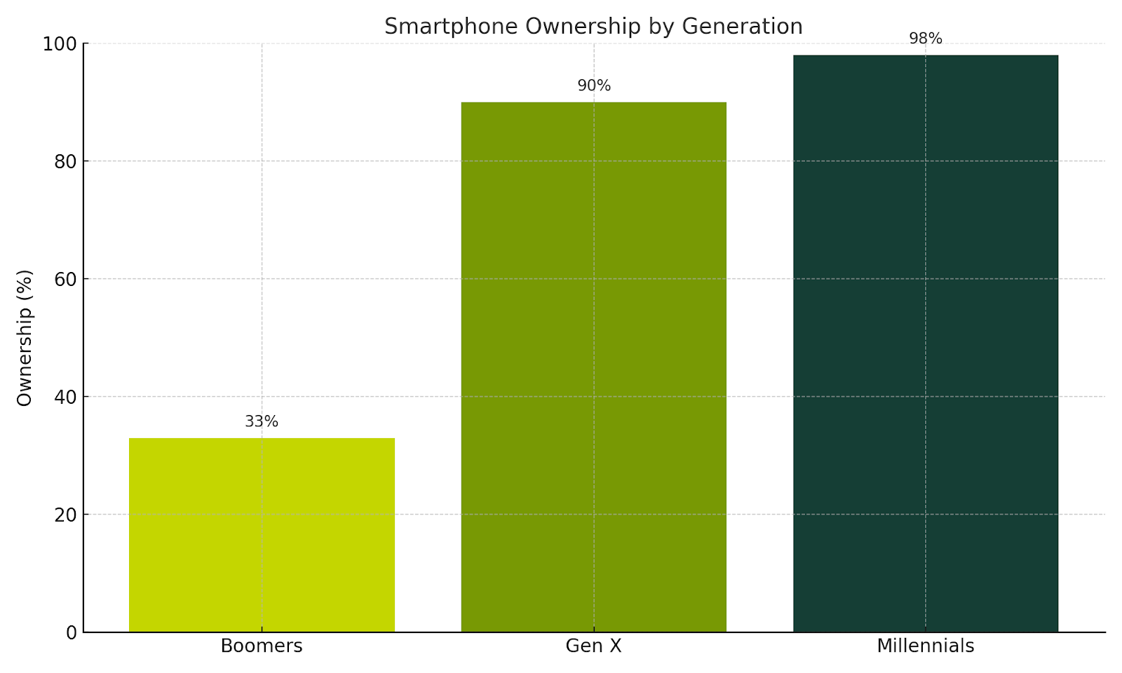
About one-third of Boomers don’t use cell phones and prefer desktop. But over 90% of Gen Xers own smartphones and use them for everything from casual browsing to task-focused activities. This means your mobile experience can’t be an afterthought. It has to be fully optimized and offer the same functionality as your desktop site.

A chart demonstrating smartphone ownership by generation, with Millennials in the lead with 98%, followed by GenX with 90% and Boomers at only 33%.

Shorten the user journey.

Evaluate your information architecture. Reduce the number of steps required to complete a task. Give users clear feedback on their progress during multi-step processes, like booking or checkout. If an error occurs, explain it in plain language and show users how to fix it. Empower them to learn and troubleshoot on their own.

Managing complexity is key. As the web grows more complex, seniors will need simplified pathways. Break large tasks into smaller steps using multi-stage forms. Let users save their progress and return later. This flexibility supports a better experience.

Train your users.

Gen X is willing to learn, so help them. Offer training videos, FAQs, how-tos, tooltips, and contextual help menus. Even chatbots can guide them through interfaces. Embed learning into their journey so they can grow more confident over time.

Color combinations matter.

Color is the first thing users experience. As people age, vision shifts. Blue cells in the eye fade, making it harder to see blue. If your brand uses blue for important UI elements, support it with sizing, shapes, or iconography. Avoid using blue and yellow together — or red and green. These combinations can be hard to distinguish.

Use a contrast checker.

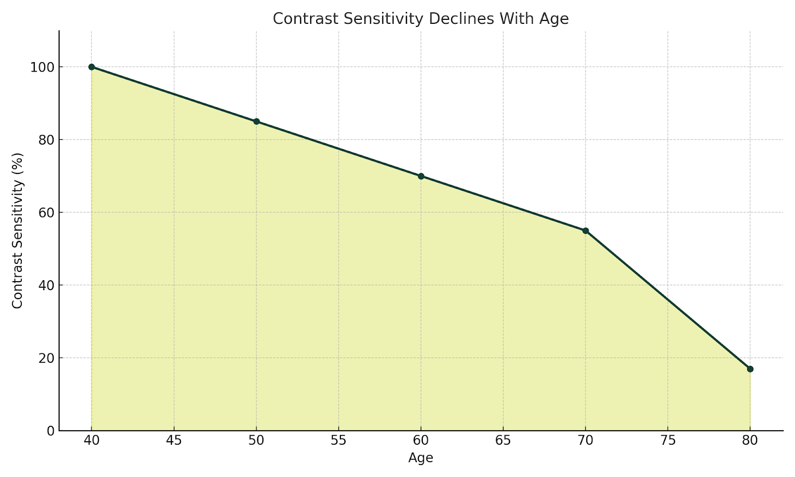
According to the National Library of Medicine, contrast sensitivity starts declining after age 40 and may be reduced by up to 83% by age 80. A 4.5:1 ratio is considered accessible, but 7:1 is ideal. Proper contrast helps users distinguish navigation, CTAs, and form inputs. WebAIM is a good contrast checker.

NO ALL CAPS (or rather, no all caps).

ALL CAPS reduces readability and disrupts the ability to quickly scan content, especially on mobile. Increase font size and use legible typefaces instead.

Put the ‘fun’ in functionality.

Personalized support helps users feel seen. Chatbots and virtual assistants offer real-time help. Provide access to help resources, contact options, and support channels. Boomers may prefer phone calls, while Gen X leans toward email or chat. Give users multiple ways to get assistance.

Support assistive technologies.

As Gen X ages, they’ll experience many of the same mobility and vision challenges as older Boomers. Make sure your site works with screen readers and voice recognition tools. This not only increases usability but also makes your users feel heard and supported.

Everyone benefits (including site owners)

So what are the benefits of doing all this?

  1. You reduce stigma. A well-designed site helps seniors feel welcome and avoids making them feel like outsiders who have to jump through hoops.
  2. You improve accessibility and usability. And with that comes an SEO bonus: accessible sites rank better.
  3. You boost engagement. Seniors trust and rely heavily on word-of-mouth  (especially Boomers). A positive experience encourages them to share it with friends and family, expanding your reach.
  4. Ultimately, good design improves lives. It’s what happens when people can easily find the information, services or solutions they need.

Keep measuring, keep improving.

It’s a question we often hear our clients ask: 

“How do you measure the success of implementing these practices?”

At Kanopi, we’re big believers in what comes next. We don’t consider a website “done” when it launches. Instead, we support it over time through regular checks, testing and user feedback, and continue to refine the experience to meet evolving goals. We use both qualitative and quantitative methods to track success, using both data and direct insights from users.

If something isn’t working like it should, we make changes. Ongoing improvement helps each site stay effective and relevant.

Want more? We held a webinar about this.

Interface of ON24's webinar platform with Cliff Persaud giving a webinar on best practices on building a website for an aging population.

Cliff Persaud is our wise yet not-quite-senior-aged Creative & Strategy Director here at Kanopi. If you’re interested in delving into more of his cranial treasures, check out his other blog posts below. Even better, set aside 30 minutes to watch his webinar on website best practices for aging populations.

The "community bookshelf," as the facade of the facility's parking garage is often called, at the Kansas City Central Library. It's a building made to look like a stack of books.

How to Design a Better Academic Catalog

How to create a smarter, simpler experience for your prospective students

In higher education, your academic catalog is more than a list. It serves as one of the most powerful tools for converting prospective students in your digital ecosystem. But too often, these catalogs feel like information overload instead of a helpful resource.

Here at Kanopi, we believe exploring program options shouldn’t feel like trying to find a pimple on a grasshopper. With hundreds (or even thousands) of offerings across multiple campuses, modalities, and degrees, it’s easy for prospective students to feel lost. 

This is just one reason why our design strategy is guided by one overarching, all-encompassing principle: 

Don’t make me think.

If you’re a higher ed marketer, here are some ways you can apply this simple principle to design an academic catalog that transforms your own complex program data into intuitive, user-friendly digital experiences:

Let Users Guide Their Own Journey 

When it comes to catalog navigation, filters are your best friend. Implement robust, accessible faceted search systems that let users narrow their options based on:

  • Area of study
  • Degree level (undergraduate, graduate, certificate)
  • Campus or delivery format (online, in-person, hybrid)
  • Geographic location
  • Start term or admission requirements

By allowing users to set their own parameters, you’ll cut down on information noise and turn the catalog from a data dump into a personalized discovery tool.

Personalize with Guided Exploration 

Imagine a student landing on your catalog page and seeing a simple prompt:

“What would you like to study?”
“Where would you like to study?”
“What kind of degree are you pursuing?”

This is progressive disclosure in action. It simplifies decision-making by breaking complex choices into small and manageable steps. By leading users through a tailored journey, you reduce cognitive load and build confidence at every click.

Side-by-Side Program Comparisons

Once a student narrows their list, they want to compare their options quickly and clearly. Make this easier for them by enabling side-by-side comparisons of key metrics like:

  • Tuition and fees
  • Program duration
  • Delivery format
  • Career outcomes

This helps students quickly compare their options and gives marketers a clear way to highlight each program’s strengths.

Clear Visual Hierarchy = Better Engagement

Long-form academic content can feel dense. There are a few ways you can help make it easier to digest:

  • Plain, accessible language
  • Consistent layout patterns (like tabs and accordions)
  • Strong visual hierarchy for easy scanning

It’s all about clarity and flow. The goal is to help users move through content easily, without strain or confusion.

Modular, Scalable, and Future-Proof

Content scalability is especially important when you’re managing hundreds of programs. That’s why we recommend building with modular design in CMS platforms like Drupal and WordPress. Program data entered once can be repurposed across multiple views, pages, and audiences. That means less duplication, better consistency, and easier updates.

Built for Mobile, Optimized for Speed

Prospective students are mobile-first. Ensure every catalog experience is fully responsive and performance-optimized. Whether someone is researching from a laptop, tablet, or smartphone, they’ll enjoy a fast, seamless experience.

Thoughtful Use of AI for Discovery

AI can enhance search and discovery with tools like:

  • Intent-based search
  • Smart recommendations
  • Behavior-driven prompts

At the same time, it’s essential to maintain transparency, ethical oversight and user control to ensure AI is always used responsibly. Because technology should support student exploration, not hijack it.

Design your academic catalog in a way that makes the complex simple

In the end, your academic catalog should feel like a trusted guide and not an obstacle course. Whether you offer 50 programs or 5,000, your audience deserves a clear, user-friendly experience that respects their time and needs.

UX wireframes

Accessibility in the Design Process

(Note: If you’re short on time, click here for the tl:dr summary.)

We take web accessibility seriously here at Kanopi. It’s a key part of being an inclusive organization, which is one of our core values.

It’s also because we need to be. And so do you. 

Let’s start with the fact that it just makes good business sense. 

According to CDC stats, 27% of adults in the U.S. alone are permanently disabled (which itself is just one small portion of the entire disability spectrum). If your website doesn’t address their accessibility concerns, you’re essentially denying them the opportunity to become your customer, member, subscriber, applicant, or whatever your website goals may be. 

It’s also worth mentioning that, depending on the nature of your organization, you could even face potential legal liability if your website isn’t properly accessible.

In practice, it means we’ve baked accessibility considerations directly into our processes, throughout every department and team. For example, when our strategy team creates user personas, they ensure at least one of them has a specific accessibility need along with the standard set of attributes

Since many of the considerations regarding website accessibility are design considerations, our design team has created an Accessibility Checklist that we apply to everything we create. It’s based on the A11y Project plus our own team’s experience, and it’s meant to help ensure our designs meet the standards set forth by the Web Content Accessibility Guidelines (WCAG).

The A11y Project provides the most comprehensive explanation of WCAG. So, to quote them verbatim: 

The WCAG is a shared standard for web content accessibility for individuals, organizations, and governments. There are three levels of accessibility compliance in the WCAG, which reflect the priority of support:

  • A: Essential — If this isn’t met, assistive technology may not be able to read, understand, or fully operate the page or view.
  • AA: Ideal Support — Required for multiple government and public body websites. 
  • AAA: Specialized Support — This is typically reserved for parts of websites and web apps that serve a specialized audience.

As A11y points out, this list by itself won’t make your site fully accessible to everyone, but it will go a long way toward improving the overall user experience.

Kanopi Design Accessibility Checklist

Color Contrast

We check text contrast to prioritize readability, and meet a minimum WCAG AA-compliant 4.5:1 contrast ratio.

We also ensure that color contrast for non-text items (graphical objects, for example) meets the minimum standard 3:1.

We use Webaim’s contrast checker tool to ensure our contrast ratios are compliant.

Typography

WCAG guidelines require that text can be resized up to 200 percent without losing content or functionality, and without relying on assistive technology. This rule does not apply to captions or images of text.

We choose fonts that work well at both large and small sizes. They feature clear, distinct letterforms that are easy to read in many situations. This helps accommodate the variation found across different mobile devices.

We use a minimum size of 12 points or 16 pixels for all body copy. 

Animation & Motion

While most mobile and desktop operating systems now include ‘reduce motion’ settings, websites themselves should also allow for further controls. WCAG also states that users should always be able to exert some control over how they experience animation in websites. 

This is why the websites we design, build and support allow users to play and stop animations as it suits them. We also use motion strategically, so it enhances the experiences for some users without impeding the experiences for others.

Layout Design

We make sure all user interface elements in our designs are sized and spaced to make interaction (i.e. via ‘tap’ or alternative interfaces) as simple as possible for users with reduced motor functionality.

In addition to being compliant with WCAG guidelines regarding text spacing and other interface elements, it also aligns with more general design best practices — in this case, Jakob’s Law.

Accessibility benefits all users.

We’ve found that adhering to accessibility guidelines not only opens your websites to potential new users, but it creates a better user experience for everyone. 

These are just a sample of the user benefits accessible websites provide:

  • Reduced friction points within the website experience
  • Easier to consume and engage with content
  • Better mobile experience
  • Wider audience reach 
  • Reduced bounce rates
  • SEO benefits
  • Higher conversion rates

Feel free to borrow this checklist for your own organization, or formulate your own list that best reflects your user research. And if your website needs to be more accessible, a major redesign might be the right step. If you’re not sure, we’re here to help.

If you’re interested in learning more about accessibility, check out these posts: 

TL:DR Design Accessibility Checklist 

Note: As per our Accessibility Expert Candice Dexter, we should note that these checklist items apply to more than one rule each; but we’re focusing here on its primary compliance rule.

Color Contrast

Check for:

We prioritize fonts that perform at large and small sizes We test text contrast to prioritize readability, and meet a minimum AA-compliant 4.5:1 contrast ratio.

We also ensure that color contrast for non-text items (such as graphical objects) meets the minimum standard 3:1.

To comply with:

Typography

Check for:

We prioritize fonts that perform at large and small sizes that have distinct, easily identifiable letterforms. A minimum size of 12 points or 16 pixels is used for all body copy. 

We stick with fonts that can be easily read in a variety of scenarios, to account for the variation that can occur with mobile devices.

Animation & Motion

Check for:

Users should always be able to exert some control over how they experience animation in websites. While most mobile and desktop operating systems now include ‘reduce motion’ settings, websites themselves should also allow for further controls.

The websites we design, build and support give users the ability to play and stop animations as it suits them. We also use motion strategically, to enhance the experiences for some users without impeding others.

Layout Design

Check for:

We make sure all user interface elements in our designs are sized and spaced to make interaction (i.e. via ‘tap’ or alternative interfaces) as simple as possible for users with reduced motor functionality.

Example of a persona for a resident at UCSF Urology, showing the accessibility needs

Accessible personas: the key to inclusive web design

The World Health Organization (WHO) estimates over 15% of the world’s population — or 1.3 billion people — self-identify as having a disability.

That’s why creating inclusive and accessible websites isn’t just a nice-to-have in today’s online world; it’s an absolute necessity. 

As hospitals, universities, and nonprofits strive to meet the needs of everyone who visits their websites, it becomes all the more crucial to understand the diverse challenges folks face when attempting to interact with inaccessible content (and the impact this can have on customer acquisition, applications, and fundraising.)

Here at Kanopi, we’d argue that to understand what people with disabilities need from your website, you should develop accessible personas — detailed representations of your different website visitors, particularly those with disabilities.

This blog explores why accessible personas are essential, how they help design better user experiences and the best practices for developing them. Let’s get started!

What are accessible personas?

We’ve written about them before here, but simply put, a persona is a fictional yet data-driven representation of your target customer, written as if the persona were a real person. It’s documented in a way that lists everything from demographic information to hobbies, to pain points, and motivators. 

A persona is a tool you can use to create sales and marketing materials that have a specific target user in mind, rather than a generic one. They are designed to guide content writers, designers, and developers in crafting websites that can be easily accessed and navigated by everyone, regardless of their abilities.

But what many personas lack is taking accessibility needs into account. We can’t forget or ignore that site visitors can have various impairments, including permanent, temporary, and situational disabilities (see below for more on those). This is particularly critical in healthcare, where users come to a website with any number of accessibility needs and need information quickly and easily. 

Example: a persona for a UCSF Department of Urology patient

Example: a persona for a UCSF Department of Urology patient

By focusing on different disability types — such as mobility, visual, hearing, cognitive, and neurological impairments — organizations can better anticipate the needs of folks who may face barriers when interacting with their websites.

Dyslexia alone affects 20% of the population and represents 80–90% of all those with learning disabilities. It’s the most common of all neurocognitive disorders. Limiting all capitalization and breaking up large walls of text to add white space are just a few design solutions that help ensure your site content is dyslexia-friendly. 

It’s also essential to consider the three different types of impairments:

  • Permanent impairments, like blindness or permanent mobility limitations.
  • Temporary impairments, such as an eye injury or recovering from surgery.
  • Situational impairments, like those faced by a person in bright sunlight or within a noisy environment.

There’s a strong business case for developing accessible personas.

Improved usability for everyone

Accessible personas help organizations understand the unique challenges faced by people with disabilities, leading to more inclusive and user-friendly web design. 

The insights drawn from accessible personas ensure that accessibility isn’t an afterthought but an integrated part of the design process. 

By considering different abilities, you create a better experience not only for folks with disabilities but for everyone — whether they’re navigating your website with a keyboard, voice control, or even in a noisy or visually cluttered space.

Most organizations must comply with accessibility laws, such as the Americans with Disabilities Act (ADA) and Section 508 of the Rehabilitation Act

Then there’s the issue of ethics. Put simply, ensuring your website is accessible to people with disabilities means equal access to your site’s content for all, not just a few. 

Enhances content, UX, & design

Creating accessible personas encourages teams to focus on key aspects of accessibility, such as content clarity, navigation ease, and intuitive design. 

For instance, a persona with a hearing impairment might require captions for videos and a visual indicator for sound cues. 

Additionally, a person with a visual impairment might need large text options and high-contrast colors. 

These solutions — along with many more outlined in our content scorecard — help ensure that everyone who visits your website can read, navigate and use your content as intended.

Fosters empathy & inclusion

Developing personas based on real-world impairments fosters empathy among strategists, content writers, designers, and developers. 

When teams are guided by detailed personas that represent real-world people, you can create a stronger emotional connection to your organization’s accessibility goals. 

This empathy can shift the focus from mere compliance to a genuine commitment to creating more inclusive and usable digital experiences for everyone.

Best practices for developing accessible personas

Consider permanent, temporary, & situational disabilities

Disabilities can vary widely in terms of permanence. Some folks might have lifelong disabilities, like blindness, while others might have temporary conditions, such as an eye injury. 

Situational impairments — like a noisy environment or bright lighting — also affect how people interact with your website.

Account for diverse impairments

A disability can impact someone’s senses and abilities differently, including:

  • Mobility: People with limited motor control may require options to navigate your website without precise mouse movements. Ensure your site provides keyboard navigation, large buttons, and clear visual cues for all clickable elements.
  • Visual: Permanent impairments like blindness or color blindness and temporary issues such as cataracts or eye injuries require solutions including alt text, high-contrast colors, and adjustable font sizes.
  • Hearing: People with hearing impairments need captions and transcripts for videos and visual cues for audio content.
  • Cognitive & Neurological: People with cognitive impairments benefit from clear, simple language, step-by-step instructions, and tutorials that help them navigate your website easily.

Embed accessibility in Drupal

Once you’ve designed your personas, make it easy to implement how you’ll meet people’s needs.

The Drupal A11y Project Checklist created and maintained by developers at Kanopi offers helpful, integrated guidance on interaction methods, navigation, and structure for individuals, organizations, and governments.

Screenshot of the Drupal.org A11y project checklist

Practical solutions for a variety of impairments

Avoid taking a one-size-fits-all approach. Different solutions assist different impairments. For example:

  • Mobility Impairments: Ensure folks can navigate your site using their keyboard or screen reader. Avoid requiring precise mouse movements, which can be difficult for people with motor impairments.
  • Visual Impairments: Craft high-contrast color schemes and resizable text options, and use descriptive alt text for images and videos. These features benefit people with blindness, color blindness, and even temporary impairments like eye injuries. 
  • Hearing Impairments: Use captions, transcripts, and visual cues to replace audio information. Additionally, provide clear, concise language to ensure understanding.
  • Cognitive Impairments: Simplify language, use step-by-step instructions, and minimize complex interactions. Visual aids can be beneficial for people with cognitive or neurological impairments.
  • Neurological impairments: Avoid extreme flash and strobe of visual content, parallax effects, and scroll-triggered animations, considering the needs of the 50 million people worldwide who have epilepsy and the 1.8 million adults worldwide who have bilateral vestibular hypofunction (BVH).

Where to start for creating your own accessible personas 

The UK Government Digital Service (GDS) has developed seven different open-source accessibility personas that you can use as a reference to get started. However, the GDS also notes that creating accessible personas is not a substitute for including people with access needs in your user testing.

Guidelines from Microsoft’s Inclusive Design methodology provide a comprehensive approach to developing accessible personas as well.

Accessible personas not only humanize your site’s users but also help prioritize and align content, UX, and design solutions to better meet their needs.

At Kanopi, we create personas from many different sources, including:

  • user research
  • interviews with real people
  • data gathered through analytics
  • and market knowledge best practices.

We’ve developed accessible personas for many organizations, including Flagler College, the Gilder Lehrman Hamilton Education Program, and the UCSF Department of Urology.

While it may seem like a daunting task, taking small, incremental steps can improve your site’s accessibility over time. For example, you could start by focusing on your website’s forms.

A stethoscope sits on a laptop keyboard

The 22 Best Hospital Website Design Examples to Inspire You

For people facing medical issues, quickly finding the right healthcare provider is essential. Increasingly, patients are browsing hospital websites to find the information they need. With 82% of patients using search engines to find a healthcare provider, hospital websites have become essential to the patient journey.

As a result, your hospital needs to offer a robust, user-friendly hospital website design that exceeds patient expectations. This guide will explore how to optimize your website design through the following sections: 

Here, you can gather inspiration and key insights for your hospital website build or refresh project. 

What is the hospital website user journey?

The first step of designing an effective, engaging hospital website is to understand how your website fits into the overall patient experience. With the right strategies, your website can turn casual internet visitors into long-term, loyal patients of your healthcare facility. This is best illustrated through the steps of the hospital website user journey: 

Hospital Website User Journey

Turn casual visitors into long-term, loyal patients by optimizing every digital touchpoint.

Click a journey phase above to view details.

Key Digital Elements That Support This Phase

    • Awareness: Users discover your website through a Google search, social media post, recommendation from a family member or friend, referral from another website, etc. 
    • Research: Visitors browse your website to understand your offerings, including your specialties, healthcare professionals on staff, appointment booking process, and other services and resources. 
    • Decision: Users determine whether to become patients and schedule an appointment. This will depend on whether your website answers their questions and offers a convenient, simple booking process. 
    • Empowerment: Your hospital empowers patients to take control of their health through updated patient records, clear next actions, and ongoing two-way communications between patients and healthcare professionals.
    • Retention: Patients decide whether to remain at your healthcare organization or leave for another institution. The online experience you offer them, such as the patient portal and online payment process, plays into their decision.

    As you can see, your hospital website plays a significant role in a patient’s perception of your institution and their satisfaction with their care. Your job is to facilitate each patient’s journey to make it as easy as possible for them to find the services and resources they need.

    Why do searchers visit hospital websites?

    Put yourself in your patients’ shoes: When using a hospital website, what features, resources, and design elements would you expect to see? 

    94% of website first impressions are based on design, and 61% of website users will go to another website if they don’t find what they’re looking for within about five seconds. That means you have limited time to capture your audience’s attention and help them complete their intended actions. 

    To provide a positive experience for your community and encourage retention, we recommend taking a patient-first approach to healthcare web design. To do so, keep in mind the following things visitors want to be able to accomplish through your website.

    Users want to:

    Therefore, you should:


    • Find information quickly.
    • Avoid popup ads.
    • Use card design or content grids to make all homepage information immediately visible. Avoid carousels, which can lead to visitors missing some crucial information.
    • Limit multi-level menus to a single tier for each main category. This avoids overwhelming users with too many menu options.

    • Use your website without facing accessibility barriers.
    • Choose a content management system (CMS) that offers built-in accessibility features, such as the ability to easily add alternative text to images.
    • Don’t use animations or auto-playing videos—they can be distracting, slow down performance, and are inaccessible for some audiences. 
    • Use sufficient color contrast. The WCAG recommends a contrast ratio of at least 4.5:1 for normal text and 3:1 for large text. Check your website’s contrast with WebAim’s free Contrast Checker.
    • Test your website for accessibility using both manual and automated tests.

    • Access simple, actionable next steps relevant to their needs.
    • Create distinct pathways for each primary user group, such as current patients, new patients, donors, healthcare professionals, etc. Use calls to action (CTAs) that speak to different user needs to help visitors navigate your site.
    • Design your website around your users’ needs by keeping patient-centered content at the forefront of your site and content intended for healthcare professionals in a lesser position. 
    • Include just a handful of homepage buttons/calls to action (CTAs) to keep the next actions straightforward.

    • See proof of your hospital’s credibility.
    • Use authentic, unposed images—not stock photos.
    • Include credentials in your healthcare professional directory, including educational background, certifications, awards, etc. 
    • Spotlight your hospital’s high rankings in industry resources like the U.S. World News & Report Best Hospitals rankings
    • Incorporate patient testimonials and case studies.

    • Keep their personal information secure.

    22 stellar examples of effective hospital web design

    We’ve rounded up top hospital website design examples and the stand-out features that make each example successful. Explore each website to gather inspiration for your hospital’s website design. 

    1. Cleveland Clinic | Clear CTAs
    2. Mayo Clinic | Simple Search
    3. Colorado Health Foundation | Enhanced user experience
    4. The University of Kansas Health System | Prominent credibility markers
    5. Seattle Children’s Hospital | Compelling video
    6. Northwestern Medicine | Eye-catching branding
    7. St. Jude Children’s Research Hospital | Impact stories
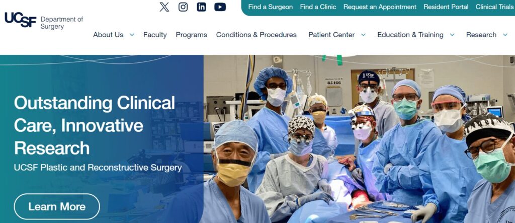
    8. UCSF Department of Surgery | Intuitive user experience
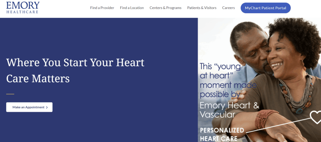
    9. Emory Healthcare | Effective location browsing
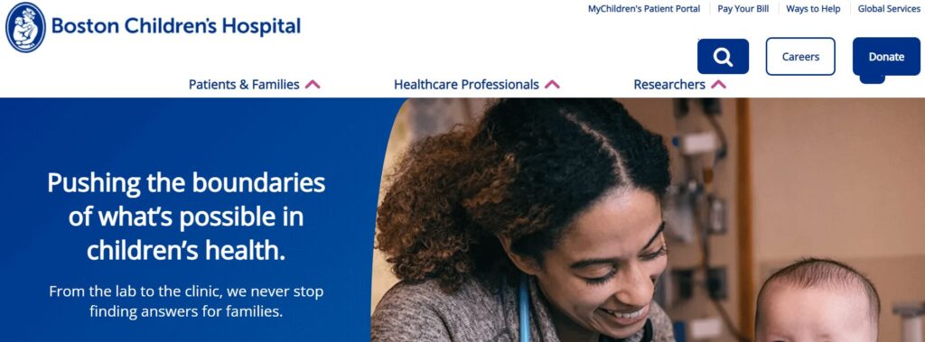
    10. Boston Children’s Hospital | Powerful homepage hero image
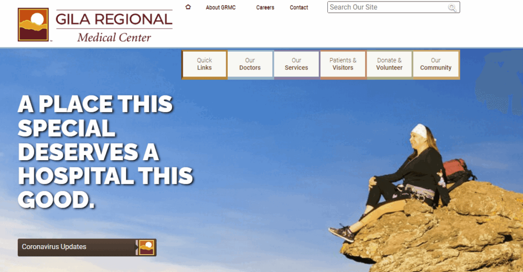
    11. Gila Regional Medical Center | Multilingual capabilities
    12. Massachusetts General Hospital | User-friendly CTAs
    13. Memorial Sloan Kettering Cancer Center | Patient-first language
    14. Cincinnati Children’s | Convenient online payments
    15. McLean Hospital | Data transparency
    16. UCLA Medical Center | Authoritative content
    17. Cedars-Sinai Medical Center | Simple online donation page
    18. NYU Langone Hospitals | Convenient appointment scheduling
    19. Northside Hospital | Compelling statistics
    20. Saint Francis Health System | Attention-grabbing imagery
    21. The George Washington University Hospital | Online health risk assessments
    22. The Ohio State University Wexner Medical Center | User-friendly patient information

    1. Cleveland Clinic | Clear CTAs

    The homepage for the Cleveland Clinic, a top hospital website design example
    • Clear homepage CTAs address common patient needs (find a doctor, get directions, schedule an appointment).
    • A robust health library answers common medical questions and concerns.
    • The homepage emphasizes the hospital’s commitment to patient-centered care.

    2. Mayo Clinic | Simple search

    The Mayo Clinic homepage
    • The homepage search function makes it easy to research health concerns and conditions.
    • Users can explore robust biographies for all staff members to make informed decisions when choosing a doctor. 
    • There are options to schedule appointments online or by phone, with additional FAQs to make the onboarding process smoother.

    3. Colorado Health Foundation | Enhanced user experience

    Homepage of The Colorado Health Foundation website
    • The site is highly accessible; the Colorado Health Foundation worked with the web design experts at Kanopi to increase the site’s Lighthouse score (a measure of page performance and accessibility) to 95/100.
    • We also worked with the organization to streamline the top-level menu to the most important items, simplifying the user experience for visitors.
    • The homepage content cards simplify the user journey by speaking to visitors’ FAQs.

    4. The University of Kansas Health System | Prominent credibility markers

    Homepage for the University of Kansas Health System, a top hospital web design example
    • The hospital’s U.S. News & World Report ranking is featured on the homepage to demonstrate credibility.
    • The site makes it simple to find relevant news and events about the hospital by including links on the homepage.
    • Patients can easily request medical records, empowering them to access their health information.

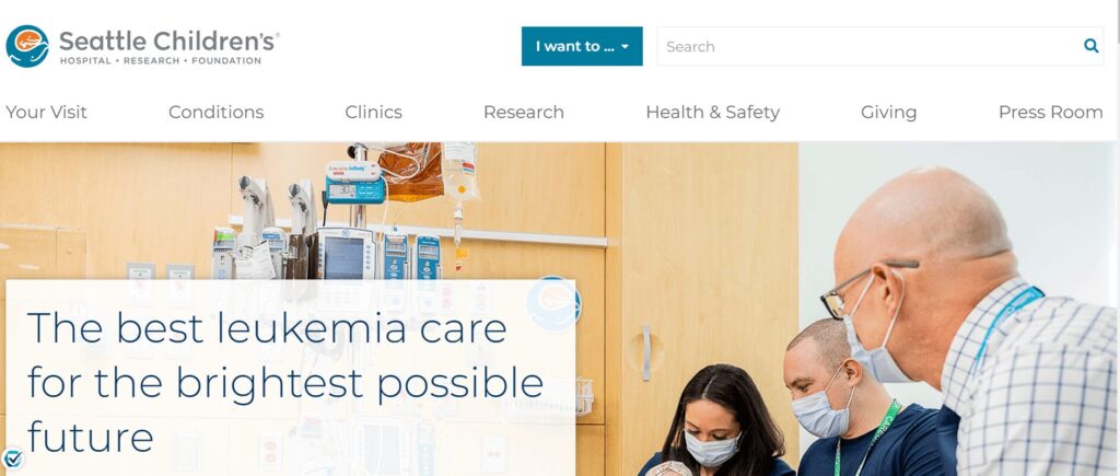
    5. Seattle Children’s Hospital | Compelling video

    Homepage of the Seattle Children’s Hospital website
    • The homepage features a compelling video (that would be even better if it weren’t auto-playing to enhance accessibility).
    • The site also spotlights its high U.S. News & World Report ranking.
    • Families can access detailed information to prepare and feel more comfortable ahead of a visit.

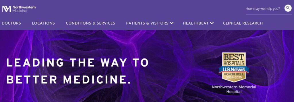
    6. Northwestern Medicine | Eye-catching branding

    Homepage for Northwestern Medicine, a leading hospital web design example
    • The eye-catching branding uses the hospital’s color palette.
    • There are multiple ways to find locations by name, specialty, or location type.
    • Compelling patient stories and case studies showcase what it’s like to seek care at this institution.

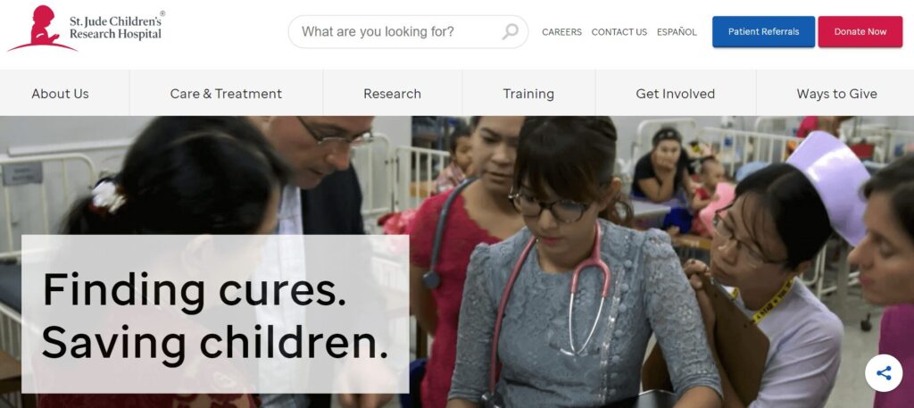
    7. St. Jude Children’s Research Hospital | Impact stories

    Homepage for St. Jude, a top hospital website design example
    • The site features emotional impact stories about patient experiences.
    • Comprehensive articles and explanations of the hospital’s research demonstrate authority.
    • A simple online donation process with options to dedicate a gift in honor or memory of someone empowers visitors to show their support. 

    8. UCSF Department of Surgery | Intuitive user experience

    Homepage for UCSF Department of Surgery
    • Kanopi worked with UCSF to organize and reinvigorate their website, identifying user personas and reformatting the site for a more intuitive user experience.
    • Micro-interactions, transition animations, and soft shapes add visual intrigue without distracting or overwhelming users.
    • Imagery focuses on showing real people, adding authenticity and relatability to the site.
    • Our partnership earned multiple awards for user experience and health care services.

    9. Emory Healthcare | Effective location browsing

    Homepage for Emory Healthcare, representing one of the best hospital website designs
    • The primary homepage CTA (“Make an Appointment”) speaks directly to the most common user need.
    • How-to videos offer guidance for using the hospital’s patient portal.
    • Users can browse locations by care type or specialty.

    10. Boston Children’s Hospital | Powerful homepage hero image

    Homepage for the Boston Children’s Hospital website
    • The homepage hero image is compelling and its static nature makes it less distracting than a rotating image carousel.
    • Integrations with social platforms like Instagram give a unique feel to the homepage content.
    • Videos incorporated throughout the site provide information for families looking to book virtual or in-person appointments.

    11. Gila Regional Medical Center | Multilingual capabilities

    Homepage for Gila Regional Medical Center, a top hospital website design
    • The homepage features credibility markers such as ratings and awards from credible organizations.
    • Resources are available in both English and Spanish, increasing the site’s language accessibility.
    • The website sticks to the most relevant details for patients, avoiding overloading itself with confusing or distracting information. 

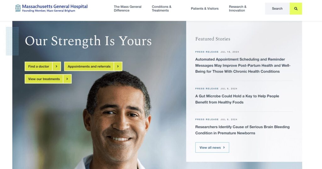
    12. Massachusetts General Hospital | User-friendly CTAs

    Homepage for Massachusetts General Hospital, a top hospital web design
    • The homepage buttons saying “Find a doctor,” “Appointments and referrals,” and “View our treatments” make it easy for patients to find what they’re looking for. 
    • A simple internal search function offers a convenient way to research conditions and treatments.
    • The site is available in multiple languages, making it accessible to a wider audience. 

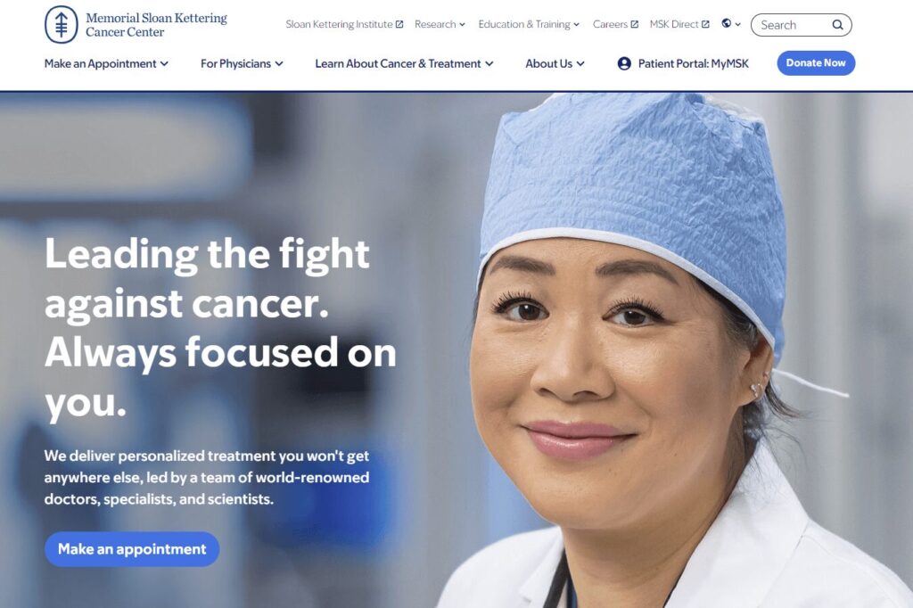
    13. Memorial Sloan Kettering Cancer Center | Patient-first language

    Homepage of the Memorial Sloan Kettering Cancer Center
    • The homepage leverages patient-first language using “you” pronouns. 
    • The homepage has one hero CTA focused on patients’ needs (“Make an appointment”), keeping the page uncluttered and useful for visitors in a hurry.
    • The website features timely public notices for security incidents, keeping its community informed. 

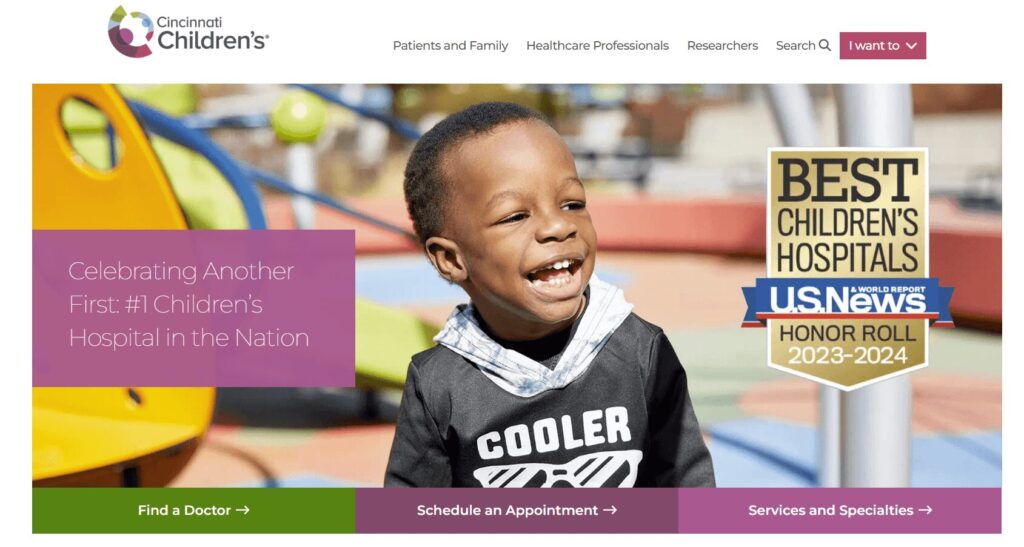
    14. Cincinnati Children’s | Convenient online payments

    Cincinnati Children’s Hospital homepage
    • The homepage celebrates the hospital’s ranking of #1 Children’s Hospital in the Nation by U.S. News & World Report. 
    • The “I want to” CTA in the top menu allows users to quickly find the resources they need.
    • Clear billing options are outlined on the website, including convenient online, phone, and mail options. 

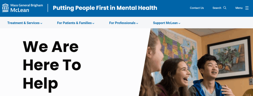
    15. McLean Hospital | Data transparency

    Homepage for McLean Hospital
    • Privacy incidents are highlighted directly on the homepage, empowering patients to understand potential threats to their personal data.
    • Treatment options are arranged by age, making it easier for visitors to find relevant information.
    • The hospital offers convenient online mental health webinars and courses for community members to feel more empowered and take control of their mental health. 

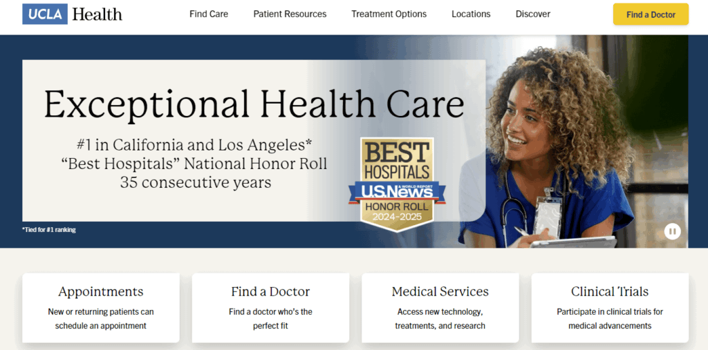
    16. UCLA Medical Center | Authoritative content

    Homepage for the UCLA Medical Center, a top hospital web design example
    • The hospital’s credentials are highlighted right on the homepage: “#1 in California and Los Angeles, ‘Best Hospitals’ National Honor Roll, 35 consecutive years” 
    • Users can translate the website into 10 different languages.
    • Visitors can search by location, provider, medical services, and clinical trials to find the practice that’s right for them.

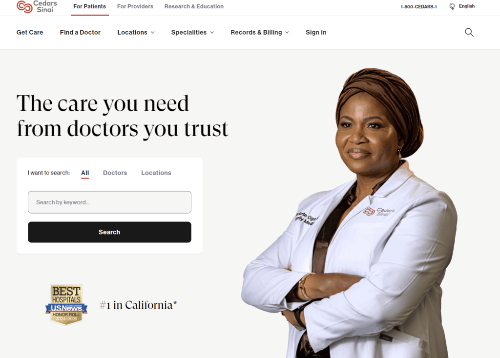
    17. Cedars-Sinai Medical Center | Simple online donation page

    Cedars-Sinai Medical Center homepage
    • The hospital’s user-friendly internal search function is highlighted directly on the homepage.
    • The online donation page is streamlined and empowering, giving donors the option to donate to a specific area or give in honor or memory of someone.
    • The website uses clear statistics to highlight the organization’s positive impact and beneficial research. 

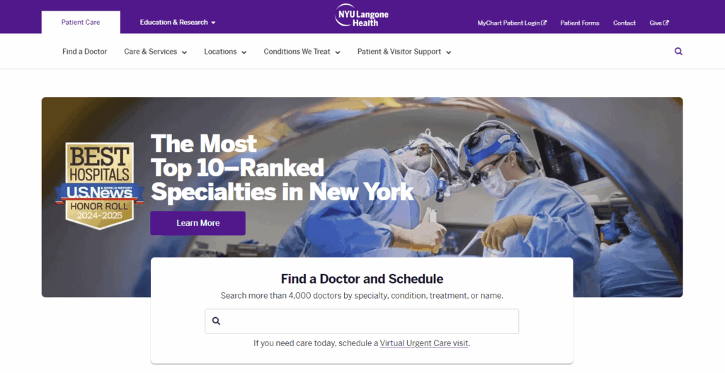
    18. NYU Langone Hospitals | Convenient appointment scheduling

    Homepage for the NYU Langone Health website, a top hospital web design example
    • Users can search doctors by specialty, condition, treatment, or name.
    • The homepage has clear links to the online patient portal.
    • Visitors can schedule virtual urgent care visits. 

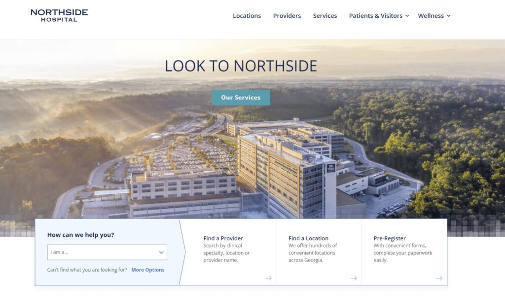
    19. Northside Hospital | Compelling statistics

    Homepage for Northside Hospital
    • The homepage “I am” CTA makes it easy for visitors to self-select a user group that matches their needs.
    • The homepage also features compelling statistics speaking to the hospital’s positive impact.
    • The website’s patient stories use photos and direct quotes to convey patient experiences. 

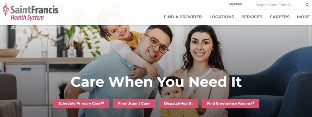
    20. Saint Francis Health System | Attention-grabbing imagery

    Homepage for Saint Francis Health System
    • The homepage incorporates an eye-catching hero image. 
    • News articles feature the hospital’s high quality rankings from credible organizations.
    • Users can search for a provider by specialty, location, or insurance. 

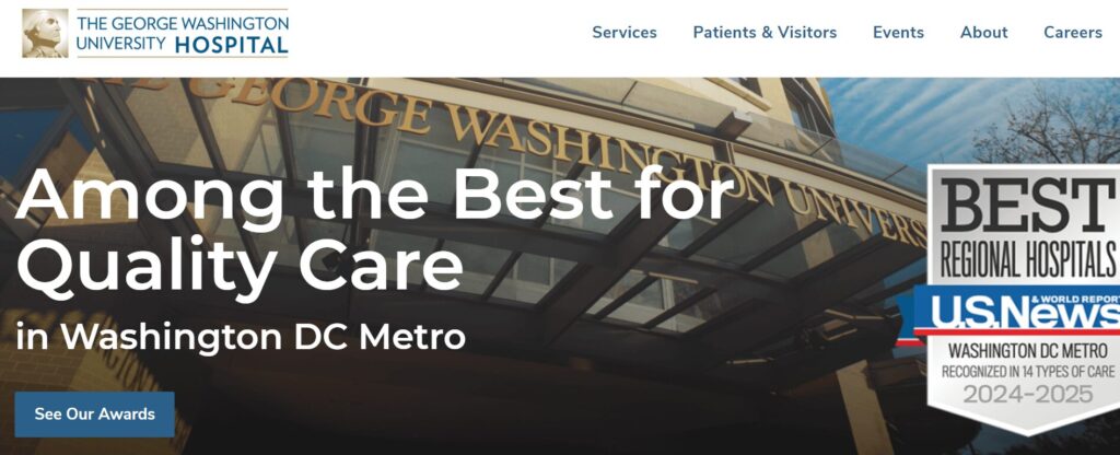
    21. The George Washington University Hospital | Online health risk assessments

    Homepage for the George Washington University Hospital, a top hospital web design example
    • The homepage emphasizes the hospital’s awards and rankings, demonstrating credibility.
    • The site spotlights a wide variety of patient services, including spiritual care, language services, and access to medical records. 
    • Online health risk assessments help patients take charge of their health. 

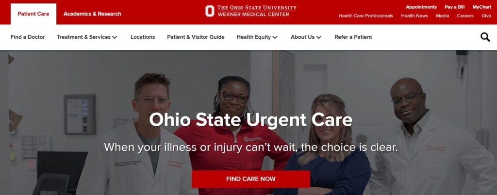
    22. The Ohio State University Wexner Medical Center | User-friendly patient information

    The homepage for The Ohio State University Wexner Medical Center website 
    • The homepage CTA speaks directly to patients who may feel a sense of urgency, saying “When your illness or injury can’t wait, the choice is clear.”
    • The online Patient & Visitor Guide answers common patient FAQs to help visitors feel more comfortable with their stay. 
    • The site highlights the hospital’s commitment to health equity, including information about its roadmap and initiatives to achieve health equity. 

    Features of successful hospital website design

    Now that you better understand what your audience wants to see from your hospital website, let’s summarize the specific features your site should have to fulfill their needs. Successful hospital websites have the following elements: 

    • Information about location, parking, and other logistics
    • Staff/doctor directory
    • Comprehensive educational content covering medical and healthcare topics
    • Event calendar
    • Credibility markers (awards, certifications, credentials, etc.) 
    • Convenient appointment booking
    • Streamlined navigation
    • User-friendly internal search
    • Timeless look
    • Mobile-friendly functionality 
    • Accessible content 
    • Multilingual options
    • Security features for sensitive information (strong password requirements, two-factor authentication, etc.) 
    • Insurance information

    Adapt these features to your organization’s unique branding and tone to create a consistent website that appeals to all user needs.

    Work with Kanopi to optimize your hospital website

    A hospital web design and development project is a major undertaking, and you need an experienced developer on your side to create a finished product that exceeds your audience’s expectations. Kanopi Studios is a reliable healthcare web design partner that will help you create the effective hospital website your community deserves.

    Our services include:

    • User and stakeholder research
    • User persona development and testing
    • Content audit and strategy
    • Healthcare website design focused on user-friendliness and accessibility
    • Website development and maintenance

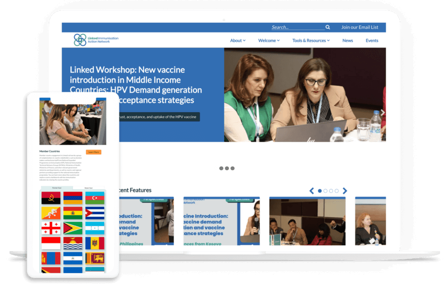
    Hospital web design case study: The Linked Immunisation Action Network

    The desktop and mobile versions of the Linked Immunisation Action Network website

    Our partnership with the Linked Immunisation Action Network offers a helpful look into how we approach hospital and healthcare web design. The organization came to us needing to improve their website’s performance and usability—two important site aspects that are heavily impacted by design.

    Focusing on high-traffic areas (the homepage and Tools and Resources section), we updated the backend code and fixed form and plugin issues. We also redesigned the Tools and Resources section to streamline user pathways, improve search functionality, and enhance visual design to increase engagement.

    As a result, the site saw both desktop and mobile speeds improve as well as an accessibility boost. Read the complete case study here and explore our other recent healthcare projects to see how we take website design from ideas to reality. 

    Wrapping Up

    Remember: Investing in effective web design support upfront will help your organization achieve a high return on investment (ROI) for your project. It’s worth it to work with an expert who can guide the process from start to finish and implement best practices. 

    Looking for additional healthcare web design support? Start with these additional resources: 

    Two female students walk around a college campus, wearing bags and holding books

    Higher Ed Website Design: 12 Examples & Tips for 2026

    Higher ed institutions have several Sisyphean tasks to overcome, such as rising tuition costs, concerns about the value of an education, and other obstacles. The good news is that you already have a useful tool to enhance trust and credibility—your higher ed website. 

    75% of consumers say they judge an organization’s credibility based on the quality of its website design. With a positive and forward-thinking higher education website, you can gain the trust of your audience and strengthen your online presence.

    At Kanopi, our designers keep their eyes and ears open to understand the unique pressures and requirements of the higher education web design landscape. We work with higher education clients to build websites that better tell their universities’ stories. Leaning on our experience, we’ll review the best higher ed website designs in 2025 and the best practices represented in each example. 

    1. University of Arizona | Optimized user experience 
    2. Stanford University | Use of AI as an organizational practice
    3. Kenyon University | More resources for underrepresented members of the student community
    4. University of Waterloo | Clarity on DEI initiatives
    5. Western Washington University’s Department of Design | Interactive design
    6. University of Wisconsin-Madison | Rich interactive experiences
    7. Adelphi University | Improved usability and accessibility
    8. Georgetown University | Focus on mental health and wellness
    9. University of South Alabama | Creating opportunities for personalization of the online experience
    10. Loyola University Maryland | Charming microinteractions
    11. Rice University | Interactive student tours
    12. Rhode Island School of Design | Real-time updates

    1. University of Arizona | Optimized user experience

    The University of Arizona’s website homepage

    What to know about this higher ed website design best practice

    The user experience is the way visitors interact with your higher education website. Browsing your undergraduate majors, signing up for your newsletter, submitting a donation using your online giving form—all of these activities fall under the umbrella of user experience. 

    Higher ed website design is focused on simplifying the user experience to facilitate streamlined user journeys for every visitor. This means that every visitor can find the information they need quickly and easily, whether they’re a prospective or current student, faculty member, parent, donor, or community or business partner. 

    What we love about the University of Arizona’s website

    The University of Arizona homepage immediately offers tailored resources for one of its most important user groups: accepted new students. New students can view the next enrollment steps, such as paying the enrollment fee, signing up for new student orientation, and exploring scholarships. 

    Arizona’s website also offers an “I am” drop-down search option for other visitors. Visitors choose the descriptor that best matches them and are sent to a webpage with specific resources for their needs. 

    The University of Arizona’s “I am” CTA with options for future and current students, faculty, parents, and more

    Take a look at this example of the personalized content you can serve each audience using tailored CTAs:

    Metropolitan University

    Personalized Excellence

    These customized experiences that speak to specific user groups are becoming increasingly common as universities learn more about their target audiences. 

    Next steps to take

    To help visitors move through your content more easily, your college or university website should:

    • Use concise, powerful calls to action (CTAs). Your CTAs should address common user questions and concerns to help connect individuals with the necessary information. 
    • Offer clear navigation. Keep your website menu short and straightforward, with a limited number of items. This keeps your navigation uncluttered and easy to use. 
    • Be mobile-friendly. Ensure your site has an effective mobile-responsive design to offer an equally positive user experience across all devices. 
    • Offer clear next actions for each visitor segment. Give visitors a variety of prompts to help them move through your website content. For instance, similar to the Arizona website, take a look at how the Georgetown University website offers quick links for different visitors:
    Georgetown’s quick links with info for faculty, staff, students, alumni, and parents, representing the higher ed website design trend of clear next actions for different users

    Identify five to seven user groups or personas within your higher education audience to determine which user journeys to prioritize on your website. 

    2. Stanford University | Use of AI as an organizational practice

    Screenshot of the Stanford University website homepage

    What to know about this higher ed website design best practice

    Students and faculty have greater access to user-friendly artificial intelligence (AI) than ever before. Website visitors want to know how your university approaches AI in the classroom and helps students prepare for an AI-centered workforce. 

    According to an Inside Higher Ed survey, almost three-quarters of students say that their universities should prepare them for AI in the workplace, either “a lot” (27%) or “somewhat” (45%).

    What we love about the Stanford University website

    Stanford makes their position on AI usage clear with a webpage on Generative AI Policy Guidelines. It clearly states the circumstances under which instructors can use AI to support learning and situations where students should not use AI tools.

    Screenshot of Stanford’s Generative AI Policy Guidance

    Next steps to take

    To meet the demand for information about AI usage, your higher education website should highlight: 

    • Student use of AI. Spotlight opportunities for students to learn more about AI in their field through research and hands-on application. 
    • Institutional AI policies. Include a webpage outlining your university’s approach to student and instructor use of AI in academics.
    • Research and development. Feature any news or research updates from university professors in the field of AI. 

    Potential and current students want to know that your university is on the cutting edge of these technologies that will profoundly impact their daily lives, so your AI information should be easy to find on your website. 
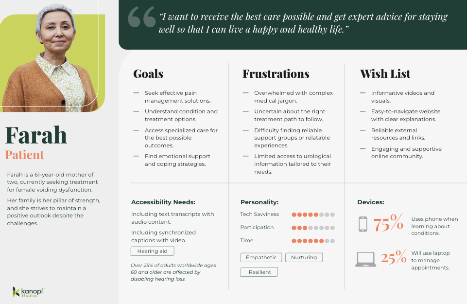
    3. Kenyon University | More resources for underrepresented members of the student community

    Screenshot of the Kenyon University website homepage

    What to know about this higher ed website design best practice

    Higher education institutions have increasingly emphasized diversity, equity, and inclusion (DEI) initiatives to ensure all students feel welcome and to expose all students to different cultures and backgrounds. Students themselves are noticing a difference—over half of students surveyed in the fall of 2021 said they perceived a noticeable difference in diversity on campus.

    However, there’s still more progress to be made. That’s why colleges and universities have emphasized creating streamlined user pathways that connect students of color, members of the LGBTQ+ community, disabled students, first-generation college students, and other underrepresented groups with the resources and information they need.

    What we love about the Kenyon University website

    The Kenyon College Diversity & Inclusion page exemplifies how you can bring your school’s commitment to diversity to the forefront. The page states the school’s commitment to fostering a diverse and inclusive learning environment and offers a variety of resources for underrepresented students. This gives current and prospective students an easy way to access the support they need to reach their full potential. 

    Kenyon’s Diversity & Inclusion information page

    Next steps to take

    To help underrepresented students feel supported at your school, you should update your university’s website in the following ways: 

    • Provide tailored information for first-generation and international students to simplify navigating the application process. 
    • Include the link to your school’s Office of Diversity and Inclusion in your main website menu.
    • Spotlight mentoring opportunities or affinity groups for underrepresented communities.

    4. University of Waterloo | Clarity on DEI initiatives

    The University of Waterloo homepage

    What to know about this higher ed website design best practice

    In addition to helping students access the resources they need thrive, universities are clarifying their stance on diversity, equity, and inclusion (DEI) policies amid changes to higher ed acceptance policies

    What we love about the University of Waterloo’s website

    The University of Waterloo offers a clear Equity, Diversity, Inclusion, & Anti-Racism (EDI-R) strategy page detailing the organization’s strategic goals. Waterloo takes its commitment further by magnifying diverse student voices in the content creation process through its Amplify podcast

    The podcast focuses on giving students a voice to discuss their experiences as university community members who hold marginalized identities. It also provides plenty of quick links to resources for students in need, such as counseling services and student associations.

    Episode titles and descriptions for episodes of Waterloo’s Amplify podcast, representing the higher ed website design trend of greater clarity on DEI initiatives

    Next steps to take

    To help your university community understand your policies, create a dedicated webpage outlining your approach and goals. For example, similar to the Waterloo example above, the McMaster University website features an Equity, Diversity, and Inclusion (EDI) strategy roadmap with a clear framework, action plan, and definitions. 

    5. Western Washington University’s Department of Design | Interactive design

    The WWU Design homepage, showing different pieces of art that users can move around and arrange on the page

    What to know about this higher ed website design best practice

    Interactive design helps your university website stand out from the crowd, blending the functional and the aesthetic to create a more well-rounded user experience. 94% of users’ first website impressions are related to design, making this a key aspect of your nonprofit’s website strategy. 

    What we love about the Western Washington website

    Check out Western Washington University’s Department of Design website homepage above. The interactive homepage actually allows visitors to rearrange elements on the page to create their own design. This is a unique way to show visitors what the school is about while providing an engaging and memorable user experience. 

    Next steps to take

    Consider what makes your university or department unique and how you can represent your school’s personality visually. For example, does your college offer summer programs? Try a scrapbook style design to emphasize the blend of learning and summer fun. Animation and illustration styles could also help you present different aspects of your university in a more engaging way.  

    6. University of Wisconsin-Madison | Rich interactive experiences

    The University of Wisconsin-Madison homepage

    What to know about this higher ed website design best practice

    Interactive experiences put website visitors in control of their online experience. They can engage with information and resources that interest them most or appeal to their unique needs.

    What we love about the University of Wisconsin-Madison’s website

    Interactive timelines are an effective tool for showcasing continuity and allowing users to explore areas that interest them. 

    The University of Wisconsin-Madison’s interactive timeline is an excellent example of a rich interactive timeline experience. Users can scroll down the page to read about the school’s history and select images to learn more about specific events or notable people.

    UW-Madison’s interactive timeline, indicative of the higher ed website design trend of interactivity

    Next steps to take

    If you have an idea for a creative interactive element but are unsure how to bring it to life, reach out to an experienced design partner like Kanopi for support. These experts can turn your vision into reality and ensure your creative idea fits seamlessly into your website’s overall look and feel. 

    7. Adelphi University | Improved usability and accessibility

    The Adelphi University homepage

    What to know about this higher ed website design best practice

    The best university websites know that an inclusive website is a fully accessible one. Accessibility means a website is usable and understandable by everyone, regardless of age or ability.

    Accessible higher ed websites consider the wide range of human experiences when designing and structuring pages and content. From long-term accessibility issues, such as color blindness, to users with short-term impairments like a broken arm, accessible websites offer visitors an enjoyable and user-friendly experience. 

    What we love about the Adelphi University website

    Along with a page explaining their web accessibility policies, Adelphi University offers a form for users to report accessibility issues. Users can provide information about the web address where they encountered the problem and explain the issue they experienced. 

    Screenshot of the web accessibility form on the Adelphi website

    Next steps to take

    To improve your site’s accessibility, you can:

    • Follow the Web Content Accessibility Guidelines (WCAG) as you develop or redesign your website. These guidelines were created to establish a universal standard for website accessibility. 
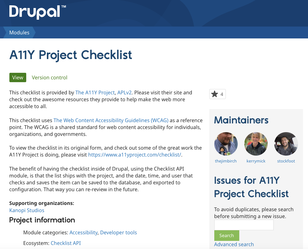
    • Explore Kanopi’s list of best accessibility tools. Resources such as the A11Y project checklist and Lighthouse can help you assess your site’s current level of accessibility and identify opportunities for improvement. 
    • Test your website’s accessibility manually. This crucial step helps you note any instances of poor accessibility that automatic testing resources might have missed. To conduct thorough manual testing, try navigating your website with just your keyboard or zooming in to 200% to assess usability in that format. 

    8. Georgetown University | Focus on mental health and wellness

    The Georgetown University website homepage

    What to know about this higher ed website design best practice

    In the past few years, college students’ mental health struggles have hit crisis levels. Financial worries and school stress have always been major contributors to poor student mental health, but the pandemic added a new dimension to the crisis. Many students switched to hybrid or fully virtual class schedules, leading to increased feelings of loneliness and isolation. 

    The mental health declines prompted by the pandemic are still in effect today. 44% of students reported feeling depressed in the past year, and 95% of college counselors said that mental health is a growing concern at their school. 

    What we love about the Georgetown University’s website

    Georgetown University offers a webpage with mental well-being resources and counseling options for student, faculty, and staff mental health resources. The page even offers guiding questions to help visitors find the right resources.

    The Georgetown University website prioritizes centralizing mental health resources in its higher ed website design.

    Next steps to take

    Ensure your own higher education website showcases your mental health resources. By adopting an empathetic, understanding tone, prospective and current students will feel more comfortable using available resources.

    9. University of South Alabama | Creating opportunities for personalization of the online experience

    The University of South Alabama homepage

    What to know about this higher ed website design best practice

    Personalization is increasingly essential for all forms of marketing, including higher education outreach. According to EAB, 93% of students said receiving a personalized message from a college would encourage them to explore a school further.

    College websites are heeding the call for more personalization by taking steps to personalize both their website’s public-facing and gated versions. 

    Public-facing personalization

    The public-facing side of your website includes all content that any visitor can access without a login. 

    The best higher ed websites leverage data analytics to track user behaviors and serve more relevant content on the front end. For example, let’s say you have a visitor who previously visited your university website to start an application but didn’t finish the form. On their next visit, your site can serve CTAs that remind them to apply before your deadline. 

    Gated content personalization

    Gated content is any content on your website that requires a login to access. 

    When current students log into their profile on your college website, they should be able to access a customized dashboard with information relevant to their needs. For example, a student in the journalism school should be able to see the deadline for advising registration and upcoming student organization meetings.

    What we love about the University of South Alabama’s website

    The University of South Alabama’s website offers an easily accessible portal for students to log into popular applications that support their student journey. Website users can also toggle between a student view and a faculty and staff view, depending on their needs.

    Student log in options on the South Alabama website

    Next steps to take

    Determine which types of personalization you’d like to offer through your website, whether public-facing, gated, or a combination of both. Ensure your website offers robust security credentials to keep student information safe when logging into gated content. These measures include:

    • Requiring complex passwords
    • Offering two-factor authentication for logins
    • Ensuring your website uses HTTPS to encrypt data

    10. Loyola University Maryland | Charming microinteractions

    Loyola University Maryland’s homepage

    What to know about this higher ed website design best practice

    Microinteractions are the small moments and design elements users experience on your website that engage them more deeply. This encompasses everything from hovering over a button and watching it get larger or change colors to interacting with an in-depth infographic. 

    Think about the satisfaction and joy you experience when using Facebook’s reaction buttons or sending an iPhone message with an animation. These small interactions engage and delight users, making digital browsing a more enjoyable experience. 

    What we love about the Loyola University Maryland website

    The Loyola website includes a few simple button microinteractions. For example, the homepage CTA button shows a different message when users hover over it, changing from “More Than Ready” to “Discover the Loyola Difference.” In addition, an arrow appears pointing downward, letting users know that when they click the button, they’ll be sent further down the homepage to learn more about the college. 

    Additional CTAs use the school’s white and green color scheme to make buttons pop on the page through color-changing microinteractions. 

    Next steps to take

    Evaluate your website to determine whether you want to incorporate microinteractions into your content. We recommend using these elements sparingly so they don’t distract from other aspects of the user experience. 

    Even though these microinteractions represent small moments, they can significantly impact your visitors’ experience using your website. By optimizing even these brief connections, you ensure every interaction users have with your website is a positive one. 

    11. Rice University | Interactive student tours

    The Rice University homepage

    What to know about this higher ed website design best practice

    Campus visits and tours have a major impact on whether students decide to attend your college. In fact, 69% of high school students said that a good campus visit could make them significantly more interested in a college they weren’t entirely interested in, and a bad experience can turn them off of a college they were very interested in. 

    Because many colleges accept students from around the country and worldwide, virtual tours are widely used in the sector. These tours offer a glimpse at university life for students who can’t attend an in-person tour. 

    What we love about the Rice University website

    Rice University’s virtual tour is full of unique elements and microinteractions, starting with the rocket ship animation that appears when you hover over the “Launch Map” button.

    Next steps to take

    Creating a virtual tour experience is a major undertaking, so we recommend connecting with a higher ed website developer who can manage the project efficiently, especially if you want to create something as unique and robust as Rice’s virtual tour. 

    Some colleges also use services like YouVisit, which creates virtual tours using HD video production and 360-degree images. 

    12. Rhode Island School of Design Alumni | Real-time updates

    The RISD Alumni website homepage

    What to know about this higher ed website design best practice

    College and university websites are embracing their role as digital resources for learning more about their schools and providing ongoing updates on everything from recent news to research developments. 

    Social media feeds, blog post updates, and news articles help keep higher education websites fresh and relevant. They show visitors that the university keeps up with current events and contributes to important conversations.

    What we love about the Rhode Island School of Design website

    One example of this higher ed web design best practice is the Rhode Island School of Design’s alumni website homepage news feed. The feed is a scrolling carousel of recent news updates and blog posts that alumni community members may be interested in. 

    RISD’s alumni news feed

    Next steps to take

    By using your higher education website to feature news and current events, you can make it a helpful resource for your university’s community and a wider audience of alumni, sponsors, researchers, and prospective students interested in staying up to date with your institution.

    How Kanopi Can Help With Your Higher Ed Website Design

    Working with a website design agency helps your college or university stay updated with effective, usable design best practices. At Kanopi, we offer web design services for colleges, universities, and other higher education institutions. 

    We understand that a strong university website design starts with knowing your target audience, balancing their varying goals, and serving each segment equally. Here’s a glance at the elements we assess and optimize through our process:

    Kanopi’s higher ed website design services
    1. Research and Discovery: We conduct qualitative and quantitative user research and testing. Then, we use our findings to create a vision board for your website to ensure we accurately capture your goals and strategy.
    2. Content Strategy: We audit your existing content, assess your tone and style, and help create a more inclusive strategy that prioritizes accessibility.
    3. User Experience: We craft user personas for your primary audience groups and create journeys and pathways that speak to each persona. 
    4. Website Design: We ensure your higher ed website has a top-of-the-line design that optimizes every user interaction. 

    Please review our higher education design case studies and contact us if you want to improve your college or university website. 
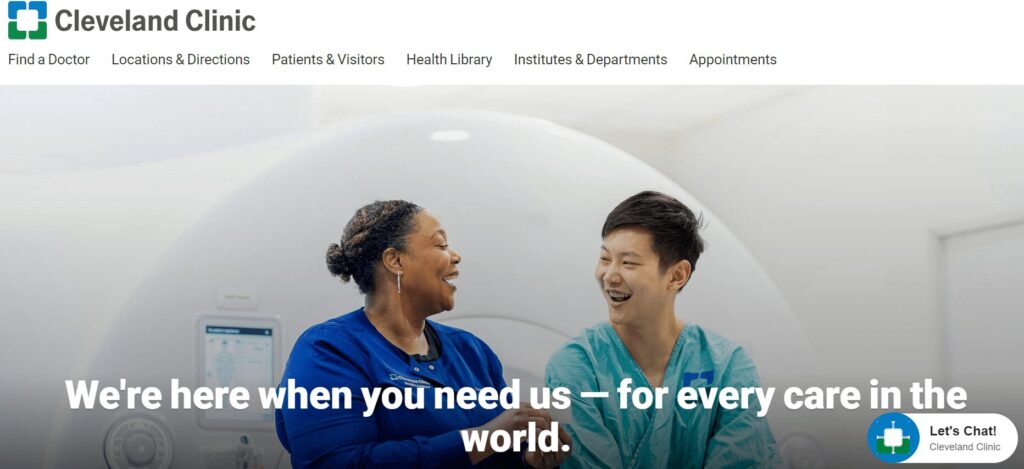
    Wrapping Up

    Your website can effectively connect stakeholders to opportunities that interest them and help them feel welcome in your university community. Use this guide to stay current with the best practices that resonate most with prospective and current students and other core audiences. 

    For more information on college and general web design tips, check out these additional resources: 

    Passengers wait in a check-in line at an airport

    Airport Web Design: Tips to Help Your Site Take Flight

    Airline travel is more popular than ever—the industry set a record in 2024 with nearly 5 billion passengers. Clearly, people are ready to explore the world. Is your airport’s website ready to meet their needs with a positive user experience?

    This guide explores everything you need to know about airport web design, including: 

    Let’s start by reviewing a few commonly asked questions about airport web design. 

    Airport Web Design: FAQs

    Why is it essential to have a quality website design for my airport?

    In general, passengers are happy with their air travel experience—an Ipsos survey found that the vast majority of passengers were satisfied with their air travel experience, and only 3% reported being “very dissatisfied.”

    A high-quality airport website is an essential component of providing a positive experience for travelers. Clearly outlined lounge locations, dining options, baggage options, and more on your site will help your airport maintain high passenger satisfaction.

    What do users expect from airport websites?

    Today, most airline travelers are digitally savvy. They want a web experience that helps them get need-to-know information as quickly and painlessly as possible. Here’s what visitors expect from airport websites: 

    What visitors expect from airport websites (listed below)
    • User-friendly, fast-loading browsing experience: Over half of website users will leave a site if it takes more than three seconds to load. Therefore, your airport’s passengers will expect your website to load quickly and offer a streamlined user experience. This is especially important if your airport’s Wi-Fi isn’t high-speed—offering a website with fewer loading issues is imperative.
    • Updated, accurate flight information. Whether they are travelers themselves or seeking flight details to facilitate airport pick-ups, your website’s users expect to see accurate real-time flight information. 
    • Mobile-friendly capabilities and a positive app experience: Your website should look great on desktop computers and mobile browsers and apps. After all, most travelers don’t want to pull out their computers to view your website. Plus, the top five most used U.S. airline apps have collectively seen their monthly active users grow to over 9 million, demonstrating customers’ interest in using apps to manage their travel. 
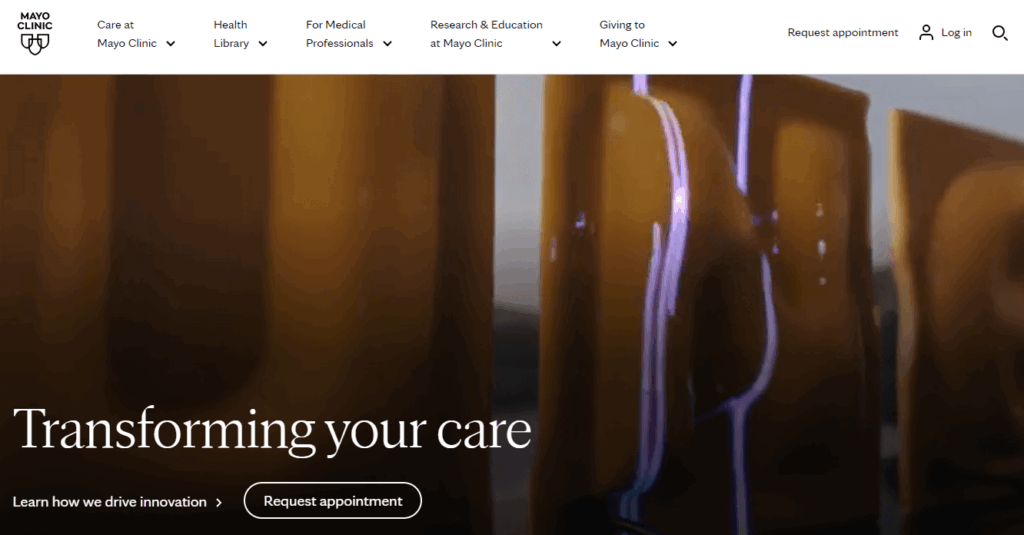
    • Accessibility. Over 70 million American adults and 1.3 billion people worldwide live with disabilities, so your site needs to accommodate a wide range of accessibility needs. Your content, navigation system, and forms must be inclusive and accessible to everyone. 
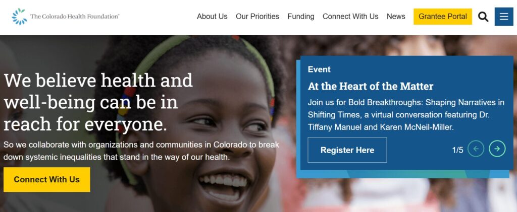
    Jump to our best practices section for a closer look at how to optimize each of these aspects of the user experience. 
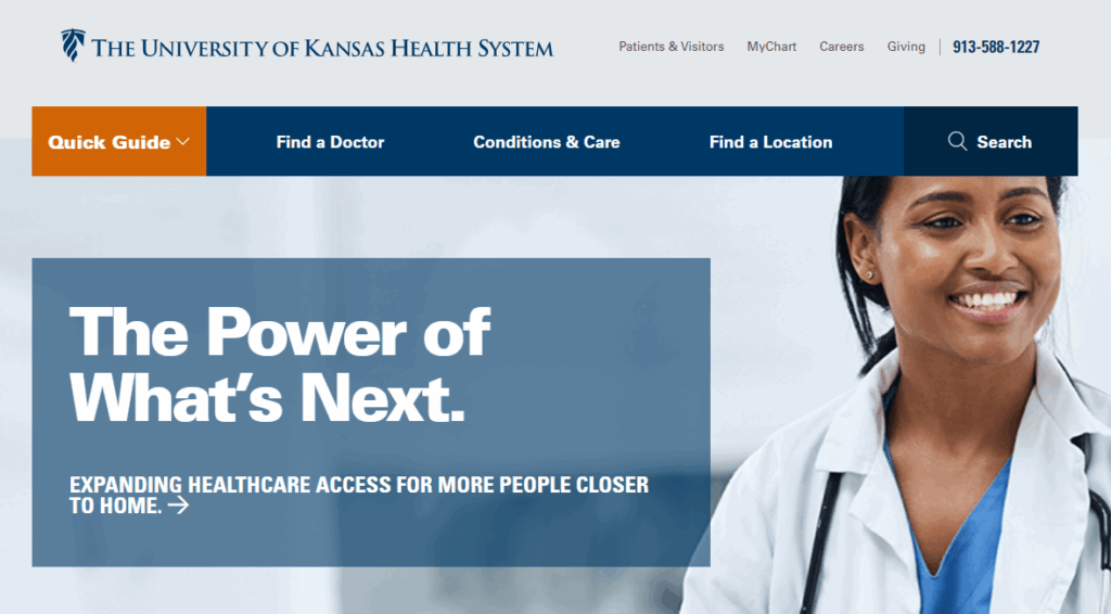
    How can I balance function and visual appeal on my airport website?

    You may be tempted to design your airport’s website with all the latest bells and whistles, from interactive maps to eye-catching animations. However, it’s essential not to lose sight of providing a functional and convenient website, especially for first-time travelers, users with disabilities, or older customers.

    That’s why we recommend starting from a less-is-more approach to airport web design. At Kanopi, our web design experts are well-versed in balancing form and function to produce websites that exceed user expectations. Our process includes the following steps: 

    1. User background research. We perform deep audience research to understand your stakeholders’ perspectives and needs. Then, we conduct stakeholder workshops, competitor analyses, content and technical audits, and sitemap creation and testing to plot the right strategy for your website design. 
    2. Website design. Kanopi focuses on telling every brand’s story through colors, typography, imagery, and motion that reflects your mission and vision. 
    3. User experience testing. We create core personas that reflect your audience to ensure your website meets their needs. Then, we test the site to ensure a positive experience before deploying updates.  
    4. Ongoing support. We maximize your site’s success through ongoing performance enhancements, conversion optimizations, and security reinforcement. 

    This process results in a streamlined user flow that effortlessly guides users through your website to the information they need. The user flow for airport websites involves the steps visitors take to navigate from flight details to transportation information, and other key details they need to make their travel experience more comfortable, like shopping options. 

    For instance, take a look at the San Francisco International Airport (SFO) website.

    The SFO website's main menu

    Kanopi worked with this organization to design an intuitive navigation system based on users’ most pressing needs. The top-level main menu lists items by priority, from flights to transportation, parking, shopping and dining, maps, services, and travel tips. The website doesn’t need flashy design elements or avant-garde technology to help users get from point A to point B as efficiently as possible. 

    Features of Compelling Airport Web Designs

    To summarize, here are the features your airport website will need to facilitate the passenger experience: 

    • A simple tool for checking flight status
    • Parking booking and information about available lots
    • Maps
    • Ground transportation options
    • Information about shops, restaurants, and lounges

    These features might vary depending on your airport’s unique services, but in general, these are the essential items visitors will seek on your website.

    Airport Web Design Best Practices

    Integrate real-time, accurate data into your airport website. 

    Certain aspects of air travel can be unquestionably stressful. Figuring out the best route to make a tight connection, trying to find your new gate number when it’s been unexpectedly changed, circling the pickup area multiple times due to delayed flights—these inconveniences can put a damper on the passenger experience.

    However, with real-time data, you can turn your airport website into a helpful resource that lessens or eliminates many of these pain points. Live flight updates, baggage claim statuses, and real-time parking information can help travelers better plan their journeys. 

    You can automate these processes using specific technologies for your website, such as APIs for flight data, which provide real-time and historical flight tracking information. We recommend working with a developer to determine the best tools to add to your site to expand its functionality and help customers access the necessary data. 

    Prioritize accessibility.

    As mentioned above, accessibility is essential for airport websites. Accessibility makes your website easier to navigate for all users, meaning it should be a top priority in your airport web design strategy.

    Start improving your site’s accessibility by keeping these tips in mind: 

    • Follow the Web Content Accessibility Guidelines (WCAG). These guidelines are the industry standard for designing a fully functional and accessible website. They include specific requirements such as implementing alternative text for images and videos, logical navigation, keyboard accessibility, use of color, and more.
    • Conduct automated and manual tests. Automated testing tools like Lighthouse and WAVE are a great place to start your accessibility testing because they can point out major accessibility issues that should be addressed immediately. However, we also recommend conducting manual testing to replicate the user experience and highlight issues that automated tools may be unable to catch. 

    Use color theory to drive engagement. 

    Studies have shown that up to 90% of customers’ first impressions of a brand come from color alone. Therefore, the color scheme you choose for your airport website will play a significant role in passengers’ opinions of your airport. 

    Here are some of the most popular shades for airport websites: 

    • Blue: Conveys trust, reliability, and peace. In our research, airport websites overwhelmingly choose blue color schemes.
    The homepage for the O’Hare International Airport website
    The homepage for the SEA-TAC airport website
    • Neutral tones (tan, gray, shades of white): Convey professionalism, minimalism, and modernism.
    The Zurich Airport website homepage

    Use accent colors based on your brand’s palette to add small color pops throughout your site. For example, the Dallas-Fort Worth International Airport website leverages neutral background colors with a reddish-orange accent color for text and buttons. 

    The DFW Airport website homepage

    Keep it as simple as possible.

    Remember, a key aspect of the airport user experience is ensuring visitors can access information quickly. They may be in a rush to catch a flight or pick up a loved one, and they need to know exactly where to go and what to do.

    Simplify your site by taking these steps: 

    • Ensure your main menu only includes the essentials, like the features listed above. 
    • Use white space effectively to reduce clutter and allow your design elements to breathe. 
    • Offer an internal search bar at the top of every page so users can quickly find the specific information they need. 

    Prioritize passenger cybersecurity. 

    Research by Bridewell found that 55% of aviation organizations experienced a ransomware attack in the previous 12 months. Accidental loss or disclosure of data was ranked as the top threat to civil aviation. 

    Reassure passengers that your airport will do everything possible to keep their data secure. Take the following security measures on your website as part of your overarching cybersecurity efforts: 

    • Run regular security checks and deploy updates and patches as soon as they’re available. 
    • Require strong passwords and multi-factor authentication for any login portals. 
    • Use a PCI-compliant payment processor to manage transactions safely and securely. 

    Enhance performance. 

    We already discussed how fast-loading websites maintain audience attention, but what steps can your airport site take to facilitate better performance? We recommend following these tips: 

    • Compress images and consider converting them into performance-optimized file formats like WebP or SVG. 
    • Use a content management system (CMS) or plugin to leverage caching on your site. This ensures that pages load faster on subsequent visits. 
    • Strip unneeded code from content if you’re copying and pasting from a platform like Google Docs into your CMS. This action often carries over a lot of unnecessary characters that can slow down your site’s load times.
    • Keep your CMS, plugins, and modules up to date and upgrade to new versions as soon as possible. 

    Level up the passenger experience with AI chatbots. 

    An AI chatbot functions as an internal search tool for your airport website. Visitors can communicate with the chatbot to find information or resources they’re seeking. If the chatbot can’t answer the question, it can direct users to your website’s customer service information to connect with a staff member. 

    Over 937 million people use AI chatbots today, and the market is projected to continue to grow. Chatbots are a simple way to make your site more functional without increasing complexity. 

    Optimize your website for mobile devices. 

    Globally, mobile devices make up over 60% of internet traffic, making optimizing your airport website for mobile devices essential. Incorporate these strategies to improve your website’s mobile experience:

    • Use large fonts and easily touchable buttons. Test different font sizes to find the right fit and ensure buttons are appropriately spaced so users can easily tap them on mobile screens. 
    • Ensure your menu is hidden and expandable on mobile devices. Use a collapsible mobile menu to keep your homepage uncluttered on phone screens. 
    • Leverage a user-friendly app. Offer passengers an app to access the same need-to-know information your website offers, like flight details, parking information, and security wait times. 

    Take a look at this example of a non-mobile-optimized website vs. a mobile-optimized one:

    A non-mobile optimized website with a poor layout and small fonts vs. a mobile-optimized layout with a vertical format and large fonts

    As you can see, the non-mobile-optimized version contains tiny fonts, small buttons, and poorly-spaced items. In contrast, the mobile-optimized site has a vertically-oriented layout, large fonts, and easily-tappable buttons for a better mobile experience.

    Incorporate multilingual capabilities. 

    Your airport likely sees thousands of multilingual travelers annually, especially if you’re an international airport. Ensure your site can be translated into multiple languages based on your passengers’ most common languages. 

    You can manage this process using multiple URLs for different languages or a plugin to facilitate multilingual capabilities. If you choose to use a plugin, consider working with a developer to create a custom solution catered to your needs. A custom plugin is also more likely to run smoothly and load quickly on your site, enhancing performance. 

    5 Inspiring Airport Web Design Examples

    San Francisco International Airport: Best airport website for simple navigation

    Screenshots of the mobile and desktop versions of the SFO Airport website

    As mentioned above, the San Francisco International Airport (SFO) website is a stellar example of streamlined navigation. When SFO reached out to Kanopi, the airport needed to revamp its website presence to offer an outstanding online guest experience.

    The previous SFO website was cumbersome and difficult to use, running on an outdated version of Drupal. The organization needed a modern, flexible, and engaging website to support its business goals and provide a better customer experience. 

    The Kanopi team collaborated with SFO to:

    • Conduct user experience research and stakeholder interviews. 
    • Redesign the site with a diverse, technically-optimized visual approach. 
    • Make the navigation more intuitive.
    • Better highlight vendor information.
    • Provide personalized flight details. 
    • Infuse the website with the Bay Area’s rich and unique culture. 

    The result? SFO now has an award-winning website with a user-friendly interface, responsive layout, and modern navigation. 

    Changi Airport: Best calls-to-action 

    A call to action is a button, menu item, or link that helps different users navigate your website and find the specific information they’re looking for. The Changi Airport website’s homepage contains a variety of useful CTAs that help users navigate smoothly through their website journey. These include:

    • The internal search function right at the top of the page that encourages users to search for specific information
    The Changi Airport website’s internal search function right at the top of the page that encourages users to search for specific information
    • The “I Am” button CTA, where users can select the description that best fits their needs
    The Changi airport website’s “I Am” button CTA, where users can select the description that best fits their needs
    • The quick links buttons that link to multiple common next actions users may want to take
    The Changi homepage’s quick links buttons that link to multiple common next actions users may want to take

    These CTAs provide easy access to key information that makes passengers’ experiences much smoother and stress-free. 

    Jacksonville International Airport: Best airport web design visual style

    The JAX Airport website homepage

    The Jacksonville International Airport’s website stands out in terms of visual design and signature style. The website includes a variety of user-friendly and engaging design elements, including: 

    • A fun airplane homepage animation and microinteractions that include buttons popping off the page
    • Easily accessible parking information and security wait times
    The parking and security information on the JAX Airport homepage
    • User-friendly service locations map with multiple filters and overlays to find the right information

    The website’s calming blue color scheme, detailed flight information, and regularly updated news articles provide a sense of authoritativeness. 

    Minneapolis-Saint Paul International Airport: Best airport website for accessibility

    The MSP Airport website homepage

    Both airports and airlines are legally required to comply with various physical and digital accessibility standards, including offering accessible websites and other digital resources like information or check-in kiosks. The Minneapolis-Saint Paul International Airport’s website offers a useful example of an accessible airport website in practice.

    This website scores 96% on Lighthouse, a tool that measures accessibility. Key accessibility components that stand out on this site include: 

    • Images have alternative text
    • Buttons have accessible and specific names
    • Links are distinguishable without relying on color alone
    • Touch targets are sufficiently sized
    • Form elements have accurate associated labels

    The site also offers a streamlined, expandable menu and multilingual capabilities for six languages, making the content more accessible for international passengers. 

    London Heathrow Airport: Best airport website for audience-focused language

    The London Heathrow Airport website

    The Heathrow Airport website has much to offer when it comes to catering to the passenger experience. The website includes audience-focused language and various tools that make the travel experience more comfortable. These include: 

    These features help reassure first-time travelers or international passengers that they can access the resources and information they need to make their trips more enjoyable. 

    How Kanopi Supports Airport Web Design

    Our website designers and developers at Kanopi Studios have extensive experience creating optimized corporate and commercial websites, including airport websites. 

    Our Technical Expertise

    Our experienced developers ensure your airport website includes all the technical elements it needs to serve your audience effectively, including: 

    • Flexible layouts that allow content editors to update their sites independently without needing to contact a developer
    • Creation of personalized dashboards for airport passengers to access content related to their travel itineraries
    • Location data that enables users to customize the content they see based on their home country
    • Development of client-facing dashboards for a user-friendly content administration experience and editing workflow

    We can help you build a new website from the ground up or optimize your existing online presence, even if it contains custom or complex code. Our developers are highly experienced and skilled at working with existing code and reformatting your site to better suit your current needs. 

    Contact our team today to discuss your airport website’s goals and see how the experts at Kanopi can help. 

    Wrapping up

    Ultimately, your airport website should reassure passengers that they will have a positive experience, equip them with the resources and information they need to have a smooth journey, and encourage them to continue using your services for their travel needs. If you need support to bring your airport website’s vision to life, research web design and development partners and request proposals to explore your options and find the right consultant for your needs. 

    Looking for more information about designing a top-tier website? Start with these additional resources: