







Kanopi Team

12 Best Healthcare Website Design Examples & Why They Work

Is your healthcare website prepared to meet your community members' needs?

In today’s highly digital world, most patients do their research before they make an appointment with a healthcare provider. In fact, Google sees over 1 billion health-related searches per day. In 2024, popular health searches ranged from questions about diseases (“Is strep throat contagious?”) to general health tips (“How much water should you drink a day?”). 

What does this mean for your organization’s healthcare website? Accurate and accessible healthcare information is more crucial than ever. Whether your organization is a health institute, medical school, or hospital, your website is an essential resource for your community. 

This guide reviews top healthcare website design examples and the features and best practices that make these resources effective. Here’s what to expect:

The Benefits of Engaging Healthcare Website Design

Although not every search result will lead to a doctor’s appointment, users will still engage with your organization online in some way. Make the most of their virtual visit with a great design that meets their needs and establishes your organization as a credible source. With thoughtful design, your healthcare website can:

  • Grow brand awareness: A robust, well-designed website establishes your organization as a credible and knowledgeable source new users can turn to. 
  • Build trust among current audience members: When visitors see that your website is professional and comprehensive, they’ll trust your organization more. One healthcare website study found that “website design, clear layout, interactive features, and the authority of the owner have a positive effect on trust or credibility.” 
  • Offer your audience convenience: A comprehensive healthcare website gives community members access to a 24/7 resource that’s available with just a few clicks. 

Your website should give current and prospective patients confidence in your quality of care. Its design should emphasize your medical expertise and put their minds at ease. 

Best Practices for Healthcare Website Design

Put yourself in a patient’s shoes. What would they expect from a professional healthcare website? Speed, responsiveness, credible content—all of the above! How your website delivers on these expectations defines your site’s performance. 

An effective healthcare website incorporates the following elements:

  • User-friendly, patient-centric design
  • An easy-to-use internal search function
  • Accessible design
  • Heightened security for sensitive information
  • Responsive design
  • A mobile-friendly interface
  • Accurate, informative content
  • Fast load speeds

As a best practice, regularly reviewing and updating each of these elements is essential. For example, your organization must always keep its sensitive information secure. Bolster your infrastructure with updated security measures to protect against attackers and mitigate system vulnerabilities. 

Accessibility is another must, as healthcare sites, in particular, have users with various needs. Your site must follow the Web Content Accessibility Guidelines (WCAG) and accessibility best practices so those with temporary or permanent disabilities can easily access the content. 

Effective Healthcare Website Design Examples

Researching organizations that thrive in healthcare web design can help you better understand what makes a great website. 

However, truly impactful design should always represent your organization’s specific audience. For example, a university healthcare website will have student health services and resources, while an urgent care might provide interactive symptom checkers. 

Let’s review top healthcare website examples and the best practices that make them great. 

  1. Clear FAQs: San Francisco Health Service System
  2. Comprehensive internal search: Mayo Clinic
  3. High performance: The Linked Immunisation Action Network
  4. Accessibility and navigability: The Colorado Health Foundation 
  5. Spotlighting personnel: Global Brain Health Institute
  6. Useful CTAs: The Cleveland Clinic
  7. Inspiring testimonials: Boston Children’s Hospital
  8. Incorporating visitor feedback: CDC
  9. Bold, consistent branding: National Women’s Health Network
  10. User-friendly content: BetterHelp
  11. Member-exclusive benefits: Eye Recommend
  12. Data-driven storytelling: The Gates Foundation

1. Clear FAQs: San Francisco Health Service System

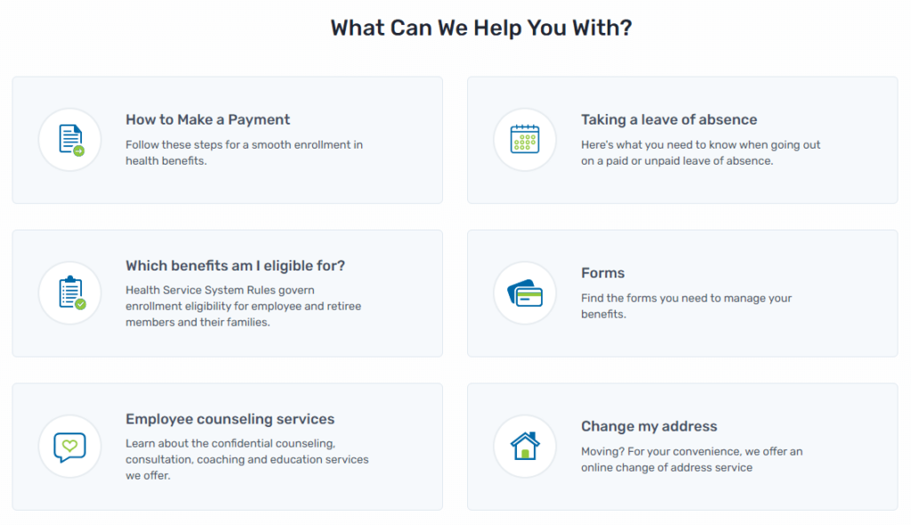
The San Francisco Health Service System's effective FAQs (shown in this screenshot) make it a top example of great healthcare website design.

Great design anticipates needs. The San Francisco Health Service System’s homepage excels at providing relevant, helpful prompts to guide visitors. Its FAQs encompass the six most common reasons why a visitor may need their services. Each FAQ then directs visitors to an accompanying page that provides them with useful information. 

This design is also mindful of visitors’ time and mental state. People searching for medical assistance might be feeling stressed or anxious, making it critical that you answer their questions and concerns quickly.

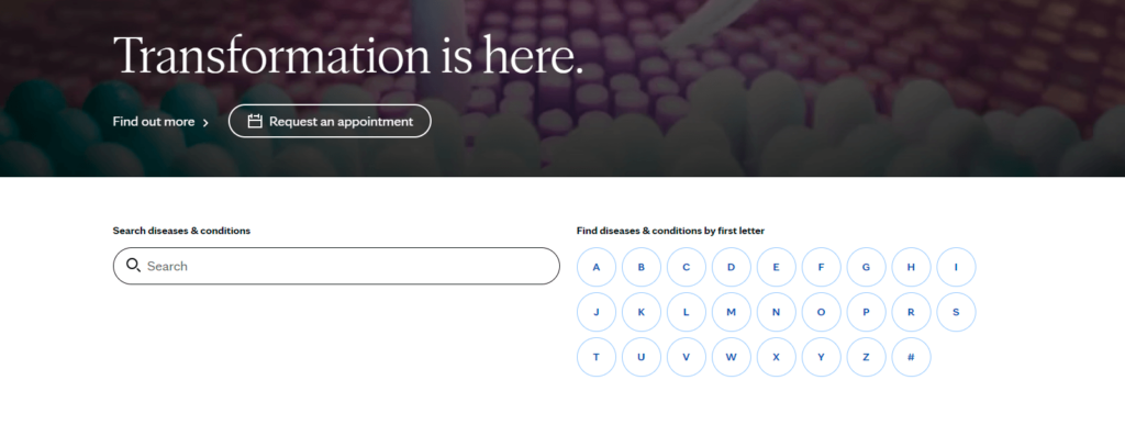
This screenshot captures the Mayo Clinic’s internal search feature within its healthcare website design.

As the number one hospital in the U.S., the Mayo Clinic provides accessible web design that assists visitors’ road to recovery. One feature worth spotlighting is its comprehensive internal search that prompts visitors to find the right resources for their circumstances. 


For example, a visitor may enter “kidney disease” into the search bar. Then, the results page would direct them to related articles such as Chronic Kidney Disease or Lupus. From there, visitors can discover the diagnosis and treatment options, or make an appointment.

3. High performance: The Linked Immunisation Action Network

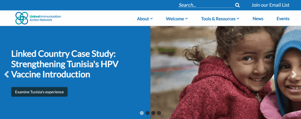
The homepage for Linked’s website

The Linked Immunisation Action Network (Linked) is a healthcare organization that helps identify challenges and best practices to improve immunization programs in middle-income countries. Because it often works in areas with poor internet access, the organization must offer its audience a high-performing, fast-loading website. 

To improve its site performance, Linked turned to the web design experts at Kanopi for help. We updated the homepage to reduce load times by replacing the hero carousel with a more streamlined version. We also enhanced the Tools & Resources section with straightforward content pathways, filters to improve internal search, and improved visual design. 

As a result, the site’s desktop and mobile performance improved—the mobile performance jumped by an average of 13 points, which is crucial for practitioners working in the field. 

4. Accessibility and navigability: The Colorado Health Foundation

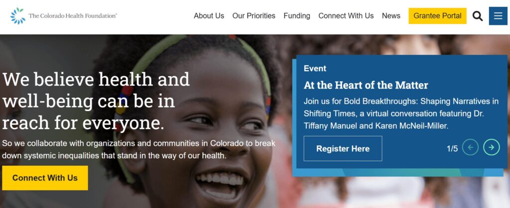
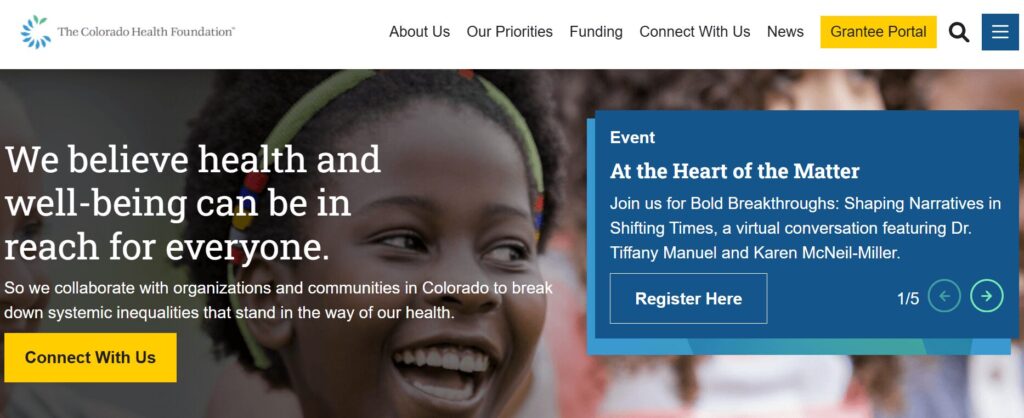
The CHF website homepage

The Colorado Health Foundation (CHF) is a state organization devoted to improving the health of all Coloradans. To make its services equally accessible to everyone in the state, it needed to improve its site’s user experience and ensure its mission was front and center.

CHF worked with Kanopi to make these necessary changes. We used discovery work and heatmaps to understand how users navigated the site. Then, we made strategic navigation fixes based on the areas users interacted with most. We streamlined the main menu to just six primary items to reduce complexity. 

In addition, we helped the organization create a data display to demonstrate accountability in their pursuit of racial justice to achieve health equity. This element helps increase audience trust in the organization’s mission.

Because of our enhancements to navigation and design, the site now scores a high 95/100 on Lighthouse (a report that measures a site’s accessibility level). 

5. Spotlighting personnel: Global Brain Health Institute

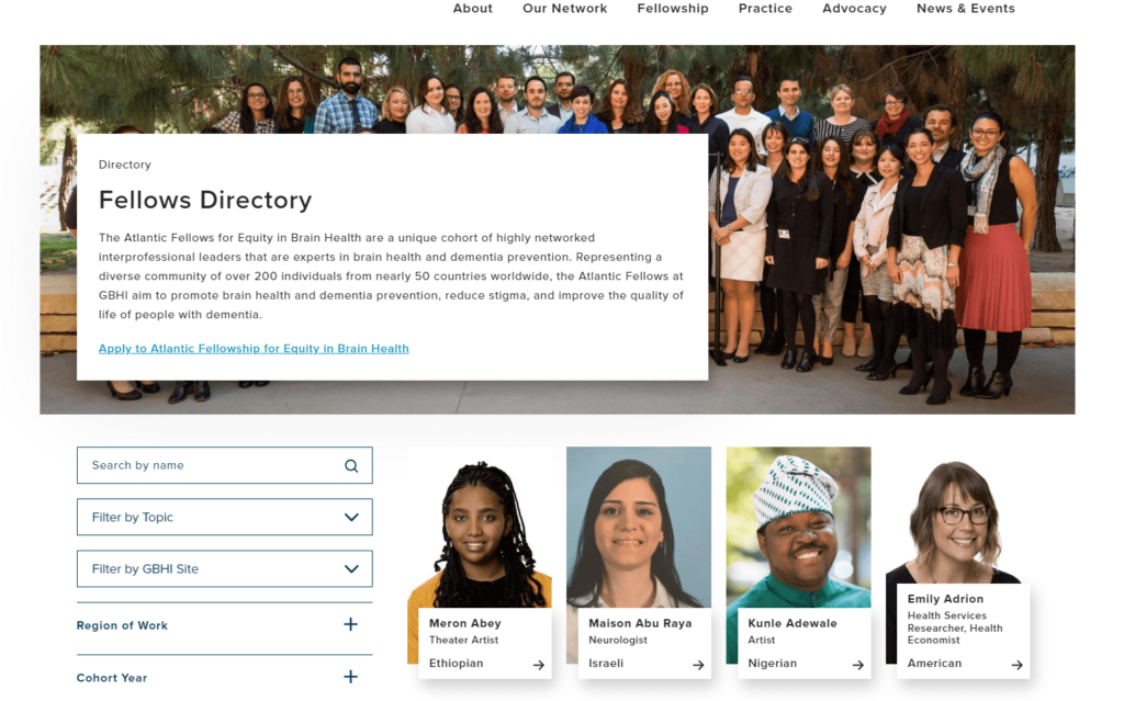
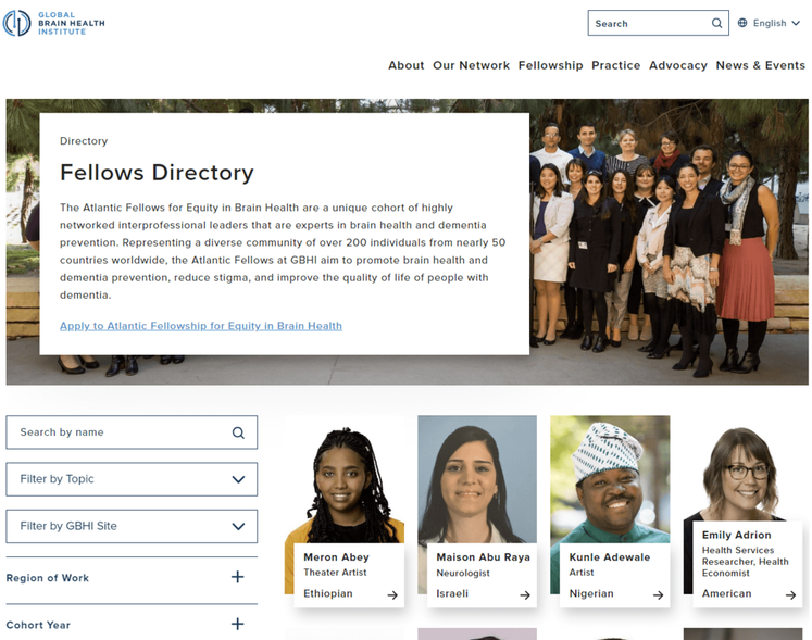
This image pictures the Global Brain Institute’s fellows directory as an example of effective healthcare website design at work.

The Global Brain Institute’s fellows directory is a great example of connective design at work. Its comprehensive directory spotlights interprofessional leaders that are experts in brain health and dementia prevention. The page allows visitors to search by name, and filter by topic, region, or cohort, so visitors can connect with fellows and/or apply for the fellowship. This well-designed page acts as a promotional tool as well since visitors can observe the caliber and variety of the fellowship body. 

6. Useful CTAs: The Cleveland Clinic

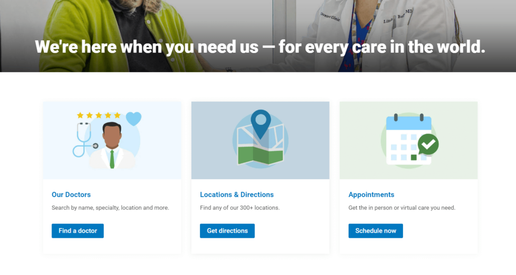
This screenshot shows The Cleveland Clinic’s smart use of clear CTAs within its healthcare website design.

The Cleveland Clinic’s welcoming design assures visitors that their organization is ready to meet their needs. Just below this home page tagline, visitors can access three main resources to meet their needs—doctors, directions, and appointments. 

These sections are known as CTAs (calls to action) and invite visitors to take the next action to complete their website journey. For instance, if a visitor clicks “Locations & Directions” they are led to a page where they can enter their location and find one of the 310 clinics that is closest to them. Google Maps then provides visitors a glimpse of their route so they can best prepare. 

7. Inspiring testimonials: Boston Children’s Hospital

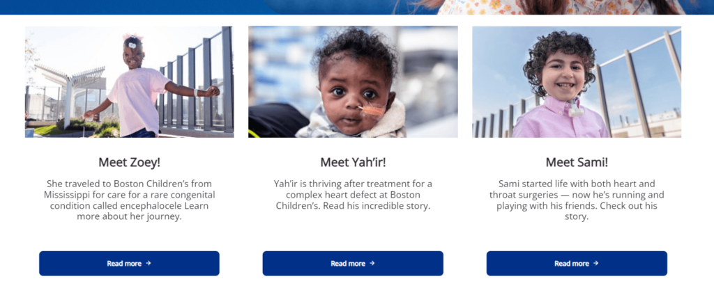
This image pictures inspiring testimonials from the Boston Children’s Hospital that capture a personal approach to healthcare website design.

Your healthcare organization probably does some incredible work. Take a page out of the Boston Children’s Hospital’s book and highlight your work through inspiring testimonials. Their web design is personal as it introduces visitors to children who have recovered from necessary procedures. Each child is pictured and has a link for visitors to learn more about their story.

Visitors who find themselves on this page are most likely parents who are anxious about their child’s health. This design approach makes them feel hopeful and increases their trust in this organization’s capabilities. 

8. Incorporating visitor feedback: CDC

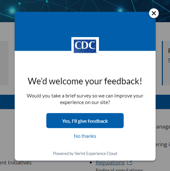
This screenshot pictures the CDC’s responsive healthcare website design that invites visitors to provide feedback.

The Centers for Disease Control and Prevention (CDC) website design thoughtfully acknowledges user experience. Its built-in survey encourages visitors to provide feedback so that the CDC can offer the best online experience. 

Additionally, the CDC’s web design policies take user communication preferences into account. Their policies stipulate that they are committed to using plain writing, so users can find what they need without having to interpret medical jargon. 

9. Bold, consistent branding: National Women’s Health Network

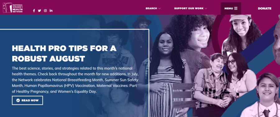
This screenshot shows the National Women’s Health Network’s bold healthcare website design branding.

A well-branded site makes your organization stand out and boosts your credibility. The National Women’s Health Network is a great example of effective online branding at work. The site’s colorful collage of women highlights its target audience and invites visitors to explore the organization’s mission, vision, and values.

Colorful titles also help break up the content and guide through the homepage’s main sections. This way, visitors can assess the homepage quickly and easily without excessive scrolling or losing interest. 

10. User-friendly content: BetterHelp

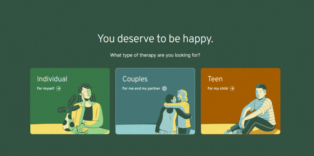
This screenshot illustrates BetterHelp’s user-friendly healthcare website design.

As the world’s largest online therapy service, BetterHelp sees many visitors who desire to connect with licensed professionals. Its user-friendly design addresses visitors’ desires through clean, organized page content. 

The first three home page CTA options give visitors a choice to find help for themselves or their loved ones. Then, the visitors are directed to complete a questionnaire that recognizes their needs and offers relevant help.

11. Member-exclusive benefits: Eye Recommend

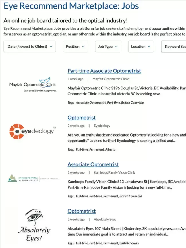
Eye Recommend’s Job Marketplace is shown

Many healthcare organizations thrive on member involvement, including Eye Recommend. Eye Recommend is a professional group for independent optometrists in Canada. Its goal is to empower members with technology, services, and resources to expand their clinics. 

Eye Recommend partnered with Kanopi to strategize the best ways to bring valuable, exclusive content to their members. Ultimately, we helped their team create a convenient online job marketplace where members can easily browse open positions. Members can filter listings by location, allowing them to find roles within their local area. Features like this, in addition to a user-friendly internal search function for the organization’s full website, provide clear value to members and improve the user experience. 

12. Data-driven storytelling: The Gates Foundation

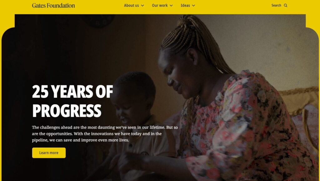
The Gates Foundation website homepage

The Gates Foundation, founded by Bill Gates and Melinda French Gates, is one of the largest philanthropic foundations in the world. Its website tells the story of the organization’s initiatives, including fighting poverty and disease and sparking innovations worldwide. 

The foundation’s website leverages many powerful case studies and impact statistics to illustrate its international positive impact. Users can easily browse through examples of the organization’s work, categorized by location and strategy used. 

Maintaining Your Healthcare Website Design Over Time

An effective healthcare website isn’t static; it must change and grow over time to continue meeting your community’s needs.  

We’ve compiled a list of the most common healthcare website design maintenance considerations, adapted from our guide to website maintenance for nonprofits. Ask yourself the following questions to continually assess your website and maintain it over the years: 

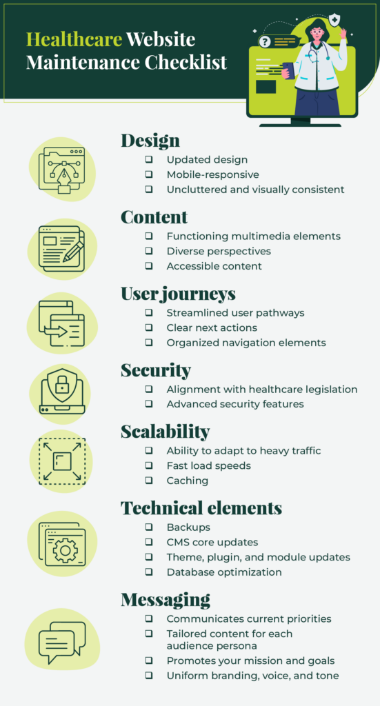
An abbreviated version of the healthcare website design maintenance checklist (explained in the sections below)

Design

  • Is your design outdated?
  • Does your design effectively adapt to mobile screen sizes?
  • Is your design cluttered or visually inconsistent across pages?

Content

User journeys

  • Do you have clear user pathways for your core audiences?
  • Does every user have clear next actions they can take on your website to find the information they need or get involved on a deeper level with your healthcare organization, whether through volunteering, donating, etc.?
  • Are your navigation elements (like your main menu) and CTAs aligned to drive user engagement? 

Security

  • Does your website have any security vulnerabilities that need to be addressed?
  • Does your website align with healthcare legislation including HIPAA and HITECH?
  • Does your website leverage advanced security features like SSL to maintain compliance?

Scalability

  • Can your website’s network effectively scale up and adapt to heavier traffic loads?
  • Is your code optimized to facilitate fast load speeds? 
  • Does your website have caching mechanisms to improve load speeds for subsequent visits?

Technical elements

  • Do you need to conduct any of the following technical maintenance tasks?
    • Backups
    • CMS core updates
    • Theme, plugin, and module updates
    • Database optimization

Messaging

  • Does your website accurately reflect your healthcare organization’s current priorities?
  • Does your website have content and messaging that appeals to every audience persona?
  • Does your blog content promote your organization’s mission and goals? 
  • Do all website pages reflect your organization’s branding, voice, and tone?

Approach website maintenance as a continuous, ongoing process, rather than a major task you complete every so often. It can be helpful to work with a professional web design firm to support your website over time so it doesn’t lose traffic or face security issues. 

Work with Kanopi to Bring Your Healthcare Website Vision to Life

Here at Kanopi, we support healthcare organizations with a continuous improvement approach

We do more than just security patches and software updates—our designers and developers act as strategic partners to support your website with a clear growth plan and adaptive execution. Whether your site is a new online resource or an established healthcare website, we can provide the ongoing, reliable support you need to reach your goals. 

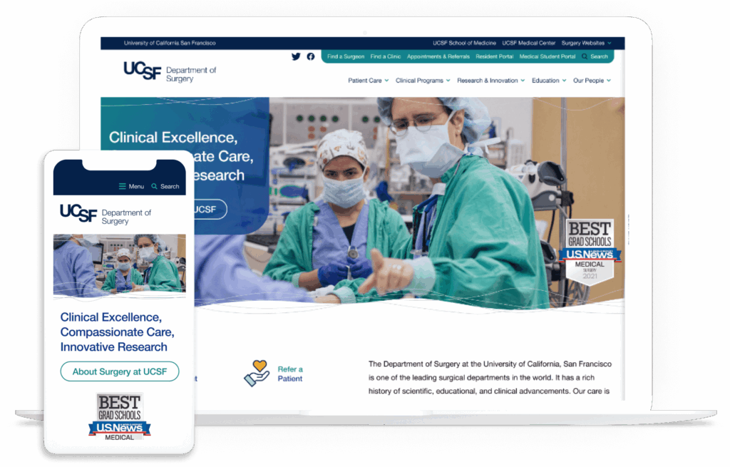
Check out our work with the Department of Surgery at the University of California, San Francisco, for an example of how we leverage our design expertise for our healthcare clients. The department needed a website that reflected its rich history of scientific and clinical advancements. However, it was saddled with an overly complicated configuration of 80+ domains for different topic areas and a proprietary CMS that didn’t offer an easy way to navigate between these domains.

Through deep discovery work and prototypes, we evaluated how users interacted with the site to identify key improvements to the user experience. We migrated the site to Drupal, simplifying domain access and preserving consistency. We also infused the site with human-led imagery and mobile accessibility.

The desktop and mobile versions of the UCSF website after working with Kanopi’s healthcare web design team

This project won a W3 Award for Best User Experience and a Web Excellence Award for Health Care Community and Health Care Services

No project is too large or complex for our web designers. Interested in collaborating? Check out our work.

Additional Web Design Resources

Kanopi Dev Team Jumping

How to Evaluate a Web Design Proposal

Pushing a rhinoceros up a hill.

Cleaning a frat house the morning after a homecoming party.

Evaluating proposals to choose a new website design & development agency.

If you’ve ever had to perform the latter task on behalf of a mission-driven organization, you know firsthand that it can seem every bit as difficult as the others on that list. It’s one of the most critical investments an organization can make. Done correctly, it’s also one of the most time-consuming. 

As with most things, there are best practices you can adopt that will guide you to better results. UK-based creative digital agency Crucible recently published an insightful blog post with tips on how to effectively evaluate a web proposal, which we highly recommend reading.

On top of the standard evaluation criteria, mission-driven organizations frequently have additional factors they need to consider. In this post, we’ll share the most important questions your organization should be asking as part of your due diligence.

(And if you’re still trying to write your RFP, we have a blog post with an RFP template for website projects to help guide you through the process, as well as a post about why strategic planning before the RFP is key.)

1. Does the agency understand your mission and goals?  

A strong proposal begins with a deep understanding of your organization:

  • Rather than just pitching generic services, look for signs that the agency has taken the time to truly understand your organization’s goals.
  • This includes both the full scope of work and the broader purpose of your website — whether it’s to inspire action, increase donations, or engage members/leadership.  

The best agencies will ask thoughtful questions during the proposal phase and reflect your priorities in their responses.

2. Do your values align?

For mission-driven organizations in particular, this is fundamentally important:  

  • Does the agency demonstrate a commitment to causes similar to yours?  
  • Are they mission-driven themselves, or do they approach projects solely from a commercial standpoint?  

An agency that shares your values will often bring more passion and insight to the project. 

3. Are they specialized in your field (but not too specialized)?

However, sometimes when you work with an agency that specializes exclusively in one specific vertical, you end up with a cookie-cutter design; this is why it’s also important to make sure their experience isn’t too narrow. Diversity in an agency’s portfolio is a sign of broader expertise and fresh ideas.

4. What’s their track record? 

Take a good look into their history and stability:  

  • How long have they been in business? An agency with many years of experience often brings a level of expertise that newer firms lack.
  • What are their employee and client retention rates? High retention is a strong indicator of a reliable, well-run agency.
  • What social proof validates their experience? Look for client testimonials, case studies, and ratings on platforms like Clutch.co, where reviews often provide detailed insights about an agency’s reliability, communication, and impact on similar projects. Have a gander at ours, for example.

5. Can they deliver the basics?

Before you fall in love with a proposal, ensure it meets your foundational needs:  

  • Timeline: Is it realistic for your organization’s schedule?  
  • Budget: Does it align with your financial constraints?  
  • Scope: Does it comprehensively address your requirements?  

Think of this as the Maslow hierarchy of needs for your project. After all, for your website to shine, first it needs to work!

6. Whom will you be working with day-to-day?  

This is a big one. You’ll work most closely with the agency’s design & dev teams, not their sales or marketing reps. So, ask to meet the people who will actually handle your project:  

  • Project Manager: Your primary point of contact.  
  • Designer: The person responsible for the website’s look and feel.  
  • Developer: The individual who will bring the design to life.  

Also ask how they intend to handle staffing requirements:

  • Full-time employees tend to have a more vested interest in the agency’s mission, and are familiar with their team members and internal processes; this often allows them to work more efficiently. 
  • Relying on contractors allows the agency to hand-pick specific skill sets for your project needs — but as hired guns, they may not be as invested in the project or the overall mission.

One more point: if they plan to use full-time staff, clarify if they’ll need to hire additional people. If so, ask how long their onboarding process usually takes. Not that this should be a dealbreaker; but knowing these things at the outset prevents surprises down the road.  

7. Do they have really great skills? 

Napoleon Dynamite’s astute observation about girls should also be true for your selection process. At least when it comes to technical skills. Bow-hunting, not so much.

Again, even the most beautiful website can fail if it doesn’t perform well. Run their sample websites through tools like Google Lighthouse to evaluate:  

  • Accessibility: Does the website work for users of all abilities?  
  • SEO Performance: Will it rank well in search engines?  
  • Code Quality: Is the website fast, secure, and maintainable?  

8. Can they provide realistic references? 

Any agency can provide glowing testimonials. Instead, try asking for a reference about a challenging project:  

  • What went wrong, and how did they resolve it?
  • Did the client remain with them afterward?  

Their answer will reveal a lot about how they handle obstacles and maintain relationships. It’s the reason this question is a standard part of job interviews. 

9. What happens after launch?

Websites aren’t static. They need ongoing care to function optimally and ensure longevity — and provide maximum value for your investment. That’s why it’s essential to ask any prospective agency these questions:  

  • Do they offer post-launch support or enhancements?
  • Will they help your site evolve as your needs change?  

F.W.I.W., here at Kanopi we believe that a website should look and work great on launch day — but it should look and work even better years down the road. Continuous support is not an add-on for us; it’s a core service. This is why the websites we design, build, and support regularly last 10 years or more. Just thought we’d put that out there. 😉

Strictly for the Drupal

Since this post is all about questions, we have one for you: 

Is your organization looking to build/rebuild in Drupal? 

If so, you’re in luck. The Drupal Association has created this helpful template & guide to help organizations in search of a Drupal Certified Partner write an effective RFP tailored specifically for, you guessed it, Drupal. 

And make no mistake about it, Drupalites, you do not want to mess around with providers who aren’t certified. Unless you enjoy living in a prolonged state of rage and tears while spending lots of money to fix problems caused by incompetence. (Did I neglect to mention that we’re one of just 100 Drupal Certified Partners in the whole wide world?)

In fact, we recommend that you check out the template & guide even if your site isn’t Drupal. Its structure and content will prove useful for anyone writing a website RFP.

You’re picking a partner, so make it a good fit! 

Particularly for mission-driven organizations, evaluating a web design proposal is about more than picking the cheapest or fastest option. It’s about finding a partner that truly believes in your mission and will create a website that supports your goals. By asking these vital questions, you can ensure that the agency you choose is the right fit for your organization — which hopefully means you won’t need to push that rhino up the hill again for a very long time.  

Need more guidance? Feel free to reach out — at Kanopi, we’re here to help mission-driven organizations like yours succeed.

Close up of circuits and switches

The Power of Component-Driven Design

It’s been a stressful, harrowing quest — but at last, after all the tears, sweat, occasional rage and countless revisions, you can gaze at your screen with contentment and relief.

 After all, you’ve finally achieved a homepage design that’s nothing short of perfection: 

  • The brand expression is subtle but dynamic. 
  • Calls-to-action are irresistible as catnip to my two needlessly anxious cats.
  • All of which is served up with imagery worthy of the Louvre. 

Now, all that remains is to design some engaging, human-centric service pages. 

Sadly, this is where your weeping begins anew — as you now realize that functional issues have rendered your splendid visual design completely & utterly useless:

  • The lovely callout banners you’ve designed won’t accept more text without breaking.
  • Images are distorting and peoples’ faces are getting cropped.
  • The row that was built to hold four cards now needs to accommodate five.

Dear friends and readers, we’ve witnessed this scenario more times than we can count. And it’s exactly why, here at Kanopi, we focus on designing and building with web components.

The modular way to ensure your design works — always.

Strip away the visual styling and most web pages can be broken down into a few distinct content areas: 

  1. Navigation
  2. Main headline
  3. Body copy, including subheads, lists, and sidebars
  4. Collections of images
  5. Calls-to-action/pathways to take next steps.

These building blocks form the foundation of a reusable component library that can be combined and customized to create various types of pages. For example, a photo gallery page might only need a few components, whereas a longform article could require many. From the early stages of design and content strategy, we carefully plan the components a site will need and ensure they are designed to fit together seamlessly, enabling the creation of diverse and flexible layouts.

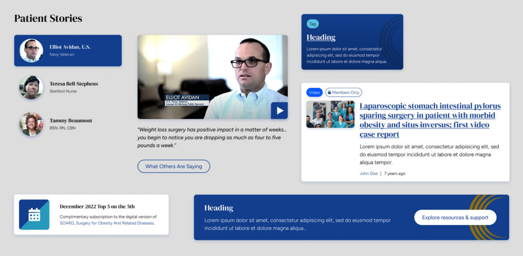
Design components from the American Society for Metabolic and Bariatric Surgery website

Examples of components:

  • Page headers and heroes
  • Card rows
  • CTA banners
  • Media galleries
  • Testimonials
  • Subnavigation and link lists

Ideal for websites of any and all sizes.

This is true even if you’re starting with just a single landing page. After all, what if you need to duplicate that page with variations for different audiences? Does the page lead to a form and link to ancillary pages like privacy policy and terms? Starting with components gives you the power to scale faster and more predictably than figuring it out as you go.

Modular doesn’t mean boring.

One of the coolest things about designing with components is that they allow us to create variants. Variants allow us to extend a component with different presentation styles, such as alternative color schemes, distinct text formatting, or layouts that switch between columns and rows. Even with all these different styles, the basic structure of the content stays the same, making it easy to read. This balance lets us keep the message consistent while adding variety, so each component fits the content just right.

The hero component we developed for Exploratorium uses variants to open up a universe of options for media display and content formatting.
The hero component we developed for Exploratorium uses variants to open up a universe of options for media display and content formatting. 

Even more component benefits:

1. They align design and development.

If there’s one thing computers are good at, it’s duplicating things. Websites are coded in reusable blocks, so designing and planning content in similar blocks leads to a smooth handoff to developers. And since components live in a central library, a change only needs to be made in one place to propagate through the entire site. This is much simpler and less error-prone than making the same change manually in a thousand different places, wouldn’t you agree?

2. They simplify accessibility and quality assurance testing.

Teams can conduct preliminary accessibility and QA testing on components as they’re developed — making later rounds of testing faster and easier. No need to worry about whether a link is large enough or colors contrast adequately if those considerations have already been built into the component and its variants.

3. They’ll save you a bunch of money.

Of course, I saved the best part for last: components make estimating more accurate by breaking design and development deliverables into manageable chunks. Throughout the project, they act as guide rails to keep efforts on track and within scope, while also serving as a framework for content strategy and copywriting.

Looking for examples? We’ve got plenty.

As I mentioned, here at Kanopi we design all our websites using components, so feel free to check out virtually any of our case studies. However, if you’re curious to see our coolest examples — the ones that showcase the true potential of component-driven design — check out these sites in particular:

If you’re ready to explore the potential of component-driven design, our team is here to help you create a gorgeous-looking website that also works seamlessly for your needs. Even if you’re just curious about how your site could be reimagined with components, we’d love to hear from you.

9 Standout Hospital Web Development Examples & Expert Tips

Your hospital web development is vital to modern patient care in the digital age.

With 89% of patients in the U.S. Googling their health symptoms before going to the doctor, your hospital website is essential to serving your community’s needs and providing accurate, trustworthy information.

Your website serves as a virtual front door for patients and potential visitors, providing them with essential information about the hospital’s services, specialties, and facilities. A user-friendly structure and design instills credibility and enhances the patient experience by allowing easy access to critical details, such as appointment scheduling, contact information, and directions. 

To develop your website effectively and ensure it supports your community, we’ve created this guide, which covers: 

Why Medical Website Development Matters

Before someone goes to the doctor, they’ll likely browse through a couple of physicians, make sure they’re in their healthcare network, scroll through times for an appointment— and do it all online.

People also turn to your website to answer medical queries, get updated on recent healthcare news, donate to your institution, and access an online health portal where they can update appointments and pay bills. A well-developed site helps to:

  • Craft a recognizable, highly reputable brand. If your hospital website doesn’t exist or contains outdated resources, it’s more than likely that people will take one look at it and deem your institution unreliable.
  • Differentiate yourself from other hospitals. A well-designed website communicates your commitment to patient-centered care, innovation, and technology, which can set you apart from competitors.
  • Build customer loyalty. To build customer/patient loyalty, your website needs to establish itself as a reliable medical web resource so that individuals can use it to make appointments, contact doctors, and pay bills.
  • Offer 24-hour patient communication and information. Your website provides patients with important information and resources outside of normal office hours. 
  • Simplify marketing for hospital events and needs. Use your website to promote hospital events, streamline donation appeals, and attract more patients.

While it may feel daunting to get started with hospital web development, it’s a worthwhile investment. Improving your online presence is the first step toward attracting and retaining more patients.

Features to Include in Your Hospital Website

Whether someone is coming in for a quick check-up or a visit to the ER, your hospital website is an integral part of their journey. To ensure it serves your community to the best of its ability, your website needs these specific site features: 

  • Simple navigation and menus
  • A list of services your hospital provides
  • Appointment booking tools
  • Contact details
  • Interactive advanced search functionality
  • Doctor/team information
  • AI-powered chatbots to answer patient questions and personalize the visitor experience
  • A secure, PCI-compliant online payment portal 
  • Blog/news/press releases about your hospital
  • Description of departments
  • Medical advice
  • Feedback forms (including surveys and polls) 
  • Hospital directions and parking information
  • Telemedicine functionality (such as patient portal login pages or scheduling resources)
  • Mobile-responsive design

Use these features as a checklist to ensure your website is a comprehensive resource for your patients, staff, and community members.

Top Hospital Web Development Examples and Best Practices

The best way to determine if your hospital website is up to par is to look at other successful sites. Review these hospital website examples to inspire your web development efforts:

  1. Simple navigation: Global Brain Health Institute
  2. Clear CTAs: Mayo Clinic
  3. Patient-focused design: UCSF Department of Surgery
  4. Consistent, bold branding: Cleveland Clinic
  5. Accessibility: Mount Sinai
  6. Inclusivity: Northwestern Medicine
  7. Mobile-friendliness: Johns Hopkins Medicine
  8. Accurate, updated information: Yale New Haven Hospital
  9. Streamlined user experience: Colorado Health Foundation
This screenshot of the Global Brain Health Institute’s fellowship directory stands out for its simple hospital web development.

The Global Brain Health Institute (GBHI), an organization dedicated to protecting the world from brain disease and other health threats, wanted to ensure that visitors could easily navigate their site and locate different programs, services, and projects. 

As a result, they worked with Kanopi to add a navigation bar that is logically organized and prominently placed throughout the website, so users can quickly find what they need. The site also features a fellowship directory that includes a search bar and filters. This is useful for medical students interested in pursuing a fellowship in a particular specialty, as well as for patients who want to learn more about the expertise of the hospital’s staff.

Why simple navigation is essential for hospital websites: As soon as someone lands on your hospital website, they should be able to find the content or service they seek. To ensure your site is easily navigable, consider mapping out the patient journey to better understand how people get to your site and what they do once they get there.

2. Clear CTAs: Mayo Clinic

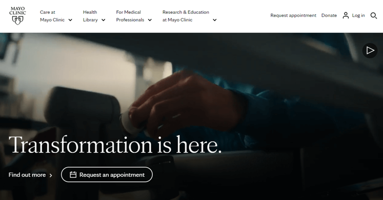
This screenshot of the Mayo Clinic’s homepage shows how to effectively incorporates CTAs into hospital web development.

The Mayo Clinic is a nonprofit academic medical center, known for its expertise in many areas of medicine and for providing high-quality care to patients. Their homepage features multiple calls to action (CTAs) that encourage visitors to schedule an appointment, donate, or learn more about a particular medical condition or procedure. 

By including clear CTAs on their website, the Mayo Clinic helps visitors understand what medical services they provide, what treatments are available, and how to seek help if they need it.

Why clear calls to action matter for hospital websites: Carefully-placed CTAs let website visitors know exactly where and how to complete their intended action. As you create your own, consider the specific actions that you want visitors to take. Then, use clear and concise language to convey your purpose. For example, you might say “Schedule an Appointment Today” or “Learn More about Our Cancer Center.”

3. Patient-focused design: UCSF Department of Surgery

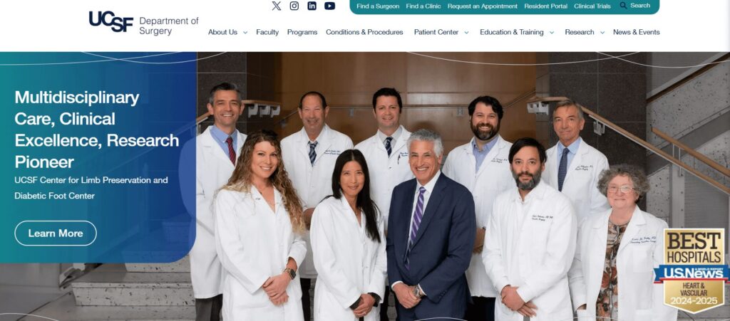
The UCSF Department of Surgery website homepage

The Department of Surgery at the University of California, San Francisco (UCSF) is a leading surgical department with a rich history of research and scientific advancements. UCSF worked with Kanopi to create a positive, patient-focused website experience. We evaluated which site elements matter the most to users using deep discovery work and prototypes. 

As a result, we helped enhance this website with a variety of user-friendly fixes, including:

  • Simple domain access with consistency across topics and departments
  • Human-led imagery of UCSF doctors and videos highlighting the patient experience
  • A mobile-first approach with a responsive design

Why patient-focused design is essential for hospitals: Your patients are the heart and soul of your hospital, and appealing to their needs will help you maintain high audience engagement. Patients should feel welcomed and comfortable using your website and signing up for your services. A friendly, patient-focused design helps foster a sense of community. 

4. Consistent, bold branding: Cleveland Clinic

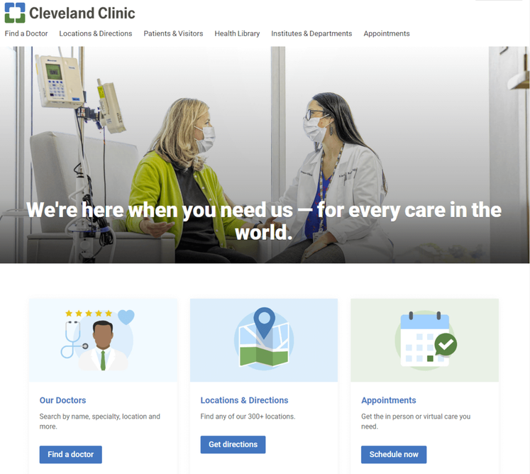
As seen in this screenshot of the Cleveland Clinic’s homepage, it’s important to use consistent, bold branding in hospital web development.

Cleveland Clinic is one of the top multispeciality academic medical centers in the country. To establish a strong, recognizable brand and reinforce their reputation, they included bold, eye-catching colors throughout their website.

Notice how all of the elements on their homepage are blue and green. When patients come across these colors in other mediums and materials, they’ll likely associate them with Cleveland Clinic. 

Why consistency and bold branding is important for hospital websites: Consistent branding builds trust between patients and your hospital, which can be especially important in the healthcare industry where patients often have significant concerns about their health and well-being.

Adding color is a popular medical website design trend, with vivid and deep colors being sported on many successful hospital websites. Consider your site’s color palette before diving into web development to make sure your website branding is consistent throughout its pages.

5. Accessibility: Mount Sinai

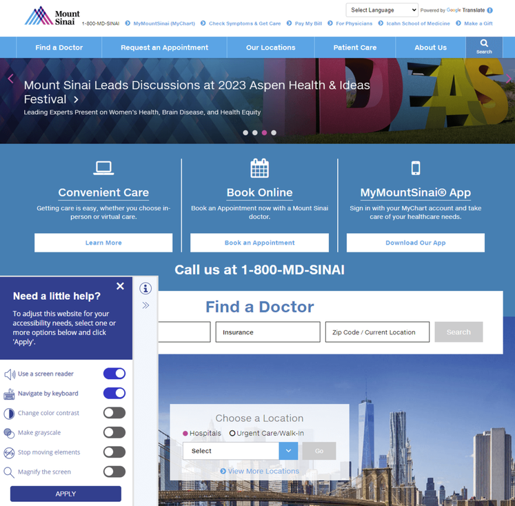
This screenshot of Mount Sinai’s homepage contains an accessibility tool, an important element of hospital web development.

Mount Sinai’s healthcare system prides itself on providing a wide range of services to diverse populations, including medical education, research, and patient care. To meet their patients’ varied needs, they prioritized creating an accessible website. 

The accessibility tool in the bottom footer allows visitors to use a screen reader, navigate using their keyboards, and change the color contrast, if needed. 

Why accessible design matters for hospital websites: Having an inaccessible hospital website will not only turn away those who might need your services the most but paints your entire establishment in a negative light. Because of the industry that you’re in, maintaining full compliance with the ADA and WCAG is essential. You want your entire community to feel accepted and at ease with your services, especially when it concerns medical care.

6. Inclusivity: Northwestern Medicine

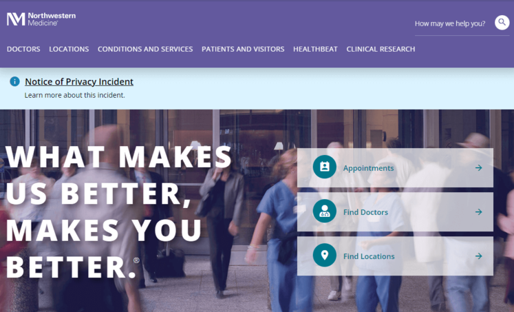
This is a screenshot of Northwestern Medicine’s website, which stands out for its inclusive hospital web development.

Northwestern Medicine has a number of hospitals, all of which are committed to providing inclusive care to patients of all backgrounds and demographics. Maintaining an inclusive website is important for Northwestern Medicine, as it allows them to better connect with their patients and provide them with the resources and care they need. 

Their Patients and Visitors page is extremely comprehensive, with CTAs that address a wide variety of concerns and questions. 

Why inclusivity is important for hospital websites: Your hospital website content needs to represent the voice of all of your users, whether it’s patients, frontline workers, researchers, or caregivers.

7. Mobile-friendliness: Johns Hopkins Medicine

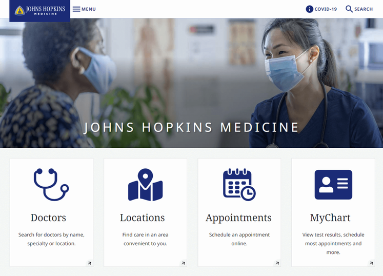
This is a screenshot of Johns Hopkins’ website homepage, which leverages mobile-friendly hospital web development.

Johns Hopkins Medicine is known for its world-class medical facilities, including hospitals, clinics, and research centers. As a leading healthcare provider, they needed to keep up with changes in technology by creating a mobile-friendly website. 

Their mobile-responsive site design allows patients to schedule appointments, access medical information, and communicate with healthcare providers, regardless of the device they’re using. 

Why mobile-friendliness matters for hospital websites: With over 60% of the global internet population using a mobile device to access the internet, your hospital web design must work on all different screen sizes. For patients or families already in the hospital or waiting room, the ability to quickly look something up on their phone or tablet is critical. 

Most content management systems (CMS) can create a mobile-responsive site automatically. However, there are some easy ways you can ensure your site’s responsiveness. For instance, use large buttons, a vertical layout, and avoid large chunks of text.

8. Accurate, updated information: Yale New Haven Hospital

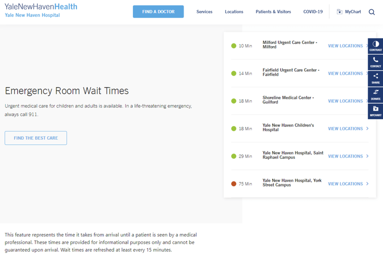
This screenshot of Yale New Haven Hospital’s homepage features emergency room wait times, an important aspect of hospital web development.

Yale New Haven Hospital provides a wide range of medical services to its local community. As with any hospital, their website needs to provide accurate and reliable information about their services, facilities, and medical personnel. That way, patients can make informed decisions about their care. 

Perhaps most notably, Yale New Haven’s homepage features emergency room wait times, informing patients where to seek care and what to expect when they arrive. 

Why accurate and updated information is essential for hospital websites: When it comes to healthcare, accuracy is non-negotiable. It’s critical that your web content is consistently updated and provides the most high-quality information available. 

9. Streamlined user experience: Colorado Health Foundation

The CHF homepage

The Colorado Health Foundation (CHF) is a statewide organization that aims to improve the health and well-being of all Colorado residents. The CHF partnered with Kanopi to clean up their site’s navigation and streamline the user experience. 

Based on our research and expertise, our developers instituted impactful changes. We condensed the main menu to a cleaner version focused on the items that matter most to users. We also improved the visitor journey by:

  • Ensuring consistent page layout
  • Incorporating translation support
  • Adding accordions to streamline page design with collapsable text
  • Building a data display to foster accountability for the organization’s racial and health equity goals
  • Enhancing accessibility with clearer fonts, tab navigation, and meaningful links

Why a streamlined user experience matters for hospitals: Patients visiting your hospital’s website may be rushed or anxious. A simplified user experience connects them with the information or resources they need quickly and seamlessly. 

Tips for Hospital Website Compliance

Your hospital website will likely have multiple services that collect and store patient data, whether that includes a health portal, appointment tool, or bill payment.

With this in mind, your hospital web development practices must follow regulations like the Health Insurance Portability and Accountability Act (HIPAA) and Health Information Technology for Economic and Clinical Health Act (HITECH):

  • HIPAA is an act created by the American government to protect patient data such as names, phone numbers, email addresses, social security numbers, and medical records.
  • HITECH extends HIPAA requirements to bring additional benefits and protection to patients. This regulation establishes that patients should always have access to their health information online, and if hospitals do have a data violation, patients should be notified immediately. Depending on the seriousness of the data breach, your hospital may also incur various penalties and fees.

To ensure your website and software solutions not only comply with HIPAA and the HITECH Act but go above and beyond to ensure data protection, you need the following safeguards:

  • Tech safeguards include encryption software, data backups, and firewalls. Assess the state of your current healthcare cybersecurity system to ensure you have the proper safeguards in place.
  • Physical safeguards include only granting access to material records or electronic devices with the aforementioned data after proper authorization.
  • Administrative safeguards include the guidelines your hospital sets up to ensure that internal procedures comply with HIPAA.

Once these safety nets are in place, add a privacy policy statement to your website explaining your commitment to HIPAA and HITECH compliance. Publicizing this statement will help you build trust with current and prospective patients.  

How to Maintain Your Hospital Website

Hospital website maintenance is crucial to ensure your site remains a high-performing, accessible, and convenient resource for your audience. Follow these best practices to future-proof and maintain your website over time.

Adopt a continuous improvement approach

Web Design Process Comparison

Traditional Waterfall Process

Strategy
Design
Development
Launch

Drawbacks

Rigid & Less FlexibleChanges are difficult and expensive once development begins.

Costly & Time-ConsumingLarge upfront investment with lengthy timelines.

Quickly OutdatedWebsite can become stale shortly after launch.

Growth-Driven Design Cycle

Benefits

Save Time & MoneySmaller initial investment with continuous improvements.

Always Fresh & RelevantContinuous optimization prevents site staleness.

Data-Driven DecisionsInformed improvements based on real user behavior.

Traditional website design and development takes a linear approach, with a clear pathway from strategy to implementation. However, a growth-driven, continuous improvement approach involves an ongoing, iterative process of:

  • Strategizing new website innovations
  • Implementing website changes to test your hypotheses
  • Tracking results and adjusting your approach based on feedback 

This perspective pushes you to constantly update your website based on evolving best practices. Plus, you can avoid major site overhauls, which can cost your organization time and money.

Update your website according to accessibility innovations

New accessibility innovations are released constantly, helping to improve the online experience for users with temporary or permanent disabilities. Intelligent eyewear, a hands-free mouse, and AI-powered assistants are just a few of the exciting innovations we’re seeing this year.

Your website maintenance process should include accessibility updates to ensure your site stays usable and functional for all users. Take the time to adjust to the impacts of the following potential changes: 

  • New assistive technology. Innovations in screen reader technology, AI assistants, assistive voice solutions, and other accessible technologies change how individuals interact with your web content. Make sure your website is structured properly, with clear navigation and heading structures, so it’s compatible with all assistive technology. 
  • Accessibility testing techniques. Alongside updates to assistive technology itself, the way web designers can test sites for accessibility constantly evolves as well. Stay up to date on the best automated testing tools available as well as techniques for manually assessing your site. Resources like Kanopi’s guide to accessibility testing can be a huge help because our developers use these tools every day to ensure the sites we build or refresh are completely accessible and compatible with assistive technologies. 
  • Changes to legal requirements. Laws like the Americans with Disabilities Act (ADA) and the Section 508 Amendment to the Rehabilitation Act govern web accessibility in the United States. Keep this legislation in mind as you refresh your website for accessibility. If you want to expand into new markets in other countries, be aware of their accessibility legislation to remain compliant. 

Here at Kanopi, we take a holistic approach to web accessibility, learning about your website’s visitors and their unique accessibility needs to build a strategy that works best for your organization. Learn more about our approach in this short video:

Conduct technical fixes

The technical elements of your hospital website play a major role in your users’ online experience. Technical issues can slow down your website and leave it vulnerable to security breaches. 

To keep your website in top shape, prioritize fixing the following technical issues: 

  • Broken links. Broken links can hurt your SEO performance and create a negative user experience. Use an automated tool like Semrush or Google Search Console to identify and correct broken links with mass updates. 
  • Security risks. Run core updates for your CMS and plugins or modules, encrypt sensitive data, require strong passwords for CMS users, and enable two-factor website authentication. In addition, host regular security training sessions with your team to ensure everyone is up to date with the latest security risks and best practices. 
  • Slow page loading speed. Measure page load speed using a free tool like Google’s PageSpeed Insights or Lighthouse. Common performance issues include large image files, unused JavaScript or CSS, and large network payloads. 

Set up recurring technical reports to get ongoing updates about your site’s health. Continuously monitoring your site and fixing performance issues will help you avoid smaller problems snowballing into major complications down the line. 

Update your content

Your website’s content equips your audience with the crucial medical information they need to make informed decisions about their health. Updated, accurate content helps raise your hospital’s authority level and gives more credibility to your institution. 

In your website maintenance process, make the following content updates: 

  • SEO updates. Use SEO tools like Ahrefs or Moz to keep an eye on your search engine rankings. If any of your website’s most important pages, like high-value blog posts or your homepage, start slipping in the rankings, make a plan to refresh the content to enhance its SEO appeal. For example, you could better incorporate the main keyword, add more engaging visual elements, or refresh the page with updated health information. 
  • Audience shifts. Your hospital’s core audience and their content preferences may change over time. New people could move into your coverage area with new online medical needs. Or, audience members may begin expressing interest in different blog post topics than what you normally cover. Pay attention to metrics like blog post engagement rates, time spent on each page, and audience demographics to ensure your content aligns with your audience’s interests and needs. 
  • Interactive content additions. Interactive content is on an upward trajectory right now as more consumers seek out these engaging online elements. Interactive content can also lead to 2x the conversion rate of passive (or static) content. Find opportunities to incorporate this content into your hospital website, whether through online health assessments, quizzes, maps, surveys, or polls. 

These content updates and the website maintenance process in general are most successful when working with a dedicated web development partner that has expertise and experience in maintaining websites like yours. Read on for an inside look at how the Kanopi team approaches hospital web development support. 

How Kanopi’s Hospital Web Development Services Can Help

Partner with a website support and development agency to ensure you’re doing everything possible to improve your hospital website.

Kanopi is a top partner for hospitals with a continuous improvement team that has helped develop over 150 active sites. No matter what stage your hospital website is at, our team can conduct a full website redesign project or build it from scratch. 

Here are our services:

  • Content management system support tailored to user needs—whether you use Drupal or WordPress as a CMS, we have experts who can customize each platform to align with your organization’s needs and branding.
  • Custom module/plugin development—if you can’t find the right tool to perform a specific action, our coding team can create it.
  • WCAG 2.1 AA accessibility standards to ensure that anyone can access and engage with your healthcare services as needed.
  • Custom integrations for an online health portal or other solutions that can expand your hospital website’s capabilities.
  • Responsive, mobile-first design because we know that your online hospital services should be accessible from any device, anywhere.
  • Technical SEO strategy and implementation so that if anyone looks up your hospital’s name, a specific doctor, or a program, your hospital website is the first option on the search results page.

Even after your optimized site is officially launched, we will continue working alongside your hospital to create a website growth plan. This ensures that your site is sustainable for as long as possible and will support your hospital as it evolves.

Check out our healthcare web development work to see our guidance and expertise in action.  

Screengrab of the on-demand webinar from Tim Tufts about the UCSF Department of Surgery project

Want to dig deeper into how Kanopi works with healthcare clients? To learn about how UCSF Department of Surgery and Kanopi worked together, check out our webinar “It Takes a Village: Managing a Large Community in a Website Redesign.”

Additional Resources

For more information on website development, check out these resources: 

AI-generated image of the number 2025 made our of three-dimensional glass in purple and blue hues.

Web Design Trends to Watch in 2025

How are we at the end of 2024 already? It feels like only yesterday that we were sitting right in this very spot asking, “how are we at the end of 2023 already?” 

In any case, here we are — which means it’s time for that one special holiday tradition specifically mandated by our Marketing department: our blog about which visual web design trends are going to be hottest throughout the coming year. Only this time around, we’re giving you, dear reader, the opportunity to weigh in as well. Do you agree with our predictions? Let us know below (and maybe next year blogs that incorporate surveys will be on everyone’s list of trends for 2026.)

As we move into 2025, design trends are blending innovative technology with a deeper emphasis on human connection. From dark mode and playful accents to an increased focus on inclusivity, the themes emerging this year underscore a balance between creativity and accessibility. This post explores the top design trends to watch, providing insights on how they can be applied thoughtfully to create engaging and authentic experiences for users.

Dark Mode Slowly Creeps Along  

Dark mode has become a standard on operating systems, but website adoption has been slower. While popular, dark mode design requires extensive adjustments to branding and color palettes, and often presents technical challenges. Until automation catches up, adding dark mode will remain time-intensive.

11
Web Design Trends to Watch in 2025 - Question 01

Do you agree? Will dark mode stick mainly to OS-level?

Is Minimalism Still a Big Deal?  

Minimalism’s clean aesthetic has become prevalent across a number of sectors. The fashion industry has been one prominent example. However, many brands are beginning to reconsider this approach, with some returning to traditional logos to avoid the blandness associated with certain minimalist styles. If you’re looking for an example outside the fashion industry, check out Microsoft’s new 3D illustration style with detailed lighting and translucent glass effects.

The key for brands is to align with their unique identity rather than chasing trends. As seen in high-profile rebrands like Burger King and Pizza Hut, success comes when brands stick with the visuals that truly resonate with audiences. 

10
Web Design Trends to Watch in 2025 - Question 02

Do you agree? Will more brands start keeping minimalism to a minimum?

Even More Inclusive People Images  

Inclusivity in visual media is evolving, with companies expanding representations to include disabilities, nonbinary identities, and various racial backgrounds. This trend moves beyond general categories to focus on individuality, showing a more nuanced human experience. Here’s our go-to list for finding inclusive images for your next blog or social post. 

10
Web Design Trends to Watch in 2025 - Question 03

What do you think? Has your organization become more inclusive in choosing the images that represent it?

Playful Accents 

Playful typography, ornamental elements, stickers and scribbles are seeing a resurgence, adding warmth and character to designs. Expect to see more ‘inflatable’ or ‘melty’ type treatments in packaging and branding. These organic elements bridge the physical and digital, reminiscent of creative touches like 2023’s Spotify Wrapped.

8
Web Design Trends to Watch in 2025 - Question 04

‘Inflatable’... ‘melty’... do you agree? Will playful accents continue to gain ground in 2025?

Return to the 90s and 00s 

The nostalgia for 90s and 00s styles has influenced fashion, packaging, and digital design. However, rather than simply imitating, brands should aim to capture the underlying spirit of those decades — focusing on authenticity and individuality.

9
Web Design Trends to Watch in 2025 - Question 05

Do you agree? Will styles continue to harken back to simpler, more flannel-y decades past?

Proof of Humanity  

In an era of rising digital distrust (hello artificial intelligence), brands need to show authenticity. This can mean avoiding generic stock photos in favor of real employee photos (which, trends aside, is something we’ve always urged our clients to do) and providing verifiable information to establish trust.

10
Web Design Trends to Watch in 2025 - Question 06

Does your organization prioritize using real photos instead of generic stock images?

Customizable UI  

User customization options are expanding, especially on platforms like iOS and Android, where users can personalize themes and icons. Young audiences are definitely embracing this trend, favoring platforms that allow for a tailored experience; however, it’s still too early to tell whether the OS trend will cross over to web design.

6
Web Design Trends to Watch in 2025 - Question 07

What do you think? Will the trend toward customizable UI carry over to web design in 2025?

Cool, But What About AI?  

AI in design is now mainstream but requires careful use, as AI-generated content very often needs to be refined by actual humans. While AI-driven photo editing is gaining ground quickly, it also raises serious questions about authenticity. Many companies now publish guidelines on responsible AI use, typically detailing their efforts to ensure transparency and accountability while addressing and mitigating bias.

Incidentally, our current policy at Kanopi is not to use AI in the generation of deliverables. However, we’re also keeping a close eye on developments in this area.

6
Web Design Trends to Watch in 2025 - Question 08

Would you say your organization is learning how to use AI intelligently?

Final Thoughts (for the next 11 months, at least) 

Design in 2025 will center on striking a harmony between the digital and the human, the bold and the soothing. By embracing these trends, brands can forge stronger connections with their audiences, combining aesthetic appeal with functionality and inclusivity. 

Finally, let’s be honest — by 2025, there will probably be more blog posts about ‘emerging design trends’ than there are actual trends. Just remember: for every new color palette, there’s a designer somewhere writing a thousand-word piece on why this is the year of ‘soothing yet bold’.

Wordpress Logo

Are WordPress page builders right for your organization?

Page builders are a great tool, but they’re not always the right solution. If you’re a small organization with minimal updates to your website — like changing your schedule or hours — page builders can be a fantastic option. They are simple, cost-effective, and user-friendly, which makes them a good choice for organizations with straightforward needs. 

Common WordPress page builders:

These are the ones we come across most frequently here at Kanopi:

  • Elementor
  • Divi
  • WP Bakery
  • Beaver Builder

Why people like page builders: 

One of the main reasons page builders are popular is because they save time and reduce costs. You don’t need a full development setup or specialized tools to get started.

Everything can be done right in the site’s interface, meaning there’s no need for code repositories (GitHub)or additional software licenses.  

Heck, you can even use a public computer at your local library to make changes. This simplicity means you don’t need developers to build and manage a site with a page builder. 

The trouble with page builders:

However, it’s hard to have it both ways; if your organization needs frequent custom updates, a page builder may not be the best fit. Page builders are often performance-heavy, which can slow down your site due to their reliance on plugins. And while they can be useful, they sometimes cause accessibility issues (see below) or limit flexibility. If you’re after a high level of customization or specific functionality, you might hit a wall with a page builder.

What about accessibility and performance with page builders?

Glad you asked: when it comes to accessibility and performance, page builders aren’t as “easy” and “worry free” as they may look.

Accessibility issues:

  • Semantic HTML: Page builders tend not to produce semantic markup. This can prevent screen readers from properly interpreting the content.
  • Keyboard Navigation: Page builders create very complex HTML for page and component layouts which can create barriers for keyboard navigation or even keyboard traps. Menus can be extremely complex, making it difficult to even navigate the menu with a keyboard, let alone a mouse. 
  • ARIA Attributes: Page builders do their best to utilize these but it is very easy to have them incorrect, or missing.
  • Color Contract: Color is managed by the content editor which gives them great power and control. However this also very quickly can lead to an inaccessible site as the color contrast can easily and quickly fall out of the range of accessible.
  • Focus state: Focus states are used by keyboard navigation. These interactive states can easily become mismanaged or used in page builders creating a disorienting experience for users.

Performance issues:

  • Bloated code base: As mentioned earlier, page builders typically have very bloated code, using a lot of markup to create simple layouts, and creating loading a large amount of JS and CSS on pages. This slows down page load time.
  • Large DOM size: to piggyback on the above, complex layouts and long pages can have a large DOM size due to the number of elements that it creates. This slows down the page load as you have to wait for all those elements to render
  • Render blocking: Because they can load a lot of resources, internal and external CSS and JS files, those external resources may not be managed properly blocking page load until those payloads are downloaded first.
  • Database bloat: Page Builders can store a ton of data in the database. Depending on your site size and host, this can drastically slow down your overall performance

In short: if you’re truly trying to build accessible, performant, websites there are still many things to work around and manage with the use of page builder tools.

(FYI: we’re big into accessibility here at Kanopi and write about it a lot, so please reach out of you have questions around this).

Moving Beyond Page Builders

We’ve worked with several clients to help them move from page builders to more sustainable, flexible solutions. Here are a few examples:

California Prevention Training Center (CAPTC) – Divi 

Issue: This website was over-engineered with Divi. We redesigned and overhauled the site, removing the unnecessary complexity of the page builder and improving the overall user experience and site performance. 

California Prevention Training Center (CAPTC) home page before we removed it from a Divi builder

California Prevention Training Center (CAPTC) home page after the rebuild

The California Prevention Training Center (CAPTC) website before (left) and after (right) moving off of Divi.

Carmanah – Divi

Current Status: The site was outdated and had an overly complex backend. The client came to us seeking a redesign, with a focus on improving performance and security. We’re migrating away from Divi, which will streamline the website’s backend, improve load times, and enhance the admin user experience.

The Carmanah home page

Adaptive Biotech – Elementor 

Issue: Over time, the page builder became a hindrance, especially with accessibility and content entry limitations. We rebuilt key components of the site using Gutenberg blocks and Advanced Custom Fields (ACF). This approach removes the need for the page builder and its plugins, improving site performance and reducing load times.

Adaptive Biotech website home page

DonorSearch – Visual Composer

Issue: The client couldn’t make content edits without breaking the layout. We rolled out a more manageable solution, using blocks within the editor and ACF to create custom blocks. This enabled a flexible redesign and content migration, with a focus on creating a dynamic, easily editable website. The new DonorSearch design also allowed for different content variations, so the site remains fresh and adaptable over time.

DonorSearch website before we reworked it off page builder

DonorSearch website home page after the redesign

The DonorSearch website before (left) and after (right) moving off of Visual Composer.

Final Thoughts

While page builders offer an easy, cost-effective solution for simple websites, they have limitations regarding scalability, customization, and performance. 

For organizations that need a more flexible, sustainable solution, moving away from page builders to custom-built sites using WordPress’s core features can make a significant difference. Whether you want to improve performance, accessibility, or content management, working with a development team to find the right solution is key.If you have any questions or issues with page builders on your WordPress site, we’re here to help. We’ve worked with numerous clients to solve page builder issues, and our team is ready to help you get the most out of your website — whether that means refining your current setup or transitioning to a custom-built solution.

Illustration with a smily face emoji being held by a hand. Common web symbols such as 5 star ratings and pins are overlapping.

Patient-first design for healthcare

As a designer who’s worked with many clients in healthcare services, I’ve seen the unintended consequences the pandemic has wrought upon website design throughout the industry. Providers were forced to stretch whatever resources they had to adapt to sudden and completely unprecedented new circumstances. Often this meant adding new online tools and functionality to their websites as quickly as possible, with no time or budget to devote much thought to the user experience. 

(Note: Short on time? Not much of a reader? No worries! Simply check out our TL;DR summary below.)

Even now, many patients still rely on virtual healthcare. Studies in both the US and Canada have shown online/virtual consultations with medical professionals and other healthcare services have remained much higher today than before the pandemic. For some patients, it’s simply their preference; however, in certain cases, it’s become the only option available. Whatever the reason, online services are now a permanent fixture in the healthcare delivery model. For providers, adapting to this new reality means embracing the concept of patient-first design.

Designing healthcare websites with a patient-first approach is essential to creating positive user experiences and promoting effective healthcare delivery overall. It not only enhances accessibility but also ensures that users can navigate the platform easily, find relevant information, and engage seamlessly with healthcare services.

At Kanopi, patient-first design begins at the user research phase. It involves discovering and defining the ‘pain points’ (no pun intended) with the current site’s user experience. Having worked with several healthcare clients, we’ve identified a few issues that keep popping up across a wide variety of websites for different healthcare services. I’ve listed some of these recurring pain points below, as well as the most effective solutions that we’ve devised for them.

Problem: The site is not designed for accessibility.

This is the most prevalent issue we come across. You’d be surprised at the number of healthcare websites that were designed and built with little or no consideration for their users’ accessibility needs. Just like physical buildings, websites also need to be accessible. And it’s especially important when your patients are visually and/or physically impaired in ways that limit their ability to use websites.

Accessibility concerns can range from minor sensory impairments to more complex neurological conditions. They even include temporary impairments — like a broken wrist, for example. 

We always recommend a full accessibility audit of your site before a redesign, and frequent accessibility checks after launch to ensure your site is always compliant. Here’s a comprehensive but easy rundown on how to test your site for accessibility. 

Being compliant with standards like Web Content Accessibility Guidelines (WCAG) not only allows more people to engage with your site, but also leads to better design and improved functionality for everyone.

Solutions:

Too extensive to list here, but here are some of the more common web accessibility solutions we implement for clients:

  • We check text contrast to prioritize readability, and meet a minimum 4.5:1 contrast ratio — and that text can be resized up to 200% without loss of content or functionality. We also use a minimum size of 12 points or 16 pixels for all body copy. This helps accommodate users with dyslexia and/or visual impairments.
  • It’s also to ensure our design adheres to laws such as Section 508 of the Rehabilitation Act, which organizations must comply with to qualify for federal funding.
  • Our designs also provide support for reduced-motion browser settings and allow users to play and stop animations as it suits them. This is to benefit the approximately 35% of adults aged 40 years or older in the United States (approximately 69 million Americans) who experience some form of vestibular dysfunction. It also assists users with certain types of cognitive disabilities.
  • This rule applies to jargon universally, but always avoid medical jargon when clearer language can be used. Not only is it easier for patients to understand, but your search capabilities should be able to provide the same results for both medical and laypersons’ terminology, e.g. “ophthalmologist” and “eye doctor”.

Problem: Patients need to find information quickly.

This is true for all sites and all users, but it’s especially relevant to healthcare, especially if there’s an emergency. If you’re looking for specific information about an illness or medical condition, it’s important that you can find it as quickly as possible. Unfortunately, too many healthcare sites are bogged down by convoluted sitemaps and subpar search functionality.

Solutions:

Problem: Patients need clear, actionable next steps.

This one goes hand-in-hand with the previous problem and is equally essential to keeping the patient journey free of obstacles.

Solutions:

  • Provide easily searchable clinic and physician listings with low-friction contact and scheduling.
  • Prioritize the content that’s most relevant to patients — i.e., keep it at the top. Any content intended for physicians or academic researchers should follow below. This is literally ‘patient-first design’. However, it always surprises me how many healthcare sites don’t follow this hierarchy.

Problem: Too many details up front (i.e. ‘getting lost in the weeds’).

This is a problem we commonly (but by no means exclusively) encounter with research hospitals. Bogging down your content with technical and operational details can be overwhelming and disruptive to the patient journey. Designing your website around your organizational chart is a primary example. It’s incredibly frustrating for patients who simply need to find relevant information as quickly as possible.

Solutions:

  • Create separate pathways for (1) the patient journey and (2) internally-facing administration and research information.
  • When writing medical staff bios, prioritize succinct, patient-focused info at the top — before listing professional details. For example:
    • Name and credentials
    • Practice locations
    • Contact and scheduling info
    • Professional recognition.
    • Types of insurance they accept

Problem: Patients seek concrete proof of credibility.

This is another common problem we see; the good news is that it’s also one of the easiest to fix. It usually doesn’t require any changes to your sitemap or page designs. It just takes a bit more diligent content curation.

Solutions:

  • Include patient testimonials and case studies wherever possible.
  • Include plenty of patient-focused, real-life imagery — and ditch the stock photos!
    • People want to be sure they’re looking at your actual doctors, staff, and facilities. In terms of design, few things erode your credibility faster than a stock photo on your site that patients have already seen elsewhere on the web. 
    • This also includes ‘stock-ish’ photos; i.e., actual photos of your facilities and people, but they’re so generic/ obviously staged/ devoid of personality that they may as well be stock.
    • A talented photographer will be able to compose and capture images that convey your high-quality patient care, professionalism, passion, and teamwork. Yes, 99% of the time stock is cheaper. But it also shows none of the above.
  • Also, make sure each person appearing in your photos has signed model release forms! Your marketing agency or professional photographer will usually handle this part. But you definitely don’t want to overlook this requirement, as it could lead to patient privacy violations and serious legal repercussions. 
  • Include your accolades — awards, rankings, partnership badges, etc. — and keep them current.

If this all seems like a daunting task, keep this simple fact in mind: referrals and search engines don’t provide much info. When patients need information about you, your website is typically the first place they’ll look. By prioritizing the user experience and considering your patients’ needs, your healthcare website can improve communication, promote health literacy, and ultimately contribute to better overall patient outcomes.

Want more interesting reads about web design for the healthcare industry? Check out these two blogs:

TL;DR: Ensuring Patient-First Design For Your Healthcare Website

ProblemYour website doesn’t meet patients’ accessibility needs.
Solutions
  • Large type, short blocks of text, and high color contrast. Must be at least WCAG Level AA to qualify for federal funding in the US.
  • Slow, subtle video and animation and support for reduced motion.
  • Avoid jargon; use clear, concise language.
ProblemPatients need to find information quickly, but your website doesn’t facilitate this.
Solutions
  • Lead with bold CTAs that prioritize important patient actions. Create specific pathways for different patient journeys (e.g.: pre- and post-procedure) to prevent patients from getting lost.
  • Include a distinct, dedicated Conditions & Procedures search (see our UCSF Surgery example)
ProblemPatients need clear next steps and ways to take action.
Solutions
  • Prioritize patient-relevant info at the top; professional / physician / academic info should follow.
  • Provide easily searchable clinic and physician listings with low-friction contact and scheduling CTAs.
ProblemTechnical and operational details are overwhelming and will disrupt the patient journey; e.g. designing your website around your org. chart.
Solutions
  • Keep separate pathways for the (1) patient journey and (2) internally-facing administration and research information.
  • Prioritize succinct, patient-focused info at the top of bios before getting into professional details. Example:
    • Name and credentials
    • practice locations
    • contact and scheduling info
    • professional recognition
ProblemPatients seek concrete proof of credibility.
Solutions
  • Include patient testimonials and case studies wherever possible.
  • Include photos, but no stock photos! Use actual, real-life patient-focused imagery instead. Make sure all photos posted on your site have signed model clearances as required.
  • Include awards, rankings, partnership badges, etc. — and keep them current.
AI generated illustration of a man designing a website and looking at a large monitor

Top trends in content & design for 2024

Around this time of year, we’re always asked one question — over and over, without fail:

“So, got any plans for the holidays?”

So let’s address this one off the top. Yes, we do have plans. And while our plans vary each year, they almost always involve solemnly swearing not to overeat… and then definitely overeating.

The next-most-frequent question we’re asked around this time of year is, “which trends in your industry are going to be big in (upcoming year)?” Over the years, we’ve found that the best way to prepare for this question is to write a blog post about it. So, here are what we consider to be among the top trends in content strategy, copywriting, and UX design to keep an eye on in 2024. 

Design

1. That 90s Design…

As everyone knows, design trends tend to be cyclical — and while That 90s Show may have suffered a quick exit from Netflix, look for this bygone decade to be next in line for a resurgence. 

Overall, the 90s aesthetic was about authenticity and gritty expressions of realism. You can see this in popular 90s-era styles like collaging — a rough, cut-and-paste aesthetic that involves layering and combining different kinds of imagery, textures and type.

2. Claymorphism will officially go mainstream.

This simplistic 3D design style began floating onto the scene a few years ago in select app interfaces, and its popularity has been growing steadily across the web ever since. This article in Smashing Magazine does a great job of both defining claymorphism and comparing it to the numerous other ‘morphisms’ from which it evolved.  

More importantly, could 2024 be the year that trends like Claymorphism finally banish the Memphis design aesthetic once and for all — thereby making our Creative Director Cliff Persaud’s year, no matter what else happens? Only time will tell.

Copywriting

3. AI hype will continue to run amok.

The seemingly unstoppable hype that’s been swirling around AI tools like Chat GPT over the past couple of years shows no signs of subsiding. If anything, it’s only getting louder — despite the fact that it continues to have few applications where its effectiveness is really worth all the hype.

While its capabilities in tools like Grammarly and platforms like Vimeo are expanding, AI still has a long way to go when it comes to writing like actual humans — let alone being able to write with a truly authentic voice. If you’d like to know specifically how AI falls short, this article explains it better than anything else we’ve seen. Sadly, however, realistic assessments won’t be enough to slow down the AI hype train in 2024. (We’ve also previously weighed in on how we think AI will affect creatives.)

4. Storytelling will keep gaining believers.

Let’s face it: over-reliance on keyword-based SEO doesn’t appear to be going anywhere. Neither does its shrill, annoying cousin — pay-per-click (PPC). However, we’re also seeing storytelling play a major role in content across the web, as more and more organizations are recognizing its value. It’s a trend that we believe will continue in 2024, and as longtime storytelling proponents we couldn’t be happier about this.

Content

5. Look for interactive video content in all kinds of new places.

Interactive video is a form of digital video that allows viewers to directly engage with its content. This is usually done by clicking the frame (or touching it on a mobile device), although in some cases viewers can interact with it via typed commands. 

Interactive video first gained global attention in the mid-2000s with Burger King’s ‘Subservient Chicken’ (remember it?) Other mind-blowing creative marketing efforts soon followed. Since then, its popularity has steadily grown, especially as  technological innovation makes it cheaper and easier than ever to produce.

As video content continues to become more of a best practice than a trend, look for more nonprofits, educational institutions, and healthcare providers to explore interactive video in 2024. Its potential to help these organizations share more personalized service delivery, education, and marketing content is definitely there.

6. More robust CMS editing tools. Less reliance on developers.

Designing, building, and supporting Drupal and WordPress websites as we do, we’ve noticed that a growing number of clients are looking for more control over their design layouts. For example, they may not always want to contact a developer for something as straightforward as creating a new landing page.

We’re not the only ones who’ve noticed this, judging by the number of robust content editing tools that are now available. These not only give the editor more tools to create unique landing pages by reorganizing components, but they’re also more visual and intuitive than your standard editors.

Gutenberg blocks are becoming ever more popular — and have become more refined since its WordPress 5.0 release back in 2018. On the Drupal front, tools like Drupal’s Layout Paragraphs, Frontend Editing, and Layout Builder are bringing robust drag-and-drop editing to content creators. 

(And if you’re thinking this is technically a development trend and not a design trend, well, check out our post on 2024 development trends.) 

Wide lapels will be all the rage.

The thing about these new-year-trend-predicting posts is that there’s always the potential for some new, exciting innovation to come out of left field and take everyone by surprise. In that spirit, we also predict that interest rates will drop to, say, 3%. Fennel will be crowned as the new supreme superfood. And the Orlando Magic will win the NBA finals in a four-game sweep. 

And we will definitely overeat during the holidays. It’s one prediction that has a 100% chance of being right.

a close up photo of a lap top with a Braille keyboard attachment

How to Test Your Website for Accessibility

Faye
Faye Polson

There’s something wonderful about putting on adult shoes as a kid. They’re enormous and floppy and shuffle around on your feet as you lift and walk. I remember doing this often with my dad’s shoes, regardless of the smell, giggling all the way.

Somewhere along the line between then and now, walking in someone else’s shoes loses that magical charm. It’s more comfortable to maintain the status quo. What works for us must work for everyone, right?

Except it doesn’t. Humans are not “one size fits all” and this is also true when it comes to the internet. Like a building needs accessibility access, a website needs accessible code so that it can be used by everyone.

Many people have vision problems, hearing loss, physical limitations and more. In fact, 27% of adults — a full 61 million people — in the United States alone are permanently disabled in some way. Once you include temporary disabilities (such as a broken wrist), or extend the range to teens and children, that number soars even higher.

Your site could be unusable for up to a quarter of your audience, and it’s worth it to check. Follow this guide to do some quick testing, or jump down to our tl:dr.

Why automated tools are useful but also insufficient

We’re often asked for metrics and automatic scans that can “score” a site for accessibility. As appealing as that may sound, it’s simply not an option in the current technical landscape. In reality, it is generally accepted that automated tools can only detect about 30% of WCAG’s 2.1 success criteria. Any tool or service that claims 100% automation is 100% lying.

The reason for that is there are many accessibility issues that Artificial Intelligence (AI) simply cannot understand, and while a scan could possibly identify a place where a human mind should take a look, it couldn’t say with any certainty whether or not there is an error there. In fact, the more aggressive the scanning tool, the more likely it is that there are false positives in the results.

A common example of this are images. Automated tools can detect whether or not an image has alternative text (a requirement for accessibility) but they can’t tell if the alternative text is appropriate for the image.

Because of this, testing requires both automated tools and manual tests. And since each tool is different in what it can detect, and how it presents its errors, it’s recommended that you use multiple tools when testing website accessibility. Each tool has its own pros and cons, things it does really well, and areas that need improvement.

By the way, the disparity between automated testing and manual testing is also why we highly recommend you avoid quick fix solutions like overlays. There are a number of other reasons, including legal reasons, but when it comes down to it automated tools are only part of the process.

Automated scanning tools to use

Lighthouse (Google)

Pros:

  • Provides scores out of 100 (for people who love metrics)
  • Gives advice for manual checks
  • Easy to use extension
  • Generally no false positives
  • Identifies target size errors
  • Can also provide SEO and Performance audits
  • Links errors to Deque’s aXe ruleset

Cons:

  • Very simple scan
  • Only audits 44 possible accessibility errors
  • Provides minimal information regarding errors

WAVE

Pros:

  • Easy to use via URL
  • Allows toggling styles and javascript on and off for scans
  • Attractive visual interface
  • Shows Level A and AA items as errors (red)
  • Shows Level AAA, and Best Practice items as warnings (orange)
  • Identifies all ARIA used
  • Identifies all structural elements
  • Identifies accessibility features applied
  • Identifies contrast errors separately
  • Provides helpful information regarding error
  • Links errors to WebAIM’s WCAG 2 Checklist
  • Links directly to code in Developer Tools
  • Has built in contrast checker

Cons:

  • Cannot scan javascript injected content
  • Generates a few false positives each scan

aXe

Pros:

  • Shows Level A and Level AA errors
  • Best Practice items can be toggled on and off
  • Groups errors by serious, critical, moderate, and mild errors
  • Groups uncertain items for manual review
  • Links errors to Deque’s aXe ruleset
  • Explains specific fix options for each error
  • Links directly to code in Developer Tools
  • Rarely gives false positives

Cons:

  • Extension can be overwhelming and difficult to use
  • Does not scan hidden items
  • May or may not scan javascript injected content

SiteImprove

Browser extension
Paid Platform

Pros:

  • Platform version can scan site wide
  • Platform scans for Level A, Level AA, and Level AAA errors
  • Includes scans for Best Practices
  • Platform provides a score out of 100 (for people who love metrics)
  • Extension can be configured to scan for specific levels, such as warnings, items to review, best practice, items likely related to content entry, etc
  • Links errors to WCAG 2:1 Guidelines
  • Links directly to code in Developer Tools
  • Groups errors by guideline

Cons:

  • Aggressive scan causes frequent false positives
  • Considers many Level AAA and Best Practice items to fall under Levels A and AA
  • Difficulty understanding javascript injected content

ANDI

Pros:

  • Extremely easy to install
  • Very visual interface
  • Provides information on how a screen reader might interpret some elements
  • Great entry into understanding what kinds of errors can exist
  • Has built in contrast checker

Cons:

  • Does not link errors to guidelines
  • Limited suggestions for fixes

Add manual testing to find what the automated tools didn’t

Once you’ve run your site through some of the automated tools, it’s time to get some hands-on experience about what it’s like to use your site in someone else’s shoes.

How to do keyboard testing

Believe it or not, keyboard testing is actually “low key” and easy to do. There are only a few things that you need to know in order to do this testing on your own.

Tab, Shift + Tab

Pressing tab will move you down a webpage through interactive elements like links, buttons, and form fields. Pressing shift + tab will take you backwards through those same elements.

Spacebar / Enter

These keys “activate” interactive elements. When you are focused on a link, hitting one of these will open that link. Sometimes they can also move you into an “application” state where other keys become usable (see Arrow Keys).

Arrow Keys

These keys will scroll the page up and down, but not always. Tabs, accordions, sliders, and menus can be designed as applications. That means once you are focused on them (or enter them using the spacebar), using the arrow keys will navigate you through those interactive elements instead of scrolling the page.

Esc

If you have entered an application, or a popup window, the escape key should exit that area and allow you to continue down the page where you left off.

Knowing these interactions, you should be able to use your webpage without a mouse. Try it for yourself and see if you can reach and use all of the interactive elements.

  • Can you see where your focus is (what your next keypress will activate)?
  • Can you navigate through your menu?
  • Is tabbing logical, or does the focus move to unexpected areas?
  • Can you use sliders, accordions, galleries, videos, and tabs?
  • Can you enter form information and submit?
  • Do you get “trapped” anywhere and need to use your mouse to move on?

If you can’t use your page without a mouse, or if the keyboard experience is generally frustrating, then there’s some improvement to be made with accessibility. Keyboard functionality is vital to most assistive technologies, and if you had a hard time then chances are so is someone else.

A note about screen reader testing

You will likely need to hire someone to do this for you, as it takes a high level of skill and experience to operate. But using the ANDI tool on your site can show you some of the things a screen reader will present to a user, so if you’re interested give that tool a try.

To learn more about screen readers and assistive technology, check out our Screen Reader 101 blog post.

Where to find real users to test your site

Putting your site in front of real users with a variety of disabilities will most certainly uncover any issues missed by automated and keyboard testing.

Here are some resources for finding those users:

If you think there’s a problem, it’s time for a deep dive audit

While the methods mentioned here can give you an overall picture of a single page’s level of accessibility, it doesn’t reflect the full breadth of your site. For that, you’ll want a deep dive accessibility audit.

This type of work typically takes someone with a good deal of experience in the accessibility space. It would entail automated and manual testing of multiple pages to try and get a sample of each template used, in addition to some randomly selected pages. The auditor needs to know how to use multiple tools, how to test via keyboards and screen readers, how to investigate Javascript injected content, and know what to look for in criteria that can’t be caught in an automated scan.

Kanopi specializes in accessibility for our clients and we do offer deep dive accessibility audits, including itemized results for remediation. If you’re interested, send us a message!

TL:DR for testing your website’s accessibility

Try to use your website without a mouse.
If it’s frustrating for you, it’s frustrating for someone else.

Imagine someone was trying to navigate your homepage only by headings and links.
If someone couldn’t see the page and only had these elements to navigate by, would they know where to go?

Run your most popular page through two or three of the tools mentioned in this article.
A single issue can prevent someone from buying a product, viewing a service, or understanding your content. Take any errors seriously.

Re-test your site every so often.
Updates to code and content can unexpectedly change your site’s accessibility. Regular testing helps keep you informed about potential barriers on your site.

Want more accessibility info via a webinar?

Interface of ON24's webinar platform with Candice Dexter giving a webinar on the ADA guidelines.

Kanopi’s Candice Dexter gave a webinar for our client the University of California San Francisco called “Making Your Websites Accessible: An Overview of the New Federal ADA Guidelines.” (30 minutes)