
In today’s highly digital world, most patients do their research before they make an appointment with a healthcare provider. In fact, Google sees over 1 billion health-related searches per day. In 2024, popular health searches ranged from questions about diseases (“Is strep throat contagious?”) to general health tips (“How much water should you drink a day?”).
What does this mean for your organization’s healthcare website? Accurate and accessible healthcare information is more crucial than ever. Whether your organization is a health institute, medical school, or hospital, your website is an essential resource for your community.
This guide reviews top healthcare website design examples and the features and best practices that make these resources effective. Here’s what to expect:
- The Benefits of Engaging Healthcare Website Design
- Best Practices for Healthcare Website Design
- Effective Healthcare Website Design Examples
- Maintaining Your Healthcare Website Design Over Time
- Work with Kanopi to Bring Your Healthcare Website Vision to Life
The Benefits of Engaging Healthcare Website Design
Although not every search result will lead to a doctor’s appointment, users will still engage with your organization online in some way. Make the most of their virtual visit with a great design that meets their needs and establishes your organization as a credible source. With thoughtful design, your healthcare website can:
- Grow brand awareness: A robust, well-designed website establishes your organization as a credible and knowledgeable source new users can turn to.
- Build trust among current audience members: When visitors see that your website is professional and comprehensive, they’ll trust your organization more. One healthcare website study found that “website design, clear layout, interactive features, and the authority of the owner have a positive effect on trust or credibility.”
- Offer your audience convenience: A comprehensive healthcare website gives community members access to a 24/7 resource that’s available with just a few clicks.
Your website should give current and prospective patients confidence in your quality of care. Its design should emphasize your medical expertise and put their minds at ease.
Best Practices for Healthcare Website Design
Put yourself in a patient’s shoes. What would they expect from a professional healthcare website? Speed, responsiveness, credible content—all of the above! How your website delivers on these expectations defines your site’s performance.
An effective healthcare website incorporates the following elements:
- User-friendly, patient-centric design
- An easy-to-use internal search function
- Accessible design
- Heightened security for sensitive information
- Responsive design
- A mobile-friendly interface
- Accurate, informative content
- Fast load speeds
As a best practice, regularly reviewing and updating each of these elements is essential. For example, your organization must always keep its sensitive information secure. Bolster your infrastructure with updated security measures to protect against attackers and mitigate system vulnerabilities.
Accessibility is another must, as healthcare sites, in particular, have users with various needs. Your site must follow the Web Content Accessibility Guidelines (WCAG) and accessibility best practices so those with temporary or permanent disabilities can easily access the content.
Effective Healthcare Website Design Examples
Researching organizations that thrive in healthcare web design can help you better understand what makes a great website.
However, truly impactful design should always represent your organization’s specific audience. For example, a university healthcare website will have student health services and resources, while an urgent care might provide interactive symptom checkers.
Let’s review top healthcare website examples and the best practices that make them great.
- Clear FAQs: San Francisco Health Service System
- Comprehensive internal search: Mayo Clinic
- High performance: The Linked Immunisation Action Network
- Accessibility and navigability: The Colorado Health Foundation
- Spotlighting personnel: Global Brain Health Institute
- Useful CTAs: The Cleveland Clinic
- Inspiring testimonials: Boston Children’s Hospital
- Incorporating visitor feedback: CDC
- Bold, consistent branding: National Women’s Health Network
- User-friendly content: BetterHelp
- Member-exclusive benefits: Eye Recommend
- Data-driven storytelling: The Gates Foundation
1. Clear FAQs: San Francisco Health Service System
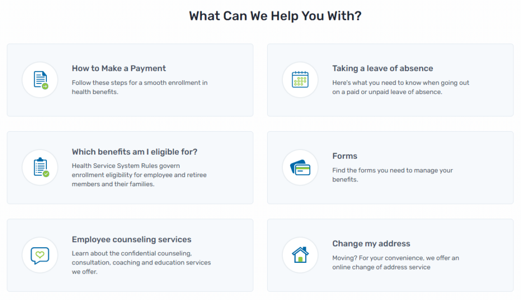
Great design anticipates needs. The San Francisco Health Service System’s homepage excels at providing relevant, helpful prompts to guide visitors. Its FAQs encompass the six most common reasons why a visitor may need their services. Each FAQ then directs visitors to an accompanying page that provides them with useful information.
This design is also mindful of visitors’ time and mental state. People searching for medical assistance might be feeling stressed or anxious, making it critical that you answer their questions and concerns quickly.
2. Comprehensive internal search: Mayo Clinic
As the number one hospital in the U.S., the Mayo Clinic provides accessible web design that assists visitors’ road to recovery. One feature worth spotlighting is its comprehensive internal search that prompts visitors to find the right resources for their circumstances.
For example, a visitor may enter “kidney disease” into the search bar. Then, the results page would direct them to related articles such as Chronic Kidney Disease or Lupus. From there, visitors can discover the diagnosis and treatment options, or make an appointment.
3. High performance: The Linked Immunisation Action Network
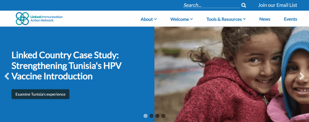
The Linked Immunisation Action Network (Linked) is a healthcare organization that helps identify challenges and best practices to improve immunization programs in middle-income countries. Because it often works in areas with poor internet access, the organization must offer its audience a high-performing, fast-loading website.
To improve its site performance, Linked turned to the web design experts at Kanopi for help. We updated the homepage to reduce load times by replacing the hero carousel with a more streamlined version. We also enhanced the Tools & Resources section with straightforward content pathways, filters to improve internal search, and improved visual design.
As a result, the site’s desktop and mobile performance improved—the mobile performance jumped by an average of 13 points, which is crucial for practitioners working in the field.
4. Accessibility and navigability: The Colorado Health Foundation
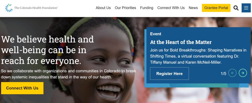
The Colorado Health Foundation (CHF) is a state organization devoted to improving the health of all Coloradans. To make its services equally accessible to everyone in the state, it needed to improve its site’s user experience and ensure its mission was front and center.
CHF worked with Kanopi to make these necessary changes. We used discovery work and heatmaps to understand how users navigated the site. Then, we made strategic navigation fixes based on the areas users interacted with most. We streamlined the main menu to just six primary items to reduce complexity.
In addition, we helped the organization create a data display to demonstrate accountability in their pursuit of racial justice to achieve health equity. This element helps increase audience trust in the organization’s mission.
Because of our enhancements to navigation and design, the site now scores a high 95/100 on Lighthouse (a report that measures a site’s accessibility level).
5. Spotlighting personnel: Global Brain Health Institute
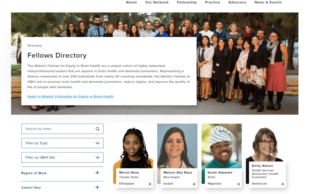
The Global Brain Institute’s fellows directory is a great example of connective design at work. Its comprehensive directory spotlights interprofessional leaders that are experts in brain health and dementia prevention. The page allows visitors to search by name, and filter by topic, region, or cohort, so visitors can connect with fellows and/or apply for the fellowship. This well-designed page acts as a promotional tool as well since visitors can observe the caliber and variety of the fellowship body.
6. Useful CTAs: The Cleveland Clinic
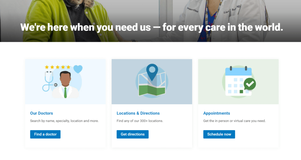
The Cleveland Clinic’s welcoming design assures visitors that their organization is ready to meet their needs. Just below this home page tagline, visitors can access three main resources to meet their needs—doctors, directions, and appointments.
These sections are known as CTAs (calls to action) and invite visitors to take the next action to complete their website journey. For instance, if a visitor clicks “Locations & Directions” they are led to a page where they can enter their location and find one of the 310 clinics that is closest to them. Google Maps then provides visitors a glimpse of their route so they can best prepare.
7. Inspiring testimonials: Boston Children’s Hospital
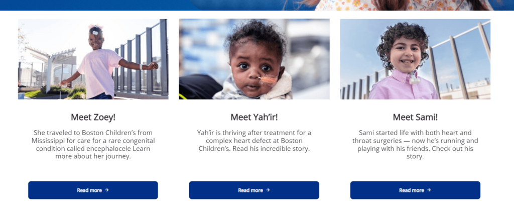
Your healthcare organization probably does some incredible work. Take a page out of the Boston Children’s Hospital’s book and highlight your work through inspiring testimonials. Their web design is personal as it introduces visitors to children who have recovered from necessary procedures. Each child is pictured and has a link for visitors to learn more about their story.
Visitors who find themselves on this page are most likely parents who are anxious about their child’s health. This design approach makes them feel hopeful and increases their trust in this organization’s capabilities.
8. Incorporating visitor feedback: CDC
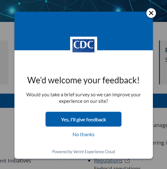
The Centers for Disease Control and Prevention (CDC) website design thoughtfully acknowledges user experience. Its built-in survey encourages visitors to provide feedback so that the CDC can offer the best online experience.
Additionally, the CDC’s web design policies take user communication preferences into account. Their policies stipulate that they are committed to using plain writing, so users can find what they need without having to interpret medical jargon.
9. Bold, consistent branding: National Women’s Health Network
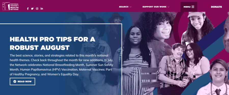
A well-branded site makes your organization stand out and boosts your credibility. The National Women’s Health Network is a great example of effective online branding at work. The site’s colorful collage of women highlights its target audience and invites visitors to explore the organization’s mission, vision, and values.
Colorful titles also help break up the content and guide through the homepage’s main sections. This way, visitors can assess the homepage quickly and easily without excessive scrolling or losing interest.
10. User-friendly content: BetterHelp
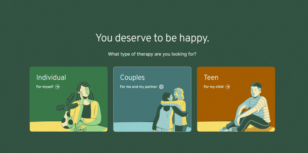
As the world’s largest online therapy service, BetterHelp sees many visitors who desire to connect with licensed professionals. Its user-friendly design addresses visitors’ desires through clean, organized page content.
The first three home page CTA options give visitors a choice to find help for themselves or their loved ones. Then, the visitors are directed to complete a questionnaire that recognizes their needs and offers relevant help.
11. Member-exclusive benefits: Eye Recommend
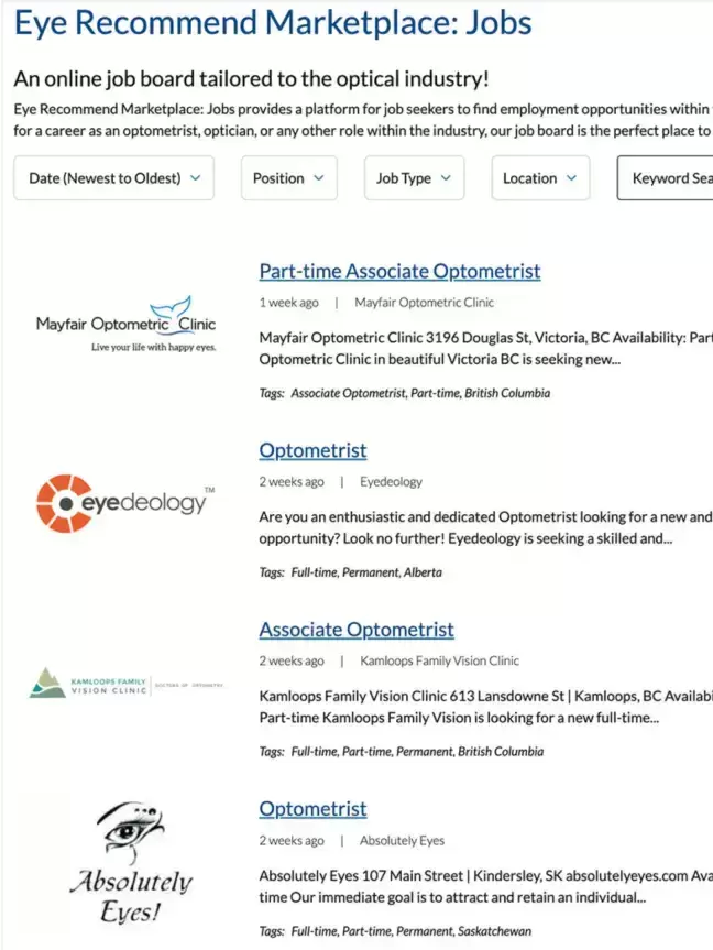
Many healthcare organizations thrive on member involvement, including Eye Recommend. Eye Recommend is a professional group for independent optometrists in Canada. Its goal is to empower members with technology, services, and resources to expand their clinics.
Eye Recommend partnered with Kanopi to strategize the best ways to bring valuable, exclusive content to their members. Ultimately, we helped their team create a convenient online job marketplace where members can easily browse open positions. Members can filter listings by location, allowing them to find roles within their local area. Features like this, in addition to a user-friendly internal search function for the organization’s full website, provide clear value to members and improve the user experience.
12. Data-driven storytelling: The Gates Foundation
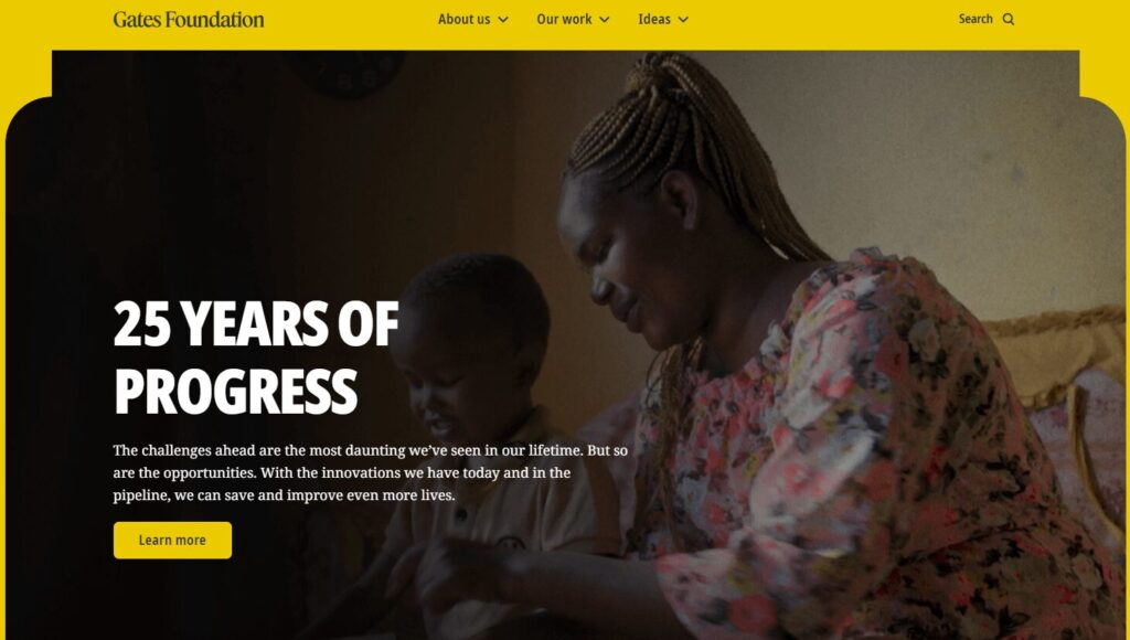
The Gates Foundation, founded by Bill Gates and Melinda French Gates, is one of the largest philanthropic foundations in the world. Its website tells the story of the organization’s initiatives, including fighting poverty and disease and sparking innovations worldwide.
The foundation’s website leverages many powerful case studies and impact statistics to illustrate its international positive impact. Users can easily browse through examples of the organization’s work, categorized by location and strategy used.
Maintaining Your Healthcare Website Design Over Time
An effective healthcare website isn’t static; it must change and grow over time to continue meeting your community’s needs.
We’ve compiled a list of the most common healthcare website design maintenance considerations, adapted from our guide to website maintenance for nonprofits. Ask yourself the following questions to continually assess your website and maintain it over the years:
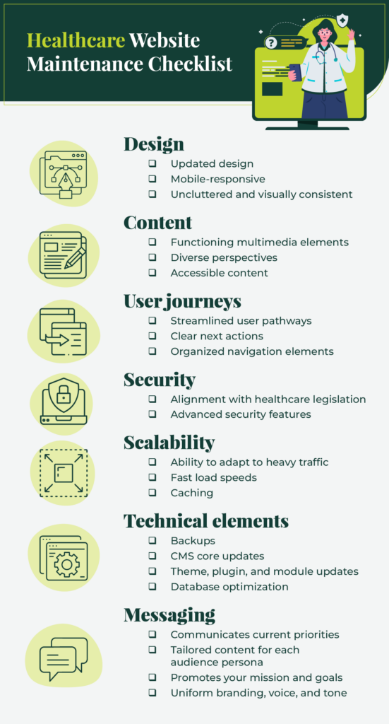
Design
- Is your design outdated?
- Does your design effectively adapt to mobile screen sizes?
- Is your design cluttered or visually inconsistent across pages?
Content
- Are your multimedia elements, like photos and videos, functioning properly?
- Does your content encompass your audience’s diverse perspectives?
- Is your content accessible to all audience members, following the WCAG guidelines?
User journeys
- Do you have clear user pathways for your core audiences?
- Does every user have clear next actions they can take on your website to find the information they need or get involved on a deeper level with your healthcare organization, whether through volunteering, donating, etc.?
- Are your navigation elements (like your main menu) and CTAs aligned to drive user engagement?
Security
- Does your website have any security vulnerabilities that need to be addressed?
- Does your website align with healthcare legislation including HIPAA and HITECH?
- Does your website leverage advanced security features like SSL to maintain compliance?
Scalability
- Can your website’s network effectively scale up and adapt to heavier traffic loads?
- Is your code optimized to facilitate fast load speeds?
- Does your website have caching mechanisms to improve load speeds for subsequent visits?
Technical elements
- Do you need to conduct any of the following technical maintenance tasks?
- Backups
- CMS core updates
- Theme, plugin, and module updates
- Database optimization
Messaging
- Does your website accurately reflect your healthcare organization’s current priorities?
- Does your website have content and messaging that appeals to every audience persona?
- Does your blog content promote your organization’s mission and goals?
- Do all website pages reflect your organization’s branding, voice, and tone?
Approach website maintenance as a continuous, ongoing process, rather than a major task you complete every so often. It can be helpful to work with a professional web design firm to support your website over time so it doesn’t lose traffic or face security issues.
Work with Kanopi to Bring Your Healthcare Website Vision to Life
Here at Kanopi, we support healthcare organizations with a continuous improvement approach.
We do more than just security patches and software updates—our designers and developers act as strategic partners to support your website with a clear growth plan and adaptive execution. Whether your site is a new online resource or an established healthcare website, we can provide the ongoing, reliable support you need to reach your goals.
Check out our work with the Department of Surgery at the University of California, San Francisco, for an example of how we leverage our design expertise for our healthcare clients. The department needed a website that reflected its rich history of scientific and clinical advancements. However, it was saddled with an overly complicated configuration of 80+ domains for different topic areas and a proprietary CMS that didn’t offer an easy way to navigate between these domains.
Through deep discovery work and prototypes, we evaluated how users interacted with the site to identify key improvements to the user experience. We migrated the site to Drupal, simplifying domain access and preserving consistency. We also infused the site with human-led imagery and mobile accessibility.
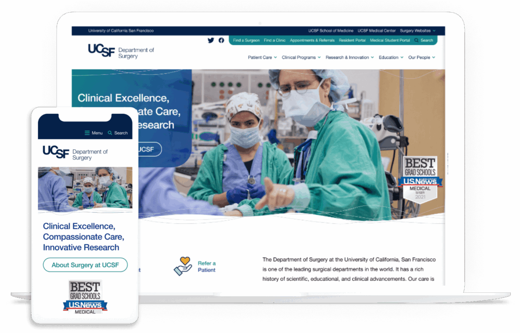
This project won a W3 Award for Best User Experience and a Web Excellence Award for Health Care Community and Health Care Services.
No project is too large or complex for our web designers. Interested in collaborating? Check out our work.
Additional Web Design Resources
- The 22 Best Hospital Website Design Examples to Inspire You. A hospital website redesign requires careful planning and implementation. Review our hospital web development guide for insight into the process.
- Healthcare Web Development: Your Complete Guide for 2025. Strategic web development ensures you’re doing everything possible to meet your audience’s needs. Use this guide as your web development roadmap.
- The ROI of Great Web Design. What can a great website do for your organization’s budget? Read this article for an inside look into how effective web design can dramatically boost your ROI.
- Webinar: It Takes a Village: Managing a Large Community in a Website Redesign.” Want to dig deeper into how Kanopi works with healthcare clients? Learn how the UCSF Department of Surgery and Kanopi worked together to create an award-winning website.