Higher ed institutions have several Sisyphean tasks to overcome, such as rising tuition costs, concerns about the value of an education, and other obstacles. The good news is that you already have a useful tool to enhance trust and credibility—your higher ed website.
75% of consumers say they judge an organization’s credibility based on the quality of its website design. With a positive and forward-thinking higher education website, you can gain the trust of your audience and strengthen your online presence.
At Kanopi, our designers keep their eyes and ears open to understand the unique pressures and requirements of the higher education web design landscape. We work with higher education clients to build websites that better tell their universities’ stories. Leaning on our experience, we’ll review the best higher ed website designs in 2025 and the best practices represented in each example.
- University of Arizona | Optimized user experience
- Stanford University | Use of AI as an organizational practice
- Kenyon University | More resources for underrepresented members of the student community
- University of Waterloo | Clarity on DEI initiatives
- Western Washington University’s Department of Design | Interactive design
- University of Wisconsin-Madison | Rich interactive experiences
- Adelphi University | Improved usability and accessibility
- Georgetown University | Focus on mental health and wellness
- University of South Alabama | Creating opportunities for personalization of the online experience
- Loyola University Maryland | Charming microinteractions
- Rice University | Interactive student tours
- Rhode Island School of Design | Real-time updates
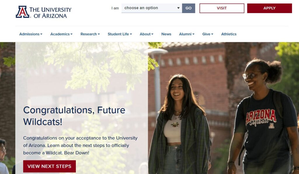
1. University of Arizona | Optimized user experience
What to know about this higher ed website design best practice
The user experience is the way visitors interact with your higher education website. Browsing your undergraduate majors, signing up for your newsletter, submitting a donation using your online giving form—all of these activities fall under the umbrella of user experience.
Higher ed website design is focused on simplifying the user experience to facilitate streamlined user journeys for every visitor. This means that every visitor can find the information they need quickly and easily, whether they’re a prospective or current student, faculty member, parent, donor, or community or business partner.
What we love about the University of Arizona’s website
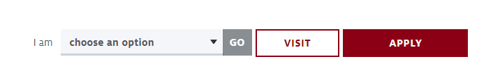
The University of Arizona homepage immediately offers tailored resources for one of its most important user groups: accepted new students. New students can view the next enrollment steps, such as paying the enrollment fee, signing up for new student orientation, and exploring scholarships.
Arizona’s website also offers an “I am” drop-down search option for other visitors. Visitors choose the descriptor that best matches them and are sent to a webpage with specific resources for their needs.
Take a look at this example of the personalized content you can serve each audience using tailored CTAs:
Metropolitan University
Personalized Excellence
These customized experiences that speak to specific user groups are becoming increasingly common as universities learn more about their target audiences.
Next steps to take
To help visitors move through your content more easily, your college or university website should:
- Use concise, powerful calls to action (CTAs). Your CTAs should address common user questions and concerns to help connect individuals with the necessary information.
- Offer clear navigation. Keep your website menu short and straightforward, with a limited number of items. This keeps your navigation uncluttered and easy to use.
- Be mobile-friendly. Ensure your site has an effective mobile-responsive design to offer an equally positive user experience across all devices.
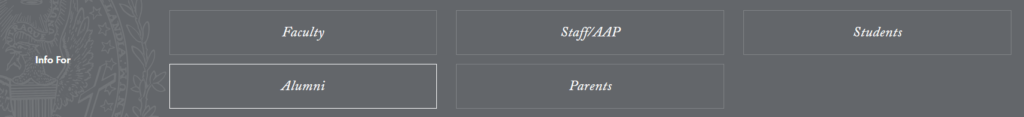
- Offer clear next actions for each visitor segment. Give visitors a variety of prompts to help them move through your website content. For instance, similar to the Arizona website, take a look at how the Georgetown University website offers quick links for different visitors:
Identify five to seven user groups or personas within your higher education audience to determine which user journeys to prioritize on your website.
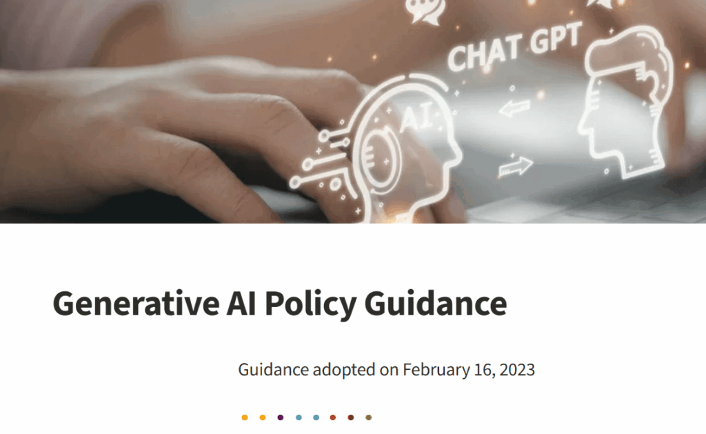
2. Stanford University | Use of AI as an organizational practice
What to know about this higher ed website design best practice
Students and faculty have greater access to user-friendly artificial intelligence (AI) than ever before. Website visitors want to know how your university approaches AI in the classroom and helps students prepare for an AI-centered workforce.
According to an Inside Higher Ed survey, almost three-quarters of students say that their universities should prepare them for AI in the workplace, either “a lot” (27%) or “somewhat” (45%).
What we love about the Stanford University website
Stanford makes their position on AI usage clear with a webpage on Generative AI Policy Guidelines. It clearly states the circumstances under which instructors can use AI to support learning and situations where students should not use AI tools.
Next steps to take
To meet the demand for information about AI usage, your higher education website should highlight:
- Student use of AI. Spotlight opportunities for students to learn more about AI in their field through research and hands-on application.
- Institutional AI policies. Include a webpage outlining your university’s approach to student and instructor use of AI in academics.
- Research and development. Feature any news or research updates from university professors in the field of AI.
Potential and current students want to know that your university is on the cutting edge of these technologies that will profoundly impact their daily lives, so your AI information should be easy to find on your website.
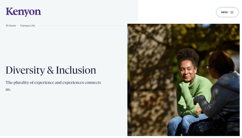
3. Kenyon University | More resources for underrepresented members of the student community
What to know about this higher ed website design best practice
Higher education institutions have increasingly emphasized diversity, equity, and inclusion (DEI) initiatives to ensure all students feel welcome and to expose all students to different cultures and backgrounds. Students themselves are noticing a difference—over half of students surveyed in the fall of 2021 said they perceived a noticeable difference in diversity on campus.
However, there’s still more progress to be made. That’s why colleges and universities have emphasized creating streamlined user pathways that connect students of color, members of the LGBTQ+ community, disabled students, first-generation college students, and other underrepresented groups with the resources and information they need.
What we love about the Kenyon University website
The Kenyon College Diversity & Inclusion page exemplifies how you can bring your school’s commitment to diversity to the forefront. The page states the school’s commitment to fostering a diverse and inclusive learning environment and offers a variety of resources for underrepresented students. This gives current and prospective students an easy way to access the support they need to reach their full potential.
Next steps to take
To help underrepresented students feel supported at your school, you should update your university’s website in the following ways:
- Provide tailored information for first-generation and international students to simplify navigating the application process.
- Include the link to your school’s Office of Diversity and Inclusion in your main website menu.
- Spotlight mentoring opportunities or affinity groups for underrepresented communities.
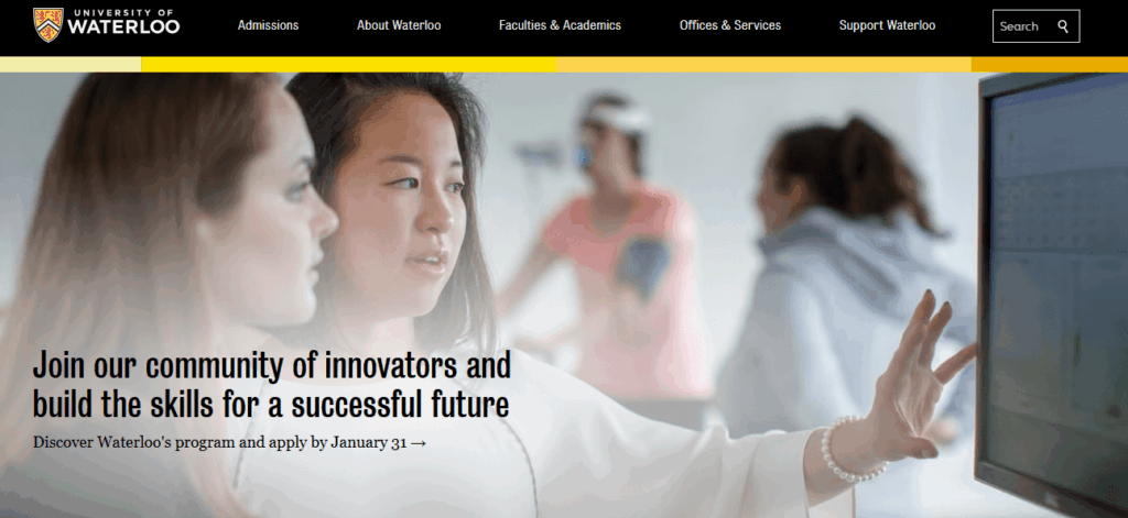
4. University of Waterloo | Clarity on DEI initiatives
What to know about this higher ed website design best practice
In addition to helping students access the resources they need thrive, universities are clarifying their stance on diversity, equity, and inclusion (DEI) policies amid changes to higher ed acceptance policies.
What we love about the University of Waterloo’s website
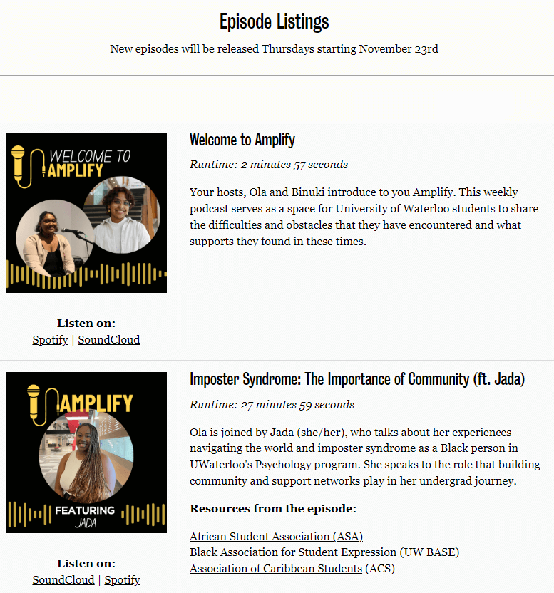
The University of Waterloo offers a clear Equity, Diversity, Inclusion, & Anti-Racism (EDI-R) strategy page detailing the organization’s strategic goals. Waterloo takes its commitment further by magnifying diverse student voices in the content creation process through its Amplify podcast.
The podcast focuses on giving students a voice to discuss their experiences as university community members who hold marginalized identities. It also provides plenty of quick links to resources for students in need, such as counseling services and student associations.
Next steps to take
To help your university community understand your policies, create a dedicated webpage outlining your approach and goals. For example, similar to the Waterloo example above, the McMaster University website features an Equity, Diversity, and Inclusion (EDI) strategy roadmap with a clear framework, action plan, and definitions.
5. Western Washington University’s Department of Design | Interactive design
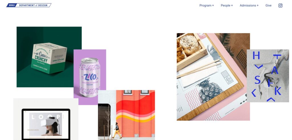
What to know about this higher ed website design best practice
Interactive design helps your university website stand out from the crowd, blending the functional and the aesthetic to create a more well-rounded user experience. 94% of users’ first website impressions are related to design, making this a key aspect of your nonprofit’s website strategy.
What we love about the Western Washington website
Check out Western Washington University’s Department of Design website homepage above. The interactive homepage actually allows visitors to rearrange elements on the page to create their own design. This is a unique way to show visitors what the school is about while providing an engaging and memorable user experience.
Next steps to take
Consider what makes your university or department unique and how you can represent your school’s personality visually. For example, does your college offer summer programs? Try a scrapbook style design to emphasize the blend of learning and summer fun. Animation and illustration styles could also help you present different aspects of your university in a more engaging way.
6. University of Wisconsin-Madison | Rich interactive experiences
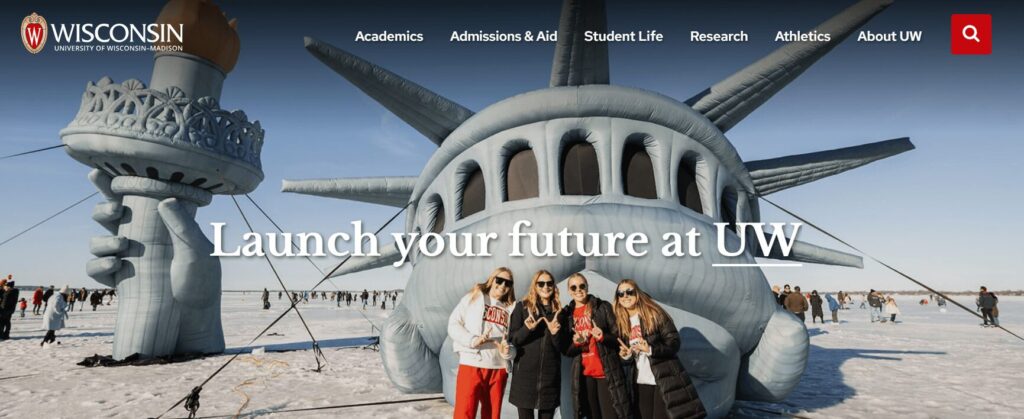
What to know about this higher ed website design best practice
Interactive experiences put website visitors in control of their online experience. They can engage with information and resources that interest them most or appeal to their unique needs.
What we love about the University of Wisconsin-Madison’s website
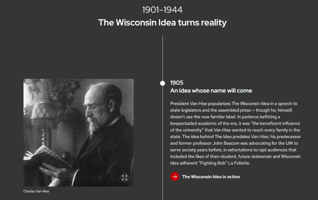
Interactive timelines are an effective tool for showcasing continuity and allowing users to explore areas that interest them.
The University of Wisconsin-Madison’s interactive timeline is an excellent example of a rich interactive timeline experience. Users can scroll down the page to read about the school’s history and select images to learn more about specific events or notable people.
Next steps to take
If you have an idea for a creative interactive element but are unsure how to bring it to life, reach out to an experienced design partner like Kanopi for support. These experts can turn your vision into reality and ensure your creative idea fits seamlessly into your website’s overall look and feel.
7. Adelphi University | Improved usability and accessibility
What to know about this higher ed website design best practice
The best university websites know that an inclusive website is a fully accessible one. Accessibility means a website is usable and understandable by everyone, regardless of age or ability.
Accessible higher ed websites consider the wide range of human experiences when designing and structuring pages and content. From long-term accessibility issues, such as color blindness, to users with short-term impairments like a broken arm, accessible websites offer visitors an enjoyable and user-friendly experience.
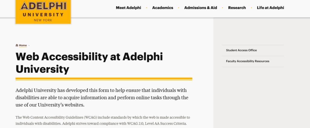
What we love about the Adelphi University website
Along with a page explaining their web accessibility policies, Adelphi University offers a form for users to report accessibility issues. Users can provide information about the web address where they encountered the problem and explain the issue they experienced.
Next steps to take
To improve your site’s accessibility, you can:
- Follow the Web Content Accessibility Guidelines (WCAG) as you develop or redesign your website. These guidelines were created to establish a universal standard for website accessibility.
- Explore Kanopi’s list of best accessibility tools. Resources such as the A11Y project checklist and Lighthouse can help you assess your site’s current level of accessibility and identify opportunities for improvement.
- Test your website’s accessibility manually. This crucial step helps you note any instances of poor accessibility that automatic testing resources might have missed. To conduct thorough manual testing, try navigating your website with just your keyboard or zooming in to 200% to assess usability in that format.
8. Georgetown University | Focus on mental health and wellness
What to know about this higher ed website design best practice
In the past few years, college students’ mental health struggles have hit crisis levels. Financial worries and school stress have always been major contributors to poor student mental health, but the pandemic added a new dimension to the crisis. Many students switched to hybrid or fully virtual class schedules, leading to increased feelings of loneliness and isolation.
The mental health declines prompted by the pandemic are still in effect today. 44% of students reported feeling depressed in the past year, and 95% of college counselors said that mental health is a growing concern at their school.
What we love about the Georgetown University’s website
Georgetown University offers a webpage with mental well-being resources and counseling options for student, faculty, and staff mental health resources. The page even offers guiding questions to help visitors find the right resources.
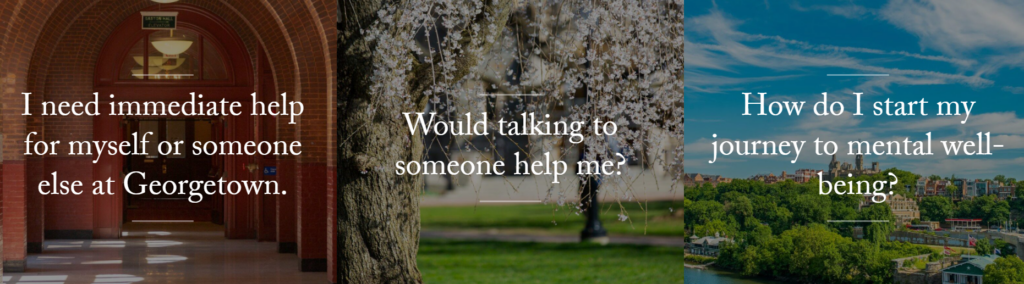
Next steps to take
Ensure your own higher education website showcases your mental health resources. By adopting an empathetic, understanding tone, prospective and current students will feel more comfortable using available resources.
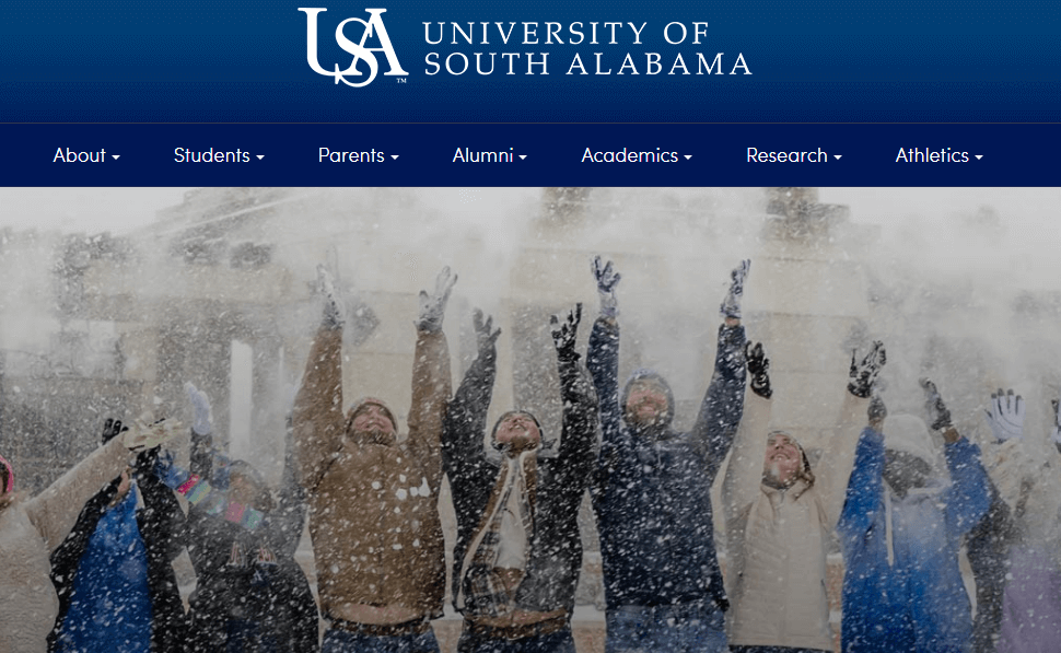
9. University of South Alabama | Creating opportunities for personalization of the online experience
What to know about this higher ed website design best practice
Personalization is increasingly essential for all forms of marketing, including higher education outreach. According to EAB, 93% of students said receiving a personalized message from a college would encourage them to explore a school further.
College websites are heeding the call for more personalization by taking steps to personalize both their website’s public-facing and gated versions.
Public-facing personalization
The public-facing side of your website includes all content that any visitor can access without a login.
The best higher ed websites leverage data analytics to track user behaviors and serve more relevant content on the front end. For example, let’s say you have a visitor who previously visited your university website to start an application but didn’t finish the form. On their next visit, your site can serve CTAs that remind them to apply before your deadline.
Gated content personalization
Gated content is any content on your website that requires a login to access.
When current students log into their profile on your college website, they should be able to access a customized dashboard with information relevant to their needs. For example, a student in the journalism school should be able to see the deadline for advising registration and upcoming student organization meetings.
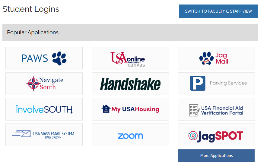
What we love about the University of South Alabama’s website
The University of South Alabama’s website offers an easily accessible portal for students to log into popular applications that support their student journey. Website users can also toggle between a student view and a faculty and staff view, depending on their needs.
Next steps to take
Determine which types of personalization you’d like to offer through your website, whether public-facing, gated, or a combination of both. Ensure your website offers robust security credentials to keep student information safe when logging into gated content. These measures include:
- Requiring complex passwords
- Offering two-factor authentication for logins
- Ensuring your website uses HTTPS to encrypt data
10. Loyola University Maryland | Charming microinteractions

What to know about this higher ed website design best practice
Microinteractions are the small moments and design elements users experience on your website that engage them more deeply. This encompasses everything from hovering over a button and watching it get larger or change colors to interacting with an in-depth infographic.
Think about the satisfaction and joy you experience when using Facebook’s reaction buttons or sending an iPhone message with an animation. These small interactions engage and delight users, making digital browsing a more enjoyable experience.
What we love about the Loyola University Maryland website
The Loyola website includes a few simple button microinteractions. For example, the homepage CTA button shows a different message when users hover over it, changing from “More Than Ready” to “Discover the Loyola Difference.” In addition, an arrow appears pointing downward, letting users know that when they click the button, they’ll be sent further down the homepage to learn more about the college.
Additional CTAs use the school’s white and green color scheme to make buttons pop on the page through color-changing microinteractions.
Next steps to take
Evaluate your website to determine whether you want to incorporate microinteractions into your content. We recommend using these elements sparingly so they don’t distract from other aspects of the user experience.
Even though these microinteractions represent small moments, they can significantly impact your visitors’ experience using your website. By optimizing even these brief connections, you ensure every interaction users have with your website is a positive one.
11. Rice University | Interactive student tours
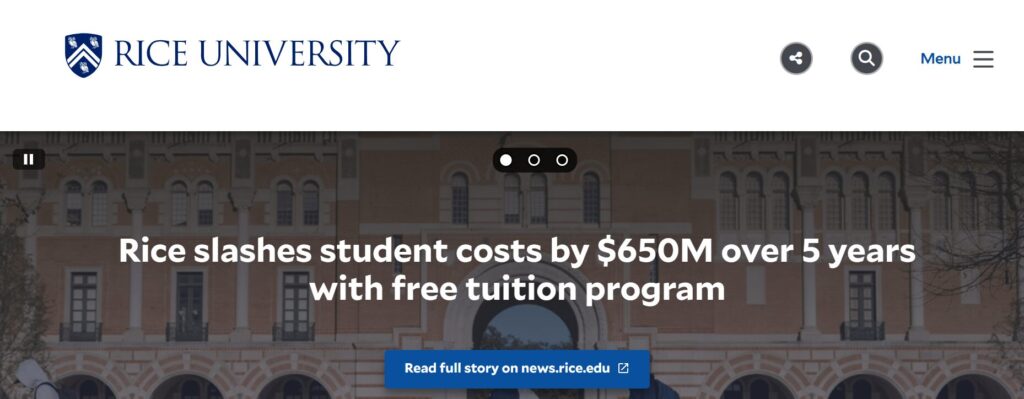
What to know about this higher ed website design best practice
Campus visits and tours have a major impact on whether students decide to attend your college. In fact, 69% of high school students said that a good campus visit could make them significantly more interested in a college they weren’t entirely interested in, and a bad experience can turn them off of a college they were very interested in.
Because many colleges accept students from around the country and worldwide, virtual tours are widely used in the sector. These tours offer a glimpse at university life for students who can’t attend an in-person tour.
What we love about the Rice University website
Rice University’s virtual tour is full of unique elements and microinteractions, starting with the rocket ship animation that appears when you hover over the “Launch Map” button.
Next steps to take
Creating a virtual tour experience is a major undertaking, so we recommend connecting with a higher ed website developer who can manage the project efficiently, especially if you want to create something as unique and robust as Rice’s virtual tour.
Some colleges also use services like YouVisit, which creates virtual tours using HD video production and 360-degree images.
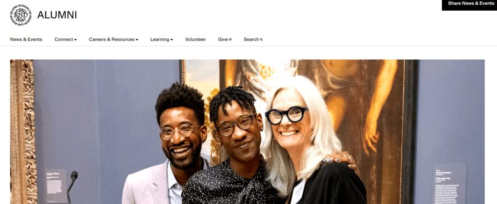
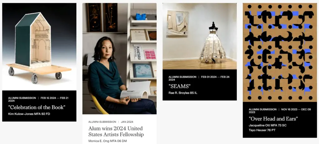
12. Rhode Island School of Design Alumni | Real-time updates
What to know about this higher ed website design best practice
College and university websites are embracing their role as digital resources for learning more about their schools and providing ongoing updates on everything from recent news to research developments.
Social media feeds, blog post updates, and news articles help keep higher education websites fresh and relevant. They show visitors that the university keeps up with current events and contributes to important conversations.
What we love about the Rhode Island School of Design website
One example of this higher ed web design best practice is the Rhode Island School of Design’s alumni website homepage news feed. The feed is a scrolling carousel of recent news updates and blog posts that alumni community members may be interested in.
Next steps to take
By using your higher education website to feature news and current events, you can make it a helpful resource for your university’s community and a wider audience of alumni, sponsors, researchers, and prospective students interested in staying up to date with your institution.
How Kanopi Can Help With Your Higher Ed Website Design
Working with a website design agency helps your college or university stay updated with effective, usable design best practices. At Kanopi, we offer web design services for colleges, universities, and other higher education institutions.
We understand that a strong university website design starts with knowing your target audience, balancing their varying goals, and serving each segment equally. Here’s a glance at the elements we assess and optimize through our process:
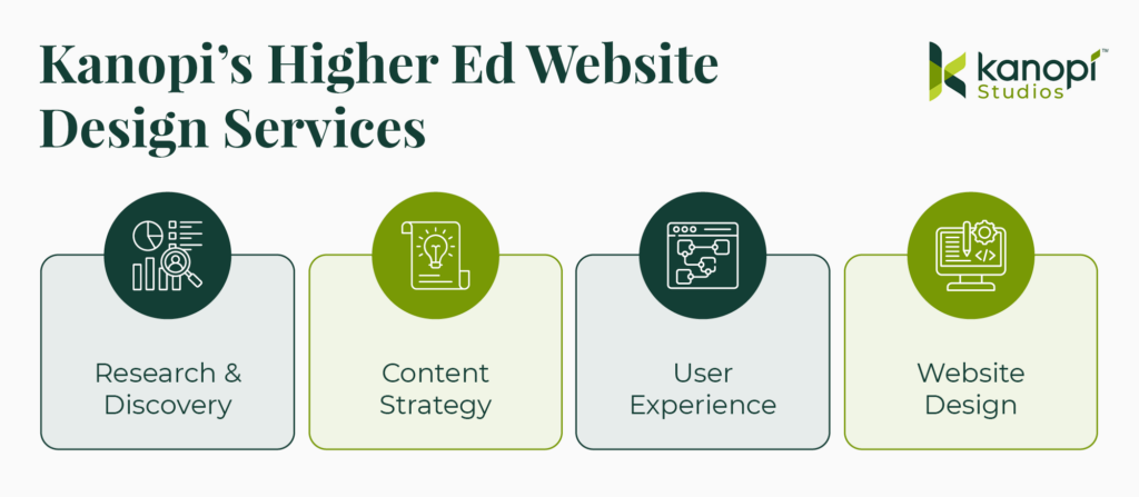
- Research and Discovery: We conduct qualitative and quantitative user research and testing. Then, we use our findings to create a vision board for your website to ensure we accurately capture your goals and strategy.
- Content Strategy: We audit your existing content, assess your tone and style, and help create a more inclusive strategy that prioritizes accessibility.
- User Experience: We craft user personas for your primary audience groups and create journeys and pathways that speak to each persona.
- Website Design: We ensure your higher ed website has a top-of-the-line design that optimizes every user interaction.
Please review our higher education design case studies and contact us if you want to improve your college or university website.
Wrapping Up
Your website can effectively connect stakeholders to opportunities that interest them and help them feel welcome in your university community. Use this guide to stay current with the best practices that resonate most with prospective and current students and other core audiences.
For more information on college and general web design tips, check out these additional resources:
- 25+ of the Best College Websites & Why They Stand Out. See these best practices in action by reviewing the best college websites available.
- Web Design Trends to Watch in 2025. Explore more influential design trends for websites this year.
- Higher Ed Website Design | Kanopi Studios. Learn about Kanopi’s higher ed website design process that we leverage to help clients create effective and sustainable websites.