
From the streaming services we binge to the smartphone we buy, there’s no denying excellent website design matters. Great web design can mean the difference between people landing on your site and coming back daily or landing on your site and immediately leaving, never to return again.
As University of Washington designer and teacher Joe Sparano puts it:
“good design is obvious and great design is invisible.”
Although also invisible is harmful website design that’s inaccessible for some people.
Boosting revenue, increasing donations, enhancing engagement, and saving staff time are just a handful of the many measurable benefits of great website design.
Let’s dig into the details!
Boost your revenue
It’s hard to ignore the power of discovery paired with quantifiable data to drive content & user experience (UX) improvements.
Do you know who uses your site and what their needs are?
You may think you know, but the truth is user behavior shifts and changes at a rapid pace. It’s vital to regularly test assumptions about who is currently using your site and how they use it, gathering insight to inform design solutions that better meet user needs today.
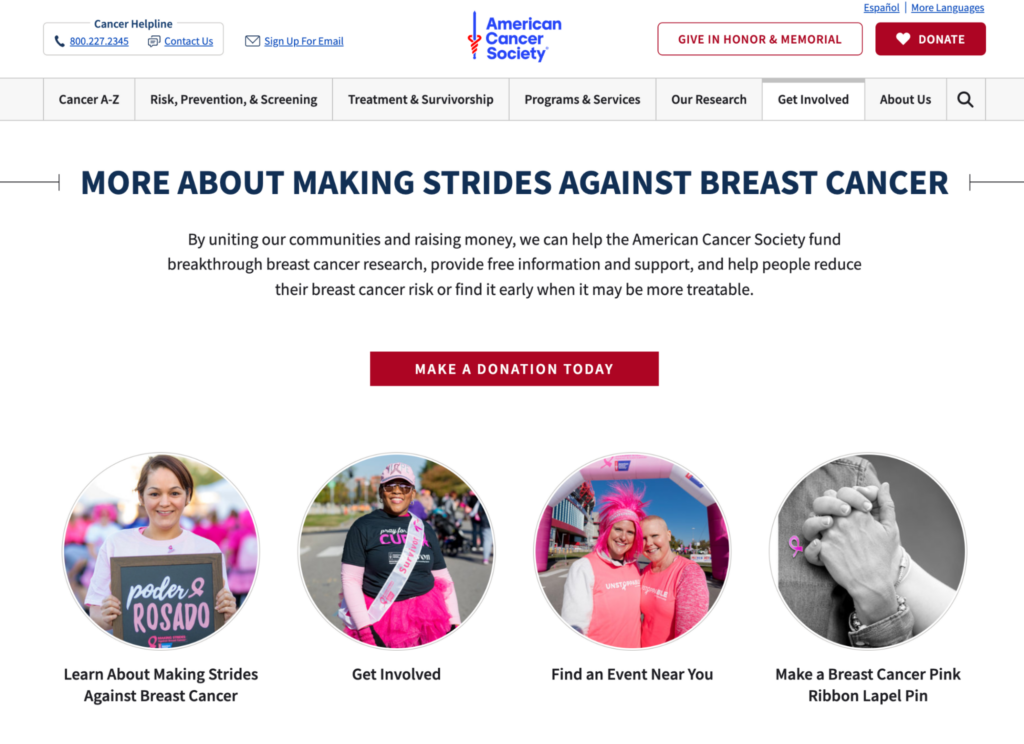
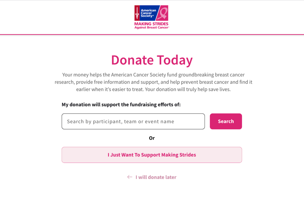
The American Cancer Society (ACS) boosted its revenue by 4.5% by redesigning its website using research and data.
How did they do it? The ACS team created a new donation form on their site that sends funds only to breast cancer research. The nonprofit made it easier for their top personas to do what they came to the site to do, looking at how people interact with their site and how their needs and goals change over time.
Analytics data showed that ACS was missing out on valuable traffic between its main website and its “Making Strides” sub-site. The team got to work creating clear user pathways between the two websites, providing donors with the action they wanted to take most, as illustrated by the data — supporting breast cancer research specifically.
Increase online giving
Well-designed nonprofit websites focus on the user experience of its donors, making it easier for them to find the information they need, including all of the ways they can support the organization while allowing them to complete donations seamlessly.
Great design backed by a donor content strategy leads with impact that’s personal, clearly showing existing and future donors how their generosity makes a difference.
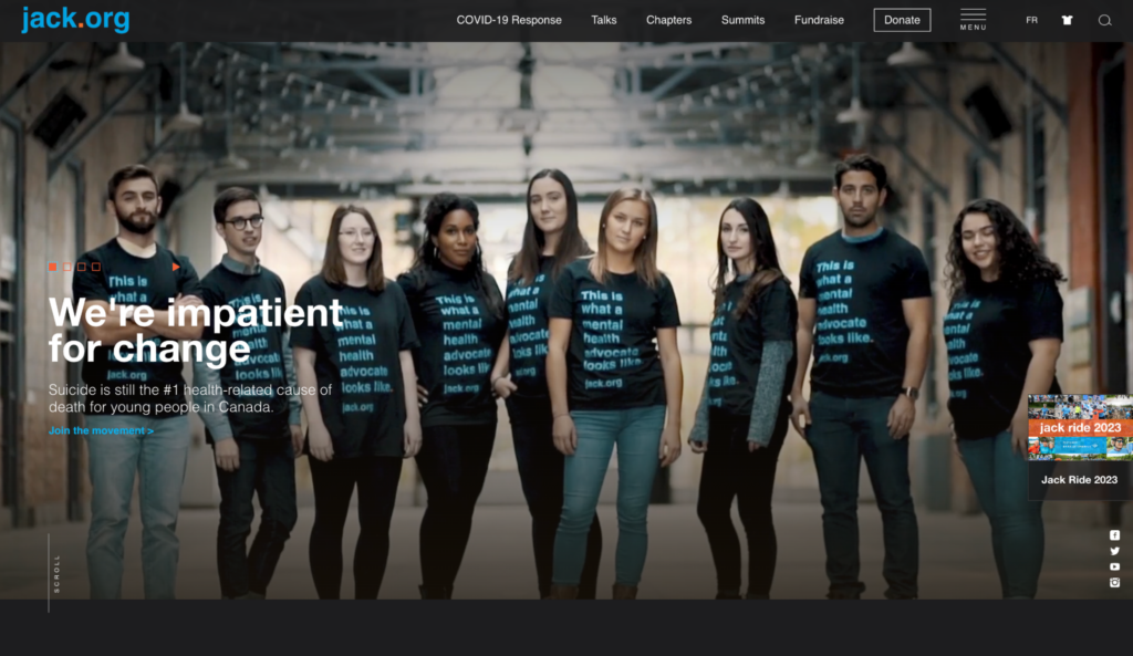
Jack.org is Canada’s only charity training and empowering young leaders to revolutionize mental health. The Canadian nonprofit needed a website to help them better connect with young people nationwide.
By reviewing its donor experience, the charity boosted online donations by 80%, with a 108% increase in online donation revenue.
How did they do it? They implemented an enhanced strategy focussing on UX, followed by a redesign that included powerful, seamless fundraising and sales integrations, making their site AODA & WCAG compliant.
The University of North Carolina School of the Arts decided to redesign its website when it realized it wasn’t meeting the needs of two of its most important groups of people — students and donors.
By upgrading its information architecture, creating engaging microcontent and improving functionality, admission inquiries climbed 518%, and the university saw online donations increase by 48%:
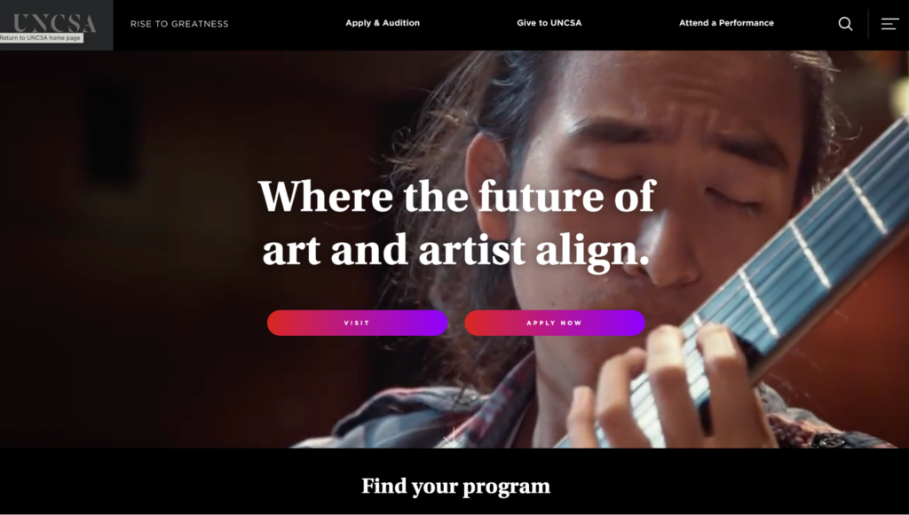
“The storytelling as a narrative was really the way to sell and to communicate what the institution is,”
said Vice Provost and Dean of Student Affairs Ward Caldwell,
“I think one of the unique aspects of the site design is that it encourages exploration. It provides all the links to move people through the site, but it also encourages people to linger, to get an understanding of how we take students through a journey of artistic exploration.”
Source: UNCSA
Engage a new generation with machine learning
Twenty-five percent of what you sell on your website is your product or service. The remaining 75% is an intangible feeling from a package deal with said product or service.
What do you want people to feel from interacting with your site’s content?
A clear and consistent content style within your website design can help you engage Gen Zers (people born between 1997 to 2012.) Speak to younger folks on a personal level using language and words they recognize and use themselves daily, factoring in aggregated data that helps you better understand your user’s emotions.
Develop a tone and voice that fits your organization and resonates with your users, keeping it conversational and action-based.
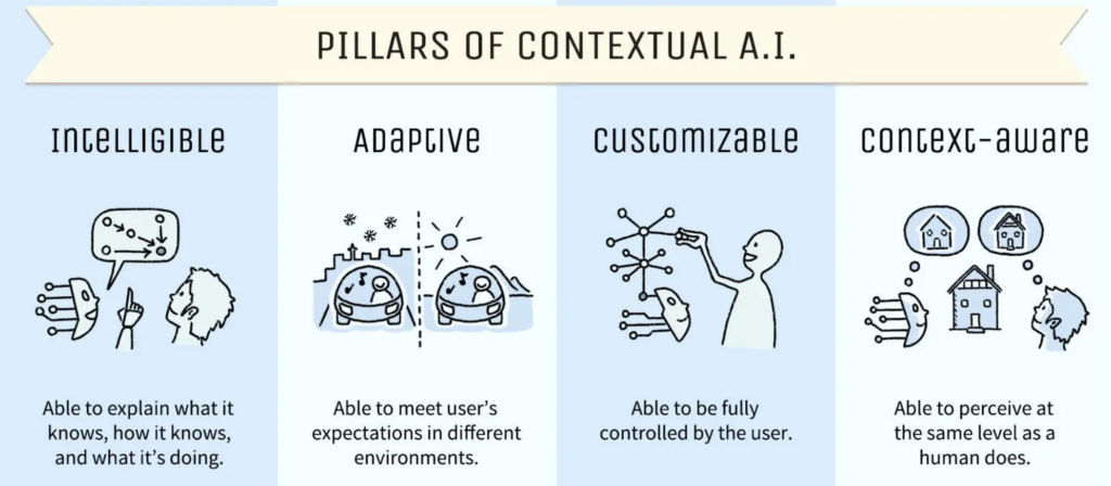
Make your site more human using contextual AI to design a website that makes people feel something and achieve ROI growth as you connect with the next generation. Your ultimate goal should be to deliver a focused experience instead of just a website.
Colleges and universities are deploying user-controlled, AI-powered chatbots to connect with people faster, helping them convert more prospective applicants into enrolled students.
Ahead of a new academic year, students have many questions about programs, fees, housing, and more. Admissions departments work flat out, and responding to every question takes time.
Chatbots eliminate this problem. They’re convenient, easy to use and designed to provide automated responses to common questions from students, avoiding ambiguity and slow replies.
Students can chat with them any time, day or night, which is particularly useful for international folks living in a different time zone than their desired college or university.
Make it accessible to all
Design that addresses the unique needs, barriers, and challenges that people with disabilities face when using your site will benefit all users, ensuring your site is inclusive and accessible.
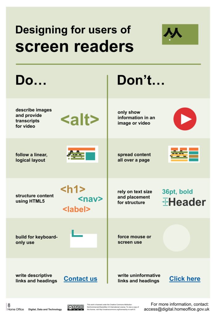
Don’t make the mistake of allowing accessibility to become an afterthought you attempt to shoehorn into a near-finished design. It’ll cost you time and money in the long run.
Fifteen percent of the world’s population, or 1.3 billion people, self-identify as having a disability, so design a website accessible to all and watch your ROI grow.
What does accessible website design look like? Do you have to forfeit captivating visuals to gain a truly accessible site? Not quite.
Are you keen to introduce motion on your site to increase engagement? Great! Though first, understand how movement on websites impacts people with vestibular disorders such as epilepsy. Avoid using excessive animation to ensure everyone can use your site, opting for thoughtfully executed motion design users can control instead, for example, prominent pause, stop, and play options on embedded videos.
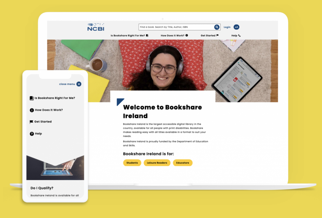
Partnering with the National Council for the Blind in Ireland, Kanopi was able to design a website that’s AAA compliant (the highest level of web accessibility) without sacrificing good design.
The nonprofit’s site includes fun, engaging graphics with bright colors and relatable student imagery while nailing text-to-background color contrast, large text, and text zoom functionality. Site visitors know exactly where to go from the homepage, with straightforward user journeys for students, readers, and educators:
Rank higher on Google
A site that’s well-designed and optimized for search engines can drive more organic traffic and improve search engine rankings. It’s that simple.
VITAS Healthcare, a pioneering hospice movement since 1978, improved its organic click-through rate (CTR) by 52% through improved design. A CTR is the percentage of searchers who click on a search engine result.
How did they do it? Improving their meta descriptions made them more descriptive and meaningful, adding direct telephone numbers for folks to reach them immediately.
Meta descriptions are HTML tags summarizing your webpage’s content. It’s a snippet of text, roughly 160 characters long, that appears under your page title on a search engine result page like Google.
The meta descriptions of every landing page you design may fly under the radar at times, though this behind-the-scenes component is key to great website design that ensures your site is discoverable.
Save staff time
A well-designed website can make it easier for a nonprofit or higher education institution to complete two vital tasks:
- communicate with your key stakeholders and
- disseminate important information.
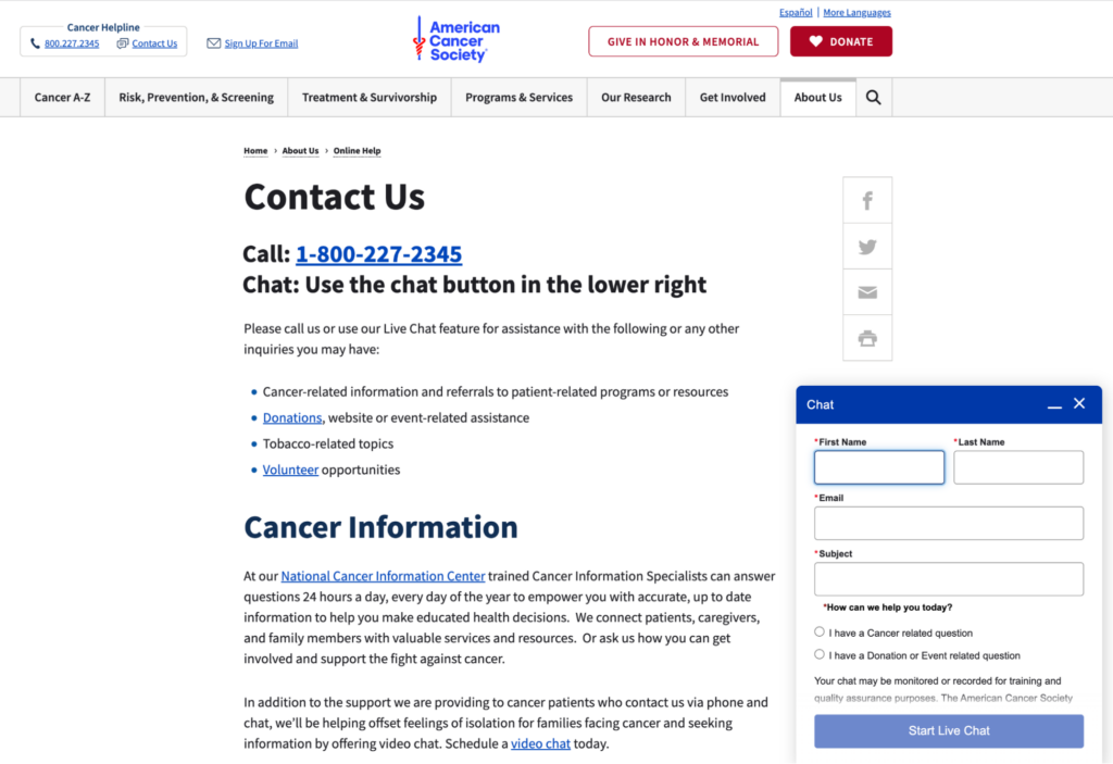
It took staff 25% less time to respond to inquiries following the redesign of the American Cancer Society’s website. They refined their “Contact Us” page with a clear content hierarchy, providing pathways for questions by phone, live chat, or video chat and by topics such as donations and volunteering opportunities:
How does this translate to ROI? Let’s do some quick math.
Suppose your staff spends 10 hours or 25% of their 40-hour work week navigating and replying to inquiries from your website. With time savings similar to the American Cancer Society at 25%, your staff can now respond to inquiries in 7.5 hours instead of 10.
For a team of 5, that saves 650 hours per year that could be redirected to other essential tasks within your organization.
Great design starts with research and strategy
Here at Kanopi, accessibility is baked into our process at the start of every website design project. Our strategists, designers, and developers collaborate to skillfully balance website design that produces the wow factor while not compromising on building a site accessible to all.
Good website design isn’t just “sparkle and boom.”
The real boom happens when you use research to develop a strategy that enhances your user experience and improves your conversion rates.
Are you after more donations? More enrollment? More memberships?
It is invaluable to gain an accurate, up-to-date picture of how people use your site and what they expect to find. Find that sweet spot where content meets both the needs of your users and your organizational goals by developing a content strategy based on user research.
The tried and tested way to turn one-page website viewers into repeat visitors and continuous supporters is by designing a website with user experience at its core.
We’ve provided only a handful of examples of how great website design can impact a nonprofit or higher education institution’s ability to achieve its goals and boost its ROI in the process. From increasing revenue, giving and organic traffic to engaging the next generation, improving accessibility, and saving staff time, we think the proven results of excellent site design speak for themselves.