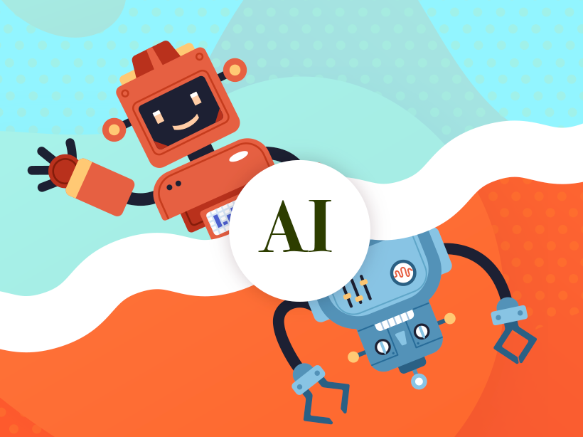







Illustration of a happy red robot waving juxtaposed against an angry blue robot

AI: The Good, The Bad, and How It Will Affect Creatives

The emergence of AI-driven platforms like ChatGPT and MidJourney has transformed how creative agencies approach strategy and content development. Rapid AI adoption brings both opportunities and challenges, often not fully grasped by creative and strategy teams. In this article, we explore the pros and cons of integrating AI into your creative workflow.

Will AI replace your design and strategy teams?

The bottom line is that AI tools like Microsoft Designer, Adobe Firefly, Google Bard, and the plethora of AI tools emerging each day, present a double-edged sword for creative agencies. On the one hand, they can help streamline workflows and save time and money by automating repetitive tasks. On the other hand, they also present a potential threat to agencies’ revenue streams by allowing clients to take on more of the creative work themselves. This in and of itself will create challenges for clients as they try to navigate the focused approach a professional can bring to a creative project by balancing UX, functionality, design, and business goals.

To stay competitive, agencies need to find ways to add value beyond what AI tools can offer. This might mean focusing on high-level strategy and ideation, or finding ways to integrate AI tools into their own processes to enhance their work. At the end of the day, it’s not about whether AI will replace human creatives, but rather how agencies can leverage the technology to create better work and deliver more value to their clients.

At Kanopi we believe that top-tier creative and human-centric experiences will always demand the expertise of skilled professionals. The analogy we draw is: while cell phone cameras have made photography accessible to the masses, we still rely on experienced professionals to capture our most significant life moments. In the same vein, we think clients who recognize the importance of how good design will impact their ROI will continue to depend on the knowledge and skills of professionals to deliver their projects successfully.

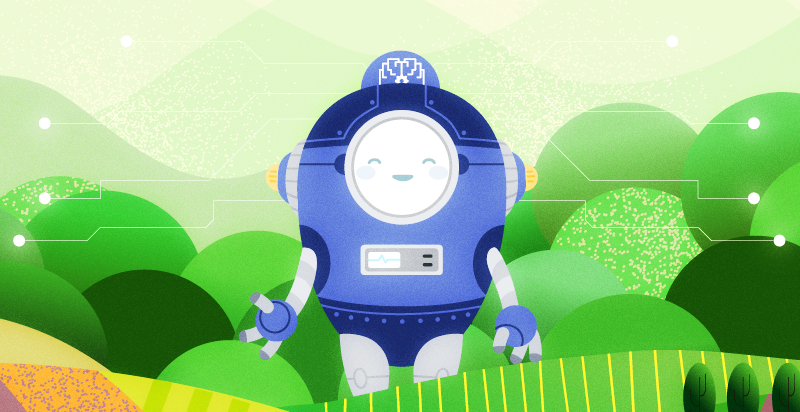
Illustration of a happy blue oval-shaped robot against a green background that simulates trees.

All Hail our Robot Overlords: The case for using AI

We find that most of the advantages of utilizing AI tools come down to the following three categories.

  1. Cost: AI tools are becoming more affordable and may be invaluable for smaller organizations with limited teams to be competitive with larger companies. AI tools can help to reduce the need for expensive design software and personnel, making it more cost-effective for businesses to produce high-quality designs and content.
  2. Speed and Efficiency: AI tools can help designers and content creators to work more efficiently by automating repetitive tasks, such as resizing images or optimizing content for SEO. This can save a significant amount of time and allow designers to focus on more creative aspects of their work.
  3. Creative Ideation: AI tools can contribute to the ideation phase of a creative project by analyzing data from social media trends, consumer behavior, and industry insights to help creatives better understand their target audience. By fine-tuning their ideas with this information, creatives can then create impactful and innovative work that delivers more to their clients.
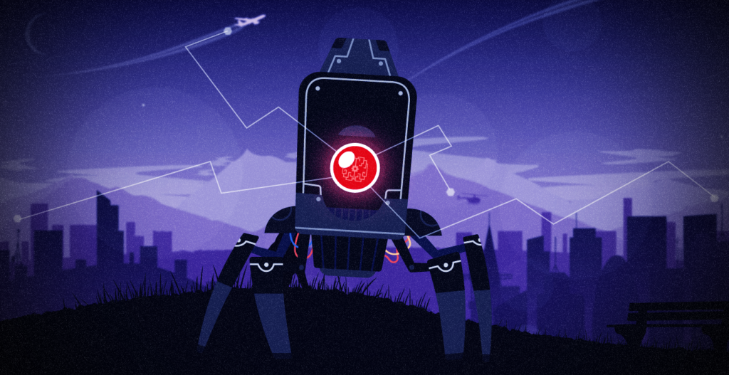
Illustration of a scary robot with one red eye and pointy legs against a dark purple cityscape.

The Ghost In the  Machine: The risks of using AI tools

  1. Legality: The use of AI tools in creative work raises concerns about copyright, sourcing, and how AI consumes work as part of its algorithm. Currently, legislators and legal scholars are grappling with the question of who owns the rights to AI-generated works. We suggest a balanced approach. It is recommended that agencies and individuals use AI as a tactical tool within their creative process rather than relying on it as the sole centerpiece of their ideation and research.
  2. Less creative and unique solutions: AI tools are limited by their algorithms and data sets, resulting in less varied and unique outputs. Even with impressive individual pieces, looking at collections like those in MidJourney’s sample galleries reveals an overreliance on certain design elements, such as teal and blue color schemes. These limitations emphasize the importance of the human touch in creative ideation, intuition, and truly customized designs that AI tools cannot replicate.
  3. Potential for misuse and AI Bias: While AI tools have the potential to revolutionize industries, they are not immune to biases. Human input and limited data can result in skewed outputs that discriminate against certain groups of people. As demonstrated by Amazon’s AI recruiting tool, an over-reliance on data without human oversight can lead to biased outcomes. Agencies need to train their staff to identify and counteract bias in AI tools to prevent potential misuse.

    As AI tools continue to evolve, we anticipate the emergence of ethical AI practices and increased transparency regarding how AI processes and interprets data. These factors will become increasingly important for the widespread adoption and acceptance of AI as a viable business tool in the future.

AI tools can be a valuable asset to creative professionals, providing increased efficiency, accuracy, and cost-effectiveness. However, it is important to balance the use of AI with a human touch to ensure that creative outputs are engaging, usable, and can meet project KPIs. Additionally, it is important to be aware of the potential for misuse and to use AI tools ethically and responsibly. As AI technology continues to evolve, it will be interesting to see how it is integrated into the field of graphic design and content strategy.

Hands on a keyboard

The ROI of Great Website Design

Making the business case for a well-designed website.

From the streaming services we binge to the smartphone we buy, there’s no denying excellent website design matters. Great web design can mean the difference between people landing on your site and coming back daily or landing on your site and immediately leaving, never to return again.

As University of Washington designer and teacher Joe Sparano puts it:

“good design is obvious and great design is invisible.”

Although also invisible is harmful website design that’s inaccessible for some people.

Boosting revenue, increasing donations, enhancing engagement, and saving staff time are just a handful of the many measurable benefits of great website design.

Let’s dig into the details!

Boost your revenue 

It’s hard to ignore the power of discovery paired with quantifiable data to drive content & user experience (UX) improvements. 

Do you know who uses your site and what their needs are?

You may think you know, but the truth is user behavior shifts and changes at a rapid pace. It’s vital to regularly test assumptions about who is currently using your site and how they use it, gathering insight to inform design solutions that better meet user needs today.

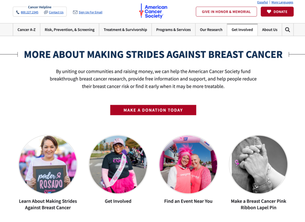
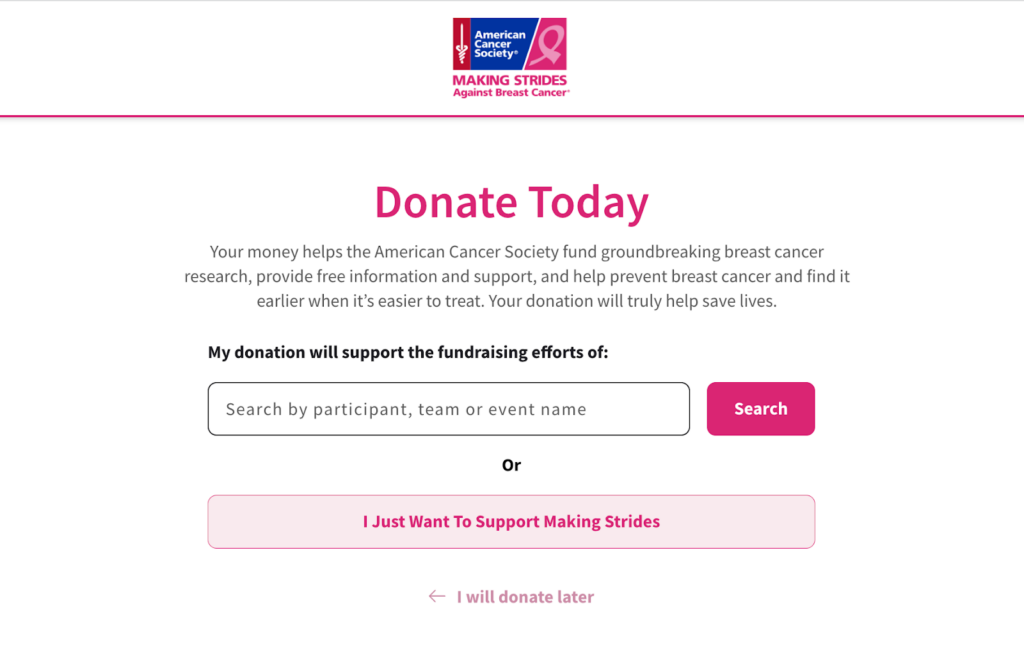
The American Cancer Society (ACS) boosted its revenue by 4.5% by redesigning its website using research and data.

How did they do it? The ACS team created a new donation form on their site that sends funds only to breast cancer research. The nonprofit made it easier for their top personas to do what they came to the site to do, looking at how people interact with their site and how their needs and goals change over time. 

Analytics data showed that ACS was missing out on valuable traffic between its main website and its “Making Strides” sub-site. The team got to work creating clear user pathways between the two websites, providing donors with the action they wanted to take most, as illustrated by the data — supporting breast cancer research specifically. 

cancer.org donation page
Cancer.org form
Source: cancer.org

Increase online giving 

Well-designed nonprofit websites focus on the user experience of its donors, making it easier for them to find the information they need, including all of the ways they can support the organization while allowing them to complete donations seamlessly. 

Great design backed by a donor content strategy leads with impact that’s personal, clearly showing existing and future donors how their generosity makes a difference.

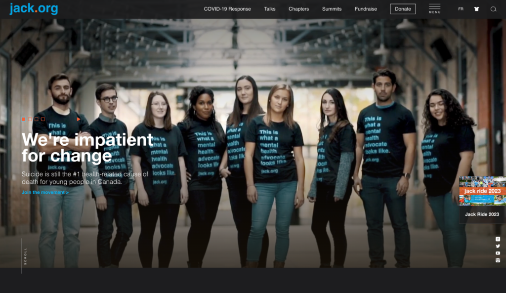
Jack.org is Canada’s only charity training and empowering young leaders to revolutionize mental health. The Canadian nonprofit needed a website to help them better connect with young people nationwide.

By reviewing its donor experience, the charity boosted online donations by 80%, with a 108% increase in online donation revenue. 

How did they do it? They implemented an enhanced strategy focussing on UX, followed by a redesign that included powerful, seamless fundraising and sales integrations, making their site AODA & WCAG compliant.

Homepage of jack.org
Source: Jack.org

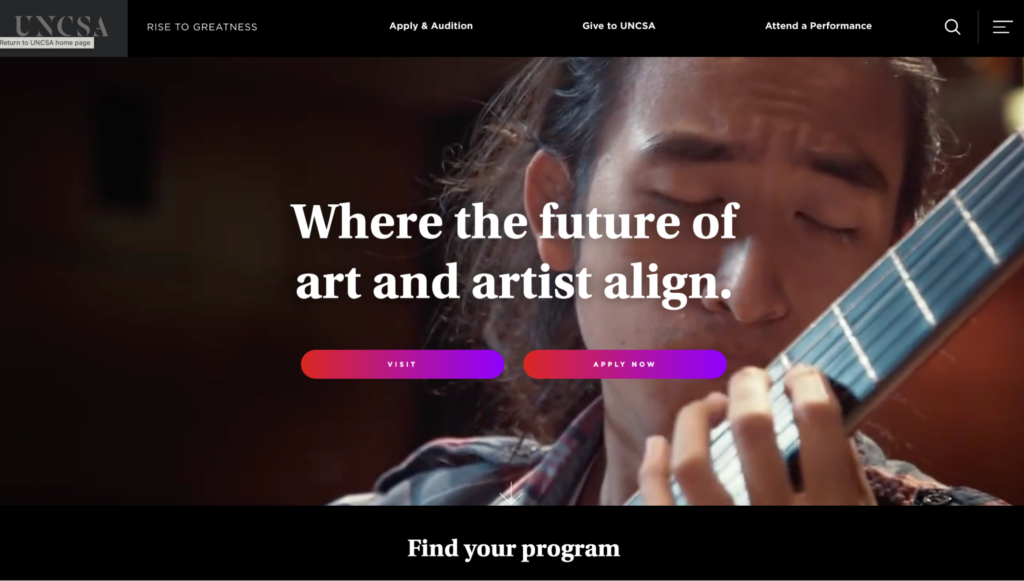
The University of North Carolina School of the Arts decided to redesign its website when it realized it wasn’t meeting the needs of two of its most important groups of people — students and donors. 

By upgrading its information architecture, creating engaging microcontent and improving functionality, admission inquiries climbed 518%, and the university saw online donations increase by 48%:

Univeersity of North Carolina school of the arts home page
Source: UNCSA


“The storytelling as a narrative was really the way to sell and to communicate what the institution is,” 

said Vice Provost and Dean of Student Affairs Ward Caldwell, 

“I think one of the unique aspects of the site design is that it encourages exploration. It provides all the links to move people through the site, but it also encourages people to linger, to get an understanding of how we take students through a journey of artistic exploration.”

Source: UNCSA 

Engage a new generation with machine learning 

Twenty-five percent of what you sell on your website is your product or service. The remaining 75% is an intangible feeling from a package deal with said product or service. 

What do you want people to feel from interacting with your site’s content?

A clear and consistent content style within your website design can help you engage Gen Zers (people born between 1997 to 2012.) Speak to younger folks on a personal level using language and words they recognize and use themselves daily, factoring in aggregated data that helps you better understand your user’s emotions.

Develop a tone and voice that fits your organization and resonates with your users, keeping it conversational and action-based.

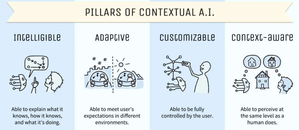
Source: Adobe


Make your site more human using contextual AI to design a website that makes people feel something and achieve ROI growth as you connect with the next generation. Your ultimate goal should be to deliver a focused experience instead of just a website.

Colleges and universities are deploying user-controlled, AI-powered chatbots to connect with people faster, helping them convert more prospective applicants into enrolled students.

Ahead of a new academic year, students have many questions about programs, fees, housing, and more. Admissions departments work flat out, and responding to every question takes time.

Chatbots eliminate this problem. They’re convenient, easy to use and designed to provide automated responses to common questions from students, avoiding ambiguity and slow replies.

Students can chat with them any time, day or night, which is particularly useful for international folks living in a different time zone than their desired college or university. 

Make it accessible to all 

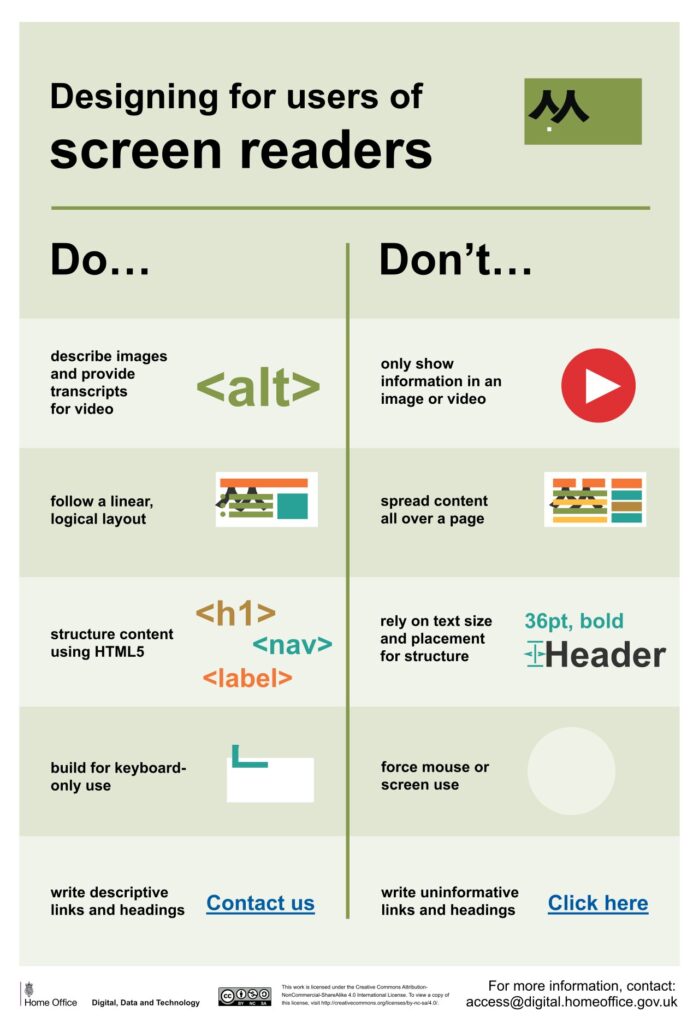
Design that addresses the unique needs, barriers, and challenges that people with disabilities face when using your site will benefit all users, ensuring your site is inclusive and accessible.

Dos and don'ts on designing for accessibility posters by GOV.UK 
Source: Dos and don’ts on designing for accessibility posters by GOV.UK 

Don’t make the mistake of allowing accessibility to become an afterthought you attempt to shoehorn into a near-finished design. It’ll cost you time and money in the long run. 

Fifteen percent of the world’s population, or 1.3 billion people, self-identify as having a disability, so design a website accessible to all and watch your ROI grow. 

What does accessible website design look like? Do you have to forfeit captivating visuals to gain a truly accessible site? Not quite. 

Are you keen to introduce motion on your site to increase engagement? Great! Though first, understand how movement on websites impacts people with vestibular disorders such as epilepsy. Avoid using excessive animation to ensure everyone can use your site, opting for thoughtfully executed motion design users can control instead, for example, prominent pause, stop, and play options on embedded videos.

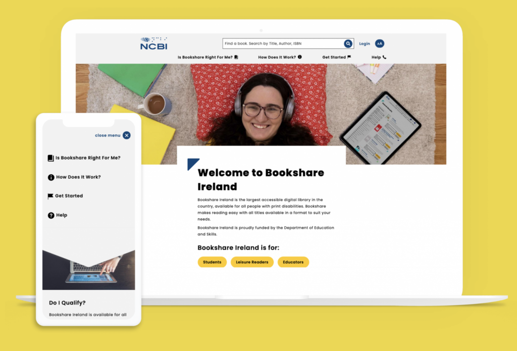
Partnering with the National Council for the Blind in Ireland, Kanopi was able to design a website that’s AAA compliant (the highest level of web accessibility) without sacrificing good design. 

The nonprofit’s site includes fun, engaging graphics with bright colors and relatable student imagery while nailing text-to-background color contrast, large text, and text zoom functionality. Site visitors know exactly where to go from the homepage, with straightforward user journeys for students, readers, and educators:

Source: NCBI Case Study

Rank higher on Google 

A site that’s well-designed and optimized for search engines can drive more organic traffic and improve search engine rankings. It’s that simple.

VITAS Healthcare, a pioneering hospice movement since 1978, improved its organic click-through rate (CTR) by 52% through improved design. A CTR is the percentage of searchers who click on a search engine result.

How did they do it? Improving their meta descriptions made them more descriptive and meaningful, adding direct telephone numbers for folks to reach them immediately.

Meta descriptions are HTML tags summarizing your webpage’s content. It’s a snippet of text, roughly 160 characters long, that appears under your page title on a search engine result page like Google.

The meta descriptions of every landing page you design may fly under the radar at times, though this behind-the-scenes component is key to great website design that ensures your site is discoverable. 

Save staff time  

A well-designed website can make it easier for a nonprofit or higher education institution to complete two vital tasks:

  • communicate with your key stakeholders and 
  • disseminate important information. 

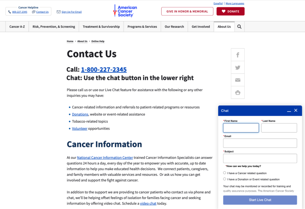
It took staff 25% less time to respond to inquiries following the redesign of the American Cancer Society’s website. They refined their “Contact Us” page with a clear content hierarchy, providing pathways for questions by phone, live chat, or video chat and by topics such as donations and volunteering opportunities:


Chatbot on cancer.org
Source: cancer.org.

How does this translate to ROI? Let’s do some quick math.

Suppose your staff spends 10 hours or 25% of their 40-hour work week navigating and replying to inquiries from your website. With time savings similar to the American Cancer Society at 25%, your staff can now respond to inquiries in 7.5 hours instead of 10. 

For a team of 5, that saves 650 hours per year that could be redirected to other essential tasks within your organization.

Great design starts with research and strategy

Here at Kanopi, accessibility is baked into our process at the start of every website design project. Our strategists, designers, and developers collaborate to skillfully balance website design that produces the wow factor while not compromising on building a site accessible to all. 

Good website design isn’t just “sparkle and boom.” 

The real boom happens when you use research to develop a strategy that enhances your user experience and improves your conversion rates. 

Are you after more donations? More enrollment? More memberships? 

It is invaluable to gain an accurate, up-to-date picture of how people use your site and what they expect to find. Find that sweet spot where content meets both the needs of your users and your organizational goals by developing a content strategy based on user research. 

The tried and tested way to turn one-page website viewers into repeat visitors and continuous supporters is by designing a website with user experience at its core. 

We’ve provided only a handful of examples of how great website design can impact a nonprofit or higher education institution’s ability to achieve its goals and boost its ROI in the process. From increasing revenue, giving and organic traffic to engaging the next generation, improving accessibility, and saving staff time, we think the proven results of excellent site design speak for themselves. 

Green environment technology concept. generative ai showing a tree growing out of a motherboard

Green energy, cloud use, and sustainable websites

This Earth Day, consider how you harness the power of sustainability with your online presence.

Many people assume that the Internet is a more environmentally friendly way of sharing information; businesses and organizations are no longer printing materials on paper or plastics, using inks, and shipping mail as they did before the Internet became the primary marketing hub. There is a large environmental impact with supply chains, but building websites feels less impactful. 

But is it? Not necessarily. In fact, creating and maintaining websites uses a lot of electricity. And websites that are heavily trafficked use even more energy. 

The internet is not as green as you would think. Think of how many people are online at any given time. There’s an impact every time someone sends an email. Every time they send a tweet, or a Facebook post, etc. Then consider that an estimated 37% of the world’s population (that’s 2.9 billion people) have never used the internet, so there are still more people that could be online. 

There’s a carbon footprint involved with all we do digitally. As businesses become increasingly digital, we must ask ourselves how to ensure sustainability online. That means more than just making sure your website is up and running so you can eliminate other forms of communication — it means harnessing the power of green energy, cloud use, and building sustainable websites so that our digital presence is as eco-friendly as possible. 

This Earth Day, we’d like to provide some quick tips on how to be more proactive about sustainability when creating your next website project. 

But first, how “green” is your current site?

How does your website fare now? Use tools like Ecograder and Website Carbon to estimate your digital footprint. It’s an eye-opener to see where your website could be making improvements.

If you follow website UX and coding best practices, here’s the good news: by default, best practices for web design and accessibility translate into more sustainable websites. They are built using lightweight code that can load quickly even on slow connections Since they are designed to prioritize user goals, and performance less time is spent loading or trying to find information … which translates into time, energy, and ultimately cost savings.

Sustainable websites also use fewer resources overall, which helps conserve energy. They are often made as fast and performant as possible, particularly if they are more heavily used on mobile devices. And don’t forget about accessibility: sustainable websites tend to be more accessible for users with disabilities too! 

But if you need your website to be more sustainable, let’s dig into where you can make some impactful changes.

Harnessing green energy in the Cloud 

Green energy is a key component of sustainability online. After all, each time you access the internet, you are using electricity. But what if you could use renewable sources of energy such as solar or wind power instead of relying on fossil fuels? 

Cloud computing makes this possible. By hosting your data in the cloud and taking advantage of green energy sources, companies can reduce their carbon footprints while still getting access to all the same features they would with traditional hosting services. Plus, it’s often cheaper and has lower maintenance for your internal teams. 

In short, work with your hosting provider to make sure your website is powered by renewable energy. 

If you’re looking for a new hosting provider, a great place to look is The Green Web Foundation’s directory, a listing of over 500 hosting providers around the world with a tangible commitment to using green energy in their data centers.

Fun fact: Kanopi is hosted with Pantheon, which offers container-based, serverless hosting. And they’re built on GCP, a green platform

Practice sustainable web design

Practicing sustainable web design will help make your site efficient while reducing website carbon emissions. This includes being smart about how you use images and how they load on the page; one example is using responsive images, which serve the correctly sized image for the user’s device to avoid unnecessary resource usage. 

User Experience (UX) optimization is an ever-evolving practice, and Kanopi is constantly refining our approach to how users consume and interact with websites. By optimizing the user experience of your website, you can expect to see increased user satisfaction, shorter interaction pathways, and a reduction in overall energy consumption associated with your site. Essentially the better the usability of your site, the better it is for the environment. So make sure you know what your audiences are looking for so they can find it fast. 

This also applies to content: create content that is meaningful to your users in order to keep the overall site lean, and avoid content that adds unwanted complexity or bloat to your site. Video content is especially energy dense and should be deployed in a purpose-driven and user-focused manner. 

This website on sustainable web design has many other excellent suggestions on how to keep your site design as sustainable as possible.

Improve your page speed and performance

The faster your site loads and users find what they need, the less energy is used. The more efficient, the better. It really is that simple. 

How the site is built and developed is key. Due to the collaborative nature of open-source tools and the community, software tools are optimized for better performance and efficiency (something proprietary solutions don’t often consider). Open-source tools can also help lean teams start small and test ideas before scaling, thereby reducing waste. 

Website optimization is not a “set it and forget it” activity. It’s an area where you can always make iterative improvements, and ongoing optimization of your website is essential to reducing your energy footprint. 

This can be done in several ways:

  • Ensure your codebase is meeting or exceeding current best practices. Over time, these efficiencies will result in less energy consumed overall and will allow your site to stay evergreen.
  • Performance reviews. Looking at the key metrics that inform Google’s Core Web Vitals is a great way to impact your page speed (and rank higher in search results, too). UX patterns play a role here as well, since patterns like carousels are tricky to implement without noticeably affecting your page load times.
  • Only track what you need to track, and use a tag manager. Third-party trackers are one of the biggest culprits when it comes to slowing down your site. Think hard about how, when, and where you’re using the information, and only collect what you need. It’s also better for user privacy, which your users will appreciate!

Sustainability is good business. 

At the end of the day, harnessing sustainability online is essential for businesses looking to remain competitive in today’s digital world while still being mindful of their environmental impact.  

So when you’re thinking of more ways to be eco-friendly around the office, think beyond ways you can make your physical space greener or how your IT infrastructure could have a greener footprint. Consider how you can also apply eco-friendly techniques to your entire digital environment. In tandem with websites, sustainable digital marketing strategies go hand-in-hand. When it comes to digital marketing campaigns, it’s important to think about how you can minimize your environmental impact while still achieving your goals. This includes focusing on organic search traffic rather than paid ads whenever possible, and utilizing email marketing over direct mail campaigns which require physical materials like envelopes and paper. 

We recommend regular UX and code audits as the improvements they can provide are not only essential to the long-term health of your website but also have a direct impact on the amount of energy consumed (Kanopi can help with audits). Taking a holistic approach to sustainability will ensure your business is doing its part, and opportunities for positive impact exist at every level and scale. 

By keeping these tips in mind, CMOs and marketing managers can make sure their businesses are doing their part for people AND planet alike. 

Additional resources:

Businessman pointing finger at chart to analyzing growth, Site stats, Data inform, Statistics, monitoring financial reports and investments concept illustration

7 Key Tactics to Drive Website Homepage Conversions

Vivian Clark

The homepage is the first impression of your website. Ensure it's attractive, compelling, and easy to use so they'll stay on your site rather than bounce to competitors.

How does your website conversion rate affect your business?

Your website conversion rate is the percentage of visitors who take specific actions on your site (e.g., sign up, download, purchase). Your website conversion rate affects revenue, customer acquisition cost, return on investment (ROI), and customer engagement and loyalty — some of the most critical factors determining your business’s long-term success.

So how do you create a great homepage? Let’s walk through 7 key strategies you can apply immediately to your homepage to improve conversion rates.

1. Understand your audience 

Create meaningful connections with your customers by understanding who they are and what they want. You must understand their needs, goals, behaviors, and values. The best way to do that is by using quantitative and qualitative research methods and building personas.

  • Google Analytics: What are people coming to your site for? What pages are they landing on? How much time are they spending on the site? These questions can reveal valuable insights about how customers interact with your homepage — and where you might fall short.

Related read: Goodbye Universal Analytics. Hello, Google Analytics 4 (GA4)!

  • User research: You can also learn a lot by analyzing user interaction with heat mapping. Better still, interview your audience directly about the problems they’re trying to solve, what pain points or frustrations they are experiencing while trying to complete their tasks, and what improvements they would like to see implemented.

Related read: Audience Behavior: Learn More with User Research

  • Personas: After quantitative analysis and user research, you can create personas, which are fictional characters that represent your target audience. Ultimately, personas help prioritize content, design solutions, and user experience to meet better user needs. They also establish messaging that can be used across different channels — from social media to email marketing — to better communicate with customers.

Related read: How personas help with website design

2. Clear Value Proposition

Create a one-sentence description of why your company exists. It goes beyond the obvious — “we make great software” — to explain what makes your product special and unique. 

The best value propositions have three characteristics:

  • They are specific: They use quantifiable metrics or measures (number of customers, dollars saved, etc.) to show how your product works for the customer.
  • They are unique: You should describe how your product differs from and is better than competitors’ offerings.
  • They tell a story about how customers will benefit from using your product or service.

Many websites with strong value propositions effectively communicate the benefits of their products or services to potential customers. Here are a few examples:

  1. Grammarly – Great Writing, Simplified: The value proposition is specific and unique in helping users improve their writing skills by eliminating grammar errors. It also tells how using Grammarly can help users make a better personal and professional impression.
Grammarly's home page
Grammarly’s home page
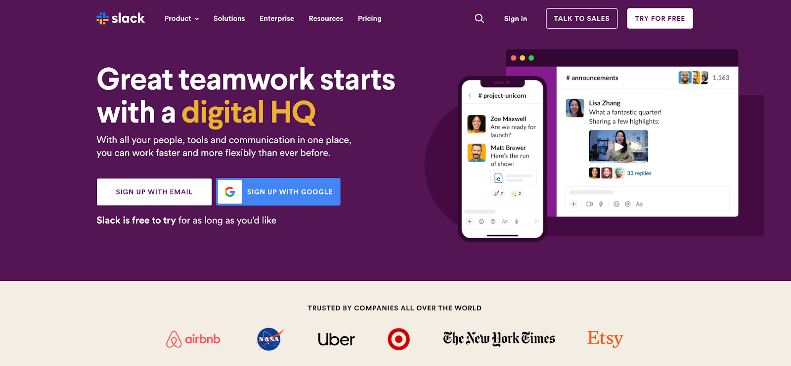
  1. Slack – Credibility and Productivity: Slack’s value proposition focuses heavily on the remote teams’ pain points by offering workplace communication and collaboration solutions. They also tell a story about how using Slack can help users stay connected and productive no matter where they are.
Slack's home page
Slack’s home page
  1. Uber – Offering Convenience: Uber’s value proposition centers on providing a convenient, reliable, affordable transportation service through a user-friendly mobile application. They target two distinct audiences with different value propositions: passengers and drivers.
Uber home page
Uber’s home page

Related read: The Top 5 Content Strategy Trends for 2023, Five Ways to Improve Your Healthcare Content Strategy.

3. Goal-Based Information Architecture

Information architecture (IA) is the structure that supports the organization of content and functionality on a website. It is how visitors navigate a site and find the information they’re looking for. It is not supposed to be a reflection of how your organization is structured; instead, information architecture aims to provide users with access to information in a way that makes sense to them.

High findability and discoverability results from a goal-based information architecture and well-designed navigation system. It reduces the number of unnecessary clicks by offering straightforward user journeys, which can increase customer satisfaction and loyalty.

As you think about building your site information architecture, keep these components in mind:

  • Organization: How we categorize and structure information.
  • Labeling: How we represent information.
  • Navigation: How users browse or move through information.
  • Search: How users look for information.

4. Offer a More Engaging User Experience

Make sure your website is easy to use, engaging, and relevant. Here are some tips to help you do that:

  • Include search functionality: Searching is one of the most popular and efficient ways to navigate online. So help your visitors find the information that interests them without having to click through multiple pages or scroll through lengthy content.
  • Create easy-to-scan web pages: Nowadays, people rarely read web pages word-for-word. Instead, they scan them to get the gist of what’s being said. It is especially true for users with low reading skills or who are in a hurry. To help with this, break up your content into digestible chunks that make sense and get your message across, and be strategic about how you use images to aid in understanding.
  • Offer live chat support: Live chat support allows visitors to contact someone from your organization immediately if they have questions about products or services before buying.

5. Improve Page Load Time

Speed is a significant factor in the success of a website. The faster your website loads, the more likely it is to convert your visitors into customers. If your site takes too long to load, people will leave and go somewhere else.

  • Images are often one of the biggest causes of slow-loading pages. Ensure you’re using the correct image format (JPEG or PNG) and compressing them as much as possible without losing quality. Also, don’t forget to check image dimensions — if they’re too large, they’ll slow down your site even more.
  • The content of your page is another major factor in its speed — especially if you’re using some plugin or lots of external resources, such as fonts. You should also make sure that both your CSS and JavaScript files are cached by browsers. You can add expired headers or move them to a CDN (Content Delivery Network).
  • Use loading progress indicators or skeleton screens for any action that takes longer than one second. Skeleton screens provide a blank version of the page into which information is gradually loaded. It creates the immediate sense that data is incrementally displayed on the screen and lets people have a great experience while waiting.

PageSpeed Insights by Google is an excellent tool for checking your site performance and getting recommendations for optimizations.

6. Design for Mobile Devices

Designing a mobile-friendly website is one of the critical things you can do to improve your conversion rate. While desktop computers are still the most common devices used to browse the Web, over 50% of all online searches happen on mobile devices. Mobile users also make more purchases on their phones and tablets than desktops (which means that your forms should be easy to use as well). 

Here are some helpful tips for designing for the small screen:

  • Make your site mobile-friendly and responsive: A mobile-friendly website displays correctly on any device — including smartphones, tablets, and desktop computers — without requiring users to scroll horizontally or zoom to view content on their screens. Responsive design adjusts the layout of a page depending on whether someone is viewing it on a mobile device or desktop computer.
  • Reduce Clutter: Mobile screens are smaller than desktops — so it’s important to reduce clutter and focus on the most critical information. You can remove unnecessary graphics and text and minimize content that isn’t crucial to the user’s primary task. 
  • Minimize user input: Reduce the amount of information required from users. Limit forms to only those essential fields, allowing users to submit data without entering it manually and taking advantage of touch controls.
  • Keep Mobile Navigation Simple: Refine navigation to be discoverable, accessible on mobile, and easy for users to explore and complete all primary tasks without explanation. Navigation should always be available, not just when we anticipate that the user needs it. Ensure the labels are clear and concise, and all links are visually distinct to make them clear when users have activated them.

7. Craft strong call-to-action (CTA)

A strong CTA is the most crucial part of your homepage. It should be clear and compelling but not pushy or salesy. It should also take visitors to a page that matches their intent — one that’s relevant to their interests and needs.

It’s tempting to think of your homepage as an opportunity to get people excited about what you do but remember why they’re there first: because they want something from you. The best CTAs are specific and measurable (for example, “sign up for our newsletter”) rather than vague (“learn more”). If visitors need to know what they’ll get from signing up for something, there’s no reason for them to do it!

A good CTA has three key elements:

  • Clear: It’s clear what visitors should do when they click the button (e.g., sign up for your newsletter).
  • Compelling: The button should inspire visitors to take action, not just give them an option. An effective CTA will lead people through the funnel and get them closer to conversion than a weak one.
  • Concise: Your CTA needs to be short enough that it doesn’t distract from the rest of your content but long enough that it still feels like an actionable step for visitors.

Start converting! 

This suggestions list, while extensive, is not exhaustive. But by following these essential strategies and keeping them in mind when developing a website, you will be able to create a powerful and effective homepage that is useful for users and drive conversions that result in loyal customers and fantastic ROI.

Want to learn more about how you can leverage your website to generate demand and drive conversions? Contact us, and we’ll guide you through these strategic processes.

Kanopi Team

How to make your website recession-proof

Take these steps to set your site up for success.

The economy is ever-changing, but one thing is certain: websites are here to stay, and are increasingly critical to the success of any business. The world continues to navigate through the pandemic, inflation, and bank closures while some economists predict a recession in the near future. Through all that uncertainty, it’s important to make sure your website is recession-proof so you can maintain your business during tough times. 

As luck would have it, these tips are best practices regardless of whether there’s a recession or not. If you’re already doing these steps, well done! You’re already set up for success if times get tough. 

If you aren’t, what are you waiting for? Whether you’re just starting out or already have an established presence online, there’s no time like now to make sure your website is prepared for whatever lies ahead.

Let’s take a look at some of the best ways to make your website recession-proof:

  • Know your audience
  • Improve the user experience
  • Develop an SEO strategy
  • Focus on quality content
  • Optimize for mobile devices
  • Build brand loyalty
  • Perform regular maintenance on all the above

    Know your audience. 

    This may seem obvious, but don’t dismiss this step. One of the most important aspects of running a successful website is understanding who your audience is and what they want. Knowing your target demographic can help you create content that resonates with them, resulting in higher engagement and more conversions. 

    Use analytics tools such as Google Analytics to track user behavior on your site so you can identify trends and adjust accordingly. Additionally, use surveys and polls to gain direct feedback from customers about their experiences on your site. 

    Improve the User Experience. 

    User experience (UX) is also key when it comes to making sure your website stands out from the competition during a recession. People don’t have time to waste hunting around for information or struggling through an overly complex navigation system — they want answers quickly. Make sure your site has a simple and intuitive design, attractive visuals, and easy-to-find information about products and services so users can find what they need without wasting time. 

    Additionally, utilize customer feedback to see where improvements could be made and keep track of customer engagement on each page of your site so you know what works best and where changes should be made. 

    Develop an SEO strategy. 

    Search engine optimization (SEO) is essential for getting your website noticed by potential customers. When people search for a product or service related to what you offer, they want to find relevant results quickly. This means that you need to optimize your website with the right keywords so that it appears on the first page of search engine results pages (SERPs). 

    How do you do this? Use tools like SEMRush or AnswerThePublic to study what keywords people search for. Next, create quality content that uses those keywords (but don’t engage in keyword stuffing! That will have a negative effect). Lastly, you’ll want to create backlinks from other websites back to yours, such as providing a guest post on another site that provides a link back to your blog. 

    An effective SEO strategy will help increase organic traffic which in turn can lead to increased sales during times of economic uncertainty. 

    Focus on quality content. 

    Piggybacking off the SEO needs, your content should always be king when it comes to making sure your website stands out from the competition. Quality content not only helps attract new visitors but also keeps existing ones coming back for more. Aim to provide valuable information through blog posts, videos, images, and other media. If you’re able to answer frequently asked questions or provide helpful advice regarding topics relevant to your business, even better! This will help establish authority and trust with potential customers while also boosting SEO rankings. 

    Additionally, make sure you’re optimizing your content. In addition to using the right keywords, ensure that all titles, tags, headlines and images are accurate and relevant to what customers are looking for. 

    Lastly, make your content as accessible as possible to reach a wider audience.

    Optimize for mobile devices. 

    With more people turning to their phones and tablets as their go-to device for browsing the web, optimizing for mobile devices has become increasingly important. When it comes to mobile, you’ll want to make it easier for users to find what they’re looking for quickly and efficiently. 

    Make sure all page elements are sized properly so that they fit within a phone or tablet screen without having to zoom in or scroll horizontally. Additionally, consider utilizing responsive design techniques so that pages automatically adjust based on the size of the device being used to view them. 

    Build brand loyalty. 

    Engaging with customers on a personal level can be key when it comes to staying afloat during economic downturns. Building customer loyalty through social media campaigns and newsletters can be an effective way of connecting directly with potential customers and encouraging them not only visit but also return to your website frequently. You can also use surveys or feedback forms on your website so that customer opinions can be taken into account when making decisions about product offerings or services in order to better meet their needs.  

    Perform regular maintenance on all of the above.

    Creating a website is not a “set it and forget it” activity. As the internet evolves, your site needs to evolve with it. It’s best to keep your site updated regularly with iterative updates rather than let it sit for too long; if you leave too much to fix at once, you can get stuck making expensive fixes later.

    Revisit your audiences biannually to make sure you’re still addressing their needs. Review your data regularly to see what’s resonating with your audiences, and where you’re losing them, and make UX edits accordingly. Audit your content regularly as well to modify content that’s underperforming and update content that’s performing well to keep it that way. Check your site’s performance regularly to make sure it’s loading quickly, which will cut down on bounce rates and site abandonment.

    Making these changes now will pay off in the long run.

    A recession doesn’t have to spell doom for businesses operating in the digital space — not if they take proactive steps toward ensuring their websites are optimized in every way possible. By following these steps today, you can ensure that your website will remain competitive tomorrow no matter what economic conditions may come your way.

    And if you need help, Kanopi’s always here for you

    12 Business Benefits of Using WordPress for Enterprise

    WordPress is the most popular content management system (CMS) by far, powering 43% of all websites. WordPress hosts sites for a wide variety of organizations, including media groups, nonprofits, higher education institutions, and corporations. But is WordPress for enterprise the right platform for your business’s complex needs

    Enterprise-level companies require reliable and scalable websites to grow and compete with other large organizations in the digital era. Often, enterprise leaders turn to expensive and complicated customized web solutions to host their sites. 

    WordPress has evolved into a powerful and flexible solution to handle complex enterprise needs. Now, well-known brands like Facebook, Microsoft, and Spotify run their websites using WordPress. 

    In this guide, we’ll walk through the following sections to give you a better sense of how WordPress for Enterprise can benefit your organization:

    Let’s start by answering some of the most frequently asked questions about WordPress for Enterprise. 

    WordPress for Enterprise: FAQs

    What does WordPress for Enterprise mean?

    WordPress for Enterprise is the application of the WordPress platform to meet the needs of large businesses. These organizations are usually multinational corporations with multiple domains and thousands of users accessing their sites at once.

    According to WordPress, their enterprise solutions are used “wherever there’s a requirement for flexible, cost-effective, and secure creation and distribution of content.” Media and publishing organizations, E-commerce sites, and other large-scale businesses use this solution for their online marketing, communication, and commerce needs. 

    What features do enterprise websites need?

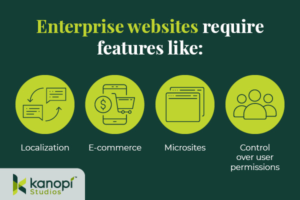
    Enterprise websites require the ability to handle significant traffic and user engagement. Often, these sites will need to support features like:

    Enterprise WordPress websites require features like localization, e-commerce, microsites, and control over user permissions.
    • Localization. Localization requires adjusting site content to the cultural and linguistic norms and context of different target audiences. Localization involves translating text and adjusting images and text to ensure all website elements are culturally appropriate and relevant. This is especially important for organizations that offer services for an international audience, such as airports or global health organizations.
    • E-commerce. Some enterprise websites require e-commerce functionality that allows visitors to browse products or services and complete secure transactions. This involves an online storefront and a secure payment processor with multiple payment options. 
    • Microsites. A microsite is an individual web page or site made to function as a separate entity while still being a part of your existing website. Some corporations use microsites to promote sub-brands or special events. 
    • Control over user permissions. Enterprise websites need to only allow specific users permission to access certain features. This promotes greater security across the organization. 

    Enterprise websites must connect with a diverse, often global audience. These features make it easier for marketing professionals to promote their businesses while maintaining reliable security and other core features.

    What’s better for an enterprise — WordPress or Drupal?

    As you search for a new CMS, you might also come across Drupal as a top option. Drupal is another open-source CMS that organizations with complex needs, like enterprises and government institutions, use to create robust and secure websites. 

    Drupal also offers multilingual functionality, security, and control over user permissions. In addition, Drupal has strong accessibility for both back- and front-end users. The release of Drupal 10 in 2022 unveiled the platform’s most modern, accessible editing experience yet, along with a host of additional advanced features. When choosing between Drupal and WordPress, consider your corporation’s unique needs and what CMS features you will prioritize. Explore our guide to Drupal vs. WordPress to learn more about the primary differences between these platforms and help determine which CMS is right for your enterprise. 

    Common WordPress for Enterprise Misconceptions

    Due to the early days when it was primarily a blogging platform, several misconceptions about WordPress’s capabilities have prevailed over time. Here are a few common misunderstandings: 

    WordPress is only for blogs and is not a true CMS.

    As mentioned, WordPress powers 43% of all websites (including websites for some of the biggest brands today), meaning it can do much more than just blogging.

    WordPress is not great for security.

    Third-party plugins may create a little bit of risk, but WordPress’s core system is incredibly safe.WordPress has also invested in fast security releases, with a team of 50 experts managing them. Even whitehouse.gov is on WordPress, showing how far the platform has come in regard to security. 

    Open source is not reliable at the enterprise level. 

    Enterprise-level organizations can safely use an open-source CMS. Massive sites like Facebook and Google use open-source systems to power their tech. 

    WordPress doesn’t offer a lot of support.

    WordPress’ extensive open-source community facilitates access to tons of contributors and developers that create new plugins, themes, and features every day. As a well-known and popularly-used CMS, WordPress has plenty of support from millions of users and experienced developers. 

    12 Benefits of WordPress for Enterprise

    What’s the true story about what WordPress can do for your enterprise website? Let’s take a look at the top benefits of WordPress for enterprise: 

    1. High ROI

    WordPress’s return on investment is very high compared to proprietary systems, especially in terms of the total cost of ownership (WordPress is free!) and implementation speed. Building and testing new features can be completed in just a few weeks because of easy access to themes and plugins. 

    2. Strong security

    As mentioned, WordPress offers consistent updates and security releases to protect users from common hacks. You can also look to additional security plugins to further protect your site.

    3. SEO friendly

    Search engine optimization (SEO) is crucial to help boost the visibility of your enterprise website across search engine results pages. WordPress offers built-in SEO-friendly features, such as optimized URL structures and category and tag options that help search engines better understand your website’s structure. Plus, using an SEO plugin like Yoast, All in One SEO, or SEOPress can make the optimization process even simpler. 

    4. Access to integrations

    Because WordPress is so popular, there is already a vast number of third-party tools that are ready to integrate with your system. This means your enterprise business can quickly add features and make site updates without needing to invest in expensive custom solutions. Besides the many free tools, enterprise businesses can also invest in premium paid plugins with added support!

    5. Easy to use

    Once your site is up and running, the WordPress platform is perfect for non-technical users. The Block Editor (also known as the Gutenberg editor) offers an intuitive backend experience that arranges content into a series of blocks for text, images, videos, and other page elements. This ensures that any of your enterprise businesses’ team members can jump in and make necessary changes.

    If you need help along the way with managing your content, there are plenty of resources available—start with Kanopi’s webinar on the subject!

    6. Open-source community

    One of the most valuable features of WordPress is the open-source community supporting its development. These contributors create new plugins, themes, security patches, and features to help WordPress users customize their sites to their needs. This community is always growing and evolving. 

    7. Accessible

    WordPress is devoted to creating accessible front- and back-end user interfaces. Their Accessibility Team runs ongoing audits and tests on themes and functionality using assistive technologies. Also, any code built into the WordPress core system must meet the Web Content Accessibility Guidelines version 2.1 level AA

    8. Scalable

    WordPress has made great strides when it comes to improving website performance. You can ensure your website is prepared to handle a large amount of traffic by making use of these WordPress elements: 

    • Keep your code clean and only invest in high-quality, lightweight plugins and themes. 
    • Use a page caching tool to help improve page load speed. 
    • Select an enterprise WordPress host that emphasizes scalability. 

    Scalability is necessary to ensure that your enterprise website can manage a large volume of traffic efficiently.

    9. Streamlined media management

    Enterprise businesses use many online media types such as documents, visual media like photos and videos, and audio files. With WordPress, you can upload and manage just about any media type in a streamlined and intuitive manner. Easily manage media on the backend and edit it visually on the front end.

    10. User management and multisite domains

    Your enterprise website may need to run a network of subdomains or microsites and give access to only a select number of team members. WordPress supports multisite usage with Super Admins, a user role that can set up networks and control user permissions.

    11. International capabilities

    Your enterprise website must be scalable on an international level. WordPress is available in over 100 languages, ensuring you can effectively reach your global audience.

    12. Flexible and agile

    This is the true differentiator between a proprietary and open-source system. Your enterprise business’ next goal is always going to be starting a new project, making processes more efficient, or releasing updates, all without compromising quality.

    That’s why you need a system with high agility, like WordPress. With easy collaboration between content editors and developers, the WordPress system allows your team to build and expand website features quickly without breaking the bank.

    Enterprise WordPress Development Services

    Do you have a large-scale project in mind? Or do you already have a built-out enterprise-grade website and just need support

    Consider working with a WordPress development expert like Kanopi. Our professionals work closely with your enterprise business to understand your unique needs and strategize how your WordPress website can best support them.

    Plus, Kanopi takes a continuous improvement approach to ensure that your site is always improving over time — perfect for a quickly-growing enterprise business.

    Our WordPress development services include:

    • Plugin and theme upgrades
    • Security patches
    • Performance enhancements
    • Content strategy
    • E-commerce updates

    Plus, we have a dedicated enterprise support tier customized to your business needs, ensuring that your website stays updated and viable over the long term. 


    WordPress is a flexible, scalable, reliable CMS that can take your enterprise website to the next level. If you’re looking to upgrade your CMS or switch to WordPress, the recent release of WordPress 6.1 and the improvements that come with it mean that it’s a great time to get on board. 

    Looking for more information about what WordPress can do for your business? Start here:

    At Kanopi, we’re always trying to stay on top of best practices, and also always looking forward to what’s coming so we can offer our clients the most up-to-date solutions and recommendations. With that in mind, our creative team has pulled together our thoughts on what we’ll be seeing more of in web design in 2023. 

    AI-generated assets

    In 2022 artificial intelligence (AI) tools came to the forefront with Midjourney, Jasper, and Dall-E breaking out into the public consciousness as tools for generating (in some cases jaw-dropping) textual, illustrative and photographic assets. (note: Jasper also creates content if you need help writing blogs or social media posts).

    The viability of these tools will be tested in 2023 as creative teams look for ways to incorporate them into their project pipelines. AI could potentially be a way to generate creative assets that, in the past, were cost prohibitive, especially for clients in the non-profit space. It will also allow content teams to move faster if they’ve had to rely on others for artwork to accompany their content. 

    Where we will see challenges arise is in the variability of AI-generated assets. You never quite know what you’re going to get, so art directing an AI bot may prove frustrating or time-consuming. AI-generated art also raises some questions about copyright, infringement, and ownership, as well as questions about ethics and if it is actually art at all. We feel these issues will need to be further clarified before AI can be fully embraced as a production tool in agencies. It will also be interesting to watch how stock photography sites respond as users create their own AI-generated content rather than searching through stock libraries.

    While there are tangible issues with using AI, the speed and flexibility at which teams can create assets using platforms like Jasper and Midjourney cannot be ignored. We see 2023 as the year in which many organizations will start to assess the benefits and integrate AI-generated copy and art into their creative workflow. All hail our robot overlords!

    Very realistic image of a shark generated by artificial intelligence.
    AI-generated shark created by Michael Howeely

    The end of Corporate Memphis

    We’ve seen the flat minimalist illustration aesthetic known (often disparagingly) as Corporate Memphis become ubiquitous over the past few years as a way for agencies to add custom illustrations to their creative product. Generators such as https://stubborn.fun/ have further reduced the time and cost associated with custom illustration and has allowed for the proliferation of this style across the web.

    **Warning: strong opinions ahead**

    Here at Kanopi, this is one trend we’re happy to see is coming to an end. The Corporate Memphis style was one that was intended to communicate a streamlined, minimalist aesthetic while allowing for custom messaging in a medium that has traditionally been time-consuming and costly. In practice, however, we found the opportunities presented by this minimal aesthetic were squandered in favor of presenting stiff characters in generic environments with little to no context or meaningful connection to the content they are intended to support. In essence, this style became a substitute for stock photography, but in illustrative form. 

    In 2023, we’re looking forward to a move towards meaningful, contextualized custom illustration. We also see a move towards incorporating geometric patterns and organic textures into illustrations as a positive move away from the rote flat designs which was a key signifier for Corporate Memphis.

    Illustration of a business woman and business man shaking hands.

    This leads us to….

    Greater emphasis on custom illustration

    We see a move to customized illustration as a trend that will continue to blossom in the coming 12 months. The shift towards greater use of texture and naturalistic illustration styles is something we find refreshing when compared to the more mechanical illustrative styles used in recent years. 

    Illustration has traditionally been seen as a cost and time-intensive endeavor for website owners. The emergence of tools like Procreate and Adobe Fresco has effectively lowered these barriers. Designers now have access to simple yet powerful hardware and software tools that reduce the time and cost that are usually associated with custom illustrations.

    Website owners would further benefit from customized illustrations as it helps provide specific context and meaning that can be lost if using only photographic elements. The ability to incorporate micro-interactions and animations to explain products and services presents a powerful way to captivate users and draw them further into your website experience. A great example of these concepts is the Todoist website which is a masterclass in the effective use of illustration to support content.

    Lastly, who doesn’t like something that is truly unique? Customized illustration allows website owners to differentiate themselves by showcasing an experience that is wholly theirs. We think this combined with the increasing creative avenues designers have to generate custom illustration will see this trend continue throughout 2023.

    The return of expressive typography

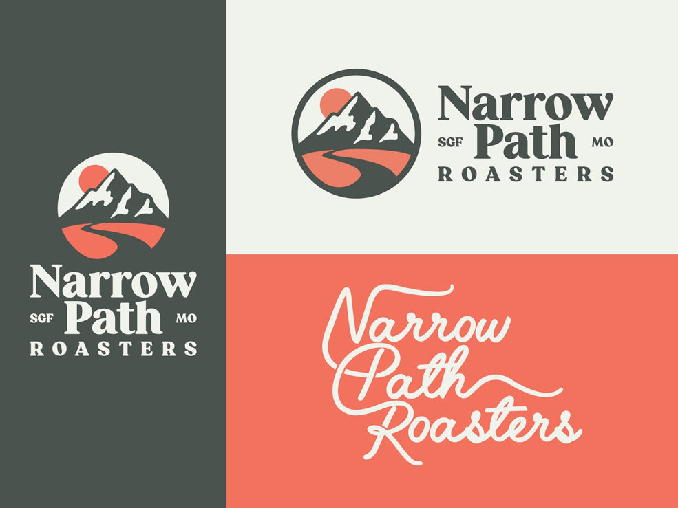
    Over the past decade, typography has shifted towards placing a more practical and utilitarian (often minimalist) focus on its usage for web projects. We think 2023 will see the return of expressive typography. 

    We predict a greater focus on “maximalism” and adopting some of the humanist letterforms seen in vintage typography. Additionally, with the emergence of inexpensive tools like Glyphs, custom typography may also have a minor renaissance.

    A return to placing greater emphasis on art-directing type will allow designers to expand the creative applications of typography in their projects. But watch out for potential pitfalls: the factors that will ultimately determine whether this is a lasting trend is how we balance user needs in the areas of accessibility and legibility with the creative treatment of typographic elements. It’s great to get creative and expressive with typography, but it’s not ok if it’s at the expense of users.

    Examples of different typography treatments for a company called Narrow Path Roasters
    Typography by Ben Howes

    Visual storytelling grows up

    At its core, design is about telling stories, so visual storytelling has always been a crucial part of effective digital experiences. The best visual narratives help distill complex or abstract concepts into easily digestible ideas for our clients

    While the pandemic ushered in a return to minimalism, now designers are starting to prioritize rich visual storytelling that goes beyond copy and videos. We see a greater emphasis being placed on incorporating 3D elements, inclusive visuals, animation, and the creative use of whitespace utilized as a way to tell engaging stories. An excellent example of this is the Population Healthier microsite.

    We’d caution against going too far with this, however. You want to balance the desire to add these elements with accessibility and usability best practices. Sometimes less really is more!

    And if your team is ready to take your website’s design to a new level in 2023, contact us. Kanopi always creates with the future of web design in mind.

    screengrabs of Figma, Sketch, and Adobe websites

    Our Top 5 Web Design Tools

    Paul Circle
    Paul Circle

    The pros and cons of our favorite design tools for web and app design.

    A lot has changed in the design world the past several years, especially with the tools designers use to create work for clients. Ten years ago, most designers would probably say that the primary tool they used to create designs was Photoshop; it was simply a sign of the times. There weren’t many options to choose from during those days; Sketch was only two years old and still pretty new on the scene. While Photoshop and the rest of the Adobe Suite are of course fantastic for design and imagery, they come with high learning curves and don’t always translate easily into web design. 

    Flash forward to the present day and you’ll notice there are many tools to choose from. Perhaps too many. That’s a great problem to have. That means designers have options they can choose from to meet their own personal design needs, whether those needs relate to fun, work, or both. With all these options, it can be hard to figure out what tools are best for both the designer and the job.

    We at Kanopi figured we would help designers who might have that problem by presenting them with the top 5 design tools that designers like to use.

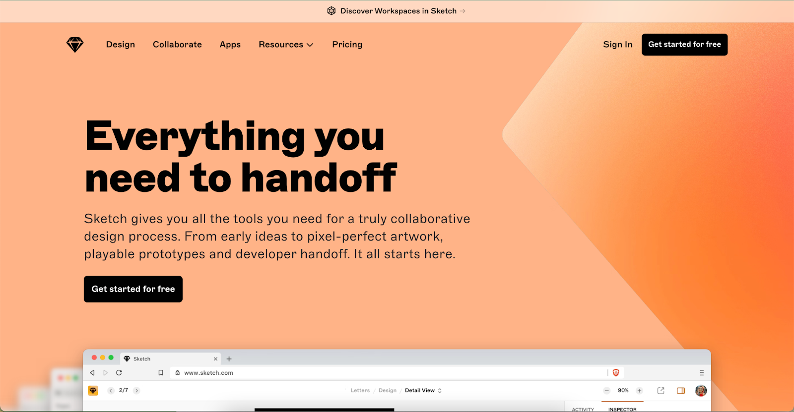
    Sketch

    Screengrab of the Sketch website

    Released in 2010, sketch quickly became an industry standard for designers seeking alternatives to Photoshop and Illustrator. Since its release, Sketch has become a robust design platform for UI/UX design and won Apple’s Design Award in 2012.

    OS: Mac OS

    Pricing: $9.00/Mo or Yearly Plan of $99.00

    Pros:

    • Prototyping and design system functionality
    • Robust illustration tools
    • Online community of resources
    • Low learning curve
    • Intuitive UI
    • Has many plugins
    • Vector based
    • Local app does not need to rely on internet connection/syncing
    • Exporting assets is easy
    • Offers versioning
    • Can easily create and manage elements/components easy with symbols and color variables
    • Imports PDFs and SVGs easily

    Cons:

    • Desktop application only for Mac
    • Web application is not robust
    • Collaboration is not seamless. Project files must be uploaded to web application
    • No free version
    • Local files are difficult to share compared to browser based applications
    • Prototyping lacks easy sharing. Must use 3rd party applications like Proto.io
    • Manual saving
    • Need applications like Zeplin for developers to export css and design assets.

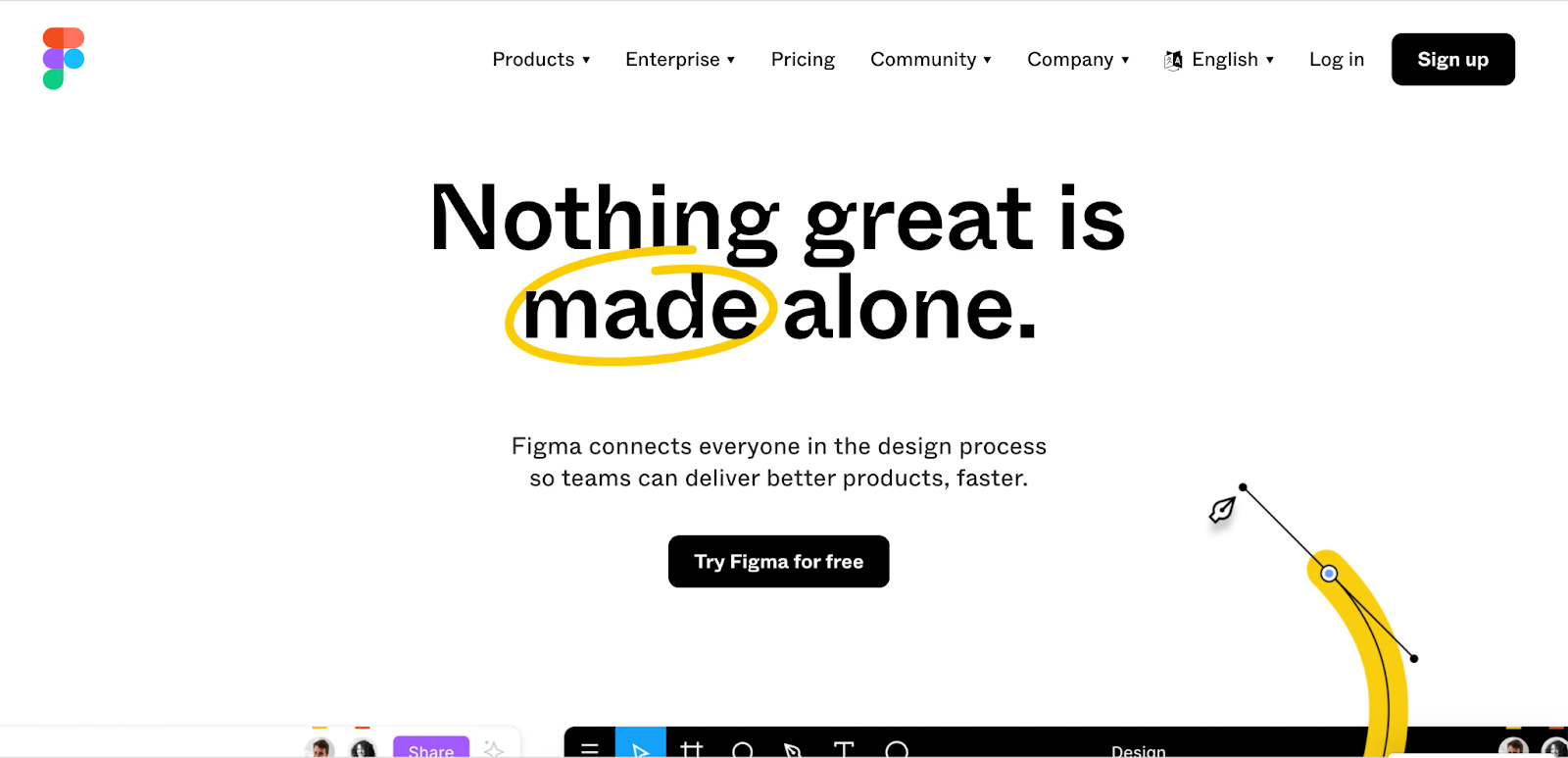
    Figma

    Screengrab of the Figma website

    Coming on to the design scene in 2016, Figma was created with collaboration in mind. Its platform is an all-in-one source for designing, prototyping, sharing, and most importantly: collaborating between clients and members of your team. According to the UX Tools 2021 Design Survey, Figma was the most popular application for UI in 2021,and was the application that designers were most excited to try for 2022. Since its inception, Figma has garnered a large and prolific user base, with companies like Coinbase, Twitter, and Github using its platform to solve their digital problems.

    OS: Mac OS / Windows / Linux

    Pricing: Free – $45.00/mo

    Pros:

    • Web based application focused on real-time collaboration
    • Can easily manage projects, files, and assets
    • Offers prototyping that can be easily previewed and shared in the browser
    • Prototyping and design system functionality
    • Inspect functionality provides css for developers, removing the need for 3rd party applications like Zeplin
    • Online community and resources
    • Low learning curve, and provides tutorial files that help users learn the application
    • Intuitive UI
    • Has many plugins
    • Vector based
    • Exporting assets is easy
    • Offers versioning
    • Can create and manage elements/components easy with symbols and color variables
    • Autosaving
    • Auto layout

    Cons:

    • Internet connection can affect experience
    • Needs at least 4gb of RAM
    • Lack of global colors

    Adobe XD

    Screengrab of the Adobe website

    Rising from the ashes from Adobe Fireworks, Adobe XD came on to the scene with its first beta release in 2016. Since then, Adobe XD has become a robust design tool and a common alternative to applications like Figma and Sketch.

    OS: Mac OS / Windows / Linux

    Pricing: Free – 9.99/mo

    Pros:

    • Works on both Mac and Windows
    • Robust prototyping that has good transitions 
    • Video/Audio recording
    • Can manage projects, files, asset easily
    • Vector Based
    • Intuitive UI
    • Works with Photoshop, Illustrator, and Indesign
    • Online resources for learning
    • Repeat Grid feature is a plus
    • Developer share feature allows designers to mark assets for export. Developers can download with a simple link
    • Voice triggering in prototyping
    • Auto Animate function makes animating in prototypes easy
    • Prototyping is more robust than other platforms 
    • Usable locally without internet connection

    Cons:

    • Plugin library is not as expansive as Figma and Sketch
    • Collaboration is not seamless. Project files must be uploaded to the cloud
    • Updating application from CC 
    • Mobile prototypes can only be viewed on Mac OS

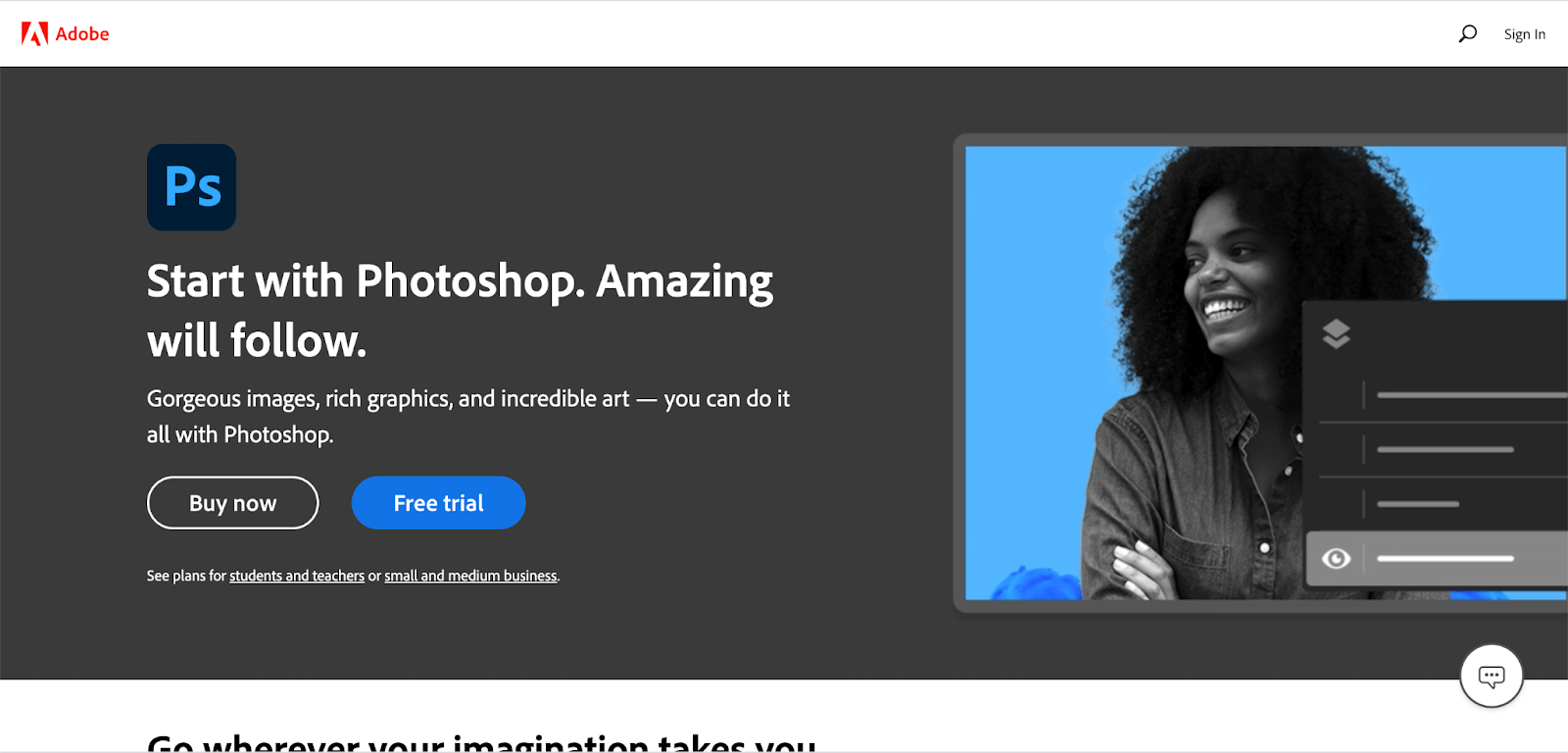
    Photoshop

    Screengrab of the Photoshop website

    Released in 1990, Photoshop has served as an industry standard for photo editing, digital art, and even (up until a few years ago) web design. Despite the emergence of popular design applications like Adobe XD, Sketch, and Figma, Photoshop continues to be used for design work. According to UX Tools 2021 Design Survey, Photoshop is still used as a popular primary tool for UI design, right after Figma, Sketch, and Adobe XD.

    OS: Mac OS / Windows / Linux

    Pricing: 9.99/mo – 19.99/mo depending on plan

    Pros:

    • Works on both Mac OS and Windows
    • Robust image editing capabilities
    • Has sophisticated export capabilities for images
    • 3D graphic rendering
    • Many export options for image assets
    • Texture and digital art capabilities
    • Usable locally without internet connection

    Cons:

    • Raster based
    • Larger file sizes
    • No prototyping or design system capabilities
    • Not engineered for UI design
    • Saving out assets for dev is difficult
    • No option to inspect elements for CSS
    • No collaboration
    • Sharing is difficult
    • Grid system not as robust for UI design

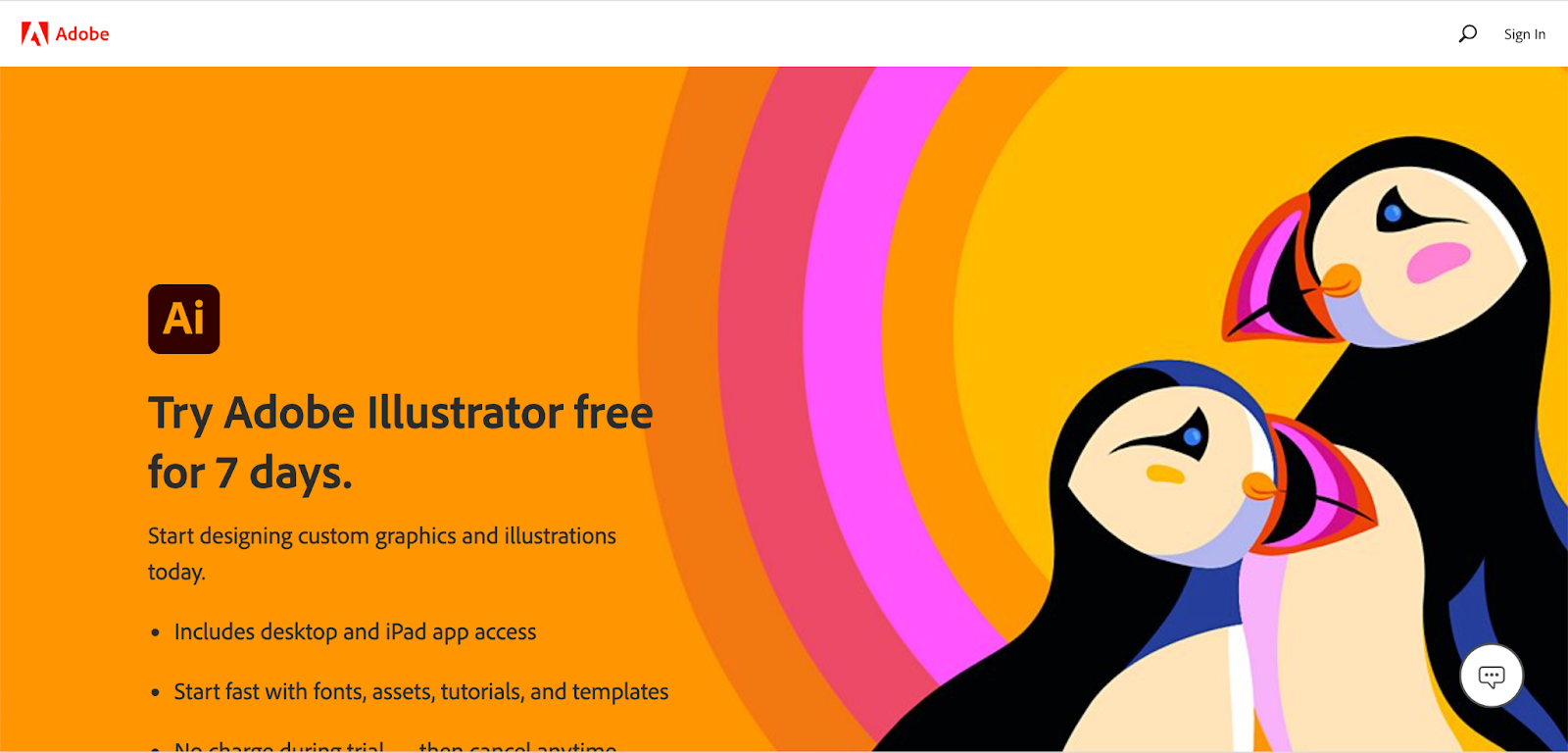
    Illustrator

    Screengrab of the Adobe Illustrator website

    Released in 1987 as, Illustrator has served as the go-to application for creating stunning vector graphics for many different types of design projects, even for web and UI. According to UX Tools 2021 Design Survey, after Photoshop, Illustrator is surprisingly used as a popular primary tool for UI design.

    OS: Mac OS / Windows / Linux

    Pricing: 20.99/mo

    Pros:

    • Mac OS and Windows
    • Robust vector editing capabilities
    • File size is small
    • Usable locally without internet connection

    Cons:

    • No prototyping or design system capabilities
    • Not engineered for UI design
    • Saving out assets for dev is difficult
    • No option to inspect elements for CSS
    • No collaboration
    • Sharing is difficult
    • Grid system not as robust for UI design

    Start creating!

    We hope that this list was helpful in showing the best tools other designers use, as well as give you an idea on what tool works best for you.

    If you need help with your designs, contact us. Our team can create designs for you that look great and get results. 

    THIS BLOG POST IS NOT AUTHORIZED, ENDORSED OR SPONSORED BY ADOBE, PUBLISHER OF ILLUSTRATOR PHOTOSHOP, and ADOBE XD.

    Kanopi Team

    4 reasons for choosing an all-in-one design and development agency

    When designing and developing your website, partnering with one agency that handles both offers advantages that are hard to ignore.

    Whether for your higher education institution, nonprofit, or your software as a service (SaaS) firm, a website build is often thought of as a two-phase process during its construction. 

    Firstly, you need a platform design and strategy. You’ll want to study your typical website visitors, organize and audit your pages and content, and create an information architecture while thoughtfully choosing fonts and colors for your user interface. The UX design process is a crucial part of every platform build, ensuring your site will be a pleasure to navigate while meeting website visitors’ needs.

    Website development naturally follows once you have your design. Engineers code, test, debug, and retest every component of your site to ensure it’s functional, accessible, and secure before it’s ready to go live. 

    It’s not uncommon for companies to think of each of these vital phases — design and development — as two distinct and separate entities. Because of this, folks often consider partnering with one agency to design their platform and another to develop it. 

    We don’t deny this strategy can produce fantastic websites. In some instances, choosing a specialized agency to focus on a single phase of your site build makes sense. However, we’d like to highlight how design and development are not as independent as some think, and there are advantages to having the two phases connected. 

    Working with one agency that’s mastered both design and development can save you time and money while ensuring your site is a joy to use and will be for many years to come. We’ve pulled together our top four reasons firms should consider choosing one agency for designing and developing their website.

    Four reasons for choosing an all-in-one design and development agency: 

    1) You’ll launch faster.

    When gaining both design and development from the same agency, your project life cycle is more efficient, meaning your website is able to go live faster. This valuable time-saving is the result of consistent alignment between designers and engineers.

    Whenever Kanopi inherits a platform designed elsewhere, we ensure the strategic thinking isn’t lost in the transition as this is one of the most common blockages when your platform moves from the design agency to a development agency. Accessibility issues, missed content requirements, and an unworkable CMS can also crop up when working with separate design and development firms.

    One agency can ensure your site is accessible.

    Design agencies that don’t offer website development in-house can sometimes create design specs that don’t meet accessibility and usability guidelines. When it comes time to build your site, engineers may need to do extra work or modify your agreed-upon design to meet the needs of everyone who uses your website. 

    With design and development working together, accessibility isn’t an afterthought and can be included in the strategy and design of your website from the very beginning. 

    Understanding your content requirements is more seamless.

    Another challenge that can extend project timelines are missed content requirements, as design agencies can occasionally overlook your company’s content requirements due to focusing on aesthetics. Unfortunately, we’ve seen designs break when it comes time to migrate a company’s actual content over to the platform design. Without a technical review of the actual content that needs migrating, designers might miss any number of needs, including not taking image size requirements into consideration, ensuring that content isn’t being broken up into multiple components, or creating space for headlines that are too short to accommodate actual headline length. 

    Conversely, what if the designers create visuals around content that doesn’t yet exist? It can look great having all the bells and whistles in the design, but if the content doesn’t exist, someone has to make it, or the design may look flat.  Make sure things like images, videos, and content fields exist or can be created before signing off on that design.

    With development and design working hand-in-hand, engineers are able to provide expertise on content needs while designers are beginning to craft a beautiful website that’s functional. 

    You’ll get a CMS that’s easier to use. 

    Lastly, disjointed design and development can sometimes leave behind the unique needs of content managers. Busy content teams need a content management system (CMS) that’s a breeze to use. With a focus on front-end design, design-only firms sometimes provide designs that do not lend well to editing specific assets in the CMS (for example, image sizes that require Photoshop or another outside tool to crop to proper sizes). Development can lean into the design process to help integrate a CMS that’s user-friendly, no matter the skill level of your content team members. 

    Additionally, having a pattern library within your CMS is crucial to keep your site’s design consistent over time. Design firms tend to design each of your web pages, but rarely design full pattern libraries that work across an entire site that help maintain a smooth workflow between design and code when it’s time for development. Creating every web page in isolation leads to multiple ways to display content, slowing down your project.

    When Kanopi develops websites, we look for patterns we can apply site-wide to eliminate gaps that commonly appear through separate page design. Without pattern libraries, numerous patterns may be created for similar content, which can lead to increased complexity, longer development time, and the need for additional project management support with a heftier price tag.

    2) Feature development is easier.

    When you decide to partner with an agency providing both design and development, designers and engineers work in tandem and are able to understand the nuances of the features necessary to make your website the best it can be. 

    When the Golden Gate National Parks Conservancy and Institute of Golden Gate partnered with Kanopi, we were able to take a strategic approach to their visual design, factoring in their complex infrastructure and functionality requirements. 

    Mapping, in particular, is a complex feature for the park and one that needs to look great while providing an intuitive user experience and a CMS behind the scenes that’s fit for purpose. Kanopi created a content administration experience, allowing for polygon drawing and mapping files to direct intricate paths for hiking in the park: 

    An example of one of the many available maps of the trails managed by Parks Conservancy. This one overlooks the Golden Gate Bridge.

    3) Project management is more cohesive.

    When you partner with an all-in-one agency, you ensure the smoothest transition possible as your platform passes from the designers to the engineers.

    Designers within an all-in-one agency understand the skillsets, workflow, and limitations of the engineers with whom they work. They’re familiar with what design practices are going to make the job of the developers as smooth as possible, and which ones might come up against issues in the build phase. Those built-in efficiencies make a huge impact on time and budget.

    Working with separate design and development agencies can lead to numerous layers of project management with a costly transfer (in terms of both time and money) between them all. 

    Working with an all-in-one agency can also help your internal project management go more smoothly. You can avoid misaligned team expectations with the help of the agency, which will work to meet with senior-level stakeholders regularly and keep them up to date on your web strategy. Learn more about this process in our guide to avoiding the “Swoop and Poop.”

    4) Your designs will have more longevity. 

    The final reason for choosing the same agency for both design and development comes down to the sustainability of your site. Websites designed and developed by the same team prove the test of time because designers, engineers, and project managers can collectively gain a deep understanding of your company’s mission and long-term goals. They are able to strategize a plan for your website post-launch, so it continues to support your business goals and remain a great site to interact with next year and the year after next.   

    With design files at the ready, simple navigation enhancements and tweaks to key elements can be made quickly and easily, keeping your website looking sharp and delightful to navigate.

    Weeks can stretch into months for design updates that need to go back to an original contractor that crafted your initial platform design. An all-in-one agency becomes an expert in your business, armed with a thorough understanding of your history and unique growth plans.

    Build a better, more sustainable platform with Kanopi.

    Kanopi is a close-knit team of designers, engineers, and project managers, who are all working towards the same mission of pairing creative solutions with solid and sustainable architecture while keeping our client’s entire ecosystem in mind.

    We’re incredibly proud of the award-winning websites we’ve designed and built for our clients. In addition to design and development, we provide robust support after your website goes live, going above and beyond basic bug fixes and security updates. 

    ‘When I describe Kanopi to others, I talk about customer service, great services, a sustainable site, and a relationship that gets better over time. Every project we have done with Kanopi has improved our site and made it work harder and better for us.’

    Laura H, Digital Marketing Manager, Stratford Schools

    Are you interested in partnering with us? Reach out if you want a better, more sustainable site.