A few years ago, every organization needed a search engine optimization strategy (and they still do). Now there’s a new must-have climbing just as fast: a plan for artificial intelligence.
This isn’t the part where we warn you that the robots are coming for your job. They’re not. What’s changing is quieter and more useful: how people find information, how content gets made, and what visitors expect when they arrive. The opportunity is to make your organization easier to find, your team more effective, and your website more helpful.
We think about it in three parts:
Getting found when the search box is a chatbot
The way people search is changing fast. Instead of typing keywords into Google, people ask ChatGPT, Gemini, Claude, and Perplexity full questions. Around a third of desktop searches now show a Google AI Overview before the blue links appear, and when that happens, far fewer people click through.
Sit with that: it changes the whole funnel. Your next visitor might never scroll a page of results, and might just ask a chatbot and take it at its word. They may never visit your home page to learn about you, and instead may rely on results from whatever large language model (LLM) they are using. So the bar has moved: your content must be clear, trustworthy, well-organized, and easy for AI to read and cite. Technical SEO still matters, but the job now includes making sure your expertise is found and cited by the tools people turn to first. We help clients get ahead of that today.
Working smarter, with your people in charge
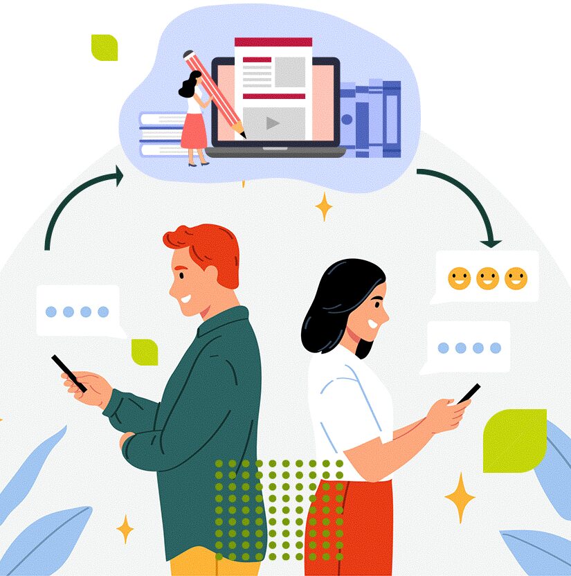
The best results come from people and AI side by side. AI handles the grunt work: drafting, summarizing, floating ideas, writing image descriptions, speeding up repetition. What it can’t do is understand your mission, know your audience, protect your brand, or notice when it’s confidently, cheerfully wrong. That part is still yours.
So we help clients build workflows that keep people in charge:
AI guidelines for content editors
Brand and tone guardrails
Prompt libraries worth using
Editorial sign-off and accessibility reviews
Training on when to lean on AI, and when not to
Here’s what that looks like. A recent migration needed alt text for thousands of images. By hand, that delays launch by weeks. Instead, AI drafted every description, and our team reviewed, edited, and approved each before it went live. The site launched on time, accessibility intact. AI did the volume. People did the thinking.
Building a website that does more of the work
AI is also changing what your website can do for visitors. We’re helping clients add features like:
Better ways to surface expertise buried in a big site
Picture a student on an academic program page who opens search and types, “What are the requirements for this program?” A traditional search engine shrugs and returns broad admissions pages. A well-built AI experience knows that “this program” refers to the page they’re on and returns the exact requirements with links to the source. It feels less like digging through a filing cabinet and more like being shown around by someone who knows the place.
Behind the scenes, we lean on AI too.
We put AI to work in our own process as well, always to support our people rather than stand in for them. Take content strategy. Recently, we reviewed more than 5,300 pages for a client. A first pass at that scale used to take weeks; with AI, we did it in hours. Then our strategists do the part that counts, asking whether each page still earns its place, whether it should stay, change, or go, where the accessibility and SEO gaps are, and what’s quietly confusing people. It’s the same in development: AI handles the repetitive coding and testing, which frees our developers for the harder, more interesting problems, which is where the real value lives anyway.
So, where do you start?
There’s a lot of noise about AI. Some are sure it’ll replace every job; others won’t touch it. The truth sits in the middle: AI is powerful, but only as good as the person holding it. You don’t have to do everything at once. Most organizations begin with a few honest questions:
How do we move faster without letting quality slip?
The answers look different for everyone, and that’s fine. The point is to start asking. AI is already reshaping how people search, work, and learn, and we’d love to help you make the most of it, with people at the center.
If you want to improve brand visibility in AI search engines, five things move the needle: make your site crawlable, write answer-first content, clarify your entity with structured data, earn third-party mentions and reviews, and keep your content fresh. Then measure how often AI actually cites you. These work as one connected system, and together they decide whether ChatGPT, Perplexity, Gemini, Claude, and Google AI Overviews name your brand or skip right past it.
First, let’s kill a myth. A lot of companies assume AI-referred visitors poke around but never buy. The data says otherwise, and the difference is big! According to Adobe, AI-referred retail traffic converted 38% worse than regular traffic back in March 2025, then flipped to converting 42% better by March 2026.
That’s an 80-point reversal in twelve months, and those visitors also spent 48% longer on site plus viewed 13% more pages. AI shoppers are turning into your highest-intent audience, and when you’re missing from AI answers, you lose them at the exact moment they’re deciding.
This guide walks through eight strategies in three layers: your on-site foundation, your off-site authority, and how you measure it all. Each one ties back to how modern search and AI systems actually size up a brand.
What Does Brand Visibility in AI Search Engines Actually Mean?
Brand visibility in AI search engines is how often an AI system surfaces, cites, or recommends your brand inside an answer it generates. That’s different from ranking a page on a traditional results list. You can hold a strong organic position and still be invisible in AI answers, because AI systems weigh entities and trust signals across the whole web, not just the pages sitting on your domain.
Why does that gap exist? The two systems pick sources in completely different ways. Traditional search hands you a ranked list of links and lets you click. AI search writes one answer and names a short list of brands inside it. If you’re not on that list, you don’t exist at the decision point. Earning a spot on it is the whole job of Generative Engine Optimization (GEO), also called Answer Engine Optimization (AEO).
For bigger companies, the stakes climb higher. AI referral traffic is small in volume but punches well above its weight, because the people who arrive tend to be further along in their decision. That makes AI search visibility a pipeline question, instead of a vanity-metric one.
How Do You Build the Technical and Content Foundation for AI Visibility?
Your foundation is the set of on-site, machine-readable moves that everything else depends on. An AI system can’t cite content it can’t reach, and it can’t pull an answer out of content it can’t parse. So crawlability, answer-first structure, structured data, and topic clusters all come first in any AI-visibility program.
1. Make Your Site Crawlable and Accessible to AI Bots
Before anything else, AI crawlers have to be able to reach and render your pages. Make sure your site is crawlable by Googlebot and by AI crawlers like OAI-SearchBot, audit your robots.txt so nothing important is blocked, and don’t bury your main content behind JavaScript a crawler might never run.
Plenty of sites block reputable AI crawlers by accident through old robots.txt rules, and the damage is silent. The content just never becomes eligible to be cited (yikes!). Go through your robots.txt file and any server-level or CDN-level rules to confirm AI crawlers can get through, while still keeping out the aggressive or malicious bots that hammer your infrastructure. The underlying build matters a lot here, because a fast, crawlable, well-structured site is much easier for both search engines and AI systems to read.
A quick crawlability audit runs through a short checklist:
Confirm critical pages return a 200 HTTP status code and aren’t accidentally noindexed.
Check that your XML sitemap is current and submitted through Google Search Console.
Clear out redirect chains and broken internal links that burn crawl budget.
Verify your main content renders in raw HTML instead of needing client-side JavaScript to show up.
That last one trips up more sites than you’d think. Many AI crawlers don’t run JavaScript the way a browser does, so anything injected after page load can be invisible to them. Page speed ties it all together, since faster pages are easier to crawl and more likely to land in AI-generated answers.
2. Write Answer-First, Citation-Ready Content
Answer-first content puts the core answer to a heading’s question in the first 40 to 60 words of the section, before you expand on anything (see the first paragraph of this blog post? It’s a summary!). There’s a reason for that specific structure. AI systems pull out discrete, self-contained answer blocks, and the block that opens a section is the one most likely to get lifted into a generated answer.
A few concrete moves make your content easy to extract. Use descriptive, question-format headings that sound like how people actually ask things out loud. Keep each paragraph on a single idea. Turn any set of items or steps into a list or table so it becomes a clean, structured object. And write each sentence so it stands on its own, because an answer engine grabs sentences one at a time, and a sentence stuffed with vague pronouns falls apart the moment it’s pulled out of context.
The payoff is measurable. In a recent study, Kevin Indig (from Growth Advisor) found that roughly 44% of all LLM citations come from the first 30% of an article, which makes front-loading your clearest answer one of the highest-return content rules you’ve got. Because AI systems choose sources on extractability rather than rank alone, a page with a strong answer block can earn citations even when it sits well below page one of traditional results.
3. Add Structured Data to Clarify Your Entity
Structured data is machine-readable JSON-LD code that tells AI systems exactly who your brand is and how your content, people, and offerings fit together. Add Organization and Person schema with the sameAs property pointing to your official profiles, put Article or BlogPosting schema on editorial content and FAQPage schema on FAQ pages, then validate every block with Google’s Rich Results Test.
Think of schema as a verification layer. When an AI system needs to describe your brand accurately, structured data hands it parseable facts it can trust, which cuts the odds of the AI getting your business wrong OR leaving it out altogether. The sameAs property earns its keep on entity clarity, because linking your Organization and Person entities to LinkedIn, Crunchbase, and Wikidata pulls your brand’s identity across the web into one recognizable entity.
Topic clusters signal depth to AI systems by wrapping a core subject in supporting content that answers the questions around it. Build a pillar page for your main topic, publish supporting articles that each answer one specific related question, and link them together so an AI system can tell you cover the subject thoroughly, not through a single keyword-optimized page.
Clusters matter more in AI search because of how these systems dig into a query. AI engines run query fan-out, spinning up a bunch of narrower sub-questions and stitching the answers into one response. So content that anticipates those spin-off questions and answers them clearly is far more likely to become the source the system keeps coming back to.
Something that we use to find fan-out queries is a tool called Qforia from iPullRank. It’s free, though you do have to attach your Gemini API key which has some small costs associated with it.
Building one is a repeatable process:
Start with the broad question a buyer brings to an AI system.
Map the narrower sub-questions that branch off it.
Assign each sub-question to a supporting article that answers it directly and completely.
Link every supporting article back to the pillar and across to its siblings with descriptive anchor text.
Those internal links act like signposts that tell an AI system how your content connects, which raises the chance a page gets picked for an AI summary. Contextual links placed inside sentences carry more weight than generic navigation links stuck in a sidebar or footer. Give it time, and a mature cluster becomes the reference an AI engine trusts for the whole topic, not just one query.
How Do You Build Off-Site Authority and Trust for AI Search?
Off-site authority is your cross-web reputation, and it carries unusual weight in AI search because these systems care more about what others say about you than what you say about yourself. Entity authority, digital PR, and review velocity all tell an AI system the same thing: this brand is credible, consistent, and worth recommending.
5. Strengthen Entity Authority and a Consistent Semantic Identity
Entity authority comes from showing a clear, consistent identity everywhere your brand shows up. Use the same brand name, description, and core messaging across your website, LinkedIn, Google Business Profile, and third-party sources. Publish credentialed author bios. Keep your About page explicit about your history and where your expertise lives.
Consistency is what teaches an AI system to link your brand to specific topics. When you repeat a clear identity across every channel, AI models learn which concepts to attach to you, the way HubSpot came to own “CRM for startups” by lining up its messaging around startup growth and marketing automation. Mixed signals do the reverse. Inconsistent naming, conflicting descriptions, or a fuzzy positioning statement force the AI to reconcile the contradictions, and it often resolves them by leaving you out. This is the heart of E-E-A-T (Experience, Expertise, Authoritativeness and Trustworthiness) and entity optimization: a recognizable, well-described entity is a citable one.
6. Earn Third-Party Validation Through Digital PR
Third-party validation is the strongest off-site signal you can build, because AI systems check your authority across the open web instead of taking your domain’s word for it. Earn citations and mentions in industry publications, trusted news outlets, and authoritative blogs, and favor contextual, entity-rich mentions over piles of low-quality directory listings.
Quality wins here, and it isn’t even close. One mention in a recognized industry publication that talks about your brand in context beats hundreds of generic directory listings, because that contextual mention teaches the AI what you’re actually known for. Good digital PR pitches newsworthy stories, original data, and real expert commentary to journalists and editors, which earns you natural links and unlinked brand mentions that both feed entity recognition. Kanopi’s guide on future-proofing SEO with links in an AI-first world digs into how anchor text, brand mentions, and digital PR work differently now than they did back when everyone just counted backlinks.
Original research is your most reliable digital-PR asset for AI visibility, full stop. Publish a unique study, survey, benchmark, or dataset, and journalists cite it as a primary source while AI systems reference it whenever the underlying question comes up. Your authority compounds every time the data gets quoted.
Expert-driven content works the same way, since a definitive guide or framework that becomes reference material keeps earning links on its own. And don’t sleep on community participation. Answering real questions with genuine expertise on Reddit and Quora builds the unlinked brand recognition AI systems read as a credibility signal, even when those links are nofollow.
7. Build Review Velocity and Community Presence
Review velocity and community presence feed the exact platforms AI systems crawl and cite when they make recommendations. Find your promoters (amazing customers & brand cheerleaders), then point them toward review platforms AI leans on, like G2, Capterra, TrustRadius, and Google Reviews. Keep a real presence on the community platforms that carry weight in AI answers, too.
Recency and platform choice both matter here. AI platforms weigh fresh reviews more heavily than old ones, so a steady stream of recent, authentic reviews keeps you visible to buyers and the models they consult. A burst of reviews followed by silence fades fast.
On the community side, get specific instead of spreading yourself thin. Reddit, YouTube, and LinkedIn are high-signal for AI answers because they get crawled and cited so often, so ten genuine Q&A videos or a habit of helpful, expert participation in the right threads builds real citation signals over time. Instagram and TikTok do far less for AI answer visibility, so put your energy where AI systems actually pull from if that’s your goal.
8. Keep Content Fresh So It Stays Citable
Fresh content stays eligible for AI citation, because AI systems strongly favor recent and recently updated material. Keep a refresh schedule for your most important pages, show a visible “last updated” date, and update your stats, examples, and insights so the content reflects where the topic stands now.
Freshness isn’t cosmetic in AI search. The large majority of AI citations come from content published or updated in the last two years, so an unmaintained page slowly loses citation eligibility even if it once ranked well.
Generative systems want the latest on a subject, so treat your key content as living material you revisit, not a set-and-forget asset. Pair a modest cadence of fresh, timely pieces with a core of updated evergreen content, and you protect both your traditional rankings and your AI citation eligibility.
Where Should You Start? A First-90-Days Sequence
If you can only tackle part of this, work it in dependency order rather than by preference, because each layer builds on the one before it. Fix the foundation first, clarify your entity next, then build off-site authority, then measure. Otherwise you’re out earning mentions for pages an AI crawler can’t even reach.
Here’s the order the pieces depend on:
Weeks 1 to 3, foundation. Audit crawlability and robots.txt, confirm AI crawlers can access the site, and restructure your highest-value pages to be answer-first.
Weeks 3 to 6, entity and schema. Deploy Organization, Person, Article, and FAQPage schema, add sameAs links to your official profiles, and validate every block.
Weeks 6 to 12, off-site authority. Launch digital PR around a newsworthy angle or original data, and start a review-generation motion with your promoters.
This sequencing is what most competitor guides skip. They rattle off tactics without answering the question a marketing leader actually asks, which is what to do first. Do the off-site work before the foundation is solid, and you waste effort on pages that can’t be cited yet.
Ready to Get Cited by AI, Not Just Ranked?
Most brands have no clear picture of where they show up across AI search, or where they vanish. Kanopi can help you find out and fix it, starting with the foundation that makes everything else possible. Talk to Kanopi about an AI-visibility assessment and map out your next 90 days.
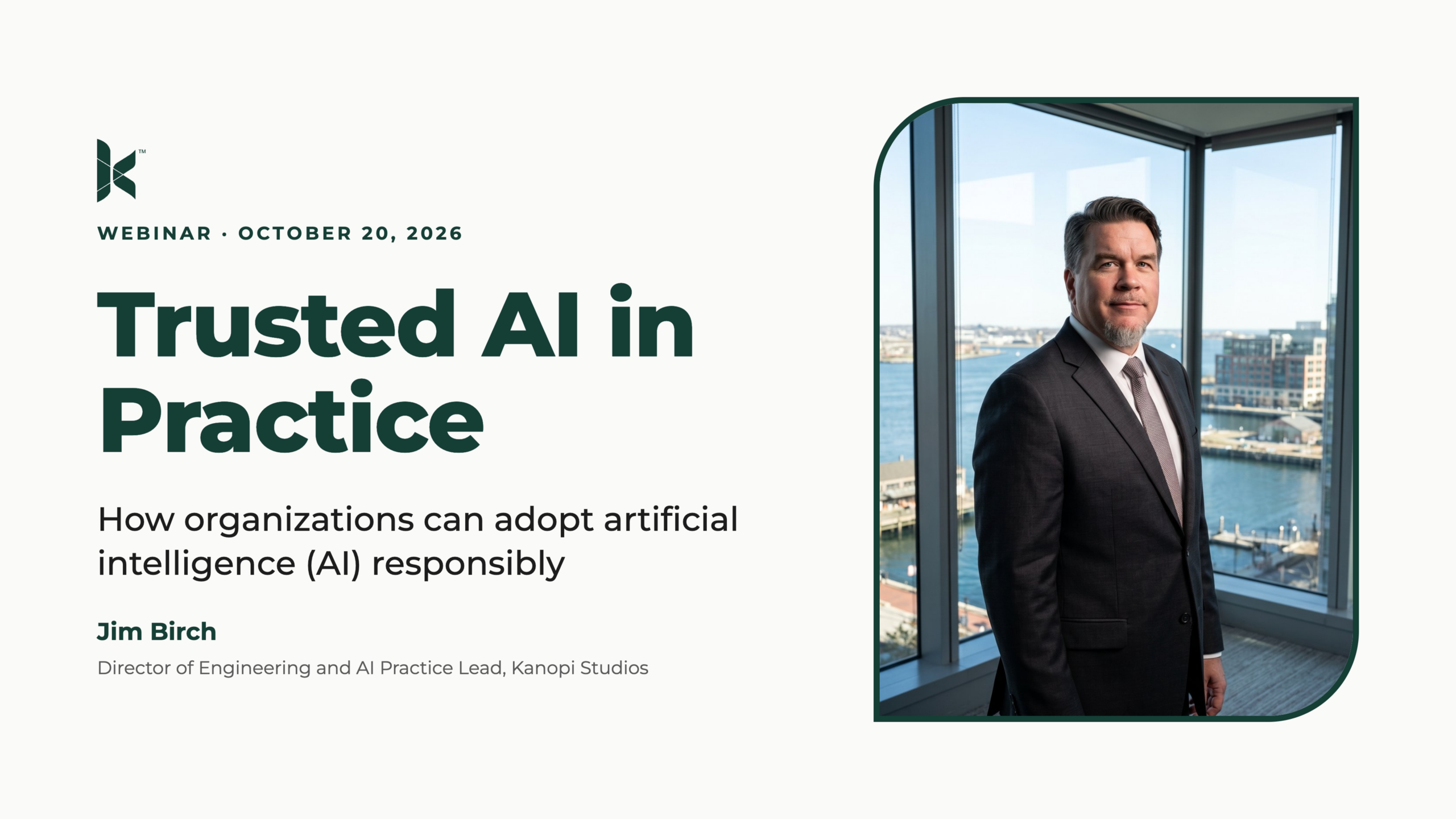
Want more info? We held a webinar on this topic!
In this 60-minute session, Kanopi’s Lauren Chervinski breaks down exactly how modern AI engines decide which brands to surface, cite, and recommend, and the practical system you can use to become one of them.
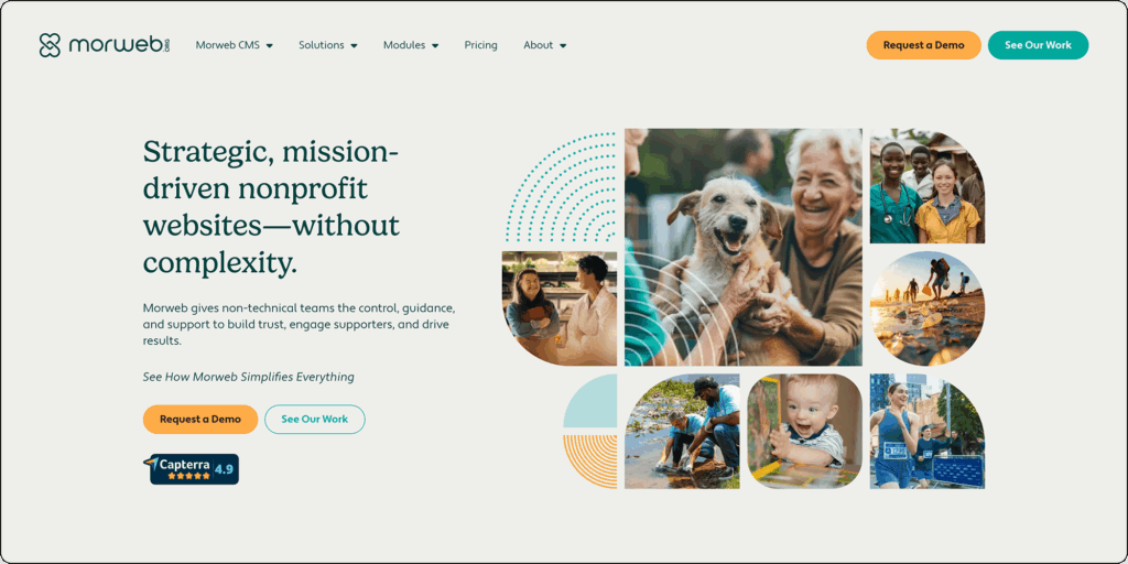
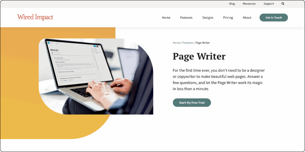
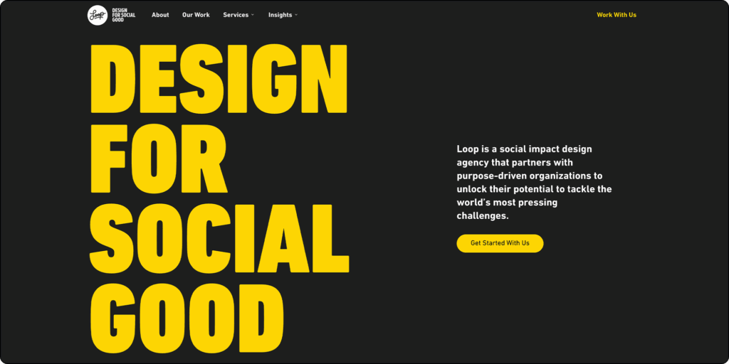
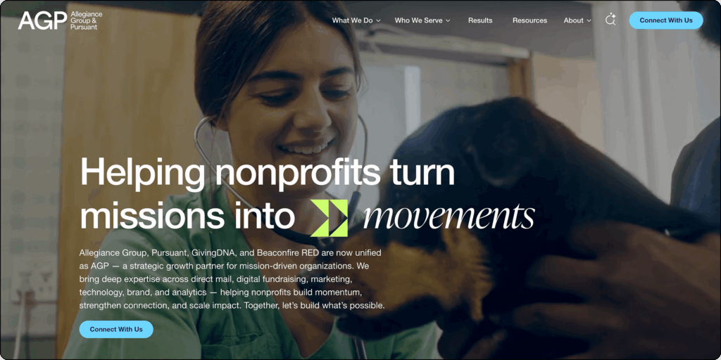
11 Standout Nonprofit Web Design Companies for 2026
Allison Manley
Many nonprofit marketers believe their work is over once their new website goes live. However, the average lifespan of a site is only two years. Without dedicated ongoing support, mounting technical and user experience issues quickly decrease engagement.
To maximize your impact, your organization needs a web design agency that acts as a long-term strategic partner. The top agencies recognize that a successful digital presence requires continuous iteration to meet shifting donor expectations and rigorous tech standards.
Find the right partner to scale your digital presence in the sections below:
Top nonprofit web design companies act as dedicated strategic partners, prioritizing the long-term technical stability and comprehensive accessibility of the sites they work on. These agencies have mastered open-source enterprise platforms (rather than basic software) and guarantee continuous lifecycle support.
With ongoing web expertise, nonprofits can more easily mitigate security vulnerabilities and maintain website uptime. The best nonprofit web design agencies help organizations:
Maintain their websites over time. Ongoing dedicated maintenance keeps your digital infrastructure stable. In other words, reliable partners stick around.
Handle enterprise-level complexity. Effective partners actively manage complex website architectures rather than relying on rigid proprietary software ecosystems. Custom database builds require foundational technical expertise to succeed, and top providers can deliver optimal flexibility.
Building for the future.Continuous iteration ensures nonprofit websites can adapt seamlessly to evolving donor expectations and major technological advancements. The digital philanthropic landscape shifts rapidly, so providers that offer continuous improvement are essential.
When evaluating potential digital agencies, thoroughly examine internal team composition and structural hierarchy. It is important to find a provider that has dedicated technical architects working alongside visual creatives. This collaborative approach ensures that your provider will help you build a website that looks and works great.
11 top nonprofit web design companies
The following web design providers span from specialized niche digital builders to advanced enterprise-level strategic partners offering robust lifecycle management. Thoughtfully review these options to find a partner whose strengths and expertise are aligned with your specific website needs.
Enterprise-level CMS development (Drupal/WordPress)
Website migrations
Code rescue
Ongoing website maintenance and support
Conversion optimization
Key differentiators:
Kanopi offers code rescue services, meaning we can step in to fix and refine your website’s code, even if another agency first created it.
Kanopi also embeds WCAG AA accessibility in every phase of the web design and development process, from early color contrast strategy to QA testing, ensuring digital inclusion is a fundamental architectural standard.
We provide white-glove ongoing support and continuous iteration to help nonprofits build websites that stay active and healthy for years.
See how Kanopi’s growth-driven continuous improvement approach can help you scale up your website much faster than the traditional, linear web design approach:
Web Design Process Comparison
TraditionalGrowth-Driven
Traditional Waterfall Process
Strategy
Design
Development
Launch
Drawbacks
Rigid & Less FlexibleChanges are difficult and expensive once development begins.
Costly & Time-ConsumingLarge upfront investment with lengthy timelines.
Quickly OutdatedWebsite can become stale shortly after launch.
Growth-Driven Design Cycle
Benefits
Save Time & MoneySmaller initial investment with continuous improvements.
Always Fresh & RelevantContinuous optimization prevents site staleness.
Data-Driven DecisionsInformed improvements based on real user behavior.
Notable clients:
First Tee: Kanopi delivered a custom WordPress multi-site solution that allows the organization to seamlessly house and manage over 150 individual member sites.
Gilder Lehrman Institute: We delivered a full Drupal build for the institute’s Hamilton Education Program, creating a flexible and accessible digital experience.
Exploratorium: Kanopi partnered with this San Francisco-based museum and nonprofit to execute a full Drupal build, guiding them through a highly collaborative discovery process.
Navigating the web design landscape requires an understanding of costs, platform choices, and compliance standards. Review these frequently asked questions to make informed decisions for your organization’s digital presence.
How much does a nonprofit website cost?
Initial financial investments for nonprofit web design vary widely depending on your specific functional requirements. Standard redesigns for emerging community groups often start in the moderate five-figure range, while sprawling enterprise migrations frequently exceed six figures.
Effective financial planning requires treating your website as an evolving digital product. Establish a dedicated annual budget for continuous iterative improvements and ongoing support following the initial launch.
What is the best CMS for a nonprofit website?
Open-source platforms generally offer the greatest long-term structural flexibility for nonprofits. With an open-source CMS, your nonprofit can build custom functionality and maintain full control over your website’s source code, allowing you to migrate to a different site host or web development provider with ease. Open-source platforms also tend to have highly rigorous security standards, which are essential for nonprofits that need to protect sensitive donor and beneficiary information.
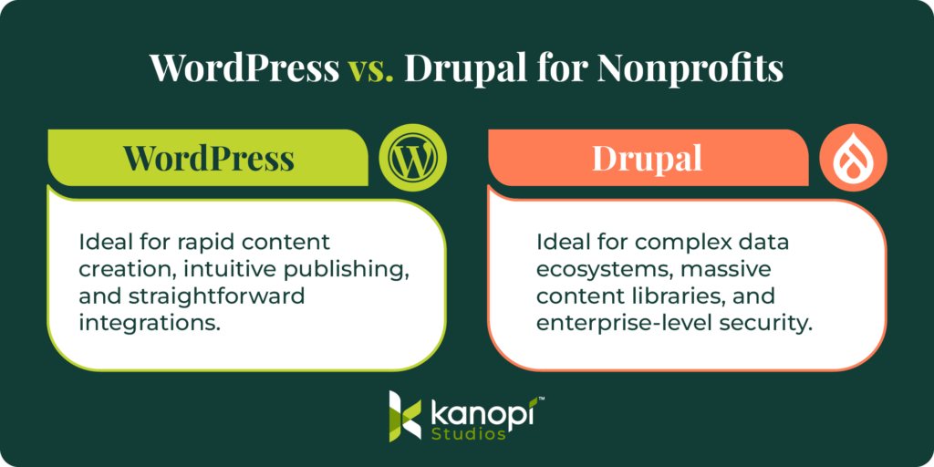
Two of the best open-source CMS platforms for nonprofits are WordPress and Drupal. WordPress excels at rapid content creation and straightforward digital publishing tasks, whereas Drupal dominates complex data ecosystems and offers robust security.
Do web design agencies help with nonprofit accessibility compliance?
The best digital partners integrate accessibility directly into the foundational site architecture. They test color contrast and screen reader compatibility well before the public launch to ensure total digital inclusion.
To maintain strict WCAG AA compliance over time, schedule comprehensive accessibility testing every six months. Use automated scanning tools to catch basic errors, and also require manual human testing to ensure no issues fall through the cracks.
Why do nonprofits need custom web design over templates?
Pre-built templates offer convenience and speed if you want to get a nonprofit website up and running quickly, but they come with serious drawbacks. For example, they can slow down your website’s loading speed due to unnecessary code. They also come with structural limitations, meaning you have fewer opportunities to customize your site to your exact needs.
On the other hand, custom web design lets you build a digital platform tailored to your specific needs and goals. This web design strategy is highly scalable, allowing you to easily expand your website as your organization grows. Plus, you can build tailored user journeys for specific segments of your nonprofit’s audience. For example, you can seamlessly guide a first-time volunteer down a path completely different from that of a major legacy donor.
Partnering with Kanopi Studios
Kanopi Studios provides ongoing technical strategy, enterprise CMS solutions, and baked-in accessibility to support your nonprofit’s long-term website health. By combining deep audience research with expert web engineering, Kanopi builds secure, user-focused digital presences on open-source platforms like Drupal and WordPress.
Kanopi creates compelling user experiences that convert casual visitors into dedicated donors, volunteers, and ambassadors for your cause, whether your organization requires:
A complete website redesign
Complex multi-site architecture managing hundreds of regional chapters
Dedicated lifecycle support
Learn more about how Kanopi approaches ongoing website support beyond just security patches:
The Ultimate Website Maintenance for Nonprofits Checklist. Use this actionable checklist to protect your digital presence from technical debt and declining user engagement by adopting a continuous-improvement approach to strategy, CMS updates, and compliance.
Best Nonprofit Website Platforms: How to Choose Wisely. This resource holistically compares leading proprietary builders and open-source solutions to help your organization select a highly secure, scalable CMS that matches its long-term operational and integration needs.
These days all you need to do is hop onto LinkedIn and you’ll see it: writers from every walk of life writing dissertation-length posts and blogs about how much they hate AI.
Well, this isn’t that. I’m not here to add to that smoldering heap of discontent.
Because frankly, all our opinions about AI are irrelevant. It’s one of those rare, emerging technologies that completely transforms not only entire industries, but the direction of human progress itself. And no amount of railing on social media about its generally acknowledged flaws will change this.
Instead, I’m going to stick to the facts. Starting with this one:
AI is sort of like the devil.
I’m not saying it’s evil (again, this isn’t about my opinions.) What I am saying is it’s incredibly seductive. It promises simplicity, efficiency and the ability to get things done without relying on others. Tangible benefits like these attract business people the way insect larvae attract honey badgers. That’s why I want to spend the rest of this post highlighting some reasons why you still need a writer in this age of AI, despite the visceral temptation you may be feeling to rely on it exclusively.
Let’s begin with an obvious fact that’s often overlooked:
AI doesn’t actually write. It generates.
This may seem like splitting hairs, but it’s an important distinction. AI is a machine. It can’t consider a piece of writing in the context of your overall brand, your history, or your positioning in the market. It can’t step back and see the bigger picture while it generates text. It can only do specifically what you tell it to do. That’s why it’s called prompting.
And speaking of prompts:
Prompt engineers are also not writers.
Of course, the better your AI prompting skills, the better quality your AI will produce. You can write a prompt instructing it to follow your brand guidelines for grammar, tone and style. Or a prompt that tells it to go easy on those ubiquitous AI em dashes. It’s even getting better at keeping precise word counts.
But after all that, how do you know if the copy it generates is good, or simply good enough? There’s more to good writing than avoiding bad writing.
No copy is perfect. But a writer’s mistakes actually serve a purpose.
Ok, I know I said I wasn’t here to give my personal opinions, but I’ll share this one: tools like Grammarly have overinflated the importance of not only AI, but perfect grammar as well.
Some of the most award-winning copywriters I know freely admit to being miserable at grammar. Their most celebrated work is riddled with errors; yet it’s won awards and gotten results anyway.
Why?
Because, in the end, writing is about more than just writing. It’s about communicating, evoking feelings and connecting with the reader, regardless of how many words Grammarly has double-underlined.
To accomplish this, experienced writers will often play around with words and phrases. Writers from Hemingway to Woolf to the late advertising legend Jim Riswold all regularly ignored proper grammar to achieve their literary goals and preserve the unique character of their work. And when it comes to writing for the web or for any other marketing communication, mistakes often lead to better insights or more original ideas.
Our imperfections make us human. They also make us better writers.
Writers have lived a life of anguish. Exploit this.
At the risk of sounding melodramatic, there’s some truth in the notion that all great art is borne of suffering.
An unrequited love inspires a classic painting.
A shattered dream inspires a timeless song.
And sometimes, wasted hours trying to figure out how to contact customer service inspires some darn impactful website copy.
Suffering doesn’t always mean tragedy. And bad customer/user experiences create nothing but suffering.
Isn’t that why marketers call them pain points?
But AI doesn’t actually feel the mind-bending frustration they cause. Human writers, meanwhile, want to rip their faces off every time they try to navigate a poorly designed website.
It’s why human copy is more impactful; we distill our actual feelings into the words they write.
We’re human. Storytelling is part of our programming.
It’s the difference between writing an owner’s manual and writing copy that people actually want to read. AI can generate stories with all the right structural elements. But only humans can write stories that connect through shared experience and empathy, which is precisely what makes writing memorable and effective.
This article by Eddie Shleyner illustrates this perfectly. He shares 88 gripping, heartfelt words he wrote about witnessing his daughter’s birth, then compares it to some text he had AI generate on the same subject with the same word count. If you haven’t read it, I strongly recommend you see for yourself how profound the difference is.
Lived experience always makes for more authentic writing. And there’s no shortage of writers who’d be happy to tap into their lifetime of pain for your benefit.
AI gives you what you ask for. Writers give you what you need.
The biggest disadvantage to using AI as a creative tool is that it gives you precisely what you ask for.
Yep, of all its well-documented flaws, this might actually be the worst thing it does.
Yet this isn’t a new problem. If you’ve spent any time in the creative field, you know it existed long before AI.
There’s never been a shortage of creative agencies and individual professionals who gladly provide whatever their clients ask for: no questions asked, and no additional thought or exploration provided. And the result is almost always bland, mediocre creative work that satisfies the client but rarely achieves what they actually needed.
Famed advertising agency Crispin once referred to this approach as malicious obedience, which may be the most appropriate term ever invented.
AI has simply perfected it.
Of course the client should be happy with the work they get. But the sharpest work, the kind that actually builds brands and delivers results, comes from people who push past the brief. Whether you want to reshape your brand or just sharpen your website copy, that takes someone willing to ask the harder question: not what did you ask for, but what do you actually need?
I’m not saying only writers can recognize good writing. But writers understand the process of getting there better than anyone. It’s part passion and part obsession, and it’s what pushes good copy past the serviceable and into something worth reading.
Meanwhile, the war against ‘good enough’ rages on.
People who rely on AI for their website copy will usually concede that a professional copywriter could do a much better job. They also cite two main reasons why they’re using AI despite this: time and budget.
Again, this is a calculation writers have been watching people make for eons. All those angry writers hate-posting in your LinkedIn feed? They’ve all spent their careers fighting a timeless war against ‘good enough’. AI is simply the newest front.
And this may be the most disappointing thing about how AI use is evolving: people tend to use it to expedite tasks, not to make the work better. The prevailing mindset seems to be, “as long as it’s better than I could do myself, I’ll use AI,” when the real question should be, “how can we use AI to create the best work possible?”
Getting the most out of AI requires someone who knows what “best” actually looks like. That’s why the best of both worlds provides the best value.
The least your users deserve is a human in the loop.
I’ll let you in on a secret: not all writers hate using AI. Not only is it an efficient way to generate outlines, but it can also spit out a serviceable first draft. By taking care of the grunt work — i.e. research, drafts and iteration — it allows the writer to focus on crafting the copy, which is the part that separates professional writers from people who simply know how to string together a proper sentence.
AI is a tool. A genuinely useful one. But a tool is only as good as the hands holding it, and the best copy you’ve ever read was written by someone who stayed up too late, second-guessed every word and cared way more than the job required. That person still exists. And your readers can tell the difference.
At Kanopi, we see copywriting as a strategic part of any successful website project. Strong website messaging is shaped by audience insight and content planning, along with a clear understanding of how people move through a site. It helps content support search visibility and improve the user experience, moving visitors toward action.
What goes into effective website copy
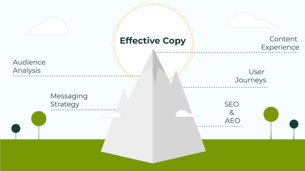
Effective copy starts before we’ve written the first draft, with a clear picture of where you are and what you’re trying to accomplish.
For starters, you’ll need to clearly understand:
Your audience and their needs
Your goals and services
The questions your website needs to answer

From there, content planning shapes key messages and defines what belongs on each page. We use content outlines and content maps to show what pages are needed and how they connect across the site. Once this structure is in place, we can define what each page needs to communicate.
Content Planning Maps for Riverview Hospital
This is what makes the planning phase so valuable. It gives teams a shared direction and makes it easier to create content efficiently across a full website. Even more importantly, it reduces guesswork along the way.
Before writing we ask:
How will a specific user type move through the site?
What do they need to know first?
What might make them pause, hesitate, or leave?
What will help them feel confident enough to take action?
Effective content supports the full site experience. The words on the page need to be clear, but they also need to fit the flow of the site and support the person using it.
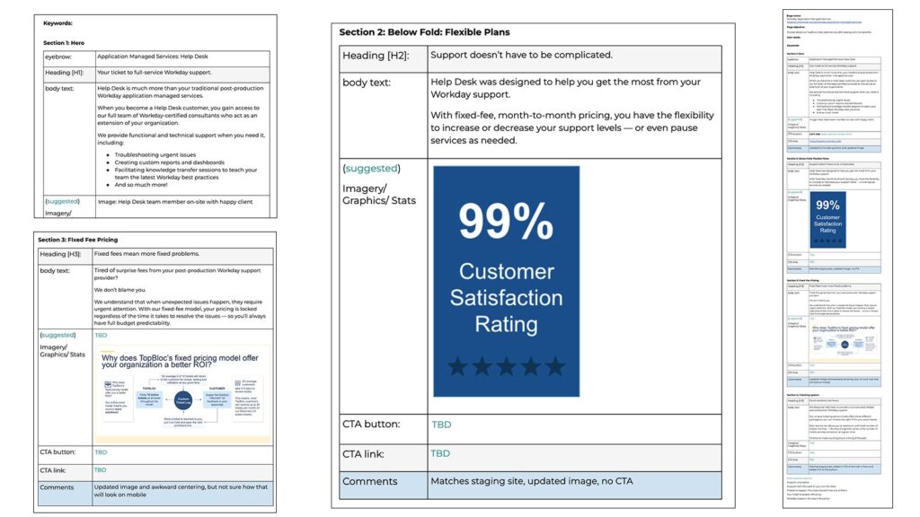
Our work with TopBlocis a good example of what that planning looks like in practice. This project had several distinct challenges to navigate:
Content Outlines For TopBloc
A technically complex subject. TopBloc operates in a niche space, providing Workday implementation and support to organizations that already knew the platform. The revised copy needed to speak to that audience without oversimplifying or relying on jargon that would exclude anyone newer to the ecosystem.
A site that had outgrown its structure. Content had spread across multiple pages and no longer reflected how their services were organized. We consolidated it so the site matched the business as it actually existed.
Deeply institutional language. Much of the existing copy read as corporate and static. A significant part of the rewrite was about making the content more conversational and benefit-led.
How to write copy that performs well in search
Search is changing. People still use search engines, but they’re also using AI assistants like Claude, Gemini and others.This means writing for search now looks a lot like writing for people: the clearer and more useful your content is, the more likely it is to be found and understood.
SEO/AEO Analysis for Flagler College
We saw this firsthand with a client of ours, Flagler College. There was very little consistency between their web pages. Some were written in a clear marketing voice, while others were dense with academic language. Often these vastly different writing styles appeared within the same menu grouping.
We rewrote the copy to fit their new brand voice, and visitors could find what they needed faster. Both search engines and AI assistants tend to reward that kind of clarity.
A practical checklist for stronger website copy
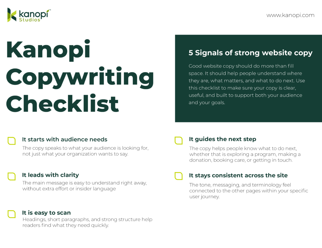
Effective website copy is clear, useful and built around what people need to know and do. To make these ideas easier to apply, we created a downloadable checklist with five essentials for stronger website copy. You can use the image below, but we’ve also included it in text as well:
Kanopi Copywriting Checklist:
It starts with audience needs. The copy speaks to what your organization is looking for, not just what your organization wants to say.
It leads with clarity. The main message is easy to understand right away, without extra effort or insider language.
It is easy to scan. Headings, short paragraphs, and strong structure help readers find what they need quickly.
It guides the next step. The copy helps people know what to do next, whether that is exploring a program, making a donation, booking care, or getting in touch.
It stays consistent across the site. The tone, messaging, and terminology feel connected to the other pages within your specific user journey.
How effective copy supports your business goals
Messaging clarity matters even more for organizations juggling multiple audiences or competing priorities.
Sunnylands came to us facing that exact challenge. Our qualitative user research uncovered recurring points of confusion among website visitors. Many were unclear about whether Sunnylands actually is. Was it a public park? A museum? A venue for academic retreats? Between the navigation and the page copy, visitors simply weren’t getting the answers they needed.
Users also had difficulty finding up-to-date information about events and attractions that were happening in the park, or which ones required advance booking.
Those findings shaped how we approached the content. We restructured the copy to answer the most fundamental question first, giving visitors a clear sense of what Sunnylands is before asking them to explore further. We also reorganized event and attraction information to make time-sensitive details and booking requirements easier to surface.
Smart planning should never be optional.
When writers have a clear structure to work from, drafts come together faster and client reviews go more smoothly. The number of revision rounds drops significantly as well. That efficiency compounds across a full website project.
When budgets are tight, clients sometimes look at content planning as a line item they can trim. However, skipping the planning phase doesn’t remove that work from the project. It just moves it downstream, where it costs more to fix and takes longer to resolve. The writing takes longer, the revisions multiply and the timeline stretches in ways that are harder to recover from.
The projects that go smoothest and deliver the strongest results are almost always the ones that began with a solid content plan.
Your healthcare or hospital website is the vital link connecting community members with the essential medical services they need to lead healthy lives. Your website is a critical launch point in the patient journey—studies show that over 60% of consumers use the web to choose a new healthcare provider or search for a service or care option, such as urgent care or imaging services.
Take a look at this example patient journey illustrating the key role healthcare websites play in transforming website visitors into patients:
Patient Journey
Step 1 of 4
Google
Search results for “best dermatologist…”
Ad • www.skindoc.com
Premium Skin Care Clinic
Board-certified experts. Book now.
TOP RATED
ClearSkin Dermatology
Rated #1 for patient satisfaction. Same-day appointments.
★★★★★ (2,847 reviews)
ClearSkin
ServicesAbout
Your Skin Deserves Expert Care
We combine medical excellence with a luxury patient experience.
📅 Schedule Consultation
Complete Your Booking
Selected Service:
General Dermatology Consultation
Time:
Tuesday, Oct 14 at 10:30 AM
Success!
The journey is complete.
However, your organization might not have the capacity or expertise to turn your digital home into a comprehensive resource that effectively serves your community. Working with a healthcare web design company can provide the support you need to continue delivering high-quality online experiences to your audience.
This guide compares the top healthcare web design agencies to help your healthcare organization find the right fit for your digital needs, covering:
Location: Kanopi operates remotely, with a team spread across North America.
Best For: A high-touch, mission-driven partnership
Target Audience: University medical departments, health foundations, hospitals, and specialized health networks
Services Overview: Kanopi’s healthcare web design services are built on a philosophy that medical websites should be easy for everyone to use, from patients to content editors to healthcare providers. The Kanopi team prioritizes intuitive user interfaces, accessible functionality and content, and mobile-friendliness. Additionally, every healthcare website Kanopi builds is fully HIPAA- and at least WCAG 2.1 AA-compliant.
Key healthcare web design services include:
Research and strategy: Every web project starts with discovery and research for a deep understanding of your target audience. This ensures that your website speaks to your users’ needs, no matter who they are.
Design, user experience, and content: Kanopi creates engaging, accessible, and user-friendly healthcare content that simplifies the visitor experience and deepens audience relationships.
Web development: Kanopi’s engineers bring your website to life with essential features and functionality, from online patient portals to location maps.
Web support: The Kanopi team partners with you to drive long-term success, continually enhancing your website with security updates, feature upgrades, and revitalized navigation.
Here’s a snapshot of how Kanopi approaches patient-first design for healthcare clients. We turn messy user interfaces into clean, engaging, patient-first digital experiences.
Before & After UX Slider
The Power of Patient-First Design
✚ CareFirst
Services • Doctors • Portal • Contact
Your Health Journey, Simplified
Access records, book doctors, and manage care from any device.
Book Appointment →
👨⚕️
Modern UX
🏥 GENERAL MEDICAL GROUP INC.Login | Register | Search
Target Audience: Hospitals, health centers, and public sector organizations that serve diverse or vulnerable communities.
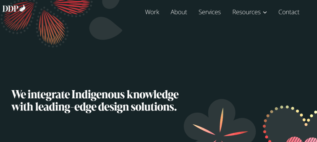
Services Overview: Design de Plume’s services are fueled by a commitment to inclusivity and honoring indigenous traditions. Their services include strategy, branding, website design, and campaigns. Some of their healthcare clients include the Johns Hopkins Center for Indigenous Health and the Maamwesying Ontario Health Team (MOHT).
Best For: High-end digital “front door” product engineering
Target Audience: Large health systems and payors seeking sophisticated digital consumer experiences.
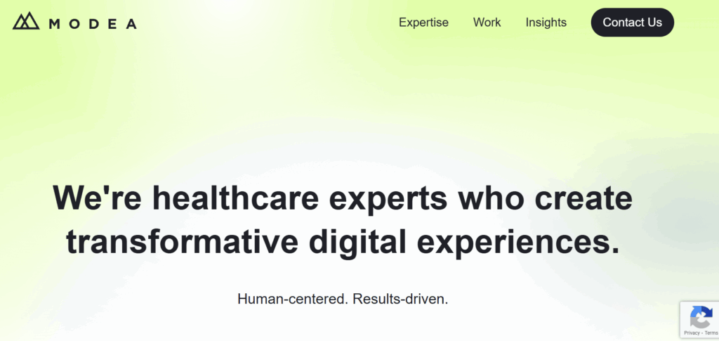
Services Overview: Modea partners with healthcare organizations to build and optimize their online resources. Their services include digital strategy, UX design, web development, electronic health record (EHR) integration, and HIPAA compliance. Their work has helped clients increase website conversions, site speed, and digital revenue.
Best For: Privacy-first marketing and HIPAA-compliant attribution
Target Audience: Large health systems, payors, and multi-location providers who need to prove marketing ROI.
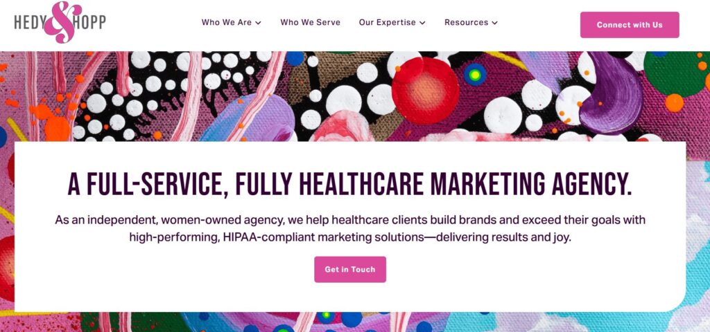
Services Overview: Hedy & Hopp is a full-service digital marketing agency for healthcare organizations. They can step in at any point to support healthcare websites, whether they need a full rebuild or optimization. They can also build a robust marketing strategy that sets up your healthcare organization for long-term growth.
Target Audience: Medical practices and solo providers
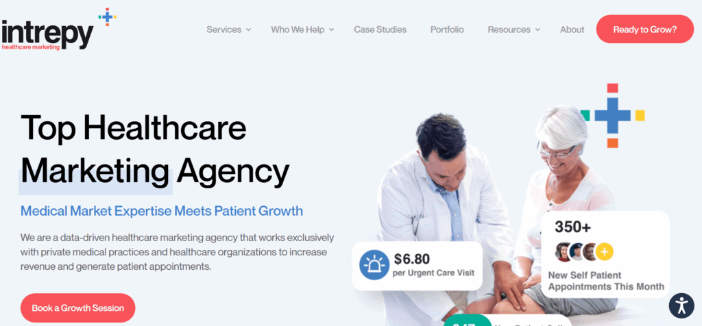
Services Overview: Intrepy takes a data-driven approach to healthcare marketing, leveraging real-world experience to provide tailored services that healthcare organizations need. Their services include medical SEO, web design, video production, paid advertising, and more. Clients have seen increases in organic website traffic and appointment booking after working with Intrepy.
Location: Based in Minneapolis, MN, with clients across the U.S.
Best For: Medical device and life science companies
Target Audience: B2B MedTech
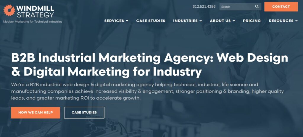
Services Overview: Windmill Strategy provides digital marketing services to B2B marketers with complex offerings. They help medical businesses establish leadership in their sector, showcase their offerings more effectively, and generate leads. They also build websites for life sciences organizations that speak to many audiences, from healthcare professionals and scientists to patients.
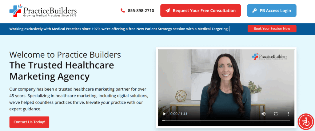
Services Overview: Practice Builders has been in the healthcare digital marketing space for over 45 years. They help practices grow through web design, reputation management, SEO, and social media marketing. Their clients range from medical offices to dental practices and other specialties.
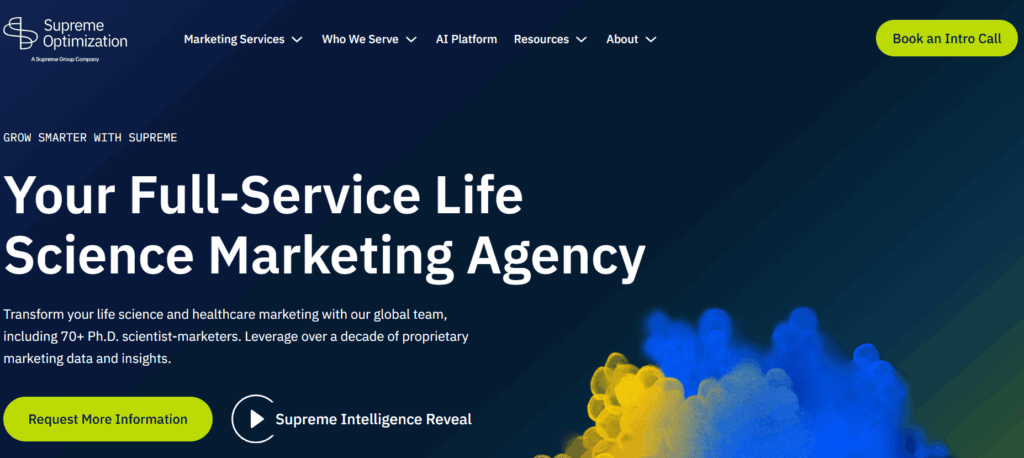
Target Audience: Scientific organizations needing Ph.D.-level strategists to communicate complex healthcare or life science products.
Services Overview: Supreme Optimization is a full-service marketing agency for life science organizations. Their global team includes 70+ Ph.D. scientist-marketers, ensuring they have deep knowledge of life science topics. Their team helps orgs maximize their ROI through smart UX and data-driven intelligence.
Best For: Biotech branding and investor-focused design
Target Audience: Biotechnology
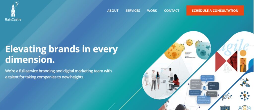
Services Overview: RainCastle Communications builds B2B websites for life sciences, healthcare technology, and professional services. They take a strategic approach to web optimization, from thoughtful discovery and design to ongoing optimization. Their industry expertise allows them to achieve strong results while reducing risks.
Top Healthcare Web Design Companies: FAQs
How does healthcare web design differ from standard web design?
Healthcare sites face significantly higher stakes than other sectors; they must balance complex regulatory compliance (HIPAA, ADA) with a patient-first UX that reduces anxiety and is easy to use for web visitors who are often stressed or in a hurry.
Why is industry-specific experience so important?
Experienced agencies already understand clinical workflows, medical SEO, and the specific trust signals needed to convert a visitor into a patient, so they don’t need to be brought up to speed on the ins and outs of your industry.
What is the average timeline for a healthcare website build?
Timelines depend on scope, but they generally range from a few months to significantly longer for enterprise-level organizations with complex integrations, such as EHRs and patient portals.
How do agencies protect sensitive patient information (PHI)?
Top firms implement SSL encryption, secure data storage, and encrypted form submissions to ensure that any data transmitted, from appointment requests to bill pay, is protected from breaches.
What features do patients value most on a healthcare site?
Data shows that 94% of consumers prioritize easy navigation on the websites they use. Other essential healthcare site features include intuitive search, mobile-friendly appointment scheduling, provider directories, and secure patient portals.
Why is mobile-first design critical in healthcare?
With over 64% of web traffic originating from mobile phones, patients need to be able to find directions or book care while on the go, often while juggling other stressful tasks like childcare and jobs. That means a mobile-friendly interface is critical to help them complete essential tasks.
How is accessibility handled for diverse patient needs?
Agencies should follow WCAG guidelines by creating designs that facilitate keyboard navigation, provide high color contrast for the visually impaired, are screen reader compatible, and offer clear, jargon-free content.
How much does a professional healthcare website cost?
Pricing varies widely based on the number of pages, custom features (such as telehealth integrations), and the level of ongoing support required.
How can we measure the ROI of a new website?
A top-quality agency will track specific metrics such as increases in new patient inquiries, online appointment bookings, and improved search engine rankings for key medical terms. You can use this data to evaluate whether your site is serving your goals or whether you need to adjust your strategy to improve outcomes.
How to Choose the Right Service Provider for Your Needs
Ensure specialty alignment. If your healthcare organization requires specialized functionality, ensure the web design provider you work with can accommodate your needs. For example, a pediatric care clinic needs a balance of professional trust for parents and a friendly, approachable aesthetic. This often requires multilingual content options and quick links for vaccine schedules or dosage charts.
💡 Pro Tip: Ask for a “Design Persona” review. A provider should be able to explain how their design choices specifically appeal to both the logical needs of a parent/patient and the emotional comfort of the user.
View portfolios. Explore case studies and client stories from potential providers to see whether their services and deliverables align with your requirements. Verify that their past work includes high-quality medical imagery and engaging video storytelling. Also, browse their past projects on a mobile device to ensure complete mobile compatibility.
💡 Pro Tip: Don’t just look at the homepages. Navigate to a deep resource page on your phone (e.g., a dosage chart or provider directory). If you have to pinch and zoom to read it, they aren’t truly mobile-optimized.
Ask for references. Don’t just take their word for it—ask potential agencies for references from past clients so you fully understand their approach with healthcare providers. For instance, you may ask a reference, “How did the agency handle situations where a timeline needed to be extended due to a new compliance requirement?”
💡 Pro Tip: Ask this exact question: “Can you describe a time this agency caught a compliance or security risk before you did?” This reveals whether they are proactive partners or just order-takers.
Verify HIPAA compliance and security standards. Ensure the provider you choose complies with digital HIPAA guidelines and offers top-level security standards. Confirm they implement multi-factor authentication (MFA) for all logins, SSL encryption for every form, and secure off-site backups.
💡 Pro Tip: If a provider says, “Our hosting is HIPAA-compliant, so your site is too,” keep looking. HIPAA compliance requires specific encryption at the application level (how the forms handle data), not just where the files are stored.
Ensure custom accessibility. Ensure custom accessibility. Your web design partner should be able to tailor your site’s accessibility to your unique audience. For example, if your organization serves populations with low vision and blindness, your web provider should be able to build your website to accommodate these needs, including high color contrast, audio descriptions, and other essentials.
💡 Pro Tip: Ask for an accessibility audit report from a previous project. If they can’t produce one, they likely aren’t testing for screen readers or low-vision users.
Ask about EHR integration. Ask specifically if they have integrated with your exact EHR system, such as Epic, Oracle Health, PracticeSuite, or athenaOne, as the technical lift varies significantly between platforms. Ensure they can seamlessly link to or embed patient portals so users can access test results and medical history without a confusing login experience.
💡 Pro Tip: Integration isn’t “one size fits all.” Ask: “Do you use a native API integration for [Epic/Oracle], or are you just skinning an external login page?” The latter often leads to a disjointed user experience.
Explore support options. Determine the level of ongoing support your provider will offer your organization to ensure continued success. Ask about their guaranteed response time for critical security patches versus general content updates.
💡 Pro Tip: Distinguish between “Response Time” (we saw your email) and “Resolution Time” (the bug is fixed). Ensure your service-level agreement (SLA) defines both for critical security patches.
Inquire about results tracking. Evaluate how providers measure website performance and report back to clients. Beyond traffic, they should track online appointment booking rates, newsletter sign-ups, and the “Success Rate” of your internal search bar.
💡 Pro Tip: Ask them to set up “Conversion Funnels” that track how many visitors to a service page actually complete an “Appointment Request” form.
Wrapping Up
Finding the right web design provider for your healthcare organization is as much about relationship building as it is about wireframes and branding strategies. When you can find an agency that truly cares about your organization, deeply understands its needs, and is devoted to its success, you can build an online presence that furthers your healthcare mission.
For more information, check out these additional healthcare web design resources:
Agentic Journeys: AI agents (like Gemini and GPT) are now bypassing traditional website funnels to complete transactions directly.
Semantic HTML as “SEO 2.0”: Clean, machine-readable code is no longer optional; it’s how AI discovers and recommends your site.
Calmer UX: Design is shifting toward minimalist, “distraction-free” interfaces that prioritize speed and accessibility.
Trust UX: Privacy and consent are now core architectural requirements, not just legal checkboxes.
Component-Driven Development: Using unified design systems to scale content rapidly without technical debt.
It’s that time of year again when we look ahead to what’s coming. We admittedly don’t love the word “trends” because it implies something fleeting, while our entire philosophy here at Kanopi is about building sustainably and intelligently, so websites will last. The word “trends” works great for a short headline, but this article is more about outlining what we see coming in all aspects of website design and development, so you can be prepared to decide what could work for your business.
We’ll warn you: artificial intelligence is covered a lot in this article. Love it or hate it, it’s here. While we are all learning to find ways to allow AI into our workflows in order to create efficiencies, it’s critical to use it in a way that keeps humanity strong! (If you’re curious, here’s how Kanopi uses AI for clients).
What are the top strategy trends for 2026?
1. Let the bots organize large datasets
One thing that AI is very skilled with is helping aggregate large, disparate datasets. Think competitor research, user behavior data, or analytics reports.
Our content and UX strategy teams use a combination of ChatGPT and Claude to analyze large datasets, identify patterns, and turn complex information into clear, human-readable insights. AI can be used here to reduce the manual lift required for time-intensive activities; work that once took weeks can now be completed in just a few days, freeing our strategists to focus on the high-impact thinking that drives meaningful results for our clients.
As always, human guidance is key. A human needs to review the outputs as they come. It helps maintain accuracy, minimize bias, and ensure that AI outputs stay closely aligned with the project’s goals and broader strategic direction.
2. Agentic journeys & funnel flattening
AI agents (ChatGPT, Gemini, custom enterprise agents, etc.) will increasingly handle research, booking, donations, and transactions end-to-end, collapsing multi-step funnels into single-intent, conversational flows. Early adoption in 2026 will raise new questions about attribution, fraud, consent, and regulation.
What about website design, UX and content?
3. Make your content speak AI
AI isn’t just reading your content anymore. It’s deciding whether to recommend you at all. If your site isn’t structured in a way that ChatGPT, Gemini, and other AI agents can understand, you’re basically invisible to a growing chunk of how people discover things online. We’re talking semantic HTML, well-structured and agent-friendly APIs, stable URLs, and clean information hierarchies, and structured data … all the stuff that makes your content machine-readable. This is no longer optional. Think of it as SEO 2.0, except now you’re optimizing for robots that are way smarter than the old-school web crawlers. Otherwise, expect degraded representation in AI-driven search and assistants.
What Kanopi is doing: We start with AI-led content audits that reveal exactly where your content stands. What’s discoverable, what’s buried, what’s redundant, and what’s completely invisible to AI systems. These audits don’t just identify problems, they inform strategy, helping you prioritize what to fix first based on actual impact.
4. Scale your content without sacrificing your voice
One of the biggest challenges teams face is keeping content fresh and consistent across dozens (or hundreds) of pages. You’ve got style guides gathering dust, content editors struggling to match tone, and updates that take forever because every piece needs multiple rounds of review. AI changes that equation completely. But only if it’s trained on your voice, not generic internet speak.
What Kanopi is doing: We’re building custom AI workflows that learn your brand’s style guide, tone, and content patterns, then generate copy variations that actually sound like you. But we’re not just handing you a robot and wishing you luck. We’re creating prompt libraries and content templates tailored to your team’s specific needs. Need 10 variations of a CTA? Done. Want to update product descriptions across your catalog while maintaining consistency? Easy. We’re giving your content editors AI tools that work with them, not against them, so they can keep sites current without burning out. It’s like having a writing assistant who’s read every piece of content you’ve ever published and knows exactly how you like things done.
5. Design for speed and intuition
Nobody wants to click through five pages to do something an AI can handle in one conversation. We’re witnessing a significant shift toward interfaces that anticipate users’ needs and deliver them faster. Think calmer designs, less clutter, smarter personalization that doesn’t feel intrusive. Multi-step funnels are collapsing into simple, conversational flows because that’s what AI agents are built for and what users now expect. The best interfaces in 2026 will feel less like navigating a website and more like having a helpful assistant who intuitively understands your needs.
What Kanopi is doing: We’re using AI-powered tools to streamline our design workflows that create meaningful efficiencies for our downstream development teams. Our Figma to Claude process enables rapid component prototyping. This means we can create more, iterate faster and refine work, without putting timelines or budgets at risk.
6. Unifying theme and atomic/component-driven design
A major trend shaping 2026 web design is the continued move toward unified, component-based systems. Instead of designing every page from scratch, we create a consistent library of reusable interface elements, buttons, cards, forms, navigation patterns, that work together seamlessly across your entire site. This ensures visual cohesion, faster development, and a smoother user experience.
What Kanopi is doing: We take this further by pairing modern design tools with cutting-edge AI development workflows. Using Figma’s Model Context Protocol (MCP), our design files connect directly to advanced AI coding tools like OpenAI Codex and Anthropic’s Claude. This means our designs are translated into high-quality, production-ready code with exceptional accuracy.
Once components are built, we use Google Chrome DevTools MCP to let AI validate how each piece actually renders in a real browser, catching visual issues early and ensuring the final experience matches the design vision.
From there, our developers ensure each component can be easily managed in your CMS. Finally, we build end-to-end functional tests that automatically watch for regressions, ensuring that as your site evolves, nothing breaks along the way.
The result is a unified design system powered by intelligent workflows that keeps your site visually consistent, easy to maintain, and ready to scale.
Other things we see coming
AI can serve as a valuable design research partner, helping designers quickly surface trends, industry-specific design patterns and assessing the accessibility of design components as they are being designed.
Aesthetically speaking, we’re noticing a shift to calmer user experiences; minimalist interfaces, fewer distractions, more clarity, and clearer information hierarchies.
Lastly, compliance for WCAG and “Consent UX” or “Trust UX” — the design of user interfaces and flows that ethically obtain user permission for data collection and use — is becoming mandatory. See the “Trust, Privacy, Consent & compliance in the next section for more information on this.
There’s even more happening in website development (whether it’s Drupal, WordPress, or custom code)
Just like in strategy, content, and design, development is also undergoing a meaningful shift. These aren’t fads. They’re structural changes in how teams build, maintain, and future-proof websites. Here’s what we see shaping 2026:
7. Server-side rendering & resilient delivery
We’re watching teams swing back toward server-side rendering (SSR), static site generation (SSG), and progressive enhancement. This isn’t nostalgia, instead it’s a response to what users (and AI systems) now expect: fast initial loads, predictability, resilience, and content that’s easily discoverable by both humans and machines.
Modern frameworks absolutely still have a place, especially when rich interactivity is required, but we’re seeing a clearer separation between where complexity adds value and where it gets in the way.
8. Rethinking architecture: agents vs. complex frontends
As AI agents begin handling more of the “consumption layer” — surfacing answers, facilitating transactions, navigating information — the value of extremely complex, client-heavy architectures is being reconsidered.
For informational sites and straightforward user journeys, well-structured, semantic content often wins over front-end flexibility. Complex frontends will continue to power robust applications, but many marketing and discovery-focused sites are trending back toward hybrid or server-first models.
Agents are already consuming AI-friendly APIs, and with evolving authentication, they’ll get even better at interpreting content over time. With the current pace of innovation, we predict this will be a delicate dance throughout 2026.
9. AI-accelerated technical debt
AI coding tools are incredible accelerators, but they’re accelerators in both directions. Yes, they speed up delivery. They also multiply code volume, inconsistency, and architectural drift if teams don’t stay vigilant.
This is where strong standards, clean patterns, and senior oversight matter more than ever. Without them, organizations end up with AI-generated technical debt and fragmented prompt/model sprawl — problems that cost significantly more to untangle later. Kanopi builds governance into our workflows so speed never comes at the expense of long-term stability.
10. Trust, privacy, consent & compliance
As AI becomes embedded in websites and applications, the way we communicate trust changes too. Users need clarity around how their data is used, how permissions work, and what AI agents are doing on their behalf.
“Trust UX” is becoming its own discipline. Transparent consent flows, auditable agent actions, and understandable data policies are now core engineering requirements, not afterthoughts. And with legal scrutiny around consent management on the rise, we expect this to intensify in the coming year.
Users increasingly expect experiences that adapt to them, including personalized recommendations, context-aware content, and layouts that respond to user intent. Achieving this requires real AI infrastructure: data pipelines, model governance, and ethical frameworks.
Basic rules-based personalization won’t cut it anymore. Organizations that want to deliver anticipatory digital experiences will need to invest in more holistic, AI-driven systems.
12. Accessibility & inclusion as architectural foundations
Accessibility is no longer something you “add on” during QA. It’s becoming a structural requirement. Semantic HTML, non-JavaScript critical paths, and robust WCAG compliance are essential for AI discoverability and multimodal search (and are just good practice regardless).
As agents rely more on clean, machine-readable content, inaccessible markup and JS-gated experiences will carry increasing penalties. Building inclusively from the start is now both an ethical responsibility and a competitive advantage.
Curious about what Kanopi’s doing specifically? Here are a few exciting projects keeping us engaged:
Drupal CMS, Drupal Canvas, and Site Templates!
We’re hard at work in the Drupal community, helping Drupal CMS development continue. Drupal CMS 2.0 was released in January 2026, complete with a working Site template example building on top of Drupal Canvas, the new editor coming to Drupal.
There are AI integrations, theming in the browser, and instant component creation. This all will minimize development cycles and empower content creators to prototype and publish as they see fit.
We will be working to release a Site Template in the initial launch of the Drupal.org marketplace, so check back with us in the spring at DrupalCon Chicago.
AI Tooling to increase content editor and developer efficiency
We’re working to build AI workflows and tools into our tech stack and into Drupal and WordPress sites to help all of us be more productive in our day to day tasks. We’re connecting Figma to coding agents, as well as connecting automated audits to ticketing systems, content, image, and audio generation in content management systems. Basically, we are working in a way that we can do more with less.
Things are moving quickly, but the basics are still critical.
It’s a lot to absorb when technology moves ever faster, but it’s important to remember that the basics still hold true: your website needs to work for the humans that use it. Your visitors need the information they came looking for, and your editors on the back end need to be able to make updates that keep the website performant, accessible, and fresh.
There’s always going to be more we can do to make websites better, so it’s easy to get overwhelmed with everything that’s coming. But remember this: you don’t need to know everything, you only need to know the things that will make your website meet the goals you’ve defined for it.
We hope this post helps inspires you with ideas on how to make your website stronger in 2026!
Search optimization has changed. Traditional SEO still matters, but it’s no longer enough on its own. Today, your site also needs to perform well in generative search engines and AI-driven tools like ChatGPT, Perplexity and Google’s AI Overviews. That’s where GEO (Generative Engine Optimization) and AEO (Answer Engine Optimization) come in.
At Kanopi, we don’t treat SEO, GEO and AEO as separate strategies. They all depend on the same foundation: a fast and crawlable site with a clear and accessible structure for people and machines. When you build that foundation well, your content can perform in traditional search and AI tools. It can also adapt to what comes next.
Many of our clients already think this way. They want Drupal AI consulting and ongoing optimization, not one-time fixes.
Here’s how we approach this in practice, with real examples from our work.
Start with the Technical Foundation
Strong optimization always begins with the basics. If search engines or AI systems can’t reliably crawl and understand your site, everything else is harder.
At this stage, our work typically includes:
Auditing the site’s search foundation
Crawlability
Performance
Templates
Metadata
Internal linking
Accessibility
Finding and fixing issues that suppress search performance
Broken links
Orphaned pages
Duplicate content patterns
Redirect gaps
Low-value pages that dilute crawl budget
Reviewing CMS structure
Drupal templates
WordPress templates
Content models that support consistent indexing and interpretation
This work isn’t flashy, but it is essential. It creates the conditions for SEO, GEO and AEO to work together instead of competing with each other.
Make Content “Answer-Ready” for GEO and AEO
AI tools tend to reward content that answers questions clearly and quickly. However, that doesn’t mean dumbing content down. It means structuring it so the core message is easy to extract, which starts with strong brand and entity signals that reinforce credibility. Key pages need to stay fresh and consistent and the format has to work for both crawlers and AI systems.
To support this, we focus on practical changes that make content easier to understand and easier to trust. This includes:
Restructuring key pages so they answer the primary question early; we use clear headings and short sections that readers can scan
Strengthening entity clarity and relationships (for example: between people, departments, research areas, programs and initiatives)
Reducing ambiguity so AI systems can connect concepts accurately and return answers with proper context and attribution
This helps content perform better in AI-generated answers, featured snippets and zero-click results while still encouraging users to visit the site for deeper information.
Add Machine-Readable Signals Without Overdoing It
Search engines and AI systems rely on structured signals to understand what your content represents. We add these carefully and intentionally.
This usually includes:
Implementing or refining structured data where it provides real value, such as:
Organization
Person
Article or news
Events
Standardizing key on-page signals:
Titles
Descriptions
Canonical patterns
Open Graph metadata
Reducing conflicting signals so platforms interpret your content consistently
The goal is clarity, not complexity. More markup isn’t always better.
Manage Bot Traffic So Performance Stays Stable
AI crawlers and aggressive bots can put real strain on sites, especially on search results and listing pages. We treat bot management as part of optimization, not just security.
Here’s how we manage bot traffic:
Blocking malicious bots as early as possible, ideally at the CDN or WAF layer before requests reach your Drupal, WordPress or the database
Applying rate limiting and bot controls to reduce resource strain from aggressive crawlers
Maintaining a robots.txt strategy that supports SEO while limiting unnecessary crawling
When appropriate, implementing an llms.txt (proposal-level, community-led) approach to guide some AI crawlers towards key pages to also reduce unnecessary crawling
We also review bot patterns regularly and adjust controls as new crawlers emerge.
Measure, Iterate, and Improve Over Time
SEO, GEO and AEO aren’t one-time projects. They improve through iteration.
Ongoing work often includes:
Using analytics and search data to identify high-value queries, zero-result patterns and content gaps
Maintaining an optimization backlog and delivering improvements incrementally
Folding this work into ongoing support, alongside performance, accessibility and analytics improvements
This avoids disruptive overhauls and keeps progress steady.
Real Examples from Our Work
Kanopi Studios We’ve applied this same approach to our own site. We clarified service language, improved content structure and added machine-readable signals for AI discovery.
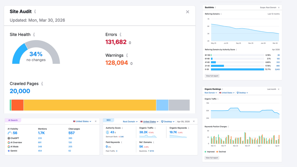
Today, roughly one-third of our new inbound leads originate from ChatGPT and similar tools. GEO and AEO are definitely driving real business outcomes.
COIT For COIT, we focused on structuring service pages and how-to content to answer common user questions directly. This increased visibility in AI-generated answers and featured snippets, while still guiding users back to the site. We also supported franchise-related content so it was easy to discover and accurate across both traditional search and AI platforms.
San Francisco International Airport For SFO, we supported SEO and emerging AEO strategies on a large, high-traffic site. Our work focused on performance, content clarity and structured data so users could quickly find authoritative answers about services and operations.
Centre for Digital Media For the Centre for Digital Media, we improved the sitemap and clarified user pathways, strengthening information architecture and internal linking. This improved discoverability and reinforced SEO fundamentals that also support AI interpretation.
Ongoing Support Clients Technical SEO is a recurring part of many support engagements. It often works alongside performance tuning and continuous improvement.
This is where SEO, GEO and AEO work tends to live and mature over time.
How clients are using AI on their websites today
AI tools are still emerging for many organizations, but early adopters are already seeing practical benefits.
PEN America PEN America publishes a high volume of image-based content. Manual alt text creation was slow and inconsistent. We implemented AI-powered alt text generation directly into the editorial workflow. Editors can review and refine suggestions, reducing manual effort while improving accessibility compliance. It also speeds up publishing.
Settle In US Settle In US serves people navigating complex immigration information. Long, text-heavy pages were difficult for some users. We implemented text-to-speech using Eleven Labs, improving accessibility and making critical content easier to consume.
Exploratorium Exploratorium manages a large and diverse content library. The keyword search made discovery difficult. We implemented Algolia with AI-based semantic search, allowing users to find relevant content even when their terms didn’t match exact keywords. This improved discovery and engagement across the site.
A solid foundation helps your content be found.
SEO, GEO and AEO aren’t separate checklists. They’re different expressions of the same goal: making your site easy to understand, easy to access and genuinely helpful.
With a solid foundation, you can expand your content strategy so it performs across search engines, AI tools and future platforms without constant reinvention. Visibility also comes from getting your best content cited and discussed beyond your site. That can include digital PR, partnerships, guest contributions and community-first participation where your audiences already ask questions. Generative tools often draw from both trusted publishers and community platforms, such as YouTube or Reddit. A strong off-site strategy can build your credibility and increase how often your content gets referenced.
If you’re moving in that direction, ongoing optimization and AI-aware strategy can help you gain more value.
Want more? We held a webinar that’s related to this.
If you manage a website for a nonprofit, university, or healthcare organization, chances are your audience isn’t just browsing for pleasure. They’re looking for something important: how to donate, how to register for classes, or how to schedule care for themselves or a loved one.
That’s why navigation is so critical. It’s not just about design, it’s about helping people find what they need quickly, clearly, and confidently.
In this post we’ll break down the most common website navigation patterns, along with a look at how AI-powered search is changing and how website owners and editors should think about navigation.
A horizontal menu across the top of the page, often with your logo on the left and links like “About,” “Programs,” or “Donate” on the right.
Why it works:
It’s familiar and expected
Keeps the most important pages of your website experience front and center
Easy to use on desktops, tablets and larger mobile devices (depending on the number of options)
Things to watch:
Too many items can clutter the user interface (UI)
Not suitable for websites with dense or complex information architecture
Where it fits:
Perfect for mission-driven websites with clear, high-level goals, which use a simple, action-oriented top menu like: Donate, Get Involved, Refer a Patient.
Good place for contact info, careers, privacy policy, and internal links
Things to watch:
Avoid cramming it with too many items
Keep it visually simple and organized
Consider including key items from your main navigation to create a secondary point for users to traverse your site
Where it fits:
All websites benefit from a helpful footer, it’s the safety net for people who scroll all the way down looking for answers.
The Next Shift: AI-Powered Navigation
Now for what’s coming next, and is already starting to show up on forward-looking websites … instead of clicking through layers of navigation, more and more visitors want to just ask a question:
“How do I apply for tuition assistance?”
“I need directions to the clinic.”
“How can I get involved beyond just donating?”
AI-powered search tools, including chat-style interfaces and natural language search are making this possible. It’s like giving your site a smart assistant that understands questions and points people to the right answer instantly.
Why it matters for your mission:
Saves time for visitors (and staff)
Reduces friction points, especially during stressful moments (like seeking care or emergency help)
Helps users find specific, deep content without navigating complex menus
AI tools can supplement your menus, not replace them. For example, a donor might browse your navigation, but a returning volunteer could just ask the chatbot “Where’s the login page for last year’s volunteers?”
As more people expect intuitive experiences everywhere, organizations that invest in smart search tools, especially on high-traffic or information-dense sites, will have an opportunity to stand out.
Choose the right navigation pattern for your needs.
Good navigation helps people find what they need with the least amount of friction. Whether someone wants to make a donation or explore academic programs, choosing the right navigation pattern is critical for making it easier for users to connect with the content that matters most. It’s all about removing friction and guiding people in the right direction.