Data from Forrester Research shows that a frictionless user experience can increase digital engagement and conversion rates by up to 400%. This research highlights the importance of a streamlined layout for your association’s membership site dashboard page.
A high-performance dashboard must balance intuitive visual hierarchies with robust engineering to keep users engaged, supported, and continuously deriving value from their subscriptions. This guide walks through that framework. We’ll cover:
- What is a membership site dashboard page?
- What are the benefits of creating a membership dashboard page?
- Why associations should avoid standard dashboard templates
- The six-step framework for high-performance dashboards
- Essential web design best practices for member portals
- Elevate your member experience with Kanopi Studios
What is a membership site dashboard page?
A membership site dashboard page is the secure, private home screen members see immediately after logging in to a gated platform. This central hub consolidates personalized resources, exclusive benefits, subscription details, and profile configurations into a single accessible interface designed to drive ongoing member engagement.
What are the benefits of creating a membership dashboard page?
The benefits of creating a membership dashboard page are that it:
- Serves as the primary driver of member relationships: Your dashboard is the single most critical digital touchpoint for delivering long-term value to your association’s audience. When built correctly, it transforms passive site visitors into active, lifelong community participants who value their membership. It shifts the dynamic from a transactional subscription into an indispensable professional resource.
- Maps directly to user behavioral data: Effective dashboard layouts organize components to ensure members find immediate value without having to search. This strategy is based on quantitative research, such as tracking clear user click paths to reveal exactly which features matter most to your distinct audience cohorts. It eliminates cluttered interfaces, reduces cognitive load, and surfaces high-demand assets based on real-world patterns.
- Streamlines structural user pathways: Aligning portal architecture with intuitive navigation principles reduces confusion and keeps members connected to core benefits. A clean navigational framework ensures that essential actions remain accessible in under two clicks, maximizing overall portal efficacy. That way, users never feel lost while exploring gated resources.
To secure engagement right from the start, try dropping a simple profile tracker directly onto members’ main dashboard. Instead of requiring people to fill out a massive form when they sign up, this helpful feature gently asks for just a few details over separate visits. Gathering info bit by bit lets your marketing team customize outreach without slowing down your users.
Why associations should avoid standard dashboard templates
To build a member portal that actually grows with your community, skip the standard out-of-the-box templates. Mass-market themes box you into stiff layouts that probably can’t handle your unique member tiers or complex user journeys.
It can get messy fast. Over time, rigid setups create costly technical debt, block your essential software integrations, and frustrate the very people you want to support, ultimately hurting your renewal rates.
The disadvantages of dashboard templates include:
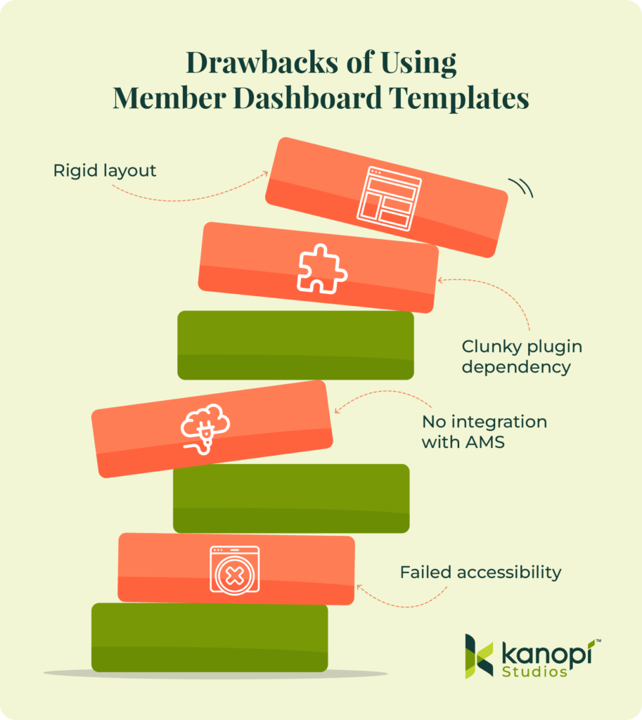
- Failing to meet digital inclusion requirements: Compliance is non-negotiable for membership dashboards. Generic platforms like Wix often lack the infrastructure needed to implement enterprise-grade WCAG accessibility standards. Additionally, they use closed ecosystems that prevent developers from altering fundamental semantic code or managing deep screen-reader optimization requirements, leaving your association exposed to significant regulatory risks.
- Creating operational bottlenecks for staff: Plugin-centric systems lock marketing teams into rigid layouts that require developer assistance for minor visual updates. Your staff becomes dependent on external technical help to make even small changes. This configuration can stifle organizational agility, delay time-sensitive communications, and require you to spend more of your marketing budget on minor code repairs.
- Restricting mobile-first responsive refinements: True responsiveness requires precision. Default layouts from basic tools lack polished, responsive UX frameworks across mobile screen sizes. They often break on smaller tablets or modern smartphone screens. This structural failure can cause accessibility barriers for on-the-go professionals who need rapid access to portal tools during events, travel, or daily commutes.
- Ignoring practical engineering blueprints: Industry advice often focuses on big-picture strategy but lacks practical, technical steps for building the user interface. It rarely explains how to create reliable data requests, handle many users at once, or style custom page sections efficiently.
Investing in custom architecture upfront keeps your money safe and your portal running smoothly. Plus, it frees your marketing team from serving as tech support, giving them time to focus entirely on keeping your members happy.
The six-step framework for high-performance dashboards
Building a custom member dashboard page requires a human-centered plan. Focus on deeply understanding your audience, making the interface completely frictionless, ensuring it works flawlessly on mobile, and connecting your systems smoothly. Taking this step-by-step approach cuts out fragile shortcuts, leaving you with a secure digital home that grows along with your community.
1. Conduct research and persona development.
Ground all visual choices in qualitative user research and structured content audits instead of chasing passing aesthetic trends. This makes your web environment more engaging, actionable, and friendly for everyone. Before sketching any layout concepts, your design team must:
- Map out exact user behavior patterns: For instance, if your website analytics show that most members log in just to check their continuing education credits, that tracker needs to live right at the top of the page. Keep it prominent.
- Survey existing member challenges: Ask members where they struggle. You might find that executive-tier members are frustrated by complex navigation menus, while younger professionals can’t find your job board on their smartphones. Listen to them and incorporate their feedback.
- Catalog every digital asset: Gather every PDF guide, webinar recording, and exclusive tool package so you can see exactly how much on-screen real estate your gated assets will need.
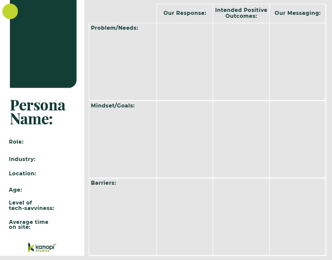
Use this research to create 3-5 distinct audience personas. Identify your audience’s needs, goals, and barriers to access. At the same time, plan your strategy for responding to members’ needs with clear messaging and positive interactions. Use this template to help get started building personas:
This comprehensive research phase uncovers the precise strategies required to serve diverse membership tiers effectively.
2. Bake in accessibility from the start.
True responsive design means writing clean, flexible code that adapts beautifully to any screen size while remaining fully optimized for assistive devices (like screen readers). Taking this proactive approach ensures a high-quality, seamless experience for everyone, no matter how they access your platform.
Here is how to make that happen naturally:
- Fix common web design mistakes. Build with clean semantic markup so your private portal never accidentally alienates people who use assistive tools.
- Take down low-contrast barriers. Poor color contrast is the single most common web accessibility issue, affecting over 83% of web layouts. Using sharp, clear contrast ratios ensures older professionals or visually impaired members can enjoy your resources effortlessly without eye strain.
- Move past basic automated checkers. Data assessments show that just 2% of standard public and gated web pages meet more than 70% of testable WCAG requirements. Simple software scanners only catch a small fraction of issues, which is why real human testing matters so much.
3. Prioritize mobile-friendliness.
Your members are busy and constantly on the move. That’s why a great member portal has to look and work seamlessly on a smartphone. When you build a clean, flexible layout for smaller screens, you make it incredibly easy for your community to log in, explore resources, and get things done cleanly from anywhere.
Here is how to design a mobile experience your members will love:
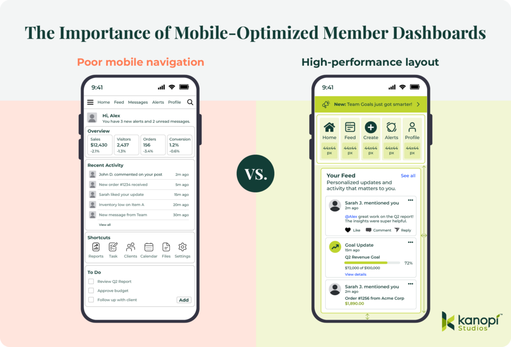
- Prioritize visual layout hierarchy. When someone logs in from their phone, they’re usually looking for quick info, like an event check-in QR code or a quick profile update. Give these high-demand features prime real estate to save your users from scrolling through endless rows of text.
- Size for touch target accuracy. Tiny buttons frustrate everyone. Make sure your buttons, links, and navigation tabs are at least 44×44 pixels, so they are easy to tap with a thumb. Additionally, space things out nicely. Give your interactive elements plenty of breathing room to prevent accidental misclicks and simplify actions for members who are navigating your portal while multitasking on the go.
- Surfacing exclusive membership benefits. Remind people why they love being a part of your association. Drop in welcoming content blocks that highlight active perks right on the mobile screen to naturally encourage deeper platform engagement. Visually calling out member-only resources turns casual daily check-ins into regular reminders of the concrete return on their membership investment.
Take a look at the difference that true mobile optimization can have on your online presence:
4. Develop scalable architecture and seamless integrations.
Give your marketing team the power to manage your portal without waiting on a developer. Building a flexible backend with modular component blocks lets your staff update text, swap banners, and change layouts on the fly.
Plus, your underlying technical foundation must play well with all your critical systems, such as your association management system (AMS), payment gateway, and learning platform. Using clean, decoupled code ensures that member data updates flow seamlessly to the screen without causing unexpected crashes or slowing page load times. Your portal stays lightning fast and totally reliable.
5. Invest in holistic, ongoing platform support.
Think of launch day as the true beginning of your dashboard-building process, not the finish line. Keeping a close eye on user heatmaps and behavioral analytics highlights exactly where people get stuck or lose interest. These real-time insights let your team refine layout choices on the fly to meet evolving community demands, ensuring your platform stays useful for years to come.
Also, keep your connected systems happy. Scheduling automated stress tests quarterly catches sneaky API glitches before they affect your member portal experience. Data feeds fluctuate often. Building proactive error handling directly into your custom framework shields your front-end layout from external technical hiccups, giving your community a smooth ride every time they log in.
Essential web design best practices for member portals
When you focus on data-informed best practices, you build a secure member portal that performs well, is easy for your internal team to run, and is highly personalized for every member who logs in to your ecosystem.
Let’s look at the essential design rules we use to keep portals running cleanly:

- Empower your internal team. Give your staff the freedom to work fast. Moving to a component-based editing setup cuts out your dependency on developers and makes daily content management a breeze for your marketing team. When non-technical staff can tweak layouts on their own, your association stays agile while saving on maintenance costs.
- Deploy flexible modular components. Think of your site elements as digital building blocks. Using smart content structures like Drupal Paragraphs lets your staff rearrange dashboard sections without touching a single line of code. Content managers can easily drag, drop, and tweak promotional blocks to match your shifting campaign goals all year long.
- Eliminate code dependencies for updates. Making fast updates shouldn’t require a technical ticket. Your marketing managers should be able to swap out alert banners, feature new resources, and edit copy seamlessly on the fly. This creative autonomy speeds up your internal production cycles and removes stressful workflow bottlenecks.
- Ensure brand continuity. Let automation protect your design standards. A solid component-based system automatically locks in your typography, official colors, and button margins, so your staff can’t accidentally break the layout. This systemic safety net ensures that no matter how many content updates your team makes, your public-facing dashboard always looks polished and professional.
- Design welcoming empty states. First impressions matter. When a brand-new member logs in for the first time, they won’t have any personal activity history yet. Staring at a blank screen can cause instant confusion. Instead of leaving dashboard sections empty, guide new users with friendly welcome videos, curated starter kits, or simple setup checklists to get them engaged right away.
- Implement smart notification systems. Separate critical operational announcements or membership renewal notices from your regular content feed so your community never misses a time-sensitive update. Use prominent, highly accessible header banners. Isolating high-priority warnings from general reading materials ensures instant visibility, which directly boosts your renewal actions.
Want to take your portal personalization a step further? Try adding a smart visibility layer to your modular components to share hyper-targeted content. This rule-based setup allows your marketing team to display specific dashboard blocks only to members whose subscriptions expire in the next sixty days. Reaching out based on real-time account status drives renewals up without cluttering the screen for your secure, long-term subscribers.
Elevate your member experience with Kanopi Studios
At Kanopi Studios, we design custom, accessible, and high-performance digital solutions tailored to real member behavior data. We believe in crafting sustainable web environments that empower internal marketing teams while creating deeply inclusive user experiences. We build trust, not just websites.
Our comprehensive design capabilities for associations include:
- Human-centered UX layout strategies and thorough persona exploration: We conduct extensive audience interviews, map behavioral click paths, and analyze exactly how your distinct member tiers interact with your gated assets. This thorough examination ensures your new layout automatically highlights the most critical tools, reducing user onboarding friction and immediately demonstrating the ROI of membership in the very first session.
- Fully accessible, WCAG 2.0 AA-compliant interface design: Our engineering teams integrate digital inclusion parameters into the wireframing phase, ensuring your secure portal provides high-contrast typography and comprehensive screen-reader compatibility. By resolving common semantic regressions early, we protect your organization from legal vulnerabilities and deliver a seamless digital environment for all professionals.
- Component-based backend management configurations for non-technical agility: We configure intuitive administrative workspaces using modular building platforms like Drupal Paragraphs, allowing marketing managers to update promotional components instantly without writing custom code. This structural autonomy eliminates external development bottlenecks, allowing your team to deploy real-time notifications or highlight time-sensitive resources efficiently.
- Continuous post-launch optimization and data-driven design enhancements: We monitor click distributions, scroll depths, and user drop-off points long after your launch day. Based on this data, our team will implement iterative layout enhancements that continually respond to changing user demands, protecting your digital investment and driving sustained subscription renewals.
Wrapping up
Prioritizing the user experience will turn your membership portal into a growth engine. Review your current dashboard analytics this week to identify exactly where your members encounter navigation roadblocks. Taking immediate action to remove these friction points guarantees a measurable drop in user churn.
Optimize your association’s digital ecosystem further with these expert resources:
- How the 9 Best Association Websites Drive Engagement in 2026. Discover how leading associations arrange their webpages and secure login portals to capture member attention, streamline complex navigation paths, and significantly boost annual renewal metrics.
- How to create a membership directory: Key elements + tips. A membership directory is another essential tool you should offer your members so they can connect with one another and make the most of their involvement with your organization. Learn how to build an effective directory with this guide.
- Understanding AA vs. AAA Website Accessibility: What’s the Difference (and Why It Matters). Dive deep into the technical criteria that separate standard accessibility from enterprise-grade design compliance to protect your site against modern legal vulnerabilities.