




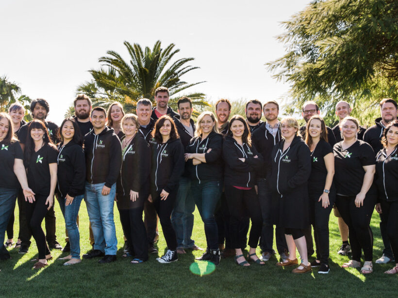
A diverse group of marketing professionals meets at a large conference table to discuss strategy

11 Standout Nonprofit Web Design Companies for 2026

Many nonprofit marketers believe their work is over once their new website goes live. However, the average lifespan of a site is only two years. Without dedicated ongoing support, mounting technical and user experience issues quickly decrease engagement.

To maximize your impact, your organization needs a web design agency that acts as a long-term strategic partner. The top agencies recognize that a successful digital presence requires continuous iteration to meet shifting donor expectations and rigorous tech standards.

Find the right partner to scale your digital presence in the sections below:

What defines a top nonprofit web design company?

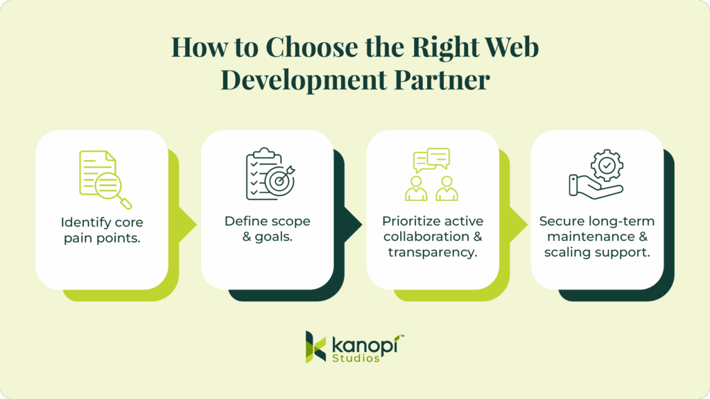
Top nonprofit web design companies act as dedicated strategic partners, prioritizing the long-term technical stability and comprehensive accessibility of the sites they work on. These agencies have mastered open-source enterprise platforms (rather than basic software) and guarantee continuous lifecycle support.

With ongoing web expertise, nonprofits can more easily mitigate security vulnerabilities and maintain website uptime. The best nonprofit web design agencies help organizations:

  • Maintain their websites over time. Ongoing dedicated maintenance keeps your digital infrastructure stable. In other words, reliable partners stick around.
  • Handle enterprise-level complexity. Effective partners actively manage complex website architectures rather than relying on rigid proprietary software ecosystems. Custom database builds require foundational technical expertise to succeed, and top providers can deliver optimal flexibility.
  • Building for the future. Continuous iteration ensures nonprofit websites can adapt seamlessly to evolving donor expectations and major technological advancements. The digital philanthropic landscape shifts rapidly, so providers that offer continuous improvement are essential. 

When evaluating potential digital agencies, thoroughly examine internal team composition and structural hierarchy. It is important to find a provider that has dedicated technical architects working alongside visual creatives. This collaborative approach ensures that your provider will help you build a website that looks and works great. 

11 top nonprofit web design companies

The following web design providers span from specialized niche digital builders to advanced enterprise-level strategic partners offering robust lifecycle management. Thoughtfully review these options to find a partner whose strengths and expertise are aligned with your specific website needs. 

1. Kanopi Studios

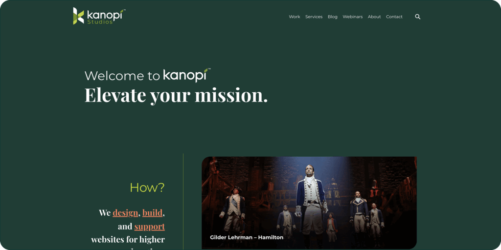
The Kanopi Studios website homepage
  • Clients served:
    • Mid-to-large nonprofits
    • Enterprise organizations
    • Higher education organizations
    • Healthcare organizations
  • Services provided:
    • Custom web design
    • Enterprise-level CMS development (Drupal/WordPress)
    • Website migrations
    • Code rescue
    • Ongoing website maintenance and support
    • Conversion optimization
  • Key differentiators: 
    • Kanopi offers code rescue services, meaning they can step in to fix and refine your website’s code, even if another agency first created it. 
    • Kanopi also embeds WCAG AA accessibility in every phase of the web design and development process, from early color contrast strategy to QA testing, ensuring digital inclusion is a fundamental architectural standard.
    • They provide white-glove ongoing support and continuous iteration to help nonprofits build websites that stay active and healthy for years. 

See how Kanopi’s growth-driven continuous improvement approach can help you scale up your website much faster than the traditional, linear web design approach:

Web Design Process Comparison

Traditional Waterfall Process

Strategy
Design
Development
Launch

Drawbacks

Rigid & Less FlexibleChanges are difficult and expensive once development begins.

Costly & Time-ConsumingLarge upfront investment with lengthy timelines.

Quickly OutdatedWebsite can become stale shortly after launch.

Growth-Driven Design Cycle

Benefits

Save Time & MoneySmaller initial investment with continuous improvements.

Always Fresh & RelevantContinuous optimization prevents site staleness.

Data-Driven DecisionsInformed improvements based on real user behavior.

  • Notable clients: 
    • First Tee: Kanopi delivered a custom WordPress multi-site solution that allows the organization to seamlessly house and manage over 150 individual member sites. 
    • Gilder Lehrman Institute: We delivered a full Drupal build for the institute’s Hamilton Education Program, creating a flexible and accessible digital experience. 
    • Exploratorium: Kanopi partnered with this San Francisco-based museum and nonprofit to execute a full Drupal build, guiding them through a highly collaborative discovery process. 

2. Elevation Web

The Elevation website homepage

3. Morweb

The Morweb website homepage
  • Clients served: Nonprofits, schools, healthcare organizations, and associations.
  • Services provided: Web design and proprietary CMS software.
  • Key differentiator: Offers a proprietary CMS tailored specifically for nonprofits with built-in donation and event modules.
  • Notable clients: Engineers Without Borders USA, Mercy USA, New Futures

4. Wired Impact

The Wired Impact homepage

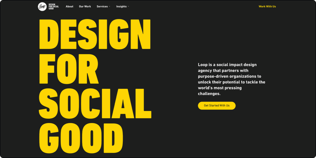
5. Loop

The Loop website homepage

6. Allegiance Group + Pursuant

The AGP website homepage
  • Clients served: Large nonprofits and fundraising organizations.
  • Services provided: Digital fundraising strategy, marketing, and web development.
  • Key differentiator: Offers deep integration of web design with omnichannel fundraising and donor analytics.
  • Notable clients: RAINN, League of Women Voters, New Jersey School Boards Association   

7. Firespring

The Firespring homepage

8. Cornershop Creative

9. Constructive

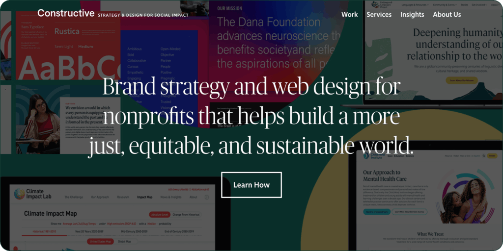
The Constructive website homepage
  • Clients served: Social impact organizations and think tanks.
  • Services provided: Brand strategy, UX design, and digital platforms.
  • Key differentiator: Focuses on bridging the gap between brand strategy and highly interactive, complex web content experiences.
  • Notable clients: Endangered Languages Project, St David’s Foundation, Plan USA   

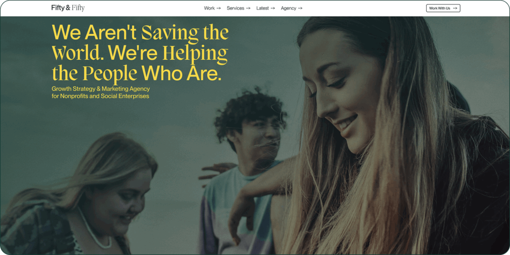
10. Fifty & Fifty

The Fifty & Fifty homepage

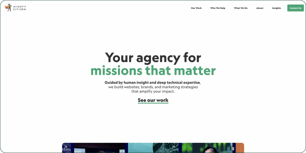
11. Mighty Citizen

The Mighty Citizen homepage
  • Clients served: Mission-driven organizations, associations, higher education, and government.
  • Services provided: Branding, marketing, and web design.
  • Key differentiator: Utilizes deep, data-driven user research and audience segmentation prior to the design phase.
  • Notable clients: Long Center, United Way For Greater Austin, Bipartisan Policy Center   

Nonprofit web design provider FAQs

Navigating the web design landscape requires an understanding of costs, platform choices, and compliance standards. Review these frequently asked questions to make informed decisions for your organization’s digital presence.

How much does a nonprofit website cost?

Initial financial investments for nonprofit web design vary widely depending on your specific functional requirements. Standard redesigns for emerging community groups often start in the moderate five-figure range, while sprawling enterprise migrations frequently exceed six figures.

Effective financial planning requires treating your website as an evolving digital product. Establish a dedicated annual budget for continuous iterative improvements and ongoing support following the initial launch.

What is the best CMS for a nonprofit website?

Open-source platforms generally offer the greatest long-term structural flexibility for nonprofits. With an open-source CMS, your nonprofit can build custom functionality and maintain full control over your website’s source code, allowing you to migrate to a different site host or web development provider with ease. Open-source platforms also tend to have highly rigorous security standards, which are essential for nonprofits that need to protect sensitive donor and beneficiary information.

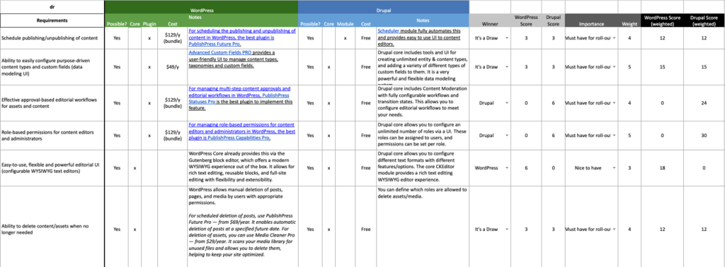
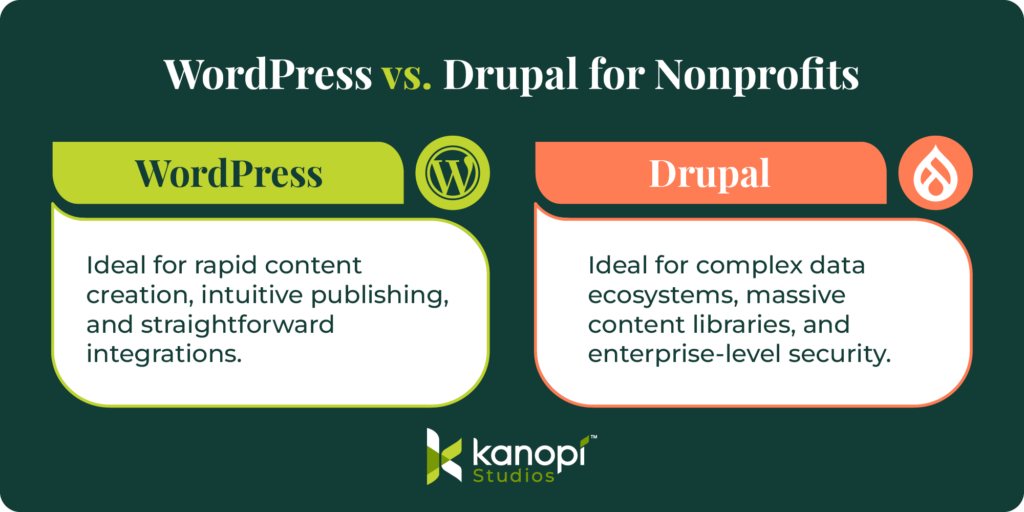
Two of the best open-source CMS platforms for nonprofits are WordPress and Drupal. WordPress excels at rapid content creation and straightforward digital publishing tasks, whereas Drupal dominates complex data ecosystems and offers robust security.

WordPress vs. Drupal for nonprofits

Do web design agencies help with nonprofit accessibility compliance?

The best digital partners integrate accessibility directly into the foundational site architecture. They test color contrast and screen reader compatibility well before the public launch to ensure total digital inclusion.

To maintain strict WCAG AA compliance over time, schedule comprehensive accessibility testing every six months. Use automated scanning tools to catch basic errors, and also require manual human testing to ensure no issues fall through the cracks. 

Why do nonprofits need custom web design over templates?

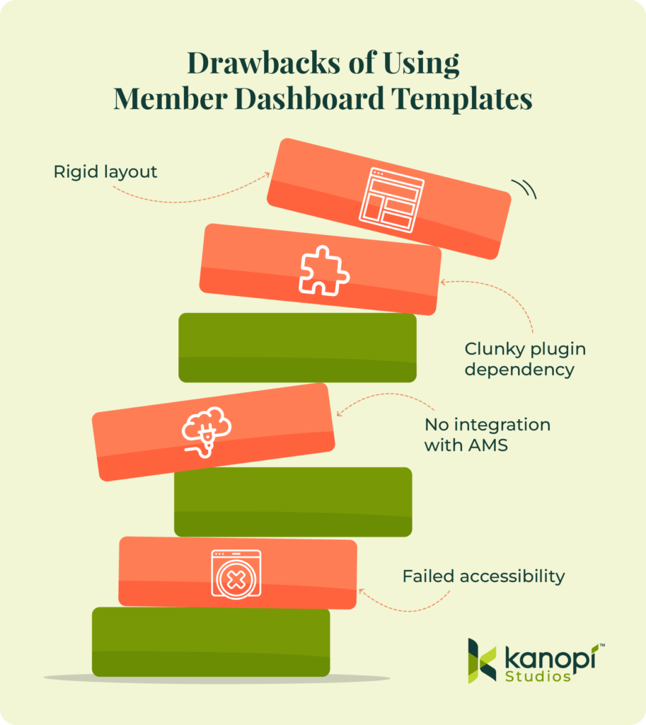
Pre-built templates offer convenience and speed if you want to get a nonprofit website up and running quickly, but they come with serious drawbacks. For example, they can slow down your website’s loading speed due to unnecessary code. They also come with structural limitations, meaning you have fewer opportunities to customize your site to your exact needs. 

On the other hand, custom web design lets you build a digital platform tailored to your specific needs and goals. This web design strategy is highly scalable, allowing you to easily expand your website as your organization grows. Plus, you can build tailored user journeys for specific segments of your nonprofit’s audience. For example, you can seamlessly guide a first-time volunteer down a path completely different from that of a major legacy donor.

Partnering with Kanopi Studios

Kanopi Studios provides ongoing technical strategy, enterprise CMS solutions, and baked-in accessibility to support your nonprofit’s long-term website health. By combining deep audience research with expert web engineering, Kanopi builds secure, user-focused digital presences on open-source platforms like Drupal and WordPress. 

Kanopi creates compelling user experiences that convert casual visitors into dedicated donors, volunteers, and ambassadors for your cause, whether your organization requires:

  • A complete website redesign
  • Complex multi-site architecture managing hundreds of regional chapters
  • Dedicated lifecycle support 

Learn more about how Kanopi approaches ongoing website support beyond just security patches:

Additional resources

Denise, Jill, Tim and Erin from Kanopi leaning over a laptop to review what's on the screen.

Why Strategic Planning Leads to Better RFPs

Congratulations! You’ve decided to send out a website RFP.

It’s a huge undertaking, building a new site. And since going from day one to launch can take several months, it only makes sense that you’d want to get that RFP out there as soon as possible, right?

Solid plan. Except for one seemingly minor oversight that’s pretty much guaranteed to throw a wrench into all that efficiency you were hoping to achieve:

You didn’t start with discovery.

So you skipped strategic planning. What’s the worst that could happen?

When organizations skip this critical strategic work and jump straight to publishing the RFP, they’re effectively manifesting the worst-case scenario. Sadly, we’ve seen this happen countless times. 

Here’s what it looks like:

The RFP makes its way around your organization. Along the way, every interest-holder gets to add all the items on their website wishlist.

By the time it’s published, instead of a focused plan with clear objectives and priorities that gives potential vendors an accurate picture of what you really need, your RFP has become a collected work of assumptions and disparate desires. A proverbial shopping cart filled with conflicting priorities, bloated requirements and a scope that’s disconnected from real outcomes.

Naturally, the proliferation of AI has only made the problem worse.

AI is great at generating ideas. But it doesn’t know your priorities, your constraints or what will actually drive value for your organization. So it tends to produce everything, instead of the right things.

The inevitable result?

The vendors have questions. Lots of them.

Many are repetitive (albeit slightly varied) versions of the same question. You end up answering hundreds of questions just to clarify what the project actually is. It’s time-consuming and often frustrating for your team.

This is not what you were hoping for.

Strategic planning creates a clear, focused RFP

Preventing the chaos we’ve described above is just one reason why we strongly advocate for pre-RFP planning. 

That means working with a partner to help you clearly define the essentials:

  • your goals
  • your audiences
  • your key user pathways
  • and most importantly, your scope

Once you have clarity on these, then you can write and publish an RFP that sets everyone up to succeed.

Make the review process easier on yourself.

When you lead with strategic planning, everything dials in. You’ll have exactly what a focused RFP needs:

  • a defined strategy
  • aligned interest-holders
  • a prioritized, realistic scope

You’re no longer asking agencies to help you figure out the problem. You’re asking them to execute a clear plan.

The benefits immediate and unmistakeable:

  • fewer clarification questions
  • more focused proposals
  • stronger, more relevant agency responses

Best of all, you’ve sent the right message to all potential vendors: that you’re a competent client with clearly defined goals and expectations. Any vendor worth their salt appreciates that.

Better RFPs lead to better projects

A strategic RFP isn’t just easier to manage. It sets the foundation for the entire project.

You’ll get quotes on what will actually drive value, not based on the bloat that was thrown into an unfocused RFP.

That means:

  • more accurate budgets
  • clearer timelines
  • and a smoother path from selection to execution

By the way: if you’re looking for tips on RFP writing, we wrote a blog post about how to write a great one, as well as this one about how to evaluate the responses.

What we’ve seen in practice

We’ve used this approach successfully with a range of organizations, including:

In each case, strategic planning helped bring focus before going to RFP, resulting in stronger outcomes and more efficient procurement.

RFIs don’t build relationships.
Conversations do.

In response to the growing number of Requests for Information we’re seeing, we have one request of our own:

If you want to get to know us, the best way is to book a call.

After all, the amount of work that goes into responding to RFIs is significant even at the best of times. But these days, RFIs seem to be suffering from the same lack of quality control as non-discovery based RFPs: long lists of repetitive, generic questions with no clear connection to actual business goals.

If the real question is, “Can you help us solve X?” then let’s start there.

A simple conversation will get you more honest, useful answers than a 50-question document ever will.

The bottom line

An RFP shouldn’t be an exercise in figuring out what you need.

It should be a clear, confident ask to the market.

And it all starts with sound strategic planning.

Kanopi’s Drupal development services focus on creating functional, sustainable Drupal websites.

The different kinds of AI search

Remember the salad days of site search? You’d type in a few keywords and the right page link (ideally) would appear before your very eyes.

These days, modern websites are packed with content spread across many different page types. And real people rarely search using the exact words a site author chose. People today come with questions shaped by chat-style tools and short attention spans. 

AI-assisted search closes that gap. Instead of forcing people to guess the right keywords, it meets them where they are, finding the right content even if the words don’t match exactly. In other words, instead of relying only on literal keyword matches, it can understand intent. 

The result is a search experience that feels less like foraging on your own while scanning a filing cabinet and more like being guided to the right answer.

This means users can land on your site and enter their actual questions, such as:

  • “How do I renew my membership?”
  • “What does this program cover?”

And the result is a direct answer with clear next steps and the sources to verify it.

For users, this means less jumping between pages and better findability for long-tail content. It also helps different audiences (like newcomers, power users or internal staff) move faster from question to action.

These outcomes are driven by a set of underlying AI search capabilities. The ten capabilities below define what modern search can do at a technical level.

AI search type capabilities

  1. Semantic (vector) search
  2. Natural language search / query understanding
  3. Answer-first (RAG) search
  4. Hybrid retrieval (keyword + vector)
  5. AI reranking
  6. Personalized / permission-aware search
  7. Federated search
  8. Conversational refinement (multi-turn)
  9. Result clustering
  10. Extractive answers

These capabilities can be grouped into three categories:

  1. UX/behaviour patterns
  2. retrieval/ranking patterns
  3. the answer-generation layer

Here is how we would group them:

Group: UX/behaviour patterns

  1. Natural language search / query understanding
  2. Conversational refinement (multi-turn)
  3. Result clustering
  4. Extractive answers

Group: Retrieval/ranking patterns

  1. Semantic (vector) search
  2. Hybrid retrieval (keyword + vector)
  3. AI reranking
  4. Personalized / permission-aware search
  5. Federated search

Group: Answer-Generation Layer

  1. Answer-first (RAG) search

Let’s define what each of these are

Of course, not all of these capabilities are new. Some have been part of search infrastructure for years.

Pre-LLM systems relied on rules and taxonomies. AI-assisted systems rely on learned representations (embeddings) and learned relevance judgments (rerankers/LLMs) instead.

Here’s what all of that means:

  • Less dependency on perfect tagging/synonyms
  • Better search performance on vague or long-tail queries
  • Stronger resilience to wording differences
  • New things to pay attention to, such as
    • Evaluation
    • Monitoring
    • Guardrails

AI search capabilities explained

Let’s look at what these search capabilities actually do:

Semantic (vector) search uses embeddings to match content by meaning rather than exact keywords, so it works well when users describe an idea in different words than the site uses.

  • Before AI: “Semantic” was mostly synonyms, stemming, taxonomy/metadata tuning, or manually curated related terms.
  • AI-assisted: embeddings learn meaning from language, so they match paraphrases and conceptually similar content without requiring hand-authored synonyms.

Natural language search / query understanding interprets what the user is asking in plain language. It detects intent and expands synonyms automatically and can apply smart filters (such as content type, audience or date) without requiring perfect keywords.

Answer-first (RAG) search (seen at the top of a Google results page) retrieves relevant pages/passages and then generates a direct answer or summary from those sources, typically showing citations and letting the user click through to the underlying content.

Hybrid retrieval (keyword + vector) combines classic keyword matching with semantic matching, giving you the precision of exact terms (names, acronyms) and the flexibility of meaning-based search in a single results set.

  • Before AI: “Hybrid” often meant keyword search plus boosting by metadata/categories, or separate “related content” systems.
  • AI-assisted: it’s literally blending lexical scoring + vector similarity, often with a smarter fusion strategy and sometimes an ML reranker that learns what relevant looks like.

AI reranking takes the initial top results from keyword/semantic/hybrid retrieval and reorders them using an AI model that’s better at judging relevance, often producing noticeably better best result first behavior.

Personalized and permission-aware search tailors results based on who the user is and what they’re allowed to see. When appropriate, it also weighs what’s most relevant to them personally. This is a great way to start to create a personalized experience on membership sites.

Federated search queries multiple content systems and blends them into one unified result set. It handles deduplication (identifying near-duplicates) and applies consistent ranking across sources.

Examples of systems it might query:

  • CMS content (such as Drupal or WordPress)
  • Documents and knowledge bases
  • Helpdesk platforms
  • Before AI: Results from multiple sources were merged using fixed weights and basic field mapping. Deduplication was brittle and required significant manual tuning.
  • AI-assisted: The system detects content types and maps fields more accurately. It also handles deduplication better and applies smarter cross-source ranking. Some systems add source routing to direct queries to the most relevant index.

Conversational refinement (multi-turn) lets users iterate naturally by asking follow-up questions or applying constraints in dialogue (“only show policies,” “for Canada,” “updated last year”) and the search experience maintains context across turns.

Result clustering groups results into meaningful themes (such as policies, programs or locations) so users can navigate broad queries and pick the right direction quickly.

  • Before AI: clustering relied on predefined categories or rule-based taxonomy.
  • AI-assisted: clusters are created dynamically from the actual result set using embeddings/topic modeling/LLMs, so they adapt to the query and label clusters in user-friendly language.

Extractive answers surface the most relevant passages directly from source content. They highlight snippets or create jump-to-section links rather than generating new prose. This makes them a safer and more auditable option for compliance-sensitive sites.

  • Before AI: Snippets were usually keyword-in-context based or the meta description. The passage selection was simple.
  • AI-assisted: Models select the best passage even if it doesn’t share exact keywords. They also do better passage boundary selection and can pull multiple supporting passages with higher precision.

What does it all mean for your website?

In WordPress or Drupal, AI-assisted search is usually added as a layer that sits beside or in front of the CMS’s native search. The CMS remains the source of truth. You publish content to a search service that handles keyword indexing and vector embeddings, with optional answer generation.

Practically, that looks like:

  • Extract content (pages, posts, media text, PDFs, custom entities)
  • Normalize it into a clean index schema
  • Generate embeddings for semantic matching
  • Push everything into a search backend
  • Your site’s search page calls that backend through an API
  • Ranked results are returned with the established behavior patterns
  • Search results are displayed within your site’s design

Most teams roll this out incrementally:

  1. Start with hybrid retrieval and better snippets
  2. Add reranking and clustering once the basics are stable
  3. Then add RAG where content governance is straightforward. 

The CMS work typically involves a plugin or module paired with a small service that handles indexing and updates. It also tracks analytics so you can measure relevance and keep improving.

The next level: When search knows where you are

AI-assisted search really shines when it can incorporate the user’s location within your site into what they’re asking. 

Picture a prospective student browsing a specific Programs page on a college site. They open search and type: “What are the requirements to take this program?”

A traditional search engine treats that as a generic query and returns broad admissions content.

An AI-assisted experience works differently. It can be designed to recognize that “this program” refers to the page the user is already on, then surface requirements tied to that exact program with clear links back to the source content.

This kind of context-aware search is achievable in both WordPress and Drupal. The CMS already knows which page the user is viewing, including:

  • The program name
  • Taxonomy terms
  • Related content

That context travels with the query, unlocking capabilities that wouldn’t otherwise be possible:

  • Scoping results to the current program
  • Applying smarter filtering and boosting
  • Surfacing answer-first results that summarize requirements while citing their sources

The end result is a journey that feels less like hunting and more like being guided, especially for users who arrive with natural questions rather than perfect keywords.

Hands on a keyboard

How the 9 Best Association Websites Drive Engagement in 2026

Having a streamlined, user-friendly association website is a non-negotiable in 2026. A Clutch survey of 500 internet users found that half believe a company’s website design is important to their overall brand, and 31% think an engaging user experience is a top priority for website design. A professional, clean, modern digital presence establishes the immediate credibility necessary for long-term audience engagement.

But association website design is about more than aesthetics—high-quality, engaging design can also directly impact your revenue. The 2025 Association Member Experience Report from Higher Logic found a five-year renewal rate of 93% among members who describe their digital involvement as “very easy,” while those who struggled with online navigation or portals reported lower engagement. 

With that in mind, we created this comprehensive guide to website design for associations, focusing on these key topics: 

What makes for an engaging association website design in 2026?

Engaging association websites prioritize streamlined functionality, with biometric authentication capabilities, WCAG 2.1 AA accessibility compliance, and AI-driven content personalization. High-performing sites function as member retention engines, reducing administrative friction and delivering immediate value through self-service portals and intuitive, mobile-first navigation.

Essential elements of a high-performing association site

Associations can transition from “information overload” to “engagement-first” design by focusing on these essential elements:

  • Streamlined, member-first navigation: Effective navigation includes clear, action-oriented labels for menu items that prioritize the top 5–7 areas members actually visit. By reducing the number of top-level menu items and utilizing mega-menus for deeper discovery, you can help members find what they’re looking for in seconds, not minutes. 
  • Comprehensive member portals: Your membership portal is the online home of your member experience. High-performing portals include self-service tools for everything from tracking certification credits to managing group memberships or medical expenses. Additionally, centralized membership dashboards with reminders, upcoming events, and resources reduce your staff’s administrative burden while empowering your members.
  • Mobile-friendly design: With more than 60% of web traffic coming from mobile devices as of Q1 2025, mobile-friendliness is crucial. This means thumb-friendly navigational elements, such as properly-spaced buttons and hamburger-style menus. Additionally, prioritize rapid load times (targeting under 2 seconds) and simplified mobile forms. If a member can’t register for your annual conference while standing in line for coffee, your design is a barrier to your revenue.
  • Accessibility as a default: Accessibility is a requirement for equitable membership. This means building to WCAG 2.1 AA standards from day one. Proper color contrast, screen-reader compatibility, and keyboard navigation ensure that your association’s mission is available to everyone, regardless of ability or device.
  • AI-driven personalization: Personalized web experiences can increase new-member sign-up conversion rates by up to 202%. AI tools are the gateway to developing tailored member experiences that suit each individual’s needs. By analyzing past behavior, like webinar attendance or white paper downloads, your website can dynamically surface the most relevant resources for each individual, ensuring they see exactly what they need without having to dig through your archives.
  • Bento grid layouts: Inspired by the organized compartments of a Japanese bento box, this layout style uses modular, rectangular tiles to display diverse types of content simultaneously without feeling cluttered. It’s the perfect solution for associations that need to highlight multiple resources, such as news, upcoming events, and a Join CTA,  on a single screen. Take a look at an example of what this layout style looks like:
Membership

Join Our Community

Elevate your craft with exclusive resources and a global network of peers.

Become a Member
Upcoming
MARCH 15, 2026

Annual Summit 2026

Workshops and visionary keynotes from industry titans.

2,500+
Active Members

Latest Updates

2H AGO
Q3 Expansion Strategy
YESTERDAY
New Mentor Applications
Newsletter
Weekly insights.
  • Clear member benefits: Engaging membership sites feature a dedicated, high-visibility page or section that clearly outlines the value proposition of each membership tier. Use concise language, an ROI calculator, and social proof (such as member testimonials) to highlight the benefits of joining your membership program. Your website should also make it easy for existing members to access benefits online, such as event registrations, courses, and job boards.  

Research from Association Adviser’s 2025 Association Benchmarking Report determined that even though associations increased member touchpoints to an average of 30.4 times per month last year, many are running into the challenge of “information overload,” where more content is actually leading to less engagement. 

As a result, your website communications goal isn’t to increase the number of touchpoints, but to increase their relevance. By focusing on these essentials, you ensure that every digital interaction reinforces your association’s value rather than contributing to the clutter.

Best association website design examples

The best way to gather ideas for optimizing your association’s website is to review examples of successful sites and note how they effectively incorporate key features and functionality that support the member experience. Here are nine top association websites and the key features and functionality that enable them to engage prospective and existing members: 

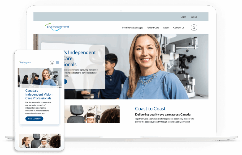
1. Eye Recommend

The Eye Recommend website homepage

Eye Recommend’s website is both a powerful recruitment tool for their optometric cooperative and a functional search engine for patients.

Three stand-out features of the Eye Recommend website:

  • Consolidated benchmarking single sign-on (SSO): Kanopi simplified the user experience for the Eye Recommend website by building a single sign-on solution. Members can now access critical Clinic Benchmarking data, including gross profits and patient metrics, with a single set of credentials, which eliminated the need to juggle multiple logins across different domains.
  • Localized marketplace with Solr Search: To help independent clinics scale, Kanopi implemented a powerful Solr Search and an expanded Marketplace. Members can filter listings by location to find equipment, inventory, and practices for sale that are specifically relevant to their region, reducing search friction.
  • Visual consistency and accessibility-first design: Recognizing that a vision care organization must lead by example, Kanopi overhauled the site’s typography and color contrast. The result was a design refresh that provided a welcoming brand presentation while ensuring the site met high accessibility standards for all users.

Learn more about how Kanopi improved page load times and mobile usage for Eye Recommend

2. International Association of Business Communicators (IABC)

The IABC website homepage

The IABC website leverages clear brand storytelling and a high-performance search function that makes decades of communication archives accessible.

Three stand-out features of the IABC website:

  • Unified domain architecture: IABC worked with Kanopi Studios to merge three disparate sites into one cohesive WordPress home, reducing maintenance while strengthening brand authority.
  • High-performance archive search: A robust filtering system allows members to instantly surface decades of communication research and case studies.
  • Dynamic component-based layouts: Flexible design blocks empower the IABC team to create consistent, professional pages without needing a developer.

Read more about how Kanopi successfully merged three sites to tell IABC’s compelling story

3. American Association of Retired Persons (AARP)

The AARP website homepage

The AARP website provides a masterclass in accessible design. The site boasts a 99/100 accessibility score on Lighthouse, an automated website auditing tool, demonstrating a high level of commitment to design legibility and inclusivity. 

Three stand-out features of the AARP website:

  • Inclusive typography and high color contrast: The high-legibility design features larger touch targets and high color contrast ratios tailored for older demographics.
  • Cognitive load management: The clean, distraction-free layout uses clear iconography and simple language to prevent information overload.
  • Voice search optimization: Advanced SEO and technical architecture make the site easily navigable via voice-assistive technologies.

4. National Association of Realtors (NAR) 

The NAR website homepage

As one of the largest professional associations in the world, the NAR website is a benchmark for managing massive volumes of data while providing a personalized experience for over 1.5 million members. Their site excels at translating complex legislative and market data into actionable insights.

Three stand-out features of the NAR website:

  • Dynamic member center with SSO integration: This setup enables real-time access to education credits, membership status, and personalized benefits tailored to the user’s specific real estate board.
  • Robust research and statistics hub: The site features interactive data visualizations and proprietary market reports, positioning the NAR as the definitive authority on housing data.
  • A geographically targeted advocacy platform: Members can connect with local and national legislative alerts, making it simple for realtors to engage in “call to action” campaigns that impact their specific markets.

5. Project Management Institute (PMI)

The PMI website homepage

PMI manages a massive global audience with highly technical needs. Their site handles a diverse array of certifications (PMP, CAPM, etc.) within a unified ecosystem.

Three stand-out features of the PMI website:

  • Global chapter geo-locator: An interactive map tool uses browser geolocation to instantly connect members with their local chapter and upcoming regional networking events.
  • Gamified certification progress: A visual “Roadmap to Certification” uses progress bars and milestones to help members navigate the complex requirements of professional credentialing.
  • Standards+™ digital resource library: A searchable, high-speed digital platform provides “just-in-time” access to the PMBOK® Guide and other technical standards via mobile-optimized snippets rather than long PDFs.

6. Alberta Teachers Association

The ATA website homepage

The ATA offers a great example of an association using web design to reduce administrative costs while improving member convenience. The organization moved from mailing physical plastic cards to a self-serve digital card service and embraced several additional modern web design features to improve the user experience.

Three stand-out features of the ATA website:

  • Complex permissions logic: A robust backend handles varied access levels for over 40,000 members, ensuring the right resources reach the right teachers.
  • Simplified dues management: Integrated payment systems make it easy for members to manage their professional standing and renewals online.
  • Member-centric news feed: A customized content engine surfaces local chapter news alongside province-wide educational updates.

7. IEEE Communications Society

The IEEE ComSoc website homepage

IEEE ComSoc is a global network of over 40,000 communications technology professionals. The website provides a streamlined user experience, highlighting resources such as publications, events, community engagement opportunities, and skill development training. 

Three stand-out features of the IEEE ComSoc website:

  • Technical publication integration: Direct API connections to IEEE Xplore allow members to access high-level technical papers without leaving the ComSoc site.
  • Global event calendars: A centralized, timezone-aware calendar features dozens of international conferences and local chapter meetups.
  • Expert directories: A searchable “Find an Expert” database facilitates global networking among telecommunications professionals.

8. American Nurses Association (ANA)

The ANA website homepage

As the online hub for the premier professional association for RNs, the ANA website goes above and beyond in facilitating the member journey. It successfully balances advocacy and professional development with a highly personal feel.

Three stand-out features of the ANA website:

  • Integrated certification tracker: A seamless connection to the ANCC (American Nurses Credentialing Center) allows nurses to track continuing education credits and certification status directly through their profile.
  • Action-oriented advocacy center: This tool reduces the friction of political engagement by enabling members to contact their representatives with pre-filled templates based on their zip code.
  • Custom job alerts: Members can set alerts that notify them only of roles matching their specific nursing sector and geographic preferences, effectively filtering out irrelevant postings.

9. New England Association of Schools & Colleges (NEASC)

The NEASC website homepage

The NEASC website is a top-tier example of how an accrediting body can use digital tools to manage complex professional workflows. The site serves as a vital bridge between educational institutions and rigorous accreditation standards.

Three stand-out features of the NEASC website:

  • Searchable institution directory with advanced filtering: The public and educational professionals can verify the accreditation status of thousands of schools across multiple membership cycles and regions.
  • Resource-heavy accreditation toolkits: Designed with a clear content hierarchy, these kits enable school administrators to easily navigate the extensive documentation and self-reflection forms required for accreditation.
  • Streamlined event and workshop registration system: This tool handles high-volume sign-ups for professional development sessions, specifically tailored to different educational sectors from early childhood through higher education.

Expert website design tips for associations

1. Design for frictionless renewals.

Renewals provide your association with reliable recurring revenue, but a poorly designed website can become a barrier to member retention. A Higher Logic report found that almost half of associations report first-year renewal rates below 60%, often due to “unclear onboarding” on their websites.

Action steps to take today: 

  • Implement biometric login options (FaceID/TouchID) for member portals, making it easier for members to access their membership status information on supported devices. 
  • Provide an auto-renewal opt-in checkbox at the point of initial sign-up or renewal that allows members to keep a payment method on file for automatic annual billing.
  • Offer secure tokenization through gateways like Stripe or Authorize.net so members can pay with “the card on file” in a single click.

2. Optimize for answer engine visibility. 

While you may be familiar with search engine optimization (SEO), your site must also be optimized for generative or answer engines like ChatGPT and Gemini to succeed in today’s online landscape. People interact with generative search engines much less formally than traditional search platforms, asking questions in a conversational style and expecting immediate, personalized responses. 

Action steps to take today: 

  • Structure your content with clear H2 and H3 headings so AI engines can easily pull your information into their summaries.
  • Implement structured data, otherwise known as schema, to help engines understand the context of each page on your site. This could include Person, Organization, FAQ, BlogPosting, and Product schema. 
  • Identify and resolve technical issues that can affect traditional and AI search results, such as broken links or slow page load times. 

3. Use dynamic social proof.

Members want to see authentic, real-time validation from their peers. Dynamic social proof transforms your website from a one-way sales pitch into a living community, leveraging FOMO (the fear of missing out) and transparency to demonstrate your association’s value.

Action steps to take today: 

  • Record member video stories to share in recruitment emails and blog posts. 
  • Display real-time counters (e.g., “452 members are attending our next webinar”) to encourage engagement and build community.
  • Incorporate a live social media feed displaying posts from both your organization’s page and member posts that tag your organization or use one of your hashtags. 

4. Maintain brand consistency. 

If a member clicks from your main homepage to a legacy “Resources” subdomain or a third-party “Career Center” and the design suddenly changes, it erodes trust and creates friction in the user experience. Maintaining a unified visual and tonal language across all platforms ensures your association comes across as professional, reliable, and secure.

Action steps to take today: 

  • Create a digital style guide for your staff to use when making any website updates or changes. Include logo usage instructions, typography, hex codes, standardized writing conventions, and other visual and tonal guidelines. 
  • Audit your third-party integrations (like your AMS portal or job board) to ensure they use “header/footer” wrapping that matches your primary site’s navigation.
  • Standardize your component library so that every button, form, and “Call to Action” looks and behaves the same way, regardless of which page the member is visiting.

Curious whether your association’s website is currently hitting the mark when it comes to implementing best practices? Complete our free UX assessment scorecard to help evaluate your current performance and identify areas for improvement:

UX Scorecard

Rate your website to uncover member experience opportunities.

Association website design: FAQs

How often should our association redesign its website?

Associations should conduct recurring UX audits every six months. During this process, you should make small adjustments and improvements to your site based on metrics like time on page and conversion rates. This continuous improvement process ensures that your site won’t become outdated too quickly and that you can easily respond to fluctuations in your engagement metrics.

How do we integrate our AMS (Association Management System) without slowing down the site?

Adopt headless CMS architectures or prioritize API-first integrations to maintain peak front-end performance. A “headless” approach enables developers to deliver content via APIs seamlessly across any platform by decoupling the backend (i.e., your content management system, such as WordPress or Drupal) from the user interface. With a headless website architecture, you can create content once and seamlessly distribute it across both your website and your AMS.

What is the average cost of a custom association website in 2026? 

The cost of a custom association website depends heavily on the complexity of features such as member portal integrations. For mid-to-large associations, the investment covers deep AMS synchronization, custom single-sign-on (SSO) configurations, and rigorous accessibility auditing to meet inclusive design standards.

How can AI improve our member experience? 

AI tools can enhance members’ experiences through personalized content recommendations and support. Generative AI can now provide “predictive search,” which anticipates a member’s needs based on their career stage or past renewal behavior. Plus, 24/7 AI-driven member support chats help streamline the member experience by delivering immediate answers to common questions.

How Kanopi can help you create a member-centric website

The Kanopi team is well-versed in crafting member retention engines out of legacy association websites. We’ve helped dozens of associations transform their fragmented digital footprints into unified, high-performance platforms. Our website design services for associations include: 

  • Strategic discovery: Our team conducts comprehensive audience research to understand your current presence and develop a strategy tailored to your community.
  • AMS & SSO integration: We specialize in connecting complex back-end systems (iMIS, Fonteva, NetForum, etc.) to websites and implementing straightforward SSO for member-only portals.
  • Unified digital ecosystems: We consolidate fragmented domains and multi-site architectures into one high-performance, easy-to-manage platform.
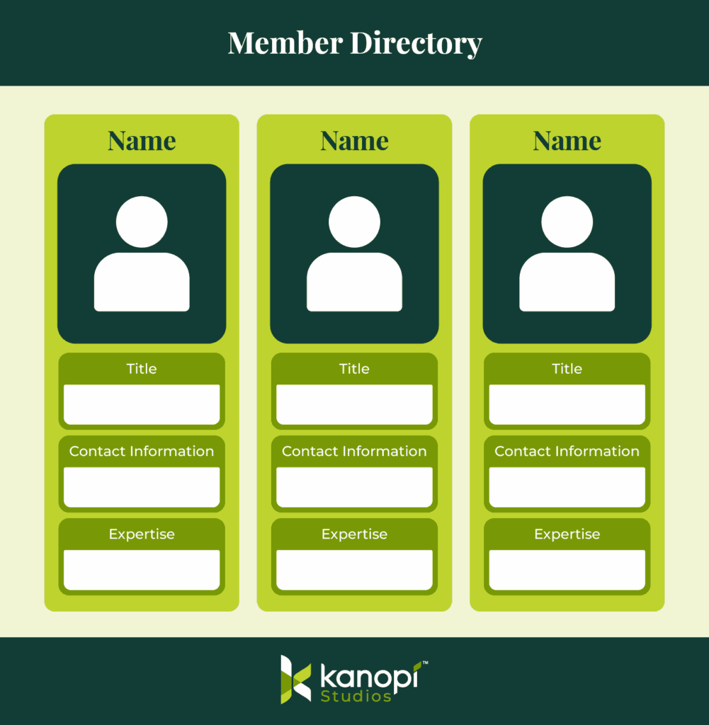
  • High-performance dashboards: We build enhanced member areas featuring responsive, fully customizable charts and personalized resource libraries.
  • Inclusive design focus: We ensure your site meets all of the highest AA/AAA accessibility standards, providing equitable access for your entire global audience.
  • Continuous improvement: Through dedicated web support, we partner with you long-term to keep your site healthy and responsive to new trends.

From streamlining complex workflows to creating modern, accessible designs, see how we’ve helped organizations like yours thrive.

Wrapping Up

By prioritizing intuitive navigation, AI-driven personalization, and mobile-first accessibility, you can move beyond 'information overload' and start delivering true value via your association website design. Whether you’re looking for a full redesign or a targeted UX audit, the goal remains the same: making your members' digital involvement seamless. 

Kanopi's Jen Hill, Tim Tufts, and Joe Tuen giving high fives and thumbs up.

12 Website Design & Development Trends for 2026

Key Takeaways

  • Agentic Journeys: AI agents (like Gemini and GPT) are now bypassing traditional website funnels to complete transactions directly.
  • Semantic HTML as “SEO 2.0”: Clean, machine-readable code is no longer optional; it’s how AI discovers and recommends your site.
  • Calmer UX: Design is shifting toward minimalist, “distraction-free” interfaces that prioritize speed and accessibility.
  • Trust UX: Privacy and consent are now core architectural requirements, not just legal checkboxes.
  • Component-Driven Development: Using unified design systems to scale content rapidly without technical debt.

It’s that time of year again when we look ahead to what’s coming. We admittedly don’t love the word “trends” because it implies something fleeting, while our entire philosophy here at Kanopi is about building sustainably and intelligently, so websites will last. The word “trends” works great for a short headline, but this article is more about outlining what we see coming in all aspects of website design and development, so you can be prepared to decide what could work for your business. 

We’ll warn you: artificial intelligence is covered a lot in this article. Love it or hate it, it’s here. While we are all learning to find ways to allow AI into our workflows in order to create efficiencies, it’s critical to use it in a way that keeps humanity strong! (If you’re curious, here’s how Kanopi uses AI for clients).

1. Let the bots organize large datasets

One thing that AI is very skilled with is helping aggregate large, disparate datasets. Think competitor research, user behavior data, or analytics reports.

Our content and UX strategy teams use a combination of ChatGPT and Claude to analyze large datasets, identify patterns, and turn complex information into clear, human-readable insights. AI can be used here to reduce the manual lift required for time-intensive activities; work that once took weeks can now be completed in just a few days, freeing our strategists to focus on the high-impact thinking that drives meaningful results for our clients. 

As always, human guidance is key. A human needs to review the outputs as they come. It helps maintain accuracy, minimize bias, and ensure that AI outputs stay closely aligned with the project’s goals and broader strategic direction. 
2. Agentic journeys & funnel flattening

AI agents (ChatGPT, Gemini, custom enterprise agents, etc.) will increasingly handle research, booking, donations, and transactions end-to-end, collapsing multi-step funnels into single-intent, conversational flows. Early adoption in 2026 will raise new questions about attribution, fraud, consent, and regulation. 

What about website design, UX and content?

3. Make your content speak AI

AI isn’t just reading your content anymore. It’s deciding whether to recommend you at all. If your site isn’t structured in a way that ChatGPT, Gemini, and other AI agents can understand, you’re basically invisible to a growing chunk of how people discover things online. We’re talking semantic HTML, well-structured and agent-friendly APIs, stable URLs, and clean information hierarchies, and structured data … all the stuff that makes your content machine-readable. This is no longer optional. Think of it as SEO 2.0, except now you’re optimizing for robots that are way smarter than the old-school web crawlers. Otherwise, expect degraded representation in AI-driven search and assistants.

What Kanopi is doing: We start with AI-led content audits that reveal exactly where your content stands. What’s discoverable, what’s buried, what’s redundant, and what’s completely invisible to AI systems. These audits don’t just identify problems, they inform strategy, helping you prioritize what to fix first based on actual impact.

4. Scale your content without sacrificing your voice

One of the biggest challenges teams face is keeping content fresh and consistent across dozens (or hundreds) of pages. You’ve got style guides gathering dust, content editors struggling to match tone, and updates that take forever because every piece needs multiple rounds of review. AI changes that equation completely. But only if it’s trained on your voice, not generic internet speak.

What Kanopi is doing: We’re building custom AI workflows that learn your brand’s style guide, tone, and content patterns, then generate copy variations that actually sound like you. But we’re not just handing you a robot and wishing you luck. We’re creating prompt libraries and content templates tailored to your team’s specific needs. Need 10 variations of a CTA? Done. Want to update product descriptions across your catalog while maintaining consistency? Easy. We’re giving your content editors AI tools that work with them, not against them, so they can keep sites current without burning out. It’s like having a writing assistant who’s read every piece of content you’ve ever published and knows exactly how you like things done.

5. Design for speed and intuition

Nobody wants to click through five pages to do something an AI can handle in one conversation. We’re witnessing a significant shift toward interfaces that anticipate users’ needs and deliver them faster. Think calmer designs, less clutter, smarter personalization that doesn’t feel intrusive. Multi-step funnels are collapsing into simple, conversational flows because that’s what AI agents are built for and what users now expect. The best interfaces in 2026 will feel less like navigating a website and more like having a helpful assistant who intuitively understands your needs.

What Kanopi is doing: We’re using AI-powered tools to streamline our design workflows that create meaningful efficiencies for our downstream development teams. Our Figma to Claude process enables rapid component prototyping. This means we can create more, iterate faster and refine work, without putting timelines or budgets at risk. 

6. Unifying theme and atomic/component-driven design

A major trend shaping 2026 web design is the continued move toward unified, component-based systems. Instead of designing every page from scratch, we create a consistent library of reusable interface elements, buttons, cards, forms, navigation patterns, that work together seamlessly across your entire site. This ensures visual cohesion, faster development, and a smoother user experience.

What Kanopi is doing: We take this further by pairing modern design tools with cutting-edge AI development workflows. Using Figma’s Model Context Protocol (MCP), our design files connect directly to advanced AI coding tools like OpenAI Codex and Anthropic’s Claude. This means our designs are translated into high-quality, production-ready code with exceptional accuracy.

Once components are built, we use Google Chrome DevTools MCP to let AI validate how each piece actually renders in a real browser, catching visual issues early and ensuring the final experience matches the design vision.

From there, our developers ensure each component can be easily managed in your CMS. Finally, we build end-to-end functional tests that automatically watch for regressions, ensuring that as your site evolves, nothing breaks along the way.

The result is a unified design system powered by intelligent workflows that keeps your site visually consistent, easy to maintain, and ready to scale.

Other things we see coming

  • AI can serve as a valuable design research partner, helping designers quickly surface trends, industry-specific design patterns and assessing the accessibility of design components as they are being designed. 
  • Aesthetically speaking, we’re noticing a shift to calmer user experiences; minimalist interfaces, fewer distractions, more clarity, and clearer information hierarchies. 
  • Lastly, compliance for WCAG and “Consent UX” or “Trust UX” — the design of user interfaces and flows that ethically obtain user permission for data collection and use — is becoming mandatory. See the “Trust, Privacy, Consent & compliance in the next section for more information on this.  

There’s even more happening in website development (whether it’s Drupal, WordPress, or custom code)

Just like in strategy, content, and design, development is also undergoing a meaningful shift. These aren’t fads. They’re structural changes in how teams build, maintain, and future-proof websites. Here’s what we see shaping 2026:

7. Server-side rendering & resilient delivery

We’re watching teams swing back toward server-side rendering (SSR), static site generation (SSG), and progressive enhancement. This isn’t nostalgia, instead it’s a response to what users (and AI systems) now expect: fast initial loads, predictability, resilience, and content that’s easily discoverable by both humans and machines.

Modern frameworks absolutely still have a place, especially when rich interactivity is required, but we’re seeing a clearer separation between where complexity adds value and where it gets in the way.

8. Rethinking architecture: agents vs. complex frontends

As AI agents begin handling more of the “consumption layer” — surfacing answers, facilitating transactions, navigating information — the value of extremely complex, client-heavy architectures is being reconsidered.

 For informational sites and straightforward user journeys, well-structured, semantic content often wins over front-end flexibility. Complex frontends will continue to power robust applications, but many marketing and discovery-focused sites are trending back toward hybrid or server-first models.

Agents are already consuming AI-friendly APIs, and with evolving authentication, they’ll get even better at interpreting content over time. With the current pace of innovation, we predict this will be a delicate dance throughout 2026.
9. AI-accelerated technical debt

AI coding tools are incredible accelerators, but they’re accelerators in both directions. Yes, they speed up delivery. They also multiply code volume, inconsistency, and architectural drift if teams don’t stay vigilant.

This is where strong standards, clean patterns, and senior oversight matter more than ever. Without them, organizations end up with AI-generated technical debt and fragmented prompt/model sprawl — problems that cost significantly more to untangle later. Kanopi builds governance into our workflows so speed never comes at the expense of long-term stability.

As AI becomes embedded in websites and applications, the way we communicate trust changes too. Users need clarity around how their data is used, how permissions work, and what AI agents are doing on their behalf.

“Trust UX” is becoming its own discipline. Transparent consent flows, auditable agent actions, and understandable data policies are now core engineering requirements, not afterthoughts. And with legal scrutiny around consent management on the rise, we expect this to intensify in the coming year.
11. Predictive personalization & AI-driven adaptation

Users increasingly expect experiences that adapt to them, including personalized recommendations, context-aware content, and layouts that respond to user intent. Achieving this requires real AI infrastructure: data pipelines, model governance, and ethical frameworks.

Basic rules-based personalization won’t cut it anymore. Organizations that want to deliver anticipatory digital experiences will need to invest in more holistic, AI-driven systems.

12. Accessibility & inclusion as architectural foundations

Accessibility is no longer something you “add on” during QA. It’s becoming a structural requirement. Semantic HTML, non-JavaScript critical paths, and robust WCAG compliance are essential for AI discoverability and multimodal search (and are just good practice regardless).

As agents rely more on clean, machine-readable content, inaccessible markup and JS-gated experiences will carry increasing penalties. Building inclusively from the start is now both an ethical responsibility and a competitive advantage.

Curious about what Kanopi’s doing specifically? Here are a few exciting projects keeping us engaged:

Drupal CMS, Drupal Canvas, and Site Templates!

We’re hard at work in the Drupal community, helping Drupal CMS development continue. Drupal CMS 2.0 was released in January 2026, complete with a working Site template example building on top of Drupal Canvas, the new editor coming to Drupal.

There are AI integrations, theming in the browser, and instant component creation. This all will minimize development cycles and empower content creators to prototype and publish as they see fit.

We will be working to release a Site Template in the initial launch of the Drupal.org marketplace, so check back with us in the spring at DrupalCon Chicago.

AI Tooling to increase content editor and developer efficiency

We’re working to build AI workflows and tools into our tech stack and into Drupal and WordPress sites to help all of us be more productive in our day to day tasks. We’re connecting Figma to coding agents, as well as connecting automated audits to ticketing systems, content, image, and audio generation in content management systems. Basically, we are working in a way that we can do more with less.

Things are moving quickly, but the basics are still critical.

It’s a lot to absorb when technology moves ever faster, but it’s important to remember that the basics still hold true: your website needs to work for the humans that use it. Your visitors need the information they came looking for, and your editors on the back end need to be able to make updates that keep the website performant, accessible, and fresh. 

There’s always going to be more we can do to make websites better, so it’s easy to get overwhelmed with everything that’s coming. But remember this: you don’t need to know everything, you only need to know the things that will make your website meet the goals you’ve defined for it. 

We hope this post helps inspires you with ideas on how to make your website stronger in 2026!

The front entrance of UCSF Medical Center

How better web experiences support UCSF’s mission

For more than ten years, our team has worked with UCSF across many departments. We support clinical goals, academic progress, and research efforts. Projects range from merging platforms to updating individual websites, with the goal for each being to improve clarity and accessibility while creating lasting value. (Check out our decade of UCSF collaboration here.) 

A platform built to grow

Our most ambitious collaboration involved the UCSF Department of Surgery website. This initiative consolidated more than 80 independent domains into a unified Drupal ecosystem.

We began by studying what different audiences needed. Patients had one set of needs. Researchers had another. Prospective residents required clear guidance while faculty needed direct support. We developed a template system that enabled each sub-site to retain its identity while maintaining overall brand consistency and navigation.

The result: an award-winning user experience that improved both visitor confidence and editorial manageability.

The UCSF Department of Surgery websitehome page

Refreshes that drive engagement

Not every project needs a ground-up rebuild. We worked on the UCSF School of Nursing site with a focus on the homepage. The team reorganized navigation and improved visual design. It also made the Apply path more visible. 

The result: application page views rose 9.3% in the first three months. It’s a reminder that smart, targeted updates drive real results.

The UCSF Nursing website homepage

Ongoing support, long-term value

Our partnerships continue after launch. One example is the UCSF Department of Urology site. We migrated the site from Drupal 7 to a new system. We also removed unnecessary pages and improved access for all users. 

The result: their Lighthouse accessibility score rose from seventy to one hundred. Our update also included new tools that make editing easier.

Effective websites need to evolve over time, which is why we stay involved to help yours keep improving.

The UCSf Urology website home page

A modern experience for patients and providers 

For the UCSF Department of OB/GYN, we led a full redesign that made the site easier to navigate for patients seeking care and faculty looking for clinical or research resources. The new structure makes each pathway easier to use. It also brings important services forward and improves access for every user.

The result: a modernized experience that can support both clinical needs and everyday content management.

The UCSF OBGYN website home page

Clarity in a fast-moving environment 

The Department of Emergency Medicine needed a site that could serve multiple audiences without overwhelming any of them. We delivered a refreshed experience that organizes clinical content into clear pathways. It also arranges academic and research material in the same way to help users find what they need. Visitors can now move quickly from high-level overviews to detailed information with far less effort.

The result: this project demonstrates how thoughtful restructuring can bring order to even the most complex content ecosystems.

The UCSF Department of Emergency Medicine website home page

So, what makes the partnership work?

UCSF operates a complex web ecosystem with many departments and platforms. They need a partner who can cover their full range of needs, including:

  • Extensive experience in higher education and healthcare web environments
  • Proven track record across dozens of UCSF departmental sites
  • The flexibility to handle website projects of any scale or scope; from full redesigns, to mid-life refreshes, to ongoing support

Sustaining a digital environment this broad requires a partner who can think beyond individual projects and focus on continuity.

Here’s what you need in a strategic partner

Higher ed and healthcare often serve wildly different audiences simultaneously. Find a partner who understands that complexity and delivers results that address it.

And as we always say, launch day is only the beginning. Ask about long-term stability and how they handle evolving needs.

Demand concrete outcomes like better engagement metrics and clearer user paths. Look for editing workflows that don’t need developer support.

Ideally, your team should control messaging and content while your partner looks after platform health, performance optimization, and accessibility compliance. This arrangement lets each side focus on core work and move forward without delay or dependence on the other.

Kanopi Dev Team Jumping

How to Future-Proof Your SEO With Links in an AI-First World

Search is getting chatty. Around 35% of desktop queries now surface a Google AI Overview before the blue links even show up, and when that happens, click-through rates drop by 56%. To stay visible, we need to shift our mindset from “collect more links” to “earn more citations.” That means:

  1. Quality-first backlinks that AI trusts.
  2. Smart internal linking so bots understand your expertise.
  3. Brand mentions on Reddit, LinkedIn, and niche forums that prove real-world authority.

AI Has Rewritten the SEO Playbook

What changed?

  • Conversational results: Large Language Models (LLMs, which is software that predicts the next best word, like ChatGPT or Gemini) answer questions in a chat box instead of a list of pages.
  • Zero-click reality: 65% of searches already end without a website visit, and projections hit 70% by mid to late 2025.
  • Visibility > traffic: If an AI cites you, you win impressions and brand recall, even when no one taps a link.

Why it matters to marketers

Traditional SEO measures success by ranking and clicks. In an AI-first world, the real KPI is how often the robots say your name. Authority signals, like links, mentions, structured content, feed those answers.

How LLM’s Surface Data For a Query

Fan-out queries are the extra searches that an AI (like ChatGPT, Gemini, or Google’s AI Overviews) launches behind the scenes to build a rich, well-rounded answer. Think of them as the follow-up questions a savvy researcher would type into Google after hearing your main question.

How Fan-Out Queries Work in 3 Steps

1. Intent Mapping

The AI model reads the user’s original prompt and breaks it into the underlying “jobs to be done.” 

Example: A user asks, “What’s the healthiest plant-based protein for muscle gain?” The AI decides on sub-topics like: “protein quality,” “amino-acid profile,” “digestibility,” “protein cost.”

2. Query Generation (the “fan-out”)

For each sub-topic, the AI spins up more specific searches, often 5–20 at a time.

  • “best complete plant protein source”
  • “digestibility score of pea protein vs soy”
  • “price per gram plant protein 2025”
  • “clinical studies plant protein muscle hypertrophy”

3. Aggregation & Synthesis

The engine scrapes results, scores credibility, and stitches the findings into a single conversational answer. Only the polished summary appears to the user; the fan-out queries stay under the hood.

Quick Optimization Tips

  • Cover related sub-topics in one hub post (you can then write more in-depth articles separately, and link to those from your hub post – continue to read for more details on this)
  • Use descriptive sub-headings (H2/H3)
  • Include data points (especially our own data), definitions, and mini-FAQs
  • Refresh supporting stats annually

Fan-out queries are the AI’s way of triple-checking its work. By anticipating these spin-off questions and addressing them clearly on your website, you position your content to be the source the bots (and your future customers!) keep coming back to.

Yep, backlinks still move the needle, but only the right ones. Think quality over quantity, context over random link swaps. Long gone are the days when any old link could bump you up the rankings. 

In 2025, Google’s AI Overviews and chat-based engines like ChatGPT weigh backlinks more like reputation votes. They look at who is linking to you, why they’re doing it, and whether the surrounding content makes sense for your topic. 

If a respected publication, niche podcast site, or university blog points to your guide, that’s gold. Ten spammy directory links? Dead weight.

What still works

Links aren’t dead; they’re pickier. AI assesses:

  • Source authority (Is the site trustworthy?)
  • Topical relevance (Does the surrounding content match your niche?)
  • Anchor context (Natural language > exact-match keyword stuffing).
  1. Create genuinely linkable assets: original research, interactive tools, or deep guides others want to reference.
  2. Upgrade anchor text: Mix branded mentions with partial-match phrases so it reads like real prose. (i.e. “Check out Kanopi Studio’s AI-SEO checklist” instead of “Click here.”)
  3. Partner up: Cooperate with trade groups, podcasts, or complementary SaaS platforms for joint studies and co-branded webinars.
  4. Think digital PR, not link exchange: Pitch journalists with newsworthy data; the story earns you natural links and brand buzz.

Anchor text is the clickable words in a hyperlink. It tells both readers and search engines what they’ll get on the other side.


Internal Linking: Your Secret Weapon for AI Understanding

Internal links are the signposts that tell AI, “Here’s how all our content connects.” As Google’s AI Overviews roll out, internal links help “AI algorithms better recognize the relevance and authority of your site,” increasing the chance your page is chosen for the summary box.

Google calls solid link architecture “crucial” for getting a site fully indexed because it signals which topics are broad pillars and which are supporting details.

Let’s pretend we’re working on a boat repair brand.  

1. Pillar-cluster model (quick refresher)

  • Pillar page: A broad, authoritative hub (i.e. “Your Ultimate Guide to Boat Maintenance”).
  • Cluster pages: Deeper articles that cover subtopics (i.e., “Winterizing Your Engine,” “Cleaning Fiberglass Hulls”).
  • Links both ways: Every cluster links back to the pillar and to each related cluster.

2. Semantic anchor text strategy

Instead of repeating the exact same anchor text “boat maintenance guide” 10+ times, vary with natural phrases: “seasonal service tips,” “engine tune-up checklist.” This diversity feels more “human” and also helps AI map related ideas.

3. Implementation checklist

  1. Audit: Use tools like Screaming Frog or Ahrefs to spot orphan pages (a webpage with no internal links pointing to it, making it hard for users and bots to find) or pages with low internal links.
  2. Map clusters: Use a Google Sheet to group URLs and note missing links.
  3. Add context links: Place them inside sentences, not sidebars. Contextual placement carries more weight with AI and readers alike.

Google and OpenAI both license Reddit data – so having a presence on forums (Reddit and Quora) is definitely recommended! 

LinkedIn pulses also tend to show up in business queries.All of these unlinked brand shout-outs train AI on who you are and whether you’re trusted.

Why mentions matter

AI tries to mimic real-world consensus (which is why they love crawling forums like Reddit, or review sites). When your brand name pops up across different credible conversations, it acts like digital word-of-mouth. That familiarity makes an AI citation more likely

How to spark the right chatter

Use social listening tools (Brandwatch, Mention) to track new discussions, then jump in to clarify facts or offer resources. Every helpful reply is a brand mention in the making!

Three Tactical Wins You Can Deploy Today

  1. See what AI already says about you

    Open ChatGPT or Gemini and ask, “What is [Brand]?” Note missing or incorrect points, then update your About page and top-traffic posts to make these facts easy for AI to pull.
  2. Mine AI for unanswered questions

    This is a fun trick I love to use. Run a Deep Research prompt (if you have a paid ChatGPT subscription, which I highly recommend!) on your main keyword. The model spits out common sub-queries (see below). Turn each gap into a quick FAQ or blog update, or include them on your service or product pages! 
A ChatGPT response for best web development agencies in the USA
  1. Track citations over time

    Pick 5 to 10 queries that are relevant to your brand (ex. “best virtual golf simulators,” or “best web development agency”) and record which brands AI lists every 2-4 weeks. Find an LLM Mention template and example for this here. There are also tools like XFunnel.AI that help to automate this task but typically cost a subscription fee.

So that’s the game plan! Ditch the “collect-all-the-links” mindset, double-down on quality signals that AIs actually trust, and give those fan-out queries everything they need to pick your brand first. 

If we tighten up our internal links, spark real chatter out in the wild, and watch our citation share like a hawk, we won’t just survive the AI shake-up, we’ll ride it. Let’s get out there and make sure the next time someone asks a smart bot a question, your name pops up in the answer.

Quick Glossary

  • LLM (Large Language Model): A type of AI that predicts words to generate human-like text.
  • AI Overview: Google’s summary box powered by generative AI, they appear above organic links.
  • Anchor text: The words you click in a hyperlink.
  • Internal link: A link that points to another page on the same website.
  • Orphan page: A page with no internal links linking to it, making it hard to find.

Want more? We held a webinar about it.

Interface of ON24's webinar platform with Lauren CHervinski giving a webinar on SEO usage with AI.

How is AI transforming the SEO game? Kanopi’s Lauren Chervinski breaks it all down in this webinar, “Beyond Backlinks: Future-Proofing Your SEO in an AI-First World” (48 minutes)

Drupal has always been a huge part of the Open Web, empowering its users to create ambitious websites. The Drupal community continues to make the platform more accessible and feature-rich. One of the most exciting advancements in this space is the introduction of Drupal CMS, which is designed to provide an easy-to-use, out-of-the-box experience.

What is Drupal CMS?

Drupal CMS aims to make Drupal more accessible to a broader, less technical audience. This project joins the best of Drupal’s contributed project ecosystem to create a streamlined experience. Building on top of Drupal core, Drupal CMS takes advantage of recent core initiatives like Recipes, Project Browser, and Automatic Updates.

The goal? To make it easier than ever for users to go from installation to a fully functional website, even if they have little to no prior Drupal experience. Drupal CMS comes pre-packaged with carefully curated “recipes” that cater to everyday use cases. By guiding site builders through a smoother, faster setup process, Drupal CMS aims to reduce barriers to entry and attract new users to Drupal.

Drupal CMS is designed to compete directly with Wix, WordPress, Squarespace, and other out-of-the-box solutions so users can spin up a site quickly and effectively, but with the bonus of getting the most commonly used components of Drupal — and the power of Drupal — built in!

The Drupal CMS interface when you first download it.

What’s in Drupal CMS?

Administration experience

Drupal CMS has a stunning admin experience out of the box, using Gin for the admin theme to give the user interface (UI) a gorgeous, airy look. Users can log in with a username or password. Once they do, they will land on a brand-new Dashboard.

Drupal core’s Navigation module adds a new left-hand navigation bar. Together with the search in the top bar provided by the Coffee module, this makes navigating the Drupal admin screens much faster.

The Drupal CMS dashboard, showing all the navigation.

The Page

The base Drupal recipe comes with a Page content type and many niceties, such as a Trash bin, auto-saving of edit forms, page duplication thanks to Quick Node Clone, core Media enhancements like Focal Point, and, of course, Project Browser to find new recipes, modules, and automatic updates.

Drupal CMS's page for Project Browser, where you can search for various components.

Content types

Additional content types can be added in the installer or later in Project Browser.

The Blog, Case Studies, Events, News, Person profiles, and Project recipes all have their respective content types, dependent entities like taxonomies to categorize themselves or locations for events. They also have a listing page and a Drupal view that lists individual news, events, and other content types.

Content types in Drupal CMS

Additional Recipes

Not only are there content-type recipes, but you can also add functionality to Drupal CMS’ using prebuilt add-ons provided by recipes. The application is fast, and what would take a developer hours or days to configure is now done in the blink of an eye. These recipes include:

SEO Tools

It adds standard search engine optimization tools such as meta tags, XML sitemap, robots.txt management, and more.

Google Analytics

This recipe adds tracking of website traffic using Google Analytics and Google Tag Manager. Requires a Google Tag Manager ID.

Accessibility Tools

Adds automated checks to help ensure content conforms to web accessibility guidelines.

AI Assistant

Adds integration with AI services, such as alt text generation and a chatbot to assist with site-building. Requires an API key from Open AI or Anthropic.

Search

Adds a search to help visitors find content.

Forms

This recipe adds a simple contact form and tools for building forms.

Where can I try Drupal CMS?

There is a Drupal CMS Trial at https://new.drupal.org/drupal-cms/trial, where you can spin up a temporary instance of Drupal CMS and test all the features.

You can also download the Drupal CMS code directly from https://www.drupal.org/project/cms

What if my site gets too robust for Drupal CMS?

This is one of the advantages of Drupal CMS: If a marketer wanted to expand their Drupal CMS site into a more complex one as their needs grow, it would be easy to do! Drupal CMS installs the latest version of Drupal 11. So the goal is one spins up a Drupal CMS site, grows it over time, and when additional support is needed to expand the site, it can be seamlessly expanded to take advantage of all the flexibility and complexity that Drupal offers. 

The Future of Drupal CMS

Drupal CMS 1.1 will be released in the short term in early 2025. This release will contain not only bug fixes but also minor enhancements. Still, it will also include a demo of Experience Builder (XB), then a new page builder that will empower site builders to construct and theme their entire website solely within their browser using basic HTML, CSS, and templating markup, eliminating the need for extensive coding experience and Drupal expertise. A full release of XB is expected in the fall of 2025 and will be the main feature in Drupal CMS 2.0.

2025 will also bring new tracks to Drupal CMS as work wraps up on existing tracks.

Project Browser

Work will continue on the Project Browser initiative as an official Drupal CMS track. The tool continues to evolve to support recipe application and re-application, module discovery, and as a gateway to automatic updates with the eventual goal of adding Project Browser to the core.

Workspaces as content moderation

Workspaces is a module in Drupal core that allows for staging content changes beyond simple Draft <> Published workflows. As page creation evolves with Experience Builder, making changes to any number of different components and pages at once will be possible, and those changes will be able to be published en masse, providing next-level content staging.

Telemetry

Telemetry is a process of collecting information about how software acts in the real world and how users interact with it. Besides collecting module usage information, Drupal has never previously collected data about how users interact with Drupal. This is a new initiative where we aim to improve the product with actual data from users.

Migration

Migrating into Drupal’s structured data architecture has always been a developer-centric task. As more folks adopt Drupal and may want to migrate off their existing platforms, the track aims to simplify content importing into Drupal. AI-assisted migration demos have already been demonstrated using existing websites and even PDFs. Still, this track will look at all options for making migration to Drupal easier.

Tours

The Drupal Tour module, powered by the open-source Shepherd JavaScript library, provides users with tours through web content using tooltips. This track aims to provide user-facing documentation of the Drupal CMS administration area in an instructive and seamless manner to educate users about all the tools and possibilities.

Translation

Initially slated for the initial release of Drupal CMS, extending Drupal core’s multilingual capabilities to recipes and Drupal CMS is a big task that will expand its global audience. Since Drupal CMS is built on top of Drupal, users can manually configure all of Drupal’s multilingual tools. Having them preconfigured with improvements in translation tools and workflows will make Drupal CMS much easier to use.

Single Sign On (SSO)

Single sign-on, managing who can log into your CMS and what permissions they have in an external system, is a popular request for sites we build. Numerous platforms and services can be used, each with nuances and requirements. This track will aim to create easy-to-use solutions to aid organizations in user management.

A New Design System

Experience Builder will require a design system of easy-to-use components that site builders can adapt to their own organization’s styles and one that designers can adapt to their visions. Mediacurrent, an open-source product agency, has been selected to lead that track. Look for a preview at DrupalCon Atlanta 2025.

Contribution in Drupal CMS

Kanopi Studios is playing a key role in the development of Drupal CMS, sponsoring contributions first on the Recipes Initiative going back to 2022, and now being a top-tier agency committing time and resources to the development of Drupal CMS 1.0.

Engineering Manager Jim Birch serves as a Drupal Recipes Initiative Coordinator and a Drupal Core Subsystem Maintainer for Recipes and Default Content. These roles are vital because Recipes form the foundation of Drupal CMS, ensuring that preconfigured solutions are available for various website use cases. Recipes simplify the site-building process by providing modular, ready-to-use solutions that are easily customized to meet specific needs.

In addition to his work with Recipes, Jim is a Drupal CMS Lead for the SEO Track alongside John Doyle from Digital Polygon. Together, they oversee the integration of SEO best practices into Drupal CMS. This ensures that websites built using Drupal CMS are optimized for search engines out of the box.

Kanopi Studio’s involvement doesn’t stop there. Jim Birch is also a member of the Drupal CMS Advisory Council, which helps guide Drupal CMS’s strategic direction. The council bridges the Drupal CMS team, the Drupal Association, Drupal core, and the wider community.

Drupal CMS is a bold new chapter for Drupal!

This is an exciting development in the Drupal project that really speaks to those marketers and content creators who are looking for easier and better ways to share their content online. By combining Drupal core with pre-packaged recipes, Drupal CMS aims to make the web a nicer place.

Screengrab of the on-demand webinar from Jim Birch about Drupal Recipes and Starshot

Want to dig deeper into Recipes and Starshot? Check out this webinar by Kanopi’s Jim Birch called “Recipes. Starshot, and the Future of Drupal.” (47 minutes)

Hands holding credit card and using laptop. Online shopping

Improve Conversions with Better CTAs: a Quick Guide

Your organization has just rebranded its website. It’s got a beautiful, modern design full of updated visuals and tons of ways for supporters to engage with your mission—great!

Weeks and months go by. You’re still promoting your campaigns, programs, and newsletter sign-up options like normal, but you don’t notice any changes in your performance. Your online fundraising results seem roughly the same as before.

Was the website investment a mistake? Did it make a difference? 

Unfortunately, major website updates might not make a difference for your digital bottom line if your online marketing foundation is shaky to begin with. The purpose of your organization’s website is to communicate and inspire action. Rebrands and design updates can help you excel at the former, but if you’re neglecting the latter, you’re facing an uphill battle.

The calls to action, or CTAs, on your website (as well as your emails and social media posts) convert online engagement into a tangible impact for your organization. With poor CTAs, even the most well-designed nonprofit or higher education websites can struggle to generate value and on-the-ground engagement. 

Even experienced marketers can benefit from revisiting the basics of conversions and CTAs to ensure your website is making the most of current best practices. Improving your website’s ROI is easily approachable once you get a refresher on the basic concepts at play. Let’s take a look.

What’s a conversion?

In the marketing world, a conversion occurs whenever a reader or web visitor completes a specific target action. For nonprofit organizations, for example, these target actions typically include:

  • Donating online
  • Donating via text-to-give
  • Signing up to receive emails
  • Signing up to volunteer
  • Signing up to receive SMS messages

Other organizations might have target actions such as:

  • Downloading a white paper
  • Registering for a webinar or event
  • Signing up to receive emails
  • Purchasing an item

Conversions generally revolve around a specific endpoint in a user journey like the examples listed above. 

Your website and other marketing materials will have already stewarded and encouraged web visitors to reach that point and feel ready to take the target action. You can drill down and track intermediary steps like clickthroughs to your website from an email as distinct, unique conversions as part of the process to reach the ultimate desired action.

Essentially, you can think of a conversion as the final step a visitor takes that gets you closer to a concrete goal like increasing campaign revenue or your donor acquisition rate. In other words, it’s the point when an interested visitor is officially “converted” into a secured donor, volunteer, email recipient, etc.

What’s a call to action (CTA)?

A call to action is the explicit way in which you ask readers or site visitors to take a target action. 

Calls to action usually include buttons or graphics and include text and visuals that entice users to take action. All CTAs should direct users straight to a target landing page, the web page that includes the form or instructions for how to take the target action. 

For nonprofits, a blanket “donate now” button in your website’s header is considered best practice. You’ll also need to include more targeted asks throughout your website depending on each page’s purpose in order to support your organization’s more specific goals, like email, volunteer, recurring gift, or membership sign-ups.

Essential elements of effective CTAs

So what makes an effective call to action? Each CTA will look different depending on its unique context and the goal it’s supporting, but these are some essential elements that all CTAs should include:

1) Relevance

Simply put, what you’re asking readers to do must make sense. What can you assume users are looking for or seeking to accomplish when they visit specific pages of your website? Consider these factors:

  • A user’s intent and goals when visiting a specific web page. Are they looking to learn more about something? Are they looking to take a specific action? Depending on the purpose of the page, determine what would make the most sense to ask this user to do.
  • The specific context of the message. For instance, if it’s part of an email stream for previous volunteers, ask them to learn more about your new opportunities and join your next event rather than sign up for an orientation session.
  • A user’s readiness. Do they need more information before being likely to take your target action? For example, a brief section of your “ways to give page” about planned gifts will be more successful if it asks readers to click through to a more detailed page about how bequests work. That page is where a more specific request to set up a bequest will make the most sense contextually in the user’s journey. 

Ensuring relevance requires putting yourself in a visitor’s shoes. When adding or updating your CTAs, look at the page in question and think about who lands on it and why. Putting thought into the page’s context will allow you to add truly relevant additional CTAs to it that will boost its conversion-generating power. 

For some organizations that offer direct services to large audiences, like healthcare institutions, there could be much more complex user intents and goals at play. Their web designs and CTA strategies need to be more carefully plotted out to ensure each page’s CTAs are relevant to visitors’ goals and journeys. Check out Kanopi’s healthcare web design guide for an overview of what these strategies look like in action.

2) Compelling language

Your CTAs, whether they’re on a web page, email, marketing text message, social post, or even a printed mailer, need to stand out. What would you be more likely to click—“click here to donate” or “give a lifesaving gift today”?

To encourage clicks and engagement, use compelling and engaging language. Consider these best practices:

  • Use active voice and action verbs.
  • Avoid industry jargon.
  • Use “power words” that help tap into supporters’ emotions, curiosity, or concern.
  • Avoid using “we” and centering your organization—the focus should be on your supporters.
  • Evoke a sense of urgency or time sensitivity when appropriate.

Take a look at the donate and sign-up buttons on your website and email drafts and quickly review their language. Are there any immediate improvements you can identify? These are fast, easy changes you can make, and while they might seem small, they add up. If just 10 more supporters are encouraged to click through, learn about your mission, and give a gift for the first time, those are 10 more donors and gifts you wouldn’t have otherwise acquired!

3) Specificity 

Similarly to the importance of compelling language, your CTAs should also be very clear. Readers should immediately understand what you’re asking of them and where you’ll direct them if they click through.

When drafting the language for your CTA buttons, links, and graphics, double-check that you’re being as clear as possible. A good rule of thumb is to keep your text short and direct, balancing conciseness with the compelling action tips listed above. 

For most organizations, this will be fairly easy since most of your asks are quite straightforward—donate, sign up, learn more, contact us, etc.

More complex institutions should put extra consideration into the clarity of their CTAs. For example, college websites have to house a lot of diverse material that will be used by a wide range of audiences—students, alumni and families, staff, donors, community partners, and more. Understanding your audiences, making asks that are relevant to their goals, and using compelling but specific language will make a smoother experience for everyone who arrives on the website.

4) Prominent design and placement

You also need to consider the visual look and placement of your CTAs. Follow these best practices:

  • Visuals
    • For buttons, use bold colors that complement your website’s color scheme and stand out against the background. Ensure that the text color has sufficient contrast to be easily seen.
    • For graphics, also use bold colors that complement your main color scheme, but consider the additional visual elements. Your logo and well-designed illustrations will work, but photos of people tend to best catch users’ attention.
  • Placement
    • If you want readers to see something, make it easy to find! Bold buttons at the end of paragraphs and banner graphics at the tops and bottoms of pages are natural placements for CTAs.
    • Charitable organizations should include a “donate now” button on their website’s running header.
    • Including multiple CTAs is fine and often recommended, but don’t overdo it—keep each page focused on its core purpose.
    • If you have embeddable email sign-up forms, calendars, and donation tools, make use of them! These elements streamline the user experience and can boost engagement.

CTAs should be prominent but shouldn’t feel haphazardly placed. Each of the essential elements discussed in this guide involves considering the user experience and the context in which you ask visitors to take target actions. If you take a moment to think through the CTA from the user’s perspective, it becomes much easier to identify the right placements that will ensure it’s seen and acted upon.

Getting started and measuring your performance

Once you’ve got a solid grasp on call-to-action best practices and implement updates to your strategy, how do you ensure they actually make a difference? Follow these steps on an ongoing basis:

  1. Set clear goals. What are the specific outcomes you want to see as a result of updating your approach to CTAs? For example, you might aim to increase online fundraising conversions by 25% overall in the next 6 months, or you might set channel-specific goals, like increasing email clickthroughs by 15%.
  1. Create dedicated landing pages to support your goals. It’ll be easiest to track your progress when all the CTAs that are part of a campaign all point users to the same place. This allows you to review incoming traffic to a single landing page and its specific sources without wading through unnecessary amounts of irrelevant data. The landing pages should include the forms or instructions that will allow users to complete the final target action that you’re asking of them.
  1. Actively track your conversion rates. By funneling traffic to a dedicated landing page and tracking the number of form completions, you can calculate your conversion rates for the different CTAs that send users there. Web analytics tools and website plugins can greatly simplify this task. However you collect the data, make sure to intentionally track it so that you can measure your progress over time.
  1. Correlate performance to specific strategies. With conversion data in hand, you can take a closer look at your highest- and lowest-performing calls to action. What strategies do they employ? What audiences are they targeting? These are the insights that will help you continually improve your conversion rates and better understand your audience’s motivations for engaging with your organization.
  1. Test and refine your CTAs. With everything you’ve learned, make targeted changes to your CTAs and track the results. For a more systematic approach, try an A/B test in which you present two similar audiences with slightly different variations on the same CTA. Keep the process running with fine-tuned updates, testing, and analysis.

The data collection and analysis aspects of an effective CTA strategy are often harder for small shops to handle, which is why third-party help can be so valuable. Web designers and consultants can help with your CTA strategy, develop custom landing pages, and provide analytics solutions to help you roll out a professional-grade conversion strategy.


The bottom line is that conversions (and the calls to action that create them) must be approached intentionally. A beautiful website is only a true asset for your organization when it can make an impact, and that’s accomplished by understanding and adapting the strategies discussed here. Best of luck!

A nonprofit-specific version of this blog post was originally published on Mogli.