
Numbers tell stories. But only when people can understand them.
Strong visualization doesn’t just make data look better. It actually makes data more useful by helping people understand what they see and act on what they learn.
That’s why organizations including nonprofits, healthcare providers and universities now rely on data visualization to share complex information. A policymaker can compare trends at a glance. A researcher can explore findings without wading through tables. A well-designed chart or map reveals patterns that would otherwise stay buried in spreadsheets and reports.
In this post, we’ll look at what makes a visualization effective. We’ll also share some favorite examples from around the web, where data storytelling can get extremely creative.
What makes data visualization effective?
Effective data visualization helps people understand information quickly and clearly. It reveals patterns and relationships that might otherwise go unnoticed.
While every project has different goals, the strongest visualizations tend to share a few characteristics:
They start with a clear message
Before choosing a chart type or designing an interaction, it helps to define what the audience should learn. Effective visualizations focus attention on a specific insight instead of asking people to interpret everything at once. Researchers at the International Development Research Centre identify this as one of the most important steps in the process: understand the story you want to tell before you decide how to tell it.
They reduce complexity
Good visualizations and infographics make complex information easier to understand. That often means removing unnecessary elements, simplifying layouts and focusing attention on the data itself. Decorative effects, cluttered interfaces and excessive detail can distract from the story the data is trying to tell.
They guide the reader’s attention
Design choices help readers understand what matters most. Colour, size, position and movement can establish hierarchy and direct attention toward key insights. When used intentionally, these elements help people navigate information without feeling overwhelmed.
The examples below approach these principles in different ways. Some rely on interaction. Others use narrative structure or visual hierarchy. Each demonstrates how thoughtful design can turn information into understanding.
Our finely curated list of amazing data visualization examples
What if the moon were only 1 pixel?
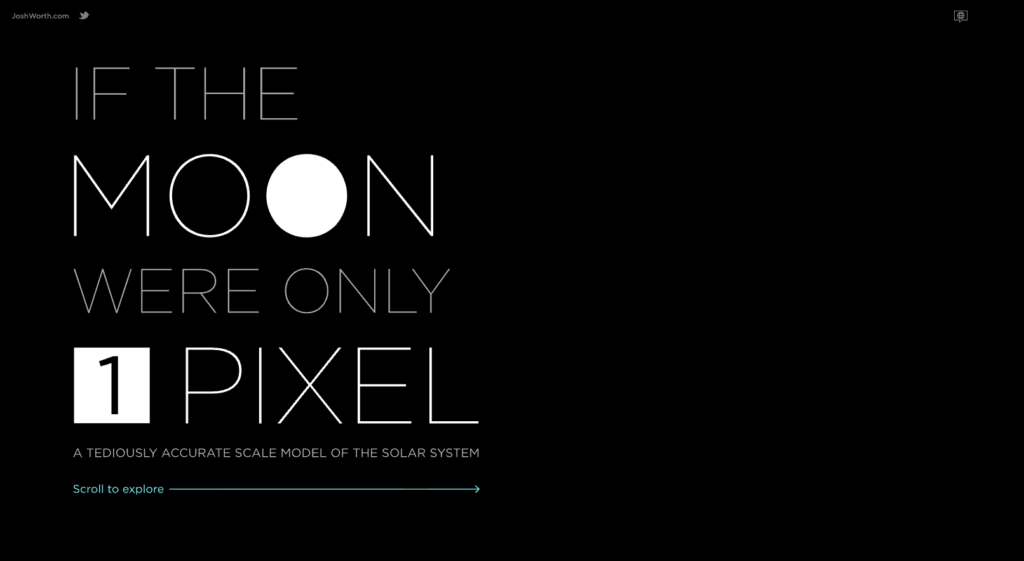
Scale is difficult to communicate with words alone. This visualization makes the vast distances of space feel tangible by asking users to experience them firsthand, a technique that could work just as well for timelines and historical events.
Stolen years: US gun deaths
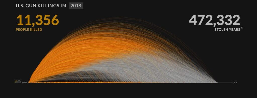
Strong filtering tools let users explore the data from different perspectives and uncover patterns that matter to them. The result feels less like reading a report and more like investigating the data for yourself.
Shape of change
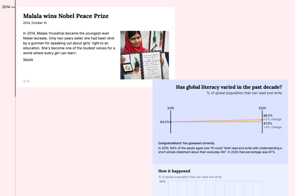
This project shows how designers can make large and complex datasets easier to navigate. Clear visual structure helps users follow the story without getting lost in the volume of information. And allowing the user to play along with each statistic to see if they can guess the numbers is a fun form of gamification to keep users interested while learning.
Eyes on asteroids
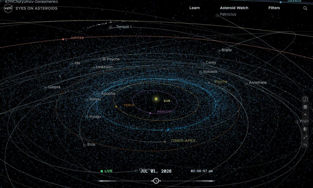
The scale of this project is impressive, but its greatest strength is how it turns complex scientific data into an immersive experience. Users do not just view the information; they interact with it.
Data USA
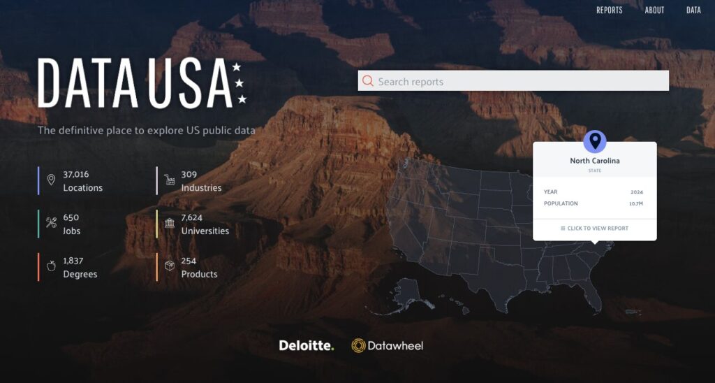
Data USA shows how powerful data visualization can be when paired with strong information architecture. The Oil and Gas Extraction profile helps users explore workforce and wage trends across regions, while the Computer Science profile connects education and employment data to reveal broader industry patterns. Both examples make dense public datasets approachable and useful.
Gapminder
Gapminder remains one of the most influential examples of interactive data visualization. Its range of chart options makes it easy to compare trends and explore relationships between variables.
Flourish example gallery
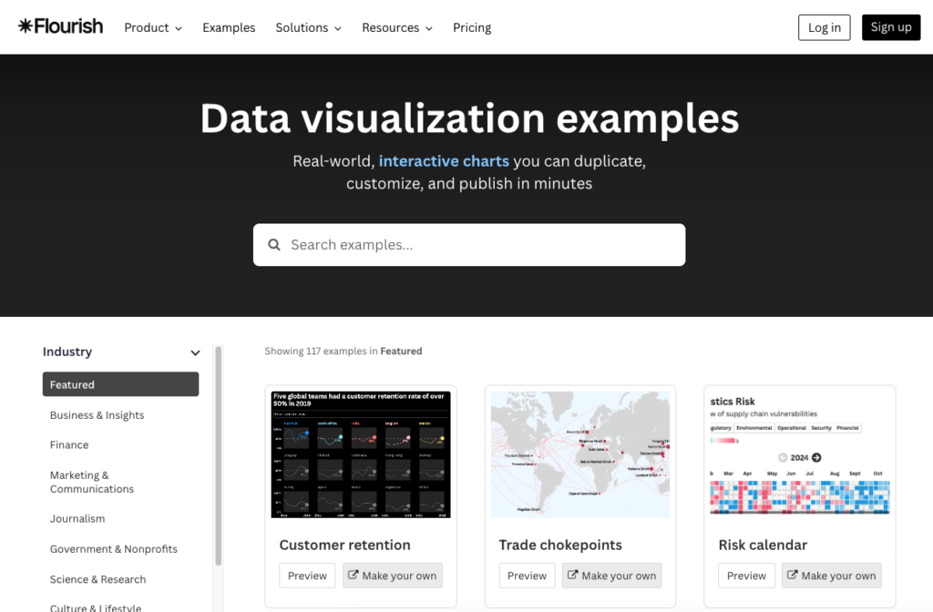
The Flourish gallery highlights how the same data can take many forms depending on the story you want to tell. Examples like Nobel Prize Story and FIFA Rankings show how interaction can add context and clarity.
And to round out our list…
Below are four examples from The Pudding, an online publication known for data-driven storytelling. Its projects blend journalism with interactive design, showing how visualization can actually guide readers through a story. Absolutely worth immersing yourself for an hour or three.
Women’s pockets

Not every effective data visualization needs cutting-edge technology. This example combines straightforward charts with strong storytelling to make the findings accessible and memorable.
Democracy
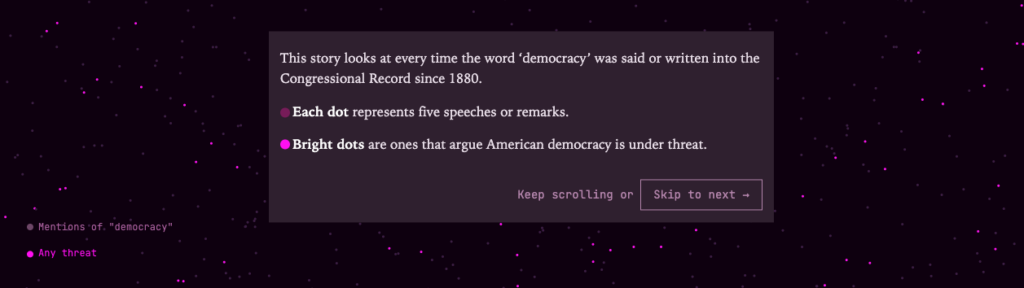
Animation gives this timeline a clear sense of movement and progression. Rather than presenting events as static points in time, it helps users understand how change unfolds.
American anxieties
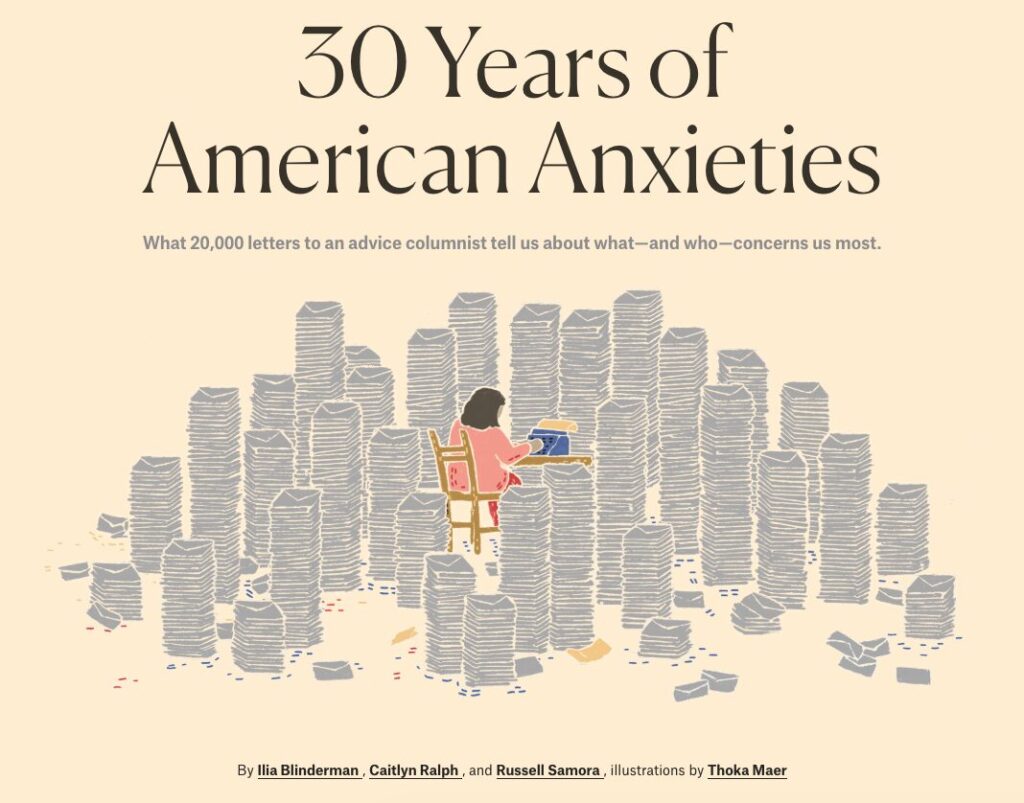
This project blurs the line between website and data visualization. Its familiar interface makes a large amount of information feel approachable and easy to explore.
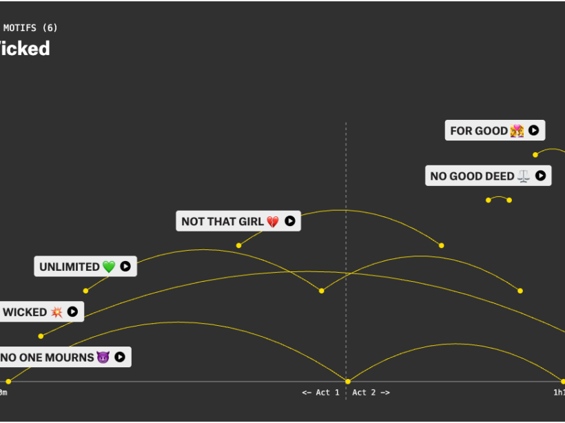
Musical motifs
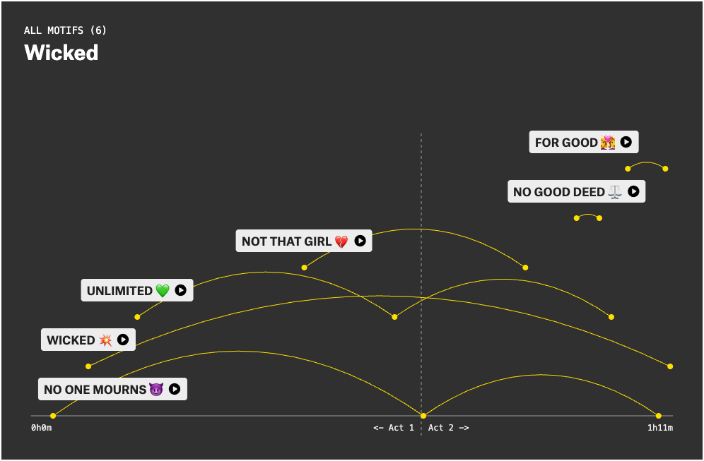
The exploration tools invite users to move beyond the main narrative and discover their own connections. That sense of discovery keeps people engaged with the data for longer.
The best data visualizations make information easier to understand
The examples listed here vary widely in style and scope. Some use animation. Some rely on interaction. Others use simple charts and clear storytelling.
What they share is a commitment to helping people understand something that would be difficult to grasp from raw data alone. They start with a clear message, reduce complexity and guide attention toward the insights that matter most.
In the end, effective data visualization isn’t about creating the most impressive chart or the most sophisticated interface. It’s about helping people see patterns, understand relationships and make sense of information. When it does that well, data becomes more than numbers on a screen.
It becomes a story people can understand.