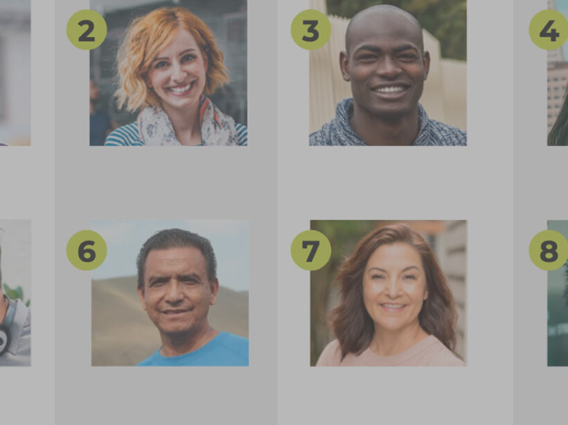







baby and mother smiling at each other

Reflecting reality: finding diverse and inclusive stock images for your designs

It can be tough to find images that embrace the variety within your audience. These stock sites help bridge the gap.

Diversity is a broad term. When used in relation to image sourcing and representation of content on a web design, blog post, press release, or other live content viewed by an audience, it’s important to address the full scope of diversity within the audience. This scope may vary based on the topic of the content. But to be inclusive we need to take into account the demographic of an audience from multiculturalism, age, identity, sexuality, and physical or mental impairments.  

Images are the first step to capturing your audience’s attention. Content represented with images has been shown to have a much higher engagement than content without images. So while sourcing an image, it is critical that it not only properly represents the topic, but takes advantage of the opportunity to appeal to multiple demographics within your audience. 

The demographic of an audience varies depending on the product, service, or information being shared with the viewer. While addressing inclusivity we should take into account what images will best help tell the story of our brand and best align with our target audience. Consider the following:

  • Do they have disabilities or impairments of any type?
  • Is the clientele of a certain age?
  • Is the clientele of a certain gender?
  • What are the gender roles we wish to portray or speak to (e.g. who is pictured doing the dishes or mowing the lawn)?
  • Are we assuming romance is heterosexual? 

Currently there’s a lack of inclusion in media

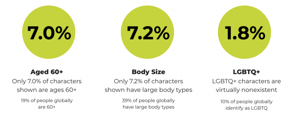
Research from the Geena Davis Institute has suggested that while 19% of people globally are 60+, only 7.0% of characters in images in the media today are ages 60 and older. Similarly, 7.2% of characters are shown with large body types (though 39% of people globally have large body types), and only 1.8% of characters represent the LGBTQ+ community (while 10% of people globally identify as LGBTQ). That is just a small window into the lack of inclusion, making it even more important to be mindful when addressing the varying demographics within an audience. 

Chart showing the lack of representation in media for those who are 60+ years old, have larger body sizes, and identify as LGBTQ+.
Source: the Geena Davis Institute

In order to make the search for more inclusivity easier, you’ll need to make a conscious effort to narrow down not only what would best speak to a target audience, but also best represent your brand. Knowing the who and what sets the foundation for how to search for what we’re looking for.

Keywords control our results

When conducting an image search on any platform, keywords help narrow the search by allowing the algorithm to better understand our visual needs. There are a few different algorithms running that control how our search results. The primary algorithm is based on keywords, popularity, and engagement — essentially, how many times a photo has been downloaded. 

This also means that based on historical bias, the highest popularity and most engagement on images results in highlighting that historical bias e.g., a range of potential white people with a few token people of color included. This means we might not get offered the images that best represent our target audience or brand right away.

In order to help counteract the impact historical bias has had on image search results, stock photography platforms such as Getty and Shutterstock have created a secondary algorithm. This secondary algorithm looks at the region where the search is being made and tries to match that region’s racial demographic when providing the results.

This is one action the platforms have taken to help us in our search for more inclusive images, but what else can we do? Add detailed keywords. 

When we don’t have the ability to add filters detailing ethnicity, sexuality, or physical and mental impairments, keywords should be prioritized to help refine our search for more inclusive images. For example, searching for a “person walking” may lead to various people walking, and they will most likely be white individuals. If we change our search to “black person walking”, “latino person walking”, or “mature adult walking” it allows the algorithm to refine our search based on keywords.  

Where to look for inclusive images

Because caucasian individuals are overly represented on stock photography sites, sometimes keywords don’t always lead us to our perfect image. Below is a list of free and paid resources that allow for more diversity. 


CreatHER Stock:

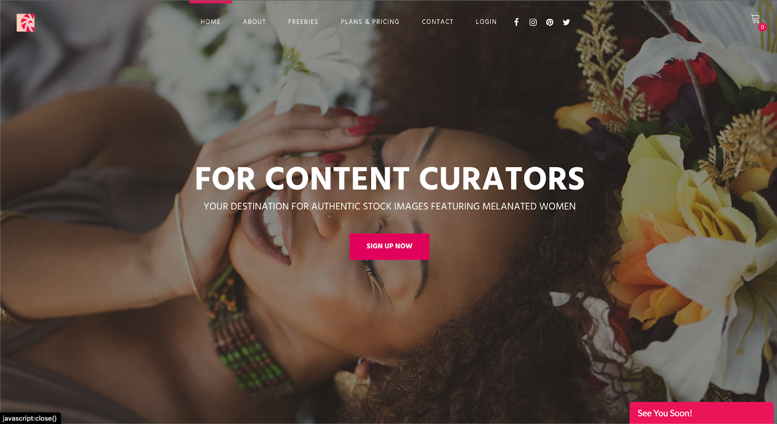
Run by founder & brand designer Neosha Gardner and photographer I’sha Gaines, this authentic stock site is a finely-tailored “for-us-by-us” set of lifestyle and business visual content or images featuring Women of Color. A subscription runs $10/month, with the option for more advanced plans at a higher fee. Although a subscription is required to access a majority of the photography on this platform, they do have a section of select “freebies” one can download. 


Homepage for pocstock.com

pocstock

pocstock is a global media company committed to creating and delivering premium stock photos, videos, and illustrations where people of color are front and center. They have flexible pricing plans so you can access their 150,000+ assets within your budget.


Nappy.co

​​Nappy.co is a free stock photography site dedicated to making it easy for companies to bring people of color into their designs, presentations, and marketing collateral.


The Gender Spectrum Collection

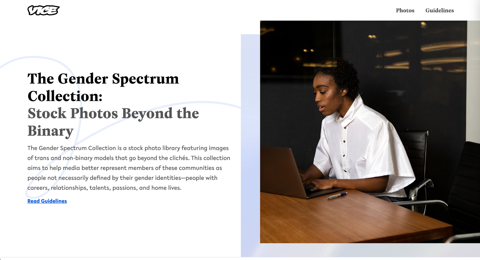
The Gender Spectrum Collection is a free image sourcing resource intended to help media better represent members of non-gender conforming communities. This collection helps depict people not necessarily defined by their gender identities, but rather simply people with careers, relationships, talents, passions, and home lives, just like everyone else in the world.


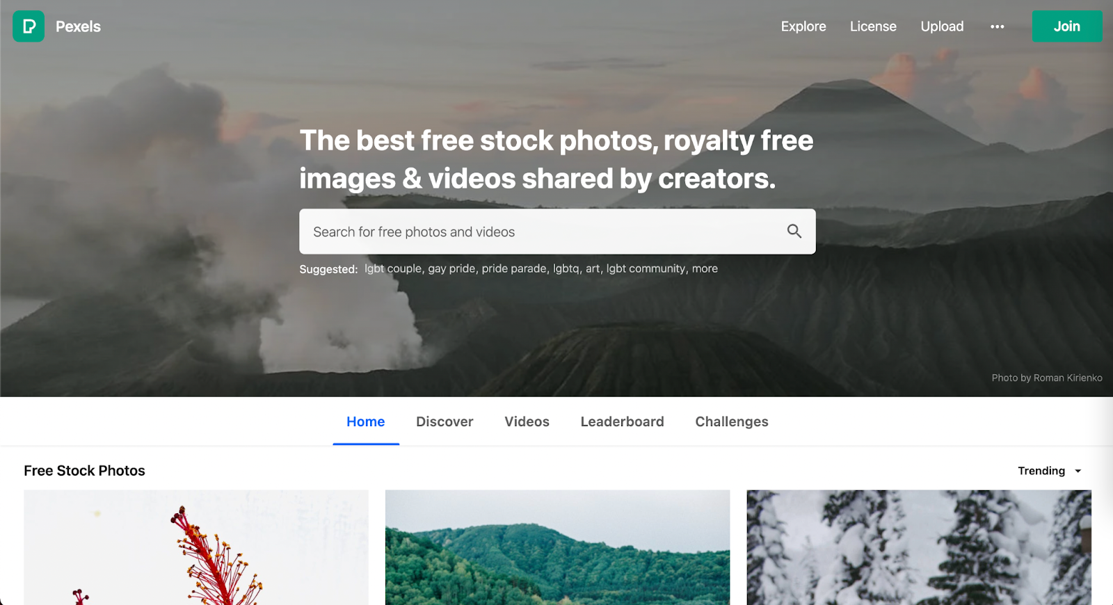
Pexels

Pexel is a well-known stock photography site with no subscription required. When it comes to diversity and inclusion they have created an environment where underrepresented communities have an opportunity to shine … as long as you include the ethnicity in your search. Multicultural, LGBTQ+, and impaired individuals are represented. 


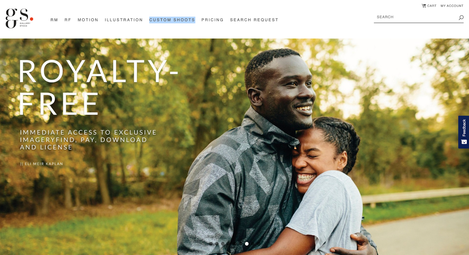
Gallery Stock is a subscription-based stock photography with an extensive collection of images accompanied with an extremely detailed filter to refine the search. Their subscriptions prices vary based on the needs of various users. In contrast to a majority of its competitors, Gallery Stock has the option for a custom shoot. This is a great option if you don’t quite find what meets your needs amongst all the resources at hand, don’t have a photographer, and have a budget that allows for custom shots. 


Getty Images

Getty (also owner of Shutterstock) is one of the largest and most well-known image sourcing platforms, and as such, has a great depth of diverse and inclusive images, videos, and animations for all demographics. For inclusivity, specifically Project #ShowUs, project is a category dedicated to providing more inclusive imagery. Getty also has a meticulous filter system that allows you to add detailed filters to refine your selection during your search for diversity. There are a variety of paid subscriptions or packs. Because Getty is a pricier option, it’s best for teams, agencies, or anyone who consistently sources new images as there will be a high return on investment. 


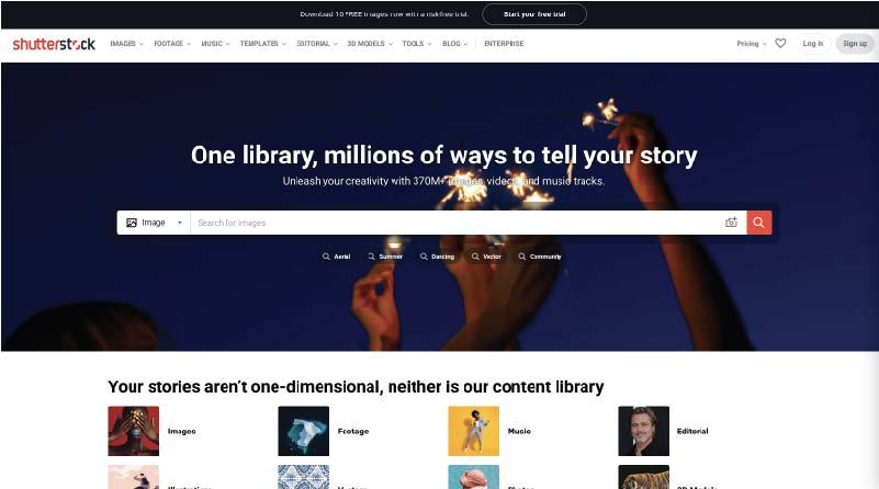
Shutterstock

Shutterstock (also owned by Getty) is another well-known paid image sourcing tool from which many designers and marketers source. While there are a variety of images for inclusive imagery, one search in particular that really stood out for having an abundance of photos for such an underrepresented demographic — ”disability in tech”. When searched, the result leads to 1,714 high-quality photos, vectors, and illustrations. This collection makes sourcing images of those who may have disabilities working in tech that much more visible.


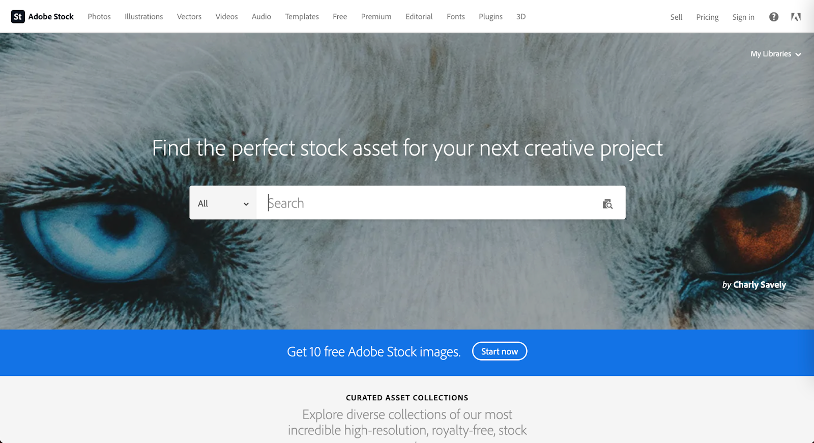
Adobe Stock

Adobe Stock is another well known source amongst the creative community as it is part of the Adobe platform. This is a source that is recommended for teams, agencies, or anyone who consistently sources new images as there will be a high return on investment. Although Adobe is not equipped with detailed filters, they do have an abundance of images. Using keywords will make those diverse images more visible within your results. 


Flickr 

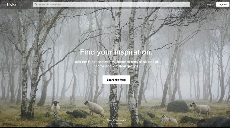
Mapbox has taken to Flickr, a stock photography sourcing and sharing site (much like Pinterest), to create a board of more inclusive imagery. They recently launched a collection dedicated to “Queer in Tech” in order to promote the representation of queer and gender-nonconforming individuals in tech. As a demographic that is often underrepresented throughout the industry, Flickr has created an opportunity to help shift that statistic using a collection of images ranging from collaboration and teamwork, leadership, design, engineering, to mobile development.

The inspiration for this collection arose from a Twitter post about a board created by Stephanie Morillo and Christina Morillo dedicated to Women of Color (WOC) in Tech, also an underrepresented demographic within the industry. The collection, titled #WOCTechChat, has a wide range of WOC in various technical professional settings. 

Flickr in itself is a useful and free image sourcing tool with the option for a pro subscription.


Macro

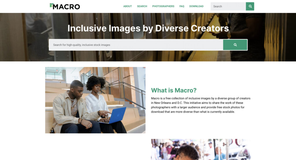
Macro is a new and emerging stock photography project providing free stock photography to its visitors. The platform allows users to download diverse imagery, captured by diverse photographers. Macro benefits communities by ensuring the photographers themselves are paid and have a full profile to showcase their work and information in order to reach potential new clients or opportunities. 

“I think diversity in front of the camera is easy. Diversity behind the camera is difficult. Often black or trans photographers see the world very differently, even behind the lens.”

Zora Khiry, New Orleans, Macro featured photographer

Diverse images exist to support your brand

Brands should create content that speaks to their audience as a whole. Young, white, straight, able-bodied, cis-gender men in imagery are very common, but not representative of every audience. Hopefully these resources will assist you in finding images that best represent your brand and give you a more inclusive voice for all demographics within your audience. 

Drupal Web Design: How An Agency Like Kanopi Can Help

Kim Lai
Kim Lai

Take your Drupal web design to the next level.

Drupal is an open-source content management system (CMS), free to download, and offers an impressive amount of baseline functionality that users can leverage right from the get-go. From there, it’s easy to expand your Drupal system and customize it to your heart’s desire with over 47,000 modules, almost 3,000 themes, and high-level custom coding capabilities.

Along with its robust features and scalability, Drupal is a great platform for web design.

Here at Kanopi, we know that Drupal development and maintenance is an ongoing process. When it comes to designing your Drupal site, you may feel as if the work is never done. Is your web design effective for your organization’s current needs? What do you need for a well-designed Drupal website? All of these questions and more will be answered in this guide.

Need help setting up your Drupal site or tackling a redesign project? Contact Kanopi today.

The Components of Effective Drupal Web Design

When it comes to determining how effective your web design is, ask yourself these three questions:

  1. Can supporters easily navigate to their target destination?
  2. Is your website telling a clear story?
  3. Do the visuals support the character and tone that your organization wants to present?
  4. Can visitors find/know what the main call to action is?

If you answered yes to all four, then your Drupal website and its design are probably in good shape. If you answered no to all four, then it’s time to rethink your web design strategy. However, it’s more than likely that your answers fell somewhere in between—or you aren’t sure exactly what your answers are at all!

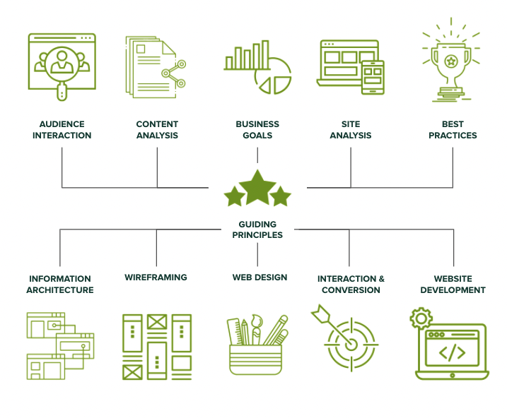
To help you walk through each of these questions and how web design can affect your answers, we’ll review these essential components: structure of information, wireframes, visual & interactive design, accessibility.

Structure of Information 

Let’s use an airport website as an example. Imagine a user wants to find parking availability information on an airport website built using Drupal. They check the homepage and menu, click around a bit, and land on the “Getting to the Airport” page. But there’s no parking information to be found! When they realize the information they need isn’t easily accessible, they decide to quit the page and move on.

This process of navigating a website, going to different pages, and clicking on various links is all based on your website’s structure of information, otherwise known as its information architecture.

Your website’s information architecture describes the physical structure and layout of your website’s content. Think of it as the studs a house is built on— the studs determine where your kitchen, living room, and bathrooms will be. Once that’s determined, you can then choose where your kitchen island and cabinets will go.

For your website, your information architecture helps choose how many pages there are, what type of page it is (i.e. article or list), and how these pages connect to each other. 

When it comes to web design, it’s critical to determine the structure of information if you want to answer yes to our first question: “Can supporters easily navigate to their target destination?” Before launching your site or during a website redesign, make sure you outline the information architecture and sitemap so that your information architecture makes sense and flows logically for the user.

Wireframes

Along with the structure of your entire website, you also need to consider the flow and functionality of your individual pages. That’s where a website wireframe comes in.

Website wireframes are basically a visual guide representing the framework of each page type. They aim to arrange elements in the best way to ensure your website accomplishes a particular purpose and the organization’s goals. In particular, your wireframe might depict a page layout including:

  • Paragraphs
  • Different media types (images, video, audio, gifs, etc.)
  • The menu and footer navigation
  • Calls to action placement
  • List filter functionality
  • Visual description of interaction points, like buttons, accordions, etc.

Along with the actual items on your page and where they’ll live, your wireframe will need to address how these components work together to tell a specific story. When it comes to wireframes, think less about the visual content and think more about user flow. For instance, will users be using one long scroll page to explore different content? Will they need to actually click on elements to engage with certain graphics?

With your website’s wireframe finalized, it’s much easier to answer yes to our second question, “Is your website telling a clear story?” This is because your wireframe ultimately dictates how you tell the story of your content. When visitors click on a web page, it’s up to the visual design to facilitate their journey.

Visual & Interactive Design 

When you think of the term “web design,” it’s not uncommon to first think about the visual aspects of your website.

Your website’s visual design refers to the aesthetics and branding of your site. This can include graphics style, logo, colors, fonts, and other visual elements. To ensure that your visual design is consistent, it’s recommended to create a brand or style guide to ensure that visual elements are used consistently throughout your site.

And, while the visual design is critical for how your users respond and engage with your site, make sure you don’t fall into the mistake of overusing visual elements and distracting users from the actual purpose of the page.

Related to visual design is interactive design. This type of design is specifically focused on the visual elements that users engage with. This includes buttons, links, slideshows, videos, and more. When it comes to visual interactive design, brainstorm the different ways you can create a visual cue. Common ways to indicate to users that a visual element is interactive are using color, shapes, underlines, and other elements that make it stand out on a page.

Determining your visual and interactive design can help you respond positively to our third and fourth questions, “Do the visuals support the character and tone that your organization wants to present?” and “Can visitors find/know what the main call to action is?” As soon as someone lands on your site, your visual and interactive design should immediately connect them to your organization and let them know which elements they can engage with.

Accessibility & Design

Accessibility isn’t necessarily a component of web design, but the concepts go hand in hand. After all, having a well designed website doesn’t mean much if it’s inaccessible. 

Inaccessible web content describes when, whether due to technology or ability, users cannot engage with or contribute to the online world. In fact, your web design is the first stage in which a site becomes accessible to all users.

Interested in learning more about web accessibility? Take a deeper dive into demystifying website accessibility compliance in our guide.

A properly designed website needs to be accessible for all users, including those with low vision, color blindness, seizures, cognitive impairments, and those dealing with situational impairments (such as a broken arm or carrying a crying baby). The great thing about Drupal is that all features of its core platform comply with WCAG 2.1 and ATAG 2.0. Drupal also has built-in accessibility features like custom color contrast and intensity and form labeling to help screen readers.

Make sure to also consider accessibility for those in different countries (Drupal 8+ users can take advantage of its multilingual capabilities) and those using different screen sizes (Drupal can account for both desktop and mobile users.)

Get Inspired: 3 Drupal Websites

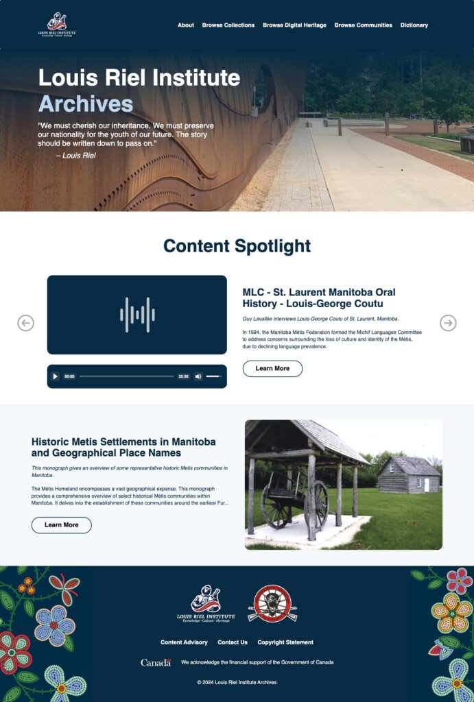
When talking about web design, it can be hard to visualize exactly what these components and concepts will look like in reality. The best way to learn? By looking at well-designed Drupal websites for inspiration! Here are three examples (the first two being Kanopi clients) of Drupal websites displaying effective web design.

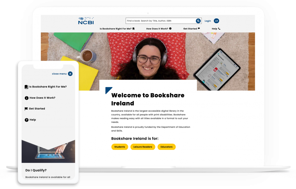
1. National Council for the Blind: Drupal Web Design Example

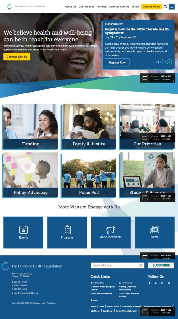
NCBI's website is a good example of Drupal web design.

The National Council for the Blind (NCBI) is an organization that aims to decrease visual impairment reading barriers and provide digital opportunities for both learning and literacy.

A core value of NCBI is creating accessible learning and literacy, and their Drupal website does just that. Their website is AAA compliant with considerations for users with visual impairments, including color contrast, font families, and even font size.

Along with accessible design, NCBI’s website has these effective web design best elements:

  • An embedded search tool with a convenient form label letting you know the content you can find.
  • Bright yellow and rounded buttons that stand out from the rest of the more angular visual components.
  • A sticky navigation system so users can click on the most popular landing pages whenever they want.

Read our dedicated NCBI case study to learn more about Kanopi’s role in building their website.

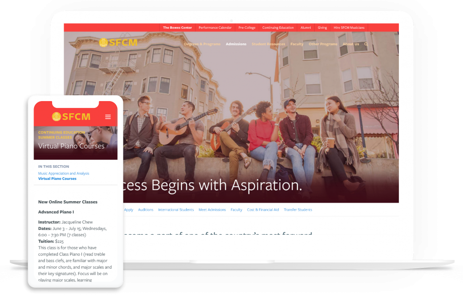
2. San Francisco Conservatory of Music: Drupal Web Design Example

SFCM's website has effective Drupal web design.

The San Francisco Conservatory of Music (SFCM) aims to provide comprehensive music education that prepares artists for the rest of their careers. They wanted a website to reflect their exceptional education and chose the Drupal system for its visual beauty and streamlined content.

As soon as you land on the SFCM website, you’re met with an interactive logo and an audio button that plays a symphony performed by students of the conservatory. Site visitors are immediately invited in and introduced to the prestige of this musical institution—all within the homepage!

Here are some other standout web design features of this Drupal site:

  • Homepage timeline that is easy to scroll through and presents SFCM’s rich history and accomplishments in a streamlined way.
  • Image links that zoom in slightly as you hover over them to show that they are clickable.
  • Clear branding with consistent colors of red and gold.

Read our dedicated SFCM case study to learn more about Kanopi’s role in building their website.

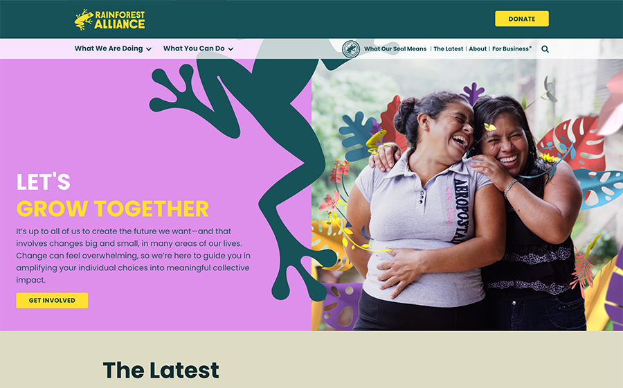
3. Rainforest Alliance: Drupal Web Design Example

The Rainforest Alliance is a great example of Drupal web design.

The Rainforest Alliance (RA) is an organization dedicated to conserving biodiversity and ensuring sustainability in rainforests.

This website is beautifully designed and easy to engage with, introducing visitors to all of the progress the RA is making. As you scroll down the homepage, you’re met with posts on an embedded social media feed, recent news articles, the RA’s main mission, and what supporters can do to help!

In particular, the RA website boasts these web design features:

  • Graphic links that change colors as you hover over them to indicate that they are clickable.
  • A menu in the footer to switch languages with ease, from English to French to Chinese and more.
  • Dynamic graphics and images that blend seamlessly together to create a visually engaging homepage.

Curious to learn more about this project? Check out Drupal’s dedicated case study on the Rainforest Alliance.

How a Drupal Web Design Agency like Kanopi Can Help

Your Drupal website’s web design is not something you want to take lightly. If you find yourself needing more extensive web design help or you work with a larger organization with more complex needs, partnering with a Drupal web design agency like Kanopi might be exactly what you need.

With Kanopi’s team, you gain support from professionals with years of experience developing, supporting, and designing Drupal websites. Consider the following benefits of partnering with Kanopi:

  • Each of Kanopi’s Drupal team members has, on average, 11 years in Drupal Development, and several of our team members are Acquia-certified. 
  • Many Kanopi members are also considered thought leaders in the industry and speak regularly at DrupalCon and Drupal Camps in North America.
  • Kanopi is a supporting partner to the Drupal Association, contributes regularly to the Drupal Project, and is one of the main organizers of BADCamp.

We’re not only fully updated on the latest website best practices, accessibility trends, and Drupal updates, but we also take a continuous improvement approach to site development, ensuring that your web design always serves your organization and meets your customers’ needs.

And, we help teams avoid the dreaded “Swoop and Poop” management phenomenon by aligning senior-level stakeholders on expectations and goals. We create open lines of communication within your team to ensure everyone is on the same page and working to support your main objectives.

Kanopi Drupal Web Design Services:

  • Mood Boards – We work closely with your organization to create mood boards that act as design ‘snapshots’ to help convey your site’s overall feel and aesthetic. We use any existing brand signals and can create new ones if needed. This allows your organization and other stakeholders a chance to give input on the ground level prior to the heavy lifting of design.
  • Design Mockups – Want to see what your website might look like? Here at Kanopi we can create design mockups of your site once all the building blocks are pulled together. This way, you can ensure the web design reflects your brand and meets all expectations.
  • Style Guides – To ensure your web design remains consistent and true to your brand, we work together with your team to create the ultimate style guide. Your style guide will contain elements of brand voice and tone, typography, colors, logo usage, and more to create standards to guide our web design team.
  • Research Discovery – When it comes to web design, user flow and interaction play a large part in what media elements you use and how you organize them. To make sure that your website serves your audience, we undergo user research and even create user personas. Doing so illuminates similarities and differences in how site visitors act to ensure your site meets your goals and reaches the right audience.
  • Design AA Accessibility Standards Our accessibility standards are built into our system and are a top priority for all of the sites we help design, develop, and support.
  • Prototype Interactions – Along with design mockups and style guides to address the more visual design aspects of your website, our designers also can help you map out the interactions. We don’t just design what you see in a screenshot, but also how each element clicks, swipes, scrolls, and more. We work closely with you to determine the UX layout that best serves your audience with different wireframes and prototypes you can explore.
  • Testing And Support After Launch – Our work doesn’t stop once your website is live. As soon as it is launched, we will continue to test the site to make sure user interactions and the design of your site moves users forward to their goal. If support is needed after launch, our Kanopi design team is still there to assist, answer any questions, and ensure your site is set up for long term growth.

No project is too large for our Kanopi Drupal team. Whatever stage your site is in, we’re ready to jump in and assist with web design, development, and support to get your Drupal site where it needs to be.

Kanopi is here to address any of your Drupal web design needs.

The Five Biggest UX Design Mistakes

Kim Lai
Kim Lai

What went wrong with UX last year and how to fix it moving forward

What works when it comes to user experience (UX) is constantly evolving as our behavior online shifts and changes over time. A web design feature that delighted your site users ten years ago could now inadvertently conceal valuable content that you want to take center stage. Or worst-case scenario, it could be driving folks away from your site. 

To help you keep on top of the latest UX design trends, we’ve pulled together the five most common UX mistakes made in the past year and explain why each is causing issues when it comes to the user experience. We also suggest better options for each design mistake to ensure your site remains as accessible and sustainable as possible:

  1. Problematic carousels 
  2. Intrusive pop-ups 
  3. Unnecessary side-bars 
  4. Distracting auto-play videos 
  5. Too many buttons 

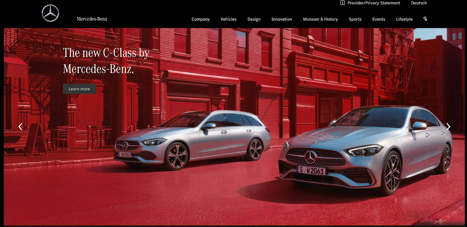
Problematic carousels

Source: Mercedes-Benz

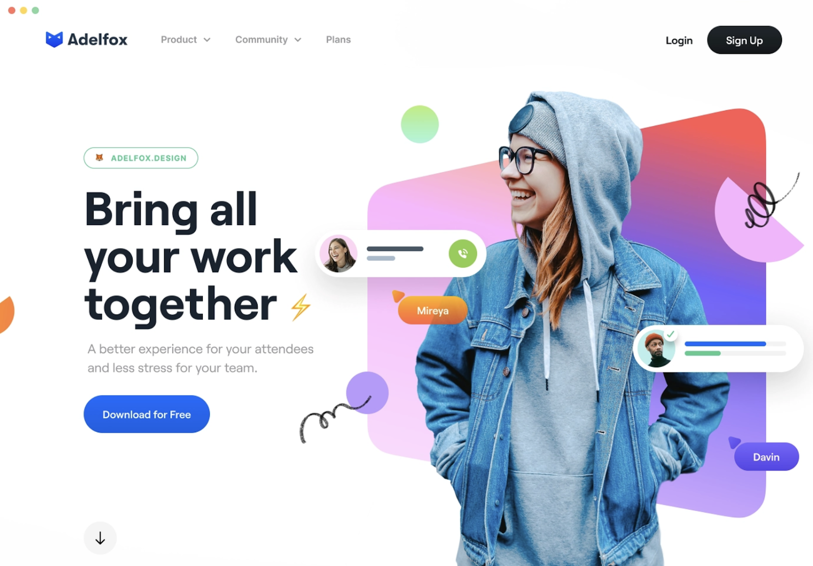
Home page carousels are a trendy design feature on many websites as they are thought to provide a clever way to condense a lot of content into one screenful.

What’s the issue? 

If the carousel auto-rotates, users may not have enough time to read before the slide changes. And our tendency to scroll down the page is increasing. A study conducted by the Nielsen Norman Group found 57% of site users stay above the fold of a webpage compared with 80% of website users over a decade ago. 

Content can be missed as website users often scroll past the carousel and miss vital information that doesn’t appear on the first slide.

If the content on the first slide doesn’t align with the organization’s values, it can give website users the wrong impression and even be misleading. 

Finally, in many cases, you cannot simply scale down to a mobile device. Content may get cut off or become too small to read when a user views your content on their mobile device.

A better way 

Source: Dribbble

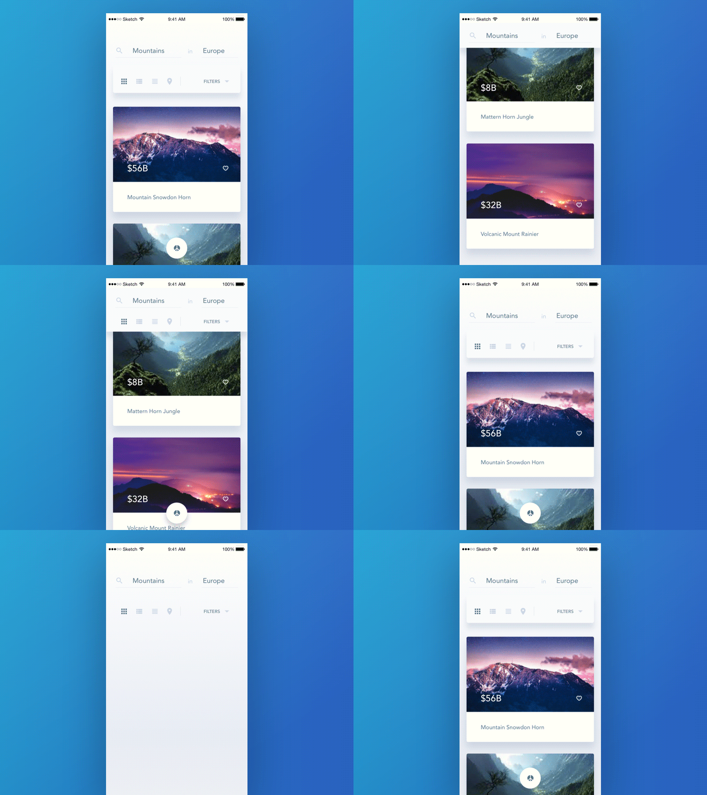
Instead of using a carousel of images, choose a single, impactful hero image and display key goals of both your users and your business to guide the user journey.  

You can also try using a card design pattern to get across two or three key messages on your homepage. 

Examples of good card design:

Intrusive pop-ups

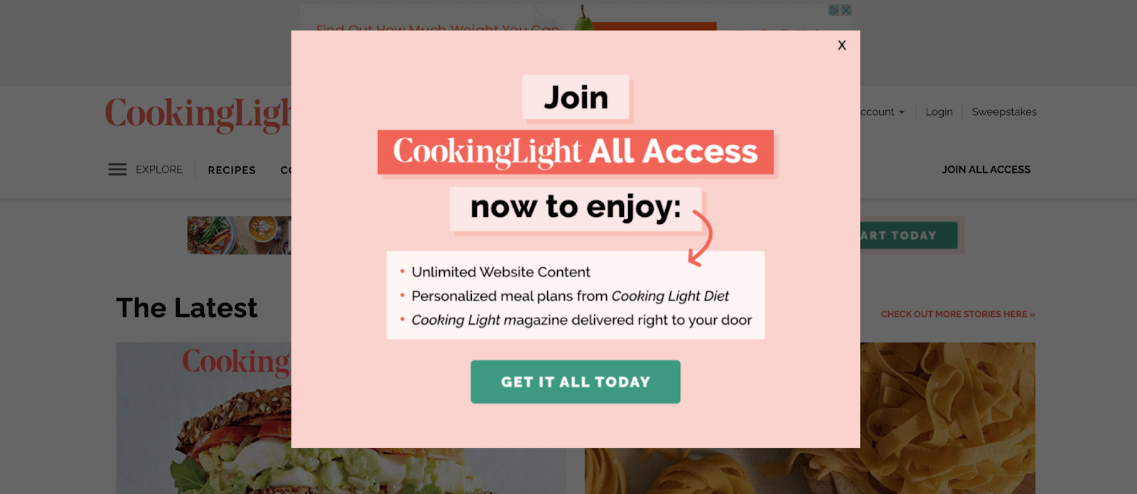
Source: CookingLight

Pop-ups held a reputation as a great marketing tool in the past. They were proven to be very effective at generating leads, for example.  

But with Google’s January 2017 update, sites that contain pop-ups or interstitials that make content less accessible are penalized in their search rankings. And Google has identified what is good and what is a bad pop-up.

What’s the issue?

Pop-ups can interrupt the natural flow of the website user by hijacking the current webpage to highlight new information on an additional screen.

Pop-ups also affect the accessibility of your website. They create keyboard traps and unnecessary screen reader content that can confuse and distract users trying to navigate your site. 

Aside from making your website accessible to more users, there’s also a business case to be made for making your site’s popups more accessible.

A better way 

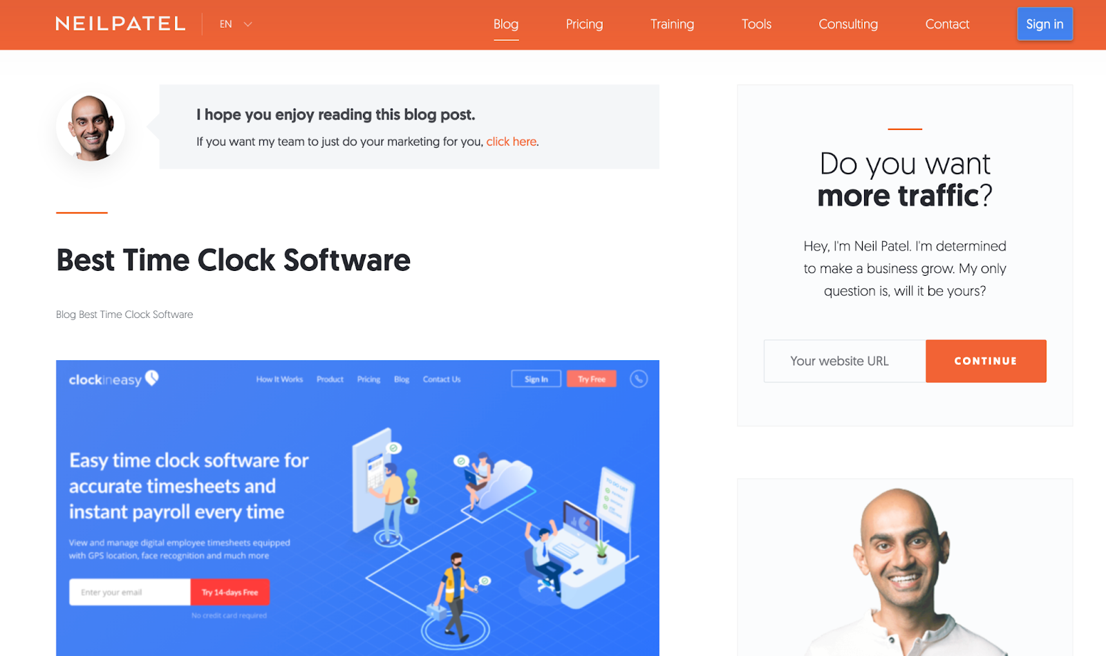
Source: Neil Patel

Make sure you comply with Google’s guidelines when it comes to pop-ups to avoid being penalized by Google. 

Google explains the following techniques make content less accessible to a user:

  • popups that cover the main content, either immediately after the user navigates to a page from a search result, 
  • Displaying an interstitial that the user has to dismiss before accessing the main content, and 
  • Including a layout where the above-the-fold portion of the page is too similar to an interstitial, and the original content is inlined underneath the fold.

Displaying content you’re inclined to include in a pop-up in a sidebar instead is best practice (as outlined in the Neil Patel example above), as is delaying the opening of pop-ups on your website if you must have them. 

Lastly, If you have to use pop-ups, design your pop-ups so that they take up less than 50% of your web page’s space.

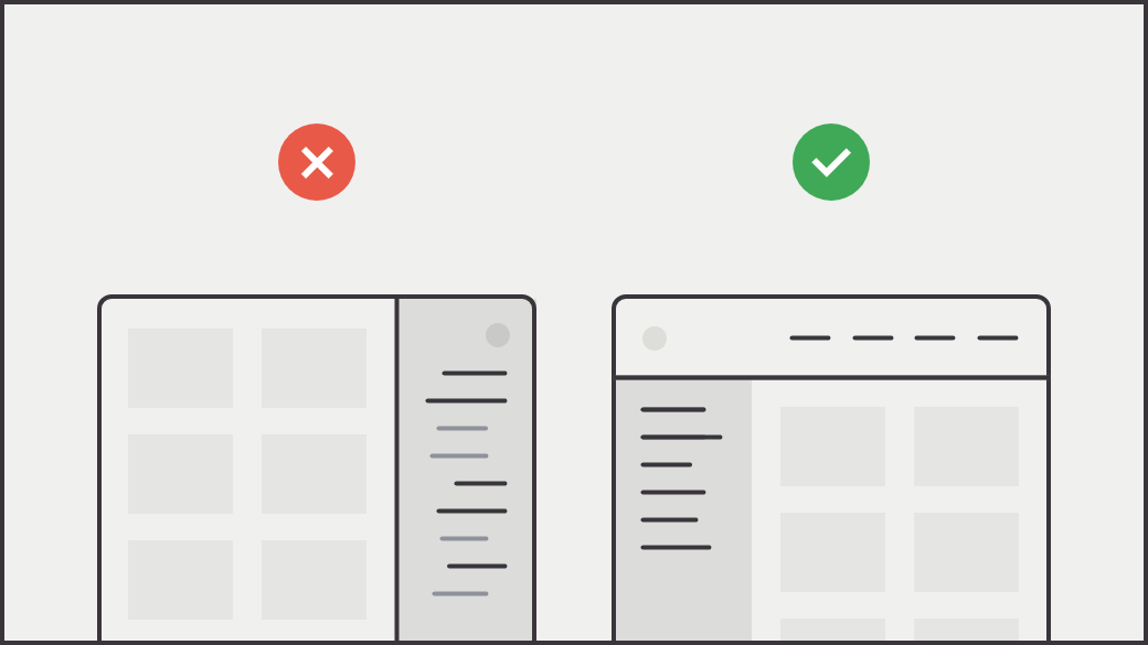
Unnecessary sidebars

Source: Prototypr

On-page navigation via a sidebar provides links to related content or provides pathways for a deep content dive.

What’s the issue?

With unnecessary sidebars, some of your most valuable content can quickly become inaccessible. Remember, clicks are valuable. You risk losing potential customers if users have to click around to find the content they are after. 

In addition, if your website’s on-page menu changes once a link is chosen, your site users can end up feeling lost and confused while trying to navigate your content. 

And finally, in many cases, many sidebar menus are not adequately designed for interacting with content through mobile devices, affecting the responsive design of your site.

A better way 

Source: Craigslist Redesign by Aurélien Salomon for Orizon

Instead of having important content buried in a sidebar, combine similar content together onto one long page. Your website visitors are naturally conditioned to scroll.

A nudge to scroll provides a handful of other benefits:

  • It delivers content more quickly because there is no need to wait for pages to load
  • It doesn’t require a commitment by forcing users to choose a button — or pick between multiple buttons — and abandon their current page
  • It allows visitors to digest information at their own speed

Besides providing a scrolling option, try using a drop-down menu design pattern that passes usability testing with flying colors and creates an enhanced user experience, guiding the user journey in the process.

Examples:

Distracting auto-play videos

Source: Fit Radio

Auto-pay videos use sights, sounds, and moving imagery in an attempt to create emotional connections with site visitors.

What’s the issue?

Auto-play videos can trigger your site visitors to experience dizziness and nausea. And if that auto-play video is accompanied by sound, it can be loud and confuse your website visitors.

Videos assume that your site users can see. They can have a negative physical impact on those sensitive to movement and ultimately limit the accessibility of your website.

In addition, large video files can slow down site speed, impacting the overall UX of your website and your site’s Core Web Vitals, which now affect where you end up in search engine results. 

And finally, videos tend to distract your site visitors, grabbing more of their attention than you intended. They do not support the immediate consumption of information.

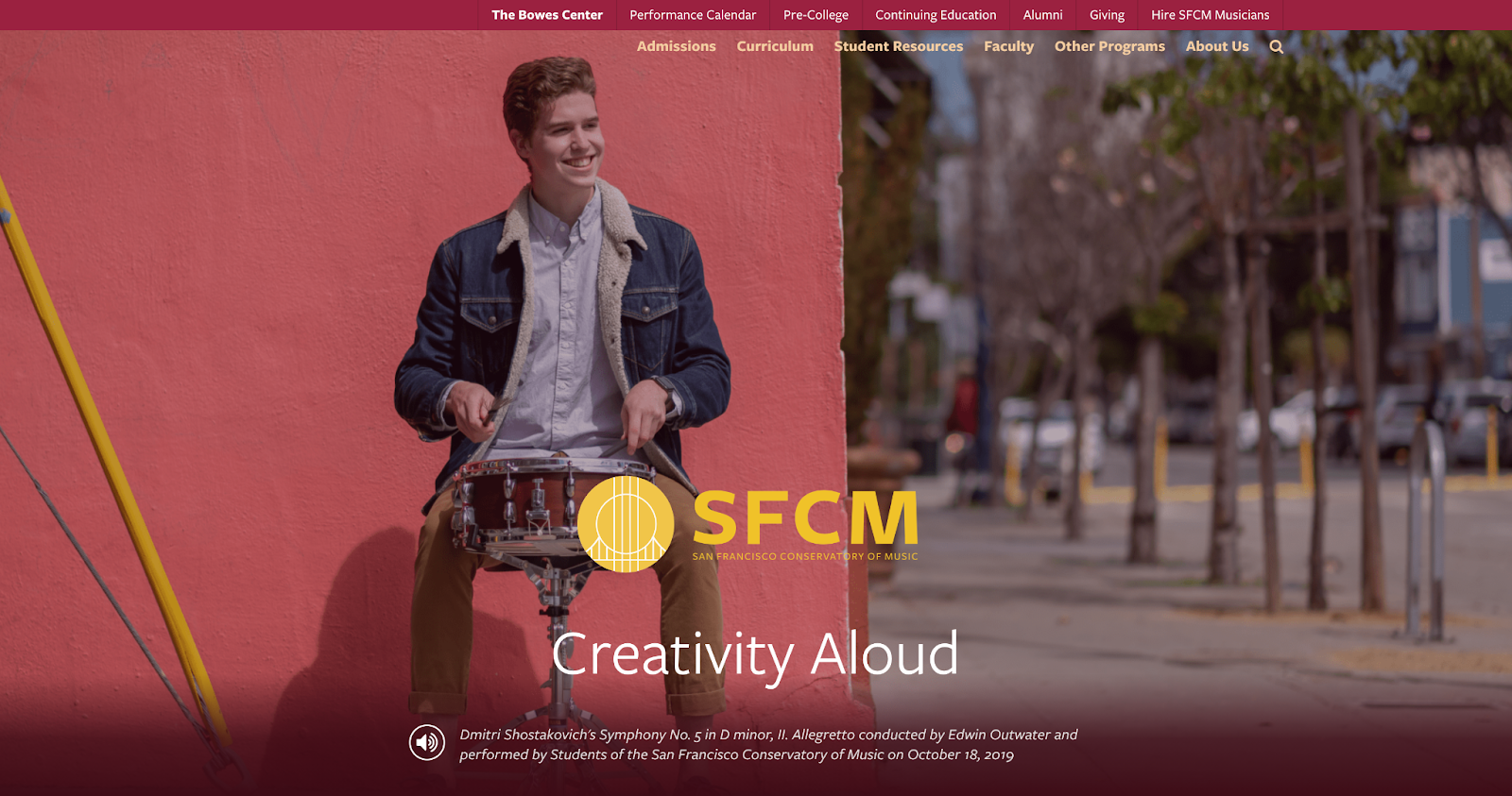
A better way 

Source: San Francisco Conservatory of Music 

Video and sound content is helpful only if your site visitors have control over it, fully understand what’s contained within it, and are provided with an alternate way to access it. 

Give your website visitors the ability to decide how they interact with the video and sound content on your site by literally putting the controls on the video area for an improved user experience. 

Too many buttons

Buttons are a common UX design feature for ensuring your site visitors have all the available options at their fingertips.

What’s the issue?

Source: Green Geeks 

We aren’t against the use of buttons, but too many buttons can harm. If you force too many options on your site visitors, they may opt for the path of least resistance – to leave your site. 

Too many buttons competing for the attention of site visitors makes it difficult for the user to focus on individual pieces of content on your website.

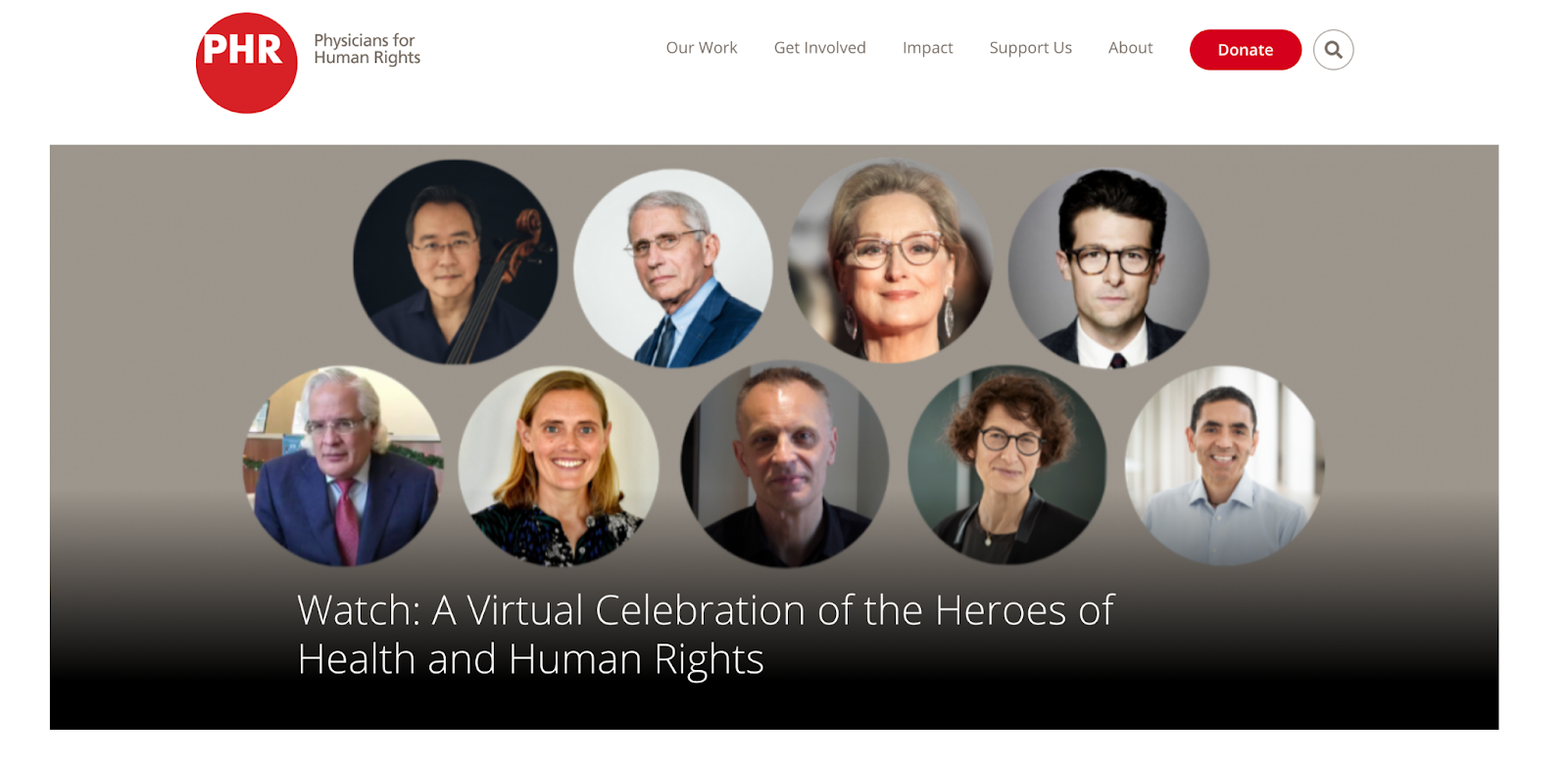
A better way 

Source: Physicians for Human Rights 

Less is more when it comes to great UX design. Focus on making your main call-to-action (CTA) as straightforward as possible and make it easy to find with one stand-out and consistent button design. If you have secondary CTAs, use a smaller, less flashy button or link design.

Prefer to see this in a video?

I presented this talk at the NTC Conference in March 2021 and provided a bit more information. Check it out.

Avoid these common UX mistakes to make your site a joy to navigate   

Building a sustainable website that’s delightful to use is about catering to your users’ wants and needs while assisting you in achieving your business goals. A powerful way to ensure your site meets the needs of your users is by avoiding common UX mistakes. 

These common UX mistakes made in 2020 were first presented at the Nonprofit Technology Conference (NTC) earlier this year. You can watch the presentation in full on YouTube. 

50% Of All Big Projects Fail, including Websites. Why?

Jimmy's Photo
Jim Hoogewind

Marketing leaders have the best intentions going into an expensive and large six-figure website overhaul. However, according to the Harvard Business Review, as many as half of big projects like these are considered failures when all is said and done. And you’re left wondering…

  • Why did this take longer than I was told?
  • Why was more funding needed than was estimated?
  • Why were there so many surprises and scope changes?
  • Why do I feel so burned by the agency my team selected?

Now you find yourself facing down another big website overhaul and all the risk associated with it. How will you feel confident it will be successful this time? How will you be sure you won’t be left with heartburn and the same frustrating questions as last time?

In my 15+ years working in this industry, I’ve learned there are three key elements to ensuring a big website design and development project is successful.

Think of it like a three-legged stool…

1) Stakeholder Alignment

Performing candid and skillfully focused stakeholder exercises which tease out the goals and intentions of important leaders in your organization. These exercises force invaluable conversations, and ultimately lead to buy-in.

2) User Experience

Target audience data mitigates risk by replacing assumptions with defined needs and specific pain points. These eventually inform the site experience that’s most helpful to each audience.

3) Design & Development Planning

With stakeholders aligned and users defined, design and development planning can begin using models such as sitemaps and wireframes. Technical and functional requirements can start to be dialed in as well.

Unfortunately, most agencies focus only on one or maybe two of the legs described above, resulting in a shaky foundation to your project. But not Kanopi. We focus on and thrive at all three, and we make it fun along the way. 

We call this endeavor the Website Growth Plan (WGP). Through this proven process, we’re able to answer questions such as:

  • I know my site is not working for me, but how do I improve it? 
  • I will need to migrate from Drupal 7 to D8 or D9, but what will that budget look like?
  • How can I improve my SEO? How is my site performance now?
  • I need a new content strategy, but how can I do this properly when I am already so busy?

After taking factors (like the ones illustrated below) into account, the WGP delivers an all encompassing action plan for your website. By setting expectations early and often, this helps avoid the heartburn-inducing questions you were left with after your last website project.

Which website growth plan is right for me?

More information can be found here, but below is an overview of our various plans:

Website Reimagine

This plan is a concentration of UX research, content strategy, and a bite-sized amount of design. It helps formulate a game plan that drives clarity for the team and gets some early design thinking on the table. Plus, it is actually a wonderful use of time as it is the first step in an overall design and development project, as the deliverables include a roadmap to launch.

Usability and Design

This is a data-informed optimization plan incorporating user experience, visual design and content recommendations delivered in an actionable plan for next steps.

Content Strategy

Amplify your message through a powerful analysis of important information, including user needs, competitor analysis, personas and Customer Decision Journey mapping — from Awareness to Advocacy. This plan focuses on storytelling content, user experience, visual design recommendations, and more.

Drupal 7 Transition Plan

You should feel secure planning and budgeting for the transition from D7 to D8/9 or to WordPress. This plan removes the “unknown” and illuminates the details for your organization to make an informed decision and take action on next steps.

Technical SEO

This is a deep-dive to analyze your website’s SEO technical health and set you up for search engine optimization success.

GDPR & Compliance

The General Data Protection Regulation (GDPR) is a legal framework that sets guidelines for the collection and processing of personal information from individuals who live in the European Union (EU). This plan gets you compliant.

Accessibility

Reach your audience and meet compliance with Website Compliance Accessibility Guidelines (WCAG 2.1 AA or higher) through a skillful analysis and recommendations action plan.

Technical Review

A comprehensive technical deep-dive into your site’s code and technical health to provide foundational recommendations for optimization and stability.

And if one of those doesn’t quite fit? Don’t worry. Our nimble nature finds us creating custom packages for our clients to best meet their needs. Contact us to chat about which plan is the best fit.

Kanopi Team

Creating a Digital Strategy for Nonprofits – Made Simple

In 2019, total online nonprofit revenue grew by 10% and is predicted to only continue rising.

The online world is rich and full of information. From watching Netflix to exploring your Instagram feed to looking up dinner recipes, there seems to be no end to the internet content available.

With such a truly saturated space, your nonprofit needs a focused and comprehensive digital strategy if you want to reach supporters in meaningful ways and increase fundraising for your mission. Otherwise, your message can get buried and you risk losing sight of your goal.

The best digital nonprofit strategy likely spans multiple tools and marketing outlets. Creating this type of strategy can seem intimidating, especially if you’re not aware of how those tools and outlets support each other. This guide will dive deep into not only exactly what a digital nonprofit strategy is, but also how to best create one for your organization and some top tips to maximize those efforts.

Table of Contents

What Is A Digital Nonprofit Strategy?

Your nonprofit organization likely already depends on a few key tools to reach and engage your supporters. Your online donation platform facilitates gifts, your content management system (CMS) helps you create a beautifully designed website, and your marketing tools promote upcoming campaigns and engage donors. 

However, it’s not enough to just have an arsenal of working tech. In fact, it takes careful planning and coordination to ensure that your tools and marketing strategies not only work together but also support each other. That’s where your digital nonprofit strategy comes in.

In simple terms, your digital nonprofit strategy is a focused plan that takes action on your fundraising and donor engagement goals through digital marketing methods.

Your overarching nonprofit goals, any budget constraints, and the technology you have all impact your digital strategy. This strategy then informs your online marketing efforts, with the two working together to maximize your nonprofit’s impact. 

The common tools and marketing channels nonprofits use for their digital strategy include:

  • Nonprofit website – Your website is an increasingly important part of your nonprofit digital strategy. Your nonprofit site centralizes your online engagement and is likely the first place supporters will look when they want to find out more about your mission and any upcoming events or campaigns. It’s also where donors give! How you design your website and the content you add to it is crucial in your digital marketing efforts.
  • Online fundraising solution – This is how you accept online gifts from your supporters. It’s important that the tools you use accurately capture donor data and protect their sensitive information.
  • Email/text communications – Sending your supporters marketing materials, whether through email or text, is a popular way to get the word of an upcoming campaign out quickly. Use your communication tools to further relationships with donors by sending them personalized messages, donor thank you letters, and other targeted content.
  • Social media content – More and more, people are finding out about exciting events and nonprofit efforts through social media content. Because of its easy shareability, it’s a great way to not only reach your current supporters but also expand your audience. Encourage your followers to repost your content and thank them publicly for it on the platform!

One of the great things about your nonprofit digital strategy is that it naturally depends on tools and is generating valuable data. You can reference this data to continually refine your digital strategy and reach your target audience in more meaningful ways.

Steps To Creating A Nonprofit Digital Strategy

Your nonprofit digital strategy is unique to your organization, goals, and audience. These are some common steps that all nonprofit leaders will generally follow:

1. Determine overarching nonprofit goals

The first step to creating a successful nonprofit digital strategy is to establish your goals. This is the foundation of your entire strategy each engagement and decision your nonprofit makes should be with your core goals in mind.

To begin brainstorming, consider these questions. Do you want to:

  • Raise a certain amount of money?
  • Increase awareness of your mission?
  • Grow your audience or base of supporters?
  • Increase a specific audience profile?
  • Generate new leads?

Once you have a general idea of the goals you want to accomplish, it’s time to make them actionable. Start by:

  • Identifying gaps in your current nonprofit digital strategy and consider how you might tackle them for your updated strategy.
  • Analyzing data in your database to find a quantifiable target for your overarching goals. For instance, look at past successful fundraising campaigns to gauge what a realistic goal may be this time around. 
  • Brainstorming the technology that will play a role. What digital tools and marketing outlets will you be using?

Determining your goals is crucial to guide your nonprofit digital strategy and to provide insight into the choices you’ll make. Make sure your goals are specific and actionable, with clear targets and ways to measure success.

2. Define audience and web personas

If you want to make the most of your nonprofit digital strategy, you have to become familiar with the audience you’re trying to reach. 

Start with reviewing your past data to learn more about how your existing audience engages with your nonprofit. Looking to your website, Google Analytics, CRM, and email marketing metrics can give you clues into the types of supporters that engage with you online and the content that they best respond to. For instance, if past donors heavily engaged with your Instagram posts, then that’s worth noting when creating your new digital strategy.

You can use this same data to create audience or web personas. Web personas are detailed profiles of your nonprofit’s target audience. Your organization will likely use more than one web persona to account for the different types of people who support your nonprofit. With a clearly defined target customer in mind, it’s much easier to tailor your digital content to speak directly to them.

To create web personas, you need to:

  1. Research your audience. Some key audience details to take note of are age, location, income level, interests/activities, and donor behavior.
  2. Document and organize information. If there are common data points, begin grouping them together to start creating a persona. This could by interests, needs, preferences, age group, corporate match eligibility, and more. How you segment your own supporters will depend on your unique organization and goals.
  3. Bring personas to life. It’s easier to create targeted marketing content for a persona when you think of them as real people. Consider giving your audience personas a name with a visual/face that matches their general description.
Here's an example of a web persona for a nonprofit digital strategy.

When creating web personas it’s helpful to get as detailed and specific as possible. The above image is an example of how you might organize the details in a web persona and determine the best way to connect with that audience. From there you can produce website content and other digital materials catering to each persona, creating a more engaging and personalized user experience.

3. Consider any constraints

As you develop your digital nonprofit strategy and set your goals, you also have to consider any constraints. While it’s nice to think that the sky’s the limit, it’s often unrealistic and can set your strategy up for failure.

These might not all apply to you, but here are some of the common constraints to keep in mind:

  • Financial budgets. Consider how much you can spend when it comes to developing, implementing, and executing new digital marketing and fundraising strategies. 
  • Technological constraints. What is the current state of your organization’s technological infrastructure? 
  • Timing. Is the timing of the digital strategy aimed towards a certain date, such as Giving Tuesday, or an anniversary?
  • Staffing and labor. Is your current team enough to handle everything when it comes to your digital nonprofit strategy? Remember, you can also turn to volunteers or even a tech consultant for additional staffing.

4. Invest in the necessary tools

If you’re looking to really bring your digital nonprofit strategy to the next level, you might have to invest in a new tool or platform. The internet is always changing, with new ways to engage online popping up all the time. It’s worth it to review your current processes and make sure that it’s meeting the needs of your growing nonprofit and supporters. 

Today, nonprofits see their digital engagement with supporters occur in these locations:

  • Nonprofit website
  • Online marketing campaigns
  • Social media activity
  • Email marketing campaigns

Is your current nonprofit solution doing all it can for the above channels? Consider the gaps in your toolkit or ways your tools could work better together. For example, let’s say your digital nonprofit strategy’s focus is social media and peer-to-peer engagement. Do you have all of the necessary accounts and fundraising tools you need?

Or, let’s say you’re pushing corporate giving. Does your organization have the appropriate tools in place to promote matching gifts and drive more match requests to completion? This might mean embedding an employer search tool into your donation form for donors to research their eligibility or enabling autosubmission tools to let donors automatically submit requests to employers post-donation.

Often, nonprofits seek the help of a nonprofit technology consultant at this stage. The right consultant can perform an audit of your nonprofit’s current tech solution and make suggestions. If your website no longer supports your growing organization, a consultant can help upgrade your current CMS platform or optimize it with extensions.

5. Align your messaging and content

Now that you have concrete goals and the tools to carry them out, it’s time to think about your marketing content. This is the voice of your nonprofit digital strategy and helps tell your story.

When it comes to the story you want to tell, you not only have to be true to your mission but also figure out how to tell it in easily shareable and digestible bites. Short, but emotionally investing, stories are much more likely to resonate with supporters and reach new prospects via reposting and sharing.

The content of your digital strategy should address your audience first. Remember how we defined the audience and developed personas in an earlier step? This data can now be used to personalize the messaging and content to each persona group.

For instance, consider the persona of a completely new supporter. Let’s imagine them stumbling upon your nonprofit website. To immediately connect with them through your content, consider embedding a high-quality image within your homepage of the community you help, along with some quick stats about why they are in need. This can capture the visitor’s attention and introduce them to the most immediate goals for your organization. 

6. Consider the channels you use

You already know that the most important digital channels to your nonprofit digital strategy are your website, social media accounts, email campaigns, and any other online advertising. 

But how do those channels work together?

  • Your nonprofit website is the central hub for your digital strategy. It can connect supporters to your email list, social media accounts, and is where they can give online. Your website needs to be well designed, informative, valuable, and fully integrated with your other online fundraising and CRM platforms.
  • Social media platforms are great for reaching wide audiences. Consider where your current supporters are most active online and focus on those few platforms to promote any upcoming campaigns, advertise blog posts, and share fun, but relevant, videos or viral challenges. Try to post content that encourages supporters to share it with their own network.
  • Email marketing is an essential part of your nonprofit digital strategy. Not only can you use it to reach a wide number of people at once, but you can also even create segmented email lists to cater to more of your specific audience personas. Make sure to track open and response rates to determine which email outreach tactics work best.
  • Online advertising and other digital marketing strategies are important for increasing visibility. This can include online ads on different websites or links back to your organization from other reputable charity organizations. This can also involve SEO techniques that help boost the visibility of your website and blog posts during organic internet searches.

7. Measure campaign’s success

The last thing you need to determine before you start employing your digital nonprofit strategy is how you’re going to measure success. This should have been outlined during the goal-setting stage, but you can take it to the next level with some key tools.

For instance, use your nonprofit tech solution to compile reports and compare metrics based on the combined data from all of your tools and marketing channels. What types of data points and metrics should you look at? Here are some of the top ones:

  • Completed donations
  • Volunteer applications
  • Email subscriptions
  • Pledge signatures
  • Email open rates
  • Email response rates
  • Website bounce rate
  • Online donation page bounce rate

Compile reports on these metrics prior to the campaign and after. This gives you a direct look into how your digital nonprofit strategy impacted and helped your organization.

5 Tips to Make The Most Of Your Nonprofit Digital Strategy

The best digital nonprofit strategy is data-based and audience-centric. While how you make the most of your own strategy is dependant on your organization and mission, here are the top tips that can help all nonprofit leaders:

  1. Optimize for a mobile experience. Did you know that roughly 1-in-5 American adults are “smart-phone only” users? At every touchpoint in your digital nonprofit strategy, it’s crucial that you consider how this may look on a mobile device. Otherwise, you’re missing out on some key opportunities.
  2. Use email appeals. Even as new technology and platforms arise, email is still the best way to reach your supporters online. Make sure that donors are aware of your email list and embed forms for users to opt-in on your website, social media accounts, and other relevant places. And don’t be afraid of being aggressive with your send schedule; data shows that while people may grumble about getting too much email, they still open, read, and interact with it.
  3. Personalize messaging. Whenever you can, you should make your marketing content and messaging as personalized as possible. This is most used in email marketing, but can be implemented with text messaging and even within your website. For instance, consider creating specific landing pages for each of your audience personas to better target their needs.
  4. Inbound marketing techniques. This involves all the ways you make it easy for supporters to find your nonprofit and is much more subtle than outright contacting them. For instance, creating educational blog posts, hosting events, implementing search engine optimization, and sharing social media posts are key inbound ways to build brand awareness. The more people see and recognize your nonprofit, the more likely they want to find out more and support your cause. Remember to always include a link to your nonprofit website and other specific landing pages so that supporters know how to take action if inspired.
  5. Partner with a nonprofit tech consultant. Sometimes, partnering with a nonprofit tech consultant is the best method of truly optimizing your digital strategy. The right agency should work closely with your organization to become familiar with your goals, your audience, and current technology solution. Then, they can provide their expertise when it comes to optimizing that solution for your nonprofit’s needs.

If you think a nonprofit technology consultant is what you need, explore our own services to see if Kanopi is right for you.

How Kanopi Can Optimize Your Nonprofit Digital Strategy

A crucial component of any nonprofit digital strategy is the website. It’s the centralizing factor of almost all of your online engagements and where donors can make gifts. As a top partner for nonprofits, we at Kanopi Studios have helped develop over 150 active sites.

When you partner with us, we don’t just develop, maintain, and support your nonprofit website (though we are experts at it!). We like to think of ourselves as extensions of your organization. With thorough research and data analysis, we dive deep into your unique online audience and provide specific suggestions based on carefully crafted web personas.

We take a continuous improvement approach to website maintenance, as smaller and consistent fixes tend to be more beneficial to your website health than large systematic updates that only happen once a year.

Along with this, we also provide a website growth plan to help you make the most of your online presence even when our partnership is over. We don’t just set up your website and hand over the reins — you’ll get specific and customized next steps as to how to increase conversions and further expand your online platform.

Here are some more of our top services for nonprofits:

  • User-focused approach to content strategy, design, and site development.
  • CMS development for Drupal, WordPress, or Mukurtu.
  • Extensive research on nonprofit’s goals, missions, and audience.
  • Accessibility and compliance consulting.
  • Technical SEO optimizations.
  • Updated knowledge on relevant privacy laws and legislations, like whether California’s CPAA affects your organization.
  • User persona creation to map your supporters’ journeys once they visit your site.
  • Staff augmentation to provide extra help when it comes to design or development tasks.

Don’t forget SEO! We gave a webinar about it.

Interface of the ON24 webinar platform showing Lauren Chervinski hosting her webinar about SEO.

Ready to Boost Your Website’s Performance Without the Overwhelm? A must-attend webinar for business owners, marketers, and anyone looking to make SEO work smarter, not harder. Lauren Chervinski gave a webinar focused on SEO called “SEO Survival Kit: 5 Steps to Thrive Now and in the AI Era .” (47 minutes)

Head shots of various people

UX Personas for Website Design: 5 Steps for Designers

When we think about creating a website that’s rooted in exceptional UX and carries users through a seamless and delightful pathway, the first place we start is by creating a buyer persona. Building personas allows you to step into the shoes of your customers and really understand them—a key success factor for any sales and marketing team. In fact, 71% of companies that exceed revenue and lead goals have documented buyer personas.

There are a few key steps you can take to build a persona, which we’ll outline in this article.

But, first…

What is a buyer persona?

Simply put, it’s a detailed description of your target customer, written as if the persona were a real person. It’s documented in a way that lists everything from demographic information to hobbies, to pain points, and motivators. A persona is a tool you can use to create sales and marketing materials that have a specific target user in mind, rather than a generic one. By having this clearly defined target customer in mind, you can tailor your marketing messages and website content to speak directly to your target audience.

How do you use buyer personas?

Buyer personas help inform everything you do, from the words your sales team uses on a call, and the content you post on your website, to the way you write a social media post. 

Your buyer personas empower every department to be more intentional with their messaging and actions:

  • Writers can align content with your target customers’ needs and wants. Content that’s written specifically for your audience will resonate with them better and lead them to take the intended action
  • Imagery and design can be informed by what would inspire and attract your personas
  • Sales materials can be customized to address the specific needs and pain points of your target personas
  • Your Development team can better plan, build wireframes, determine the scope, and align UX behaviors

How to Build a Persona in 5 steps

1. Research your audience

Knowing your current audience’s demographics is a great first step in your persona exploration. Learn more about who is already buying from you! You can find a great deal of information by digging into your website analytics and social media analytics. Some of the key data points to collect include:

If there are gaps in your data, you can consider gathering additional information through email surveys, online surveys, focus groups, and customer interviews.

2. Document and organize your information

Use your research to start documenting your buyer personas in a clearly laid out template, that captures a full view of who they are and what makes them unique. It should include what you’ve learned about their motivations and pain points through your research phase.

Key information you can consider including:

  • Name, age, sex, education level, job title
  • Role at the company (not necessarily job title. For example, “decision-maker”)
  • Technology they use
  • Worldview (one sentence that sums up this person)
  • Motivation (overall goals, what gets them out of bed in the morning?)
  • Pain points (what’s standing in the way of their success?)
  • Solutions they’re shopping for

3. Bring them to life

Now that you understand your personas’ background it’s time to give them some personality. When building your persona, it’s helpful to give them a name and a visual/face. Search stock photo sites to find a good match for your persona’s demographic data and behaviors (for example, their age, casual vs. formal attire).

By bringing them to life and really personifying each persona you can start thinking of them as real customers, and easily use the personas to support conversations internally.

For example, if your marketing team has a piece of content they want to produce, you can then ask: Is this content going to be helpful for “Techie Trey”? If so, let’s be sure to address their needs and mindset when creating it.

A detailed example of a persona and the information it could include, such as goals, frustrations, and what kind of technology they use.
A detailed example of a persona, and the type of information included.

4. Speak to them

Develop messaging around your new persona(s) that will help inform the way you speak to your prospective customers on your various channels; website, social media, sales materials, etc.

  • Create a 30-second “Elevator Pitch”: Create an easy way to present and describe your product to your persona. Be quick and concise.
  • Marketing Messaging: What is the best way to describe your product or service to your persona that will alleviate their pain points.

5. Invest in a Customer Decision Journey

Now that you’ve defined your personas, we highly recommend flowing those personas through a Customer Decision Journey (CDJ). This is a great way to understand how to engage with your audience in each step of their journey with you, and strategically create pathways that support their needs. This process also helps organize and identify what your most immediate approach should be to your content strategy and your website experience.

Kanopi can help with that! If you need help creating personas, mapping out a Customer Decision Journey, or anything related to awesome UX, we’re here, ready, and willing to support you.

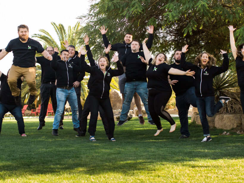
Kanopi Dev Team Jumping

How to Make a Website Last: Best Strategies and Tools

A continuous improvement approach is best for sustaining your website for the long-term.

One of my favorite things to talk about with clients is how to get the most of your budget. As Kanopi’s CEO, I spend every day doing exactly that. So much so that I created the above webinar around making your site last for the long-term. But I also wanted to touch on some of the principles and tools here in a post

In the older days of the web, it was standard to redo a site every few years. There were enough drastic changes in the early days of the internet that every few years it was imperative to overhaul a site to keep up. It cost a lot of money, and could take anywhere from 6 to 12 months depending on the scope. 

But here at Kanopi, we’ve recognized that the internet has grown up, and we’ve gotten away from that approach. Can we do a full overhaul if it’s the best option for your project? Absolutely! But we prefer to adopt a more Kaizen approach. Why? Because websites are never done. We like to say the first day of your project is actually the day your site launches, because yes, it’s wonderful that you’ve built a site, but now it has to evolve and grow over time. And the best way to do that is via a continuous improvement approach that improves it in small, positive increments over time. It’s more sustainable for both your team and your budget.

How do I apply continuous improvement to my website?

Usually you know when it’s time to give your site some love. It’s typically when you can say yes to any number of the following questions: 

  • Has your organization evolved?
  • Has your industry evolved?
  • Can your users find what they are looking for?
  • Have your users’ needs changed?
  • Is your content presented effectively for your users?
  • Is your conversion rate declining?
  • Have your search engine rankings changed?
  • Have your competitors changed their approach?
  • Is your site fast enough?
  • Does your site overuse design trends?
  • Does your site look great on mobile devices?
  • Is your site easy to use and edit?

So let me ask you: even if you can answer yes to just ONE of these questions, why not make that small improvement now? Why wait until you have lots of issues that require a larger lift? If you had a 100 year old house, you wouldn’t ignore all the small problems that accumulate over time. You’d fix them as they presented themselves, or else your house becomes an expensive money pit (or a total tear-down). 

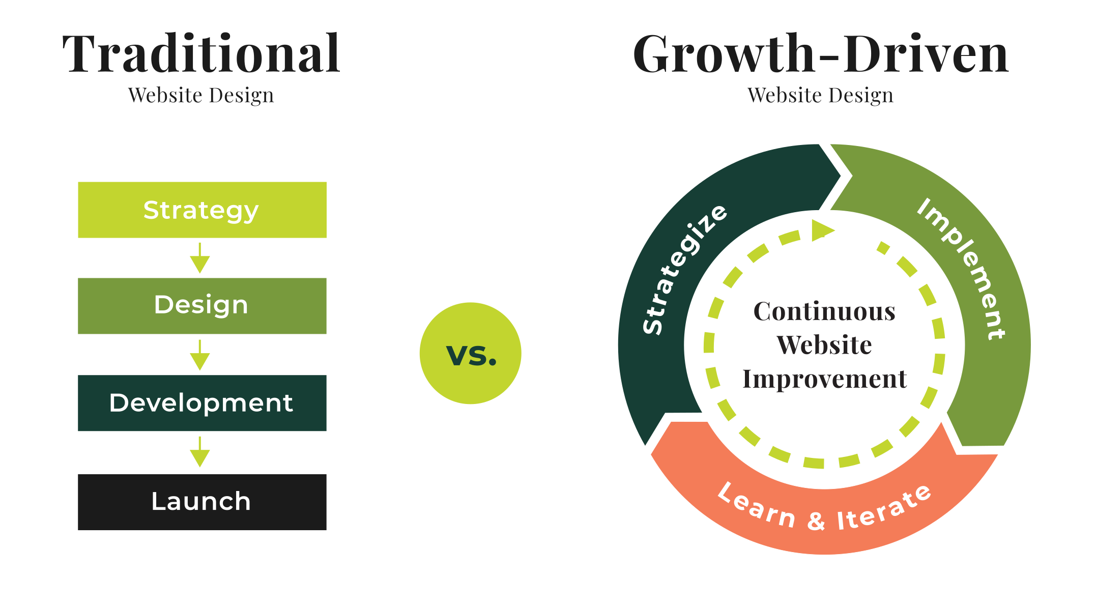
This is where you need to think about your site in terms of a circular flywheel. Don’t think about your site in terms of Strategy > Design > Development > Launch, and then let it sit untouched for a while.

Instead, think of a circular process of Strategy > Implement > Learn & Iterate, where after you Iterate, you revisit Strategy again! This will translate into a site that is always being refreshed and improved without breaking the bank.

Traditional vs Growth-Driven

Start with Strategy

No matter what we do, at Kanopi we always start with strategy. Here is where I recommend focusing on what matters most to your user and stakeholders, and don’t waste your time on things that don’t matter. This is where you can look at doing any of the following activities; 

  • SWOT analysis: outline your strengths, weaknesses, opportunities and threats. 
  • User journeys: look at how your users go through your site. What pathways do they take, and do those align with the pathways you want them to follow?
  • Personas: how well do you know your users? Are you targeting the right audience?
  • Competitive Analysis: what do your competitors do well? What do they do poorly?
  • Data & Analytics: what does your data tell you? Do you know how to interpret it?
  • Site Audit: is your content old and irrelevant? It may be time to either update or archive it.

Once you’ve taken a look at all those items, then it’s time to make a plan for moving forward. There are many areas of your site where you can make incremental — but positive — improvements to address the above strategic questions: 

  • Information architecture: should you rework your links, or change how your site is structured?
  • Usability: how can you make it easier for visitors to use your site? 
  • Design: small design enhancements
  • Accessibility: how accessible is your code and your content?
  • Performance: is your site as fast as you need it to be?
  • Content: are your calls to action clear? Does your content speak to your users?

Consider these quick wins

Decide which of these matter the most to you and can propel you forward in the best way. You can start with some low-hanging fruit, such as:

  • Navigation: remove links people click on the least.
  • Simple theme changes: refining the type and tweaking the color palette.
  • Focused design: make design alterations to the homepage or key landing pages.
  • Accessibility: make sure your content is accessible as possible, including your images. 
  • Reimagine or archive content: freshen up content that needs it, and archive content that is no longer useful or relevant. Check out this presentation about auditing your site for additional help, as well as this one on content strategy improvements you can make today.

Now it’s time to Implement

Here’s where we operationalize the plan. Break the work into two- or three-week long sprints. Determine what you can get done in that concentrated timeframe that will get you the results you need. It sounds a bit like agile development, and it is in the sense of breaking it into smaller chunks. A sprint schedule helps deliver value quickly and consistently. As we like to say: small bites create big wins!

Learn and improve from there

Now that you’ve completed that one discrete piece, measure it. How did it go? What can be improved? 

Doing these activities can also help keep the momentum going: 

  • Share wins and successes: talk with your team about what worked and how it can be made even better.
  • Measure regularly (weekly/monthly/rolling): by doing regular data checks, you can keep on top of what is still working over time. 
  • Schedule user testing: remember, your site is all about meeting your users needs. Test with users regularly to make sure you’re still meeting their needs. 
  • Use sprints to integrate feedback: you can even set up feedback on a sprint schedule. 

Will all that information, keep the momentum going and head back to Strategy! 

Continuous improvement keeps you nimble: you’ll to get into a place where you’re doing less, launching more often, and making more impact. And if something doesn’t work as well as expected, luckily it’s over after a short time frame, so you can move on to the next piece. 

And if you have a Drupal 7 site, we wrote a whole blog post specifically about how there’s still life in your D7 site. You can keep it going for a while past its expected end of life in Fall 2021. (On the other hand, if you’re determined to upgrade to Drupal 9, check out our guide on D9 planning: a guide to upgrading or extending the longevity of your site.)

Tools for making your website last

Here are some tools that can help you extend the life of your site. This is not a comprehensive list (each category has many more great options), but these are some of our regular go-tos:

SEO 

Search engine optimization is an ever-evolving practice of increasing the quality and quantity of website traffic by increasing the visibility of your website (or a specific web page) to users. But you don’t have to be an expert in SEO to make demonstrable improvements to your site with some handy tools:

  • Google Search Console, Bing Webmaster Tools: if you are not communicating directly with the search engines, you are missing out on valuable tools and information.
  • SEM Rush: research both your and your competitor’s keywords, and identify pages that rank for the terms for which you want to rank.
  • Screaming Frog SEO Spider: crawl your site like a search engine does, and see exactly what they see.  Helps identify issues and opportunities.
  • Moz Local: if you manage a local business, check out this suite of tools that helps you define data about your business, and distributes it to aggregators and sites where you want to be found.
  • Majestic: research and develop backlink strategies with Majestic’s incredibly vast link database.

Accessibility 

These days it’s imperative to make your site accessible. In many industries — and the number is growing — it’s illegal to have an inaccessible site. These tools can help you get there: 
  • Wave: a browser extension that checks for compliance issues found in Section 508 and WCAG 2.1 guidelines.
  • Lighthouse: an open-source automated accessibility testing tool. Available as a browser extension, from the command line, or as a Node module, this tool will scan the URLs for performance, accessibility, SEO, and more.
  • Axe: Axe is an accessibility testing engine for websites and other HTML-based user interfaces. It’s fast, secure, lightweight, and was built to seamlessly integrate with any existing test environment so you can automate accessibility testing alongside your regular functional testing.
  • SiteImprove: their content and accessibility audits use Web Content Accessibility Guidelines (WCAG 2.1) as its guide. The tool checks that there are no broken links or misspellings, and also identifies when page content is too dense or hard to comprehend.
  • TotA11y Plugin: this tool helps visualize how your site performs with assistive technologies.

Additionally, here’s another blog post we wrote about Kanopi’s Favorite Accessibility Tools. Also read our thoughts on how content editors hold the keys to an accessible website.
Usability 

It’s critical to test with your users to make sure they are getting the information they want when they want it. These tools will help achieve that:

  • UserTesting.com: a usability customer experience testing platform that gets on-demand feedback about a product or service from real users.
  • HotJar: HotJar uses heatmaps so you can see how visitors are really using your website, collect user feedback and turn more visitors into customers.
  • Crazy Egg: you can use Crazy Egg to learn what your web visitors are doing. Heatmaps, recordings, A/B testing & more.
  • Optimizely: It’s best known for its A/B testing, and allows for terrific segmentation for more accurate results. 

Measuring Data 

We always recommend measuring what matters, and that will be different for every organization. What matters to you? Is it the number of page views? Is there a certain conversion goal you are trying to hit (like number of donations, or email newsletter sign-ups)? Is it page views? Or perhaps speed? 

  • Google Analytics: this is Google’s free web analytics service that allows you to analyze in-depth detail about the visitors on your website
  • Google Tag Manager: a free tool that allows you to manage and deploy marketing tags (snippets of code or tracking pixels) on your website or mobile app without having to modify the code.
  • Lighthouse (again): because this open-source automated testing tool does so much more than just accessibility, we had to include it here as well. Available as a browser extension, from the command line, or as a Node module, this tool will scan the URLs for performance, accessibility, SEO, and more.
  • GTmetrix: a free tool that analyzes your page’s speed performance. GTmetrix generates scores for your pages and offers actionable recommendations on how to fix them.

However you measure your data, you will have to track your users. And it’s critical to find the balance between learning from your users without getting insidious with how the data is being collected. We all want to know more so we can make better websites that attract users, but we need to be responsible about it!

With small bites, you can make your website last!

At Kanopi, we love to say, “small bites create big wins!” And it’s just so doable: you really can make huge improvements in smaller chunks to avoid feeling overwhelmed and also keep your budget in check. 

But if you do need the assist to make your website last for the long-term, that’s our specialty. Contact us. We’d love to help. 

As-Needed Website Design Support with Kanopi

Kanopi’s Support Services can evolve your website design.

Have you ever wished you could access an entire website agency’s genius on an as-needed basis? Have you worked with website support agencies that were good at keeping your site running and your software up to date, but less able to ensure its continued success? 

Web support is one of our strengths, mainly because we do it differently than other agencies. Support at Kanopi Studios is so much more than quick bug fixes and software updates; you’ll get access to an entire team of senior-level experts as needed, from user experience to design to development — all within a set monthly budget. 

Here are some examples of design services you can get in support:

  • Rethinking your navigation.
  • Incorporating new branding (logos, colors, typography, theming, etc). 
  • Reimagining your homepage, increasing conversions, while keeping your software up to date.

The Kanopi team’s ability to offer a full range of flexible services is just one of the ways we go above and beyond to support our client’s needs.

Turning concepts into masterpieces

“Many of our clients start with great ideas of their own, and may even have sketches of what they are looking for,” says Denise Beyer, Director of Support. “Bringing a designer in to hear their ideas, learn about their goals, and ask the right questions always adds an extra level of creativity and polish to the final design.”

Even a small investment in design can help you save budget in the long run. A few quick design mockups can help teams evaluate options and think through solutions before they are built, ensuring that the work gets done right the first time.

Design-thinking supports user needs

Kanopi’s designers and user experience strategists collaborate with clients to analyze the challenges your users face and find the best solution to help solve them.

“If your users repeatedly call you for help with the same issue, or have a hard time finding information on your site, our user experience team members can help,” Denise says. “We’ve worked with nonprofits to help increase their donations, helped website users find answers to common questions, increased conversions for businesses, and much more.”

Making smart look and feel updates

The Kanopi design team also offers branding support, whether you need an updated logo, a fresh look on specific pages, or a re-skin for your entire website.
“Some of our clients work with outside branding agencies and just need their websites to fit a new look, and others look to our team to help them update their brand design,” Denise shared. “We meet our clients where they are and are available to help with whatever is needed.”

See our work in action

Below, we’ve included a few examples of design projects that our support team has completed for our amazing clients. 

A redesigned homepage and new navigation for the Colorado Health Foundation

New, translatable page templates were designed to enhance the visibility of Colorado Health’s focus areas and priorities. This new design optimizes website real estate and standardizes design elements and components to ensure a cohesive and impactful presence. We also removed their complicated mega menu and introduced simple navigation with clear user journeys.

Colorado Health Foundation homepage before Kanopi's upgrades
BEFORE: Colorado Health Foundation’s Homepage
Colorado Health Foundation's Homepage after Knaopi's upgrades
AFTER: Colorado Health Foundation’s Homepage

A reworked mega menu elevated TopBloc’s content and bolstered their identity

TopBloc recognized that users were getting stuck searching for content, so they came to Kanopi for a focused fix with their mega-menu. Based on user research, we crafted a revised UX strategy and meticulously reworked and renamed items in their information architecture, ultimately elevating their site’s content and bolstering their identity. Both Desktop and Mobile menus were redesigned and developed for a seamless flow and pages are accessible and clear.

TopBloc's previous menu before Kanopi's upgrades
BEFORE: TopBloc home page without the mega menu
TopBloc's menu and navigation after Kanopi's upgrades
AFTER: TopBloc’s new mega menu

An improved user experience for The Louis Riel Institute

Our redesign for the Louis Riel Institute website’s archives gives the site a fresh, modern look, complete with an updated color scheme and an intuitive layout that enhances the user experience.

Louis Riel Institute Archives Homepage before Kanopi's upgrades
BEFORE: Louis Riel Institute Archives Homepage
Louis Riel Institute Archives Homepage after Kanopi's upgrades
AFTER: Louis Riel Institute Archives Homepage

A visual refresh for First Tee’s Partner Pages

A CRO audit led to the redesign of First Tee’s partner page. The project utilized existing block patterns and introduced a couple of new ones to enhance user engagement and conversion rates.

First Tee Partner Page before Kanopi's improvements
BEFORE: First Tee Partner Page
First Tee Partner Page after Kanopi's improvements
AFTER: First Tee Partner Page

Impactful improvements to UCSF HIVE

UCSF Health Innovation via Engineering (HIVE) needed a new refresh of the homepage, navigation and people pages in order to better display and surface their content. An accessible video on the homepage adds interest while keeping the site WCAG compliant.

UCSF HIVE Homepage before Kanopi's upgrades
BEFORE: UCSF HIVE Homepage
UCSF HIVE Homepage after Kanopi's improvements
AFTER: UCSF HIVE Homepage

New functionality for The University of Michigan School of Information (UMSI)

Often our Support team is tasked with creating new pages using existing brand signals, and we did just that for University of Michigan. UMSI conducts research, builds solutions and prepares students to bridge people, information and technology. They needed a new section on the site that would be a centralized media center and newsroom to connect journalists and government officials with UMSI thought leaders and faculty experts. This included a section on “trending topics” which allows users to filter by topic to easily find faculty experts.

University of Michigan School of Information (UMSI)'s Media Center page
UMSI’s new Media Center page
University of Michigan School of Information (UMSI) page for professor Cliff Lampe
“Trending Topics” were added to individual bio pages as well to make it easier for users to find faculty experts.

To further extend their media offerings, UMSI launched a new Podcast called, “Information Changes Everything.” For this new podcast, there needed to be website functionality to promote and share the information on each episode, as well as the written transcript following each episode.

University of Michigan School of Information (UMSI) podcast landing page
The landing page for the podcast
University of Michigan School of Information (UMSI) individual podcast page, this one for Jeff Furman of Ben & Jerrys Ice Cream.
The individual episode page

Working with Kanopi’s support team

The Kanopi team looks at your site holistically, rather than as a series of tasks. When you work with us, you’re hiring a team of senior-level experts who are available on-demand to help with all types of website updates. And no job is too big or too small.

Ready to learn more? Contact us to discuss ongoing improvements for your website. 

Montage of various mood boards

What is a style tile (or mood board), and why is it helpful?

Kim Lai
Kim Lai

As a designer, it’s always exciting when a client says “Let’s start from scratch.” You are the unicorn, the holy grail, in other words, a designer’s dream client.

But this is where your project can get into trouble. Without a framework, there’s a high chance your team is presented with a design that neither represents your voice nor (and more importantly) speaks to your target audience. 
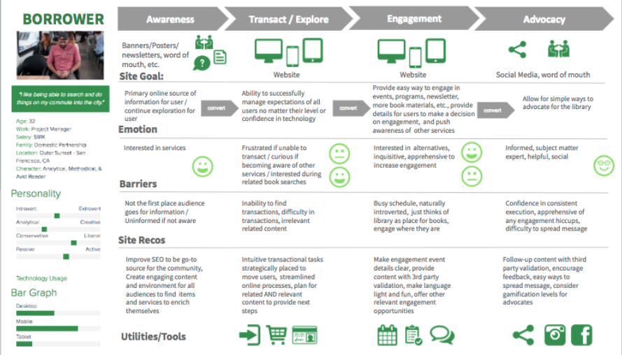
Mood boards are an essential step towards creating any visual language in this type of scenario. At their core, a mood board is a curated collection of images that visually represents the creative direction of a project. They will typically include existing elements of your brand such as color palettes, typography, illustrations/iconography, and image style direction – all wrapped up to meet a particular mood, voice and tone. Style tiles take this a step further and include user experience elements like form fields, component layout direction, etc. 

These all will feed into your Pattern Library. Learn more about pattern libraries here.

These directional deliverables are typically conceived during or after the strategy phase, once a solid approach is derived from various activities like stakeholder and user research, content evaluation and competitive analyses, and can be done simultaneously with information architecture (IA) work and wireframing. 

But to be clear, style tiles are NOT Layouts. They are meant to be used as a means to evoke a specific emotion or style within the design parameters of your brand, giving the design team a visual path forward when creating your website. The mood set will be applied to the layouts once the user experience approach is approved. And those layouts will be carried forward into development. 

Below are four reasons why mood boards/style tiles are an essential step in design development.

They aid designers to hone your concept in a low stakes environment. 

This practice allows a designer to explore various style concepts quickly without burning through your budget. By focusing energy on one aspect at a time, a designer is able to create more efficiently because they don’t have to consider all design elements at once. 

Style tile for BADCamp, showing use of images, buttons, colors, and statistics.
The style tile for BADCamp

They communicate design vision in a valuable, shareable format.

It can be very complicated to express your visual ideas using words alone. Style tiles give you an idea of what their finished product might look like and avoid any misinterpretations. It creates a shared vocabulary to use when discussing design concepts that can be used by both client and designer.

These three style tiles were created using the following adjectives: trusting, modern, corporate, impactful, and energetic.

They allow us to collaborate on designs early.

Using this iterative approach, designers create opportunities to jumpstart invaluable aesthetics conversations. Getting your feedback and buy-in early and often provides space for the designer to ask followup questions and allows you to brainstorm ideas as the design progresses. In this approach, we’ve opened communication lines that give you more ownership over your designs.

Style tile for Moscone Center, showing colors, photography, buttons, and typography.
Style tile for Moscone Center

Demonstrating and maintaining trust with you is critical. 

The beginning of a client/designer relationship is the most tenuous when both parties are building their relationship. A style tile educates a designer on your aesthetic preferences while you gain trust in your designer’s vision.

Style tile / mood board for General Data
Style tile for General Data

Without style tiles, a lot of time could be sunk into designed web pages that do not work for your needs. At this point it’s difficult to backtrack because a lot of decisions — layout, colors, graphics, imagery — have been decided and will need to be re-considered. This can have a cascading effect on other designed elements which will negatively impact your budget and timeline. 

For example, let’s say you wanted to change a button’s color from blue to orange. Seems like a simple color shift! But a designer would have to consider how that affects secondary buttons, tags, text links, etc. to ensure the user experience is still intuitive: if orange is the new link color, then anything else that needs to be a link should also be changed to orange to manage user expectations.

The only time we feel comfortable skipping this useful step is when branding guidelines have been established and you are not looking for any design refresh. Otherwise, style tiles are an integral part of our design process. It helps to build a strong  collaborative relationship with you through a holistic, visual definition for your organization. The design process will feel less nebulous as you are consulted during multiple touchpoints throughout the process. 

And if you need help creating the mood for your site, contact us. We’d be happy to help.