
As a designer, it’s always exciting when a client says “Let’s start from scratch.” You are the unicorn, the holy grail, in other words, a designer’s dream client.
But this is where your project can get into trouble. Without a framework, there’s a high chance your team is presented with a design that neither represents your voice nor (and more importantly) speaks to your target audience.
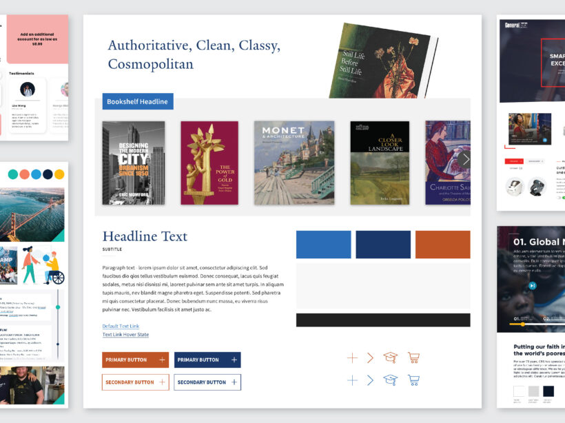
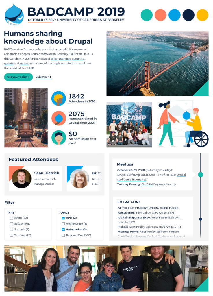
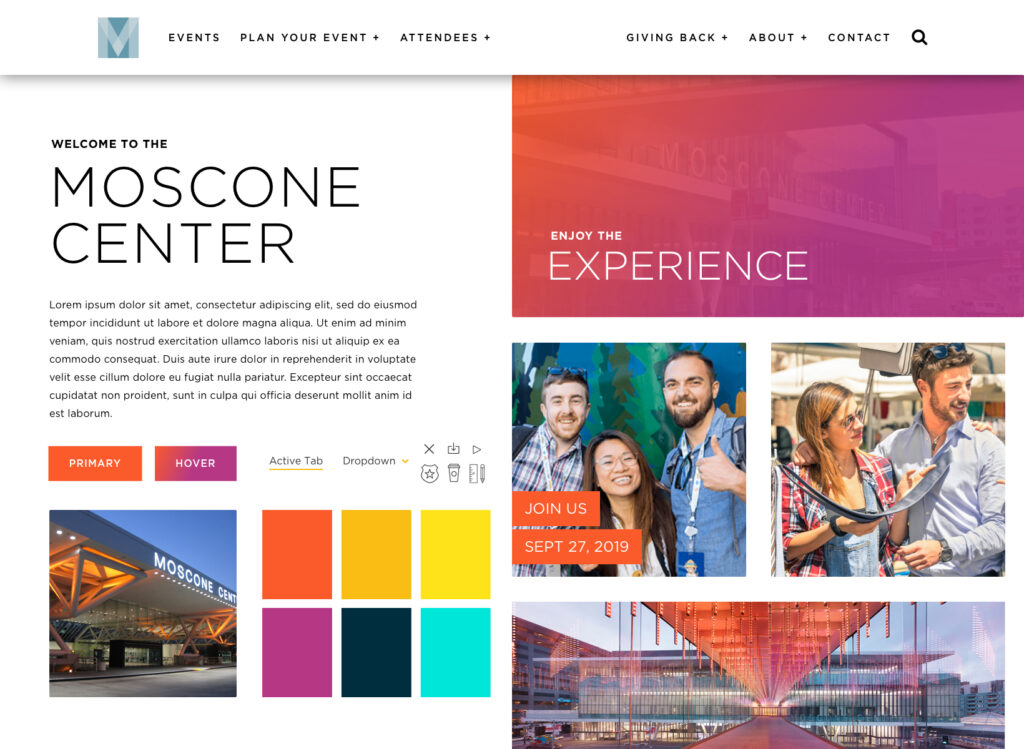
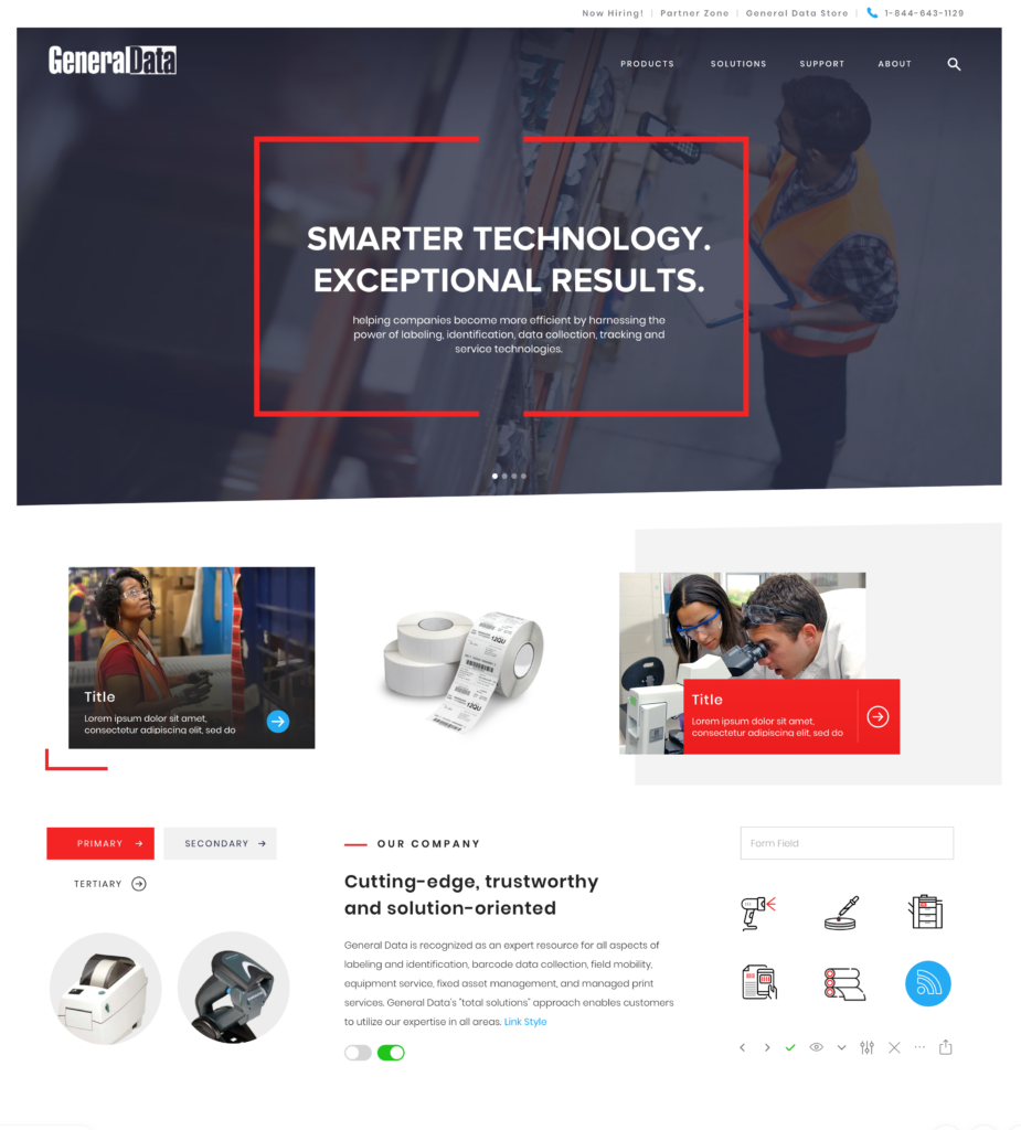
Mood boards are an essential step towards creating any visual language in this type of scenario. At their core, a mood board is a curated collection of images that visually represents the creative direction of a project. They will typically include existing elements of your brand such as color palettes, typography, illustrations/iconography, and image style direction – all wrapped up to meet a particular mood, voice and tone. Style tiles take this a step further and include user experience elements like form fields, component layout direction, etc.
These all will feed into your Pattern Library. Learn more about pattern libraries here.
These directional deliverables are typically conceived during or after the strategy phase, once a solid approach is derived from various activities like stakeholder and user research, content evaluation and competitive analyses, and can be done simultaneously with information architecture (IA) work and wireframing.
But to be clear, style tiles are NOT Layouts. They are meant to be used as a means to evoke a specific emotion or style within the design parameters of your brand, giving the design team a visual path forward when creating your website. The mood set will be applied to the layouts once the user experience approach is approved. And those layouts will be carried forward into development.
Below are four reasons why mood boards/style tiles are an essential step in design development.
They aid designers to hone your concept in a low stakes environment.
This practice allows a designer to explore various style concepts quickly without burning through your budget. By focusing energy on one aspect at a time, a designer is able to create more efficiently because they don’t have to consider all design elements at once.
They communicate design vision in a valuable, shareable format.
It can be very complicated to express your visual ideas using words alone. Style tiles give you an idea of what their finished product might look like and avoid any misinterpretations. It creates a shared vocabulary to use when discussing design concepts that can be used by both client and designer.

They allow us to collaborate on designs early.
Using this iterative approach, designers create opportunities to jumpstart invaluable aesthetics conversations. Getting your feedback and buy-in early and often provides space for the designer to ask followup questions and allows you to brainstorm ideas as the design progresses. In this approach, we’ve opened communication lines that give you more ownership over your designs.
Demonstrating and maintaining trust with you is critical.
The beginning of a client/designer relationship is the most tenuous when both parties are building their relationship. A style tile educates a designer on your aesthetic preferences while you gain trust in your designer’s vision.
Without style tiles, a lot of time could be sunk into designed web pages that do not work for your needs. At this point it’s difficult to backtrack because a lot of decisions — layout, colors, graphics, imagery — have been decided and will need to be re-considered. This can have a cascading effect on other designed elements which will negatively impact your budget and timeline.
For example, let’s say you wanted to change a button’s color from blue to orange. Seems like a simple color shift! But a designer would have to consider how that affects secondary buttons, tags, text links, etc. to ensure the user experience is still intuitive: if orange is the new link color, then anything else that needs to be a link should also be changed to orange to manage user expectations.
The only time we feel comfortable skipping this useful step is when branding guidelines have been established and you are not looking for any design refresh. Otherwise, style tiles are an integral part of our design process. It helps to build a strong collaborative relationship with you through a holistic, visual definition for your organization. The design process will feel less nebulous as you are consulted during multiple touchpoints throughout the process.
And if you need help creating the mood for your site, contact us. We’d be happy to help.