Children’s Organ Transplant Association (COTA)
Providing fundraising assistance and support for medically fragile families.
Client Overview
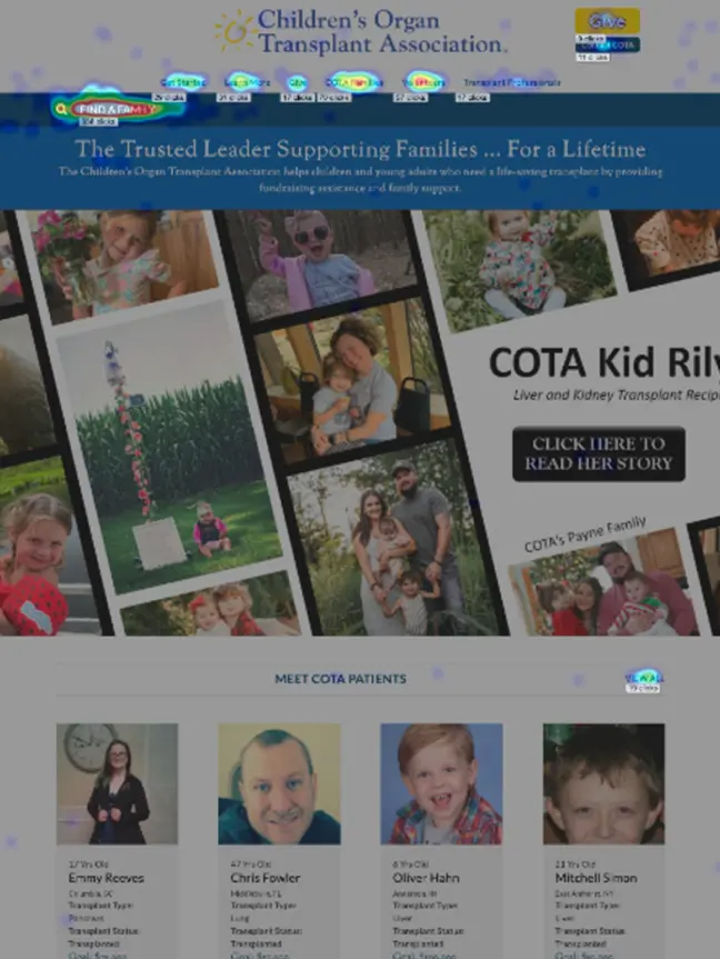
The Children’s Organ Transplant Association (COTA) helps children and young adults who need a life-saving transplant by providing fundraising assistance and family support.
COTA Mobile Gallery
The challenge
COTA had two separate projects — their main site and client portal— that had to work together seamlessly to provide support for the families using their services. As work progressed, they decided we’d also be a good fit for their campaigns project.
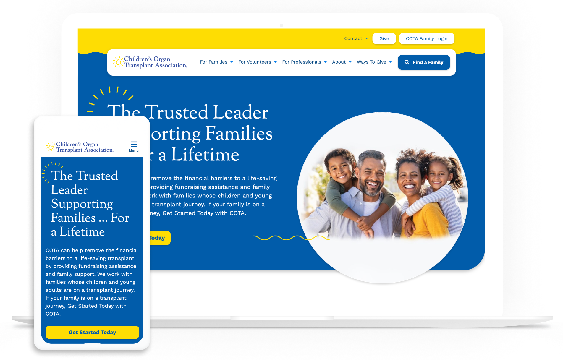
Their most pressing issue was that they’d outgrown their main WordPress website. The outdated design was neither accessible nor mobile-friendly, and it was slow to load, taking a full 15.9 seconds to become fully functional for visitors on a mobile device.
Perhaps even worse, their campaigns application website — a network of individual fundraising websites that help families raise funds — wasn’t on WordPress. This made it difficult for COTA staff to find anyone to support it.
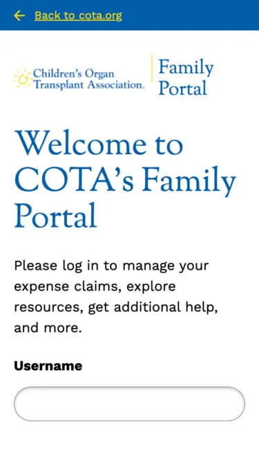
Lastly, COTA needed a way for families to submit their expenses for medical needs, travel, and more. Previously, families were submitting via downloadable forms, and there was no dashboard to allow them to manage their expenses. This part of the project would need to be created from scratch.
The process
Click Maps
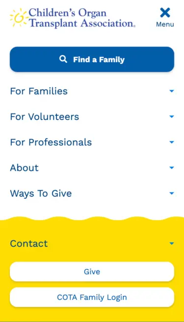
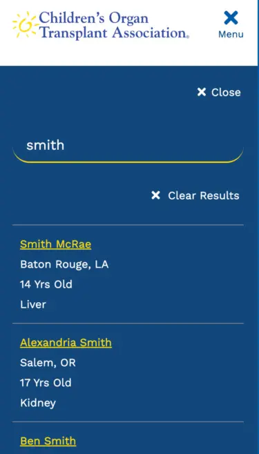
Using click maps, we learned that the two most visited navigation items on both desktop and mobile were “Find a Family” and “Submit Expenses.”
Wireframes
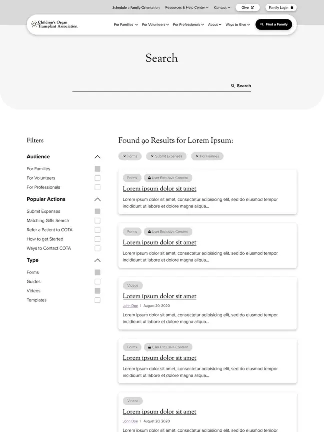
Using the info we gathered from our discovery research, we improved their navigation and content strategy to surface the right information at the right time.
The solution
After a comprehensive discovery process, we defined the main goals:
- optimize the site to be more performant, particularly on mobile,
- improve the overall visual structure and content strategy to increase time of engagement,
- create a sitemap to define overall information architecture that improves the user journeys, reduces friction points, and allows users to surface information relevant to their needs efficiently,
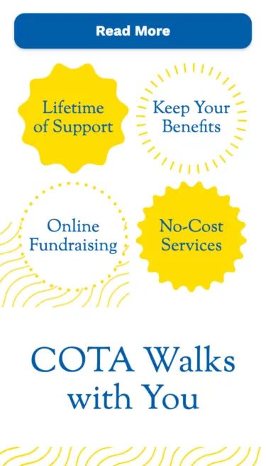
- create a content strategy to define how new site content will meet both user and COTA needs — including a plan for creating and modifying accessible, readable content, with set benchmarks to measure success.
Our discovery also informed the mood boards, wireframes, pattern library, and the hi-fidelity layouts for the main website and client portal.
The campaigns application was a straight rebuild onto WordPress — with little alteration to the original visual layouts, so no wireframes or layouts were required. This way, COTA could quickly launch a network of over 2,800 multi-sites from the main COTA domain without disrupting the clients using them.
Key features
Client Portal
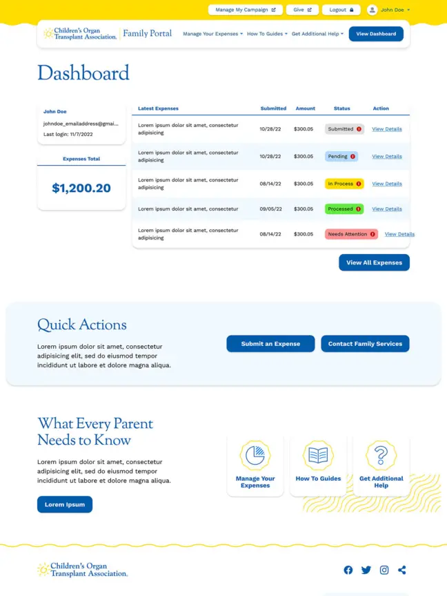
Thanks to a more user friendly and secure form submission, families can now upload expenses, calculate expense totals, and view them all in the portal. The portal also provides how-to guides and tutorials.
Flexible Components
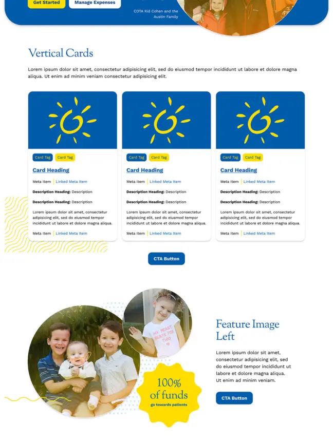
The modular design allows for flexibility in creating new pages and templates, giving COTA staff more control over maintaining and evolving the website.
Content Strategy
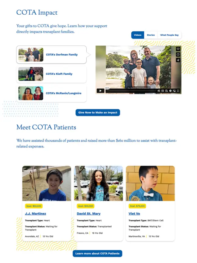
We created a comprehensive content strategy to guide effective storytelling, voice and tone, and how to best focus on what makes COTA unique in their fundraising space.
The result
Working on all three projects simultaneously resulted in a holistic and cohesive approach, ensuring all three could work together visually and technically. We reimagined COTA in a modern, beautiful way that lets families get the support they need seamlessly. On the backend, the component-based designs give the admin team more control over future site expansion and ongoing maintenance.