Google recently rolled out its new search generative experience (SGE) to select users based in the United States.
In this blog, we outline what SGE is, why it matters, and how it’s predicted to impact the healthcare industry and its websites.
Before we do that, though, let’s run through a quick Google & AI history lesson:
History of Google & AI
For 25 years, 80% of Google’s revenue came from ads.
At the same time, search is declining: 25% predicted as folks embrace Artificial Intelligence (AI).
We’re trained to search through learned behavior: unnatural phrasing, lack of verbs, and unconversational.
AI allows us to search using full-sentence structures, following our natural behavior and conversations.
What is Search Generative Experience or SGE?
Google’s Search Generative Experience (SGE) is an experiment using AI to create search engine results page content. Believe it or not, Bing is already doing this and has been doing it for a while now.
Google continues to change the format, layout, content, data, and other elements in SGE results.
What’s being displayed?
Collapsed view (AI-generated content is collapsed for the searcher)
Opt-in (a prompt appears at the top of the page, allowing searchers to opt-in to an AI-generated overview of their search)
Long(er) queries (a pediatrician who accepts Aetna in Chicago) display specific locations & people knowledge cards.
Informational queries (e.g. “What is stiff neck?”) display an AI-generated top-of-page snippet.
Local queries (e.g. “best neurologist near me”) display doctor profile knowledge cards.
Where’s Google getting its data?
Listings (Google Business Profiles)
Reviews (Google Business Profiles)
Site content, Find a Doctor (FAD) & third-party sites like Yelp.
Search engine marketing (SEM) impact
23% of ads show up on top of SGE
32% of ads show up below SGE
0% of ads show up within SGE (for healthcare)
What we’re seeing
Google continues to experiment, though we’re seeing:
Data populating SGE directly from Google Business Profiles. This includes listings & review data.
Website content that is more structured and sitting on heavily schema-tagged pages is showing more often.
Google is “summarizing” page content – including patient reviews on provider pages and content on well-structured content pages.
Paid ads are not showing most of the time (at least not for now.)
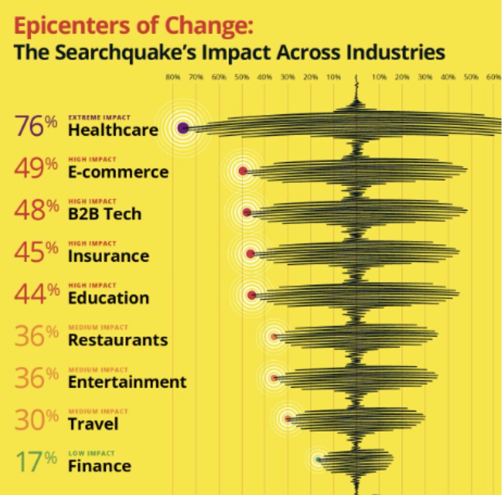
Organic traffic to healthcare websites is predicted to decline. An 18-75% loss could be seen overnight. Education sites should prepare for a decline as high as 44%.
The hardest-hit sites will be content pages (such as Healthgrades, WebMD, Mayo Clinic, etc.) and any content pages on your healthcare organization’s website.
Things to consider
Expect organic traffic to decline dramatically.
Already, we’re seeing changes to how websites are discovered (or not discovered).
Queries that contain “who, what, and where” type questions will likely see the most declines in organic traffic to healthcare sites.
Informational queries that are more research-based are now more likely to reduce organic traffic, whereas they once could have led to traffic to sites .
Expect a focus on people over paid; your doctors, physicians, healthcare professionals, and medical school faculty will be heavily prioritized to show in SGE results.
Changes will affect how people (doctors, faculty, etc.) appear in SGE, making listings and reviews over paid ads all the more critical to your healthcare website’s content strategy right now.
Focus on search intent, and what people mean when they search and find healthcare sites.
Consider ways to craft content for long-tail queries.
Prioritize listings and reviews. Ensure that data is robust, up-to-date, properly structured, and connected to platforms to help drive better impressions and accuracy on Google and other sites.
Don’t ignore Google reviews (respond, generate, etc.)
Build relationships and horizontal pathways between content on your healthcare website.
Focus on E-E-A-T
Experience, Expertise, Authoritativeness, and Trustworthiness come from your brand. We can help you connect the dots on your website and tell your story if you fear this is currently lacking from your site.
With the UCSF Department of Surgery in particular, it’s about making connections between content about health conditions, people who treat them, and the places where surgeons can see patients with related conditions.
Each page should be properly structured and display an optimized content hierarchy, taking into consideration how Google can reference information in SGE.
And most importantly: ensure every page is schema-tagged!
Focusing on website transactions
As your healthcare website content continues to be distributed to train AI algorithms, websites will increasingly become places where folks need to transact, not learn.
Websites need to focus on these key transactions:
Phone calls to make appointments.
Online appointment bookings.
Other calls to action (newsletter sign-up, apply for a clinical trial, etc.)
SEO will become SGO
As SGE continues to evolve, SEO will increasingly resemble SGO. Healthcare websites need to pivot towards becoming transactional hubs, facilitating intuitive actions such as appointment bookings and clinical trial sign-ups directly from search engine results pages (SERPs).
While Google’s Search Generative Experience reflects a paradigm shift in search engine functionality, it also presents exciting opportunities for hospitals, clinics, and medical schools to enhance their digital strategies.
By embracing AI-driven data analyses, optimizing content for search intent, and prioritizing patient, donor, and resident engagement through transactional website functionalities, healthcare organizations can proactively adapt to the changing digital landscape and continue to thrive in this emerging AI-centered online world.
Your organization has just rebranded its website. It’s got a beautiful, modern design full of updated visuals and tons of ways for supporters to engage with your mission—great!
Weeks and months go by. You’re still promoting your campaigns, programs, and newsletter sign-up options like normal, but you don’t notice any changes in your performance. Your online fundraising results seem roughly the same as before.
Was the website investment a mistake? Did it make a difference?
Unfortunately, major website updates might not make a difference for your digital bottom line if your online marketing foundation is shaky to begin with. The purpose of your organization’s website is to communicate and inspire action. Rebrands and design updates can help you excel at the former, but if you’re neglecting the latter, you’re facing an uphill battle.
The calls to action, or CTAs, on your website (as well as your emails and social media posts) convert online engagement into a tangible impact for your organization. With poor CTAs, even the most well-designed nonprofit or higher education websites can struggle to generate value and on-the-ground engagement.
Even experienced marketers can benefit from revisiting the basics of conversions and CTAs to ensure your website is making the most of current best practices. Improving your website’s ROI is easily approachable once you get a refresher on the basic concepts at play. Let’s take a look.
What’s a conversion?
In the marketing world, a conversion occurs whenever a reader or web visitor completes a specific target action. For nonprofit organizations, for example, these target actions typically include:
Other organizations might have target actions such as:
Downloading a white paper
Registering for a webinar or event
Signing up to receive emails
Purchasing an item
Conversions generally revolve around a specific endpoint in a user journey like the examples listed above.
Your website and other marketing materials will have already stewarded and encouraged web visitors to reach that point and feel ready to take the target action. You can drill down and track intermediary steps like clickthroughs to your website from an email as distinct, unique conversions as part of the process to reach the ultimate desired action.
Essentially, you can think of a conversion as the final step a visitor takes that gets you closer to a concrete goal like increasing campaign revenue or your donor acquisition rate. In other words, it’s the point when an interested visitor is officially “converted” into a secured donor, volunteer, email recipient, etc.
What’s a call to action (CTA)?
A call to action is the explicit way in which you ask readers or site visitors to take a target action.
Calls to action usually include buttons or graphics and include text and visuals that entice users to take action. All CTAs should direct users straight to a target landing page, the web page that includes the form or instructions for how to take the target action.
For nonprofits, a blanket “donate now” button in your website’s header is considered best practice. You’ll also need to include more targeted asks throughout your website depending on each page’s purpose in order to support your organization’s more specific goals, like email, volunteer, recurring gift, or membership sign-ups.
Essential elements of effective CTAs
So what makes an effective call to action? Each CTA will look different depending on its unique context and the goal it’s supporting, but these are some essential elements that all CTAs should include:
1) Relevance
Simply put, what you’re asking readers to do must make sense. What can you assume users are looking for or seeking to accomplish when they visit specific pages of your website? Consider these factors:
A user’s intent and goals when visiting a specific web page. Are they looking to learn more about something? Are they looking to take a specific action? Depending on the purpose of the page, determine what would make the most sense to ask this user to do.
The specific context of the message. For instance, if it’s part of an email stream for previous volunteers, ask them to learn more about your new opportunities and join your next event rather than sign up for an orientation session.
A user’s readiness. Do they need more information before being likely to take your target action? For example, a brief section of your “ways to give page” about planned gifts will be more successful if it asks readers to click through to a more detailed page about how bequests work. That page is where a more specific request to set up a bequest will make the most sense contextually in the user’s journey.
Ensuring relevance requires putting yourself in a visitor’s shoes. When adding or updating your CTAs, look at the page in question and think about who lands on it and why. Putting thought into the page’s context will allow you to add truly relevant additional CTAs to it that will boost its conversion-generating power.
For some organizations that offer direct services to large audiences, like healthcare institutions, there could be much more complex user intents and goals at play. Their web designs and CTA strategies need to be more carefully plotted out to ensure each page’s CTAs are relevant to visitors’ goals and journeys. Check out Kanopi’s healthcare web design guide for an overview of what these strategies look like in action.
2) Compelling language
Your CTAs, whether they’re on a web page, email, marketing text message, social post, or even a printed mailer, need to stand out. What would you be more likely to click—“click here to donate” or “give a lifesaving gift today”?
To encourage clicks and engagement, use compelling and engaging language. Consider these best practices:
Use active voice and action verbs.
Avoid industry jargon.
Use “power words” that help tap into supporters’ emotions, curiosity, or concern.
Avoid using “we” and centering your organization—the focus should be on your supporters.
Evoke a sense of urgency or time sensitivity when appropriate.
Take a look at the donate and sign-up buttons on your website and email drafts and quickly review their language. Are there any immediate improvements you can identify? These are fast, easy changes you can make, and while they might seem small, they add up. If just 10 more supporters are encouraged to click through, learn about your mission, and give a gift for the first time, those are 10 more donors and gifts you wouldn’t have otherwise acquired!
3) Specificity
Similarly to the importance of compelling language, your CTAs should also be very clear. Readers should immediately understand what you’re asking of them and where you’ll direct them if they click through.
When drafting the language for your CTA buttons, links, and graphics, double-check that you’re being as clear as possible. A good rule of thumb is to keep your text short and direct, balancing conciseness with the compelling action tips listed above.
For most organizations, this will be fairly easy since most of your asks are quite straightforward—donate, sign up, learn more, contact us, etc.
More complex institutions should put extra consideration into the clarity of their CTAs. For example, college websites have to house a lot of diverse material that will be used by a wide range of audiences—students, alumni and families, staff, donors, community partners, and more. Understanding your audiences, making asks that are relevant to their goals, and using compelling but specific language will make a smoother experience for everyone who arrives on the website.
4) Prominent design and placement
You also need to consider the visual look and placement of your CTAs. Follow these best practices:
Visuals
For buttons, use bold colors that complement your website’s color scheme and stand out against the background. Ensure that the text color has sufficient contrast to be easily seen.
For graphics, also use bold colors that complement your main color scheme, but consider the additional visual elements. Your logo and well-designed illustrations will work, but photos of people tend to best catch users’ attention.
Placement
If you want readers to see something, make it easy to find! Bold buttons at the end of paragraphs and banner graphics at the tops and bottoms of pages are natural placements for CTAs.
Charitable organizations should include a “donate now” button on their website’s running header.
Including multiple CTAs is fine and often recommended, but don’t overdo it—keep each page focused on its core purpose.
If you have embeddable email sign-up forms, calendars, and donation tools, make use of them! These elements streamline the user experience and can boost engagement.
CTAs should be prominent but shouldn’t feel haphazardly placed. Each of the essential elements discussed in this guide involves considering the user experience and the context in which you ask visitors to take target actions. If you take a moment to think through the CTA from the user’s perspective, it becomes much easier to identify the right placements that will ensure it’s seen and acted upon.
Getting started and measuring your performance
Once you’ve got a solid grasp on call-to-action best practices and implement updates to your strategy, how do you ensure they actually make a difference? Follow these steps on an ongoing basis:
Set clear goals. What are the specific outcomes you want to see as a result of updating your approach to CTAs? For example, you might aim to increase online fundraising conversions by 25% overall in the next 6 months, or you might set channel-specific goals, like increasing email clickthroughs by 15%.
Create dedicated landing pages to support your goals. It’ll be easiest to track your progress when all the CTAs that are part of a campaign all point users to the same place. This allows you to review incoming traffic to a single landing page and its specific sources without wading through unnecessary amounts of irrelevant data. The landing pages should include the forms or instructions that will allow users to complete the final target action that you’re asking of them.
Actively track your conversion rates. By funneling traffic to a dedicated landing page and tracking the number of form completions, you can calculate your conversion rates for the different CTAs that send users there. Web analytics tools and website plugins can greatly simplify this task. However you collect the data, make sure to intentionally track it so that you can measure your progress over time.
Correlate performance to specific strategies. With conversion data in hand, you can take a closer look at your highest- and lowest-performing calls to action. What strategies do they employ? What audiences are they targeting? These are the insights that will help you continually improve your conversion rates and better understand your audience’s motivations for engaging with your organization.
Test and refine your CTAs. With everything you’ve learned, make targeted changes to your CTAs and track the results. For a more systematic approach, try an A/B test in which you present two similar audiences with slightly different variations on the same CTA. Keep the process running with fine-tuned updates, testing, and analysis.
The data collection and analysis aspects of an effective CTA strategy are often harder for small shops to handle, which is why third-party help can be so valuable. Web designers and consultants can help with your CTA strategy, develop custom landing pages, and provide analytics solutions to help you roll out a professional-grade conversion strategy.
The bottom line is that conversions (and the calls to action that create them) must be approached intentionally. A beautiful website is only a true asset for your organization when it can make an impact, and that’s accomplished by understanding and adapting the strategies discussed here. Best of luck!
As spring breezes sweep away the cobwebs of winter, it’s not just our homes that deserve a thorough cleaning: your websites do, too! Like any living space, your website can accumulate clutter over time, impacting its performance and user experience.
Join us as we explore some of the tasks that should be on every website owner’s spring cleaning checklist.
Remove and update 404 links
Imagine you’re tracking down an important piece of information on the internet, only to hit the dreaded 404 error — foiled again! If your website aims to attract and delight end users, providing them with a positive user experience while they visit your site is crucial. When end users encounter a broken link, it can be frustrating and diminish their trust in your website.
From an SEO (search engine optimization) standpoint, 404 errors can be a red flag to search engines, suggesting a lack of upkeep that can negatively influence your site’s ranking. Additionally, broken links disrupt the flow of search engine crawlers, hindering the site’s ability to be indexed correctly, which impacts how easily a user can find your website when performing an online search.
Ensuring that all links lead to the intended content keeps users engaged, encourages them to explore more of the site, and helps maintain a positive reputation with visitors and search engines.
How to check for 404 links
This task may seem daunting, especially for e-commerce or large-scale websites, but various free tools scrape your website for not only 404 errors but other unsuccessful HTTP response codes. As Quality Assurance (QA), I’ve used the following links and can vouch for both their thoroughness and a pleasant user interface.
Among the most time-intensive yet vital tasks in your website’s ‘spring cleaning’ regimen is the thorough review of your content. Whether you’ve recently upgraded to the latest version of Drupal or are creating a new website, the content you initially uploaded was current. The real challenge lies in maintaining that freshness over time. But the more you can keep it current, the better it is for your site’s SEO.
It is imperative to regularly evaluate and update your website’s content to ensure that your information remains relevant, engaging, and meets user’s needs. This task, unfortunately, does require manual effort (but can be made more enjoyable by pouring a glass of wine while you review your content.)
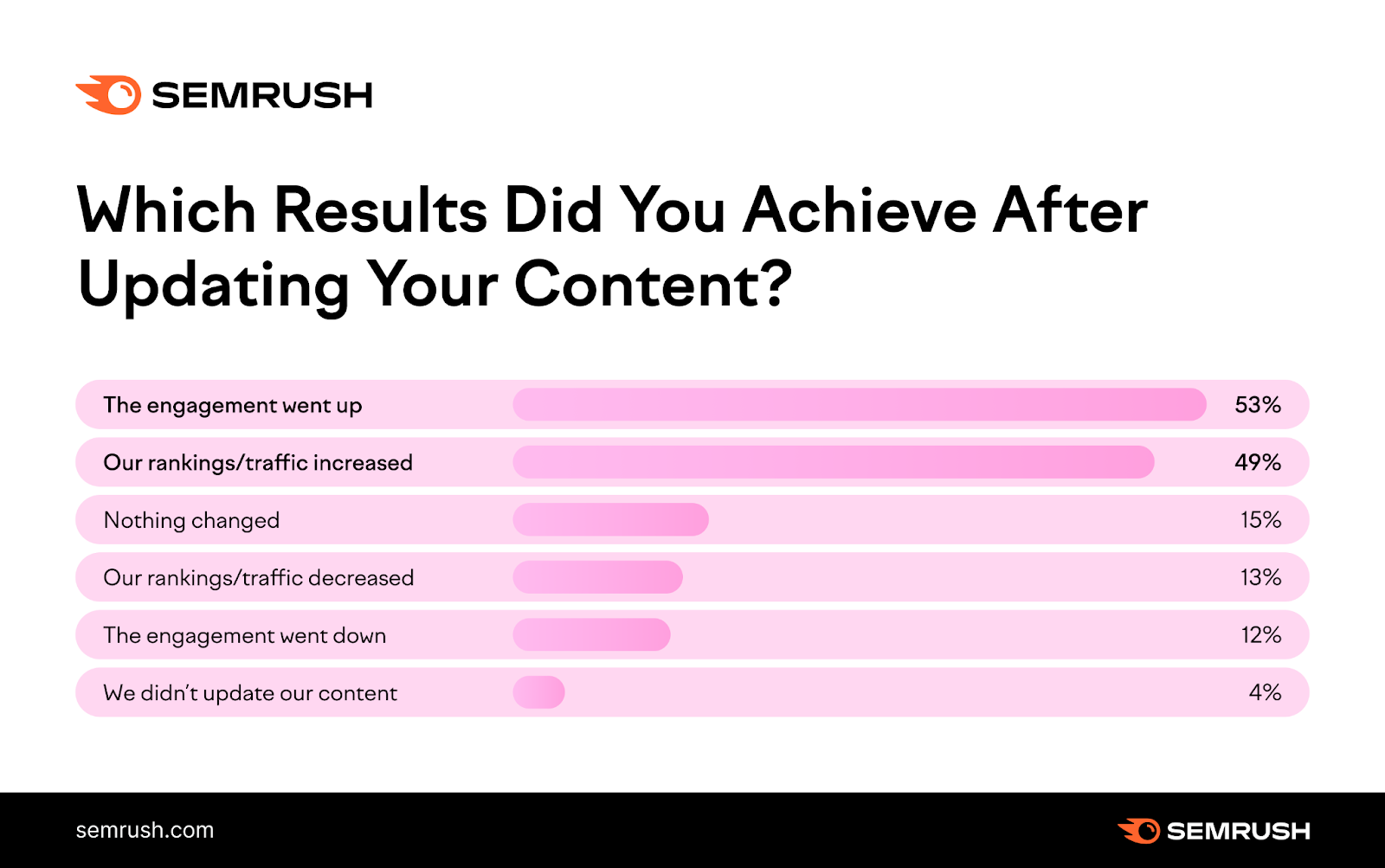
Are you thinking it may not be worth the effort? This Semrush report found that 53% of marketers noted increased end-user engagement simply by updating their content.
How to keep your content current
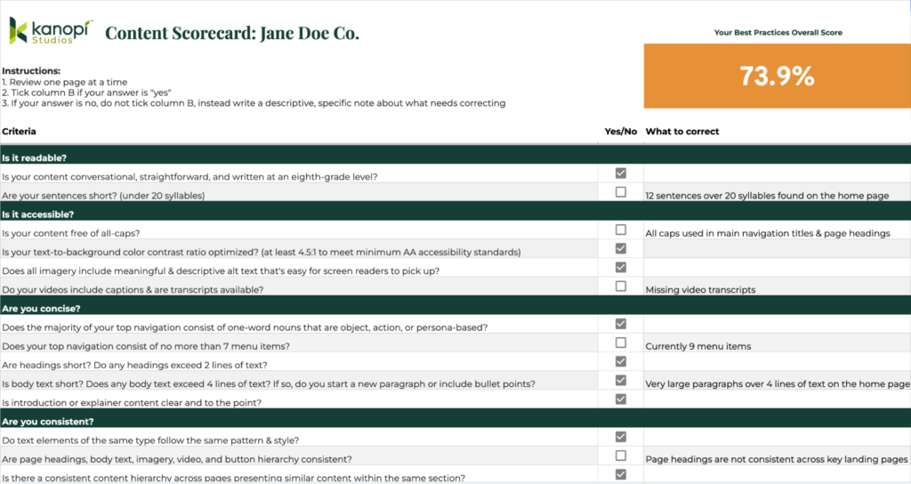
A content update or refresh can be as in-depth as you’d like. We’ve created a helpful content scorecard for anyone wishing to do a full content audit of their site.
Additionally, look at Google Analytics so you can review which pieces of content are getting the most traffic. Then look at which ones aren’t getting enough. Can those be refreshed or updated? Can you add more images? Lastly, check your keywords as well to ensure your content is ranking the way you wish.
Trends come and go, memes go viral and then fall out of existence (does anybody remember the ‘Dancing Baby’ 3D rendering from the 90s?), and while continually updating your website’s content to keep it bussin’ is lowkey tedious, taking the time once or twice a year to glow up your cheugy content shows you and your website got rizz. No cap.
Note: The author wants to apologize for the last few sentences on this topic.
Audit meta tag/schema data
Updating your Schema markup and meta tags is a crucial but often overlooked aspect of website maintenance, as updating these fields yields no visible, immediate results. What does this data even mean, and what does it do?
Schema, a specific type of microdata, creates a description (or “rich snippet”) that appears in search results. For example, use a search engine to look up information on an upcoming event. Schema can provide you with where the event is taking place, the date and time of the event, images related to the event, and dozens more options.
On the other hand, meta tags provide metadata about the HTML document itself, giving potential site visitors more details about what kind of information your website has. Meta tags also help curate a better online experience by specifying images, titles, and descriptions appearing when a page is shared via social media.
How to update your meta tags and schema
/blog/wordpress-maintenance-and-support/While there are thousands of configuration opens for schema markups, it is an excellent opportunity for more detail-oriented folks to get in there and refine the data as much as they’d like. As an added bonus, this data is easily configured within the Configuration settings for both Drupal and WordPress.
Want more information on how many configuration options there are for Schema markups, or do you want to know more? Check out our blog post or visit schema.org’s ‘Getting Started’ section at schema.org. Or are you curious as to how your website appears for end users? Validate your schema markup here, and check your meta tags here.
Verify media items have appropriate alt text and captions
The importance of website accessibility cannot be overstated and here at Kanopi, we have stated this importance plenty of times:
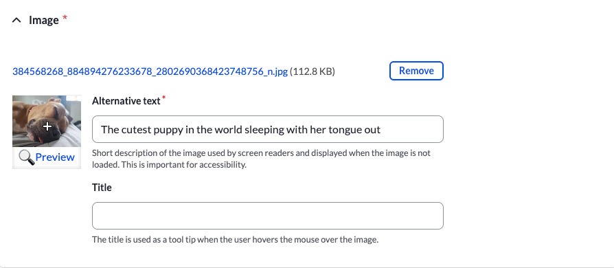
When we think about enhancing website accessibility, we aim to create a seamless user experience, regardless of how one interacts with the site. Consider this: while a user who doesn’t rely on assistive technologies can instantly appreciate an image of the world’s cutest puppy snoozing with its tongue poking out, these delightful details may escape a user depending on a screen reader.
How to add alt text and captions
Thankfully, it’s really easy to update alt text and captions in your media. When doing a content audit, simply check the images in your CMS when doing a ‘spring cleaning’ for your website to ensure the alt text and captions are there.
By dedicating just a few hours a couple of times a year to update your images with clear titles, descriptive alt text, and informative captions, you not only comply with accessibility standards but also enrich everyone’s browsing experience. This small investment of time will ensure that all users, regardless of their mode of access, can view and interact with all of your site’s content, so you don’t lose any visitors along the way.
It’s time to get tidy!
Like many of life’s endeavors, consistent upkeep is not merely beneficial; it’s essential. This same logic applies with equal force to your website. The amount of time you choose to invest — a modest four hours or a more substantial forty — rests entirely in your hands, but remember that dedicating time to refresh and enhance your website will inevitably draw more visitors and significantly improve their user experience.
Are you interested in a spring clean but find yourself strapped for time? Reach out to us. Let us fine-tune your website to perfection.
That translates to 252,000 new websites created each and every day.
How can you ensure your website’s content is optimized to attract and retain visitors against an ever-increasing number of websites vying for our attention — and that it reaches the coveted top spot on Google’s search engine results page?
At the very least, consider the questions Google asks for creating helpful, reliable, people-first content.
Now, if you really want to take your content to the next level, read on to learn about Kanopi Studios’ Content Scorecard. We’ve built a powerful tool that allows you to evaluate various aspects of your content and identify areas that offer the greatest opportunities for improvement.
Getting a team excited about a big website redesign is easy. What’s less easy is getting folks excited about a content audit. How do you show a content audit is worth the time and resources? By focusing on the value of completing one.
In this blog, we’ll explore the key metrics of Kanopi’s content scorecard and discuss how it can assist you with auditing the content found on your website, along with the benefits of doing so.
Before we dig into the key metrics, let’s discuss content audits and ROI.
Content audits pinpoint costly problems
Content can expire faster than a carton of milk in your fridge. And if content is no longer helping folks complete key tasks on your site, it could be doing more harm than good.
If any content on your site is actively losing leads, it needs your full attention.
A range of issues impacts your content’s ability to reach and convert your website visitors, including:
outdated information
accessibility issues
confusing or unclear messaging
non-intuitive website navigation
poor readability, and
technical problems like missing metadata.
These challenges can drive website visitors away from your site. Running a content audit can help you find and fix the most prominent issues before they become costly.
Content audits extend the life of existing content
Content audits aren’t just for analyzing your site’s content and finding mistakes. They also discover opportunities to get more out of your existing content.
Content improvement plans tend to surface naturally as a result of content audits. They uncover powerful opportunities to:
Drive more traffic to your site, improving search engine rankings while beating your competitors to the top spot on Google’s search engine results pages.
Stand out from the rest, elevating important differentiators to help you overtake your competitors.
Convert site visitors to patients or customers through increased engagement and conversion optimization.
Numbers always help folks visualize impact. Kanopi audited the Alameda County Community Food Bank’s website content and navigation, using findings to develop a strategy that led to:
+37% in page views per session and
93/100 accessibility score.
Content audits increase the ROI of long-term strategy
Important marketing campaigns need to begin with an informed, data-backed strategy. If you’re about to start a project like a website redesign, begin with a content audit to understand:
what content you currently have,
how your content is performing, and
how to take a holistic approach to improve all site content.
The optimal moment to capture these insights is before you make big changes.
Set yourself up to get the best possible return by setting benchmarks for measuring content performance and how you’ll evaluate success instead of devoting vital resources to something that’ll need fixing later on.
Now, let’s get into Kanopi’s content scorecard metrics used with every content audit we run for our clients:
Content Best Practices
Writing for the web means taking a user-first approach and getting to grips with how people consume content. People aren’t reading your content word-by-word. Instead, folks scan for keywords that help them accomplish the goal of their visit to your website.
Apply these eight proven best practices to ensure your site’s content is actionable and purposeful:
1. Readability
When it comes to your content, readability significantly impacts user engagement.
Simply put, content that‘s easy to read and understand is more likely to resonate with your website visitors.
To evaluate readability, make sure your content is conversational, straightforward, and written at an eighth-grade level. Authoring tools like the Hemingway Editor can help you evaluate the reading level of your content.
Also, you’ll want to ensure that your sentences are short and concise — ideally 20 syllables or less.
2. Accessibility
Ensuring that your content is accessible to all users, including those with disabilities, is not only a legal requirement but also a sound business decision. The World Health Organization estimates that 1 in 6 of us experiences significant disability. Why create unnecessary barriers for folks using your website with inaccessible content?
Check factors such as text-to-background color contrast ratio, meaningful alt text for images, captions for videos, and availability of transcripts.
The WAVE web accessibility evaluation tool provides browser extensions that help you identify which content on your web pages is causing the most challenging accessibility issues.
3. Brevity
In today’s fast-paced digital world, we all have short attention spans, which is why it’s crucial to keep your website’s content concise and to the point.
Save the elaborate prose for that novel you’ve been meaning to write. You can evaluate the brevity of your site’s text-based content by examining factors such as the length of navigation items, headings, body text, and introduction/explainer content.
4. Consistency
Consistency is vital to creating a cohesive and user-friendly experience across your website.
You can assess consistency by checking if text elements follow the same pattern and style, if there is a consistent content hierarchy across pages familiar to folks, and if navigation pathways are logical and easy to follow.
5. Clear Pathways
Your content should guide users along a clear path down every page and across to related pages on your site, leading them to the next desired action.
Check that the next desired action you want folks to take is clearly stated on the page, that the page is organized logically, and navigation pathways are easy to find and follow. Prominent breadcrumbs help people keep track of where they are within the content on your site.
6. Accuracy
Ensuring that your content is accurate and up to date is essential for maintaining credibility and trust with your website visitors.
Evaluate accuracy by checking for outdated information and verifying that content has been fact-checked by one of your subject-matter experts.
7. Narrative Progression
Effective storytelling can captivate your audience and keep them engaged with your content.
Assess your narrative progression by checking if content flows logically from the top of each page to the bottom, providing users with a cohesive and engaging experience. Headings, subheadings, body text, and buttons should relate to each other and guide folks to easily move down each web page.
8. Telling your story
Every piece of content on your site should serve a purpose and contribute to your overarching narrative. Every word, image, video, and graphic should relate to each other and help you tell your organization’s story.
Evaluate your storytelling chops by checking if text complements images, illustrations, and videos and if it’s clear how each piece of content contributes to telling your story.
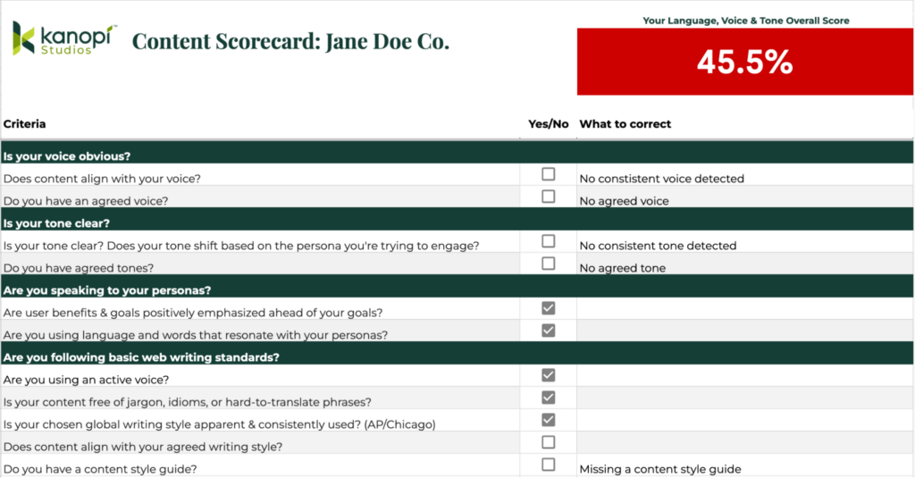
Language, Voice, & Tone
Determining the right voice and tone — and which words to use to convey your voice and tone — is essential to engaging your site visitors and creating a connection with them.
Different content warrants a shifting tone (e.g., if you’re discussing cancer treatment options it’s best not to be too light), but generally speaking, aim for a personal, positive tone when writing content.
Strike the right balance between appearing casual with your readers while avoiding bureaucratic or institutional speak. Your writing should sound like it is coming from a human, not a corporate robot. ‘Write like you talk’ is a helpful phrase to remember to ensure your writing isn’t too stiff.
Getting your tone right can be tricky, but studies show it dramatically impacts your user’s perception of your organization. Here are four key points to remember:
1. Your Voice
Your organization’s voice is its personality — it sets the tone for communicating with your website visitors.
Assess your voice by checking if content aligns with your brand’s voice, and if it’s consistent across your site. (If you don’t have written guidelines in place describing your brand voice, we’d strongly recommend you start there.)
2. Your Tone
The tone of your content can vary depending on the audience you’re trying to reach and the message you’re trying to convey.
Evaluate your tone by checking if it’s clear, consistent, and resonates with your target personas.
3. Persona Alignment
Tailoring your content to resonate with your target personas is essential for connecting with the people who matter most to your organization.
Evaluate persona alignment by checking that your content emphasizes user benefits and goals and if the language and words on your site resonate with the people who visit it daily.
What is a persona, you ask? Personas are archetypical users whose characteristics and goals represent the needs of a larger group of your audience. Learn more about how personas help with web design.
4. Web Writing Standards
Adhering to basic web writing standards can improve the clarity and effectiveness of your content.
Check your content uses an active voice, avoids jargon and idioms, follows a consistent writing style, and aligns with your agreed content style guide.
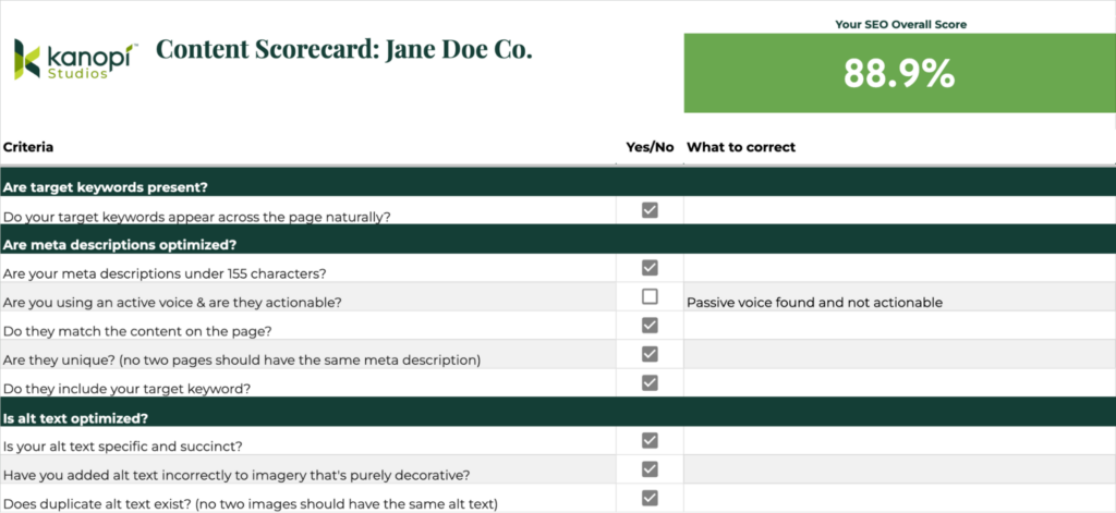
Search Engine Optimization (SEO)
There’s no denying that optimizing your content for SEO impacts your content’s performance and helps you meet important marketing goals.
Without it, your organization could be missing out on organic traffic, leads, sales, visibility, and rankings. Zero in on your keywords, meta descriptions, and alt text to get the most out of your existing content:
1. Keyword Optimization
Optimizing your content for relevant keywords can improve its visibility in search engine results.
Achieve basic keyword optimization by checking if target keywords are present and appear naturally throughout each page within headings, subheadings, body text, and buttons (as opposed to throwing them in without considering their proper context, a.k.a. ‘shoehorning’).
2. Meta Description Optimization
Meta descriptions play a crucial role in attracting clicks from folks using search engines to find what they need. Evaluate your meta descriptions by checking if they’re under 155 characters, use an active voice, match the content on the page, are unique, and include target keywords.
3. Alt Text Optimization
Alt text is essential for providing context to users who cannot view images.
Review your site’s alt text by making sure it’s specific succinct, and correctly applied to relevant images. Also, ensure all images have unique alt text. Duplicate alt text can confuse folks who use a screen reader when exploring your site.
Ensure your content is readable, accessible, SEO optimized (and more!)
By closely examining your content to ensure it follows best practices, you can pinpoint areas that need improvement and make sure your content is engaging, accessible, and optimized for both visitors and search engines like Google.
By conducting regular content audits using Kanopi’s content scorecard, you can maintain high-quality content standards and ensure that all the content on your website tells your unique story.
If you need help with your next content audit, don’t hesitate to get in touch with Kanopi. We’re more than happy to help you get started.
When looking at image media in a CMS like WordPress or Drupal, it can seem incredibly overwhelming at first.
There are so many fields and though they each have a specific intended purpose, for many of us, we didn’t worry so much about them at first. Now with increasing awareness of the role of textual content for accessibility purposes, we all want to pay closer attention. So let’s take a quick peek at what those are and how they’re used.
Alternative (Alt) Tags
Alt tags are the most commonly used tags. Their purpose is to be an alternative in case the image cannot be shown. Decades ago these were most widely used to help account for images taking a long time to load on dial-up connections. As our technologies have changed since then, the purpose of the Alt tag has taken on a more important role.
Accessibility: Alt text is primarily used to describe the content of an image to those who cannot see it. This includes visually impaired users or users who have chosen to disable images. Without alt text, these users might miss out on crucial information conveyed by the image.
SEO: Search engines cannot directly understand what an image is about. Alt text helps search engines understand the content of an image and its context within the page, which can improve your site’s SEO. Search engines can use this information to index images correctly, and it can help your site appear in image search results.
Provides Context if Images Fail to Load: If an image fails to load due to a poor internet connection or an error in the image file, the alt text will be displayed instead. This helps users understand what should have been there.
Supports Non-Visual Browsers: Alt text also benefits people using text-only browsers or command-line browsers, which do not display images.
Compliance with Standards and Regulations: Adding alt text to images is a requirement under the Web Content Accessibility Guidelines (WCAG) and, by extension, regulations like the Americans with Disabilities Act (ADA). Non-compliance with these standards can have legal implications.
Overall, alt text plays a crucial role in making the internet more inclusive and accessible, helping to ensure that everyone, regardless of their physical abilities, can use and understand web content.
Alt Text in Action
Since alt text need to convey an image to someone who may not be able to see it, it needs to be descriptive, concise, and meaningful in context. Let’s look at an example.
One possible alt text for this could be “chair” or “balloon. Those were the search terms that found this image on Unsplash. Technically it may be accurate to use “chair” or “balloon” or even “chair and balloon” as the alt text, but it doesn’t give adequate information for a user to understand why this image has been included. What is the information that is being conveyed?
We could say, “white chair with a large pink helium balloon attached to its back” which would be highly descriptive and better explain the image. Or if this is a part of a short story about a lonely birthday, maybe the greater context would be given by something along the lines of, “the empty chair sat alone with its balloon in the room.” This would invoke a feeling that would enhance the storytelling experience.
The end goal should always be to give a user a connection to the image without relying on the image being visible. Remember to convey the same feeling or meaning that it’s meant to give those who can see it. If it’s important enough to show a user, it’s important enough to describe to a user who can’t see it.
It also needs to be concise. The alt text is only a short space to help give context. If your image is complicated or needs additional detail then a long text format such as a caption would be a better choice. Try to keep your alt tags around 120-125 characters.
Of course not every image offers a user great value or an emotional connection. Often icons with labels and other decorative patterns just don’t have non-visual context. In this case, you need to indicate that you would provide alt text if there were any and that this image is merely “decorative”. This means that you need an empty alt tag – that signifies to assistive technology that this image has nothing contextual to share. This can look like this:
<img src="istock250871.jpg" alt="" />

<img src="istock250871.jpg" alt />
Either is fine as long as it’s there. If it’s not there, then the image alt will become its file name and istock250871.jpg just doesn’t give a lot of helpful context.
Captions
Some images convey complex meanings or details that can’t be fully captured in just 120 characters. These images benefit from what is known as a ‘long description’. This isn’t a replacement for alt text, but rather an optional addition. It usually appears as a caption under the image, providing a more in-depth explanation or context.
Longer descriptions that aren’t captions can also be attached behind the scenes or nearby as part of the standard presentation, such as the paragraph immediately following an image. Developers can also connect these longer descriptions for those using assistive technology to make the relationship perfectly clear, but typically captions already include these connections and are easily edited through the CMS (Drupal does not have this field by default but it can be added). If a caption will do the job, there’s no need for additional content.
Situations that may require an image caption include:
Charts and diagrams
Complex Images
Images that need additional information to create more context
Images that need a heading
Images that require a source credit
The idea behind captions is to be able to describe the meaning, visual content, or any additional context. They can be longer or, if the surrounding text gives lots of content, could simply supplement that data (such as a source).
Let’s look at a few examples.
Decorative Image with Caption
In this situation, the website chose not to give the image alt text but did include an empty alt tag to indicate that the assistive technology could bypass the image. The caption was included to acknowledge that an image was present and to give an accompanying description. Though there are several reasons to choose this approach, perhaps they wanted to allow the articles to add as much content as desired without character limitations. It might cause some confusion as users have bypassed the image the caption is referencing, but it does technically meet the criteria.
Caption: Guion S. “Guy” Bluford photographing the Earth with a video camcorder through the shuttle’s overhead window. NASA.
Image with Alt Text and a Caption
This is what we’d consider a better approach. We have alt text that acknowledges the image is there and gives a description of that image. Then a visual caption to identify the image, and expand on the source. As much as accessibility is a legal need, every piece of content should be geared toward informing the user. What would make this slightly better would be if the alt focused solely on the visual description of the uniform and let the caption provide the details of who and when, but that’s just nitpicking at this point. The current content is perfectly acceptable.
Alt Text: U.S. Army green service uniform worn by Colin L. Powell as General and as Chairman of the Joint Chiefs of Staff. Uniform is hanging on a pole facing forward.
Caption:
A U.S. Army green service uniform worn by Colin L. Powell as General and as Chairman of the Joint Chiefs of Staff.
Collection of the Smithsonian National Museum of African American History and Culture, Gift of General Colin L. Powell, USA (Ret).
Choosing Your Approach
These are just two ways this was handled and are simple examples. In some cases there may be a need to showcase something much more complex, like a pie chart, or a technical diagram. In those cases a simple alt text of “Named Chart” and a detailed caption that explains the important data points would be a possible option. Or maybe there’s a need for a developer to connect a “long description” to the image. Overall your team needs to consider the data and what its value is to the user to choose the best approach.
Image Description
This is the general description field made available within WordPress and isn’t typically used within a theme, though it could be utilized in a number of ways if desired. It could even be used as a long description field in a custom theme. Drupal may or may not have a similar field since developers can add any number of additional fields to media based on type and display. By default, Drupal has fields for the image, the alt text, and the title. If you wanted to include a long description, or any additional information, your developer can make those adjustments.
Titles
Tiles are often under utilized in themes since the alt text is the preferred method for providing accessible information regarding an image, but both WordPress and Drupal have these fields. A title is only given to the user when a developer has written code to display it, or to have it appear on a specific interaction such as hover or click. By default, the title goes unnoticed by the average user. Screen readers can always access the title if they choose to, but the alt text is read automatically upon reaching the image so the title is often skipped. Search engines will always be able to see the title, so keep that in mind if you choose to fill it in.
One Final Note
Drupal and WordPress are incredibly flexible! They can allow for many customizations and allows you, as a content manager, to add so much value for your end users. Empower users to understand the meaning of your site’s visual content, regardless of their device, technology, or level of vision. Allow people to be the hero of their own story as they consume, understand, and act on next steps. If you keep that strategy in mind as you approach your image management you’ll be successful in accessibility, content strategy, SEO, and the overall experience for your users.
We’ve all heard the phrase: “Life is a journey, not a destination.”
Similar to the choices in our everyday lives, the decisions your donors make can impact how and if they decide to give to your organization. This is known as the donor journey.
Regardless of whether you’re a long term fundraising professional or you’ve just established your organization, “donor journey” shouldn’t be an unfamiliar term. It’s pretty self-explanatory—it describes how a potential prospect makes their way to becoming an official donor and an advocate for your mission. It includes everything from conducting research on your nonprofit’s website to promising continued support.
Understanding and refining your donors’ experiences enables greater mission outcomes. We’re here to tell you exactly what the donor journey entails and how you can create the most enjoyable experience possible for your supporters.
The donor journey is a framework that fundraising professionals in nonprofits, higher education institutions, and other organizations use to better understand and engage with their supporters. It encompasses each stage of a donor’s relationship with your organization, from their first interaction to their continued support.
By mapping the donor journey, you can better track how and when your supporters engage with your organization, allowing you to uncover opportunities to strengthen those relationships.
Remember, your donors are one of your organization’s most important assets. They provide you with the essential funding needed to continue your meaningful work and serve your community. It makes sense that you do everything you can to recruit and retain them, and that starts with understanding their journey with your nonprofit.
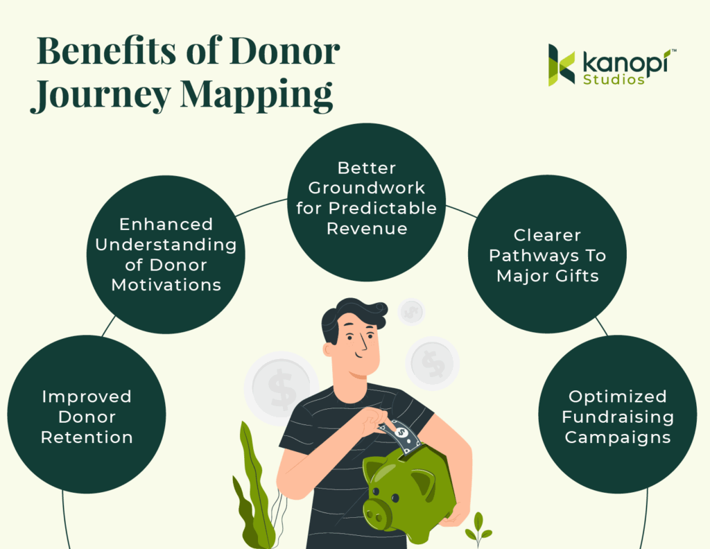
Why Is Donor Journey Mapping Important?
Understanding the donor journey will not only help you track how and when your supporters give, but it’ll also provide some basis for why they donate. The more familiar you are with your average donor’s journey, the better you can engage with them and garner more support down the line.
Some of the key benefits of mapping the donor journey include:
Improved Donor Retention: Mapping out the donor journey helps identify key touchpoints where donors may lose interest or disengage, allowing you to address these issues and improve retention.
Enhanced Understanding of Donor Motivations: Mapping out the donor journey tells you what motivates your donors to give, helping you adjust your outreach to align with their motivations and values.
Better Groundwork for Predictable Revenue: By understanding the typical pathways supporters take, your nonprofit can anticipate giving and forecast revenue streams more accurately.
Clearer Pathways to Major Gifts: Donor journey mapping can pinpoint engagement patterns and touchpoints that often lead to larger gifts over time.
Optimized Fundraising Campaigns: You can identify what marketing messages and campaigns resonate most with donors, allowing you to pick the best types of campaigns and craft meaningful appeals.
Whether you leverage this strategy for its fundraising benefits or impact on your reputation, donor journey mapping is an essential part of your nonprofit digital strategy.
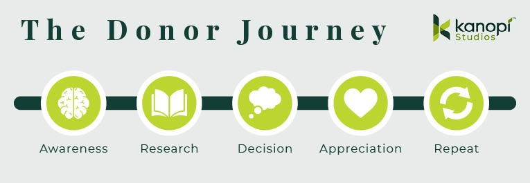
The Elements of the Donor Journey
What makes up the donor journey? Each stage may differ slightly depending on your organization and your supporters, but the donor journey will likely follow these elements regardless of your unique situation: Awareness, research, decision, appreciation, and repetition.
Donor Journey Step 1: Awareness
This is the very first step of the donor journey. Whether it’s through your website, a post from a friend on social media, or word of mouth, this is the moment that the prospect becomes aware of your organization and mission.
Without awareness, the donor journey never begins. To raise awareness and increase the likelihood of new supporters, follow these tips:
Optimize your nonprofit website for SEO to improve your presence on search engines.
Create supporter personas to better understand the type of audiences that engage with your organization.
Actively use your social media channels to give updates on your mission.
Update your website with recent accomplishments and major changes.
Keep your content human-centric to appeal to new supporters.
Get involved in local events, fairs, or speaking opportunities.
Collaborate with influencers, companies, or other nonprofits that align with your mission and have influence within your target audience.
Encourage existing supporters to fundraise on your behalf, leveraging their personal networks to spread awareness.
Consider paid advertising to promote your mission and tap into advanced targeting features, like how the World Wildlife Fund uses Google Ads to target mission-related terms:
Donor Journey Step 2: Research
Once someone is aware of the need for your mission, they’ll likely do further research to determine whether they want to support the cause and how they can do so.
This entire stage is about building trust. You need to give potential donors a reason to give to your organization and support your efforts.
First off, ensure your nonprofit website is optimized. This is likely the first place a prospect is going to look when researching your cause. Your website should be regularly maintained and updated to promote valuable content about your mission and organization. You can:
Use success stories and infographics to relay accomplishments and important metrics quickly.
Provide concrete metrics and data to back up your claims.
Practice transparency by being honest about where your funds go and by being open to answering questions.
Compile and share an annual report that summarizes your yearly accomplishments and progress.
Include testimonials from other donors or from specific community members you help.
Post compelling content like news stories and blog posts related to your mission online (content marketing costs 62% less than traditional marketing strategies, making this both a cost-effective and engaging strategy).
While you should always prioritize transparency, try to focus on the value you bring to the community and avoid being overly pessimistic. Too much negativity can make users less likely to donate.
Donor Journey Step 3: Decision
Now that your prospect is familiar with your organization’s work, they’ll show their intent in some way. This can be opting into email newsletters or following your social media accounts. They might even decide to make their first gift.
To encourage prospects to take the leap and donate, consider the following:
Ensure the target action is prominently displayed in all marketing content, including social media and email. Incorporate CTAs like large buttons and easy-to-find links that send prospects to your donation form.
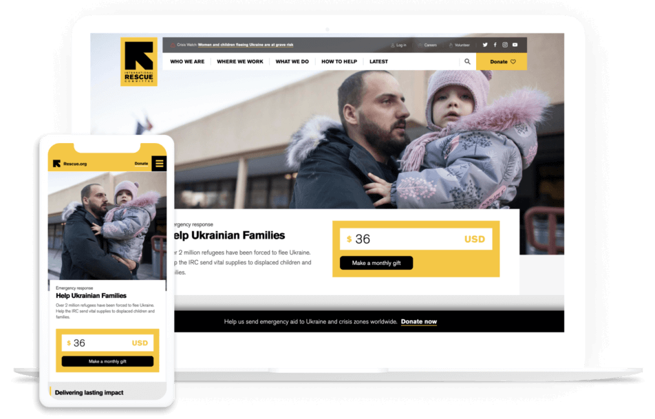
Make recurring donations a primary option. Within your donation form, add a simple box that supporters can check off if they want to give regularly. Alternatively, create an inspiring monthly giving page like the International Rescue Committee did. Either way, making recurring donations a primary option encourages your donors to become consistent givers:
Show the value of suggested donation amounts. Sometimes it can be hard to contextualize how a gift will help an organization. List a couple of suggested amounts as well as the direct impact they have. For example, tell supporters that a $100 gift will pay for 10 meals at your community homeless shelter.
Design your website with an accessible user experience (UX) in mind. Ensure that your nonprofit website is accessible to everyone, regardless of their location, language, ability, or device. This enhances the user experience and expands your supporter base. Learn more about this topic with our article on demystifying website accessibility compliance.
Feature matching gifts across your site. Donors often need a nudge, and matching gift research shows that 84% of donors are more likely to donate if they know that their employer will match their donation. Add a corporate giving page to your navigation menu and embed an employer search tool into your donation page to highlight this opportunity at a key point in the donor journey.
Donor Journey Step 4: Appreciation
Once the gift is made, this doesn’t mean the journey is over. In fact, this is the perfect opportunity to set the foundation for future engagement with a thank you letter and a summary of impact.
Showing donor appreciation is an integral part of the donor journey. Your supporters need to know how much their contribution has impacted your mission. Many donors stop giving because they simply don’t know what their previous gift did. Even so, more than 60% of nonprofits don’t thank donors properly.
Here’s what you can do to thank donors in ways that resonate:
Use your email solution to automate thank you messages to send as soon as a gift is made.
Take advantage of data automation to personalize each message with name and gift size.
If known, describe the specific impact the gift has made.
Include a “next step” in your letter, such as signing up for newsletters, reading a success story, or checking their matching gift eligibility to take their support further.
Follow up once the campaign is complete, and use data metrics to report on their gift’s full impact.
Add an option for donors to share their contributions on social media, further spreading awareness of your mission.
Create a thank-you video that features heartfelt messages of appreciation from staff or beneficiaries.
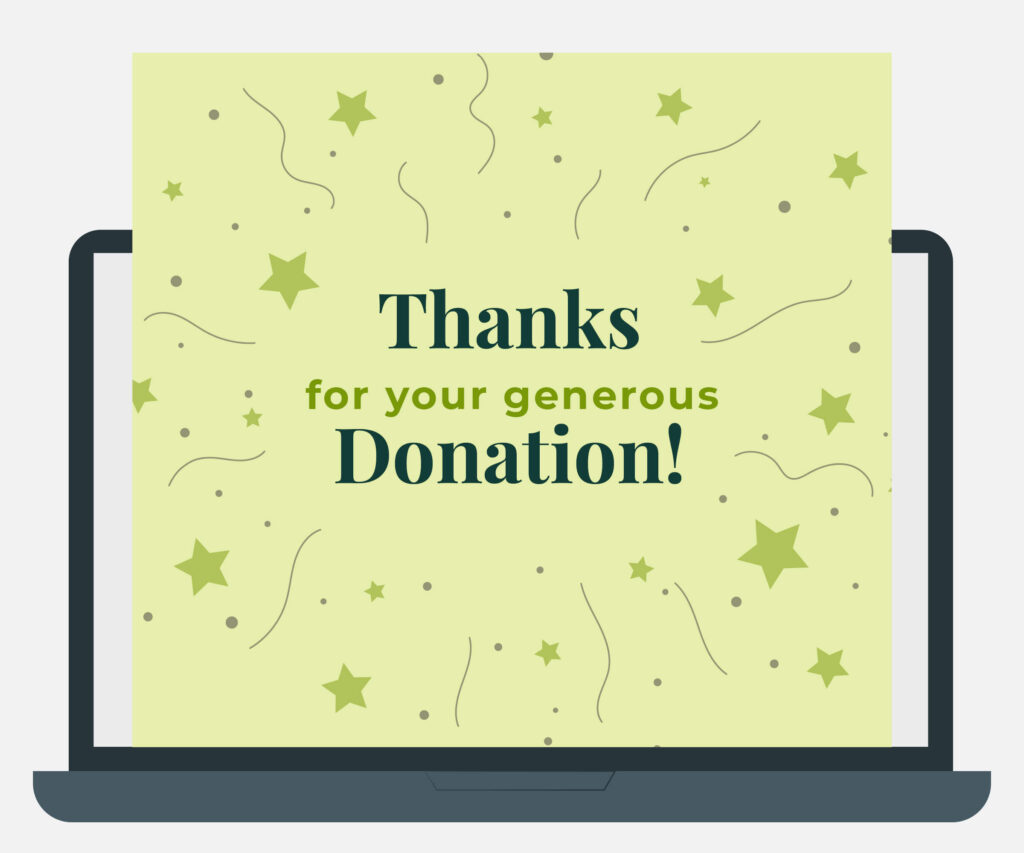
Use engaging formats for thank-yous, such as a digital greeting card with a mission-related illustration or a compelling image of a beneficiary, to demonstrate genuine gratitude:
Donor Journey Step 5: Repeatable
Ultimately, the final goal of recruiting new donors isn’t the gift itself. It’s the meaningful relationship you cultivate and its foundation for long-term support.
With the donor journey, you’ll be repeating the same cycle over and over again. However, that doesn’t mean you have to overhaul your website or marketing materials—but it is a good idea to review them to ensure they are fully up-to-date.
To keep donors on this journey, you’ll have to continue inspiring them with valuable messaging, update your website with the most recent accomplishments, and continue to build these important relationships. This is vital since a 10% reduction in donor attrition can yield up to a 200% increase in projected value. In other words, the higher your donor retention rate, the better!
Remember, your relationship should be built on open communication, not a marketing initiative. Welcome feedback, share successes, alert people to upcoming events, and show appreciation at each stage.
How to Map Donor Journeys for Your Nonprofit
The donor journey for your nonprofit will follow the basic elements above. But understanding the specifics requires some careful planning:
Define your key performance indicators (KPIs).
Make sure you’re tracking organizational success beyond fundraising dollars. Website visits, email opens, and more can all be helpful KPIs to track. Also, review benchmark data to see how similar organizations measure success and how your nonprofit compares.
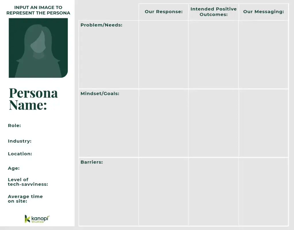
Create audience personas.
Many marketing leaders use audience personas to understand their supporters and create targeted outreach strategies. Think of a persona as your hypothetical ideal supporter. Each persona should include demographics, personality traits, interests, goals of supporting your work, and barriers your organization can help them overcome.
Also, consider how they engage with your organization. Do they often check out your website for new updates? Do you interact with them on social media? Use this persona template below to help get started:
Isolate aspects of your digital user journeys that apply to the donor journey.
In an increasingly digital world, people primarily find out about your mission online. Make sure their digital journey on your website and across your online marketing channels guides their decision to give.
By understanding your nonprofit’s digital touchpoints, you can ensure a seamless experience and adapt to the fast-paced digital landscape. If you notice areas in which your technology doesn’t meet expectations, you might need a tech upgrade. That might mean purchasing new donation software, investing in a more robust CRM system, or enhancing your website’s functionality to better support user engagement.
Review the elements of an effective donor journey.
This enables you to note any improvement opportunities. Do you need more educational content on your website to support the research stage? Do you have a lot of supporter engagement but insufficient gifts? There may be a problem in the “decision” stage of your donor journey. Noting these elements will clue you into the touchpoints you need to work on.
You can also look for trends and metrics in your nonprofit database to find where donors fall off. This can indicate what improvements to make to your recruitment and retention strategies. For instance, you might notice your online donation form’s conversion rate or website’s bounce rate is low, signifying that you need to improve those pages to better support the research and decision stages.
Revisit, refine, and retest often!
Don’t stop after you outline your donor journey. Instead, continue reviewing how your supporters engage with your offerings and donate. Whether it’s due to new technology or the economic climate, the donor journey will change over time.
Pro Tip: To accurately flesh out the donor journey and apply its insights to your own organization, turn to a nonprofit technology consultant like Kanopi. By working closely with a professional, you’ll gain a better sense of not only how your supporters engage with your organization but also how you can use those findings to improve outreach and retention.
How Kanopi Can Help
At Kanopi, our expert web developers and designers are top partners for nonprofits. We’ve helped to develop over 150 active sites and launch their digital transformation.
Our continuous improvement team works closely with your organization to become familiar with your goals and supporter base. With thorough research and insights into the larger nonprofit and web industry, Kanopi can help you map out a donor journey and:
Create user personas to determine your nonprofit audience and come up with an outreach strategy that best targets their needs.
Design your website with the donor journey in mind to ensure it funnels prospects to your online donation page and is SEO-optimized.
Analyze your content strategy to enhance donors’ experiences when researching your cause.
Offer insight into the best ways your website can aid your donor journey.
Ensure your website follows accessibility and compliance guidelines.
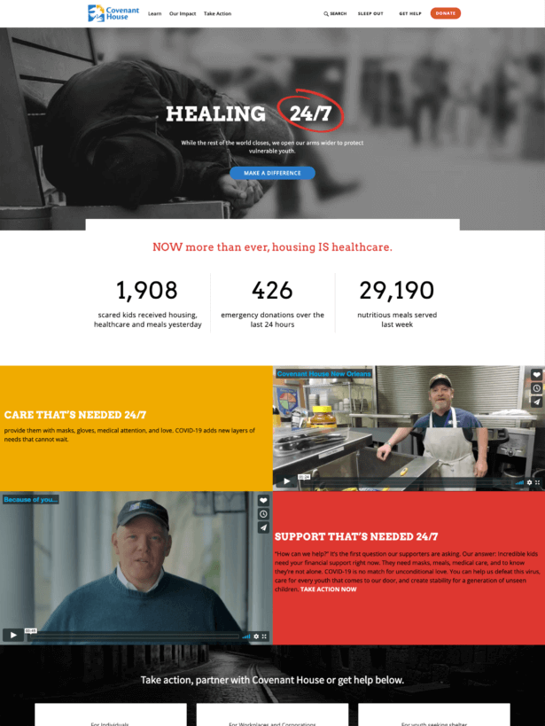
For an example of our work in action, check out our project for Covenant House. As part of our work, we updated their donation processes, improved donor tracking, and created a detailed roadmap to guide their digital transformation. They experienced a 42% increase in transactions, 178% increase in new users, and 123% increase in sessions per user—just to name a few of the site’s notable improvements.
Partner with us to start leveraging the donor journey for your own organization. We can help ensure your nonprofit marketing methods and website meet your needs and help you with your goals. Contact us here to learn more.
Wrapping Up
Mapping the donor journey empowers your nonprofit to refine every step of the giving experience. Knowing where supporters fall off allows you to proactively improve those steps and inspire supporters to stick around long-term.
With so many donors giving online, improving your organization’s donor journey all starts with a strong website. Make it easy to learn about your cause, find involvement opportunities, and ultimately donate. Remember, our team can step in to improve your website, whether you need technical assistance, design help, or a complete relaunch.
As you touch up your website, check out these helpful resources:
Using WordPress for Nonprofits: The Ultimate Guide. WordPress is one of the most popular website builders available. Learn how to leverage the platform to drive donations, educate your audience, and enhance your digital presence.
Higher Ed Website Design: 12+ Trends and Tips for 2024. Higher education institutions need powerful websites to engage alumni, attract prospective students, and keep parents informed. This guide teaches powerful web design tips you won’t want to overlook.
Healthcare content marketing is more important than ever before, as increasing numbers of consumers turn to digital channels to resolve their health needs.
60% of American consumers use online scheduling tools to make healthcare appointments. “Dr. Google” is a well-known phenomenon, as almost 90% of patients Google their symptoms before heading to the doctor. Healthcare organizations and their content marketing teams are responding with enhanced digital front doors in light of recent shifts in patient behavior.
However, it can be challenging for healthcare and hospital marketing teams to empower end users while still working to achieve business goals. How can you ensure your site continues to meet patients, physicians, and caregivers’ needs? Focus on making your digital experience as straightforward as possible for visitors to complete tasks, ease patient anxiety, and empower your healthcare workforce.
This guide will cover the ins and outs of healthcare content marketing to help your organization develop a blueprint that works best for your needs. Here’s the roadmap:
To define healthcare content marketing, let’s first break down how it differs from traditional content marketing:
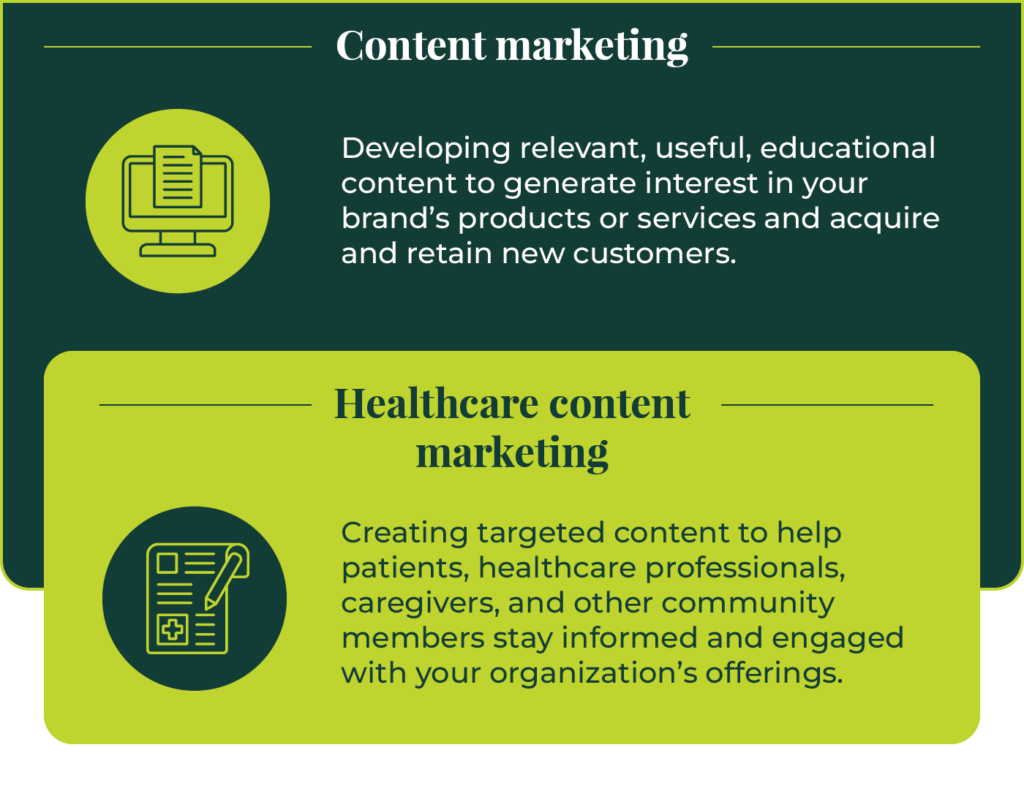
Content marketing is the process of developing relevant, useful, educational online content to generate interest in a brand’s products or services and acquire and retain new customers.
Content marketing differs from advertising in that it doesn’t rely on explicitly promoting a brand’s offerings. Instead, it serves audience needs by providing valuable informational materials that empower consumers to learn more about a topic and make more informed decisions.
Therefore, healthcare content marketing involves creating targeted content to help patients, healthcare professionals, caregivers, and other community members stay informed and engaged with your organization’s offerings. This content can help build your institution’s credibility, combat online misinformation, and grow your patient base.
Why should you develop a healthcare content marketing strategy?
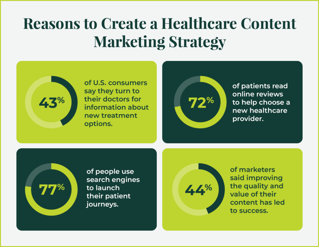
44% of marketers said improving the quality and value of their content has led to success. Plus, content marketing can drive a high return on investment (ROI) for your healthcare organization. Research shows that content marketing costs 62% less than traditional marketing strategies while generating three times as many leads.
In addition to these concrete benefits, healthcare institutions should develop content marketing strategies because they can use them to:
1. Empower patients with trustworthy information and resources
43% of U.S. consumers say they turn to their doctors for information about new treatment options. With a comprehensive healthcare marketing strategy, you can make this essential health information easier for patients to find and empower them to take charge of their health outcomes.
2. Enhance your organization’s credibility and reputation
Many Americans feel as if the healthcare system has left them behind or isn’t meeting their needs. In fact, less than half of Americans are satisfied with the quality of U.S. healthcare.
A high-quality website with trustworthy content can enhance your healthcare organization’s credibility to help regain any lost trust. Despite the negative trend in public opinion, 76% of consumers still say that they trust their doctor the most for health information. Your content marketing approach can strengthen this trust and help forge stronger bonds with your community.
3. Improve patient acquisition
Many studies and surveys show that a top-notch online presence is necessary for attracting more patients to your healthcare organization. For example:
72% of patients read online reviews to help choose a new healthcare provider.
43% of patients want to be able to schedule appointments online.
77% of people use search engines to launch their patient journeys.
By improving your healthcare organization’s overall online experience, you can attract more new patients and provide a positive first impression of your organization.
Healthcare content marketing trends
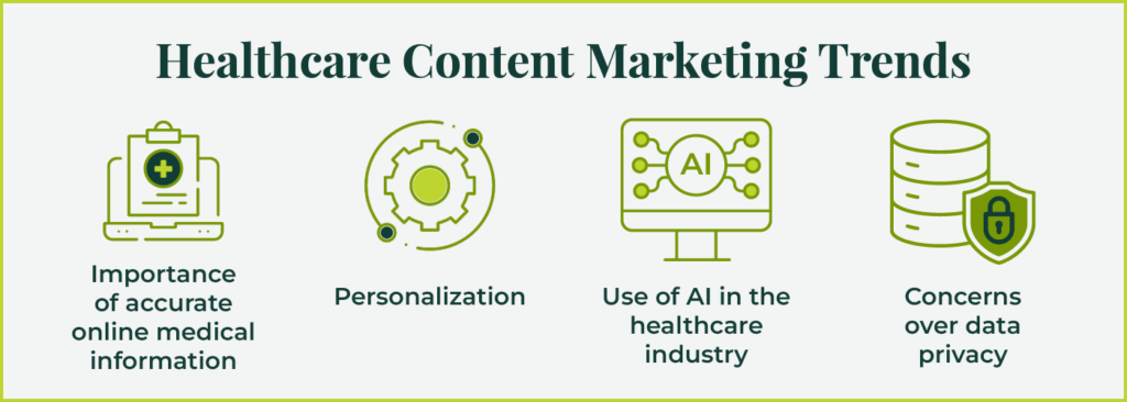
Healthcare content marketing and web development trends don’t evolve in a vacuum; they’re highly dependent on the shifting attitudes and behaviors of patients and healthcare professionals. With that in mind, here are four healthcare trends to keep in mind when developing your content marketing strategy:
Importance of accurate online medical information
Over 70% of people say they’ve been exposed to health misinformation at some point, with 82% citing social media as the biggest source of misinformation. Online healthcare misinformation can have real negative consequences, leading people to feel suspicious of vaccines or avoid going to the doctor when they have a medical issue.
Healthcare content marketers should keep this atmosphere of mistrust and misinformation in mind when developing content for their websites. Many consumers don’t know who to trust when it comes to getting accurate information, so your content should reflect reliability and trustworthiness at every turn. Incorporate multiple first-person sources, such as patient or doctor accounts, and studies verified by third-party, reputable sources to enhance credibility.
Personalization
Personalization in marketing is the process of creating content designed to appeal to a specific audience based on their unique attributes and interests. Personalization is becoming increasingly essential, as 71% of consumers expect personalized interactions with brands.
While it may be challenging to create personalized content for every individual in your audience, you can create personalized content for different audience segments, also known as personas. We’ll explore the benefits and uses of personas in a later section.
Use of AI in the healthcare industry
The use of artificial intelligence (AI) in the healthcare industry is growing, with applications for streamlining administrative workflows, patient outreach, clinical documentation, and more. Generally, healthcare AI is considered a supplemental tool and not a full replacement for the work of healthcare professionals.
However, since AI tools are still evolving, they have several limitations and data quality issues healthcare professionals must consider. The error rate for AI tools in the healthcare sector has reached as high as an estimated 23%. In addition, healthcare professionals must be aware of potential biases in AI models. If AI tools are trained using datasets that are not representative of a community’s complete population, they could perpetuate biases or stereotypes in the healthcare space.
These limitations have led to valid concerns among consumers. 60% of Americans say they would feel uncomfortable with healthcare providers relying on AI when administering care.
As a result, healthcare marketers interested in using AI to support their content strategies must tread carefully, weighing the benefits and potential risks of using AI tools. Although healthcare marketers work in a different realm than healthcare providers, marketers’ actions will still reflect on the institution as a whole. Those who do decide to incorporate AI solutions into the content creation process should outline clear policies for:
Vetting their AI solutions to ensure security and mechanisms to combat bias
Communicating with audience members about how their AI processes work and how consumers can opt out of having their data used in AI marketing strategies
Responding to any data or ethical breaches quickly by containing the problem and communicating with affected stakeholders
Concerns over data privacy
Similar to consumer’s fears over the use of AI tools are concerns about health data privacy. One survey found that almost 75% of patients are concerned about protecting the privacy of their health data, and only 20% said they knew the scope of companies and individuals with access to their data.
These concerns emphasize the importance of communicating clearly and transparently with audience members regarding how, when, and why you might use their data in marketing practices. Check out the Cleveland Clinic’s privacy policy for reference. The policy outlines:
How the organization collects information
How they use the data
Who they share the information with
Security measures they take to keep the data safe
How consumers can prevent their data from being collected or used
Procedures for updating the policy
Steps to build a powerful healthcare content strategy
How can you build a content marketing strategy that keeps these key trends and considerations into account while providing value for patients, community members, and healthcare providers? The following best practices will help lay the foundation for a comprehensive content approach.
Inclusive storytelling is about letting the voice of the patient, frontline worker, researcher, or caregiver explain your mission, purpose, and impact. These stories should reflect the diverse communities your organization serves, welcoming and embracing all of your users. Does your organization’s story address people’s problems and fears while leaving them more informed, confident, and at ease?
To help you get started, keep the CDC’s Health Equity Guiding Principles in mind when developing inclusive content. Key guidelines include using:
A health equity lens. A health equity lens is a multi-pronged communication strategy that involves avoiding the perpetuation of long-standing social and health inequities, reflecting the diversity of your community in your content, and involving the community in the content creation process. It also requires viewing healthcare as intersectional, meaning individuals may experience more than one health or social inequality (as well as strengths and assets) at the same time.
First-person, humanizing language. For example, instead of saying “the mentally ill” use “people with a mental illness.”
Inclusive images. Reach out to members of the community to ensure the images you choose reflect their lived experiences. Avoid images that perpetuate negative stereotypes.
From video and text to images and quotes, every piece of content on your website should assist in telling your healthcare organization’s story to site visitors. Inclusive storytelling needs to go beyond an inclusive image or two; your user research, tone and style, and team structures should all reflect your healthcare organization’s emphasis on inclusivity.
Create audience personas
Personas are fictionalized representations of different audience segments. They often include the following characteristics:
Name, location, and age
Industry or job title
Level of tech-savviness
The problem the person is experiencing
How your organization can solve their problem
Barriers to connection
Messaging your organization should use to connect with the person
It’s generally recommended to develop around three to five personas. For example, your healthcare website might have personas for patients, healthcare providers, patient families, staff, and donors. Use this template to build personas for your organization:
After developing your personas, you can start creating content that appeals to each group. Determine what topics each audience is most interested in. For example, patients may want easy access to doctor profiles or symptom checkers, while donors are interested in how your organization uses gifts to fund its mission.
Before you create a new piece of content, review your personas and ask yourself:
Who is the intended audience?
What problem, question, or issue does the audience have?
How can you help solve their problem through your content?
How can you reduce barriers to make it easier for your audience to find your content and implement your recommended solutions?
Focus on the user journey
People expect timely, accurate, and actionable solutions to medical problems. Healthcare marketers are responding with educational content that aligns with community needs. By engaging people early in the healthcare journey, marketers can guide them on a path to improved health and gain trust and brand loyalty while achieving content marketing goals in the process.
What pathways do you guide visitors on when they arrive on your website? Do those pathways quickly and easily help visitors do what they came to your site to do?
By exploring the patient journey and developing UX personas, you can better understand how people get to your site and what they expect to do once there. You can also identify any existing barriers that stop them from completing critical tasks on your healthcare website.
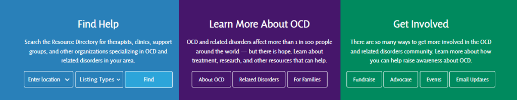
Take the International OCD Foundation website, for example. The website’s homepage has a variety of CTAs and links based on different users’ goals and motivations. This includes ways to find help, learn more about OCD, or get involved in supporting those with OCD.
Kanopi helped the foundation conduct user experience research to identify users’ needs and design the site to help them complete their goals faster. Plus, we helped add tailored features like better site navigation to facilitate a smoother user experience.
In addition to these larger user-experience considerations, consider a few quick fixes to simplify the online journey even further. For instance, banners or alert messages can help bring emergency or vital information front and center for patients. Also, from chatbots to call buttons and contact forms, all of your contact methods should be consistently placed and static on every page of your site to help patients contact you in a way that suits them.
Prioritize accessibility
27% of U.S. adults self-identify as disabled. On top of this, people visiting healthcare sites may be experiencing an elevated level of stress that can be a distraction.
To help counter this, keep your user journey clear from distraction as you build an accessible web presence. The Web Content Accessibility Guidelines (WCAG) go deep into recommendations for developers, but here are three quick steps you can take as a content strategist to improve your site’s accessibility:
Ensure your site has simple, straightforward navigation and that all non-textual content has alternative text that can be interpreted by screen readers. Also, it’s good to keep in mind that Google uses alternative text when ranking images. Ensuring alternative text exists throughout your website will impact your site’s visibility on search engines, in addition to boosting your content marketing goals.
Use easy-to-read fonts and colors with significant contrast to ensure the content on your site is readable by site visitors with vision and cognitive impairments.
Ensure all content on your site has a logical content heading structure. That means using a single H1 tag (usually your page title) and keeping other header tags in sequential order. Sequential heading order helps assistive technologies better navigate your site while indicating to Google the general outline of the content. It can even impact your search engine results page (SERP) display.
Test your website for accessibility about three to four times per year. You can use automated accessibility tools, such as Lighthouse or WAVE, to identify accessibility issues. However, automated tools should be just the starting point. Manually test your website for accessibility to replicate the user experience and ensure you don’t miss any problems.
People read differently online than they do offline, especially when under stress. The truth is we read very little online. Instead of reading every word, we scan web pages for the information we need.
With this in mind, follow these tips to improve your online content’s readability:
Make your content scannable. Make sure you’re using clear and straightforward language, bullet points, buttons, and bold text to assist visitors as they scan your site.
Avoid using all capitalization. All caps reduces your content’s readability because all words have a uniform rectangular shape, meaning readers can’t identify words by their shape. Checking your site doesn’t use all capitalization also ensures it’s accessible to the 15-20% of the population who experience dyslexia, as all capitalized letters are harder for them to read.
Avoid jargon. Medical jargon, although sometimes necessary, can confuse site visitors. Try to keep the use of complicated terminology to a minimum to keep site visitors engaged and give your content marketing efforts a helping hand. When this is unavoidable, offer links to definitions or simply spell out acronyms the first time they are used to ease the user’s journey.
Determine whether text is the best way to get across essential information. For example, could an infographic with key stats or an interactive data visualization better serve your healthcare site users? Could a short video help get vital information to site visitors more effectively than words? Explore how you can visually validate the work you do and the care you provide to patients.
Offer translations. Keep in mind that English is a second language for many while writing content on your website. Think about actions you could take to make it easier for users to translate your site into other languages, such as using a translation service or premium extension.
Taking these steps helps simplify the user journey as much as possible, ensuring that visitors can find the information they’re looking for with minimal stress.
Emphasize credibility
As mentioned above, trustworthiness is one of the most critical elements to consider when crafting your healthcare content marketing approach. When audience members know they can have faith in your website to deliver reliable, accurate content, they’ll return to your site again and again and be more likely to take advantage of your services.
Incorporate the following types of content into your marketing strategy to project credibility:
Interviews or blog posts authored by subject matter experts (SMEs). Coordinate with healthcare professionals at your organization to leverage their expertise in your content. Interview doctors, nurses, and other professionals and include direct quotes in content like blog posts and case studies. Invite healthcare providers to write blog posts for your website to discuss topics they’re passionate about or areas they’re currently researching.
Statistics or citations from credible sources. Make sure any sources you cite in your content are reliable and credible. This usually includes sources like peer-reviewed journals, government agencies, or accredited health organizations. Directly link to these sources so readers can verify their legitimacy.
Updated, fresh content. Keep your blogroll and news articles fresh by updating your website at least once a day with new content. This shows audiences that your institution is keeping up with the latest research, news, and reports. Readers will appreciate having access to updated, accurate medical information. Include dates on when the content was last updated so readers know how current the content is.
Balanced information. Your content should be clear, transparent, and balanced. Provide an unbiased perspective that sticks to the facts and avoids sensationalizing or exaggeration. This can reassure audience members who may feel confused or anxious about a medical issue and help reduce their fears.
Take a look at the Mayo Clinic’s website for an example of an effective way to showcase trustworthy healthcare information. The website features a robust medical directory where visitors can research everything from their symptoms to information about clinical trials, drugs and supplements, and more.
Revive your calls to action
Calls to action (CTAs) are the buttons and links you use to invite website visitors to take a certain action. Your healthcare CTAs should:
Tell site visitors why they should do something. Don’t just tell visitors what you want them to do; provide the why behind the action. For example, take a look at this pop-up CTA on the Boston Children’s Hospital site. The CTA requests that supporters donate now to get their gift doubled, but first provides the context that donations help more children in need.
Make it clear what visitors will see when they click on your CTA. Users should know exactly what to expect when they click on your CTAs. For example, let’s say you’re creating a CTA encouraging visitors to become a peer-to-peer fundraiser to support your healthcare organization. Many site visitors may not know what peer-to-peer fundraising entails, so make your CTAs more specific and clear. You could use text like, “Sign up here to help raise funds on behalf of Sunshine Children’s Hospital.”
Be accessible. Use bold fonts, large buttons, and strong color contrast to help your CTAs stand out and be accessible to all audiences. Use simple language and avoid jargon in your CTAs.
Let’s take a look at the Cohen Veteran’s Network website CTAs. The website has many helpful buttons for users with a variety of goals and needs. These buttons include:
Find a Clinic
Watch Video
Call a Clinic
Our Impact
Each button stands out against the background with bold letters and high-contrast colors.
Cohen Veteran’s Network partnered with Kanopi to help update their web presence after they expanded from 2-3 clinics to 12-15 clinics in six years. We helped modernize their site, update their user personas, enhance branding, improve navigation, and more. Read the full case study for more information.
Refine your SEO strategy
When developing a healthcare content strategy, search engine optimization (SEO) may sometimes feel like an afterthought or an added level of complexity to your processes. However, don’t neglect the benefits that SEO can bring to your marketing approach. SEO can help get your content in front of new audiences, enhance your credibility, and even bring new patients into your practice.
One of the easiest and most effective ways to improve your SEO strategy is to prioritize the user experience. Of course, don’t neglect elements like including a compelling meta description or a clickable page title. But to design content that ranks well, it should be created with the user in mind, not a search engine algorithm.
“Google’s automated ranking systems are designed to present helpful, reliable information that’s primarily created to benefit people, not to gain search engine rankings, in the top Search results.”
To create content that works for your audience and helps achieve better SEO results, Google recommends putting yourself in your audience’s shoes and keeping these tips in mind:
Write content that you would share with a friend or recommend on social media.
Develop original material that goes beyond the obvious to spotlight new angles or valuable insights.
Provide transparent sourcing that makes it clear the content was written by or constructed with the help of an expert.
Create action-focused content that helps a user achieve a specific goal.
Don’t rely on generic outputs produced by generative AI solutions—ensure your content has a clear perspective and distinctive point of view.
Avoid simply summarizing other existing content and ensure any new content provides real value to a reader.
Don’t neglect the technical aspects of SEO, either. Often, you can improve your website’s rankings with a few backend fixes that help promote better page performance. Leverage an SEO checklist or a free tool like PageSpeed Insights to identify areas for improvement.
Use multichannel marketing
Cross-channel or multichannel marketing offers plenty of benefits over single-channel marketing. Businesses that use at least four different channels can see ROI increases of up to 300%. In addition, it can take up to eight touchpoints with a consumer to make a sale. Leveraging multiple marketing channels allows you to carry out a variety of unique touchpoints without coming off as overbearing.
Promote your web content and message across platforms like:
Email
Social media
Other blogs (via guest blogging)
Direct mail
Press releases
Ensure all of your marketing materials are uniformly branded to promote cohesion and brand recognition. Use the same fonts, colors, logos, and tone across all channels to reinforce your nonprofit’s message.
Tools to support your healthcare content marketing
Plenty of software solutions and tools can help streamline your nonprofit’s workflow as you implement the tips in this guide. Search for solutions that integrate with your existing software platforms to enable seamless data migrations.
Here is a quick overview of some tools you might find useful in the content creation process:
Generative AI. Generative AI solutions likeChatGPT and Bard can help generate content ideas, develop blog post outlines, and adjust your writing for specific audiences. Just be sure to review any outputs you receive from these tools for accuracy. Avoid using AI content verbatim because it can often be generic or even plagiarized, which can have negative SEO consequences.
Design tools. Graphic design tools can help you keep up with content design trends and craft visually appealing marketing collateral. Free tools like Canva and Adobe Express are a great place to start.
CMS. WordPress and Drupal tend to be the best options for organizations with complex needs, like healthcare organizations. That’s because these platforms are highly scalable and offer advanced security features. Plus, they are very user-friendly, allowing users without extensive web development experience to add and refresh content.
Marketing platforms. Marketing platforms can be invaluable for cross-channel promotions. Consider email-focused tools likeMailChimp and Constant Contact, social media scheduling platforms like Hootsuite, or multi-platform solutions like HubSpot.
Analytics. Website analytics solutions help measure the effectiveness of your content marketing approach by tracking metrics like online conversions, bounce rate, time on page, and more. In addition, user behavior tools like HotJar can be valuable for understanding the user experience through heatmaps and user surveys. However, be sure to carefully vet your analytics solutions and tracking tools to ensure they don’t lead to any HIPAA violations. Use our roundup of HIPAA-compliant analytics tools to find the right solution for your healthcare website.
It can be beneficial to work with a web design and development professional to help understand which tools will work best for your organization and how to get the highest ROI out of your software solutions.
Kanopi can help build a powerful healthcare content marketing strategy
We have a solid understanding of the unique challenges you face when delivering your healthcare content strategy. We work collaboratively to find improvements and enhancements to your online presence that bolster your content marketing efforts and meet business needs, all while helping your users complete the tasks they came to your site to complete quickly and easily.
Through inclusive storytelling, focusing on the patient journey, and ensuring your site is accessible, you can create a site that meets your users’ needs and your content marketing goals.
Contact us today to ensure your site meets your users’ needs and your content marketing needs through a robust content strategy, an intuitive user interface, accessible and inclusive content, and a comfortable mobile experience.
Additional healthcare content marketing resources
Looking for more resources to build your content marketing strategy? Start here:
7 Best Hospital Web Development Examples. Hospital websites have specific considerations to keep in mind to build a website that effectively meets audience needs. This guide has everything you need to know about hospital web development.
Healthcare Website Design | Kanopi Studios. Ready to launch your healthcare content marketing strategy with expert support? Reach out to Kanopi here for a healthcare website consultation.
Around this time of year, we’re always asked one question — over and over, without fail:
“So, got any plans for the holidays?”
So let’s address this one off the top. Yes, we do have plans. And while our plans vary each year, they almost always involve solemnly swearing not to overeat… and then definitely overeating.
The next-most-frequent question we’re asked around this time of year is, “which trends in your industry are going to be big in (upcoming year)?” Over the years, we’ve found that the best way to prepare for this question is to write a blog post about it. So, here are what we consider to be among the top trends in content strategy, copywriting, and UX design to keep an eye on in 2024.
Design
1. That 90s Design…
As everyone knows, design trends tend to be cyclical — and while That 90s Show may have suffered a quick exit from Netflix, look for this bygone decade to be next in line for a resurgence.
Overall, the 90s aesthetic was about authenticity and gritty expressions of realism. You can see this in popular 90s-era styles like collaging — a rough, cut-and-paste aesthetic that involves layering and combining different kinds of imagery, textures and type.
2. Claymorphism will officially go mainstream.
This simplistic 3D design style began floating onto the scene a few years ago in select app interfaces, and its popularity has been growing steadily across the web ever since. This article in Smashing Magazine does a great job of both defining claymorphism and comparing it to the numerous other ‘morphisms’ from which it evolved.
More importantly, could 2024 be the year that trends like Claymorphism finally banish the Memphis design aesthetic once and for all — thereby making our Creative Director Cliff Persaud’s year, no matter what else happens? Only time will tell.
Copywriting
3. AI hype will continue to run amok.
The seemingly unstoppable hype that’s been swirling around AI tools like Chat GPT over the past couple of years shows no signs of subsiding. If anything, it’s only getting louder — despite the fact that it continues to have few applications where its effectiveness is really worth all the hype.
While its capabilities in tools like Grammarly and platforms like Vimeo are expanding, AI still has a long way to go when it comes to writing like actual humans — let alone being able to write with a truly authentic voice. If you’d like to know specifically how AI falls short, this article explains it better than anything else we’ve seen. Sadly, however, realistic assessments won’t be enough to slow down the AI hype train in 2024. (We’ve also previously weighed in on how we think AI will affect creatives.)
4. Storytelling will keep gaining believers.
Let’s face it: over-reliance on keyword-based SEO doesn’t appear to be going anywhere. Neither does its shrill, annoying cousin — pay-per-click (PPC). However, we’re also seeing storytelling play a major role in content across the web, as more and more organizations are recognizing its value. It’s a trend that we believe will continue in 2024, and as longtime storytelling proponents we couldn’t be happier about this.
Content
5. Look for interactive video content in all kinds of new places.
Interactive video is a form of digital video that allows viewers to directly engage with its content. This is usually done by clicking the frame (or touching it on a mobile device), although in some cases viewers can interact with it via typed commands.
Interactive video first gained global attention in the mid-2000s with Burger King’s ‘Subservient Chicken’ (remember it?) Other mind-blowing creative marketing efforts soon followed. Since then, its popularity has steadily grown, especially as technological innovation makes it cheaper and easier than ever to produce.
As video content continues to become more of a best practice than a trend, look for more nonprofits, educational institutions, and healthcare providers to explore interactive video in 2024. Its potential to help these organizations share more personalized service delivery, education, and marketing content is definitely there.
6. More robust CMS editing tools. Less reliance on developers.
Designing, building, and supporting Drupal and WordPress websites as we do, we’ve noticed that a growing number of clients are looking for more control over their design layouts. For example, they may not always want to contact a developer for something as straightforward as creating a new landing page.
We’re not the only ones who’ve noticed this, judging by the number of robust content editing tools that are now available. These not only give the editor more tools to create unique landing pages by reorganizing components, but they’re also more visual and intuitive than your standard editors.
(And if you’re thinking this is technically a development trend and not a design trend, well, check out our post on 2024 development trends.)
Wide lapels will be all the rage.
The thing about these new-year-trend-predicting posts is that there’s always the potential for some new, exciting innovation to come out of left field and take everyone by surprise. In that spirit, we also predict that interest rates will drop to, say, 3%. Fennel will be crowned as the new supreme superfood. And the Orlando Magic will win the NBA finals in a four-game sweep.
And we will definitely overeat during the holidays. It’s one prediction that has a 100% chance of being right.
How does your website conversion rate affect your business?
Your website conversion rate is the percentage of visitors who take specific actions on your site (e.g., sign up, download, purchase). Your website conversion rate affects revenue, customer acquisition cost, return on investment (ROI), and customer engagement and loyalty — some of the most critical factors determining your business’s long-term success.
So how do you create a great homepage? Let’s walk through 7 key strategies you can apply immediately to your homepage to improve conversion rates.
1. Understand your audience
Create meaningful connections with your customers by understanding who they are and what they want. You must understand their needs, goals, behaviors, and values. The best way to do that is by using quantitative and qualitative research methods and building personas.
Google Analytics: What are people coming to your site for? What pages are they landing on? How much time are they spending on the site? These questions can reveal valuable insights about how customers interact with your homepage — and where you might fall short.
User research: You can also learn a lot by analyzing user interaction with heat mapping. Better still, interview your audience directly about the problems they’re trying to solve, what pain points or frustrations they are experiencing while trying to complete their tasks, and what improvements they would like to see implemented.
Personas: After quantitative analysis and user research,youcan create personas, which are fictional characters that represent your target audience. Ultimately, personas help prioritize content, design solutions, and user experience to meet better user needs. They also establish messaging that can be used across different channels — from social media to email marketing — to better communicate with customers.
Create a one-sentence description of why your company exists. It goes beyond the obvious — “we make great software” — to explain what makes your product special and unique.
The best value propositions have three characteristics:
They are specific: They use quantifiable metrics or measures (number of customers, dollars saved, etc.) to show how your product works for the customer.
They are unique: You should describe how your product differs from and is better than competitors’ offerings.
They tell a story about how customers will benefit from using your product or service.
Many websites with strong value propositions effectively communicate the benefits of their products or services to potential customers. Here are a few examples:
Grammarly – Great Writing, Simplified: The value proposition is specific and unique in helping users improve their writing skills by eliminating grammar errors. It also tells how using Grammarly can help users make a better personal and professional impression.
Grammarly’s home page
Slack – Credibility and Productivity: Slack’s value proposition focuses heavily on the remote teams’ pain points by offering workplace communication and collaboration solutions. They also tell a story about how using Slack can help users stay connected and productive no matter where they are.
Slack’s home page
Uber – Offering Convenience: Uber’s value proposition centers on providing a convenient, reliable, affordable transportation service through a user-friendly mobile application. They target two distinct audiences with different value propositions: passengers and drivers.
Information architecture (IA) is the structure that supports the organization of content and functionality on a website. It is how visitors navigate a site and find the information they’re looking for. It is not supposed to be a reflection of how your organization is structured; instead, information architecture aims to provide users with access to information in a way that makes sense to them.
High findability and discoverability results from a goal-based information architecture and well-designed navigation system. It reduces the number of unnecessary clicks by offering straightforward user journeys, which can increase customer satisfaction and loyalty.
As you think about building your site information architecture, keep these components in mind:
Organization: How we categorize and structure information.
Labeling: How we represent information.
Navigation: How users browse or move through information.
Search: How users look for information.
4. Offer a More Engaging User Experience
Make sure your website is easy to use, engaging, and relevant. Here are some tips to help you do that:
Include search functionality: Searching is one of the most popular and efficient ways to navigate online. So help your visitors find the information that interests them without having to click through multiple pages or scroll through lengthy content.
Create easy-to-scan web pages: Nowadays, people rarely read web pages word-for-word. Instead, they scan them to get the gist of what’s being said. It is especially true for users with low reading skills or who are in a hurry. To help with this, break up your content into digestible chunks that make sense and get your message across, and be strategic about how you use images to aid in understanding.
Offer live chat support: Live chat support allows visitors to contact someone from your organization immediately if they have questions about products or services before buying.
5. Improve Page Load Time
Speed is a significant factor in the success of a website. The faster your website loads, the more likely it is to convert your visitors into customers. If your site takes too long to load, people will leave and go somewhere else.
Images are often one of the biggest causes of slow-loading pages. Ensure you’re using the correct image format (JPEG or PNG) and compressing them as much as possible without losing quality. Also, don’t forget to check image dimensions — if they’re too large, they’ll slow down your site even more.
The content of your page is another major factor in its speed — especially if you’re using some plugin or lots of external resources, such as fonts. You should also make sure that both your CSS and JavaScript files are cached by browsers. You can add expired headers or move them to a CDN (Content Delivery Network).
Use loading progress indicators or skeleton screens for any action that takes longer than one second. Skeleton screens provide a blank version of the page into which information is gradually loaded. It creates the immediate sense that data is incrementally displayed on the screen and lets people have a great experience while waiting.
PageSpeed Insights by Google is an excellent tool for checking your site performance and getting recommendations for optimizations.
6. Design for Mobile Devices
Designing a mobile-friendly website is one of the critical things you can do to improve your conversion rate. While desktop computers are still the most common devices used to browse the Web, over 50% of all online searches happen on mobile devices. Mobile users also make more purchases on their phones and tablets than desktops (which means that your forms should be easy to use as well).
Here are some helpful tips for designing for the small screen:
Make your site mobile-friendly and responsive: A mobile-friendly website displays correctly on any device — including smartphones, tablets, and desktop computers — without requiring users to scroll horizontally or zoom to view content on their screens. Responsive design adjusts the layout of a page depending on whether someone is viewing it on a mobile device or desktop computer.
Reduce Clutter: Mobile screens are smaller than desktops — so it’s important to reduce clutter and focus on the most critical information. You can remove unnecessary graphics and text and minimize content that isn’t crucial to the user’s primary task.
Minimize user input: Reduce the amount of information required from users. Limit forms to only those essential fields, allowing users to submit data without entering it manually and taking advantage of touch controls.
Keep Mobile Navigation Simple: Refine navigation to be discoverable, accessible on mobile, and easy for users to explore and complete all primary tasks without explanation. Navigation should always be available, not just when we anticipate that the user needs it. Ensure the labels are clear and concise, and all links are visually distinct to make them clear when users have activated them.
7. Craft strong call-to-action (CTA)
A strong CTA is the most crucial part of your homepage. It should be clear and compelling but not pushy or salesy. It should also take visitors to a page that matches their intent — one that’s relevant to their interests and needs.
It’s tempting to think of your homepage as an opportunity to get people excited about what you do but remember why they’re there first: because they want something from you. The best CTAs are specific and measurable (for example, “sign up for our newsletter”) rather than vague (“learn more”). If visitors need to know what they’ll get from signing up for something, there’s no reason for them to do it!
A good CTA has three key elements:
Clear: It’s clear what visitors should do when they click the button (e.g., sign up for your newsletter).
Compelling: The button should inspire visitors to take action, not just give them an option. An effective CTA will lead people through the funnel and get them closer to conversion than a weak one.
Concise: Your CTA needs to be short enough that it doesn’t distract from the rest of your content but long enough that it still feels like an actionable step for visitors.
Start converting!
This suggestions list, while extensive, is not exhaustive. But by following these essential strategies and keeping them in mind when developing a website, you will be able to create a powerful and effective homepage that is useful for users and drive conversions that result in loyal customers and fantastic ROI.
Want to learn more about how you can leverage your website to generate demand and drive conversions? Contact us, and we’ll guide you through these strategic processes.