The new federal ADA guidelines: what they mean for websites

In an era where digital inclusivity is becoming increasingly critical, the new ADA (Americans with Disabilities Act) guidelines for web accessibility aim to help create a more equitable online experience. 

For those of us responsible for maintaining websites, this will require an ongoing commitment to ensuring your site is navigable, readable, and compatible with diverse technologies at all times. 

Site owners have been tasked with achieving and maintaining WCAG 2.1 AA compliance by April 24, 2026. Adopting these standards not only fulfills your organization’s legal obligations, but will also enhance user experience and foster a more inclusive digital environment.

But first, a brief history.

Timeline:

  • In 1990, the Americans with Disabilities Act (ADA) was signed into law as a landmark civil rights measure aimed at preventing discrimination based on disability. This legislation mandates reasonable accommodation requests by employees and establishes accessibility requirements for public spaces, such as wheelchair ramps. 
  • In 1998, Section 508 was added to the Rehabilitation Act of 1973, requiring that all federal agency information technologies — including websites — be accessible to both employees and the public.
  • Additionally, under Title II of the ADA, state and local governments are now required to adhere to federal accessibility regulations that went into effect as of June 2024. 
  • Government entities have until 2026 to achieve compliance; however, those serving populations of less than 50,000 have until 2027. 
  • Consequently, websites with a .gov domain are now expected to meet these accessibility standards.

The four principles:

At the heart of these guidelines — as well as providing the technical standards for compliance — are the Web Content Accessibility Guidelines (WCAG) 2.1 Level AA. These guidelines outline four fundamental principles to ensure that web content is accessible to everyone: 

  • Perceivable: Can the content be seen and read?
  • Operable: Can the content be navigated? Think keyboard accessibility.
  • Understandable: Is the content organized? 
  • Robust: Is the content compatible with technology? Screen readers, for example.

Otherwise known simply as P.O.U.R.

What does this mean for web maintenance?

To effectively navigate the new guidelines and ensure your website remains inclusive and compliant, it will be important  to focus on the following key areas:

1. Accessibility Standards: Ensuring your website content meets the P.O.U.R. principles described above.

2. Regular Accessibility Audits: Audits will need to be performed on a regular basis to identify and fix issues. This might include using automated tools and manual testing to ensure ongoing compliance.

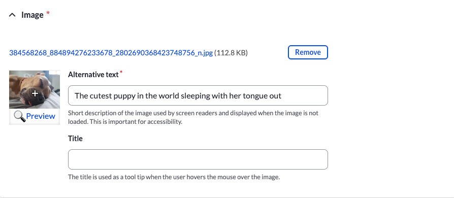
3. Inclusive Design: Updates to your site should be designed with accessibility in mind from the start. This means incorporating features like alt text for images, proper keyboard navigation, and accessible forms. (We’ve posted extensively about this subject; please check out the links below.)

4. Legal Compliance: Non-compliance with ADA guidelines can lead to legal challenges and potential lawsuits. Ensuring that your website meets the latest guidelines helps mitigate legal risks.

5. Training and Awareness: Web development and maintenance teams should be trained on accessibility best practices to ensure that new content and features adhere to these standards.

6. User Feedback: Incorporating feedback from users with disabilities can help identify and address accessibility issues that might not be caught through automated testing alone. As with user testing in general, when done correctly it is definitely the added time investment.

We love web accessibility.

We take web accessibility seriously at Kanopi. It’s a key part of being an inclusive organization, which is one of our core values. We’ve built accessibility practices into every step of our process, including research, discovery, content auditing, and persona reviews. Several of our team members are IAAP certified experts who frequently write articles and give presentations about website accessibility and inclusion. In fact, here are a few related blog posts our team has written:

It’s also worth mentioning that every site we build and support is AA WCAG compliant or better. So if you need help ensuring your organization’s website meets the new guidelines, please reach out to us! Working in collaboration with your internal teams, we’ll help you align your brand with modern web accessibility best practices. 

A more inclusive web is a better web.

The new ADA guidelines underscore the need for a proactive approach to web accessibility. As digital spaces become central to everyday life, embracing these standards not only ensures legal compliance but also enriches every user’s experience and promotes inclusivity. By integrating accessibility into the core of your web maintenance strategy — through regular audits, inclusive design, and responsive user feedback — you contribute to a more equitable digital world.

‘Spring Cleaning’ Your Website

As spring breezes sweep away the cobwebs of winter, it’s not just our homes that deserve a thorough cleaning: your websites do, too! Like any living space, your website can accumulate clutter over time, impacting its performance and user experience. 

Join us as we explore some of the tasks that should be on every website owner’s spring cleaning checklist. 

Remove and update 404 links

Imagine you’re tracking down an important piece of information on the internet, only to hit the dreaded 404 error — foiled again! If your website aims to attract and delight end users, providing them with a positive user experience while they visit your site is crucial. When end users encounter a broken link, it can be frustrating and diminish their trust in your website.

From an SEO (search engine optimization) standpoint, 404 errors can be a red flag to search engines, suggesting a lack of upkeep that can negatively influence your site’s ranking. Additionally, broken links disrupt the flow of search engine crawlers, hindering the site’s ability to be indexed correctly, which impacts how easily a user can find your website when performing an online search.

Ensuring that all links lead to the intended content keeps users engaged, encourages them to explore more of the site, and helps maintain a positive reputation with visitors and search engines.

How to check for 404 links

This task may seem daunting, especially for e-commerce or large-scale websites, but various free tools scrape your website for not only 404 errors but other unsuccessful HTTP response codes. As Quality Assurance (QA), I’ve used the following links and can vouch for both their thoroughness and a pleasant user interface. 

Manually review content

Among the most time-intensive yet vital tasks in your website’s ‘spring cleaning’ regimen is the thorough review of your content. Whether you’ve recently upgraded to the latest version of Drupal or are creating a new website, the content you initially uploaded was current. The real challenge lies in maintaining that freshness over time. But the more you can keep it current, the better it is for your site’s SEO.

It is imperative to regularly evaluate and update your website’s content to ensure that your information remains relevant, engaging, and meets user’s needs. This task, unfortunately, does require manual effort (but can be made more enjoyable by pouring a glass of wine while you review your content.)

Are you thinking it may not be worth the effort? This Semrush report found that 53% of marketers noted increased end-user engagement simply by updating their content. 

Screengrab of an SEMRush report with a bar chart demonstrating how engagement went up by 53% after content was updated on a website.

How to keep your content current

A content update or refresh can be as in-depth as you’d like. We’ve created a helpful content scorecard for anyone wishing to do a full content audit of their site. 

Additionally, look at Google Analytics so you can review which pieces of content are getting the most traffic. Then look at which ones aren’t getting enough. Can those be refreshed or updated? Can you add more images? Lastly, check your keywords as well to ensure your content is ranking the way you wish. 

Trends come and go, memes go viral and then fall out of existence (does anybody remember the ‘Dancing Baby’ 3D rendering from the 90s?), and while continually updating your website’s content to keep it bussin’ is lowkey tedious, taking the time once or twice a year to glow up your cheugy content shows you and your website got rizz. No cap. 

Note: The author wants to apologize for the last few sentences on this topic.

Audit meta tag/schema data

Updating your Schema markup and meta tags is a crucial but often overlooked aspect of website maintenance, as updating these fields yields no visible, immediate results. What does this data even mean, and what does it do?

Schema, a specific type of microdata, creates a description (or “rich snippet”) that appears in search results. For example, use a search engine to look up information on an upcoming event. Schema can provide you with where the event is taking place, the date and time of the event, images related to the event, and dozens more options.

On the other hand, meta tags provide metadata about the HTML document itself, giving potential site visitors more details about what kind of information your website has. Meta tags also help curate a better online experience by specifying images, titles, and descriptions appearing when a page is shared via social media. 

How to update your meta tags and schema

/blog/wordpress-maintenance-and-support/While there are thousands of configuration opens for schema markups, it is an excellent opportunity for more detail-oriented folks to get in there and refine the data as much as they’d like. As an added bonus, this data is easily configured within the Configuration settings for both Drupal and WordPress

Want more information on how many configuration options there are for Schema markups, or do you want to know more? Check out our blog post or visit schema.org’s ‘Getting Started’ section at schema.org. Or are you curious as to how your website appears for end users? Validate your schema markup here, and check your meta tags here

Verify media items have appropriate alt text and captions

The importance of website accessibility cannot be overstated and here at Kanopi, we have stated this importance plenty of times:

When we think about enhancing website accessibility, we aim to create a seamless user experience, regardless of how one interacts with the site. Consider this: while a user who doesn’t rely on assistive technologies can instantly appreciate an image of the world’s cutest puppy snoozing with its tongue poking out, these delightful details may escape a user depending on a screen reader. 

The backend of a website showing how and where to enter alternative text for a photo of a sleeping puppy.

How to add alt text and captions

Thankfully, it’s really easy to update alt text and captions in your media. When doing a content audit, simply check the images in your CMS when doing a ‘spring cleaning’ for your website to ensure the alt text and captions are there. 

By dedicating just a few hours a couple of times a year to update your images with clear titles, descriptive alt text, and informative captions, you not only comply with accessibility standards but also enrich everyone’s browsing experience. This small investment of time will ensure that all users, regardless of their mode of access, can view and interact with all of your site’s content, so you don’t lose any visitors along the way.

It’s time to get tidy!

Like many of life’s endeavors, consistent upkeep is not merely beneficial; it’s essential. This same logic applies with equal force to your website. The amount of time you choose to invest — a modest four hours or a more substantial forty — rests entirely in your hands, but remember that dedicating time to refresh and enhance your website will inevitably draw more visitors and significantly improve their user experience.

Are you interested in a spring clean but find yourself strapped for time? Reach out to us. Let us fine-tune your website to perfection.

Alt Text, and Captions, and Titles, Oh My!

When looking at image media in a CMS like WordPress or Drupal, it can seem incredibly overwhelming at first.

There are so many fields and though they each have a specific intended purpose, for many of us, we didn’t worry so much about them at first. Now with increasing awareness of the role of textual content for accessibility purposes, we all want to pay closer attention. So let’s take a quick peek at what those are and how they’re used. 

Alternative (Alt) Tags

Alt tags are the most commonly used tags. Their purpose is to be an alternative in case the image cannot be shown.  Decades ago these were most widely used to help account for images taking a long time to load on dial-up connections. As our technologies have changed since then, the purpose of the Alt tag has taken on a more important role.

Accessibility: Alt text is primarily used to describe the content of an image to those who cannot see it. This includes visually impaired users or users who have chosen to disable images. Without alt text, these users might miss out on crucial information conveyed by the image.

SEO: Search engines cannot directly understand what an image is about. Alt text helps search engines understand the content of an image and its context within the page, which can improve your site’s SEO. Search engines can use this information to index images correctly, and it can help your site appear in image search results.

Provides Context if Images Fail to Load: If an image fails to load due to a poor internet connection or an error in the image file, the alt text will be displayed instead. This helps users understand what should have been there.

Supports Non-Visual Browsers: Alt text also benefits people using text-only browsers or command-line browsers, which do not display images.

Compliance with Standards and Regulations: Adding alt text to images is a requirement under the Web Content Accessibility Guidelines (WCAG) and, by extension, regulations like the Americans with Disabilities Act (ADA). Non-compliance with these standards can have legal implications.

Overall, alt text plays a crucial role in making the internet more inclusive and accessible, helping to ensure that everyone, regardless of their physical abilities, can use and understand web content.

Alt Text in Action

Since alt text need to convey an image to someone who may not be able to see it, it needs to be descriptive, concise, and meaningful in context. Let’s look at an example.

One possible alt text for this could be “chair” or “balloon. Those were the search terms that found this image on Unsplash. Technically it may be accurate to use “chair” or “balloon” or even “chair and balloon” as the alt text, but it doesn’t give adequate information for a user to understand why this image has been included. What is the information that is being conveyed?

We could say, “white chair with a large pink helium balloon attached to its back” which would be highly descriptive and better explain the image. Or if this is a part of a short story about a lonely birthday, maybe the greater context would be given by something along the lines of, “the empty chair sat alone with its balloon in the room.” This would invoke a feeling that would enhance the storytelling experience.

The end goal should always be to give a user a connection to the image without relying on the image being visible. Remember to convey the same feeling or meaning that it’s meant to give those who can see it. If it’s important enough to show a user, it’s important enough to describe to a user who can’t see it.

It also needs to be concise. The alt text is only a short space to help give context. If your image is complicated or needs additional detail then a long text format such as a caption would be a better choice. Try to keep your alt tags around 120-125 characters. 

Of course not every image offers a user great value or an emotional connection. Often icons with labels and other decorative patterns just don’t have non-visual context. In this case, you need to indicate that you would provide alt text if there were any and that this image is merely “decorative”. This means that you need an empty alt tag – that signifies to assistive technology that this image has nothing contextual to share. This can look like this:

<img src="istock250871.jpg" alt="" />

<img src="istock250871.jpg" alt />

Either is fine as long as it’s there. If it’s not there, then the image alt will become its file name and istock250871.jpg just doesn’t give a lot of helpful context.

Captions

Some images convey complex meanings or details that can’t be fully captured in just 120 characters. These images benefit from what is known as a ‘long description’. This isn’t a replacement for alt text, but rather an optional addition. It usually appears as a caption under the image, providing a more in-depth explanation or context.

Longer descriptions that aren’t captions can also be attached behind the scenes or nearby as part of the standard presentation, such as the paragraph immediately following an image. Developers can also connect these longer descriptions for those using assistive technology to make the relationship perfectly clear, but typically captions already include these connections and are easily edited through the CMS (Drupal does not have this field by default but it can be added). If a caption will do the job, there’s no need for additional content.

Situations that may require an image caption include:

  • Charts and diagrams
  • Complex Images
  • Images that need additional information to create more context
  • Images that need a heading 
  • Images that require a source credit

The idea behind captions is to be able to describe the meaning, visual content, or any additional context. They can be longer or, if the surrounding text gives lots of content, could simply supplement that data (such as a source).

Let’s look at a few examples.

Decorative Image with Caption

In this situation, the website chose not to give the image alt text but did include an empty alt tag to indicate that the assistive technology could bypass the image. The caption was included to acknowledge that an image was present and to give an accompanying description. Though there are several reasons to choose this approach, perhaps they wanted to allow the articles to add as much content as desired without character limitations. It might cause some confusion as users have bypassed the image the caption is referencing, but it does technically meet the criteria.

An image from another site that was missing alt text. Alt text provided here just to identify image presence.

URL:
https://www.nasa.gov/history/honoring-african-americans-in-space/

Alt Text: none/decorative

Caption: Guion S. “Guy” Bluford photographing the Earth with a video camcorder through the shuttle’s overhead window. NASA.

Image with Alt Text and a Caption

This is what we’d consider a better approach. We have alt text that acknowledges the image is there and gives a description of that image. Then a visual caption to identify the image, and expand on the source. As much as accessibility is a legal need, every piece of content should be geared toward informing the user. What would make this slightly better would be if the alt focused solely on the visual description of the uniform and let the caption provide the details of who and when, but that’s just nitpicking at this point. The current content is perfectly acceptable.

U.S. Army green service uniform worn by Colin L. Powell as General and as Chairman of the Joint Chiefs of Staff. Uniform is hanging on a pole facing forward.

URL:
https://nmaahc.si.edu/explore/stories/honoring-general-colin-powell

Alt Text: U.S. Army green service uniform worn by Colin L. Powell as General and as Chairman of the Joint Chiefs of Staff. Uniform is hanging on a pole facing forward.

Caption:

A U.S. Army green service uniform worn by Colin L. Powell as General and as Chairman of the Joint Chiefs of Staff.

Collection of the Smithsonian National Museum of African American History and Culture, Gift of General Colin L. Powell, USA (Ret).

Choosing Your Approach

These are just two ways this was handled and are simple examples. In some cases there may be a need to showcase something much more complex, like a pie chart, or a technical diagram. In those cases a simple alt text of “Named Chart” and a detailed caption that explains the important data points would be a possible option. Or maybe there’s a need for a developer to connect a “long description” to the image. Overall your team needs to consider the data and what its value is to the user to choose the best approach.

Image Description

This is the general description field made available within WordPress and isn’t typically used within a theme, though it could be utilized in a number of ways if desired. It could even be used as a long description field in a custom theme. Drupal may or may not have a similar field since developers can add any number of additional fields to media based on type and display. By default, Drupal has fields for the image, the alt text, and the title. If you wanted to include a long description, or any additional information, your developer can make those adjustments.

Titles

Tiles are often under utilized in themes since the alt text is the preferred method for providing accessible information regarding an image, but both WordPress and Drupal have these fields. A title is only given to the user when a developer has written code to display it, or to have it appear on a specific interaction such as hover or click. By default, the title goes unnoticed by the average user. Screen readers can always access the title if they choose to, but the alt text is read automatically upon reaching the image so the title is often skipped. Search engines will always be able to see the title, so keep that in mind if you choose to fill it in.

One Final Note

Drupal and WordPress are incredibly flexible! They can allow for many customizations and allows you, as a content manager, to add so much value for your end users. Empower users to understand the meaning of your site’s visual content, regardless of their device, technology, or level of vision. Allow people to be the hero of their own story as they consume, understand, and act on next steps. If you keep that strategy in mind as you approach your image management you’ll be successful in accessibility, content strategy, SEO, and the overall experience for your users. 

Web Accessibility Mistakes: The Good, The Bad, and The Ugly

Let’s dive into the quirky world of web accessibility, where mistakes are as common as cat videos on the internet. Trust me, these blunders are not just face-palm moments but also huge learning curves. So, buckle up for a rollercoaster ride through the most common accessibility missteps!

1. Overlays: A Digital Band-Aid

Let’s start with overlays. Ah, overlays, the digital equivalent of slapping a Band-Aid on a broken arm. They promise a quick fix to accessibility, but in reality, they’re about as effective as a chocolate teapot. Overlays often fail to address the underlying issues, leaving users with disabilities in a virtual lurch, and possibly in legal jeopardy. Instead, follow the best practice approach referred to as “native Accessibility” which means building accessibility into the design and code from the onset.

2. Testing Tools: Don’t Put All Your Eggs in One Basket

Next up, testing tools. Relying on a single tool for accessibility testing is like painting a house with a toothbrush. Sure, you might make some progress, but you’re missing out on the heavy machinery! Diverse tools uncover different issues, so mix them up. Use automated tools, manual testing, and – the secret sauce – real user feedback when possible.

3. Contrast Catastrophes: More Than Just a Fashion Statement

Now, let’s talk contrast. Poor contrast on websites isn’t just a design faux pas; it’s an accessibility nightmare. It’s like trying to read a book in a dimly lit room while wearing sunglasses. Not fun. And it’s so easy to check! Ensure your text stands out against its background like a zebra in a field of horses. Your users’ eyes will thank you.

4. Keyboard Navigation: Don’t Leave Anyone Stranded

Imagine navigating a website with just your keyboard and getting stuck on a digital island with no way out. Welcome to the world of poor keyboard navigation. It’s essential for motor-disabled users but often forgotten like last year’s New Year’s resolutions. Make every interactive element reachable via keyboard. Your users shouldn’t need a map and compass to navigate your site.

5. Alt Text: A Picture is Worth a Thousand Words, But Only If You Describe It

Images on your site are invisible to screen readers unless they have alt text. Skipping alt text is like showing a movie with no sound and no subtitles. Describe those images! It’s not just a courtesy; it’s a gateway to a richer experience for users who rely on screen readers.

6. Forms: The Bermuda Triangle of Accessibility

Ever filled out a form online and felt like you entered the Bermuda Triangle? That’s what it’s like when forms aren’t accessible. Labels disappearing, confusing instructions, and error messages as clear as mud. Make your forms as straightforward as a LEGO instruction manual — easy to follow and frustration-free. The more inclusive and accessible, the better.

7. Multimedia Mayhem: Don’t Just Play it, Say it!

Multimedia content without captions and transcripts is like a joke without a punchline. It just doesn’t work. Captions aren’t just for those with hearing impairments; they’re a boon during noisy commutes or when your headphones decide to play hide and seek. Transcripts? They’re the MVP for users who prefer reading over watching.

Wrapping Up: The Path to Inclusive Web Wonderland

So there you have it, folks: a whirlwind tour through the wild world of common web accessibility mistakes. Remember, creating an accessible website opens doors; it’s not about being perfect, it’s about being better. Let’s make the web a wonderland for everyone, one accessibility fix at a time!

If you need help with the accessibility of your website, contact us.

An Assistive Technology Rundown

When I was a kid, if you wanted to call someone you either had to know their number by heart, or have it written down somewhere. Some people had little notebooks of contacts or a rolodex, and in Canada everyone had this big fat phone book, half white and half yellow. The white side had all the local residential numbers, and the Yellow Pages had all the local businesses.

As time went on, and it became normal to have cell phones, people started storing numbers in their devices. Many stopped registering landlines. Personal numbers were no longer something you looked up. Soon the big phone book that landed on our front step every year was reduced to just the Yellow Pages.

Not long after cell phones became the norm, smartphones quickly took over. With easy access to the internet, and the ability to dial the number straight from a website, even the Yellow Pages became obsolete. Mostly they went into the recycling bin. People complained about the waste of paper for books no one needed. Finally in 2019, the Yellow Pages went fully digital and the phone book became a thing of the past.

In the last decade so much of our life has moved online. In part this was expedited by the pandemic and the need for remote access to all kinds of services, but our world was already headed in this direction. Just ask the Yellow Pages.

Before you know it, some real life service providers may become obsolete and make the same jump to be exclusively digital. But when that happens, will it be usable by everyone? That’s where assistive technology comes in.

What counts as assistive technology? 

At its core, it’s anything that helps people with disabilities maintain, improve, or increase their capabilities. It might be the easiest to think of something visible and obvious like a wheelchair or a scooter, but it’s really a much broader category of equipment. Something as simple as a pencil holder that helps a child learn how to hold their pencil correctly is an assistive tool. 

Here’s a few more examples of assistive technology. What would you add to it?

  • Hearing aids
  • Wheelchairs
  • Glasses
  • Prosthetics 
  • Speech synthesizers
  • Crutches or slings
  • Braille
  • Scooters
  • Braces and casts
  • Power lifts
  • Communication boards
  • Adjusted school curriculum
  • Computer software
  • Elevators, escalators, and ramps

There’s also a wide variety of people using assistive technology. Some will use it for their entire lives, and some maybe just for a few minutes. They can be old, young, and anywhere in between.

Typically Permanent

  • Motor control difficulties
  • Cognitive difficulties
  • Learning and reading disabilities
  • Low literacy
  • Non-native speakers
  • Hearing loss
  • Low or no vision
  • Deaf-blind
  • Color blindness

Typically Temporary

  • Injuries that limit mobility like strains, sprains, and fractures
  • Medications that cause side effects like tremors or cognitive impairment
  • Eye injuries / eye infections
  • Broken eardrum / ear infections
  • Concussions
  • Recovering from surgery 
  • Plus any number of things that aren’t due to a disability, injury, or illness:
    • Intoxication 
    • Broken / missing computer mouse 
    • Being in a moving vehicle traveling over a rough surface
    • Only having one hand available while the other holds a toddler, a laundry basket, grocery bags, an angry cat, etc. 

With all of those in mind, take a look at this list and think about how you would typically accomplish these tasks in a brick and mortar world. Persons with disabilities have to do these  same things, and are generally able to because we live in a society where accessibility is regulated and enforced (though there is room for significant improvement).

  • Register for events
  • Apply for jobs
  • Order food
  • Financial management
  • Fill out taxes
  • Look up phone numbers and hours of operation
  • Go to school
  • Book flights & hotels

But now think about doing these things digitally, with a limited capacity to perceive or interact with the internet. What if you couldn’t read? Or speak? Or see? Or hear? Or move? How would you do those things? Could you even do those things digitally? What if there were no other options? No one should be restricted from these activities simply because of a disability. 

What kinds of assistive technologies are used online?

Incredible advancements made in bringing assistive technology into the digital world and ensuring anyone can have access to content and services online. It is actually possible to navigate and use a website using just your eyes!

Here’s some of the amazing assistive technology that’s being used today around the world:

Screen readers 

  • Synthetic speech spoken aloud provides the ability to consume digital content audibly.
  • Price range from free to $1,200 USD

Braille Displays 

  • Converts screen content into braille characters and sends them to a display where the individual can feel the output. Some devices also allow for braille input.
  • Price range $1000 to $7000 USD

Voice Recognition Software 

  • Allows users to speak instructions that can be utilized to navigate and instruct a digital display such as a website or other software.
  • Price range free to $500 USD, yearly subscription models are common

Eye Tracking*

  • Sensors that track eye movements in real time, identifying where the user is looking, responding to head / eye movements for engagement.
  • Price range $100 – $10,000+ USD

*Note: Some eye tracking software / devices are not created for accessibility and only track eye movements for data collection.

Switch Devices  

  • Provides binary input via foot pedal, Sip ‘n’ Puff, joysticks, and more. Some Switch Devices can receive non-binary input for more complex instructions.
  • Price range $20 – $2,000+ USD 

Sip ‘n’ Puff 

  • Allows users to utilize a straw like device to provide switch input through the use of their breath and can be customized for the user.
  • Price range $200 – $800 USD

You’ve seen some of these in action even if you didn’t realize it. Stephen Hawking used a switch device for much of his life to control his wheelchair and voice synthesizer via his thumb, in addition to eye tracking / blinking. He eventually had a custom switch device made when he was no longer able to use his thumb that would sense the tensing of muscles in his cheek to receive similar inputs. These advances in technology allowed one of the most brilliant minds of our time to continue his work for 55 years after he became paralyzed.

What needs to happen to make a website usable by these devices?

These devices will not work on a website unless they are built according to the WCAG 2.2 guidelines, meeting the Level AA standard as a bare minimum. This opens up a site to be understood by assistive technologies. Accessible websites will inform these devices what content is being reviewed and how to interact with it. It allows users to fill out forms, use navigation, find relevant information, download or upload files, check their email, everything you need to be able to do to operate in a digital world.

How can I improve my site so it’s accommodating to these devices?

While I advocate for all websites being Level AA compliant, it’s especially imperative if your site is in an industry such as  higher education, government, healthcare, etc. Both the USA and Canada have regulations regarding accessibility requirements so be sure to check that you are in compliance with the appropriate laws.

We can’t fix the entire internet in one push of a button, but you can start now by getting a sense of how accessible your current website is. Once you have an idea of what needs to be done, find an agency that prioritizes accessibility and can help you get your site across that line. 

Moving forward, make accessibility a part of your ongoing website goals. Because one day you too might need a little help from assistive technology.

How to Test Your Website for Accessibility

There’s something wonderful about putting on adult shoes as a kid. They’re enormous and floppy and shuffle around on your feet as you lift and walk. I remember doing this often with my dad’s shoes, regardless of the smell, giggling all the way.

Somewhere along the line between then and now, walking in someone else’s shoes loses that magical charm. It’s more comfortable to maintain the status quo. What works for us must work for everyone, right?

Except it doesn’t. Humans are not “one size fits all” and this is also true when it comes to the internet. Like a building needs accessibility access, a website needs accessible code so that it can be used by everyone.

Many people have vision problems, hearing loss, physical limitations and more. In fact, 27% of adults — a full 61 million people — in the United States alone are permanently disabled in some way. Once you include temporary disabilities (such as a broken wrist), or extend the range to teens and children, that number soars even higher.

Your site could be unusable for up to a quarter of your audience, and it’s worth it to check. Follow this guide to do some quick testing, or jump down to our tl:dr.

Why automated tools are useful but also insufficient

We’re often asked for metrics and automatic scans that can “score” a site for accessibility. As appealing as that may sound, it’s simply not an option in the current technical landscape. In reality, it is generally accepted that automated tools can only detect about 30% of WCAG’s 2.1 success criteria. Any tool or service that claims 100% automation is 100% lying.

The reason for that is there are many accessibility issues that Artificial Intelligence (AI) simply cannot understand, and while a scan could possibly identify a place where a human mind should take a look, it couldn’t say with any certainty whether or not there is an error there. In fact, the more aggressive the scanning tool, the more likely it is that there are false positives in the results.

A common example of this are images. Automated tools can detect whether or not an image has alternative text (a requirement for accessibility) but they can’t tell if the alternative text is appropriate for the image.

Because of this, testing requires both automated tools and manual tests. And since each tool is different in what it can detect, and how it presents its errors, it’s recommended that you use multiple tools when testing website accessibility. Each tool has its own pros and cons, things it does really well, and areas that need improvement.

By the way, the disparity between automated testing and manual testing is also why we highly recommend you avoid quick fix solutions like overlays. There are a number of other reasons, including legal reasons, but when it comes down to it automated tools are only part of the process.

Automated scanning tools to use

Lighthouse (Google)

Pros:

  • Provides scores out of 100 (for people who love metrics)
  • Gives advice for manual checks
  • Easy to use extension
  • Generally no false positives
  • Identifies target size errors
  • Can also provide SEO and Performance audits
  • Links errors to Deque’s aXe ruleset

Cons:

  • Very simple scan
  • Only audits 44 possible accessibility errors
  • Provides minimal information regarding errors

WAVE

Pros:

  • Easy to use via URL
  • Allows toggling styles and javascript on and off for scans
  • Attractive visual interface
  • Shows Level A and AA items as errors (red)
  • Shows Level AAA, and Best Practice items as warnings (orange)
  • Identifies all ARIA used
  • Identifies all structural elements
  • Identifies accessibility features applied
  • Identifies contrast errors separately
  • Provides helpful information regarding error
  • Links errors to WebAIM’s WCAG 2 Checklist
  • Links directly to code in Developer Tools
  • Has built in contrast checker

Cons:

  • Cannot scan javascript injected content
  • Generates a few false positives each scan

aXe

Pros:

  • Shows Level A and Level AA errors
  • Best Practice items can be toggled on and off
  • Groups errors by serious, critical, moderate, and mild errors
  • Groups uncertain items for manual review
  • Links errors to Deque’s aXe ruleset
  • Explains specific fix options for each error
  • Links directly to code in Developer Tools
  • Rarely gives false positives

Cons:

  • Extension can be overwhelming and difficult to use
  • Does not scan hidden items
  • May or may not scan javascript injected content

SiteImprove

Browser extension
Paid Platform

Pros:

  • Platform version can scan site wide
  • Platform scans for Level A, Level AA, and Level AAA errors
  • Includes scans for Best Practices
  • Platform provides a score out of 100 (for people who love metrics)
  • Extension can be configured to scan for specific levels, such as warnings, items to review, best practice, items likely related to content entry, etc
  • Links errors to WCAG 2:1 Guidelines
  • Links directly to code in Developer Tools
  • Groups errors by guideline

Cons:

  • Aggressive scan causes frequent false positives
  • Considers many Level AAA and Best Practice items to fall under Levels A and AA
  • Difficulty understanding javascript injected content

ANDI

Pros:

  • Extremely easy to install
  • Very visual interface
  • Provides information on how a screen reader might interpret some elements
  • Great entry into understanding what kinds of errors can exist
  • Has built in contrast checker

Cons:

  • Does not link errors to guidelines
  • Limited suggestions for fixes

Add manual testing to find what the automated tools didn’t

Once you’ve run your site through some of the automated tools, it’s time to get some hands-on experience about what it’s like to use your site in someone else’s shoes.

How to do keyboard testing

Believe it or not, keyboard testing is actually “low key” and easy to do. There are only a few things that you need to know in order to do this testing on your own.

Tab, Shift + Tab

Pressing tab will move you down a webpage through interactive elements like links, buttons, and form fields. Pressing shift + tab will take you backwards through those same elements.

Spacebar / Enter

These keys “activate” interactive elements. When you are focused on a link, hitting one of these will open that link. Sometimes they can also move you into an “application” state where other keys become usable (see Arrow Keys).

Arrow Keys

These keys will scroll the page up and down, but not always. Tabs, accordions, sliders, and menus can be designed as applications. That means once you are focused on them (or enter them using the spacebar), using the arrow keys will navigate you through those interactive elements instead of scrolling the page.

Esc

If you have entered an application, or a popup window, the escape key should exit that area and allow you to continue down the page where you left off.

Knowing these interactions, you should be able to use your webpage without a mouse. Try it for yourself and see if you can reach and use all of the interactive elements.

  • Can you see where your focus is (what your next keypress will activate)?
  • Can you navigate through your menu?
  • Is tabbing logical, or does the focus move to unexpected areas?
  • Can you use sliders, accordions, galleries, videos, and tabs?
  • Can you enter form information and submit?
  • Do you get “trapped” anywhere and need to use your mouse to move on?

If you can’t use your page without a mouse, or if the keyboard experience is generally frustrating, then there’s some improvement to be made with accessibility. Keyboard functionality is vital to most assistive technologies, and if you had a hard time then chances are so is someone else.

A note about screen reader testing

You will likely need to hire someone to do this for you, as it takes a high level of skill and experience to operate. But using the ANDI tool on your site can show you some of the things a screen reader will present to a user, so if you’re interested give that tool a try.

To learn more about screen readers and assistive technology, check out our Screen Reader 101 blog post.

Where to find real users to test your site

Putting your site in front of real users with a variety of disabilities will most certainly uncover any issues missed by automated and keyboard testing.

Here are some resources for finding those users:

If you think there’s a problem, it’s time for a deep dive audit

While the methods mentioned here can give you an overall picture of a single page’s level of accessibility, it doesn’t reflect the full breadth of your site. For that, you’ll want a deep dive accessibility audit.

This type of work typically takes someone with a good deal of experience in the accessibility space. It would entail automated and manual testing of multiple pages to try and get a sample of each template used, in addition to some randomly selected pages. The auditor needs to know how to use multiple tools, how to test via keyboards and screen readers, how to investigate Javascript injected content, and know what to look for in criteria that can’t be caught in an automated scan.

Kanopi specializes in accessibility for our clients and we do offer deep dive accessibility audits, including itemized results for remediation. If you’re interested, send us a message!

TL:DR for testing your website’s accessibility

Try to use your website without a mouse.
If it’s frustrating for you, it’s frustrating for someone else.

Imagine someone was trying to navigate your homepage only by headings and links.
If someone couldn’t see the page and only had these elements to navigate by, would they know where to go?

Run your most popular page through two or three of the tools mentioned in this article.
A single issue can prevent someone from buying a product, viewing a service, or understanding your content. Take any errors seriously.

Re-test your site every so often.
Updates to code and content can unexpectedly change your site’s accessibility. Regular testing helps keep you informed about potential barriers on your site.

Screen Reader 101

It’s time to take a look at screen readers and get a better understanding of who uses them, and what it’s like to use assistive technology on the web.

What’s a screen reader?

A screen reader is a piece of software that is able to review textual content from a computer and present it to a user via synthetic speech. It’s what we call “assistive technology” and essentially “reads the screen” out loud to the user. You may have heard the term used specifically in regards to the internet, likely because screen readers are an invaluable asset for the accessibility community. 

Screen readers present a website as plain text, including important semantic information such as region, headings, links, and interactive elements. Where most users might perceive a website as an interactive brochure of sorts, a screen reader’s experience is closer to an interactive audiobook.

Because of this, screen readers make the internet accessible to users who otherwise might not be able to perceive or understand content being presented visually.

Who are screen readers for?

It’s tempting to think of screen readers as used only by people who have limited vision, but that’s not the sole use case. In fact screen readers are so helpful, they’re used by many different groups of people.

  • People who are blind
  • People with low vision
  • People who have learning and reading disabilities
  • People with cognitive impairments
  • People with motor disabilities
  • People with low literacy
  • People who are non-native speakers
  • People who prefer to listen to content rather than read it

That’s a wide range of needs, and there’s a good chance that any given website’s audience overlaps with one or more of those categories.

What’s it like to use a screen reader?

This is a basic example of the JAWS screen reader going through a small chunk of website content. The experience is quite linear, just straight down the page without any additional context and demonstrates the “plain text” aspect of how a screen reader regurgitates information.

For a more extensive look at screen readers in action, here are a few videos under 5 minutes that can give you deeper insight into the experience.

UCSF Screen Reader Demo

SLCC Screen Reader Demo by individual with no vision

TPGI Accessible Page vs Inaccessible Page

How does website inaccessibility impact screen readers?

Structure & Order Matters

Screen readers understand a page in a linear pattern, apart from the design and layout, following what is known as the “DOM order” (Document Object Model). Essentially, the DOM order is the html of the page in the order that it is written. 

Why does that matter? Because while I can style a button from the footer to visually appear as though it’s in the header, someone using a screen reader will not reach that button until the application reaches the footer. This could be a confusing experience if the user could see the button, but not hear its function.  

Consider if a form’s labels were all on the left side of the page and the inputs where you enter information were all on the right side of the page, but they were coded as two columns instead of rows. A screen reader would read all of the labels first (down the first column), then all of the inputs second (down the second column). Without visually being able to line up the label to the input, a user wouldn’t know how to fill out the form.

To create an accessible experience, the DOM should follow a logical structure. It needs to make sense to someone who can’t see the page, but also to those who can see it. Remember, many users of screen readers are also viewing the page; it would be confusing to bounce around illogically ordered content. Users might lose their place on the page, or start confusing the relationships between headings, content, and links. For those with cognitive difficulties, this would be incredibly frustrating.

Landmarks & Headings Become Waypoints

If you think about a webpage like an essay, it has an introduction (the header), the body (the main content), and a conclusion (the footer). And every good essay has an outline (the headings).

A screen reader has the ability to move down a page using these kinds of landmarks as waypoints. Users could choose to move from the header to the main content, to the footer. If a page is created without essential landmarks, the screen reader can’t find those elements for the user. A site with proper semantic html will automatically inform assistive technologies of those regions, making it easier for users to navigate the page.

Aside from landmarks, screen readers can also travel via headings, allowing their users to select a sub heading that piques their interest and start reading from there. If your headings don’t follow a logical outline structure, this could misdirect and misinform users. In an essay you would never put the opening paragraph above the title, yet online this is a common faux pas done under the assumption that everyone can visually see and realize the intention.

When you visit a webpage, typically you’ll see a large number of links. Sometimes this is limited to the main navigation, but often there are links within the content, call to action buttons, or lists of quick links for navigating to popular pages. Screen readers are capable of pulling out all of the links from a website and presenting them to a user so they can more easily find where to go.

Take a look at your webpage. Look at all of your links and compile a list of them in your head. Do they make sense without surrounding content? If not, then it’s possible your site would give a screen reader some trouble.

Let’s say you had a sub-page called “About” in the main navigation going to a page service/about. But then down in the footer area you had a page called “About” going to company/about-us. A screen reader would present each link as “About” and the user would have no idea they were two different urls, or that one was about your services and the other your company.

Likewise, generic link text can be incredibly frustrating. Buttons and links reading “click here” or “read more” or “view now” are poor descriptions and don’t offer any information about where the user will be taken when activated. Read more about what? What am I going to view? Why should I click here?

These problems and more can quickly make your website unnavigable by screen readers, but these problems can also be solved with good accessibility practices. There are ways to include more information that only a screen reader can “see” and present back to a user to provide additional context to potentially confusing links.

What other kinds of assistive technology are there?

Beyond screen readers, consider these other technologies:

Braille Displays – these refreshable displays output textual content with braille that updates as a user moves throughout the page.

Voice Control – allows users to speak instructions that can be utilized to navigate a page through the same waypoints and elements that a screen reader uses.

Eye Tracking – tracks eye movement to trigger page elements and interactions.

Sip & Puff – allows users to utilize a straw like device to provide binary input through the use of their breath.

Switch Devices – provides binary input via foot pedal or other interactive equipment that can be extended for more complex inputs.

Magnification – provides the ability to zoom in and out on content.

While screen readers are just one branch of the assistive technology tree, at their core is the idea of turning a visual website into textual content understandable by a machine. Because of that, all of this other technology typically benefits from screen reader accessibility, making your site available to many more people who otherwise might not have been able to access your products and services.

Where to get a screen reader?

It’s fairly easy to find browser extensions or apps to add screen reader capabilities to a device, but here are the top three tried, tested, and true full solutions that are preferred by the accessibility community at large.

JAWS

Operating Systems: Windows® 11, Windows 10, Windows Server® 2022, Windows Server 2019, and Windows Server 2016.

Cost: Paid

This incredibly powerful screen reader solution has a robust suite of features and abilities. It integrates with other assistive technologies extremely well; in fact it is so popular that more than 53% of screen reader users are using JAWS.

NVDA

Operating Systems: PCs running Microsoft Windows 7 SP1 and later

Cost: Free

While the main product is free (supported by donations), there is additional support and resources offered in paid package deals. One of the really nice features of this software is it can be run from a USB drive, which makes it ideal for those using community computers at a library or café.

VoiceOver

Operating Systems: Most Apple devices

Cost: Free

If you’re using an Apple device, you likely already have this installed. From watches to computers to TVs, you can use a variety of VoiceOver accessibility settings. It’s also compatible with a huge range of refreshable Braille displays.

For further reading, American Foundation for the Blind has additional information on free and paid screen reader services.

Inclusive Language

At Kanopi, we strive to be inclusive in as many ways as possible: from our hiring practices, to accessibility within our documents and website, to social media. We also work as a company to make our verbal communications inclusive. Some everyday phrases have problematic origins, and we may not have awareness of that. The following lists contain phrases/words that are problematic, some suggestions for what to use instead, and some links that explain more. 

As many of these phrases have been used for decades, a person using problematic language may be unaware of the issues surrounding particular words or phrases. So we suggest giving the individual the benefit of the doubt (within reason, of course), talking to that person about the word or phrase by approaching them privately, telling them what you noticed, your understanding of why the word or phrase is problematic, and suggesting alternate language they might use to get their point across.

Trigger Warning: the following content includes examples of abelist, gendered, racist, and gatekeeping language. While some examples may be specific to the US or to Canada, we realize that this is an evolving list that can and will grow and change over time.

Ableist Language

Ableist language encompasses words and phrases that deliberately or accidentally hurt individuals who live with disabilities. Rather than using ableist language, we strive to use people-first language.

Resource: https://gcdd.org/news-a-media/people-first-language.html 

Problematic LanguageUse Instead
Lame Stodgy | Tacky | Cheesy
Crazy | Insane | Schizophrenic | Hysterical | Manic | Psycho | Spaz | MoronUnbelievable | Silly | Preposterous | Illogical | Irrational | intense | Wild | Vehement | Impassioned | Piercing
ADHDUnfocused
OCDTidy | Organized
That’s so gay…Cheesy | Tacky
Blind to, deaf toDidn’t understand | Couldn’t perceive
RetardedSilly | Confusing
Click (when referring to mouse action)Select
See URLVisit URL
Suffers from….Lives with… (ex: “Suffers from Aids” versus “Lives with AIDS”)
BingeingIndulged | Satiated | Spree | Wallowed
A table of ableist language and recommended alternatives

Gendered Language

Resource: https://writingcenter.unc.edu/tips-and-tools/gender-inclusive-language/

Problematic LanguageUse Instead
Umbrella terms like “homosexual” or “gay”Use LGBTQIA or LGBTTIQ2S
Brother or sisterSibling
Man the boothStaff the booth
MankindHumankind
Guys or Dudes (as in, “Hey guys!”)Hey everyone | Y’all | Folks or Folx
Pronouns (she/her or he/him)Neutral pronouns (they/them), or use the person’s name
LaymanLayperson
A table of gendered language and recommended alternatives

Pronouns

Not every person identifies as part of a gender “binary” (meaning, either male or female). Gender identity and expression fall upon a broad spectrum, and individuals may identify anywhere on or outside of that spectrum. Non-binary individuals may identify as gender fluid, agender (without gender), genderfluid, genderqueer, or something else entirely. Knowing this, we should never assume a person’s gender identity strictly based upon the clothes they wear, the timbre of their voice, or even their physical attributes. 

One way that we can be clear about our own gender expression (if we are comfortable doing so) is to name our pronouns. We can do this in conversation (“My name is XXX, and my pronouns are XX/XX”), through our email signature, Slack profile, Twitter handle — there are many avenues! What’s more, by identifying our own pronouns, we may make another person feel comfortable identifying their pronouns for us. 

If you are not clear on a person’s pronouns, or the information is not presented by the person, it is also okay, when speaking to someone, to ask for their pronouns. Some ways to do this might be to simply say:  “What pronouns do you use?” or “What pronouns should I use for you in this space?” or “My name is [NAME], and my pronouns are [XX/XX]. What about you?”

Racist and Colonialist Language

Problematic LanguageUse InsteadResource
Peanut Galleryhecklers, interrupters, botherers, cheap seatsLink
White Trash, RedneckLink
Inner City, Urbanlow-income city, high-need locale, metropolitan population, city-dwellersLink
Ghetto, GhettoblasterLink
Grandfather (as in, “grandfathered in”)Legacy, old rule, inherited, precedentLink
Gyp, GyppedRipped off, cheated, conned, swindled, shortchanged, bamboozledLink
Master | SlaveLeader | Follower, Teacher | Student, Parent | ChildLink
Indian give(r)UngiftedLink
No can do | Long time no see | Me likeyI can’t, I cannot | I haven’t seen you in a while | I like itLink
Spirit Animal“Patronus” (Harry Potter reference), familiar, raison d’être / reason for living, kindred spiritLink
Paddy WagonPolice vehicleLink
Call a spade a spadetell it like it is, it is what it is,
“if it looks like a duck and it sounds like a duck, it is probably a duck”
Link
Colored (people)People of ColorLink
Sherpaguide, coach, commander, leaderLink
Guruexpert, virtuoso, authority, maestro, captainLink
Ninjaexpert, ace, virtuoso, maven, jediLink
Naziauthoritarian, absolutist, boss, sticklerLink
Scalpedrobbed, hustled, fleeced, pulled a fast oneLink
Tribegroup, crew, squad, community, circleLink
Powwowchat, brainstorm, ideateLink
Hip Hip Hooray!Hooray! (“Hip hip” is the problem)Link
Eenie Meenie Miney Moflip a coin, ask a friend, just make a decision without singing.Link
Moronfool, doofus, nitwitLink
Nomad / digital nomadremote worker, location-independent workerLink
Tipping Pointboiling point, reached the limit, crossroad, the final straw.”Link
The “ok” Emoji and/or Hand GestureThe “thumb’s up” Emoji and/or Hand GestureLink
Low Hanging FruitQuick Wins, easy tasksLink
SpookyCreepy, scary, frighteningLink
SavageFierce, cruel, violent. In some contexts, this is used as a synonym for “expert” – in those instances, use expert, ace, virtuoso, maven, jediLink
Stakeholderinvestor, sponsor, partner, collaborator, colleague, associate, participantLink
A table of racist and colonialist language, with recommended alternatives and further reading.

Gifs and Digital Blackface

“Digital blackface” describes the act of producing, posting, or circulating ‘black reaction gifs’ online and especially on social media threads. The practice is problematic because it re-enforces stereotypes of Black Americans as exaggeratedly comic personae, or, especially in the case of women, as archly sassy, but in a way that does not detract from their fundamental availability to the project of white identity construction. Several good articles about digital blackface can be found here, here, and here

So, as a practice, reaction gifs are fine to use, but be mindful of the individuals pictured within those gifs, and the big-picture message the content you choose may be sending. 

“Knowledge Gatekeeping” Language

Knowledge gatekeeping relates to an assumption of another’s level of understanding and/or education level, and inferring a level of ease as a result (for example: “It’s so easy” “as simple as”). 

Problematic LanguageWhy It’s Problematic
“It’s so easy”This assumes the recipient’s skill level
“Common knowledge”This assumes a level of education or exposure to information
“Wait, you have never used a [Git client]?”This not only assumes a level of education or exposure to information, but it discourages folks that are new to a concept from speaking up or reaching out for help.
A table of knowledge gatekeeping language and why it’s problematic.

Evolving from Violent Language

Credit to Anna Taylor for this compilation, and posted with her permission.

Problematic LanguageUse Instead
“We’re going to pull the trigger.”“We’re going to launch.”
“I’ll take a stab at it.”“I’ll take a pass at it.”
“Did we jump the gun?”“Did we start too soon?”
“I’ll bite the bullet.”“I won’t avoid it any longer.”
“What’s the deadline?”“What’s the due date?”
“We have to pick our battles.”“We have to choose our opportunities.”
“Can you shoot me an email?”“Can you send me an email?”
“That was overkill.”“That was a bit excessive.”
“I bombed the presentation.”“I didn’t do my best.”
“Let’s roll with the punches.”“Let’s move forward.”
“We can soften the blow by …”“We can make it a little easier by …”
“I’m going to take a shot in the dark.”“I’m going to take a guess.”
“Let’s not beat a dead horse.”“Let’s not focus on that anymore.”
“I was blown away by her presentation.”“I was impressed by her presentation.”
“I was kicking around an idea.”“I was thinking through an idea.”
“He’s a straight shooter in meetings.”“He’s pretty direct in meetings.”
A table of violent phrases with potential substitutes.

Microaggressions

“Microaggression” is a term used for commonplace verbal, behavioral or environmental slights, whether intentional or unintentional, that communicate hostile, derogatory, or negative attitudes toward stigmatized or culturally marginalized groups. The Micropedia is a wonderful and beautifully designed website that outlines what these look like, gives an opportunity to offer suggestions, and gives advice on how to address them.

Other Resources

Disability Language Style Guide by the National Center on Disability and Journalism

Inclusive Language Guide from Educause

5 Simple Ways to Improve Website Content Accessibility

Accessibility is a growing demand on the internet as our world shifts from in person to online in a variety of aspects. The pandemic has escalated that shift, and it’s becoming increasingly clear that all websites need to be accessible regardless of legal requirements.

While WCAG 2.1 compliant websites are coded following accessibility guidelines, it’s easy for a site to slip away from compliance through regular content entry. Or perhaps accessibility isn’t something that you’ve prioritized before and you’re just getting started on making improvements. Either way, here are five simple actions you can take right now to improve your website accessibility from a content perspective.

  1. Review / Revise Acronyms & Abbreviations
  2. Remove All Caps
  3. Use Sequential Heading Structure
  4. Alt Text
  5. Descriptive Links

Review / Revise Acronyms & Abbreviations

Acronyms and abbreviations are common in a number of organizations and industries. What’s often overlooked is how those are interpreted by screen readers.

I once came across some website content where they were comparing Generation X to Generation Z, but they used the abbreviations “Gen. X” and “Gen. Y”. Screen readers will often try to expand an abbreviation for clarity. When I tested the content, I discovered it was being read as “General X” and “General Y”. So while the original intent was to save on space, the meaning was confusing to anyone using a screen reader.

Likewise, some acronyms can be troublesome. P.O.W. would be read as “Prisoner of War” while POW would be read as “pow!” like the comic book action. It’s a good idea to read aloud to yourself the content on your website, and consider the potential for misinterpretation by someone hearing rather than seeing it.

Remove All Caps

Whenever I think of all caps, I think of AmyJune Hineline, former Kanopian and winner of the 2021 Aaron Winborn Award (she really loves that being mentioned). She used to regularly remind us all of how all caps can be a common source of frustration and miscommunication with the hashtag #NOWTHATCHERISDEAD. AmyJune would then ask, “Who’s dead? Cher or Thatcher?”

Switching to all lowercase in this circumstance won’t help either. If you are looking for a way to make hashtags more readable, capitalize the first letter of each word (NowThatcherIsDead). It’s called Camel Case (or Pascal Case, depending on who you ask) and it improves readability considerably. For the record, I promised AmyJune that if I ever had a child I would name them Cher Thatcher so the original hashtag would still be true when they passed. Problem solved.

Of course we typically use spacing and punctuation in website content, which helps alleviate some confusion, and all caps are typically used as an easy way to identify something as a heading or to indicate additional importance. But due to the uniform shape that capital letters give words, they become more difficult to identify at a glance and therefore reduce readability. Using Title Case (Now Thatcher Is Dead) is considered easier to parse, both visually and cognitively.

Use Sequential Heading Structure

HTML headings are structured similarly to an essay outline. Your page starts with an “H1” and should only have one of these. This is the heading that tells search engines and users what the focus of the page is. This is typically the title of your page or blog post. The remaining heading values (H2 – H6) are used to identify the content hierarchy of the page. 

Screen readers depend on headings to navigate a page, as users will typically bounce through the headings to find a section to read. If your page skips heading levels, or uses heading levels incorrectly, these users will not be able to correctly navigate your content.

  • H1 – Page Title
    • H2 – Section Title
      • H3 – Subtitle
      • H3 – Subtitle
        • H4 – Subtitle
        • H4 – Subtitle
      • H3 – Subtitle
    • H2 – Section Title
    • H2 – Section Title
      • H3 – Subtitle
      • H3 – Subtitle
      • H3 – Subtitle

Alt Text

Alternative text, commonly known as the alt text, displays when an image link is broken and can’t be displayed. And it’s far more useful than you may realize. Search engines use alt text to further understand the context of your web page and so it’s also useful for SEO purposes. But even more important, alt text is what’s read aloud by a screen reader. For someone with low or no vision, this description helps them identify the content of an image without needing to see it.

Decorative images, such as swoops or waves or other abstract design elements don’t require alt text, but your average image does. But not all alt text is created equal. When describing a picture, consider the purpose of the image and the feeling it’s meant to convey. Identify what is important to understand from the context of the image and the content around it, then articulate that in the alt text. Remember, if it’s valuable enough to show to a sighted user, it’s worth describing to users of assistive technology.

Take a look at this image taken by the James Webb Telescope, uploaded by NASA. The alt text reads, “A large pink, speckled galaxy resembling a wheel with a small, inner oval, with dusty blue in between on the right. Two smaller spiral galaxies about the same size are to the left, all against a black background.” This accurately conveys the image content without being too wordy.

A large pink, speckled galaxy resembling a wheel with with a small, inner oval, with dusty blue in between on the right, with two smaller spiral galaxies about the same size to the left against a black background.
Credits: NASA, ESA, CSA, STScI, Source

Most CMS platforms offer the ability to easily add alt text to your images and it’s highly recommended that you take advantage of the option to do so. Visit your website’s media library and review uploaded images, updating as needed. Then remember to add alt text when new images are added and you should be good to go.

Links are plentiful on almost any webpage. From the navigation bar, to the footer, there’s bound to be several links leading to other areas of your website or even to external sites. One of the most common types of links seen in content is the “read more” link. Generic phrases such as “Learn More,” “Read More,” “View,” and “Click Here”  offer little content to assistive technologies which often scan the links of a page and simply provide them to a user without the surrounding context. 

For example, if your page has three cards for news articles and the links for each are “Read More”, assistive technologies may present them as “Read more, link, read more, link, read more, link.” That is useless to the user if they cannot visually see the title of the article that goes with the link. 

In fact, this type of link is so discouraged, Google penalizes it when calculating a website’s SEO score. And yet this is an incredibly common practice. Even Kanopi’s website utilizes read more links in a number of situations. So how can you get around this ambiguity? 

Ideally it’s done by having hidden screen reader text added in addition to the “read more.” You’ll find an accessible website often has additional content that’s hidden visually but presented specifically to assistive technology. Instead of reading “Read more, link,” the screen reader is presented with, “Read more [about our blog post on accessible design], link.” This is how we do it with Kanopi’s site, making it possible to use “read more” as link text.

But because this method requires some behind-the-scenes code, it’s more commonly used in templated areas that automatically present content with read more links. When you’re adding textual content to your site, you may just want to add a button or link to send the reader onto more information. When that happens, it’s important to remember the link may be reviewed independently of the content around it. Being descriptive will help your SEO and your accessibility. 

I could tell you to “read more,” but it would be better for me to point you to an article about inclusive and accessible webforms.

Beyond Content Entry

Accessibility is an absolute necessity as assistive technology opens up the internet to more and more people. If you’re interested in achieving a WCAG 2.1 compliant website, get in touch with Kanopi. We’d love to help you create a site that is accessible to all.