If you want to refresh your nonprofit website, you’re in good company. According to the 2023 Nonprofit Tech for Good report, 68% of nonprofits have redesigned their websites in the past three years.
As nonprofits continue to prioritize mobile optimization, security, and engagement, we’re here to help you do the same. In this post, we’ve rounded up standout nonprofit websites to inspire your next refresh or rebrand, highlighting key design elements that create an impactful nonprofit online presence.
We’ve compiled the best nonprofit websites to inspire you as you tackle a refresh or rebrand, organized into these categories:
- Best nonprofit website designs
- Best nonprofit websites for accessibility
- Best nonprofit websites for calls to action
- Best nonprofit websites for storytelling
- Most creative nonprofit websites
Stick around for tips on collaborating with a web development agency to build a site that empowers your nonprofit’s community. As you explore, consider how these website elements could enhance your own. After all, the best ideas are often inspired by what’s already working!
Best nonprofit website designs
The best nonprofit websites offer seamless UX and a stylish, professional, uniform design. Top sites have a content strategy that meets their users’ needs and considers how offline moments connect with online ones. They understand their users’ generational differences and provide a tailored UX that reflects this, with flexible giving options and coordinated online and print experiences.
With these qualities in mind, here are a few of the best nonprofit website designs and what makes them great. We’ve compiled a variety of designs, from more creative to more straightforward examples, to provide a full overview of the current state of nonprofit web design.
Girls Who Code
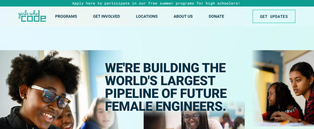
Girls Who Code seeks to close the gender gap in the technology industry by engaging and training girls in computer science and coding skills. They’ve served 450,000 girls through their variety of summer camps, clubs, and college prep programs.
What we like about Girls Who Code’s website design:
- Girls Who Code’s inspiring mission statement takes center stage on their homepage hero, supported with imagery of the girls they represent.
- Their site includes vibrant and bold colors that offer strong color contrast.
- Their dedicated donation page provides a simple FAQ explaining how donations are spent and how to sponsor Girls Who Code if you’re a company.
Equal Opportunity Community Initiative
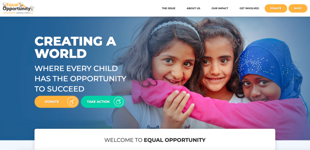
Based in Toronto, the Equal Opportunity Community Initiative (EOCI) is committed to improving the lives of vulnerable children, providing them an equal opportunity to reach their full potential. They prioritize five pillars to reach these goals: education, training, community, social mobility, and essential life needs.
Why Equal Opportunity Community Initiative’s web design stands out:
- The EOCI’s branded online donation page provides a seamless giving experience.
- They have quick links to essential resources, providing different users with a clear starting point as they begin their journey through the site.
- Engaging photos of the organization in action on the homepage helps visually tell the success story of the EOCI.
David Suzuki Foundation
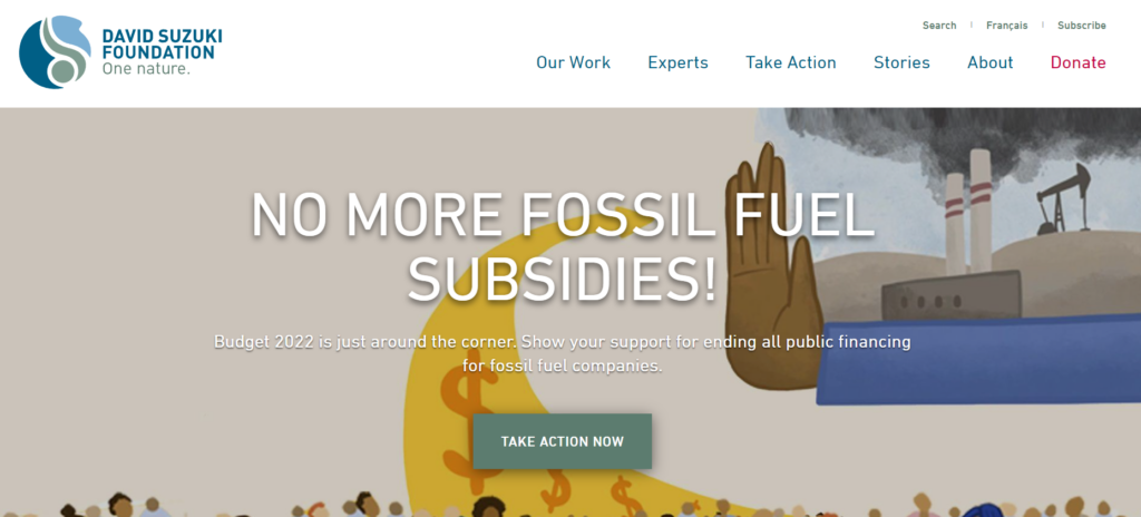
The David Suzuki Foundation is dedicated to fighting climate change, restoring nature, and creating more sustainable communities. The foundation’s initiatives range from protecting caribou habitats in Ontario to supporting youth-led climate-related lawsuits.
What we like about the David Suzuki Foundation’s web design
- The DSF website is genuinely accessible, with concise and accurate alternative text for images on every page of their site.
- Their straightforward user journeys for visitors who want to take action from the homepage, whether they wish to act online, locally, or in their own backyard.
- The David Suzuki Foundation provides several flexible and innovative ways to give, including monthly and one-time donations, donating stocks, or virtual gifts.
Golden Gate National Parks Conservancy
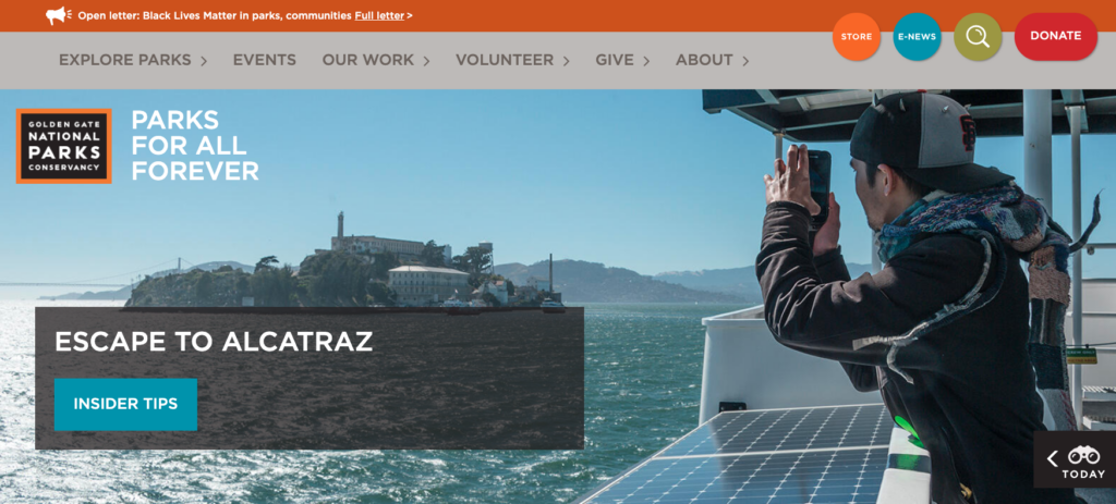
The Golden Gate National Parks Conservancy is dedicated to preserving the Golden Gate National Parks to be enjoyed by current and future generations. To accomplish this aim, the Conservancy focuses on four main areas: trail and park improvements, education and youth programs, ecosystem and wildlife conservation, and community programs and social impact.
What’s great about the Golden Gate National Parks Conservancy’s web design
- As part of Kanopi’s continuous website improvement program, ongoing improvements have resulted in a 31% decrease in bounce rate.
- Their embedded searchable directory within the homepage makes it easy for users to look up the park they’re interested in quickly.
- They have clear user pathways for park visitors, volunteers, and donors from the homepage.
CARE
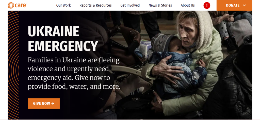
CARE’s mission is to end poverty and achieve social justice. Their work extends to many areas, including fighting hunger and malnutrition, strengthening resilience in the face of climate change, and reducing the educational and economic gap to help women succeed.
What’s great about CARE’s web design:
- From letter-writing and advocacy to donating and volunteering, CARE provides flexible and creative ways to support their cause online, including their reimagined CARE Package in response to COVID-19.
- An eye-catching responsive infographic tells site visitors how much of their expenses go to program services in their static footer.
- CARE’s up-to-date news and stories section keeps supporters informed and engaged.
Children’s Organ Transplant Association (COTA)
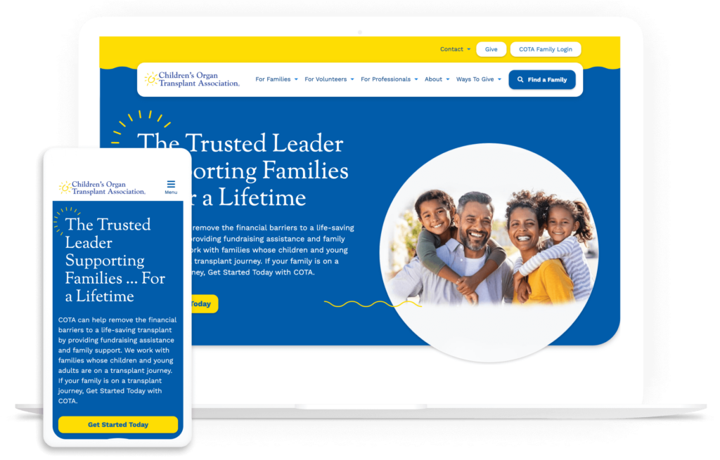
The Children’s Organ Transplant Association (COTA) helps reduce financial burdens for families with children who require organ transplants. This healthcare nonprofit equips volunteers and families with the resources and tools they need to fundraise on their own. The organization has supported thousands of patients and helped raise over $160 million since 1986.
What we love about COTA’s nonprofit web design:
- COTA turned to Kanopi for support in updating its website to transform it into a mobile-friendly, accessible, high-performance resource. The site’s flexible structure, bold branding, and readable content make it easy for anyone to navigate and engage with the site.
- With the help of Kanopi’s expert guidance, families can now access a secure, user-friendly online portal to review expenses and access fundraising how-to guides and tutorials.
- The site also has a strong storytelling component, with compelling video testimonials, blog posts, and direct quotes from those who have been supported by the organization.
Freedom Service Dogs of America
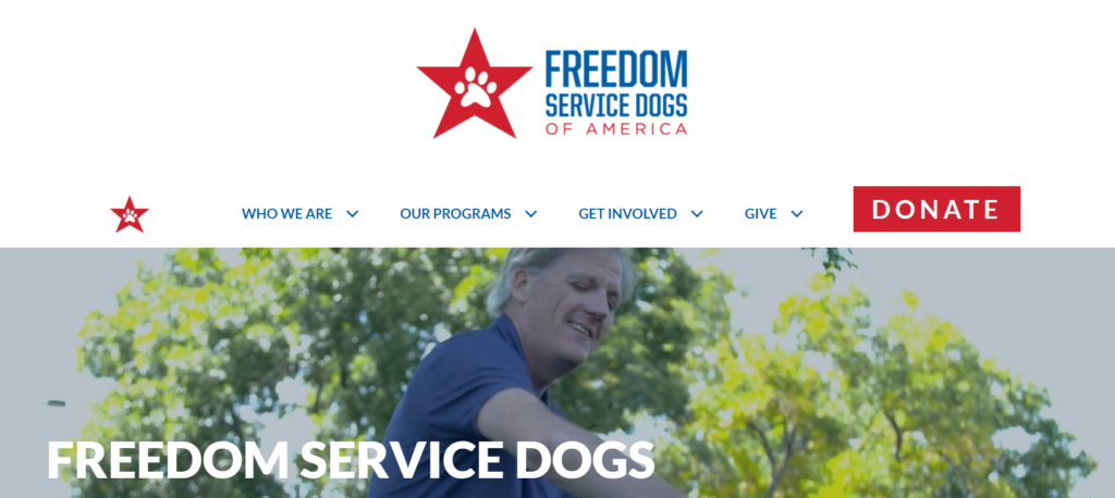
Freedom Service Dogs partners veterans as well as children and adults with disabilities with trained assistance dogs. The dogs are completely free of charge for each individual.
Here’s why Freedom Service Dogs is one of the best nonprofit websites:
- The monthly giving program is prominently displayed on the homepage, helping supporters easily become recurring donors.
- The site has straightforward “about us” and impact information, reassuring donors and other stakeholders that their support will be used wisely.
- The bold, eye-catching design captivates visitors with a red, white, and blue theme.
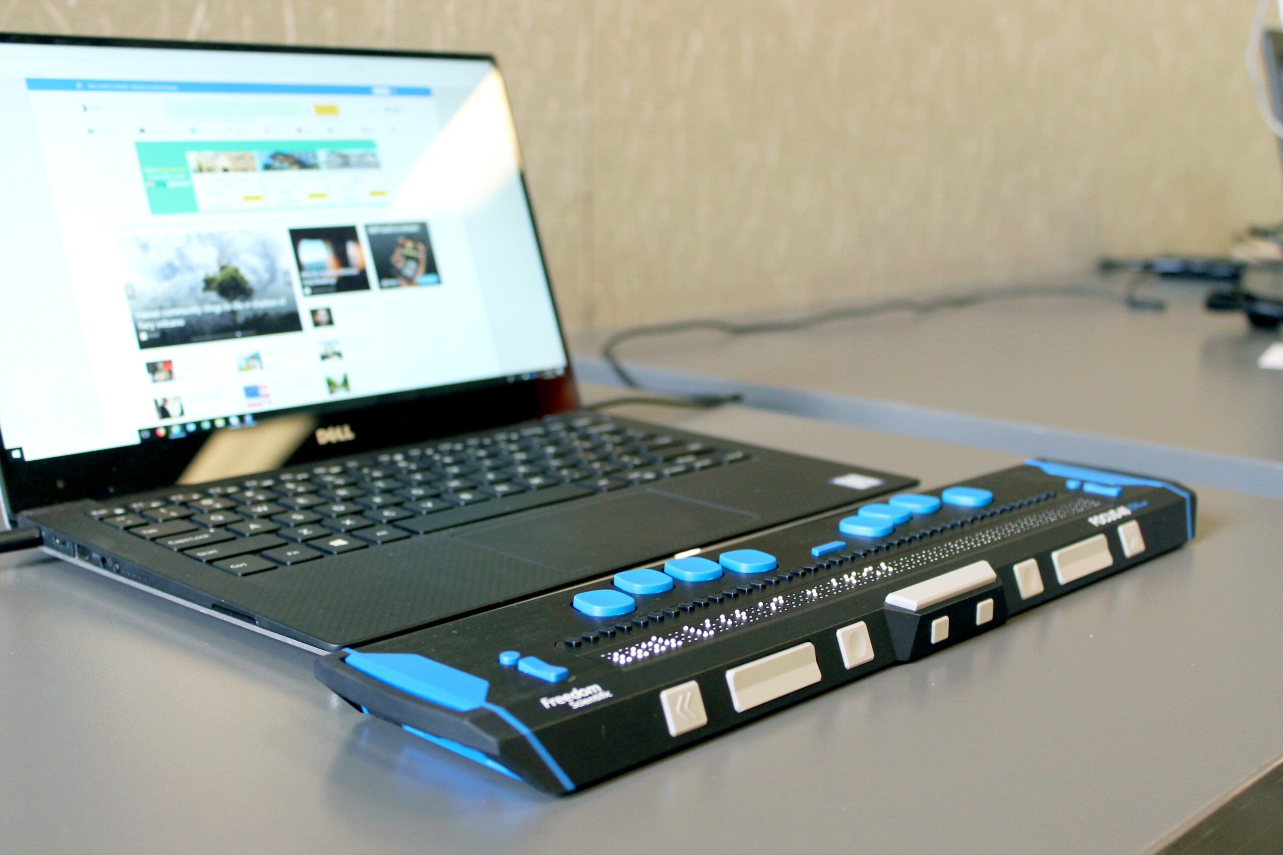
Best nonprofit websites for accessibility
Accessibility isn’t just nice to have for nonprofit websites. In many cases, legal regulations like the Americans with Disabilities Act (ADA) require websites to be accessibility to all visitors.
So, what are a few quick ways to improve your website’s accessibility? When using multimedia like video and images, include alternative text for visitors using screen-readers. Also, all of your content should be clear and easy to read by following color contrast standards.
Use Kanopi’s recommended accessibility tools to help test your site’s accessibility, and don’t forget to conduct plenty of manual testing as well to ensure compliance. Also, take a look at these nonprofit websites that are doing accessibility right.
Boys & Girls Clubs of America
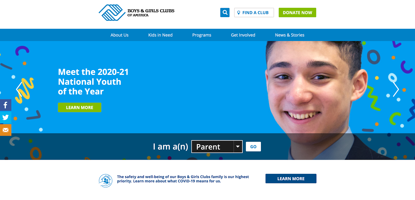
The Boys & Girls Clubs of America provide after-school and mentorship programs for kids. Clubs can be found in all 50 states, helping young people prepare for their futures, break the cycle of inequity, and improve their overall stability and well-being.
What’s excellent about the Boys & Girls Clubs of America web design:
- The Boys & Girls Clubs of America provides a clear user journey starting point right from their homepage hero, with a drop-down menu for parents, teens, supporters, and educators.
- This nonprofit website features an accessibility menu that allows users to adjust the contrast, highlight links, increase text spacing, increase font size, and more.
- The site offers a built-in screen reader, which reads text aloud from the website. This enhances the browsing experience without people needing to rely on external software.
Feeding America
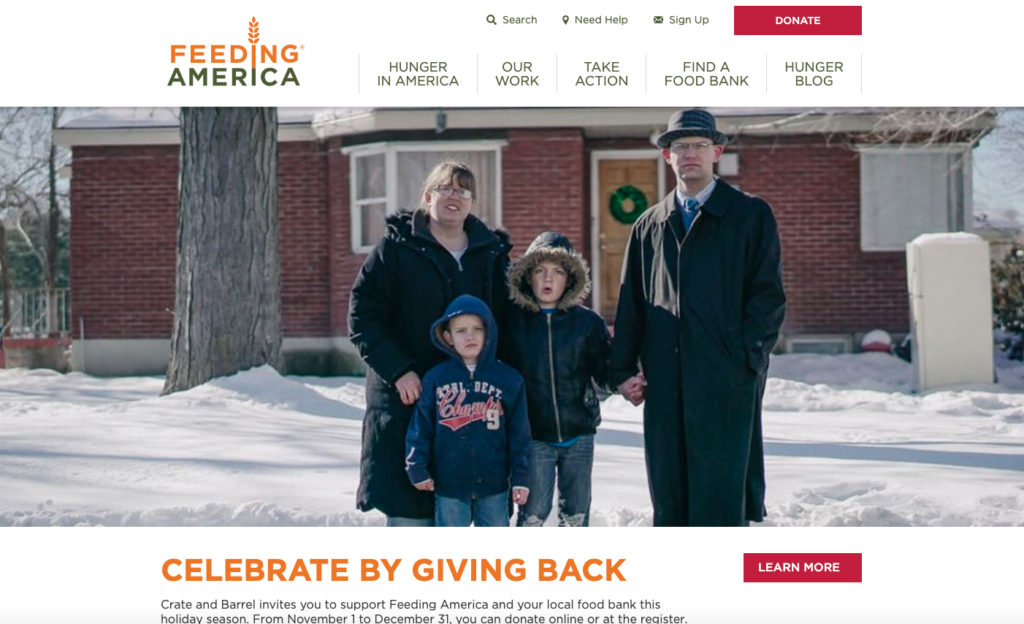
Feeding America is a hunger-relief organization dedicated to providing greater food security across the U.S. Their programs include mobile pantries, disaster food assistance, SNAP application assistance, and more.
Why Feeding America’s accessible web design stands out:
- Feeding America’s website offers straightforward user journeys for donors, volunteers, and advocates. For instance, when you click “Take Action” in the menu, there are separate options to volunteer, donate meals, and host a food drive.
- Large font sizes and high contrast increase the site’s readability while drawing attention to the most important content.
- The navigation bar offers a clear and intuitive layout, making it easier for users with cognitive or motor impairments to find relevant information. The minimalistic design reduces cognitive load, while large, labeled buttons provide clear paths for actions.
The Humane League
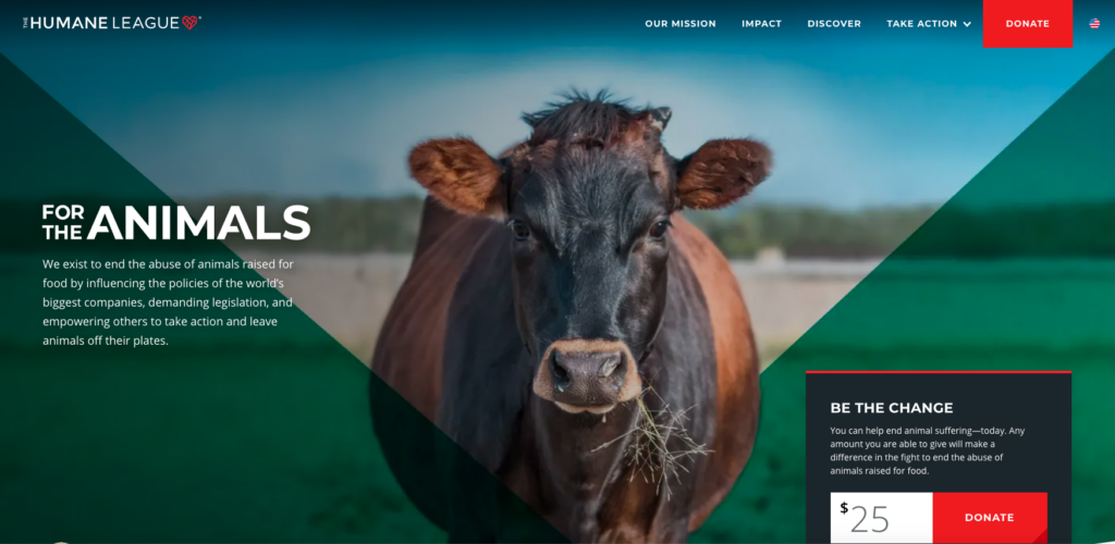
The Humane League seeks to end the abuse of animals raised for food production. The organization runs advocacy campaigns to encourage the world’s largest food companies to adopt more humane animal welfare policies.
What’s excellent about The Humane League’s accessible web design:
- The website is accessible across different devices, improving usability for all users regardless of their screen size.
- The Humane League offers one-off and monthly donations directly from their homepage hero through a CTA that weaves potential donors into their success story.
- The website’s navigation menu is consolidated into categories to avoid visually or mentally overstimulating users.
American Heart Association
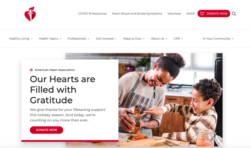
The American Heart Association (AHA) prioritizes fighting heart disease and stroke through research and public education. The AHA website serves as an online donation hub as well as a valuable educational resource for learning more about various health topics.
What’s great about the American Heart Association’s accessible web design:
- The AHA uses distinct colors that meet contrast standards, making the content on their site accessible to everyone.
- Their powerful CTA ‘Help Stop the Silent Killer’ firmly plants prospective donors into the story they tell.
- They provide flexible ways to donate, including information on their donation page about how the AHA uses donors’ money to address COVID-19.
The National Council for the Blind in Ireland
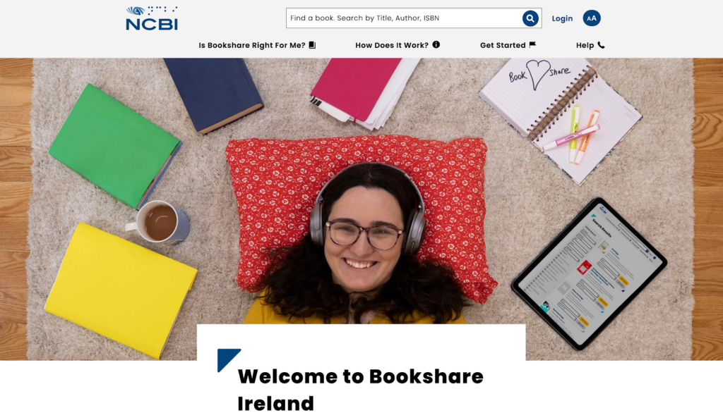
The National Council for the Blind in Ireland (NCBI) provides support and services to the vision-impaired. Their Bookshare website offers the largest accessible digital library in Ireland.
Why The National Council for the Blind in Ireland’s accessible web design makes an impact:
- Kanopi is proud to partner with NCBI, creating an accessible site that’s AAA compliant with high contrast, large text, and font zoom.
- Fun graphics, bright colors, and relatable student pictures keep visitors engaged.
- There are straightforward user journeys for students, leisure readers, and educators that begin from the homepage.
Best nonprofit websites for calls to action
The best nonprofit websites know who their users are and what motivates them. Successful nonprofit marketing teams ask questions and research how their donors, constituents, and volunteers behaviors to identify changing trends. Then, they use calls to action (CTAs) and other simple navigation elements that make it easier for visitors to browse and find what they’re looking for.
Here are a few nonprofit websites that leverage CTAs impactfully.
Mercy Corps
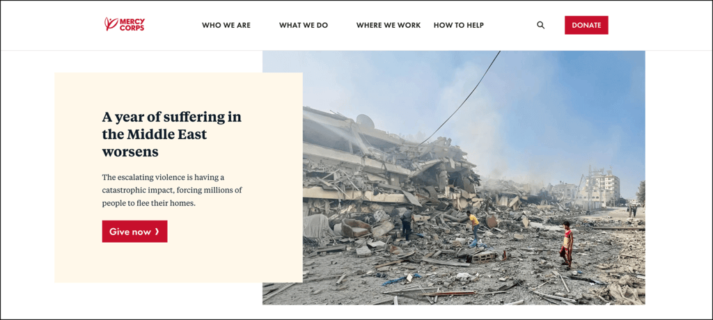
Mercy Corps is a global humanitarian organization that works to alleviate suffering, poverty, and oppression in some of the world’s most vulnerable communities. They provide emergency relief in the wake of disaster, manage the effects of climate change and conflict, and create sustainable solutions in more than 40 countries.
Why Mercy Corps’ website design stands out:
- The website features strategically placed donation buttons, often highlighted in a contrasting color to make them stand out. A “Donate Now” button is always visible in the navigation menu, enabling visitors to take action at any point in their browsing experience.
- The site uses emotional imagery, videos, and personal stories from people impacted by Mercy Corps’ work. These stories create a deep emotional connection with visitors, motivating them to act, whether by donating, volunteering, or spreading awareness.
- The site features compelling landing pages, like a matching gift page encouraging visitors to double their impact through a simple process. It provides a convenient search tool for donors to check if their company participates, motivating them to take immediate action through workplace giving.
Habitat for Humanity
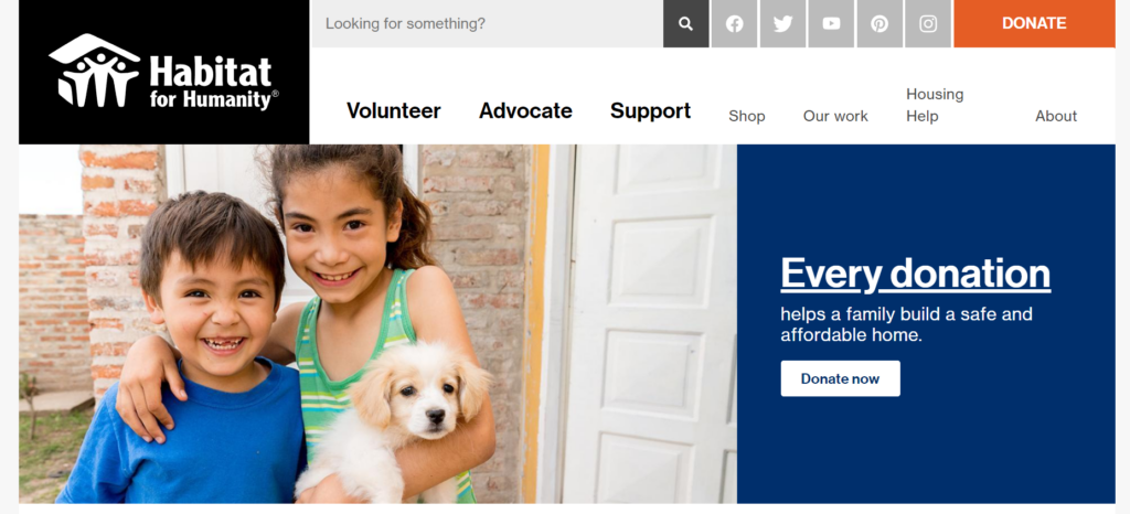
Founded in 1976 in Americus, Georgia, Habitat for Humanity is a nationwide nonprofit that helps individuals build, refurbish, or preserve homes. New homeowners contribute a certain amount of “sweat equity” to help build their new house in exchange for an affordable mortgage.
Why Habitat for Humanity‘s CTAs stands out:
- Habitat for Humanity engages site visitors with an uplifting story of building strength, stability, and self-reliance through shelter.
- Multiple “Donate Now” CTAs encourage donors to act right off the homepage.
- A static menu with quick links to their Facebook, Twitter, YouTube, Pinterest, and Instagram accounts alongside descriptive search functionality and a prominent donate button make it easy to connect with them.
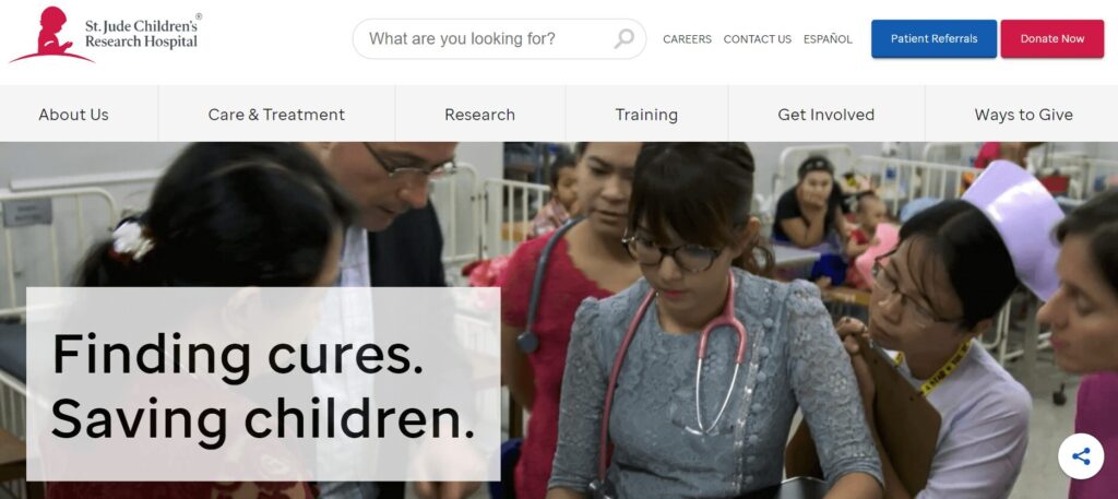
St. Jude Children’s Research Hospital
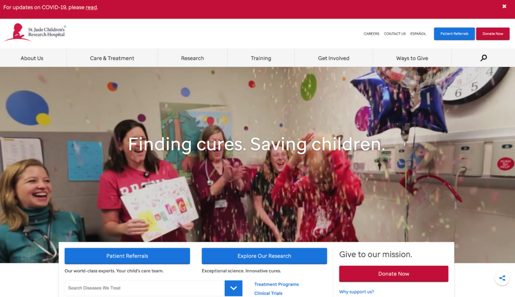
St. Jude Children’s Research Hospital seeks to research, treat, and ultimately defeat childhood cancer and other life-threatening pediatric diseases. They cover the costs of treatment, travel, housing, and food for families with children facing childhood cancer.
Why St. Jude Children’s Research Hospital’s CTAs make an impact:
- Users can translate St. Jude Children’s Research Hospital’s website into Spanish, making their site accessible to more people with just one click.
- Their drop-down search menu, listed by the diseases they treat, is built with their users in mind and helps site visitors get the information they need quickly.
- They weave donors into their success stories and explain the impact of giving simply and concisely.
The Michael J. Fox Foundation
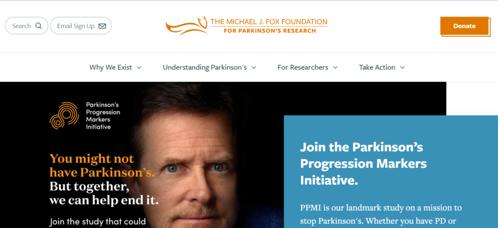
The Michael J. Fox Foundation is dedicated to finding a cure for Parkinson’s disease using research and the development of advanced therapies. They operate without an endowment and seek to act as quickly as possible to direct funding toward vital research and projects.
What we like about The Michael J. Fox Foundation for Parkinson’s Research’s web design:
- The Michael J. Fox Foundation tells a hopeful story, inviting users to ‘Celebrate Science’ from their homepage hero CTA.
- Their content focuses on their donors and the difference they make through their support throughout their whole site.
- Moving and empowering quotes from people with Parkinson’s explain the importance of research and how each person’s action affects millions of people.
Leukemia & Lymphoma Society
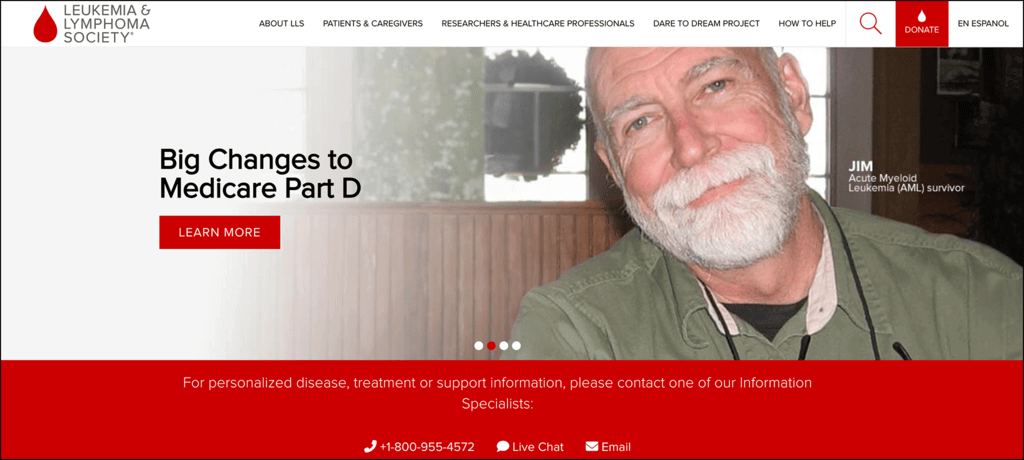
The Leukemia & Lymphoma Society (LLS) seeks to eliminate blood cancers through pioneering research, education, and advocacy. They work toward this mission by offering support for patients, caregivers, researchers, and healthcare professionals.
Here’s what caught our eye on the LLS website:
- The LLS homepage provides helpful resources for patients and caregivers, contributing to a stress-free browsing environment.
- There are multiple ways to stay in touch via social media and email, allowing supporters to connect via their preferred platform.
- The homepage highlights prominent news articles and other updates to help keep visitors informed.
Glacier National Park Conservancy
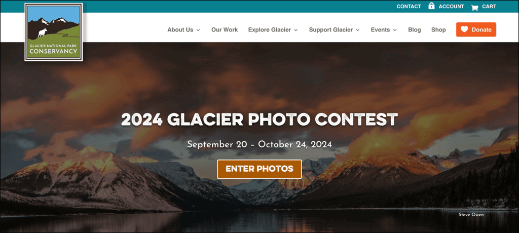
The Glacier National Park Conservancy is the official fundraising partner of Glacier National Park in Montana. It supports the park’s preservation, education, and research efforts through donations, grants, special projects, programs, and volunteer involvement. The Conservancy works to ensure that Glacier National Park remains a protected, vibrant natural resource for future generations.
What we love about Glacier Conservancy’s website design:
- Glacier Conservancy’s website features a variety of ways to give, calling on supporters to donate, purchase items in an online store, submit matching gift requests, buy a special license plate from the DMV, and take other actions.
- The organization uses Google Ads, making it incredibly easy to find the site. Through the Google Ad Grant program, they run ads that drive purchases from their online store, targeting keywords like “Glacier National Park Campgrounds” and “Glacier National Park Tours” to funnel visitors toward taking action. For reference, Getting Attention has an example of one of their ads, including performance results.
- The site’s branding represents Glacier National Park well, with images that showcase the park’s scenery and animals. It also uses colors associated with the outdoors, including glacier blue, grassy green, and sunset burnt orange.
The Climate Reality Project
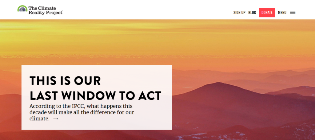
Founded by former U.S. Vice President Al Gore, the Climate Reality Project is another education and advocacy organization working to mitigate climate change. The organization’s signature program is a leadership training corps that equips leaders fighting for climate change solutions with greater resources and knowledge.
Here’s why The Climate Reality Project is one of the best nonprofit websites:
- Bold calls to action on the homepage inspire visitors to get involved in fighting climate change, encouraging users to sign up for the organization’s email newsletter.
- User-friendly, concise educational resources help communicate climate change issues in an easily digestible way.
- A streamlined online donation page that allows donors to show their support in just a few clicks.
Girl Scouts
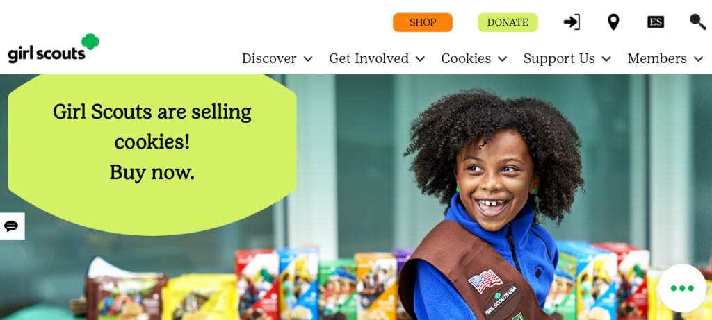
Girl Scouts invites girls across America to participate in building life skills such as leadership, entrepreneurship, and active citizenship. Typical Girl Scouts activities include camping, volunteering, earning badges, and, of course, selling cookies.
What stands out about the Girl Scouts’ web design:
- Engaging, informative images show girls participating in rewarding activities, bringing the Girl Scouts’ mission to life.
- The full site is available in Spanish, increasing accessibility.
- Clear user pathways provide resources for all involved, including the Girl Scouts themselves, volunteers, and parents and families.
The ASPCA
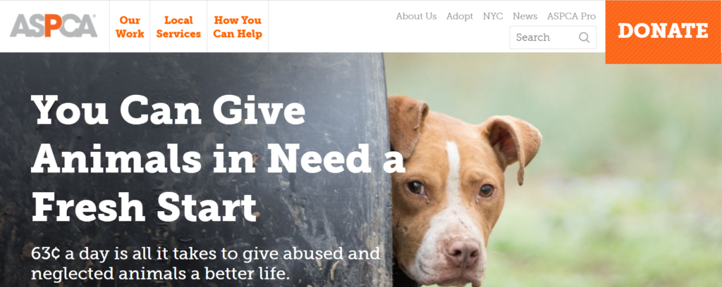
The American Society for the Prevention of Cruelty to Animals (ASPCA) is a well-known animal welfare organization founded to be a voice for vulnerable animals. The organization’s main activities include helping reduce overwhelming shelter intake rates, relocating animals to safe homes, and providing spay/neuter services.
Here’s what caught our attention on the ASPCA website:
- The organization is known for its heart-tugging commercials, and its website is no different. Compelling photos of animals in need engage visitors right when they land on the homepage.
- The large DONATE button in the top right corner catches potential donors’ attention and stays visible no matter where you navigate to on the site.
- The “Team ASPCA” fundraising page provides detailed descriptions for different fundraising opportunities that supporters can participate in, from birthday campaigns to hosting a fundraising event.
Best nonprofit websites for storytelling
Supporters want to be part of a winning team. Focusing on successes allows the user to envision how their time and donations will make a difference. Stories of building others up both resonate and empower donors to join your nonprofit’s ongoing journey.
Take inspiration from the following nonprofit websites that excel at compelling storytelling.
Doctors Without Borders
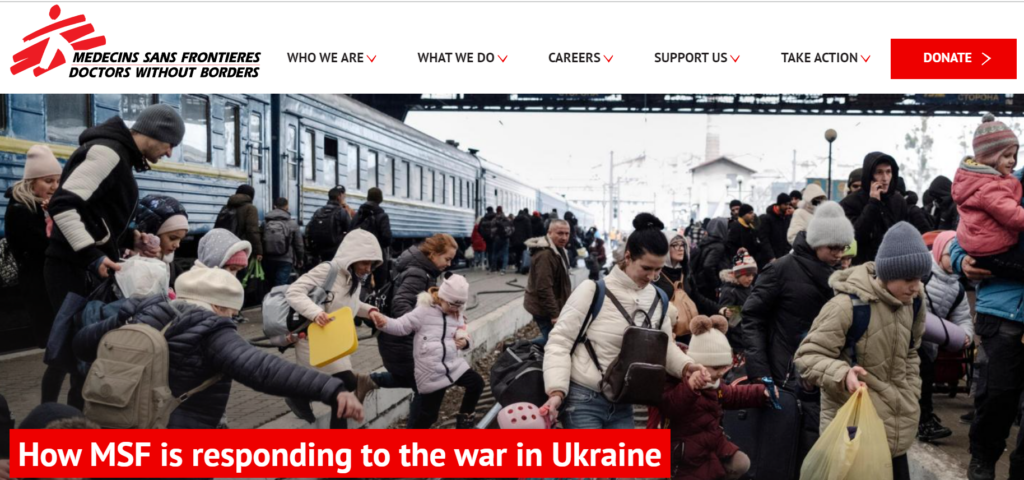
Doctors Without Borders is an international non-governmental organization dedicated to delivering medical aid where it’s most needed, typically in war zones or countries impacted by disease. The organization’s commitment to independence and impartiality allows its volunteers to take action in instances where politics or bureaucracy might slow other humanitarian response efforts.
What’s excellent about the Doctors Without Borders web storytelling:
- Doctors Without Borders keeps visitors informed with up-to-date news and events, including a link to a live online discussion about mental health from their homepage hero.
- An engaging static infographic on where donor money goes appears in the footer on every page of their site.
- Donor-centric language puts supporters at the heart of the mission. One example is, “Your gift helps us provide medical humanitarian aid for hundreds of thousands of people each year.”
The Ronald McDonald House
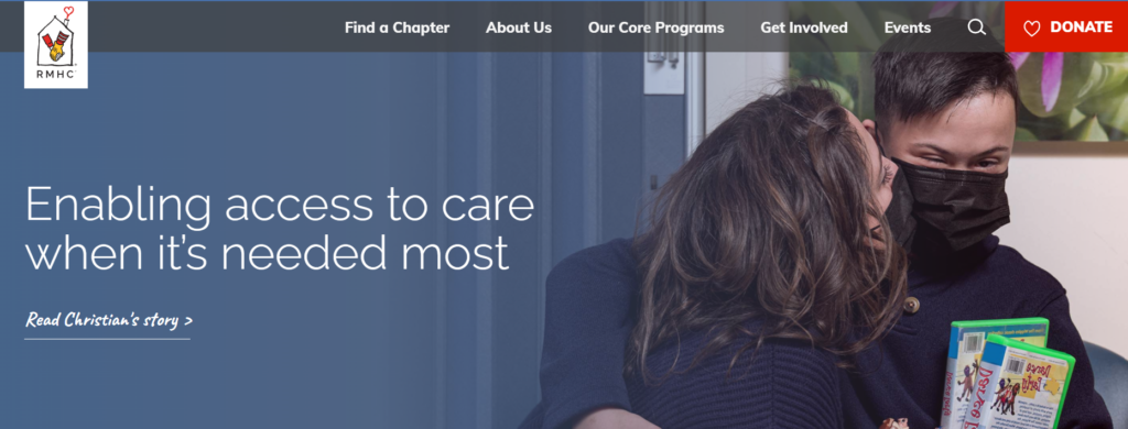
Ronald McDonald House Charities accommodate families with children undergoing medical procedures or treatments, allowing them to stay in RMHC lodgings for free. This helps save families money by letting them avoid hotel costs, while also providing a little peace of mind while their children are undergoing treatment.
Why the Ronald McDonald House digital storytelling makes an impact:
- RMHC’s powerful hero image invites donors into the world of someone directly impacted by donor support, with a compelling CTA to read their story.
- Their red donate button with a heart icon catches the attention of site visitors.
- The RMHC shares an engaging video filled with real families on their “Get Involved” page to empower volunteers.
The Salvation Army USA
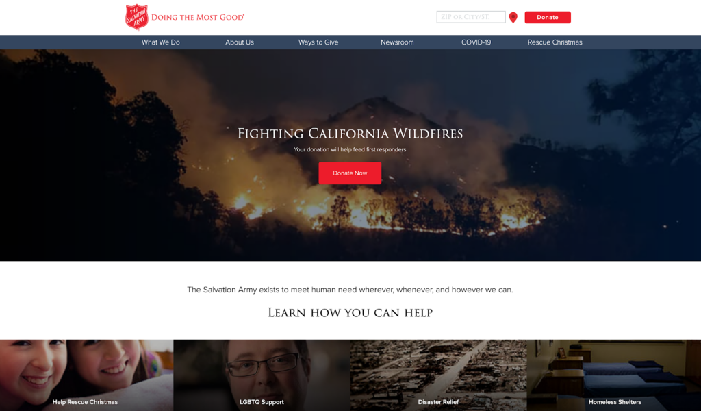
The Salvation Army is a Christian organization with a mission to combat homelessness and poverty and contribute to disaster relief. Supporters can help out by donating money or goods, hosting a fundraiser, or volunteering.
How the Salvation Army USA online stories makes an impact:
- Their homepage hero with a compelling CTA makes it clear why people should act now and how.
- Their site includes powerful films, making it possible for site visitors to hear directly from people whose lives are changed for the better through the Salvation Army.
- The main services are broken down clearly on the homepage as well as a straightforward explanation of how the Salvation Army works to meet local needs.
The Conservation Fund
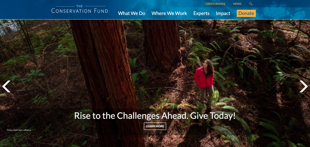
The Conservation Fund seeks to protect America’s critical land and water through conservation and mitigation solutions. The organization is backed by a strong network of regional experts working to implement community-level change.
What we like about The Conservation Fund’s web stories:
- The Conservation Fund puts its partners and supporters at the heart of their impact story.
- They use engaging video stories to help users visualize what their donations go toward.
- An interactive map shows the locations across all 50 states where the Conservation Fund has launched effective projects.
The Nature Conservancy
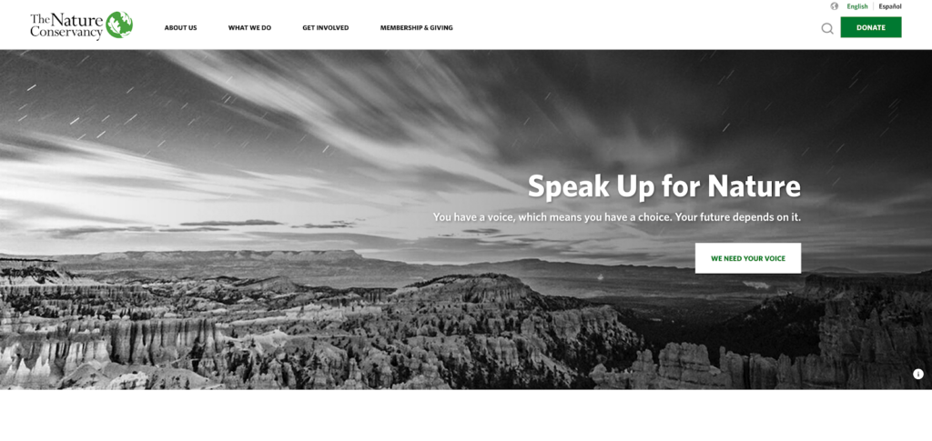
The Nature Conservancy seeks to tackle climate change, protect water and land resources, and build healthier communities to protect the global environment. They have lofty goals to achieve by 2030, including reducing CO2 emissions, helping 100 million people who are at risk of being impacted by severe climate change, and conserving 10 billion acres of ocean.
Why The Nature Conservancy’s digital storytelling stands out:
- The Nature Conservancy uses inspiring imagery of animals and beautiful landscapes to emotionally connect users with nature and wildlife.
- Using geolocation, the site recognizes where a user currently is and presents specific projects they’ve completed in that person’s state.
- The Nature Conservancy features individual narratives about how conservation efforts have improved communities and ecosystems.
Alex’s Lemonade Stand
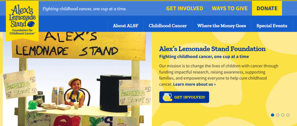
Alex’s Lemonade Stand helps fund research, spread awareness, and support families with the goal of curing childhood cancer. Since 2005, the organization has funded over 1,000 grants at 150 institutions. Alex’s Lemonade Stand also empowers kids to host their own lemonade stand fundraisers within their communities. Kids can host their own lemonade stand in their community, with the proceeds going to research projects and family support.
These features make the Alex’s Lemonade Stand web design stand out:
- Their homepage includes a “Featured Hero” which highlights a beneficiary, includes a welcoming photo, and links to their unique story. When someone clicks through to the full story, the landing page also includes links to other beneficiaries’ stories, so readers can keep exploring.
- The bold, playful colors and branding catch the eye while also appealing to the organization’s kid-friendly mission.
- Alex’s Lemonade Stand regularly updates its site and blog with heartfelt stories, offering a behind-the-scenes look at its impact on childhood cancer. Each post highlights the personal journeys of children and families, the organization’s fundraising efforts, and the research advancements it funds.
Most creative nonprofit websites
Top nonprofit websites balance creativity with a simple user experience and uniform branding. Creativity doesn’t just have to mean creative design — it can encompass creative donation opportunities, online experiences, and other elements that show visitors something unexpected.
Explore the following creative nonprofit sites and note how they take a unique approach to audience engagement.
World Wildlife Fund
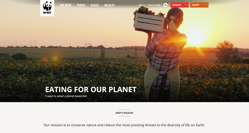
The World Wildlife Fund (WWF) is an international conservation organization dedicated to reducing the negative impact of human activities on the environment. The WWF is the world’s largest wildlife and conservation organization, working in over 100 countries.
What we like about the World Wildlife Fund’s web design:
- WWF offers a variety of resources for teachers to use in their classrooms to teach students about different animals and how to respect the environment. You can even sign up for a newsletter to receive regular resources.
- This nonprofit website features interactive eCards that supporters can send to their friends and family to show they care about wildlife and the Earth.
- The site includes interactive maps, quizzes, and free wildlife wallpapers to engage visitors.
Wounded Warriors Family Support
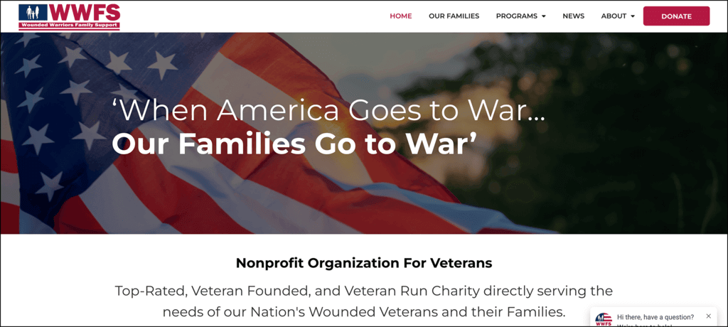
Wounded Warriors Family Support (WWFS) is a veteran-run charity that provides support to the families of wounded, injured, or fallen members of the U.S. military. For two decades, their mission has been to enhance the quality of life for military families by offering assistance and resources to help them cope with the emotional, physical, and financial challenges they face.
Why WWFS’ web design is unique and engaging:
- This nonprofit website features unique donor engagement opportunities to boost retention, like hosting a race or golf event. Through an external platform, they also created eCards that people could send to a veteran, scholarship recipient, or friends to show support. You can explore WWFS’ eCard collection here.
- The site prominently features awards, recognitions, and partnerships, showcasing the organization’s credibility and collaborations with other nonprofits and veteran groups.
- WWFS offers a range of resources, such as information on respite care, family retreats, and mobility assistance programs. The website provides all the necessary details for families in need, including eligibility criteria, application processes, and timelines.
Covenant House
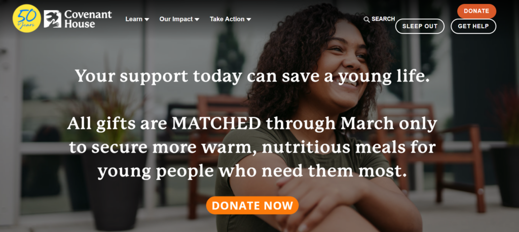
Covenant House provides support and housing for youths experiencing homelessness or trafficking. The organization offers a “continuum of care,” from street and van outreach to crisis care and long-term support.
Why the Covenant House website is so inspiring:
- Kanopi won two awards for our work on the Covenant website, helping this digital hub shine with updated integrations and donation processes, as well as an improved storytelling approach.
- The homepage offers multiple opportunities to get involved, from donating to participating in a Sleep Out event
- Their “Meet Our Kids” page allows children impacted by homelessness to share their own stories.
Memphis Zoo
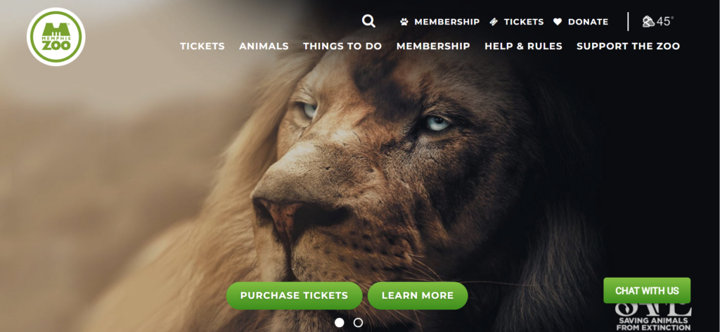
Located in Memphis, Tennessee, the Memphis Zoo is home to over 3,500 animals, 500 species, and 19 exhibits. The zoo is supported by ticket sales, a membership program, direct donations, and corporate sponsorships.
Our favorite elements of the Memphis Zoo website include:
- Live animal cams turn the website into an engaging, interactive digital hub, rather than a static online experience.
- A detailed donation page offers donors greater flexibility with descriptions of different types of giving supporters can participate in.
- High-quality images of animals and zoo visitors provide a professional, immersive browsing experience.
The Malala Fund
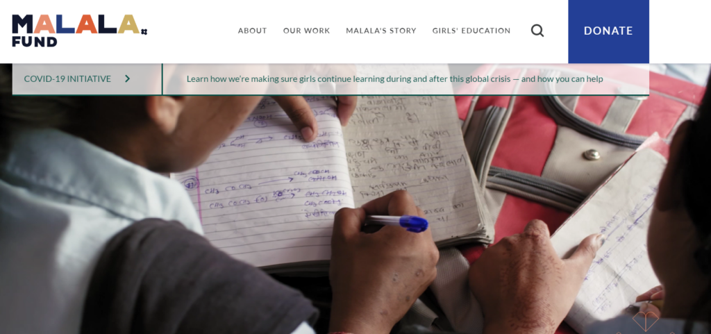
The Malala Fund helps girls pursue secondary education worldwide. The organization supports education advocates and activists, bolstering their work and connecting them to a global network that can provide support and professional development.
Here’s why the Malala Fund made our best nonprofit websites list:
- The engaging, eye-catching homepage video brings the organization’s mission to life by showing the people it works with (which would be even better if the video were more accessible, with a pause or hide functionality).
- Compelling statistics showcase the extent of education and gender inequality in each country the Malala Fund operates.
- The website achieves a sleek look by making use of a mix of white space and pops of bright color.
RAICES
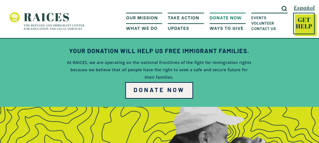
The Refugee and Immigrant Center for Education and Legal Services (RAICES) works to support immigrants and refugees by providing free and low-cost legal services to families and children in detention. The organization also offers social services such as resettlement assistance, transit support, and more.
What we like about the RAICES website:
- The striking branding incorporates visually-appealing colors and font choices.
- There are many easily-accessible resources for refugees and immigrants, from removal defense services to DACA renewals.
- A self-service portal allows donors to take control of their engagement by updating their personal information and contributions whenever they want.
The END Fund
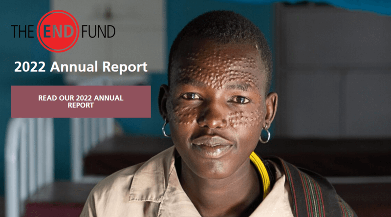
The END Fund is a nonprofit devoted to mobilizing resources to address neglected tropic diseases. The organization uses donations to fund much-needed treatments. Their website places a major focus on their impact, with plenty of statistics related to their cause and programs.
Unique features of the END Fund website include:
- The site places an impressive focus on transparency and accountability, with a large and prominent annual report CTA on the homepage.
- The homepage clearly lays out the issue the organization addresses, giving visitors a solid understanding of the problem before diving into ways to help.
- The website highlights three funds for supporters to donate to, providing more flexibility in allowing donors to choose campaigns that speak to their passions.
Sign up for our newsletter to get more web design best practices right in your inbox!
Empower Your Donors with an Optimized Nonprofit Website
As a nonprofit marketing professional, you might have plenty of creative and innovative web design ideas buzzing around in your head, but no clear picture of how to implement those ideas. That’s why working with a web design and development agency is often the best way for nonprofits to fully optimize their websites.
Web design agencies like Kanopi can help manage your website redesign process, using their years of experience, best practices, and visitor research to guide the way. Kanopi will support your nonprofit website development and design from start to finish, offering services such as:
- User research
- Content strategy
- Website design and development
- Ongoing support
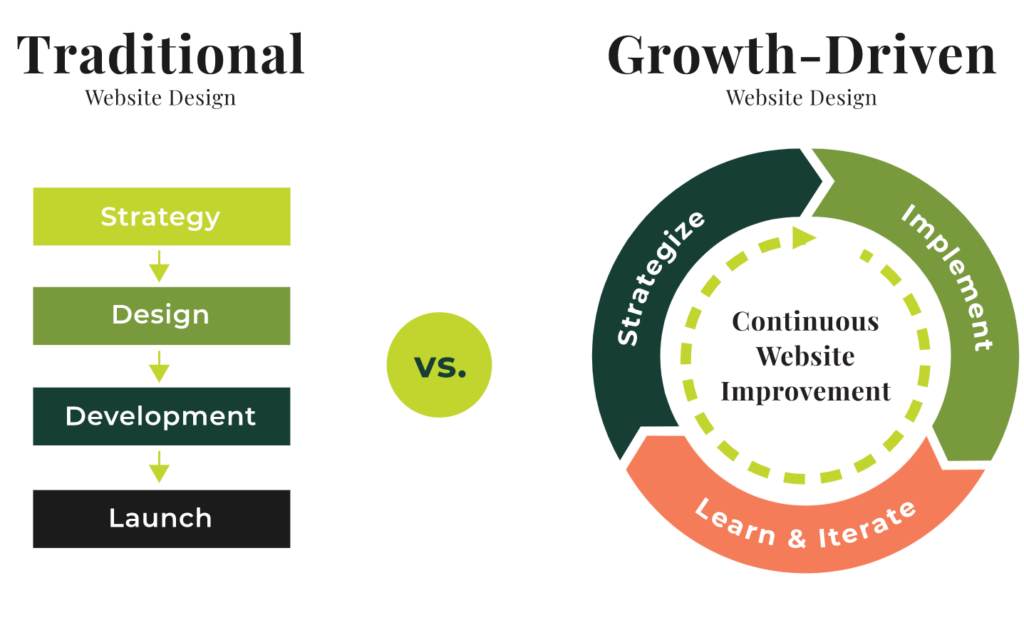
Plus, working with Kanopi allows you to adopt a continuous improvement approach for your website, keeping it updated and effective as best practices evolve. We’ll ensure your website is positioned for long-term growth and designed to help achieve your goals, whether that’s growing your advocacy efforts or increasing your online donor audience.
Looking for a few additional resources to help strategize your web design approach? Check out these guides and resources:
- Creating a Digital Strategy for Nonprofits – Made Simple. A digital strategy is an action plan that helps you reach your fundraising goals using online platforms. Build a better nonprofit digital strategy with the help of this guide.
- What Is A Nonprofit Technology Assessment? Not seeing a positive return on investment with your organization’s technology solutions? Find out how a technology assessment can help.
- Webinar: Managing Content in WordPress. Many nonprofits choose WordPress to manage their content. This webinar offers tips and best practices for accessibility, SEO, landing pages, and more.
- The Donor Journey: Creating Smarter Digital Experiences. Engaging donors is one of your website’s most important functions. Use this guide to create a more streamlined donor experience.