10 Best Healthcare Website Design Examples (and Expert Tips)

In today’s highly digital world, most patients do their research before they make an appointment with a healthcare provider. In fact, Google sees over 1 billion health-related searches per day.

To break it down further, last year’s health-related searches focused on physical fitness and mental health specifically. Searches like “exercising for mental health” and “how to handle stress” topped the charts. People now expect to know how to get healthy and stay healthy as soon as possible

What do these things mean for your organization’s healthcare website? Accurate and accessible healthcare information is more crucial than ever. Whether your organization is a health institute, medical school, or hospital, your website is an essential resource for your community. 

In this guide, we’ll review top healthcare website design examples and the features and best practices that make these resources effective. 

Why Great Healthcare Website Design Matters

Although not every search result will lead to a doctor’s appointment, users will still engage with you in some way online. Make the most of their online visit with a great design that meets their needs and establishes your organization as a credible source. With thoughtful design, your healthcare website can:

  • Grow brand awareness: A robust, well-designed website establishes your organization as a credible, knowledgeable institution. 
  • Build trust among current audience members: When visitors see that your website is professional and comprehensive, they’ll place more trust in your organization. 
  • Offer your audience convenience: A comprehensive healthcare website gives community members access to a 24/7 resource that’s available with just a few clicks. 

Your website should give current and prospective patients confidence in your quality of care. Its design should echo your medical expertise and put their minds at ease. 

What Makes a Good Healthcare Website Design?

Put yourself in a patient’s shoes. What would they expect from a professional healthcare website? Speed, responsiveness, credible content—all of the above! How your website delivers on these expectations defines your site’s performance. 

To summarize, a good healthcare website incorporates the following elements:

  • User-friendly design
  • An easy-to-use internal search function
  • Accessible content
  • Heightened security for sensitive information
  • Responsive design

As a best practice, it’s essential to review and update each of these elements regularly. For example, your organization must keep its sensitive information secure at all times. This means you must bolster your infrastructure with updated security measures to protect against attackers and mitigate system vulnerabilities. 

Accessibility is another must as Healthcare sites in particular have users with a large variety of needs. This means the site must follow WCAG guidelines and accessibility best practices so those with temporary or permanent disabilities can easily access the content. 

Effective Healthcare Website Design Examples

To get a better idea of great healthcare web design, it’s helpful to research organizations that thrive in this area. 

However, great design should always be representative of your organization’s specific audience. For example, a university healthcare website will have student health services and resources while an urgent care might provide interactive symptom checkers. 

That said, let’s review top healthcare website examples and the best practices used that make these examples so great. 

1. Clear FAQs: San Francisco Health Service System

The San Francisco Health Service System's effective FAQs (shown in this screenshot) make it a top example of great healthcare website design.

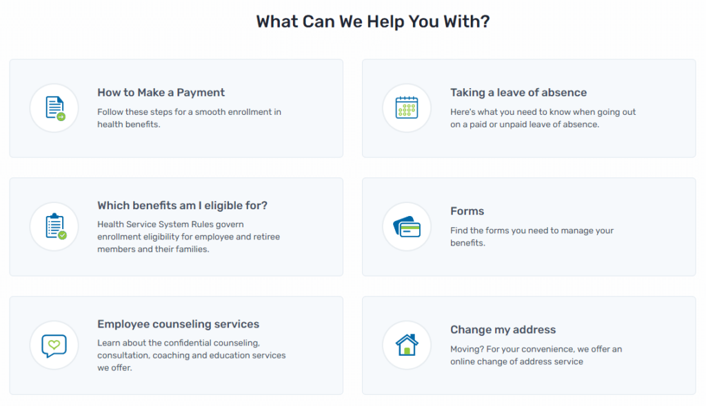
Great design anticipates needs. The San Francisco Health Service System’s homepage excels at providing relevant, helpful prompts to guide visitors. Its FAQs encompass the six most common reasons why a visitor may need their services. Each FAQ then directs visitors to an accompanying page that provides them with useful information. 

This design is also mindful of visitors’ time and mental state. People searching for medical assistance might be feeling stressed or anxious, making it critical that you answer their questions and concerns quickly.

2. Comprehensive internal search: Mayo Clinic

This screenshot captures the Mayo Clinic’s internal search feature within its healthcare website design.

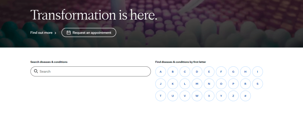
As the number one hospital in the U.S., the Mayo Clinic provides accessible web design that assists visitors’ road to recovery. One feature worth spotlighting is its comprehensive internal search that prompts visitors to find the right resources for their circumstances. 


For example, a visitor may enter “kidney disease” into the search bar. Then, the results page would direct them to related articles such as Chronic Kidney Disease or Lupus. From there, visitors can discover the diagnosis and treatment options, or make an appointment.

3. Connecting those in need to funding: The Colorado Health Foundation 

This image pictures The Colorado Health Foundation’s accessible healthcare website design that connects those in need to funding.

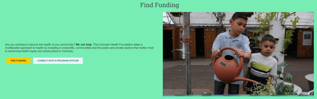
The Colorado Health Foundation’s web design provides helpful resources for communities in need. This speaks to the organization’s desire to further health equity. 

More specifically, the Colorado Health Foundation’s “Find Funding” section allows visitors to either apply for funding or connect with a program officer for more information. Each option leads to a page that provides helpful information such as phone numbers and email addresses that connect those in need to funding opportunities. 

4. Spotlighting personnel: Global Brain Health Institute

This image pictures the Global Brain Institute’s fellows directory as an example of effective healthcare website design at work.

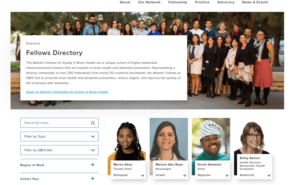
The Global Brain Institute’s fellows directory is a great example of connective design at work. Its comprehensive directory spotlights interprofessional leaders that are experts in brain health and dementia prevention. The page allows visitors to search by name, and filter by topic, region, or cohort, so visitors can connect with fellows and/or apply for the fellowship. This well-designed page acts as a promotional tool as well since visitors can observe the caliber and variety of the fellowship body. 

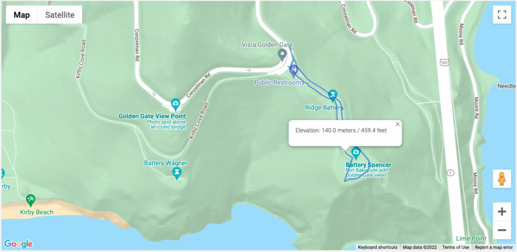
5. Useful CTAs: The Cleveland Clinic

This screenshot shows The Cleveland Clinic’s smart use of clear CTAs within its healthcare website design.

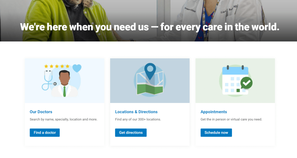
The Cleveland Clinic’s welcoming design assures visitors that their organization is ready to meet their needs. Just below this home page tagline, visitors can access three main resources to meet their needs—doctors, directions, and appointments. 

These sections are known as CTAs (calls to action) and invite visitors to take the next action to complete their website journey. For instance, if a visitor clicks “Locations & Directions” they are led to a page where they can enter their location and find one of the 310 clinics that is closest to them. Google Maps then provides visitors a glimpse of their route so they can best prepare. 

6. Inspiring testimonials: Boston Children’s Hospital

This image pictures inspiring testimonials from the Boston Children’s Hospital that capture a personal approach to healthcare website design.

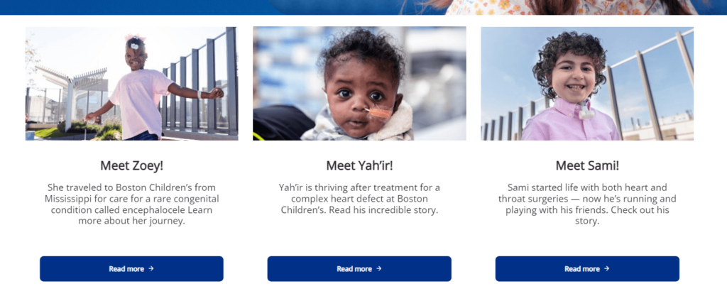
Your healthcare organization probably does some incredible work. Take a page out of the Boston Children’s Hospital’s book and highlight your work through inspiring testimonials. Their web design is personal as it introduces visitors to children who have recovered from necessary procedures. Each child is pictured and has a link for visitors to learn more about their story.

Visitors who find themselves on this page are most likely parents who are anxious about their child’s health. This design approach makes them feel hopeful and increases their trust in this organization’s capabilities. 

7. Incorporating visitor feedback: CDC

This screenshot pictures the CDC’s responsive healthcare website design that invites visitors to provide feedback.

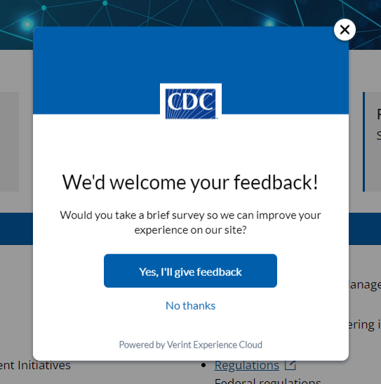
The Centers for Disease Control and Prevention (CDC) website design thoughtfully acknowledges user experience. Its built-in survey encourages visitors to provide feedback so that the CDC can offer the best online experience. 

Additionally, the CDC’s web design policies take user communication preferences into account. Their policies stipulate that they are committed to using plain writing, so users can find what they need without having to interpret medical jargon. 

8. Bold, consistent branding: National Women’s Health Network

This screenshot shows the National Women’s Health Network’s bold healthcare website design branding.

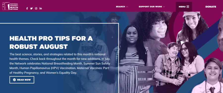
A well-branded site makes your organization stand out and boosts your credibility. The National Women’s Health Network is a great example of effective online branding at work. The site’s colorful collage of women highlights its target audience and invites visitors to explore the organization’s mission, vision, and values.

Colorful titles also help break up the content and guide through the homepage’s main sections. This way, visitors can assess the homepage quickly and easily without excessive scrolling or losing interest. 

9. User-friendly content: BetterHelp

This screenshot illustrates BetterHelp’s user-friendly healthcare website design.

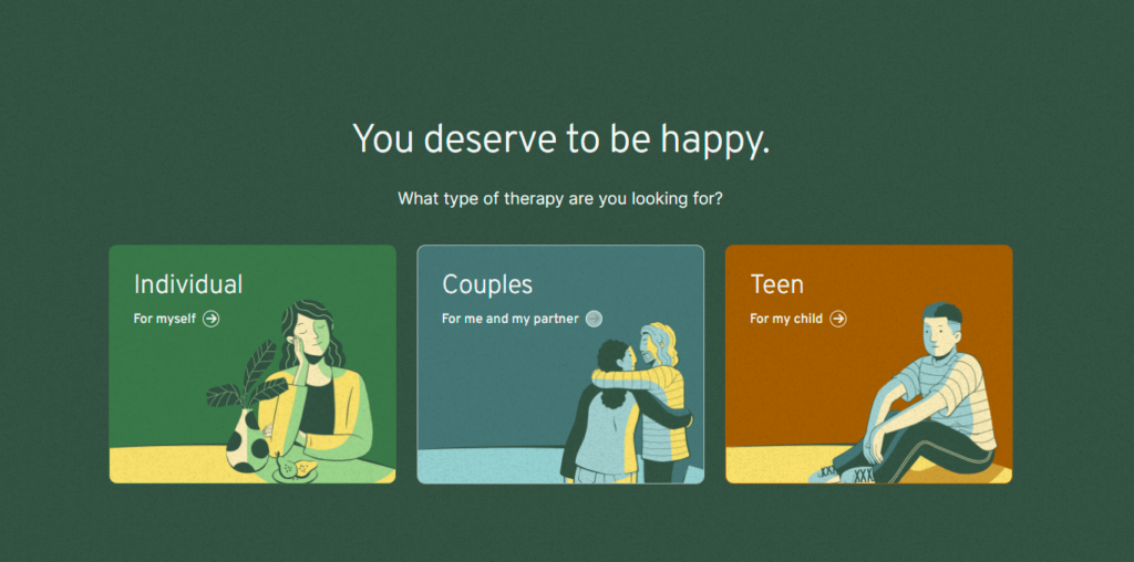
As the world’s largest online therapy service, BetterHelp sees many visitors who desire to connect with licensed professionals. Its user-friendly design addresses visitors’ desires through clean, organized page content. 

The first three home page CTA options give visitors a choice to find help for themselves or their loved ones. Then, the visitors are directed to complete a questionnaire that recognizes their needs and offers relevant help.

10. Member-Exclusive Benefits: Eye Recommend

Eye Recommend’s Job Marketplace is shown

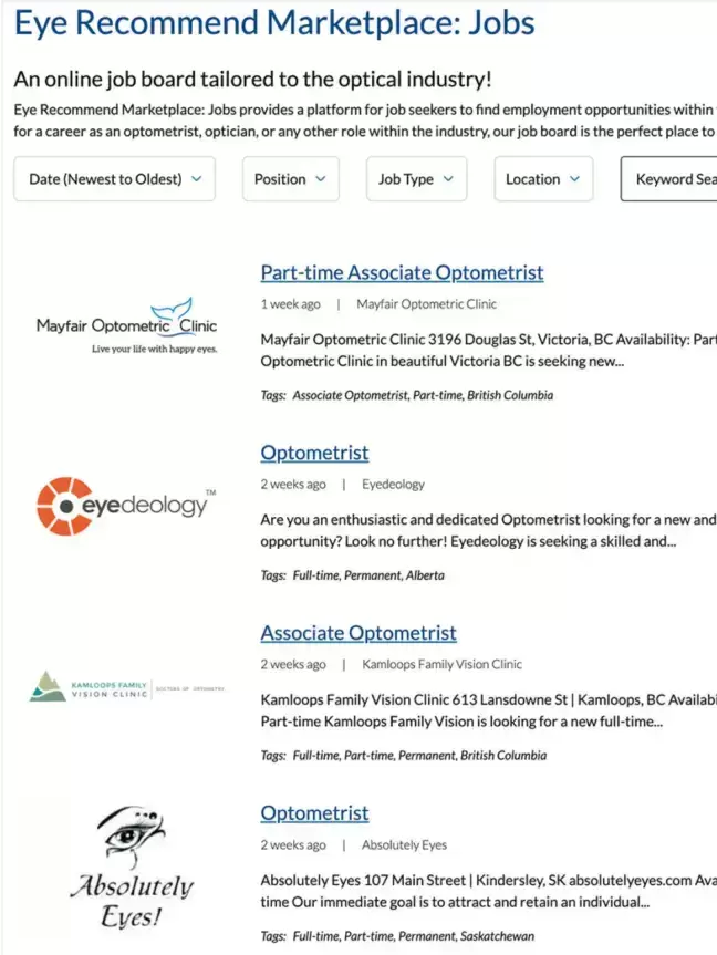
Many healthcare organizations thrive on member involvement, including Eye Recommend. Eye Recommend is a professional group for independent optometrists in Canada. Its goal is to empower members with technology, services, and resources to expand their clinics. 

Eye Recommend partnered with Kanopi to strategize the best ways to bring valuable, exclusive content to their members. Ultimately, we helped their team create a convenient online job marketplace where members can easily browse open positions. Members can filter listings by location, allowing them to find roles within their local area. Features like this, in addition to a user-friendly internal search function for the organization’s full website, provide clear value to members and improve the user experience. 


What does your web design say about your healthcare organization? A responsive, accessible site communicates credibility, helpfulness, and authority. Welcome site visitors to your platform by incorporating elements from these example sites to ensure optimal user experience. This way, you’ll create a positive brand image and heighten your relevance. 

At Kanopi, we’ve partnered with a wide range of healthcare organizations to enhance their online presence. Our personalized approach incorporates your organization’s unique online needs to help you reach your audience more effectively. No project is too large or complex for our web designers. Interested in collaborating? Check out our work.

Additional Web Design Resources:

Green energy, cloud use, and sustainable websites

Many people assume that the Internet is a more environmentally friendly way of sharing information; businesses and organizations are no longer printing materials on paper or plastics, using inks, and shipping mail as they did before the Internet became the primary marketing hub. There is a large environmental impact with supply chains, but building websites feels less impactful. 

But is it? Not necessarily. In fact, creating and maintaining websites uses a lot of electricity. And websites that are heavily trafficked use even more energy. 

The internet is not as green as you would think. Think of how many people are online at any given time. There’s an impact every time someone sends an email. Every time they send a tweet, or a Facebook post, etc. Then consider that an estimated 37% of the world’s population (that’s 2.9 billion people) have never used the internet, so there are still more people that could be online. 

There’s a carbon footprint involved with all we do digitally. As businesses become increasingly digital, we must ask ourselves how to ensure sustainability online. That means more than just making sure your website is up and running so you can eliminate other forms of communication — it means harnessing the power of green energy, cloud use, and building sustainable websites so that our digital presence is as eco-friendly as possible. 

This Earth Day, we’d like to provide some quick tips on how to be more proactive about sustainability when creating your next website project. 

But first, how “green” is your current site?

How does your website fare now? Use tools like Ecograder and Website Carbon to estimate your digital footprint. It’s an eye-opener to see where your website could be making improvements.

If you follow website UX and coding best practices, here’s the good news: by default, best practices for web design and accessibility translate into more sustainable websites. They are built using lightweight code that can load quickly even on slow connections Since they are designed to prioritize user goals, and performance less time is spent loading or trying to find information … which translates into time, energy, and ultimately cost savings.

Sustainable websites also use fewer resources overall, which helps conserve energy. They are often made as fast and performant as possible, particularly if they are more heavily used on mobile devices. And don’t forget about accessibility: sustainable websites tend to be more accessible for users with disabilities too! 

But if you need your website to be more sustainable, let’s dig into where you can make some impactful changes.

Harnessing green energy in the Cloud 

Green energy is a key component of sustainability online. After all, each time you access the internet, you are using electricity. But what if you could use renewable sources of energy such as solar or wind power instead of relying on fossil fuels? 

Cloud computing makes this possible. By hosting your data in the cloud and taking advantage of green energy sources, companies can reduce their carbon footprints while still getting access to all the same features they would with traditional hosting services. Plus, it’s often cheaper and has lower maintenance for your internal teams. 

In short, work with your hosting provider to make sure your website is powered by renewable energy. 

If you’re looking for a new hosting provider, a great place to look is The Green Web Foundation’s directory, a listing of over 500 hosting providers around the world with a tangible commitment to using green energy in their data centers.

Fun fact: Kanopi is hosted with Pantheon, which offers container-based, serverless hosting. And they’re built on GCP, a green platform

Practice sustainable web design

Practicing sustainable web design will help make your site efficient while reducing website carbon emissions. This includes being smart about how you use images and how they load on the page; one example is using responsive images, which serve the correctly sized image for the user’s device to avoid unnecessary resource usage. 

User Experience (UX) optimization is an ever-evolving practice, and Kanopi is constantly refining our approach to how users consume and interact with websites. By optimizing the user experience of your website, you can expect to see increased user satisfaction, shorter interaction pathways, and a reduction in overall energy consumption associated with your site. Essentially the better the usability of your site, the better it is for the environment. So make sure you know what your audiences are looking for so they can find it fast. 

This also applies to content: create content that is meaningful to your users in order to keep the overall site lean, and avoid content that adds unwanted complexity or bloat to your site. Video content is especially energy dense and should be deployed in a purpose-driven and user-focused manner. 

This website on sustainable web design has many other excellent suggestions on how to keep your site design as sustainable as possible.

Improve your page speed and performance

The faster your site loads and users find what they need, the less energy is used. The more efficient, the better. It really is that simple. 

How the site is built and developed is key. Due to the collaborative nature of open-source tools and the community, software tools are optimized for better performance and efficiency (something proprietary solutions don’t often consider). Open-source tools can also help lean teams start small and test ideas before scaling, thereby reducing waste. 

Website optimization is not a “set it and forget it” activity. It’s an area where you can always make iterative improvements, and ongoing optimization of your website is essential to reducing your energy footprint. 

This can be done in several ways:

  • Ensure your codebase is meeting or exceeding current best practices. Over time, these efficiencies will result in less energy consumed overall and will allow your site to stay evergreen.
  • Performance reviews. Looking at the key metrics that inform Google’s Core Web Vitals is a great way to impact your page speed (and rank higher in search results, too). UX patterns play a role here as well, since patterns like carousels are tricky to implement without noticeably affecting your page load times.
  • Only track what you need to track, and use a tag manager. Third-party trackers are one of the biggest culprits when it comes to slowing down your site. Think hard about how, when, and where you’re using the information, and only collect what you need. It’s also better for user privacy, which your users will appreciate!

Sustainability is good business. 

At the end of the day, harnessing sustainability online is essential for businesses looking to remain competitive in today’s digital world while still being mindful of their environmental impact.  

So when you’re thinking of more ways to be eco-friendly around the office, think beyond ways you can make your physical space greener or how your IT infrastructure could have a greener footprint. Consider how you can also apply eco-friendly techniques to your entire digital environment. In tandem with websites, sustainable digital marketing strategies go hand-in-hand. When it comes to digital marketing campaigns, it’s important to think about how you can minimize your environmental impact while still achieving your goals. This includes focusing on organic search traffic rather than paid ads whenever possible, and utilizing email marketing over direct mail campaigns which require physical materials like envelopes and paper. 

We recommend regular UX and code audits as the improvements they can provide are not only essential to the long-term health of your website but also have a direct impact on the amount of energy consumed (Kanopi can help with audits). Taking a holistic approach to sustainability will ensure your business is doing its part, and opportunities for positive impact exist at every level and scale. 

By keeping these tips in mind, CMOs and marketing managers can make sure their businesses are doing their part for people AND planet alike. 

Additional resources:

7 Key Tactics to Drive Website Homepage Conversions

How does your website conversion rate affect your business?

Your website conversion rate is the percentage of visitors who take specific actions on your site (e.g., sign up, download, purchase). Your website conversion rate affects revenue, customer acquisition cost, return on investment (ROI), and customer engagement and loyalty — some of the most critical factors determining your business’s long-term success.

So how do you create a great homepage? Let’s walk through 7 key strategies you can apply immediately to your homepage to improve conversion rates.

1. Understand your audience 

Create meaningful connections with your customers by understanding who they are and what they want. You must understand their needs, goals, behaviors, and values. The best way to do that is by using quantitative and qualitative research methods and building personas.

  • Google Analytics: What are people coming to your site for? What pages are they landing on? How much time are they spending on the site? These questions can reveal valuable insights about how customers interact with your homepage — and where you might fall short.

Related read: Goodbye Universal Analytics. Hello, Google Analytics 4 (GA4)!

  • User research: You can also learn a lot by analyzing user interaction with heat mapping. Better still, interview your audience directly about the problems they’re trying to solve, what pain points or frustrations they are experiencing while trying to complete their tasks, and what improvements they would like to see implemented.

Related read: Audience Behavior: Learn More with User Research

  • Personas: After quantitative analysis and user research, you can create personas, which are fictional characters that represent your target audience. Ultimately, personas help prioritize content, design solutions, and user experience to meet better user needs. They also establish messaging that can be used across different channels — from social media to email marketing — to better communicate with customers.

Related read: How personas help with website design

2. Clear Value Proposition

Create a one-sentence description of why your company exists. It goes beyond the obvious — “we make great software” — to explain what makes your product special and unique. 

The best value propositions have three characteristics:

  • They are specific: They use quantifiable metrics or measures (number of customers, dollars saved, etc.) to show how your product works for the customer.
  • They are unique: You should describe how your product differs from and is better than competitors’ offerings.
  • They tell a story about how customers will benefit from using your product or service.

Many websites with strong value propositions effectively communicate the benefits of their products or services to potential customers. Here are a few examples:

  1. Grammarly – Great Writing, Simplified: The value proposition is specific and unique in helping users improve their writing skills by eliminating grammar errors. It also tells how using Grammarly can help users make a better personal and professional impression.
Grammarly's home page
Grammarly’s home page
  1. Slack – Credibility and Productivity: Slack’s value proposition focuses heavily on the remote teams’ pain points by offering workplace communication and collaboration solutions. They also tell a story about how using Slack can help users stay connected and productive no matter where they are.
Slack's home page
Slack’s home page
  1. Uber – Offering Convenience: Uber’s value proposition centers on providing a convenient, reliable, affordable transportation service through a user-friendly mobile application. They target two distinct audiences with different value propositions: passengers and drivers.
Uber home page
Uber’s home page

Related read: The Top 5 Content Strategy Trends for 2023, Five Ways to Improve Your Healthcare Content Strategy.

3. Goal-Based Information Architecture

Information architecture (IA) is the structure that supports the organization of content and functionality on a website. It is how visitors navigate a site and find the information they’re looking for. It is not supposed to be a reflection of how your organization is structured; instead, information architecture aims to provide users with access to information in a way that makes sense to them.

High findability and discoverability results from a goal-based information architecture and well-designed navigation system. It reduces the number of unnecessary clicks by offering straightforward user journeys, which can increase customer satisfaction and loyalty.

As you think about building your site information architecture, keep these components in mind:

  • Organization: How we categorize and structure information.
  • Labeling: How we represent information.
  • Navigation: How users browse or move through information.
  • Search: How users look for information.

4. Offer a More Engaging User Experience

Make sure your website is easy to use, engaging, and relevant. Here are some tips to help you do that:

  • Include search functionality: Searching is one of the most popular and efficient ways to navigate online. So help your visitors find the information that interests them without having to click through multiple pages or scroll through lengthy content.
  • Create easy-to-scan web pages: Nowadays, people rarely read web pages word-for-word. Instead, they scan them to get the gist of what’s being said. It is especially true for users with low reading skills or who are in a hurry. To help with this, break up your content into digestible chunks that make sense and get your message across, and be strategic about how you use images to aid in understanding.
  • Offer live chat support: Live chat support allows visitors to contact someone from your organization immediately if they have questions about products or services before buying.

5. Improve Page Load Time

Speed is a significant factor in the success of a website. The faster your website loads, the more likely it is to convert your visitors into customers. If your site takes too long to load, people will leave and go somewhere else.

  • Images are often one of the biggest causes of slow-loading pages. Ensure you’re using the correct image format (JPEG or PNG) and compressing them as much as possible without losing quality. Also, don’t forget to check image dimensions — if they’re too large, they’ll slow down your site even more.
  • The content of your page is another major factor in its speed — especially if you’re using some plugin or lots of external resources, such as fonts. You should also make sure that both your CSS and JavaScript files are cached by browsers. You can add expired headers or move them to a CDN (Content Delivery Network).
  • Use loading progress indicators or skeleton screens for any action that takes longer than one second. Skeleton screens provide a blank version of the page into which information is gradually loaded. It creates the immediate sense that data is incrementally displayed on the screen and lets people have a great experience while waiting.

PageSpeed Insights by Google is an excellent tool for checking your site performance and getting recommendations for optimizations.

6. Design for Mobile Devices

Designing a mobile-friendly website is one of the critical things you can do to improve your conversion rate. While desktop computers are still the most common devices used to browse the Web, over 50% of all online searches happen on mobile devices. Mobile users also make more purchases on their phones and tablets than desktops (which means that your forms should be easy to use as well). 

Here are some helpful tips for designing for the small screen:

  • Make your site mobile-friendly and responsive: A mobile-friendly website displays correctly on any device — including smartphones, tablets, and desktop computers — without requiring users to scroll horizontally or zoom to view content on their screens. Responsive design adjusts the layout of a page depending on whether someone is viewing it on a mobile device or desktop computer.
  • Reduce Clutter: Mobile screens are smaller than desktops — so it’s important to reduce clutter and focus on the most critical information. You can remove unnecessary graphics and text and minimize content that isn’t crucial to the user’s primary task. 
  • Minimize user input: Reduce the amount of information required from users. Limit forms to only those essential fields, allowing users to submit data without entering it manually and taking advantage of touch controls.
  • Keep Mobile Navigation Simple: Refine navigation to be discoverable, accessible on mobile, and easy for users to explore and complete all primary tasks without explanation. Navigation should always be available, not just when we anticipate that the user needs it. Ensure the labels are clear and concise, and all links are visually distinct to make them clear when users have activated them.

7. Craft strong call-to-action (CTA)

A strong CTA is the most crucial part of your homepage. It should be clear and compelling but not pushy or salesy. It should also take visitors to a page that matches their intent — one that’s relevant to their interests and needs.

It’s tempting to think of your homepage as an opportunity to get people excited about what you do but remember why they’re there first: because they want something from you. The best CTAs are specific and measurable (for example, “sign up for our newsletter”) rather than vague (“learn more”). If visitors need to know what they’ll get from signing up for something, there’s no reason for them to do it!

A good CTA has three key elements:

  • Clear: It’s clear what visitors should do when they click the button (e.g., sign up for your newsletter).
  • Compelling: The button should inspire visitors to take action, not just give them an option. An effective CTA will lead people through the funnel and get them closer to conversion than a weak one.
  • Concise: Your CTA needs to be short enough that it doesn’t distract from the rest of your content but long enough that it still feels like an actionable step for visitors.

Start converting! 

This suggestions list, while extensive, is not exhaustive. But by following these essential strategies and keeping them in mind when developing a website, you will be able to create a powerful and effective homepage that is useful for users and drive conversions that result in loyal customers and fantastic ROI.

Want to learn more about how you can leverage your website to generate demand and drive conversions? Contact us, and we’ll guide you through these strategic processes.

How to make your website recession-proof

The economy is ever-changing, but one thing is certain: websites are here to stay, and are increasingly critical to the success of any business. The world continues to navigate through the pandemic, inflation, and bank closures while some economists predict a recession in the near future. Through all that uncertainty, it’s important to make sure your website is recession-proof so you can maintain your business during tough times. 

As luck would have it, these tips are best practices regardless of whether there’s a recession or not. If you’re already doing these steps, well done! You’re already set up for success if times get tough. 

If you aren’t, what are you waiting for? Whether you’re just starting out or already have an established presence online, there’s no time like now to make sure your website is prepared for whatever lies ahead.

Let’s take a look at some of the best ways to make your website recession-proof:

  • Know your audience
  • Improve the user experience
  • Develop an SEO strategy
  • Focus on quality content
  • Optimize for mobile devices
  • Build brand loyalty
  • Perform regular maintenance on all the above

    Know your audience. 

    This may seem obvious, but don’t dismiss this step. One of the most important aspects of running a successful website is understanding who your audience is and what they want. Knowing your target demographic can help you create content that resonates with them, resulting in higher engagement and more conversions. 

    Use analytics tools such as Google Analytics to track user behavior on your site so you can identify trends and adjust accordingly. Additionally, use surveys and polls to gain direct feedback from customers about their experiences on your site. 

    Improve the User Experience. 

    User experience (UX) is also key when it comes to making sure your website stands out from the competition during a recession. People don’t have time to waste hunting around for information or struggling through an overly complex navigation system — they want answers quickly. Make sure your site has a simple and intuitive design, attractive visuals, and easy-to-find information about products and services so users can find what they need without wasting time. 

    Additionally, utilize customer feedback to see where improvements could be made and keep track of customer engagement on each page of your site so you know what works best and where changes should be made. 

    Develop an SEO strategy. 

    Search engine optimization (SEO) is essential for getting your website noticed by potential customers. When people search for a product or service related to what you offer, they want to find relevant results quickly. This means that you need to optimize your website with the right keywords so that it appears on the first page of search engine results pages (SERPs). 

    How do you do this? Use tools like SEMRush or AnswerThePublic to study what keywords people search for. Next, create quality content that uses those keywords (but don’t engage in keyword stuffing! That will have a negative effect). Lastly, you’ll want to create backlinks from other websites back to yours, such as providing a guest post on another site that provides a link back to your blog. 

    An effective SEO strategy will help increase organic traffic which in turn can lead to increased sales during times of economic uncertainty. 

    Focus on quality content. 

    Piggybacking off the SEO needs, your content should always be king when it comes to making sure your website stands out from the competition. Quality content not only helps attract new visitors but also keeps existing ones coming back for more. Aim to provide valuable information through blog posts, videos, images, and other media. If you’re able to answer frequently asked questions or provide helpful advice regarding topics relevant to your business, even better! This will help establish authority and trust with potential customers while also boosting SEO rankings. 

    Additionally, make sure you’re optimizing your content. In addition to using the right keywords, ensure that all titles, tags, headlines and images are accurate and relevant to what customers are looking for. 

    Lastly, make your content as accessible as possible to reach a wider audience.

    Optimize for mobile devices. 

    With more people turning to their phones and tablets as their go-to device for browsing the web, optimizing for mobile devices has become increasingly important. When it comes to mobile, you’ll want to make it easier for users to find what they’re looking for quickly and efficiently. 

    Make sure all page elements are sized properly so that they fit within a phone or tablet screen without having to zoom in or scroll horizontally. Additionally, consider utilizing responsive design techniques so that pages automatically adjust based on the size of the device being used to view them. 

    Build brand loyalty. 

    Engaging with customers on a personal level can be key when it comes to staying afloat during economic downturns. Building customer loyalty through social media campaigns and newsletters can be an effective way of connecting directly with potential customers and encouraging them not only visit but also return to your website frequently. You can also use surveys or feedback forms on your website so that customer opinions can be taken into account when making decisions about product offerings or services in order to better meet their needs.  

    Perform regular maintenance on all of the above.

    Creating a website is not a “set it and forget it” activity. As the internet evolves, your site needs to evolve with it. It’s best to keep your site updated regularly with iterative updates rather than let it sit for too long; if you leave too much to fix at once, you can get stuck making expensive fixes later.

    Revisit your audiences biannually to make sure you’re still addressing their needs. Review your data regularly to see what’s resonating with your audiences, and where you’re losing them, and make UX edits accordingly. Audit your content regularly as well to modify content that’s underperforming and update content that’s performing well to keep it that way. Check your site’s performance regularly to make sure it’s loading quickly, which will cut down on bounce rates and site abandonment.

    Making these changes now will pay off in the long run.

    A recession doesn’t have to spell doom for businesses operating in the digital space — not if they take proactive steps toward ensuring their websites are optimized in every way possible. By following these steps today, you can ensure that your website will remain competitive tomorrow no matter what economic conditions may come your way.

    And if you need help, Kanopi’s always here for you

    12 Business Benefits of Using WordPress for Enterprise

    WordPress is the most popular content management system (CMS) by far, powering 43% of all websites. WordPress hosts sites for a wide variety of organizations, including media groups, nonprofits, higher education institutions, and corporations. But is WordPress for enterprise the right platform for your business’s complex needs? 

    Enterprise-level companies require reliable and scalable websites to grow and compete with other large organizations in the digital era. Often, enterprise leaders turn to expensive and complicated customized web solutions to host their sites. 

    WordPress has evolved into a powerful and flexible solution to handle complex enterprise needs. Now, well-known brands like Facebook, Microsoft, and Spotify run their websites using WordPress. 

    In this guide, we’ll walk through the following sections to give you a better sense of how WordPress for Enterprise can benefit your organization:

    Let’s start by answering some of the most frequently asked questions about WordPress for Enterprise. 

    WordPress for Enterprise: FAQs

    What does WordPress for Enterprise mean?

    WordPress for Enterprise is the application of the WordPress platform to meet the needs of large businesses. These organizations are usually multinational corporations with multiple domains and thousands of users accessing their sites at once.

    According to WordPress, their enterprise solutions are used “wherever there’s a requirement for flexible, cost-effective, and secure creation and distribution of content.” Media and publishing organizations, E-commerce sites, and other large-scale businesses use this solution for their online marketing, communication, and commerce needs. 

    What features do enterprise websites need?

    Enterprise websites require the ability to handle significant traffic and user engagement. Often, these sites will need to support features like:

    Enterprise WordPress websites require features like localization, e-commerce, microsites, and control over user permissions.
    • Localization. Localization requires adjusting site content to the cultural and linguistic norms and context of different target audiences. Localization involves translating text and adjusting images and text to ensure all website elements are culturally appropriate and relevant. 
    • E-commerce. Some enterprise websites require e-commerce functionality that allows visitors to browse products or services and complete secure transactions. This involves an online storefront and a secure payment processor with multiple payment options. 
    • Microsites. A microsite is an individual web page or site made to function as a separate entity while still being a part of your existing website. Some corporations use microsites to promote sub-brands or special events. 
    • Control over user permissions. Enterprise websites need to only allow specific users permission to access certain features. This promotes greater security across the organization. 

    Enterprise websites must connect with a diverse, often global audience. These features make it easier for marketing professionals to promote their businesses while maintaining reliable security and other core features.

    What’s better for an enterprise — WordPress or Drupal?

    As you search for a new CMS, you might also come across Drupal as a top option. Drupal is another open-source CMS that organizations with complex needs, like enterprises and government institutions, use to create robust and secure websites. 

    Drupal also offers multilingual functionality, security, and control over user permissions. In addition, Drupal has strong accessibility for both back- and front-end users. The release of Drupal 10 in 2022 unveiled the platform’s most modern, accessible editing experience yet, along with a host of additional advanced features. When choosing between Drupal and WordPress, consider your corporation’s unique needs and what CMS features you will prioritize. Explore our guide to Drupal vs. WordPress to learn more about the primary differences between these platforms and help determine which CMS is right for your enterprise. 

    Common WordPress for Enterprise Misconceptions

    Due to the early days when it was primarily a blogging platform, several misconceptions about WordPress’s capabilities have prevailed over time. Here are a few common misunderstandings: 

    WordPress is only for blogs and is not a true CMS.

    As mentioned, WordPress powers 43% of all websites (including websites for some of the biggest brands today), meaning it can do much more than just blogging.

    WordPress is not great for security.

    Third-party plugins may create a little bit of risk, but WordPress’s core system is incredibly safe.WordPress has also invested in fast security releases, with a team of 50 experts managing them. Even whitehouse.gov is on WordPress, showing how far the platform has come in regard to security. 

    Open source is not reliable at the enterprise level. 

    Enterprise-level organizations can safely use an open-source CMS. Massive sites like Facebook and Google use open-source systems to power their tech. 

    WordPress doesn’t offer a lot of support.

    WordPress’ extensive open-source community facilitates access to tons of contributors and developers that create new plugins, themes, and features every day. As a well-known and popularly-used CMS, WordPress has plenty of support from millions of users and experienced developers. 

    12 Benefits of WordPress for Enterprise

    What’s the true story about what WordPress can do for your enterprise website? Let’s take a look at the top benefits of WordPress for enterprise: 

    1. High ROI

    WordPress’s return on investment is very high compared to proprietary systems, especially in terms of the total cost of ownership (WordPress is free!) and implementation speed. Building and testing new features can be completed in just a few weeks because of easy access to themes and plugins. 

    2. Strong security

    As mentioned, WordPress offers consistent updates and security releases to protect users from common hacks. You can also look to additional security plugins to further protect your site.

    3. SEO friendly

    Search engine optimization (SEO) is crucial to help boost the visibility of your enterprise website across search engine results pages. WordPress offers built-in SEO-friendly features, such as optimized URL structures and category and tag options that help search engines better understand your website’s structure. Plus, using an SEO plugin like Yoast, All in One SEO, or SEOPress can make the optimization process even simpler. 

    4. Access to integrations

    Because WordPress is so popular, there is already a vast number of third-party tools that are ready to integrate with your system. This means your enterprise business can quickly add features and make site updates without needing to invest in expensive custom solutions. Besides the many free tools, enterprise businesses can also invest in premium paid plugins with added support!

    5. Easy to use

    Once your site is up and running, the WordPress platform is perfect for non-technical users. The Block Editor (also known as the Gutenberg editor) offers an intuitive backend experience that arranges content into a series of blocks for text, images, videos, and other page elements. This ensures that any of your enterprise businesses’ team members can jump in and make necessary changes.

    If you need help along the way with managing your content, there are plenty of resources available—start with Kanopi’s webinar on the subject!

    6. Open-source community

    One of the most valuable features of WordPress is the open-source community supporting its development. These contributors create new plugins, themes, security patches, and features to help WordPress users customize their sites to their needs. This community is always growing and evolving. 

    7. Accessible

    WordPress is devoted to creating accessible front- and back-end user interfaces. Their Accessibility Team runs ongoing audits and tests on themes and functionality using assistive technologies. Also, any code built into the WordPress core system must meet the Web Content Accessibility Guidelines version 2.1 level AA

    8. Scalable

    WordPress has made great strides when it comes to improving website performance. You can ensure your website is prepared to handle a large amount of traffic by making use of these WordPress elements: 

    • Keep your code clean and only invest in high-quality, lightweight plugins and themes. 
    • Use a page caching tool to help improve page load speed. 
    • Select an enterprise WordPress host that emphasizes scalability. 

    Scalability is necessary to ensure that your enterprise website can manage a large volume of traffic efficiently.

    9. Streamlined media management

    Enterprise businesses use many online media types such as documents, visual media like photos and videos, and audio files. With WordPress, you can upload and manage just about any media type in a streamlined and intuitive manner. Easily manage media on the backend and edit it visually on the front end.

    10. User management and multisite domains

    Your enterprise website may need to run a network of subdomains or microsites and give access to only a select number of team members. WordPress supports multisite usage with Super Admins, a user role that can set up networks and control user permissions.

    11. International capabilities

    Your enterprise website must be scalable on an international level. WordPress is available in over 100 languages, ensuring you can effectively reach your global audience.

    12. Flexible and agile

    This is the true differentiator between a proprietary and open-source system. Your enterprise business’ next goal is always going to be starting a new project, making processes more efficient, or releasing updates, all without compromising quality.

    That’s why you need a system with high agility, like WordPress. With easy collaboration between content editors and developers, the WordPress system allows your team to build and expand website features quickly without breaking the bank.

    Enterprise WordPress Development Services

    Do you have a large-scale project in mind? Or do you already have a built-out enterprise-grade website and just need support? 

    Consider working with a WordPress development expert like Kanopi. Our professionals work closely with your enterprise business to understand your unique needs and strategize how your WordPress website can best support them.

    Plus, Kanopi takes a continuous improvement approach to ensure that your site is always improving over time — perfect for a quickly-growing enterprise business.

    Our WordPress development services include:

    • Plugin and theme upgrades
    • Security patches
    • Performance enhancements
    • Content strategy
    • E-commerce updates

    Plus, we have a dedicated enterprise support tier customized to your business needs, ensuring that your website stays updated and viable over the long term. 


    WordPress is a flexible, scalable, reliable CMS that can take your enterprise website to the next level. If you’re looking to upgrade your CMS or switch to WordPress, the recent release of WordPress 6.1 and the improvements that come with it mean that it’s a great time to get on board. 

    Looking for more information about what WordPress can do for your business? Start here:

    Web Design Trends for 2023

    At Kanopi, we’re always trying to stay on top of best practices, and also always looking forward to what’s coming so we can offer our clients the most up-to-date solutions and recommendations. With that in mind, our creative team has pulled together our thoughts on what we’ll be seeing more of in web design in 2023. 

    AI-generated assets

    In 2022 artificial intelligence (AI) tools came to the forefront with Midjourney, Jasper, and Dall-E breaking out into the public consciousness as tools for generating (in some cases jaw-dropping) textual, illustrative and photographic assets. (note: Jasper also creates content if you need help writing blogs or social media posts).

    The viability of these tools will be tested in 2023 as creative teams look for ways to incorporate them into their project pipelines. AI could potentially be a way to generate creative assets that, in the past, were cost prohibitive, especially for clients in the non-profit space. It will also allow content teams to move faster if they’ve had to rely on others for artwork to accompany their content. 

    Where we will see challenges arise is in the variability of AI-generated assets. You never quite know what you’re going to get, so art directing an AI bot may prove frustrating or time-consuming. AI-generated art also raises some questions about copyright, infringement, and ownership, as well as questions about ethics and if it is actually art at all. We feel these issues will need to be further clarified before AI can be fully embraced as a production tool in agencies. It will also be interesting to watch how stock photography sites respond as users create their own AI-generated content rather than searching through stock libraries.

    While there are tangible issues with using AI, the speed and flexibility at which teams can create assets using platforms like Jasper and Midjourney cannot be ignored. We see 2023 as the year in which many organizations will start to assess the benefits and integrate AI-generated copy and art into their creative workflow. All hail our robot overlords!

    Very realistic image of a shark generated by artificial intelligence.
    AI-generated shark created by Michael Howeely

    The end of Corporate Memphis

    We’ve seen the flat minimalist illustration aesthetic known (often disparagingly) as Corporate Memphis become ubiquitous over the past few years as a way for agencies to add custom illustrations to their creative product. Generators such as https://stubborn.fun/ have further reduced the time and cost associated with custom illustration and has allowed for the proliferation of this style across the web.

    **Warning: strong opinions ahead**

    Here at Kanopi, this is one trend we’re happy to see is coming to an end. The Corporate Memphis style was one that was intended to communicate a streamlined, minimalist aesthetic while allowing for custom messaging in a medium that has traditionally been time-consuming and costly. In practice, however, we found the opportunities presented by this minimal aesthetic were squandered in favor of presenting stiff characters in generic environments with little to no context or meaningful connection to the content they are intended to support. In essence, this style became a substitute for stock photography, but in illustrative form. 

    In 2023, we’re looking forward to a move towards meaningful, contextualized custom illustration. We also see a move towards incorporating geometric patterns and organic textures into illustrations as a positive move away from the rote flat designs which was a key signifier for Corporate Memphis.

    Illustration of a business woman and business man shaking hands.

    This leads us to….

    Greater emphasis on custom illustration

    We see a move to customized illustration as a trend that will continue to blossom in the coming 12 months. The shift towards greater use of texture and naturalistic illustration styles is something we find refreshing when compared to the more mechanical illustrative styles used in recent years. 

    Illustration has traditionally been seen as a cost and time-intensive endeavor for website owners. The emergence of tools like Procreate and Adobe Fresco has effectively lowered these barriers. Designers now have access to simple yet powerful hardware and software tools that reduce the time and cost that are usually associated with custom illustrations.

    Website owners would further benefit from customized illustrations as it helps provide specific context and meaning that can be lost if using only photographic elements. The ability to incorporate micro-interactions and animations to explain products and services presents a powerful way to captivate users and draw them further into your website experience. A great example of these concepts is the Todoist website which is a masterclass in the effective use of illustration to support content.

    Lastly, who doesn’t like something that is truly unique? Customized illustration allows website owners to differentiate themselves by showcasing an experience that is wholly theirs. We think this combined with the increasing creative avenues designers have to generate custom illustration will see this trend continue throughout 2023.

    The return of expressive typography

    Over the past decade, typography has shifted towards placing a more practical and utilitarian (often minimalist) focus on its usage for web projects. We think 2023 will see the return of expressive typography. 

    We predict a greater focus on “maximalism” and adopting some of the humanist letterforms seen in vintage typography. Additionally, with the emergence of inexpensive tools like Glyphs, custom typography may also have a minor renaissance.

    A return to placing greater emphasis on art-directing type will allow designers to expand the creative applications of typography in their projects. But watch out for potential pitfalls: the factors that will ultimately determine whether this is a lasting trend is how we balance user needs in the areas of accessibility and legibility with the creative treatment of typographic elements. It’s great to get creative and expressive with typography, but it’s not ok if it’s at the expense of users.

    Examples of different typography treatments for a company called Narrow Path Roasters
    Typography by Ben Howes

    Visual storytelling grows up

    At its core, design is about telling stories, so visual storytelling has always been a crucial part of effective digital experiences. The best visual narratives help distill complex or abstract concepts into easily digestible ideas for our clients

    While the pandemic ushered in a return to minimalism, now designers are starting to prioritize rich visual storytelling that goes beyond copy and videos. We see a greater emphasis being placed on incorporating 3D elements, inclusive visuals, animation, and the creative use of whitespace utilized as a way to tell engaging stories. An excellent example of this is the Population Healthier microsite.

    We’d caution against going too far with this, however. You want to balance the desire to add these elements with accessibility and usability best practices. Sometimes less really is more!

    And if your team is ready to take your website’s design to a new level in 2023, contact us. Kanopi always creates with the future of web design in mind.

    Our Top 5 Web Design Tools

    A lot has changed in the design world the past several years, especially with the tools designers use to create work for clients. Ten years ago, most designers would probably say that the primary tool they used to create designs was Photoshop; it was simply a sign of the times. There weren’t many options to choose from during those days; Sketch was only two years old and still pretty new on the scene. While Photoshop and the rest of the Adobe Suite are of course fantastic for design and imagery, they come with high learning curves and don’t always translate easily into web design. 

    Flash forward to the present day and you’ll notice there are many tools to choose from. Perhaps too many. That’s a great problem to have. That means designers have options they can choose from to meet their own personal design needs, whether those needs relate to fun, work, or both. With all these options, it can be hard to figure out what tools are best for both the designer and the job.

    We at Kanopi figured we would help designers who might have that problem by presenting them with the top 5 design tools that designers like to use.

    Sketch

    Screengrab of the Sketch website

    Released in 2010, sketch quickly became an industry standard for designers seeking alternatives to Photoshop and Illustrator. Since its release, Sketch has become a robust design platform for UI/UX design and won Apple’s Design Award in 2012.

    OS: Mac OS

    Pricing: $9.00/Mo or Yearly Plan of $99.00

    Pros:

    • Prototyping and design system functionality
    • Robust illustration tools
    • Online community of resources
    • Low learning curve
    • Intuitive UI
    • Has many plugins
    • Vector based
    • Local app does not need to rely on internet connection/syncing
    • Exporting assets is easy
    • Offers versioning
    • Can easily create and manage elements/components easy with symbols and color variables
    • Imports PDFs and SVGs easily

    Cons:

    • Desktop application only for Mac
    • Web application is not robust
    • Collaboration is not seamless. Project files must be uploaded to web application
    • No free version
    • Local files are difficult to share compared to browser based applications
    • Prototyping lacks easy sharing. Must use 3rd party applications like Proto.io
    • Manual saving
    • Need applications like Zeplin for developers to export css and design assets.

    Figma

    Screengrab of the Figma website

    Coming on to the design scene in 2016, Figma was created with collaboration in mind. Its platform is an all-in-one source for designing, prototyping, sharing, and most importantly: collaborating between clients and members of your team. According to the UX Tools 2021 Design Survey, Figma was the most popular application for UI in 2021,and was the application that designers were most excited to try for 2022. Since its inception, Figma has garnered a large and prolific user base, with companies like Coinbase, Twitter, and Github using its platform to solve their digital problems.

    OS: Mac OS / Windows / Linux

    Pricing: Free – $45.00/mo

    Pros:

    • Web based application focused on real-time collaboration
    • Can easily manage projects, files, and assets
    • Offers prototyping that can be easily previewed and shared in the browser
    • Prototyping and design system functionality
    • Inspect functionality provides css for developers, removing the need for 3rd party applications like Zeplin
    • Online community and resources
    • Low learning curve, and provides tutorial files that help users learn the application
    • Intuitive UI
    • Has many plugins
    • Vector based
    • Exporting assets is easy
    • Offers versioning
    • Can create and manage elements/components easy with symbols and color variables
    • Autosaving
    • Auto layout

    Cons:

    • Internet connection can affect experience
    • Needs at least 4gb of RAM
    • Lack of global colors

    Adobe XD

    Screengrab of the Adobe website

    Rising from the ashes from Adobe Fireworks, Adobe XD came on to the scene with its first beta release in 2016. Since then, Adobe XD has become a robust design tool and a common alternative to applications like Figma and Sketch.

    OS: Mac OS / Windows / Linux

    Pricing: Free – 9.99/mo

    Pros:

    • Works on both Mac and Windows
    • Robust prototyping that has good transitions 
    • Video/Audio recording
    • Can manage projects, files, asset easily
    • Vector Based
    • Intuitive UI
    • Works with Photoshop, Illustrator, and Indesign
    • Online resources for learning
    • Repeat Grid feature is a plus
    • Developer share feature allows designers to mark assets for export. Developers can download with a simple link
    • Voice triggering in prototyping
    • Auto Animate function makes animating in prototypes easy
    • Prototyping is more robust than other platforms 
    • Usable locally without internet connection

    Cons:

    • Plugin library is not as expansive as Figma and Sketch
    • Collaboration is not seamless. Project files must be uploaded to the cloud
    • Updating application from CC 
    • Mobile prototypes can only be viewed on Mac OS

    Photoshop

    Screengrab of the Photoshop website

    Released in 1990, Photoshop has served as an industry standard for photo editing, digital art, and even (up until a few years ago) web design. Despite the emergence of popular design applications like Adobe XD, Sketch, and Figma, Photoshop continues to be used for design work. According to UX Tools 2021 Design Survey, Photoshop is still used as a popular primary tool for UI design, right after Figma, Sketch, and Adobe XD.

    OS: Mac OS / Windows / Linux

    Pricing: 9.99/mo – 19.99/mo depending on plan

    Pros:

    • Works on both Mac OS and Windows
    • Robust image editing capabilities
    • Has sophisticated export capabilities for images
    • 3D graphic rendering
    • Many export options for image assets
    • Texture and digital art capabilities
    • Usable locally without internet connection

    Cons:

    • Raster based
    • Larger file sizes
    • No prototyping or design system capabilities
    • Not engineered for UI design
    • Saving out assets for dev is difficult
    • No option to inspect elements for CSS
    • No collaboration
    • Sharing is difficult
    • Grid system not as robust for UI design

    Illustrator

    Screengrab of the Adobe Illustrator website

    Released in 1987 as, Illustrator has served as the go-to application for creating stunning vector graphics for many different types of design projects, even for web and UI. According to UX Tools 2021 Design Survey, after Photoshop, Illustrator is surprisingly used as a popular primary tool for UI design.

    OS: Mac OS / Windows / Linux

    Pricing: 20.99/mo

    Pros:

    • Mac OS and Windows
    • Robust vector editing capabilities
    • File size is small
    • Usable locally without internet connection

    Cons:

    • No prototyping or design system capabilities
    • Not engineered for UI design
    • Saving out assets for dev is difficult
    • No option to inspect elements for CSS
    • No collaboration
    • Sharing is difficult
    • Grid system not as robust for UI design

    Start creating!

    We hope that this list was helpful in showing the best tools other designers use, as well as give you an idea on what tool works best for you.

    If you need help with your designs, contact us. Our team can create designs for you that look great and get results. 

    THIS BLOG POST IS NOT AUTHORIZED, ENDORSED OR SPONSORED BY ADOBE, PUBLISHER OF ILLUSTRATOR PHOTOSHOP, and ADOBE XD.

    4 reasons for choosing an all-in-one design and development agency

    Whether for your higher education institution, nonprofit, or your software as a service (SaaS) firm, a website build is often thought of as a two-phase process during its construction. 

    Firstly, you need a platform design and strategy. You’ll want to study your typical website visitors, organize and audit your pages and content, and create an information architecture while thoughtfully choosing fonts and colors for your user interface. The UX design process is a crucial part of every platform build, ensuring your site will be a pleasure to navigate while meeting website visitors’ needs.

    Website development naturally follows once you have your design. Engineers code, test, debug, and retest every component of your site to ensure it’s functional, accessible, and secure before it’s ready to go live. 

    It’s not uncommon for companies to think of each of these vital phases — design and development — as two distinct and separate entities. Because of this, folks often consider partnering with one agency to design their platform and another to develop it. 

    We don’t deny this strategy can produce fantastic websites. In some instances, choosing a specialized agency to focus on a single phase of your site build makes sense. However, we’d like to highlight how design and development are not as independent as some think, and there are advantages to having the two phases connected. 

    Working with one agency that’s mastered both design and development can save you time and money while ensuring your site is a joy to use and will be for many years to come. We’ve pulled together our top four reasons firms should consider choosing one agency for designing and developing their website.

    Four reasons for choosing an all-in-one design and development agency: 

    1) You’ll launch faster.

    When gaining both design and development from the same agency, your project life cycle is more efficient, meaning your website is able to go live faster. This valuable time-saving is the result of consistent alignment between designers and engineers.

    Whenever Kanopi inherits a platform designed elsewhere, we ensure the strategic thinking isn’t lost in the transition as this is one of the most common blockages when your platform moves from the design agency to a development agency. Accessibility issues, missed content requirements, and an unworkable CMS can also crop up when working with separate design and development firms.

    One agency can ensure your site is accessible.

    Design agencies that don’t offer website development in-house can sometimes create design specs that don’t meet accessibility and usability guidelines. When it comes time to build your site, engineers may need to do extra work or modify your agreed-upon design to meet the needs of everyone who uses your website. 

    With design and development working together, accessibility isn’t an afterthought and can be included in the strategy and design of your website from the very beginning. 

    Understanding your content requirements is more seamless.

    Another challenge that can extend project timelines are missed content requirements, as design agencies can occasionally overlook your company’s content requirements due to focusing on aesthetics. Unfortunately, we’ve seen designs break when it comes time to migrate a company’s actual content over to the platform design. Without a technical review of the actual content that needs migrating, designers might miss any number of needs, including not taking image size requirements into consideration, ensuring that content isn’t being broken up into multiple components, or creating space for headlines that are too short to accommodate actual headline length. 

    Conversely, what if the designers create visuals around content that doesn’t yet exist? It can look great having all the bells and whistles in the design, but if the content doesn’t exist, someone has to make it, or the design may look flat.  Make sure things like images, videos, and content fields exist or can be created before signing off on that design.

    With development and design working hand-in-hand, engineers are able to provide expertise on content needs while designers are beginning to craft a beautiful website that’s functional. 

    You’ll get a CMS that’s easier to use. 

    Lastly, disjointed design and development can sometimes leave behind the unique needs of content managers. Busy content teams need a content management system (CMS) that’s a breeze to use. With a focus on front-end design, design-only firms sometimes provide designs that do not lend well to editing specific assets in the CMS (for example, image sizes that require Photoshop or another outside tool to crop to proper sizes). Development can lean into the design process to help integrate a CMS that’s user-friendly, no matter the skill level of your content team members. 

    Additionally, having a pattern library within your CMS is crucial to keep your site’s design consistent over time. Design firms tend to design each of your web pages, but rarely design full pattern libraries that work across an entire site that help maintain a smooth workflow between design and code when it’s time for development. Creating every web page in isolation leads to multiple ways to display content, slowing down your project.

    When Kanopi develops websites, we look for patterns we can apply site-wide to eliminate gaps that commonly appear through separate page design. Without pattern libraries, numerous patterns may be created for similar content, which can lead to increased complexity, longer development time, and the need for additional project management support with a heftier price tag.

    2) Feature development is easier.

    When you decide to partner with an agency providing both design and development, designers and engineers work in tandem and are able to understand the nuances of the features necessary to make your website the best it can be. 

    When the Golden Gate National Parks Conservancy and Institute of Golden Gate partnered with Kanopi, we were able to take a strategic approach to their visual design, factoring in their complex infrastructure and functionality requirements. 

    Mapping, in particular, is a complex feature for the park and one that needs to look great while providing an intuitive user experience and a CMS behind the scenes that’s fit for purpose. Kanopi created a content administration experience, allowing for polygon drawing and mapping files to direct intricate paths for hiking in the park: 

    An example of one of the many available maps of the trails managed by Parks Conservancy. This one overlooks the Golden Gate Bridge.

    3) Project management is more cohesive.

    When you partner with an all-in-one agency, you ensure the smoothest transition possible as your platform passes from the designers to the engineers.

    Designers within an all-in-one agency understand the skillsets, workflow, and limitations of the engineers with whom they work. They’re familiar with what design practices are going to make the job of the developers as smooth as possible, and which ones might come up against issues in the build phase. Those built-in efficiencies make a huge impact on time and budget.

    Working with separate design and development agencies can lead to numerous layers of project management with a costly transfer (in terms of both time and money) between them all. 

    Working with an all-in-one agency can also help your internal project management go more smoothly. You can avoid misaligned team expectations with the help of the agency, which will work to meet with senior-level stakeholders regularly and keep them up to date on your web strategy. Learn more about this process in our guide to avoiding the “Swoop and Poop.”

    4) Your designs will have more longevity. 

    The final reason for choosing the same agency for both design and development comes down to the sustainability of your site. Websites designed and developed by the same team prove the test of time because designers, engineers, and project managers can collectively gain a deep understanding of your company’s mission and long-term goals. They are able to strategize a plan for your website post-launch, so it continues to support your business goals and remain a great site to interact with next year and the year after next.   

    With design files at the ready, simple navigation enhancements and tweaks to key elements can be made quickly and easily, keeping your website looking sharp and delightful to navigate.

    Weeks can stretch into months for design updates that need to go back to an original contractor that crafted your initial platform design. An all-in-one agency becomes an expert in your business, armed with a thorough understanding of your history and unique growth plans.

    Build a better, more sustainable platform with Kanopi.

    Kanopi is a close-knit team of designers, engineers, and project managers, who are all working towards the same mission of pairing creative solutions with solid and sustainable architecture while keeping our client’s entire ecosystem in mind.

    We’re incredibly proud of the award-winning websites we’ve designed and built for our clients. In addition to design and development, we provide robust support after your website goes live, going above and beyond basic bug fixes and security updates. 

    ‘When I describe Kanopi to others, I talk about customer service, great services, a sustainable site, and a relationship that gets better over time. Every project we have done with Kanopi has improved our site and made it work harder and better for us.’

    Laura H, Digital Marketing Manager, Stratford Schools

    Are you interested in partnering with us? Reach out if you want a better, more sustainable site. 

    Reflecting reality: finding diverse and inclusive stock images for your designs

    Diversity is a broad term. When used in relation to image sourcing and representation of content on a web design, blog post, press release, or other live content viewed by an audience, it’s important to address the full scope of diversity within the audience. This scope may vary based on the topic of the content. But to be inclusive we need to take into account the demographic of an audience from multiculturalism, age, identity, sexuality, and physical or mental impairments.  

    Images are the first step to capturing your audience’s attention. Content represented with images has been shown to have a much higher engagement than content without images. So while sourcing an image, it is critical that it not only properly represents the topic, but takes advantage of the opportunity to appeal to multiple demographics within your audience. 

    The demographic of an audience varies depending on the product, service, or information being shared with the viewer. While addressing inclusivity we should take into account what images will best help tell the story of our brand and best align with our target audience. Consider the following:

    • Do they have disabilities or impairments of any type?
    • Is the clientele of a certain age?
    • Is the clientele of a certain gender?
    • What are the gender roles we wish to portray or speak to (e.g. who is pictured doing the dishes or mowing the lawn)?
    • Are we assuming romance is heterosexual? 

    Currently there’s a lack of inclusion in media

    Research from the Geena Davis Institute has suggested that while 19% of people globally are 60+, only 7.0% of characters in images in the media today are ages 60 and older. Similarly, 7.2% of characters are shown with large body types (though 39% of people globally have large body types), and only 1.8% of characters represent the LGBTQ+ community (while 10% of people globally identify as LGBTQ). That is just a small window into the lack of inclusion, making it even more important to be mindful when addressing the varying demographics within an audience. 

    Chart showing the lack of representation in media for those who are 60+ years old, have larger body sizes, and identify as LGBTQ+.
    Source: the Geena Davis Institute

    In order to make the search for more inclusivity easier, you’ll need to make a conscious effort to narrow down not only what would best speak to a target audience, but also best represent your brand. Knowing the who and what sets the foundation for how to search for what we’re looking for.

    Keywords control our results

    When conducting an image search on any platform, keywords help narrow the search by allowing the algorithm to better understand our visual needs. There are a few different algorithms running that control how our search results. The primary algorithm is based on keywords, popularity, and engagement — essentially, how many times a photo has been downloaded. 

    This also means that based on historical bias, the highest popularity and most engagement on images results in highlighting that historical bias e.g., a range of potential white people with a few token people of color included. This means we might not get offered the images that best represent our target audience or brand right away.

    In order to help counteract the impact historical bias has had on image search results, stock photography platforms such as Getty and Shutterstock have created a secondary algorithm. This secondary algorithm looks at the region where the search is being made and tries to match that region’s racial demographic when providing the results.

    This is one action the platforms have taken to help us in our search for more inclusive images, but what else can we do? Add detailed keywords. 

    When we don’t have the ability to add filters detailing ethnicity, sexuality, or physical and mental impairments, keywords should be prioritized to help refine our search for more inclusive images. For example, searching for a “person walking” may lead to various people walking, and they will most likely be white individuals. If we change our search to “black person walking”, “latino person walking”, or “mature adult walking” it allows the algorithm to refine our search based on keywords.  

    Where to look for inclusive images

    Because caucasian individuals are overly represented on stock photography sites, sometimes keywords don’t always lead us to our perfect image. Below is a list of free and paid resources that allow for more diversity. 


    CreatHER Stock:

    Run by founder & brand designer Neosha Gardner and photographer I’sha Gaines, this authentic stock site is a finely-tailored “for-us-by-us” set of lifestyle and business visual content or images featuring Women of Color. A subscription runs $10/month, with the option for more advanced plans at a higher fee. Although a subscription is required to access a majority of the photography on this platform, they do have a section of select “freebies” one can download. 


    Nappy.co

    ​​Nappy.co is a free stock photography site dedicated to making it easy for companies to bring people of color into their designs, presentations, and marketing collateral.


    The Gender Spectrum Collection

    The Gender Spectrum Collection is a free image sourcing resource intended to help media better represent members of non-gender conforming communities. This collection helps depict people not necessarily defined by their gender identities, but rather simply people with careers, relationships, talents, passions, and home lives, just like everyone else in the world.


    Pexels

    Pexel is a well-known stock photography site with no subscription required. When it comes to diversity and inclusion they have created an environment where underrepresented communities have an opportunity to shine … as long as you include the ethnicity in your search. Multicultural, LGBTQ+, and impaired individuals are represented. 


    Gallery Stock is a subscription-based stock photography with an extensive collection of images accompanied with an extremely detailed filter to refine the search. Their subscriptions prices vary based on the needs of various users. In contrast to a majority of its competitors, Gallery Stock has the option for a custom shoot. This is a great option if you don’t quite find what meets your needs amongst all the resources at hand, don’t have a photographer, and have a budget that allows for custom shots. 


    Getty Images

    Getty (also owner of Shutterstock) is one of the largest and most well-known image sourcing platforms, and as such, has a great depth of diverse and inclusive images, videos, and animations for all demographics. For inclusivity, specifically Project #ShowUs, project is a category dedicated to providing more inclusive imagery. Getty also has a meticulous filter system that allows you to add detailed filters to refine your selection during your search for diversity. There are a variety of paid subscriptions or packs. Because Getty is a pricier option, it’s best for teams, agencies, or anyone who consistently sources new images as there will be a high return on investment. 


    Shutterstock

    Shutterstock (also owned by Getty) is another well-known paid image sourcing tool from which many designers and marketers source. While there are a variety of images for inclusive imagery, one search in particular that really stood out for having an abundance of photos for such an underrepresented demographic — ”disability in tech”. When searched, the result leads to 1,714 high-quality photos, vectors, and illustrations. This collection makes sourcing images of those who may have disabilities working in tech that much more visible.


    Adobe Stock

    Adobe Stock is another well known source amongst the creative community as it is part of the Adobe platform. This is a source that is recommended for teams, agencies, or anyone who consistently sources new images as there will be a high return on investment. Although Adobe is not equipped with detailed filters, they do have an abundance of images. Using keywords will make those diverse images more visible within your results. 


    Flickr 

    Mapbox has taken to Flickr, a stock photography sourcing and sharing site (much like Pinterest), to create a board of more inclusive imagery. They recently launched a collection dedicated to “Queer in Tech” in order to promote the representation of queer and gender-nonconforming individuals in tech. As a demographic that is often underrepresented throughout the industry, Flickr has created an opportunity to help shift that statistic using a collection of images ranging from collaboration and teamwork, leadership, design, engineering, to mobile development.

    The inspiration for this collection arose from a Twitter post about a board created by Stephanie Morillo and Christina Morillo dedicated to Women of Color (WOC) in Tech, also an underrepresented demographic within the industry. The collection, titled #WOCTechChat, has a wide range of WOC in various technical professional settings. 

    Flickr in itself is a useful and free image sourcing tool with the option for a pro subscription.


    Macro

    Macro is a new and emerging stock photography project providing free stock photography to its visitors. The platform allows users to download diverse imagery, captured by diverse photographers. Macro benefits communities by ensuring the photographers themselves are paid and have a full profile to showcase their work and information in order to reach potential new clients or opportunities. 

    “I think diversity in front of the camera is easy. Diversity behind the camera is difficult. Often black or trans photographers see the world very differently, even behind the lens.”

    Zora Khiry, New Orleans, Macro featured photographer

    Diverse images exist to support your brand

    Brands should create content that speaks to their audience as a whole. Young, white, straight, able-bodied, cis-gender men in imagery are very common, but not representative of every audience. Hopefully these resources will assist you in finding images that best represent your brand and give you a more inclusive voice for all demographics within your audience.