Kanopi Team

Creating a Digital Strategy for Nonprofits – Made Simple

In 2019, total online nonprofit revenue grew by 10% and is predicted to only continue rising.

The online world is rich and full of information. From watching Netflix to exploring your Instagram feed to looking up dinner recipes, there seems to be no end to the internet content available.

With such a truly saturated space, your nonprofit needs a focused and comprehensive digital strategy if you want to reach supporters in meaningful ways and increase fundraising for your mission. Otherwise, your message can get buried and you risk losing sight of your goal.

The best digital nonprofit strategy likely spans multiple tools and marketing outlets. Creating this type of strategy can seem intimidating, especially if you’re not aware of how those tools and outlets support each other. This guide will dive deep into not only exactly what a digital nonprofit strategy is, but also how to best create one for your organization and some top tips to maximize those efforts.

Table of Contents

What Is A Digital Nonprofit Strategy?

Your nonprofit organization likely already depends on a few key tools to reach and engage your supporters. Your online donation platform facilitates gifts, your content management system (CMS) helps you create a beautifully designed website, and your marketing tools promote upcoming campaigns and engage donors. 

However, it’s not enough to just have an arsenal of working tech. In fact, it takes careful planning and coordination to ensure that your tools and marketing strategies not only work together but also support each other. That’s where your digital nonprofit strategy comes in.

In simple terms, your digital nonprofit strategy is a focused plan that takes action on your fundraising and donor engagement goals through digital marketing methods.

Your overarching nonprofit goals, any budget constraints, and the technology you have all impact your digital strategy. This strategy then informs your online marketing efforts, with the two working together to maximize your nonprofit’s impact. 

The common tools and marketing channels nonprofits use for their digital strategy include:

  • Nonprofit website – Your website is an increasingly important part of your nonprofit digital strategy. Your nonprofit site centralizes your online engagement and is likely the first place supporters will look when they want to find out more about your mission and any upcoming events or campaigns. It’s also where donors give! How you design your website and the content you add to it is crucial in your digital marketing efforts.
  • Online fundraising solution – This is how you accept online gifts from your supporters. It’s important that the tools you use accurately capture donor data and protect their sensitive information.
  • Email/text communications – Sending your supporters marketing materials, whether through email or text, is a popular way to get the word of an upcoming campaign out quickly. Use your communication tools to further relationships with donors by sending them personalized messages, donor thank you letters, and other targeted content.
  • Social media content – More and more, people are finding out about exciting events and nonprofit efforts through social media content. Because of its easy shareability, it’s a great way to not only reach your current supporters but also expand your audience. Encourage your followers to repost your content and thank them publicly for it on the platform!

One of the great things about your nonprofit digital strategy is that it naturally depends on tools and is generating valuable data. You can reference this data to continually refine your digital strategy and reach your target audience in more meaningful ways.

Steps To Creating A Nonprofit Digital Strategy

Your nonprofit digital strategy is unique to your organization, goals, and audience. These are some common steps that all nonprofit leaders will generally follow:

1. Determine overarching nonprofit goals

The first step to creating a successful nonprofit digital strategy is to establish your goals. This is the foundation of your entire strategy each engagement and decision your nonprofit makes should be with your core goals in mind.

To begin brainstorming, consider these questions. Do you want to:

  • Raise a certain amount of money?
  • Increase awareness of your mission?
  • Grow your audience or base of supporters?
  • Increase a specific audience profile?
  • Generate new leads?

Once you have a general idea of the goals you want to accomplish, it’s time to make them actionable. Start by:

  • Identifying gaps in your current nonprofit digital strategy and consider how you might tackle them for your updated strategy.
  • Analyzing data in your database to find a quantifiable target for your overarching goals. For instance, look at past successful fundraising campaigns to gauge what a realistic goal may be this time around. 
  • Brainstorming the technology that will play a role. What digital tools and marketing outlets will you be using?

Determining your goals is crucial to guide your nonprofit digital strategy and to provide insight into the choices you’ll make. Make sure your goals are specific and actionable, with clear targets and ways to measure success.

2. Define audience and web personas

If you want to make the most of your nonprofit digital strategy, you have to become familiar with the audience you’re trying to reach. 

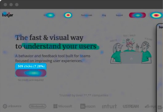
Start with reviewing your past data to learn more about how your existing audience engages with your nonprofit. Looking to your website, Google Analytics, CRM, and email marketing metrics can give you clues into the types of supporters that engage with you online and the content that they best respond to. For instance, if past donors heavily engaged with your Instagram posts, then that’s worth noting when creating your new digital strategy.

You can use this same data to create audience or web personas. Web personas are detailed profiles of your nonprofit’s target audience. Your organization will likely use more than one web persona to account for the different types of people who support your nonprofit. With a clearly defined target customer in mind, it’s much easier to tailor your digital content to speak directly to them.

To create web personas, you need to:

  1. Research your audience. Some key audience details to take note of are age, location, income level, interests/activities, and donor behavior.
  2. Document and organize information. If there are common data points, begin grouping them together to start creating a persona. This could by interests, needs, preferences, age group, corporate match eligibility, and more. How you segment your own supporters will depend on your unique organization and goals.
  3. Bring personas to life. It’s easier to create targeted marketing content for a persona when you think of them as real people. Consider giving your audience personas a name with a visual/face that matches their general description.
Here's an example of a web persona for a nonprofit digital strategy.

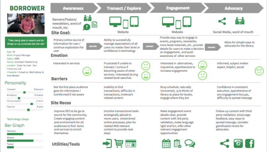
When creating web personas it’s helpful to get as detailed and specific as possible. The above image is an example of how you might organize the details in a web persona and determine the best way to connect with that audience. From there you can produce website content and other digital materials catering to each persona, creating a more engaging and personalized user experience.

3. Consider any constraints

As you develop your digital nonprofit strategy and set your goals, you also have to consider any constraints. While it’s nice to think that the sky’s the limit, it’s often unrealistic and can set your strategy up for failure.

These might not all apply to you, but here are some of the common constraints to keep in mind:

  • Financial budgets. Consider how much you can spend when it comes to developing, implementing, and executing new digital marketing and fundraising strategies. 
  • Technological constraints. What is the current state of your organization’s technological infrastructure? 
  • Timing. Is the timing of the digital strategy aimed towards a certain date, such as Giving Tuesday, or an anniversary?
  • Staffing and labor. Is your current team enough to handle everything when it comes to your digital nonprofit strategy? Remember, you can also turn to volunteers or even a tech consultant for additional staffing.

4. Invest in the necessary tools

If you’re looking to really bring your digital nonprofit strategy to the next level, you might have to invest in a new tool or platform. The internet is always changing, with new ways to engage online popping up all the time. It’s worth it to review your current processes and make sure that it’s meeting the needs of your growing nonprofit and supporters. 

Today, nonprofits see their digital engagement with supporters occur in these locations:

  • Nonprofit website
  • Online marketing campaigns
  • Social media activity
  • Email marketing campaigns

Is your current nonprofit solution doing all it can for the above channels? Consider the gaps in your toolkit or ways your tools could work better together. For example, let’s say your digital nonprofit strategy’s focus is social media and peer-to-peer engagement. Do you have all of the necessary accounts and fundraising tools you need?

Or, let’s say you’re pushing corporate giving. Does your organization have the appropriate tools in place to promote matching gifts and drive more match requests to completion? This might mean embedding an employer search tool into your donation form for donors to research their eligibility or enabling autosubmission tools to let donors automatically submit requests to employers post-donation.

Often, nonprofits seek the help of a nonprofit technology consultant at this stage. The right consultant can perform an audit of your nonprofit’s current tech solution and make suggestions. If your website no longer supports your growing organization, a consultant can help upgrade your current CMS platform or optimize it with extensions.

5. Align your messaging and content

Now that you have concrete goals and the tools to carry them out, it’s time to think about your marketing content. This is the voice of your nonprofit digital strategy and helps tell your story.

When it comes to the story you want to tell, you not only have to be true to your mission but also figure out how to tell it in easily shareable and digestible bites. Short, but emotionally investing, stories are much more likely to resonate with supporters and reach new prospects via reposting and sharing.

The content of your digital strategy should address your audience first. Remember how we defined the audience and developed personas in an earlier step? This data can now be used to personalize the messaging and content to each persona group.

For instance, consider the persona of a completely new supporter. Let’s imagine them stumbling upon your nonprofit website. To immediately connect with them through your content, consider embedding a high-quality image within your homepage of the community you help, along with some quick stats about why they are in need. This can capture the visitor’s attention and introduce them to the most immediate goals for your organization. 

6. Consider the channels you use

You already know that the most important digital channels to your nonprofit digital strategy are your website, social media accounts, email campaigns, and any other online advertising. 

But how do those channels work together?

  • Your nonprofit website is the central hub for your digital strategy. It can connect supporters to your email list, social media accounts, and is where they can give online. Your website needs to be well designed, informative, valuable, and fully integrated with your other online fundraising and CRM platforms.
  • Social media platforms are great for reaching wide audiences. Consider where your current supporters are most active online and focus on those few platforms to promote any upcoming campaigns, advertise blog posts, and share fun, but relevant, videos or viral challenges. Try to post content that encourages supporters to share it with their own network.
  • Email marketing is an essential part of your nonprofit digital strategy. Not only can you use it to reach a wide number of people at once, but you can also even create segmented email lists to cater to more of your specific audience personas. Make sure to track open and response rates to determine which email outreach tactics work best.
  • Online advertising and other digital marketing strategies are important for increasing visibility. This can include online ads on different websites or links back to your organization from other reputable charity organizations. This can also involve SEO techniques that help boost the visibility of your website and blog posts during organic internet searches.

7. Measure campaign’s success

The last thing you need to determine before you start employing your digital nonprofit strategy is how you’re going to measure success. This should have been outlined during the goal-setting stage, but you can take it to the next level with some key tools.

For instance, use your nonprofit tech solution to compile reports and compare metrics based on the combined data from all of your tools and marketing channels. What types of data points and metrics should you look at? Here are some of the top ones:

  • Completed donations
  • Volunteer applications
  • Email subscriptions
  • Pledge signatures
  • Email open rates
  • Email response rates
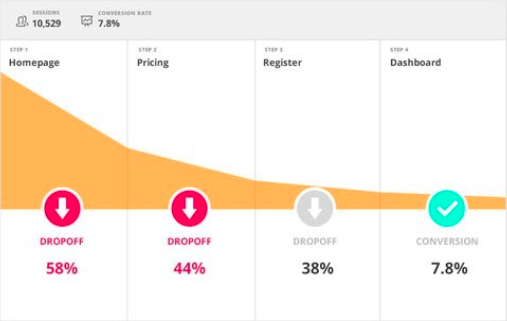
  • Website bounce rate
  • Online donation page bounce rate

Compile reports on these metrics prior to the campaign and after. This gives you a direct look into how your digital nonprofit strategy impacted and helped your organization.

5 Tips to Make The Most Of Your Nonprofit Digital Strategy

The best digital nonprofit strategy is data-based and audience-centric. While how you make the most of your own strategy is dependant on your organization and mission, here are the top tips that can help all nonprofit leaders:

  1. Optimize for a mobile experience. Did you know that roughly 1-in-5 American adults are “smart-phone only” users? At every touchpoint in your digital nonprofit strategy, it’s crucial that you consider how this may look on a mobile device. Otherwise, you’re missing out on some key opportunities.
  2. Use email appeals. Even as new technology and platforms arise, email is still the best way to reach your supporters online. Make sure that donors are aware of your email list and embed forms for users to opt-in on your website, social media accounts, and other relevant places. And don’t be afraid of being aggressive with your send schedule; data shows that while people may grumble about getting too much email, they still open, read, and interact with it.
  3. Personalize messaging. Whenever you can, you should make your marketing content and messaging as personalized as possible. This is most used in email marketing, but can be implemented with text messaging and even within your website. For instance, consider creating specific landing pages for each of your audience personas to better target their needs.
  4. Inbound marketing techniques. This involves all the ways you make it easy for supporters to find your nonprofit and is much more subtle than outright contacting them. For instance, creating educational blog posts, hosting events, implementing search engine optimization, and sharing social media posts are key inbound ways to build brand awareness. The more people see and recognize your nonprofit, the more likely they want to find out more and support your cause. Remember to always include a link to your nonprofit website and other specific landing pages so that supporters know how to take action if inspired.
  5. Partner with a nonprofit tech consultant. Sometimes, partnering with a nonprofit tech consultant is the best method of truly optimizing your digital strategy. The right agency should work closely with your organization to become familiar with your goals, your audience, and current technology solution. Then, they can provide their expertise when it comes to optimizing that solution for your nonprofit’s needs.

If you think a nonprofit technology consultant is what you need, explore our own services to see if Kanopi is right for you.

How Kanopi Can Optimize Your Nonprofit Digital Strategy

A crucial component of any nonprofit digital strategy is the website. It’s the centralizing factor of almost all of your online engagements and where donors can make gifts. As a top partner for nonprofits, we at Kanopi Studios have helped develop over 150 active sites.

When you partner with us, we don’t just develop, maintain, and support your nonprofit website (though we are experts at it!). We like to think of ourselves as extensions of your organization. With thorough research and data analysis, we dive deep into your unique online audience and provide specific suggestions based on carefully crafted web personas.

We take a continuous improvement approach to website maintenance, as smaller and consistent fixes tend to be more beneficial to your website health than large systematic updates that only happen once a year.

Along with this, we also provide a website growth plan to help you make the most of your online presence even when our partnership is over. We don’t just set up your website and hand over the reins — you’ll get specific and customized next steps as to how to increase conversions and further expand your online platform.

Here are some more of our top services for nonprofits:

  • User-focused approach to content strategy, design, and site development.
  • CMS development for Drupal, WordPress, or Mukurtu.
  • Extensive research on nonprofit’s goals, missions, and audience.
  • Accessibility and compliance consulting.
  • Technical SEO optimizations.
  • Updated knowledge on relevant privacy laws and legislations, like whether California’s CPAA affects your organization.
  • User persona creation to map your supporters’ journeys once they visit your site.
  • Staff augmentation to provide extra help when it comes to design or development tasks.

Don’t forget SEO! We gave a webinar about it.

Interface of the ON24 webinar platform showing Lauren Chervinski hosting her webinar about SEO.

Ready to Boost Your Website’s Performance Without the Overwhelm? A must-attend webinar for business owners, marketers, and anyone looking to make SEO work smarter, not harder. Lauren Chervinski gave a webinar focused on SEO called “SEO Survival Kit: 5 Steps to Thrive Now and in the AI Era .” (47 minutes)

How your website’s UX impacts brand perception

Kim Lai
Kim Lai

There are simple steps you can take to improve the user experience of your site.

Consumers have a lot to choose from, so the first impression of your brand online is critical. Your website is often one of the first touchpoints your audience comes into contact with — if not the first — and that experience can make or break their perception of your company. In fact, 88% of people are less likely to return to a website after a bad user experience.

What is user experience (UX)?

At its core, user experience (UX) is the way an individual feels when they’re interacting with a website. It requires an understanding of user wants, needs, values, and limitations. We are not talking about just the visual design (such as colors, font choices, or images), but the entire experience for the customer as they interact with your site and its elements, and how each element works to influence the whole. 

User experience needs to answer four crucial questions:

Can I find it?
Is your audience able to navigate content easily?

Do I understand it?
Is the language you’re using clear and accessible to the widest audience possible? 
Can your content be understood by audiences with visual or other impairments?

Can I use it?
Does your audience understand how to use your website?
Does it make sense where I should go?

Do I feel satisfied?
Does your website fulfill a need? 
How satisfying is that journey?

If your website misses the mark on even one of these questions, you risk losing your customers to a competitor, and you risk your brand reputation. 79% of users who don’t find what they are looking for on one website will go on searching on other websites.

How do we measure user experience? 

There are three main categories used to compare your website to others on the market: performance, information flow, and communication style. Let’s look at some numbers.

Performance

When we think about performance we consider how quickly site pages load on both desktop and mobile devices. Mobile devices are particularly important as 65% of all website visits come from smartphones. 

With 61% of customers saying they’d leave a brand they loved after a single bad experience, it’s incredibly important to pay attention to the experience of your site. 

  • 52% of users said that a bad mobile experience made them less likely to engage with a company, and 74% of visitors are likely to come back to your site if it has good mobile UX. 
  • Mobile users are 5 times more likely to abandon a task if a site isn’t optimized for mobile.
  • 60% of users will not trust a company that hasn’t optimized for mobile.
  • 57% of users refuse to recommend a business with a bad mobile site.
  • 25% in improved organic traffic if you have a responsive mobile design.
  • 40% of people will leave a website if it takes more than 3 seconds to load.

Wondering where we got these statistics? See the resources below.

Information Flow

79% of users who don’t find what they are looking for on one website will go on searching on other websites. The attention span of your audience is short — typically less than 10 seconds — and the ability to find immediate information can mean the difference between a repeat visitor and one that never returns.

  • 40% of users will abandon a website if it seems messy.
  • There’s a 400% higher conversion rate with great UX design, which is double what a great visual design can generate. 
  • 71% of publishers say content that looks well-organized on mobile devices boosts positive user experience feedback.

Communication of Content

How you communicate your message is just as important as where it’s featured on a web page. It helps users get the information they’re looking for, and tells them what you can offer. As a bonus, good copywriting can boost your SEO rankings, since 75% of all website traffic runs through Google search.

The format of your content matters too. You want to consider how your audience processes information (whether it’s visually, through videos, or through longer content), and tailor your content to their consumption preferences.

  • 46% of all website visitors will not trust a company if its mission statement is not clear. 
  • 70% of people learn about a company through their blog rather than ads.
  • 73% of people are persuaded to buy a product or a service through a video.

How to improve your User Experience (UX)?

The best way to ensure your website has a stellar user experience is to take a look at how it’s currently performing through quantitative and qualitative research, then apply any findings to make actionable updates and improve your UX.

Gather Quantitative Data

Tools like Google Analytics and Hotjar allow you to see how the majority of your audience behaves, using click tracking and conversion funnel tracking. 

Click Tracking

Click tracking identifies where a person clicks and how far they scroll down a page.

HotJar allows you to use heat mapping to see where users click on your site.

Conversion Funnel

A conversion funnel identifies the biggest barriers to conversions and discovering ways to improve the flow.

HotJar also provides conversion funnels to see where users drop off your site.

Quantitative questions

Then once we’ve gathered the data, here’s what we typically look for: 

  • How does your audience find you? Do they find you through social media, internet search, or do they know who you are?
  • What is the first page someone lands on? If not the homepage, is there enough information to entice them to stay on your site?
  • What is your most popular content? The answer will help prioritize your navigation.
  • What buttons are used most often? The answer will help prioritize your calls to action placement.

Gather Qualitative Data

Quantitative data can tell you a lot about your UX, but you also need qualitative data to understand the more subjective perceptions of your brand and website. Gathering qualitative data will help you understand how your audience feels about your brand, their interpretation of your value, and their experience with the website.

A great way to capture this information is through surveys. You can capture the audience perspective in real-time through an onsite survey, or you can create a Google Survey to send to current or prospective customers.  

Qualitative questions

Once we’ve gathered this data, here’s what we typically ask:

  • Is your audience finding the content they need? If not, what is the barrier?
  • Why do they choose you over other organizations? The answer will help shape your value statements.
  • How does your audience feel about the site design? Illuminate visual design issues you may not be aware of.
  • Rate qualities your organization wants to embody. Understanding what qualities resonate with your audience helps prioritize message and content.

Apply your learnings

Armed with your rich qualitative and quantitative data, you can start to apply your learnings and make improvements to your UX. There are several areas where most websites need attention that can make a big impact, such as image size, menu navigation, and page layouts.

Size images appropriately
Image file sizes are one of the top offenders when optimizing site performance. Resizing super large images to appropriate sizes can speed up load times.

Streamline menu structure
Think of your navigation as your table of contents. Your audience should know where they can find the information they need, and it should be easy to locate. Take a critical look at your website’s menu structure and content.

Optimize the mobile experience
Make sure your website is responsive and that the mobile experience feels just as rich and inviting as your desktop experience.

Optimize page layouts
Use eye-tracking and heat-mapping tools to identify current site behaviors to identify areas that could use a visual boost. And on the back-end, make sure your code isn’t loading unused features.

Edit your content
Trim content down to the most salient points. Use headlines to highlight the most valuable information. Strategically use images that elevate your message.

Use relatable language
Your site is the first handshake your organization extends to a person. Using familiar language makes your organization feel inviting and personable. Plus, writing in an easy to understand way will boost your SEO.

Small steps can lead to big UX improvements.

Improving your UX doesn’t need to be a big hurdle to overcome. These are mostly small fixes that can make a big impact. 

If needed, employ a third party opinion, whether it’s through a new employee, a consultant, or an agency. The perspective of an outside party will provide insights you may not see because you’re too familiar with your own brand.

Want to dive deeper into the numbers? 

Here is a list of sites with a lot of research and UX statistics. 

Need more help? 

If you need an outside perspective, Kanopi is here to help! We can help measure and improve your UX, while keeping your unique company goals in mind. 

Four ways to optimize your higher education website

Donna
Donna Bungard

Build trust through effective content strategy.

Higher education students, like many others, are facing hard choices this year. COVID-19 has changed things, and though some students are happily returning to school, others have opted to wait. McKinsey’s student enrollment survey found 15% of students are very likely to defer by at least a semester in 2020. Other studies predicted that nearly 30% of students would delay. Though the actual numbers vary by school, area, and so on, there is a lesson for us to learn from and a unique opportunity to optimize your higher education site. Start the conversation and build a connection with prospective students who need to decide what they will do for the 2021 winter semester. 

Let’s start by recognizing the great work you’ve done so far! We know many institutions have had to quickly pivot and make changes to address user needs. We’re into the fall semester, and you’ve helped many students figure out what they’re doing for the next few months. 

Now is the time to ensure your website meets your users’ needs and supports your institution’s goals for the rest of the calendar year. A college’s website is the most influential resource used by prospective students for their higher education search. You can risk losing your audience by not paying attention to your website and the power it yields. Additionally, there’s a risk of your school looking out of touch and underprepared if you don’t adjust your content strategy in light of COVID-19. 

A McKinsey report stated, “normal operations may not resume for US higher education institutions until summer 2021.” By strengthening your online presence now, you can turn people nervously researching your post-secondary school into enrolled students who feel confident and safe starting their education with you next year.

Here are 4 content strategy fixes you can make to your higher education website to increase student enrollment:

Review user personas 

We suggest taking a close look at your existing user personas and exploring how the pandemic may be affecting what they need and expect from your website content. We looked at the most common user personas held by our higher education clients and how shifts in their needs may affect your content strategy:

  • Prospective students may want reassurance their education won’t be negatively affected by changes your college or university has made as a result of COVID-19. Moreover, they may fear the choice to defer a semester could negatively impact their long term success. Ensure your content addresses their concerns, and manages their expectations. Be transparent about what you are doing to alleviate their worries, and what you’ll do to make the experience as genuine as possible. In the end, every user needs to feel valued and heard. Make content relating to their needs (financial aid, admission updates) and desires (you paused, not stopped) easy to find and simple to scan.
  • A parent of a prospective student worries about the long and short term impact COVID-19 will have on their child’s education. 85% of parents said they need to know more about what colleges and universities are doing to ensure student safety. Others are looking for what comes next. It’s vital to bring this information front and center on your website.
  • Alumni often have a deep connection and want to support their school. Make it easy for them to make a difference: from clear user pathways to donations to empowering users to share their stories, updates to your strategy can give them a clear path forward to support you during this unprecedented time.

Improve site navigation

Make it easy for students to find what they are looking for by improving your website’s navigation. 

  • Make sure your site has multiple welcome mats. Research from last year explains more and more that students are not always entering your website through the front door (your homepage). People search the web using keywords and phrases and are navigating directly to pages on tuition fees, particular majors, top professors, and campus life. Wherever a prospective student ends up on your site, they should find consistent, relevant, and up-to-date information that guides them on their journey through your site.
  • Improving your website’s search functionality can do wonders for students trying to navigate to the content they want and need, quickly and easily. Explore “fuzzy” search or optimize a no results page to help them find what they are looking for. 
  • Ensure users can access your content. Users cannot take action if content is out of their reach:
    • More than 60% of users are surfing on their phones, and more than 50% of searches take place on a mobile device; it’s vital your website offers a robust mobile experience. 
    • Approximately 25% of US and Canadian adults self-identify as disabled. With nearly a quarter of your audience affected, accessibility is more than a legal matter. 
    • Many sources have estimated that nearly 50% of searches will be done via voice by the end of this year, which means that the accessible features you build in will help more of these users find you. 

Your content should be as easy to perceive and navigate regardless of what medium the site visitor uses. Take a look at Kanopi’s top tools and tech to use to help you meet accessibility standards.

Refine call to actions (CTAs)

Audit the existing CTAs on your landing pages through the lens of someone who may be anxious about enrolling in college during a pandemic. Do your CTAs take into account people’s current fears? Do they reassure prospective students while at the same time convincing them to do something? 

  • Make it personal. Use pronouns ‘you,’ ‘us’ and ‘we’ to build a digital connection with prospective students.
  • Use empowering, reassuring language, and an empathetic tone. The unpredictable nature of COVID-19 has made students anxious about starting college. Address this in your call to actions to connect with your users emotionally to empower students to take action.
  • Simplicity converts. The key to a successful call to action is to tell people what they should do and why they should do it in the most direct way possible. 
  • Make CTAs accessible. don’t use vague language like “learn more” or “read more.” For blind users, it might not be clear what will happen when they click. Instead, get specific, such as “download the white paper” or “subscribe now.”

Where possible, go virtual  

We know the pressure is mounting on many colleges and universities to embrace more online learning tools due to the COVID-19 pandemic. If your institution has plans for virtual learning, you should focus on moving towards that, and your online presence should reflect and complement this.

  • Virtual tours can give people a greater sense of what your school represents and help prospective students decide if it’s the right fit for them. Even if you choose to deliver a large proportion of classes online, virtual tours can strengthen your school’s brand, presence, and create a sense of community. Make sure to include captions so all users can perceive this valuable content. 
  • Consider new ways to connect prospective students with faculty, staff, guidance counselors, and each other through your website. Could short video clips give students a clear idea of what they should expect from a particular curriculum, and what enhanced support is available? If you go that route, remember that representation matters! 
  • Help alumni tell their success stories online. Allowing for user-generated content will make it easy for them to share photos, videos, and quotes explaining how attending your school impacted their lives and careers for the better:
Image from the San Francisco Conservatory of Music case study
San Francisco Conservatory of Music case study

Building connection

Engaging prospective students through a robust online presence and by building a digital connection with them, you can build on students’ trust that your online classes now and the 2021 courses you’re planning will be just as rewarding. 

Need some assistance with how to optimize your higher education website to increase enrollment? Kanopi can help! Kanopi has years of experience building and supporting higher education websites across the United States and Canada. We’ve partnered with UCLA, Stanford, and the University of British Columbia, to name a few. Contact us to start the conversation

Kanopi Team

Working with a niche agency: do I need to work with someone who’s built a site just like mine?

The pros and cons of working with specialized agencies.

Throughout my career of developing and designing websites for over a decade, I’ve been asked more or less the same question a number of times. The question is usually raised when I’m chatting to people at conferences or in meetings with new clients. People ask me to point to a site Kanopi has built for an organization exactly like theirs. In most cases, I respond with a question for them:

I ask, ‘what problem is your web presence needing to solve?’

Whether a large corporation, a nonprofit, or a civil organization, the best websites all have a few things in common: they are easy to use, they meet their users’ needs and they present smart content that supports key business objectives.

Does your website have a content strategy that speaks to your users? Do you have a clear user journey and are you making the right conversions? Does your site have the right layout for optimal flow? 

Knowing what problems your web presence needs to solve is key. I’ve outlined a few common problems we see with websites, and how you can learn from verticals outside of your own that are solving similar problems to yours.

Focus on the problems you need to solve through your website. 

Many companies still focus on what messages they want to deliver on their website rather than what their users need. This causes them to migrate towards the sites of companies with more or less the same service offer, product, or mission. While researching the competition is important, when it comes to building a great website, it’s more valuable to focus on the needs of your unique users. What sites can you look to that are solving problems like yours fast and efficiently? 

For example, let’s imagine publishing company X wants a better website. They look for an agency that has developed a site for publishing company Y.

Publishing company X’s site is built, exactly like publishing company Y’s, but unfortunately neither meet their user’s needs and publishing company X is left scratching their head as to why their web presence hasn’t improved.

What if publishing company X instead looked at the problem their website is needing to solve? For example, the need for presenting a high volume of useful content in an accessible, inclusive way. They might realize that advocacy organization Z had the same problem — lots and lots of valuable content that wasn’t easy to access. Publishing company X could use a similar search and filtering functionality used by advocacy organization Z. Functionality that is simple and easy to use which improved the experience for their users. Their users are now engaged, their questions have been answered and they’ve been motivated to take action.

Example of Search functionality. Many functionalities work well regardless of industry.
Image of simple filter & search functionality

Instead of looking for an agency that has built a site for a company exactly like yours, why not ask if they’ve solved some of these common web presence problems?

  • Have you optimized the flow of a site by building the right layout?
  • Have you crafted a user-centered content strategy for a site?
  • Have you helped improve and get the right conversions for a site?

By partnering with an agency that has solved similar web presence problems to the ones you currently face, you’re more likely to find the right solutions and ensure your website meets the needs of your users and supports the goals of your business.

With a diverse range of clients comes unique insight.  

There are benefits to partnering with an agency that has a diverse range of clients. Agencies working effectively alongside fast-paced business clients tend to be quick and nimble in their approach. They are able to apply insight gained from their experience in the corporate world to their partnerships with clients in other verticals, such as nonprofit and civic.

Additionally, agencies working with clients in the nonprofit and advocacy sectors become acutely aware of fluctuating budgets and learn to do more with less when it comes to managing a sustainable and relevant web presence. 

If you are able to partner with a team of engineers, themers, designers, and strategists who all have experience across a number of sectors, you’ll gain valuable access to their cross-vertical knowledge and expertise that can then be applied to your own website.

Pitfalls of working with an agency that only works in a niche vertical.

Some agencies specialize in certain verticals, such as only working in higher education or with nonprofits. And to be fair, many of them are great at what they do! They know the market well, and can hit the ground running with several assumptions based on past knowledge and experience with other similar clients. 

However, there can be disadvantages to partnering with an agency that only builds sites for one vertical or niche industry. You risk your web presence too closely resembling your competition due to tunnel vision or templated solutions, rather than having a site that supports your distinctive brand. In addition, the use of industry-specific templates can affect your web presence, having an impact on scalability and customization down the road. Assumptions can also be made about who your users are and what their unique needs are, if simply aligning to similar organizations. 

If you decide to stick with an agency that specializes in your vertical, that’s fine. Just make sure that they do the proper research about your organization so that they know what problems need to be solved for you, that they give you a solution that addresses your needs, and that they don’t follow a template so that your final site looks just like your competitors, 

Kanopi can help you find the right solution for your web presence woes.

From our mission-driven clients in healthcare, higher education, and human rights advocacy to our large business and civic organization clients, we have a track record of improving web presence and building sustainable sites across a number of industries and verticals. 

Partner with Kanopi to gain a better understanding of your user’s needs and build a website that’s beautiful and easy to use while helping you achieve your business objectives.

Head shots of various people

UX Personas for Website Design: 5 Steps for Designers

When we think about creating a website that’s rooted in exceptional UX and carries users through a seamless and delightful pathway, the first place we start is by creating a buyer persona. Building personas allows you to step into the shoes of your customers and really understand them—a key success factor for any sales and marketing team. In fact, 71% of companies that exceed revenue and lead goals have documented buyer personas.

There are a few key steps you can take to build a persona, which we’ll outline in this article.

But, first…

What is a buyer persona?

Simply put, it’s a detailed description of your target customer, written as if the persona were a real person. It’s documented in a way that lists everything from demographic information to hobbies, to pain points, and motivators. A persona is a tool you can use to create sales and marketing materials that have a specific target user in mind, rather than a generic one. By having this clearly defined target customer in mind, you can tailor your marketing messages and website content to speak directly to your target audience.

How do you use buyer personas?

Buyer personas help inform everything you do, from the words your sales team uses on a call, and the content you post on your website, to the way you write a social media post. 

Your buyer personas empower every department to be more intentional with their messaging and actions:

  • Writers can align content with your target customers’ needs and wants. Content that’s written specifically for your audience will resonate with them better and lead them to take the intended action
  • Imagery and design can be informed by what would inspire and attract your personas
  • Sales materials can be customized to address the specific needs and pain points of your target personas
  • Your Development team can better plan, build wireframes, determine the scope, and align UX behaviors

How to Build a Persona in 5 steps

1. Research your audience

Knowing your current audience’s demographics is a great first step in your persona exploration. Learn more about who is already buying from you! You can find a great deal of information by digging into your website analytics and social media analytics. Some of the key data points to collect include:

If there are gaps in your data, you can consider gathering additional information through email surveys, online surveys, focus groups, and customer interviews.

2. Document and organize your information

Use your research to start documenting your buyer personas in a clearly laid out template, that captures a full view of who they are and what makes them unique. It should include what you’ve learned about their motivations and pain points through your research phase.

Key information you can consider including:

  • Name, age, sex, education level, job title
  • Role at the company (not necessarily job title. For example, “decision-maker”)
  • Technology they use
  • Worldview (one sentence that sums up this person)
  • Motivation (overall goals, what gets them out of bed in the morning?)
  • Pain points (what’s standing in the way of their success?)
  • Solutions they’re shopping for

3. Bring them to life

Now that you understand your personas’ background it’s time to give them some personality. When building your persona, it’s helpful to give them a name and a visual/face. Search stock photo sites to find a good match for your persona’s demographic data and behaviors (for example, their age, casual vs. formal attire).

By bringing them to life and really personifying each persona you can start thinking of them as real customers, and easily use the personas to support conversations internally.

For example, if your marketing team has a piece of content they want to produce, you can then ask: Is this content going to be helpful for “Techie Trey”? If so, let’s be sure to address their needs and mindset when creating it.

A detailed example of a persona and the information it could include, such as goals, frustrations, and what kind of technology they use.
A detailed example of a persona, and the type of information included.

4. Speak to them

Develop messaging around your new persona(s) that will help inform the way you speak to your prospective customers on your various channels; website, social media, sales materials, etc.

  • Create a 30-second “Elevator Pitch”: Create an easy way to present and describe your product to your persona. Be quick and concise.
  • Marketing Messaging: What is the best way to describe your product or service to your persona that will alleviate their pain points.

5. Invest in a Customer Decision Journey

Now that you’ve defined your personas, we highly recommend flowing those personas through a Customer Decision Journey (CDJ). This is a great way to understand how to engage with your audience in each step of their journey with you, and strategically create pathways that support their needs. This process also helps organize and identify what your most immediate approach should be to your content strategy and your website experience.

Kanopi can help with that! If you need help creating personas, mapping out a Customer Decision Journey, or anything related to awesome UX, we’re here, ready, and willing to support you.

Kanopi Dev Team Jumping

How to Make a Website Last: Best Strategies and Tools

A continuous improvement approach is best for sustaining your website for the long-term.

One of my favorite things to talk about with clients is how to get the most of your budget. As Kanopi’s CEO, I spend every day doing exactly that. So much so that I created the above webinar around making your site last for the long-term. But I also wanted to touch on some of the principles and tools here in a post

In the older days of the web, it was standard to redo a site every few years. There were enough drastic changes in the early days of the internet that every few years it was imperative to overhaul a site to keep up. It cost a lot of money, and could take anywhere from 6 to 12 months depending on the scope. 

But here at Kanopi, we’ve recognized that the internet has grown up, and we’ve gotten away from that approach. Can we do a full overhaul if it’s the best option for your project? Absolutely! But we prefer to adopt a more Kaizen approach. Why? Because websites are never done. We like to say the first day of your project is actually the day your site launches, because yes, it’s wonderful that you’ve built a site, but now it has to evolve and grow over time. And the best way to do that is via a continuous improvement approach that improves it in small, positive increments over time. It’s more sustainable for both your team and your budget.

How do I apply continuous improvement to my website?

Usually you know when it’s time to give your site some love. It’s typically when you can say yes to any number of the following questions: 

  • Has your organization evolved?
  • Has your industry evolved?
  • Can your users find what they are looking for?
  • Have your users’ needs changed?
  • Is your content presented effectively for your users?
  • Is your conversion rate declining?
  • Have your search engine rankings changed?
  • Have your competitors changed their approach?
  • Is your site fast enough?
  • Does your site overuse design trends?
  • Does your site look great on mobile devices?
  • Is your site easy to use and edit?

So let me ask you: even if you can answer yes to just ONE of these questions, why not make that small improvement now? Why wait until you have lots of issues that require a larger lift? If you had a 100 year old house, you wouldn’t ignore all the small problems that accumulate over time. You’d fix them as they presented themselves, or else your house becomes an expensive money pit (or a total tear-down). 

This is where you need to think about your site in terms of a circular flywheel. Don’t think about your site in terms of Strategy > Design > Development > Launch, and then let it sit untouched for a while.

Instead, think of a circular process of Strategy > Implement > Learn & Iterate, where after you Iterate, you revisit Strategy again! This will translate into a site that is always being refreshed and improved without breaking the bank.

Traditional vs Growth-Driven

Start with Strategy

No matter what we do, at Kanopi we always start with strategy. Here is where I recommend focusing on what matters most to your user and stakeholders, and don’t waste your time on things that don’t matter. This is where you can look at doing any of the following activities; 

  • SWOT analysis: outline your strengths, weaknesses, opportunities and threats. 
  • User journeys: look at how your users go through your site. What pathways do they take, and do those align with the pathways you want them to follow?
  • Personas: how well do you know your users? Are you targeting the right audience?
  • Competitive Analysis: what do your competitors do well? What do they do poorly?
  • Data & Analytics: what does your data tell you? Do you know how to interpret it?
  • Site Audit: is your content old and irrelevant? It may be time to either update or archive it.

Once you’ve taken a look at all those items, then it’s time to make a plan for moving forward. There are many areas of your site where you can make incremental — but positive — improvements to address the above strategic questions: 

  • Information architecture: should you rework your links, or change how your site is structured?
  • Usability: how can you make it easier for visitors to use your site? 
  • Design: small design enhancements
  • Accessibility: how accessible is your code and your content?
  • Performance: is your site as fast as you need it to be?
  • Content: are your calls to action clear? Does your content speak to your users?

Consider these quick wins

Decide which of these matter the most to you and can propel you forward in the best way. You can start with some low-hanging fruit, such as:

  • Navigation: remove links people click on the least.
  • Simple theme changes: refining the type and tweaking the color palette.
  • Focused design: make design alterations to the homepage or key landing pages.
  • Accessibility: make sure your content is accessible as possible, including your images. 
  • Reimagine or archive content: freshen up content that needs it, and archive content that is no longer useful or relevant. Check out this presentation about auditing your site for additional help, as well as this one on content strategy improvements you can make today.

Now it’s time to Implement

Here’s where we operationalize the plan. Break the work into two- or three-week long sprints. Determine what you can get done in that concentrated timeframe that will get you the results you need. It sounds a bit like agile development, and it is in the sense of breaking it into smaller chunks. A sprint schedule helps deliver value quickly and consistently. As we like to say: small bites create big wins!

Learn and improve from there

Now that you’ve completed that one discrete piece, measure it. How did it go? What can be improved? 

Doing these activities can also help keep the momentum going: 

  • Share wins and successes: talk with your team about what worked and how it can be made even better.
  • Measure regularly (weekly/monthly/rolling): by doing regular data checks, you can keep on top of what is still working over time. 
  • Schedule user testing: remember, your site is all about meeting your users needs. Test with users regularly to make sure you’re still meeting their needs. 
  • Use sprints to integrate feedback: you can even set up feedback on a sprint schedule. 

Will all that information, keep the momentum going and head back to Strategy! 

Continuous improvement keeps you nimble: you’ll to get into a place where you’re doing less, launching more often, and making more impact. And if something doesn’t work as well as expected, luckily it’s over after a short time frame, so you can move on to the next piece. 

And if you have a Drupal 7 site, we wrote a whole blog post specifically about how there’s still life in your D7 site. You can keep it going for a while past its expected end of life in Fall 2021. (On the other hand, if you’re determined to upgrade to Drupal 9, check out our guide on D9 planning: a guide to upgrading or extending the longevity of your site.)

Tools for making your website last

Here are some tools that can help you extend the life of your site. This is not a comprehensive list (each category has many more great options), but these are some of our regular go-tos:

SEO 

Search engine optimization is an ever-evolving practice of increasing the quality and quantity of website traffic by increasing the visibility of your website (or a specific web page) to users. But you don’t have to be an expert in SEO to make demonstrable improvements to your site with some handy tools:

  • Google Search Console, Bing Webmaster Tools: if you are not communicating directly with the search engines, you are missing out on valuable tools and information.
  • SEM Rush: research both your and your competitor’s keywords, and identify pages that rank for the terms for which you want to rank.
  • Screaming Frog SEO Spider: crawl your site like a search engine does, and see exactly what they see.  Helps identify issues and opportunities.
  • Moz Local: if you manage a local business, check out this suite of tools that helps you define data about your business, and distributes it to aggregators and sites where you want to be found.
  • Majestic: research and develop backlink strategies with Majestic’s incredibly vast link database.

Accessibility 

These days it’s imperative to make your site accessible. In many industries — and the number is growing — it’s illegal to have an inaccessible site. These tools can help you get there: 

  • Wave: a browser extension that checks for compliance issues found in Section 508 and WCAG 2.1 guidelines.
  • Lighthouse: an open-source automated accessibility testing tool. Available as a browser extension, from the command line, or as a Node module, this tool will scan the URLs for performance, accessibility, SEO, and more.
  • Axe: Axe is an accessibility testing engine for websites and other HTML-based user interfaces. It’s fast, secure, lightweight, and was built to seamlessly integrate with any existing test environment so you can automate accessibility testing alongside your regular functional testing.
  • SiteImprove: their content and accessibility audits use Web Content Accessibility Guidelines (WCAG 2.1) as its guide. The tool checks that there are no broken links or misspellings, and also identifies when page content is too dense or hard to comprehend.
  • TotA11y Plugin: this tool helps visualize how your site performs with assistive technologies.

Additionally, here’s another blog post we wrote about Kanopi’s Favorite Accessibility Tools. Also read our thoughts on how content editors hold the keys to an accessible website.

Usability 

It’s critical to test with your users to make sure they are getting the information they want when they want it. These tools will help achieve that:

  • UserTesting.com: a usability customer experience testing platform that gets on-demand feedback about a product or service from real users.
  • HotJar: HotJar uses heatmaps so you can see how visitors are really using your website, collect user feedback and turn more visitors into customers.
  • Crazy Egg: you can use Crazy Egg to learn what your web visitors are doing. Heatmaps, recordings, A/B testing & more.
  • Optimizely: It’s best known for its A/B testing, and allows for terrific segmentation for more accurate results. 

Measuring Data 

We always recommend measuring what matters, and that will be different for every organization. What matters to you? Is it the number of page views? Is there a certain conversion goal you are trying to hit (like number of donations, or email newsletter sign-ups)? Is it page views? Or perhaps speed? 

  • Google Analytics: this is Google’s free web analytics service that allows you to analyze in-depth detail about the visitors on your website
  • Google Tag Manager: a free tool that allows you to manage and deploy marketing tags (snippets of code or tracking pixels) on your website or mobile app without having to modify the code.
  • Lighthouse (again): because this open-source automated testing tool does so much more than just accessibility, we had to include it here as well. Available as a browser extension, from the command line, or as a Node module, this tool will scan the URLs for performance, accessibility, SEO, and more.
  • GTmetrix: a free tool that analyzes your page’s speed performance. GTmetrix generates scores for your pages and offers actionable recommendations on how to fix them.

However you measure your data, you will have to track your users. And it’s critical to find the balance between learning from your users without getting insidious with how the data is being collected. We all want to know more so we can make better websites that attract users, but we need to be responsible about it!

With small bites, you can make your website last!

At Kanopi, we love to say, “small bites create big wins!” And it’s just so doable: you really can make huge improvements in smaller chunks to avoid feeling overwhelmed and also keep your budget in check. 

But if you do need the assist to make your website last for the long-term, that’s our specialty. Contact us. We’d love to help. 

Kanopi Team

How to Avoid the Swoop and Poop

Some advice on working with key decision makers for a smoother project.

Maybe you’ve seen this happen:

A large project is underway. An individual in a position of seniority is busy and unable to pay attention to the details you and your team are managing. At the last minute, this individual prioritizes your project and subsequently drops into the project (a swoop) and then recognizes all of the areas where the project’s outcome isn’t in alignment with what they had imagined. Both approaches — the imagined and the actual outcome — may be completely valid, but they’re still out of alignment with what this vital decision maker was anticipating. That senior leader shares significant criticism and may even demand changes (poop) to the work. And then, POOF! They’re gone.

The “Swoop and Poop” — also known as Seagull Management — is based on this visual: a large, squawking seagull who is only tangentially interested or involved in your project flies in, makes a lot of noise, dumps on your work, and then flies back out, leaving a new mess for others to fix. 

If it’s happened in your organization, you’ve surely recognized how disappointing, heartbreaking and de-motivating this is to your entire team. It can be difficult to remain focused on project parameters when you get distracted by the ‘should haves’. 

In the end, businesses are groups of people working together, and it’s the human equation that becomes the source of the stress. 

Working with Humans

When people ask me the best part about building websites, I say THE HUMANS!

When people ask me what is the hardest part about building websites, I say THE HUMANS! 

This is why our team at Kanopi specializes in working with the humans affected by each project. We’re complicated creatures. We recognize that the key decision makers in your project extend far beyond any of us on a single call. As your project team, we recognize the intellectual and emotional impact of our work on:

  • end-users
  • content editors and managers
  • the “On the Ground” team
  • visionary key decision makers

and just about anyone else who touches your site. 

It all comes down to building a web of connections. Regardless of the problem we are solving, or for whom we are solving it, we are forging connections between humans as we create impact in a digital space. Your website is the hub of those connections, where all aspects of the users’ omnichannel journey meet, and where your organization looks to translate and define vision and representation. 

The Poop and Swoop; how do we avoid it? 

At Kanopi, we empower humans to be in alignment. This means making sure those senior-level decision makers are on the same page from the start of a project as well as during the lifetime of the relationship. By carving out time in their schedules at key checkpoints, we can ensure the vision remains in alignment. 

Checkpoints may include: 

  1. Introductory interview and documentation of needs/wants/ideas/fears
  2. Communicate findings of the research and the website recommendations
  3. Share all key deliverables during the process
  4. Regular meetings to provide executive-level summaries of project progress
  5. Weekly status update on the project with links and a call to action for feedback 

Communicating with key decision makers at those checkpoints serves two purposes. 

First, you are extending an opportunity for feedback, alignment, and most importantly, connection. Forging stronger bonds here can help establish common vocabularies and improve all-around organizational communication moving forward. 

The second benefit is that you will have documentation that speaks to the project along the way. This means if you still have someone come back to you with an attempt to ‘poop’, you will be able to provide them with the feedback received and showcase how the project got to where it was with their involvement. Most key decision makers want to stay on time and on budget on any project, so point to the documentation. Kindly note that there were multiple opportunities for feedback, and pivoting this late in the game can cause monetary and/or timeline consequences. You’ll be prepared to defend decisions when they are made based on research. It is easier than you think!

Justifying the Time

Chances are all members of your organization are busy. The game of ‘calendar Tetris’ is real, and can be very difficult. Key decision makers may be difficult to track down, especially when you’re tasked with pushing the project forward. Sometimes the biggest challenge on a project is getting the necessary key decision makers in the room.

Tactics we’ve found to be successful include:

  • Communicating how the budget is better optimized by ensuring the team is in alignment.  
  • Speaking to their KPIs/needs and how their take on the website can help bridge the gap between where they are and where they want to go.
  • Emphasize the team-building benefits that come from sharing the vision at these checkpoints. 

Embracing What Makes Us Humans

Working together through establishing communication rhythms and vocabularies can improve productivity, optimize budgets, increase morale and overall enhance your website project. In short, it makes it all a bit easier. We can work with you to ask the right questions that get to the heart of “Why” and steer clear of the swoop and poop. 

Kanopi Team

Three Content Strategy Improvements You Can Make Today

Donna
Donna Bungard

We’ve all heard it: content is king. But anyone who’s tried to audit their content — much less get a full handle on it — has come to understand how big of a call that is. Your content makes you relatable to users as you guide them through their journey (with the goal of conversion) while also communicating the value of your content to search engines too. Your content needs to entice the new visitors that you want to attract, gently suggest to your non-target market that this content is not for them, all while delighting returning users again and again. It’s a lot

So, instead of taking on the word, or your content all at once, let’s look at the 3 content strategy improvements you can make now to optimize this incredible asset. 

“Success is making those who believed in you look brilliant.”

Hubspot

Define & Track Success

Until you know what it looks like for a user to convert, you’ll never celebrate an accurate conversion rate. Define your macro and micro conversions. What do you want your readers to do with your content? Is there a form you want them to fill out, or a way you want them to engage?

To continue winning the internet marketing game, your content has to be more than just brilliant — it has to give the people consuming that content the ability to become a better version of themselves.”

Michelle StinsonRoss, Managing Director of Marketing Operations, Apogee Results on Hubspot

The key to all content marketing is to make the end-user the protagonist — the hero of their own story. Before they can strap on that cape and tights they need a goal, which is  that point when they convert. Clearly define what your users need to do to be their own hero. Some common conversions are:

  • contact form submitted
  • donation made
  • chat engagement
  • responded to an ad or social media engagement
  • download gated content
  • video watched to completion
  • blog article read to completion

Once that’s done, track it. Utilize Google Analytics’ goals, events, and functions. Build funnels and review the behavioral flow. See where users are coming from, and where they are going. If you have the option, optimize a tool like SEM Rush to see how your search engine rankings for keywords and phrases measure up to your competition. Set yourself up for success to not only say your users are making a difference, but to demonstrate how well you’ve accomplished this. 

Navigation

Ok great work! You now know what success looks like. Time to break out the map to get them there. I know, we don’t typically envision Superman stopping up in the clouds, pulling out his phone and looking up an address on Google Maps, but our heroes need a bit more help than he does. Simply put, your navigation is there to help the user along their journey from point A to point B. So… how clear are your pathways? 

Often, even the best-maintained sites suffer from sprawl; content is added in a hurry and different teams are updating all the information as regularly as possible. The problem is, over time this can blur the steps a user will take to get where they’re going. Navigation dropdowns can collect 10 or more links and users are so overwhelmed with choices they often just click anything, which isn’t the best way to move them towards their goal. So let’s break down a few basic rules to apply to your navigation:

  • Try to keep it limited to about 4-5 options per navigation: this includes your main nav, your hero nav, and each dropdown. Perhaps the only exception would be your footer, but even then, each column should only include 4-5 options. Make it easy for your users. Either a path will lead them to your goal or it won’t. 
  • Use clear language: you don’t have long before an end-user gets frustrated and clicks anything (including the back button). Make the language consists and representative of the page. And remember: if your menu items are outputting your properly formatted page titles, these menu links will also be what shows up on search engine result pages,helping your hero get to you as well as move within your site. 
  • Make sure it’s accessible: this isn’t only for the 20% of self-identified disabled users out there, this is for everyone. From a poor internet connection to a cracked phone screen to a user who hasn’t had their coffee yet and is prone to ‘fat fingering it’ (The Thing was a hero too!) accessible menus make it easier for everyone.

Engaging Calls to Action (CTA)

A strong CTA is far more than a combination of words that hopefully compels people to click on a button — it’s a powerful statement of intent, a rallying cry to our tribe, the crescendo of a rousing speech that leaves the audience exhilarated, clenched fists raised triumphantly to the sky. Well, that’s the idea, anyway.”

Dan Shewan, Wordstream

What if Commissioner Gordon never called Batman on his red phone, or the random person never yelled help as they point to the villain descending? The hero would never know where they were needed next. Your CTAs are the same thing: they show your user, the hero, where to go next to accomplish their goal. 

Make them clear. 
Make them engaging. 
Direct to the next step.

And for accessibility purposes, don’t be vague. “Click here” doesn’t give tell a screen reader what the user will gain by clicking. Use words and directions that tell assistive technologies what clicking will accomplish. 

A few great CTAs include:

  • Get involved today!
  • Make a difference in someone’s life.
  • Start the conversation.
  • Tell us what you think.

There is a lot more you can do with your content, but these are three critical steps you can take right now to make an impactful difference that will add value to your site. Think about it: you know your user, your company, and your goals. You’re already in the best possible position to help your users do more than visit your website, you’re empowered to make them the hero. Start with these three steps and verify how they are working. And if something isn’t working, just adjust and try again. 

If at any point this starts to feel overwhelming, and we get it, you’ve already got a lot on your plate, just drop us a note and we’ll talk it through content strategy improvements. You’re the hero of our story and we’re happy to write that together. 

Hands on a keyboard

Simplifying Omnichannel Marketing for Greater Impact

Donna
Donna Bungard

Omnichannel marketing has been shown to improve website conversions and more organizations are starting to see the positive impact this approach has with repeat visitors. Google Research has reported that 98% of Americans switch between devices on the same day, having a constant experience at every step of the user journey is critical. With millions of organizations competing for billions of dollars users in both the for-profit and the non-profit sectors each year, the pressure is mounting.

5 Key Factors when Building Your Omnichannel Experience

Even the most seasoned marketers can become buried in the details of each user’s touchpoint with a given campaign. With your website being your source of truth, organic search, paid search, email, tv, and social media are some of the channels that feed off of that. Once we take into account desktop, mobile and tablet experiences — and the variations of each — there is a lot to manage. Here we’ll break down 5 pieces of this puzzle to make your marketing pathway a bit more clear. 

Know your users

We’ve grown past the Marketing 101 approach to understanding our user base. Demographics alone don’t give us insight into who your users are and, more importantly, why they are visiting your site. Add to that, demographics are predicted to slowly change; from baby boomers and Gen Xers to Millenials and Gen Z, more socially mindful generations are born into the online world. This will change the level of directness vs connection users will expect from their user journey.

There are countless variables but there are ways to get to know your users. 

  • First, ask them! Utilize online surveys and focus groups to talk to your users and find out why they make the choices they make when navigating your website.
  • Look at the cultural and social-economic climate of the regions that bring you the most traffic and look for influencers there.
  • Send personalized thank-you notes that include open-ended questions to encourage a continuous two-way communication with you.

And from this build well-defined personas that are inclusive as well as nimble to help your team speak to your audience on all your channels.  

Define the path they are taking vs the optimal user journey

When driving most new places, I open my Google Maps app and look at the different ways to get where I want to go. When planning larger road trips, I enter specific stops along the way to break up long stretches of highways or avoid city traffic at rush hour. At the end of my trip, my app records the path I took. This same methodology can be applied to your users’ journey. 

When driving to most new places, I open my Google Maps app and look at the different ways to get where I want to go. When planning larger road trips, I enter specific stops along the way to break up long stretches of highways or avoid city traffic at rush hour. At the end of my trip, my app records the path I took. This same methodology can be applied to your users’ journey. 

I often recommend starting backward. Instead of identifying what your users are doing first, jump right into what you want them to be doing. It comes back to the simple strategic premise that you can never achieve success until you define it. So, let’s define it.

When driving most new places, I open my Google Maps app and look at the different ways to get where I want to go. When planning larger road trips, I enter specific stops along the way to break up long stretches of highways or avoid city traffic at rush hour. At the end of my trip, my app records the path I took. This same methodology can be applied to your users’ journey. 

I often recommend starting backward. Instead of identifying what your users are doing first, jump right into what you want them to be doing. It comes back to the simple strategic premise that you can never achieve success until you define it. So, let’s define it. 

  • How do you define a macro-conversion on your site?
  • What is a micro-conversion?
  • How would you like a series of micro-conversions to build to a macro-conversion?
  • If a user isn’t a target user, at what point in the journey should they determine that?

From these endpoints, build backward to each of your channels.

Now put that aside and map how your users are really traveling through your site from various touchpoints. Add tracking variables as needed/permitted to help break this down.

How close is your actual users’ journey to the optimal one? With this data, you can identify tweaks and nuances that will redirect users along the path instead of trying to start from scratch. You can customize whole campaigns to ramp up a specific channel or just optimize CTAs to promote engagement. Either way, it’s typically easier than starting over.

Optimize your voice

Your brand’s voice and tone are designed to communicate the purpose and build trust. Promoting empathy helps to build that trust and keep users engaged through and beyond conversion. But not every user needs to be spoken in the same way. 

There are countless personalization options out there and they have great results, but before you take that leap, you can start by optimizing your voice per channel. I don’t speak the same way when I’m texting my spouse from the grocery store as I do over a family dinner. Similarly, your users do not expect the same content from social media to your website, but they do expect the same voice speaking to them. 

Do a content audit on your site, in a sampling of your emails or direct mail pieces, your TV or radio spots, and on your social media: is your message and tone ringing true while speaking specifically to that audience? Analyze and adjust as often as needed to make the most of what you’re already doing. 

Utilize system integrations for seamless pathways

Your team is likely extremely busy, especially in key periods such as the end of the year. Use the tools at your disposal by integrating your website with outside CRMs, automation, and email tools. The best approach for this will be determined by what systems you’re using and how.

Reimagine success

Marketers are inherently creative, it’s what brought most of us to this space at the start. Your team already knows that your website is the source from which all other channels feed and where all other journeys meet. But when buried in data, campaign details, and the various touchpoints, it can be hard to see how you want that truth to be. It’s time to stop and step back and start using your imagination again. Visualize the user experience as you did the heroes’ journey in a favorite book. Look at channels like doorways and touchpoints as plot devices. When organizations utilize the omnichannel experience to its fullest, they can guide potential conversions to become the protagonist on their journey to conversion and in the end, build a stronger relationship and a greater likelihood for repeat visits.

With the countless channels and variables, your website is at the heart of them all. The strategy builds your user experience and the truth you put out there. Technical excellence allows users to access the intended journey from all angles. You may need outside experts to offer a fresh perspective as you continuously grow your site. From focused engagements to incremental improvements, your site needs to evolve to meet the needs of this changing digital landscape. Find out if our approach is right for you.