

We’ve all heard the phrase: “Life is a journey, not a destination.”
Similar to the choices in our everyday lives, the decisions your donors make can impact how and if they decide to give to your organization. This is known as the donor journey.
Regardless of whether you’re a long term fundraising professional or you’ve just established your organization, “donor journey” shouldn’t be an unfamiliar term. It’s pretty self-explanatory—it describes how a potential prospect makes their way to becoming an official donor and an advocate for your mission. It includes everything from conducting research on your nonprofit’s website to promising continued support.
Understanding and refining your donors’ experiences enables greater mission outcomes. We’re here to tell you exactly what the donor journey entails and how you can create the most enjoyable experience possible for your supporters.
Table of Contents
- What is the Donor Journey?
- Why is Donor Journey Mapping Important?
- The Elements of the Donor Journey
- How to Map Donor Journeys for Your Nonprofit
What is the Donor Journey?
The donor journey is a framework that fundraising professionals in nonprofits, higher education institutions, and other organizations use to better understand and engage with their supporters. It encompasses each stage of a donor’s relationship with your organization, from their first interaction to their continued support.
By mapping the donor journey, you can better track how and when your supporters engage with your organization, allowing you to uncover opportunities to strengthen those relationships.
Remember, your donors are one of your organization’s most important assets. They provide you with the essential funding needed to continue your meaningful work and serve your community. It makes sense that you do everything you can to recruit and retain them, and that starts with understanding their journey with your nonprofit.
Why Is Donor Journey Mapping Important?
Understanding the donor journey will not only help you track how and when your supporters give, but it’ll also provide some basis for why they donate. The more familiar you are with your average donor’s journey, the better you can engage with them and garner more support down the line.
Some of the key benefits of mapping the donor journey include:
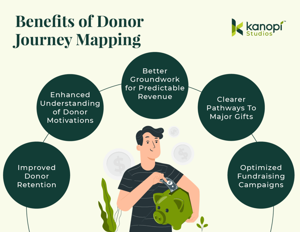
- Improved Donor Retention: Mapping out the donor journey helps identify key touchpoints where donors may lose interest or disengage, allowing you to address these issues and improve retention.
- Enhanced Understanding of Donor Motivations: Mapping out the donor journey tells you what motivates your donors to give, helping you adjust your outreach to align with their motivations and values.
- Better Groundwork for Predictable Revenue: By understanding the typical pathways supporters take, your nonprofit can anticipate giving and forecast revenue streams more accurately.
- Clearer Pathways to Major Gifts: Donor journey mapping can pinpoint engagement patterns and touchpoints that often lead to larger gifts over time.
- Optimized Fundraising Campaigns: You can identify what marketing messages and campaigns resonate most with donors, allowing you to pick the best types of campaigns and craft meaningful appeals.
Whether you leverage this strategy for its fundraising benefits or impact on your reputation, donor journey mapping is an essential part of your nonprofit digital strategy.
The Elements of the Donor Journey
What makes up the donor journey? Each stage may differ slightly depending on your organization and your supporters, but the donor journey will likely follow these elements regardless of your unique situation: Awareness, research, decision, appreciation, and repetition.
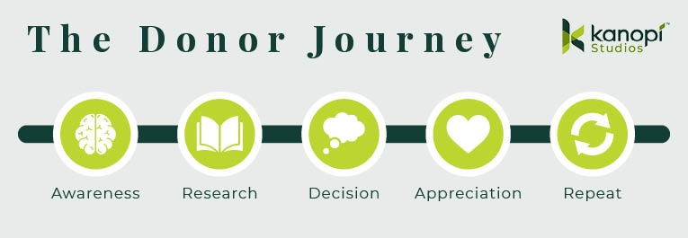
Donor Journey Step 1: Awareness
This is the very first step of the donor journey. Whether it’s through your website, a post from a friend on social media, or word of mouth, this is the moment that the prospect becomes aware of your organization and mission.
Without awareness, the donor journey never begins. To raise awareness and increase the likelihood of new supporters, follow these tips:
- Optimize your nonprofit website for SEO to improve your presence on search engines.
- Create supporter personas to better understand the type of audiences that engage with your organization.
- Actively use your social media channels to give updates on your mission.
- Update your website with recent accomplishments and major changes.
- Keep your content human-centric to appeal to new supporters.
- Get involved in local events, fairs, or speaking opportunities.
- Collaborate with influencers, companies, or other nonprofits that align with your mission and have influence within your target audience.
- Encourage existing supporters to fundraise on your behalf, leveraging their personal networks to spread awareness.
- Consider paid advertising to promote your mission and tap into advanced targeting features, like how the World Wildlife Fund uses Google Ads to target mission-related terms:
Donor Journey Step 2: Research
Once someone is aware of the need for your mission, they’ll likely do further research to determine whether they want to support the cause and how they can do so.
This entire stage is about building trust. You need to give potential donors a reason to give to your organization and support your efforts.
First off, ensure your nonprofit website is optimized. This is likely the first place a prospect is going to look when researching your cause. Your website should be regularly maintained and updated to promote valuable content about your mission and organization. You can:
- Use success stories and infographics to relay accomplishments and important metrics quickly.
- Provide concrete metrics and data to back up your claims.
- Practice transparency by being honest about where your funds go and by being open to answering questions.
- Compile and share an annual report that summarizes your yearly accomplishments and progress.
- Include testimonials from other donors or from specific community members you help.
- Post compelling content like news stories and blog posts related to your mission online (content marketing costs 62% less than traditional marketing strategies, making this both a cost-effective and engaging strategy).
While you should always prioritize transparency, try to focus on the value you bring to the community and avoid being overly pessimistic. Too much negativity can make users less likely to donate.
Donor Journey Step 3: Decision
Now that your prospect is familiar with your organization’s work, they’ll show their intent in some way. This can be opting into email newsletters or following your social media accounts. They might even decide to make their first gift.
To encourage prospects to take the leap and donate, consider the following:
- Make your donation form easy to find on your website. The average person’s attention span is a mere 8.25 seconds, so it’s key to include a link to your donation page within your menu or with a bright, eye-catching button.
- Ensure the target action is prominently displayed in all marketing content, including social media and email. Incorporate CTAs like large buttons and easy-to-find links that send prospects to your donation form.
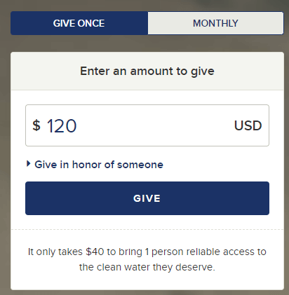
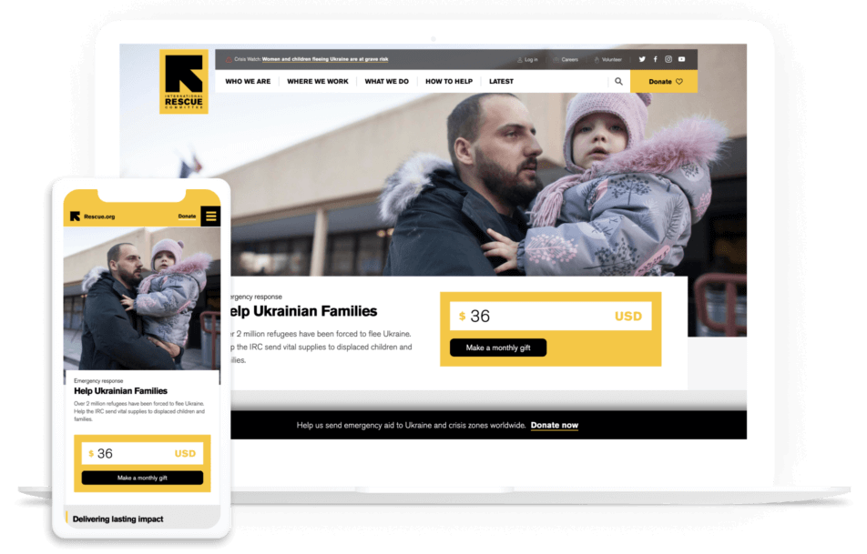
- Make recurring donations a primary option. Within your donation form, add a simple box that supporters can check off if they want to give regularly. Alternatively, create an inspiring monthly giving page like the International Rescue Committee did. Either way, making recurring donations a primary option encourages your donors to become consistent givers:
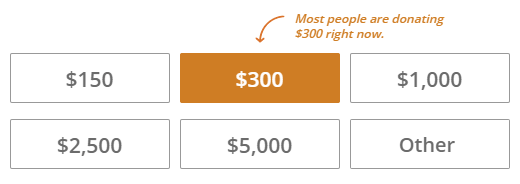
- Show the value of suggested donation amounts. Sometimes it can be hard to contextualize how a gift will help an organization. List a couple of suggested amounts as well as the direct impact they have. For example, tell supporters that a $100 gift will pay for 10 meals at your community homeless shelter.
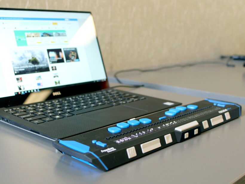
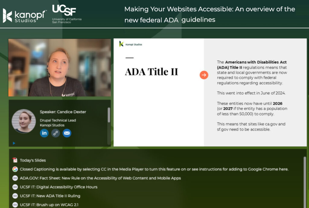
- Design your website with an accessible user experience (UX) in mind. Ensure that your nonprofit website is accessible to everyone, regardless of their location, language, ability, or device. This enhances the user experience and expands your supporter base. Learn more about this topic with our article on demystifying website accessibility compliance.
- Feature matching gifts across your site. Donors often need a nudge, and matching gift research shows that 84% of donors are more likely to donate if they know that their employer will match their donation. Add a corporate giving page to your navigation menu and embed an employer search tool into your donation page to highlight this opportunity at a key point in the donor journey.
Donor Journey Step 4: Appreciation
Once the gift is made, this doesn’t mean the journey is over. In fact, this is the perfect opportunity to set the foundation for future engagement with a thank you letter and a summary of impact.
Showing donor appreciation is an integral part of the donor journey. Your supporters need to know how much their contribution has impacted your mission. Many donors stop giving because they simply don’t know what their previous gift did. Even so, more than 60% of nonprofits don’t thank donors properly.
Here’s what you can do to thank donors in ways that resonate:
- Use your email solution to automate thank you messages to send as soon as a gift is made.
- Take advantage of data automation to personalize each message with name and gift size.
- If known, describe the specific impact the gift has made.
- Include a “next step” in your letter, such as signing up for newsletters, reading a success story, or checking their matching gift eligibility to take their support further.
- Follow up once the campaign is complete, and use data metrics to report on their gift’s full impact.
- Add an option for donors to share their contributions on social media, further spreading awareness of your mission.
- Create a thank-you video that features heartfelt messages of appreciation from staff or beneficiaries.
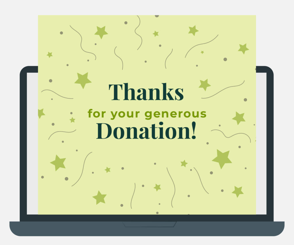
- Use engaging formats for thank-yous, such as a digital greeting card with a mission-related illustration or a compelling image of a beneficiary, to demonstrate genuine gratitude:
Donor Journey Step 5: Repeatable
Ultimately, the final goal of recruiting new donors isn’t the gift itself. It’s the meaningful relationship you cultivate and its foundation for long-term support.
With the donor journey, you’ll be repeating the same cycle over and over again. However, that doesn’t mean you have to overhaul your website or marketing materials—but it is a good idea to review them to ensure they are fully up-to-date.
To keep donors on this journey, you’ll have to continue inspiring them with valuable messaging, update your website with the most recent accomplishments, and continue to build these important relationships. This is vital since a 10% reduction in donor attrition can yield up to a 200% increase in projected value. In other words, the higher your donor retention rate, the better!
Remember, your relationship should be built on open communication, not a marketing initiative. Welcome feedback, share successes, alert people to upcoming events, and show appreciation at each stage.
How to Map Donor Journeys for Your Nonprofit
The donor journey for your nonprofit will follow the basic elements above. But understanding the specifics requires some careful planning:
Define your key performance indicators (KPIs).
Make sure you’re tracking organizational success beyond fundraising dollars. Website visits, email opens, and more can all be helpful KPIs to track. Also, review benchmark data to see how similar organizations measure success and how your nonprofit compares.
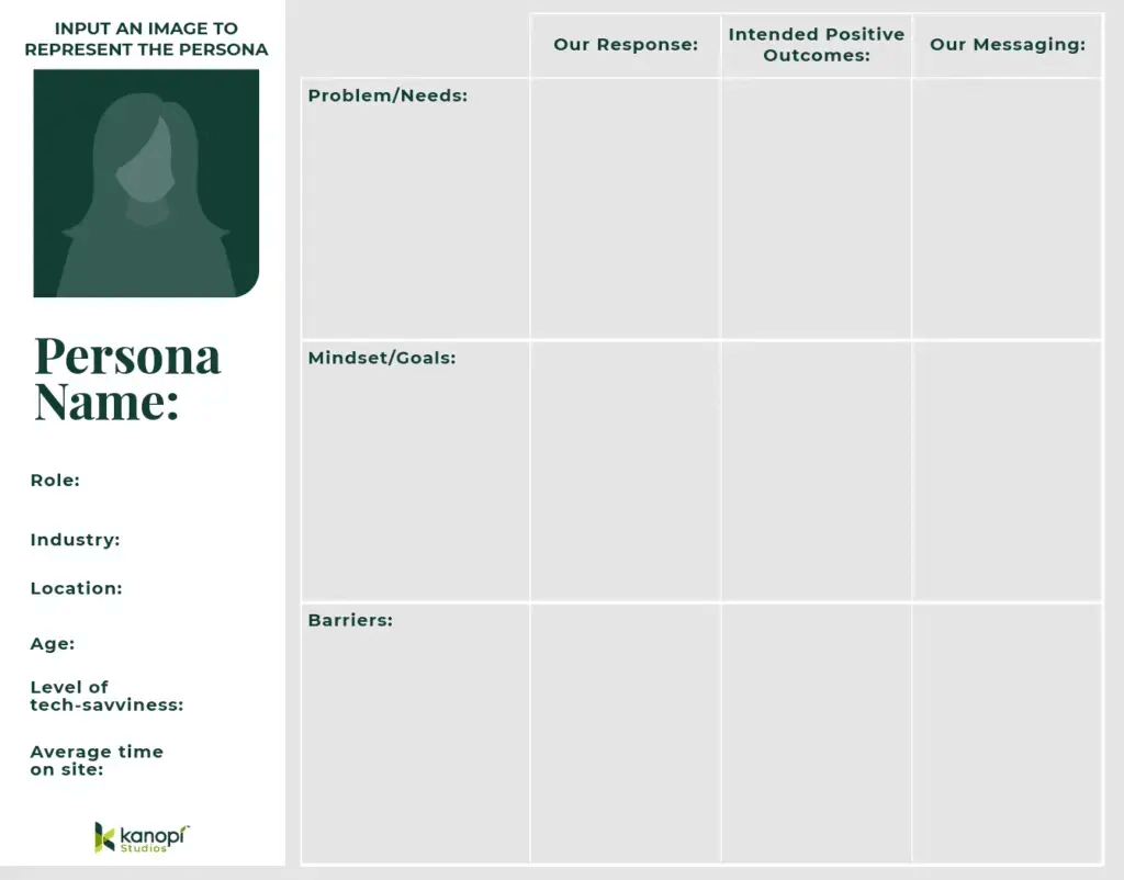
Create audience personas.
Many marketing leaders use audience personas to understand their supporters and create targeted outreach strategies. Think of a persona as your hypothetical ideal supporter. Each persona should include demographics, personality traits, interests, goals of supporting your work, and barriers your organization can help them overcome.
Also, consider how they engage with your organization. Do they often check out your website for new updates? Do you interact with them on social media? Use this persona template below to help get started:
Isolate aspects of your digital user journeys that apply to the donor journey.
In an increasingly digital world, people primarily find out about your mission online. Make sure their digital journey on your website and across your online marketing channels guides their decision to give.
By understanding your nonprofit’s digital touchpoints, you can ensure a seamless experience and adapt to the fast-paced digital landscape. If you notice areas in which your technology doesn’t meet expectations, you might need a tech upgrade. That might mean purchasing new donation software, investing in a more robust CRM system, or enhancing your website’s functionality to better support user engagement.
Review the elements of an effective donor journey.
This enables you to note any improvement opportunities. Do you need more educational content on your website to support the research stage? Do you have a lot of supporter engagement but insufficient gifts? There may be a problem in the “decision” stage of your donor journey. Noting these elements will clue you into the touchpoints you need to work on.
You can also look for trends and metrics in your nonprofit database to find where donors fall off. This can indicate what improvements to make to your recruitment and retention strategies. For instance, you might notice your online donation form’s conversion rate or website’s bounce rate is low, signifying that you need to improve those pages to better support the research and decision stages.
Revisit, refine, and retest often!
Don’t stop after you outline your donor journey. Instead, continue reviewing how your supporters engage with your offerings and donate. Whether it’s due to new technology or the economic climate, the donor journey will change over time.
Pro Tip: To accurately flesh out the donor journey and apply its insights to your own organization, turn to a nonprofit technology consultant like Kanopi. By working closely with a professional, you’ll gain a better sense of not only how your supporters engage with your organization but also how you can use those findings to improve outreach and retention.
How Kanopi Can Help
At Kanopi, our expert web developers and designers are top partners for nonprofits. We’ve helped to develop over 150 active sites and launch their digital transformation.
Our continuous improvement team works closely with your organization to become familiar with your goals and supporter base. With thorough research and insights into the larger nonprofit and web industry, Kanopi can help you map out a donor journey and:
- Create user personas to determine your nonprofit audience and come up with an outreach strategy that best targets their needs.
- Design your website with the donor journey in mind to ensure it funnels prospects to your online donation page and is SEO-optimized.
- Analyze your content strategy to enhance donors’ experiences when researching your cause.
- Offer insight into the best ways your website can aid your donor journey.
- Ensure your website follows accessibility and compliance guidelines.
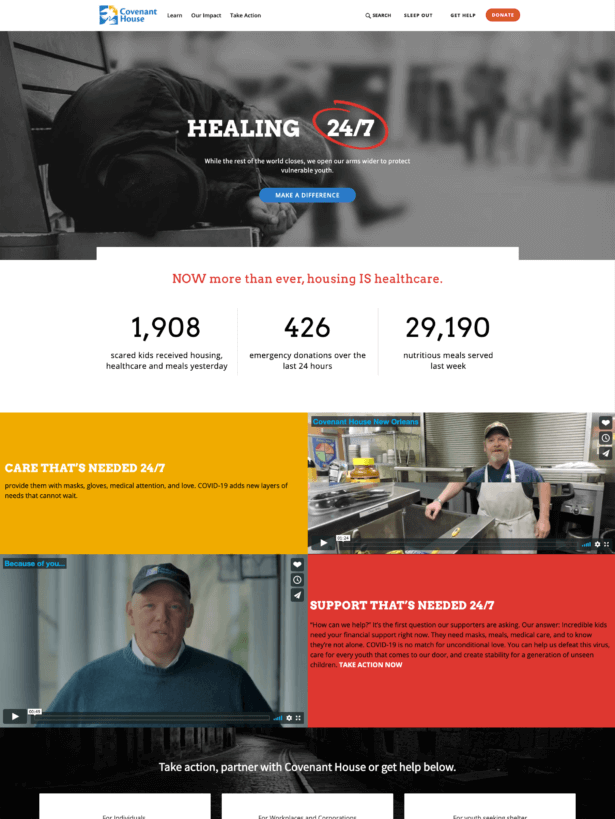
For an example of our work in action, check out our project for Covenant House. As part of our work, we updated their donation processes, improved donor tracking, and created a detailed roadmap to guide their digital transformation. They experienced a 42% increase in transactions, 178% increase in new users, and 123% increase in sessions per user—just to name a few of the site’s notable improvements.
Partner with us to start leveraging the donor journey for your own organization. We can help ensure your nonprofit marketing methods and website meet your needs and help you with your goals. Contact us here to learn more.
Wrapping Up
Mapping the donor journey empowers your nonprofit to refine every step of the giving experience. Knowing where supporters fall off allows you to proactively improve those steps and inspire supporters to stick around long-term.
With so many donors giving online, improving your organization’s donor journey all starts with a strong website. Make it easy to learn about your cause, find involvement opportunities, and ultimately donate. Remember, our team can step in to improve your website, whether you need technical assistance, design help, or a complete relaunch.
As you touch up your website, check out these helpful resources:
- Drupal vs. WordPress: Settling the Long-Time CMS Debate. Need help deciding which CMS is right for your nonprofit? Check out our in-depth comparison of the two platforms.
- Using WordPress for Nonprofits: The Ultimate Guide. WordPress is one of the most popular website builders available. Learn how to leverage the platform to drive donations, educate your audience, and enhance your digital presence.
- Higher Ed Website Design: 12+ Trends and Tips for 2024. Higher education institutions need powerful websites to engage alumni, attract prospective students, and keep parents informed. This guide teaches powerful web design tips you won’t want to overlook.