






4 Simple Steps to Migrate from Drupal to WordPress

Are you thinking of migrating from Drupal to WordPress?

Drupal is one of the most popular content management systems (CMS). Many organizations and institutions, from airports to universities, use its open-source platform, which currently powers 6% of the top 10,000 websites.

Drupal’s CMS gives web developers fine-grain control over user permissions, the ability to handle complex queries, advanced configuration management, and a platform that can host large amounts of data storage.

However, not everyone needs the complex capabilities that Drupal offers. While it’s free to use and has a strong community of developers and users, that doesn’t necessarily mean it’s the best CMS for you. That’s where WordPress, another popular open-source CMS, comes in. 

WordPress is considered one of the most user-friendly CMSs. Its intuitive editing experience makes it easy for non-developers to add content. It’s also the most popular CMS by far, used by 62.5% of all websites. Plus, it’s easy and fast to get a WordPress website up and running. 

In this guide, we’ll explore the steps required to smoothly migrate your Drupal website to WordPress. Here’s what we’ll cover: 

Let’s begin by reviewing common situations that lead organizations to consider a Drupal to WordPress migration. 

Reasons to migrate from Drupal to WordPress

There are plenty of pros and cons for both Drupal and WordPress, but you might have recently begun to feel that Drupal’s drawbacks outweigh its advantages for your unique website. 

Here are some common reasons why some organizations might want to switch their CMS from Drupal to WordPress:

  • Drupal doesn’t have all the capabilities you need.
  • Drupal is too confusing to use.
  • Drupal costs too much money to maintain.
  • WordPress’s editorial process and media management are much easier than Drupal’s.
  • WordPress is more user-friendly and doesn’t require as many custom configurations.

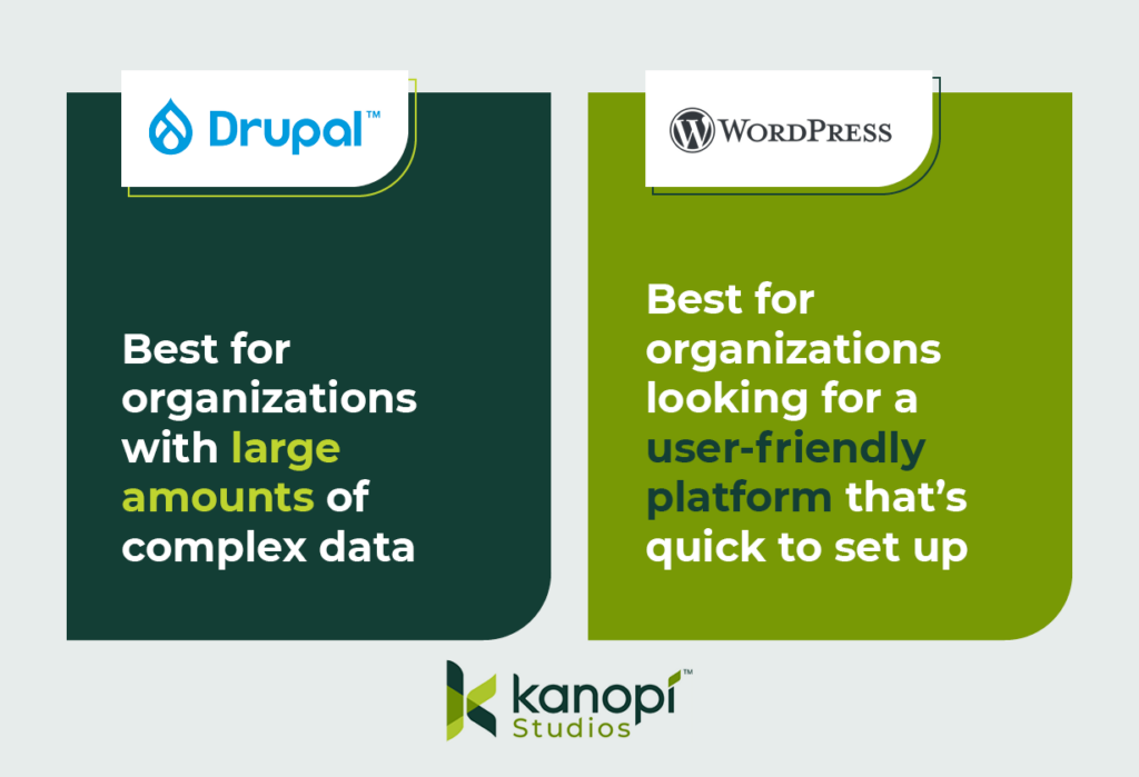
Essentially, Drupal tends to work better for more complex web projects and large amounts of data, whereas WordPress is often considered to be more user-friendly out of the box. 

This image explains the primary benefits of Drupal and WordPress. Drupal is best for organizations with complex data, while WordPress works for organizations looking for a user-friendly, quick-start platform.

Things to consider before a Drupal to WordPress migration

A Drupal to WordPress migration may require a decent amount of work. If your original Drupal site is more complicated than you thought, you might be looking at a lengthy and budget-pushing migration. So, you shouldn’t jump into the migration process without careful thought and consideration. 

Here are two initial considerations to remember when planning your Drupal to WordPress CMS migration:

Ensure you have appropriate hosting

If the host you use for your Drupal website doesn’t support WordPress installations, you’ll have to switch to a new provider. Here are some hosts that have managed WordPress offerings and support the WordPress community: 

Assess the complexity of your data

Not every site element will transfer smoothly during the migration process, especially since the code components that make up Drupal sites differ from WordPress sites. This will likely result in more custom code and alterations during the migration. For example, your Drupal site might: 

  • Use paragraphs or panels, which you’ll need to convert to Advanced Custom Fields (ACF) content in WordPress
  • Feature a lot of metadata or redirects, which can make mapping your data more complex
  • Require custom functions if you’re migrating your data into WordPress Gutenberg blocks
  • Contain many different content or user types, which also have their own fieldsets and will affect your data mapping
  • Have relationships between nodes, referencing, and related content, which you’ll need to map on the WordPress site

You might feel confident that you can handle this migration on your own, but it’s recommended to partner with a technology consultant professional for the best results. 

For instance, the Kanopi team features professionals in Drupal and WordPress development who have insight into the best ways to tackle complex data during the migration process. We can also help you determine whether the move from Drupal to WordPress is the best next step for your organization. Our philosophy isn’t that one CMS is better than the other—just that one might have capabilities that better fit your needs.

4 steps to migrate Drupal to WordPress

Every Drupal migration is unique based on the site’s structure, but there are a few standard steps that developers take throughout the process. Even if you’re a marketing professional, it’s helpful to be aware of these steps to understand how the migration process will affect elements like your site’s branding and content. 

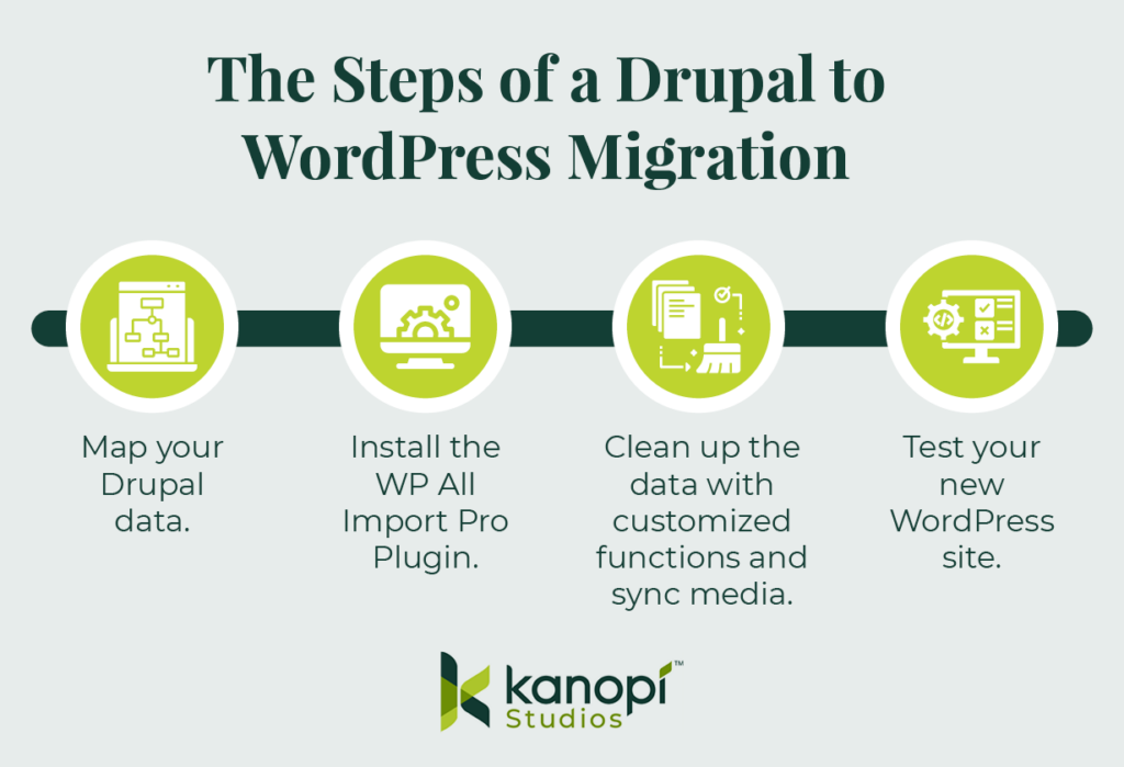
Here are the steps that you or a developer will take throughout the migration process: 

These are the steps of a Drupal to WordPress migration, outlined in the text below.

1. Map your Drupal data.

Transitioning from Drupal to WordPress requires more than just a copy and paste of a simple title and body field. Given Drupal’s complexity, your site is bound to have some custom elements and fields that need to be pulled over and converted to WordPress.

Before you begin the migration process, you’ll want to map out all of your Drupal data. This includes (but is not limited to):

  • Authoring information
  • Publishing dates
  • Images and attachments
  • SEO metadata

As you map out your data, keep in mind that you’ll want to export this on a content-type or user-type basis. This way, you can also import them into your WordPress site using the same method for each type. This is an important step because each content or user type probably also has a different field type.

Then, you’ll use Views and a Views Data Export module to output that content and create an XML, JSON, or CSV file. The type of file you use will depend on what version of Drupal you’re using.

2. Install the WP All Import Pro Plugin.

To prepare for the migration, you’ll also have to take some steps on the WordPress side. Specifically, we recommend downloading the WordPress plugin WP All Import Pro, with the ACF add-on. The add-on allows developers to map fields within Drupal to custom ACF blocks within WordPress.

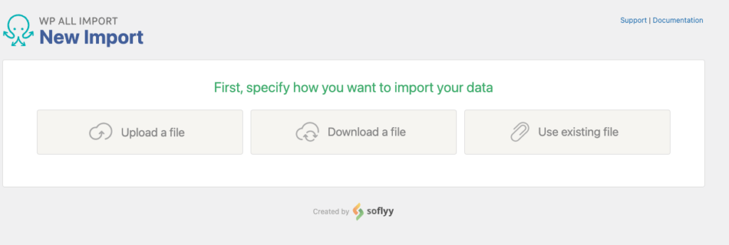
After you download the WP All Import Pro plugin, you’ll then upload the XML, JSON, or CSV file you created when you mapped your Drupal data. This first step allows you to choose how you want to import your data:

Screenshot of the All Import plugin screen asking the user how they'd like to import their data

Then, choose the data you want to import. Since you are migrating your whole site, you’ll likely import all of your data. This process can include posts, pages, taxonomies, users, or custom post types added by other themes and plugins.

3. Clean up the data with customized functions and sync media.

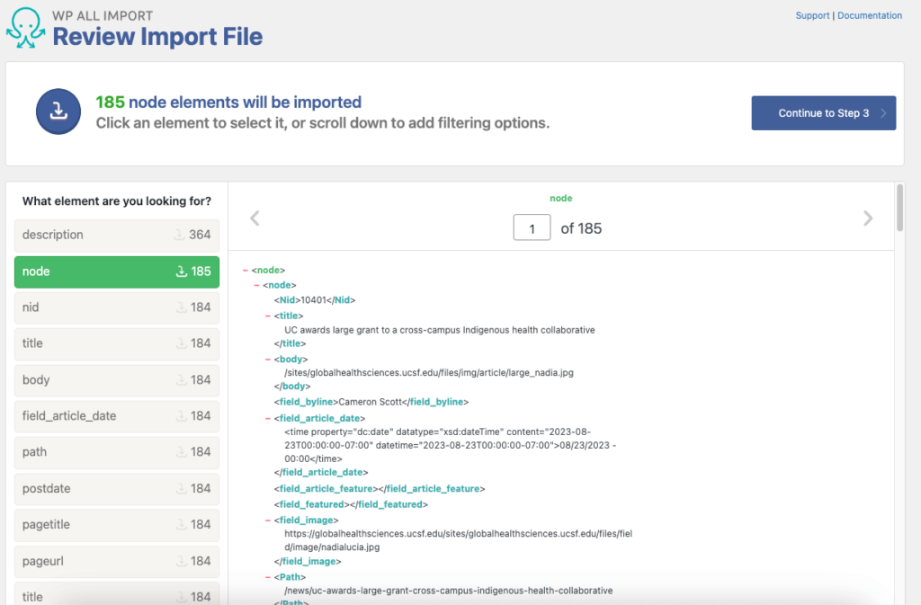
WP All Import Pro will process your import file and prepare the data you chose for import. This is the time when you can choose to configure your import data. You might need to write some custom fields to clean up, strip out, or map specific data.

Screenshot of an example of an import file in the WP All Import plugin

This step will differ depending on your Drupal site and the data you mapped, so the exact nuances you should look for and the custom functions you might create will be unique to your situation. In some cases, you may not have to make any customizations at all (but you likely will). 

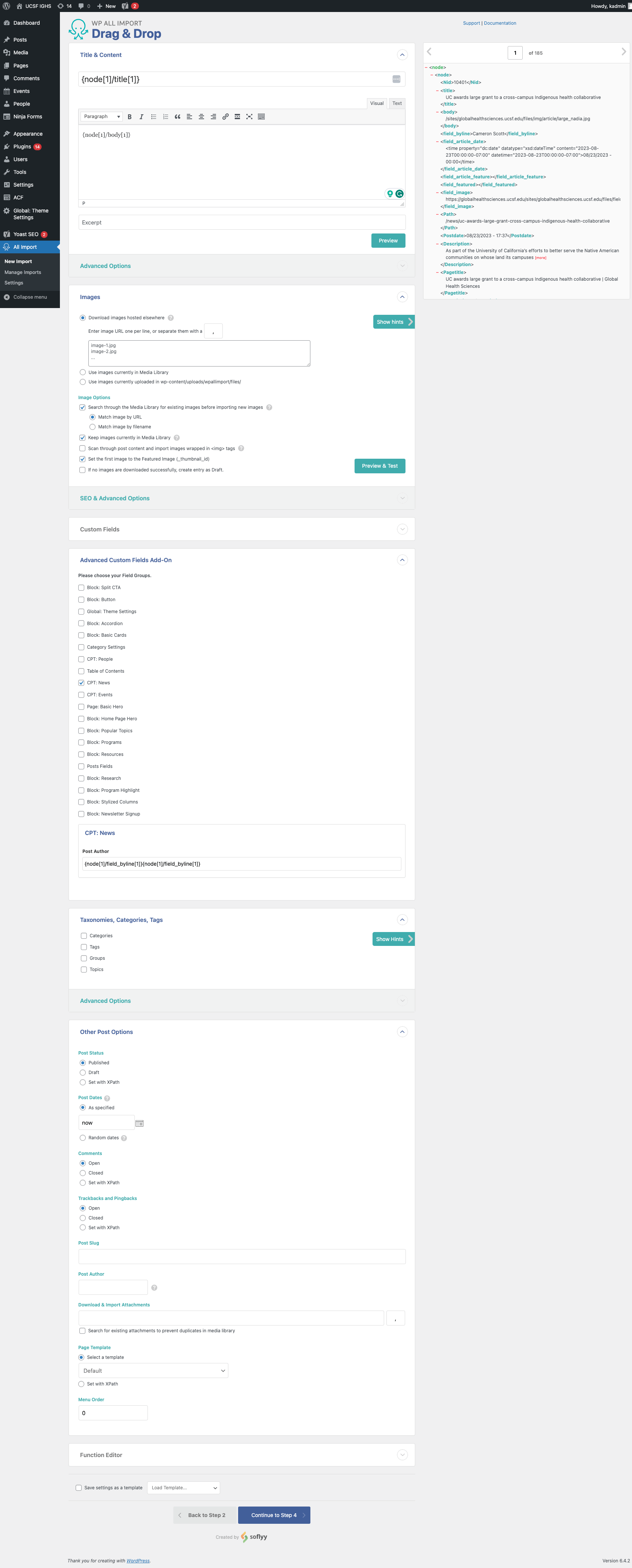
Here’s what the data will look like in the WordPress backend:

Data is shown in the WP All Import Drag & Drop editor

Additionally, sometimes images, PDFs, or other attachments don’t transfer or fail during the migration. This can lead to broken links, images that don’t load, and website issues.

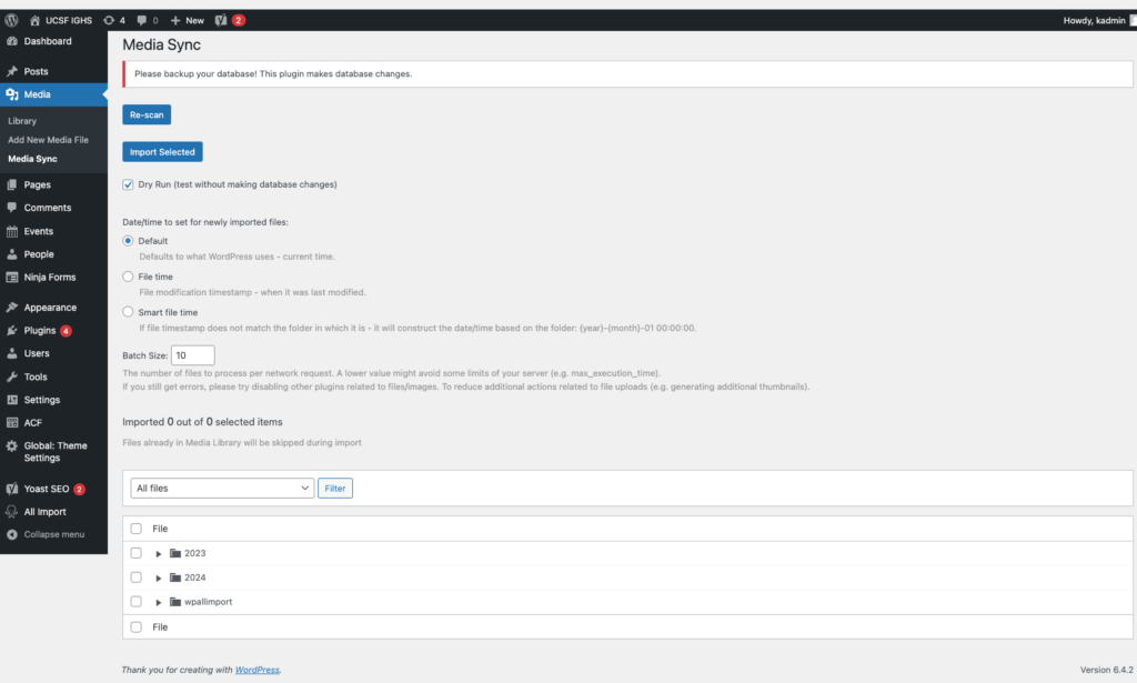
The MediaSync plugin can help resolve this issue. You can initiate a Secure File Transfer Protocol (SFTP) to transfer the files that didn’t initially move over to an uploads directory within WordPress. Then, you can use the MediaSync library to sync the data and files to resolve any broken assets. Here’s a look at this plugin in action:

The WordPress Media Sync plugin

4. Test your new WordPress site. 

Once the migration is completed, test out your WordPress site to ensure everything is functioning properly. Browse your website manually to replicate the user experience and test various elements such as your:

  • Forms
  • Links
  • Content (images, videos, text, and other media)
  • Search functionality
  • Performance (for example, assess page load times)
  • Mobile-responsiveness
  • SEO elements (meta descriptions, titles, tags, headers, internal linking, etc.) 
  • Accessibility (image alt text, color contrast, keyboard functionality, etc.) 

Testing these elements will allow you to catch errors that might have accidentally carried over or appeared during the migration process. 

Tips for optimizing your new WordPress website

After completing the migration, you can start to optimize your WordPress website to set it up for long-term success. Follow these steps to keep your website in tip-top shape: 

  • Run performance tests regularly. Tests like PageSpeed Insights can help you identify elements that may slow down your website. Common reasons for website lag include images that are too large or unnecessarily messy or complex code. Test your site regularly to catch and correct these errors before they negatively affect your site’s usability. 
  • Install any necessary plugins. Some of the most useful WordPress plugins include those for SEO, security, or caching. Make sure to carefully vet any potential plugins before using them to ensure that they won’t slow down your site. 
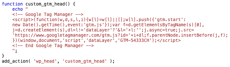
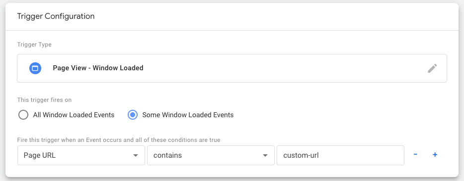
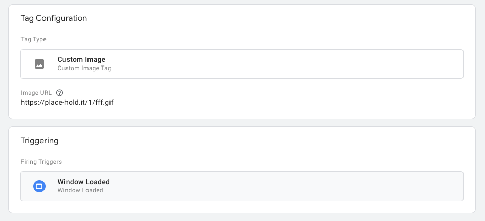
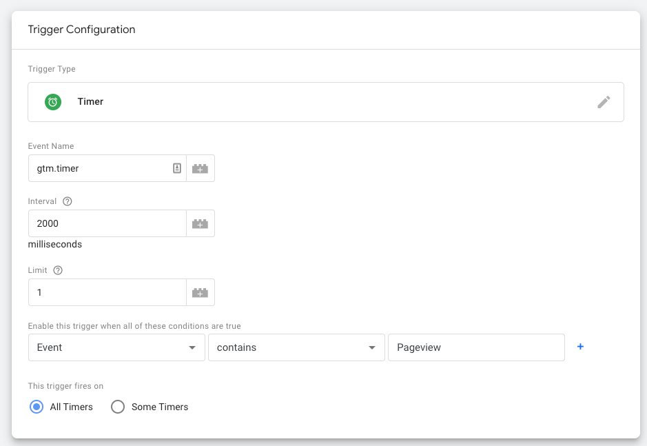
  • Set up Google Analytics 4 (GA4). GA4 is the latest generation of Google Analytics. It’s an event-based tracking tool that can help you better understand your website visitors’ behaviors. Set up your GA4 configuration and Google Tag Manager as soon as possible to start tracking traffic on your new WordPress site. 

These steps will help you maintain a strong website foundation, allowing you to easily adapt to any WordPress trends or new innovations as they arise. 

For more information about how to manage your WordPress content effectively, check out Kanopi’s webinar on the subject.

Wrapping up

Even if you feel confident that you can handle the Drupal to WordPress migration on your own, it’s recommended to partner with a technology consultant professional for the best results.

Here at Kanopi, we typically recommend Drupal for clients with complex needs and large amounts of data. If you think you can do without the high-power capabilities of Drupal and would rather opt for something more user-friendly, then WordPress is the right move. But, if you think Drupal will serve your organization better in the long run, our Kanopi team can also assist with any version migrations or updates you need.

Looking for more tips to help determine the best path forward for your website? Start with these additional resources: 

Drupal 7 End of Life: A Guide to Next Steps. If you’re a Drupal 7 user, you might be weighing your options ahead of Drupal 7’s upcoming end-of-life. This guide offers tips to help determine your next steps. 

Drupal vs. WordPress: Which One is Right For You? Choosing between WordPress and Drupal comes down to weighing the pros and cons of your unique website. Assess the primary differences between the platforms with this guide. 

12 Business Benefits of Using WordPress for Enterprise. If your website needs to handle complex enterprise needs, WordPress can be a great fit. Learn about the primary benefits of WordPress for Enterprise.

Wordpress Logo

Should You Use Headless WordPress? The Pros and Cons

Ryan's Headshot
Ryan Leeson

As web developers seek more opportunities to design flexible, dynamic websites to serve their clients’ needs, one of the most popular solutions they turn to is headless WordPress. 

A headless or decoupled CMS paves the way for simple multi-channel or cross-device content delivery and allows developers to implement new innovations quickly. In this guide, we’ll cover the benefits and drawbacks of headless WordPress to help you determine whether headless is the right choice for your project. 

What is headless WordPress?

Headless WordPress is a content management system that uses WordPress for the back-end editing experience while using a separate, custom front-end stack to display content to visitors. 

Traditional WordPress configuration

A traditional WordPress configuration uses themes to display content to visitors on the front-end. An inherent feature of a traditional web stack is the user-managed site content (i.e. the words and images of a blog post or page) is pre-assembled and delivered as one whole block of HTML, along with the template (the structural and visual treatment including navigation, logo, social icons, etc.). Essentially, the site’s overall structure and per-page user-managed content are completely intertwined. 

If you need parts of your site to receive updates or changes based on user interaction, this coupled assembly can become a drawback. Imagine if every time you changed an item in your cart while using a web storefront, the whole page reloaded. 

Communications between a visitor’s web browser, via JavaScript (JS), and a site, via Application Programming Interface (API), have been used for decades to help websites manage small interactions on a page. With this combination, only the relevant data or parts of a page are sent and received by web browsers.

This JS+API methodology is a common website-building approach, but it comes with a few drawbacks. The JS applications are coupled but separate from the rest of the website. Plus, they’re written in a different language, meaning developers must recreate significant segments of their original PHP-written code in JS.

Headless WordPress configuration

On the other hand, headless WordPress delivers content through an API. This allows you to send and accept data as JSON, which is a native data structure for JavaScript. This provides more flexibility in adjusting the front-end experience. 

WordPress natively offers the REST API, which allows secure interaction with a site and its data. In addition, a community-led initiative created by WPGraphQL provides another flexible type of API. These tools offer standardized functionality rather than having to roll out your own entirely custom-built APIs. 

Both tools retrieve a site’s content and data in a systematic, standardized way, rather than having to sift through extra information. The data and content from the APIs are by default in JSON format. 

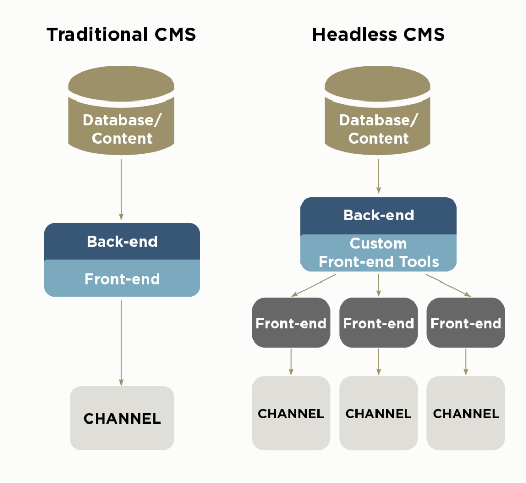
Review this infographic for another look at the differences between traditional and headless CMS configurations:

This graph shows how traditional CMSs deliver content in a coupled format while headless CMSs use a decoupled configuration.

Headless WordPress benefits

What benefits can a headless system offer your WordPress website? Here are a few additional advantages of headless WordPress:

  • Greater development flexibility and control: Choose any front-end developer tech you like—you aren’t limited to using the CMS language. 
  • Greater design flexibility: Create a unique user experience without being restricted by the preset templates and themes. 
  • Ability to create a faster, more efficient website: Decoupling your website from the traditional WordPress format can help speed up content delivery with more efficient, tailored code. Start with a dynamic front-end framework like NextJS or Gatsby, both written in JavaScript, which natively composes the site using small, flexible chunks of data and content. 
  • Better security: Since your front-end content is separated from the back-end processes, there are fewer opportunities for hackers to gain access to your database. 
  • Ability to publish on multiple channels: Because the site’s content and data are separate from the theme and templates, it’s easier to provide the information needed for secondary platforms such as mobile devices, kiosks, and smart devices. Let’s say you run a company that syndicates content to subsidiary groups or republishes content across an intranet as well as your external site. With the content and data presented via API, each site can read only the content of an individual article without adding the templated content and branding. 

Headless WordPress allows you to get creative with your content and find the delivery format that works best for you and your audience. 

Headless WordPress drawbacks

Headless WordPress is not for everyone. Typically, it works best for organizations that have the resources needed to maintain this configuration for the long term. 

Here are a few reasons why headless WordPress might not be the right choice for your CMS configuration:

  • Requires more maintenance: Because your site’s back-end and front-end platforms are different, you maintain two separate systems rather than just one. Having multiple elements also adds complexity to your CMS, which can take more time to set up and maintain.  
  • May have to pay for a developer to program the front-end: The traditional WordPress configuration is user-friendly for people and organizations with less website management experience or resources. In contrast, maintaining a headless WordPress system requires programming expertise, which you may have to outsource. 
  • May not have access to user-friendly third-party tools: CMS ecosystems provide a large variety of third-party plugins and other tools to solve common problems. In the near term, especially for WordPress, a lot of these solutions only support the traditional web stack. This means you may need to recreate or forgo certain convenient tools. However, many major components like internationalization, SEO, and cross-platform hosting (like WPEngine’s Atlas) are still available with minor integration work, meaning you won’t be completely on your own when it comes to user-friendly add-ons.

Headless WordPress configurations tend to be used more by major corporations with complex website needs. Smaller organizations may not have data needs that warrant a headless format. 

How to start your headless WordPress project

After reading these pros and cons, perhaps you determined your organization will consider launching a headless WordPress website. You have the time and resources needed to dedicate to the build and maintenance process, and you want the flexibility that a headless system offers. 

However, your organization might not have a developer or programmer on staff who can develop your headless WordPress configuration. In this case, we recommend working with an experienced web developer, like the experts at Kanopi, to help get your headless WordPress project off the ground.

What is Kanopi’s process for creating a headless WordPress website? 

When considering if headless WordPress is the right solution for our clients, we first ask whether the client’s site has enough dynamic functionality that justifies the transition from a classic CMS format. 

For example, does the site’s data need to easily move between pages for needs such as tracking user preferences or monitoring how visitors have interacted with the site so far? Will the site’s content need to appear on multiple platforms within the Internet of Things, such as smart speakers or mobile apps? Is the site’s content served in different ways to an organization’s internal and external audiences?

If the answer is yes, we then identify the right solution for the client’s front-end needs. Our preferred solution is Atlas, WPEngine’s front-end solution for headless websites. 

Next, we get to work creating a UX strategy, site map, and wireframe before putting our blueprints into action. 

Headless WordPress case study

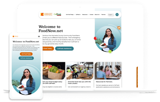
Kanopi worked with the Alameda Community Food Bank to design a new, user-friendly website to better serve its community’s needs. The organization needed a better way to connect community members in need with local food pantries and other resources.

The Alameda Community Food Bank website is an example of a headless CMS project that the Kanopi team developed.

We helped streamline the main navigation and added prominent call-to-action buttons for different users’ needs. Using a headless configuration, we also designed the site so that key data about visitors’ locations is constant across pages, making it easier for users to find relevant information quickly. This functionality made it simple to provide information about the closest food banks across multiple pages. 

Wrapping up

Headless as a service is an exciting new development, making this CMS format more accessible for all types of organizations with complex website needs. If you think headless is the right move for your website, don’t hesitate to reach out to the Kanopi team today to get your project started.

Green environment technology concept. generative ai showing a tree growing out of a motherboard

Green energy, cloud use, and sustainable websites

This Earth Day, consider how you harness the power of sustainability with your online presence.

Many people assume that the Internet is a more environmentally friendly way of sharing information; businesses and organizations are no longer printing materials on paper or plastics, using inks, and shipping mail as they did before the Internet became the primary marketing hub. There is a large environmental impact with supply chains, but building websites feels less impactful. 

But is it? Not necessarily. In fact, creating and maintaining websites uses a lot of electricity. And websites that are heavily trafficked use even more energy. 

The internet is not as green as you would think. Think of how many people are online at any given time. There’s an impact every time someone sends an email. Every time they send a tweet, or a Facebook post, etc. Then consider that an estimated 37% of the world’s population (that’s 2.9 billion people) have never used the internet, so there are still more people that could be online. 

There’s a carbon footprint involved with all we do digitally. As businesses become increasingly digital, we must ask ourselves how to ensure sustainability online. That means more than just making sure your website is up and running so you can eliminate other forms of communication — it means harnessing the power of green energy, cloud use, and building sustainable websites so that our digital presence is as eco-friendly as possible. 

This Earth Day, we’d like to provide some quick tips on how to be more proactive about sustainability when creating your next website project. 

But first, how “green” is your current site?

How does your website fare now? Use tools like Ecograder and Website Carbon to estimate your digital footprint. It’s an eye-opener to see where your website could be making improvements.

If you follow website UX and coding best practices, here’s the good news: by default, best practices for web design and accessibility translate into more sustainable websites. They are built using lightweight code that can load quickly even on slow connections Since they are designed to prioritize user goals, and performance less time is spent loading or trying to find information … which translates into time, energy, and ultimately cost savings.

Sustainable websites also use fewer resources overall, which helps conserve energy. They are often made as fast and performant as possible, particularly if they are more heavily used on mobile devices. And don’t forget about accessibility: sustainable websites tend to be more accessible for users with disabilities too! 

But if you need your website to be more sustainable, let’s dig into where you can make some impactful changes.

Harnessing green energy in the Cloud 

Green energy is a key component of sustainability online. After all, each time you access the internet, you are using electricity. But what if you could use renewable sources of energy such as solar or wind power instead of relying on fossil fuels? 

Cloud computing makes this possible. By hosting your data in the cloud and taking advantage of green energy sources, companies can reduce their carbon footprints while still getting access to all the same features they would with traditional hosting services. Plus, it’s often cheaper and has lower maintenance for your internal teams. 

In short, work with your hosting provider to make sure your website is powered by renewable energy. 

If you’re looking for a new hosting provider, a great place to look is The Green Web Foundation’s directory, a listing of over 500 hosting providers around the world with a tangible commitment to using green energy in their data centers.

Fun fact: Kanopi is hosted with Pantheon, which offers container-based, serverless hosting. And they’re built on GCP, a green platform

Practice sustainable web design

Practicing sustainable web design will help make your site efficient while reducing website carbon emissions. This includes being smart about how you use images and how they load on the page; one example is using responsive images, which serve the correctly sized image for the user’s device to avoid unnecessary resource usage. 

User Experience (UX) optimization is an ever-evolving practice, and Kanopi is constantly refining our approach to how users consume and interact with websites. By optimizing the user experience of your website, you can expect to see increased user satisfaction, shorter interaction pathways, and a reduction in overall energy consumption associated with your site. Essentially the better the usability of your site, the better it is for the environment. So make sure you know what your audiences are looking for so they can find it fast. 

This also applies to content: create content that is meaningful to your users in order to keep the overall site lean, and avoid content that adds unwanted complexity or bloat to your site. Video content is especially energy dense and should be deployed in a purpose-driven and user-focused manner. 

This website on sustainable web design has many other excellent suggestions on how to keep your site design as sustainable as possible.

Improve your page speed and performance

The faster your site loads and users find what they need, the less energy is used. The more efficient, the better. It really is that simple. 

How the site is built and developed is key. Due to the collaborative nature of open-source tools and the community, software tools are optimized for better performance and efficiency (something proprietary solutions don’t often consider). Open-source tools can also help lean teams start small and test ideas before scaling, thereby reducing waste. 

Website optimization is not a “set it and forget it” activity. It’s an area where you can always make iterative improvements, and ongoing optimization of your website is essential to reducing your energy footprint. 

This can be done in several ways:

  • Ensure your codebase is meeting or exceeding current best practices. Over time, these efficiencies will result in less energy consumed overall and will allow your site to stay evergreen.
  • Performance reviews. Looking at the key metrics that inform Google’s Core Web Vitals is a great way to impact your page speed (and rank higher in search results, too). UX patterns play a role here as well, since patterns like carousels are tricky to implement without noticeably affecting your page load times.
  • Only track what you need to track, and use a tag manager. Third-party trackers are one of the biggest culprits when it comes to slowing down your site. Think hard about how, when, and where you’re using the information, and only collect what you need. It’s also better for user privacy, which your users will appreciate!

Sustainability is good business. 

At the end of the day, harnessing sustainability online is essential for businesses looking to remain competitive in today’s digital world while still being mindful of their environmental impact.  

So when you’re thinking of more ways to be eco-friendly around the office, think beyond ways you can make your physical space greener or how your IT infrastructure could have a greener footprint. Consider how you can also apply eco-friendly techniques to your entire digital environment. In tandem with websites, sustainable digital marketing strategies go hand-in-hand. When it comes to digital marketing campaigns, it’s important to think about how you can minimize your environmental impact while still achieving your goals. This includes focusing on organic search traffic rather than paid ads whenever possible, and utilizing email marketing over direct mail campaigns which require physical materials like envelopes and paper. 

We recommend regular UX and code audits as the improvements they can provide are not only essential to the long-term health of your website but also have a direct impact on the amount of energy consumed (Kanopi can help with audits). Taking a holistic approach to sustainability will ensure your business is doing its part, and opportunities for positive impact exist at every level and scale. 

By keeping these tips in mind, CMOs and marketing managers can make sure their businesses are doing their part for people AND planet alike. 

Additional resources:

Wordpress Logo

Building Gutenberg Blocks with ACF is Still Relevant. Here’s Why.

Oliver Harrison

The Gutenberg Editor (or Block Editor), introduced in WordPress 5.0 in 2018, revolutionized the WordPress editing experience when it replaced the Classic Editor as the default option. To further improve the block editing experience, many developers turn to Advanced Custom Fields (ACF). This WordPress plugin allows users to add extra custom fields to WordPress editing screens, extending the Gutenberg editor’s functionality. 

Now, in 2023, some developers might question whether building Gutenberg blocks with ACF is still the right move for their web projects. Some have tossed around the idea that it’s better to use native Gutenberg blocks because full site editing is coming. 

However, it’s our opinion that ACF is still one of the best ways to develop your custom Gutenberg blocks. In this post, we’ll explain why and highlight some relevant ACF updates. 

What are the benefits of using ACF to build Gutenberg blocks?

We can sum up the benefits of building Gutenberg blocks with ACF in three words: simplicity, speed, and familiarity. 

Building Gutenberg blocks with JavaScript can be time-consuming and requires many developers to learn a whole new coding language. ACF makes the process much more intuitive, allowing you to create blocks using the familiar coding language many of us have been comfortable with for years — PHP. 

Furthermore, using ACF makes the block-editing process much simpler for clients who need to add or update content themselves. 

What’s the benefit of creating your own Gutenberg block with ACF rather than using the pre-made options?

Using ACF, you can develop Gutenberg blocks that better suit your unique website needs. You won’t be restricted by the limitations of core Gutenberg blocks or be forced to use one or several plugins to achieve a particular level of custom functionality. This allows you to tailor your website exactly to your (or your client’s) preferences.

What’s new with ACF?

There are plenty of exciting new ACF developments that make the plugin even more beneficial for your development projects. 

ACF 6.0 was released in September 2022, unveiling a fresh user interface, greater accessibility, and other new features that offer more flexibility to developers. Here are a few relevant ACF updates to be aware of: 

ACF 6.0 Blocks can use block.json

JSON is WordPress’s preferred format for registering blocks. It encapsulates the information WordPress needs to know about each block.

Block.json is new in WordPress and has now been added to ACF. This update makes it even simpler to tell WordPress that the block you’ve created is an ACF block and specify the values you want to add to it.

Here is an example of what your block.json file might look like:

{
	"name": "namespace/accordion",
	"title": "Accordion",
	"description": "A block used to show an Accordion.",
	"editorStyle": "file:./editor.css",
	"editorScript": "file:./editor.js",
	"style": "file:./frontend.css",
	"script": "file:./frontend.js",
	"category": "block-category",
	"icon": "table-row-before",
	"apiVersion": 2,
	"keywords": [ "accordion", "block" ],
	"acf": {
		"mode": "auto",
		"renderTemplate": "accordion.php"
	},
	"supports": {
		"align": false,
		"alignContent": false,
		"alignText": true,
		"anchor": true,
		"color": {
			"text": true,
			"background": true,
			"link": true
		},
		"customClassName": true,
		"fullHeight": true,
		"jsx": true,
		"spacing": {
			"margin": [ "top", "bottom" ],
			"padding": true
		},
		"typography": {
			"lineHeight": true,
			"fontSize": true
		}
	},
}

Many of these settings align with the typical settings for registering an ACF block type, with a few changes made to the name, script, and style parameters. 

ACF Blocks can inherit Gutenberg controls 

Inside block.json, Gutenberg controls were previously only available for JavaScript Gutenberg blocks. You can now apply some of the same controls to an ACF block as well — they can be enabled using the ‘supports’ property.

For example, if you want to allow a user to be able to change the background color of a block, you can add the ‘color’ property, then set the ‘background’ property to ‘true’, as seen above.

With that completed, you will then need to get the property set by the user, like so:

$my_block_classes = [];
if ( ! empty( $block['backgroundColor'] ) ) {
	$my_block_classes[] = 'has-background';
	$my_block_classes[] = 'has-' . $block['backgroundColor'] . '-background-color';
}

Finally, implode your block classes array into the top level of your block, like below:

<section class="my-block-name <?php echo ( ! empty( $my_block_classes ? esc_attr( implode( " ", $my_block_classes ) ) ) ) : ''; ?>">

With that completed, the color your user selects will be applied as a background color to your block. Keep in mind that if the WordPress color palette defaults aren’t overridden in theme.json, those defaults will be the colors available to the user.

You can “scope” block styles and scripts to each block 

Along with the block.json update, WordPress is encouraging developers to use the WordPress npm package, wp-scripts (aka @wordpress/scripts), to prepare blocks for rendering on the front end. This allows each block to independently have its own styles and scripts. 

WordPress automatically in-lines the styles and scripts for a block, as defined in block.json. This technique can make pages load faster because they will only appear when the block is present. The other major benefit is that if a certain block doesn’t appear on a page, it won’t load that block’s scripts and styles. This can save on your bundle size and will also keep one block’s styles from impacting the others.

ACF 6.0 features significant UI updates

With ACF 6.0 comes a refreshed look for the plugin, with updates made to admin screens such as the field group editor and tools page. For example, ACF has reduced the height of the fields settings screen by grouping settings into tabs. 

ACF has also made significant strides toward greater accessibility. Now, users can edit fields using only keyboard navigation. Also, ACF has improved focus styling for keyboard navigation, making it easier to see where you are on the page. 

Coming soon: Built-in Custom Post Type and Taxonomy creation

With the expected release of ACF 6.1 in the next few months, ACF users can look forward to custom post type and taxonomy creation within the plugin itself! This is huge news and will help many developers as it might allow them to remove a plugin from a site or allow them to build out custom post types without manual coding. Another nice perk of how ACF is planning to implement this functionality is that all of the Custom Post Type and Taxonomy configuration will be written to local JSON. This means it can be committed to a repository like GitHub, just like the custom field JSON.

Extensions make ACF even more flexible

Dozens of extensions can add supplemental functionality to the ACF framework. One of the most helpful is ACF Extended, an enhancement tool that adds over 100 additional features, such as new fields, new field groups, and bi-directional fields. However, ACFE can be overkill in certain use cases, as all those additional features can add unnecessary bloat. Choose your extensions carefully. There are also plenty of unofficial plugins available that you can use to further build out your web projects with supplemental ACF tools. 

The ACF community is growing

WP Engine purchased five popular developer-focused WordPress tools in 2022, including ACF. With this acquisition, the ACF team has become much more vocal, hosting twice-monthly community-oriented ACF Chat Fridays. Follow ACF on Twitter to stay in the know about when these chats take place and the topics they cover. 

Wrapping Up

Looking for tips and guidance to help you make the most of your WordPress project?  Reach out to Kanopi’s WordPress team or connect with other users via the ACF support page. It’s an exciting time in ACF history, so don’t hesitate to get involved in the community today.  

Dark side of Earth with lights and electricity expanding across the surface.

Translating Your Website into Other Languages

Faye
Faye Polson

In North America, language translation on websites isn’t terribly common; most websites are in a single language representative of the large demographic of English speakers. But around the world, there is a much larger demand for website translation, and even within North America, there are regulations that businesses and organizations must follow which require translation options. Canada, for example, requires French in many cases due to its status as an official language. Fun fact: every single Canadian has spent breakfast reading both the English and French sides of the cereal box.

Up until 2019, a common method for adding easy translations to a website was to use the Google Translate Widget. It was easy, free, and automatically translated the page on the fly. But if you follow that link, you’ll notice this widget has been discontinued. But you do have other options!

Where to Get Free Website Translation

Hopefully, your primary website visitors use Chrome, Edge, or Safari as their main browsers. These browsers include native translation and will prompt the user to select their chosen language without any extra effort on your part as the website owner. Google does offer a translation extension that can be used on other browsers, such as Brave or Firefox. This means you do not need to make changes to your site to offer native translation.

At the moment, if your demographic primarily speaks a single language, this is probably the route you want to take, unless you have to meet government regulations due to the nature of your organization and the country you live in. In which case, then you want a more robust solution and a budget to match.

Where to Get Paid Website Translation

If your translation needs are greater, you will be looking at a paid service. And the cost will vary depending on the size of your site, the amount of content, and the service you use. The following are the solutions Kanopi has the most direct experience with.

Cloud Translation API

Google’s recommended alternative to their former Google Translate Widget is their cloud translation service, Cloud Translation API. It’s affordable and supported by both WordPress and Drupal with the appropriate extensions. There are a few plan options to choose from, letting you decide what’s best for your site. While a developer can help integrate this solution into your site, you will also need to create your own account for your company and work with the Cloud Translation API sales team to estimate your monthly costs.

Using a Translation Service and/or Premium Extensions

Short of having employees who can do all your translation, a translation service allows you to submit your source content with language requirements and receive translated copies in return. If you need to alter the content of your pages based on language, for example switching from imperial measurements to metric, this is likely something you want to consider. 

The modules (Drupal) and plugins (WordPress) needed to make this work can help automate some of the actual translation. Yet depending on how many languages are supported, some organizations find they need at least one dedicated role to help manage and review these translation processes.

There’s a huge array of services to choose from, and the right solution will depend on your organization’s needs. Meanwhile, here are the premium extensions Kanopi recommends for adding language translation to your website.

WordPress:

Use WPML with their Automatic Translation. This plugin will also work with various translation services if needed. Cost-wise, you are looking at $99 per year, plus the optional translation service you might use.

Drupal:

TMGT allows you to work with a variety of translation services depending on what Drupal version your site is on. Price will vary with your choice of service.

Lingotek is another integration that Kanopi has used frequently. It’s a combination of an extension and translation service. Price will vary according to your needs.

Get website translation and go global!

If language translation is right for your site, start scouting your translation service options. Start with looking at the Cloud Translation API, then move on to researching the premium plugins if you need something a little more hands-on. And as always, Kanopi would love to hear from you if you’re looking for a développeuse (that’s French for developer).

12 Business Benefits of Using WordPress for Enterprise

WordPress is the most popular content management system (CMS) by far, powering 43% of all websites. WordPress hosts sites for a wide variety of organizations, including media groups, nonprofits, higher education institutions, and corporations. But is WordPress for enterprise the right platform for your business’s complex needs

Enterprise-level companies require reliable and scalable websites to grow and compete with other large organizations in the digital era. Often, enterprise leaders turn to expensive and complicated customized web solutions to host their sites. 

WordPress has evolved into a powerful and flexible solution to handle complex enterprise needs. Now, well-known brands like Facebook, Microsoft, and Spotify run their websites using WordPress. 

In this guide, we’ll walk through the following sections to give you a better sense of how WordPress for Enterprise can benefit your organization:

Let’s start by answering some of the most frequently asked questions about WordPress for Enterprise. 

WordPress for Enterprise: FAQs

What does WordPress for Enterprise mean?

WordPress for Enterprise is the application of the WordPress platform to meet the needs of large businesses. These organizations are usually multinational corporations with multiple domains and thousands of users accessing their sites at once.

According to WordPress, their enterprise solutions are used “wherever there’s a requirement for flexible, cost-effective, and secure creation and distribution of content.” Media and publishing organizations, E-commerce sites, and other large-scale businesses use this solution for their online marketing, communication, and commerce needs. 

What features do enterprise websites need?

Enterprise websites require the ability to handle significant traffic and user engagement. Often, these sites will need to support features like:

Enterprise WordPress websites require features like localization, e-commerce, microsites, and control over user permissions.
  • Localization. Localization requires adjusting site content to the cultural and linguistic norms and context of different target audiences. Localization involves translating text and adjusting images and text to ensure all website elements are culturally appropriate and relevant. This is especially important for organizations that offer services for an international audience, such as airports or global health organizations.
  • E-commerce. Some enterprise websites require e-commerce functionality that allows visitors to browse products or services and complete secure transactions. This involves an online storefront and a secure payment processor with multiple payment options. 
  • Microsites. A microsite is an individual web page or site made to function as a separate entity while still being a part of your existing website. Some corporations use microsites to promote sub-brands or special events. 
  • Control over user permissions. Enterprise websites need to only allow specific users permission to access certain features. This promotes greater security across the organization. 

Enterprise websites must connect with a diverse, often global audience. These features make it easier for marketing professionals to promote their businesses while maintaining reliable security and other core features.

What’s better for an enterprise — WordPress or Drupal?

As you search for a new CMS, you might also come across Drupal as a top option. Drupal is another open-source CMS that organizations with complex needs, like enterprises and government institutions, use to create robust and secure websites. 

Drupal also offers multilingual functionality, security, and control over user permissions. In addition, Drupal has strong accessibility for both back- and front-end users. The release of Drupal 10 in 2022 unveiled the platform’s most modern, accessible editing experience yet, along with a host of additional advanced features. When choosing between Drupal and WordPress, consider your corporation’s unique needs and what CMS features you will prioritize. Explore our guide to Drupal vs. WordPress to learn more about the primary differences between these platforms and help determine which CMS is right for your enterprise. 

Common WordPress for Enterprise Misconceptions

Due to the early days when it was primarily a blogging platform, several misconceptions about WordPress’s capabilities have prevailed over time. Here are a few common misunderstandings: 

WordPress is only for blogs and is not a true CMS.

As mentioned, WordPress powers 43% of all websites (including websites for some of the biggest brands today), meaning it can do much more than just blogging.

WordPress is not great for security.

Third-party plugins may create a little bit of risk, but WordPress’s core system is incredibly safe.WordPress has also invested in fast security releases, with a team of 50 experts managing them. Even whitehouse.gov is on WordPress, showing how far the platform has come in regard to security. 

Open source is not reliable at the enterprise level. 

Enterprise-level organizations can safely use an open-source CMS. Massive sites like Facebook and Google use open-source systems to power their tech. 

WordPress doesn’t offer a lot of support.

WordPress’ extensive open-source community facilitates access to tons of contributors and developers that create new plugins, themes, and features every day. As a well-known and popularly-used CMS, WordPress has plenty of support from millions of users and experienced developers. 

12 Benefits of WordPress for Enterprise

What’s the true story about what WordPress can do for your enterprise website? Let’s take a look at the top benefits of WordPress for enterprise: 

1. High ROI

WordPress’s return on investment is very high compared to proprietary systems, especially in terms of the total cost of ownership (WordPress is free!) and implementation speed. Building and testing new features can be completed in just a few weeks because of easy access to themes and plugins. 

2. Strong security

As mentioned, WordPress offers consistent updates and security releases to protect users from common hacks. You can also look to additional security plugins to further protect your site.

3. SEO friendly

Search engine optimization (SEO) is crucial to help boost the visibility of your enterprise website across search engine results pages. WordPress offers built-in SEO-friendly features, such as optimized URL structures and category and tag options that help search engines better understand your website’s structure. Plus, using an SEO plugin like Yoast, All in One SEO, or SEOPress can make the optimization process even simpler. 

4. Access to integrations

Because WordPress is so popular, there is already a vast number of third-party tools that are ready to integrate with your system. This means your enterprise business can quickly add features and make site updates without needing to invest in expensive custom solutions. Besides the many free tools, enterprise businesses can also invest in premium paid plugins with added support!

5. Easy to use

Once your site is up and running, the WordPress platform is perfect for non-technical users. The Block Editor (also known as the Gutenberg editor) offers an intuitive backend experience that arranges content into a series of blocks for text, images, videos, and other page elements. This ensures that any of your enterprise businesses’ team members can jump in and make necessary changes.

If you need help along the way with managing your content, there are plenty of resources available—start with Kanopi’s webinar on the subject!

6. Open-source community

One of the most valuable features of WordPress is the open-source community supporting its development. These contributors create new plugins, themes, security patches, and features to help WordPress users customize their sites to their needs. This community is always growing and evolving. 

7. Accessible

WordPress is devoted to creating accessible front- and back-end user interfaces. Their Accessibility Team runs ongoing audits and tests on themes and functionality using assistive technologies. Also, any code built into the WordPress core system must meet the Web Content Accessibility Guidelines version 2.1 level AA

8. Scalable

WordPress has made great strides when it comes to improving website performance. You can ensure your website is prepared to handle a large amount of traffic by making use of these WordPress elements: 

  • Keep your code clean and only invest in high-quality, lightweight plugins and themes. 
  • Use a page caching tool to help improve page load speed. 
  • Select an enterprise WordPress host that emphasizes scalability. 

Scalability is necessary to ensure that your enterprise website can manage a large volume of traffic efficiently.

9. Streamlined media management

Enterprise businesses use many online media types such as documents, visual media like photos and videos, and audio files. With WordPress, you can upload and manage just about any media type in a streamlined and intuitive manner. Easily manage media on the backend and edit it visually on the front end.

10. User management and multisite domains

Your enterprise website may need to run a network of subdomains or microsites and give access to only a select number of team members. WordPress supports multisite usage with Super Admins, a user role that can set up networks and control user permissions.

11. International capabilities

Your enterprise website must be scalable on an international level. WordPress is available in over 100 languages, ensuring you can effectively reach your global audience.

12. Flexible and agile

This is the true differentiator between a proprietary and open-source system. Your enterprise business’ next goal is always going to be starting a new project, making processes more efficient, or releasing updates, all without compromising quality.

That’s why you need a system with high agility, like WordPress. With easy collaboration between content editors and developers, the WordPress system allows your team to build and expand website features quickly without breaking the bank.

Enterprise WordPress Development Services

Do you have a large-scale project in mind? Or do you already have a built-out enterprise-grade website and just need support

Consider working with a WordPress development expert like Kanopi. Our professionals work closely with your enterprise business to understand your unique needs and strategize how your WordPress website can best support them.

Plus, Kanopi takes a continuous improvement approach to ensure that your site is always improving over time — perfect for a quickly-growing enterprise business.

Our WordPress development services include:

  • Plugin and theme upgrades
  • Security patches
  • Performance enhancements
  • Content strategy
  • E-commerce updates

Plus, we have a dedicated enterprise support tier customized to your business needs, ensuring that your website stays updated and viable over the long term. 


WordPress is a flexible, scalable, reliable CMS that can take your enterprise website to the next level. If you’re looking to upgrade your CMS or switch to WordPress, the recent release of WordPress 6.1 and the improvements that come with it mean that it’s a great time to get on board. 

Looking for more information about what WordPress can do for your business? Start here:

Kanopi Team

The What & How of CSS Theming: Common Concerns & Helpful Tools

Kate Walsh

When CSS was first introduced, it was straightforward. There weren’t any CSS variables, there were no preprocessors. The world was simple, and we were so young! Developers added colors to a site with a hex code (or rgba if they were very lucky and cutting edge!), and those colors were what they were. If a developer wanted to implement a dark and light mode — they often needed to create two completely separate stylesheets and swap the site’s body classes out with JavaScript. Implementing multiple themes on a single site was cumbersome, hefty, and required a lot of additional maintenance.

With the introduction of CSS variables and other color and theme-related CSS features, custom CSS theming has become much easier. When we talk about CSS theming, we’re talking about changing a site based on a user-provided context that lets us still fully control the experience. There is still some element of JavaScript required to swap out the body classes when using a toggle to allow the user to use their preferred theme on your site, but no longer do you have to maintain two separate stylesheets. Native CSS variables make theme swapping much easier than it once was. CSS theming is an excellent way to allow users and developers to dictate website settings easily.

Ways to Use CSS Theming

Dark/Light Mode

Dark and light modes are one awesome, commonplace way to use CSS theming. Users can set their preferred dark or light mode via system settings, browser settings, or even special applications to modify user settings. You can make your entire website respect the user’s settings — which is always nice! 

Branding

Say you’re working on a website that features a few similar products, like breakfast cereals. Each product uses the same overarching information for its brand — just with different colors and fonts. Without rewriting huge swathes of CSS for each different product, you can use CSS theming and perhaps a body class in your HTML to provide totally different branded looks for your products. 

Accessibility

A combination of prefers-contrast or forced-colors media queries with CSS theming can help make your website more accessible. You can make your site look even better and more accessible to users with these preferences.

Common Considerations Introduced by CSS Theming

CSS theming is a valuable tool to have in your developer toolkit, but it does add some complexities you’ll need to consider during implementation.

Respecting User Settings

As mentioned elsewhere, it’s important to respect user settings where possible. It burns the eyes a bit when you’ve got everything set to shades of black (charcoal, onyx, obsidian, jet), and you suddenly land on a page in blinding, brilliant white — or vice versa.

Images

Images are important when theming. Whether it’s an icon where the font color is adjustable, an SVG where the fill color is adjustable, or a regular old JPG, PNG, or WEBP image — you will have to adjust all of the images on your website. A common example is a client logo reel — you’ll have to store two copies (a dark mode compatible and a light mode compatible) in most instances. If you’re lucky enough to have a client logo reel consisting entirely of SVGs, you’ll be able to use CSS to swap the fill. Most of us aren’t so blessed, however. On a site with tons of images — duplication of image files can even become a storage concern if the images are poorly optimized.

Increased QA Time

When you implement CSS theming, the time required to perform quality assurance checks on the work increases. The same pages must be checked multiple times when using dark and light modes. Instructions for swapping dark and light mode must be written so that less-technical QA agents understand the necessary steps and how to perform them. It’s important to bake these increases into the budget and turnaround time when working with CSS theming.

FART

Haha, right? Not so much. The “Flash of inAccurate coloR Theme,” or FART for short, occurs when you have improperly digested your CSS selectors a momentary flash of the incorrect color scheme. For example, say your user prefers to use a dark theme — but your website defaults to a light theme before detecting and swapping to the user-specified preference. FART can be handled in several different ways and is an important consideration when theming. Properly-handled rendering makes your site look that much more polished and awesome.

Tools to Help You Theme

CSS Variables (+ JavaScript)

CSS variables are key to effectively theming with CSS. CSS variables enable you to swap out various CSS properties throughout your custom theme. Variables have been widely supported in modern browsers since approximately 2017, so 2023 is a great (and safe) time to start using them. 

Variables enable flexibility in your theme and stylesheet. They function similarly to preprocessor-based variables, with a slightly different syntax and a key difference: CSS variables can be updated live. Preprocessors compile your variables, so once you’ve set a variable — that’s that; it can’t be updated or changed within the stylesheet. Native CSS variables can be scoped to different CSS classes, and function more like CSS properties.

Some examples of CSS variable syntax:

Declare a variable:

--brand-color: #c4d600

Use a variable:

font-color: var(--brand-color)

It is also possible to scope a variable:

.brand-light {
    --brand-color: #c4d600;
}

.brand-dark {
    --brand-color: #153e35;
}

With a little extra JavaScript toggle magic, the brand-light and brand-dark colors can be added to any part of the page. For a global theme, those brand classes can be added to the html tag or the CSS :root selector. For more specific parts of the page, those classes can be added to individual parts and components.

Media Features & CSS Properties

prefers-color-scheme is a CSS media feature “used to detect if a user has requested light or dark color themes” (MDN). prefers-contrast is similar, used to “detect whether the user has requested the web content to be presented with a lower or higher contrast.” These color scheme preferences work like any standard @media query used to target browsers by screen size — they’re just working off of color and contrast preferences instead of size.

Color scheme is the user setting engaged either in system settings or occasionally the browser settings. This allows you to make your CSS more specific when the user prefers a light or a dark mode, or a high-contrast theme. 

These media features are important for accessibility work, which helps users with low or no sight when browsing your website. When you make your site look even better for these users, you’re going the extra mile in terms of accessibility – always a worthwhile endeavor!

When drilling down to specific elements, the color-scheme property can assist. This property allows an element to indicate which color schemes it can be rendered in. This property is especially useful when styling default form controls; custom form controls such as select or radio buttons can be a bit of a tangle under normal circumstances. The color-scheme property and default form elements make that process slightly less painful.

Theming Specific Libraries, Tools, and Practices

  • https://toggles.dev/ provides some amazing premade animated toggles for light and dark modes. Lightbulbs, suns and moons, and other cute icons galore!
  • Various front-end libraries have implemented theming-specific tools. It’s always a good idea to check out what the big players are implementing. Bootstrap and Tailwind both have some great ideas and inspiration for CSS theming, with the benefit of widespread usage. It’s great when someone else runs into your problem before you do!
  • For testing and QA purposes, you can swap between dark and light modes in various ways. Your computer’s global system settings will allow easy swapping between dark and light modes. However, if you don’t want to go that far — the developer tools in various browsers often also allow you to switch between light and dark modes. Here’s a screenshot showing how to do this in Firefox. 
Firefox interface shows how to switch between light and dark modes.

Summing Up CSS Theming

CSS theming is a new paradigm, with new concerns and considerations. However, there is a lot of power and flexibility that comes along with CSS theming. It’s a worthwhile endeavor to get familiar with CSS theming and the associated new CSS features such as variables, media features, and theming-specific CSS properties. There are plenty of new tools and libraries out there to help you gain fast proficiency with CSS theming.

Old printing press template with removable letters

Using Gutenberg to Elevate the WordPress Editing Experience

Faye
Faye Polson

“Gutenberg” is the name given to the movable block editor adopted by WordPress back in 2018, harkening back to Johannes Gutenberg who invented one of the early European movable-type printing presses. Reusable individual letters that could be moved, and reused, eventually lead to typography and fonts as we know them.

Of course, nowadays we have printing technology that Johannes could not have even imagined, let alone believe that an entire online editing experience would be named after him. 

But what exactly is Gutenberg?

Most of us are familiar with editing experiences, such as typing in an email, Microsoft Word, or Google Docs. These experiences are mostly similar; you have a blank space to type and buttons for alignment, styles, fonts, sizes, etc. This has been a common website editing interface for decades, but it is both creatively and logistically restricting. 

If you wanted to move a section from one location to another, you’d have to copy and paste it, then delete the original. Trying to completely rearrange your content would be frustrating and time consuming. Or if you wanted some snappy responsive columns, you would have to switch to view the document code and write HTML and CSS. 

Gutenberg is WordPress’s native “drag and drop” site builder. It solves those problems by allowing you to create your content in blocks designed for the specific content you’re using. There are over 90 blocks to choose from. You can play around with all of these options on the Gutenberg demo.

This flexibility allows content editors to populate their website with more complex content, and then shuffle it around within the layout. In fact, there are many themes that lean so heavily on Gutenberg that you wouldn’t need a developer at all. With the introduction of Full Site Editing, nearly anyone could put together a working website that’s beautiful too.

Why use a web developer at all?

While there are many themes that do leverage everything Gutenberg has to offer (those 90+ blocks), that’s not the case for most of them. And for existing sites with legacy themes, there is little chance that they are able to take advantage of this newer technology. Out-of-the-box websites are useful and serve a purpose but when you need custom design, structure, and functionality, you need to call in professionals.

Another struggle with drag-and-drop sites is the global element. If you have 30 headings on your website and decide you want to change them all from green to blue, you’d need to go through and edit the color settings on all 30 headings one by one. While there are some global elements, the vast majority of your page content will require manual editing. This can be incredibly time-consuming.

Native Gutenberg blocks can be unexpectedly limiting. For example, if you desire rounded borders on all media but the block you’re using doesn’t have support for a border-radius, you’d need a developer to create and apply custom classes. Keep going down that path and suddenly you can have a site full of custom classes and blocks that never look the same from one to another. This can be an editing nightmare and require excess documentation to keep it all straight. Suddenly that easy drag-and-drop editing experience requires a higher level of skill.

There’s a better way to customize.

Kanopi approaches Gutenberg blocks from the perspective of creating consistent and branded content. One of the big advantages of Gutenberg is that we can create new blocks and apply our own styles and structure. This allows us to create blocks that can hold and display any type of content within a defined set of rules. Instead of pouring budget into styling 90+ blocks (and their hundreds of combinations) that may never be needed, our team focuses on creating custom content solutions for our clients.

This “best of both worlds” approach lets site editors continue to use the ease of Gutenberg’s drag-and-drop experience, while also creating consistent, branded content. As a website moves from its initial build into support, these blocks can be expanded upon and updated globally (and thoughtfully). Even older sites without any Gutenberg usage can be configured to allow for this type of block expansion without disrupting the existing content.

Gutenberg is here to stay.

It’s clear that WordPress is leaning in on the use of Gutenberg and the Full Site Editing implemented in the past year. Meanwhile, Advanced Custom Fields Pro (the preferred and recommended plugin for enhancing WordPress’s content management) is keeping pace to ensure custom block creation works seamlessly with every stride made. Whether using an out of the box theme, or having an agency custom building according to your organization’s needs, Gutenberg is a phenomenal solution with room to grow in many directions.

Contact us to discuss how Gutenberg can work for you
Kanopi Team

The Top WordPress & Drupal Trends for 2023

A new year means a new look at what’s on the horizon. Kanopi is always looking ahead to what is happening in the development space, so we asked our team to give their thoughts on what’s ahead for next year.

We’ve split this into three sections: 

  • The top WordPress trends for 2023
  • The top Drupal trends for 2023
  • The top website development trends (regardless of CMS) for 2023

Let’s start with WordPress …

New WordPress, new theme, same direction

With the release of WordPress 6.1, Twenty Twenty-Three has already arrived; the new default theme is called (numerically incremented, as usual) Twenty Twenty-Three (TT3). What hasn’t changed is the focus on Full Site Editing (FSE). In fact, TT3 continues with the trend of moving towards FSE. Block patterns are prevalent and variations are implemented theme-wide to allow for a huge variety of customizations (10 theme style variations!) without having to touch any code whatsoever.

What else is new in WordPress 6.1

WordPress 6.1 released on November 2nd with many improvements with much of the focus placed on accessibility and performance. Both of these areas were Identified by developers and the community (after heavy criticism) as needing more love as the Gutenberg block editor received the lion’s share of updates in recent releases.

Happily, many needed improvements and fixes were implemented in this release. Below are links to comprehensive lists of the updates, including:

Need more of a beginner’s guide? This blog post is a great resource

  • Agencies are figuring out how to stay on top of the changes with Gutenberg, building Block themes, and Full site editing. 
  • Block Patterns will continue to be used and will become ubiquitous across any block-based theme.

Drupal continues its rapid development pace, adding more secure and performant code releasing Drupal 10 on the backbone of Symfony 6 and PHP 8.1.

Upgrading from Drupal 9 to Drupal 10 is easy using the drupal-rector tool, which looks for deprecated code. There are also a large number of contributed modules that already have been ported. So if you’re on D9, moving to D10 should be easy.

Drupal 10 features include:

  • The new, modern Claro administration theme, which provides a better administration experience.
  • Olivero default theme, which is the new default front-end theme for Drupal with a modernized look and feel
  • CKEditor 5 which provides a much better authoring experience and more modern editing.
  • Modern JavaScript components to replace some uses of jQuery for better performance.
  • Theme Starterkit tools for bespoke theme creation.

But as the Drupal crew is ever working hard to keep evolving, the work has already begun to be included in Drupal 11. The following core initiatives are being worked on in the contrib community, and will be merged into core when they are ready:

  • Project Browser: this will allow ambitious site builders to discover and install modules and theme from their admin screens.
  • Drupal Recipes: allows site builders to install and configure groups of modules to achieve features such as an event section, or a blog.
  • Automated Updates in Core.
  • A more streamlined Core: the Great Module Migration continues moving lesser used modules from core to the contrib community for a smaller Drupal core.

Performance and Speed

As we wrote in a blog post about Core Web Vitals earlier this year, research shows the chance of a bounce increases by 32% when a page load time takes one to three seconds, and by 90% when the page load time takes up to five seconds. Speed matters! Make sure to take a look at your Core Web Vitals. 

Accessibility

This is a drum that Kanopi beats frequently, but that’s because it’s really that critical. 26% of US adults identify as being permanently disabled in some way. If you count those with temporary disabilities like a broken wrist, or situational disabilities like being on a noisy subway, the number climbs considerably. That’s a huge percentage of people that feel alienated when a site isn’t accessible to them. There are many ways to make a site accessible, including adding captions and alt text to images and videos, ensuring proper contrast, and entering content with a correct heading structure. Make 2023 the year you decide to make your site as accessible as possible. 

Thumb-Friendly Mobile Navigation

In 2022, 60% of all website traffic came via mobile devices, so a mobile-first approach is imperative. This also means that all critical elements on a website must be within easy reach of a user’s thumbs, including the navigation. Think about what’s really necessary on each page and what can get edited. Focus on a vertical orientation rather than a landscape one, and what functions need to be done on your site with a touchscreen. 

Artificial Intelligence (AI and Machine Learning (ML)

2023 should be the year when companies will move forward with implementing both of these, if they haven’t already (and our Creative team sees this trend on the design and content side as well). On top of improving productivity and using data more efficiently, AI doesn’t have to prove its usefulness anymore. Plus, it’s become quite accessible to work with as most cloud platforms offer it as a plug-and-play service. 

AI enables machines to learn from their experiences and make decisions without human intervention. This technology can be used to automate mundane tasks such as data entry or content generation, allowing developers to spend more time focusing on more complex problems. For example, there are plugins that can help you create better content for your website by using artificial intelligence. 

ML is also being used in web development, enabling sites to better understand user intent and behavior so they can deliver personalized experiences tailored just for them. For example, think about how chatbots can deliver a personalized experience with your audiences.

Speaking of …

Personalization

It’s impossible to talk about future website trends without discussing personalization. The days of one-size-fits-all websites are quickly coming to an end as organizations look for ways to tailor their websites to individual users’ needs, wants, and interests. Consider that Gen Z has grown up with some degree of personalization and expects it, and apps such as Spotify and Netflix have already conditioned us to expect some personalized recommendations on what we hear and watch. (Personalization is also critical in content strategy and web design for 2023.)

While it initially felt uncomfortable or intrusive when platforms knew personal things about us, it’s now become a more mainstream experience that helps users get what they want or need faster. 

A few examples:

  • Geolocation: location services can help your audiences find events local to them.
  • Product recommendation: a great example of online shopping is Patagonia. After filling out a questionnaire about sizing, the site predicts what size would be best on every single product page. The algorithm bases itself on the information a user shares but also the reviews it receives from similar users who made the purchase.
  • Personalized newsletter: This is tangential to your website, but why ignore this critical marketing tool that leads readers to your website? It’s become a common practice to send a newsletter with content specific to your audience’s needs (and there’s lots of data to back up the power of personalized newsletters). Split up your newsletters by audience so you are speaking to their goals, then direct them to the content on your website so they do the conversions you want. 

Voice Interfaces & Voice Search Optimization 

Voice interfaces are becoming increasingly popular as more people turn to voice assistants such as Siri or Alexa for help with their online searches. To stay ahead of the curve, web developers need to start optimizing their sites for voice search by ensuring that all content is written in conversational language and utilizing structured data markup tools like Schema.org or Google’s Structured Data Markup Helper tool. This will ensure that your content is easily readable by search engines so that it shows up when people search via voice assistants.  

Small bites can create big wins.

With these new developments come exciting opportunities for organizations looking to stay ahead of the competition. While some of these trends might not seem achievable or even necessary for your organization to implement at a large scale, even implementing some in smaller ways can garner big results. CMOs and marketing managers should keep an eye on these emerging trends so they can capitalize on them before their competitors do!

And as always, if you need any help with your websites in 2023, Kanopi is here to assist. Contact us anytime