
For people facing medical issues, quickly finding the right healthcare provider is essential. Increasingly, patients are browsing hospital websites to find the information they need. With 82% of patients using search engines to find a healthcare provider, hospital websites have become essential to the patient journey.
As a result, your hospital needs to offer a robust, user-friendly hospital website design that exceeds patient expectations. This guide will explore how to optimize your website design through the following sections:
- What is the hospital website user journey?
- Why do searchers visit hospital websites?
- 22 stellar examples of effective hospital web design
- Features of successful hospital website design
- Work with Kanopi to optimize your hospital website
Here, you can gather inspiration and key insights for your hospital website build or refresh project.
What is the hospital website user journey?
The first step of designing an effective, engaging hospital website is to understand how your website fits into the overall patient experience. With the right strategies, your website can turn casual internet visitors into long-term, loyal patients of your healthcare facility. This is best illustrated through the steps of the hospital website user journey:
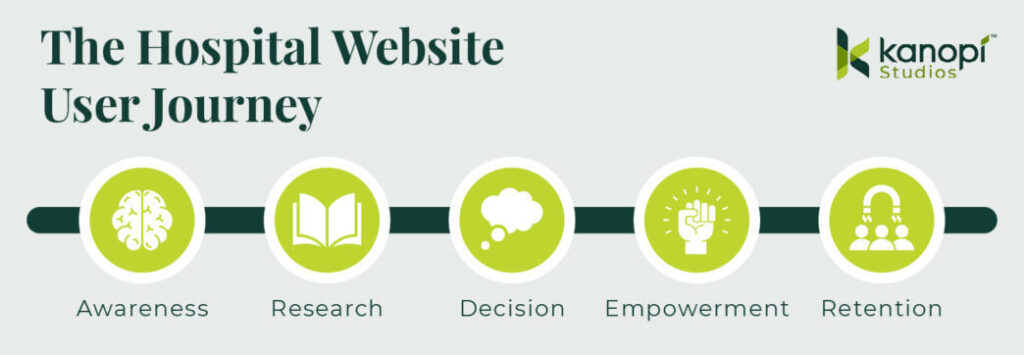
- Awareness: Users discover your website through a Google search, social media post, recommendation from a family member or friend, referral from another website, etc.
- Research: Visitors browse your website to understand your offerings, including your specialties, healthcare professionals on staff, appointment booking process, and other services and resources.
- Decision: Users determine whether to become patients and schedule an appointment. This will depend on whether your website answers their questions and offers a convenient, simple booking process.
- Empowerment: Your hospital empowers patients to take control of their health through updated patient records, clear next actions, and ongoing two-way communications between patients and healthcare professionals.
- Retention: Patients decide whether to remain at your healthcare organization or leave for another institution. The online experience you offer them, such as the patient portal and online payment process, plays into their decision.
As you can see, your hospital website plays a significant role in a patient’s perception of your institution and their satisfaction with their care. Your job is to facilitate each patient’s journey to make it as easy as possible for them to find the services and resources they need.
Why do searchers visit hospital websites?
Put yourself in your patients’ shoes: When using a hospital website, what features, resources, and design elements would you expect to see?
94% of website first impressions are based on design, and 61% of website users will go to another website if they don’t find what they’re looking for within about five seconds. That means you have limited time to capture your audience’s attention and help them complete their intended actions.
To provide a positive experience for your community and encourage retention, we recommend taking a patient-first approach to healthcare web design. To do so, keep in mind the following things visitors want to be able to accomplish through your website.
Users want to:
Therefore, you should:
- Find information quickly.
- Avoid popup ads.
- Use card design or content grids to make all homepage information immediately visible. Avoid carousels, which can lead to visitors missing some crucial information.
- Limit multi-level menus to a single tier for each main category. This avoids overwhelming users with too many menu options.
- Use your website without facing accessibility barriers.
- Choose a content management system (CMS) that offers built-in accessibility features, such as the ability to easily add alternative text to images.
- Don’t use animations or auto-playing videos—they can be distracting, slow down performance, and are inaccessible for some audiences.
- Use sufficient color contrast. The WCAG recommends a contrast ratio of at least 4.5:1 for normal text and 3:1 for large text. Check your website’s contrast with WebAim’s free Contrast Checker.
- Test your website for accessibility using both manual and automated tests.
- Access simple, actionable next steps relevant to their needs.
- Create distinct pathways for each primary user group, such as current patients, new patients, donors, healthcare professionals, etc. Use calls to action (CTAs) that speak to different user needs to help visitors navigate your site.
- Design your website around your users’ needs by keeping patient-centered content at the forefront of your site and content intended for healthcare professionals in a lesser position.
- Include just a handful of homepage buttons/calls to action (CTAs) to keep the next actions straightforward.
- See proof of your hospital’s credibility.
- Use authentic, unposed images—not stock photos.
- Include credentials in your healthcare professional directory, including educational background, certifications, awards, etc.
- Spotlight your hospital’s high rankings in industry resources like the U.S. World News & Report Best Hospitals rankings.
- Incorporate patient testimonials and case studies.
- Keep their personal information secure.
- Update your site regularly to quickly deploy security patches and fixes.
- Leverage security measures like SSL encryption and PCI compliance for transactions.
- Keep patient health information private by leveraging HIPAA-compliant analytics tools.
22 stellar examples of effective hospital web design
We’ve rounded up top hospital website design examples and the stand-out features that make each example successful. Explore each website to gather inspiration for your hospital’s website design.
- Cleveland Clinic | Clear CTAs
- Mayo Clinic | Simple Search
- Colorado Health Foundation | Enhanced user experience
- The University of Kansas Health System | Prominent credibility markers
- Seattle Children’s Hospital | Compelling video
- Northwestern Medicine | Eye-catching branding
- St. Jude Children’s Research Hospital | Impact stories
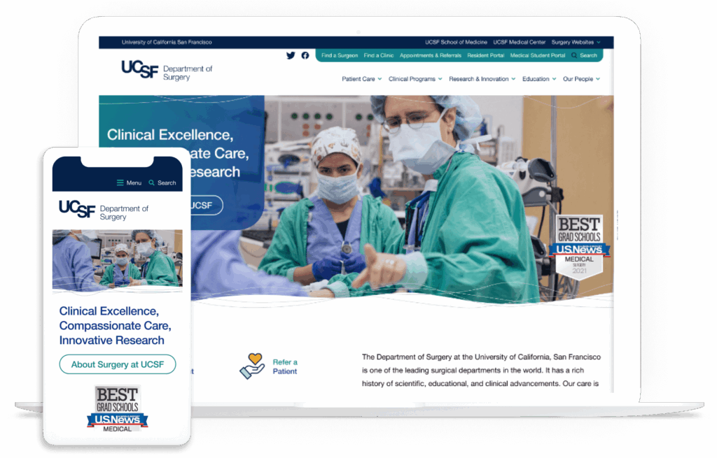
- UCSF Department of Surgery | Intuitive user experience
- Emory Healthcare | Effective location browsing
- Boston Children’s Hospital | Powerful homepage hero image
- Gila Regional Medical Center | Multilingual capabilities
- Massachusetts General Hospital | User-friendly CTAs
- Memorial Sloan Kettering Cancer Center | Patient-first language
- Cincinnati Children’s | Convenient online payments
- McLean Hospital | Data transparency
- UCLA Medical Center | Authoritative content
- Cedars-Sinai Medical Center | Simple online donation page
- NYU Langone Hospitals | Convenient appointment scheduling
- Northside Hospital | Compelling statistics
- Saint Francis Health System | Attention-grabbing imagery
- The George Washington University Hospital | Online health risk assessments
- The Ohio State University Wexner Medical Center | User-friendly patient information
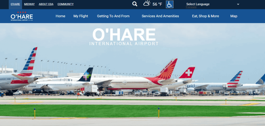
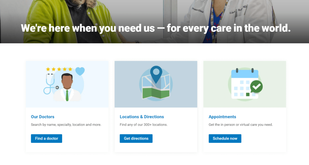
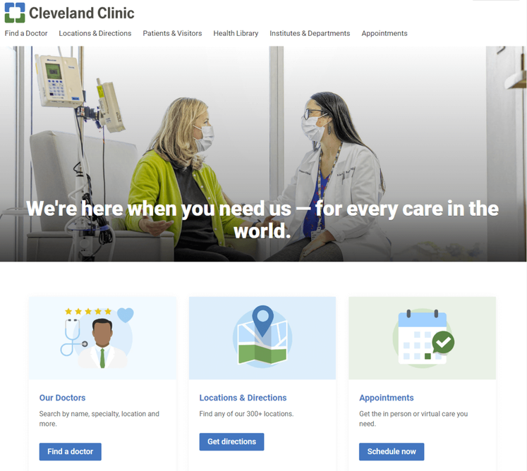
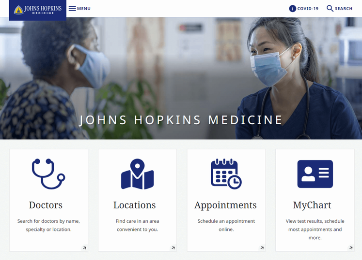
1. Cleveland Clinic | Clear CTAs
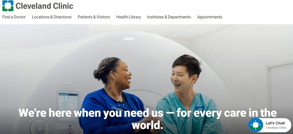
- Clear homepage CTAs address common patient needs (find a doctor, get directions, schedule an appointment).
- A robust health library answers common medical questions and concerns.
- The homepage emphasizes the hospital’s commitment to patient-centered care.
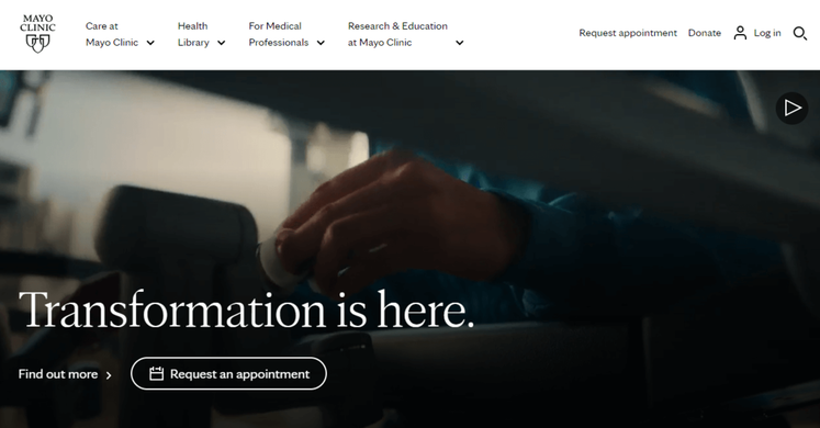
2. Mayo Clinic | Simple search
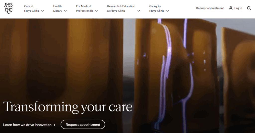
- The homepage search function makes it easy to research health concerns and conditions.
- Users can explore robust biographies for all staff members to make informed decisions when choosing a doctor.
- There are options to schedule appointments online or by phone, with additional FAQs to make the onboarding process smoother.
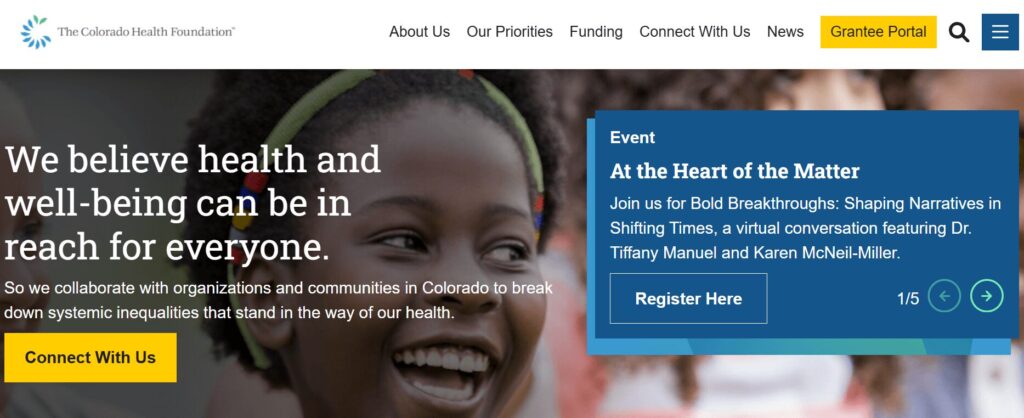
3. Colorado Health Foundation | Enhanced user experience
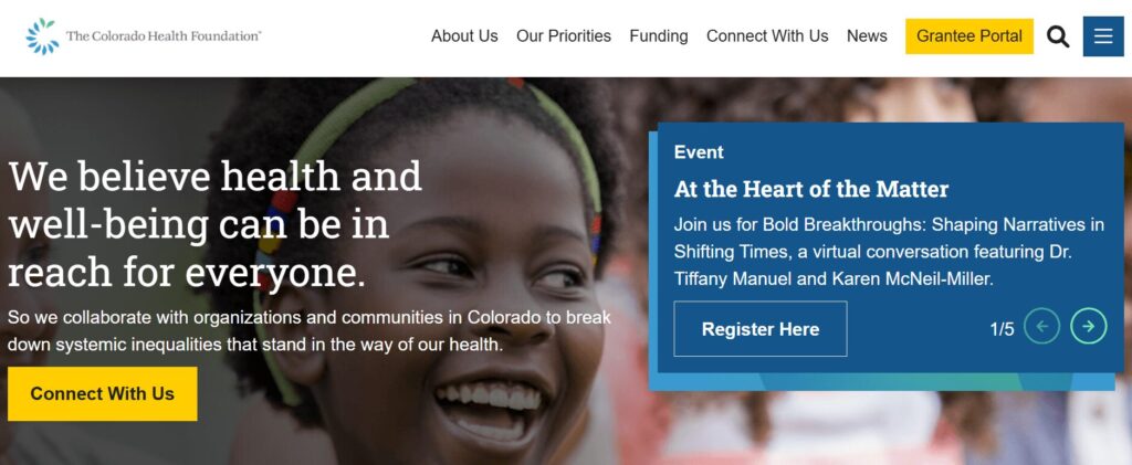
- The site is highly accessible; the Colorado Health Foundation worked with the web design experts at Kanopi to increase the site’s Lighthouse score (a measure of page performance and accessibility) to 95/100.
- We also worked with the organization to streamline the top-level menu to the most important items, simplifying the user experience for visitors.
- The homepage content cards simplify the user journey by speaking to visitors’ FAQs.
4. The University of Kansas Health System | Prominent credibility markers
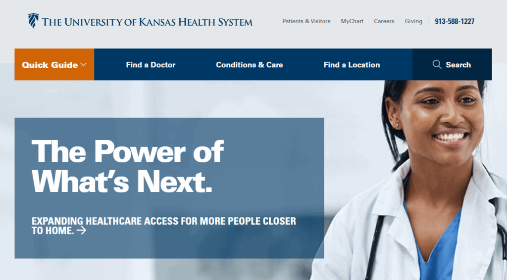
- The hospital’s U.S. News & World Report ranking is featured on the homepage to demonstrate credibility.
- The site makes it simple to find relevant news and events about the hospital by including links on the homepage.
- Patients can easily request medical records, empowering them to access their health information.
5. Seattle Children’s Hospital | Compelling video
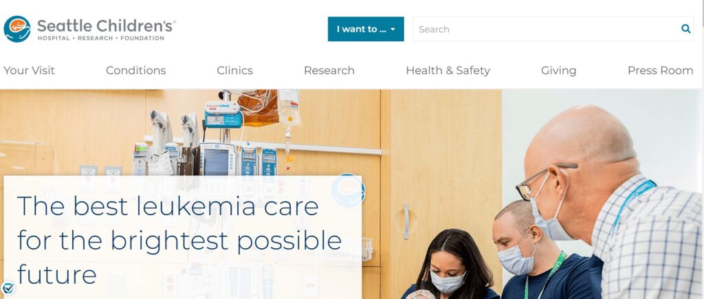
- The homepage features a compelling video (that would be even better if it weren’t auto-playing to enhance accessibility).
- The site also spotlights its high U.S. News & World Report ranking.
- Families can access detailed information to prepare and feel more comfortable ahead of a visit.
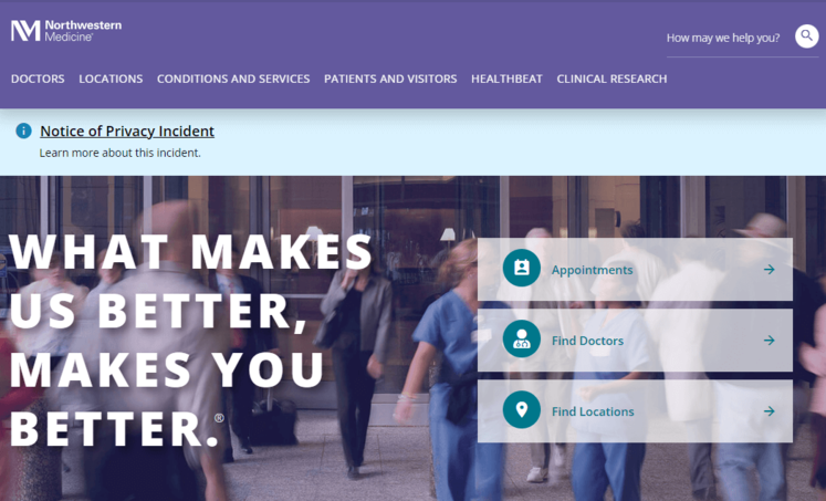
6. Northwestern Medicine | Eye-catching branding
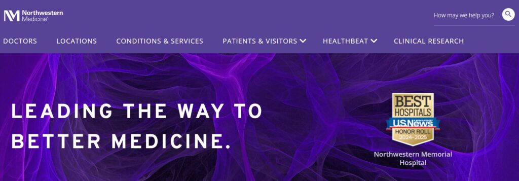
- The eye-catching branding uses the hospital’s color palette.
- There are multiple ways to find locations by name, specialty, or location type.
- Compelling patient stories and case studies showcase what it’s like to seek care at this institution.
7. St. Jude Children’s Research Hospital | Impact stories
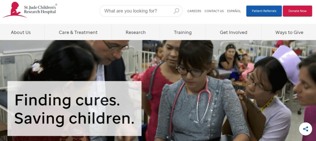
- The site features emotional impact stories about patient experiences.
- Comprehensive articles and explanations of the hospital’s research demonstrate authority.
- A simple online donation process with options to dedicate a gift in honor or memory of someone empowers visitors to show their support.
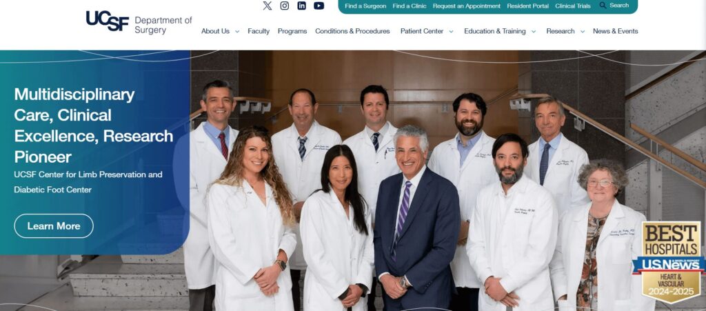
8. UCSF Department of Surgery | Intuitive user experience
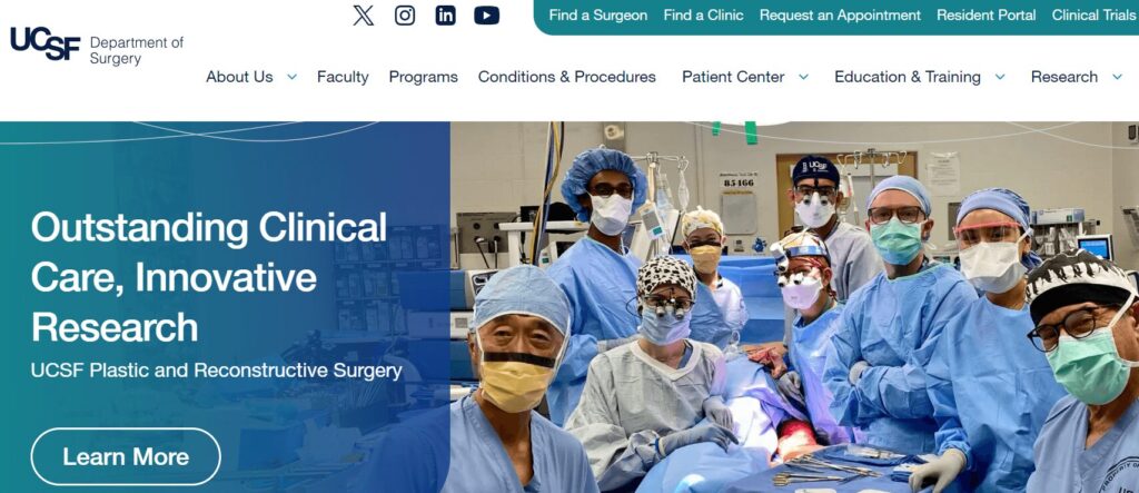
- Kanopi worked with UCSF to organize and reinvigorate their website, identifying user personas and reformatting the site for a more intuitive user experience.
- Micro-interactions, transition animations, and soft shapes add visual intrigue without distracting or overwhelming users.
- Imagery focuses on showing real people, adding authenticity and relatability to the site.
- Our partnership earned multiple awards for user experience and health care services.
9. Emory Healthcare | Effective location browsing
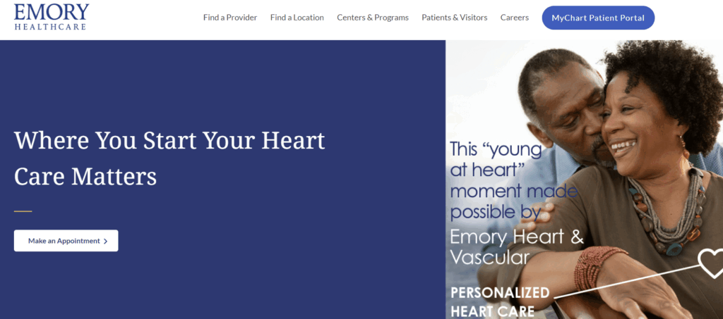
- The primary homepage CTA (“Make an Appointment”) speaks directly to the most common user need.
- How-to videos offer guidance for using the hospital’s patient portal.
- Users can browse locations by care type or specialty.
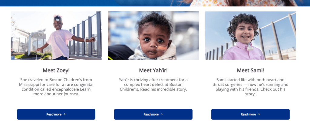
10. Boston Children’s Hospital | Powerful homepage hero image
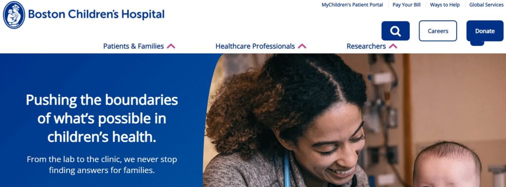
- The homepage hero image is compelling and its static nature makes it less distracting than a rotating image carousel.
- Integrations with social platforms like Instagram give a unique feel to the homepage content.
- Videos incorporated throughout the site provide information for families looking to book virtual or in-person appointments.
11. Gila Regional Medical Center | Multilingual capabilities
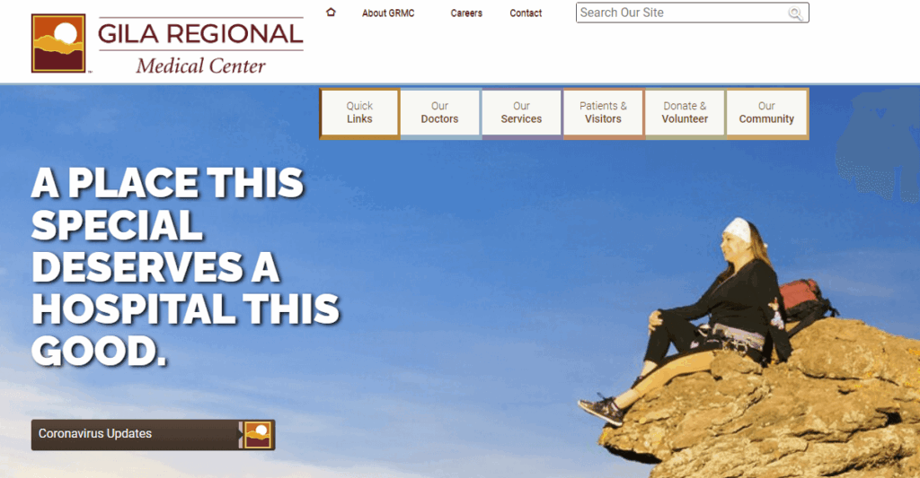
- The homepage features credibility markers such as ratings and awards from credible organizations.
- Resources are available in both English and Spanish, increasing the site’s language accessibility.
- The website sticks to the most relevant details for patients, avoiding overloading itself with confusing or distracting information.
12. Massachusetts General Hospital | User-friendly CTAs
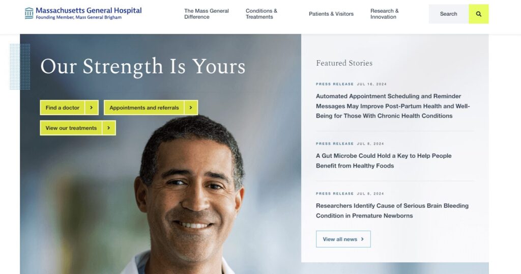
- The homepage buttons saying “Find a doctor,” “Appointments and referrals,” and “View our treatments” make it easy for patients to find what they’re looking for.
- A simple internal search function offers a convenient way to research conditions and treatments.
- The site is available in multiple languages, making it accessible to a wider audience.
13. Memorial Sloan Kettering Cancer Center | Patient-first language
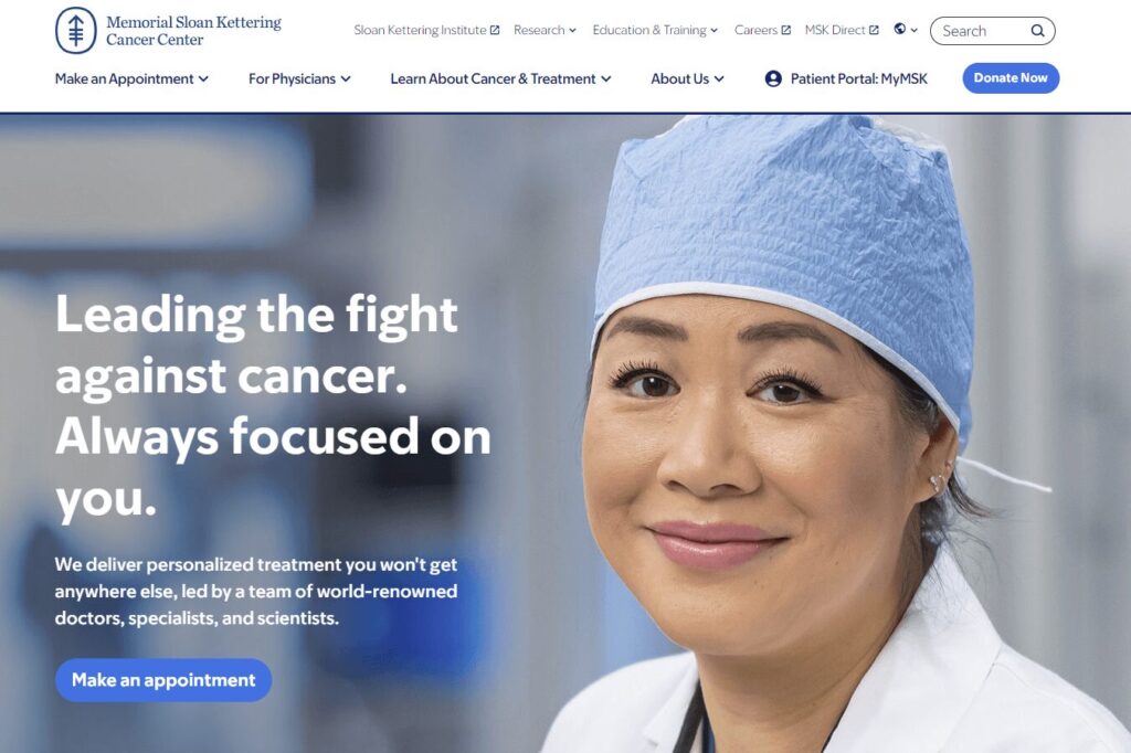
- The homepage leverages patient-first language using “you” pronouns.
- The homepage has one hero CTA focused on patients’ needs (“Make an appointment”), keeping the page uncluttered and useful for visitors in a hurry.
- The website features timely public notices for security incidents, keeping its community informed.
14. Cincinnati Children’s | Convenient online payments
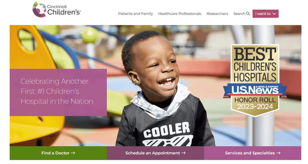
- The homepage celebrates the hospital’s ranking of #1 Children’s Hospital in the Nation by U.S. News & World Report.
- The “I want to” CTA in the top menu allows users to quickly find the resources they need.
- Clear billing options are outlined on the website, including convenient online, phone, and mail options.
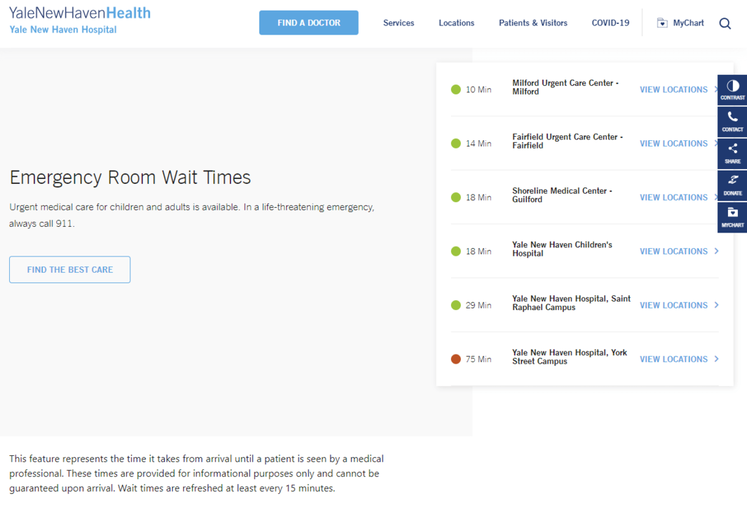
15. McLean Hospital | Data transparency
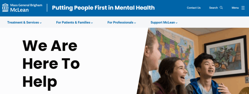
- Privacy incidents are highlighted directly on the homepage, empowering patients to understand potential threats to their personal data.
- Treatment options are arranged by age, making it easier for visitors to find relevant information.
- The hospital offers convenient online mental health webinars and courses for community members to feel more empowered and take control of their mental health.
16. UCLA Medical Center | Authoritative content
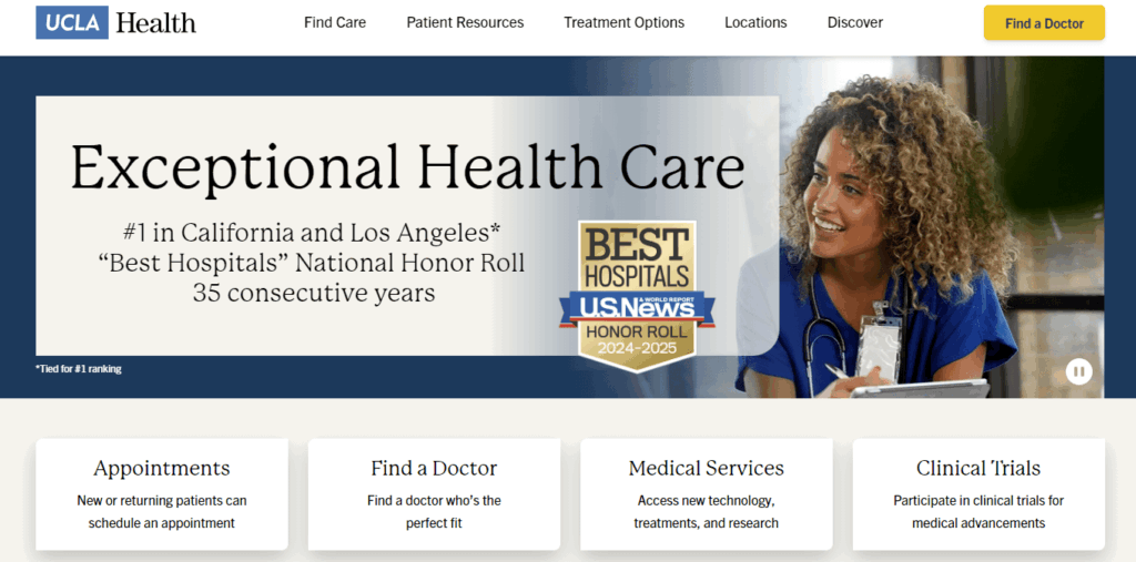
- The hospital’s credentials are highlighted right on the homepage: “#1 in California and Los Angeles, ‘Best Hospitals’ National Honor Roll, 35 consecutive years”
- Users can translate the website into 10 different languages.
- Visitors can search by location, provider, medical services, and clinical trials to find the practice that’s right for them.
17. Cedars-Sinai Medical Center | Simple online donation page
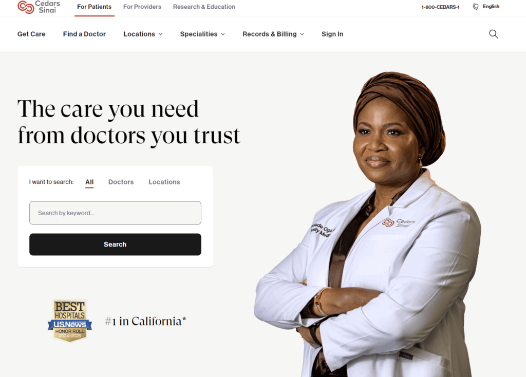
- The hospital’s user-friendly internal search function is highlighted directly on the homepage.
- The online donation page is streamlined and empowering, giving donors the option to donate to a specific area or give in honor or memory of someone.
- The website uses clear statistics to highlight the organization’s positive impact and beneficial research.
18. NYU Langone Hospitals | Convenient appointment scheduling
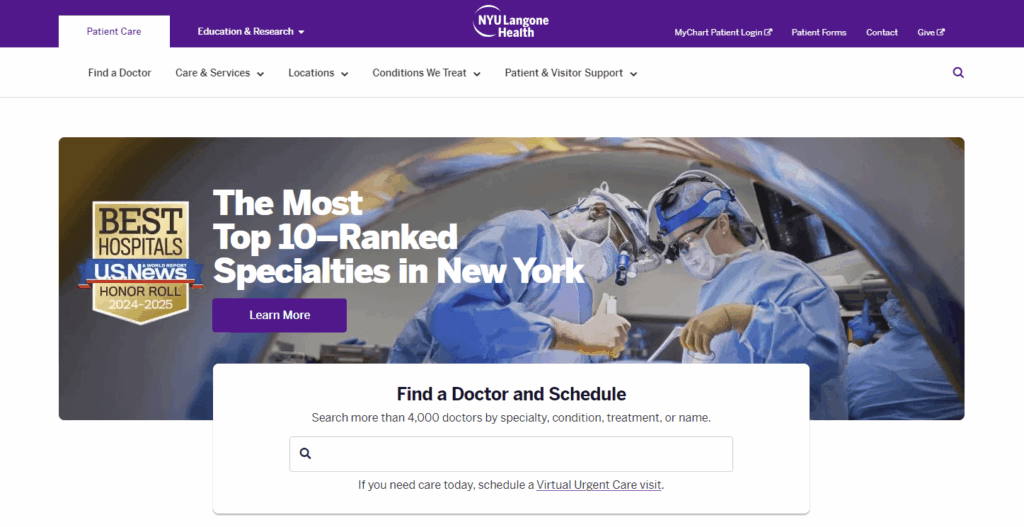
- Users can search doctors by specialty, condition, treatment, or name.
- The homepage has clear links to the online patient portal.
- Visitors can schedule virtual urgent care visits.
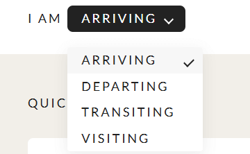
19. Northside Hospital | Compelling statistics
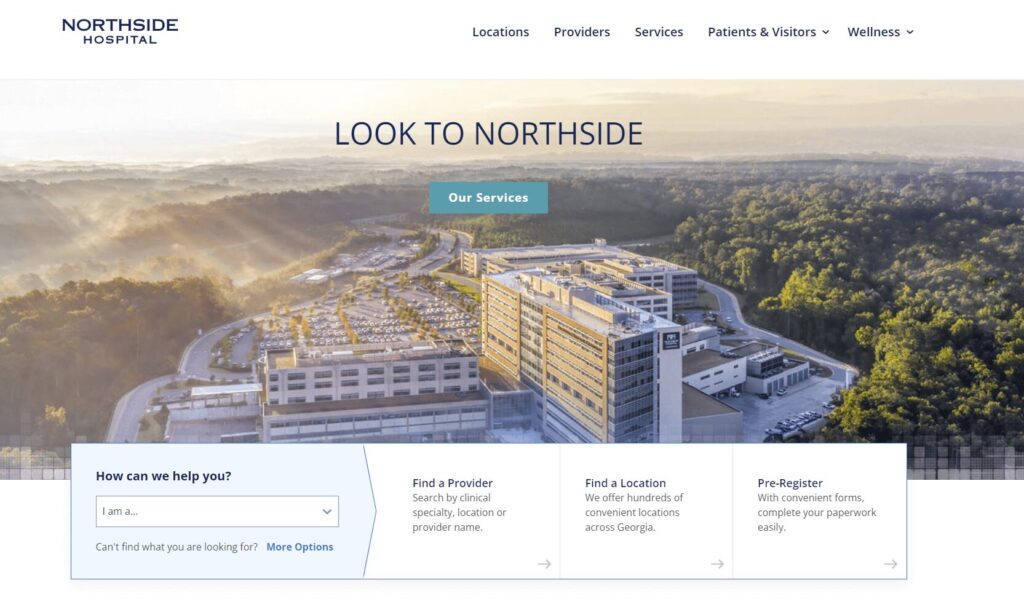
- The homepage “I am” CTA makes it easy for visitors to self-select a user group that matches their needs.
- The homepage also features compelling statistics speaking to the hospital’s positive impact.
- The website’s patient stories use photos and direct quotes to convey patient experiences.
20. Saint Francis Health System | Attention-grabbing imagery
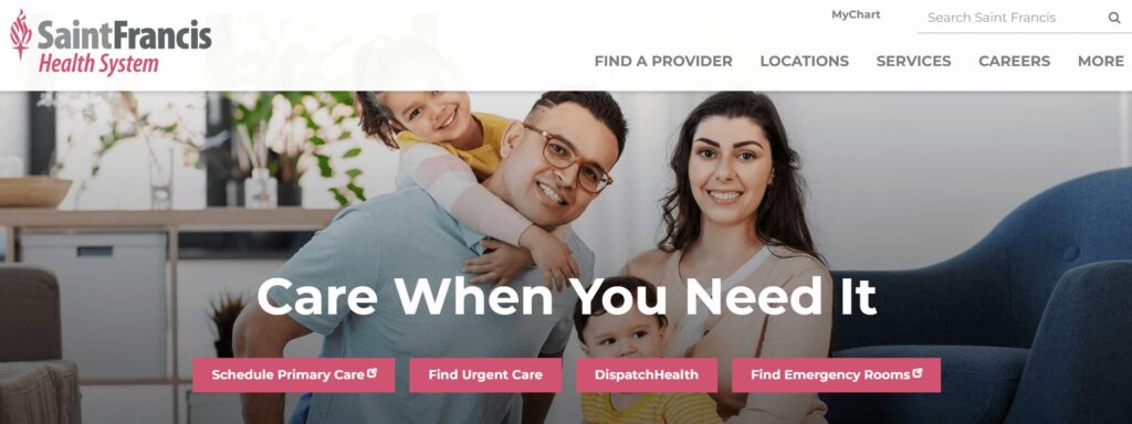
- The homepage incorporates an eye-catching hero image.
- News articles feature the hospital’s high quality rankings from credible organizations.
- Users can search for a provider by specialty, location, or insurance.
21. The George Washington University Hospital | Online health risk assessments
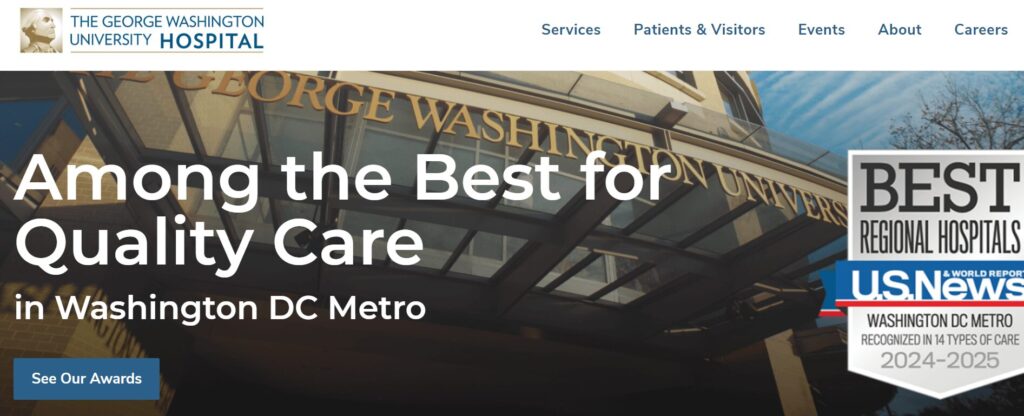
- The homepage emphasizes the hospital’s awards and rankings, demonstrating credibility.
- The site spotlights a wide variety of patient services, including spiritual care, language services, and access to medical records.
- Online health risk assessments help patients take charge of their health.
22. The Ohio State University Wexner Medical Center | User-friendly patient information
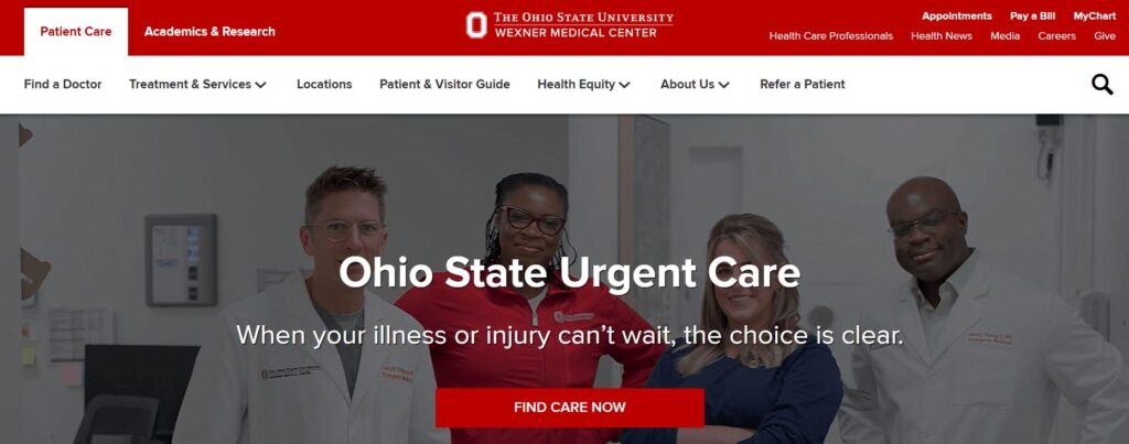
- The homepage CTA speaks directly to patients who may feel a sense of urgency, saying “When your illness or injury can’t wait, the choice is clear.”
- The online Patient & Visitor Guide answers common patient FAQs to help visitors feel more comfortable with their stay.
- The site highlights the hospital’s commitment to health equity, including information about its roadmap and initiatives to achieve health equity.
Features of successful hospital website design
Now that you better understand what your audience wants to see from your hospital website, let’s summarize the specific features your site should have to fulfill their needs. Successful hospital websites have the following elements:
- Information about location, parking, and other logistics
- Staff/doctor directory
- Comprehensive educational content covering medical and healthcare topics
- Event calendar
- Credibility markers (awards, certifications, credentials, etc.)
- Convenient appointment booking
- Streamlined navigation
- User-friendly internal search
- Timeless look
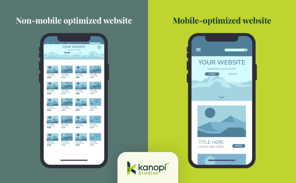
- Mobile-friendly functionality
- Accessible content
- Multilingual options
- Security features for sensitive information (strong password requirements, two-factor authentication, etc.)
- Insurance information
Adapt these features to your organization’s unique branding and tone to create a consistent website that appeals to all user needs.
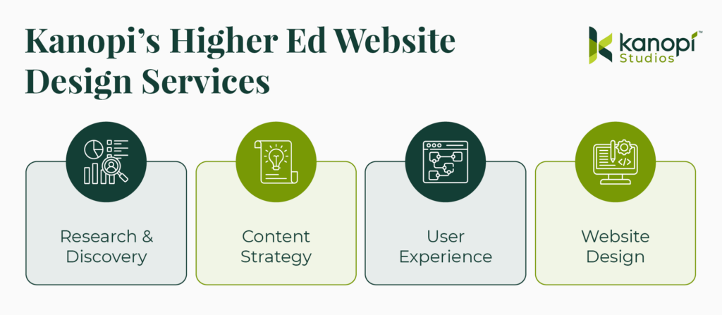
Work with Kanopi to optimize your hospital website
A hospital web design and development project is a major undertaking, and you need an experienced developer on your side to create a finished product that exceeds your audience’s expectations. Kanopi Studios is a reliable healthcare web design partner that will help you create the effective hospital website your community deserves.
Our services include:
- User and stakeholder research
- User persona development and testing
- Content audit and strategy
- Healthcare website design focused on user-friendliness and accessibility
- Website development and maintenance
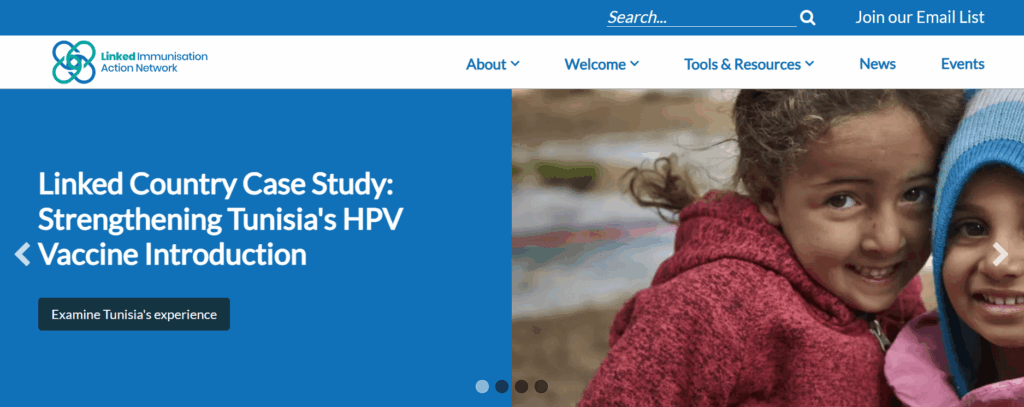
Hospital web design case study: The Linked Immunisation Action Network
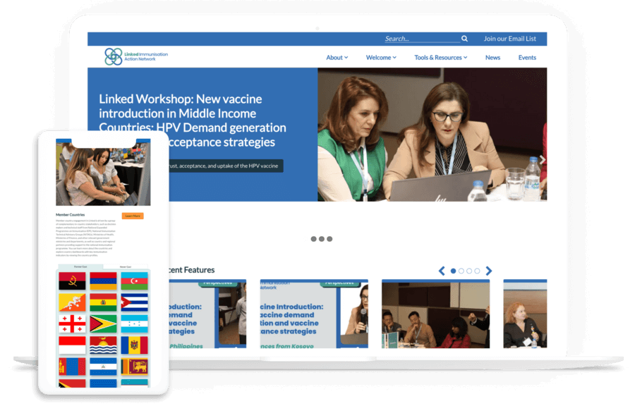
Our partnership with the Linked Immunisation Action Network offers a helpful look into how we approach hospital and healthcare web design. The organization came to us needing to improve their website’s performance and usability—two important site aspects that are heavily impacted by design.
Focusing on high-traffic areas (the homepage and Tools and Resources section), we updated the backend code and fixed form and plugin issues. We also redesigned the Tools and Resources section to streamline user pathways, improve search functionality, and enhance visual design to increase engagement.
As a result, the site saw both desktop and mobile speeds improve as well as an accessibility boost. Read the complete case study here and explore our other recent healthcare projects to see how we take website design from ideas to reality.
Wrapping Up
Remember: Investing in effective web design support upfront will help your organization achieve a high return on investment (ROI) for your project. It’s worth it to work with an expert who can guide the process from start to finish and implement best practices.
Looking for additional healthcare web design support? Start with these additional resources:
- 7 Best Hospital Web Development Examples and Expert Tips. Explore more hospital web development examples to understand how to optimize the technical side of your site.
- How to Use Healthcare Content Marketing to Drive Engagement. Explore how your hospital’s content strategy plays into your audience engagement efforts.
- 7 HIPAA-Compliant Website Analytics Tools for Healthcare. Review top HIPAA-compliant analytics solutions to find the right tool for your healthcare website.
- Webinar: Website Best Practices for an Aging Population. Kanopi’s Cliff Persaud discusses the challenges and opportunities facing healthcare providers, and how they can ensure their website design meets the needs of aging patients.