Screen Reader 101

It’s time to take a look at screen readers and get a better understanding of who uses them, and what it’s like to use assistive technology on the web.

What’s a screen reader?

A screen reader is a piece of software that is able to review textual content from a computer and present it to a user via synthetic speech. It’s what we call “assistive technology” and essentially “reads the screen” out loud to the user. You may have heard the term used specifically in regards to the internet, likely because screen readers are an invaluable asset for the accessibility community. 

Screen readers present a website as plain text, including important semantic information such as region, headings, links, and interactive elements. Where most users might perceive a website as an interactive brochure of sorts, a screen reader’s experience is closer to an interactive audiobook.

Because of this, screen readers make the internet accessible to users who otherwise might not be able to perceive or understand content being presented visually.

Who are screen readers for?

It’s tempting to think of screen readers as used only by people who have limited vision, but that’s not the sole use case. In fact screen readers are so helpful, they’re used by many different groups of people.

  • People who are blind
  • People with low vision
  • People who have learning and reading disabilities
  • People with cognitive impairments
  • People with motor disabilities
  • People with low literacy
  • People who are non-native speakers
  • People who prefer to listen to content rather than read it

That’s a wide range of needs, and there’s a good chance that any given website’s audience overlaps with one or more of those categories.

What’s it like to use a screen reader?

This is a basic example of the JAWS screen reader going through a small chunk of website content. The experience is quite linear, just straight down the page without any additional context and demonstrates the “plain text” aspect of how a screen reader regurgitates information.

For a more extensive look at screen readers in action, here are a few videos under 5 minutes that can give you deeper insight into the experience.

UCSF Screen Reader Demo

SLCC Screen Reader Demo by individual with no vision

TPGI Accessible Page vs Inaccessible Page

How does website inaccessibility impact screen readers?

Structure & Order Matters

Screen readers understand a page in a linear pattern, apart from the design and layout, following what is known as the “DOM order” (Document Object Model). Essentially, the DOM order is the html of the page in the order that it is written. 

Why does that matter? Because while I can style a button from the footer to visually appear as though it’s in the header, someone using a screen reader will not reach that button until the application reaches the footer. This could be a confusing experience if the user could see the button, but not hear its function.  

Consider if a form’s labels were all on the left side of the page and the inputs where you enter information were all on the right side of the page, but they were coded as two columns instead of rows. A screen reader would read all of the labels first (down the first column), then all of the inputs second (down the second column). Without visually being able to line up the label to the input, a user wouldn’t know how to fill out the form.

To create an accessible experience, the DOM should follow a logical structure. It needs to make sense to someone who can’t see the page, but also to those who can see it. Remember, many users of screen readers are also viewing the page; it would be confusing to bounce around illogically ordered content. Users might lose their place on the page, or start confusing the relationships between headings, content, and links. For those with cognitive difficulties, this would be incredibly frustrating.

Landmarks & Headings Become Waypoints

If you think about a webpage like an essay, it has an introduction (the header), the body (the main content), and a conclusion (the footer). And every good essay has an outline (the headings).

A screen reader has the ability to move down a page using these kinds of landmarks as waypoints. Users could choose to move from the header to the main content, to the footer. If a page is created without essential landmarks, the screen reader can’t find those elements for the user. A site with proper semantic html will automatically inform assistive technologies of those regions, making it easier for users to navigate the page.

Aside from landmarks, screen readers can also travel via headings, allowing their users to select a sub heading that piques their interest and start reading from there. If your headings don’t follow a logical outline structure, this could misdirect and misinform users. In an essay you would never put the opening paragraph above the title, yet online this is a common faux pas done under the assumption that everyone can visually see and realize the intention.

When you visit a webpage, typically you’ll see a large number of links. Sometimes this is limited to the main navigation, but often there are links within the content, call to action buttons, or lists of quick links for navigating to popular pages. Screen readers are capable of pulling out all of the links from a website and presenting them to a user so they can more easily find where to go.

Take a look at your webpage. Look at all of your links and compile a list of them in your head. Do they make sense without surrounding content? If not, then it’s possible your site would give a screen reader some trouble.

Let’s say you had a sub-page called “About” in the main navigation going to a page service/about. But then down in the footer area you had a page called “About” going to company/about-us. A screen reader would present each link as “About” and the user would have no idea they were two different urls, or that one was about your services and the other your company.

Likewise, generic link text can be incredibly frustrating. Buttons and links reading “click here” or “read more” or “view now” are poor descriptions and don’t offer any information about where the user will be taken when activated. Read more about what? What am I going to view? Why should I click here?

These problems and more can quickly make your website unnavigable by screen readers, but these problems can also be solved with good accessibility practices. There are ways to include more information that only a screen reader can “see” and present back to a user to provide additional context to potentially confusing links.

What other kinds of assistive technology are there?

Beyond screen readers, consider these other technologies:

Braille Displays – these refreshable displays output textual content with braille that updates as a user moves throughout the page.

Voice Control – allows users to speak instructions that can be utilized to navigate a page through the same waypoints and elements that a screen reader uses.

Eye Tracking – tracks eye movement to trigger page elements and interactions.

Sip & Puff – allows users to utilize a straw like device to provide binary input through the use of their breath.

Switch Devices – provides binary input via foot pedal or other interactive equipment that can be extended for more complex inputs.

Magnification – provides the ability to zoom in and out on content.

While screen readers are just one branch of the assistive technology tree, at their core is the idea of turning a visual website into textual content understandable by a machine. Because of that, all of this other technology typically benefits from screen reader accessibility, making your site available to many more people who otherwise might not have been able to access your products and services.

Where to get a screen reader?

It’s fairly easy to find browser extensions or apps to add screen reader capabilities to a device, but here are the top three tried, tested, and true full solutions that are preferred by the accessibility community at large.

JAWS

Operating Systems: Windows® 11, Windows 10, Windows Server® 2022, Windows Server 2019, and Windows Server 2016.

Cost: Paid

This incredibly powerful screen reader solution has a robust suite of features and abilities. It integrates with other assistive technologies extremely well; in fact it is so popular that more than 53% of screen reader users are using JAWS.

NVDA

Operating Systems: PCs running Microsoft Windows 7 SP1 and later

Cost: Free

While the main product is free (supported by donations), there is additional support and resources offered in paid package deals. One of the really nice features of this software is it can be run from a USB drive, which makes it ideal for those using community computers at a library or café.

VoiceOver

Operating Systems: Most Apple devices

Cost: Free

If you’re using an Apple device, you likely already have this installed. From watches to computers to TVs, you can use a variety of VoiceOver accessibility settings. It’s also compatible with a huge range of refreshable Braille displays.

For further reading, American Foundation for the Blind has additional information on free and paid screen reader services.

Inclusive Language

At Kanopi, we strive to be inclusive in as many ways as possible: from our hiring practices, to accessibility within our documents and website, to social media. We also work as a company to make our verbal communications inclusive. Some everyday phrases have problematic origins, and we may not have awareness of that. The following lists contain phrases/words that are problematic, some suggestions for what to use instead, and some links that explain more. 

As many of these phrases have been used for decades, a person using problematic language may be unaware of the issues surrounding particular words or phrases. So we suggest giving the individual the benefit of the doubt (within reason, of course), talking to that person about the word or phrase by approaching them privately, telling them what you noticed, your understanding of why the word or phrase is problematic, and suggesting alternate language they might use to get their point across.

Trigger Warning: the following content includes examples of abelist, gendered, racist, and gatekeeping language. While some examples may be specific to the US or to Canada, we realize that this is an evolving list that can and will grow and change over time.

Ableist Language

Ableist language encompasses words and phrases that deliberately or accidentally hurt individuals who live with disabilities. Rather than using ableist language, we strive to use people-first language.

Resource: https://gcdd.org/news-a-media/people-first-language.html 

Problematic LanguageUse Instead
Lame Stodgy | Tacky | Cheesy
Crazy | Insane | Schizophrenic | Hysterical | Manic | Psycho | Spaz | MoronUnbelievable | Silly | Preposterous | Illogical | Irrational | intense | Wild | Vehement | Impassioned | Piercing
ADHDUnfocused
OCDTidy | Organized
That’s so gay…Cheesy | Tacky
Blind to, deaf toDidn’t understand | Couldn’t perceive
RetardedSilly | Confusing
Click (when referring to mouse action)Select
See URLVisit URL
Suffers from….Lives with… (ex: “Suffers from Aids” versus “Lives with AIDS”)
BingeingIndulged | Satiated | Spree | Wallowed
A table of ableist language and recommended alternatives

Gendered Language

Resource: https://writingcenter.unc.edu/tips-and-tools/gender-inclusive-language/

Problematic LanguageUse Instead
Umbrella terms like “homosexual” or “gay”Use LGBTQIA or LGBTTIQ2S
Brother or sisterSibling
Man the boothStaff the booth
MankindHumankind
Guys or Dudes (as in, “Hey guys!”)Hey everyone | Y’all | Folks or Folx
Pronouns (she/her or he/him)Neutral pronouns (they/them), or use the person’s name
LaymanLayperson
A table of gendered language and recommended alternatives

Pronouns

Not every person identifies as part of a gender “binary” (meaning, either male or female). Gender identity and expression fall upon a broad spectrum, and individuals may identify anywhere on or outside of that spectrum. Non-binary individuals may identify as gender fluid, agender (without gender), genderfluid, genderqueer, or something else entirely. Knowing this, we should never assume a person’s gender identity strictly based upon the clothes they wear, the timbre of their voice, or even their physical attributes. 

One way that we can be clear about our own gender expression (if we are comfortable doing so) is to name our pronouns. We can do this in conversation (“My name is XXX, and my pronouns are XX/XX”), through our email signature, Slack profile, Twitter handle — there are many avenues! What’s more, by identifying our own pronouns, we may make another person feel comfortable identifying their pronouns for us. 

If you are not clear on a person’s pronouns, or the information is not presented by the person, it is also okay, when speaking to someone, to ask for their pronouns. Some ways to do this might be to simply say:  “What pronouns do you use?” or “What pronouns should I use for you in this space?” or “My name is [NAME], and my pronouns are [XX/XX]. What about you?”

Racist and Colonialist Language

Problematic LanguageUse InsteadResource
Peanut Galleryhecklers, interrupters, botherers, cheap seatsLink
White Trash, RedneckLink
Inner City, Urbanlow-income city, high-need locale, metropolitan population, city-dwellersLink
Ghetto, GhettoblasterLink
Grandfather (as in, “grandfathered in”)Legacy, old rule, inherited, precedentLink
Gyp, GyppedRipped off, cheated, conned, swindled, shortchanged, bamboozledLink
Master | SlaveLeader | Follower, Teacher | Student, Parent | ChildLink
Indian give(r)UngiftedLink
No can do | Long time no see | Me likeyI can’t, I cannot | I haven’t seen you in a while | I like itLink
Spirit Animal“Patronus” (Harry Potter reference), familiar, raison d’être / reason for living, kindred spiritLink
Paddy WagonPolice vehicleLink
Call a spade a spadetell it like it is, it is what it is,
“if it looks like a duck and it sounds like a duck, it is probably a duck”
Link
Colored (people)People of ColorLink
Sherpaguide, coach, commander, leaderLink
Guruexpert, virtuoso, authority, maestro, captainLink
Ninjaexpert, ace, virtuoso, maven, jediLink
Naziauthoritarian, absolutist, boss, sticklerLink
Scalpedrobbed, hustled, fleeced, pulled a fast oneLink
Tribegroup, crew, squad, community, circleLink
Powwowchat, brainstorm, ideateLink
Hip Hip Hooray!Hooray! (“Hip hip” is the problem)Link
Eenie Meenie Miney Moflip a coin, ask a friend, just make a decision without singing.Link
Moronfool, doofus, nitwitLink
Nomad / digital nomadremote worker, location-independent workerLink
Tipping Pointboiling point, reached the limit, crossroad, the final straw.”Link
The “ok” Emoji and/or Hand GestureThe “thumb’s up” Emoji and/or Hand GestureLink
Low Hanging FruitQuick Wins, easy tasksLink
SpookyCreepy, scary, frighteningLink
SavageFierce, cruel, violent. In some contexts, this is used as a synonym for “expert” – in those instances, use expert, ace, virtuoso, maven, jediLink
Stakeholderinvestor, sponsor, partner, collaborator, colleague, associate, participantLink
A table of racist and colonialist language, with recommended alternatives and further reading.

Gifs and Digital Blackface

“Digital blackface” describes the act of producing, posting, or circulating ‘black reaction gifs’ online and especially on social media threads. The practice is problematic because it re-enforces stereotypes of Black Americans as exaggeratedly comic personae, or, especially in the case of women, as archly sassy, but in a way that does not detract from their fundamental availability to the project of white identity construction. Several good articles about digital blackface can be found here, here, and here

So, as a practice, reaction gifs are fine to use, but be mindful of the individuals pictured within those gifs, and the big-picture message the content you choose may be sending. 

“Knowledge Gatekeeping” Language

Knowledge gatekeeping relates to an assumption of another’s level of understanding and/or education level, and inferring a level of ease as a result (for example: “It’s so easy” “as simple as”). 

Problematic LanguageWhy It’s Problematic
“It’s so easy”This assumes the recipient’s skill level
“Common knowledge”This assumes a level of education or exposure to information
“Wait, you have never used a [Git client]?”This not only assumes a level of education or exposure to information, but it discourages folks that are new to a concept from speaking up or reaching out for help.
A table of knowledge gatekeeping language and why it’s problematic.

Evolving from Violent Language

Credit to Anna Taylor for this compilation, and posted with her permission.

Problematic LanguageUse Instead
“We’re going to pull the trigger.”“We’re going to launch.”
“I’ll take a stab at it.”“I’ll take a pass at it.”
“Did we jump the gun?”“Did we start too soon?”
“I’ll bite the bullet.”“I won’t avoid it any longer.”
“What’s the deadline?”“What’s the due date?”
“We have to pick our battles.”“We have to choose our opportunities.”
“Can you shoot me an email?”“Can you send me an email?”
“That was overkill.”“That was a bit excessive.”
“I bombed the presentation.”“I didn’t do my best.”
“Let’s roll with the punches.”“Let’s move forward.”
“We can soften the blow by …”“We can make it a little easier by …”
“I’m going to take a shot in the dark.”“I’m going to take a guess.”
“Let’s not beat a dead horse.”“Let’s not focus on that anymore.”
“I was blown away by her presentation.”“I was impressed by her presentation.”
“I was kicking around an idea.”“I was thinking through an idea.”
“He’s a straight shooter in meetings.”“He’s pretty direct in meetings.”
A table of violent phrases with potential substitutes.

Microaggressions

“Microaggression” is a term used for commonplace verbal, behavioral or environmental slights, whether intentional or unintentional, that communicate hostile, derogatory, or negative attitudes toward stigmatized or culturally marginalized groups. The Micropedia is a wonderful and beautifully designed website that outlines what these look like, gives an opportunity to offer suggestions, and gives advice on how to address them.

Other Resources

Disability Language Style Guide by the National Center on Disability and Journalism

Inclusive Language Guide from Educause

5 Simple Ways to Improve Website Content Accessibility

Accessibility is a growing demand on the internet as our world shifts from in person to online in a variety of aspects. The pandemic has escalated that shift, and it’s becoming increasingly clear that all websites need to be accessible regardless of legal requirements.

While WCAG 2.1 compliant websites are coded following accessibility guidelines, it’s easy for a site to slip away from compliance through regular content entry. Or perhaps accessibility isn’t something that you’ve prioritized before and you’re just getting started on making improvements. Either way, here are five simple actions you can take right now to improve your website accessibility from a content perspective.

  1. Review / Revise Acronyms & Abbreviations
  2. Remove All Caps
  3. Use Sequential Heading Structure
  4. Alt Text
  5. Descriptive Links

Review / Revise Acronyms & Abbreviations

Acronyms and abbreviations are common in a number of organizations and industries. What’s often overlooked is how those are interpreted by screen readers.

I once came across some website content where they were comparing Generation X to Generation Z, but they used the abbreviations “Gen. X” and “Gen. Y”. Screen readers will often try to expand an abbreviation for clarity. When I tested the content, I discovered it was being read as “General X” and “General Y”. So while the original intent was to save on space, the meaning was confusing to anyone using a screen reader.

Likewise, some acronyms can be troublesome. P.O.W. would be read as “Prisoner of War” while POW would be read as “pow!” like the comic book action. It’s a good idea to read aloud to yourself the content on your website, and consider the potential for misinterpretation by someone hearing rather than seeing it.

Remove All Caps

Whenever I think of all caps, I think of AmyJune Hineline, former Kanopian and winner of the 2021 Aaron Winborn Award (she really loves that being mentioned). She used to regularly remind us all of how all caps can be a common source of frustration and miscommunication with the hashtag #NOWTHATCHERISDEAD. AmyJune would then ask, “Who’s dead? Cher or Thatcher?”

Switching to all lowercase in this circumstance won’t help either. If you are looking for a way to make hashtags more readable, capitalize the first letter of each word (NowThatcherIsDead). It’s called Camel Case (or Pascal Case, depending on who you ask) and it improves readability considerably. For the record, I promised AmyJune that if I ever had a child I would name them Cher Thatcher so the original hashtag would still be true when they passed. Problem solved.

Of course we typically use spacing and punctuation in website content, which helps alleviate some confusion, and all caps are typically used as an easy way to identify something as a heading or to indicate additional importance. But due to the uniform shape that capital letters give words, they become more difficult to identify at a glance and therefore reduce readability. Using Title Case (Now Thatcher Is Dead) is considered easier to parse, both visually and cognitively.

Use Sequential Heading Structure

HTML headings are structured similarly to an essay outline. Your page starts with an “H1” and should only have one of these. This is the heading that tells search engines and users what the focus of the page is. This is typically the title of your page or blog post. The remaining heading values (H2 – H6) are used to identify the content hierarchy of the page. 

Screen readers depend on headings to navigate a page, as users will typically bounce through the headings to find a section to read. If your page skips heading levels, or uses heading levels incorrectly, these users will not be able to correctly navigate your content.

  • H1 – Page Title
    • H2 – Section Title
      • H3 – Subtitle
      • H3 – Subtitle
        • H4 – Subtitle
        • H4 – Subtitle
      • H3 – Subtitle
    • H2 – Section Title
    • H2 – Section Title
      • H3 – Subtitle
      • H3 – Subtitle
      • H3 – Subtitle

Alt Text

Alternative text, commonly known as the alt text, displays when an image link is broken and can’t be displayed. And it’s far more useful than you may realize. Search engines use alt text to further understand the context of your web page and so it’s also useful for SEO purposes. But even more important, alt text is what’s read aloud by a screen reader. For someone with low or no vision, this description helps them identify the content of an image without needing to see it.

Decorative images, such as swoops or waves or other abstract design elements don’t require alt text, but your average image does. But not all alt text is created equal. When describing a picture, consider the purpose of the image and the feeling it’s meant to convey. Identify what is important to understand from the context of the image and the content around it, then articulate that in the alt text. Remember, if it’s valuable enough to show to a sighted user, it’s worth describing to users of assistive technology.

Take a look at this image taken by the James Webb Telescope, uploaded by NASA. The alt text reads, “A large pink, speckled galaxy resembling a wheel with a small, inner oval, with dusty blue in between on the right. Two smaller spiral galaxies about the same size are to the left, all against a black background.” This accurately conveys the image content without being too wordy.

A large pink, speckled galaxy resembling a wheel with with a small, inner oval, with dusty blue in between on the right, with two smaller spiral galaxies about the same size to the left against a black background.
Credits: NASA, ESA, CSA, STScI, Source

Most CMS platforms offer the ability to easily add alt text to your images and it’s highly recommended that you take advantage of the option to do so. Visit your website’s media library and review uploaded images, updating as needed. Then remember to add alt text when new images are added and you should be good to go.

Links are plentiful on almost any webpage. From the navigation bar, to the footer, there’s bound to be several links leading to other areas of your website or even to external sites. One of the most common types of links seen in content is the “read more” link. Generic phrases such as “Learn More,” “Read More,” “View,” and “Click Here”  offer little content to assistive technologies which often scan the links of a page and simply provide them to a user without the surrounding context. 

For example, if your page has three cards for news articles and the links for each are “Read More”, assistive technologies may present them as “Read more, link, read more, link, read more, link.” That is useless to the user if they cannot visually see the title of the article that goes with the link. 

In fact, this type of link is so discouraged, Google penalizes it when calculating a website’s SEO score. And yet this is an incredibly common practice. Even Kanopi’s website utilizes read more links in a number of situations. So how can you get around this ambiguity? 

Ideally it’s done by having hidden screen reader text added in addition to the “read more.” You’ll find an accessible website often has additional content that’s hidden visually but presented specifically to assistive technology. Instead of reading “Read more, link,” the screen reader is presented with, “Read more [about our blog post on accessible design], link.” This is how we do it with Kanopi’s site, making it possible to use “read more” as link text.

But because this method requires some behind-the-scenes code, it’s more commonly used in templated areas that automatically present content with read more links. When you’re adding textual content to your site, you may just want to add a button or link to send the reader onto more information. When that happens, it’s important to remember the link may be reviewed independently of the content around it. Being descriptive will help your SEO and your accessibility. 

I could tell you to “read more,” but it would be better for me to point you to an article about inclusive and accessible webforms.

Beyond Content Entry

Accessibility is an absolute necessity as assistive technology opens up the internet to more and more people. If you’re interested in achieving a WCAG 2.1 compliant website, get in touch with Kanopi. We’d love to help you create a site that is accessible to all.

Accessibility Overlays: Buyer Beware

Whether it’s the Americans with Disabilities Act (ADA) and Section 508, the Accessible Canada Act, or the governing legislation in your area, the reality is your site has to be compliant with WCAG 2.1 Level AA guidelines or risk legal ramifications.

What is website accessibility, also known as A11y? Accessibility is “the quality of being able to be reached,” or, basically the idea that every part of your website can be accessed and used by anyone. So how do you achieve that? Well, on one hand you can spend the time, effort, and money having your website audited and remediated, then set up an ongoing process to ensure your site stays current with accessibility needs and requirements. Or you can install an accessibility overlay and call it a day.

The question is, do you feel lucky?

First, what is an accessibility overlay?

Accessibility overlays (including widgets and toolbars) are automated software solutions that serve third-party scripts intended to resolve accessibility problems on websites and applications. 

Firstly, they usually apply a series of controls to a website that allow the user to adjust aspects of their viewing experience, such as colors, text size, and contrast.

Secondly, they use JavaScript to alter the code and content of your website on the fly to try and make up for existing accessibility errors with automated “repairs.”

Thirdly, they are really, really, really, really, really, really bad.

Wait, what? Why are accessibility overlays so bad?

Overlays may run into conflicts with user privacy.

Because users of assistive technologies often have specific settings on their devices and browsers, some overlays automatically detect those settings and attempt to utilize them for their configuration. To maintain this, it stores a cookie on the user’s machine, saving info about their disability settings without any kind of opt-in from the user. 

To make matters worse, any other website using the same overlay can access that same cookie to apply the same configuration. Information about an individual’s disability is incredibly personal, and this is essentially a privacy breach the user never opted into. Having an accessibility overlay on your site could risk noncompliance with GDPR, CCPA, and the like.

They increase your site’s security risk.

Anytime you load a third-party script onto your site, you are putting part of your site’s safety in the hands of the vendor. If their server is insecure, then you could be directly impacted.

Your website performance will suffer.

This is a tale as old as time; the longer it takes for your site to load, the more likely it is that the user is going to leave. JavaScript always increases page load, and third-party scripts are even worse because it’s the vendor’s server dictating the speed of that script. It’s a known fact that Google and other high priority search engines monitor site speed and that metric is utilized in your SEO ranking. Slowing down your site with an accessibility overlay will directly impact your search ranking with Google.

Website creators may become reliant on them.

Overlays are insufficient bandaids to problems that designers and developers will continue to make if they are not required to solve them. This gives the team a false sense of security and no motivation to create inclusive, accessible websites.

The “repairs” made by overlays may not be reflected in the source code. 

If you were to “view source” on a webpage, what’s reflected there may not match up with what you see being delivered by the overlay JavaScript. This means anyone using assistive technologies that rely on the source code would not be served the accessibility changes.

Overlays may be blocked by the intended audience.

Extensions designed to block ads are known to also block overlays, but ad blockers are a common tool users employ to ensure their assistive technologies are working properly. Instead those users will be served your existing inaccessible website without the overlay.

They actually create barriers to accessibility.

This is the big one. Most users of assistive technologies agree that overlays are ineffective at best, and detrimental at worst. These widgets often require activation via buttons or toolbars which of themselves may not be accessible to the user. Remember, not everyone is using their eyes and a mouse to navigate the page. Just because you can see and click on them doesn’t mean everyone can.

Moreover, users requiring assistive technologies already have solutions which impact the experience across their entire device and web browsers. An overlay can override or conflict with these settings, or even adapt unreliably (if at all), creating a frustrating experience for the user.

Companies using accessibility overlays are subject to brand damage.

Yeah. They are regarded that badly by the A11y community and those who use assistive technology. Companies caught using overlays have been called out for it on social media, and it is not a good look. The general feeling is that those organizations care more about their legal obligations than the actual end user.

  1. They require no actual accessibility knowledge or expertise.
  2. They provide controls that seem very helpful, like color contrast and text size.
  3. They promise fast and easy accessibility compliance.

It’s that last one that draws in companies and organizations looking to meet regulations. Accessibility overlays look like a temptingly cheap and quick fix for a big, expensive problem.

But accessibility overlays do fix accessibility problems, right?

No. A thousand times, no. 

There is currently no way for a single automated tool to detect all accessibility issues on a website. This is widely known in the A11y community. When we do accessibility audits at Kanopi, we use a minimum of four different automated tools, in addition to manually testing via keyboard and screen reader. Most automated tools can only detect up to 30% of potential problems, leaving up to 70% undetected. It takes a human user with training, additional tools, and a good chunk of time to find the remaining items. How then could an overlay possibly identify all accessibility issues on a webpage?

Unfortunately, they can’t. And therefore, they cannot meet the WCAG 2.1 Success Criteria. Conformance is defined as meeting all of the requirements of the standard; partial compliance is not sufficient. Any accessibility overlay provider claiming conformance is misrepresenting their product.

Just a few examples of issues an overlay is not going to be able to address, but are basic A11y requirements:

  • Detect / repair missing headings, or misused headings
  • Fill in missing alt text with appropriate content
  • Add missing labels on form fields or submit buttons
  • Fix missing or incorrect error management and handling
  • Provide reliable focus control on form inputs
  • Provide reliable keyboard access
  • Correct JavaScript content injected independently of the overlay
  • Enable zoom
  • Correct the usage of layout tables
  • Reliably correct focus order
  • Prevent keyboard traps

There’s more, but these are areas that are known to be big problems for users of assistive technologies and can make your site completely unusable for part of your audience.

What’s the worst that could happen?

In 2020, more than 250 lawsuits were filed against companies using overlays to solve accessibility issues on their sites. In fact, around 70% of accessibility cases are brought by the same ten law firms who are actively seeking websites using overlays. These law firms specialize in accessibility lawsuits and are looking for easy targets

Hunt Huey (PLLC) confirms this is a known strategy, stating: “The law firms who file website accessibility lawsuits and their pet clients start the process of finding a target using automated tools that scan for compliance with the technical requirements of the Web Content Accessibility Guidelines 2.0 or 2.1.”

“The conclusion is simple. If avoiding litigation is your goal, an overlay or widget won’t do the trick.” 

Hunt Huey

The reality is, if you want to avoid legal action then you need to reach WCAG 2.1 Level AA compliance.

So, back to the original question: Do you feel lucky? 

How do you become compliant?

It takes time, it takes expertise, it takes commitment. It takes caring about real people who use assistive technologies. Folks with disabilities are worthy of respect and inclusion. Design and build your website with inclusion and accessibility in mind, so that your site can be ‘reached’ by all. Dedicate resources to ongoing automated and manual A11y audits of your site, addressing issues at the root of the problem instead of applying bandaids.

Kanopi can help. If you’d like to know more about our A11y audits, or our dedication to building Level AA websites, get in touch with us.

Why do we need to make accessible websites?

Because it’s the right thing to do. 

Forget the legal ramifications. Forget the fact that there’s a strong business case for it. Consider for a moment the ethical responsibility to ensure your site is barrier free to anyone regardless of who they are. Consider that your clients and customers are people to respect, not problems to solve.

It’s time to make your website accessible.

4 reasons for choosing an all-in-one design and development agency

Whether for your higher education institution, nonprofit, or your software as a service (SaaS) firm, a website build is often thought of as a two-phase process during its construction. 

Firstly, you need a platform design and strategy. You’ll want to study your typical website visitors, organize and audit your pages and content, and create an information architecture while thoughtfully choosing fonts and colors for your user interface. The UX design process is a crucial part of every platform build, ensuring your site will be a pleasure to navigate while meeting website visitors’ needs.

Website development naturally follows once you have your design. Engineers code, test, debug, and retest every component of your site to ensure it’s functional, accessible, and secure before it’s ready to go live. 

It’s not uncommon for companies to think of each of these vital phases — design and development — as two distinct and separate entities. Because of this, folks often consider partnering with one agency to design their platform and another to develop it. 

We don’t deny this strategy can produce fantastic websites. In some instances, choosing a specialized agency to focus on a single phase of your site build makes sense. However, we’d like to highlight how design and development are not as independent as some think, and there are advantages to having the two phases connected. 

Working with one agency that’s mastered both design and development can save you time and money while ensuring your site is a joy to use and will be for many years to come. We’ve pulled together our top four reasons firms should consider choosing one agency for designing and developing their website.

Four reasons for choosing an all-in-one design and development agency: 

1) You’ll launch faster.

When gaining both design and development from the same agency, your project life cycle is more efficient, meaning your website is able to go live faster. This valuable time-saving is the result of consistent alignment between designers and engineers.

Whenever Kanopi inherits a platform designed elsewhere, we ensure the strategic thinking isn’t lost in the transition as this is one of the most common blockages when your platform moves from the design agency to a development agency. Accessibility issues, missed content requirements, and an unworkable CMS can also crop up when working with separate design and development firms.

One agency can ensure your site is accessible.

Design agencies that don’t offer website development in-house can sometimes create design specs that don’t meet accessibility and usability guidelines. When it comes time to build your site, engineers may need to do extra work or modify your agreed-upon design to meet the needs of everyone who uses your website. 

With design and development working together, accessibility isn’t an afterthought and can be included in the strategy and design of your website from the very beginning. 

Understanding your content requirements is more seamless.

Another challenge that can extend project timelines are missed content requirements, as design agencies can occasionally overlook your company’s content requirements due to focusing on aesthetics. Unfortunately, we’ve seen designs break when it comes time to migrate a company’s actual content over to the platform design. Without a technical review of the actual content that needs migrating, designers might miss any number of needs, including not taking image size requirements into consideration, ensuring that content isn’t being broken up into multiple components, or creating space for headlines that are too short to accommodate actual headline length. 

Conversely, what if the designers create visuals around content that doesn’t yet exist? It can look great having all the bells and whistles in the design, but if the content doesn’t exist, someone has to make it, or the design may look flat.  Make sure things like images, videos, and content fields exist or can be created before signing off on that design.

With development and design working hand-in-hand, engineers are able to provide expertise on content needs while designers are beginning to craft a beautiful website that’s functional. 

You’ll get a CMS that’s easier to use. 

Lastly, disjointed design and development can sometimes leave behind the unique needs of content managers. Busy content teams need a content management system (CMS) that’s a breeze to use. With a focus on front-end design, design-only firms sometimes provide designs that do not lend well to editing specific assets in the CMS (for example, image sizes that require Photoshop or another outside tool to crop to proper sizes). Development can lean into the design process to help integrate a CMS that’s user-friendly, no matter the skill level of your content team members. 

Additionally, having a pattern library within your CMS is crucial to keep your site’s design consistent over time. Design firms tend to design each of your web pages, but rarely design full pattern libraries that work across an entire site that help maintain a smooth workflow between design and code when it’s time for development. Creating every web page in isolation leads to multiple ways to display content, slowing down your project.

When Kanopi develops websites, we look for patterns we can apply site-wide to eliminate gaps that commonly appear through separate page design. Without pattern libraries, numerous patterns may be created for similar content, which can lead to increased complexity, longer development time, and the need for additional project management support with a heftier price tag.

2) Feature development is easier.

When you decide to partner with an agency providing both design and development, designers and engineers work in tandem and are able to understand the nuances of the features necessary to make your website the best it can be. 

When the Golden Gate National Parks Conservancy and Institute of Golden Gate partnered with Kanopi, we were able to take a strategic approach to their visual design, factoring in their complex infrastructure and functionality requirements. 

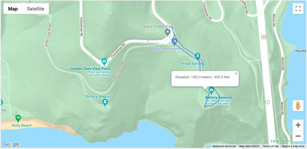
Mapping, in particular, is a complex feature for the park and one that needs to look great while providing an intuitive user experience and a CMS behind the scenes that’s fit for purpose. Kanopi created a content administration experience, allowing for polygon drawing and mapping files to direct intricate paths for hiking in the park: 

An example of one of the many available maps of the trails managed by Parks Conservancy. This one overlooks the Golden Gate Bridge.

3) Project management is more cohesive.

When you partner with an all-in-one agency, you ensure the smoothest transition possible as your platform passes from the designers to the engineers.

Designers within an all-in-one agency understand the skillsets, workflow, and limitations of the engineers with whom they work. They’re familiar with what design practices are going to make the job of the developers as smooth as possible, and which ones might come up against issues in the build phase. Those built-in efficiencies make a huge impact on time and budget.

Working with separate design and development agencies can lead to numerous layers of project management with a costly transfer (in terms of both time and money) between them all. 

Working with an all-in-one agency can also help your internal project management go more smoothly. You can avoid misaligned team expectations with the help of the agency, which will work to meet with senior-level stakeholders regularly and keep them up to date on your web strategy. Learn more about this process in our guide to avoiding the “Swoop and Poop.”

4) Your designs will have more longevity. 

The final reason for choosing the same agency for both design and development comes down to the sustainability of your site. Websites designed and developed by the same team prove the test of time because designers, engineers, and project managers can collectively gain a deep understanding of your company’s mission and long-term goals. They are able to strategize a plan for your website post-launch, so it continues to support your business goals and remain a great site to interact with next year and the year after next.   

With design files at the ready, simple navigation enhancements and tweaks to key elements can be made quickly and easily, keeping your website looking sharp and delightful to navigate.

Weeks can stretch into months for design updates that need to go back to an original contractor that crafted your initial platform design. An all-in-one agency becomes an expert in your business, armed with a thorough understanding of your history and unique growth plans.

Build a better, more sustainable platform with Kanopi.

Kanopi is a close-knit team of designers, engineers, and project managers, who are all working towards the same mission of pairing creative solutions with solid and sustainable architecture while keeping our client’s entire ecosystem in mind.

We’re incredibly proud of the award-winning websites we’ve designed and built for our clients. In addition to design and development, we provide robust support after your website goes live, going above and beyond basic bug fixes and security updates. 

‘When I describe Kanopi to others, I talk about customer service, great services, a sustainable site, and a relationship that gets better over time. Every project we have done with Kanopi has improved our site and made it work harder and better for us.’

Laura H, Digital Marketing Manager, Stratford Schools

Are you interested in partnering with us? Reach out if you want a better, more sustainable site. 

Reflecting reality: finding diverse and inclusive stock images for your designs

Diversity is a broad term. When used in relation to image sourcing and representation of content on a web design, blog post, press release, or other live content viewed by an audience, it’s important to address the full scope of diversity within the audience. This scope may vary based on the topic of the content. But to be inclusive we need to take into account the demographic of an audience from multiculturalism, age, identity, sexuality, and physical or mental impairments.  

Images are the first step to capturing your audience’s attention. Content represented with images has been shown to have a much higher engagement than content without images. So while sourcing an image, it is critical that it not only properly represents the topic, but takes advantage of the opportunity to appeal to multiple demographics within your audience. 

The demographic of an audience varies depending on the product, service, or information being shared with the viewer. While addressing inclusivity we should take into account what images will best help tell the story of our brand and best align with our target audience. Consider the following:

  • Do they have disabilities or impairments of any type?
  • Is the clientele of a certain age?
  • Is the clientele of a certain gender?
  • What are the gender roles we wish to portray or speak to (e.g. who is pictured doing the dishes or mowing the lawn)?
  • Are we assuming romance is heterosexual? 

Currently there’s a lack of inclusion in media

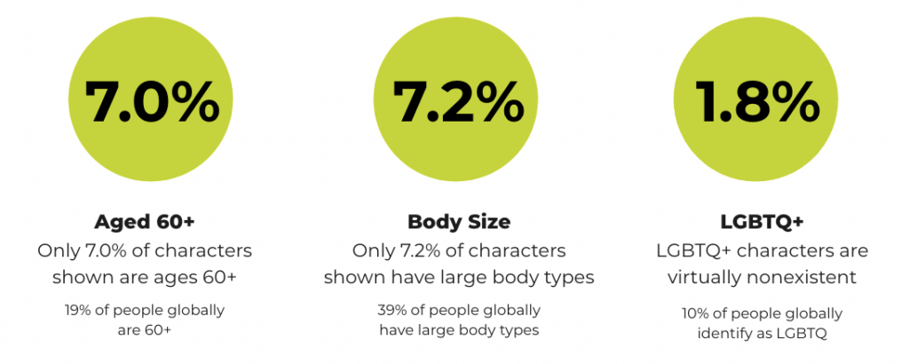
Research from the Geena Davis Institute has suggested that while 19% of people globally are 60+, only 7.0% of characters in images in the media today are ages 60 and older. Similarly, 7.2% of characters are shown with large body types (though 39% of people globally have large body types), and only 1.8% of characters represent the LGBTQ+ community (while 10% of people globally identify as LGBTQ). That is just a small window into the lack of inclusion, making it even more important to be mindful when addressing the varying demographics within an audience. 

Chart showing the lack of representation in media for those who are 60+ years old, have larger body sizes, and identify as LGBTQ+.
Source: the Geena Davis Institute

In order to make the search for more inclusivity easier, you’ll need to make a conscious effort to narrow down not only what would best speak to a target audience, but also best represent your brand. Knowing the who and what sets the foundation for how to search for what we’re looking for.

Keywords control our results

When conducting an image search on any platform, keywords help narrow the search by allowing the algorithm to better understand our visual needs. There are a few different algorithms running that control how our search results. The primary algorithm is based on keywords, popularity, and engagement — essentially, how many times a photo has been downloaded. 

This also means that based on historical bias, the highest popularity and most engagement on images results in highlighting that historical bias e.g., a range of potential white people with a few token people of color included. This means we might not get offered the images that best represent our target audience or brand right away.

In order to help counteract the impact historical bias has had on image search results, stock photography platforms such as Getty and Shutterstock have created a secondary algorithm. This secondary algorithm looks at the region where the search is being made and tries to match that region’s racial demographic when providing the results.

This is one action the platforms have taken to help us in our search for more inclusive images, but what else can we do? Add detailed keywords. 

When we don’t have the ability to add filters detailing ethnicity, sexuality, or physical and mental impairments, keywords should be prioritized to help refine our search for more inclusive images. For example, searching for a “person walking” may lead to various people walking, and they will most likely be white individuals. If we change our search to “black person walking”, “latino person walking”, or “mature adult walking” it allows the algorithm to refine our search based on keywords.  

Where to look for inclusive images

Because caucasian individuals are overly represented on stock photography sites, sometimes keywords don’t always lead us to our perfect image. Below is a list of free and paid resources that allow for more diversity. 


CreatHER Stock:

Run by founder & brand designer Neosha Gardner and photographer I’sha Gaines, this authentic stock site is a finely-tailored “for-us-by-us” set of lifestyle and business visual content or images featuring Women of Color. A subscription runs $10/month, with the option for more advanced plans at a higher fee. Although a subscription is required to access a majority of the photography on this platform, they do have a section of select “freebies” one can download. 


Homepage for pocstock.com

pocstock

pocstock is a global media company committed to creating and delivering premium stock photos, videos, and illustrations where people of color are front and center. They have flexible pricing plans so you can access their 150,000+ assets within your budget.


Nappy.co

​​Nappy.co is a free stock photography site dedicated to making it easy for companies to bring people of color into their designs, presentations, and marketing collateral.


The Gender Spectrum Collection

The Gender Spectrum Collection is a free image sourcing resource intended to help media better represent members of non-gender conforming communities. This collection helps depict people not necessarily defined by their gender identities, but rather simply people with careers, relationships, talents, passions, and home lives, just like everyone else in the world.


Pexels

Pexel is a well-known stock photography site with no subscription required. When it comes to diversity and inclusion they have created an environment where underrepresented communities have an opportunity to shine … as long as you include the ethnicity in your search. Multicultural, LGBTQ+, and impaired individuals are represented. 


Gallery Stock is a subscription-based stock photography with an extensive collection of images accompanied with an extremely detailed filter to refine the search. Their subscriptions prices vary based on the needs of various users. In contrast to a majority of its competitors, Gallery Stock has the option for a custom shoot. This is a great option if you don’t quite find what meets your needs amongst all the resources at hand, don’t have a photographer, and have a budget that allows for custom shots. 


Getty Images

Getty (also owner of Shutterstock) is one of the largest and most well-known image sourcing platforms, and as such, has a great depth of diverse and inclusive images, videos, and animations for all demographics. For inclusivity, specifically Project #ShowUs, project is a category dedicated to providing more inclusive imagery. Getty also has a meticulous filter system that allows you to add detailed filters to refine your selection during your search for diversity. There are a variety of paid subscriptions or packs. Because Getty is a pricier option, it’s best for teams, agencies, or anyone who consistently sources new images as there will be a high return on investment. 


Shutterstock

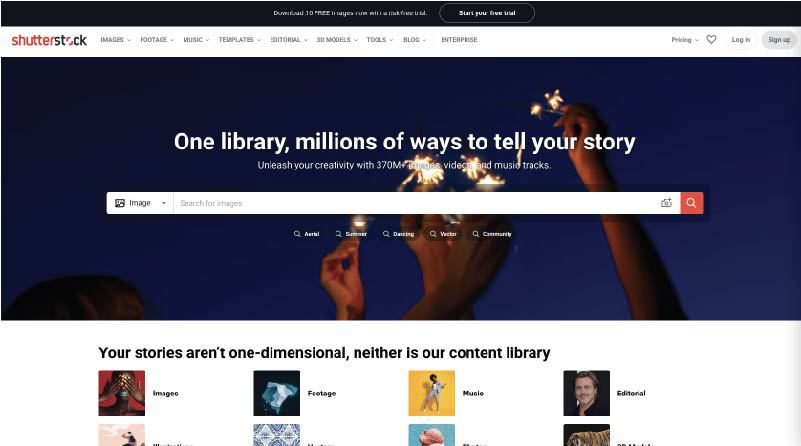
Shutterstock (also owned by Getty) is another well-known paid image sourcing tool from which many designers and marketers source. While there are a variety of images for inclusive imagery, one search in particular that really stood out for having an abundance of photos for such an underrepresented demographic — ”disability in tech”. When searched, the result leads to 1,714 high-quality photos, vectors, and illustrations. This collection makes sourcing images of those who may have disabilities working in tech that much more visible.


Adobe Stock

Adobe Stock is another well known source amongst the creative community as it is part of the Adobe platform. This is a source that is recommended for teams, agencies, or anyone who consistently sources new images as there will be a high return on investment. Although Adobe is not equipped with detailed filters, they do have an abundance of images. Using keywords will make those diverse images more visible within your results. 


Flickr 

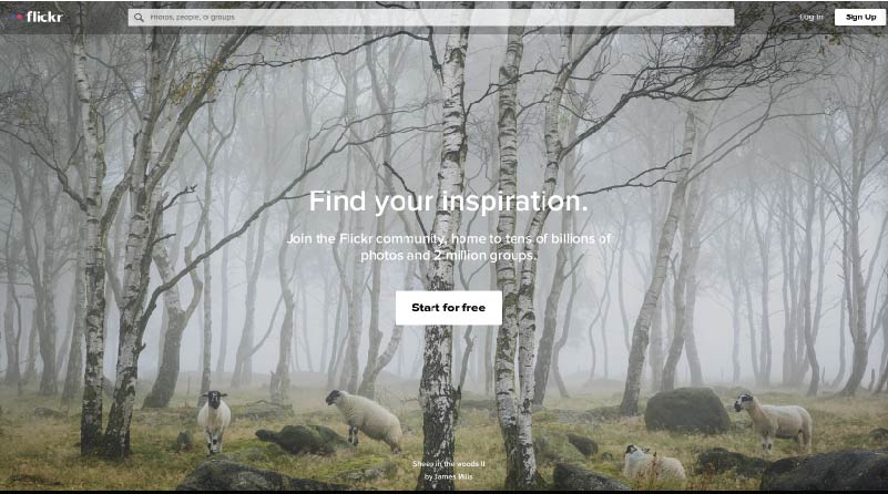
Mapbox has taken to Flickr, a stock photography sourcing and sharing site (much like Pinterest), to create a board of more inclusive imagery. They recently launched a collection dedicated to “Queer in Tech” in order to promote the representation of queer and gender-nonconforming individuals in tech. As a demographic that is often underrepresented throughout the industry, Flickr has created an opportunity to help shift that statistic using a collection of images ranging from collaboration and teamwork, leadership, design, engineering, to mobile development.

The inspiration for this collection arose from a Twitter post about a board created by Stephanie Morillo and Christina Morillo dedicated to Women of Color (WOC) in Tech, also an underrepresented demographic within the industry. The collection, titled #WOCTechChat, has a wide range of WOC in various technical professional settings. 

Flickr in itself is a useful and free image sourcing tool with the option for a pro subscription.


Macro

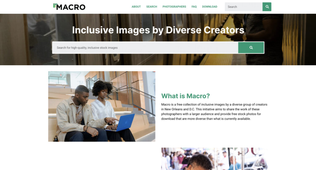
Macro is a new and emerging stock photography project providing free stock photography to its visitors. The platform allows users to download diverse imagery, captured by diverse photographers. Macro benefits communities by ensuring the photographers themselves are paid and have a full profile to showcase their work and information in order to reach potential new clients or opportunities. 

“I think diversity in front of the camera is easy. Diversity behind the camera is difficult. Often black or trans photographers see the world very differently, even behind the lens.”

Zora Khiry, New Orleans, Macro featured photographer

Diverse images exist to support your brand

Brands should create content that speaks to their audience as a whole. Young, white, straight, able-bodied, cis-gender men in imagery are very common, but not representative of every audience. Hopefully these resources will assist you in finding images that best represent your brand and give you a more inclusive voice for all demographics within your audience. 

Inclusive & Accessible Forms

Imagine you’re just outside of a coffee shop. You can smell the warm smells of coffee and teas, and freshly baked cookies. The air outside is brisk and the promise of tasty warmth is too much to resist so you go to enter the store and… 

  • someone is standing in front of the door saying “you don’t belong here”.
  • you are allowed in, able to order and pay but you have to let them call you “Lamp” 
  • you are allowed in, able to order and pay but only if you order in gibberish — and you must take whatever they think you ordered.
  • you enter the shop but are not told how much the coffee will cost and you’re not allowed to pay for it anyway.

Seems like a pretty awful experience, right? When we reach out to our website users to ask them to engage with us it’s like saying they should come in and buy a cup of coffee. And when the experience is not inclusive… well, I think you get the idea.  

Your website is the doorway to your organization. From higher education, to non-profit, to commercial establishments, you don’t want to turn people away because a form isn’t inclusive. 

What does it mean to be inclusive?

One of the key challenges is the intimidation surrounding the term “inclusive.” Some leaders simply don’t know where to start, and may be tempted to do nothing rather than risk taking a misstep. In reality, this approach is like the coffee shop owner continuing to call someone the wrong name because they are afraid to ask that person what their name is. Instead, it’s a better approach to admit you may not get it perfect the first time, but that you are open to learning. 

While it might seem vast and impossible to account for all the variables, and there’s a risk of not doing it correctly the first time, doing nothing is not an option. We live in an increasingly diverse world, with people coming from different cultures with different naming conventions and needs, and we have to accommodate different standards to include as many people as possible. You are responsible for how you present your information. That means that the answer is to find a way to make this easier to adopt into your organizational culture.  

In this article we’re going to break down inclusivity into three easy to manage concepts:

  1. Identity
  2. Accessibility 
  3. Usability

From here, we’ll discuss how to apply this to your website’s forms. Improve your website and your culture with greater understanding and empathy by knowing how to better respect your users so we can all enjoy a great cuppa and a cookie. 

Identity

I take my coffee seriously and no one can tell me how to take it. I don’t take it the same way as I did at 14 (yes, I regularly drank it back then) as I do now. And that’s just coffee. How can we impose, even ‘harmless’ limitations, on the important aspects of someone’s identity if we wouldn’t want our coffee order defined for us?

Every website visitor looks at your site through the lens of their identity and the experiences that have helped shape their perception of that identity. But how can we break that down? We cannot but we can focus on key areas that make it easier to be more inclusive to all.

  • Gender 
  • Cultural 
  • Ability 

But what do those terms mean? 

Gender identity is the understanding that the societal imposition of binary gender assignments, or specific roles/limitations associated with an assignment are exclusive and unjust. The acceptance of the idea that gender is binary is that it’s “just how it has always been,” but studies of ancient histories show that to be false. It is just how it has never been.  

Cultural identity shapes who we are in relation to where we come from. Though racial background is an aspect of this, this also includes focuses such as language, religion beliefs and other aspects by which one defines their personal history.

Ableism assumes a person’s abilities: physical, mental, environmental or otherwise. Going back to our coffee shop: it would be like the stairs to the doorway that assumes all those who want to purchase coffee and a cookie have the ability to ascend those steps. Ableism is often hidden in the most innocent language. The way in which we navigate the world around us, online or off, impacts how we interpret content. 

This leads us to our second point: accessibility

Accessibility

Accessibility has gotten a lot more press over the past few years, and though most of the press has been on the legal side, it has a greater impact than that. It can be very much like being told to buy something without being told the cost or having the ability to pay. Like the whole of inclusivity, this can feel like a lot but really, it’s based upon one principal, POUR:

  • Perceivable
  • Operatiable
  • Understandable
  • Robust

It basically means that users, regardless of ability, need access to an equal online experience. Here are some examples of challenges that may impact the usability of your site:

  • Cognitive: ADD, ADHD, ASD, Alzheimer’s etc.
  • Mobility: Parkinsons, ALS, Muscular Dystrophy
  • Visual: partial or complete blindness, color blindness, vertigo
  • Audio: partial hearing loss, deafness

Let’s talk about that coffee shop more — moving onto cookies (because who doesn’t love the occasional cookie?). Each of these challenges, alone or in combination, can impact the overall usability of a website. Website content that is unable to be navigated with assistive technologies (such as  those that do not use a mouse) is as exclusive as a person standing at the doorway to your favorite store saying “you, you cannot go in there. You don’t belong. We don’t think it’s important for you to come buy a cookie.” We wouldn’t do that in real life, we cannot do this online. 

Usability

User experience has been a focus for years and it goes beyond accessibility to overall usability. Some additional ways usability can be impacted include:

  • Low bandwidth
  • Browser level blockers or plugins
  • Other environmental factors from lighting, noise, and those that may distract the mind or limit mobility.

An overall inclusive form takes these considerations into account as well, acting like the awning over the shop’s door. 

How to make inclusive forms

In our coffee shop example, to know if the shop was inclusive we’d look at the doorways, signs and images, we’d see if there was room for us to wait in line and to pick up their drinks. We’d move through a space to make sure the shop itself was set up for us to go in and buy that cup of coffee and a cookie. We’d know, walking through there, what we are doing and why.

This is not so different online. The first step to making your forms inclusive is to really think about why you are collecting information. 

  • What is the strategically chosen goal or KPI I am focused on when I am asking these questions? 
  • How will the information I am collecting help me reach that goal or KPI? 
  • Am I asking questions I don’t really need the answer to?

In many cases we find ourselves wanting to collect information on a form to help us get to know our users better, to build better personas and the like. We don’t have the small talk about the day as the coffee is poured to learn about our customers, so, online we try to get more info at each touchpoint. We recognize that information can be valuable when it comes to learning about your customers. The idea is that digital connections and trust have to come in another form. As an industry we’re coming to this with greater respect for the end user’s right not to share or be forced to check boxes that do not align with their identity. 

Here are some common form fields to think about when considering your approach:

  • Honorifics: often the first field on a form, it can set the stage for the rest of the experience. Expand your options to include non-binary as well as professionally respectful selections such as  Dr., Mx., Rev.
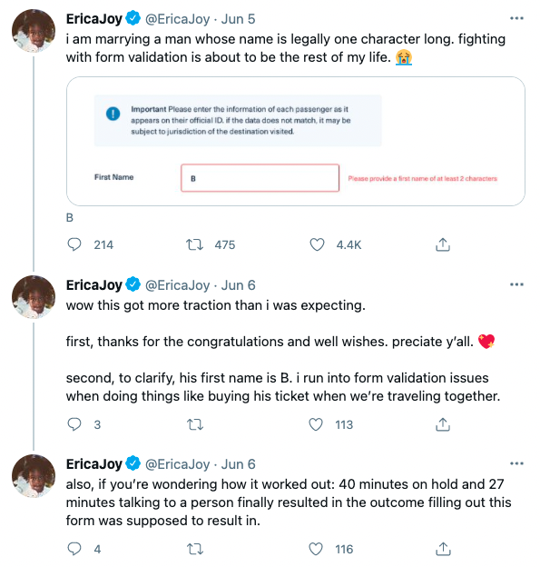
  • Names: how we call ourselves matter. Overall name fields need to lose many of the restrictions we place on them. That means no minimum (so that individuals with last names such as Yu are validated) or a maximum (Balasubramanian and other longer names have no reason to be abbreviated) character limit can be imposed. Some names are hyphenated or have apostrophes which can be flags as having special characters.
    Additionally, be mindful when using validation as history is full of people with names, such as Crazy Horse and Black Hawk that can teach us not to make assumptions. The easiest way to accomplish this is to allow for a single name field without character limits and minimal, if any, validation requirements.
  • Pronouns: there are more than binary genders and some individuals may have more than a single set of pronouns. Start by adding them/them to the selections and allow for these options to be presented as checkboxes to allow for individualized experiences. Be mindful of how these fields are asked for as well; they are not “chosen” pronouns, they are simply a person’s pronouns. 
  • Gender: do you need this information? If you are not an organization that requires a gender to perform its duties, consider adding “I’d prefer not to say” and making this an optional field. If you’re a medical institution, perhaps biological sex is a necessary field and gender may play into how a medical situation is discussed (ie: a transgendered man becomes pregnant). If you do need this information, be mindful and respectful in the words chosen and what those words mean to the end user.
  • Race: many histories tell the story of newcomers imposing racial identities on peoples without respect to how they identify themselves. This still echoes in many forms as they collect this data. To break away from those impositions, allow for a wide variety of options, acknowledging differences between similar sounding options: for example “Black” may not be the same as “African American” and “Hispanic” may not be the same as “Hispanic” or “Latin(a/o), & Latinx”. And always present this information with the ability to select multiple options. 
  • Relationships: ensure that when asking for an individual’s relationship to another we continue this practice of respect: use “spouse” over “husband/wife”, use “parent/guardian” over “mother/father”, “child” over “son/daughter” and “sibling” over “brother/sister”. This sends an immediate message to the user that you respect those in their lives. 
  • Contact Information: if collecting email addresses or phone numbers, do not limit character counts as this may discourage those with longer names and/or phone numbers originating from a country different than yours. If you intend to call someone, please ask for timezone information.

In real life most of us are nimble and practice so many of these methods: you’d be a great coffee shop owner and we’d all love buying coffee from you. Really, this comes down to doing more online of what we do when we are face to face. 

And this isn’t theoretical. Here’s an example:

And here is a recent example where someone with a last name of only two letters can’t fill out a form:

An example of a Twitter user demonstrating a non inclusive form.

This is no different than someone standing in front of the coffee shop denying you entrance. If you expect your users to provide you information you need to ensure barriers to entry have been removed. 

How to make accessible forms 

On the weekends I love really dark roasted coffee with (preferably raw, local) honey in it. The bitter sweet warmth fills my soul and fuels my morning. But imagine you’re behind me in that shop. I’m at the station off to the side where we’re adding in sweeteners and getting napkins and what not. You see that the honey jar is on a shelf just out of my reach. I cannot get it. Would you, presumably being taller than I, help me? Again, in real life you’re wonderful and you’re all about accessibility; it’s just bringing these practices into our digital lives. And it’s important; more than 20% of adults in the US and Canada self-identify as disabled, and worldwide that percentage is nearly the same. 

And consider this: all users are differently abled from time to time due to temporary or environmentally controlled factors, like a broken wrist, or being on a noisy train. 

Here are a few things to look out for to ensure your forms are inclusive to all users, regardless of abilities. 

  • Keyboard Navigation: ensure all form fields are able to be navigated to (and away from) only using a keyboard. From assistive technologies to broken track pads — this is a must do.
  • Form Labels: include descriptive and meaningful form labels to alert all users as to what is expected of them.
  • Instructions: create clear and concise indications as to what you’re hoping to accomplish, how the data will be used, and what you are hoping the user to share. 
    • Example: Asking for a number.
      • Please indicate what kind of number you’re asking for: phone, zip code etc. 

Though progress bars can be nice, they are not required. It’s more about making the expectation as to what information is needed from the end user in each step clear. 

  • Error Messages: non-visual users won’t perceive the visual error message.  Make sure that it’s location makes sense in their journey without having to backtrack and search for why something isn’t working.
  • Time Limits: time limits can create a barrier for some users. Determine if this is even necessary, and if so, look for ways to break the form into smaller, saveable pieces to allow users as much time as they need to complete the journey.
  • Contrast: many forms try to use stylish, grayed out text. A grayed out button or text is acceptable if it’s an inactive element that is not usable but if a user is to derive information about the form or interact with a field, proper color contrast is required.

Human-Centric Respect

Meeting our needs is the most human of qualities. It doesn’t matter if it’s succumbing to the desire for a cup of joe and a treat or accomplishing a task online; if we need to complete a task we must feel welcome and able to do so. Overall it’s important to keep the forms, and all aspects of your user journey, human focused. Mindful choices that show humility on the part of your organization indicate that your users are of value to you — not only you to them. We need to start with our language, user phrases of “people of” and “people who” — acknowledging that the individuals and not an imposed demographic label is what is important to you. 

Forms are asking your users to provide their personal data as they engage with your site. An inclusive approach breaks down barriers and builds trust. It’s a big world and we’re excited to make connecting with all those humans in it a little easier. Reach out if you need help with inclusive forms or overall inclusive content strategy. 

Want more related information? We’re big on inclusion and accessibility here at Kanopi. Here are a few related articles:

50% Of All Big Projects Fail, including Websites. Why?

Marketing leaders have the best intentions going into an expensive and large six-figure website overhaul. However, according to the Harvard Business Review, as many as half of big projects like these are considered failures when all is said and done. And you’re left wondering…

  • Why did this take longer than I was told?
  • Why was more funding needed than was estimated?
  • Why were there so many surprises and scope changes?
  • Why do I feel so burned by the agency my team selected?

Now you find yourself facing down another big website overhaul and all the risk associated with it. How will you feel confident it will be successful this time? How will you be sure you won’t be left with heartburn and the same frustrating questions as last time?

In my 15+ years working in this industry, I’ve learned there are three key elements to ensuring a big website design and development project is successful.

Think of it like a three-legged stool…

1) Stakeholder Alignment

Performing candid and skillfully focused stakeholder exercises which tease out the goals and intentions of important leaders in your organization. These exercises force invaluable conversations, and ultimately lead to buy-in.

2) User Experience

Target audience data mitigates risk by replacing assumptions with defined needs and specific pain points. These eventually inform the site experience that’s most helpful to each audience.

3) Design & Development Planning

With stakeholders aligned and users defined, design and development planning can begin using models such as sitemaps and wireframes. Technical and functional requirements can start to be dialed in as well.

Unfortunately, most agencies focus only on one or maybe two of the legs described above, resulting in a shaky foundation to your project. But not Kanopi. We focus on and thrive at all three, and we make it fun along the way. 

We call this endeavor the Website Growth Plan (WGP). Through this proven process, we’re able to answer questions such as:

  • I know my site is not working for me, but how do I improve it? 
  • I will need to migrate from Drupal 7 to D8 or D9, but what will that budget look like?
  • How can I improve my SEO? How is my site performance now?
  • I need a new content strategy, but how can I do this properly when I am already so busy?

After taking factors (like the ones illustrated below) into account, the WGP delivers an all encompassing action plan for your website. By setting expectations early and often, this helps avoid the heartburn-inducing questions you were left with after your last website project.

Which website growth plan is right for me?

More information can be found here, but below is an overview of our various plans:

Website Reimagine

This plan is a concentration of UX research, content strategy, and a bite-sized amount of design. It helps formulate a game plan that drives clarity for the team and gets some early design thinking on the table. Plus, it is actually a wonderful use of time as it is the first step in an overall design and development project, as the deliverables include a roadmap to launch.

Usability and Design

This is a data-informed optimization plan incorporating user experience, visual design and content recommendations delivered in an actionable plan for next steps.

Content Strategy

Amplify your message through a powerful analysis of important information, including user needs, competitor analysis, personas and Customer Decision Journey mapping — from Awareness to Advocacy. This plan focuses on storytelling content, user experience, visual design recommendations, and more.

Drupal 7 Transition Plan

You should feel secure planning and budgeting for the transition from D7 to D8/9 or to WordPress. This plan removes the “unknown” and illuminates the details for your organization to make an informed decision and take action on next steps.

Technical SEO

This is a deep-dive to analyze your website’s SEO technical health and set you up for search engine optimization success.

GDPR & Compliance

The General Data Protection Regulation (GDPR) is a legal framework that sets guidelines for the collection and processing of personal information from individuals who live in the European Union (EU). This plan gets you compliant.

Accessibility

Reach your audience and meet compliance with Website Compliance Accessibility Guidelines (WCAG 2.1 AA or higher) through a skillful analysis and recommendations action plan.

Technical Review

A comprehensive technical deep-dive into your site’s code and technical health to provide foundational recommendations for optimization and stability.

And if one of those doesn’t quite fit? Don’t worry. Our nimble nature finds us creating custom packages for our clients to best meet their needs. Contact us to chat about which plan is the best fit.

What is an Inclusive Content Strategy?

You’ve likely invested in your content strategy to some extent, and know it’s an important part of any good business. But the term ‘inclusive content strategy’ may not be something your organization has considered. Many value-driven organizations are overlooking this vital part of creating content that puts their audiences’ unique needs at the forefront. 

The Content Marketing Institute defines it this way: We define inclusive marketing as creating content that truly reflects the diverse communities that our companies serve. It means that we are elevating diverse voices and role models, decreasing cultural bias, and leading positive social change through thoughtful and respectful content.

What is Inclusion?

“Diversity is being invited to the party. Inclusion is being asked to dance.”

Verna Meyers, Public Speaker

Often Diversity and Inclusion are lumped together, or used interchangeably. But it’s important to make the distinction, especially when creating an Inclusive Content Strategy. 

  • Diversity: Refers to the vast array of human differences.
  • Inclusion: Refers to the intent of individuals or systems to actively include and support this vast array of differences.

In other words, diversity is the “what” and inclusion is the “how”. And, that’s exactly what we’re going to cover in this article: how you can create and implement an Inclusive Content Strategy.

Inclusive Language 

The foundation of an Inclusive Content Strategy is inclusive language. When we strive to understand the ways that language often unconsciously makes assumptions about people, we can work to increase inclusivity. There are many ways we unintentionally reinforce dominant norms (like language related to gender, sexual orientation, race, class, ability/disability, and age).

To really understand what it means to use inclusive language, it’s helpful to compare it to language that isn’t inclusive. 

Ableist Language

Ableist language is any word or phrase that devalues people who live with a disability. Though often inadvertent, ableist language suggests that people with disabilities are abnormal.

Inclusive content strategy takeaway:

  • Use “people with disabilities” instead of “the disabled”
  • Use “people living with HIV/AIDS” rather than “AIDS victims”
  • Use “people who use wheelchairs” rather than “wheelchair-bound” or “someone confined to a wheelchair.”
  • It’s become rather common to use descriptive words like “crazy,” “dumb,” or “retarded” in the workplace, Using “crazy” might seem harmless, but giving negative value to words like crazy or insane can marginalize people.
  • ADD, ADHD, and OCD are common terms that are misused and can be hurtful. Obsessive-compulsive disorder is a mental illness that means so much more than a knack for organization. It is an obstacle that some people live with every day. Use words like “clean” or “organized” instead.

Gendered Language 

Another aspect of inclusive language is being sure words are gender neutral. Use words that encompass all genders, rather than only two.

Inclusive content strategy takeaway:

Use gender neutral terms:

  • Nouns
  • Titles and names
  • Pronouns

Gendered words and their better alternatives:

  • Man the booth → Work the booth
  • Man Hours → Work hours
  • Freshman → First year student
  • Stewardess, Steward → Flight attendant
  • Man-made → artificial
  • Mother / Father → Parents
  • Waiter, Waitress → Server
  • Sissy → Coward
  • Forefathers → Ancestors
  • Mr. and Mrs. → Mx.

Racial Undertones

Our language is littered with symbolism of white as positive and black as negative. Let’s eliminate using the word “colored” when describing people, instead use “people of color,” which is a widely accepted umbrella term that includes any non-white person.

“Gypped” comes from the word “gypsy,” which refers to Romanian people who are often characterized unfairly as swindlers. 

“Ghetto”  is suspected to derive from an Italian slang term for waste, and dates back to the concentration camps of World War II. it also has been used to label the neighborhoods that marginalized communities were forced to inhabit due to social and economic disadvantage. Classism and racism come into the picture when you call a place, or a person “ghetto.”

Cultural racism in phrases like “culturally deprived,” “economically disadvantaged” and “underdeveloped” are other terms which warps the truth to and frames a sense of  superiority.

Inclusive content strategy takeaway:

Avoid negative or demeaning language:

These common phrases unfortunately have negative origins:

Privilege

There’s also a lot of hidden bias around the idea of privilege when it comes to our language

For example, we shouldn’t assume that all people have graduated from high school and/or gone to college (or will go to college after high school), and we should use language that keeps this in mind.

It’s also important to use language that does not assume a certain level of financial means or certain type of vocation. For example, we should not assume that everyone is presently employed, has a stable living situation, or can afford to meet their basic needs. Using phrases like “real job” and “honest living” can be problematic by perpetuating discriminating against certain sectors of the labor force.

Inclusive content strategy takeaway:

Consider areas of privilege when writing content:

  • Level of Education
  • Socio-Economics
  • English as a second language
    • Situational privilege 

Be mindful in your writing.

It’s unfortunate how many non-inclusive examples there are in our language that have snuck in over the decades, and we aren’t even aware of it! This is why it’s important to be mindful of what you write.

Want to learn more? I’ve created an entire presentation around inclusive content strategy. 

If you need help creating an Inclusive Content Strategy, we’re here! We’ve helped many organizations create accessible and inclusive websites. Reach out to us to start the conversation.