
Accessibility is a growing demand on the internet as our world shifts from in person to online in a variety of aspects. The pandemic has escalated that shift, and it’s becoming increasingly clear that all websites need to be accessible regardless of legal requirements.
While WCAG 2.1 compliant websites are coded following accessibility guidelines, it’s easy for a site to slip away from compliance through regular content entry. Or perhaps accessibility isn’t something that you’ve prioritized before and you’re just getting started on making improvements. Either way, here are five simple actions you can take right now to improve your website accessibility from a content perspective.
- Review / Revise Acronyms & Abbreviations
- Remove All Caps
- Use Sequential Heading Structure
- Alt Text
- Descriptive Links
Review / Revise Acronyms & Abbreviations
Acronyms and abbreviations are common in a number of organizations and industries. What’s often overlooked is how those are interpreted by screen readers.
I once came across some website content where they were comparing Generation X to Generation Z, but they used the abbreviations “Gen. X” and “Gen. Y”. Screen readers will often try to expand an abbreviation for clarity. When I tested the content, I discovered it was being read as “General X” and “General Y”. So while the original intent was to save on space, the meaning was confusing to anyone using a screen reader.
Likewise, some acronyms can be troublesome. P.O.W. would be read as “Prisoner of War” while POW would be read as “pow!” like the comic book action. It’s a good idea to read aloud to yourself the content on your website, and consider the potential for misinterpretation by someone hearing rather than seeing it.
Remove All Caps
Whenever I think of all caps, I think of AmyJune Hineline, former Kanopian and winner of the 2021 Aaron Winborn Award (she really loves that being mentioned). She used to regularly remind us all of how all caps can be a common source of frustration and miscommunication with the hashtag #NOWTHATCHERISDEAD. AmyJune would then ask, “Who’s dead? Cher or Thatcher?”
Switching to all lowercase in this circumstance won’t help either. If you are looking for a way to make hashtags more readable, capitalize the first letter of each word (NowThatcherIsDead). It’s called Camel Case (or Pascal Case, depending on who you ask) and it improves readability considerably. For the record, I promised AmyJune that if I ever had a child I would name them Cher Thatcher so the original hashtag would still be true when they passed. Problem solved.
Of course we typically use spacing and punctuation in website content, which helps alleviate some confusion, and all caps are typically used as an easy way to identify something as a heading or to indicate additional importance. But due to the uniform shape that capital letters give words, they become more difficult to identify at a glance and therefore reduce readability. Using Title Case (Now Thatcher Is Dead) is considered easier to parse, both visually and cognitively.
Use Sequential Heading Structure
HTML headings are structured similarly to an essay outline. Your page starts with an “H1” and should only have one of these. This is the heading that tells search engines and users what the focus of the page is. This is typically the title of your page or blog post. The remaining heading values (H2 – H6) are used to identify the content hierarchy of the page.
Screen readers depend on headings to navigate a page, as users will typically bounce through the headings to find a section to read. If your page skips heading levels, or uses heading levels incorrectly, these users will not be able to correctly navigate your content.
- H1 – Page Title
- H2 – Section Title
- H3 – Subtitle
- H3 – Subtitle
- H4 – Subtitle
- H4 – Subtitle
- H3 – Subtitle
- H2 – Section Title
- H2 – Section Title
- H3 – Subtitle
- H3 – Subtitle
- H3 – Subtitle
- H2 – Section Title
Alt Text
Alternative text, commonly known as the alt text, displays when an image link is broken and can’t be displayed. And it’s far more useful than you may realize. Search engines use alt text to further understand the context of your web page and so it’s also useful for SEO purposes. But even more important, alt text is what’s read aloud by a screen reader. For someone with low or no vision, this description helps them identify the content of an image without needing to see it.
Decorative images, such as swoops or waves or other abstract design elements don’t require alt text, but your average image does. But not all alt text is created equal. When describing a picture, consider the purpose of the image and the feeling it’s meant to convey. Identify what is important to understand from the context of the image and the content around it, then articulate that in the alt text. Remember, if it’s valuable enough to show to a sighted user, it’s worth describing to users of assistive technology.
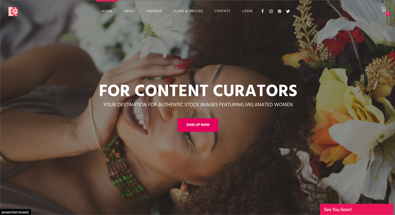
Take a look at this image taken by the James Webb Telescope, uploaded by NASA. The alt text reads, “A large pink, speckled galaxy resembling a wheel with a small, inner oval, with dusty blue in between on the right. Two smaller spiral galaxies about the same size are to the left, all against a black background.” This accurately conveys the image content without being too wordy.

Most CMS platforms offer the ability to easily add alt text to your images and it’s highly recommended that you take advantage of the option to do so. Visit your website’s media library and review uploaded images, updating as needed. Then remember to add alt text when new images are added and you should be good to go.
Descriptive Links
Links are plentiful on almost any webpage. From the navigation bar, to the footer, there’s bound to be several links leading to other areas of your website or even to external sites. One of the most common types of links seen in content is the “read more” link. Generic phrases such as “Learn More,” “Read More,” “View,” and “Click Here” offer little content to assistive technologies which often scan the links of a page and simply provide them to a user without the surrounding context.
For example, if your page has three cards for news articles and the links for each are “Read More”, assistive technologies may present them as “Read more, link, read more, link, read more, link.” That is useless to the user if they cannot visually see the title of the article that goes with the link.
In fact, this type of link is so discouraged, Google penalizes it when calculating a website’s SEO score. And yet this is an incredibly common practice. Even Kanopi’s website utilizes read more links in a number of situations. So how can you get around this ambiguity?
Ideally it’s done by having hidden screen reader text added in addition to the “read more.” You’ll find an accessible website often has additional content that’s hidden visually but presented specifically to assistive technology. Instead of reading “Read more, link,” the screen reader is presented with, “Read more [about our blog post on accessible design], link.” This is how we do it with Kanopi’s site, making it possible to use “read more” as link text.
But because this method requires some behind-the-scenes code, it’s more commonly used in templated areas that automatically present content with read more links. When you’re adding textual content to your site, you may just want to add a button or link to send the reader onto more information. When that happens, it’s important to remember the link may be reviewed independently of the content around it. Being descriptive will help your SEO and your accessibility.
I could tell you to “read more,” but it would be better for me to point you to an article about inclusive and accessible webforms.
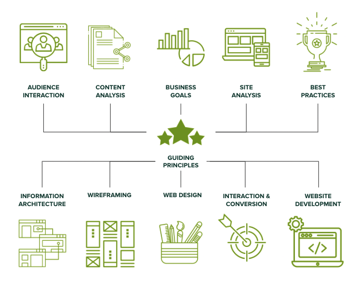
Beyond Content Entry
Accessibility is an absolute necessity as assistive technology opens up the internet to more and more people. If you’re interested in achieving a WCAG 2.1 compliant website, get in touch with Kanopi. We’d love to help you create a site that is accessible to all.