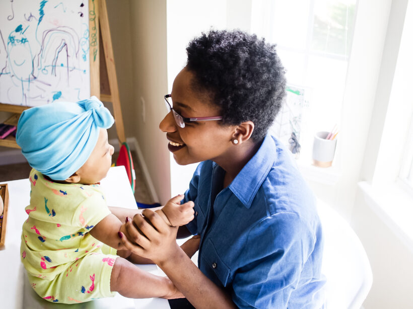

Diversity is a broad term. When used in relation to image sourcing and representation of content on a web design, blog post, press release, or other live content viewed by an audience, it’s important to address the full scope of diversity within the audience. This scope may vary based on the topic of the content. But to be inclusive we need to take into account the demographic of an audience from multiculturalism, age, identity, sexuality, and physical or mental impairments.
Images are the first step to capturing your audience’s attention. Content represented with images has been shown to have a much higher engagement than content without images. So while sourcing an image, it is critical that it not only properly represents the topic, but takes advantage of the opportunity to appeal to multiple demographics within your audience.
The demographic of an audience varies depending on the product, service, or information being shared with the viewer. While addressing inclusivity we should take into account what images will best help tell the story of our brand and best align with our target audience. Consider the following:
- Do they have disabilities or impairments of any type?
- Is the clientele of a certain age?
- Is the clientele of a certain gender?
- What are the gender roles we wish to portray or speak to (e.g. who is pictured doing the dishes or mowing the lawn)?
- Are we assuming romance is heterosexual?
Currently there’s a lack of inclusion in media
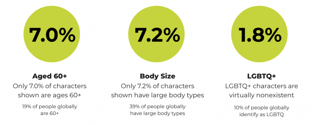
Research from the Geena Davis Institute has suggested that while 19% of people globally are 60+, only 7.0% of characters in images in the media today are ages 60 and older. Similarly, 7.2% of characters are shown with large body types (though 39% of people globally have large body types), and only 1.8% of characters represent the LGBTQ+ community (while 10% of people globally identify as LGBTQ). That is just a small window into the lack of inclusion, making it even more important to be mindful when addressing the varying demographics within an audience.
In order to make the search for more inclusivity easier, you’ll need to make a conscious effort to narrow down not only what would best speak to a target audience, but also best represent your brand. Knowing the who and what sets the foundation for how to search for what we’re looking for.
Keywords control our results
When conducting an image search on any platform, keywords help narrow the search by allowing the algorithm to better understand our visual needs. There are a few different algorithms running that control how our search results. The primary algorithm is based on keywords, popularity, and engagement — essentially, how many times a photo has been downloaded.
This also means that based on historical bias, the highest popularity and most engagement on images results in highlighting that historical bias e.g., a range of potential white people with a few token people of color included. This means we might not get offered the images that best represent our target audience or brand right away.
In order to help counteract the impact historical bias has had on image search results, stock photography platforms such as Getty and Shutterstock have created a secondary algorithm. This secondary algorithm looks at the region where the search is being made and tries to match that region’s racial demographic when providing the results.
This is one action the platforms have taken to help us in our search for more inclusive images, but what else can we do? Add detailed keywords.
When we don’t have the ability to add filters detailing ethnicity, sexuality, or physical and mental impairments, keywords should be prioritized to help refine our search for more inclusive images. For example, searching for a “person walking” may lead to various people walking, and they will most likely be white individuals. If we change our search to “black person walking”, “latino person walking”, or “mature adult walking” it allows the algorithm to refine our search based on keywords.
Where to look for inclusive images
Because caucasian individuals are overly represented on stock photography sites, sometimes keywords don’t always lead us to our perfect image. Below is a list of free and paid resources that allow for more diversity.
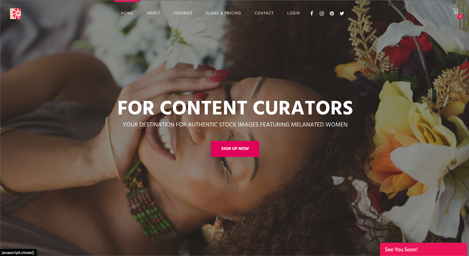
CreatHER Stock:
Run by founder & brand designer Neosha Gardner and photographer I’sha Gaines, this authentic stock site is a finely-tailored “for-us-by-us” set of lifestyle and business visual content or images featuring Women of Color. A subscription runs $10/month, with the option for more advanced plans at a higher fee. Although a subscription is required to access a majority of the photography on this platform, they do have a section of select “freebies” one can download.

pocstock
pocstock is a global media company committed to creating and delivering premium stock photos, videos, and illustrations where people of color are front and center. They have flexible pricing plans so you can access their 150,000+ assets within your budget.
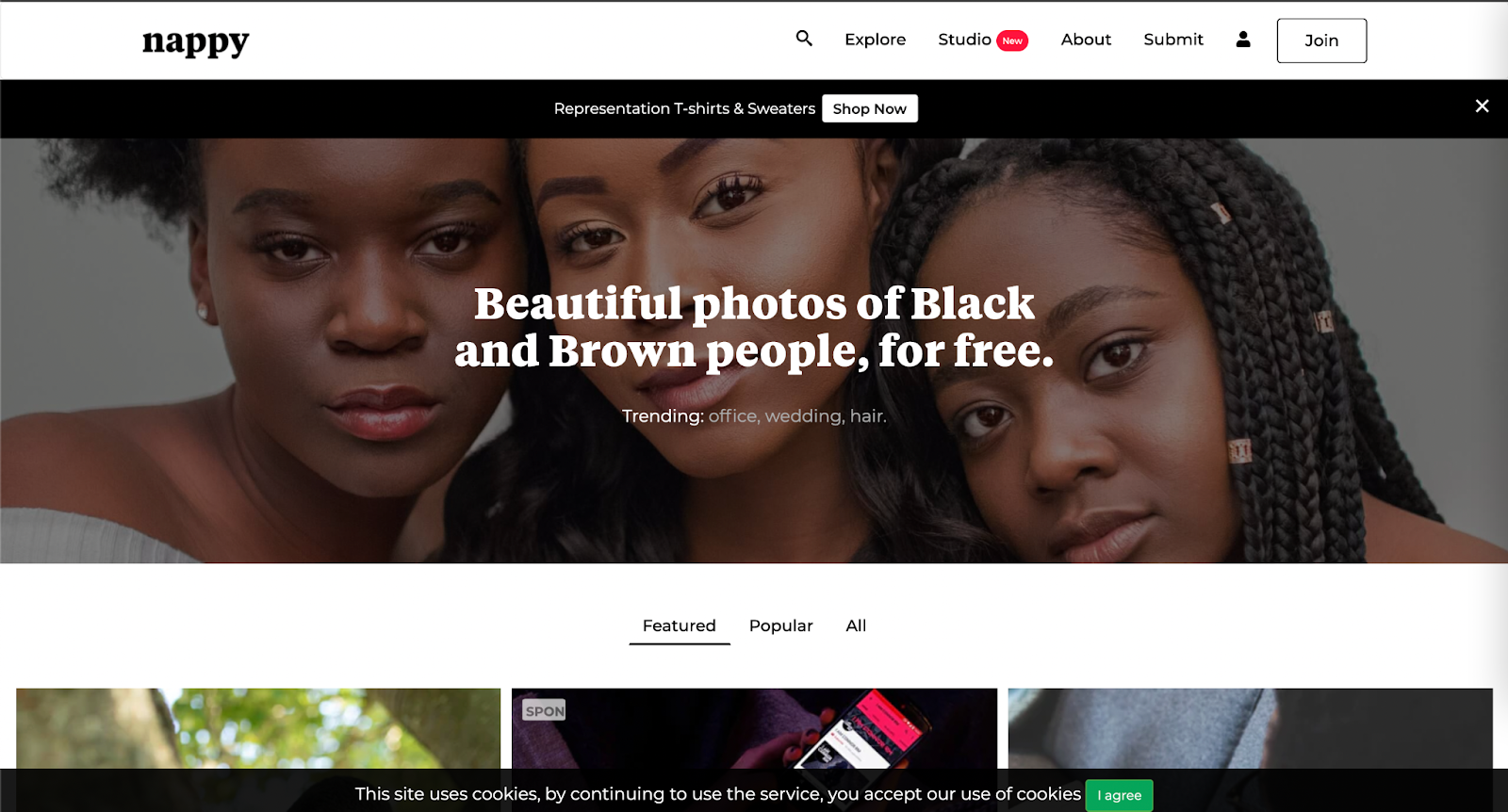
Nappy.co
Nappy.co is a free stock photography site dedicated to making it easy for companies to bring people of color into their designs, presentations, and marketing collateral.
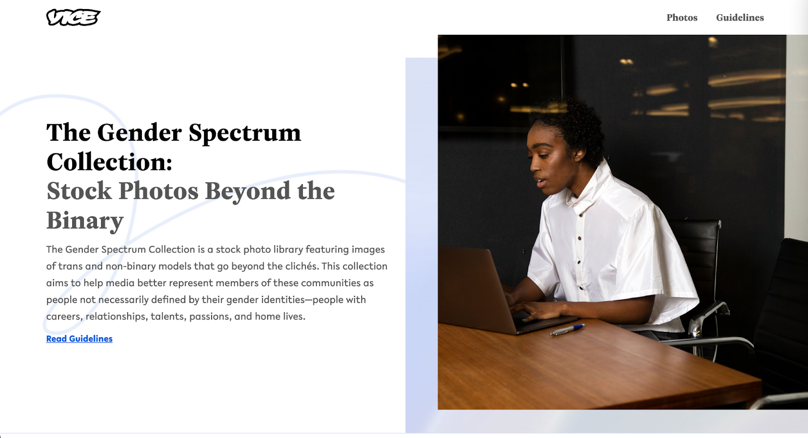
The Gender Spectrum Collection
The Gender Spectrum Collection is a free image sourcing resource intended to help media better represent members of non-gender conforming communities. This collection helps depict people not necessarily defined by their gender identities, but rather simply people with careers, relationships, talents, passions, and home lives, just like everyone else in the world.
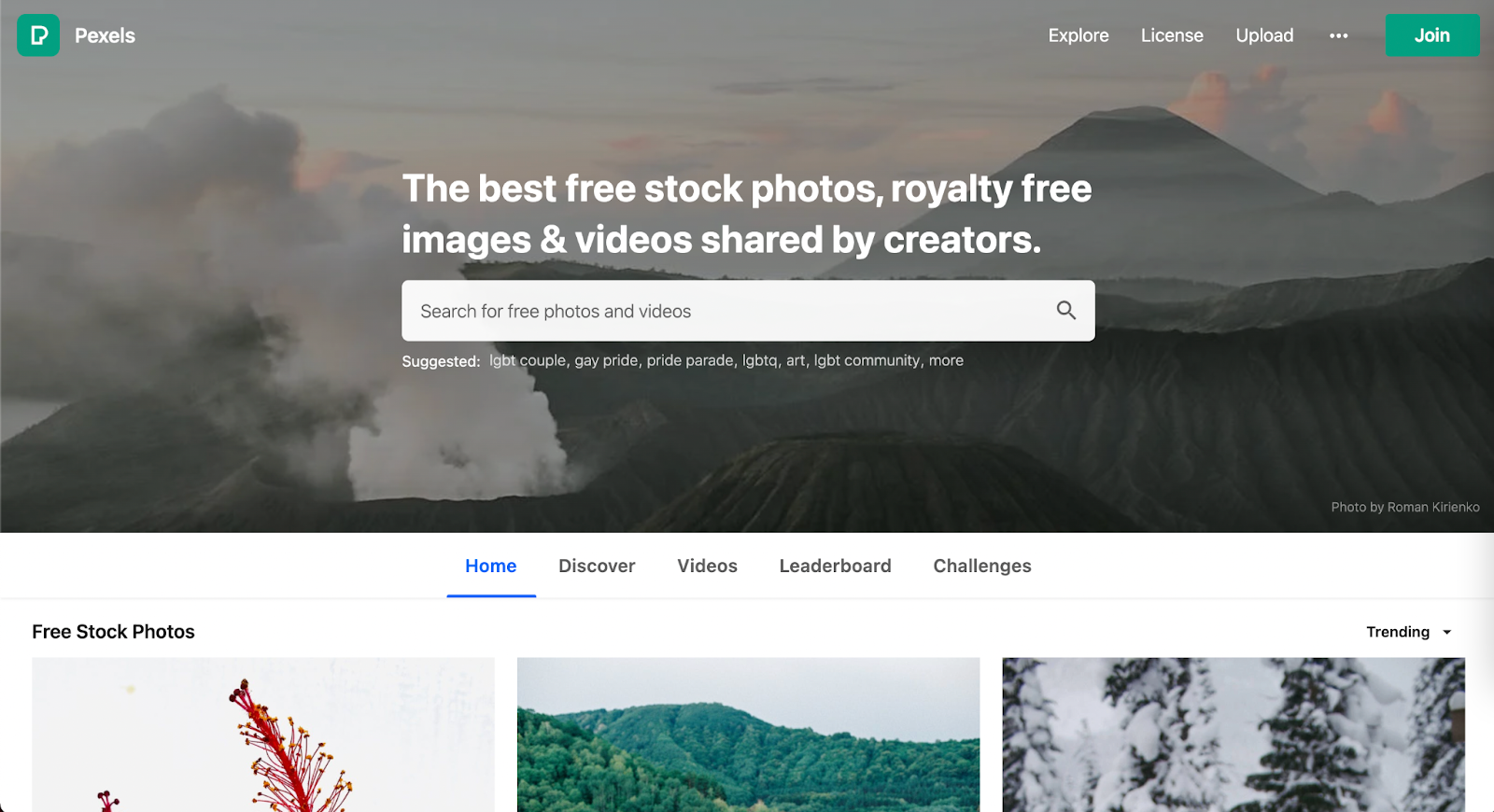
Pexels
Pexel is a well-known stock photography site with no subscription required. When it comes to diversity and inclusion they have created an environment where underrepresented communities have an opportunity to shine … as long as you include the ethnicity in your search. Multicultural, LGBTQ+, and impaired individuals are represented.
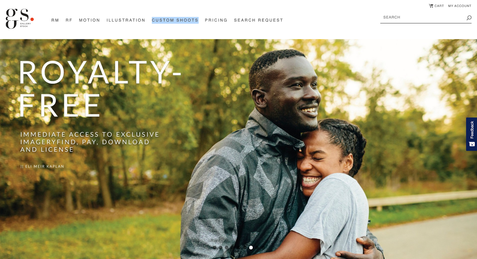
Gallery Stock
Gallery Stock is a subscription-based stock photography with an extensive collection of images accompanied with an extremely detailed filter to refine the search. Their subscriptions prices vary based on the needs of various users. In contrast to a majority of its competitors, Gallery Stock has the option for a custom shoot. This is a great option if you don’t quite find what meets your needs amongst all the resources at hand, don’t have a photographer, and have a budget that allows for custom shots.

Getty Images
Getty (also owner of Shutterstock) is one of the largest and most well-known image sourcing platforms, and as such, has a great depth of diverse and inclusive images, videos, and animations for all demographics. For inclusivity, specifically Project #ShowUs, project is a category dedicated to providing more inclusive imagery. Getty also has a meticulous filter system that allows you to add detailed filters to refine your selection during your search for diversity. There are a variety of paid subscriptions or packs. Because Getty is a pricier option, it’s best for teams, agencies, or anyone who consistently sources new images as there will be a high return on investment.
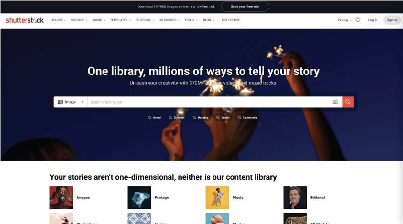
Shutterstock
Shutterstock (also owned by Getty) is another well-known paid image sourcing tool from which many designers and marketers source. While there are a variety of images for inclusive imagery, one search in particular that really stood out for having an abundance of photos for such an underrepresented demographic — ”disability in tech”. When searched, the result leads to 1,714 high-quality photos, vectors, and illustrations. This collection makes sourcing images of those who may have disabilities working in tech that much more visible.
Adobe Stock
Adobe Stock is another well known source amongst the creative community as it is part of the Adobe platform. This is a source that is recommended for teams, agencies, or anyone who consistently sources new images as there will be a high return on investment. Although Adobe is not equipped with detailed filters, they do have an abundance of images. Using keywords will make those diverse images more visible within your results.
Flickr
Mapbox has taken to Flickr, a stock photography sourcing and sharing site (much like Pinterest), to create a board of more inclusive imagery. They recently launched a collection dedicated to “Queer in Tech” in order to promote the representation of queer and gender-nonconforming individuals in tech. As a demographic that is often underrepresented throughout the industry, Flickr has created an opportunity to help shift that statistic using a collection of images ranging from collaboration and teamwork, leadership, design, engineering, to mobile development.
The inspiration for this collection arose from a Twitter post about a board created by Stephanie Morillo and Christina Morillo dedicated to Women of Color (WOC) in Tech, also an underrepresented demographic within the industry. The collection, titled #WOCTechChat, has a wide range of WOC in various technical professional settings.
Flickr in itself is a useful and free image sourcing tool with the option for a pro subscription.
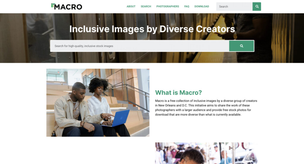
Macro
Macro is a new and emerging stock photography project providing free stock photography to its visitors. The platform allows users to download diverse imagery, captured by diverse photographers. Macro benefits communities by ensuring the photographers themselves are paid and have a full profile to showcase their work and information in order to reach potential new clients or opportunities.
“I think diversity in front of the camera is easy. Diversity behind the camera is difficult. Often black or trans photographers see the world very differently, even behind the lens.”
Zora Khiry, New Orleans, Macro featured photographer
Diverse images exist to support your brand
Brands should create content that speaks to their audience as a whole. Young, white, straight, able-bodied, cis-gender men in imagery are very common, but not representative of every audience. Hopefully these resources will assist you in finding images that best represent your brand and give you a more inclusive voice for all demographics within your audience.