
Every good, juicy story is built from three basic elements: a compelling beginning to draw the reader in, action throughout the plot to keep people engaged, and a strong ending that wraps up the story elements in a satisfying way.
Like a good story, your website needs to draw your desired audience in, keep the user engaged, and offer a means for them to take the desired actions to complete their journey, whether that means making a donation, purchasing a product, or applying for a job.
In this post, we explore how to write that story. Or in other words, how to define everything it needs to do to create a proper customer journey on a website. Utilize this no-fail approach to outlining the needs and requirements of your organization and audience to ensure that everyone gets the results they’re looking for.
Chapter 1: Defining your Audience
All websites must start by defining an audience. If you don’t know who you are writing, designing, or developing your website for, your story will read like a complicated mystery that doesn’t end well for your brand.
Start with two incredibly valuable and fairly simple exploration activities that will help you 1) uncover your user segments and 2) craft value statements for them.
You can uncover your user segments by working through these simple five questions:
- Who is this website / mobile app for?
- Why will they use it?
- When will they use it?
- How will they use it?
- Why will they keep using it?
As an example, we’ll use a Community Garden nonprofit organization looking to build a site to promote their events and information on healthy food choices.
Their target audience would likely be: Families and individuals looking for a way to eat healthy on a low income
Next, we’ll craft value statements, using a simple xyz formula:
For [target audience X]
that [cares about topic Y]
[your organization]
is a [your solution/product/service]
that [provides benefits Z]
The community garden would write a statement something like this: For families who are looking for a way to eat fresh and healthy food, Our Community Garden is an organization that provides opportunities for people to help grow, harvest and enjoy locally-grown produce.
Chapter 2: User Personas
User personas represent the different types of people who will interact with your website or product. These fictional characters can be based on real users or the types of users you’d like to attract to your site. Creating personas can help identify the features and functionality that will needed on your website to support user needs. HubSpot provides a great set of questions that can can be the basis for your user personas. In addition, we have a few tips for creating effective user personas below.
- Represent a user group for your website – Include existing clients or buyers. It can also be helpful to consider users of competitor websites.
- Write your personas as if they were real people with backgrounds, goals, and values. Include the four pillars:
- Geographical – country, city, population, density
- Demographics – age, gender, family size, occupation, income, education
- Psychographic – lifestyle, personal values, activities, interests, opinions
- Behavioral – occasions, usage, readiness
- Express and focus on the major needs and expectations of your most important user groups and don’t be afraid to prioritize them.
- Describe user’s expectations and how they’re likely to use the site
- Express common concerns and objections
Chapter 3: Tactics to Create User Personas
Here are some basic questions that can help to define your user personas.
- Define your priority initiative. What triggered the user to visit and browse your site?” Example: A flyer sent home from your child’s school about your weekend gardening program
- Identify the factors that will define success and what this will look like. What is the result or outcome they are expecting from visiting your site and what might prevent them from achieving this result? This could be easily finding information about dates and locations of weekend gardening programs.
- Frame out all the potential barriers (and don’t be afraid to be honest). Barriers could include a poorly designed homepage where events are difficult to find.
- Agree on your decision criteria. What criteria would the visitor use during their evaluation of your offerings? For example, ease of finding event locations and times.
- Map your conversion path.What is the key factor that will trigger the decision to act? What resources will they trust in helping them make a decision to move forward? For example, knowing that their child’s’ school is sponsoring a gardening day through the community gardening program may motivate the parents to participate.
Don’t forget to review your current data – it will speak volumes. Look at your site’s analytics for at least the past 6 months, focusing heavily on the “Audience Reports” within Google Analytics. This information can feed directly into your user demographics.
Additional approaches to acquire data include:
Interview your internal sales, customer service or support teams. Their interactions with your clients can provide a wealth of first-hand insight.
Administer a survey to your users. Set up a simple survey on your website through a third party program or webform like SurveyMonkey. Send the survey out to your email list to expand your reach and results.
Interview your audience. Establish a set of basic questions, then reach out to your users or clients to schedule an in-person, phone or online interview. Consider offering an incentive like a discount or coupon or small gift to make it easier to secure interviewees and to show your appreciation for their time.
The bottom line: any research is better than no research. It doesn’t have to be complicated or costly to be effective, so don’t skip this crucial step!
Chapter 4: User Stories
Start by establishing your organization’s objective (the action you want the user to complete on your site). Next, extract the objectives, needs, and desires of your users as defined in your user personas.
Then, fill out the following template:
As a [type of site visitor] I need a way to [do something] so that I can [benefit somehow]
Don’t forget to let your value statements be your guide to ensuring that user stories map to high-level user goals.
Chapter 5: Defining Features
What are the actions your users need to take on your website? These should correlate to features, which can include everything from downloading a program schedule, to contacting you for more information, to registering for a class online.
For example:
Action: Families need to be able to see a list of nearby gardening events that are appropriate for their children.
Corresponding website feature: An event content type that can be sorted by date, age range, and geographic location.
Happy ending
Using the information from your user personas, map each user’s tasks to create a feature and functionality document for your website. Through this process it’s common for the highest value features to be consistent across multiple personas and rise to the top. These become your site’s core features. Any additional features become your subset features. Depending on your budget and timeline, you can start by developing your site’s core features and save your subset for subsequent releases or when additional budget is available.
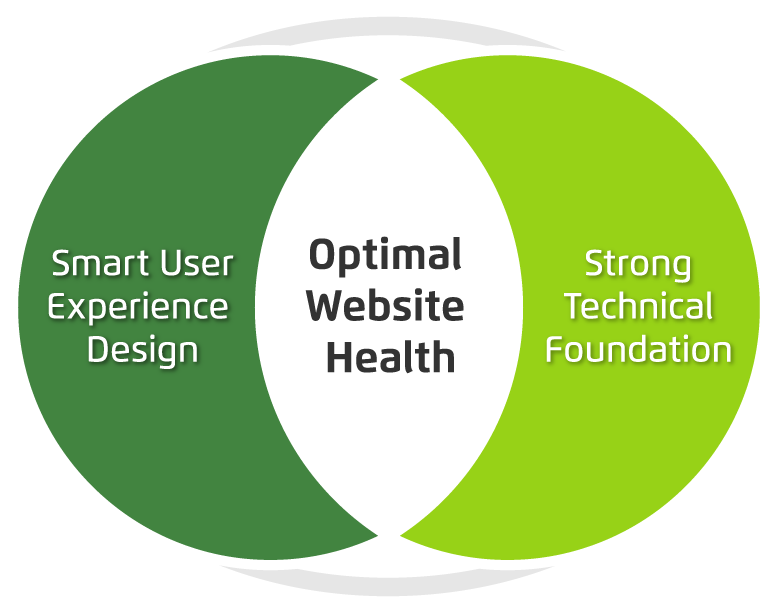
Finding the sweet spot between your organization’s needs, your user’s needs and your technical needs will ensure strong results and a happy ending for your website project.
If you or your organization needs assistance with creating a customer journey on a website, contact us today! We can work with you on any aspect of this process, from developing personas to crafting user stories to defining feature requirements.