








Woman enjoying a website on her computer

Website Musts: How to Define Everything That Your Website Needs to Do

Woman enjoying a website on her computer

Every good, juicy story is built from three basic elements: a compelling beginning to draw the reader in,  action throughout the plot to keep people engaged, and a strong ending that wraps up the story elements in a satisfying way.

Like a good story, your website needs to draw your desired audience in, keep the user engaged, and offer a means for them to take the desired actions to complete their journey, whether that means making a donation, purchasing a product, or applying for a job.

In this post, we explore how to write that story. Or in other words, how to define everything it needs to do to create a proper customer journey on a website. Utilize this no-fail approach to outlining the needs and requirements of your organization and audience to ensure that everyone gets the results they’re looking for.

Chapter 1: Defining your Audience

All websites must start by defining an audience. If you don’t know who you are writing, designing, or developing your website for, your story will read like a complicated mystery that doesn’t end well for your brand.

Start with two incredibly valuable and fairly simple exploration activities that will help you 1) uncover your user segments and 2) craft value statements for them.

You can uncover your user segments by working through these simple five questions:

  • Who is this website / mobile app for?
  • Why will they use it?
  • When will they use it?
  • How will they use it?
  • Why will they keep using it?

As an example, we’ll use a Community Garden nonprofit organization looking to build a site to promote their events and information on healthy food choices.

Their target audience would likely be: Families and individuals looking for a way to eat healthy on a low income

Next, we’ll craft value statements, using a simple xyz formula:

For [target audience X]

that [cares about topic Y]

[your organization]

is a [your solution/product/service]

that [provides benefits Z]

The community garden would write a statement something like this: For families who are looking for a way to eat fresh and healthy food, Our Community Garden is an organization that provides opportunities for people to help grow, harvest and enjoy locally-grown produce.

Chapter 2: User Personas

User personas represent the different types of people who will interact with your website or product. These fictional characters can be based on real users or the types of users you’d like to attract to your site. Creating personas can help  identify the features and functionality that will needed on your website to support user needs. HubSpot provides a great set of questions that can can be the basis for your user personas. In addition, we have a few tips for creating effective user personas below.

  • Represent a user group for your website – Include existing clients or buyers. It can also be helpful to  consider users of competitor websites.
  • Write your personas as if they were real people with backgrounds, goals, and values. Include the four pillars:
    • Geographical – country, city, population, density
    • Demographics – age, gender, family size, occupation, income, education
    • Psychographic – lifestyle, personal values, activities, interests, opinions
    • Behavioral – occasions, usage, readiness
  • Express and focus on the major needs and expectations of your most important user groups and don’t be afraid to prioritize them.
  • Describe user’s expectations and how they’re likely to use the site
  • Express common concerns and objections

Chapter 3: Tactics to Create User Personas

Here are some basic questions that can help to define your user personas.

  • Define your priority initiative. What triggered the user to visit and browse your site?” Example: A flyer sent home from your child’s school about your weekend gardening program
  • Identify the factors that will define success and what this will look like. What is the result or outcome they are expecting from visiting your site and what might prevent them from achieving this result? This could be easily finding information about dates and locations of weekend gardening programs.
  • Frame out all the potential barriers (and don’t be afraid to be honest). Barriers could include a poorly designed homepage where events are difficult to find.
  • Agree on your decision criteria. What criteria would the visitor use during their evaluation of your offerings? For example, ease of finding event locations and times.
  • Map your conversion path.What is the key factor that will trigger the decision to act? What resources will they trust in helping them make a decision to move forward? For example, knowing that their child’s’ school is sponsoring a gardening day through the community gardening program may motivate the parents to participate.

Don’t forget to review your current data – it will speak volumes. Look at your site’s analytics for at least the past 6 months, focusing heavily on the “Audience Reports” within Google Analytics. This information can feed directly into your user demographics.

Additional approaches to acquire data include:

Interview your internal sales, customer service or support teams. Their interactions with your clients can provide a wealth of first-hand insight.

Administer a survey to your users. Set up a simple survey on your website through a third party program or webform like SurveyMonkey. Send the survey out to your email list to expand your reach and results.

Interview your audience. Establish a set of basic questions, then reach out to your users or clients to schedule an in-person, phone or online interview. Consider offering an incentive like a discount or coupon or small gift to make it easier to secure interviewees and to show your appreciation for their time.

The bottom line: any research is better than no research. It doesn’t have to be complicated or costly to be effective, so don’t skip this crucial step!

Chapter 4: User Stories

Start by establishing your organization’s objective (the action you want the user to complete on your site). Next, extract the objectives, needs, and desires of your users as defined in your user personas.

Then, fill out the following template:

As a [type of site visitor] I need a way to [do something] so that I can [benefit somehow]

Don’t forget to let your value statements be your guide to ensuring that user stories map to high-level user goals.

Chapter 5: Defining Features

What are the actions your users need to take on your website? These should correlate to features, which can include everything from downloading a program schedule, to contacting you for more information, to  registering for a class online.

For example:

Action: Families need to be able to see a list of nearby gardening events that are appropriate for their children.

Corresponding website feature: An event content type that can be sorted by date, age range, and geographic location.

Happy ending

Using the information from your user personas, map each user’s tasks to create a feature and functionality document for your website. Through this process it’s common for the highest value features to be consistent across multiple personas and rise to the top. These become your site’s core features. Any additional features become your subset features. Depending on your budget and timeline, you can start by developing your site’s core features and save your subset for subsequent releases or when additional budget is available.

Finding the sweet spot between your organization’s needs, your user’s needs and your technical needs will ensure strong results and a happy ending for your website project.

If you or your organization needs assistance with creating a customer journey on a website, contact us today! We can work with you on any aspect of this process, from developing personas to crafting user stories to defining feature requirements.

Design meeting

If it ain’t broke …

How to know if your site needs a total rebuild or a focused fix

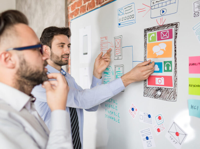
Designers mapping out a website.

So your site isn’t working the way you want it to. Maybe it’s sluggish, or you’re not seeing the conversions you want, or customers are complaining. Before you drop a huge chunk of your budget on a complete rebuild, consider that there might be a simpler (and more affordable) solution to your website woes.

We see a lot of Drupal 7 and WordPress websites here at Kanopi Studios, and we often discover that it’s more cost-effective for our clients to simply update their sites rather than rebuilding them. Making targeted updates can allow you to focus on addressing a few key issues, while still leveraging the investment of time, energy and funds that went into your site’s foundation.

Here are three key topics to consider:

1. How do you know when it’s time for a change?
2. Is your website optimally organized and designed to be user-friendly?
3. How strong is your technical foundation?

How do I know it’s time for a change?

Do any of these problems sound familiar?

  • Low conversion rates
  • Site pages take more than 3 seconds to load
  • Site doesn’t work well on mobile or other devices
  • Updating content is a difficult and frustrating process
  • Users struggle to find what they need on the site or have shared negative feedback
  • Site crashes when updating
  • Too many bugs
  • Building new features is difficult or may not even be possible
  • Site is not loading on https and triggers security warnings

If your answer to any of these is yes, it’s time to take action.

But first … is it really that important for me to address these issues?

Yes! A website that isn’t working optimally can dramatically affect your bottom line. An out-of-date or poorly designed website can:

  • Damage your credibility. If your website loads slowly, is crowded with clutter or is just plain not working, you are sending the message that your company is unprofessional.
  • Make you appear out of touch. A dated website tells your customers you are behind the technological times, or worse – you don’t care enough to stay up-to-date.
  • Cost you customers. Every customer who leaves your site in frustration due to broken links, complex forms, slow pages or confusing navigation is a customer you won’t get back. If your competitors offer similar services and have a stronger website experience, your loss will be their gain.

Decision time. If you want to avoid the damage that a dated website can cause, you’ll need to either rebuild your site or update it. If you’re ready to take action, we can help you find the best and most cost-effective approach.

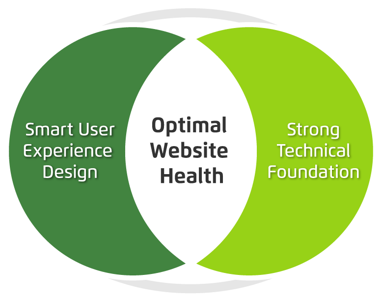
There are two primary things to consider when maximizing your site’s ROI: your user’s needs and the technology that drives your site. If you can identify and fix problems in both of these categories, you can most likely avoid a costly rebuild.

Venn diagram showing optimum website health at the intersection of smart user experience and strong tech foundation.

Next, we’ll dive a bit deeper into tips to help you level up your user experience and update your website technology without starting over from scratch. Consider it the non-surgical, diagnostic approach to improving your website experience right where it needs it the most. 

Collaborative meeting

How’s your user experience?

How to know if your site is optimally organized and designed

Now that you’ve decided that it’s time to take action to improve your website, it’s time to see if any user experience upgrades could help. Take a look through our list of issues below, and the tips to help resolve them.

Having a hard time converting leads or getting sales?

If you’re not sure why you’re not generating business from your website, it’s time to get serious about strategy and subsequent user experience upgrades. Here’s how:

  • Add a survey to your website using tools like Jotform’s Survey Maker to understand what users are looking for
  • Take a look at your analytics to understand where you are losing your users. If you don’t have analytics installed, get either Google Analytics or Tag Manager set up on your site.
  • Try an online user testing platform like Hotjar to help you go beyond standard analytics with heatmaps, visitor recordings, conversion funnels and more.
    Complete a User Experience & Conversion Optimization Audit with Kanopi Studios. We can make a whole range of insightful recommendations within your budget. Contact us to learn more.

Does your site take forever to load?

If it takes longer than three seconds, you have a problem.

  • Use Google PageSpeed or Pingdom to test your site’s speed, understand what might be slowing it down and take action to resolve any issues.
  • Make sure you have a reliable hosting company backing your site at the right level for the amount of traffic you receive.

Does your site work on mobile? Is it accessible?

It’s vital to make sure your site is accessible to everyone, no matter what device or screen size they are using. Here’s how to check:

  • Try using your site on a phone or a tablet. If you have to pinch or zoom to interact with the content, it’s time for a responsive design.
  • Make sure you can tab through all navigation and content on your site using only your keyboard, that all images have alt tags, and that you are able to use a voice browser to “read” your pages out loud. If not, you are missing key elements of accessibility.
  • Contact Kanopi Studios about an accessibility audit. We can help you identify the issues and build a plan for how to resolve them.

Is it frustrating – or impossible – to update content on your site?

If it’s a major undertaking to change even the simplest thing, something needs to happen.

  • Define your ideal workflow, then ask an expert to take a look and see how you can optimize the backend.
  • Consider the types of content that your site needs to support. Do you have templates in place that meet your needs? If not, it may be time to consider a bit of design and development time to build additional page types on your site.

Getting negative user feedback?

If the people visiting your site are taking the time to complain, chances are they might also take the time to help you make things better. Here’s how:

  • Collect feedback by sending out a survey, or document your customer service calls.
  • Always thank people for taking the time to help you improve.
  • Look for trends in the information you are receiving from users and build a plan to address any issues to help meet their needs

If none of the issues above apply, congratulations! Your user experience is likely more solid than many of the websites out there! But there are still more things to consider before committing to rebuilding your site. In our next post, we will walk you through a number of common technical issues and some helpful fixes for them.

How to “humanize” the web development process to effectively share your story & connect with your audience

Your audience is made of people. Not numbers.

While “looking at the numbers” is a quantitative way to determine how well you’ve succeeded at meeting your business goals, your audience is not a troop of robots that generate traffic numbers and donation statistics. They are living, breathing, thinking, analytical people.

Not only are they people, but most likely, they’re people with very little time in their day. In an age of constant connectivity and ubiquitous multitasking, it’s important to make an immediate impact and a clear call to action when they choose to spend their precious moments with you.

How do you make the greatest impact when you have only a few seconds of someone’s attention? Here are some tips to use during the web development process to help you to make their visit as impactful as possible.

Provide Relevant Content

The key word here is relevant. You need to dig deeply into what will be relevant for your audience. Think about the frame of mind they are in when they reach your site. For example, if most site visitors are coming to your site through a Facebook advertisement, then the page they land on should pick up the messaging and push them towards the conversion action set in that Facebook advertisement. We do not want to interrupt or divert their path, we want to extend it.

Analytics and site feedback from your users also give you big clues as to what content and activities resonate most with your audience. Optimize your site for those items. Your site needs to live, breathe, and adjust to the ever-changing needs and interests of your site visitors.

  • Kanopi Tip: Have a strategy for ongoing site maintenance to make it easy to continually optimize your site. Kanopi’s strong support team works with your organization to identify and implement optimizations. We are an extension of your team and are always there when you need us!
  • Kanopi Tip: Providing more relevant content might mean more targeted, expert content development for your site. Showcasing your expertise will lead to your audience seeing you as a trusted resource (and will help with your SEO for findability!)

Provide a Reason to Care

Your mission is important. But do your visitors realize how important it really is? Giving them a big fat “Donate” button in the header and expecting them to click it doesn’t acknowledge the whole picture. The button is only part of the work. Giving them ways to donate or join the conversation in spots they can always access helps, but you must provide this content in the context of a story. Your story. As passive visitors to a site, we want to be sold on why we should do something — not just told what to do.

  • Kanopi Tip: Compel your users to take action by involving them in your story. Don’t just tell them about your mission. Evoke emotion and connect with them. Promote pathways for conversions and donations in logical, progressive ways. Kanopi works to determine conversion points within the experience that make sense. For example, if you are talking about stories involving the individuals you help, share those individuals’ perspectives, images, or testimonials. Invite the user to engage with others or to share their story with you. This type of conversion can lead to donations, certainly. But more importantly it can lead to advocacy, inspiring your visitors to become advocates for your mission and spreading the word to others.

Don’t Trust Your Gut

While it is critical to humanize the experience, you do need those numbers to back up decisions as to what the humans on your site actually want and need. Making a subjective decision based on internal demands and objectives will only please the internal teams — not your users. Make your audience your focus during the web development process. Put benchmarks into place, and ask users for feedback. Getting information directly from your audience and their online behavior is the best way to be sure you address their needs within your site.

Make Interaction Easy

We mentioned the idea of “content in context” — integrating logical conversion points throughout your site experience in spots your users can always easily access, as well as within the context of your larger story. But we also need to optimize for a user’s environment. Mobile is now the dominant form of internet browsing. Our users are on the go. Don’t expect your audience to be settled in with a cup of coffee and a dedicated block of time to wander through your site on their desktop. Mobile is critical to the web development process.

  • Kanopi Tip: A responsive site should be thought of as “mobile-first”. At Kanopi, we strategize starting with the smallest screen sizes and work our way up from there. How do people interact with elements that you want to be omnipresent if they’re in a mobile context? Should the donation button, usually in the main header on desktop, be pinned to the bottom of the phone’s viewport for easy access? Should the phone number be more prominent on a mobile device?
  • Kanopi Tip: When designing for mobile, also think about the ergonomic position in which someone holds a phone — usually one handed, making their thumb the easiest way to navigate. Should that primary call to action go right next to where their thumb naturally lies for even easier access? And how big does it need to be to ensure an easy click target for touch?

Make Interaction Fast

Statistical data shows that the average page load time in the US for most sites is 5-7 seconds. Those same statistics show that abandonment rates take an exponential rise if your page takes longer than three seconds to load, and Google prefers that you have it under two seconds.

Given that in the US, ~71% of digital minutes spent are on mobile devices, and it’s ~62% in Canada, one thing is clear — speed matters in getting your message out. When it comes to web pages, bigger isn’t always better.

  • Kanopi Tip: Consider implementing Accelerated Mobile Pages (AMP) for your site. AMP is an open source project backed by Google that is focused on building a faster, simpler, and more performant web that is optimized for mobile devices. And As a bonus, you’ll get an SEO boost from the use of this approach.
  • Kanopi Tip: The biggest culprit in slow page load time on most pages is the number and file size of image assets. Kanopi recommends being very choosy in your use of imagery. Well designed vector imagery, use of color, and beautiful typography can have just as big a visual impact with a much smaller page footprint. And always leverage an image compression tool when you’re managing image files on your site.
  • Kanopi Tip: Only load what a user needs. At Kanopi, we take a progressively enhanced approach to web development. By starting mobile-first, we will load only the assets the mobile experience needs to render, keeping it as fast as possible. And we’ll add features and functionality as we scale. We are also not afraid to ask the hard questions — if a mobile user doesn’t need that feature… does anyone? Users leveraging external readers and “reading views” on web pages are becoming more and more prominent. They don’t want your eye candy. They want your content.

There is no “Build it and they will come.”

Building an audience-focused website with compelling stories will not cause an automagical spike in your site interactions or user donations. Understanding where your audience was before and after your site experience will give you a better understanding of how to market to them. Your site is one step in a multifaceted customer journey.

Where did their journey start? Were they at a third party platform that focuses on your subject matter? Can you partner with that platform to serve content about your organization?

Do they typically leave to visit a site rating your subject matter? Should you beef up your testimonials there to help them make a decision on interacting with you?

  • Kanopi Tip: Your site is one piece of your digital presence, and one piece of your audience’s user journey. Thinking of your site as the sole representation of your organization is not wise. People jump around and research with all the different resources available to them. Making conscious marketing choices can help make your presence, once they do land on your site, more valid, more recognizable and an authority for your cause.

Humanize the web development process!

Putting your users and their needs front and center helps both your audience and your organization and builds a relationship of trust and advocacy between them. It is the human element of our online experience that drives the numbers we use to justify our digital marketing activities to our stakeholders and makes the web development process more targeted and effective. If you try some of our tips, please contact us and let us know how they worked for you. And if you need assistance or have questions, reach out. We are always here for you.


About Kanopi

Kanopi is a women-run and family-owned business that is centered around beautiful design and strong architecture. Our data-driven approach fosters user-centricity and creates holistic web experiences based on user decisions. We believe that regular communication and support are the cornerstones of good development, and strive to give our clients a unique sense of ownership and investment in their work with Kanopi.

Aerial shot of Kanopi leadership around a table working on a project with laptops open.

How to write a winning RFP

Starting a new website project can feel overwhelming. Finding the right agency — one that truly understands your needs and can deliver effectively — is crucial. The best way to set yourself up for success? Ask the right questions from the start. But equally as important is providing as much clarity as possible in your Request for Proposal (RFP), ensuring that the responding agencies can offer accurate estimates and informed responses.

For large organizations with multiple decision-makers (we’re looking at you higher education and healthcare!) this process can be even more complex. Procurement requirements, departmental priorities, and differing opinions can make alignment challenging.

We see a lot of RFPs … ones that are 100 pages long and full of legal and procurement boilerplate, to those that are just three to five pages (and in case you were wondering, we prefer the shorter, more concise ones that get to the heart of the problem). So we have thoughts on what makes a great RFP.

To simplify the process, we’ve created an RFP template to serve as a foundation for your next website project. Our friends at the Drupal Association have written an RFP template as well specifically around open source projects.

As you work through the template, here are a few essentials to keep in mind:

  • Know your goals. Align with your internal teams in advance of the RFP process to define (and align) your needs.
  • Think in terms of building a long-term relationship. A good partnership with your vendors is key and should be established from the beginning. Do you like them as people? Can you imagine being on hours of calls? Choose an agency you can imagine collaborating with for years.
  • Be transparent. Clarity will benefit everyone. The clearer you are, the stronger and more customized the proposals you’ll get.
  • State your budget. This is a big one. When you include a realistic budget range, agencies can tailor their recommendations and avoid over- or under-scoping. It saves everyone time, builds trust, and ensures proposals are grounded in what’s achievable. Also consider reserving some percentage for contingency.  
  • Don’t be overly prescriptive. Describe your challenges, not the exact solutions. Good agencies are gifted at coming up with expert solutions to challenges that are stated in terms of problem statements or business objectives. Keeping an open mind will allow you to see (and compare) your prospective vendor’s recommendations and benefit from their expertise. 
  • Give yourself and your vendor enough time. Start the RFP process before your need is immediate to avoid extra pressure on both sides to meet an unnecessarily tight timeline to respond. Allowing more time can also mean more considered and complete responses.
  • Talk to your potential vendors ahead of time. This allows you to establish the relationship and pre-select the ones you suspect will be a good fit. The right vendors can provide a lot of value early in the process, which may even help inform the scope or direction of the RFP. Even better? Complete your strategic planning first to get extra clarity.

If you use AI to write your RFP:

AI tools can help you get started faster, but be careful: they tend to add unnecessary detail (and bloat equals a higher budget). To keep your RFP sharp:

  • Begin with a clear problem statement and desired outcomes.
  • Ask AI to outline sections, not write a full document.
  • Review, refine, and delete anything that doesn’t add value.
  • Separate “must-haves” from “nice-to-haves.”
  • Always have a human proofread any AI parts of your RFP to sanity-check the output against your goals and budget.

What’s next?

Once you’ve written that RFP and gotten responses back, it’s time to choose your vendor! We’ve also got advice on how to evaluate the RFP responses you receive.

Kanopi’s Allison Manley gave a presentation at the NTC Conference on how to write a winning RFP. Check out her presentation below to get more in-depth information.

A Decade of Data: UC Berkeley I School Case Study

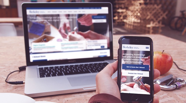
The Berkeley School of Information (UC Berkeley I School) contacted Kanopi Studios with a robust request: a redesign of their website, guidance on the modernization of development techniques, and a full migration of their site to the newest version of Drupal — which meant moving over 10 years of content.

This kind of request wasn’t unusual for us. Higher education clients are unique in that they are a lot of things to a lot of people. Audiences include academic peers, laypeople, current students, and prospective students. There are often competing goals and priorities, all of which need to be examined and addressed.

The answer to meeting the complex needs of higher education clients is always the same: start with research. With I School, our first stop was discovery. We had to figure out what we had to work with. That meant working closely with I School to determine content types, decide what information was still relevant, map the content to the new site, and gain clarity on the specific content that needed to be migrated during the development phase.

Then we set out our deliverables:

  • Drupal migration
  • Redesign
  • Training
  • Development pipeline
  • Responsive theming

We used a persona-driven design process that started and ended with the user. We asked the questions, “Who are we trying to attract?” and  “What do they want to see?” We blended the classic elements of UC Berkeley with a modern look and feel that would attract prospective students, while at the same time making sure the design would maintain the same high quality across a variety of platforms and devices.

In order to modernize the development practices used for I School’s site, we reorganized the way code and files were structured and refactored some of the custom modules so we could take advantage of newer tools in Drupal 7, such as the Database API, Panels, and various caching methods.

We also provided I School with a full platform for continuous software delivery, with automated deployments to the development site and scripted deployments across all environments. The bottom line? Less downtime and a more responsive site.

“It was a great pleasure to work with Kanopi on our website redesign project. We faced a daunting challenge migrating our highly customized site from one version of Drupal to another, while simultaneously moving to a completely new responsive visual design. The Kanopi team’s expertise and enthusiasm were critical to the success of our project. We couldn’t have done it without them!”

– Kevin Heard, Senior Director of Information Technology, UC Berkeley School of Information

As they say, the proof is in the pudding. In the weeks since the new site launched, measurable improvements are already being noticed by site administrators and, most importantly, by the users! Here’s a snapshot of the improvements:

  • Sessions increased by 4.29%
  • Users increased by 3.11%
  • Page views increased by 22.30%
  • Pages/session increased by 17.26%
  • Average session duration increased by 11.33%
  • Bounce rate decreased by 1.42%

From research to organization to design to modernization, our decisions were driven by data every step of the way. Contact us today to discover how we can transform your site and help you meet your goals.

Stop Designing Like the World is Flat: Introducing Component Driven Design

Nikki Stevens, Drupal Architect / Tech Lead
Nikki Stevens

One of the hottest topics in Drupal circles this past year is the concept of Component Driven Design to streamline front-end development and theming. While atomic design principles are not new to the design community, the introduction of twig in D8 provides those of us designing for Drupal an interesting set of tools, like PatternLab and KSS-Node, to help continue our march towards a world that’s free of the flat PSD. Awesome, right? Well… now what?

I think to see the real value, and why the community is so excited about the integration of these tools into our design and development processes, you must go back to what makes up a website in the first place. Patterns.

Patterns are all around us, and that is particularly true when it comes to the building blocks (or components) that make up modern websites. To define a pattern, you simply need to look for a couple of things: 1) Can it be given a name? 2) Does it solve a problem? 3) Is it repeatable? And 4) Can it be combined to make other more complex patterns?

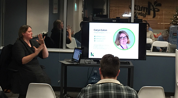
Caryn Eaton Presenting at ADUG- Introducing Component Driven Design
Caryn Eaton talking about Component Driven Design at ADUG

Let’s think about an image. While this may feel very granular, when you look more deeply, it becomes clear that it meets all the criteria one needs to define it as a pattern. Image is the name of an element that solves the problem of helping your users to visualize something. This could be a product or service, an event, or even a feeling you want to elicit when users visit your site. We reuse images throughout the site with variations, as well as combine it with other small patterns (for example headings, dates and paragraphs) to create this slightly larger pattern.

Managing all of these patterns is where tools like PatternLab and KSS-node come into play. They help to organize all of our newly declared patterns into logical buckets and build a living style guide to use code to communicate the visual language of a new website. As a designer who is also a coder, I can illustrate to our clients exactly how the team envisions these components working — not just how they will look. And yes, before you point it out, there are other tools designers use that do this effectively, but, as far as I have seen, they rarely provide production-ready code that can be leveraged directly by the CMS to jumpstart development. This is the real beauty of the twig-based relationship between D8 and PatternLab.

Now, as I hand off the designs to the remainder of the development team, there is little ambiguity yet greater flexibility to implement the remainder of the templates/pages throughout the site. By using a module, aptly named components, developers can reach over into PatternLab and import the code, classes, and styles associated with a specific pattern anywhere it is needed. This assures consistency, and even a modularity, which is something every developer strives for during the development process.

So, is the PSD dead? As much as I would love to say yes, I highly doubt it. Designers will always have a need to benchmark certain aspects of a project in static format to gain buy-in on direction. In-browser design is yet another tool in our ever-deepening toolbox to help gain efficiencies during build projects, allow us to meet project timelines, and better set client expectations, ultimately leading to happier clients and teams alike.

If you would like to learn more about how D8 and PatternLab could be implemented on your next website build, please do not hesitate to reach out to us here at Kanopi Studios.

View Caryn’s ADUG Presentation

SFCM blog

Symbiosis FTW: Better Living Through Partnerships

“Mutualism” is a fancy term for a mutually beneficial, symbiotic relationship between two entities in nature. Organisms, from simple to complex, team up and help each other to the benefit of both; resources that may be scarce for one organism are easily provided by the other. So, how can mutualism apply in the agency world? The modern approach to building technology-agnostic experiences, allows the evolution of the User Experience and Design to lead the executional decisions on “how” (the technologies) to build the “what” that has evolved. At times, firms look for a partnership to complement their team. Therefore, mutualism with other agencies can become an extension of the firm and seamlessly keep projects moving forward.

At Kanopi Studios, we feel that a symbiotic collaboration of great minds breeds great work together! That’s why we are proud to highlight our partnership with Mule Design Studio on the San Francisco Conservatory of Music (SFCM) website.


San Francisco Conservatory of Music gives students the framework and foundation to succeed throughout their studies and careers, creating a path of lifelong learning. In partnering with Mule Design Studio, SFCM was looking for a full web transformation; one that would showcase the Conservatory’s unique mission and offerings. The goal was to delight prospective students and their parents and provide pathways to relevant content inspiring them to want to study at SFCM. SFCM also wanted a robust and manageable content administration process.

Mule expertly constructed an experience to propel the brand experience and accomplish these goals, then chose Kanopi Studios as their Development Partner to bring the experience to life.


“We seek development partners who specialize in implementing state-of-the-art web experiences. Kanopi’s decade-plus experience in Drupal development, their ingenuity, and their people are why we chose to work with their studio. Mule takes a holistic approach to strategy, design, and technology, and selecting a partner like Kanopi to be a part of delivering a successful site is imperative.”

– Mike Monteiro, Mule Design


Kanopi constructed a dedicated multidisciplinary team to perform technical guidance, feasibility and executional services for the project. Together, Mule and Kanopi provided thought-leadership on real-world implementation and actualization of design, while building a blueprint for the end user’s experience, both visually and technically. The partnership between Mule and Kanopi was seamless, and the teams strived to provide a unified experience for the end client.

As with many projects, there were complexities. In this case, the end-result needed to be more of a customized web solution. Not only did the experience require carefully crafted content, the sheer volume of content required a mindful execution for the front-end to be flexible to accommodate it, as well as the CMS administration that powered it. There were also integration points, such as an EMS calendar system. In order to further integrate the calendaring system into the experience, we were able to create a customized model to group related taxonomy with events on the calendar and create a guide that SFCM could build out and load content into as needed.


“Kanopi conducted a thorough technical discovery phase to inform and define the technical specifications for the project. These were outlined in a scope document for the client and included all third party integrations. It also mapped our implementation plan, defined parameters, and called out specific criteria for the build. Throughout the project, Kanopi provided further detailed plans for the client around each milestone: CMS Training, Content Entry, QA Testing, and Launch. This documentation enabled a smooth, on-time launch.”

– Maggie Glaize, Mule Design


Alignment between Mule and Kanopi was critical to provide a unified execution, but the end client’s partnership with the teams was just, if not more, pertinent. SFCM assembled a multi-skilled team to tackle the project and methodically navigated stakeholders on their side to gain buy-in and lead the effort. The project success was an absolute collaboration between several organizations all working diligently toward common goals, and leaning on each other throughout to successfully launch the experience.

In nature, measuring the precise benefits to the individuals in a mutualistic relationship is not always a straightforward process, particularly when organisms can receive benefits from a variety of sources. By creating lasting, trusted, ongoing agency partnerships, Kanopi builds personal connections. The more we understand how our agency partners think, the more we can intuit what they need, and the more we can intuit project needs. Interactions between Kanopi and our partners are harmonious, as are the relationships we have with our end clients. 

Want to form a partnership with us on your next project? Contact us.

Kanopi Studios increases DRTV show’s conversion rate by 4.5% in just three weeks

This summer, Canella Response Television partnered with Kanopi Studios to create a website that helps generate sales for their Vacation Hunters TV direct response television (DRTV) program.  Vacation Hunters TV provides an amazing deal for a vacation for two to Mexico’s Maya Riviera. Their DRTV spot features gorgeous and enticing clips of locations to visit and things to do in the Maya Riviera- and of course, their killer offer- presented by savvy traveler extraordinaire, Cindy Christi. This was Kanopi’s first DRTV website, and we were excited about the challenge to increase their conversion rate.

A DRTV program asks consumers to respond directly to the ad by calling in or visiting their website. The Vacation Hunters TV offer is only redeemable by phone, so our goal was to have users call the 800 number and book their trip.  After watching the show multiple times to get an understanding of their flow of information and call-to-actions, we dove into the UX and design. The site needed to be an extension of the show- informative, enticing media, ample call-to-actions, and be beautifully clean and simple, unlike a lot of in-your-face DRTV companion sites.

We took the tried and true flow of a DRTV show and reimagined it for the web. We designed a one-page, long-scrolling site, introducing users to the offer, enabling them to explore the opportunity and locations through text, videos, and photos. The site also presents the host and Partners that make this deal possible. It wraps up with another offer, all while subtly keeping the call-to-action front and center.

The result? Within three weeks of the site being live, www.vacationhunters.tv generated over 1,000 phone calls and their usual conversion rate of 3-4% was up to 7.5%.  Happy travelers and a euphoric client! Now that we’ve completed our work, we’re ready to pack our bags and head to Mexico. ¡Hasta luego!

Visit Vacations Hunters TV Now