
When looking at image media in a CMS like WordPress or Drupal, it can seem incredibly overwhelming at first.
There are so many fields and though they each have a specific intended purpose, for many of us, we didn’t worry so much about them at first. Now with increasing awareness of the role of textual content for accessibility purposes, we all want to pay closer attention. So let’s take a quick peek at what those are and how they’re used.
Alternative (Alt) Tags
Alt tags are the most commonly used tags. Their purpose is to be an alternative in case the image cannot be shown. Decades ago these were most widely used to help account for images taking a long time to load on dial-up connections. As our technologies have changed since then, the purpose of the Alt tag has taken on a more important role.
Accessibility: Alt text is primarily used to describe the content of an image to those who cannot see it. This includes visually impaired users or users who have chosen to disable images. Without alt text, these users might miss out on crucial information conveyed by the image.
SEO: Search engines cannot directly understand what an image is about. Alt text helps search engines understand the content of an image and its context within the page, which can improve your site’s SEO. Search engines can use this information to index images correctly, and it can help your site appear in image search results.
Provides Context if Images Fail to Load: If an image fails to load due to a poor internet connection or an error in the image file, the alt text will be displayed instead. This helps users understand what should have been there.
Supports Non-Visual Browsers: Alt text also benefits people using text-only browsers or command-line browsers, which do not display images.
Compliance with Standards and Regulations: Adding alt text to images is a requirement under the Web Content Accessibility Guidelines (WCAG) and, by extension, regulations like the Americans with Disabilities Act (ADA). Non-compliance with these standards can have legal implications.
Overall, alt text plays a crucial role in making the internet more inclusive and accessible, helping to ensure that everyone, regardless of their physical abilities, can use and understand web content.
Alt Text in Action
Since alt text need to convey an image to someone who may not be able to see it, it needs to be descriptive, concise, and meaningful in context. Let’s look at an example.

One possible alt text for this could be “chair” or “balloon. Those were the search terms that found this image on Unsplash. Technically it may be accurate to use “chair” or “balloon” or even “chair and balloon” as the alt text, but it doesn’t give adequate information for a user to understand why this image has been included. What is the information that is being conveyed?
We could say, “white chair with a large pink helium balloon attached to its back” which would be highly descriptive and better explain the image. Or if this is a part of a short story about a lonely birthday, maybe the greater context would be given by something along the lines of, “the empty chair sat alone with its balloon in the room.” This would invoke a feeling that would enhance the storytelling experience.
The end goal should always be to give a user a connection to the image without relying on the image being visible. Remember to convey the same feeling or meaning that it’s meant to give those who can see it. If it’s important enough to show a user, it’s important enough to describe to a user who can’t see it.
It also needs to be concise. The alt text is only a short space to help give context. If your image is complicated or needs additional detail then a long text format such as a caption would be a better choice. Try to keep your alt tags around 120-125 characters.
Of course not every image offers a user great value or an emotional connection. Often icons with labels and other decorative patterns just don’t have non-visual context. In this case, you need to indicate that you would provide alt text if there were any and that this image is merely “decorative”. This means that you need an empty alt tag – that signifies to assistive technology that this image has nothing contextual to share. This can look like this:
<img src="istock250871.jpg" alt="" />

<img src="istock250871.jpg" alt />
Either is fine as long as it’s there. If it’s not there, then the image alt will become its file name and istock250871.jpg just doesn’t give a lot of helpful context.
Captions
Some images convey complex meanings or details that can’t be fully captured in just 120 characters. These images benefit from what is known as a ‘long description’. This isn’t a replacement for alt text, but rather an optional addition. It usually appears as a caption under the image, providing a more in-depth explanation or context.
Longer descriptions that aren’t captions can also be attached behind the scenes or nearby as part of the standard presentation, such as the paragraph immediately following an image. Developers can also connect these longer descriptions for those using assistive technology to make the relationship perfectly clear, but typically captions already include these connections and are easily edited through the CMS (Drupal does not have this field by default but it can be added). If a caption will do the job, there’s no need for additional content.
Situations that may require an image caption include:
- Charts and diagrams
- Complex Images
- Images that need additional information to create more context
- Images that need a heading
- Images that require a source credit
The idea behind captions is to be able to describe the meaning, visual content, or any additional context. They can be longer or, if the surrounding text gives lots of content, could simply supplement that data (such as a source).
Let’s look at a few examples.
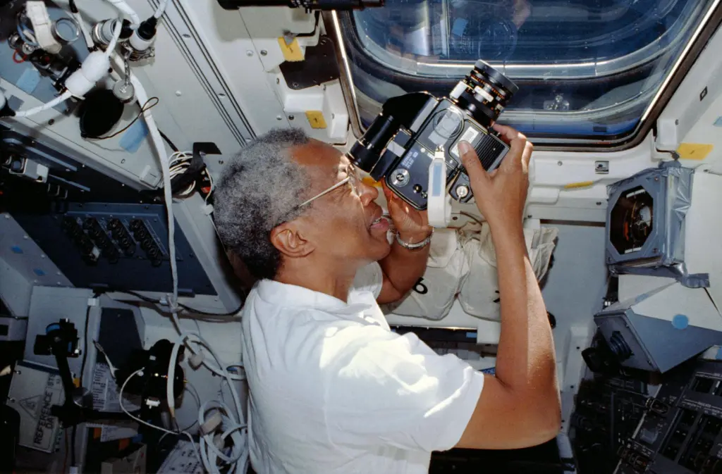
Decorative Image with Caption
In this situation, the website chose not to give the image alt text but did include an empty alt tag to indicate that the assistive technology could bypass the image. The caption was included to acknowledge that an image was present and to give an accompanying description. Though there are several reasons to choose this approach, perhaps they wanted to allow the articles to add as much content as desired without character limitations. It might cause some confusion as users have bypassed the image the caption is referencing, but it does technically meet the criteria.
URL:
https://www.nasa.gov/history/honoring-african-americans-in-space/
Alt Text: none/decorative
Caption: Guion S. “Guy” Bluford photographing the Earth with a video camcorder through the shuttle’s overhead window. NASA.
Image with Alt Text and a Caption
This is what we’d consider a better approach. We have alt text that acknowledges the image is there and gives a description of that image. Then a visual caption to identify the image, and expand on the source. As much as accessibility is a legal need, every piece of content should be geared toward informing the user. What would make this slightly better would be if the alt focused solely on the visual description of the uniform and let the caption provide the details of who and when, but that’s just nitpicking at this point. The current content is perfectly acceptable.

URL:
https://nmaahc.si.edu/explore/stories/honoring-general-colin-powell
Alt Text: U.S. Army green service uniform worn by Colin L. Powell as General and as Chairman of the Joint Chiefs of Staff. Uniform is hanging on a pole facing forward.
Caption:
A U.S. Army green service uniform worn by Colin L. Powell as General and as Chairman of the Joint Chiefs of Staff.
Collection of the Smithsonian National Museum of African American History and Culture, Gift of General Colin L. Powell, USA (Ret).
Choosing Your Approach
These are just two ways this was handled and are simple examples. In some cases there may be a need to showcase something much more complex, like a pie chart, or a technical diagram. In those cases a simple alt text of “Named Chart” and a detailed caption that explains the important data points would be a possible option. Or maybe there’s a need for a developer to connect a “long description” to the image. Overall your team needs to consider the data and what its value is to the user to choose the best approach.
Image Description
This is the general description field made available within WordPress and isn’t typically used within a theme, though it could be utilized in a number of ways if desired. It could even be used as a long description field in a custom theme. Drupal may or may not have a similar field since developers can add any number of additional fields to media based on type and display. By default, Drupal has fields for the image, the alt text, and the title. If you wanted to include a long description, or any additional information, your developer can make those adjustments.
Titles
Tiles are often under utilized in themes since the alt text is the preferred method for providing accessible information regarding an image, but both WordPress and Drupal have these fields. A title is only given to the user when a developer has written code to display it, or to have it appear on a specific interaction such as hover or click. By default, the title goes unnoticed by the average user. Screen readers can always access the title if they choose to, but the alt text is read automatically upon reaching the image so the title is often skipped. Search engines will always be able to see the title, so keep that in mind if you choose to fill it in.
One Final Note
Drupal and WordPress are incredibly flexible! They can allow for many customizations and allows you, as a content manager, to add so much value for your end users. Empower users to understand the meaning of your site’s visual content, regardless of their device, technology, or level of vision. Allow people to be the hero of their own story as they consume, understand, and act on next steps. If you keep that strategy in mind as you approach your image management you’ll be successful in accessibility, content strategy, SEO, and the overall experience for your users.