We recently came across a very interesting blog post from our friends at Orbit Media on a subject we’ve actually wanted to cover for a while now: the average website lifespan.
They discovered that the average lifespan is two years, one month. That’s it.
A low bar, indeed.
They also point out that you can extend your website’s lifespan well beyond two measly years by following some established best practices. This is something we know about first hand here at Kanopi.
In fact, we’ve found that the websites we build for our clients regularly last 10 years or more.
So what’s our secret sauce? It comes down to two things:
- how we define support, and
- how we provide that support.
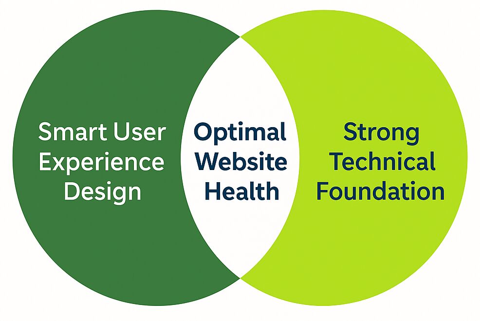
Both of these are based on years of experience and focus on a complete process that leads to steady improvement and intentional growth.
We focus on setting clear expectations from the start, ensuring clients understand the purpose, share our mindset, and are fully on board. It’s not just about making updates; it’s about bringing marketing, design, and development together so every change has a real impact.
In fact, it’s been a core part of how we work for so long that we see it as more than just a methodology. It reflects our mindset as an agency. And it’s the #1 reason the websites we build for our clients enjoy the longevity that they do.
If you’re curious to learn how we help clients build websites that last five times longer than the industry average, it starts with these steps:
We begin with both qualitative and quantitative research. Every project begins with qualitative and quantitative research. (If you’re unsure what the difference is or why both are equally important, check out this post.) The research we do informs our UX design and content strategy, ensuring optimal usability right from the outset — which results in fewer problems down the road and helps avoid premature obsolescence. This is why even when the budget we’re given is relatively small, we do as much research as possible with what we have. This step is far too important to omit.
We employ skilled, experienced professionals. Senior-level website designers and developers are capable of superior-quality work, faster problem-solving, and efficient project execution. This results in websites that remain performant, efficient, and relevant for years. By minimizing technical debt and ensuring adaptability, their experience and skill helps prevent costly rebuilds.
Also, we’ve found that full-time employees tend to have a more vested interest in client projects. So while we may occasionally complement our staff with contractors (who are also senior-level), our clients can trust that their projects will be handled almost entirely by full-time staff.

Support is not the same thing as maintenance.
The word ‘support’ in our industry has come to be synonymous with technical tickets and tasks. And notifying a help desk when there’s a problem with your site, and speaking with a technician to get the problem resolved, and then forgetting about them until you need them again.
Of course, this type of maintenance work is nonetheless important and we do provide it for our clients. But it has very little to do with how we define ‘support’ at Kanopi.
For us, support is about making an ongoing investment to ensure optimal functionality at all times. Long-term support is critical after your site launches.
It’s more than making sure the code works and the add-ons and features don’t glitch. Instead, it’s a process that involves ongoing evaluation and iteration, where we continually ask questions like these:
User Experience & Accessibility
- Have user needs evolved?
- Is the website fully responsive and optimized for different devices and browsers?
- Are there any new accessibility standards or guidelines we need to implement?
SEO & Content
- Is the content current? Are we keeping things fresh, adding interesting new content and archiving/repurposing older content that’s no longer relevant?
- Are we monitoring search trends and adjusting our SEO strategy accordingly?
- Are we leveraging AI tools or automation to enhance SEO performance?
SEM & Paid Marketing
- Are our paid search campaigns (Google Ads, social media ads) optimized for ROI?
- Are we testing and iterating on ad creatives and messaging for better engagement?
- Are we using remarketing strategies effectively to re-engage visitors?
Conversion & Engagement
- Are our landing pages optimized for conversions?
- Are we A/B testing CTAs, headlines, and page layouts to improve engagement?
- Are we analyzing user behavior to refine marketing strategies (e.g., heatmaps, scroll depth, click tracking)?
Brand & Positioning
- Are we maintaining a consistent brand voice across all marketing channels?
- Are we engaging with our audience through social media, email marketing, and community-building efforts?
Scalability & Infrastructure
- Is our hosting environment still the best fit for our current traffic and resource needs?
- Has the open source community recently invented or improved features that would enhance this website, or be a better fit than those we’ve previously implemented?
- Are we monitoring uptime and performance metrics to prevent downtime?
- Would implementing a CDN or other optimizations improve site speed?
Automation & Workflow
- Can any repetitive development tasks (e.g., updates, testing, deployments) be automated?
- Are there any new integrations (AI-Search, APIs, CRM, analytics tools) that could improve efficiency?
Performance & Security
- Are all core, theme, and plugin/module updates applied and tested for compatibility?
- Are there any deprecated functions or outdated dependencies that need refactoring?
- Is the site loading efficiently (e.g., optimized images, caching, minimized scripts)?
- Are security best practices being followed, such as firewalls, backups, and malware scans?
By revisiting these questions regularly, we ensure your digital presence continues to evolve with your users and the broader web landscape. And it helps us focus on what matters most: performance, usability and long-term value.
Conclusion (in convenient listicle form)
We didn’t actually set out to write this post as a how-to guide, but if you want to ensure your website enjoys unnaturally long life blessed with perpetual relevance, usability and neverending optimal results, these are the steps you’d need to follow:
- Do your homework; include both quantitative and qualitative analytics as part of your thorough research process.
- Entrust your strategy, design and development to the most deeply skilled, experienced team of professionals you can find. Bonus points if most of them are your full-time employees.
- Transform your definition of support from something that happens only when problems occur into a mindset of constantly looking for opportunities to enhance and improve every facet of your site.
Simply commit to these three steps with every fiber of your being and your website is guaranteed to exceed the average lifespan by a great many years. And if that seems overwhelming, you can always partner with an agency that demonstrates their passion for website longevity by writing lengthy blogs.


