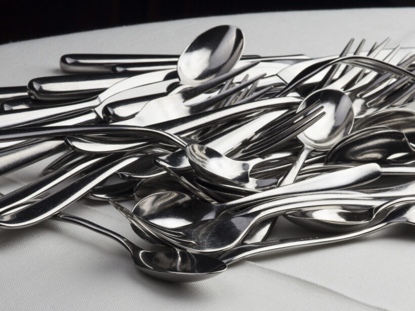
I just grab a handful of forks and spoons and knives and shove them into the tray, ignoring the divisions made to help organize your utensils, and then just hope nobody ever looks in there to realize how ridiculously lazy I am.
Of course, separating my cutlery would make it easier to find what I’m looking for, especially considering I seem to have 6 million spoons and only 5 forks. It’s completely silly that I don’t.
WordPress has the same problem as my cutlery drawer
Out of the box, WordPress websites come with Posts and Pages. Pages are what we use to build a site’s homepage, contact page, about page, landing pages, etc. Pages almost always appear in the navigation menus of your site, otherwise users would have a hard time finding them.
Posts, on the other hand, are meant to show off content in an Archive. For example, a news feed, or a blog. They also auto publish; add a new post and it magically appears at the top of your blog page (which is actually not a Page). Posts also use Categories and Tags, which can be clicked on to view Archives of posts in those Categories or Tags.
Where this gets messy is when people use their Posts as sort of a catch all for content that doesn’t fit on a page. Press releases, resources, news, blogs, announcements, videos, links, etc. I’ve clicked on the “Posts” in the WordPress dashboard and cringed to see all that content jammed into one place, knowing it must be an absolute nightmare for the site owner to navigate and sort through.
Post Formats to the rescue?
Not exactly. WordPress has something called Post Formats which allows you to choose a format for your Post. You can choose if something is a video, or a link, or a gallery, a quote, etc.. But unless your theme has templates for each one of those types, they’re useless. And considering there are 9 post formats, that’s a pretty big budget consumer for something that still won’t solve the larger issue; there’s just too much cutlery in one place.
Custom Post Types to the rescue! For realz this time.
The truth is, WordPress is made up of posts. Users are posts, Categories and Tags are posts, files and images are considered posts, even Pages are posts! The entire infrastructure of WordPress revolves around this one method of data storage. As a result, it’s really easy to make more.
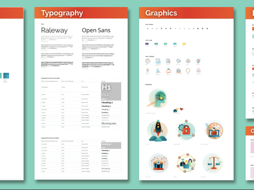
While there are Custom Post Types Plugins, a developer can literally add a custom post type through their own plugin, or to a theme’s functions, with just a few short lines of code. They can add Categories and Tags to it, tell it to behave like a Page or a Post, or give it it’s own custom taxonomies. This essentially means you can separate your content by purpose, and then present it back to the user accordingly.
Cleaning up the Cutlery Drawer: A Study in Books
Let’s get practical. I like cool used bookstores, so let’s imagine you have a used bookstore and need a website that works for the type of content you want to show.
The default Posts that come with WordPress, those will be your news / blog posts. Thanks to Gutenberg, you can really design your posts as you need them, without post formats and templates.
You’ll want an Events section, so you can brag about the upcoming J.K. Rowing book signing, or the long awaited release of Book 3 from Patrick Rothfuss. With Advanced Custom Fields (ACF), Kanopi could make a robust Custom Post Type that has event dates and times, associated authors with their social media, promotional images. We could even display this in a calendar format with integrations for Google Calendar reminders.
Next, you’ll want a rare book section. Obviously your bookstore is amazing and has some serious stock that you’re not about to upkeep online, but there’s always those special books that could bring in the collectors. Our next Custom Post Type might be Rare Books, and with the magic of ACF, we could make bibliographies and a gallery of images of the book and some of its pages. Maybe a little history blurb about the book or what makes it such a hot ticket item for collectors.
Now, you’ll also want to draw in average readers and book lovers who maybe don’t have the budget for rare books, so let’s make a Custom Post Type for Recommended Reading where you can put together a list of some highlighted books that are likely to appeal to a wider audience. It can be categorized and sortable too, so users can browse and filter. It’s going to be amazing.
Lastly, a Team Custom Post Type, because your book store has a staff of six, plus the store cat (because you’re really cool like that). Each post becomes a Team Member page, with a bio, job title, and — this is where it gets really neat — you can associate them with their favorite books from the Recommended Reading posts. In fact, let’s go one further, we can attach your staff to the blog / news posts they’ve written and show that alongside their bios. Kanopi actually does this for our own staff.
Where previously you might just jam all this content onto a single page, or into a mash up of Posts, we can take all this content and give it custom data entry and custom templating that allows for some neat cross connection and interactivity for users to better travel your site and find what’s relevant to them. Have a cat that lives at the store? You never know . . . the store cat’s blog posts might be a huge hit.
Structured Content is Mappable Content
What if simply by telling your cutlery drawer what you’re having for breakfast, it was able to select the necessary eating implements for you? Having cereal? Here’s a spoon. Pie and ice cream? No judgement, here’s a serving knife, ice cream scoop, and a fork.
The additional advantage of an intentional content structure using custom post types is that you can then apply what’s called schema data to essentially map your content. Our fictional bookstore could actually pass specific information to Google about those rare books and events to get them in front of the people most likely to be genuinely interested. Consistent data is also extremely useful for filters and searches, announcement bars, feeds, and more. It allows for a deeper level of content strategy and design to better achieve your online goals.
Are you convinced to use Custom Post Types in WordPress? Ready to start stacking your silverware?
Get organized with Kanopi