Designing for Healthy Aging: Crafting Inclusive Digital Experiences for Seniors

When designing for healthy aging, it’s important to look beyond just the visual experience. We need to consider how content, user experience, and functionality come together to shape the digital experiences of seniors navigating the web. 

One of the biggest shifts is generational: Gen X is now entering its senior years. These individuals are in their late 40s, 50s, and early 60s. (Sorry if it shocks you to see this in black & white, fellow Gen Xers, but there it is… we just report the facts.) As this shift occurs, website owners and content creators need to adjust how they present information online.

To understand this change, let’s look at how Gen X compares to previous generations. Seniors are typically seen as the least tech-savvy of all demographics. But over the last decade, as web technologies have matured and prioritized user experience over visuals, we’ve seen that seniors are adapting.

After all, Gen X has grown up with technology. They’ve evolved alongside it. They are more technologically sophisticated than Boomers. They already use the web in powerful and meaningful ways and expect a dynamic and evolving experience, not a static one. In other words: they’re ready to engage with changing digital landscapes.

Now let’s compare Gen X with Millennials (Gen Y). Both generations want ownership over their digital experiences, but how they define that ownership is different. Millennials want to personalize their experience. They want control over the interface to change colors, reorder layouts and adjust settings.

Gen X, on the other hand, seeks mastery. They’re more willing to take the time to learn how an interface works, even if it’s not perfectly optimized for them at first. They understand that websites evolve and are ready to adapt.

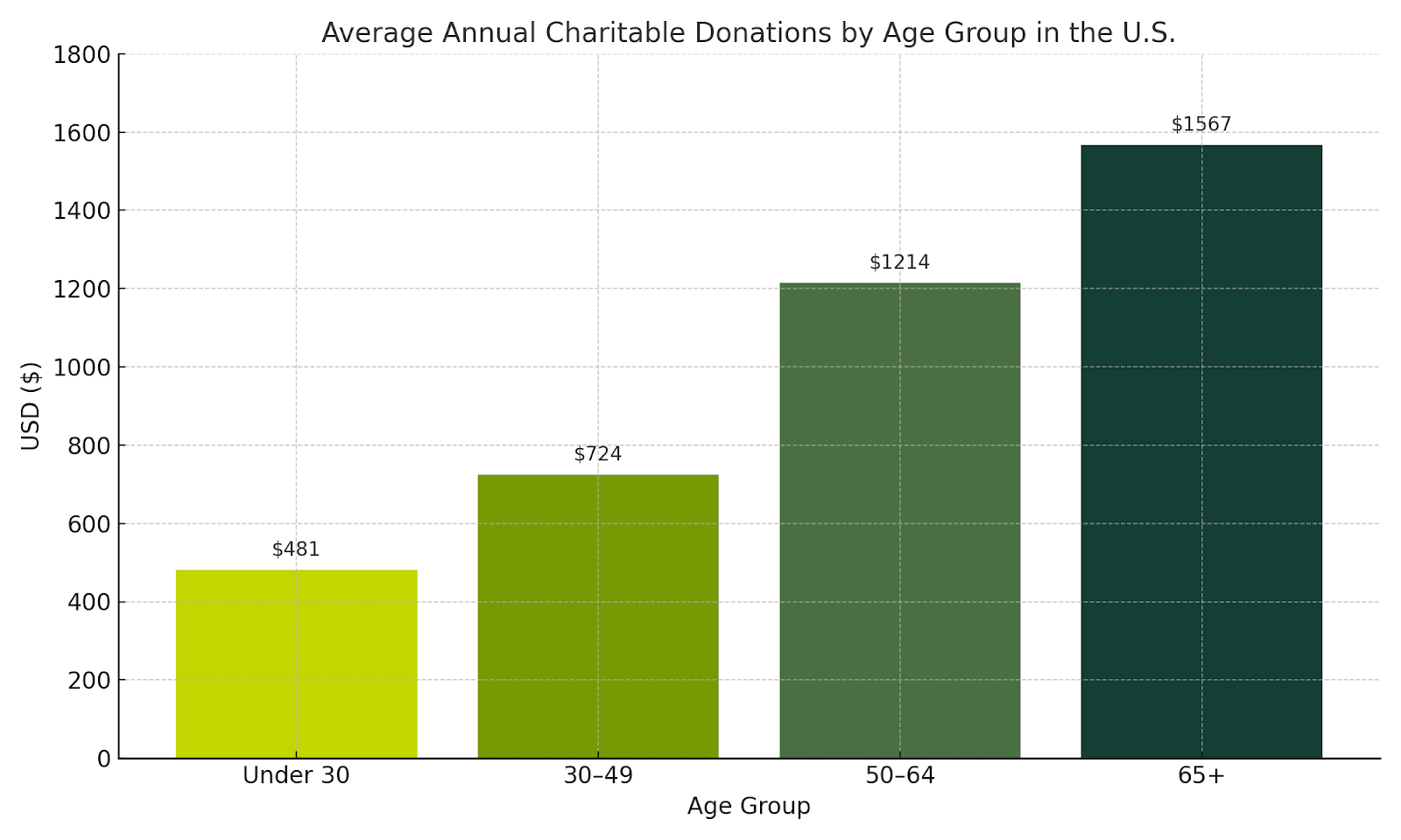
As Gen X and Y are entering their senior years and make up 46% of the US population, they will soon be the largest segment of supporters for most non-profit and educational organizations. Traditionally seniors donate more consistently, contribute higher dollar amounts, and often share causes with friends and family. Crafting intuitive and inclusive experiences for this newly senior demographic is a strategic opportunity to build lasting relationships and boost the impact of your mission over the next decade.

A chart showing how seniors 65+ are the largest donors for charitable organizations over any other younger age group, with an average of $1567 per 65+ donor.

This leads into how we can design effective websites for seniors so they can get the information they need, and you can get the conversions you want. At Kanopi, when we talk about design, we mean more than just visuals. We take a holistic approach, incorporating content, user experience, and functionality.

First, let’s talk about content.

Tell your story. Emotional storytelling is a powerful way to engage older audiences. As people age, they become more receptive to emotional connections. Use testimonials, reviews, and user-generated content. This helps build a connection between the user and your organization and can turn users into advocates.

Next, focus on messaging and clarity. 

Gen X and Boomers have been marketed to their entire lives. They know a sales pitch when they see one. They value authenticity and are skeptical of hyperbole. When we work with clients, we recommend acknowledging user struggles, empathizing with their experiences, and offering specific content solutions. Most importantly, guide them to what they need rather than simply telling them what to do.

Keep things simple. Stick to one idea per content block. Don’t overload the user with too much at once. Instead, craft a journey. Let users absorb information in small, manageable chunks. This makes your content easier to navigate and understand. It also helps users reach their goals, which improves conversions and ROI.

Refine the user experience, starting with mobile.

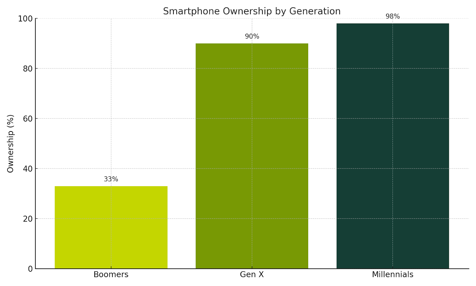
About one-third of Boomers don’t use cell phones and prefer desktop. But over 90% of Gen Xers own smartphones and use them for everything from casual browsing to task-focused activities. This means your mobile experience can’t be an afterthought. It has to be fully optimized and offer the same functionality as your desktop site.

A chart demonstrating smartphone ownership by generation, with Millennials in the lead with 98%, followed by GenX with 90% and Boomers at only 33%.

Shorten the user journey.

Evaluate your information architecture. Reduce the number of steps required to complete a task. Give users clear feedback on their progress during multi-step processes, like booking or checkout. If an error occurs, explain it in plain language and show users how to fix it. Empower them to learn and troubleshoot on their own.

Managing complexity is key. As the web grows more complex, seniors will need simplified pathways. Break large tasks into smaller steps using multi-stage forms. Let users save their progress and return later. This flexibility supports a better experience.

Train your users.

Gen X is willing to learn, so help them. Offer training videos, FAQs, how-tos, tooltips, and contextual help menus. Even chatbots can guide them through interfaces. Embed learning into their journey so they can grow more confident over time.

Color combinations matter.

Color is the first thing users experience. As people age, vision shifts. Blue cells in the eye fade, making it harder to see blue. If your brand uses blue for important UI elements, support it with sizing, shapes, or iconography. Avoid using blue and yellow together — or red and green. These combinations can be hard to distinguish.

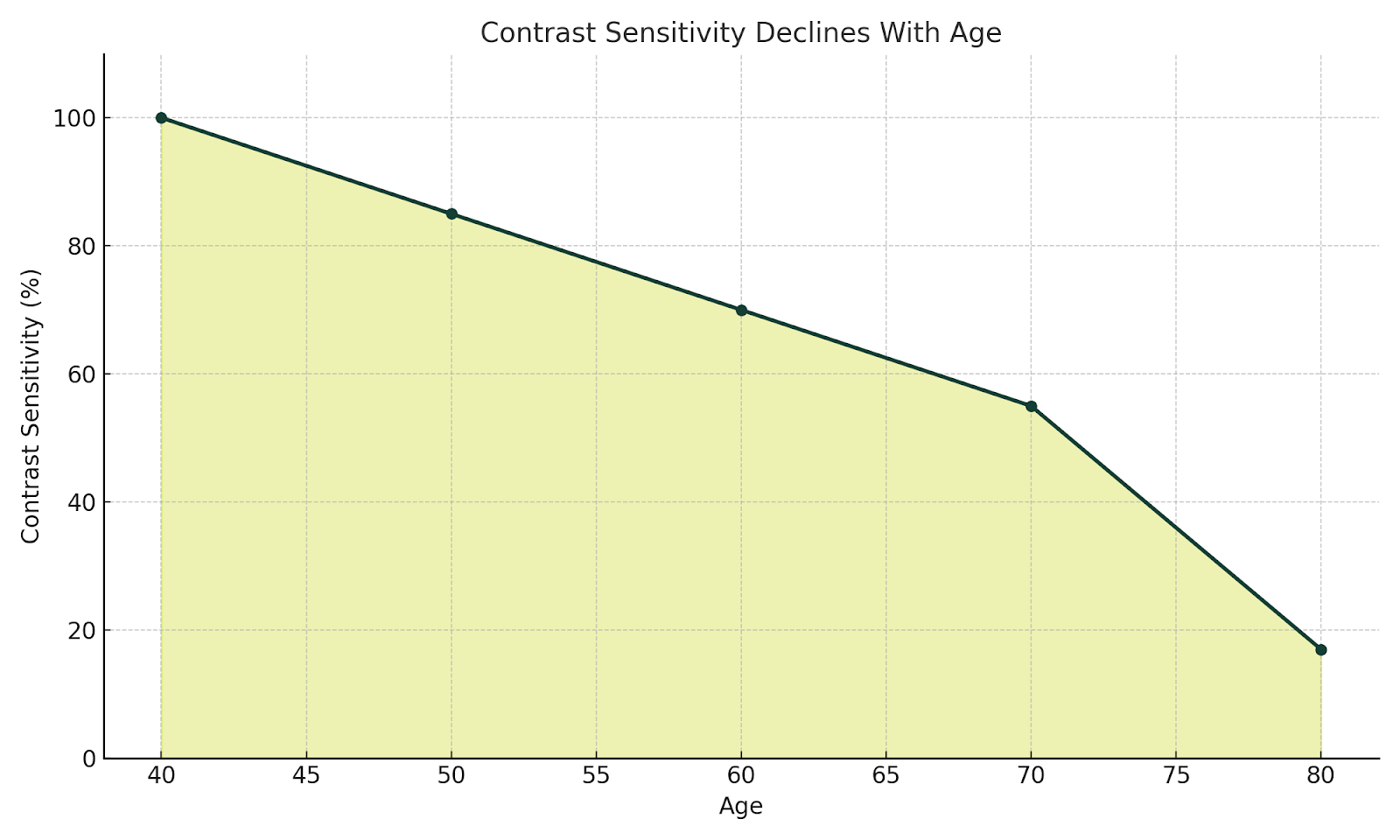
Use a contrast checker.

According to the National Library of Medicine, contrast sensitivity starts declining after age 40 and may be reduced by up to 83% by age 80. A 4.5:1 ratio is considered accessible, but 7:1 is ideal. Proper contrast helps users distinguish navigation, CTAs, and form inputs. WebAIM is a good contrast checker.

NO ALL CAPS (or rather, no all caps).

ALL CAPS reduces readability and disrupts the ability to quickly scan content, especially on mobile. Increase font size and use legible typefaces instead.

Put the ‘fun’ in functionality.

Personalized support helps users feel seen. Chatbots and virtual assistants offer real-time help. Provide access to help resources, contact options, and support channels. Boomers may prefer phone calls, while Gen X leans toward email or chat. Give users multiple ways to get assistance.

Support assistive technologies.

As Gen X ages, they’ll experience many of the same mobility and vision challenges as older Boomers. Make sure your site works with screen readers and voice recognition tools. This not only increases usability but also makes your users feel heard and supported.

Everyone benefits (including site owners)

So what are the benefits of doing all this?

  1. You reduce stigma. A well-designed site helps seniors feel welcome and avoids making them feel like outsiders who have to jump through hoops.
  2. You improve accessibility and usability. And with that comes an SEO bonus: accessible sites rank better.
  3. You boost engagement. Seniors trust and rely heavily on word-of-mouth  (especially Boomers). A positive experience encourages them to share it with friends and family, expanding your reach.
  4. Ultimately, good design improves lives. It’s what happens when people can easily find the information, services or solutions they need.

Keep measuring, keep improving.

It’s a question we often hear our clients ask: 

“How do you measure the success of implementing these practices?”

At Kanopi, we’re big believers in what comes next. We don’t consider a website “done” when it launches. Instead, we support it over time through regular checks, testing and user feedback, and continue to refine the experience to meet evolving goals. We use both qualitative and quantitative methods to track success, using both data and direct insights from users.

If something isn’t working like it should, we make changes. Ongoing improvement helps each site stay effective and relevant.

Want more? We held a webinar about this.

Interface of ON24's webinar platform with Cliff Persaud giving a webinar on best practices on building a website for an aging population.

Cliff Persaud is our wise yet not-quite-senior-aged Creative & Strategy Director here at Kanopi. If you’re interested in delving into more of his cranial treasures, check out his other blog posts below. Even better, set aside 30 minutes to watch his webinar on website best practices for aging populations.

How to Design a Better Academic Catalog

How to create a smarter, simpler experience for your prospective students

In higher education, your academic catalog is more than a list. It serves as one of the most powerful tools for converting prospective students in your digital ecosystem. But too often, these catalogs feel like information overload instead of a helpful resource.

Here at Kanopi, we believe exploring program options shouldn’t feel like trying to find a pimple on a grasshopper. With hundreds (or even thousands) of offerings across multiple campuses, modalities, and degrees, it’s easy for prospective students to feel lost. 

This is just one reason why our design strategy is guided by one overarching, all-encompassing principle: 

Don’t make me think.

If you’re a higher ed marketer, here are some ways you can apply this simple principle to design an academic catalog that transforms your own complex program data into intuitive, user-friendly digital experiences:

Let Users Guide Their Own Journey 

When it comes to catalog navigation, filters are your best friend. Implement robust, accessible faceted search systems that let users narrow their options based on:

  • Area of study
  • Degree level (undergraduate, graduate, certificate)
  • Campus or delivery format (online, in-person, hybrid)
  • Geographic location
  • Start term or admission requirements

By allowing users to set their own parameters, you’ll cut down on information noise and turn the catalog from a data dump into a personalized discovery tool.

Personalize with Guided Exploration 

Imagine a student landing on your catalog page and seeing a simple prompt:

“What would you like to study?”
“Where would you like to study?”
“What kind of degree are you pursuing?”

This is progressive disclosure in action. It simplifies decision-making by breaking complex choices into small and manageable steps. By leading users through a tailored journey, you reduce cognitive load and build confidence at every click.

Side-by-Side Program Comparisons

Once a student narrows their list, they want to compare their options quickly and clearly. Make this easier for them by enabling side-by-side comparisons of key metrics like:

  • Tuition and fees
  • Program duration
  • Delivery format
  • Career outcomes

This helps students quickly compare their options and gives marketers a clear way to highlight each program’s strengths.

Clear Visual Hierarchy = Better Engagement

Long-form academic content can feel dense. There are a few ways you can help make it easier to digest:

  • Plain, accessible language
  • Consistent layout patterns (like tabs and accordions)
  • Strong visual hierarchy for easy scanning

It’s all about clarity and flow. The goal is to help users move through content easily, without strain or confusion.

Modular, Scalable, and Future-Proof

Content scalability is especially important when you’re managing hundreds of programs. That’s why we recommend building with modular design in CMS platforms like Drupal and WordPress. Program data entered once can be repurposed across multiple views, pages, and audiences. That means less duplication, better consistency, and easier updates.

Built for Mobile, Optimized for Speed

Prospective students are mobile-first. Ensure every catalog experience is fully responsive and performance-optimized. Whether someone is researching from a laptop, tablet, or smartphone, they’ll enjoy a fast, seamless experience.

Thoughtful Use of AI for Discovery

AI can enhance search and discovery with tools like:

  • Intent-based search
  • Smart recommendations
  • Behavior-driven prompts

At the same time, it’s essential to maintain transparency, ethical oversight and user control to ensure AI is always used responsibly. Because technology should support student exploration, not hijack it.

Design your academic catalog in a way that makes the complex simple

In the end, your academic catalog should feel like a trusted guide and not an obstacle course. Whether you offer 50 programs or 5,000, your audience deserves a clear, user-friendly experience that respects their time and needs.

Accessible personas: the key to inclusive web design

The World Health Organization (WHO) estimates over 15% of the world’s population — or 1.3 billion people — self-identify as having a disability.

That’s why creating inclusive and accessible websites isn’t just a nice-to-have in today’s online world; it’s an absolute necessity. 

As hospitals, universities, and nonprofits strive to meet the needs of everyone who visits their websites, it becomes all the more crucial to understand the diverse challenges folks face when attempting to interact with inaccessible content (and the impact this can have on customer acquisition, applications, and fundraising.)

Here at Kanopi, we’d argue that to understand what people with disabilities need from your website, you should develop accessible personas — detailed representations of your different website visitors, particularly those with disabilities.

This blog explores why accessible personas are essential, how they help design better user experiences and the best practices for developing them. Let’s get started!

What are accessible personas?

We’ve written about them before here, but simply put, a persona is a fictional yet data-driven representation of your target customer, written as if the persona were a real person. It’s documented in a way that lists everything from demographic information to hobbies, to pain points, and motivators. 

A persona is a tool you can use to create sales and marketing materials that have a specific target user in mind, rather than a generic one. They are designed to guide content writers, designers, and developers in crafting websites that can be easily accessed and navigated by everyone, regardless of their abilities.

But what many personas lack is taking accessibility needs into account. We can’t forget or ignore that site visitors can have various impairments, including permanent, temporary, and situational disabilities (see below for more on those). This is particularly critical in healthcare, where users come to a website with any number of accessibility needs and need information quickly and easily. 

Example: a persona for a UCSF Department of Urology patient

Example: a persona for a UCSF Department of Urology patient

By focusing on different disability types — such as mobility, visual, hearing, cognitive, and neurological impairments — organizations can better anticipate the needs of folks who may face barriers when interacting with their websites.

Dyslexia alone affects 20% of the population and represents 80–90% of all those with learning disabilities. It’s the most common of all neurocognitive disorders. Limiting all capitalization and breaking up large walls of text to add white space are just a few design solutions that help ensure your site content is dyslexia-friendly. 

It’s also essential to consider the three different types of impairments:

  • Permanent impairments, like blindness or permanent mobility limitations.
  • Temporary impairments, such as an eye injury or recovering from surgery.
  • Situational impairments, like those faced by a person in bright sunlight or within a noisy environment.

There’s a strong business case for developing accessible personas.

Improved usability for everyone

Accessible personas help organizations understand the unique challenges faced by people with disabilities, leading to more inclusive and user-friendly web design. 

The insights drawn from accessible personas ensure that accessibility isn’t an afterthought but an integrated part of the design process. 

By considering different abilities, you create a better experience not only for folks with disabilities but for everyone — whether they’re navigating your website with a keyboard, voice control, or even in a noisy or visually cluttered space.

Most organizations must comply with accessibility laws, such as the Americans with Disabilities Act (ADA) and Section 508 of the Rehabilitation Act

Then there’s the issue of ethics. Put simply, ensuring your website is accessible to people with disabilities means equal access to your site’s content for all, not just a few. 

Enhances content, UX, & design

Creating accessible personas encourages teams to focus on key aspects of accessibility, such as content clarity, navigation ease, and intuitive design. 

For instance, a persona with a hearing impairment might require captions for videos and a visual indicator for sound cues. 

Additionally, a person with a visual impairment might need large text options and high-contrast colors. 

These solutions — along with many more outlined in our content scorecard — help ensure that everyone who visits your website can read, navigate and use your content as intended.

Fosters empathy & inclusion

Developing personas based on real-world impairments fosters empathy among strategists, content writers, designers, and developers. 

When teams are guided by detailed personas that represent real-world people, you can create a stronger emotional connection to your organization’s accessibility goals. 

This empathy can shift the focus from mere compliance to a genuine commitment to creating more inclusive and usable digital experiences for everyone.

Best practices for developing accessible personas

Consider permanent, temporary, & situational disabilities

Disabilities can vary widely in terms of permanence. Some folks might have lifelong disabilities, like blindness, while others might have temporary conditions, such as an eye injury. 

Situational impairments — like a noisy environment or bright lighting — also affect how people interact with your website.

Account for diverse impairments

A disability can impact someone’s senses and abilities differently, including:

  • Mobility: People with limited motor control may require options to navigate your website without precise mouse movements. Ensure your site provides keyboard navigation, large buttons, and clear visual cues for all clickable elements.
  • Visual: Permanent impairments like blindness or color blindness and temporary issues such as cataracts or eye injuries require solutions including alt text, high-contrast colors, and adjustable font sizes.
  • Hearing: People with hearing impairments need captions and transcripts for videos and visual cues for audio content.
  • Cognitive & Neurological: People with cognitive impairments benefit from clear, simple language, step-by-step instructions, and tutorials that help them navigate your website easily.

Embed accessibility in Drupal

Once you’ve designed your personas, make it easy to implement how you’ll meet people’s needs.

The Drupal A11y Project Checklist created and maintained by developers at Kanopi offers helpful, integrated guidance on interaction methods, navigation, and structure for individuals, organizations, and governments.

Screenshot of the Drupal.org A11y project checklist

Practical solutions for a variety of impairments

Avoid taking a one-size-fits-all approach. Different solutions assist different impairments. For example:

  • Mobility Impairments: Ensure folks can navigate your site using their keyboard or screen reader. Avoid requiring precise mouse movements, which can be difficult for people with motor impairments.
  • Visual Impairments: Craft high-contrast color schemes and resizable text options, and use descriptive alt text for images and videos. These features benefit people with blindness, color blindness, and even temporary impairments like eye injuries. 
  • Hearing Impairments: Use captions, transcripts, and visual cues to replace audio information. Additionally, provide clear, concise language to ensure understanding.
  • Cognitive Impairments: Simplify language, use step-by-step instructions, and minimize complex interactions. Visual aids can be beneficial for people with cognitive or neurological impairments.
  • Neurological impairments: Avoid extreme flash and strobe of visual content, parallax effects, and scroll-triggered animations, considering the needs of the 50 million people worldwide who have epilepsy and the 1.8 million adults worldwide who have bilateral vestibular hypofunction (BVH).

Where to start for creating your own accessible personas 

The UK Government Digital Service (GDS) has developed seven different open-source accessibility personas that you can use as a reference to get started. However, the GDS also notes that creating accessible personas is not a substitute for including people with access needs in your user testing.

Guidelines from Microsoft’s Inclusive Design methodology provide a comprehensive approach to developing accessible personas as well.

Accessible personas not only humanize your site’s users but also help prioritize and align content, UX, and design solutions to better meet their needs.

At Kanopi, we create personas from many different sources, including:

  • user research
  • interviews with real people
  • data gathered through analytics
  • and market knowledge best practices.

We’ve developed accessible personas for many organizations, including Flagler College, the Gilder Lehrman Hamilton Education Program, and the UCSF Department of Urology.

While it may seem like a daunting task, taking small, incremental steps can improve your site’s accessibility over time. For example, you could start by focusing on your website’s forms.

The 22 Best Hospital Website Design Examples to Inspire You

For people facing medical issues, quickly finding the right healthcare provider is essential. Increasingly, patients are browsing hospital websites to find the information they need. With 82% of patients using search engines to find a healthcare provider, hospital websites have become essential to the patient journey.

As a result, your hospital needs to offer a robust, user-friendly hospital website design that exceeds patient expectations. This guide will explore how to optimize your website design through the following sections: 

Here, you can gather inspiration and key insights for your hospital website build or refresh project. 

What is the hospital website user journey?

The first step of designing an effective, engaging hospital website is to understand how your website fits into the overall patient experience. With the right strategies, your website can turn casual internet visitors into long-term, loyal patients of your healthcare facility. This is best illustrated through the steps of the hospital website user journey: 

The hospital website user journey, including the steps of awareness, research, decision, empowerment, and retention
  • Awareness: Users discover your website through a Google search, social media post, recommendation from a family member or friend, referral from another website, etc. 
  • Research: Visitors browse your website to understand your offerings, including your specialties, healthcare professionals on staff, appointment booking process, and other services and resources. 
  • Decision: Users determine whether to become patients and schedule an appointment. This will depend on whether your website answers their questions and offers a convenient, simple booking process. 
  • Empowerment: Your hospital empowers patients to take control of their health through updated patient records, clear next actions, and ongoing two-way communications between patients and healthcare professionals.
  • Retention: Patients decide whether to remain at your healthcare organization or leave for another institution. The online experience you offer them, such as the patient portal and online payment process, plays into their decision.

As you can see, your hospital website plays a significant role in a patient’s perception of your institution and their satisfaction with their care. Your job is to facilitate each patient’s journey to make it as easy as possible for them to find the services and resources they need.

Why do searchers visit hospital websites?

Put yourself in your patients’ shoes: When using a hospital website, what features, resources, and design elements would you expect to see? 

94% of website first impressions are based on design, and 61% of website users will go to another website if they don’t find what they’re looking for within about five seconds. That means you have limited time to capture your audience’s attention and help them complete their intended actions. 

To provide a positive experience for your community and encourage retention, we recommend taking a patient-first approach to healthcare web design. To do so, keep in mind the following things visitors want to be able to accomplish through your website.

Users want to:

Therefore, you should:


  • Find information quickly.
  • Avoid popup ads.
  • Use card design or content grids to make all homepage information immediately visible. Avoid carousels, which can lead to visitors missing some crucial information.
  • Limit multi-level menus to a single tier for each main category. This avoids overwhelming users with too many menu options.

  • Use your website without facing accessibility barriers.
  • Choose a content management system (CMS) that offers built-in accessibility features, such as the ability to easily add alternative text to images.
  • Don’t use animations or auto-playing videos—they can be distracting, slow down performance, and are inaccessible for some audiences. 
  • Use sufficient color contrast. The WCAG recommends a contrast ratio of at least 4.5:1 for normal text and 3:1 for large text. Check your website’s contrast with WebAim’s free Contrast Checker.
  • Test your website for accessibility using both manual and automated tests.

  • Access simple, actionable next steps relevant to their needs.
  • Create distinct pathways for each primary user group, such as current patients, new patients, donors, healthcare professionals, etc. Use calls to action (CTAs) that speak to different user needs to help visitors navigate your site.
  • Design your website around your users’ needs by keeping patient-centered content at the forefront of your site and content intended for healthcare professionals in a lesser position. 
  • Include just a handful of homepage buttons/calls to action (CTAs) to keep the next actions straightforward.

  • See proof of your hospital’s credibility.
  • Use authentic, unposed images—not stock photos.
  • Include credentials in your healthcare professional directory, including educational background, certifications, awards, etc. 
  • Spotlight your hospital’s high rankings in industry resources like the U.S. World News & Report Best Hospitals rankings
  • Incorporate patient testimonials and case studies.

  • Keep their personal information secure.

22 stellar examples of effective hospital web design

We’ve rounded up top hospital website design examples and the stand-out features that make each example successful. Explore each website to gather inspiration for your hospital’s website design. 

  1. Cleveland Clinic | Clear CTAs
  2. Mayo Clinic | Simple Search
  3. Colorado Health Foundation | Enhanced user experience
  4. The University of Kansas Health System | Prominent credibility markers
  5. Seattle Children’s Hospital | Compelling video
  6. Northwestern Medicine | Eye-catching branding
  7. St. Jude Children’s Research Hospital | Impact stories
  8. UCSF Department of Surgery | Intuitive user experience
  9. Emory Healthcare | Effective location browsing
  10. Boston Children’s Hospital | Powerful homepage hero image
  11. Gila Regional Medical Center | Multilingual capabilities
  12. Massachusetts General Hospital | User-friendly CTAs
  13. Memorial Sloan Kettering Cancer Center | Patient-first language
  14. Cincinnati Children’s | Convenient online payments
  15. McLean Hospital | Data transparency
  16. UCLA Medical Center | Authoritative content
  17. Cedars-Sinai Medical Center | Simple online donation page
  18. NYU Langone Hospitals | Convenient appointment scheduling
  19. Northside Hospital | Compelling statistics
  20. Saint Francis Health System | Attention-grabbing imagery
  21. The George Washington University Hospital | Online health risk assessments
  22. The Ohio State University Wexner Medical Center | User-friendly patient information

1. Cleveland Clinic | Clear CTAs

The homepage for the Cleveland Clinic, a top hospital website design example
  • Clear homepage CTAs address common patient needs (find a doctor, get directions, schedule an appointment).
  • A robust health library answers common medical questions and concerns.
  • The homepage emphasizes the hospital’s commitment to patient-centered care.

2. Mayo Clinic | Simple search

The Mayo Clinic homepage
  • The homepage search function makes it easy to research health concerns and conditions.
  • Users can explore robust biographies for all staff members to make informed decisions when choosing a doctor. 
  • There are options to schedule appointments online or by phone, with additional FAQs to make the onboarding process smoother.

3. Colorado Health Foundation | Enhanced user experience

Homepage of The Colorado Health Foundation website
  • The site is highly accessible; the Colorado Health Foundation worked with the web design experts at Kanopi to increase the site’s Lighthouse score (a measure of page performance and accessibility) to 95/100.
  • We also worked with the organization to streamline the top-level menu to the most important items, simplifying the user experience for visitors.
  • The homepage content cards simplify the user journey by speaking to visitors’ FAQs.

4. The University of Kansas Health System | Prominent credibility markers

Homepage for the University of Kansas Health System, a top hospital web design example
  • The hospital’s U.S. News & World Report ranking is featured on the homepage to demonstrate credibility.
  • The site makes it simple to find relevant news and events about the hospital by including links on the homepage.
  • Patients can easily request medical records, empowering them to access their health information.

5. Seattle Children’s Hospital | Compelling video

Homepage of the Seattle Children’s Hospital website
  • The homepage features a compelling video (that would be even better if it weren’t auto-playing to enhance accessibility).
  • The site also spotlights its high U.S. News & World Report ranking.
  • Families can access detailed information to prepare and feel more comfortable ahead of a visit.

6. Northwestern Medicine | Eye-catching branding

Homepage for Northwestern Medicine, a leading hospital web design example
  • The eye-catching branding uses the hospital’s color palette.
  • There are multiple ways to find locations by name, specialty, or location type.
  • Compelling patient stories and case studies showcase what it’s like to seek care at this institution.

7. St. Jude Children’s Research Hospital | Impact stories

Homepage for St. Jude, a top hospital website design example
  • The site features emotional impact stories about patient experiences.
  • Comprehensive articles and explanations of the hospital’s research demonstrate authority.
  • A simple online donation process with options to dedicate a gift in honor or memory of someone empowers visitors to show their support. 

8. UCSF Department of Surgery | Intuitive user experience

Homepage for UCSF Department of Surgery
  • Kanopi worked with UCSF to organize and reinvigorate their website, identifying user personas and reformatting the site for a more intuitive user experience.
  • Micro-interactions, transition animations, and soft shapes add visual intrigue without distracting or overwhelming users.
  • Imagery focuses on showing real people, adding authenticity and relatability to the site.
  • Our partnership earned multiple awards for user experience and health care services.

9. Emory Healthcare | Effective location browsing

Homepage for Emory Healthcare, representing one of the best hospital website designs
  • The primary homepage CTA (“Make an Appointment”) speaks directly to the most common user need.
  • How-to videos offer guidance for using the hospital’s patient portal.
  • Users can browse locations by care type or specialty.

10. Boston Children’s Hospital | Powerful homepage hero image

Homepage for the Boston Children’s Hospital website
  • The homepage hero image is compelling and its static nature makes it less distracting than a rotating image carousel.
  • Integrations with social platforms like Instagram give a unique feel to the homepage content.
  • Videos incorporated throughout the site provide information for families looking to book virtual or in-person appointments.

11. Gila Regional Medical Center | Multilingual capabilities

Homepage for Gila Regional Medical Center, a top hospital website design
  • The homepage features credibility markers such as ratings and awards from credible organizations.
  • Resources are available in both English and Spanish, increasing the site’s language accessibility.
  • The website sticks to the most relevant details for patients, avoiding overloading itself with confusing or distracting information. 

12. Massachusetts General Hospital | User-friendly CTAs

Homepage for Massachusetts General Hospital, a top hospital web design
  • The homepage buttons saying “Find a doctor,” “Appointments and referrals,” and “View our treatments” make it easy for patients to find what they’re looking for. 
  • A simple internal search function offers a convenient way to research conditions and treatments.
  • The site is available in multiple languages, making it accessible to a wider audience. 

13. Memorial Sloan Kettering Cancer Center | Patient-first language

Homepage of the Memorial Sloan Kettering Cancer Center
  • The homepage leverages patient-first language using “you” pronouns. 
  • The homepage has one hero CTA focused on patients’ needs (“Make an appointment”), keeping the page uncluttered and useful for visitors in a hurry.
  • The website features timely public notices for security incidents, keeping its community informed. 

14. Cincinnati Children’s | Convenient online payments

Cincinnati Children’s Hospital homepage
  • The homepage celebrates the hospital’s ranking of #1 Children’s Hospital in the Nation by U.S. News & World Report. 
  • The “I want to” CTA in the top menu allows users to quickly find the resources they need.
  • Clear billing options are outlined on the website, including convenient online, phone, and mail options. 

15. McLean Hospital | Data transparency

Homepage for McLean Hospital
  • Privacy incidents are highlighted directly on the homepage, empowering patients to understand potential threats to their personal data.
  • Treatment options are arranged by age, making it easier for visitors to find relevant information.
  • The hospital offers convenient online mental health webinars and courses for community members to feel more empowered and take control of their mental health. 

16. UCLA Medical Center | Authoritative content

Homepage for the UCLA Medical Center, a top hospital web design example
  • The hospital’s credentials are highlighted right on the homepage: “#1 in California and Los Angeles, ‘Best Hospitals’ National Honor Roll, 35 consecutive years” 
  • Users can translate the website into 10 different languages.
  • Visitors can search by location, provider, medical services, and clinical trials to find the practice that’s right for them.

17. Cedars-Sinai Medical Center | Simple online donation page

Cedars-Sinai Medical Center homepage
  • The hospital’s user-friendly internal search function is highlighted directly on the homepage.
  • The online donation page is streamlined and empowering, giving donors the option to donate to a specific area or give in honor or memory of someone.
  • The website uses clear statistics to highlight the organization’s positive impact and beneficial research. 

18. NYU Langone Hospitals | Convenient appointment scheduling

Homepage for the NYU Langone Health website, a top hospital web design example
  • Users can search doctors by specialty, condition, treatment, or name.
  • The homepage has clear links to the online patient portal.
  • Visitors can schedule virtual urgent care visits. 

19. Northside Hospital | Compelling statistics

Homepage for Northside Hospital
  • The homepage “I am” CTA makes it easy for visitors to self-select a user group that matches their needs.
  • The homepage also features compelling statistics speaking to the hospital’s positive impact.
  • The website’s patient stories use photos and direct quotes to convey patient experiences. 

20. Saint Francis Health System | Attention-grabbing imagery

Homepage for Saint Francis Health System
  • The homepage incorporates an eye-catching hero image. 
  • News articles feature the hospital’s high quality rankings from credible organizations.
  • Users can search for a provider by specialty, location, or insurance. 

21. The George Washington University Hospital | Online health risk assessments

Homepage for the George Washington University Hospital, a top hospital web design example
  • The homepage emphasizes the hospital’s awards and rankings, demonstrating credibility.
  • The site spotlights a wide variety of patient services, including spiritual care, language services, and access to medical records. 
  • Online health risk assessments help patients take charge of their health. 

22. The Ohio State University Wexner Medical Center | User-friendly patient information

The homepage for The Ohio State University Wexner Medical Center website 
  • The homepage CTA speaks directly to patients who may feel a sense of urgency, saying “When your illness or injury can’t wait, the choice is clear.”
  • The online Patient & Visitor Guide answers common patient FAQs to help visitors feel more comfortable with their stay. 
  • The site highlights the hospital’s commitment to health equity, including information about its roadmap and initiatives to achieve health equity. 

Features of successful hospital website design

Now that you better understand what your audience wants to see from your hospital website, let’s summarize the specific features your site should have to fulfill their needs. Successful hospital websites have the following elements: 

  • Information about location, parking, and other logistics
  • Staff/doctor directory
  • Comprehensive educational content covering medical and healthcare topics
  • Event calendar
  • Credibility markers (awards, certifications, credentials, etc.) 
  • Convenient appointment booking
  • Streamlined navigation
  • User-friendly internal search
  • Timeless look
  • Mobile-friendly functionality 
  • Accessible content 
  • Multilingual options
  • Security features for sensitive information (strong password requirements, two-factor authentication, etc.) 
  • Insurance information

Adapt these features to your organization’s unique branding and tone to create a consistent website that appeals to all user needs.

Work with Kanopi to optimize your hospital website

A hospital web design and development project is a major undertaking, and you need an experienced developer on your side to create a finished product that exceeds your audience’s expectations. Kanopi Studios is a reliable healthcare web design partner that will help you create the effective hospital website your community deserves.

Our services include:

  • User and stakeholder research
  • User persona development and testing
  • Content audit and strategy
  • Healthcare website design focused on user-friendliness and accessibility
  • Website development and maintenance

Hospital web design case study: The Linked Immunisation Action Network

The desktop and mobile versions of the Linked Immunisation Action Network website

Our partnership with the Linked Immunisation Action Network offers a helpful look into how we approach hospital and healthcare web design. The organization came to us needing to improve their website’s performance and usability—two important site aspects that are heavily impacted by design.

Focusing on high-traffic areas (the homepage and Tools and Resources section), we updated the backend code and fixed form and plugin issues. We also redesigned the Tools and Resources section to streamline user pathways, improve search functionality, and enhance visual design to increase engagement.

As a result, the site saw both desktop and mobile speeds improve as well as an accessibility boost. Read the complete case study here and explore our other recent healthcare projects to see how we take website design from ideas to reality. 

Wrapping Up

Remember: Investing in effective web design support upfront will help your organization achieve a high return on investment (ROI) for your project. It’s worth it to work with an expert who can guide the process from start to finish and implement best practices. 

Looking for additional healthcare web design support? Start with these additional resources: 

How to Evaluate a Web Design Proposal

Pushing a rhinoceros up a hill.

Cleaning a frat house the morning after a homecoming party.

Evaluating proposals to choose a new website design & development agency.

If you’ve ever had to perform the latter task on behalf of a mission-driven organization, you know firsthand that it can seem every bit as difficult as the others on that list. It’s one of the most critical investments an organization can make. Done correctly, it’s also one of the most time-consuming. 

As with most things, there are best practices you can adopt that will guide you to better results. UK-based creative digital agency Crucible recently published an insightful blog post with tips on how to effectively evaluate a web proposal, which we highly recommend reading.

On top of the standard evaluation criteria, mission-driven organizations frequently have additional factors they need to consider. In this post, we’ll share the most important questions your organization should be asking as part of your due diligence.

(And if you’re still trying to write your RFP, we have a blog post with an RFP template for website projects to help guide you through that as well.)

1. Does the agency understand your mission and goals?  

A strong proposal begins with a deep understanding of your organization:

  • Rather than just pitching generic services, look for signs that the agency has taken the time to truly understand your organization’s goals.
  • This includes both the full scope of work and the broader purpose of your website — whether it’s to inspire action, increase donations, or engage members/leadership.  

The best agencies will ask thoughtful questions during the proposal phase and reflect your priorities in their responses.

2. Do your values align?

For mission-driven organizations in particular, this is fundamentally important:  

  • Does the agency demonstrate a commitment to causes similar to yours?  
  • Are they mission-driven themselves, or do they approach projects solely from a commercial standpoint?  

An agency that shares your values will often bring more passion and insight to the project. 

3. Are they specialized in your field (but not too specialized)?

However, sometimes when you work with an agency that specializes exclusively in one specific vertical, you end up with a cookie-cutter design; this is why it’s also important to make sure their experience isn’t too narrow. Diversity in an agency’s portfolio is a sign of broader expertise and fresh ideas.

4. What’s their track record? 

Take a good look into their history and stability:  

  • How long have they been in business? An agency with many years of experience often brings a level of expertise that newer firms lack.
  • What are their employee and client retention rates? High retention is a strong indicator of a reliable, well-run agency.
  • What social proof validates their experience? Look for client testimonials, case studies, and ratings on platforms like Clutch.co, where reviews often provide detailed insights about an agency’s reliability, communication, and impact on similar projects. Have a gander at ours, for example.

5. Can they deliver the basics?

Before you fall in love with a proposal, ensure it meets your foundational needs:  

  • Timeline: Is it realistic for your organization’s schedule?  
  • Budget: Does it align with your financial constraints?  
  • Scope: Does it comprehensively address your requirements?  

Think of this as the Maslow hierarchy of needs for your project. After all, for your website to shine, first it needs to work!

6. Whom will you be working with day-to-day?  

This is a big one. You’ll work most closely with the agency’s design & dev teams, not their sales or marketing reps. So, ask to meet the people who will actually handle your project:  

  • Project Manager: Your primary point of contact.  
  • Designer: The person responsible for the website’s look and feel.  
  • Developer: The individual who will bring the design to life.  

Also ask how they intend to handle staffing requirements:

  • Full-time employees tend to have a more vested interest in the agency’s mission, and are familiar with their team members and internal processes; this often allows them to work more efficiently. 
  • Relying on contractors allows the agency to hand-pick specific skill sets for your project needs — but as hired guns, they may not be as invested in the project or the overall mission.

One more point: if they plan to use full-time staff, clarify if they’ll need to hire additional people. If so, ask how long their onboarding process usually takes. Not that this should be a dealbreaker; but knowing these things at the outset prevents surprises down the road.  

7. Do they have really great skills? 

Napoleon Dynamite’s astute observation about girls should also be true for your selection process. At least when it comes to technical skills. Bow-hunting, not so much.

Again, even the most beautiful website can fail if it doesn’t perform well. Run their sample websites through tools like Google Lighthouse to evaluate:  

  • Accessibility: Does the website work for users of all abilities?  
  • SEO Performance: Will it rank well in search engines?  
  • Code Quality: Is the website fast, secure, and maintainable?  

8. Can they provide realistic references? 

Any agency can provide glowing testimonials. Instead, try asking for a reference about a challenging project:  

  • What went wrong, and how did they resolve it?
  • Did the client remain with them afterward?  

Their answer will reveal a lot about how they handle obstacles and maintain relationships. It’s the reason this question is a standard part of job interviews. 

9. What happens after launch?

Websites aren’t static. They need ongoing care to function optimally and ensure longevity — and provide maximum value for your investment. That’s why it’s essential to ask any prospective agency these questions:  

  • Do they offer post-launch support or enhancements?
  • Will they help your site evolve as your needs change?  

F.W.I.W., here at Kanopi we believe that a website should look and work great on launch day — but it should look and work even better years down the road. Continuous support is not an add-on for us; it’s a core service. This is why the websites we design, build, and support regularly last 10 years or more. Just thought we’d put that out there. 😉

Strictly for the Drupal

Since this post is all about questions, we have one for you: 

Is your organization looking to build/rebuild in Drupal? 

If so, you’re in luck. The Drupal Association has created this helpful template & guide to help organizations in search of a Drupal Certified Partner write an effective RFP tailored specifically for, you guessed it, Drupal. 

And make no mistake about it, Drupalites, you do not want to mess around with providers who aren’t certified. Unless you enjoy living in a prolonged state of rage and tears while spending lots of money to fix problems caused by incompetence. (Did I neglect to mention that we’re one of just 100 Drupal Certified Partners in the whole wide world?)

In fact, we recommend that you check out the template & guide even if your site isn’t Drupal. Its structure and content will prove useful for anyone writing a website RFP.

You’re picking a partner, so make it a good fit! 

Particularly for mission-driven organizations, evaluating a web design proposal is about more than picking the cheapest or fastest option. It’s about finding a partner that truly believes in your mission and will create a website that supports your goals. By asking these vital questions, you can ensure that the agency you choose is the right fit for your organization — which hopefully means you won’t need to push that rhino up the hill again for a very long time.  

Need more guidance? Feel free to reach out — at Kanopi, we’re here to help mission-driven organizations like yours succeed.

The Power of Component-Driven Design

It’s been a stressful, harrowing quest — but at last, after all the tears, sweat, occasional rage and countless revisions, you can gaze at your screen with contentment and relief.

 After all, you’ve finally achieved a homepage design that’s nothing short of perfection: 

  • The brand expression is subtle but dynamic. 
  • Calls-to-action are irresistible as catnip to my two needlessly anxious cats.
  • All of which is served up with imagery worthy of the Louvre. 

Now, all that remains is to design some engaging, human-centric service pages. 

Sadly, this is where your weeping begins anew — as you now realize that functional issues have rendered your splendid visual design completely & utterly useless:

  • The lovely callout banners you’ve designed won’t accept more text without breaking.
  • Images are distorting and peoples’ faces are getting cropped.
  • The row that was built to hold four cards now needs to accommodate five.

Dear friends and readers, we’ve witnessed this scenario more times than we can count. And it’s exactly why, here at Kanopi, we focus on designing and building with web components.

The modular way to ensure your design works — always.

Strip away the visual styling and most web pages can be broken down into a few distinct content areas: 

  1. Navigation
  2. Main headline
  3. Body copy, including subheads, lists, and sidebars
  4. Collections of images
  5. Calls-to-action/pathways to take next steps.

These building blocks form the foundation of a reusable component library that can be combined and customized to create various types of pages. For example, a photo gallery page might only need a few components, whereas a longform article could require many. From the early stages of design and content strategy, we carefully plan the components a site will need and ensure they are designed to fit together seamlessly, enabling the creation of diverse and flexible layouts.

Design components from the American Society for Metabolic and Bariatric Surgery website

Examples of components:

  • Page headers and heroes
  • Card rows
  • CTA banners
  • Media galleries
  • Testimonials
  • Subnavigation and link lists

Ideal for websites of any and all sizes.

This is true even if you’re starting with just a single landing page. After all, what if you need to duplicate that page with variations for different audiences? Does the page lead to a form and link to ancillary pages like privacy policy and terms? Starting with components gives you the power to scale faster and more predictably than figuring it out as you go.

Modular doesn’t mean boring.

One of the coolest things about designing with components is that they allow us to create variants. Variants allow us to extend a component with different presentation styles, such as alternative color schemes, distinct text formatting, or layouts that switch between columns and rows. Even with all these different styles, the basic structure of the content stays the same, making it easy to read. This balance lets us keep the message consistent while adding variety, so each component fits the content just right.

The hero component we developed for Exploratorium uses variants to open up a universe of options for media display and content formatting.
The hero component we developed for Exploratorium uses variants to open up a universe of options for media display and content formatting. 

Even more component benefits:

1. They align design and development.

If there’s one thing computers are good at, it’s duplicating things. Websites are coded in reusable blocks, so designing and planning content in similar blocks leads to a smooth handoff to developers. And since components live in a central library, a change only needs to be made in one place to propagate through the entire site. This is much simpler and less error-prone than making the same change manually in a thousand different places, wouldn’t you agree?

2. They simplify accessibility and quality assurance testing.

Teams can conduct preliminary accessibility and QA testing on components as they’re developed — making later rounds of testing faster and easier. No need to worry about whether a link is large enough or colors contrast adequately if those considerations have already been built into the component and its variants.

3. They’ll save you a bunch of money.

Of course, I saved the best part for last: components make estimating more accurate by breaking design and development deliverables into manageable chunks. Throughout the project, they act as guide rails to keep efforts on track and within scope, while also serving as a framework for content strategy and copywriting.

Looking for examples? We’ve got plenty.

As I mentioned, here at Kanopi we design all our websites using components, so feel free to check out virtually any of our case studies. However, if you’re curious to see our coolest examples — the ones that showcase the true potential of component-driven design — check out these sites in particular:

If you’re ready to explore the potential of component-driven design, our team is here to help you create a gorgeous-looking website that also works seamlessly for your needs. Even if you’re just curious about how your site could be reimagined with components, we’d love to hear from you.

Web Design Trends to Watch in 2025

How are we at the end of 2024 already? It feels like only yesterday that we were sitting right in this very spot asking, “how are we at the end of 2023 already?” 

In any case, here we are — which means it’s time for that one special holiday tradition specifically mandated by our Marketing department: our blog about which visual web design trends are going to be hottest throughout the coming year. Only this time around, we’re giving you, dear reader, the opportunity to weigh in as well. Do you agree with our predictions? Let us know below (and maybe next year blogs that incorporate surveys will be on everyone’s list of trends for 2026.)

As we move into 2025, design trends are blending innovative technology with a deeper emphasis on human connection. From dark mode and playful accents to an increased focus on inclusivity, the themes emerging this year underscore a balance between creativity and accessibility. This post explores the top design trends to watch, providing insights on how they can be applied thoughtfully to create engaging and authentic experiences for users.

Dark Mode Slowly Creeps Along  

Dark mode has become a standard on operating systems, but website adoption has been slower. While popular, dark mode design requires extensive adjustments to branding and color palettes, and often presents technical challenges. Until automation catches up, adding dark mode will remain time-intensive.

11
Web Design Trends to Watch in 2025 - Question 01

Do you agree? Will dark mode stick mainly to OS-level?

Is Minimalism Still a Big Deal?  

Minimalism’s clean aesthetic has become prevalent across a number of sectors. The fashion industry has been one prominent example. However, many brands are beginning to reconsider this approach, with some returning to traditional logos to avoid the blandness associated with certain minimalist styles. If you’re looking for an example outside the fashion industry, check out Microsoft’s new 3D illustration style with detailed lighting and translucent glass effects.

The key for brands is to align with their unique identity rather than chasing trends. As seen in high-profile rebrands like Burger King and Pizza Hut, success comes when brands stick with the visuals that truly resonate with audiences. 

10
Web Design Trends to Watch in 2025 - Question 02

Do you agree? Will more brands start keeping minimalism to a minimum?

Even More Inclusive People Images  

Inclusivity in visual media is evolving, with companies expanding representations to include disabilities, nonbinary identities, and various racial backgrounds. This trend moves beyond general categories to focus on individuality, showing a more nuanced human experience. Here’s our go-to list for finding inclusive images for your next blog or social post. 

10
Web Design Trends to Watch in 2025 - Question 03

What do you think? Has your organization become more inclusive in choosing the images that represent it?

Playful Accents 

Playful typography, ornamental elements, stickers and scribbles are seeing a resurgence, adding warmth and character to designs. Expect to see more ‘inflatable’ or ‘melty’ type treatments in packaging and branding. These organic elements bridge the physical and digital, reminiscent of creative touches like 2023’s Spotify Wrapped.

8
Web Design Trends to Watch in 2025 - Question 04

‘Inflatable’... ‘melty’... do you agree? Will playful accents continue to gain ground in 2025?

Return to the 90s and 00s 

The nostalgia for 90s and 00s styles has influenced fashion, packaging, and digital design. However, rather than simply imitating, brands should aim to capture the underlying spirit of those decades — focusing on authenticity and individuality.

9
Web Design Trends to Watch in 2025 - Question 05

Do you agree? Will styles continue to harken back to simpler, more flannel-y decades past?

Proof of Humanity  

In an era of rising digital distrust (hello artificial intelligence), brands need to show authenticity. This can mean avoiding generic stock photos in favor of real employee photos (which, trends aside, is something we’ve always urged our clients to do) and providing verifiable information to establish trust.

10
Web Design Trends to Watch in 2025 - Question 06

Does your organization prioritize using real photos instead of generic stock images?

Customizable UI  

User customization options are expanding, especially on platforms like iOS and Android, where users can personalize themes and icons. Young audiences are definitely embracing this trend, favoring platforms that allow for a tailored experience; however, it’s still too early to tell whether the OS trend will cross over to web design.

6
Web Design Trends to Watch in 2025 - Question 07

What do you think? Will the trend toward customizable UI carry over to web design in 2025?

Cool, But What About AI?  

AI in design is now mainstream but requires careful use, as AI-generated content very often needs to be refined by actual humans. While AI-driven photo editing is gaining ground quickly, it also raises serious questions about authenticity. Many companies now publish guidelines on responsible AI use, typically detailing their efforts to ensure transparency and accountability while addressing and mitigating bias.

Incidentally, our current policy at Kanopi is not to use AI in the generation of deliverables. However, we’re also keeping a close eye on developments in this area.

6
Web Design Trends to Watch in 2025 - Question 08

Would you say your organization is learning how to use AI intelligently?

Final Thoughts (for the next 11 months, at least) 

Design in 2025 will center on striking a harmony between the digital and the human, the bold and the soothing. By embracing these trends, brands can forge stronger connections with their audiences, combining aesthetic appeal with functionality and inclusivity. 

Finally, let’s be honest — by 2025, there will probably be more blog posts about ‘emerging design trends’ than there are actual trends. Just remember: for every new color palette, there’s a designer somewhere writing a thousand-word piece on why this is the year of ‘soothing yet bold’.