One of the hottest topics in Drupal circles this past year is the concept of Component Driven Design to streamline front-end development and theming. While atomic design principles are not new to the design community, the introduction of twig in D8 provides those of us designing for Drupal an interesting set of tools, like PatternLab and KSS-Node, to help continue our march towards a world that’s free of the flat PSD. Awesome, right? Well… now what?
I think to see the real value, and why the community is so excited about the integration of these tools into our design and development processes, you must go back to what makes up a website in the first place. Patterns.
Patterns are all around us, and that is particularly true when it comes to the building blocks (or components) that make up modern websites. To define a pattern, you simply need to look for a couple of things: 1) Can it be given a name? 2) Does it solve a problem? 3) Is it repeatable? And 4) Can it be combined to make other more complex patterns?
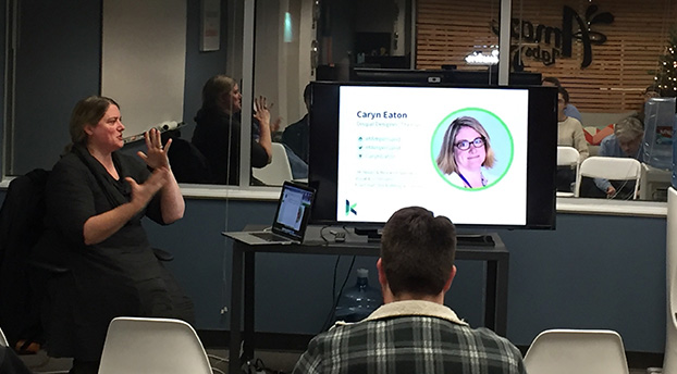
Caryn Eaton talking about Component Driven Design at ADUG
Let’s think about an image. While this may feel very granular, when you look more deeply, it becomes clear that it meets all the criteria one needs to define it as a pattern. Image is the name of an element that solves the problem of helping your users to visualize something. This could be a product or service, an event, or even a feeling you want to elicit when users visit your site. We reuse images throughout the site with variations, as well as combine it with other small patterns (for example headings, dates and paragraphs) to create this slightly larger pattern.
Managing all of these patterns is where tools like PatternLab and KSS-node come into play. They help to organize all of our newly declared patterns into logical buckets and build a living style guide to use code to communicate the visual language of a new website. As a designer who is also a coder, I can illustrate to our clients exactly how the team envisions these components working — not just how they will look. And yes, before you point it out, there are other tools designers use that do this effectively, but, as far as I have seen, they rarely provide production-ready code that can be leveraged directly by the CMS to jumpstart development. This is the real beauty of the twig-based relationship between D8 and PatternLab.
Now, as I hand off the designs to the remainder of the development team, there is little ambiguity yet greater flexibility to implement the remainder of the templates/pages throughout the site. By using a module, aptly named components, developers can reach over into PatternLab and import the code, classes, and styles associated with a specific pattern anywhere it is needed. This assures consistency, and even a modularity, which is something every developer strives for during the development process.
So, is the PSD dead? As much as I would love to say yes, I highly doubt it. Designers will always have a need to benchmark certain aspects of a project in static format to gain buy-in on direction. In-browser design is yet another tool in our ever-deepening toolbox to help gain efficiencies during build projects, allow us to meet project timelines, and better set client expectations, ultimately leading to happier clients and teams alike.
If you would like to learn more about how D8 and PatternLab could be implemented on your next website build, please do not hesitate to reach out to us here at Kanopi Studios.
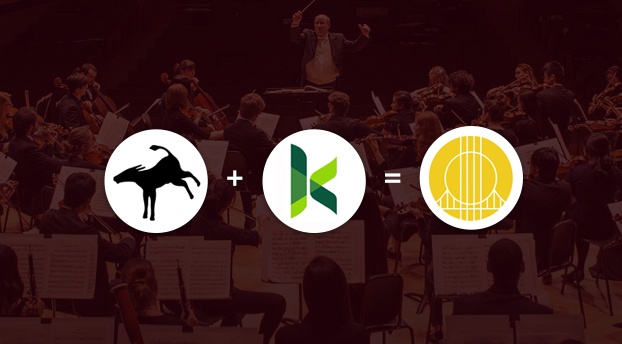
“Mutualism” is a fancy term for a mutually beneficial, symbiotic relationship between two entities in nature. Organisms, from simple to complex, team up and help each other to the benefit of both; resources that may be scarce for one organism are easily provided by the other. So, how can mutualism apply in the agency world? The modern approach to building technology-agnostic experiences, allows the evolution of the User Experience and Design to lead the executional decisions on “how” (the technologies) to build the “what” that has evolved. At times, firms look for a partnership to complement their team. Therefore, mutualism with other agencies can become an extension of the firm and seamlessly keep projects moving forward.
At Kanopi Studios, we feel that a symbiotic collaboration of great minds breeds great work together! That’s why we are proud to highlight our partnership with Mule Design Studio on the San Francisco Conservatory of Music (SFCM) website.
San Francisco Conservatory of Music gives students the framework and foundation to succeed throughout their studies and careers, creating a path of lifelong learning. In partnering with Mule Design Studio, SFCM was looking for a full web transformation; one that would showcase the Conservatory’s unique mission and offerings. The goal was to delight prospective students and their parents and provide pathways to relevant content inspiring them to want to study at SFCM. SFCM also wanted a robust and manageable content administration process.
Mule expertly constructed an experience to propel the brand experience and accomplish these goals, then chose Kanopi Studios as their Development Partner to bring the experience to life.
“We seek development partners who specialize in implementing state-of-the-art web experiences. Kanopi’s decade-plus experience in Drupal development, their ingenuity, and their people are why we chose to work with their studio. Mule takes a holistic approach to strategy, design, and technology, and selecting a partner like Kanopi to be a part of delivering a successful site is imperative.”
– Mike Monteiro, Mule Design
Kanopi constructed a dedicated multidisciplinary team to perform technical guidance, feasibility and executional services for the project. Together, Mule and Kanopi provided thought-leadership on real-world implementation and actualization of design, while building a blueprint for the end user’s experience, both visually and technically. The partnership between Mule and Kanopi was seamless, and the teams strived to provide a unified experience for the end client.
As with many projects, there were complexities. In this case, the end-result needed to be more of a customized web solution. Not only did the experience require carefully crafted content, the sheer volume of content required a mindful execution for the front-end to be flexible to accommodate it, as well as the CMS administration that powered it. There were also integration points, such as an EMS calendar system. In order to further integrate the calendaring system into the experience, we were able to create a customized model to group related taxonomy with events on the calendar and create a guide that SFCM could build out and load content into as needed.
“Kanopi conducted a thorough technical discovery phase to inform and define the technical specifications for the project. These were outlined in a scope document for the client and included all third party integrations. It also mapped our implementation plan, defined parameters, and called out specific criteria for the build. Throughout the project, Kanopi provided further detailed plans for the client around each milestone: CMS Training, Content Entry, QA Testing, and Launch. This documentation enabled a smooth, on-time launch.”
– Maggie Glaize, Mule Design
Alignment between Mule and Kanopi was critical to provide a unified execution, but the end client’s partnership with the teams was just, if not more, pertinent. SFCM assembled a multi-skilled team to tackle the project and methodically navigated stakeholders on their side to gain buy-in and lead the effort. The project success was an absolute collaboration between several organizations all working diligently toward common goals, and leaning on each other throughout to successfully launch the experience.
In nature, measuring the precise benefits to the individuals in a mutualistic relationship is not always a straightforward process, particularly when organisms can receive benefits from a variety of sources. By creating lasting, trusted, ongoing agency partnerships, Kanopi builds personal connections. The more we understand how our agency partners think, the more we can intuit what they need, and the more we can intuit project needs. Interactions between Kanopi and our partners are harmonious, as are the relationships we have with our end clients.
Want to form a partnership with us on your next project? Contact us.
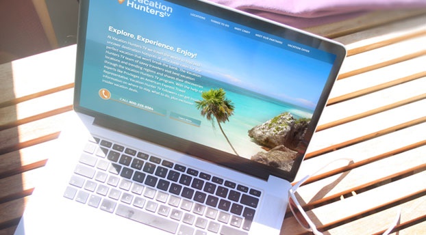
This summer, Canella Response Television partnered with Kanopi Studios to create a website that helps generate sales for their Vacation Hunters TV direct response television (DRTV) program. Vacation Hunters TV provides an amazing deal for a vacation for two to Mexico’s Maya Riviera. Their DRTV spot features gorgeous and enticing clips of locations to visit and things to do in the Maya Riviera- and of course, their killer offer- presented by savvy traveler extraordinaire, Cindy Christi. This was Kanopi’s first DRTV website, and we were excited about the challenge to increase their conversion rate.
A DRTV program asks consumers to respond directly to the ad by calling in or visiting their website. The Vacation Hunters TV offer is only redeemable by phone, so our goal was to have users call the 800 number and book their trip. After watching the show multiple times to get an understanding of their flow of information and call-to-actions, we dove into the UX and design. The site needed to be an extension of the show- informative, enticing media, ample call-to-actions, and be beautifully clean and simple, unlike a lot of in-your-face DRTV companion sites.
We took the tried and true flow of a DRTV show and reimagined it for the web. We designed a one-page, long-scrolling site, introducing users to the offer, enabling them to explore the opportunity and locations through text, videos, and photos. The site also presents the host and Partners that make this deal possible. It wraps up with another offer, all while subtly keeping the call-to-action front and center.
The result? Within three weeks of the site being live, www.vacationhunters.tv generated over 1,000 phone calls and their usual conversion rate of 3-4% was up to 7.5%. Happy travelers and a euphoric client! Now that we’ve completed our work, we’re ready to pack our bags and head to Mexico. ¡Hasta luego!
Can you recall the last time you were holding your smartphone? Of course, you can! It was likely only a few minutes ago. Actually, if you’re part of the steadily increasing number of web users who do the majority of their website browsing using their hand-held devices, chances are good you’re holding your smartphone right now to view this article.
With so many people now using their mobile devices to surf the net, the way website developers approach website creation has significantly changed. In our latest blog post for GoDaddy Garage Blog find out:
What is a mobile optimized website
Traits of websites that are optimized for mobile and tablet
Top 10 reasons why your website should be optimized for mobile viewing.
Read the ENTIRE article and make sure to check back for more posts.
It’s that time of year again! No, I’m not talking about time for turkey, football, holiday parties, and Christmas cheer – although I’m definitely excited about these things as well. What I mean is, it’s time to take a look at the upcoming web design trends for the next year. Web design has come a long way in the last several years. I always enjoy looking back, observing current trends, and making predictions on where web design is headed next. This reflection on design is not only fun – I believe that these trends are important to consider when updating or redesigning, as it helps to future-proof your site and deliver an experience your users will come to expect.
Common UI Patterns
User experience has rightfully become a large part of the web design industry. The use of responsive design has changed the way that we consume the web. This user-centric focus has resulted in many common UI patterns across mobile and web design. Although I think we will see more originality in designs popping up in the future (which I’ll touch later), I think we’ll continue to see common UI patterns popping up across the web, such as hamburger menus and hidden navigation, card layouts, simple but strong designs, and…
Meaningful Microinteractions
Essentially, microinteractions are small product moments that revolve around a single task. You take part in them every day – hitting the snooze button, checking off a to-do item, or turning on a function on a device. Examples of microinteractions on websites include progress when filling in a registration form, favoriting a song, a notification of real-time content updates, or a friendly greeting before diving into the content. Microinteractions usually get little attention unless they’re poorly executed and cause annoyance. Well planned, human-centered microinteractions can make the difference between someone tolerating your site and someone becoming a loyal user. They should use human language, colloquial speech, and include emotions. Understanding your user (what they want to accomplish, when and where the interaction will take place, etc), is the beginning of crafting enjoyable microinteractions. With a continued emphasis on User Experience in web design, we will likely see more meaningful microinteractions pop up across the web.
The example below was created by UXPin, on a hypothetical model talent website. The model’s metrics, as well as a button to download a pdf with more information, are revealed on hover. The addition of subtle animations add a bit of discoverability to the experience. Read more at UXPin’s post: UX Design Best Practices: Refined Microinteractions.
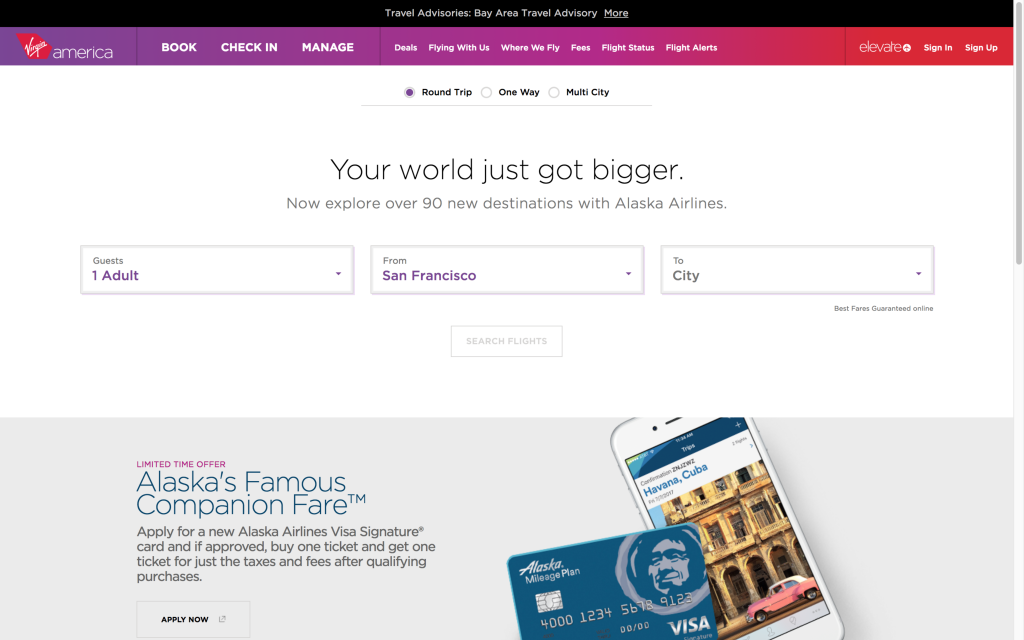
Virgin America Virgina America’s website has a lot of microinteractions on their UI that add special touches to the experience of booking a flight. The list includes active states to indicate what form field the user is on, animated indicators of the user’s selections, and messages at the top of the screen that walk the user through the process. The addition of fun messages about the destination adds personality to the interaction.
Originality
With the rise of responsive web design, we’ve also seen a huge shift toward a particular design trend – full-width banded background sections, large hero images/slideshows, lots of vertical scrolling, and parallax features. The popularity of these design features has resulted in many websites having the same look and feel. I think we’ll see a renewed emphasis on original designs in the coming year(s). This will be done through hand-drawn graphics, unique grid use, stronger focus on typography, elegant animations, and storytelling.
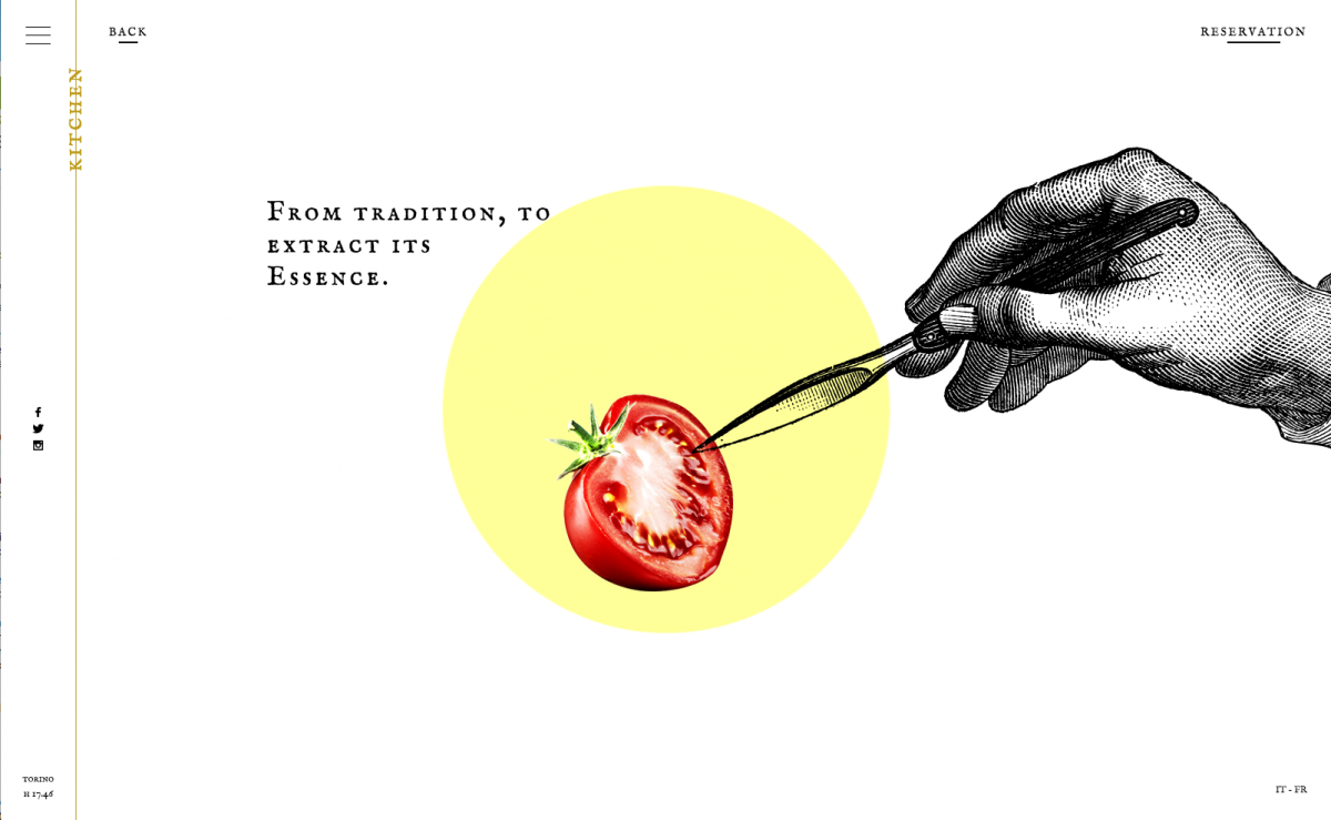
Ristorante Del Cambo This restaurant website has a unique blend of illustrations, photography, subtle video, and scrolling in a simplistic design.
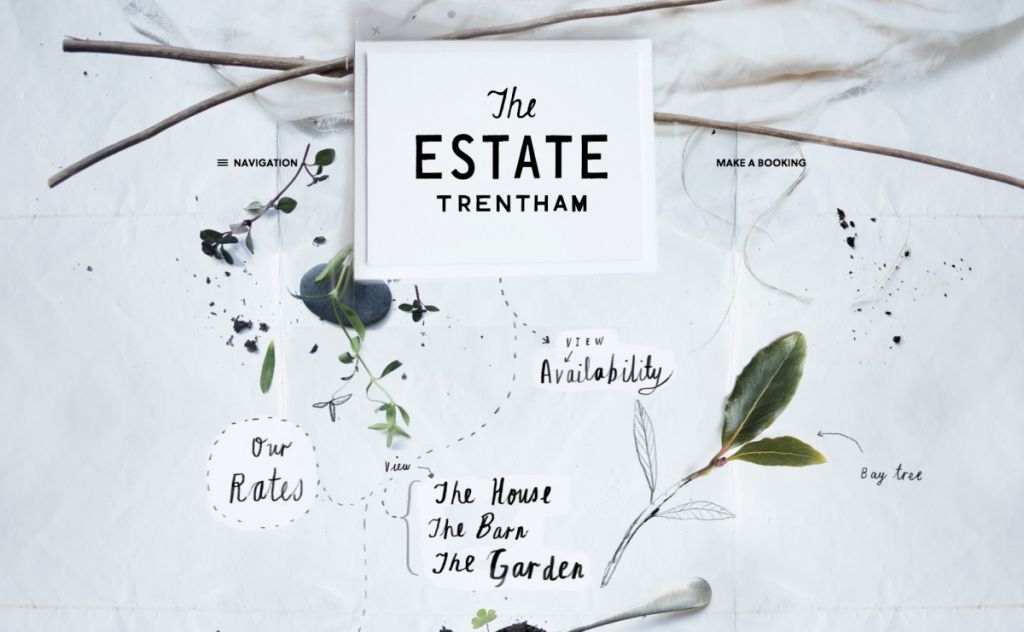
The Estate Trentham The website for The Estate Trentham uses photography and hand drawn elements to create an organic feel that matches the vibe of the estate beautifully.
Storytelling
Storytelling is as old as humankind itself, and is the primary way that we absorb and share information. A good story will engage the audience, make content and facts memorable, illicit emotions, and can ultimately persuade the audience to make a decision. It’s an important communication tool in marketing, but has been seldom used in web design. Some considerations for creating a good story parallel those for creating good web design. Crossover factors include: Who is the audience? What are your goals? Do you have a clear message? Engaging content, supporting visuals, and user interaction can be combined to bring storytelling to a website. There are already a handful of sites that make good use of storytelling, and I believe that we’ll continue to see more.
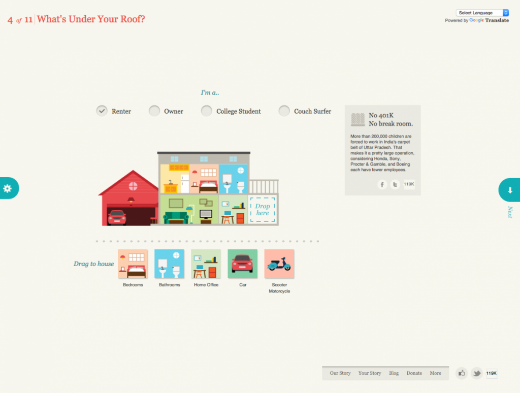
Slavery Footprint Slavery Footprint is an excellent example of a website making the user the character in the story. The user fills out an interactive survey and is given information about slavery and how it relates to them personally.
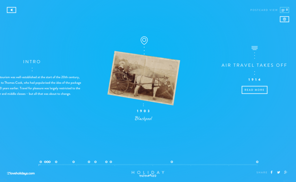
Love Holidays – Holiday Memories Holiday Memories is a promotional site for loveholiday.com. Through its clever use of an interactive timeline and map view, it displays the history of British tourism using real holiday photos.
Material Design (or the evolution of flat design)
Material Design is a guide that was created by Google (in 2014) for visual, motion, and interaction design across their platforms and devices. It isn’t exactly a design trend like flat design, although some do call it the ‘evolution of flat design’ because it borrows aesthetics from it. Google offers a library, Material Design Lite, which can be used on websites. Material Design is based on the idea of layering tactile elements, like a stack of papers. It reintroduces the use of layering, light and shadows, which were stripped out of flat design. These elements aren’t just used for visual appeal, as we’ve seen in the past. When used intelligently, they provide realistic visual cues to the user experience. Material Design brings a lot more to design, such as color palette, typography, icons and layouts, but I believe the use of layering and shadows will become the next direction for “flat” design.
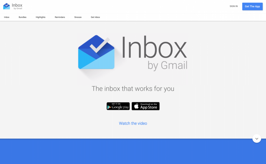
Inbox by Google Unsurprisingly, Google uses Material Design on its own products – Inbox by Google is a good example of Material Design.
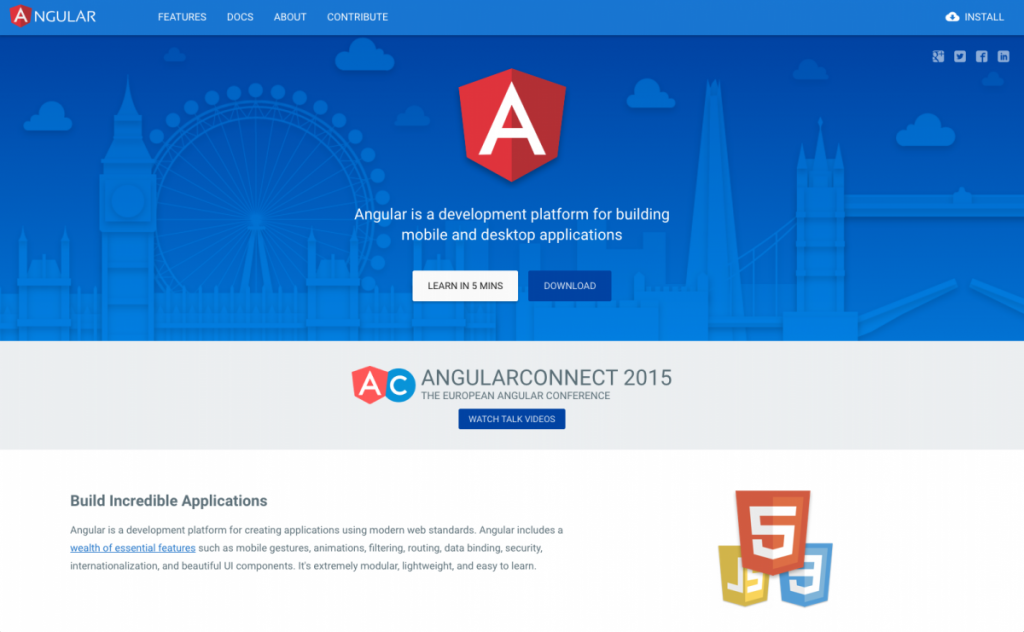
Angular.io Angular uses subtle shadows and animations to highlight interactions, separate page sections, and draw attention to important elements.
Focus on Large Screen Resolutions
You may have noticed that I didn’t include responsive design in this list of upcoming design trends. This was intentional, as I think it’s no longer a trend, but a must. Responsive design is critical, as Google has changed the way that it ranks sites that are not mobile-friendly. Having said this, I do think we’ll see a larger number of responsive sites focusing on large screen resolutions, as well as small screen. Recently, I’ve had a handful of clients ask me about designing for extra large screens. Since then, I’ve seen a steady rise in sites that are doing so. For example, Amazon recently increased its maximum width to 1500px. According to w3schools, desktop users were on screens with a resolution of larger than 1320px wide. It only makes sense to move to a larger maximum width for our websites.
Bottom Line
While I think we’ll see an increase in these trends in the coming year, it’s important to keep in mind that these, and other trending design patterns, shouldn’t be used just because they’re popular. The main focus of your design should be creating a compelling user experience. Some of the above may aid you in doing so, and some may not.
Happy holidays, happy new year, and happy designing!