
It’s that time of year again! No, I’m not talking about time for turkey, football, holiday parties, and Christmas cheer – although I’m definitely excited about these things as well. What I mean is, it’s time to take a look at the upcoming web design trends for the next year. Web design has come a long way in the last several years. I always enjoy looking back, observing current trends, and making predictions on where web design is headed next. This reflection on design is not only fun – I believe that these trends are important to consider when updating or redesigning, as it helps to future-proof your site and deliver an experience your users will come to expect.
Common UI Patterns
User experience has rightfully become a large part of the web design industry. The use of responsive design has changed the way that we consume the web. This user-centric focus has resulted in many common UI patterns across mobile and web design. Although I think we will see more originality in designs popping up in the future (which I’ll touch later), I think we’ll continue to see common UI patterns popping up across the web, such as hamburger menus and hidden navigation, card layouts, simple but strong designs, and…
Meaningful Microinteractions
Essentially, microinteractions are small product moments that revolve around a single task. You take part in them every day – hitting the snooze button, checking off a to-do item, or turning on a function on a device. Examples of microinteractions on websites include progress when filling in a registration form, favoriting a song, a notification of real-time content updates, or a friendly greeting before diving into the content. Microinteractions usually get little attention unless they’re poorly executed and cause annoyance. Well planned, human-centered microinteractions can make the difference between someone tolerating your site and someone becoming a loyal user. They should use human language, colloquial speech, and include emotions. Understanding your user (what they want to accomplish, when and where the interaction will take place, etc), is the beginning of crafting enjoyable microinteractions. With a continued emphasis on User Experience in web design, we will likely see more meaningful microinteractions pop up across the web.
The example below was created by UXPin, on a hypothetical model talent website. The model’s metrics, as well as a button to download a pdf with more information, are revealed on hover. The addition of subtle animations add a bit of discoverability to the experience. Read more at UXPin’s post: UX Design Best Practices: Refined Microinteractions.

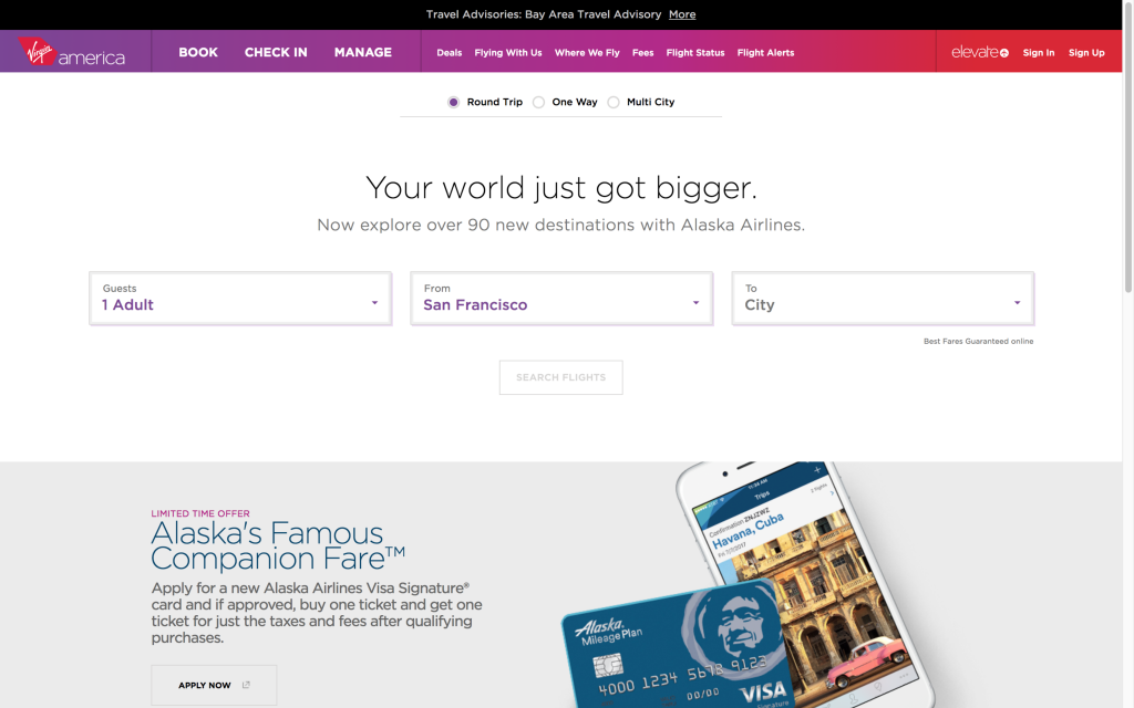
Virgin America
Virgina America’s website has a lot of microinteractions on their UI that add special touches to the experience of booking a flight. The list includes active states to indicate what form field the user is on, animated indicators of the user’s selections, and messages at the top of the screen that walk the user through the process. The addition of fun messages about the destination adds personality to the interaction.
Originality
With the rise of responsive web design, we’ve also seen a huge shift toward a particular design trend – full-width banded background sections, large hero images/slideshows, lots of vertical scrolling, and parallax features. The popularity of these design features has resulted in many websites having the same look and feel. I think we’ll see a renewed emphasis on original designs in the coming year(s). This will be done through hand-drawn graphics, unique grid use, stronger focus on typography, elegant animations, and storytelling.
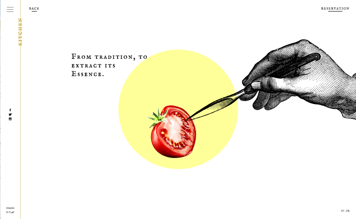
Ristorante Del Cambo
This restaurant website has a unique blend of illustrations, photography, subtle video, and scrolling in a simplistic design.

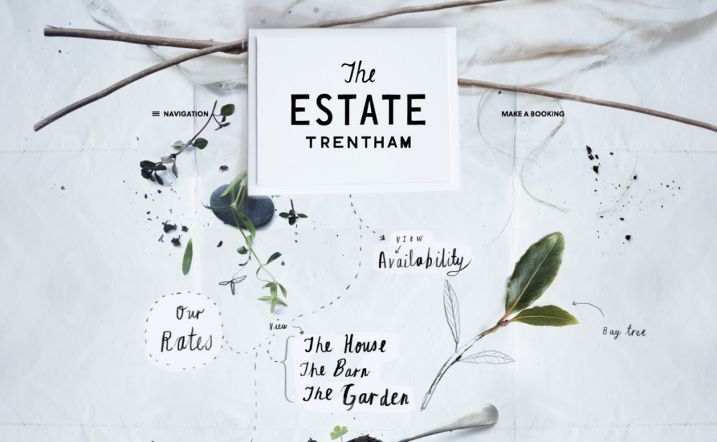
The Estate Trentham
The website for The Estate Trentham uses photography and hand drawn elements to create an organic feel that matches the vibe of the estate beautifully.
Storytelling
Storytelling is as old as humankind itself, and is the primary way that we absorb and share information. A good story will engage the audience, make content and facts memorable, illicit emotions, and can ultimately persuade the audience to make a decision. It’s an important communication tool in marketing, but has been seldom used in web design. Some considerations for creating a good story parallel those for creating good web design. Crossover factors include: Who is the audience? What are your goals? Do you have a clear message? Engaging content, supporting visuals, and user interaction can be combined to bring storytelling to a website. There are already a handful of sites that make good use of storytelling, and I believe that we’ll continue to see more.
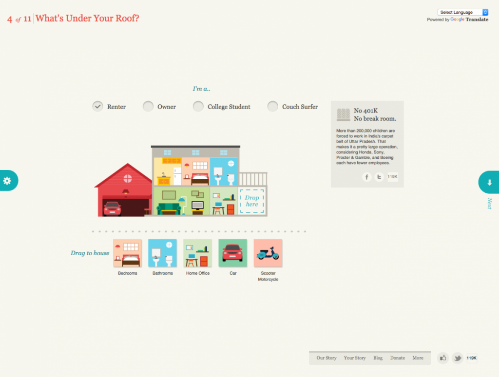
Slavery Footprint
Slavery Footprint is an excellent example of a website making the user the character in the story. The user fills out an interactive survey and is given information about slavery and how it relates to them personally.
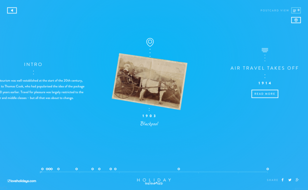
Love Holidays – Holiday Memories
Holiday Memories is a promotional site for loveholiday.com. Through its clever use of an interactive timeline and map view, it displays the history of British tourism using real holiday photos.
Material Design (or the evolution of flat design)
Material Design is a guide that was created by Google (in 2014) for visual, motion, and interaction design across their platforms and devices. It isn’t exactly a design trend like flat design, although some do call it the ‘evolution of flat design’ because it borrows aesthetics from it. Google offers a library, Material Design Lite, which can be used on websites. Material Design is based on the idea of layering tactile elements, like a stack of papers. It reintroduces the use of layering, light and shadows, which were stripped out of flat design. These elements aren’t just used for visual appeal, as we’ve seen in the past. When used intelligently, they provide realistic visual cues to the user experience. Material Design brings a lot more to design, such as color palette, typography, icons and layouts, but I believe the use of layering and shadows will become the next direction for “flat” design.
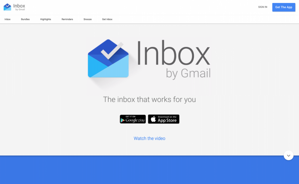
Inbox by Google
Unsurprisingly, Google uses Material Design on its own products – Inbox by Google is a good example of Material Design.
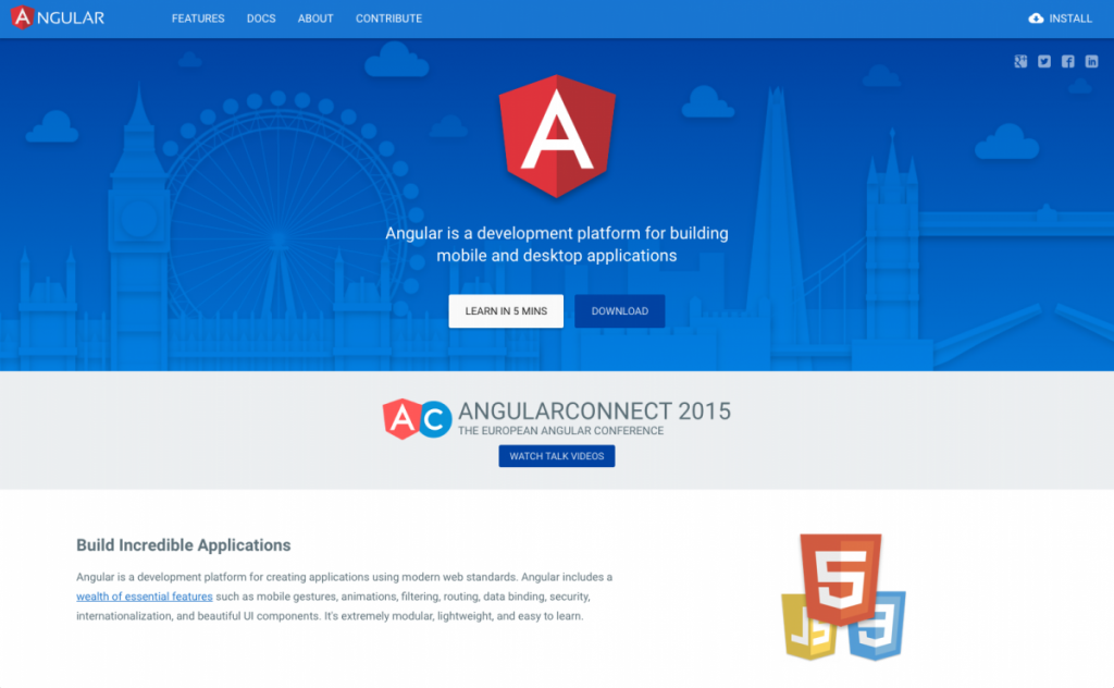
Angular.io
Angular uses subtle shadows and animations to highlight interactions, separate page sections, and draw attention to important elements.
Focus on Large Screen Resolutions
You may have noticed that I didn’t include responsive design in this list of upcoming design trends. This was intentional, as I think it’s no longer a trend, but a must. Responsive design is critical, as Google has changed the way that it ranks sites that are not mobile-friendly. Having said this, I do think we’ll see a larger number of responsive sites focusing on large screen resolutions, as well as small screen. Recently, I’ve had a handful of clients ask me about designing for extra large screens. Since then, I’ve seen a steady rise in sites that are doing so. For example, Amazon recently increased its maximum width to 1500px. According to w3schools, desktop users were on screens with a resolution of larger than 1320px wide. It only makes sense to move to a larger maximum width for our websites.
Bottom Line
While I think we’ll see an increase in these trends in the coming year, it’s important to keep in mind that these, and other trending design patterns, shouldn’t be used just because they’re popular. The main focus of your design should be creating a compelling user experience. Some of the above may aid you in doing so, and some may not.
Happy holidays, happy new year, and happy designing!