Website Design & Development Trends for 2026

It’s that time again where we look ahead to what’s coming. We admittedly don’t love the word “trends” because it implies something fleeting, while our entire philosophy is about building sustainably and intelligently so websites will last. The word “trends” works great for a short headline, but this article is more about outlining what we see coming in all aspects of website design and development so you can be prepared to decide what could work for your business. 

We’ll warn you: artificial intelligence is covered a lot in this article. Love it or hate it, it’s here. While we are all learning to find ways to allow AI into our workflows in order to create efficiencies, it’s critical to use it in a way that keeps humanity strong! (If you’re curious, here’s how Kanopi uses AI for clients).

Let’s start with strategy.

Let the bots organize large datasets

One thing that AI is very skilled with is helping aggregate large, disparate datasets. Think competitor research, user behavior data, or analytics reports.

Our content and UX strategy teams use a combination of Chat-GPT and Claude to analyze large datasets, identify patterns, and turn complex information into clear, human-readable insights. AI can be used here to lessen the manual lift behind time-intensive activities; work that once took weeks can now be completed in just a few days, freeing our strategists to focus on the high-impact thinking that drives meaningful results for our clients. 

As always, human guidance is key. A human needs to review the outputs as they come. It helps maintain accuracy, minimize bias, and ensure that AI outputs stay closely aligned with the project’s goals and broader strategic direction. 

Agentic journeys & funnel flattening

AI agents (ChatGPT, Gemini, custom enterprise agents) will increasingly handle research, booking, donations, and transactions end-to-end, collapsing multi-step funnels into single-intent, conversational flows. Early adoption in 2026 will raise new questions about attribution, fraud, consent, and regulation. 

What about website design, UX and content?

Make your content speak AI

AI isn’t just reading your content anymore. It’s deciding whether to recommend you at all. If your site isn’t structured in a way that ChatGPT, Gemini, and other AI agents can understand, you’re basically invisible to a growing chunk of how people discover things online. We’re talking semantic HTML, well-structured and agent-friendly APIs, stable URLs, and clean information hierarchies, and structured data … all the stuff that makes your content machine-readable. This is no longer optional. Think of it as SEO 2.0, except now you’re optimizing for robots that are way smarter than the old-school web crawlers. Otherwise, expect degraded representation in AI-driven search and assistants.

What Kanopi is doing: We start with AI-led content audits that reveal exactly where your content stands. What’s discoverable, what’s buried, what’s redundant, and what’s completely invisible to AI systems. These audits don’t just identify problems, they inform strategy, helping you prioritize what to fix first based on actual impact.

Scale your content without sacrificing your voice

One of the biggest challenges teams face is keeping content fresh and consistent across dozens (or hundreds) of pages. You’ve got style guides gathering dust, content editors struggling to match tone, and updates that take forever because every piece needs multiple rounds of review. AI changes that equation completely. But only if it’s trained on your voice, not generic internet speak.

What Kanopi is doing: We’re building custom AI workflows that learn your brand’s style guide, tone, and content patterns, then generate copy variations that actually sound like you. But we’re not just handing you a robot and wishing you luck. We’re creating prompt libraries and content templates tailored to your team’s specific needs. Need 10 variations of a CTA? Done. Want to update product descriptions across your catalog while maintaining consistency? Easy. We’re giving your content editors AI tools that work with them, not against them, so they can keep sites current without burning out. It’s like having a writing assistant who’s read every piece of content you’ve ever published and knows exactly how you like things done.

Design for speed and intuition

Nobody wants to click through five pages to do something an AI can handle in one conversation. We’re witnessing a significant shift toward interfaces that anticipate users’ needs and deliver them faster. Think calmer designs, less clutter, smarter personalization that doesn’t feel intrusive. Multi-step funnels are collapsing into simple, conversational flows because that’s what AI agents are built for and what users now expect. The best interfaces in 2026 will feel less like navigating a website and more like having a helpful assistant who intuitively understands your needs.

What Kanopi is doing: We’re using AI-powered tools to streamline our design workflows that create meaningful efficiencies for our downstream development teams. Our Figma to Claude process enables rapid component prototyping. This means we can create more, iterate faster and refine work, without putting timelines or budgets at risk. 

Unifying theme and atomic/component-driven design

A major trend shaping 2026 web design is the continued move toward unified, component-based systems. Instead of designing every page from scratch, we create a consistent library of reusable interface elements, buttons, cards, forms, navigation patterns, that work together seamlessly across your entire site. This ensures visual cohesion, faster development, and a smoother user experience.

What Kanopi is doing: we take this further by pairing modern design tools with cutting-edge AI development workflows. Using Figma’s Model Context Protocol (MCP), our design files connect directly to advanced AI coding tools like OpenAI Codex and Anthropic’s Claude. This means our designs are translated into high-quality, production-ready code with exceptional accuracy.

Once components are built, we use Google Chrome DevTools MCP to let AI validate how each piece actually renders in a real browser, catching visual issues early and ensuring the final experience matches the design vision.

From there, our developers ensure each component can be easily managed in your CMS. Finally, we build end-to-end functional tests that automatically watch for regressions, ensuring that as your site evolves, nothing breaks along the way.

The result is a unified design system powered by intelligent workflows that keeps your site visually consistent, easy to maintain, and ready to scale.

Other things we see coming

  • AI can serve as a valuable design research partner, helping designers quickly surface trends, industry-specific design patterns and assessing the accessibility of design components as they are being designed. 
  • Aesthetically speaking, we’re noticing a shift to calmer user experiences; minimalist interfaces, fewer distractions, more clarity, and clearer information hierarchies. 
  • Lastly, compliance for WCAG and “Consent UX” or “Trust UX” — the design of user interfaces and flows that ethically obtain user permission for data collection and use — is becoming mandatory. See the “Trust, Privacy, Consent & compliance in the next section for more information on this.  

There’s even more happening in Website Development (whether it’s Drupal, WordPress, or custom code)

Just like in strategy, content, and design, development is also undergoing a meaningful shift. These aren’t fads. They’re structural changes in how teams build, maintain, and future-proof websites. Here’s what we see shaping 2026:

Server-side rendering & resilient delivery

We’re watching teams swing back toward server-side rendering (SSR), static site generation (SSG), and progressive enhancement. This isn’t nostalgia, instead it’s a response to what users (and AI systems) now expect: fast initial loads, predictability, resilience, and content that’s easily discoverable by both humans and machines.

Modern frameworks absolutely still have a place, especially when rich interactivity is required, but we’re seeing a clearer separation between where complexity adds value and where it gets in the way.

Rethinking architecture: agents vs. complex crontends

As AI agents begin handling more of the “consumption layer” — surfacing answers, facilitating transactions, navigating information — the value of extremely complex, client-heavy architectures is being reconsidered.

 For informational sites and straightforward user journeys, well-structured, semantic content often wins over front-end flexibility. Complex frontends will continue to power robust applications, but many marketing and discovery-focused sites are trending back toward hybrid or server-first models.

Agents are already consuming AI-friendly APIs, and with evolving authentication, they’ll get even better at interpreting content over time. With the current pace of innovation, we predict this will be a delicate dance throughout 2026.

AI-accelerated technical debt

AI coding tools are incredible accelerators, but they’re accelerators in both directions. Yes, they speed up delivery. They also multiply code volume, inconsistency, and architectural drift if teams don’t stay vigilant.

This is where strong standards, clean patterns, and senior oversight matter more than ever. Without them, organizations end up with AI-generated technical debt and fragmented prompt/model sprawl — problems that cost significantly more to untangle later. Kanopi builds governance into our workflows so speed never comes at the expense of long-term stability.

As AI becomes embedded in websites and applications, the way we communicate trust changes too. Users need clarity around how their data is used, how permissions work, and what AI agents are doing on their behalf.

“Trust UX” is becoming its own discipline. Transparent consent flows, auditable agent actions, and understandable data policies are now core engineering requirements, not afterthoughts. And with legal scrutiny around consent management on the rise, we expect this to intensify in the coming year.

Predictive personalization & AI-driven adaptation

Users increasingly expect experiences that adapt to them, including personalized recommendations, context-aware content, and layouts that respond to user intent. Achieving this requires real AI infrastructure: data pipelines, model governance, and ethical frameworks.

Basic rules-based personalization won’t cut it anymore. Organizations that want to deliver anticipatory digital experiences will need to invest in more holistic, AI-driven systems.

Accessibility & inclusion as architectural foundations

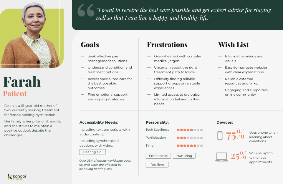
Accessibility is no longer something you “add on” during QA. It’s becoming a structural requirement. Semantic HTML, non-JavaScript critical paths, and robust WCAG compliance are essential for AI discoverability and multimodal search (and are just good practice regardless).

As agents rely more on clean, machine-readable content, inaccessible markup and JS-gated experiences will carry increasing penalties. Building inclusively from the start is now both an ethical responsibility and a competitive advantage.

As for what Kanopi’s doing specifically, here are a few exciting projects keeping us engaged:

Drupal CMS, Drupal Canvas, and Site Templates!

We’re hard at work in the Drupal community helping Drupal CMS development continue.  From that, Drupal CMS 2.0 will be released in January 2026, complete with a working Site template example building on top of Drupal Canvas, the new editor coming to Drupal.

There are AI integrations, theming in the browser, and instant component creation. This all will minimize development cycles and empower content creators to prototype and publish as they see fit.

We will be working to release a Site Template in the initial launch of the Drupal.org marketplace, so check back with us in the spring at DrupalCon Chicago.

AI Tooling to increase content editor and developer efficiency

We’re working to build AI workflows and tools into our tech stack and into Drupal and WordPress sites to help all of us be more productive in our day to day tasks. We’re connecting Figma to coding agents, as well as connecting automated audits to ticketing systems, content, image, and audio generation in content management systems. Basically, we are working in a way that we can do more with less.

Things are moving quickly, but the basics are still critical.

It’s a lot to absorb when technology moves ever faster, but it’s important to remember that the basics still hold true: your website needs to work for the humans that use it. Your visitors need the information they came looking for, and your editors on the back end need to be able to make updates that keep the website performant, accessible, and fresh. 

There’s always going to be more we can do to make websites better, so it’s easy to get overwhelmed with everything that’s coming. But remember this: you don’t need to know everything, you only need to know the things that will make your website meet the goals you’ve defined for it. 

We hope this post helps inspires you with ideas on how to make your website stronger in 2026!

Accessibility in the Design Process

(Note: If you’re short on time, click here for the tl:dr summary.)

We take web accessibility seriously here at Kanopi. It’s a key part of being an inclusive organization, which is one of our core values.

It’s also because we need to be. And so do you. 

Let’s start with the fact that it just makes good business sense. 

According to CDC stats, 27% of adults in the U.S. alone are permanently disabled (which itself is just one small portion of the entire disability spectrum). If your website doesn’t address their accessibility concerns, you’re essentially denying them the opportunity to become your customer, member, subscriber, applicant, or whatever your website goals may be. 

It’s also worth mentioning that, depending on the nature of your organization, you could even face potential legal liability if your website isn’t properly accessible.

In practice, it means we’ve baked accessibility considerations directly into our processes, throughout every department and team. For example, when our strategy team creates user personas, they ensure at least one of them has a specific accessibility need along with the standard set of attributes

Since many of the considerations regarding website accessibility are design considerations, our design team has created an Accessibility Checklist that we apply to everything we create. It’s based on the A11y Project plus our own team’s experience, and it’s meant to help ensure our designs meet the standards set forth by the Web Content Accessibility Guidelines (WCAG).

The A11y Project provides the most comprehensive explanation of WCAG. So, to quote them verbatim: 

The WCAG is a shared standard for web content accessibility for individuals, organizations, and governments. There are three levels of accessibility compliance in the WCAG, which reflect the priority of support:

  • A: Essential — If this isn’t met, assistive technology may not be able to read, understand, or fully operate the page or view.
  • AA: Ideal Support — Required for multiple government and public body websites. 
  • AAA: Specialized Support — This is typically reserved for parts of websites and web apps that serve a specialized audience.

As A11y points out, this list by itself won’t make your site fully accessible to everyone, but it will go a long way toward improving the overall user experience.

Kanopi Design Accessibility Checklist

Color Contrast

We check text contrast to prioritize readability, and meet a minimum WCAG AA-compliant 4.5:1 contrast ratio.

We also ensure that color contrast for non-text items (graphical objects, for example) meets the minimum standard 3:1.

We use Webaim’s contrast checker tool to ensure our contrast ratios are compliant.

Typography

WCAG guidelines require that text can be resized up to 200 percent without losing content or functionality, and without relying on assistive technology. This rule does not apply to captions or images of text.

We choose fonts that work well at both large and small sizes. They feature clear, distinct letterforms that are easy to read in many situations. This helps accommodate the variation found across different mobile devices.

We use a minimum size of 12 points or 16 pixels for all body copy. 

Animation & Motion

While most mobile and desktop operating systems now include ‘reduce motion’ settings, websites themselves should also allow for further controls. WCAG also states that users should always be able to exert some control over how they experience animation in websites. 

This is why the websites we design, build and support allow users to play and stop animations as it suits them. We also use motion strategically, so it enhances the experiences for some users without impeding the experiences for others.

Layout Design

We make sure all user interface elements in our designs are sized and spaced to make interaction (i.e. via ‘tap’ or alternative interfaces) as simple as possible for users with reduced motor functionality.

In addition to being compliant with WCAG guidelines regarding text spacing and other interface elements, it also aligns with more general design best practices — in this case, Jakob’s Law.

Accessibility benefits all users.

We’ve found that adhering to accessibility guidelines not only opens your websites to potential new users, but it creates a better user experience for everyone. 

These are just a sample of the user benefits accessible websites provide:

  • Reduced friction points within the website experience
  • Easier to consume and engage with content
  • Better mobile experience
  • Wider audience reach 
  • Reduced bounce rates
  • SEO benefits
  • Higher conversion rates

Feel free to borrow this checklist for your own organization, or formulate your own list that best reflects your user research. And if your website needs to be more accessible, a major redesign might be the right step. If you’re not sure, we’re here to help.

If you’re interested in learning more about accessibility, check out these posts: 

TL:DR Design Accessibility Checklist 

Note: As per our Accessibility Expert Candice Dexter, we should note that these checklist items apply to more than one rule each; but we’re focusing here on its primary compliance rule.

Color Contrast

Check for:

We prioritize fonts that perform at large and small sizes We test text contrast to prioritize readability, and meet a minimum AA-compliant 4.5:1 contrast ratio.

We also ensure that color contrast for non-text items (such as graphical objects) meets the minimum standard 3:1.

To comply with:

Typography

Check for:

We prioritize fonts that perform at large and small sizes that have distinct, easily identifiable letterforms. A minimum size of 12 points or 16 pixels is used for all body copy. 

We stick with fonts that can be easily read in a variety of scenarios, to account for the variation that can occur with mobile devices.

Animation & Motion

Check for:

Users should always be able to exert some control over how they experience animation in websites. While most mobile and desktop operating systems now include ‘reduce motion’ settings, websites themselves should also allow for further controls.

The websites we design, build and support give users the ability to play and stop animations as it suits them. We also use motion strategically, to enhance the experiences for some users without impeding others.

Layout Design

Check for:

We make sure all user interface elements in our designs are sized and spaced to make interaction (i.e. via ‘tap’ or alternative interfaces) as simple as possible for users with reduced motor functionality.

Accessible personas: the key to inclusive web design

The World Health Organization (WHO) estimates over 15% of the world’s population — or 1.3 billion people — self-identify as having a disability.

That’s why creating inclusive and accessible websites isn’t just a nice-to-have in today’s online world; it’s an absolute necessity. 

As hospitals, universities, and nonprofits strive to meet the needs of everyone who visits their websites, it becomes all the more crucial to understand the diverse challenges folks face when attempting to interact with inaccessible content (and the impact this can have on customer acquisition, applications, and fundraising.)

Here at Kanopi, we’d argue that to understand what people with disabilities need from your website, you should develop accessible personas — detailed representations of your different website visitors, particularly those with disabilities.

This blog explores why accessible personas are essential, how they help design better user experiences and the best practices for developing them. Let’s get started!

What are accessible personas?

We’ve written about them before here, but simply put, a persona is a fictional yet data-driven representation of your target customer, written as if the persona were a real person. It’s documented in a way that lists everything from demographic information to hobbies, to pain points, and motivators. 

A persona is a tool you can use to create sales and marketing materials that have a specific target user in mind, rather than a generic one. They are designed to guide content writers, designers, and developers in crafting websites that can be easily accessed and navigated by everyone, regardless of their abilities.

But what many personas lack is taking accessibility needs into account. We can’t forget or ignore that site visitors can have various impairments, including permanent, temporary, and situational disabilities (see below for more on those). This is particularly critical in healthcare, where users come to a website with any number of accessibility needs and need information quickly and easily. 

Example: a persona for a UCSF Department of Urology patient

Example: a persona for a UCSF Department of Urology patient

By focusing on different disability types — such as mobility, visual, hearing, cognitive, and neurological impairments — organizations can better anticipate the needs of folks who may face barriers when interacting with their websites.

Dyslexia alone affects 20% of the population and represents 80–90% of all those with learning disabilities. It’s the most common of all neurocognitive disorders. Limiting all capitalization and breaking up large walls of text to add white space are just a few design solutions that help ensure your site content is dyslexia-friendly. 

It’s also essential to consider the three different types of impairments:

  • Permanent impairments, like blindness or permanent mobility limitations.
  • Temporary impairments, such as an eye injury or recovering from surgery.
  • Situational impairments, like those faced by a person in bright sunlight or within a noisy environment.

There’s a strong business case for developing accessible personas.

Improved usability for everyone

Accessible personas help organizations understand the unique challenges faced by people with disabilities, leading to more inclusive and user-friendly web design. 

The insights drawn from accessible personas ensure that accessibility isn’t an afterthought but an integrated part of the design process. 

By considering different abilities, you create a better experience not only for folks with disabilities but for everyone — whether they’re navigating your website with a keyboard, voice control, or even in a noisy or visually cluttered space.

Most organizations must comply with accessibility laws, such as the Americans with Disabilities Act (ADA) and Section 508 of the Rehabilitation Act

Then there’s the issue of ethics. Put simply, ensuring your website is accessible to people with disabilities means equal access to your site’s content for all, not just a few. 

Enhances content, UX, & design

Creating accessible personas encourages teams to focus on key aspects of accessibility, such as content clarity, navigation ease, and intuitive design. 

For instance, a persona with a hearing impairment might require captions for videos and a visual indicator for sound cues. 

Additionally, a person with a visual impairment might need large text options and high-contrast colors. 

These solutions — along with many more outlined in our content scorecard — help ensure that everyone who visits your website can read, navigate and use your content as intended.

Fosters empathy & inclusion

Developing personas based on real-world impairments fosters empathy among strategists, content writers, designers, and developers. 

When teams are guided by detailed personas that represent real-world people, you can create a stronger emotional connection to your organization’s accessibility goals. 

This empathy can shift the focus from mere compliance to a genuine commitment to creating more inclusive and usable digital experiences for everyone.

Best practices for developing accessible personas

Consider permanent, temporary, & situational disabilities

Disabilities can vary widely in terms of permanence. Some folks might have lifelong disabilities, like blindness, while others might have temporary conditions, such as an eye injury. 

Situational impairments — like a noisy environment or bright lighting — also affect how people interact with your website.

Account for diverse impairments

A disability can impact someone’s senses and abilities differently, including:

  • Mobility: People with limited motor control may require options to navigate your website without precise mouse movements. Ensure your site provides keyboard navigation, large buttons, and clear visual cues for all clickable elements.
  • Visual: Permanent impairments like blindness or color blindness and temporary issues such as cataracts or eye injuries require solutions including alt text, high-contrast colors, and adjustable font sizes.
  • Hearing: People with hearing impairments need captions and transcripts for videos and visual cues for audio content.
  • Cognitive & Neurological: People with cognitive impairments benefit from clear, simple language, step-by-step instructions, and tutorials that help them navigate your website easily.

Embed accessibility in Drupal

Once you’ve designed your personas, make it easy to implement how you’ll meet people’s needs.

The Drupal A11y Project Checklist created and maintained by developers at Kanopi offers helpful, integrated guidance on interaction methods, navigation, and structure for individuals, organizations, and governments.

Screenshot of the Drupal.org A11y project checklist

Practical solutions for a variety of impairments

Avoid taking a one-size-fits-all approach. Different solutions assist different impairments. For example:

  • Mobility Impairments: Ensure folks can navigate your site using their keyboard or screen reader. Avoid requiring precise mouse movements, which can be difficult for people with motor impairments.
  • Visual Impairments: Craft high-contrast color schemes and resizable text options, and use descriptive alt text for images and videos. These features benefit people with blindness, color blindness, and even temporary impairments like eye injuries. 
  • Hearing Impairments: Use captions, transcripts, and visual cues to replace audio information. Additionally, provide clear, concise language to ensure understanding.
  • Cognitive Impairments: Simplify language, use step-by-step instructions, and minimize complex interactions. Visual aids can be beneficial for people with cognitive or neurological impairments.
  • Neurological impairments: Avoid extreme flash and strobe of visual content, parallax effects, and scroll-triggered animations, considering the needs of the 50 million people worldwide who have epilepsy and the 1.8 million adults worldwide who have bilateral vestibular hypofunction (BVH).

Where to start for creating your own accessible personas 

The UK Government Digital Service (GDS) has developed seven different open-source accessibility personas that you can use as a reference to get started. However, the GDS also notes that creating accessible personas is not a substitute for including people with access needs in your user testing.

Guidelines from Microsoft’s Inclusive Design methodology provide a comprehensive approach to developing accessible personas as well.

Accessible personas not only humanize your site’s users but also help prioritize and align content, UX, and design solutions to better meet their needs.

At Kanopi, we create personas from many different sources, including:

  • user research
  • interviews with real people
  • data gathered through analytics
  • and market knowledge best practices.

We’ve developed accessible personas for many organizations, including Flagler College, the Gilder Lehrman Hamilton Education Program, and the UCSF Department of Urology.

While it may seem like a daunting task, taking small, incremental steps can improve your site’s accessibility over time. For example, you could start by focusing on your website’s forms.

AI and Web Accessibility: Help or Hype?

Web accessibility ensures that everyone – regardless of ability – can use and benefit from your website. For some users, that means being able to navigate a site using a keyboard or screen reader. For others. It means understanding content despite vision, hearing, or cognitive challenges. It’s not just good practice; it’s increasingly required by law. And it opens your digital doors to a wider audience. 

AI is creeping into every part of digital life, including accessibility. But does it help make websites more inclusive? Or is it just another shiny tool that creates more problems than it solves?

Here’s a quick take on how AI can support accessibility, and where it might do more harm than good.

Where AI Helps

  • Auto-generated alt text. AI can analyze images and suggest descriptions, filling in gaps when content editors forget. It’s convenient on large, content-heavy sites, but human review is still essential. AI may “see” a mountain, but it won’t know why the image matters in context.
  • Real-time content feedback. Some platforms now offer accessibility checks directly in the content editing workflow. These tools help flag issues like missing headings, poor color contrast, or unlabeled buttons as content is created, making accessibility more achievable for teams without deep technical skills.
  • Conversational interfaces. AI-powered chat and voice tools can improve navigation and usability for people with mobility or vision challenges. For example, a WordPress site might integrate a voice-driven search that helps users find content without typing, while a Drupal site might use AI to guide users through complex forms using natural language cues.
  • Video and audio transcription. AI-generated transcripts and captions can make multimedia content instantly more accessible. Think about a site with hundreds of podcast episodes or instructional videos — AI can drastically reduce the time and cost of providing accessible alternatives while still allowing for human review to ensure accuracy.

Where AI Hurts

  • “One-line” accessibility overlays. These scripts promise to make your site instantly accessible. In reality, they rarely fix the underlying code and can interfere with screen readers and keyboard navigation. Worse, they give a false sense of compliance and have even led to lawsuits. Learn more about overlays.
  • Poor language translation. AI-powered translation tools can be helpful, but they often miss nuances, idioms, or culturally sensitive phrasing. A poorly translated error message or form instructions can confuse users who rely on clear, simple language.
  • Voice recognition limitations. AI-powered voice navigation tools can struggle with users who have speech impairments, strong accents or use assistive speech devices.
  • AI bias. Because AI is trained on existing data, it can reflect biases or overlook the needs of users with disabilities. What seems “smart” might miss key accessibility issues entirely.

The Bottom Line

AI can support accessibility, but it’s not a substitute for doing it right. The best results come from using AI as a helper to flag issues early, reduce manual effort, and support your team. But it still takes real people, clear standards, and smart design decisions to build truly inclusive websites.

Kanopi writes a lot about accessibility. Check out our dedicated page.

The new federal ADA guidelines: what they mean for websites

In an era where digital inclusivity is becoming increasingly critical, the new ADA (Americans with Disabilities Act) guidelines for web accessibility aim to help create a more equitable online experience. 

For those of us responsible for maintaining websites, this will require an ongoing commitment to ensuring your site is navigable, readable, and compatible with diverse technologies at all times. 

Who specifically has to follow these web and mobile app accessibility requirements? While everyone certainly should, this particular set of guidelines are targeted to the following:

  • Public transit agencies
  • State and local government offices that provide benefits and/or social services, like food assistance, health insurance, or employment services
  • Public schools, community colleges, and public universities
  • State and local police departments
  • State and local courts
  • State and local elections offices
  • Public hospitals and public healthcare clinics
  • Public parks and recreation programs
  • Public libraries

Site owners have been tasked with achieving and maintaining WCAG 2.1 AA compliance by April 24, 2026. Adopting these standards not only fulfills your organization’s legal obligations, but will also enhance user experience and foster a more inclusive digital environment.

But first, a brief history.

Timeline:

  • In 1990, the Americans with Disabilities Act (ADA) was signed into law as a landmark civil rights measure aimed at preventing discrimination based on disability. This legislation mandates reasonable accommodation requests by employees and establishes accessibility requirements for public spaces, such as wheelchair ramps. 
  • In 1998, Section 508 was added to the Rehabilitation Act of 1973, requiring that all federal agency information technologies — including websites — be accessible to both employees and the public.
  • Additionally, under Title II of the ADA, state and local governments are now required to adhere to federal accessibility regulations that went into effect as of June 2024. 
  • Government entities have until 2026 to achieve compliance; however, those serving populations of less than 50,000 have until 2027. 
  • Consequently, websites with a .gov domain are now expected to meet these accessibility standards.

The four principles:

At the heart of these guidelines — as well as providing the technical standards for compliance — are the Web Content Accessibility Guidelines (WCAG) 2.1 Level AA. These guidelines outline four fundamental principles to ensure that web content is accessible to everyone: 

  • Perceivable: Can the content be seen and read?
  • Operable: Can the content be navigated? Think keyboard accessibility.
  • Understandable: Is the content organized? 
  • Robust: Is the content compatible with technology? Screen readers, for example.

Otherwise known simply as P.O.U.R.

What does this mean for web maintenance?

To effectively navigate the new guidelines and ensure your website remains inclusive and compliant, it will be important  to focus on the following key areas:

1. Accessibility Standards: Ensuring your website content meets the P.O.U.R. principles described above.

2. Regular Accessibility Audits: Audits will need to be performed on a regular basis to identify and fix issues. This might include using automated tools and manual testing to ensure ongoing compliance.

3. Inclusive Design: Updates to your site should be designed with accessibility in mind from the start. This means incorporating features like alt text for images, proper keyboard navigation, and accessible forms. (We’ve posted extensively about this subject; please check out the links below.)

4. Legal Compliance: Non-compliance with ADA guidelines can lead to legal challenges and potential lawsuits. Ensuring that your website meets the latest guidelines helps mitigate legal risks.

5. Training and Awareness: Web development and maintenance teams should be trained on accessibility best practices to ensure that new content and features adhere to these standards.

6. User Feedback: Incorporating feedback from users with disabilities can help identify and address accessibility issues that might not be caught through automated testing alone. As with user testing in general, when done correctly it is definitely the added time investment.

We love web accessibility.

We take web accessibility seriously at Kanopi. It’s a key part of being an inclusive organization, which is one of our core values. We’ve built accessibility practices into every step of our process, including research, discovery, content auditing, and persona reviews. Several of our team members are IAAP certified experts who frequently write articles and give presentations about website accessibility and inclusion. In fact, here are a few related blog posts our team has written:

It’s also worth mentioning that every site we build and support is AA WCAG compliant or better. So if you need help ensuring your organization’s website meets the new guidelines, please reach out to us! Working in collaboration with your internal teams, we’ll help you align your brand with modern web accessibility best practices. 

A more inclusive web is a better web.

The new ADA guidelines underscore the need for a proactive approach to web accessibility. As digital spaces become central to everyday life, embracing these standards not only ensures legal compliance but also enriches every user’s experience and promotes inclusivity. By integrating accessibility into the core of your web maintenance strategy — through regular audits, inclusive design, and responsive user feedback — you contribute to a more equitable digital world.

Want more? We held a webinar about it

Interface of ON24's webinar platform with Candice Dexter giving a webinar on the ADA guidelines.

Want to dig deeper into the guidelines? Kanopi’s Candice Dexter gave a webinar for our client the University of California San Francisco called “Making Your Websites Accessible: An Overview of the New Federal ADA Guidelines.” (30 minutes)

‘Spring Cleaning’ Your Website

As spring breezes sweep away the cobwebs of winter, it’s not just our homes that deserve a thorough cleaning: your websites do, too! Like any living space, your website can accumulate clutter over time, impacting its performance and user experience. 

Join us as we explore some of the tasks that should be on every website owner’s spring cleaning checklist. 

Remove and update 404 links

Imagine you’re tracking down an important piece of information on the internet, only to hit the dreaded 404 error — foiled again! If your website aims to attract and delight end users, providing them with a positive user experience while they visit your site is crucial. When end users encounter a broken link, it can be frustrating and diminish their trust in your website.

From an SEO (search engine optimization) standpoint, 404 errors can be a red flag to search engines, suggesting a lack of upkeep that can negatively influence your site’s ranking. Additionally, broken links disrupt the flow of search engine crawlers, hindering the site’s ability to be indexed correctly, which impacts how easily a user can find your website when performing an online search.

Ensuring that all links lead to the intended content keeps users engaged, encourages them to explore more of the site, and helps maintain a positive reputation with visitors and search engines.

How to check for 404 links

This task may seem daunting, especially for e-commerce or large-scale websites, but various free tools scrape your website for not only 404 errors but other unsuccessful HTTP response codes. As Quality Assurance (QA), I’ve used the following links and can vouch for both their thoroughness and a pleasant user interface. 

Manually review content

Among the most time-intensive yet vital tasks in your website’s ‘spring cleaning’ regimen is the thorough review of your content. Whether you’ve recently upgraded to the latest version of Drupal or are creating a new website, the content you initially uploaded was current. The real challenge lies in maintaining that freshness over time. But the more you can keep it current, the better it is for your site’s SEO.

It is imperative to regularly evaluate and update your website’s content to ensure that your information remains relevant, engaging, and meets user’s needs. This task, unfortunately, does require manual effort (but can be made more enjoyable by pouring a glass of wine while you review your content.)

Are you thinking it may not be worth the effort? This Semrush report found that 53% of marketers noted increased end-user engagement simply by updating their content. 

Screengrab of an SEMRush report with a bar chart demonstrating how engagement went up by 53% after content was updated on a website.

How to keep your content current

A content update or refresh can be as in-depth as you’d like. We’ve created a helpful content scorecard for anyone wishing to do a full content audit of their site. 

Additionally, look at Google Analytics so you can review which pieces of content are getting the most traffic. Then look at which ones aren’t getting enough. Can those be refreshed or updated? Can you add more images? Lastly, check your keywords as well to ensure your content is ranking the way you wish. 

Trends come and go, memes go viral and then fall out of existence (does anybody remember the ‘Dancing Baby’ 3D rendering from the 90s?), and while continually updating your website’s content to keep it bussin’ is lowkey tedious, taking the time once or twice a year to glow up your cheugy content shows you and your website got rizz. No cap. 

Note: The author wants to apologize for the last few sentences on this topic.

Audit meta tag/schema data

Updating your Schema markup and meta tags is a crucial but often overlooked aspect of website maintenance, as updating these fields yields no visible, immediate results. What does this data even mean, and what does it do?

Schema, a specific type of microdata, creates a description (or “rich snippet”) that appears in search results. For example, use a search engine to look up information on an upcoming event. Schema can provide you with where the event is taking place, the date and time of the event, images related to the event, and dozens more options.

On the other hand, meta tags provide metadata about the HTML document itself, giving potential site visitors more details about what kind of information your website has. Meta tags also help curate a better online experience by specifying images, titles, and descriptions appearing when a page is shared via social media. 

How to update your meta tags and schema

/blog/wordpress-maintenance-and-support/While there are thousands of configuration opens for schema markups, it is an excellent opportunity for more detail-oriented folks to get in there and refine the data as much as they’d like. As an added bonus, this data is easily configured within the Configuration settings for both Drupal and WordPress

Want more information on how many configuration options there are for Schema markups, or do you want to know more? Check out our blog post or visit schema.org’s ‘Getting Started’ section at schema.org. Or are you curious as to how your website appears for end users? Validate your schema markup here, and check your meta tags here

Verify media items have appropriate alt text and captions

The importance of website accessibility cannot be overstated and here at Kanopi, we have stated this importance plenty of times:

When we think about enhancing website accessibility, we aim to create a seamless user experience, regardless of how one interacts with the site. Consider this: while a user who doesn’t rely on assistive technologies can instantly appreciate an image of the world’s cutest puppy snoozing with its tongue poking out, these delightful details may escape a user depending on a screen reader. 

The backend of a website showing how and where to enter alternative text for a photo of a sleeping puppy.

How to add alt text and captions

Thankfully, it’s really easy to update alt text and captions in your media. When doing a content audit, simply check the images in your CMS when doing a ‘spring cleaning’ for your website to ensure the alt text and captions are there. 

By dedicating just a few hours a couple of times a year to update your images with clear titles, descriptive alt text, and informative captions, you not only comply with accessibility standards but also enrich everyone’s browsing experience. This small investment of time will ensure that all users, regardless of their mode of access, can view and interact with all of your site’s content, so you don’t lose any visitors along the way.

It’s time to get tidy!

Like many of life’s endeavors, consistent upkeep is not merely beneficial; it’s essential. This same logic applies with equal force to your website. The amount of time you choose to invest — a modest four hours or a more substantial forty — rests entirely in your hands, but remember that dedicating time to refresh and enhance your website will inevitably draw more visitors and significantly improve their user experience.

Are you interested in a spring clean but find yourself strapped for time? Reach out to us. Let us fine-tune your website to perfection.

Alt Text, and Captions, and Titles, Oh My!

When looking at image media in a CMS like WordPress or Drupal, it can seem incredibly overwhelming at first.

There are so many fields and though they each have a specific intended purpose, for many of us, we didn’t worry so much about them at first. Now with increasing awareness of the role of textual content for accessibility purposes, we all want to pay closer attention. So let’s take a quick peek at what those are and how they’re used. 

Alternative (Alt) Tags

Alt tags are the most commonly used tags. Their purpose is to be an alternative in case the image cannot be shown.  Decades ago these were most widely used to help account for images taking a long time to load on dial-up connections. As our technologies have changed since then, the purpose of the Alt tag has taken on a more important role.

Accessibility: Alt text is primarily used to describe the content of an image to those who cannot see it. This includes visually impaired users or users who have chosen to disable images. Without alt text, these users might miss out on crucial information conveyed by the image.

SEO: Search engines cannot directly understand what an image is about. Alt text helps search engines understand the content of an image and its context within the page, which can improve your site’s SEO. Search engines can use this information to index images correctly, and it can help your site appear in image search results.

Provides Context if Images Fail to Load: If an image fails to load due to a poor internet connection or an error in the image file, the alt text will be displayed instead. This helps users understand what should have been there.

Supports Non-Visual Browsers: Alt text also benefits people using text-only browsers or command-line browsers, which do not display images.

Compliance with Standards and Regulations: Adding alt text to images is a requirement under the Web Content Accessibility Guidelines (WCAG) and, by extension, regulations like the Americans with Disabilities Act (ADA). Non-compliance with these standards can have legal implications.

Overall, alt text plays a crucial role in making the internet more inclusive and accessible, helping to ensure that everyone, regardless of their physical abilities, can use and understand web content.

Alt Text in Action

Since alt text need to convey an image to someone who may not be able to see it, it needs to be descriptive, concise, and meaningful in context. Let’s look at an example.

One possible alt text for this could be “chair” or “balloon. Those were the search terms that found this image on Unsplash. Technically it may be accurate to use “chair” or “balloon” or even “chair and balloon” as the alt text, but it doesn’t give adequate information for a user to understand why this image has been included. What is the information that is being conveyed?

We could say, “white chair with a large pink helium balloon attached to its back” which would be highly descriptive and better explain the image. Or if this is a part of a short story about a lonely birthday, maybe the greater context would be given by something along the lines of, “the empty chair sat alone with its balloon in the room.” This would invoke a feeling that would enhance the storytelling experience.

The end goal should always be to give a user a connection to the image without relying on the image being visible. Remember to convey the same feeling or meaning that it’s meant to give those who can see it. If it’s important enough to show a user, it’s important enough to describe to a user who can’t see it.

It also needs to be concise. The alt text is only a short space to help give context. If your image is complicated or needs additional detail then a long text format such as a caption would be a better choice. Try to keep your alt tags around 120-125 characters. 

Of course not every image offers a user great value or an emotional connection. Often icons with labels and other decorative patterns just don’t have non-visual context. In this case, you need to indicate that you would provide alt text if there were any and that this image is merely “decorative”. This means that you need an empty alt tag – that signifies to assistive technology that this image has nothing contextual to share. This can look like this:

<img src="istock250871.jpg" alt="" />

<img src="istock250871.jpg" alt />

Either is fine as long as it’s there. If it’s not there, then the image alt will become its file name and istock250871.jpg just doesn’t give a lot of helpful context.

Captions

Some images convey complex meanings or details that can’t be fully captured in just 120 characters. These images benefit from what is known as a ‘long description’. This isn’t a replacement for alt text, but rather an optional addition. It usually appears as a caption under the image, providing a more in-depth explanation or context.

Longer descriptions that aren’t captions can also be attached behind the scenes or nearby as part of the standard presentation, such as the paragraph immediately following an image. Developers can also connect these longer descriptions for those using assistive technology to make the relationship perfectly clear, but typically captions already include these connections and are easily edited through the CMS (Drupal does not have this field by default but it can be added). If a caption will do the job, there’s no need for additional content.

Situations that may require an image caption include:

  • Charts and diagrams
  • Complex Images
  • Images that need additional information to create more context
  • Images that need a heading 
  • Images that require a source credit

The idea behind captions is to be able to describe the meaning, visual content, or any additional context. They can be longer or, if the surrounding text gives lots of content, could simply supplement that data (such as a source).

Let’s look at a few examples.

Decorative Image with Caption

In this situation, the website chose not to give the image alt text but did include an empty alt tag to indicate that the assistive technology could bypass the image. The caption was included to acknowledge that an image was present and to give an accompanying description. Though there are several reasons to choose this approach, perhaps they wanted to allow the articles to add as much content as desired without character limitations. It might cause some confusion as users have bypassed the image the caption is referencing, but it does technically meet the criteria.

An image from another site that was missing alt text. Alt text provided here just to identify image presence.

URL:
https://www.nasa.gov/history/honoring-african-americans-in-space/

Alt Text: none/decorative

Caption: Guion S. “Guy” Bluford photographing the Earth with a video camcorder through the shuttle’s overhead window. NASA.

Image with Alt Text and a Caption

This is what we’d consider a better approach. We have alt text that acknowledges the image is there and gives a description of that image. Then a visual caption to identify the image, and expand on the source. As much as accessibility is a legal need, every piece of content should be geared toward informing the user. What would make this slightly better would be if the alt focused solely on the visual description of the uniform and let the caption provide the details of who and when, but that’s just nitpicking at this point. The current content is perfectly acceptable.

U.S. Army green service uniform worn by Colin L. Powell as General and as Chairman of the Joint Chiefs of Staff. Uniform is hanging on a pole facing forward.

URL:
https://nmaahc.si.edu/explore/stories/honoring-general-colin-powell

Alt Text: U.S. Army green service uniform worn by Colin L. Powell as General and as Chairman of the Joint Chiefs of Staff. Uniform is hanging on a pole facing forward.

Caption:

A U.S. Army green service uniform worn by Colin L. Powell as General and as Chairman of the Joint Chiefs of Staff.

Collection of the Smithsonian National Museum of African American History and Culture, Gift of General Colin L. Powell, USA (Ret).

Choosing Your Approach

These are just two ways this was handled and are simple examples. In some cases there may be a need to showcase something much more complex, like a pie chart, or a technical diagram. In those cases a simple alt text of “Named Chart” and a detailed caption that explains the important data points would be a possible option. Or maybe there’s a need for a developer to connect a “long description” to the image. Overall your team needs to consider the data and what its value is to the user to choose the best approach.

Image Description

This is the general description field made available within WordPress and isn’t typically used within a theme, though it could be utilized in a number of ways if desired. It could even be used as a long description field in a custom theme. Drupal may or may not have a similar field since developers can add any number of additional fields to media based on type and display. By default, Drupal has fields for the image, the alt text, and the title. If you wanted to include a long description, or any additional information, your developer can make those adjustments.

Titles

Tiles are often under utilized in themes since the alt text is the preferred method for providing accessible information regarding an image, but both WordPress and Drupal have these fields. A title is only given to the user when a developer has written code to display it, or to have it appear on a specific interaction such as hover or click. By default, the title goes unnoticed by the average user. Screen readers can always access the title if they choose to, but the alt text is read automatically upon reaching the image so the title is often skipped. Search engines will always be able to see the title, so keep that in mind if you choose to fill it in.

One Final Note

Drupal and WordPress are incredibly flexible! They can allow for many customizations and allows you, as a content manager, to add so much value for your end users. Empower users to understand the meaning of your site’s visual content, regardless of their device, technology, or level of vision. Allow people to be the hero of their own story as they consume, understand, and act on next steps. If you keep that strategy in mind as you approach your image management you’ll be successful in accessibility, content strategy, SEO, and the overall experience for your users. 

Web Accessibility Mistakes: The Good, The Bad, and The Ugly

Let’s dive into the quirky world of web accessibility, where mistakes are as common as cat videos on the internet. Trust me, these blunders are not just face-palm moments but also huge learning curves. So, buckle up for a rollercoaster ride through the most common accessibility missteps!

1. Overlays: A Digital Band-Aid

Let’s start with overlays. Ah, overlays, the digital equivalent of slapping a Band-Aid on a broken arm. They promise a quick fix to accessibility, but in reality, they’re about as effective as a chocolate teapot. Overlays often fail to address the underlying issues, leaving users with disabilities in a virtual lurch, and possibly in legal jeopardy. Instead, follow the best practice approach referred to as “native Accessibility” which means building accessibility into the design and code from the onset.

2. Testing Tools: Don’t Put All Your Eggs in One Basket

Next up, testing tools. Relying on a single tool for accessibility testing is like painting a house with a toothbrush. Sure, you might make some progress, but you’re missing out on the heavy machinery! Diverse tools uncover different issues, so mix them up. Use automated tools, manual testing, and – the secret sauce – real user feedback when possible.

3. Contrast Catastrophes: More Than Just a Fashion Statement

Now, let’s talk contrast. Poor contrast on websites isn’t just a design faux pas; it’s an accessibility nightmare. It’s like trying to read a book in a dimly lit room while wearing sunglasses. Not fun. And it’s so easy to check! Ensure your text stands out against its background like a zebra in a field of horses. Your users’ eyes will thank you.

4. Keyboard Navigation: Don’t Leave Anyone Stranded

Imagine navigating a website with just your keyboard and getting stuck on a digital island with no way out. Welcome to the world of poor keyboard navigation. It’s essential for motor-disabled users but often forgotten like last year’s New Year’s resolutions. Make every interactive element reachable via keyboard. Your users shouldn’t need a map and compass to navigate your site.

5. Alt Text: A Picture is Worth a Thousand Words, But Only If You Describe It

Images on your site are invisible to screen readers unless they have alt text. Skipping alt text is like showing a movie with no sound and no subtitles. Describe those images! It’s not just a courtesy; it’s a gateway to a richer experience for users who rely on screen readers.

6. Forms: The Bermuda Triangle of Accessibility

Ever filled out a form online and felt like you entered the Bermuda Triangle? That’s what it’s like when forms aren’t accessible. Labels disappearing, confusing instructions, and error messages as clear as mud. Make your forms as straightforward as a LEGO instruction manual — easy to follow and frustration-free. The more inclusive and accessible, the better.

7. Multimedia Mayhem: Don’t Just Play it, Say it!

Multimedia content without captions and transcripts is like a joke without a punchline. It just doesn’t work. Captions aren’t just for those with hearing impairments; they’re a boon during noisy commutes or when your headphones decide to play hide and seek. Transcripts? They’re the MVP for users who prefer reading over watching.

Wrapping Up: The Path to Inclusive Web Wonderland

So there you have it, folks: a whirlwind tour through the wild world of common web accessibility mistakes. Remember, creating an accessible website opens doors; it’s not about being perfect, it’s about being better. Let’s make the web a wonderland for everyone, one accessibility fix at a time!

If you need help with the accessibility of your website, contact us.

Want more accessibility info via a webinar?

Interface of ON24's webinar platform with Candice Dexter giving a webinar on the ADA guidelines.

Kanopi’s Candice Dexter gave a webinar for our client the University of California San Francisco called “Making Your Websites Accessible: An Overview of the New Federal ADA Guidelines.” (30 minutes)

An Assistive Technology Rundown

When I was a kid, if you wanted to call someone you either had to know their number by heart, or have it written down somewhere. Some people had little notebooks of contacts or a rolodex, and in Canada everyone had this big fat phone book, half white and half yellow. The white side had all the local residential numbers, and the Yellow Pages had all the local businesses.

As time went on, and it became normal to have cell phones, people started storing numbers in their devices. Many stopped registering landlines. Personal numbers were no longer something you looked up. Soon the big phone book that landed on our front step every year was reduced to just the Yellow Pages.

Not long after cell phones became the norm, smartphones quickly took over. With easy access to the internet, and the ability to dial the number straight from a website, even the Yellow Pages became obsolete. Mostly they went into the recycling bin. People complained about the waste of paper for books no one needed. Finally in 2019, the Yellow Pages went fully digital and the phone book became a thing of the past.

In the last decade so much of our life has moved online. In part this was expedited by the pandemic and the need for remote access to all kinds of services, but our world was already headed in this direction. Just ask the Yellow Pages.

Before you know it, some real life service providers may become obsolete and make the same jump to be exclusively digital. But when that happens, will it be usable by everyone? That’s where assistive technology comes in.

What counts as assistive technology? 

At its core, it’s anything that helps people with disabilities maintain, improve, or increase their capabilities. It might be the easiest to think of something visible and obvious like a wheelchair or a scooter, but it’s really a much broader category of equipment. Something as simple as a pencil holder that helps a child learn how to hold their pencil correctly is an assistive tool. 

Here’s a few more examples of assistive technology. What would you add to it?

  • Hearing aids
  • Wheelchairs
  • Glasses
  • Prosthetics 
  • Speech synthesizers
  • Crutches or slings
  • Braille
  • Scooters
  • Braces and casts
  • Power lifts
  • Communication boards
  • Adjusted school curriculum
  • Computer software
  • Elevators, escalators, and ramps

There’s also a wide variety of people using assistive technology. Some will use it for their entire lives, and some maybe just for a few minutes. They can be old, young, and anywhere in between.

Typically Permanent

  • Motor control difficulties
  • Cognitive difficulties
  • Learning and reading disabilities
  • Low literacy
  • Non-native speakers
  • Hearing loss
  • Low or no vision
  • Deaf-blind
  • Color blindness

Typically Temporary

  • Injuries that limit mobility like strains, sprains, and fractures
  • Medications that cause side effects like tremors or cognitive impairment
  • Eye injuries / eye infections
  • Broken eardrum / ear infections
  • Concussions
  • Recovering from surgery 
  • Plus any number of things that aren’t due to a disability, injury, or illness:
    • Intoxication 
    • Broken / missing computer mouse 
    • Being in a moving vehicle traveling over a rough surface
    • Only having one hand available while the other holds a toddler, a laundry basket, grocery bags, an angry cat, etc. 

With all of those in mind, take a look at this list and think about how you would typically accomplish these tasks in a brick and mortar world. Persons with disabilities have to do these  same things, and are generally able to because we live in a society where accessibility is regulated and enforced (though there is room for significant improvement).

  • Register for events
  • Apply for jobs
  • Order food
  • Financial management
  • Fill out taxes
  • Look up phone numbers and hours of operation
  • Go to school
  • Book flights & hotels

But now think about doing these things digitally, with a limited capacity to perceive or interact with the internet. What if you couldn’t read? Or speak? Or see? Or hear? Or move? How would you do those things? Could you even do those things digitally? What if there were no other options? No one should be restricted from these activities simply because of a disability. 

What kinds of assistive technologies are used online?

Incredible advancements made in bringing assistive technology into the digital world and ensuring anyone can have access to content and services online. It is actually possible to navigate and use a website using just your eyes!

Here’s some of the amazing assistive technology that’s being used today around the world:

Screen readers 

  • Synthetic speech spoken aloud provides the ability to consume digital content audibly.
  • Price range from free to $1,200 USD

Braille Displays 

  • Converts screen content into braille characters and sends them to a display where the individual can feel the output. Some devices also allow for braille input.
  • Price range $1000 to $7000 USD

Voice Recognition Software 

  • Allows users to speak instructions that can be utilized to navigate and instruct a digital display such as a website or other software.
  • Price range free to $500 USD, yearly subscription models are common

Eye Tracking*

  • Sensors that track eye movements in real time, identifying where the user is looking, responding to head / eye movements for engagement.
  • Price range $100 – $10,000+ USD

*Note: Some eye tracking software / devices are not created for accessibility and only track eye movements for data collection.

Switch Devices  

  • Provides binary input via foot pedal, Sip ‘n’ Puff, joysticks, and more. Some Switch Devices can receive non-binary input for more complex instructions.
  • Price range $20 – $2,000+ USD 

Sip ‘n’ Puff 

  • Allows users to utilize a straw like device to provide switch input through the use of their breath and can be customized for the user.
  • Price range $200 – $800 USD

You’ve seen some of these in action even if you didn’t realize it. Stephen Hawking used a switch device for much of his life to control his wheelchair and voice synthesizer via his thumb, in addition to eye tracking / blinking. He eventually had a custom switch device made when he was no longer able to use his thumb that would sense the tensing of muscles in his cheek to receive similar inputs. These advances in technology allowed one of the most brilliant minds of our time to continue his work for 55 years after he became paralyzed.

What needs to happen to make a website usable by these devices?

These devices will not work on a website unless they are built according to the WCAG 2.1 guidelines, meeting the Level AA standard as a bare minimum. This opens up a site to be understood by assistive technologies. Accessible websites will inform these devices what content is being reviewed and how to interact with it. It allows users to fill out forms, use navigation, find relevant information, download or upload files, check their email, everything you need to be able to do to operate in a digital world.

How can I improve my site so it’s accommodating to these devices?

While I advocate for all websites being Level AA compliant, it’s especially imperative if your site is in an industry such as  higher education, government, healthcare, etc. Both the USA and Canada have regulations regarding accessibility requirements so be sure to check that you are in compliance with the appropriate laws.

We can’t fix the entire internet in one push of a button, but you can start now by getting a sense of how accessible your current website is. Once you have an idea of what needs to be done, find an agency that prioritizes accessibility and can help you get your site across that line. 

Moving forward, make accessibility a part of your ongoing website goals. Because one day you too might need a little help from assistive technology.

Want more accessibility info via a webinar?

Interface of ON24's webinar platform with Candice Dexter giving a webinar on the ADA guidelines.

Kanopi’s Candice Dexter gave a webinar for our client the University of California San Francisco called “Making Your Websites Accessible: An Overview of the New Federal ADA Guidelines.” (30 minutes)