With 89% of patients in the U.S. Googling their health symptoms before going to the doctor, your hospital website is essential to serving your community’s needs and providing accurate, trustworthy information.
Your website serves as a virtual front door for patients and potential visitors, providing them with essential information about the hospital’s services, specialties, and facilities. A user-friendly structure and design instills credibility and enhances the patient experience by allowing easy access to critical details, such as appointment scheduling, contact information, and directions.
To develop your website effectively and ensure it supports your community, we’ve created this guide, which covers:
- Why Medical Website Development Matters
- Features to Include in Your Hospital Website
- Top Hospital Web Development Examples and Best Practices
- Tips for Hospital Website Compliance
- How to Maintain Your Hospital Website
- How Kanopi’s Hospital Web Development Services Can Help
Why Medical Website Development Matters
Before someone goes to the doctor, they’ll likely browse through a couple of physicians, make sure they’re in their healthcare network, scroll through times for an appointment— and do it all online.
People also turn to your website to answer medical queries, get updated on recent healthcare news, donate to your institution, and access an online health portal where they can update appointments and pay bills. A well-developed site helps to:
- Craft a recognizable, highly reputable brand. If your hospital website doesn’t exist or contains outdated resources, it’s more than likely that people will take one look at it and deem your institution unreliable.
- Differentiate yourself from other hospitals. A well-designed website communicates your commitment to patient-centered care, innovation, and technology, which can set you apart from competitors.
- Build customer loyalty. To build customer/patient loyalty, your website needs to establish itself as a reliable medical web resource so that individuals can use it to make appointments, contact doctors, and pay bills.
- Offer 24-hour patient communication and information. Your website provides patients with important information and resources outside of normal office hours.
- Simplify marketing for hospital events and needs. Use your website to promote hospital events, streamline donation appeals, and attract more patients.
While it may feel daunting to get started with hospital web development, it’s a worthwhile investment. Improving your online presence is the first step toward attracting and retaining more patients.
Features to Include in Your Hospital Website
Whether someone is coming in for a quick check-up or a visit to the ER, your hospital website is an integral part of their journey. To ensure it serves your community to the best of its ability, your website needs these specific site features:
- Simple navigation and menus
- A list of services your hospital provides
- Appointment booking tools
- Contact details
- Interactive advanced search functionality
- Doctor/team information
- AI-powered chatbots to answer patient questions and personalize the visitor experience
- A secure, PCI-compliant online payment portal
- Blog/news/press releases about your hospital
- Description of departments
- Medical advice
- Feedback forms (including surveys and polls)
- Hospital directions and parking information
- Telemedicine functionality (such as patient portal login pages or scheduling resources)
- Mobile-responsive design
Use these features as a checklist to ensure your website is a comprehensive resource for your patients, staff, and community members.
Top Hospital Web Development Examples and Best Practices
The best way to determine if your hospital website is up to par is to look at other successful sites. Review these hospital website examples to inspire your web development efforts:
- Simple navigation: Global Brain Health Institute
- Clear CTAs: Mayo Clinic
- Patient-focused design: UCSF Department of Surgery
- Consistent, bold branding: Cleveland Clinic
- Accessibility: Mount Sinai
- Inclusivity: Northwestern Medicine
- Mobile-friendliness: Johns Hopkins Medicine
- Accurate, updated information: Yale New Haven Hospital
- Streamlined user experience: Colorado Health Foundation
1. Simple navigation: Global Brain Health Institute
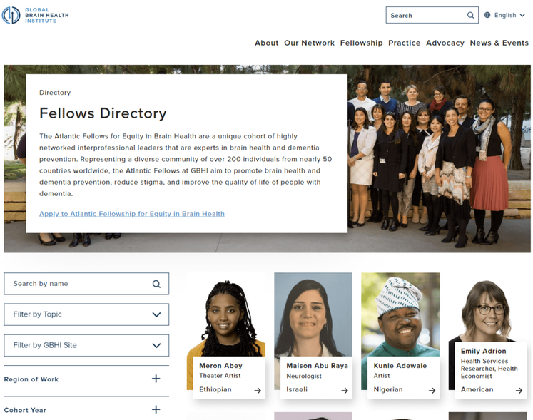
The Global Brain Health Institute (GBHI), an organization dedicated to protecting the world from brain disease and other health threats, wanted to ensure that visitors could easily navigate their site and locate different programs, services, and projects.
As a result, they worked with Kanopi to add a navigation bar that is logically organized and prominently placed throughout the website, so users can quickly find what they need. The site also features a fellowship directory that includes a search bar and filters. This is useful for medical students interested in pursuing a fellowship in a particular specialty, as well as for patients who want to learn more about the expertise of the hospital’s staff.
Why simple navigation is essential for hospital websites: As soon as someone lands on your hospital website, they should be able to find the content or service they seek. To ensure your site is easily navigable, consider mapping out the patient journey to better understand how people get to your site and what they do once they get there.
2. Clear CTAs: Mayo Clinic
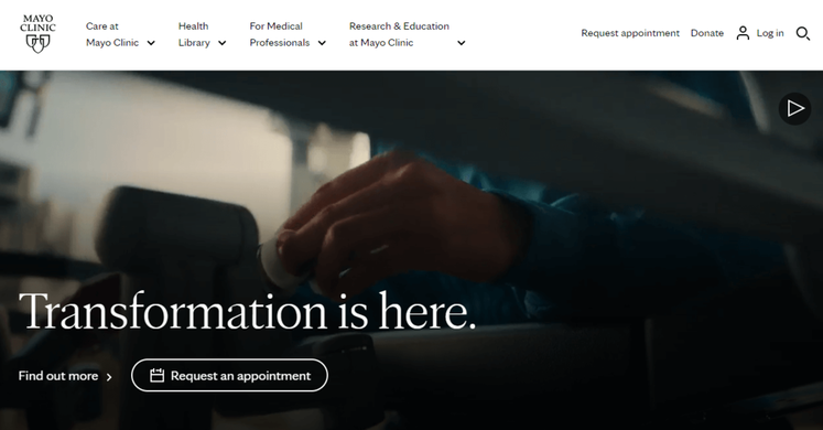
The Mayo Clinic is a nonprofit academic medical center, known for its expertise in many areas of medicine and for providing high-quality care to patients. Their homepage features multiple calls to action (CTAs) that encourage visitors to schedule an appointment, donate, or learn more about a particular medical condition or procedure.
By including clear CTAs on their website, the Mayo Clinic helps visitors understand what medical services they provide, what treatments are available, and how to seek help if they need it.
Why clear calls to action matter for hospital websites: Carefully-placed CTAs let website visitors know exactly where and how to complete their intended action. As you create your own, consider the specific actions that you want visitors to take. Then, use clear and concise language to convey your purpose. For example, you might say “Schedule an Appointment Today” or “Learn More about Our Cancer Center.”
3. Patient-focused design: UCSF Department of Surgery
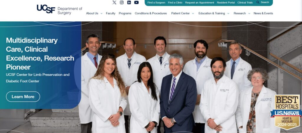
The Department of Surgery at the University of California, San Francisco (UCSF) is a leading surgical department with a rich history of research and scientific advancements. UCSF worked with Kanopi to create a positive, patient-focused website experience. We evaluated which site elements matter the most to users using deep discovery work and prototypes.
As a result, we helped enhance this website with a variety of user-friendly fixes, including:
- Simple domain access with consistency across topics and departments
- Human-led imagery of UCSF doctors and videos highlighting the patient experience
- A mobile-first approach with a responsive design
Why patient-focused design is essential for hospitals: Your patients are the heart and soul of your hospital, and appealing to their needs will help you maintain high audience engagement. Patients should feel welcomed and comfortable using your website and signing up for your services. A friendly, patient-focused design helps foster a sense of community.
4. Consistent, bold branding: Cleveland Clinic
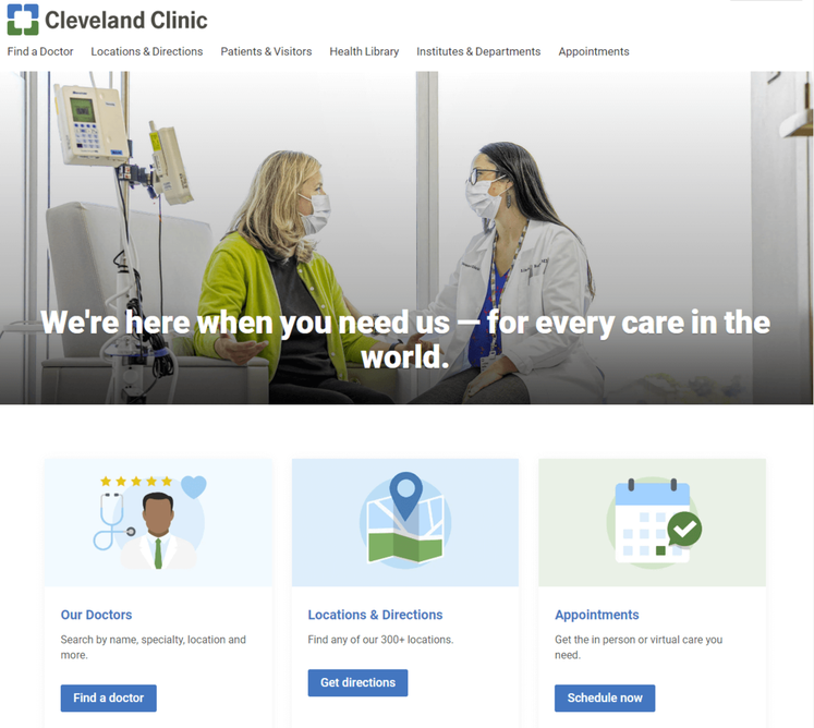
Cleveland Clinic is one of the top multispeciality academic medical centers in the country. To establish a strong, recognizable brand and reinforce their reputation, they included bold, eye-catching colors throughout their website.
Notice how all of the elements on their homepage are blue and green. When patients come across these colors in other mediums and materials, they’ll likely associate them with Cleveland Clinic.
Why consistency and bold branding is important for hospital websites: Consistent branding builds trust between patients and your hospital, which can be especially important in the healthcare industry where patients often have significant concerns about their health and well-being.
Adding color is a popular medical website design trend, with vivid and deep colors being sported on many successful hospital websites. Consider your site’s color palette before diving into web development to make sure your website branding is consistent throughout its pages.
5. Accessibility: Mount Sinai
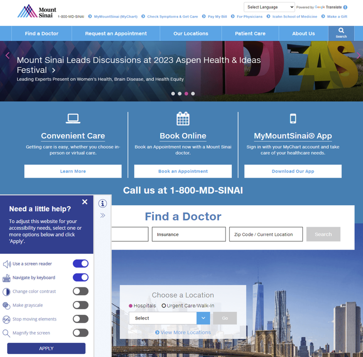
Mount Sinai’s healthcare system prides itself on providing a wide range of services to diverse populations, including medical education, research, and patient care. To meet their patients’ varied needs, they prioritized creating an accessible website.
The accessibility tool in the bottom footer allows visitors to use a screen reader, navigate using their keyboards, and change the color contrast, if needed.
Why accessible design matters for hospital websites: Having an inaccessible hospital website will not only turn away those who might need your services the most but paints your entire establishment in a negative light. Because of the industry that you’re in, maintaining full compliance with the ADA and WCAG is essential. You want your entire community to feel accepted and at ease with your services, especially when it concerns medical care.
6. Inclusivity: Northwestern Medicine
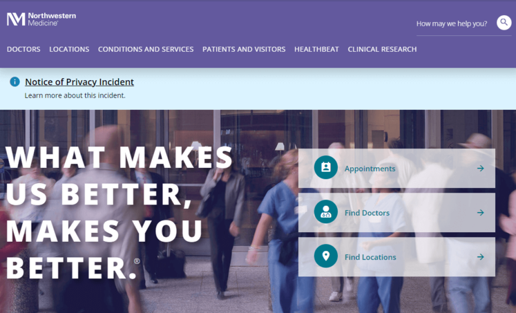
Northwestern Medicine has a number of hospitals, all of which are committed to providing inclusive care to patients of all backgrounds and demographics. Maintaining an inclusive website is important for Northwestern Medicine, as it allows them to better connect with their patients and provide them with the resources and care they need.
Their Patients and Visitors page is extremely comprehensive, with CTAs that address a wide variety of concerns and questions.
Why inclusivity is important for hospital websites: Your hospital website content needs to represent the voice of all of your users, whether it’s patients, frontline workers, researchers, or caregivers.
7. Mobile-friendliness: Johns Hopkins Medicine
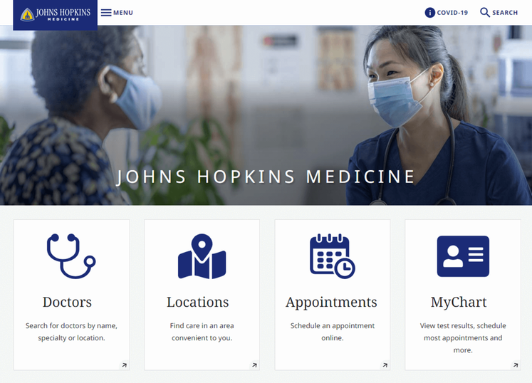
Johns Hopkins Medicine is known for its world-class medical facilities, including hospitals, clinics, and research centers. As a leading healthcare provider, they needed to keep up with changes in technology by creating a mobile-friendly website.
Their mobile-responsive site design allows patients to schedule appointments, access medical information, and communicate with healthcare providers, regardless of the device they’re using.
Why mobile-friendliness matters for hospital websites: With over 60% of the global internet population using a mobile device to access the internet, your hospital web design must work on all different screen sizes. For patients or families already in the hospital or waiting room, the ability to quickly look something up on their phone or tablet is critical.
Most content management systems (CMS) can create a mobile-responsive site automatically. However, there are some easy ways you can ensure your site’s responsiveness. For instance, use large buttons, a vertical layout, and avoid large chunks of text.
8. Accurate, updated information: Yale New Haven Hospital
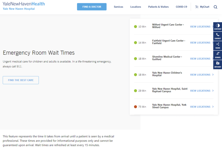
Yale New Haven Hospital provides a wide range of medical services to its local community. As with any hospital, their website needs to provide accurate and reliable information about their services, facilities, and medical personnel. That way, patients can make informed decisions about their care.
Perhaps most notably, Yale New Haven’s homepage features emergency room wait times, informing patients where to seek care and what to expect when they arrive.
Why accurate and updated information is essential for hospital websites: When it comes to healthcare, accuracy is non-negotiable. It’s critical that your web content is consistently updated and provides the most high-quality information available.
9. Streamlined user experience: Colorado Health Foundation
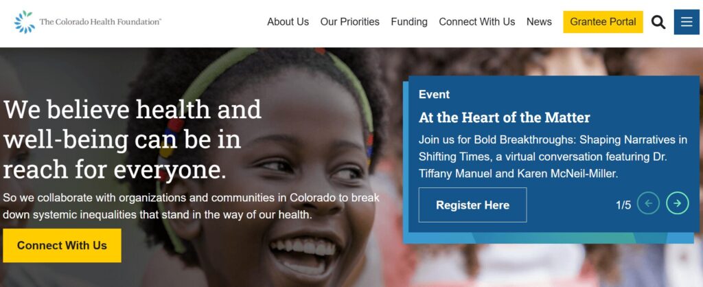
The Colorado Health Foundation (CHF) is a statewide organization that aims to improve the health and well-being of all Colorado residents. The CHF partnered with Kanopi to clean up their site’s navigation and streamline the user experience.
Based on our research and expertise, our developers instituted impactful changes. We condensed the main menu to a cleaner version focused on the items that matter most to users. We also improved the visitor journey by:
- Ensuring consistent page layout
- Incorporating translation support
- Adding accordions to streamline page design with collapsable text
- Building a data display to foster accountability for the organization’s racial and health equity goals
- Enhancing accessibility with clearer fonts, tab navigation, and meaningful links
Why a streamlined user experience matters for hospitals: Patients visiting your hospital’s website may be rushed or anxious. A simplified user experience connects them with the information or resources they need quickly and seamlessly.
Tips for Hospital Website Compliance
Your hospital website will likely have multiple services that collect and store patient data, whether that includes a health portal, appointment tool, or bill payment.
With this in mind, your hospital web development practices must follow regulations like the Health Insurance Portability and Accountability Act (HIPAA) and Health Information Technology for Economic and Clinical Health Act (HITECH):
- HIPAA is an act created by the American government to protect patient data such as names, phone numbers, email addresses, social security numbers, and medical records.
- HITECH extends HIPAA requirements to bring additional benefits and protection to patients. This regulation establishes that patients should always have access to their health information online, and if hospitals do have a data violation, patients should be notified immediately. Depending on the seriousness of the data breach, your hospital may also incur various penalties and fees.
To ensure your website and software solutions not only comply with HIPAA and the HITECH Act but go above and beyond to ensure data protection, you need the following safeguards:
- Tech safeguards include encryption software, data backups, and firewalls. Assess the state of your current healthcare cybersecurity system to ensure you have the proper safeguards in place.
- Physical safeguards include only granting access to material records or electronic devices with the aforementioned data after proper authorization.
- Administrative safeguards include the guidelines your hospital sets up to ensure that internal procedures comply with HIPAA.
Once these safety nets are in place, add a privacy policy statement to your website explaining your commitment to HIPAA and HITECH compliance. Publicizing this statement will help you build trust with current and prospective patients.
How to Maintain Your Hospital Website
Hospital website maintenance is crucial to ensure your site remains a high-performing, accessible, and convenient resource for your audience. Follow these best practices to future-proof and maintain your website over time.
Adopt a continuous improvement approach
Web Design Process Comparison
Traditional Waterfall Process
Drawbacks
Rigid & Less FlexibleChanges are difficult and expensive once development begins.
Costly & Time-ConsumingLarge upfront investment with lengthy timelines.
Quickly OutdatedWebsite can become stale shortly after launch.
Growth-Driven Design Cycle
Benefits
Save Time & MoneySmaller initial investment with continuous improvements.
Always Fresh & RelevantContinuous optimization prevents site staleness.
Data-Driven DecisionsInformed improvements based on real user behavior.
Traditional website design and development takes a linear approach, with a clear pathway from strategy to implementation. However, a growth-driven, continuous improvement approach involves an ongoing, iterative process of:
- Strategizing new website innovations
- Implementing website changes to test your hypotheses
- Tracking results and adjusting your approach based on feedback
This perspective pushes you to constantly update your website based on evolving best practices. Plus, you can avoid major site overhauls, which can cost your organization time and money.
Update your website according to accessibility innovations
New accessibility innovations are released constantly, helping to improve the online experience for users with temporary or permanent disabilities. Intelligent eyewear, a hands-free mouse, and AI-powered assistants are just a few of the exciting innovations we’re seeing this year.
Your website maintenance process should include accessibility updates to ensure your site stays usable and functional for all users. Take the time to adjust to the impacts of the following potential changes:
- New assistive technology. Innovations in screen reader technology, AI assistants, assistive voice solutions, and other accessible technologies change how individuals interact with your web content. Make sure your website is structured properly, with clear navigation and heading structures, so it’s compatible with all assistive technology.
- Accessibility testing techniques. Alongside updates to assistive technology itself, the way web designers can test sites for accessibility constantly evolves as well. Stay up to date on the best automated testing tools available as well as techniques for manually assessing your site. Resources like Kanopi’s guide to accessibility testing can be a huge help because our developers use these tools every day to ensure the sites we build or refresh are completely accessible and compatible with assistive technologies.
- Changes to legal requirements. Laws like the Americans with Disabilities Act (ADA) and the Section 508 Amendment to the Rehabilitation Act govern web accessibility in the United States. Keep this legislation in mind as you refresh your website for accessibility. If you want to expand into new markets in other countries, be aware of their accessibility legislation to remain compliant.
Here at Kanopi, we take a holistic approach to web accessibility, learning about your website’s visitors and their unique accessibility needs to build a strategy that works best for your organization. Learn more about our approach in this short video:
Conduct technical fixes
The technical elements of your hospital website play a major role in your users’ online experience. Technical issues can slow down your website and leave it vulnerable to security breaches.
To keep your website in top shape, prioritize fixing the following technical issues:
- Broken links. Broken links can hurt your SEO performance and create a negative user experience. Use an automated tool like Semrush or Google Search Console to identify and correct broken links with mass updates.
- Security risks. Run core updates for your CMS and plugins or modules, encrypt sensitive data, require strong passwords for CMS users, and enable two-factor website authentication. In addition, host regular security training sessions with your team to ensure everyone is up to date with the latest security risks and best practices.
- Slow page loading speed. Measure page load speed using a free tool like Google’s PageSpeed Insights or Lighthouse. Common performance issues include large image files, unused JavaScript or CSS, and large network payloads.
Set up recurring technical reports to get ongoing updates about your site’s health. Continuously monitoring your site and fixing performance issues will help you avoid smaller problems snowballing into major complications down the line.
Update your content
Your website’s content equips your audience with the crucial medical information they need to make informed decisions about their health. Updated, accurate content helps raise your hospital’s authority level and gives more credibility to your institution.
In your website maintenance process, make the following content updates:
- SEO updates. Use SEO tools like Ahrefs or Moz to keep an eye on your search engine rankings. If any of your website’s most important pages, like high-value blog posts or your homepage, start slipping in the rankings, make a plan to refresh the content to enhance its SEO appeal. For example, you could better incorporate the main keyword, add more engaging visual elements, or refresh the page with updated health information.
- Audience shifts. Your hospital’s core audience and their content preferences may change over time. New people could move into your coverage area with new online medical needs. Or, audience members may begin expressing interest in different blog post topics than what you normally cover. Pay attention to metrics like blog post engagement rates, time spent on each page, and audience demographics to ensure your content aligns with your audience’s interests and needs.
- Interactive content additions. Interactive content is on an upward trajectory right now as more consumers seek out these engaging online elements. Interactive content can also lead to 2x the conversion rate of passive (or static) content. Find opportunities to incorporate this content into your hospital website, whether through online health assessments, quizzes, maps, surveys, or polls.
These content updates and the website maintenance process in general are most successful when working with a dedicated web development partner that has expertise and experience in maintaining websites like yours. Read on for an inside look at how the Kanopi team approaches hospital web development support.
How Kanopi’s Hospital Web Development Services Can Help
Partner with a website support and development agency to ensure you’re doing everything possible to improve your hospital website.
Kanopi is a top partner for hospitals with a continuous improvement team that has helped develop over 150 active sites. No matter what stage your hospital website is at, our team can conduct a full website redesign project or build it from scratch.
Here are our services:
- Content management system support tailored to user needs—whether you use Drupal or WordPress as a CMS, we have experts who can customize each platform to align with your organization’s needs and branding.
- Custom module/plugin development—if you can’t find the right tool to perform a specific action, our coding team can create it.
- WCAG 2.1 AA accessibility standards to ensure that anyone can access and engage with your healthcare services as needed.
- Custom integrations for an online health portal or other solutions that can expand your hospital website’s capabilities.
- Responsive, mobile-first design because we know that your online hospital services should be accessible from any device, anywhere.
- Technical SEO strategy and implementation so that if anyone looks up your hospital’s name, a specific doctor, or a program, your hospital website is the first option on the search results page.
Even after your optimized site is officially launched, we will continue working alongside your hospital to create a website growth plan. This ensures that your site is sustainable for as long as possible and will support your hospital as it evolves.
Check out our healthcare web development work to see our guidance and expertise in action.

Want to dig deeper into how Kanopi works with healthcare clients? To learn about how UCSF Department of Surgery and Kanopi worked together, check out our webinar “It Takes a Village: Managing a Large Community in a Website Redesign.”
Additional Resources
For more information on website development, check out these resources:
- Drupal vs. WordPress: Which One is Right For You? Drupal and WordPress are two popular content management systems that hospitals depend on. Learn which one is right for your organization in this guide!
- 10 Best Healthcare Website Design Examples (and Expert Tips). Your healthcare website is a vital resource for your community. This guide explores tips and best practices for optimizing your healthcare website design.
- Inclusive & Accessible Forms. Need to collect information via a form on your website? Forms ask your users to provide personal data, so ensure those forms are inclusive and accessible.
- Webinar: Website Best Practices for an Aging Population. Kanopi’s Cliff Persaud discusses the challenges and opportunities facing healthcare providers and how they can ensure their website design meets the needs of aging patients.


