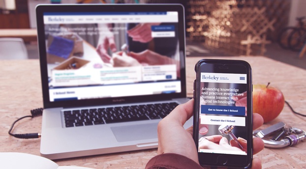
The Berkeley School of Information (UC Berkeley I School) contacted Kanopi Studios with a robust request: a redesign of their website, guidance on the modernization of development techniques, and a full migration of their site to the newest version of Drupal — which meant moving over 10 years of content.
This kind of request wasn’t unusual for us. Higher education clients are unique in that they are a lot of things to a lot of people. Audiences include academic peers, laypeople, current students, and prospective students. There are often competing goals and priorities, all of which need to be examined and addressed.
The answer to meeting the complex needs of higher education clients is always the same: start with research. With I School, our first stop was discovery. We had to figure out what we had to work with. That meant working closely with I School to determine content types, decide what information was still relevant, map the content to the new site, and gain clarity on the specific content that needed to be migrated during the development phase.
Then we set out our deliverables:
Drupal migration
Redesign
Training
Development pipeline
Responsive theming
We used a persona-driven design process that started and ended with the user. We asked the questions, “Who are we trying to attract?” and “What do they want to see?” We blended the classic elements of UC Berkeley with a modern look and feel that would attract prospective students, while at the same time making sure the design would maintain the same high quality across a variety of platforms and devices.
In order to modernize the development practices used for I School’s site, we reorganized the way code and files were structured and refactored some of the custom modules so we could take advantage of newer tools in Drupal 7, such as the Database API, Panels, and various caching methods.
We also provided I School with a full platform for continuous software delivery, with automated deployments to the development site and scripted deployments across all environments. The bottom line? Less downtime and a more responsive site.
“It was a great pleasure to work with Kanopi on our website redesign project. We faced a daunting challenge migrating our highly customized site from one version of Drupal to another, while simultaneously moving to a completely new responsive visual design. The Kanopi team’s expertise and enthusiasm were critical to the success of our project. We couldn’t have done it without them!”
– Kevin Heard, Senior Director of Information Technology, UC Berkeley School of Information
As they say, the proof is in the pudding. In the weeks since the new site launched, measurable improvements are already being noticed by site administrators and, most importantly, by the users! Here’s a snapshot of the improvements:
Sessions increased by 4.29%
Users increased by 3.11%
Page views increased by 22.30%
Pages/session increased by 17.26%
Average session duration increased by 11.33%
Bounce rate decreased by 1.42%
From research to organization to design to modernization, our decisions were driven by data every step of the way. Contact us today to discover how we can transform your site and help you meet your goals.
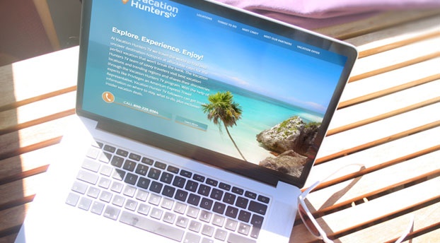
This summer, Canella Response Television partnered with Kanopi Studios to create a website that helps generate sales for their Vacation Hunters TV direct response television (DRTV) program. Vacation Hunters TV provides an amazing deal for a vacation for two to Mexico’s Maya Riviera. Their DRTV spot features gorgeous and enticing clips of locations to visit and things to do in the Maya Riviera- and of course, their killer offer- presented by savvy traveler extraordinaire, Cindy Christi. This was Kanopi’s first DRTV website, and we were excited about the challenge to increase their conversion rate.
A DRTV program asks consumers to respond directly to the ad by calling in or visiting their website. The Vacation Hunters TV offer is only redeemable by phone, so our goal was to have users call the 800 number and book their trip. After watching the show multiple times to get an understanding of their flow of information and call-to-actions, we dove into the UX and design. The site needed to be an extension of the show- informative, enticing media, ample call-to-actions, and be beautifully clean and simple, unlike a lot of in-your-face DRTV companion sites.
We took the tried and true flow of a DRTV show and reimagined it for the web. We designed a one-page, long-scrolling site, introducing users to the offer, enabling them to explore the opportunity and locations through text, videos, and photos. The site also presents the host and Partners that make this deal possible. It wraps up with another offer, all while subtly keeping the call-to-action front and center.
The result? Within three weeks of the site being live, www.vacationhunters.tv generated over 1,000 phone calls and their usual conversion rate of 3-4% was up to 7.5%. Happy travelers and a euphoric client! Now that we’ve completed our work, we’re ready to pack our bags and head to Mexico. ¡Hasta luego!
As meaningful and worthwhile as the work of your nonprofit is, getting people to invest their time money and resources on behalf of your organization’s cause can be an uphill battle. According to the National Center for Charitable Statistics, there are 1.5 million nonprofit organizations in the U.S. vying for a share of charitable donations and volunteer hours.
A well built and designed nonprofit website can provide a centralized way to bring awareness about your cause, can motivate and enroll volunteers and donors, help spread your message to a broader audience and allow you to track the effectiveness of your efforts.
While creating a nonprofit website that successfully accomplishes all these tasks can seem daunting, with some thoughtful planning, a focused UX strategy and the right backend tools, it is possible to have a website that effectively attracts, engages and converts website visitors from indifferent bystanders to advocates for good.
Engage
Know What Makes them Tick – Understanding your audience and what motivates them to act is crucial for proper engagement. Tone, style, and timing can make all the difference between a message that falls on deaf ears and one that motivates your user to want to learn more.
Many times, the messages that we think will move someone to act and what in reality will move them to act can be very different. Defining the key characteristics, motivators, challenges of the primary user you wish to engage by doing a user personas exercise can help you create content and navigation that is more targeted and relevant to your audience.
User surveys and focus groups can also be valuable exercises that can uncover important insight about your potential donor or volunteer that can help shape your organization’s communications strategy.
Who You Know – Donors are more likely to give to causes that are close to them. Whether it’s about proximity, life stage or gender, finding ways for your audience to relate to your cause is one of the first steps of engagement. For example, Kanopi worked with the McKesson Foundation’s Giving Comfort program to create an interactive database that would map the location of their community partners that could deliver comfort kits to cancer patients in their area. Knowing that there is a center ready to provide a Comfort Kit to cancer patients in my city of Thousand Oaks, CA inspires me to make a contribution.
Social Media Worthy – Last year’s water bucket challenge which flooded people’s social media feeds with images of drenched adults, children, and teens to bring attention to ALS, showcased the importance of packaging your content in a way that engages and inspires users to share with others through social media channels. The chances of achieving this level of visibility are hard to predict, however, so this is a good example of the value of creativity and out of the box thinking.
Inform
Statistics – Less is More – It is tempting to try to shower your audience with data and facts about what may or may not happen unless action is taken but too much information, presented as a string of statistics can take away from the heart of what will move people to act on behalf of your cause.
First Person Stories – The effective use of stories, anecdotes and narratives can go a long way in giving visitors a clear picture of your issue and the impact that their support can have in making a difference. The first person account by Fatima Jibrell, recipient of the Goldman Environmental prize in her blog post about the deterioration of Somalia’s coastal resources due to illegal fishing, hazardous waste dumping, and dynamite and cyanide fishing after years of civil war and lawlessness, helps to humanize a story that might not otherwise appear in the news media.
Say it with Pictures – By the same token, coupled with well-developed videos, photos and other imagery, these first-person accounts can really come to life with the right imagery. In today’s online sphere, where we’re bombarded with dozens if not hundreds of bits of information per day, it is more important than ever to create readily impactful messages.
Connect
So your engagement efforts have succeeded in getting the attention of visitors to your site who are now ready to volunteer for an event or make a donation. Whatever action you want your users to take to support your nonprofit’s goals, it should be an easy and smooth process. Anything that requires too many steps or time can drive the user away from your site. There are a variety of modules and plugins to aid in these tasks. Part of our process at Kanopi entails, tailoring modules and practices to fit your organization’s needs to come up with the best possible solution.
Follow
Knowing what messages, outreach efforts, and website features are most useful in moving potential donors and volunteers to act may feel to your organization like walking in the dark. There are a number of tools that can help shed some light on your visitors and the effectiveness of your site’s content and features so you can adapt and fine tune to improve conversion rates:
Webforms – Drupal Webforms can help your nonprofit organization collect valuable information about your visitor and generate reports that can sort this information in nearly infinite ways.
Insider Knowledge – While Google Analytics can provide some useful information on traffic volume and most visited pages on your site, you likely want to know exactly who is coming to your site and how they are interacting with your content. Cost effective email marketing platforms such as Sharpspring can be integrated with your site to track user’s interaction with your content, help you identify and reach out to potential donors and volunteers.
Ultimately, a nonprofit website that works as a tool for achieving your organization’s goals requires more than good intentions. Today’s nonprofits must be tech savvy and nimble so they can create an optimal user experience that will transform visitors into advocates for good.
Contact us to help you with your nonprofit website.
It’s that time of year again! No, I’m not talking about time for turkey, football, holiday parties, and Christmas cheer – although I’m definitely excited about these things as well. What I mean is, it’s time to take a look at the upcoming web design trends for the next year. Web design has come a long way in the last several years. I always enjoy looking back, observing current trends, and making predictions on where web design is headed next. This reflection on design is not only fun – I believe that these trends are important to consider when updating or redesigning, as it helps to future-proof your site and deliver an experience your users will come to expect.
Common UI Patterns
User experience has rightfully become a large part of the web design industry. The use of responsive design has changed the way that we consume the web. This user-centric focus has resulted in many common UI patterns across mobile and web design. Although I think we will see more originality in designs popping up in the future (which I’ll touch later), I think we’ll continue to see common UI patterns popping up across the web, such as hamburger menus and hidden navigation, card layouts, simple but strong designs, and…
Meaningful Microinteractions
Essentially, microinteractions are small product moments that revolve around a single task. You take part in them every day – hitting the snooze button, checking off a to-do item, or turning on a function on a device. Examples of microinteractions on websites include progress when filling in a registration form, favoriting a song, a notification of real-time content updates, or a friendly greeting before diving into the content. Microinteractions usually get little attention unless they’re poorly executed and cause annoyance. Well planned, human-centered microinteractions can make the difference between someone tolerating your site and someone becoming a loyal user. They should use human language, colloquial speech, and include emotions. Understanding your user (what they want to accomplish, when and where the interaction will take place, etc), is the beginning of crafting enjoyable microinteractions. With a continued emphasis on User Experience in web design, we will likely see more meaningful microinteractions pop up across the web.
The example below was created by UXPin, on a hypothetical model talent website. The model’s metrics, as well as a button to download a pdf with more information, are revealed on hover. The addition of subtle animations add a bit of discoverability to the experience. Read more at UXPin’s post: UX Design Best Practices: Refined Microinteractions.
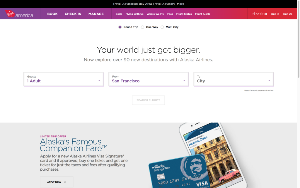
Virgin America Virgina America’s website has a lot of microinteractions on their UI that add special touches to the experience of booking a flight. The list includes active states to indicate what form field the user is on, animated indicators of the user’s selections, and messages at the top of the screen that walk the user through the process. The addition of fun messages about the destination adds personality to the interaction.
Originality
With the rise of responsive web design, we’ve also seen a huge shift toward a particular design trend – full-width banded background sections, large hero images/slideshows, lots of vertical scrolling, and parallax features. The popularity of these design features has resulted in many websites having the same look and feel. I think we’ll see a renewed emphasis on original designs in the coming year(s). This will be done through hand-drawn graphics, unique grid use, stronger focus on typography, elegant animations, and storytelling.
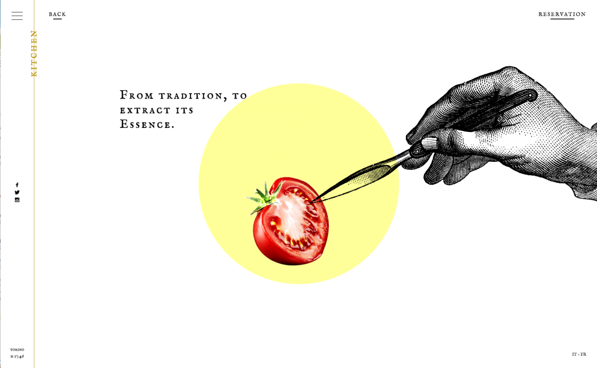
Ristorante Del Cambo This restaurant website has a unique blend of illustrations, photography, subtle video, and scrolling in a simplistic design.
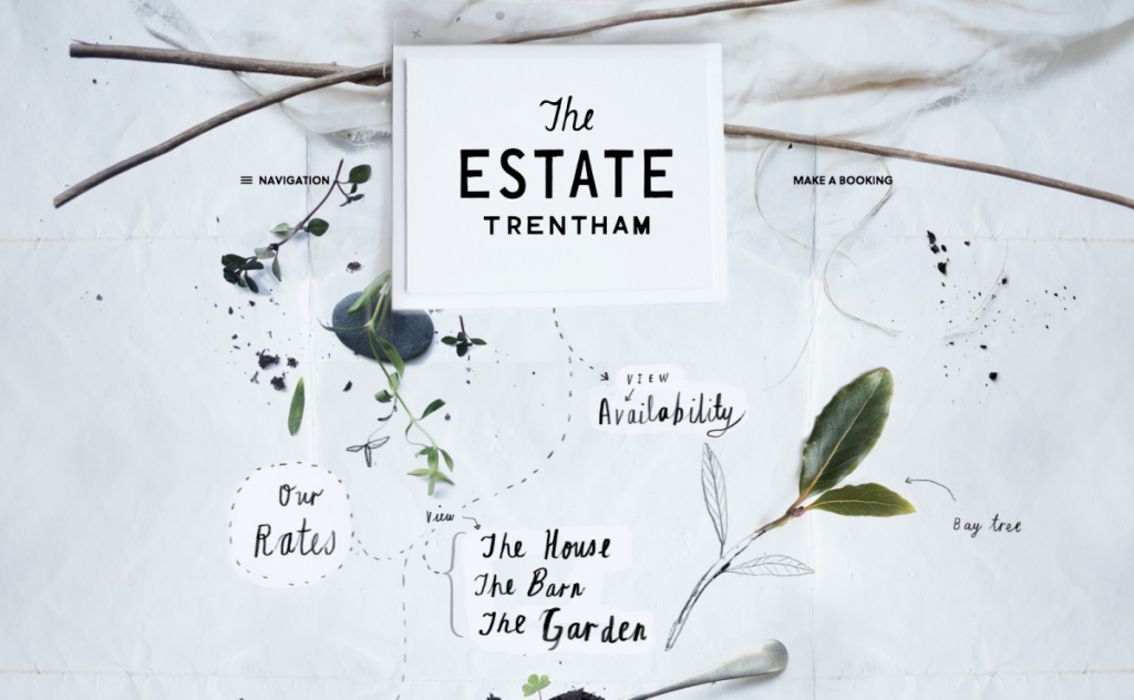
The Estate Trentham The website for The Estate Trentham uses photography and hand drawn elements to create an organic feel that matches the vibe of the estate beautifully.
Storytelling
Storytelling is as old as humankind itself, and is the primary way that we absorb and share information. A good story will engage the audience, make content and facts memorable, illicit emotions, and can ultimately persuade the audience to make a decision. It’s an important communication tool in marketing, but has been seldom used in web design. Some considerations for creating a good story parallel those for creating good web design. Crossover factors include: Who is the audience? What are your goals? Do you have a clear message? Engaging content, supporting visuals, and user interaction can be combined to bring storytelling to a website. There are already a handful of sites that make good use of storytelling, and I believe that we’ll continue to see more.
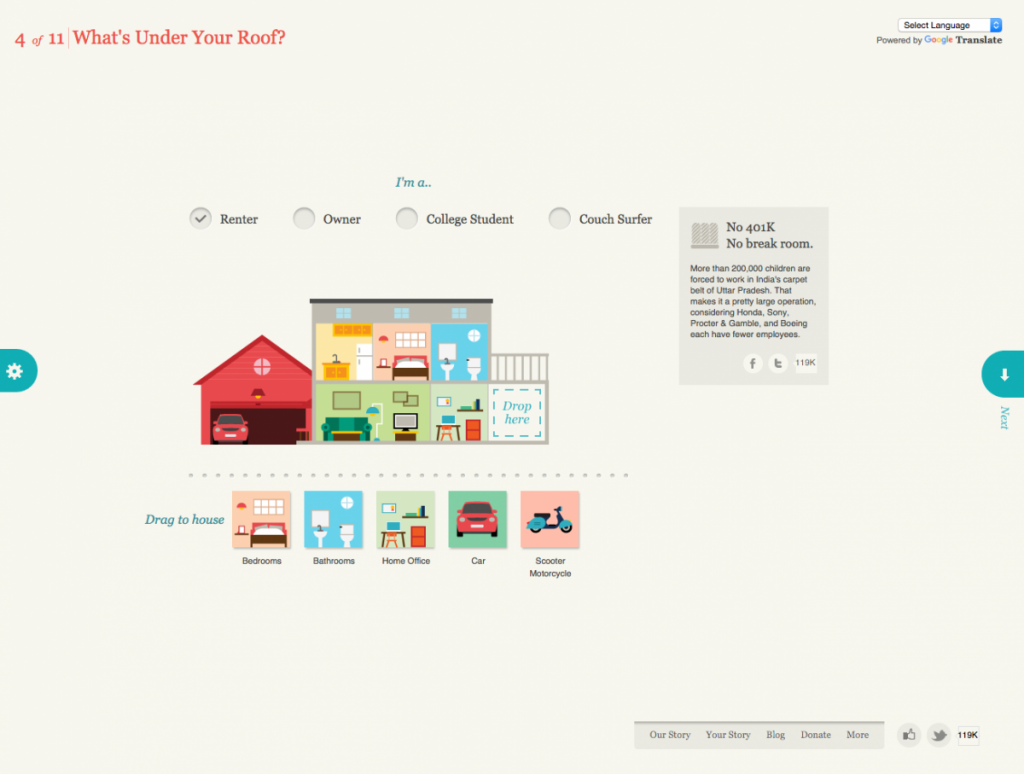
Slavery Footprint Slavery Footprint is an excellent example of a website making the user the character in the story. The user fills out an interactive survey and is given information about slavery and how it relates to them personally.
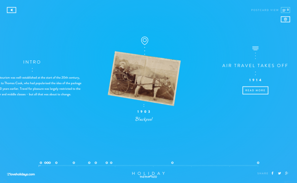
Love Holidays – Holiday Memories Holiday Memories is a promotional site for loveholiday.com. Through its clever use of an interactive timeline and map view, it displays the history of British tourism using real holiday photos.
Material Design (or the evolution of flat design)
Material Design is a guide that was created by Google (in 2014) for visual, motion, and interaction design across their platforms and devices. It isn’t exactly a design trend like flat design, although some do call it the ‘evolution of flat design’ because it borrows aesthetics from it. Google offers a library, Material Design Lite, which can be used on websites. Material Design is based on the idea of layering tactile elements, like a stack of papers. It reintroduces the use of layering, light and shadows, which were stripped out of flat design. These elements aren’t just used for visual appeal, as we’ve seen in the past. When used intelligently, they provide realistic visual cues to the user experience. Material Design brings a lot more to design, such as color palette, typography, icons and layouts, but I believe the use of layering and shadows will become the next direction for “flat” design.
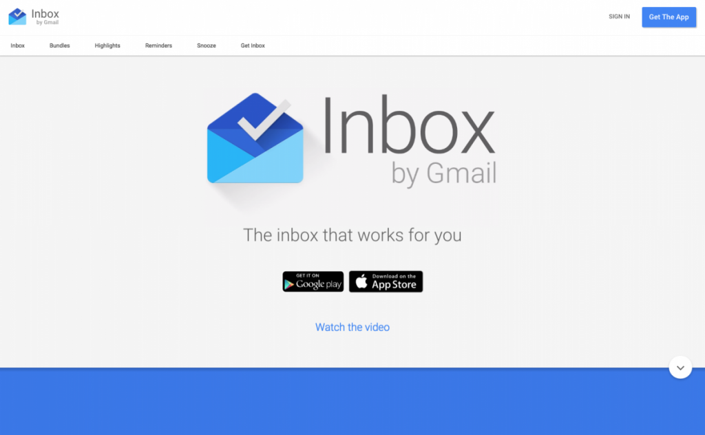
Inbox by Google Unsurprisingly, Google uses Material Design on its own products – Inbox by Google is a good example of Material Design.
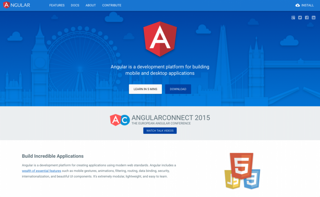
Angular.io Angular uses subtle shadows and animations to highlight interactions, separate page sections, and draw attention to important elements.
Focus on Large Screen Resolutions
You may have noticed that I didn’t include responsive design in this list of upcoming design trends. This was intentional, as I think it’s no longer a trend, but a must. Responsive design is critical, as Google has changed the way that it ranks sites that are not mobile-friendly. Having said this, I do think we’ll see a larger number of responsive sites focusing on large screen resolutions, as well as small screen. Recently, I’ve had a handful of clients ask me about designing for extra large screens. Since then, I’ve seen a steady rise in sites that are doing so. For example, Amazon recently increased its maximum width to 1500px. According to w3schools, desktop users were on screens with a resolution of larger than 1320px wide. It only makes sense to move to a larger maximum width for our websites.
Bottom Line
While I think we’ll see an increase in these trends in the coming year, it’s important to keep in mind that these, and other trending design patterns, shouldn’t be used just because they’re popular. The main focus of your design should be creating a compelling user experience. Some of the above may aid you in doing so, and some may not.
Happy holidays, happy new year, and happy designing!