How to Prevent Scope Creep

Your project is off to a good start; progress is being made, the timeline is being honored, and the budget is on track. Then one day you check your email and learn that a key stakeholder has left the project. You hear the suspenseful theme from Jaws in the back of your mind; this is the perfect scenario for that dreaded fiend scope creep to show up. 

I say fear not!  

Like a robocall in the middle of the night, scope creep is something nobody wants to encounter, especially during a project. That being said, it is also a natural part of any project and is bound to happen. The good news is that you can be proactive about heading it off at the pass, or preventing it from happening in the first place.     

Common Contributors to Scope Creep

Scope creep is the introduction of anything that can cause the focus or goals of a project to expand, and go beyond the original scope of the project. It’s not necessarily a bad thing when handled properly, but it can put the success of a project in jeopardy when handled poorly. 

Many factors can contribute to scope creep but most commonly it’s the humans that do the creeping. Any individual could knowingly or unknowingly contribute to creep; personal needs, internal politics, or the inability to make decisions are just some reasons that an individual or group can cause a project’s scope to expand. Other contributors to creep are:

  • A change in stakeholders
  • Revisions to the project goals
  • Introduction of new features or functionality
  • Additional rounds of revision to deliverables

With so many areas for creep to originate, how do you prevent it?

Preventing Scope Creep

The sad news is that you can’t prevent it from growing; humans are curious, and it’s natural that there will be questions and requests that will prod scope. So while you can make sure the team is educated in what the scope of the project is, there will always be some level of curiosity as to what additional is possible. 

You can, however, prevent it from affecting your project. I’ll go into greater detail as to specific approaches you can use for preventing creep, but it’s important to note that prevention starts with being engaged, and being a defender of the scope. 

It’s easy to be so caught up in the day to day running of a project that requests may be made or requirements added  that will push the boundaries. Consider yourself standing guard preventing those requests from making their way into the project. If you fall asleep at your post, you may find yourself clambering to remove the creep.     

Know What’s in Scope

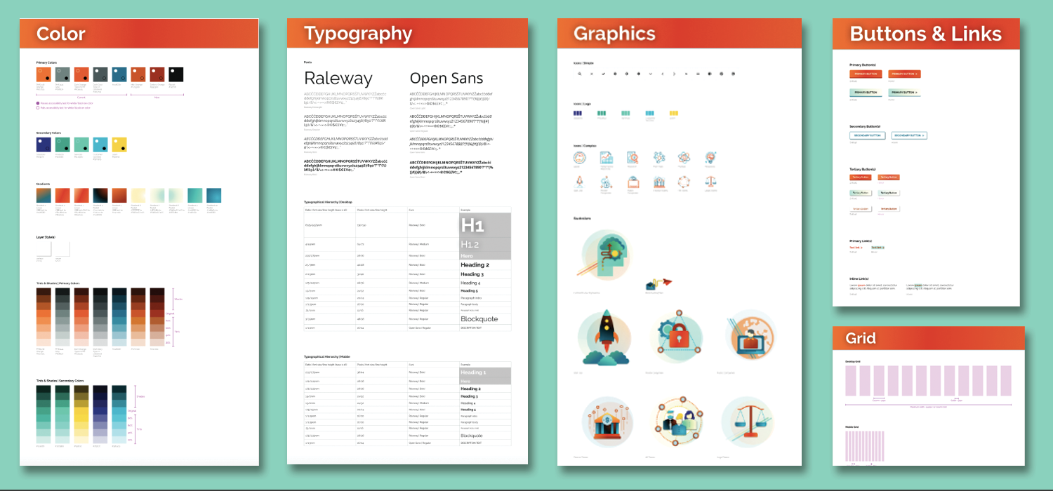
Kind of a duh, I know, but this is so often overlooked. It’s not uncommon for project participants to come and go throughout the course of a project’s life cycle. Therefore every consideration should be given to making sure every person has reviewed the project scope; which should be provided in clear documentation that outlines the roadmap for the project. This may be in the form of a contract, proposal, or a project outline. If you don’t have one, define the scope before the project even begins.

The most effective documentation not only goes into detail as to what is IN scope, but also what is OUT of scope. This helps to clearly define where the focus will be for the project. Having participants review this documentation stops scope creep in the minds of those who might introduce it, and makes everyone a guardian of the scope.  

The project manager is the core individual monitoring the pulse of the project, and it is a big responsibility to act as the sole protector of scope. By imbuing this mission in others you build a team that can move together toward a single destination, rather than spending time keeping everyone on the same path. 

Establish an MLP

MLP stands for minimum loveable product; essentially the simplest version of your completed project that you can live with. An MLP can make a huge difference in ensuring that everyone on your project is rowing in the same direction. By clearly defining what makes up the MLP, you’ll have a goal in mind where the team can place their focus before working on lower priority, or scope creep items. This isn’t to say you can’t iterate and improve on the MLP once complete; by working on what’s most important you’ll at least have something that you’re happy with. Everything else is just icing on the cake.

Document the Changes

There will always be changes during the course of a project, it’s unavoidable and that’s fine. What’s important is how those changes are adapted to the existing scope. “Change Requests” turn new requirements or requests into official scope. They’re crucial especially when additional work is going to push the boundaries of a budget, and additional funding is needed. And if additional funding isn’t possible? A change request can clearly outline how existing scope items may change or be removed to make room. Without a change request, scope is not only going to creep but expectations are going to be misaligned.

Document the Risks  

We’ve talked about making everyone a guardian of scope, but because the team can’t be on alert 24/7, how do you focus everyone’s efforts so you know what to guard against?  Documenting risks is another way to reinforce the team’s focus. Risks are those items that you know could potentially impact the success of the project or cause the scope to balloon. You may already know what they are, or they could arise organically throughout the course of the project. Regardless, what is important is to document the risks and make sure the team has transparency into those items. Include a detailed description of the item, if known, a plan to address it, and better yet; assign someone to keep an eye on it.  

Scope creep also provides opportunities!

Hopefully I haven’t made scope creep out to be the villain; as much as it is something to be on the lookout for, it’s also an important opportunity to start planning for the future. Document, and track them; those items that may be scope creep now could also be the next positive expansion for your project. 

What is a Pattern Library?

One of the keys to a great user experience is consistency. Your users should be able to understand what an element on your website is for and how to interact with it, no matter where it appears on your site. 

Identifying those reused elements (also referred to as “modules” or “components”) is a hugely important piece of the wireframing and designing process.

So the question becomes, once these elements are created, why would you design them more than once? That would be a waste of time! How can we best make use of elements that already exist?

So what is a Pattern Library?

Pattern libraries are the set of components upon which your site is built. Your site is essentially made up of pieces that act as a vocabulary upon which you can build your pages. These include forms, buttons, blocks of text, calls to action (CTAs), photo captions, etc. Good designers will ensure that within those components are consistent and reflect the brand properly in regards to typography, color usage, and other design treatments.

The designer will start from the smallest pieces of a component, and build from there. Using Brad Frost’s atomic design principles, which mimics the building blocks used in chemistry, the progression is atoms, molecules, organisms, templates, then pages. These look like this (definitions from Brad Frost):

  • Atoms: include basic HTML elements like form labels, inputs, buttons, and others that can’t be broken down any further without ceasing to be functional.
  • Molecules: relatively simple groups of UI elements functioning together as a unit. For example, a form label, search input, and button can join together to create a search form molecule.
  • Organisms: relatively complex UI components composed of groups of molecules and/or atoms and/or other organisms. These organisms form distinct sections of an interface.
  • Templates: page-level objects that place components into a layout and articulate the design’s underlying content structure.
  • Pages: specific instances of templates that show what a UI looks like with real representative content in place. 

These building blocks allow site builders and designers to create a site in a modular way, building pages with reusable elements. 

Why is a Pattern Library valuable?

With a focused approach, designing in a pattern library can save everyone a lot of time and ensure your users have a consistent interaction with your brand online. Here are a few reasons why:

Easier Change Management 

Once the pattern library is created, and the full pages are assembled, adjustments may need to be made to improve the flow. But with the implementation of a pattern library, it’s a much simpler process since each element can be adjusted slightly on its own, updating the page easily and quickly.

Scalability

Now, let’s say you need to rebrand and tweak colors, or add a new piece of functionality. These types of updates are not only much more effortless to implement in a library, but will be cohesive with the already defined patterns. And if you need to add pages to a site, you can simply reuse existing elements from the library to create those pages, and scale from there.

Consistency

Because the components in a pattern library are created with the brand in mind, and consistently used across pages of a site, it results in a better user experience for end users. Users will be able to navigate faster and understand what the design and layouts for each interaction mean.

How do I create a Pattern Library?

While several tools can be utilized to create pattern libraries, our favorite right now for design is Sketch. Here is an example of a pattern library Kanopi created for Results 4 Development using Sketch (LNCT.global):

Pattern Library

What can be really powerful and magical is a coded design system, which is when the library is built with code as opposed to as design files (like Sketch) The benefits of a coded design system is the visual design elements can then be connected to your website. That then allows even faster changes to be made by designers and to your site. Kanopi coded a pattern library for https://www.hjf.org/ to make it even easier to change elements in the future. Here’s an example using a tool called Pattern Lab:

Pattern Library Sample

Here are some other trusted examples of good pattern libraries:

Is a Style Guide the same thing as a Pattern Library?

“Style guides” and “Design systems” are often used as interchangeable with the term Pattern Library. In reality, they all work together.

Your style guide will contain elements of brand voice and tone, typography, colors, logo usage, etc, to create standards which guide the consistency of your brand mandatories. Those design signals are used to create brand consistency in your pattern library. Your pattern library and style guide are a subset of your entire Design System.

Let’s scale together!

Pattern libraries are just another tool that allows Kanopi’s designers to create superior user experiences and visual design patterns for our clients. We always build with the future in mind, because we not only create new or redesigned sites, but we also we have an amazing support department that helps sites evolve. With scalability and ease of change in mind, we can help our clients and our support team to maintain and improve the site for you over the long term. Contact us if you’re interested in working with us on your next project. 

Kanopi Studios Named an Industry Leader on Clutch

And Kanopi is proud to be one such partner to our clients, from development to comprehensive web design, our team creates solutions that empower our incredible clients.

As we mentioned before, we have enjoyed a positive presence on Clutch, a ratings and reviews platform for B2B service providers. Although we have always been a top firm on Clutch, we just received a new accolade. We are excited to share that we have been awarded the title of industry leader, topping the list of the best web design companies in San Francisco. After being put through the wringer with nearly 400 of San Francisco’s top web designers, we were listed as eighth overall.

Clutch analysts use a number of metrics to evaluate service providers, but the top consideration for quality is what a firm’s clients have to say about them, and our clients have delivered in spades. With eight verified client reviews, we maintain a perfect rating of five stars, and we have received feedback such as:

“I think there’s a professionalism at Kanopi Studios that is not always present in the web development world. They’re adept at bridging the gap between plain language and tech-speak. They also make sure they’re thinking about any possible side effects caused by executing a task and they’ve mastered the almost lost art of effective, friendly customer service.”

We always appreciate hearing from our clients, and what they have shared is better than anything we could have hoped for. Their feedback is valuable as we look forward to improving our offerings.

In addition to being named an industry leader, we have also been featured on Clutch’s sister-site, The Manifest. The Manifest is a resource that provides help to firms of all shapes and sizes, offering industry insights and how-to guides regarding a number of projects and challenges. We were featured on their list of the top web development companies in San Francisco, with notice being taken of the quality of our work and the reputation of our clients. Our feature on both Clutch and the Manifest highlights our ability to design and deliver web projects of the highest caliber. And to demonstrate that, we have put up a portfolio on Visual Objects, a place for prospective clients to compare the work of various web designers in San Francisco.

We are hopeful that the expansion of our digital presence will help us build new partnerships, but we must take the time to acknowledge the partnerships we have made along the way. A huge thank you to all of our clients! Your support means the world to us, and we cannot wait to see what you have for us going forward.

Audience Behavior: Learn More with User Research

But simply knowing who you are talking to is only one piece of the puzzle. Consider how much more effective you could be if you were able to see below the surface and observe audience behavior in real time.

Imagine you own a family restaurant. It makes sense that you would start by targeting families. You read some market research that tells you mothers make most of the decisions about where the family eats out. So you decide to develop a persona based on mothers who are looking for restaurants that offer fun options for kids.

It’s a good start! You can now build more useful content and even make some website updates to better connect with this persona. But do you know if there are pain points in your navigation? When your users visit a page, do you know where they are clicking and where they get stuck? Are there additional features or content that could add value?

There are some simple user research methods and tools which can help you get the detail you need on audience behavior to gain deeper insight. By combining direct and indirect sources of data, you’ll be able to build a user experience that truly connects with your audience.

Here’s some ways you can do this.

Direct user feedback

When you want to know something, sometimes it is easiest to just ask! Asking your users a few simple questions about their needs shows that you care about their experience and can reveal tremendous insights. We recommend making it a quick and painless process by focusing on a short list of questions through a survey on your site, or asking directly to potential/current customers, including:

  • What do you visit our website to do?
  • Did you find what you were looking for?
  • Is there anything else we could include on our site that would be helpful?

An easy way to gather this information is by setting up a pop-up survey on your website through HotJar’s polling feature. You’d be surprised how much data you can collect in just a few weeks.

For longer surveys, SurveyMonkey can be a good option. SurveyMonkey allows you to send surveys to a curated segment of your audience and can even help you gather additional input from internal stakeholders. Typeform also has several options with an intuitive admin interface, a conversational tone and engaging interface for users.

Whenever possible, we also recommend 1-1 interviews with your customers. These conversations can be invaluable in helping you to understand people’s mindset, motivations and needs by going beyond what people are doing by asking them why.  

Indirect user feedback

HotJar also supports indirect feedback methods, including heatmaps, user session recordings, and conversion form tracking.

Heatmaps allow you to see where users click, allowing you to compare the amount of attention each page element receives. For example, many websites have important calls to action in more than one place on a page because they aren’t sure which placement is more effective. Installing a heatmap will tell you which link is performing better, which can help you streamline your page. Heatmaps are most helpful on pages that receive a fair amount of traffic so that they can collect enough data available to support solid decisions.

Example of a heat map on a web page for Rama Meditation Society

User session recordings do exactly what their name promises: recording user actions so that you can see what people are doing on your site, and exactly where they pause or struggle. Looking at user sessions in aggregate can help you restructure your pages to support common paths and eliminate common challenges.

Screen grab of a user session recording

Conversion form tracking can help you see which form fields users struggle with and where they drop out of the process. This information can guide decision making around where and how to streamline forms so that they can accomplish their number one goal … conversion!

Get started understanding audience behavior today!

We know that conducting user research as part of a website project can sound expensive or time consuming, or both. But the whole reason why you need a website is to connect with your users. Without a true understanding of their needs, even the best intentions can miss the mark.

The good news is that there are a number of options available through HotJar and other tools that make user research easier to tackle than ever. And Kanopi Studios is here to help, whether you’d like more information about using user research tools or need an experienced team to lead and interpret the research. Building your website around data and insights is the best way to elevate your relationship with your audience by providing them relevant content, optimized user pathways and ultimately a better relationship with your brand. So let’s get started!

Kanopi Studios is a Top Provider on Clutch

Screen grab of the Clutch website home page

It’s not easy to find a development partner you can trust. Particularly if you’ve never been immersed in the world of web development, it may take you some time to learn the language. That can make it even more difficult to know whether your partner is really staying on track with what you want to accomplish.

Luckily, knowing what to look for in a business partner can save you from all of the potential troubles later on. Ratings and reviews sites like Clutch can help you get there. This platform focuses on collecting and verifying detailed client feedback and then using a proprietary research algorithm to rank thousands of firms across their platform. Ultimately, Clutch is a resource for business buyers to find the top-ranked service providers that match their business needs.

Luckily for us, users on Clutch will also find Kanopi Studios at the top of the list to do just that. Kanopi has been working with Clutch for a few months to collect and utilize client feedback to find out what we should focus on in the coming year. Through the process, we’ve coincidentally been named among the firm’s top digital design agencies in San Francisco.

Here are some of the leading client reviews that led us to this recognition:

“They were fantastic overall. We had great success communicating to their team via video conferencing, and they were able to answer every question we had. They also worked quickly and were very efficient with their time, so we got a great value overall.”

“Kanopi Studios’ staff members are their most impressive assets — extremely intelligent, experienced, and personable. Building a website is never easy, but working with people you both respect and like makes a huge difference.”

“Kanopi Studios successfully migrated our Drupal platform while preserving all the content that we’ve built up over the years. They worked hard to achieve a responsive design that works well on both mobile and large desktop displays.”

Not only have these kind words earned us recognition on Clutch, but we’ve also gained the attention of the how-to focused platform, The Manifest (where we are listed among top Drupal developers in San Francisco), and the portfolio-focused site, Visual Objects (where we are gaining ground among top web design agencies site-wide).

Thank you, as always, to our amazing clients for the reviews and the support.

Contact us if you’d like us to do amazing 5-star review work for you.

Accessibility at BADCamp = Education, Inspiration and Opportunity

Now that the excitement of BADCamp has worn off, I have a moment to reflect on my experience as a first-time attendee of this amazing, free event. Knowing full well how deeply involved Kanopi Studios is in both the organization and thought leadership at BADCamp, I crafted my schedule for an opportunity to hear my colleagues while also attending as many sessions on Accessibility and User Experience (UX) as possible.

Kanopi’s sessions included the following:

The rest of my schedule revolved around a series of sessions and trainings tailored toward contributing to the Drupal community, Accessibility and User Experience.

For the sake of this post, I want to cover a topic that everyone who builds websites can learn from. Without further ado, let’s dive a bit deeper into the accessibility portion of the camp.  

Who is affected by web accessibility?

According to the CDC, 53 million adults in the US live with some kind of disability; which adds up to 26% of adults in the US. Issues range from temporary difficulties (like a broken wrist) to permanent aspects of daily life that affect our vision, hearing, mental processing and mobility. Creating an accessible website allows you to communicate with 1 in 4 adults you might otherwise have excluded.

What is web accessibility?

Accessibility is a detailed set of requirements for content writers, web designers and web developers. By ensuring that a website is accessible, we are taking an inclusive attitude towards our products and businesses. The Web Content Accessibility Guidelines (WCAG) are a globally acknowledged set of standards that help us publish content that fits within the established success criteria. These guidelines are organized into the following four categories.

WCAG Categories:

  • Is your website perceivable? This applies to non-text content, time-based media (audio and video), color contrast, text size, etc.
  • Is your website operable? This ensures that content is easy to navigate using a keyboard, that animations and interactions meet real-user requirements, buttons are large enough to click, etc.
  • Is your website understandable? This means that text content is easy to read for someone at a ninth grade reading level, that interactions follow design patterns in a predictable manner, that form errors are easy to recover from, etc.
  • Is your website robust? This means that content should be easy to interpret for assistive technologies, such as screen readers.

The World Wide Web Consortium (W3C) is an international community whose mission is to lead the Web to its full potential. They have also published a checklist to aid our efforts in meeting WCAG success criteria.

Need help with making your site accessible? Contact us.

How can we be successful in making the web accessible?

Industries have varied requirements when it comes to web accessibility. WCAG has three levels of compliance, ranging from A to AA to AAA. A conformity has the lowest set of requirements and AAA has the strictest set of requirements; so strict, in fact, it may be impossible to achieve across an entire site.

Efforts to meet these standards fall on every individual involved in the process of creating a website. Although there are many tools that aid in our journey, we reach accessibility through a combination of programmatic and manual means.

The most important thing to keep in mind is the fact that achieving success in the world of accessibility is a journey. Any efforts along the way will get you one step closer towards a more inclusive website and a broader audience base.

Please Remember: Once Kanopi helps you launch an accessible site, it’s your job to maintain it. Any content you add moving forward must be properly tagged; images should have proper alt text and videos should have captions. Users come to your site because they love your content, after all! The more you can make your content accessible, the more you will delight your users.

Interested in making your site more accessible? Check out some of the resources I linked to above to join in learning from my peers about accessibility at BADCamp. If you need more help getting there, let’s chat!

Kanopi at Design 4 Drupal’s 10 Year Anniversary in Boston

Nestled right off Main Street in Cambridge, Massachusetts lies the Ray and Maria Stata Center on the campus of the Massachusetts Institute of Technology (MIT).  This abstract building designed by Pritzker Prize-winning architect Frank Gehry was the perfect venue to house the longest running, front-end focused Drupal conference in the US, Design 4 Drupal.  It demonstrates that the modern and abstract design Cambridge and MIT has seen can work perfectly with the structure needed within.

Image of sculpture at MIT that spells out "MIT" in metal, from the at Design 4 Drupal conference.

The Design 4 Drupal conference highlights training sessions and seminars focusing on designing for, and building the “front-end” of websites, or what gets seen and used by end users.  This area of focus encompasses graphic design, user experience, accessibility, performance, tooling, and much more.

Like a lot of our Higher-Ed clients, MIT is a user of Drupal, and is proud to offer this space to the Drupal community to learn and share knowledge.  I was pleased to be asked to present two sessions at the conference, and even more pleased with the knowledge I was able to take away from attending the event.

Meta and Schema: Defining the Content about your Content

The first session I presented focuses on designing and implementing a metadata strategy for your website.  Metadata is the content that describes your content. It is very important in how web pages are found in search engines, and how they are displayed on social network sites.

Image of Jim Birch's presentation in a large classroom with a projector screen at Design 4 Drupal

The presentation is a deep dive into the different specifications for meta tags and Schema.org schemas, how to decide what to markup, and then how to text and validate that you’ve done it correctly.

This session was not recorded due to technical difficulties, but the slides are available at jimbir.ch/meta-schema-drupal

Building a Better Page Builder with Bootstrap Paragraphs

The second session presented reviews the Bootstrap Paragraphs module for Drupal 8 that I developed and how it combines the power of the world’s most popular front end framework, Bootstrap, with Drupal Paragraphs, the powerful module that allows content creators to build layouts and structured pages using content components.

I have been working on this module since I first presented it at the BADCamp 2016 Front-end Summit.  The module installs a suite of components that allow content creators to quickly build out pages.

I love giving this presentation because I always get great feedback from people who use the module; who are going to use the module; or who are going to use my methodology to create their own version that fits their specific needs.  The module currently has over 25,000 downloads, and has had users from all around the world.

You can watch a recording of the session here.

Need help designing your website? Contact us and we can help

The Keynotes

The Building Blocks Of The Indie Web – Jeremy Keith

The conference featured not one, but two great keynotes.  On the first day author and developer Jeremy Keith, who was also in town for An Event Apart Boston, presented a session in which he encouraged a return from social media publishing to independent publishing.  It was a great reminder that the web was ham radio before it was cable, and can still be so.

Exploring the New Drupal Front-end with JavaScript – Dries Buytaert

The second keynote was given by founder and project lead of Drupal, Dries Buytaert.  Dries was the keynote at the very first Design 4 Drupal, so it was a special treat have have him back for the tenth anniversary.  His presentation reviewed the history of JavaScript on the web, API-first vs. API-only approaches and gave behind-the-scenes insights into Drupal’s JavaScript modernization initiative.

Design 4 Drupal Sessions

Thanks to Kevin Thull, and the organizers of Design 4 Drupal,  most of the presentations were recorded and are available to anyone at Design 4 Drupal’s YouTube channel.  There was a broad mix of different types of sessions that covered developers, designers, User Experience (UX), Accessibility (A11Y), and Tools.  Below are some highlights of the sessions I went to.

Web Accessibility Tips and Tools – Abby Kingman

Abby gave a session that was near and dear to my heart.  We are always learning about how to make our websites more accessible, and Abby’s presentation covered where to find current guidelines and specifications, and then when onto to review tools for testing.  There are lots of great links to follow from this one.

This session validated the approach we take at Kanopi to accessibility in design and development.  A lot of the tools and testing techniques were all part of our processes, and I look forward to exploring the ones I didn’t know about!

Webform Accessibility – Jacob Rockowitz

Jacob is the current maintainer and a prolific blogger and thought leader in the Drupal-sphere.  We penned an article in advance of this presentation where he reviewed his thought process, and recorded his presentation.  My favorite takeaway from this presentation was:

“Learning about accessibility can be overwhelming. We don’t have to be accessibility experts. We just need to care about accessibility.”

Kanopi has a long history of both building new and retrofitting existing sites to be WCAG compliant.  This presentation showed me that our approach, ongoing learning and iteration have us on the right track.

Variable Fonts and Our New Typography – Jason Pamental

I’m a big fan of Jason’s body of work, from his book, Responsive Typography: Using Type Well on the Web, to his blog, and frequent appearances on the Talking Drupal Podcast.

Jason’s deep knowledge of typography truly shows in this presentation that gives a brief history of type, how it moved from paper to the screen, and how the future of digital typography will be with variable fonts.

I look forward to exploring more about variable fonts with the designers at Kanopi.  The design possibilities, and the performance gains make these new tools very attractive.

Building a Living Style Guide with Herman – in Your Sass! – Chris Wells

In this technical presentation, Chris Wells, CTO of Redfin Solutions gave a nice overview of Herman, which uses SassDoc to reads comments in your stylesheets to build a static website  that is your style guide. It is not as extensive as a full blown style guide like Pattern Lab, but can be very useful for smaller teams.

This presentation has me researching simple style guide solutions.  Not every project has the budget or need for a solution like Pattern Lab, but since I already try to comment style sheets and templates, it makes sense to do it in a way that something like Herman or KSS Node can parse.

Thanks Design 4 Drupal!

Thanks to all of the volunteer organizers, especially Leslie Glynn, who was my point of contact before, during, and after the event, and in true New England fashion, made sure I took home some famous Boston cannolis for my mother.  Kanopians help organize a few different conferences across the states including BADcamp and MIDcamp, and we know putting on these conferences is a labor of love, so thank you!

The Creative Chemistry of Atomic Design

What is Atomic Design?

Designing for the web has evolved. And with good reason. Creating strong, consistent and flexible designs for responsive sites comes with unique challenges. How do we craft a responsive site with tons of different content needs and keep it unified? Enter atomic design.

Pattern-based design systems (or pattern libraries) aren’t a new idea. But atomic design gives this old concept a new framework. It helps us think about how to build from the bottom up to create a final web site.

Atomic Design is the brainchild of Brad Frost. His initial article on the subject is a great place to get an overview of this mental model. His analogy relates a smart design system to principles of chemistry.

See a video overview here.

Atoms

Atoms are the fundamental elements of your design. It doesn’t get smaller than this! They are the tiniest components of a site. These patterns establish the ground rules that everything else builds on. Atoms are a combination of the concrete and the abstract. Atoms are basic HTML elements like headers, paragraphs, and form fields. Alternatively, they are visual elements of your brand guidelines, like colors and fonts.

Molecules

Molecules are simple combinations of our design atoms. Just a few of them. Again, the emphasis is on incremental complexity. Some good examples are a photo and its caption, an article teaser block, or a search form.

Organisms

This is when things get interesting. With molecules in our toolbox, we can start to create organisms which represent larger sections of a site. Headers, footers, and grids of articles are examples of organisms.

For our clients, the site design starts to come to life with organisms. The larger layout components are a complete thought on their own, and we mix and match them to create templates.

Templates

The chemistry analogy falls away at this point, but not the benefits of the approach. Templates aggregate organisms into layouts that contain placeholder content. They establish whole layout patterns that we can apply to different types of content on the site.

Pages

Pages let us stress-test our templates by adding real content to the layouts. We create several pages that use the same template but different content. Pages help us see if our molecules don’t work in the real world and need adjusting. This feedback cycle helps create a tight, flexible site design that responds to the true needs of our clients.

Need help designing your site? Contact us. 

Benefits of Pattern-based Design

Kanopi specializes in Drupal and WordPress CMS development. In this context, pattern-based design methodologies really shine. Content management systems like Drupal and WordPress are inherently component driven. They use and re-use “building blocks” in different contexts throughout the system. An atomic approach enables us to reconfigure and repurpose molecules. It creates a consistent but flexible site architecture. This in turn is an efficient and scalable way to build a CMS-driven site experience. These patterns makes your site consistent. They give you the tools you need to evolve your site as the needs of your organization change.

Atomic Design at Kanopi

Kanopi takes two different approaches to pattern libraries based on the needs of our clients. Both follow the atomic design philosophy. One is an interactive design approach using clickable wireframes and modern design tools. The other is a living, breathing design that is purely code-based, using the Pattern Lab tool.

Interactive design

Strong designs start with strong strategic and UX thinking. Wireframing is a key step early in this process. Wireframes are the “bones” of your site. They give an idea of information hierarchy for your templates. They can also help understand what user interaction with the site will feel like. We create interactive, clickable wireframes. Using this tool, stakeholders and users interact with key features of the site interface early on. This way we catch usability issues before we ever get into visual design.

Kanopi’s experienced design team takes the wireframes and layers on the look and feel. They define patterns, or symbols, using web-centric design tools like Sketch. These symbols build upon one another in a way that maps beautifully to the atomic design process. These are static files, but they are built with a developer’s eye. How? Our web designers are front-end developers! As a result our designs start with the fundamental elements of HTML and grow and evolve from there.

In-browser design with Pattern Lab

In-browser design can feel strange and unfamiliar at first. But embracing it means faster design iterations. It gives a better real world picture of the site. And it serves as a foundation we can leverage in theme development to make the rest of the project go faster.

Pattern Lab is an open-source tool created to help designers architect efficient atomic design systems. It is our preferred tool for creating pattern libraries for our clients. Wireframing starts in this interface, in simple grey and white. This ensures we have identified all the patterns needed for the functionality and features of the site.

We take the established “bones” and flesh them out with established colors, typography, and visual elements. At the end, we can see templates that respond to your browser. Interacting with Pattern Lab feels like pages in a finished site. It eliminates the guesswork and misalignment that come from static, traditional mockups. The final experience gives you a link that you can share with stakeholders. They see what they need to see, on their device of preference.

To see a Pattern Lab design system in action, check out the demo on the Pattern Lab website.

Website Musts: How to Define Everything That Your Website Needs to Do

Woman enjoying a website on her computer

Every good, juicy story is built from three basic elements: a compelling beginning to draw the reader in,  action throughout the plot to keep people engaged, and a strong ending that wraps up the story elements in a satisfying way.

Like a good story, your website needs to draw your desired audience in, keep the user engaged, and offer a means for them to take the desired actions to complete their journey, whether that means making a donation, purchasing a product, or applying for a job.

In this post, we explore how to write that story. Or in other words, how to define everything it needs to do to create a proper customer journey on a website. Utilize this no-fail approach to outlining the needs and requirements of your organization and audience to ensure that everyone gets the results they’re looking for.

Chapter 1: Defining your Audience

All websites must start by defining an audience. If you don’t know who you are writing, designing, or developing your website for, your story will read like a complicated mystery that doesn’t end well for your brand.

Start with two incredibly valuable and fairly simple exploration activities that will help you 1) uncover your user segments and 2) craft value statements for them.

You can uncover your user segments by working through these simple five questions:

  • Who is this website / mobile app for?
  • Why will they use it?
  • When will they use it?
  • How will they use it?
  • Why will they keep using it?

As an example, we’ll use a Community Garden nonprofit organization looking to build a site to promote their events and information on healthy food choices.

Their target audience would likely be: Families and individuals looking for a way to eat healthy on a low income

Next, we’ll craft value statements, using a simple xyz formula:

For [target audience X]

that [cares about topic Y]

[your organization]

is a [your solution/product/service]

that [provides benefits Z]

The community garden would write a statement something like this: For families who are looking for a way to eat fresh and healthy food, Our Community Garden is an organization that provides opportunities for people to help grow, harvest and enjoy locally-grown produce.

Chapter 2: User Personas

User personas represent the different types of people who will interact with your website or product. These fictional characters can be based on real users or the types of users you’d like to attract to your site. Creating personas can help  identify the features and functionality that will needed on your website to support user needs. HubSpot provides a great set of questions that can can be the basis for your user personas. In addition, we have a few tips for creating effective user personas below.

  • Represent a user group for your website – Include existing clients or buyers. It can also be helpful to  consider users of competitor websites.
  • Write your personas as if they were real people with backgrounds, goals, and values. Include the four pillars:
    • Geographical – country, city, population, density
    • Demographics – age, gender, family size, occupation, income, education
    • Psychographic – lifestyle, personal values, activities, interests, opinions
    • Behavioral – occasions, usage, readiness
  • Express and focus on the major needs and expectations of your most important user groups and don’t be afraid to prioritize them.
  • Describe user’s expectations and how they’re likely to use the site
  • Express common concerns and objections

Chapter 3: Tactics to Create User Personas

Here are some basic questions that can help to define your user personas.

  • Define your priority initiative. What triggered the user to visit and browse your site?” Example: A flyer sent home from your child’s school about your weekend gardening program
  • Identify the factors that will define success and what this will look like. What is the result or outcome they are expecting from visiting your site and what might prevent them from achieving this result? This could be easily finding information about dates and locations of weekend gardening programs.
  • Frame out all the potential barriers (and don’t be afraid to be honest). Barriers could include a poorly designed homepage where events are difficult to find.
  • Agree on your decision criteria. What criteria would the visitor use during their evaluation of your offerings? For example, ease of finding event locations and times.
  • Map your conversion path.What is the key factor that will trigger the decision to act? What resources will they trust in helping them make a decision to move forward? For example, knowing that their child’s’ school is sponsoring a gardening day through the community gardening program may motivate the parents to participate.

Don’t forget to review your current data – it will speak volumes. Look at your site’s analytics for at least the past 6 months, focusing heavily on the “Audience Reports” within Google Analytics. This information can feed directly into your user demographics.

Additional approaches to acquire data include:

Interview your internal sales, customer service or support teams. Their interactions with your clients can provide a wealth of first-hand insight.

Administer a survey to your users. Set up a simple survey on your website through a third party program or webform like SurveyMonkey. Send the survey out to your email list to expand your reach and results.

Interview your audience. Establish a set of basic questions, then reach out to your users or clients to schedule an in-person, phone or online interview. Consider offering an incentive like a discount or coupon or small gift to make it easier to secure interviewees and to show your appreciation for their time.

The bottom line: any research is better than no research. It doesn’t have to be complicated or costly to be effective, so don’t skip this crucial step!

Chapter 4: User Stories

Start by establishing your organization’s objective (the action you want the user to complete on your site). Next, extract the objectives, needs, and desires of your users as defined in your user personas.

Then, fill out the following template:

As a [type of site visitor] I need a way to [do something] so that I can [benefit somehow]

Don’t forget to let your value statements be your guide to ensuring that user stories map to high-level user goals.

Chapter 5: Defining Features

What are the actions your users need to take on your website? These should correlate to features, which can include everything from downloading a program schedule, to contacting you for more information, to  registering for a class online.

For example:

Action: Families need to be able to see a list of nearby gardening events that are appropriate for their children.

Corresponding website feature: An event content type that can be sorted by date, age range, and geographic location.

Happy ending

Using the information from your user personas, map each user’s tasks to create a feature and functionality document for your website. Through this process it’s common for the highest value features to be consistent across multiple personas and rise to the top. These become your site’s core features. Any additional features become your subset features. Depending on your budget and timeline, you can start by developing your site’s core features and save your subset for subsequent releases or when additional budget is available.

Finding the sweet spot between your organization’s needs, your user’s needs and your technical needs will ensure strong results and a happy ending for your website project.

If you or your organization needs assistance with creating a customer journey on a website, contact us today! We can work with you on any aspect of this process, from developing personas to crafting user stories to defining feature requirements.