According to the most recent E-Expectations Trends Report, college and university websites are the resource current high school students turn to most often for information about an institution. That means your college website matters — a lot.
If you’re considering rebuilding or redesigning your college website, you’ve come to the right place! The expert web designers and developers at Kanopi Studios have extensive experience with optimizing higher education websites to drive traffic and engagement.
We’ve helped higher education clients increase user engagement by 71%, exceed user experience and accessibility standards, and break the mold with vibrant design. 97% of our clients return year after year, demonstrating our commitment to long-term website success.
Leaning on our experience, we’ve compiled top college website examples and tips to improve your university’s online presence. We’ll cover:
- Why is high-quality college website design essential?
- 6 Effective Features of Higher Ed Websites
- Best College Websites: Our Top Picks
- How to Build the Best College Website with Agency Help
First, let’s clarify why having a well-designed college website is so important.
Why is high-quality college website design essential?
A college website needs to meet the needs of many different users. It must provide vital information to current students, staff, parents, and alumni. At the same time, it must empower new students and donors and help recruit staff.
A high-quality, user-friendly website design is key to helping you meet the needs of your diverse audience and communicate your core message.
Also, your university’s website is often the only informative resource used by “stealth applicants,” or students who apply without first inquiring or connecting with your marketing team. That means your website carries a lot of weight in these prospective students’ decision-making process.
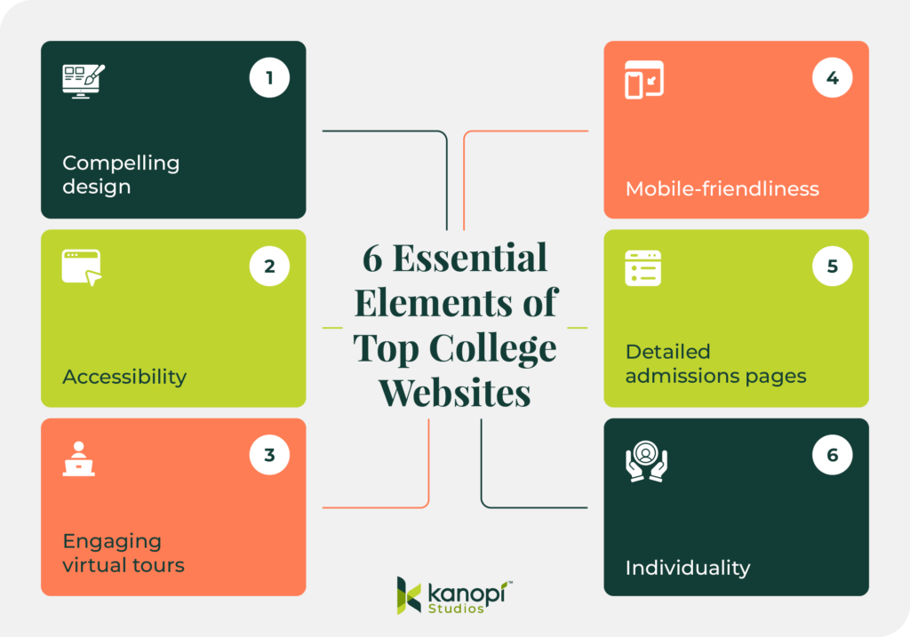
6 Effective Features of Higher Ed Websites
These elements in particular help capture your audience’s attention and deliver need-to-know details:
1. Compelling design
A well-designed website not only attracts potential students but can also provide a positive user experience that encourages prospects to explore the rest of the site and engage with more content.
When designing your own website, remember that less is more. Instead of cluttering the website with information, focus on clean, organized pages that are easy to navigate. Leave ample white space around important elements like calls to action (CTAs) to make them stand out. Doing so will help potential students find the information they need quickly and easily.
2. Accessibility
Under Section 504 and Title II, educational institutions must provide all individuals, including those with disabilities, equal access to important information and opportunities online. By making your website accessible, you avoid legal issues and demonstrate a commitment to promoting diversity, equity, and inclusion.
Check if your site adheres to accessibility and compliance laws, such as the Web Content Accessibility Guidelines. If it doesn’t, use Kanopi’s favorite tools and tech to meet these standards.
3. Engaging virtual tours
Virtual tours provide an immersive experience that can include panoramic photos, videos, and student-led tours that help prospective students better understand the campus. This insight is particularly important for students who cannot visit in person due to distance or other limitations.
Several of the following universities partner with YouVisit to add virtual tours to their websites. Consider whether working with an external partner is the best option for creating your own.
4. Mobile-friendliness
Members of Gen Z spend an average of over six hours on their phones daily, and you must meet these current and potential students where they are. Mobile optimization ensures your website is accessible on mobile devices and provides a positive user experience for all visitors.
To make your website mobile-friendly, adjust the layout and content to fit the screen size and resolution of the device on which it is being viewed. This can include reordering content, resizing images and videos, and adjusting font sizes. Other strategies for mobile optimization include simplifying the navigation menu, reducing page load times, and optimizing images and videos for mobile devices.
5. Detailed admissions pages
A comprehensive admissions page is a critical tool in a college’s recruitment strategy. It provides a clear path for potential students to navigate and ultimately submit their applications.
When crafting your admissions page, include information on how to apply, application requirements, deadlines, and important dates. It should also provide details on tuition and fees, scholarships, and other financial aid opportunities.
6. Individuality
A unique website helps distinguish your college or university from the competition. It can also leave a lasting impression on potential students, making it easier for them to understand your mission and values.
As you build your website, think about what makes your institution special. To differentiate yourself from other institutions, showcase your college’s unique and compelling aspects, such as programs, student life, or notable alumni.
Best College Websites: Our Top Picks
We’ve compiled our picks for the best college websites to explain what they are doing right and how you can replicate those best practices in your own website strategy. We’ve grouped each website based on the strategies they execute particularly well, including:
- Best College Website Designs
- Best College Websites for Accessibility
- Award-Winning College Websites
- Best Virtual College Tours
- Best Mobile College Websites
- Best College Website Admissions Pages
- Most Unique College Websites
Best College Website Designs
McGill University
Embracing minimalist design
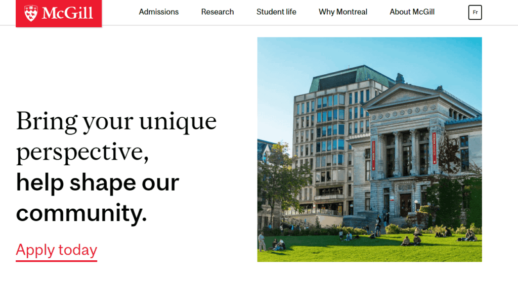
McGill University is a public research university located in Montreal, Canada. It is one of Canada’s top universities and is known for its prestigious academic programs and research. The McGill website provides a wealth of information about the university, including its history, faculty, student life, and research initiatives.
What’s excellent about McGill University’s web design:
- Minimalist look: McGill’s homepage is clean and minimalist while still providing essential content to its users.
- Inclusive language: The homepage call to action (CTA) uses second-person, inclusive language to help prospective students visualize their place on campus.
- Simple but engaging typography: The McGill website maintains simplicity throughout its typography, but did you notice the switch between serif and sans serif fonts? This creative choice offers more visual intrigue without being distracting.
Loyola University Maryland
Dynamic visuals
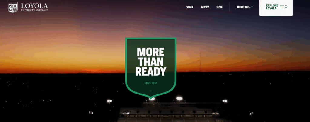
Based in Baltimore, Loyola University Maryland is one of the oldest Jesuit institutions in the United States. The Loyola Maryland website promotes the school’s Catholic values while providing plenty of information and opportunities for prospective students, donors, and faculty alike.
Standout features of Loyola University Maryland’s web design:
- Straightforward navigation: The main navigation menu is streamlined with three CTA buttons — “Visit,” “Apply,” and “Give” — that link to high-demand pages.
- Helpful white space: White space is used effectively to improve readability, enhance visual clarity, and draw attention to important information.
- Dynamic homepage video: A professional, compelling video at the top of the homepage makes the website more dynamic and memorable.
Flagler College
Bold branding and engaging scrolling
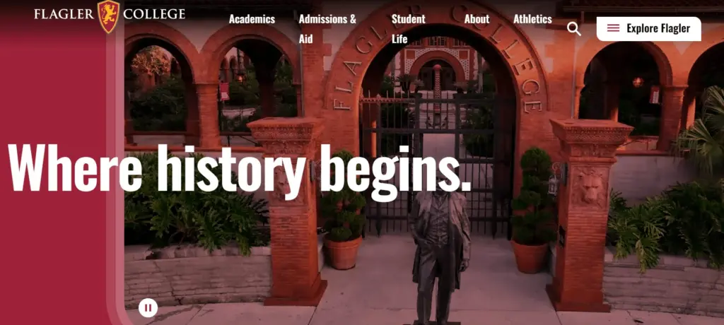
Flagler College is a small private institution located in St. Augustine, Florida. The university’s website promotes its historic roots while providing easily accessible resources for students, faculty, and other stakeholders.
Why Flagler’s web design exceeds expectations:
- Homepage video: The homepage features an engaging video showcasing the campus, complete with a pause button to improve accessibility.
- Bold colors: Flagler’s bold and eye-catching branding is on full display with colors that shift as you scroll down.
- Streamlined user pathways: Flagler worked with Kanopi’s web designers to simplify user pathways, helping visitors find what they need quickly. For example, the First Year Applicants page includes all the steps interested students need to follow to apply to the college in an easy-to-understand list.
- Simple navigation: The homepage also includes a convenient menu, allowing users to jump to different sections on the page. As a result of the structure and navigation updates supported by the Kanopi team, the Flagler site won two w3 Awards last year.
Roosevelt University
Interactive user interface
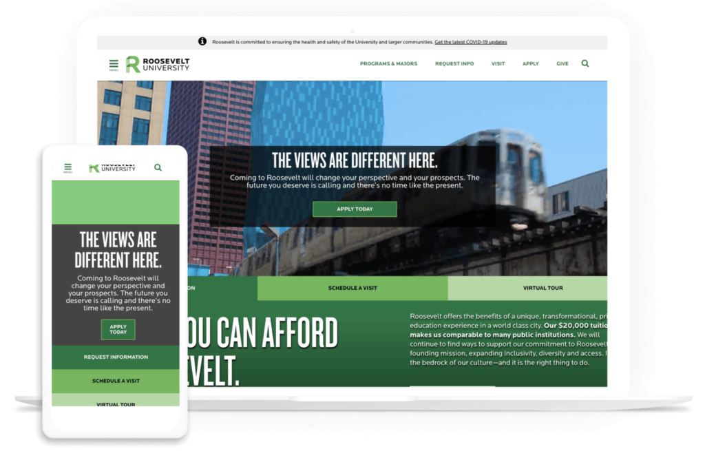
Roosevelt University is a private institution with campuses in Chicago and Schaumburg, Illinois. Roosevelt’s website prioritizes a highly engaging, interactive experience that makes it easier for current and prospective students, alumni, and other university community members to find opportunities that align with their interests.
What makes Roosevelt one of the best college websites:
- User-friendly sign-on: With the help of Kanopi’s development experts, Roosevelt migrated its website to a more user-friendly Drupal instance that offers a convenient single sign-on for all user accounts.
- Welcoming homepage: Roosevelt’s inviting homepage CTAs offer simple pathways for common user intentions, such as requesting more information, scheduling a visit, or completing a virtual tour.
- Inclusive pricing structure: Roosevelt emphasizes its relatively cheaper price tag when compared to other private universities, as well as its financial aid opportunities. This makes the website more inclusive for prospective students from all financial backgrounds.
University of Pennsylvania
Timely, relevant content and unified branding
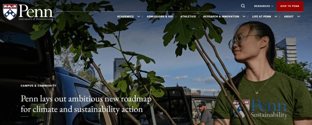
Founded by Benjamin Franklin, the University of Pennsylvania (UPenn) is one of the nine colonial colleges established before the signing of the Declaration of Independence. The UPenn website offers a straightforward, clear view of the school’s priorities, including sustainability, diversity, and inclusion commitments.
What we like about the University of Pennsylvania’s web design:
- Bold hero image: As soon as users arrive on UPenn’s homepage, they are greeted with an engaging hero image related to current events at the school.
- Consistent design: Each page maintains a consistent visual style, color scheme, and typography to create a unified and professional appearance.
- Dynamic content: The homepage is frequently updated with the latest news, events, and ways to keep in touch with the university on social media. This lends a dynamic, active feel to the university’s web presence, letting visitors know this college is serious about informing its audience about the latest happenings.
San Francisco Conservatory of Music
Clear calls to action and convenient digital calendar
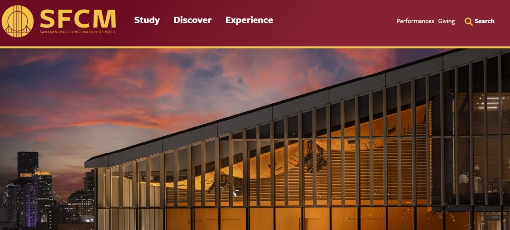
The San Francisco Conservatory of Music (SFCM) offers a world-class education for musicians, helping students prepare for long-lasting careers in the music industry. The website for this arts and culture institution spotlights information for prospective students and those looking to attend upcoming performances.
What stands out on the SFCM website:
- Performance calendar: SFCM worked with the Kanopi team to enhance their online performance calendar, allowing users to filter by department, event category, month, and year.
- Straightforward CTAs: The top-level menu offers simple and clear CTAs, including “Study,” “Discover,” and “Experience,” helping visitors navigate with ease to achieve their goals.
- Robust giving options: Donors have a wide array of giving types to choose from to show their support, including monthly giving, legacy donations, corporate gifts, and more.
Oberlin College and Conservatory
Site-wide visually engaging content
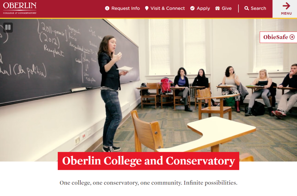
Oberlin College, located in Oberlin, Ohio, has a rich history of progressivism and student activism. The university’s website features diverse academic offerings, from a music conservatory to a strong liberal arts focus.
What we love about the Oberlin website:
- Informational homepage video: The homepage automatically plays a reel highlighting the college’s campus, facilities, and student life.
- Engaging visuals: The site uses high-quality images to give users a glimpse of what the college offers.
- Hierarchical page structure: Content is arranged with visual hierarchy in mind, guiding the user’s eye to the most important elements on the page first.
The University of Texas at Austin
Robust navigation
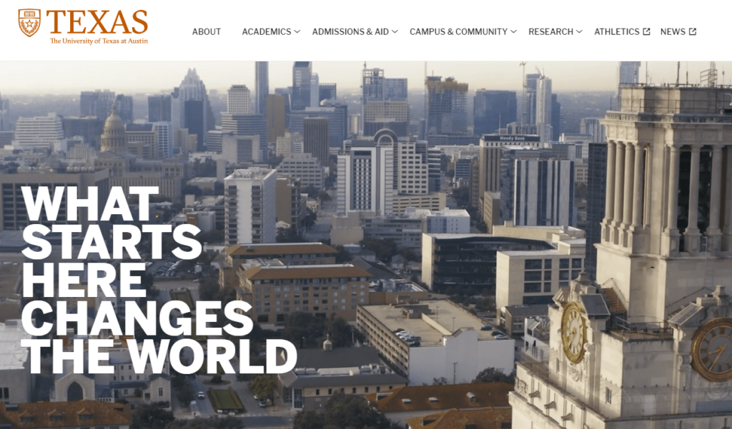
The University of Texas (UT) at Austin is a public research university in Austin, Texas, with over 51,000 students enrolled. The university’s branding and visual identity are evident throughout the website.
Here are the most effective elements of the UT Austin website design:
- Detailed navigation: A comprehensive drop-down navigation bar helps visitors find exactly what they’re looking for.
- Engaging imagery: High-resolution images and engaging graphics enhance the overall look and feel of the website.
- Aesthetically pleasing use of color: UT Austin’s burnt orange brand color contrasts stylishly with the effective use of white space and bold text.
Best College Websites for Accessibility
Cornell University
Compliant and welcoming website
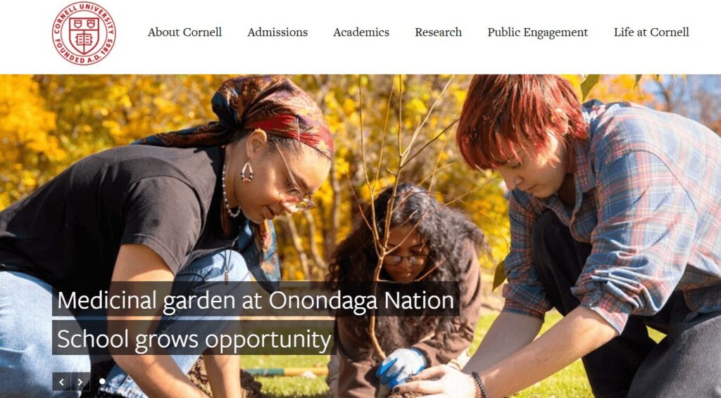
Based in Ithaca, New York, Cornell is a private Ivy League university offering seven undergraduate and seven graduate divisions. As a land-grant university, Cornell’s website keeps its research focus front and center while offering vital admissions and other academic information for current and prospective students.
What we like about Cornell’s accessible website design:
- Strong color contrast: Vibrant, bold colors pass accessibility contrast requirements.
- Useful alternative text: Images include concise and accurate alternative text for visually-impaired users.
- Welcoming language: The content features first-person language, such as “we are a diverse community of scholars,” to promote inclusion.
Adelphi University
Adept at accepting accessibility feedback
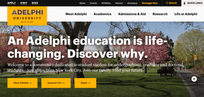
Adelphi University is a private institution located in Garden City, New York. According to its website, the university offers undergraduate and graduate programs in various academic disciplines, including social work, nursing, education, business, psychology, and more.
What makes the accessibility approach excellent:
- Captioning: Transcripts and closed captions are available for audiovisual content, enabling individuals with hearing impairments to access the information.
- Descriptive alt text: Images are backed by descriptive alternative text, making the site accessible to people using screen readers.
- Accessibility feedback: The site includes an accessibility form, where users can report questions or concerns related to individuals with disabilities and their experience accessing content. The responses help the university stay accountable and further improve its accessibility standards.
University of Notre Dame
Simple, logical, accessible design
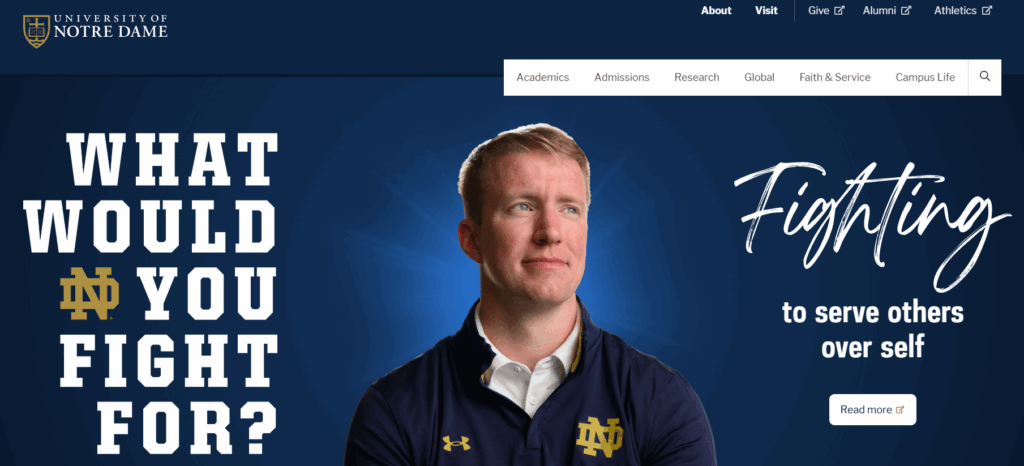
Powered by a Catholic mission, the University of Notre Dame is located in South Bend, Indiana. It serves 8,000 undergraduate students and is noted for its football team as much as its prestigious academics, with both elements reflected on its robust website.
Why the University of Notre Dame’s accessible web design impressed us:
- User-friendly navigation: A clear and consistent navigation system makes it easy for all users to find and access various website sections.
- Keyboard-navigation-friendly: All interactive elements, such as buttons and forms, can be accessed and activated using only the keyboard, which is vital for individuals who cannot use a mouse.
- Logical page structures: Headers are organized logically and hierarchically, helping screen readers navigate the content easily and improving overall readability.
University of Iowa
Engaging, accessible user experience
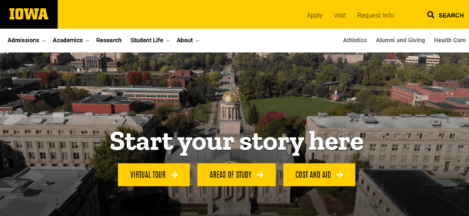
The University of Iowa (UI) is a public research university in Iowa City, Iowa. Its website boasts renowned academic programs, including those in medicine, engineering, business, and the arts.
How the University of Iowa’s accessibility commitment makes an impact:
- Simple keyboard navigation: Although the website lacks an accessible name on the search button and has a miss-coded background video, its functionalities can be operated using a keyboard alone, without requiring a mouse. This is a crucial aspect of website accessibility.
- Adjustable fonts: Users with low vision can adjust font size according to their needs without breaking the website’s layout.
- High contrast: Sufficient color contrast between text and background enhances readability for people with visual impairments or color blindness.
Award-Winning College Websites
Some college websites are so effective, engaging, and visually appealing that they’re recognized on a larger stage. One such form of recognition is the Webby Awards, an annual award ceremony recognizing the top websites of the year.
In the list below, we’ve compiled a few top examples of higher education websites honored with Webby Awards or nominations in recent years. These websites use exemplary audience engagement and visual design strategies, so note which elements you could borrow to improve your university’s website.
Moore College of Art & Design Digital Viewbook
Distinctive and creative visual look
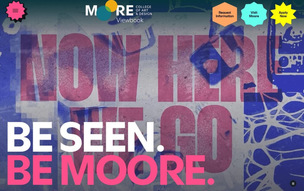
The Moore College of Art & Design is a private Philadelphia art school for women, nonbinary, and gender-nonconforming students. The college’s online promotional viewbook provides a unique and visually engaging resource for prospective students to envision their place at the school. We can honestly say we don’t see many college websites as unique and colorful as this one.
Here’s what caught our attention in the Moore College Viewbook:
- Unique comic-book-style design: The viewbook offers an engaging user experience reminiscent of reading a comic book. Bold colors, flashing elements, and unique microinteractions feel like walking through an animated world.
- Helpful user pathways: Visitors can select their own pathways using CTAs designed to provide tailored information for each educational path.
- Heavy visual emphasis: A variety of photos from different events and programs give prospective students a realistic look at what life in the program is like.
School of the Art Institute of Chicago
Unique microinteractions and branding
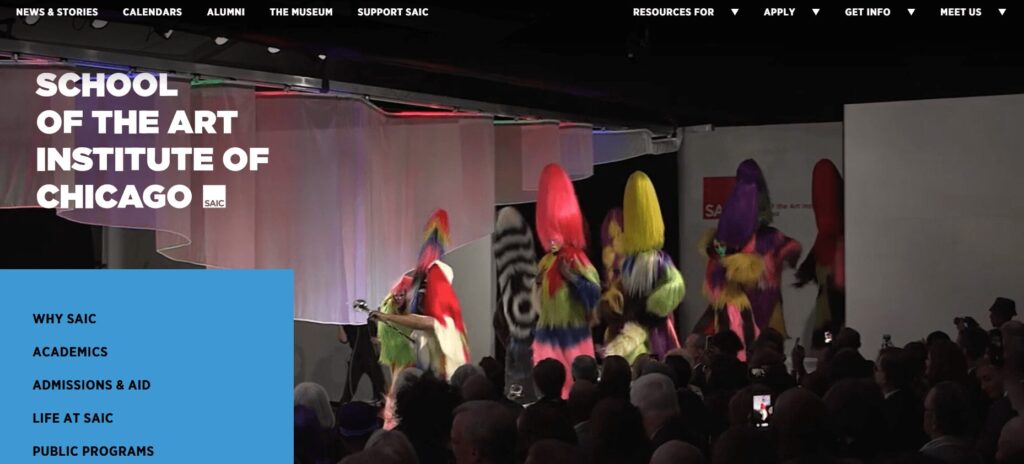
The School of the Art Institute of Chicago (SAIC) is a private art school considered one of the top art schools in the United States. The school’s website offers a veritable visual feast, with dynamic content and bold branding.
Standout features of this website include:
- User-focused navigation: The “Resources for” menu item speaks directly to the needs of different user groups, with convenient links to relevant informational pages.
- Microinteractions: The “Why SAIC?” section on the homepage features creative microinteractions — when users hover over each photo, they turn into dynamic videos that bring the content to life.
- Captivating colors: The site uses bold, eye-catching colors to create a more playful experience.
University of San Francisco
Showcasing value to prospective students
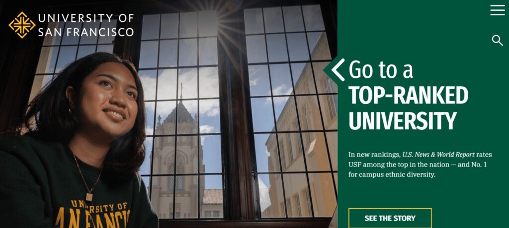
The University of San Francisco (USF) is a private Jesuit university in San Francisco, California. The USF website highlights the university’s diverse student body, quality of education, and value. Prospective students can easily access information on every program available, from undergraduate and graduate degrees to research programs.
Why we like this higher ed website:
- Compelling hero image: The primary image on the homepage is a striking solo shot of a student with a university building in the background. The photo is simple yet effective, allowing prospective students to envision themselves on campus.
- Effective use of statistics: The homepage spotlights key statistics related to the university’s success, including information about campus diversity, social mobility, and lifetime earnings. These statistics are presented clearly so prospective students can easily understand how the university will support them.
- Pop-out menu: The website uses a pop-out hamburger menu that keeps the header uncluttered.
Best Virtual College Tours
Rice University
Unique illustrations
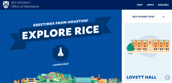
Rice University is a private research university located in Houston, Texas. It is noted for its high level of research and strong academic reputation, with a 6:1 student-to-faculty ratio. The Rice website highlights upcoming events alongside statistics about the university’s rankings and student population.
Here are the standout features of the Rice virtual tour:
- Engaging visuals: The site offers a fun twist on the typical virtual tour with an unexpected graphic layout that is still intuitive to use.
- Interactivity: An interactive map allows users to explore different areas of the campus, including academic buildings, residence halls, sports facilities, and more.
- User-friendly search functionality: A search bar encourages users to quickly look up landmarks and destinations, perfect for new and prospective students finding their way around campus.
University of Pittsburgh at Bradford
Accessible use of virtual reality
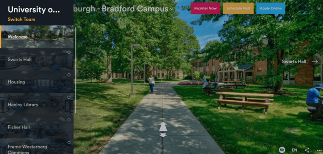
The University of Pittsburgh at Bradford is a regional campus of the University of Pittsburgh. Nestled among the Allegheny mountains, this school offers 115 academic programs to its 1,500 students. Its website showcases the variety of outdoor activities available while giving prospective students a glimpse into what life at the university is like with a carousel of homepage images.
Why the University of Pittsburgh at Bradford’s virtual tour caught our eye:
- Effective VR use: The website features a virtual campus tour that uses virtual reality (VR) to provide users with a 360-degree immersive experience.
- Student insights: The tour features video testimonials from current students, providing insights into their experiences, campus life, and extracurricular activities.
- Accessibility: The virtual tour is accessible to users with disabilities, providing keyboard navigation options, captions for videos, and alt text for images.
Morehouse College
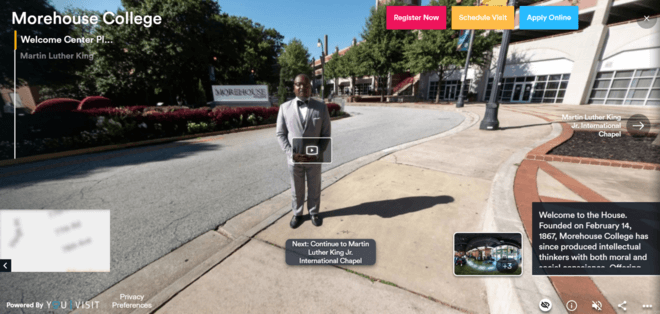
Morehouse College is a private, historically Black men’s college located in Atlanta, Georgia. The school is noted for playing an important role in the civil rights movement in the United States and for its robust alumni network, known as “Morehouse Men.”
Why the Morehouse College virtual tour stands out:
- Interactive elements: The virtual tour for Morehouse College includes interactive elements that users can click on to read more about notable landmarks, alumni, and programs.
- Immersion: 360-degree photos and videos provide an immersive view of key campus locations, giving prospective students a sense of being physically present.
- Opportunities to connect: The tour includes links to the college’s social media accounts, allowing prospective students to explore campus life further and stay updated on current events.
Best Mobile College Websites
Members of Gen Z spend an average of over six hours on their phones daily, and you must meet these current and potential students where they are. Mobile optimization ensures your website is accessible on mobile devices and provides a positive user experience for all visitors.
To make your website mobile-friendly, adjust the layout and content to fit the screen size and resolution of the device on which it is being viewed. This can include reordering content, resizing images and videos, and adjusting font sizes. Other strategies for mobile optimization include simplifying the navigation menu, reducing page load times, and optimizing images and videos for mobile devices.
Stanford University
Responsive, convenient mobile experience

Another prestigious American university, Stanford enrolls over 17,000 students. Its campus, located in Stanford, California, occupies 8,180 acres, making it one of the largest university campuses in the country. The Stanford website covers multiple aspects of the school’s mission, including events, academics, research, healthcare, campus life, and admissions, with different headers throughout the homepage.
What we like about Stanford University’s mobile design:
- Responsive layout: The website layout automatically adjusts to fit various screen sizes and resolutions, ensuring the content is easily viewable and accessible on mobile devices.
- Convenient forms: Forms are simplified for mobile use, with responsive input fields and easy-to-select options to enhance user engagement.
- Appropriate tap-target layout: Buttons and interactive elements are designed with sufficient spacing to accommodate tapping with the thumb.
University of British Columbia
Optimal mobile performance and load speeds
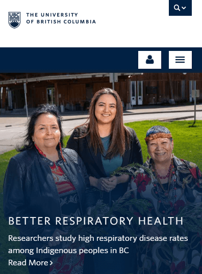
The University of British Columbia (UBC) is a top Canadian university located in Vancouver. Its website is simple and clean, spotlighting campus news alongside a strong research focus.
What makes UBC’s mobile design great:
- Performance optimization: Images and videos are compressed for faster loading times on mobile devices.
- Readability: Text is legible on smaller screens without users needing to zoom in.
- Lack of pop-ups: Pop-ups are limited to avoid disrupting the mobile browsing experience, as they can be challenging to close on smaller screens and lead to user frustration.
Brown University
Facilitating mobile connections
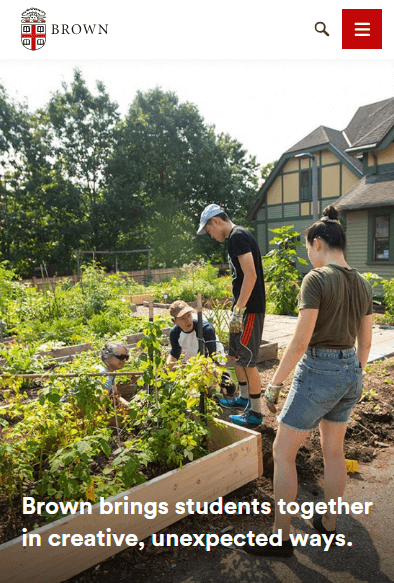
Brown University is a private Ivy League research university located in Providence, Rhode Island. It was founded in 1764 and is one of the oldest and most prestigious universities in the United States.
Why Brown University’s mobile approach stands out:
- Mobile-optimized video: The video on the homepage automatically adjusts to a static image in the mobile version, which is much easier to view.
- Simple contact options: Click-to-call options are prevalent throughout the site, allowing users to contact the college directly from their mobile devices.
- Streamlined content: Content is easy to read on smaller screens, with concise paragraphs and legible font sizes.
Best College Website Admissions Pages
University of Arizona
Convenient information for a wide range of user groups
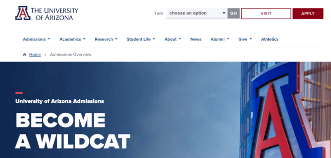
The University of Arizona is a large public land-grant university located in sunny Tucson, Arizona. Its website covers all the academic information that prospective students are curious about and provides a thorough overview of the culture and experience of living in Tucson.
Why the University of Arizona’s admissions page is effective:
- Tailored content for different user groups: The admissions overview page for the University of Arizona has dedicated sections for each type of applicant, including prospective first-year, graduate, international, transfer, and online students.
- Convenient contact information: The page highlights clear contact details for the admissions office, allowing visitors to reach out for inquiries.
- FAQs: There are also answers to frequently asked questions about the admissions process and college life.
Northwestern University
Helpful prospective student information
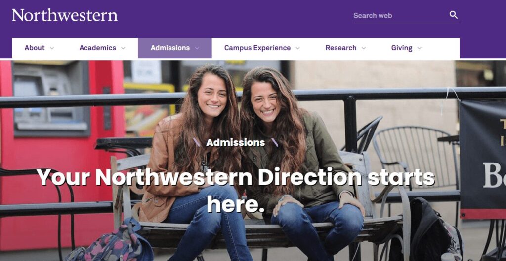
Renowned for its journalism, management, and music schools, Northwestern University stands apart as one of the most prestigious schools in the United States and the world. The school’s website highlights its prominent research focus and its commitment to fostering a diverse, inclusive, global community.
Why Northwestern’s admissions page made our list:
- Welcoming tone: The website features a warm and inviting admissions page that welcomes prospective applicants with second-person, inclusive language, saying, “Your Northwestern Direction starts here.”
- Helpful information: The page provides a concise overview of the college, highlighting its mission, values, and unique selling points. It also provides clear and detailed information about the admissions process, including application deadlines, requirements, and steps.
- Convenient touring options: The website offers multiple ways to explore the campus, including in-person tours and virtual info sessions.
Georgetown University
Inclusive and informative content
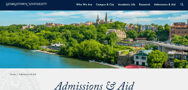
Georgetown University is a private research university in Washington, D.C. This highly selective school is also the oldest Catholic university in the United States. The Georgetown website offers information for its broad audience, including students and parents, alumni, faculty, and staff.
Here’s what’s exciting about the Georgetown admissions page:
- Diversity commitment: Georgetown’s admissions page features a diversity and inclusion statement, ensuring prospective applicants that this is a welcoming environment for all.
- Testimonials: The page includes a personal testimonial from a current student to showcase the university’s impact.
- Touring options: The page also links to the tour page, where users can either schedule an in-person visit or view the campus using virtual tour technology.
Washington State University
Focus on financial accessibility
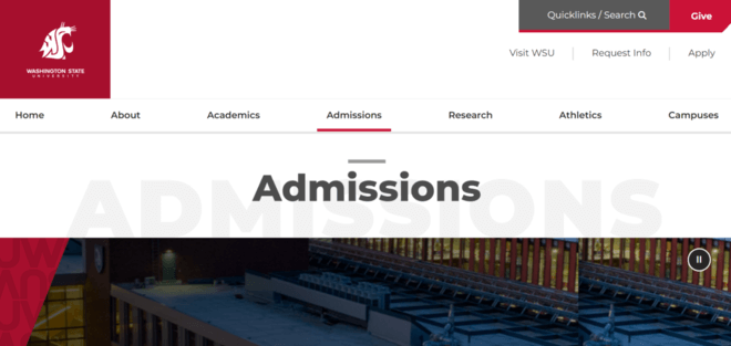
Washington State University (WSU), located in Pullman, Washington, is a renowned public research institution with a rich history spanning over a century. Its easy-to-use navigation guides visitors through academic programs, campus life, and research initiatives.
Why Washington State University’s admissions page stands out:
- Financial accessibility: The WSU admissions page features two calculators that prospective students can use to estimate their total cost of attendance and need for financial aid.
- Engaging video: A visually pleasing video walks students and their families through the process of paying for college and applying for scholarships.
Region-specific information: A clear section explains how to apply to each regional campus.
Most Unique College Websites
Western Washington University Department of Design
Uniquely engaging interactivity
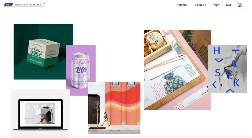
Western Washington University (WWU) is the northernmost university in the contiguous United States and is frequently ranked as one of the best public universities in the West. The university’s Department of Design offers graduate students the opportunity to expand their skills holistically. Its website takes an interactive approach that helps inform and engage visitors.
What we like about Western Washington University Department of Design’s website:
- Unique interaction opportunities: This school’s imaginative homepage hero allows users to move and position design imagery around the page with their mouse, perfectly reflecting their values and mission and engaging prospective students.
- Specific CTAs: They bring the impact of donations to life by including images and details of what users’ money goes towards under their “Give” CTA, from a new Riso printer for their production lab to scholarships and field trips.
- Casual vibe: The conversational and friendly tone of voice hooks users in and makes them want to read every last word of their content.
Kenyon College
Idiosyncratic homepage image structure
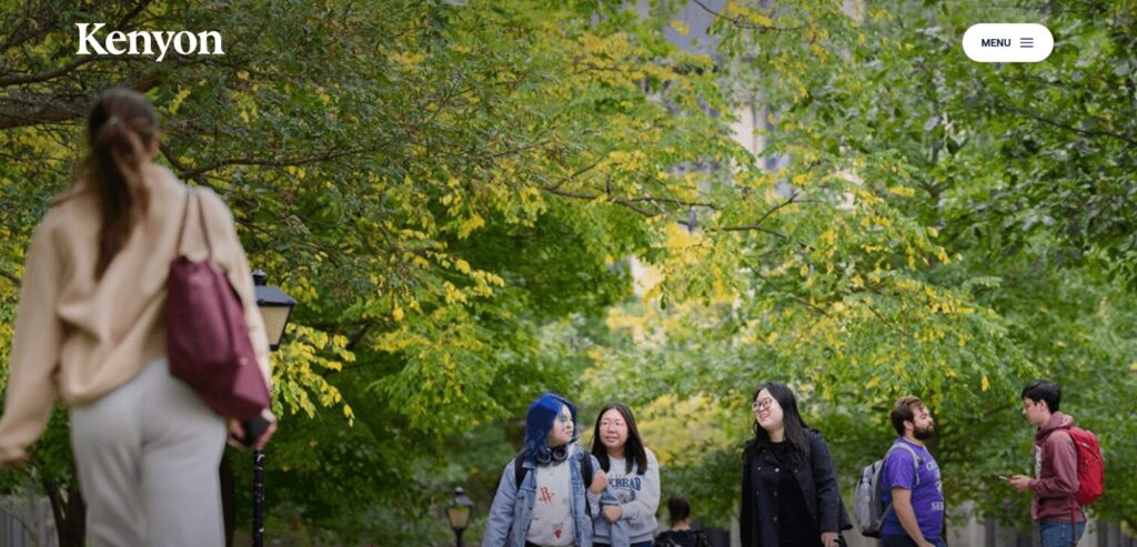
Kenyon is a small private liberal arts college based in Gambier, Ohio. Although Kenyon’s student population is a mere 1,660, its website’s unique and streamlined design puts it head and shoulders above many larger schools’ sites.
Why the Kenyon College website made the list:
- Eye-catching hero image: The homepage takes a bold, minimalist approach, with a standout quote and a unique, compelling image of everyday campus life.
- Dynamic event calendar: The site features an engaging and up-to-date event calendar showcasing campus initiatives, lectures, and other activities.
- Student success: The rest of the site highlights current student and alumni accomplishments and stories, showcasing their successes and experiences at the college.
Rhode Island School of Design – Alumni
Simple but effective design
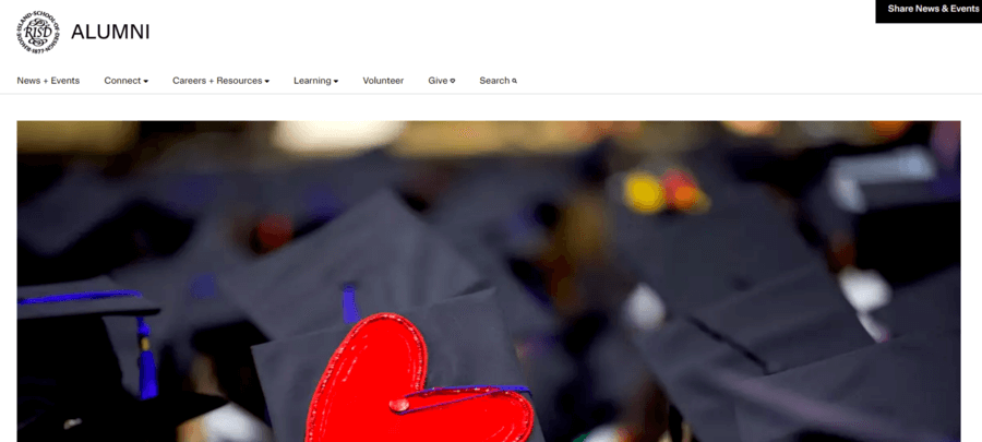
The Rhode Island School of Design (RISD) is one of the most prestigious fine arts schools in the United States. The school’s alumni website reflects its design-driven mission, showcasing unique and interactive elements that offer visual intrigue and engage visitors.
Here’s what’s exciting about the RISD Alumni website:
- Animated microinteractions: The clever use of animation, including the news and events scroll in the middle of the page and the hashtag scroll at the bottom, adds interest and serves a clear and useful purpose.
- Success stories: The website highlights alumni stories, showcasing their successes and experiences at the college.
- Simple but effective branding: The stark black-and-white design maintains a streamlined look without feeling boring.
How to Build the Best College Website with Agency Help
Website design agencies like Kanopi can help you optimize your college website by organizing content in an intuitive and visually pleasing way. Our team of specialists also offers a website growth plan once your website launches to help you stay on track toward your goals.
We offer a robust catalog of services to help support university websites at any stage of their development, including:
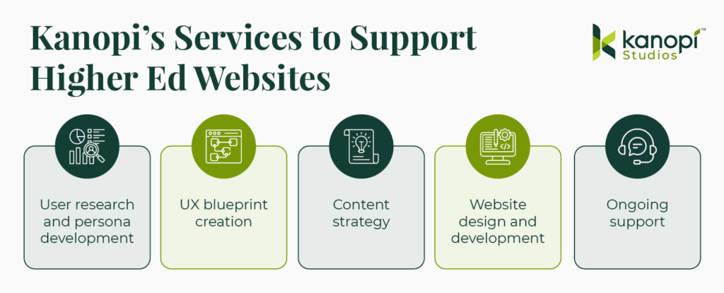
- User research and persona development: We study your audience to understand their needs, preferences, and interests. Services include stakeholder workshops, competitor analysis, content and user experience audits, and technical planning.
- UX blueprint creation: Using personas, we map out your website’s content to help your users navigate your site more efficiently and achieve their goals.
- Content strategy: Effectively telling your university’s story is key to driving audience engagement. We help refine your unique voice and style to captivate your audience with a compelling, unified message.
- Website design and development: Our design and development services are focused on ensuring your website’s front-end look and back-end structure are optimized to support your goals. Our services are built to boost conversions through accessible, interactive design and high performance.
- Ongoing support: We provide ongoing assistance to adapt your site to shifting audience needs and maintain security and high performance over time.
Working with Kanopi could give your university website redesign project the structure and expertise needed to be successful. Contact us if you want to take a continuous improvement approach to your college or university website.
Additional Resources
For more information on how to create the best college website, check out these additional resources:
- Higher Ed Website Design: Tips and Trends. Keeping higher ed web design trends in mind is an effective way to meet your audience’s needs. Explore this year’s most important trends in this comprehensive guide.
- 4 Simple Steps to Migrate from Drupal to WordPress. Interested in transitioning your college website from Drupal to WordPress? This guide covers the key steps to follow.
- The ROI of Great Website Design. Are you after more donations? More enrollment? More memberships? This post makes the case for a well-designed website.


