
Imagine this: you discover an organization that you’re passionate about through a social media post. You want to find out how you can support them so you search for them online. After scrolling through the first couple of results, you successfully find their website. The website takes a long time to load, especially some of the images. You’re trying to find their navigation menu, but after looking around for a minute, you cannot. Then, you exit the window and never think about them again.
The above situation demonstrates bad user experience, or UX.
UX describes how a potential site visitor interacts with your organization’s site. When a user lands on your nonprofit website, whether they’re a potential supporter or a current one, it shouldn’t be hard to find the content or complete the action they’re looking for.
Prioritizing UX for your nonprofit website ensures that users stay on your site for longer and engage with your offerings — but how do you do so?
We at Kanopi often work with nonprofits to ensure their website leverages all opportunities and engages donors in meaningful ways. We’ve seen the difference that even small UX fixes to your nonprofit site can have on your ability to communicate meaningfully with and bring value to supporters.
In this guide, we’ll walk you through some of our favorite UX best practices, along with a deep dive into how one of our own clients prioritized their users.
Table of Contents
- The Importance of Good UX for Your Nonprofit Website
- UX Best Practices for Nonprofit Websites
- UX for Nonprofits: NCBI Case Study
The Importance of UX for Your Nonprofit Website
Similar to how a person may enter a physical store and then choose to stay or leave based on their experience, how your supporters access and engage with your site is critical.
Nonprofit UX describes the experience that users have when they engage with an organization’s online content. As the centerpiece of your digital engagements, your nonprofit website UX is extremely important if you want to not only acquire new supporters but continue to retain current ones.
Benefits of Good UX for Nonprofits
Specifically, here is what good UX for nonprofits can bring you:
- Positive relationships between supporters and your nonprofit’s brand. The more positive the experience that users have on your website, the more they’ll consider your nonprofit as reliable and worthwhile.
- Lower development costs down the line if you invest in UX upfront. Often website creators have to invest more in tools and site development because of bad UX. Making this a priority early on can make all the difference in ensuring your website lasts.
- Increased website accessibility for users of all abilities, from any location, and using any device. You don’t want to inadvertently turn potential supporters away!
- It takes less time to optimize good UX than to continuously fix bad UX.
- More online engagements and conversions, whether that’s in donations, event registrations, or volunteer signups.
Bottom line: Good UX, especially on your nonprofit website, will lead to higher retention rates, higher engagement rates, and an overall lower cost for website development and support.
UX Best Practices for Nonprofit Websites
If you want to start prioritizing UX for your nonprofit website, consider how it might look from a new user’s perspective. Ask yourself the following questions:
- Can you easily figure out what your organization’s mission is?
- How long does it take to find common landing pages, like contact information, online donation page, blog roll, or event calendar?
- Is your website accessible on all screen sizes, from a desktop computer to a mobile phone?
The steps you take to improve UX for your site will differ depending on the answers above. Throughout it all, it’s crucial to always think of ease of use, speed, and accessibility.
Here are some UX best practices that can help improve ROI and promote clearer communication for all nonprofits:
- Use a flexible website builder/CMS. CMS platforms like WordPress and Drupal are popular options thanks to their internal and third-party integration options.
- Test your website load speed. Studies have found that 40% of users abandon a website that takes more than 3 seconds to load, with a delay of just 1 second dropping conversions by 7%.
- Keep your design user-focused. Don’t prioritize aesthetics over ease of use.
- Make use of strong visual elements like images and infographics. This is great to elicit an emotional connection between your site visitors and your mission.
- Optimize your website for mobile. It’s predicted by 2025 that almost 75% of the world will only use smartphones to access the internet. Not optimizing your online engagements and nonprofit website for mobile excludes a growing chunk of your supporters.
- Focus on conversion-optimized online donation pages and forms. This means keeping your donation page streamlined, embedding your donation form within the site, and keeping unnecessary fields to a minimum.
- Incorporate key calls-to-action to funnel users toward target actions. Bright buttons or strategically placed links going towards your online donation page can guide web visitors towards a target action. Place those CTAs on your homepage, missions statement page, and through other digital marketing like email content and social media content.
- Keep in mind web accessibility guidelines. Keeping your website accessible and compliant with WCAG and AAA guidelines is critical if you want to attract and engage with as many online supporters as possible. Explore our blog post on accessible websites for tips on how to bring your own site up to standard.
- Track website traffic over time. If you see that users are dipping on a certain page, that’s a good indicator of bad UX. Tracking website data gives you a comprehensive look at how users are engaging with your online offerings in real-time.
However, the best nonprofit websites aren’t made in a day. That’s why many nonprofit leaders will partner with a tech consultant, like Kanopi, to optimize their CMS platform and take the steps to improve their site UX.
Partner with Kanopi for Your Nonprofit UX
Here at Kanopi Studios, we offer a range of services to help nonprofits develop, maintain, and support their website. With over 150 active sites under our belt, we know a thing or two about good UX and what it takes to achieve it.
Every nonprofit organization is different, so their UX will differ as well. With extensive research into your unique audience and their goals with your organization, we dive deep to suggest and make meaningful changes that improve online supporter communication and increase conversions.
Here are some of our specific services when it comes to UX:
- Continuous improvement approach. Smaller, incremental fixes tend to be more beneficial to your website health and maintenance than larger updates that only happen once every couple of months. Our continuous improvement approach sets your website up for long-term growth.
- Content strategy creation. Let us help you curate the best content that will capture your online supporters’ attention. With our thorough audience research, we can develop and design your website to meet your audience’s unique needs.
- Persona development. User personas are a key way to learn more about your online audience and create more valuable content for them. We can create personas for your nonprofit to guide your decisions and give you more context to certain types of supporters.
- Journey and decision mapping. Every user goes through a path based on their goals when they navigate your nonprofit website. We can help track that journey, pointing out common opportunity gaps and offering solutions.
- Information architecture. Our content strategists are experts in user flow and navigation when it comes to designing and developing a website.
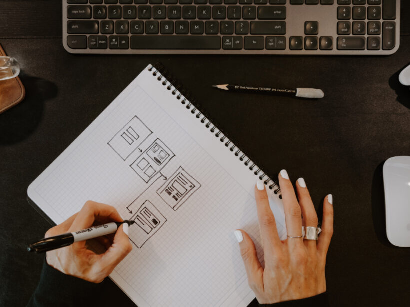
- Wireframes & Prototyping. Before we start web design or development, we’ll work closely with your team to brainstorm which layouts promote good UX through different wireframes and prototypes that you can actually explore.
- User testing. To ensure that each change and suggestion is viable, we go through ample user testing from our team. This is key if you want to improve your nonprofit UX.
UX for Nonprofits: The National Council for the Blind in Ireland (NCBI) Case Study
How does prioritizing UX for nonprofits play out in real life? To dive deeper into this topic, let’s explore our client, The National Council for the Blind (NCBI), and how we developed and designed their website.
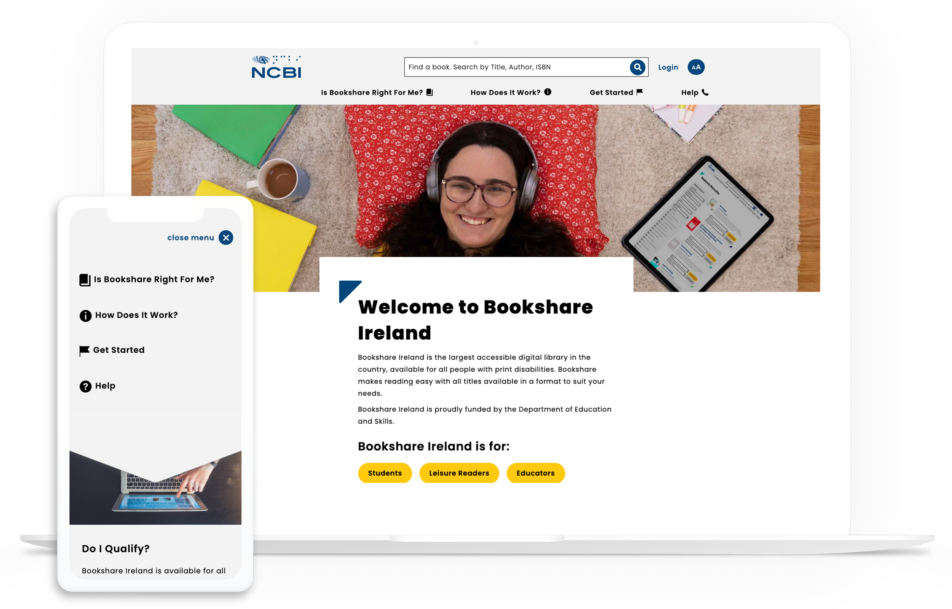
The NCBI in Ireland is part of the Bookshare project by Benetech. Their mission is to provide those with visual impairment reading barriers with new opportunities for learning and literacy. They came to us at Kanopi because they wanted to make their materials available in an online format, as well as create a website that supports their overall mission and goals.
We know that good UX is going to be a major factor here. Because of the NCBI’s unique mission, we had to build their website with those who have significant visual impairments in mind. The colors, the font, and even just the structural layout of the website all had to be carefully chosen to account for this unique audience and their goals.
You can view the finished product below.
Here’s what we did:
- Conducted in-depth and frequent accessibility testing to ensure the site is AAA compliant all the way through development.
- Followed best practices on contrast ratios and appropriate font sizes.
- Outsourced and researched the best fonts that worked well for users with visual impairment.
- Ensured that all image fields provide alt-text and that button sizes were optimized for visual impairment.
- Developed a content hierarchy that follows best accessibility practices.
- Built templates to support the hierarchy and be used even once the partnership is over.
- Customized the search interface to improve search functionality when it comes to looking up book listings.
- Optimized the entire site for mobile, for instance, in the mobile screenshot you can see the left aligned buttons are centered for easier access by thumb.
- Created customized landing pages with carefully chosen images to tell a story and bring more value to online supporters.
Through extensive research, we at Kanopi Studios were able to provide strategy, design, front and back-end development of the Drupal CMS to create a website that meets the needs of NCBI’s audience.
NCBI now has a AAA compliant site, with over 800,000 reading and literacy resources available to its online audience. With their online library only growing and their website now set up to support this growth, NCBI can confidently provide access to their educational content online all while still promoting good UX.
Explore this page for a deeper dive into the NCBI case study.