Airline travel is more popular than ever—the industry set a record in 2024 with nearly 5 billion passengers. Clearly, people are ready to explore the world. Is your airport’s website ready to meet their needs with a positive user experience?
This guide explores everything you need to know about airport web design, including:
- Airport Web Design: FAQs
- Features of Compelling Airport Web Designs
- Airport Web Design Best Practices
- 5 Inspiring Airport Web Design Examples
- How Kanopi Supports Airport Web Design
Let’s start by reviewing a few commonly asked questions about airport web design.
Airport Web Design: FAQs
Why is it essential to have a quality website design for my airport?
In general, passengers are happy with their air travel experience—an Ipsos survey found that the vast majority of passengers were satisfied with their air travel experience, and only 3% reported being “very dissatisfied.”
A high-quality airport website is an essential component of providing a positive experience for travelers. Clearly outlined lounge locations, dining options, baggage options, and more on your site will help your airport maintain high passenger satisfaction.
What do users expect from airport websites?
Today, most airline travelers are digitally savvy. They want a web experience that helps them get need-to-know information as quickly and painlessly as possible. Here’s what visitors expect from airport websites:
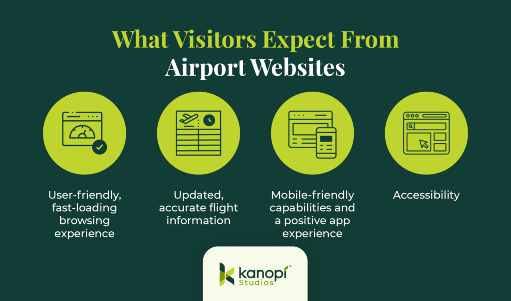
- User-friendly, fast-loading browsing experience: Over half of website users will leave a site if it takes more than three seconds to load. Therefore, your airport’s passengers will expect your website to load quickly and offer a streamlined user experience. This is especially important if your airport’s Wi-Fi isn’t high-speed—offering a website with fewer loading issues is imperative.
- Updated, accurate flight information. Whether they are travelers themselves or seeking flight details to facilitate airport pick-ups, your website’s users expect to see accurate real-time flight information.
- Mobile-friendly capabilities and a positive app experience: Your website should look great on desktop computers and mobile browsers and apps. After all, most travelers don’t want to pull out their computers to view your website. Plus, the top five most used U.S. airline apps have collectively seen their monthly active users grow to over 9 million, demonstrating customers’ interest in using apps to manage their travel.
- Accessibility. Over 70 million American adults and 1.3 billion people worldwide live with disabilities, so your site needs to accommodate a wide range of accessibility needs. Your content, navigation system, and forms must be inclusive and accessible to everyone.
Jump to our best practices section for a closer look at how to optimize each of these aspects of the user experience.
How can I balance function and visual appeal on my airport website?
You may be tempted to design your airport’s website with all the latest bells and whistles, from interactive maps to eye-catching animations. However, it’s essential not to lose sight of providing a functional and convenient website, especially for first-time travelers, users with disabilities, or older customers.
That’s why we recommend starting from a less-is-more approach to airport web design. At Kanopi, our web design experts are well-versed in balancing form and function to produce websites that exceed user expectations. Our process includes the following steps:
- User background research. We perform deep audience research to understand your stakeholders’ perspectives and needs. Then, we conduct stakeholder workshops, competitor analyses, content and technical audits, and sitemap creation and testing to plot the right strategy for your website design.
- Website design. Kanopi focuses on telling every brand’s story through colors, typography, imagery, and motion that reflects your mission and vision.
- User experience testing. We create core personas that reflect your audience to ensure your website meets their needs. Then, we test the site to ensure a positive experience before deploying updates.
- Ongoing support. We maximize your site’s success through ongoing performance enhancements, conversion optimizations, and security reinforcement.
This process results in a streamlined user flow that effortlessly guides users through your website to the information they need. The user flow for airport websites involves the steps visitors take to navigate from flight details to transportation information, and other key details they need to make their travel experience more comfortable, like shopping options.
For instance, take a look at the San Francisco International Airport (SFO) website.
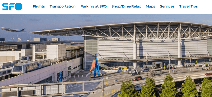
Kanopi worked with this organization to design an intuitive navigation system based on users’ most pressing needs. The top-level main menu lists items by priority, from flights to transportation, parking, shopping and dining, maps, services, and travel tips. The website doesn’t need flashy design elements or avant-garde technology to help users get from point A to point B as efficiently as possible.
Features of Compelling Airport Web Designs
To summarize, here are the features your airport website will need to facilitate the passenger experience:
- A simple tool for checking flight status
- Parking booking and information about available lots
- Maps
- Ground transportation options
- Information about shops, restaurants, and lounges
These features might vary depending on your airport’s unique services, but in general, these are the essential items visitors will seek on your website.
Airport Web Design Best Practices
Integrate real-time, accurate data into your airport website.
Certain aspects of air travel can be unquestionably stressful. Figuring out the best route to make a tight connection, trying to find your new gate number when it’s been unexpectedly changed, circling the pickup area multiple times due to delayed flights—these inconveniences can put a damper on the passenger experience.
However, with real-time data, you can turn your airport website into a helpful resource that lessens or eliminates many of these pain points. Live flight updates, baggage claim statuses, and real-time parking information can help travelers better plan their journeys.
You can automate these processes using specific technologies for your website, such as APIs for flight data, which provide real-time and historical flight tracking information. We recommend working with a developer to determine the best tools to add to your site to expand its functionality and help customers access the necessary data.
Prioritize accessibility.
As mentioned above, accessibility is essential for airport websites. Accessibility makes your website easier to navigate for all users, meaning it should be a top priority in your airport web design strategy.
Start improving your site’s accessibility by keeping these tips in mind:
- Follow the Web Content Accessibility Guidelines (WCAG). These guidelines are the industry standard for designing a fully functional and accessible website. They include specific requirements such as implementing alternative text for images and videos, logical navigation, keyboard accessibility, use of color, and more.
- Conduct automated and manual tests. Automated testing tools like Lighthouse and WAVE are a great place to start your accessibility testing because they can point out major accessibility issues that should be addressed immediately. However, we also recommend conducting manual testing to replicate the user experience and highlight issues that automated tools may be unable to catch.
Use color theory to drive engagement.
Studies have shown that up to 90% of customers’ first impressions of a brand come from color alone. Therefore, the color scheme you choose for your airport website will play a significant role in passengers’ opinions of your airport.
Here are some of the most popular shades for airport websites:
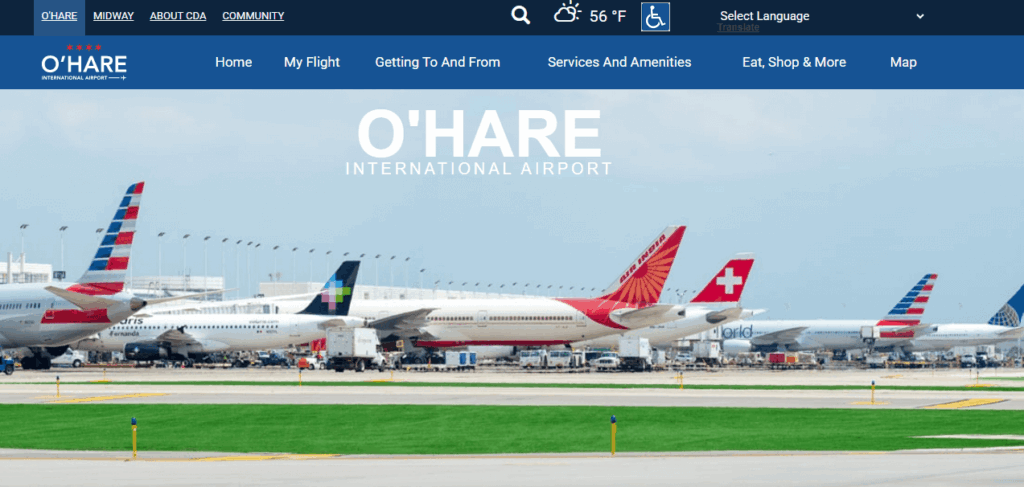
- Blue: Conveys trust, reliability, and peace. In our research, airport websites overwhelmingly choose blue color schemes.
- Example: O’Hare International Airport
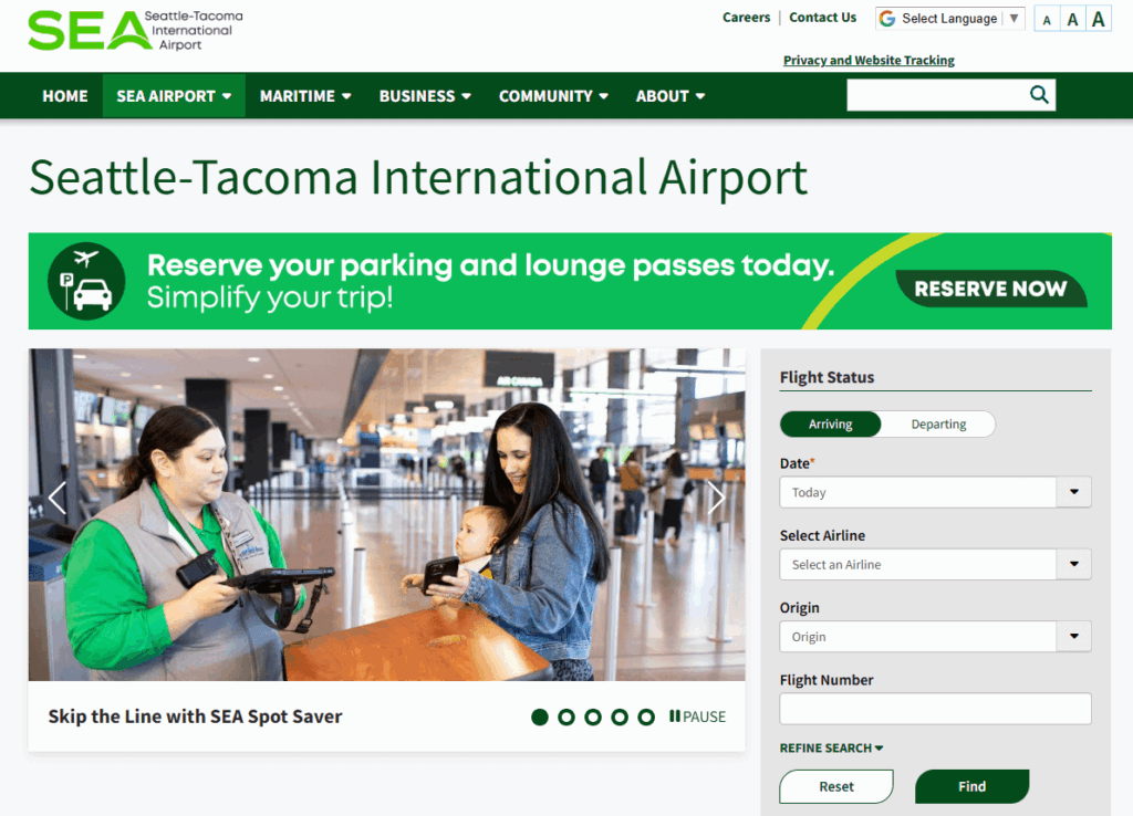
- Green: Conveys nature, sustainability, and calm.
- Example: Seattle-Tacoma International Airport
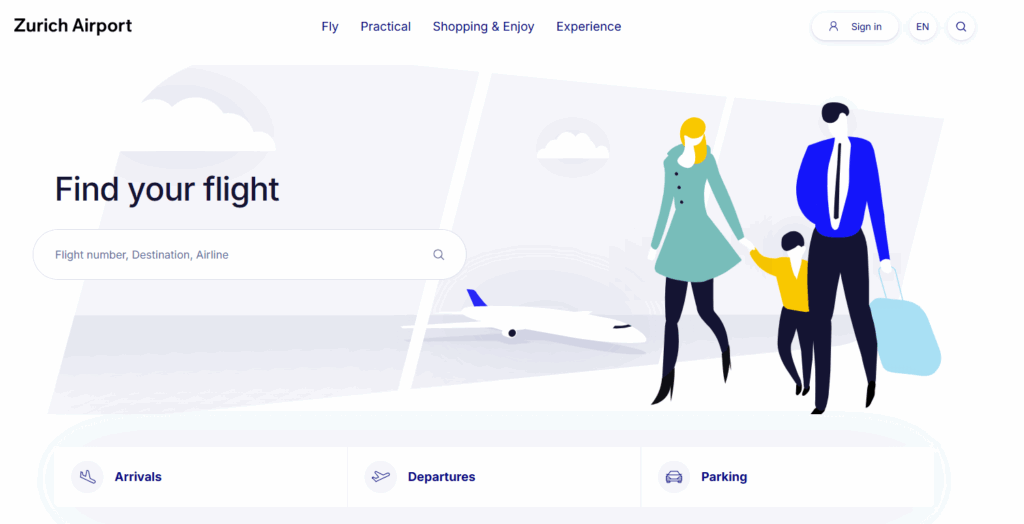
- Neutral tones (tan, gray, shades of white): Convey professionalism, minimalism, and modernism.
- Example: Zurich Airport
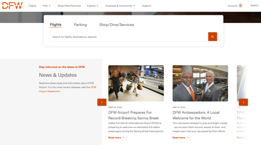
Use accent colors based on your brand’s palette to add small color pops throughout your site. For example, the Dallas-Fort Worth International Airport website leverages neutral background colors with a reddish-orange accent color for text and buttons.
Keep it as simple as possible.
Remember, a key aspect of the airport user experience is ensuring visitors can access information quickly. They may be in a rush to catch a flight or pick up a loved one, and they need to know exactly where to go and what to do.
Simplify your site by taking these steps:
- Ensure your main menu only includes the essentials, like the features listed above.
- Use white space effectively to reduce clutter and allow your design elements to breathe.
- Offer an internal search bar at the top of every page so users can quickly find the specific information they need.
Prioritize passenger cybersecurity.
Research by Bridewell found that 55% of aviation organizations experienced a ransomware attack in the previous 12 months. Accidental loss or disclosure of data was ranked as the top threat to civil aviation.
Reassure passengers that your airport will do everything possible to keep their data secure. Take the following security measures on your website as part of your overarching cybersecurity efforts:
- Run regular security checks and deploy updates and patches as soon as they’re available.
- Require strong passwords and multi-factor authentication for any login portals.
- Use a PCI-compliant payment processor to manage transactions safely and securely.
Enhance performance.
We already discussed how fast-loading websites maintain audience attention, but what steps can your airport site take to facilitate better performance? We recommend following these tips:
- Compress images and consider converting them into performance-optimized file formats like WebP or SVG.
- Use a content management system (CMS) or plugin to leverage caching on your site. This ensures that pages load faster on subsequent visits.
- Strip unneeded code from content if you’re copying and pasting from a platform like Google Docs into your CMS. This action often carries over a lot of unnecessary characters that can slow down your site’s load times.
- Keep your CMS, plugins, and modules up to date and upgrade to new versions as soon as possible.
Level up the passenger experience with AI chatbots.
An AI chatbot functions as an internal search tool for your airport website. Visitors can communicate with the chatbot to find information or resources they’re seeking. If the chatbot can’t answer the question, it can direct users to your website’s customer service information to connect with a staff member.
Over 937 million people use AI chatbots today, and the market is projected to continue to grow. Chatbots are a simple way to make your site more functional without increasing complexity.
Optimize your website for mobile devices.
Globally, mobile devices make up over 60% of internet traffic, making optimizing your airport website for mobile devices essential. Incorporate these strategies to improve your website’s mobile experience:
- Use large fonts and easily touchable buttons. Test different font sizes to find the right fit and ensure buttons are appropriately spaced so users can easily tap them on mobile screens.
- Ensure your menu is hidden and expandable on mobile devices. Use a collapsible mobile menu to keep your homepage uncluttered on phone screens.
- Leverage a user-friendly app. Offer passengers an app to access the same need-to-know information your website offers, like flight details, parking information, and security wait times.
Take a look at this example of a non-mobile-optimized website vs. a mobile-optimized one:
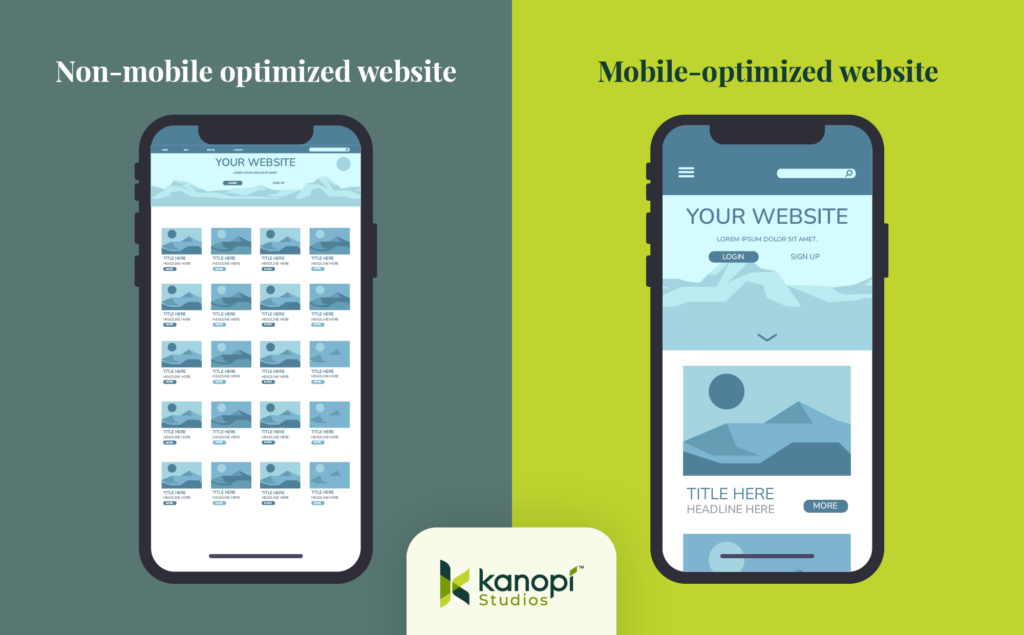
As you can see, the non-mobile-optimized version contains tiny fonts, small buttons, and poorly-spaced items. In contrast, the mobile-optimized site has a vertically-oriented layout, large fonts, and easily-tappable buttons for a better mobile experience.
Incorporate multilingual capabilities.
Your airport likely sees thousands of multilingual travelers annually, especially if you’re an international airport. Ensure your site can be translated into multiple languages based on your passengers’ most common languages.
You can manage this process using multiple URLs for different languages or a plugin to facilitate multilingual capabilities. If you choose to use a plugin, consider working with a developer to create a custom solution catered to your needs. A custom plugin is also more likely to run smoothly and load quickly on your site, enhancing performance.
5 Inspiring Airport Web Design Examples
San Francisco International Airport: Best airport website for simple navigation
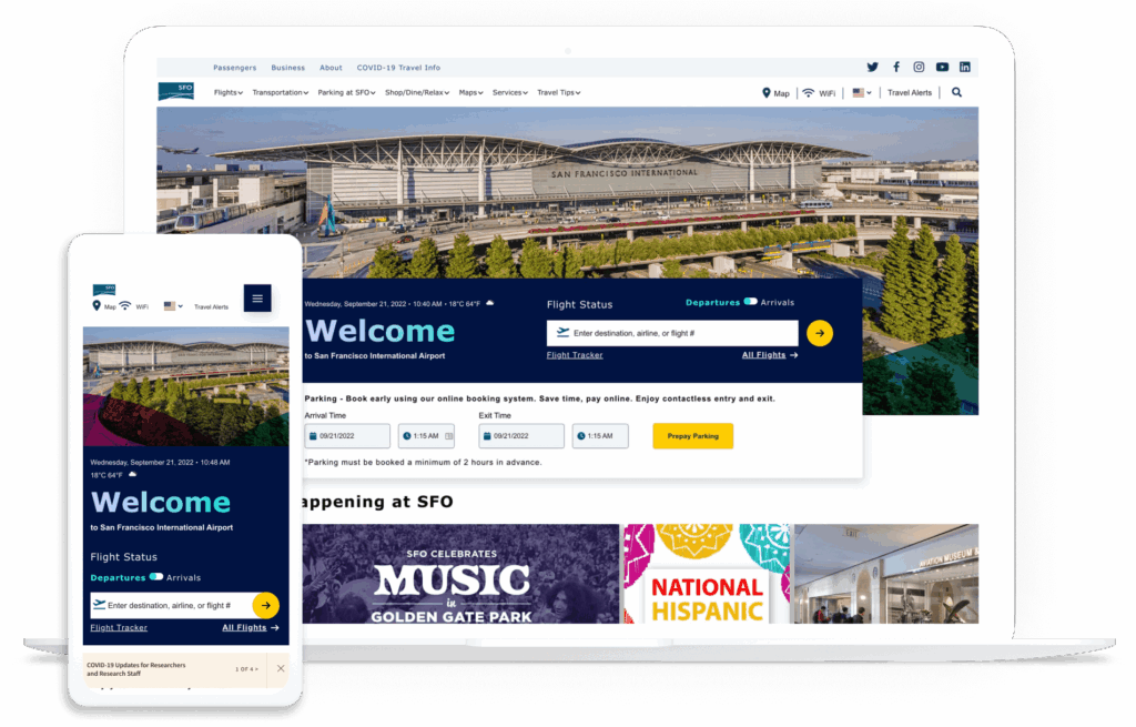
As mentioned above, the San Francisco International Airport (SFO) website is a stellar example of streamlined navigation. When SFO reached out to Kanopi, the airport needed to revamp its website presence to offer an outstanding online guest experience.
The previous SFO website was cumbersome and difficult to use, running on an outdated version of Drupal. The organization needed a modern, flexible, and engaging website to support its business goals and provide a better customer experience.
The Kanopi team collaborated with SFO to:
- Conduct user experience research and stakeholder interviews.
- Redesign the site with a diverse, technically-optimized visual approach.
- Make the navigation more intuitive.
- Better highlight vendor information.
- Provide personalized flight details.
- Infuse the website with the Bay Area’s rich and unique culture.
The result? SFO now has an award-winning website with a user-friendly interface, responsive layout, and modern navigation.
Changi Airport: Best calls-to-action
A call to action is a button, menu item, or link that helps different users navigate your website and find the specific information they’re looking for. The Changi Airport website’s homepage contains a variety of useful CTAs that help users navigate smoothly through their website journey. These include:
- The internal search function right at the top of the page that encourages users to search for specific information

- The “I Am” button CTA, where users can select the description that best fits their needs
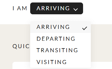
- The quick links buttons that link to multiple common next actions users may want to take

These CTAs provide easy access to key information that makes passengers’ experiences much smoother and stress-free.
Jacksonville International Airport: Best airport web design visual style
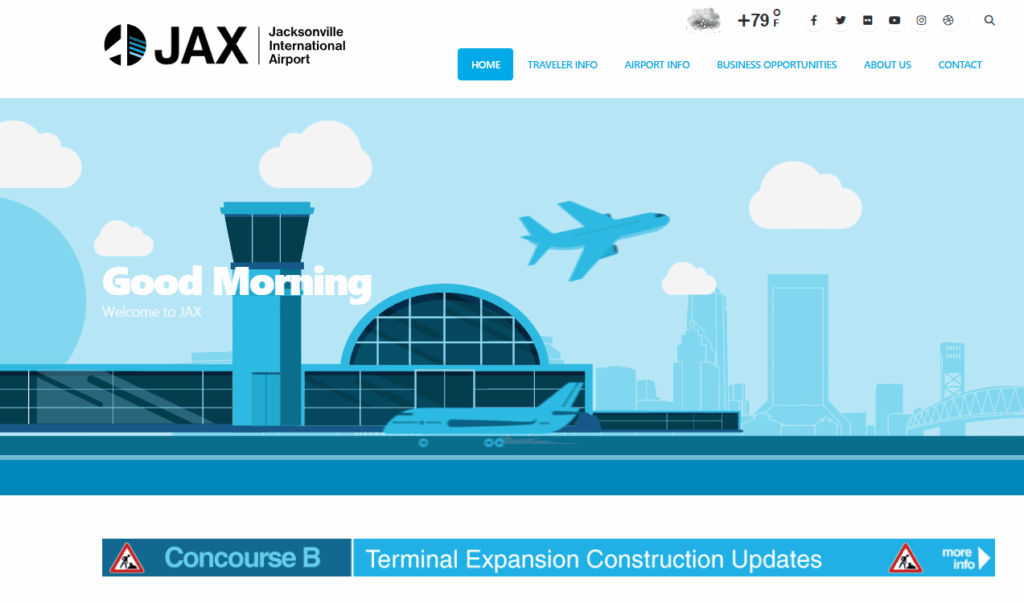
The Jacksonville International Airport’s website stands out in terms of visual design and signature style. The website includes a variety of user-friendly and engaging design elements, including:
- A fun airplane homepage animation and microinteractions that include buttons popping off the page
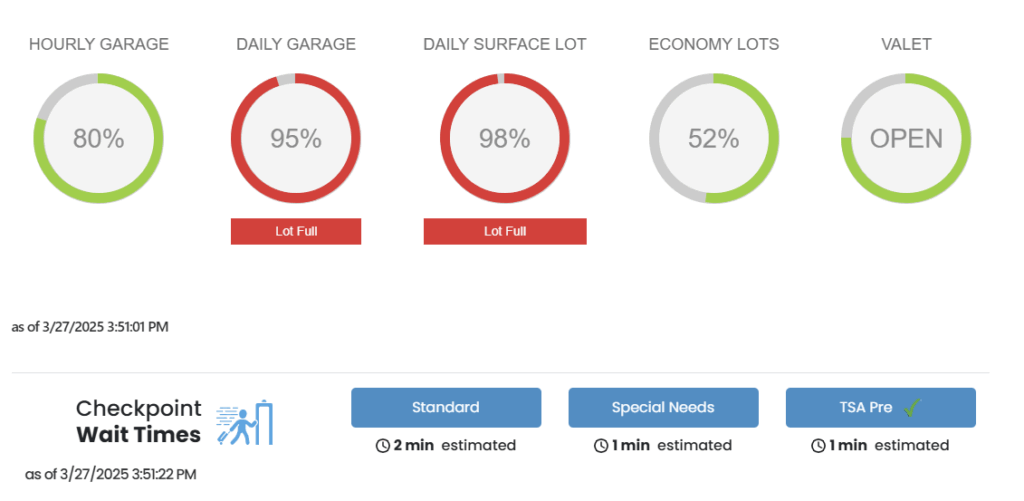
- Easily accessible parking information and security wait times
- User-friendly service locations map with multiple filters and overlays to find the right information
The website’s calming blue color scheme, detailed flight information, and regularly updated news articles provide a sense of authoritativeness.
Minneapolis-Saint Paul International Airport: Best airport website for accessibility
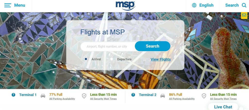
Both airports and airlines are legally required to comply with various physical and digital accessibility standards, including offering accessible websites and other digital resources like information or check-in kiosks. The Minneapolis-Saint Paul International Airport’s website offers a useful example of an accessible airport website in practice.
This website scores 96% on Lighthouse, a tool that measures accessibility. Key accessibility components that stand out on this site include:
- Images have alternative text
- Buttons have accessible and specific names
- Links are distinguishable without relying on color alone
- Touch targets are sufficiently sized
- Form elements have accurate associated labels
The site also offers a streamlined, expandable menu and multilingual capabilities for six languages, making the content more accessible for international passengers.
London Heathrow Airport: Best airport website for audience-focused language

The Heathrow Airport website has much to offer when it comes to catering to the passenger experience. The website includes audience-focused language and various tools that make the travel experience more comfortable. These include:
- A passenger rewards program for shopping discounts
- A journey planner to help travelers determine the easiest ways to travel from their original destination to the airport
- Additional ground transportation information to help navigate the rail system
These features help reassure first-time travelers or international passengers that they can access the resources and information they need to make their trips more enjoyable.
How Kanopi Supports Airport Web Design
Our website designers and developers at Kanopi Studios have extensive experience creating optimized corporate and commercial websites, including airport websites.
Our Technical Expertise
Our experienced developers ensure your airport website includes all the technical elements it needs to serve your audience effectively, including:
- Flexible layouts that allow content editors to update their sites independently without needing to contact a developer
- Creation of personalized dashboards for airport passengers to access content related to their travel itineraries
- Location data that enables users to customize the content they see based on their home country
- Development of client-facing dashboards for a user-friendly content administration experience and editing workflow
We can help you build a new website from the ground up or optimize your existing online presence, even if it contains custom or complex code. Our developers are highly experienced and skilled at working with existing code and reformatting your site to better suit your current needs.
Contact our team today to discuss your airport website’s goals and see how the experts at Kanopi can help.
Wrapping up
Ultimately, your airport website should reassure passengers that they will have a positive experience, equip them with the resources and information they need to have a smooth journey, and encourage them to continue using your services for their travel needs. If you need support to bring your airport website’s vision to life, research web design and development partners and request proposals to explore your options and find the right consultant for your needs.
Looking for more information about designing a top-tier website? Start with these additional resources:
- Creating Content Your Users Want to Read. Use this guide to spruce up your airport website’s content and make it more appealing to visitors.
- Web Design Trends to Watch. Consider these web design trends when building a vision for your website.
- Migrating Your Website? Here’s How to Maintain and Boost Your SEO. These tips can help you migrate your website successfully if you want to move to a new CMS.


