Sunnylands
Elevating a website to match the beauty of a historical estate.
Client Overview

For more than 40 years, Ambassadors Walter and Leonore Annenberg welcomed political, business, educational, and entertainment leaders to Sunnylands, their 200-acre winter home in Rancho Mirage, California. In 2001, the couple established The Annenberg Foundation Trust at Sunnylands to preserve the estate as a place where world leaders could hold retreats to meet to discuss issues of national and international importance.
Services provided
Twit.tv Mobile Gallery
The challenge
Sunnylands had been on Kanopi’s support plan for many years, but their site was running on an outdated WordPress theme with significant amounts of deprecated JavaScript that was hindering progress. The site was becoming increasingly fragile, with recurring bugs that were costly and difficult to fix.
After a decade on the same platform, it was clear that the site needed a modern refresh — one that aligned with Sunnylands’ existing brand guidelines while improving usability and performance.
Lastly they needed to fix one very specific content problem with the phrasing around the retreats held onsite. They are by invitation only and reserved for leaders across government, science, academia, nonprofit and private sectors, but Sunnylands was frequently getting requests for retreats outside of those parameters, such as company or family gatherings.
The solution
Kanopi began with a Discovery phase tailored to Sunnylands, followed by additional strategy work around positioning the retreats.
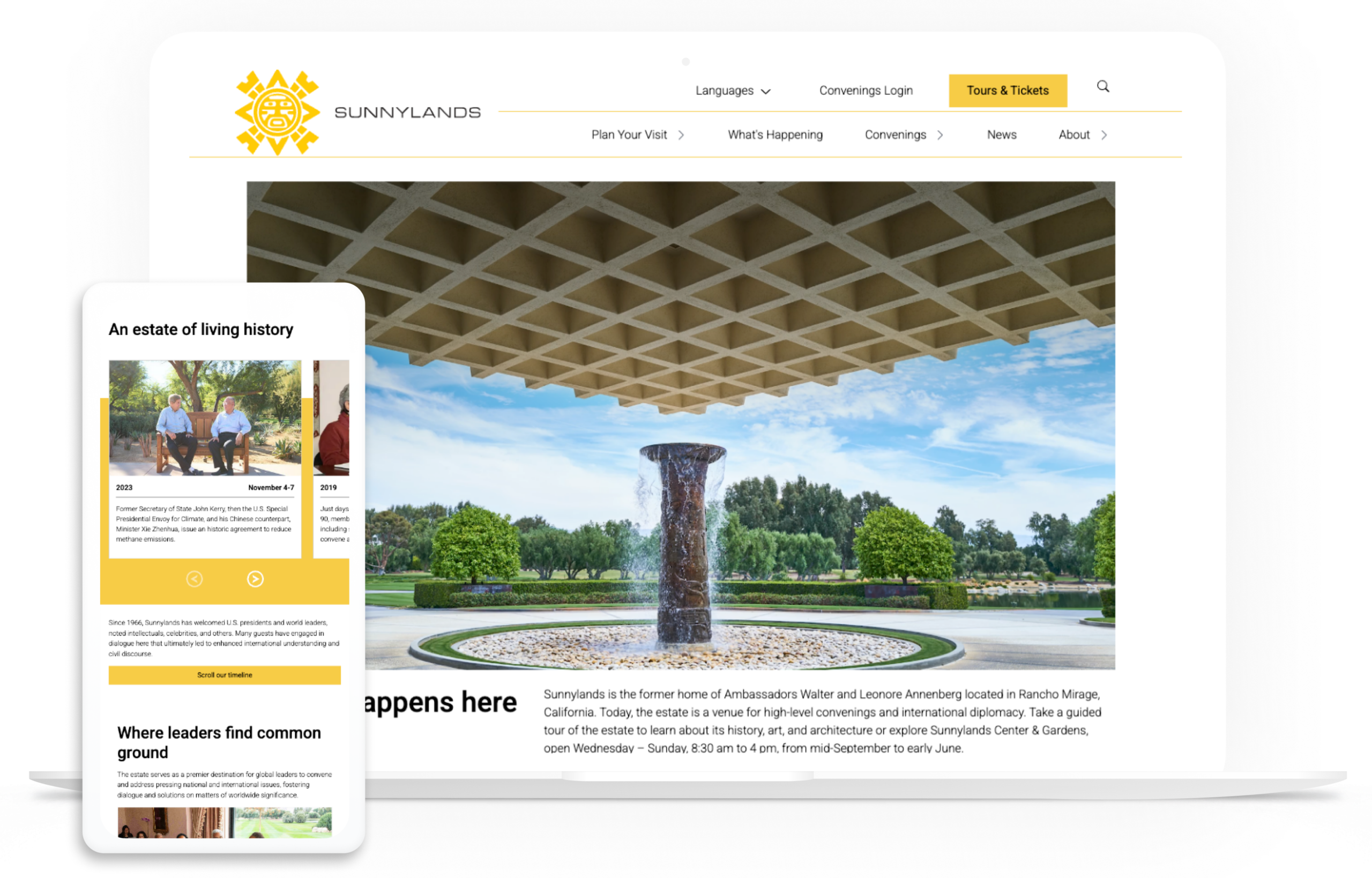
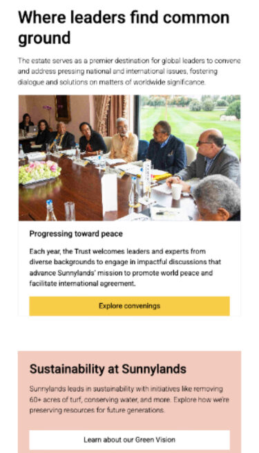
Through collaborative branding exercises, the term “Convenings” was adopted to better communicate the unique gatherings hosted by Sunnylands for global leaders.
From there, the project moved into a phased build process, allowing Sunnylands to take in changes gradually over several years. Key steps included:
- Technical Foundation: We transitioned from legacy ACF fields to Gutenberg blocks, setting up a custom theme to re-theme rather than fully migrate.
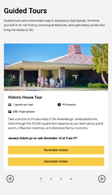
- Strategic Content Structure: Guided taxonomy improvements allowed Sunnylands’ team to create reusable, dynamic content types. For example, “Convenings” and “Events” became custom post types with dedicated functionality, replacing static pages.
- Design & Accessibility: We collaborated with Sunnylands’ creative team to update visuals (including new pink accent colors), align with brand standards, and significantly improve accessibility.
Content Optimization: Sunnylands’ team streamlined and audited their content, making it easier for visitors to find information and engage with resources.
The process
Discovery Work
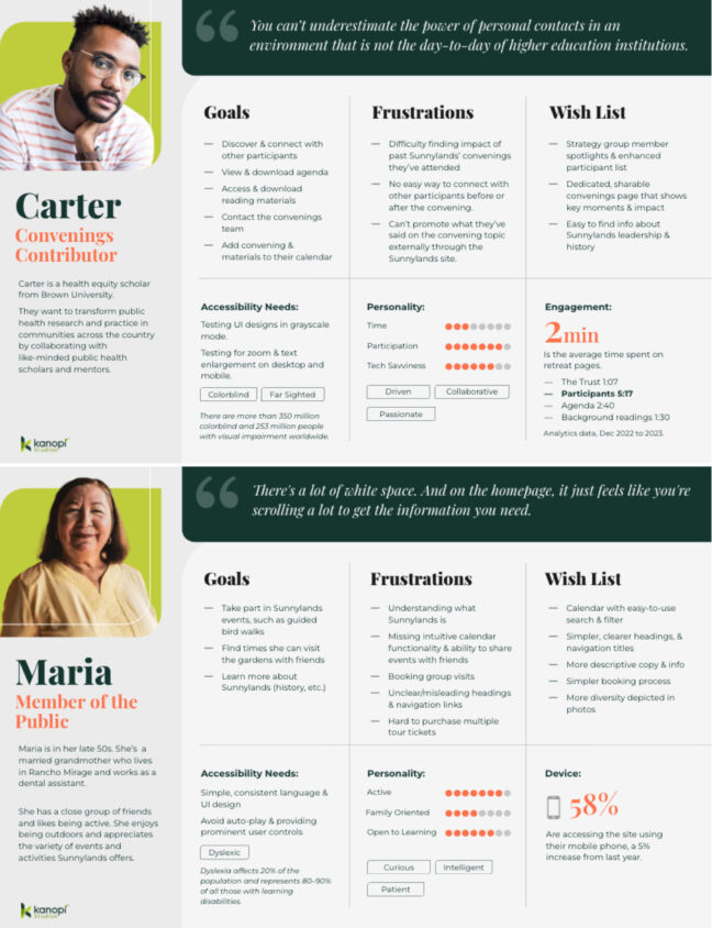
Extensive discovery work was created, including workshops with both executives and the general public, persona work, content strategy, and work on the renaming of “retreats.”
Updated Taxonomies
The initial discovery work revealed what taxonomies to add so we could create reusable content.
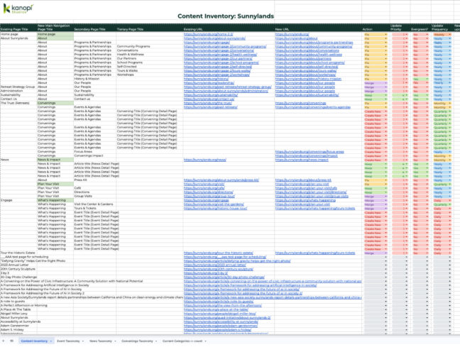
Key features
Updated Design Work
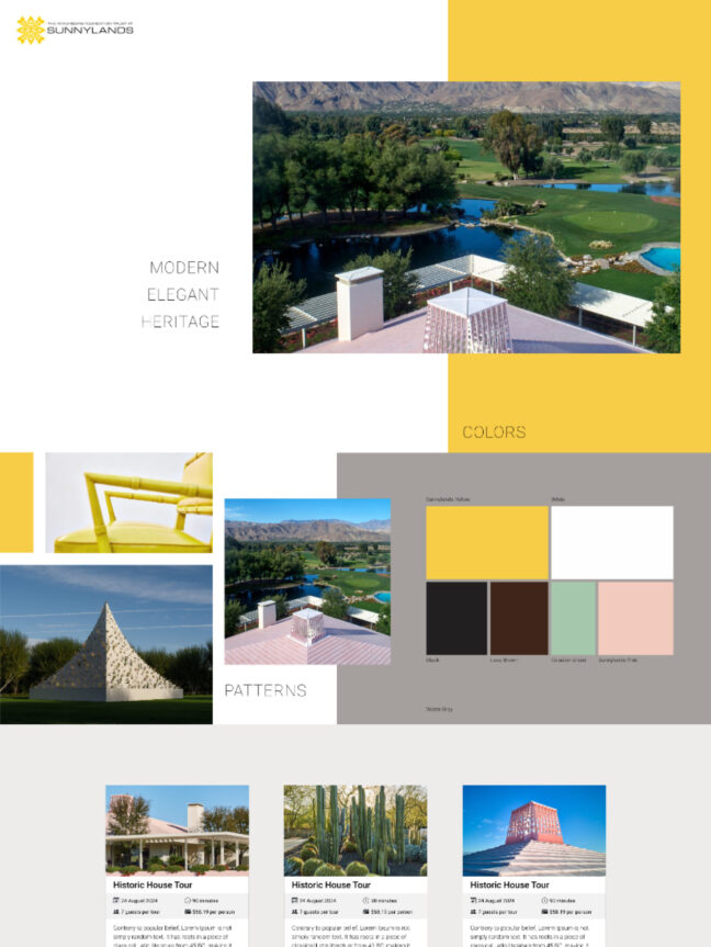
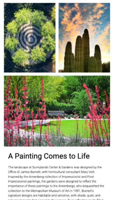
Collaborative work with the Sunnylands creative department fulfilled the alignment of the design with their brand while including new pink accent colors.
Reusable Content
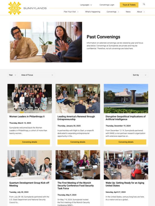
All content was audited and streamlined, with a lot of taxonomy work done to create reusable content rather than static content. For example, “Convenings” and “Events” became custom post types with dedicated functionality, replacing static pages.
Improved Accessibility
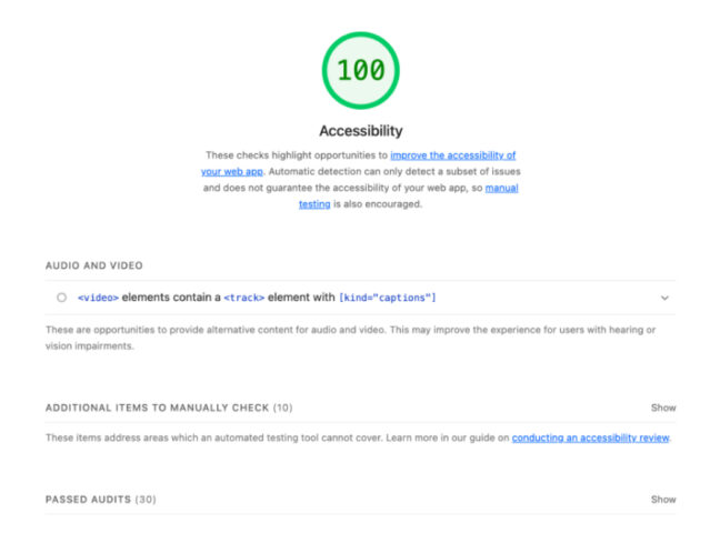
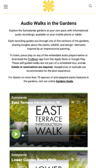
Accessibility was significantly improved, scoring a perfect 100 on Lighthouse tests for both mobile and desktop.
The result
The new Sunnylands site represents a significant leap forward in usability, accessibility, and positioning:
- Accessibility: Lighthouse scores improved, ensuring the site is more inclusive for all users.
- Visitor Experience: Tour ticket purchasing is now more straightforward, which has led to a measurable decrease in call center volume.
- Content Reusability: Dynamic content types like Convenings and Events allow for richer, more engaging storytelling.
- Strategic Messaging: Updated language around Convenings elevates Sunnylands’ profile as a premier convening space for leaders in government, science, academia, nonprofit, and the private sector.


