

What works when it comes to user experience (UX) is constantly evolving as our behavior online shifts and changes over time. A web design feature that delighted your site users ten years ago could now inadvertently conceal valuable content that you want to take center stage. Or worst-case scenario, it could be driving folks away from your site.
To help you keep on top of the latest UX design trends, we’ve pulled together the five most common UX mistakes made in the past year and explain why each is causing issues when it comes to the user experience. We also suggest better options for each design mistake to ensure your site remains as accessible and sustainable as possible:
- Problematic carousels
- Intrusive pop-ups
- Unnecessary side-bars
- Distracting auto-play videos
- Too many buttons
Problematic carousels
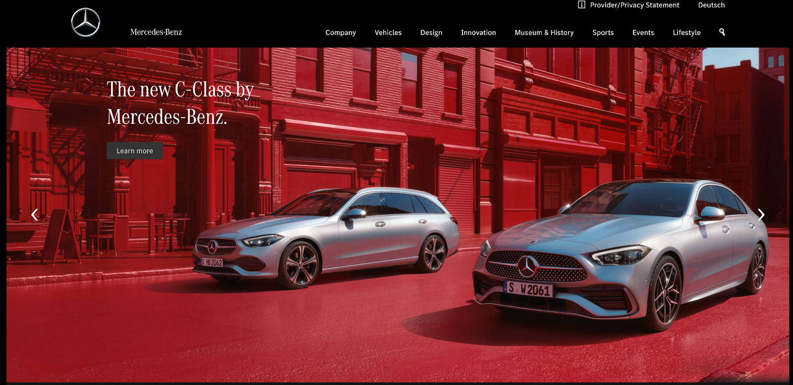
Home page carousels are a trendy design feature on many websites as they are thought to provide a clever way to condense a lot of content into one screenful.
What’s the issue?
If the carousel auto-rotates, users may not have enough time to read before the slide changes. And our tendency to scroll down the page is increasing. A study conducted by the Nielsen Norman Group found 57% of site users stay above the fold of a webpage compared with 80% of website users over a decade ago.
Content can be missed as website users often scroll past the carousel and miss vital information that doesn’t appear on the first slide.
If the content on the first slide doesn’t align with the organization’s values, it can give website users the wrong impression and even be misleading.
Finally, in many cases, you cannot simply scale down to a mobile device. Content may get cut off or become too small to read when a user views your content on their mobile device.
A better way
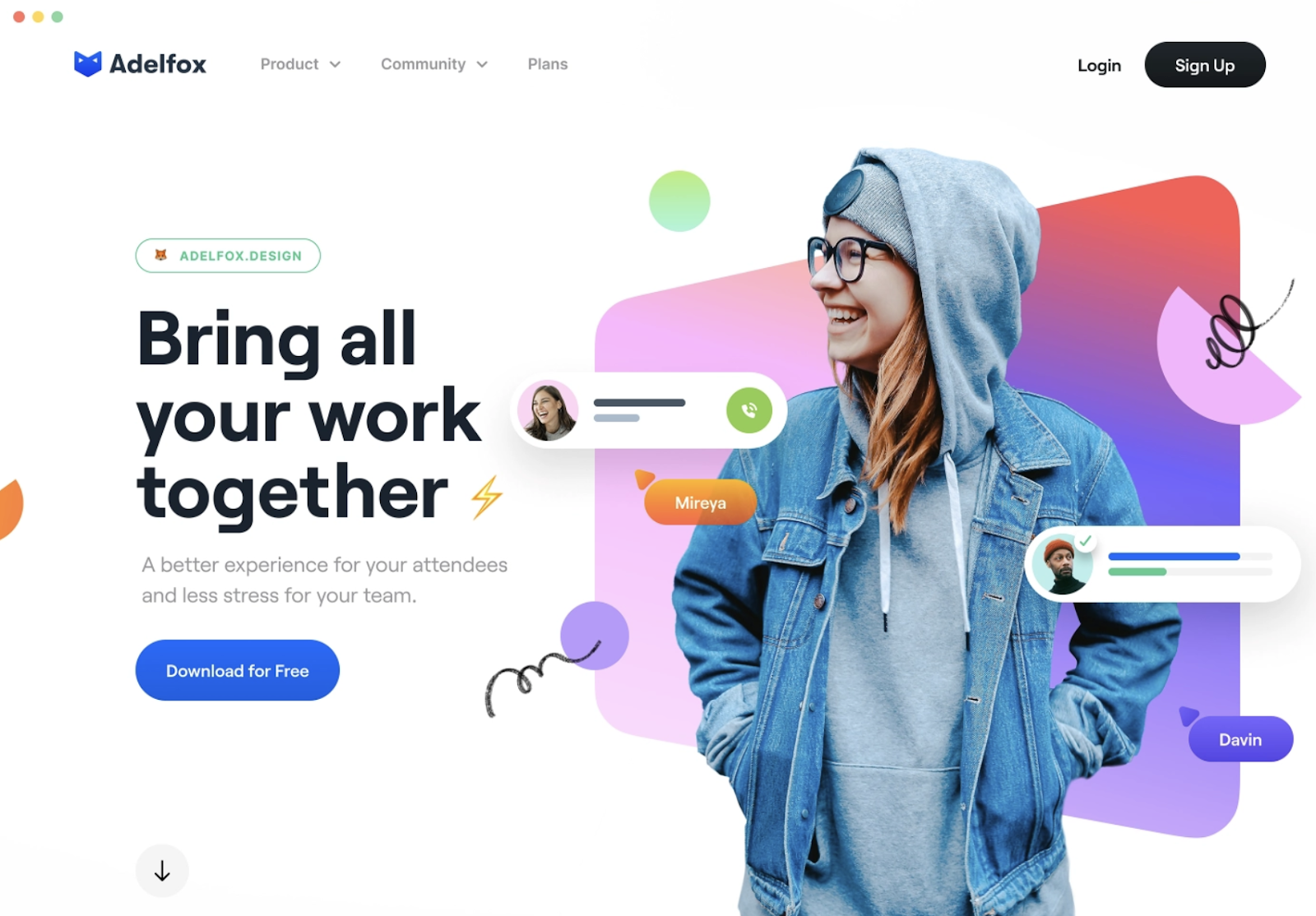
Instead of using a carousel of images, choose a single, impactful hero image and display key goals of both your users and your business to guide the user journey.
You can also try using a card design pattern to get across two or three key messages on your homepage.
Examples of good card design:
Intrusive pop-ups
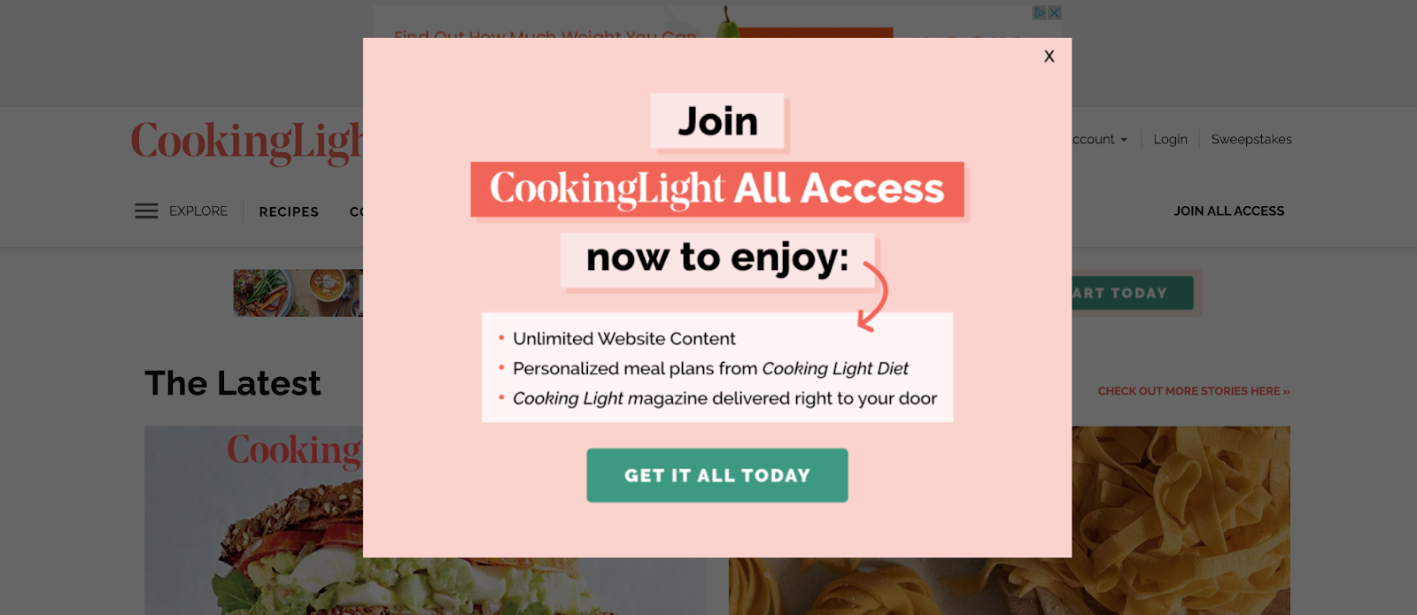
Pop-ups held a reputation as a great marketing tool in the past. They were proven to be very effective at generating leads, for example.
But with Google’s January 2017 update, sites that contain pop-ups or interstitials that make content less accessible are penalized in their search rankings. And Google has identified what is good and what is a bad pop-up.
What’s the issue?
Pop-ups can interrupt the natural flow of the website user by hijacking the current webpage to highlight new information on an additional screen.
Pop-ups also affect the accessibility of your website. They create keyboard traps and unnecessary screen reader content that can confuse and distract users trying to navigate your site.
Aside from making your website accessible to more users, there’s also a business case to be made for making your site’s popups more accessible.
A better way
Make sure you comply with Google’s guidelines when it comes to pop-ups to avoid being penalized by Google.
Google explains the following techniques make content less accessible to a user:
- popups that cover the main content, either immediately after the user navigates to a page from a search result,
- Displaying an interstitial that the user has to dismiss before accessing the main content, and
- Including a layout where the above-the-fold portion of the page is too similar to an interstitial, and the original content is inlined underneath the fold.
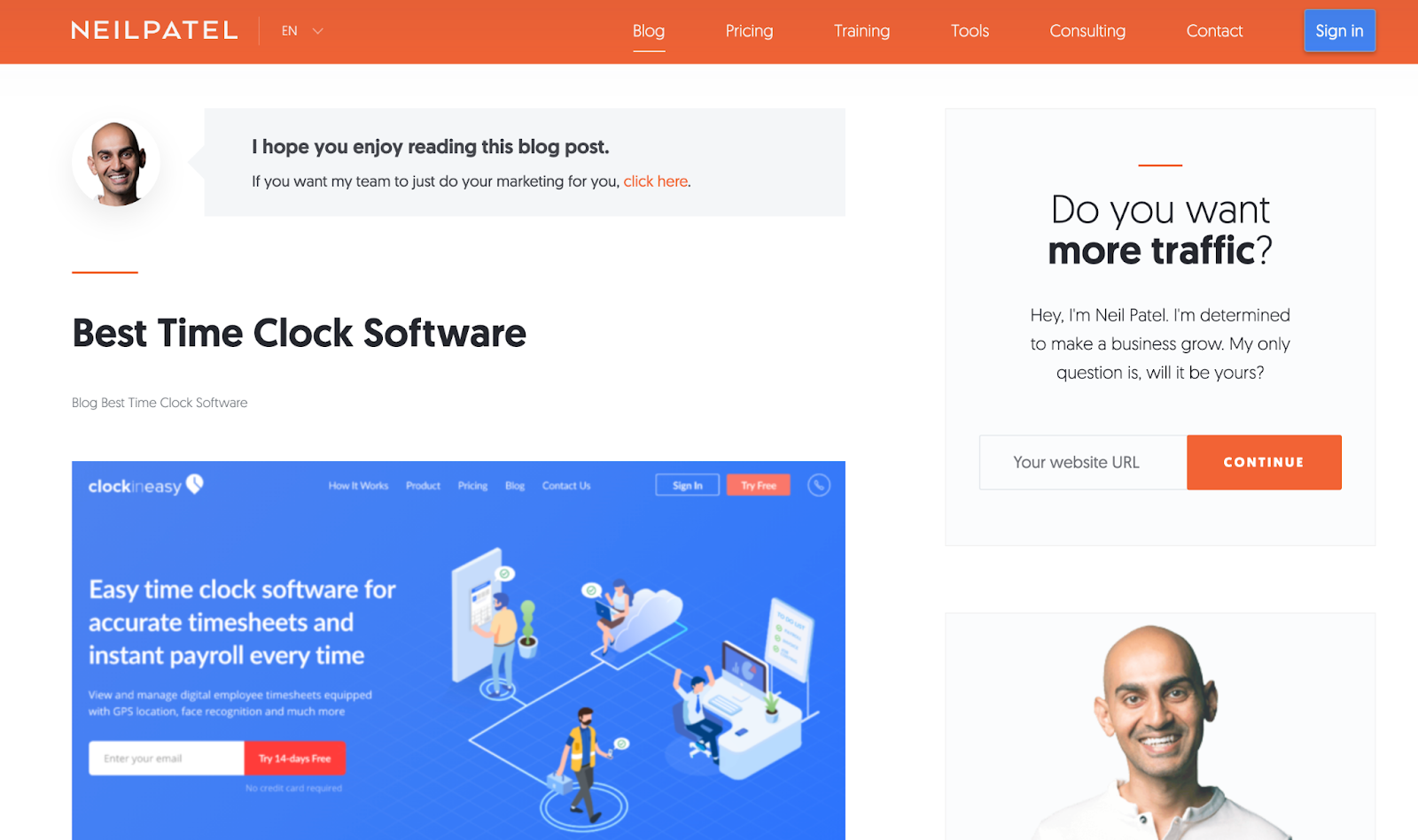
Displaying content you’re inclined to include in a pop-up in a sidebar instead is best practice (as outlined in the Neil Patel example above), as is delaying the opening of pop-ups on your website if you must have them.
Lastly, If you have to use pop-ups, design your pop-ups so that they take up less than 50% of your web page’s space.
Unnecessary sidebars
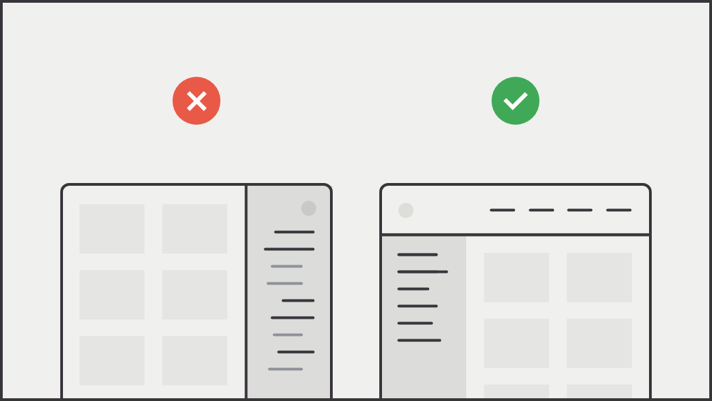
On-page navigation via a sidebar provides links to related content or provides pathways for a deep content dive.
What’s the issue?
With unnecessary sidebars, some of your most valuable content can quickly become inaccessible. Remember, clicks are valuable. You risk losing potential customers if users have to click around to find the content they are after.
In addition, if your website’s on-page menu changes once a link is chosen, your site users can end up feeling lost and confused while trying to navigate your content.
And finally, in many cases, many sidebar menus are not adequately designed for interacting with content through mobile devices, affecting the responsive design of your site.
A better way
Source: Craigslist Redesign by Aurélien Salomon for Orizon
Instead of having important content buried in a sidebar, combine similar content together onto one long page. Your website visitors are naturally conditioned to scroll.
A nudge to scroll provides a handful of other benefits:
- It delivers content more quickly because there is no need to wait for pages to load
- It doesn’t require a commitment by forcing users to choose a button — or pick between multiple buttons — and abandon their current page
- It allows visitors to digest information at their own speed
Besides providing a scrolling option, try using a drop-down menu design pattern that passes usability testing with flying colors and creates an enhanced user experience, guiding the user journey in the process.
Examples:
Distracting auto-play videos

Auto-pay videos use sights, sounds, and moving imagery in an attempt to create emotional connections with site visitors.
What’s the issue?
Auto-play videos can trigger your site visitors to experience dizziness and nausea. And if that auto-play video is accompanied by sound, it can be loud and confuse your website visitors.
Videos assume that your site users can see. They can have a negative physical impact on those sensitive to movement and ultimately limit the accessibility of your website.
In addition, large video files can slow down site speed, impacting the overall UX of your website and your site’s Core Web Vitals, which now affect where you end up in search engine results.
And finally, videos tend to distract your site visitors, grabbing more of their attention than you intended. They do not support the immediate consumption of information.
A better way
Video and sound content is helpful only if your site visitors have control over it, fully understand what’s contained within it, and are provided with an alternate way to access it.
Give your website visitors the ability to decide how they interact with the video and sound content on your site by literally putting the controls on the video area for an improved user experience.
Too many buttons
Buttons are a common UX design feature for ensuring your site visitors have all the available options at their fingertips.
What’s the issue?
We aren’t against the use of buttons, but too many buttons can harm. If you force too many options on your site visitors, they may opt for the path of least resistance – to leave your site.
Too many buttons competing for the attention of site visitors makes it difficult for the user to focus on individual pieces of content on your website.
A better way

Less is more when it comes to great UX design. Focus on making your main call-to-action (CTA) as straightforward as possible and make it easy to find with one stand-out and consistent button design. If you have secondary CTAs, use a smaller, less flashy button or link design.
Prefer to see this in a video?
I presented this talk at the NTC Conference in March 2021 and provided a bit more information. Check it out.
Avoid these common UX mistakes to make your site a joy to navigate
Building a sustainable website that’s delightful to use is about catering to your users’ wants and needs while assisting you in achieving your business goals. A powerful way to ensure your site meets the needs of your users is by avoiding common UX mistakes.
These common UX mistakes made in 2020 were first presented at the Nonprofit Technology Conference (NTC) earlier this year. You can watch the presentation in full on YouTube.