
Nonprofits are constantly seeking ways to build more successful fundraising strategies.
According to the M+R Benchmarks 2023 report, the average conversion rate for nonprofit donation pages is just 19%. Increasing your conversion rate can be challenging, but it is possible.
In this guide, we’ll explore five ways to optimize your approach and increase donation conversions for your digital fundraising campaigns:
- Make your giving form as simple as possible.
- Remind supporters to give.
- Ensure your donation page is accessible.
- Include compelling content.
- Make your donate buttons pop.
The best nonprofit websites know who their users are and what motivates them. When you figure out what motivates your supporters, you can design your donation form to appeal to their needs, increasing the likelihood that they’ll give online.
1. Make your giving form as simple as possible.
Often, a supporter’s decision to give comes down to the appearance of the donation form itself. They may feel passionate about your mission, but if your donation form is too complex, cluttered, or not mobile-optimized, they could change their minds about giving.
Bloomerang’s guide to donation page design offers a few tips for simplifying your donation page, including:
- Only ask for necessary information. Ask for names, contact information, payment details, and donation amount. That should be all the information you need to process donations and add new donors to your database. Asking for more information may scare off donors.
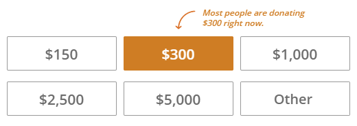
- Offer suggested donation amounts. Suggested giving amounts make it easy for donors to decide how much to give. It also leverages social proof by highlighting your most common donation amounts. Check out how the CARE online donation page spotlights their most popular giving amount:
- Enable multiple payment options. Ensure donors can pay with whatever payment method is most convenient for them by providing multiple options on your donation form. This includes credit and debit cards, ACH transfers, Venmo, PayPal, Apple Pay, and Google Pay.
- Ensure the page is mobile-friendly. Mobile-friendly donation pages have large touchable buttons and form fields, fast load speeds, and clear images.
- Make it easy to share donations. Let donors immediately spread the word about their gifts using social share buttons or eCards.
When it comes to increasing donation page conversions, less is more. Keep the form’s design simple, with just one hero image and plenty of white space. This makes it less likely that supporters will get distracted when filling out the form.
2. Remind supporters to give.
Just because someone leaves your donation page without giving doesn’t mean they can’t be convinced to donate in the future. There are a few strategies for reminding supporters of their devotion to your mission and encouraging them to give, such as:
- Send an automated email or text. With a tool like Impactive, you can create custom donation forms that automatically trigger donation reminders to visitors who leave your form without completing it.
- Engage your peer-to-peer network. Leverage peer-to-peer texting to get the word out about your donation opportunities. Identify current donors who have yet to give to your current campaign and recruit your volunteer peer-to-peer fundraisers to personally message these individuals with a link to your giving form.
- Post your donation page link frequently during your campaign. Share your giving page on social media repeatedly throughout your online campaign. Include progress updates so supporters know how much further you have to go to reach your goal.
Your nonprofit’s supporters are busy people, and giving to your organization probably isn’t the first thing on their minds. A few gentle reminders might be the push they need to complete their donations.
3. Ensure your donation page is accessible.
Accessible forms are usable by everyone, regardless of any disabilities or access issues a user may face.
An accessible donation page fosters a positive user experience for everyone. Make your donation page more accessible with the following tips:
- Provide clear instructions. Ensure users understand what is needed from them every step of the way. Use clear directions to guide users through your giving process and let them know how you’ll use their data. For example, tell supporters you need their email address to send them a donation receipt.
- Clearly label form fields. Each form field should include a clear description that appears outside the field itself. This ensures they’re easy to read for those with visual impairments who may be using a screen reader.
- Use strong color contrast. The form’s text color should have sufficient contrast with the background. For example, white letters on a black or dark navy background offer a strong contrast that ensures the text is readable.
- Ensure the page can be navigated with a keyboard. Users should be able to navigate and fill out form fields using keyboard navigation. This makes it easier for those using assistive technology to complete the form.
Test your form using assistive technology or keyboard navigation to ensure that it meets accessibility standards. This helps ensure that accessibility issues don’t fall through the cracks.
4. Include compelling content.
Remind supporters of what their gifts will support to increase the chances that they’ll give to your fundraising campaign.
Incorporate compelling content into your donation page, such as:
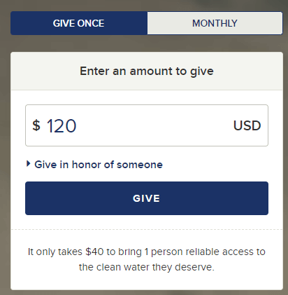
- The specific impact of each donation amount. Let supporters know the impact of different donation amounts. For example, check out how the charity: water online donation page emphasizes the impact of a $40 donation:
- A photo of the people or animals you help. Images can be particularly compelling, especially photos that show faces. Choose one striking feature or hero image for your donation page to remind donors who they will be supporting.
- Direct quotes and testimonials from beneficiaries. A direct quote from someone your nonprofit has helped can also make a big difference in inspiring supporters to donate. For example, if you’re a healthcare nonprofit, you might include a quote from someone who has benefited from your healthcare resources and services. If you’re an environmentally-focused nonprofit, you might include a testimonial from a community member who has seen the positive impact of your work on the local environment.
Use these page elements to remind supporters at every turn that their donations help real people who face the challenges your nonprofit fights to overcome.
5. Make your donate buttons pop.
Your donate form button is the most important call to action within the fundraising process. It’s the button at the end of your donation form that supporters press to submit their gifts. Make it stand out on your giving page with the following strategies:
- Use strong contrasting colors, such as white text on a red or dark blue background.
- Make the button bold, with a succinct and direct message such as “DONATE NOW.”
- Ensure the button is touchable on a mobile device by making it large and in a prominent location, such as at the very bottom of the form.
The rest of your donation buttons across your website should also be bold and stand out. For example, check out this prominent donation button on the ASPCA homepage:

This button stands out using white text on an orange background, further contrasted with the page’s black background. Plus, the compelling CTA lets donors know exactly what their gifts will support.
With these tips, you can transform your nonprofit’s website into a vital fundraising tool for successful campaigns. And if you need help, you can always contact us.