UCSF Department of Surgery
An intuitive user experience that reassures patients and inspires future residents.
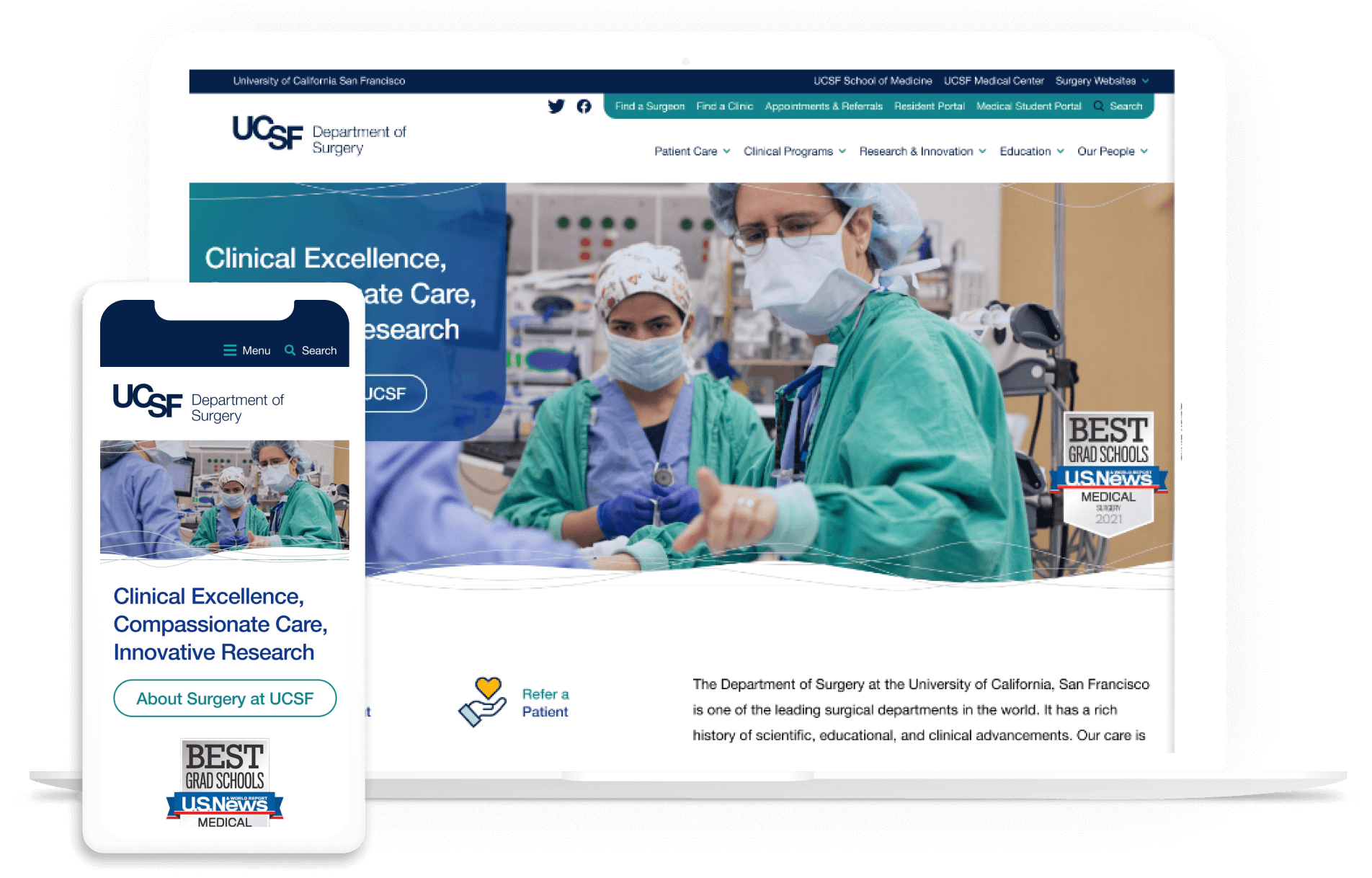
This project won two awards:
Client Overview
The Department of Surgery at the University of California, San Francisco is one of the leading surgical departments in the world with a rich history of scientific, educational, and clinical advancements. Although their care is primarily dedicated to the people of the San Francisco Bay Area (with six major area hospitals), their reputation draws patients nationally and internationally. UCSF surgeons perform a high volume of advanced, complex, and technically challenging procedures. This allows them to continually improve their skills, resulting in better outcomes for patients.
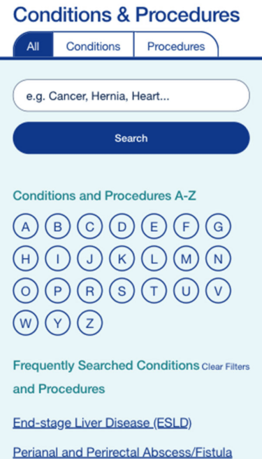
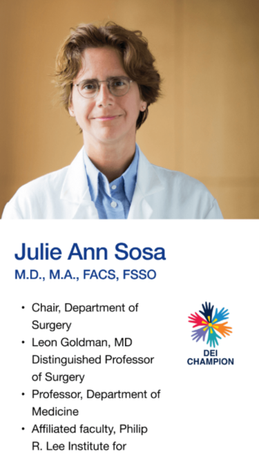
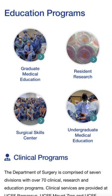
UCSF Department of Surgery Mobile Gallery

The challenge
The Department of Surgery consisted of over 80+ domains ranging from research-focused, to patient-focused, to those geared towards residents. All were built using a proprietary CMS with no cohesive way to navigate between the various domains. Even worse, many of the domains/departments were creating their own layouts, navigation, and design signals, so there was little consistency between them.
There was also no content strategy whatsoever. Most site users identified as patients and their family members trying to learn more about specific conditions and procedures, which drove organic traffic to pages other than the homepage. But those pages weren’t easy to navigate, and visitors encountered many content dead-ends — with no idea where to go next. Meanwhile, the homepage had become cluttered with too many competing inline links and no clear content hierarchy.
The CMS didn’t provide an easy way to share content, requiring editors to do extra work recreating content for each domain. The content itself didn’t serve any audience needs; it lacked patient-friendly language and didn’t inspire potential residents to apply or take further action.
UCSF needed an inspiring design worthy of its status as a world-class medical school with a growing, innovative, and diverse environment. Their new website would need overall consistency, a proper content hierarchy, and a back-end structure that provided both long-term sustainability and flexibility for content editors.
The process
Deep Discovery Work
Seven rounds of interviews with key decision makers, heat mapping, surveys, analytics research, and more informed every phase of the project, helping set clear goals for a successful outcome.

High-Fidelity Prototypes
Prototypes were created to show how users would interact with the site, and to demonstrate how animations would draw attention to key content on the page.

The solution
Drupal was the clear choice for CMS, as it provides the flexibility and scalability required for the project — and it’s also already used by much of UCSF.
The sheer number of key decision-makers — including physicians with challenging schedules — required a long discovery and research phase. We conducted seven interview sessions to collect the comprehensive feedback needed before proceeding. We uncovered all the pain points and defined priorities for four personas: Patients, Researchers, Potential Residents, and Faculty. This research drove decisions for the content, visuals, and back-end structure.
Imagery and videos were specifically created to reflect UCSF’s more hands-on and humanized approach to the patient experience. We also introduced micro-interactions, transition animations, and softer shapes to increase visual interest throughout.
We created a template for site maps that would fit the bulk of the 80+ domains, making them flexible enough to allow swapping out items for each specific lab. Content was retitled and reorganized, so it would appear on the site in the right place at the right time for the right audience.
As for the back-end, it was clear early on that we couldn’t tackle all the domains at once. We created an iterative approach to launching them, with the client prioritizing the rollout order. We used Domain Access to allow a single Drupal instance to maintain all 80+ domains so that each one would either have its own unique content or share content used on other domains.
Key features
Domain Access
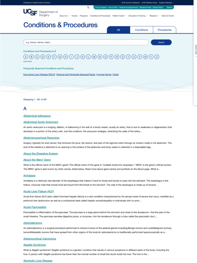
Due to having 80+ sites to manage, using Domain Access allows content to be shared across domains, saving time and preserving consistency.
Human-Led Imagery
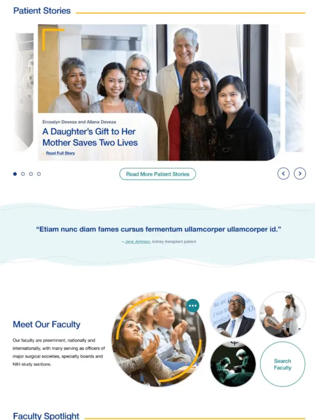
Authentic photos of UCSF physicians as well as new videos reflect the patient experience.
Mobile-First Approach
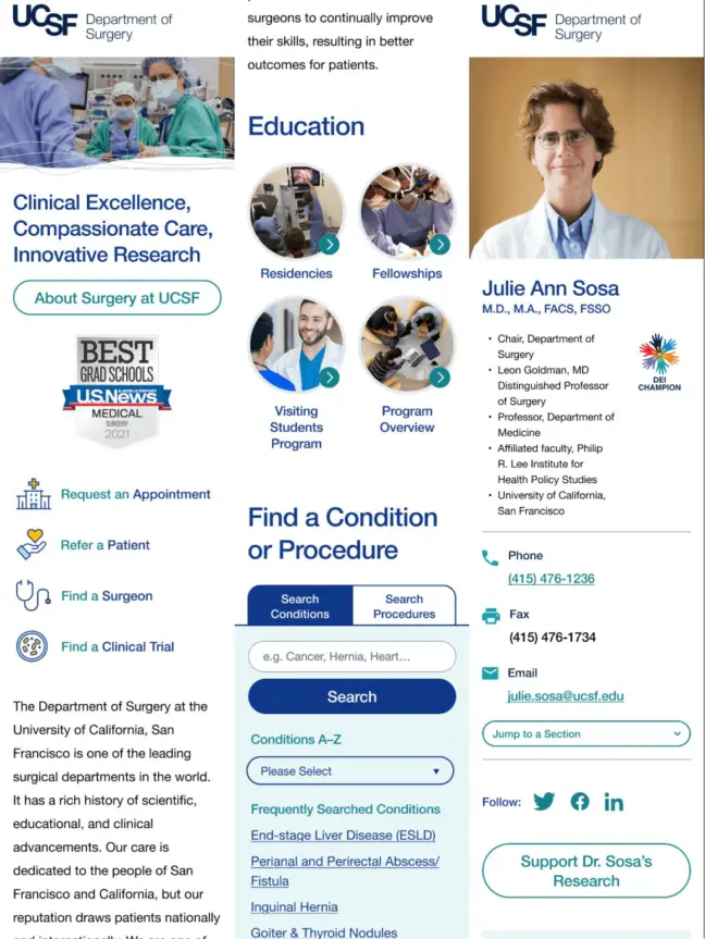
As patients increasingly access information from their phones, we ensured that a mobile-first approach would keep everything easily accessible.
The result
UCSF Department of Surgery now has a site with an intuitive user experience that reassures patients and inspires future residents. Patients, residents, faculty, and clinical researchers can now explore and find the vital information they need, whether that means connecting with the surgeon or locating a research opportunity. The new site also follows accessibility standards, with video controls in addition to font size, alt text, and contrast needs. The site was planned and built sustainably to grow with UCSF, with a streamlined administration experience making it easy for editors to maintain.
The site was acknowledged with a 2024 Web Excellence Award for the categories of Health Care Community and Health Care Services, and won a W3 Award for Best User experience.
To hear more about how UCSF and Kanopi worked together on this successful project, check out our webinar “It Takes a Village: Managing a Large Community in a Website Redesign.” (44 minutes long)


