San Francisco Airport
A one-of-a-kind, international airport serving the greater San Francisco area.
This project won four W3 Awards:

Gold
Features: Best User Experience

Silver
Features: Best Home Page
Features: Best Structure & Navigation
Websites: Transportation
This project also won two Davey Awards:

Gold
Features: Website Redesign

Silver
Features: Best User Experience
Client Overview

Founded in 1927, the San Francisco International Airport (SFO) is a dedicated organization serving the community of San Francisco, as well as the millions of travelers who pass through each year. SFO strives to be safe and secure in all of its practices, including delivering a quality guest experience while being on the cutting edge of airport, environmental and social sustainability initiatives — all while operating a successful and efficient business.
Services provided
SFO Mobile Gallery
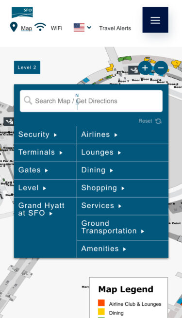
The challenge
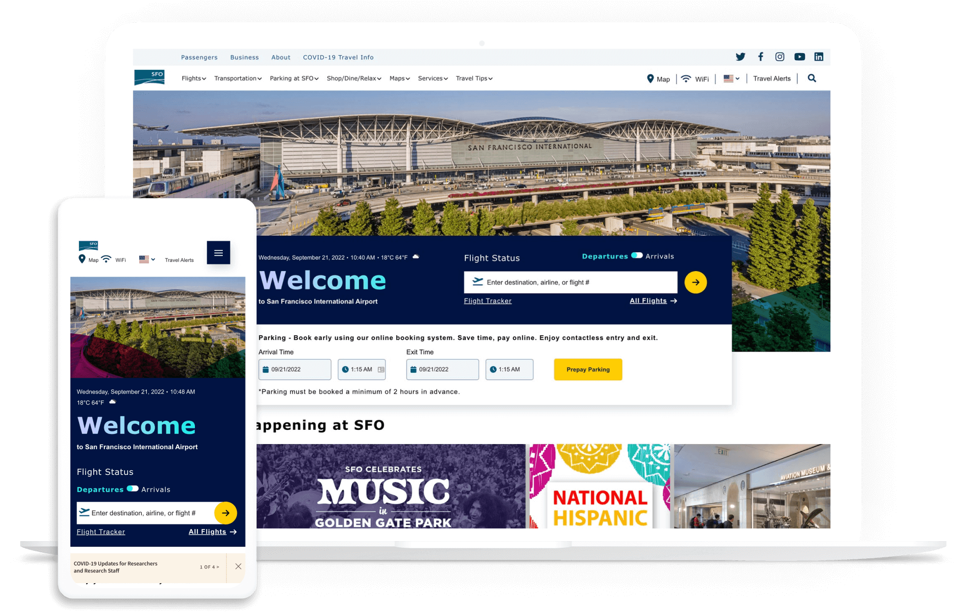
SFO’s previous site was outdated, cumbersome to navigate, and was built on an older version of Drupal that didn’t allow for more modern functionality. It was hard to update and created issues for the SFO team when new information needed to be presented. They wanted to modernize the site, making it more engaging, flexible, and easier to update. The new site also had to support their business goals, and bring more awareness to their vendors and activities at the airport.
The process
Strategy work
We collaborated with several departments of the SFO team to create an updated website solution that housed all of their important information, and supported all of the functions and features of their customer experience.
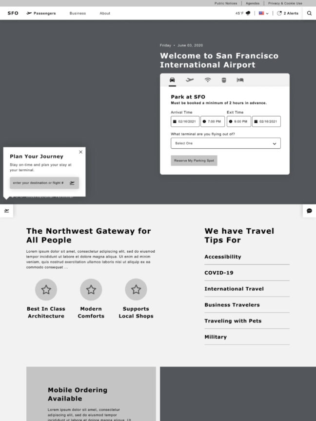
Site redesign
Our creative and development teams created three unique homepage designs. Our goal was to provide a diverse, technically-sound, visual approach for the SFO team that would help them align internally on an overall look.
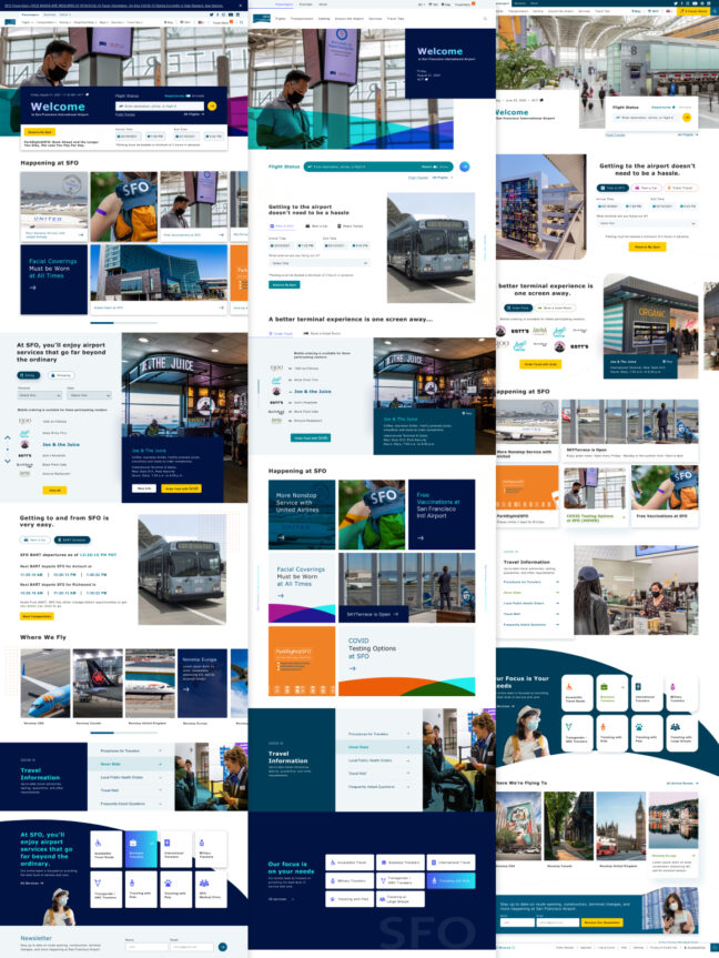
The solution
We met with seven different stakeholder groups, and parsed through guest complaints to identify the pain points and define the following goals:
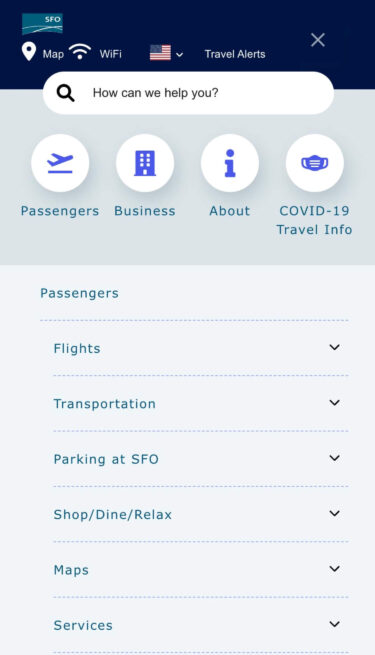
- Design an intuitive navigation
- Provide a flexible design that allows admins to create unique, content-based layouts
- Integrate revenue-generating content within the natural flow of a guest’s experience
- Improve concession & amenity browsing
- Imbue the Bay area’s famous spirit & culture
- Redesign alerts to be available on any page, even after that page was closed — without feeling intrusive
- Reflect more of the color and diversity found in SFO’s food, art, and employees
- To put a human face on SFO.
In order to prioritize these goals while leveraging the latest Drupal has to offer, we created flexible layouts that allow content admins to promote important initiatives throughout the site — independently, without requiring developer support.
We used a simplified Drupal admin interface that eliminated much of the overhead encountered on the previous site. We also created personalized dashboards that help users find content relevant to their travel plans, helping improve their overall SFO experience.
Location data provided by Pantheon’s Advanced Global CDN (AGCDN) allowed users to personalize content based on their home country. The SFO marketing department could also use this AGCDN data to run specific content campaigns on their site to visitors around the globe.
Key features
User dashboard
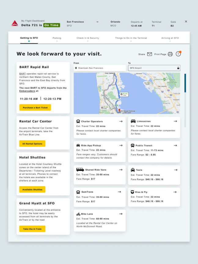
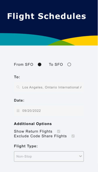
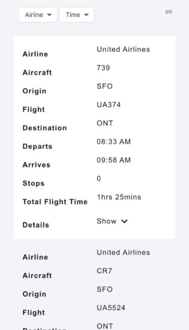
We created a customized user dashboard that personalizes both flight information and the pre-flight experience for each traveler.
Overall user experience
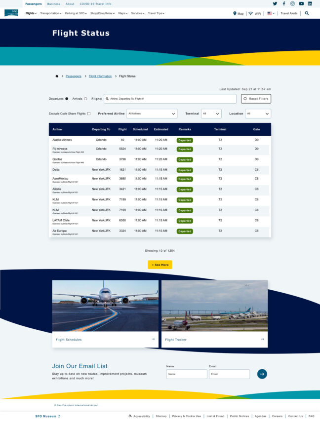
Site navigation is easier to use and the site design is more modern. Information is easier to find and tailored to SFO users.
Client dashboard
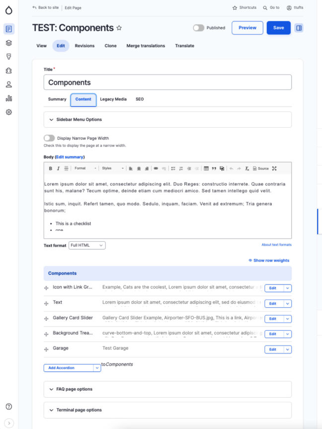
With an eye on usability, we ensured the admin experience was as easy-to-use as possible. We organized the fields to optimize a content editor’s workflow as they make updates to the site.
The result
SFO now has an easier-to-use website that allows for quicker, more efficient updating. Visitors enjoy a more responsive layout, modern navigation and an improved overall user experience. “Things to do” are more visible as well, lending to travelers having a more robust site experience. As for vendors within the airport, they are more prominent with new “profiles” offering more detailed information on their offerings and locations within the airport.
But the work didn’t stop there. After the main project launched, our work continued with a follow-up project; SFO wanted a minimal, fast-loading, and highly accessible website that highlighted a select number of pages for users without featuring any images. To achieve this, we drew inspiration from existing text-focused sites such as text.npr.org.
We re-themed the existing website by hiding images, removing scripts, and simplifying the interface. Additionally, we implemented boolean checkboxes within Drupal, allowing SFO to easily select which pages would appear on the site.
This means that SFO does not have to maintain a full separate site and the data is up to date regardless of which site they view — a huge win in accessibility.


