Eye Recommend
Giving optometrists a strong and flexible foundation for better member access and metrics.
Client Overview

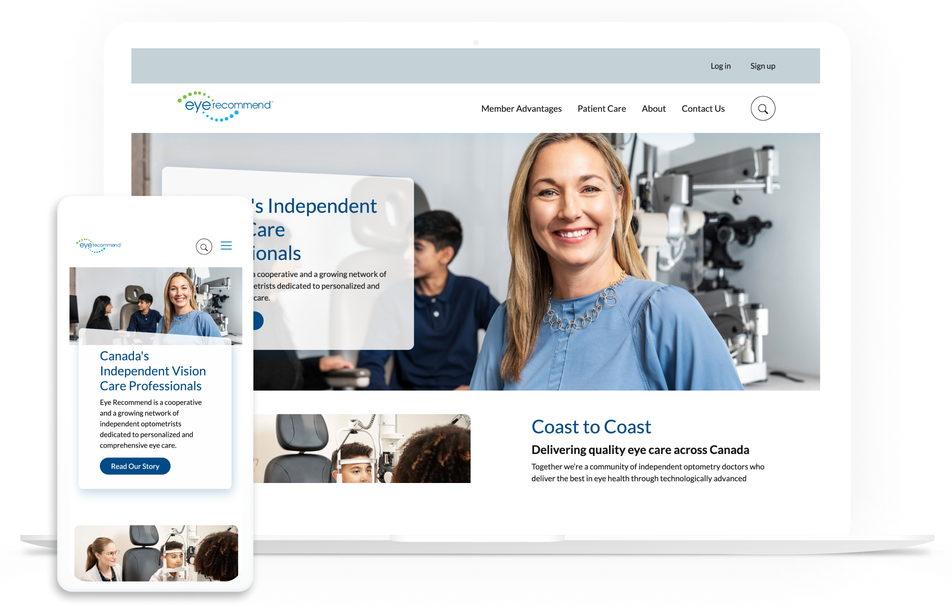
Eye Recommend is a cooperative and growing network of independent optometrists in North America dedicated to personalized and comprehensive eye care. They also create a strong community by providing training, networking, and events.
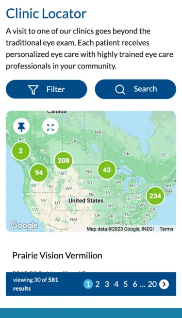
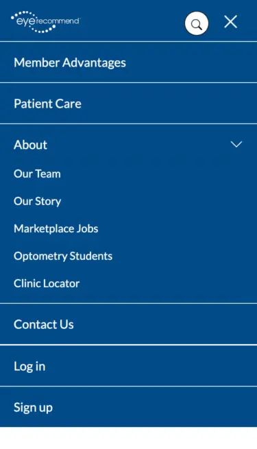
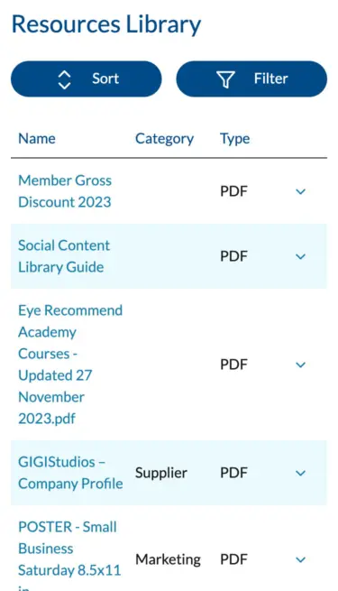
Eye Recommend Mobile Gallery

The challenge
Eye Recommend is well-known in Canada by every optometry clinic, thus brand recognition and driving traffic to the site wasn’t an issue. But the site was on an older version of Drupal (D7), so it was imperative to migrate to an updated version to give the site a much-needed technical upgrade.
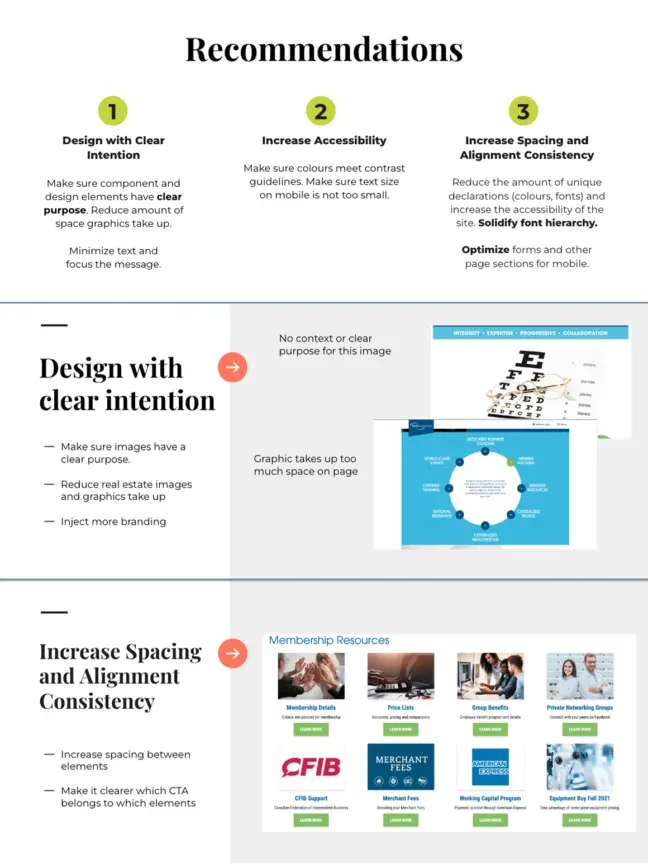
Being forced to fix the technical foundation allowed Eye Recommend to consider a design refresh as well. Research showed that while members enjoyed the content — particularly on membership pages — it needed to be better organized. Additionally, the designs were inconsistent across pages with a poor use of space and alignment.
Even more distressing, the site scored low on accessibility. Issues including poor contrast and font sizes provided terrible metrics for any organization devoted to promoting vision improvements.
While their analytics showed many good things such as a low bounce rate, strong keywords, and organic traffic, they had no effective way to measure metrics on the member’s side. There was little data to tell them what content or tactics were effective or interesting to members.
It was time for both a technical and visual refresh.
The process
User Experience Audit
We audited the site to identify strengths and weaknesses in the UX, so we could make informed decisions around visual needs and user journeys.
Mood Boards
Mood boards helped define the visual look and feel with a goal of creating a welcoming and consistent brand presentation.
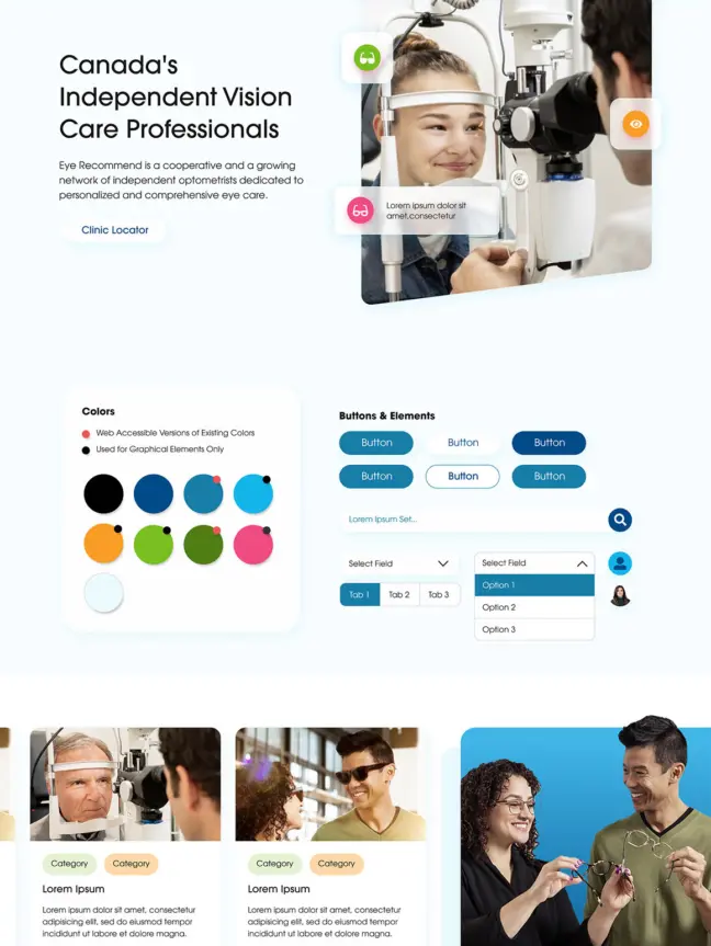
The solution
Migrating from Drupal 7 to Drupal 9 (then eventually to Drupal 10 in post-launch support) created a more updated technical foundation accompanied by a design refresh.
Deep discovery research dug into competitor analysis, heat maps, accessibility and content audits, analytics, and stakeholder interviews. This gave us a fuller understanding of the website’s strengths and weaknesses.
Our discovery work revealed a lot to like about the website’s content and visuals, including clear pathways and calls-to-action. An improved content strategy with proper hierarchy and tagging was also imperative, so members could access the quality content and navigate with ease.
Because the design consistency across pages was poor, we created new templates to give consistency to spacing and alignment across the site.
Key features
Expanded Marketplace
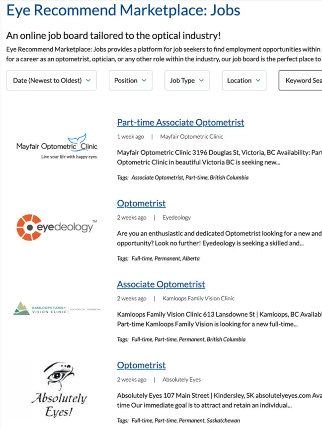
Members can select their location to only receive listings relevant to them.
Solr Search
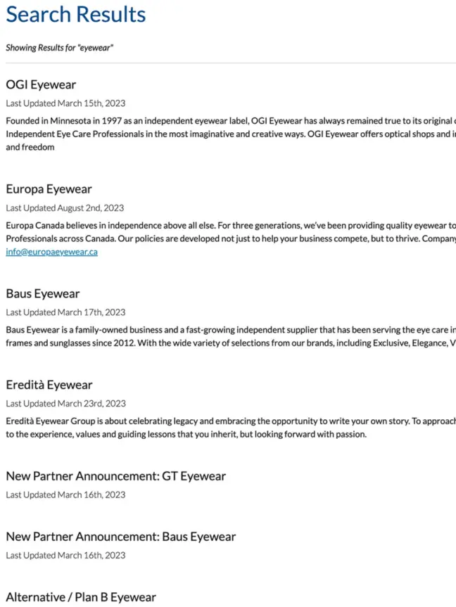
We implemented Solr Search to allow for more targeted and flexible search results.
Benchmarking Single Sign-On
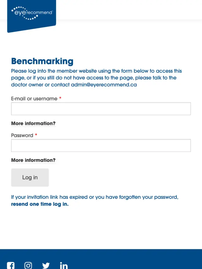
Users can now access their Clinic Benchmarking data with a single username and password instead of multiple credentials required for multiple domains.
The result
Improved flexibility and organization means Eye Recommend can now spin up new sections and pages using a variety of tools at their disposal. In particular, the member dashboard is well-organized, and users are now able to quickly find what they need.
In post-launch support, Eye Recommend has expanded the online Marketplace to include Equipment, Inventory, and Practices/Spaces for clinics.
Each clinic can now review their own stats per month or year to date — including numbers of new patients, overhead expenses, gross profit totals, and more — so they can see their progress toward meeting their goals, as well as in comparison with competitors.


