

It’s been a stressful, harrowing quest — but at last, after all the tears, sweat, occasional rage and countless revisions, you can gaze at your screen with contentment and relief.
After all, you’ve finally achieved a homepage design that’s nothing short of perfection:
- The brand expression is subtle but dynamic.
- Calls-to-action are irresistible as catnip to my two needlessly anxious cats.
- All of which is served up with imagery worthy of the Louvre.
Now, all that remains is to design some engaging, human-centric service pages.
Sadly, this is where your weeping begins anew — as you now realize that functional issues have rendered your splendid visual design completely & utterly useless:
- The lovely callout banners you’ve designed won’t accept more text without breaking.
- Images are distorting and peoples’ faces are getting cropped.
- The row that was built to hold four cards now needs to accommodate five.
Dear friends and readers, we’ve witnessed this scenario more times than we can count. And it’s exactly why, here at Kanopi, we focus on designing and building with web components.
The modular way to ensure your design works — always.
Strip away the visual styling and most web pages can be broken down into a few distinct content areas:
- Navigation
- Main headline
- Body copy, including subheads, lists, and sidebars
- Collections of images
- Calls-to-action/pathways to take next steps.
These building blocks form the foundation of a reusable component library that can be combined and customized to create various types of pages. For example, a photo gallery page might only need a few components, whereas a longform article could require many. From the early stages of design and content strategy, we carefully plan the components a site will need and ensure they are designed to fit together seamlessly, enabling the creation of diverse and flexible layouts.
Examples of components:
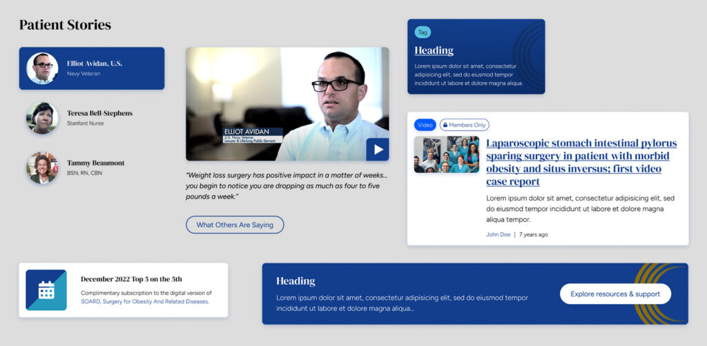
- Page headers and heroes
- Card rows
- CTA banners
- Media galleries
- Testimonials
- Subnavigation and link lists
Ideal for websites of any and all sizes.
This is true even if you’re starting with just a single landing page. After all, what if you need to duplicate that page with variations for different audiences? Does the page lead to a form and link to ancillary pages like privacy policy and terms? Starting with components gives you the power to scale faster and more predictably than figuring it out as you go.
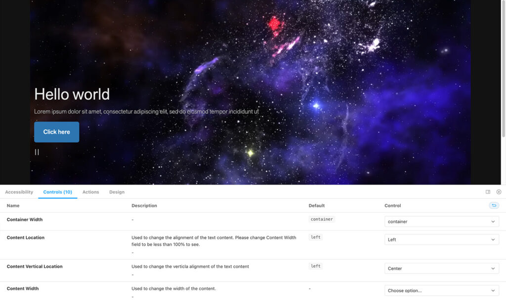
Modular doesn’t mean boring.
One of the coolest things about designing with components is that they allow us to create variants. Variants allow us to extend a component with different presentation styles, such as alternative color schemes, distinct text formatting, or layouts that switch between columns and rows. Even with all these different styles, the basic structure of the content stays the same, making it easy to read. This balance lets us keep the message consistent while adding variety, so each component fits the content just right.
Even more component benefits:
1. They align design and development.
If there’s one thing computers are good at, it’s duplicating things. Websites are coded in reusable blocks, so designing and planning content in similar blocks leads to a smooth handoff to developers. And since components live in a central library, a change only needs to be made in one place to propagate through the entire site. This is much simpler and less error-prone than making the same change manually in a thousand different places, wouldn’t you agree?
2. They simplify accessibility and quality assurance testing.
Teams can conduct preliminary accessibility and QA testing on components as they’re developed — making later rounds of testing faster and easier. No need to worry about whether a link is large enough or colors contrast adequately if those considerations have already been built into the component and its variants.
3. They’ll save you a bunch of money.
Of course, I saved the best part for last: components make estimating more accurate by breaking design and development deliverables into manageable chunks. Throughout the project, they act as guide rails to keep efforts on track and within scope, while also serving as a framework for content strategy and copywriting.
Looking for examples? We’ve got plenty.
As I mentioned, here at Kanopi we design all our websites using components, so feel free to check out virtually any of our case studies. However, if you’re curious to see our coolest examples — the ones that showcase the true potential of component-driven design — check out these sites in particular:
If you’re ready to explore the potential of component-driven design, our team is here to help you create a gorgeous-looking website that also works seamlessly for your needs. Even if you’re just curious about how your site could be reimagined with components, we’d love to hear from you.


