ePac
Client Overview
ePac’s founders began with a mission to provide locally-based consumer packaged goods companies the ability to compete with large brands by creating great packaging. Since opening their first manufacturing facility in 2016, the company’s mission has been clear: to help small brands obtain big brand presence, and give back to the communities they serve by contributing to the creation of a more sustainable, circular economy.
The Challenge
The visual design and layouts on ePac’s website needed a refresh to better reflect the company’s innovative and polished authority within the packaging industry. As a growing, global player in the industry, the team also needed to be able to scale their site(s) to expand their brand story messaging and product lines.
The Solution
In our “small bites for big wins” mentality, Kanopi chose priority, high trafficked pages, and global elements like the navigation, header, and footer to refresh for a site-wide revitalization. We took it to another level by creating a design system, which we developed using Gutenburg and Atomic Blocks so that landing pages and site expansion could be in the hands of ePac. With an easy editing system and an updated visual design approach, ePac is empowered to scale their website at will.
The Process
Mood Board Ideation
A mood board or style tile helps to nail down the key visual elements a site will use within layouts and components. For ePac we took the approach of creating the page layout in wireframe format as well as presenting the mood board together. This helped to show the full picture: visual representation paired with functionality and content hierarchy.
Design Layout
Once the mood board reflected the right visual tone, we flowed the design into the wireframes layouts and used the elements to tell ePac’s story.
Key Features
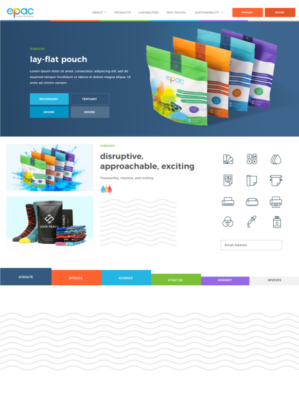
Stunning Visual Language
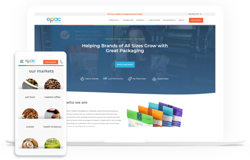
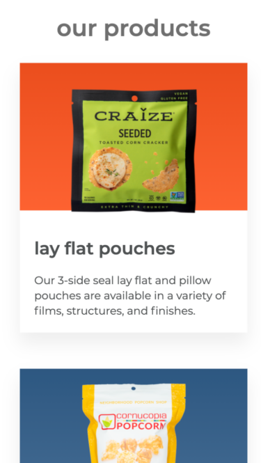
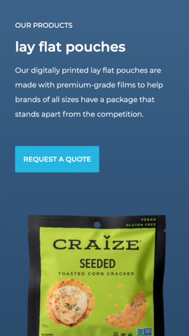
Taking cues from the actual packaging colors and shapes, the use of waved lines and a color palette with purpose brings life to the packaging story.
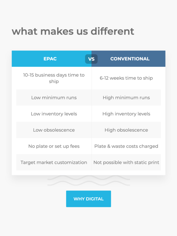
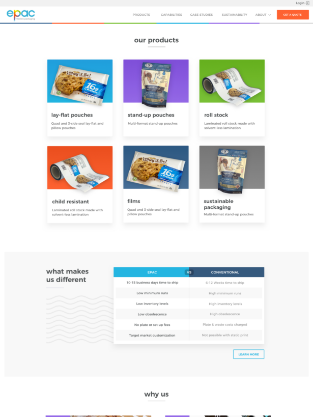
Comparison Chart
Developing an attractive comparison to express the ePac value gives site visitors a snapshot of the important difference ePac brings to their customers.
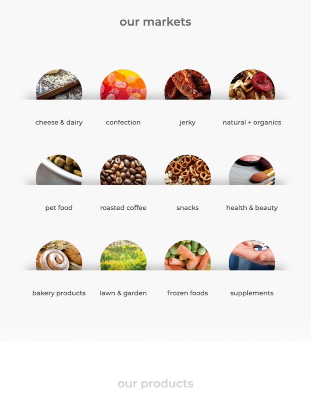
Market Segmentation
Clearly displaying the different market segments in an easy and visually appealing way gives site visitors an easy way of narrowing their focus into content that will be relevant and meaningful to them.
The Result
Sometimes small changes can make a big impact. By focusing on key UX and visual design updates we were able to create a beautiful and user-friendly site experience. ePac’s site now proudly represents their company and elevates them in their space.